
It’s not possible to design your slides appropriately if you don’t know how to use the software. Yes, you can put the text and the graphics on the slides and move them around, but you need to know how to control things to really get the look you want.
There are many books that teach you how to use your chosen application, but there are several features that are so important to the design of your slides that I want to make sure you know them right now.
I can’t provide tutorials for all the different software and all the different versions. In this chapter, I provide specific directions for the versions that are current as I write this book: PowerPoint 2007 on the PC, PowerPoint 2008 on a Mac, and Keynote ’09 on a Mac. If you’re not using one of these, I hope you will be able to find the specific adjustments in your own software, once you know what to look for.
In PowerPoint, one of the most important things to do is turn off the Autofit feature. Autofit is what makes your text change size automatically as you type into a text box or resize the box; this feature makes it almost impossible to have a consistent look between your slides—when text is autofit, every slide ends up with differently sized type and different spacing between the lines.
Turn off Autofit in PowerPoint 2007 on a PC or PowerPoint 2008 on a Mac:
- Select the text box (the outline around the text).
- Right-click[*] directly on the outline, and choose “Format Shape...” at the bottom of the contextual menu. (If it doesn’t say “Format Shape...” at the bottom, the text box isn’t selected; try again.)
[*] On a Mac: If you don’t have a two-button mouse, hold down the Control key and click directly on the outline to get the contextual menu.
- In the dialog box that shows up (shown below), click the button that says, “Do not Autofit.”
- Close the dialog box.
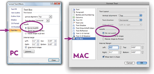
Make sure the “Text Box” option is selected in the left-hand pane.
On a Mac, to get the dialog box shown above, double-click the edge of a text box, or go to the Format menu and choose “Shape....”
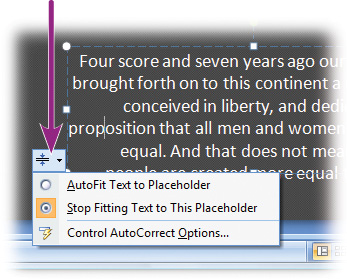
On a PC, if you see the little icon (shown right) appear at the bottom-left corner of a text box as you type, click it and choose “Stop Fitting Text to This Placeholder.”
Text is aligned in text boxes, not only horizontally as in a word processor (aligned left, centered, or right), but also vertically. This makes the text hug the top of the box, hang in the middle of the box, or sit on the bottom:
Vertical alignment: top
Vertical alignment: center
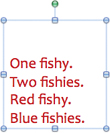
Vertical alignment: bottom
When a text box has a default that makes the text align in the vertical middle, it becomes almost impossible to align the text boxes across the slides. So you need to know how to recognize the alignment and change it when necessary. Most of the time, for consistency, you want a top alignment.
In PowerPoint, to change the vertical alignment, follow Steps 1 and 2 on the opposite page. In those same dialog boxes, toward the top, there are pop-up menus to change the “Vertical alignment.”
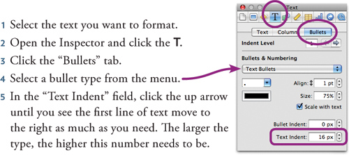
In Keynote, click in the text box you want to align. Open the Inspector (click the “i” icon in the toolbar; or from the View menu, choose “Open Inspector”). In the Inspector, click the T to display the Text pane. Then click the appropriate icon in the set shown circled, below.
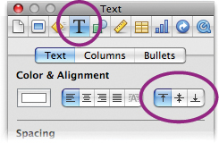
The circled icons are the vertical text alignments.
One thing that makes a huge difference in professionally designed text is spacing: spacing between the characters, between the lines, between the paragraphs, and the spacing from the bullet to the text. It is critical that you learn how to control spacing.
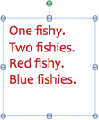
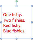
Adding space between lines of text can make it much more readable.

Can you see how a little extra line space makes the text so much easier to read?
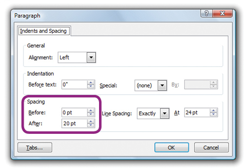
In PowerPoint, select the text. Right-click in the text and choose “Paragraph...” from the contextual menu that shows up. (On a Mac with a one-button mouse, Control-click anywhere in the text.)
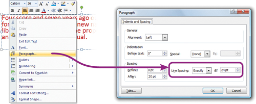
Use the “Line Spacing” options. If you choose “Exactly” (as shown above), you can apply a very specific amount of space: Take the point size of your font, add points to that number to add that amount of space between the lines. For instance, if your font size is 18 and you want 6 points of extra space, enter 24 (18 plus 6), as shown above.
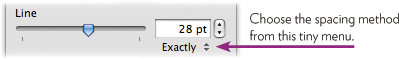
In Keynote, open the Inspector and then the Text pane (as explained on the opposite page), and adjust the “Line” slider.
On the computer, a text paragraph is created every time you hit the Return or Enter key. You might think you have three lines in, let’s say, an address, but your computer sees it as three paragraphs. Each bullet point is also considered one paragraph. So to adjust the space between paragraphs, you need to use the paragraph spacing “before” and “after,” not the line-spacing feature.
Do not ever hit the Enter or Return key twice to make space between the paragraphs! That creates an unsightly and unnecessarily huge gap.

If you adjust the line spacing, all the lines will have more space between them.
If you adjust the paragraph spacing, the lines stay together and space is added either above (before) or below (after) the paragraph.
In PowerPoint, select all the paragraphs to which you want to apply spacing. Right-click in the text and choose “Paragraph....” (or Control-click if you have a one-button mouse on a Mac). Use the Spacing “Before” and “After.”
Paragraph space before adds space above the selected paragraph. You might want to use this to separate body copy from the preceding headline.
Paragraph space after adds space below the selected paragraph. Select and separate all the bullet points this way.
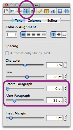
In Keynote:
- Select all the paragraphs in the text box to which you want to apply paragraph spacing.
- Open the Inspector (from the View menu, choose “Open Inspector”), and click the T to see the Text pane.
- Drag the “Before Paragraph” or “After Paragraph” sliders, or enter a number in the field.
You probably think this is a bit fussy, but once you start really seeing type on the slide, you’ll start noticing the space between the bullets and the text. Different applications usually set the bullet too far away or too close, but you can adjust it.
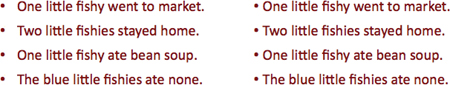
The bullets in the left-hand example are too far away from the text; they’re not in proximity to each other. On the right, each bullet has a relationship with its text.
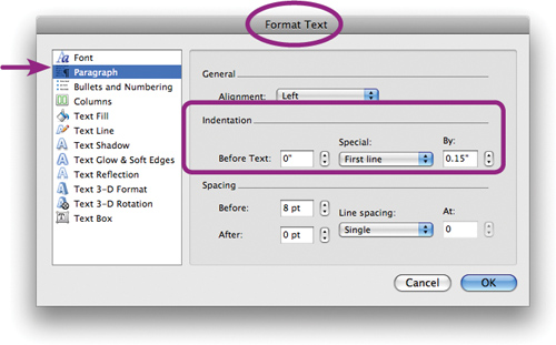
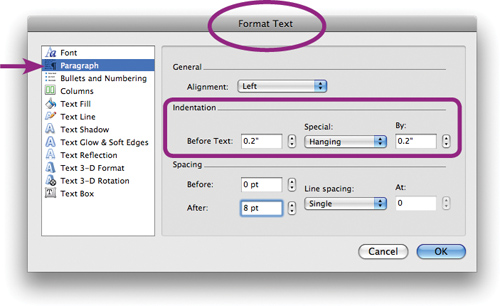
In PowerPoint, you might think that to adjust the spacing between the bullets and the text, you would use the “Bullets and Numbering” pane. Wrong. You need the “Paragraph” pane, as shown below. Select the text you want to format, then right-click (or Control-click on a Mac) and choose “Paragraph....”
If your bullets are one-liners, as above:
- In the “Before Text” field, enter 0 (zero).
- From the “Special” menu, choose “First line.”
- In the “By” field, enter a small amount to scoot the text just a wee bit to the right of the bullet.
In Keynote:
This is really important. When your bullet points have more than one line of text, the text needs to align to the other lines of text. That is, the text should not wrap back under the bullet; the bullet should “hang” out to the left.

On the left, do you see how messy the text appears when it wraps back under the bullet? On the right, the bullet points are so neat and tidy.
In PowerPoint, select the text you want to format, then right-click and choose “Paragraph...” (or on a Mac, Control-click in the selected text).
To “hang” the bullets:
- From the “Special” menu, choose “Hanging.”
- In the “By” field, enter a small amount to scoot the text a wee bit to the right of the bullet.
- Enter the same amount in the “Before Text” field.
In Keynote, follow the directions on the opposite page (bottom of the page) to open the Text pane. As you continuously click the up arrow in the “Text Indent” field, you’ll see the second line of text move to the right, and when the second line gets lined up with the first line, both lines will move together to the right, beautifully aligned.
In PowerPoint it’s easy to resize an image in the wrong way and squish it out of proportion. There’s a simple rule to follow: Resize an image using a corner handle, not any handle on the edges.

If you grab any of the handles on the edges and drag, you’ll squish the image.

photo by Laura Egley Taylor
In Keynote, the default is set so it’s not possible to resize the image out of proportion, no matter which handle you drag.
If you do want to change the proportions, open the Inspector and use the Metrics pane (the ruler icon). Uncheck the box to “Constrain proportions.” Now you can either enter a specific size, or drag any handle on the image. (To constrain proportions while that box is unchecked, hold down the Shift key when resizing.)
To tilt an image, hold down the Command key and drag a corner.