
Handouts are a critical part of most presentations. There are times when it’s not necessary to provide a handout—perhaps you are giving a keynote address and it’s more like a speech with visuals, or you’re delivering a philosophical commentary with lots of discussion.
But most often, your audience wants something tangible they can take back to the office or home. Handouts make it easier for attendees to follow along, to take notes, and to get an idea of when your presentation will end.
If you have charts or tables of data, create a handout so everyone can actually read the charts and make notes on them.
If you provide directions on how to do something, make a handout (we humans can rarely write down directions correctly while hearing them in a talk).
If you have contact information, resources, or web addresses, make a handout—never expect people to write down a complex web address correctly.
Visually, make your handout connect with your slide presentation so your audience remembers who you are. That is, pull in the same colors and fonts that they saw on the screen. And you can put your logo on the handout; it’s the perfect and preferred place for it.
You may have heard this rule: “NEVER provide handouts because it will distract listeners from your talk as they try to read ahead on the handout and listen to you at the same time.”
Balderdash.
Trust me, I can find plenty to distract myself with besides your handout. I’ve got my cell phone with access to the Internet and email and Twitter. I’ve got my laptop with access to the work that I’m behind on. I’ve got a notepad and pen—you might think I’m busily scribbling notes, but I’m actually sketching an outline for a novel. And I’ve got the coffee cart down the hall and no one’s going to stop me from walking out and getting a cup. So don’t flatter yourself that your handout will distract me from your talk.
Quite the contrary. Your thoughtfully created handout tells me you respect me enough to have created it for me, and that in turn makes me pay a little more attention.
As an attendee, I WANT to take notes. I want to circle key points on your handout and make notes to myself about what to check up on, what to report back with, what to add to my own report, etc. I want to write down interesting things you say. Taking notes while someone is talking is a skill we learned long ago—that’s how we got through school. And if your handouts are created thoughtfully, the attendees can follow along with you on the handout, only making notes where necessary for their own enlightenment.
To design your handout, use the same principles of design you read about in Chapters 7 through 10 on contrast, repetition, alignment, and proximity.
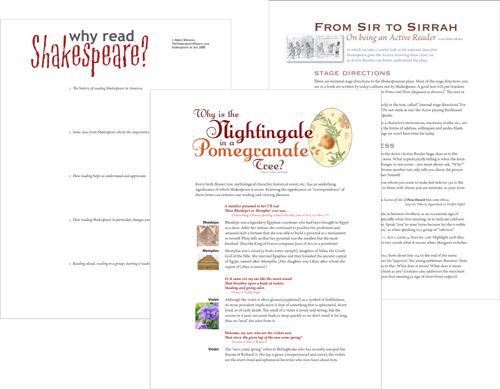
Handouts can be very simple (merely an outline to follow along), or a list of highlights and resources, or they might be complex and useful enough for other instructors to use as teaching materials.
What your audience sees on the overhead screen is temporary, and there is no guarantee they will remember it correctly; what you give them to take back to the office is permanent.
Your presentation software, of course, lets you print your slides in a variety of ways—with notes, without notes, notes only, slides only, etc. This can be handy, but not particularly effective. For instance, if you’ve expanded the number of slides so you can present each item clearly, you might have so many slides that each handout would be twenty or thirty pages. And if you’ve created your presentation to augment your speaking points instead of putting your entire talk on the slides, the slides alone won’t mean much to someone else.
So that means it’s an extra load of work to create a useful piece to leave behind. But if you create something valuable, it increases the effectiveness and impact of your entire presentation. Your attendees will appreciate it and you will look like a professional. They will have something that reminds them of you, and the influence of your presentation will last much longer.
Remember on page 47 where I encouraged you to let go of putting your logo on every slide? The slides are transitory, but your logo and other branding elements on a nicely designed handout is much more valuable (see page 139).
Very often, you will be giving the same presentation more than once, so the work you do on the handout will be amortized over the number of presentations. Plus if you put that much trouble into a presentation, you’re more likely to want to do it again! And each time it gets better.
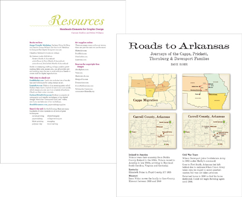
If you have maps or charts that you want people to actually read (or even see), put them in a handout.
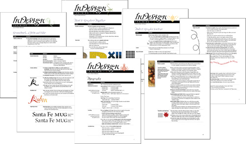
When I present Adobe InDesign workshops, I cannot expect attendees to remember everything I say. I have a moral obligation to leave behind something useful.
When you post presentations online at sites like PowerShow.com and SlideShare.net, you can include your speaker notes. Unfortunately, most people, instead of providing speaker notes, simply post the slide information in text format so there’s no extra data besides what’s on the slide.
Remember, the point of the speaker notes is to provide me, the viewer, with further insights that elaborate on your amazing presentation! And by putting these insights into the speaker notes, you don’t have to put everything you know on those tiny slides.