
15. Listen to your Eyes
The most important skill you can learn in design is to see. This chapter is a quiz designed to help you learn to see the various principles I’ve outlined in this book.
Do the slides on these pages seem a little small? Remember, if you’re in the back of a large room or if the screen is fairly small, the slides might seem about this big in person. Keep that in mind as you design.
And don’t forget, as you go through these examples, that a large part of slide design is determining what gets to stay on the slide and what goes somewhere else—to another slide, the speaker notes, the handout, or maybe to the trash.
Quiz: Listen to your eyes
We learn best if we can put into words what the problem is and what the solution might be. So as you go through these slides, spend a few minutes trying to say the problems and solutions out loud.
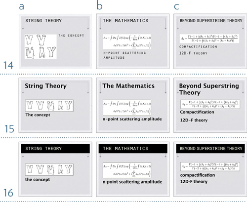
CLARITY: Choose the slide in each set whose text is most clear.
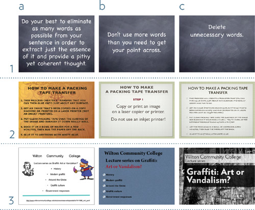
Remember, part of the principle of clarity is making sure there’s nothing useless or distracting on the slide. Does everything have to go on one slide? What exactly muddles the message on some of these? Can you name the steps it might take to get to a clean, professional look?
- ________________________________________
________________________________________
- ________________________________________
________________________________________
- ________________________________________
________________________________________
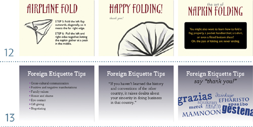
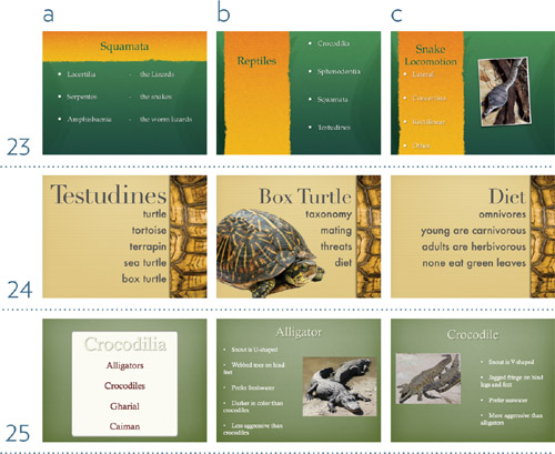
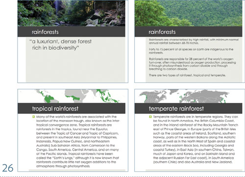
RELEVANCE: Choose the set of slides whose background or imagery does NOT confuse the communication because it is relevant to the topic.
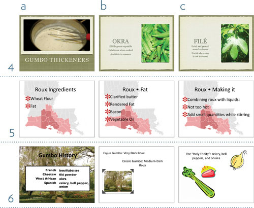
Exactly what is it that makes some of the imagery not relevant?
- ________________________________________
________________________________________
________________________________________
- ________________________________________
________________________________________
________________________________________
- ________________________________________
________________________________________
________________________________________
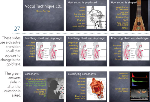
ANIMATION: In each set of slides, describe what kind of animation, transitions, video, or audio clips could be used to enhance the communication.
Why would you not want the text on all the slides to animate onto the slide?
- ________________________________________
________________________________________
________________________________________
- ________________________________________
________________________________________
________________________________________
- ________________________________________
________________________________________
________________________________________
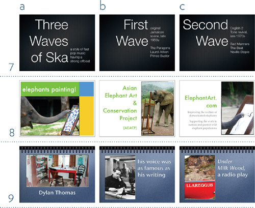
PLOT: Choose the best slide in each set with which to begin the presentation.
Why are the other slides not the best as openers?
- ________________________________________
- ________________________________________
PLOT: Choose the best slide in each set with which to end the presentation.
Why are the other slides not the best as final slides?
- ________________________________________
- ________________________________________
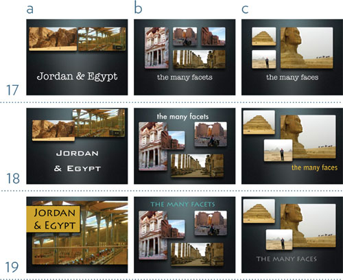
CONTRAST: Choose the set of slides that your eyes are drawn to because of the contrast.
How does the contrast help to clarify the communication? Does it change your impression of the information in any way?
- ________________________________________
________________________________________
________________________________________
- ________________________________________
________________________________________
________________________________________
- ________________________________________
________________________________________
________________________________________
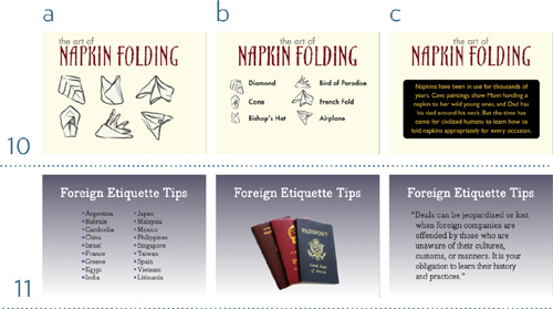
REPETITION: Choose the slide set that is most unified by repetitive elements in the design.
Name the repetitive elements in the set you chose. Are there other repetitive elements you could use on the other slides to create more unified and coherent looks?
- ________________________________________
________________________________________
________________________________________
- ________________________________________
________________________________________
________________________________________
- ________________________________________
________________________________________
________________________________________
ALIGNMENT: Choose the slide set whose alignments help to clarify the information and make it easier to comprehend.
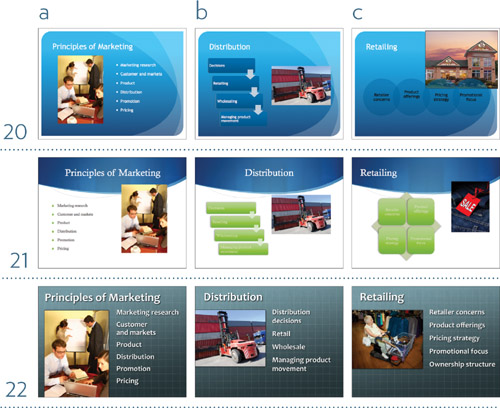
Draw lines on all the slides so you can clearly see where alignments are happening—or not.
- ________________________________________
________________________________________
________________________________________
- ________________________________________
________________________________________
________________________________________
- ________________________________________
________________________________________
________________________________________
PROXIMITY: Which slide set presents the information with clarity and cohesiveness through a good use of proximity?
Can you put into words exactly what each of the other slides needs to improve its communication through proximity?
- ________________________________________
________________________________________
________________________________________
- ________________________________________
________________________________________
________________________________________
- ________________________________________
________________________________________
________________________________________
HANDOUTS: The slide set below has too much text. Make a list of how you could change it. Decide a) what text or image stays on each slide, b) what can be expanded onto more slides, c) what text is in your talk/ speaker notes, and d) what text or image is in your handout.
Suggestions will vary, of course.
- a
________________________________________
________________________________________
b
________________________________________
________________________________________
________________________________________
c
________________________________________
________________________________________
________________________________________
d
________________________________________
________________________________________
________________________________________
OVERALL: Critique this deck of slides. Consider how (in person) some elements might enter individually as you talk about them, and consider what kinds of transitions might be used. Write down what seems to work well, and what might be improved. Use the terms you learned in this book and the checklists on the two following pages. Be specific.
What works and what might be improved?
- ________________________________________
________________________________________
________________________________________
________________________________________
________________________________________
________________________________________
________________________________________
________________________________________
________________________________________
________________________________________
Checklist for info
![]() Learn how to use your software.
Learn how to use your software.
![]() Develop your text and organizational structure before you put it on the slides.
Develop your text and organizational structure before you put it on the slides.
![]() Edit your text so it is clear and relevant.
Edit your text so it is clear and relevant.
![]() Decide which points should stay on one slide and which ones you can spread out to other slides.
Decide which points should stay on one slide and which ones you can spread out to other slides.
![]() Gather up a few graphics, if you plan to use them. You will probably think of others you need as you go along.
Gather up a few graphics, if you plan to use them. You will probably think of others you need as you go along.
![]() Consider where you might use animation, video, or sound clips to add interest and to illuminate your information.
Consider where you might use animation, video, or sound clips to add interest and to illuminate your information.
![]() Choose a relevant background, a relevant template, or design a relevant look. You will refine it as you go along, but at least get the basic structure in place.
Choose a relevant background, a relevant template, or design a relevant look. You will refine it as you go along, but at least get the basic structure in place.
![]() Create an opening slide.
Create an opening slide.
![]() Create an overview slide, if relevant (you might create several of these in your deck, as you move from topic to topic).
Create an overview slide, if relevant (you might create several of these in your deck, as you move from topic to topic).
![]() Start laying in the slides until you’ve pretty much got your look going and your outline on the slides you need.
Start laying in the slides until you’ve pretty much got your look going and your outline on the slides you need.
![]() Start refining the design of the slides according to the basic principles of contrast, repetition, alignment, and proximity.
Start refining the design of the slides according to the basic principles of contrast, repetition, alignment, and proximity.
![]() Be sure to create a winding down and ending to your tale of information.
Be sure to create a winding down and ending to your tale of information.
Checklist for slides
![]() Are your talking points edited down to the most important elements?
Are your talking points edited down to the most important elements?
![]() Are all slides clean and uncrowded (because you created as many slides as you needed)?
Are all slides clean and uncrowded (because you created as many slides as you needed)?
![]() Did you avoid putting your entire talk as text on the slides? (If you don’t put your talk on your slides, you won’t end up reading the slides.)
Did you avoid putting your entire talk as text on the slides? (If you don’t put your talk on your slides, you won’t end up reading the slides.)
![]() Did you eliminate any unecessary bullets? Please don’t ever use dashes instead of bullets—they’re so unpleasant to look at.
Did you eliminate any unecessary bullets? Please don’t ever use dashes instead of bullets—they’re so unpleasant to look at.
![]() Is everything on your slide relevant and necessary?
Is everything on your slide relevant and necessary?
![]() Is animation, audio, and video used only to clarify and to call attention to relevant items?
Is animation, audio, and video used only to clarify and to call attention to relevant items?
![]() Do you have a beginning, a middle, and an end? Is it clear to your audience when you have reached the end?
Do you have a beginning, a middle, and an end? Is it clear to your audience when you have reached the end?
![]() Is there enough contrast on the slides to draw people’s eyes toward them? Does the contrast help clarify the information?
Is there enough contrast on the slides to draw people’s eyes toward them? Does the contrast help clarify the information?
![]() Are there repetitive elements throughout the deck that visually tie it all together?
Are there repetitive elements throughout the deck that visually tie it all together?
![]() Is every item on every slide visually connected to something else on the slide? Are there alignments across your entire deck that help to keep it visually organized?
Is every item on every slide visually connected to something else on the slide? Are there alignments across your entire deck that help to keep it visually organized?
![]() Are your bullets (if you’re using them) close enough (but not too close) to the bullet copy so they appear like they belong together?
Are your bullets (if you’re using them) close enough (but not too close) to the bullet copy so they appear like they belong together?
![]() Are items that are intellectually connected also visually connected by being closer together? Are all your groups of info related to each other?
Are items that are intellectually connected also visually connected by being closer together? Are all your groups of info related to each other?
![]() Did you create a useful handout that attendees will want to keep?
Did you create a useful handout that attendees will want to keep?
![]() If you’re posting your entire presentation online, are you including your speaker notes as well?
If you’re posting your entire presentation online, are you including your speaker notes as well?