
You have certainly heard or read a number of rules for creating digital presentations. And I’ve provided a number of guidelines throughout this book. But the variety of presentations is so broad and multifaceted that I must take issue with some of the really strong pronouncements I have heard and read. Some of these pronouncements might be grounded in good information, but have been misinterpreted by non-designers who have to create slideshows and are unsure of themselves and so take things a bit too literally.
When considering which guidelines to follow for your specific talk and the presentation design, you must always be mindful of to whom you are speaking and in what kind of facility. Are you speaking in a boardroom or a ballroom or a gymnasium? At a scholarly conference or a teen workshop or a suicide-prevention center? To actors or scientists?
Guidelines are great; they give you a terrific place to start. But many rules are made to be broken. Let’s look closely at the rules you may have heard proclaimed with authority.
You have surely heard a hundred times, “Don’t read your slides!” And this gets misinterpreted to mean that one should never read what is on the slide. I have actually seen presenters start to read aloud the few words on the slide and then stop, muttering, “Oh, I shouldn’t read it.”
The point is not about reading your slides. The point is to avoid putting your talk on the slides. Don’t put your talk on the slides and you won’t have to read it.
I always read my slides aloud. For one thing, I don’t have much text on the slide and that text is what I’m talking about, so as I begin to talk about that point, it just happens to be (duh) what’s on the slide. Thus the attendees get the information in two ways—they see it and they hear it. And they have it on their handout.
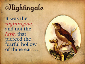
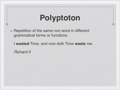
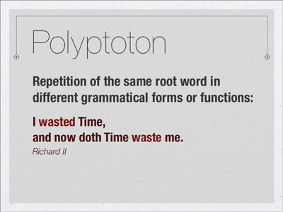
Secondly, I never assume that the people sitting in the back can actually read the slide, and even people sitting more forward might not have great eyesight, if any at all. So when I have a slide like the one below, showing a Shakespearean quote that I’m going to talk about, I want to make sure everyone knows the quote. Because it has been so hammered into everyone’s heads that one should “Never read the slides!,” I sometimes preface it with something like, “I’m going to read this quote in case those of you in the back can’t see it clearly.”
I also make sure that my laptop is positioned between me and the audience so when I read the slide from my computer, I am looking at the audience members, not at the screen with my back to them.
If you have words on a slide and never say those words, you run the risk that your audience gets confused about the relationship between what you are saying and what they are seeing.
As I’ve mentioned before, the admonition to not read your slides actually refers to a different problem—that you have put all of your information onto the slide and are using that as if you’re reading a paper. The problem is not really that you are reading the slide—the problem is that you have put everything you’re going to say on that slide. Don’t do that.
With all your text on the slide, you have no choice but to read it.
Pick out the key points and put those on the slide. Fill out the slide with your talk.
Feel free to use lovely serif typefaces if you set them large enough to be read. It’s true that on a computer screen, many sans serif faces (not all) can be easier to read because the strokes tend to be thicker and the letterforms are simpler and they don’t have small parts that can get lost in the pixels of the monitor. This is especially true of sans serifs that have been designed specifically for the screen.
But if the type can be set large enough, use a serif face if you like. It creates a completely different look and feel (usually a little warmer) than does a no-nonsense sans serif, so take advantage of that.

There’s a wide range of serif fonts. Don’t be afraid of using one, as long as it’s large enough and bold enough. Do avoid fonts with very thin strokes, such as Didot, unless you can set it really large:
This font is the classic Garamond, eminently readable, even on a screen (when set large enough).
Since you’ve read this book, you already know that animation can be an extremely useful tool for clarifying important points, calling attention to items, or creating transitions to new subtopics, etc.
What this rule really means is, “Never use the kind of animation that’s going to make your audience hate you.” That is, don’t type every word onto the page. Don’t swirl everything in from the side. Don’t use corny little animated images. Don’t use a checkerboard transition between every slide. I know it’s irresistible, but we’re all moving on into this new millennium and looking for clarity in our presentations. Use animation when it can enhance clarity.

This is part of Dave Rohr’s “Roads to Arkansas” presentation. As he talks about the migration of the family, the arrows appear and move toward the destinations, calling attention to themselves and making the path clear.
As you have seen throughout this book, there are good reasons to use different backgrounds. You just have to make sure that you know why and can put into words why you are changing the background. A reason such as, “I’m tired of the blue spaceship background and now I want a green forest” is not a good reason.
When the background changes during your presentation, it sends a signal to the audience. Make sure this is the signal you want to send—a new topic, a change in thought, a special callout. Remember, all those busy minds in your audience are going to start processing information about the background as soon as it changes, especially if it’s an interesting background. If the background doesn’t complement what you’re talking about, you’re going to lose your audience for a little bit as they work that out in their heads.
So use more than one background when it’s relevant and provides clarity.
These slides are from Paul Isakson’s deck that I showed you on pages 110–113. Although there are different backgrounds, can you see elements that tie them together? Be sure to take a look at all the slides in his example to see how well he uses different backgrounds as repetitive themes.
A nice typographic treatment of your text is perfectly acceptable and welcome. If your slide is strictly type, just make sure it’s clear—is the typeface legible, is it large enough, is the color of the type a good contrast with the background, is there contrast on the page that makes me want to look at it?
If your content is boring and your type is boring, some random graphic is not going to make it better. If you’re using a default template with small black type on a large white background, indiscriminate clip art in the corners is not going to fix it.
Of course, use relevant graphics and even animated ones when the image clarifies your point.
Seriously, do these arbitrary graphics add anything to this presentation opening?
Above, we have nice text on a template background, perfectly sufficient. Below is a slide with simply text. It looks much more sophisticated without haphazard images.

One problem with this rule is that it makes people think it’s okay to put five bullet points on every slide. The more important thing to remember is that you don’t need to put all your bullet points on one slide in the first place, as I explained in Chapter 3. Once you understand that concept and start spreading out your slides, deciding what needs to be expanded into multiple slides, and determining which collections of bullet points need to stay on one slide, you’ll find the right number—based on the needs of your presentation, not on an arbitrary number.
You might need six points or even seven (most often you’ll need fewer)—just make sure you can put into words why you must have them all on one slide (and make sure they’re big enough to read). If your reasoning creates clarity in your presentation, then use bullet points with glee.

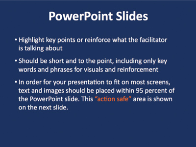
This slide has more than five bullet points on it, but that’s not the main problem or the only problem, is it?

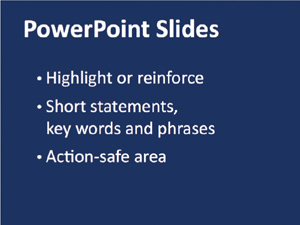
To create an opening for our story, let’s add contrast with a bold font and move those lists onto separate slides. The client loves his clipboard and uses it on everything, so we’ll let it stay.

Depending on how this talk is structured, these slides might be used to provide introductions to individual sections, which then move into one slide per bullet point.
This rule goes along with, “Never use more than six words on a slide.” It’s just not possible to lay down a rule like this and expect it to be followed, and there are many many many incredibly amazing slide presentations that break this rule.
Make every word count, be as succinct as possible, but don’t arbitrarily limit the number of words because of this rule. Be clear.

These two slides are also from Paul Isakson’s deck. He’s got no problem using a dozen words on these slides. Can you read it? Is the message clear? Can you imagine Paul expounding on these thoughts?
Also consider how someone else might have set both these ideas as bullet points on one slide (small, black Arial on a white background). I’m sure you can see the greater impact that results from separating the points and expanding onto more slides.
As I mentioned in the introduction, if you’re giving a speech or certain type of lecture, you probably don’t need multimedia. But if you’re giving a presentation, then people expect some sort of visuals.
PowerPoint is not the problem—a presenter’s ineffective use of PowerPoint is the problem. Anyone who decrees that no one should ever use PowerPoint is someone who hasn’t learned how to use the tool properly himself. So the message to you is really, “Learn to use your software and learn to create an effective presentation.”
Moonshine.
Once again, these mantras get repeated without a real understanding of the intention. It’s true that you don’t want to be a disembodied voice speaking through the blackness, but neither do you want the slides that you worked so hard on to be washed out and difficult to read because all the lights are on (or worse, the lights are pointed right at the screen).
Ideally, you’d like dim lights in the audience (but enough light so they can take notes and so you can see them and their reactions to you), some light on you standing next to the screen, and the screen itself with as little light as possible. Newer auditoriums and boardrooms are fitted for this kind of scenario, with many combinations of lighting possibilities.
If you’re going to stand in total brightness and your slides will be illegible, then why bring a slide presentation? Just give a speech. If you know the room is either all dark or all light, bring your own lamp to place near you.
The important thing to remember is that lighting is an issue, so be aware and, if possible, check out your situation beforehand on the chance that you can do something about it.
But you already know this is piffle because you read Chapter 13 about the importance of handouts and the importance of giving them to your audience before you speak. And remember, go ahead and brand your handouts with your logo!

Balderdash.
One can’t make a blanket statement that all pie charts are wrong. Pie charts are not the problem—a presenter’s ineffective use of pie charts is the problem.
Use a pie chart when it is the best way to present your information clearly. Remember, the percentage numbers in a pie chart must add up to 100 percent. And if there are too many pieces in the pie, it becomes ineffective because you can’t see the differences between the slices clearly. But if your data can show me the relative size of one thing versus a couple of other things, then a simple pie chart can be efficient and clear. And it’s fun to make a slice pull out of the pie and call attention to itself (as long as it clarifies the information!).
I’m sorry, but this is true. If you are a brilliant and trained designer, you can use Arial or Helvetica in ways that aren’t dreadfully dull. But for most people, if you plop together your presentation with the default Arial that appears on your PowerPoint page, you are doomed to mediocrity.
If you insist on using Arial or Helvetica, buy the entire professional Helvetica font family instead of using what is built into your machine. Only if you buy the whole family can you get the heavy bolds and thin thins that don’t have the patina of boring all over them.
This is the default Arial/Helvetica.
With a little work and a financial investment in the professional font family, you can make Helvetica look less tired and worn out.

Times or Times New Roman has the same problem. It’s a skillfully designed typeface, but now has the look of an old default workhorse that needs a break.

Even if you haven’t bought any new fonts, you have a good collection on your computer. Try some others (above is Rockwell).