
9
The Steam Table
It may not be since high school physics that you've seen a steam table (see Figure 9.1), a chart of the pressures and temperatures at which water turns from liquid into gas.
If you plot these numbers on a graph, you get a view of where you are in the world, based on these pressure and temperature variables, a point that tells you, with definitiveness, whether water will be water, ice, or vapor (see Figure 9.2). You know, because you have all the information you need for the equation.
Perhaps you see where this is going. In a mathematically-idealized world, we would build that “steam table” for every condition, every disease—so that you would know who to treat, who not to treat, and what we should be treating them with based on empirical results. Using the example of PSA, prostate cancer, and radical prostatectomy—the surgical removal of the prostate—the columns of our steam table could chart PSA results, the rows could chart the patient's age, and in each box we would look at the ratio of the number of people who didn't suffer from prostate cancer versus those who did, after their prostates were or were not removed.
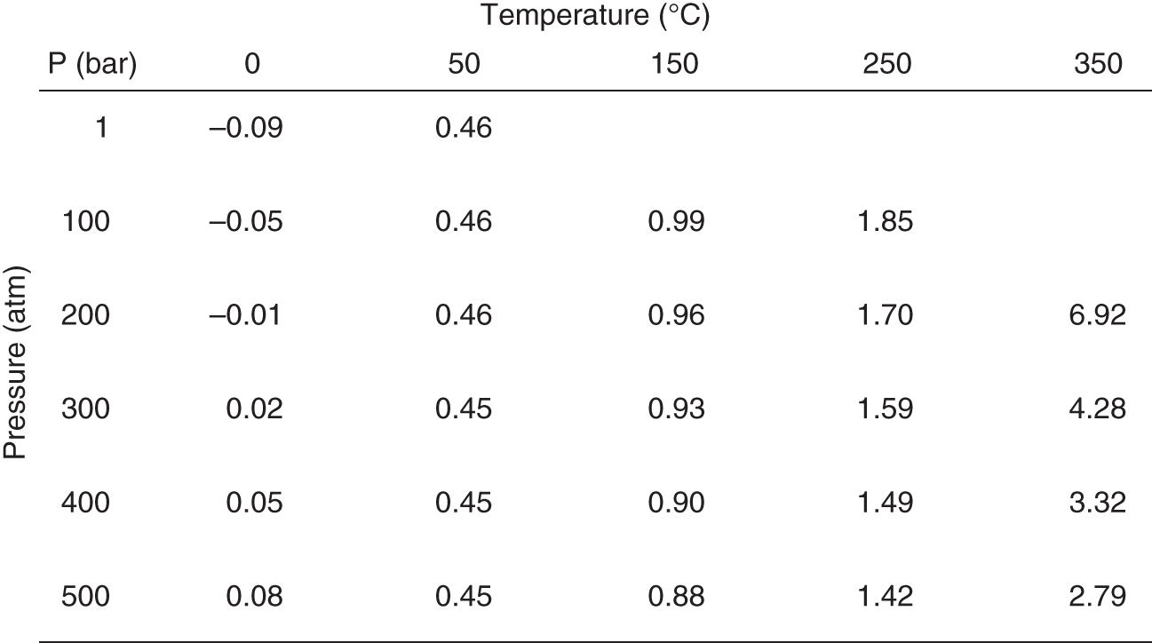
Figure 9.1 A steam table
Steam tables show the amount of a substance—typically water, hence the name—that is vapor versus liquid at a given set of combinations of temperature and pressure.

Figure 9.2 Phase diagram
Phase diagrams graphically illustrate the transition of matter from one phase to another (phase in this instance meaning liquid, solid, or gas). Illustrated here for H2O.
This should start to sound both impractical and wildly unethical—but the concept is important. If we looked at that data, we'd find that at certain combinations of age and PSA (more advanced age, relatively low PSA numbers), treating the patient doesn't drive better outcomes than leaving them alone. That would define a set of patients we shouldn't treat. There would be another group of patients who, if we choose not to treat them (likely those with excessive PSA scores at relatively young ages), the data would show they will suffer, and perhaps die, from prostate cancer. That would start to form a shape defining the patients we should treat.
By adding a treatment alternative, say an experimental drug instead of surgery, we can add more data to the table, and start to look at the shapes forming in the diagram. Now we'll start to see shapes forming around which patients to treat with this new drug versus which patients to treat surgically (see Figure 9.3). However, the lines might not be that clear—not as crisp as those between water and steam. In fact, they probably won't be nearly as crisp in this example, because treating prostate cancer is vastly more complicated than boiling water. This is where we need to start to take these two simple ideas—the table of results (the steam table), and the graphical representation of that raw data (the phase diagram)—and open our minds and our analyses to more and more dimensions of data.
We could add the grade of the cancer based on a pathologist's examination of a tumor biopsy. Now we have a three-dimensional space, and yet another way to calculate the ratios for patients untreated or treated with different therapies. We could add a dimension for the RT-PCR for PSA assay that I worked on at Columbia in the 1990s. We could add a dimension for activity, or for patient territory. We could add even more treatment options—different kinds of surgery and drugs, experimental and not experimental.
It may sound overwhelming, but conceptually there is no change. When we move from two dimensions to three, the lines of transition become sheets. When we move to four and more dimensions, the shapes become harder to visualize—but they are still there. In the patient equation-driven future, we need to catalog our data so that we can fill in as much of the steam table as possible, and impute the rest. And we need to look for the transitions—the phase shifts—that define how to optimally treat patients.

Figure 9.3 A phase diagram for treatment choices
Can the same principles visualized in a phase diagram be used to delineate the transitions between when or how a patient should be treated to receive what is computationally the best possible outcome based on existing data? This two-dimensional example is based on two biomarkers, instead of temperature and pressure from the purely chemical phase diagram in Figure 9.2. An actual phase diagram for a real disease and possible therapies would be much more complicated in structure, extending into many dimensions and likely with multiple existing and experimental therapies. But any given combination of biomarkers points to a region—or the transition between regions—corresponding to the patient equation output for the best treatment choice.
It's more than just pressure and temperature that we need to know—and so that graph, in reality, is far more multidimensional than the one on the page. But for all of this talk about sensors and data collection, this graph is the goal. This graph is where we are headed. This graph is what we need to build in order to make more granular and accurate decisions than ever before about who to treat and how. Our job in the life sciences industry is to make these graphs better and better, to figure out the layers that matter for every condition, the characteristics that need to be plotted, the codification of doctor's intuition, data-supported and scalable.
It's not about one good therapy—it's about putting a system in place to build all the good therapies, and then propagating them out into the real world, collecting more and more data to verify and sharpen our predictions, and ultimately generating consistent patient outcomes like we've never been able to generate before. It's an easy science experiment to see when water freezes or turns into gas—but for people it's far harder, with an uncountable number of variables, some of which matter some of the time, and some of which we don't even know exist yet.
Progressing Toward Alzheimer's Disease…or Maybe Not
Standing in front of a lecture hall at Columbia University not long ago, I found myself trying to establish for the audience of undergraduates and graduate students why the idea of patient equations would have such a huge impact for the future of health care. A visceral example, originally given to me by Paul Herrling of Novartis, popped into my head. It has proven to be incredibly effective—particularly with a room full of young people. It's a “good news, bad news” kind of scenario, applicable to every student in the room.
It's usually better to start with the bad news: the existence of beta-amyloid plaques—clumps of protein that are thought to clog our cognitive circuitry—has been widely debated as to its causal or coincident relationship with Alzheimer's disease.1 However, even if their existence is merely something present in greater quantities as one progresses towards dementia, its utility as a biomarker for disease progression means that beta-amyloid plaques should be worrisome to all of us. That's the bad news for the students. There is evidence to show that even in the students' relatively young brains, the march toward dementia has begun.2
Were we to biochemically peer into their skulls, we'd see these beta-amyloid clumps beginning to accumulate, and, with multiple timepoints, start to be able to show that everyone in the room is already on a course that might one day result in a diagnosis of Alzheimer's disease. And at least at the time of this writing, there is no cure, nor any preventative measures. Bad news, indeed.
So what's the good news? Most of the class will die from cardiovascular disease or cancer before that happens! (Restrained, uncomfortable laughter is typically the result of delivering the punch line of that story, and, whether causal or coincident, the students' attention has been grabbed as far as why patient equations will be so important in the course of their own lives.)
The Alzheimer's example is one of many I can produce. As I discussed in Chapter 2, before founding Medidata, I worked at Columbia, in a prostate cancer research lab. With prostate cancer, it can be the very same story. Many men over age 40 (and even by their 30s, according to some studies3) have detectable prostate cancer if you were to examine a biopsy of their prostate glands under a microscope. They are on a path that inevitably leads to more advanced disease, ultimately toward metastatic cancer, and eventually death.
However, the studies showing this are done on men who have died of other causes. Just like in the Alzheimer's example, these cancers never progressed to the point that the individual's health or quality of life was affected. Even though—perhaps for decades—the disease was lurking inside of them.
But aside from being somewhat morbid examples to get the attention of a class, these ideas serve an important purpose as we think about how to treat patients, regardless of whether a disease is life-threatening or not. In the example of prostate cancer, with plenty of treatment options available (albeit with significant quality-of-life-impacting side effects), the studies were largely connected to concerns about overdiagnosis and overtreatment.
Almost every male over 40 reading this has probably had a PSA test. However, today, an elevated PSA alone is not enough to make treatment decisions. We need other data—other inputs to the patient equation—in order to decide how to diagnose prostate cancer. We need data to decide if the patient's prostate cancer should be treated at all.
So the fundamental question we have to answer isn't whether or not we can predict that someone is going to get these diseases. They are, and we know they are, on a long-enough time scale. The question is about the trajectory of the diseases' relative progression. We need to determine, as reliably as possible, if and when intervention—or even prevention—is worthwhile. Of course, we probably want to treat you if it turns out you're going to manifest symptoms in a year. And maybe it makes sense to treat you if you're going to manifest symptoms in 10 years. But perhaps not, if you're already 102 years old.
Some people have a genetic predisposition to get Alzheimer's disease at a young age. That's one more piece of data, one more input to the patient equation, that defines a population for which a more aggressive preventative or therapeutic course might be recommended. But for those without that predisposition, if we're probably going to manifest symptoms of Alzheimer's disease, the question is whether it's going to be when we're 72 or when we're 147.
Like many mathematical equations, it is helpful to visualize this. Figure 9.4 shows a theoretical progression of disease—Alzheimer's in this illustration, but the concept is applicable to virtually any condition. On the vertical axis is the progression toward dementia. On the horizontal axis is the progression of time. Each axis has an important cutoff point. If we cross the dotted line denoting clinically-relevant dementia before we cross the solid line denoting death, then treatment is going to be relevant for us. If we're going to die first (of something else), it's not.
The first two paths, looking left to right, belong to patients who will cross the line into dementia before they die, but the last one on the right (path B) will not—Alzheimer's won't impact that patient's life. But we don't know, right now, which path we as individuals are on. If we can figure out where on that graph we are, and what we can do, if anything, to either change that trajectory or at least get ahead of whatever treatments are out there, that would be huge progress.
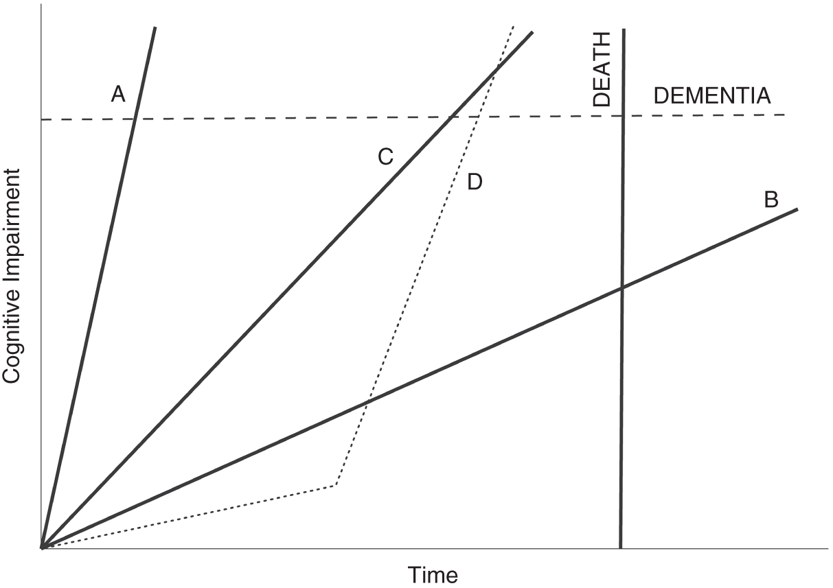
Figure 9.4 Theoretical paths for neurodegenerative disease
Looking at a plot of cognitive impairment over time, we must consider two important thresholds that a patient could cross. First, there is an impairment threshold for dementia. If the patient's impairment passes through that line, they have what is diagnosed—or at least diagnosable—as Alzheimer's disease, for example. Second, the threshold on the time axis is death, whether from the neurodegenerative condition being considered or any other cause. In this simplified illustration, a patient on path A needs therapy the most. If this were Alzheimer's, that path might be consistent with familial early-onset disease. Path B is associated with a patient who will never experience the disease in their lifetime, even though they are trending toward it. For them, treatment is not necessary, and may even be harmful in other ways. Patients on paths C and D also need therapy. The difference between the two illustrates that events along the course of our lives can change the slope of these paths. Patient D appeared for half of their life to never need therapy. Something changed (gene mutations, a cascade of phenotypic changes, their environment, or all of those) that shows why continuous monitoring is necessary if we are to best leverage patient equations.
Something all Alzheimer's researchers would agree with is that effective treatment, to truly improve lives, typically starts way too late. We need to start as early as possible—ideally, even before we're able to detect the disease clinically. We can't do that now. A preclinical diagnosis isn't something that makes any sense in the health care world today. That's where patient equations come in.
We need to be able to predict who is going to cross that line—before it happens. This is where the genetic and molecular data merges with the phenotype information we talked about in the first section of the book, the cognitive and behavioral data that may—no, almost surely will—be able to sharpen the prediction we would otherwise make about who is going to need treatment for Alzheimer's disease.
The graph in Figure 9.4 obviously simplifies things. First, I've drawn the paths as straight lines, when we don't actually know what they look like, at least not yet. Maybe they're curves, or some other shape. And we also don't know to what extent they're fixed or malleable. Maybe they change—in direction or slope, like the dotted line D, where a patient takes an unexpected and potentially explainable turn for the worse—based on exercise, based on doing crossword puzzles, based on certain medications, based on any of those layers we've already discussed. We just don't know. But the lines are a starting point. And then, in Figure 9.5, there's me. I'm headed in some direction—with some velocity—toward both of the thresholds (dementia and death), and we need to figure out which line I'm set to cross first.
With more and more data—from sensors, from traditional measures, from everything we've talked about so far in this book—we can narrow that cone of prediction, and we can plot patients with more and more accuracy. And then we can try to do something to help the patients we see headed on that path toward the dotted dementia line. The cost of treating dementia, worldwide, has been estimated by the World Health Organization at $818 billion in 2015 alone4—imagine the societal impact and the savings for health care systems around the world if we could catch this disease just a little earlier, a little more reliably, with a little more time to treat, across populations. Mathematical models can be powerful things. It's not like we're going to see the future. But the models, as we feed them better and better data, can give us a better chance of picking the right therapy and of making smarter decisions about care.

Figure 9.5 How I think about myself and cognitive impairment
The decision to treat or not to treat is illustrated here by a predictive range. Based on the path of my neurodegeneration—or likely biomarker proxies for it that we have access to now—my own patient equation will produce a range of possibilities. The better our patient equations are, with high-quality inputs for well-developed and validated predictive models, the tighter that range will be and the easier therapeutic choices will be to make. The correct placement of the dot representing the author on the y axis is an exercise left to the reader.
We'll talk more in Chapter 14 about how these kinds of patient equations can change the business models in life sciences and health care, but keep this thought in mind just for now: say I'm right there on the graph, as in Figure 9.5—no clinical symptoms of dementia. What if we could incentivize my doctors to try their best to keep me there? What if our reimbursement rules were framed by the idea that we reward doctors for patients whose diseases don't progress, and we penalize them, on a population basis, if their patients do? What if my insurer had to pay a penalty to my next insurer if I advanced at a faster rate than the data would expect? Incentives like these—once we understand these graphs better, once we have a firmer handle on the drivers of disease progression—could help shape behavior and treatment, push toward preventive care and rewards for lifestyle changes, and move the focus to keeping patients healthy instead of just treating disease once symptoms manifest themselves. Better information allows us to think far more creatively about how we structure reimbursement and the kinds of outcomes we want our health care system to drive patients toward.
Doctors are currently incentivized toward the short term, largely because the short term is all we can measure. But it's not all we'll be able to measure in the future, and that's where the power of patient equations can truly be realized.
When the Measurement and the Therapy Are One and the Same
I picked Alzheimer's disease as our example in this chapter not only because we all may be heading in that direction on the graph. The interesting thing about the lines on the graph is how malleable they may well end up being, especially if we start paying attention far sooner than we're currently able to. There are companies out there, such as Cambridge Cognition, trying to use smartphone apps to distinguish between Alzheimer's-like dementia and other memory issues that may merely be mimicking the symptoms due to depression or other mood disorders.5 They may be able to find people on the graph who appear to be heading in one direction at a particular velocity and correct our assumptions—and then guide us toward treatment that can help resolve those particular memory issues that are being caused by something fixable.
There is also the often-maligned “science” of brain training. Lumosity, makers of a “brain training” memory game, was fined millions of dollars for claiming the game could stave off cognitive decline.6 And yet, further research may in fact prove that there are some brain exercises we can do (perhaps not the same as those from Lumosity) that can slow the progress toward dementia, at the same time that these exercises may be able to help measure where on the curve we fall. Perhaps there is a future where doctors prescribe a set of exercises—partly to measure our state of decline, and partly to help us stop that decline in its tracks. We talked earlier in the book about using passive smartphone data—the number of times we check our schedule, for instance—to keep tabs on our cognition. It is also very possible to use active smartphone data—to require us to do something, click something, play something—to obtain cognitive biomarkers as well.
Lumosity may have shown itself unable to back up its claims, but at least one brain-training app has been shown, at least in one study, to lower the chances of developing dementia by 29% over the course of a decade.7 BrainHQ was studied by researchers at the University of South Florida, who found that it made an impact. It is not hard to envision that, over time, we'll see more and more apps that can genuinely change the trajectory of our curves for a whole range of conditions.
Steam Tables for Cancer
Dr. Jerry Lee, a chemical engineer by training and associate professor at the University of Southern California, is the person who got me thinking about the steam table concept when it comes to patient equations and the graphing of disease. Dr. Lee deserves all of the credit here. I met him when he was working on the Cancer Moonshot, a project at the National Cancer Institute (NCI) aiming to improve our ability to prevent cancer, detect it at an early stage, and make more therapies available to more patients.8 He was trying to obtain genomics, proteomics, and clinical phenotype information about tumor samples around the world in order to better understand—and find effective treatments for—cancers of all kinds. When he joined NCI in 2006, he told me, Dr. Lee knew that to better understand the molecular underpinnings of cancer, we needed to have more data.9 That data, however, needed to be structured and reproducible, similar to steam tables and phase diagrams used by chemical engineers. To him, the steam table concept just made sense, to have as the ultimate goal a kind of reference table that could tell us what the drivers of cancer are, and what makes the cancer what it is. If we could create a cancer steam table, we could use it to derive phase diagrams and perhaps determine what conditions we could change in order to turn the cancer from dangerous to contained—from steam back to water, so to speak.
Dr. Lee and I talked about intensive versus extensive variables—the things that are unchanging characteristics of the cancer (intensive) versus the things that change depending on the system they're in (extensive). This is critically important, as phase diagrams require us to compare intensive properties. For example, if a liter of water at room temperature is split evenly into two cups, the resulting mass and volume is halved (extensive) but the temperature of the water remains constant (intensive). If we take a tissue sample, are we measuring something that is the same no matter whose body the cancer lives in, or are we measuring something unique to that ecosystem of cancer plus host?
This kind of thinking can lead us to better understanding what we may have some control over, from a life sciences perspective, and what is simply never going to be something we can change about that particular cancer. In cancer, few cases of truly intensive measurements exist—but some come close, including the presence of BCR-ABL fusion in chronic myeloid leukemia, or overall alterations in TP53, the gene in a patient's DNA that is responsible for causing the cancer. These changes can be found at the single cell, whole tumor, and population sample sizes. As we look at 10,000, or 100,000, or a million tissue samples, are the molecular signatures that we think mean something going to hold up as useful in finding a cure, or are they simply a function of the kinds of samples we are looking at?
By looking at these different properties, and thinking about what holds up as an intensive quality of cancer, we can start to figure out what the axes of our steam table for cancer might look like. It's not temperature and pressure that determine how we treat someone's cancer, but perhaps two of the n dimensions we might need to consider are, say, activity level and age. These are of course two good prognostic indicators of treatment outcome, but they are not the only things we need to know when trying to figure out treatment.
Primary untreated late-stage tumors are only beginning to be understood, Dr. Lee explained, and one thing he is doing is working with the Department of Defense and Department of Veterans Affairs to compare them to treatment-resistant disease over time.10 Is there something to learn about the difference between late-stage tumors only first being discovered and late-stage tumors that have resisted prior treatment, or are these two kinds of disease always fundamentally the same? More study may reveal interesting insights that get us closer to understanding what that steam table for cancer might look like—but Dr. Lee isn't yet convinced we can get there soon. We are just starting to chip away at the multidimensionality of cancer, to find simple dimensions we can understand enough to take them off the table, and reduce the vast space that is still a black box.
The Data Problem
A huge problem in figuring out the contours of that black box—and we'll talk about this more in the next chapter—is the lack of usefulness of much of the clinical trial data we have, simply because it's not perfectly clean, or perfectly able to be integrated with the other data sources we have. Clinical trial data needs to be better leveraged, because it is our greatest hope right now for making breakthroughs and understanding the progression of disease. Dr. Lee talks about the difficulty of matching patients to each other—in trying to find similar patients who may have similar outcomes—when the data is inconsistent, or when some data comes from a real-world data set and other data emerges from a clinical trial.
There is a danger, he fears, that patients believe a clinical trial is always a better answer for them, when it's not always true that clinical trial therapy produces better outcomes than the standard of care. We forget that a good percentage of patients follow a trajectory that matches the expectations of the standard of care therapy. The big question is whether we can better identify the patients who won't follow that trajectory, the ones whose disease won't behave as we hope and expect and won't have the results with the standard of care therapy that we anticipate. Can we use data to find those patients prospectively instead of only realizing that they are outliers after the fact, when we look back on their courses of treatment and disease?
The answer for how to create our steam tables of the future, Dr. Lee emphasizes, is better data, more data, more and more of those layers of our layer cake, analyzed at a higher and higher frequency.
From Wellness to Illness—and Back Again
Another thing we can often forget as we think about steam tables and phase transitions is that it's not just the transition from wellness to illness—the initial treat-versus-don't-treat decision—that matters. It's also the transition—hopefully—back to wellness once the treatment is complete. And that is where we have a lot of work to do. How do we know when we can consider patients “cured” and back to a wellness state, especially with something like cancer? If a problem re-emerges years later, it is often very hard to figure out if it's a new-onset cancer or if it relates back in some way to the original. We don't have a good way right now of cataloging the data we need to make those judgments and build those steam tables. It's easy to think about, but not so easy to put into practice.
Similarly, we need to look at more and more patient data to understand the interaction of cancer with other diseases. What we do to treat a tumor may be different if a patient also has heart disease, or diabetes, or a neurodegenerative illness, and the lasting effects of treatment on those other conditions is also poorly understood right now. What it means to be sick with a certain condition, like cancer, may mean different things depending on what other comorbidities a patient faces—and all of this is a mystery right now, at least in terms of having some standard protocol and some standard set of expectations around what a patient's course will look like.
Dr. Lee compares the state of where we are right now to scientists in the sixteenth century thinking about the orbits of planets, based on discussions he's had in the past with Dr. Larry Norton of Memorial Sloan Kettering Cancer Center in New York City. As Dr. Norton has shared with Dr. Lee, there was documented data—all kinds of it—but it never really matched the motion of the planets perfectly until Johannes Kepler put it all together and realized that the orbits weren't spherical, they were elliptical—and then suddenly it all made sense. The data just needed to be looked at from a slightly different angle. That's where we are now. We are continuing to amass the data, but we haven't yet had the mindset shift that we need. And it won't come from an artificial intelligence system, but from humans looking at it differently, figuring out what they can see that no one else has seen, what we don't know yet that can explain things that we still have so much trouble explaining. The steam tables exist—we simply haven't figured them out yet.
So how do we figure out our patient equations? How do we start to move from this magic—this big black box of mysteries about disease and disease progression and the best treatments for the right patients at the right time—to a world that we can understand as easily as we can understand how to turn water into steam?
The answer, as Dr. Lee suggests, is data—but good data, matching data, useful data as the starting point for turning patient experiences into knowledge, for turning anecdotes and ideas into provable reality, into the spaces in our steam table that are just question marks right now. One thing Dr. Lee is doing is working with the Department of Defense and the Department of Veterans Affairs to create a learning health care framework that includes molecular, phenotypic, and real-world data in a longitudinal fashion.11 Systems have to speak to each other. Data has to work. In a lot of ways, that's my story at Medidata, and it's what the next chapter is about.
Notes
- 1. Simon Makin, “The Amyloid Hypothesis on Trial,” Nature 559, no. 7715 (July 2018): S4–S7, https://doi.org/10.1038/d41586-018-05719-4.
- 2. Alaina Baker-Nigh et al., “Neuronal Amyloid-β Accumulation within Cholinergic Basal Forebrain in Ageing and Alzheimer's Disease,” Brain 138, no. 6 (March 1, 2015): 1722–37, https://doi.org/10.1093/brain/awv024.
- 3. Sahil Gupta et al., “Prostate Cancer: How Young Is Too Young?,” Current Urology 9, no. 4 (2015): 212–215, https://doi.org/10.1159/000447143.
- 4. “Dementia,” World Health Organization, December 12, 2017, https://www.who.int/news-room/fact-sheets/detail/dementia.
- 5. “Alzheimer's Disease,” Cambridge Cognition, 2014, https://www.cambridgecognition.com/cantab/test-batteries/alzheimers-disease/.
- 6. Joanna Walters, “Lumosity Fined Millions for Making False Claims about Brain Health Benefits,” The Guardian, January 6, 2016, https://www.theguardian.com/technology/2016/jan/06/lumosity-fined-false-claims-brain-training-online-games-mental-health.
- 7. Eric Wicklund, “Mobile Health App Helps Seniors Reduce Their Risk For Dementia,” mHealthIntelligence, November 27, 2017, https://mhealthintelligence.com/news/mobile-health-app-helps-seniors-reduce-their-risk-for-dementia.
- 8. “CCR Cancer Moonshot Projects,” Center for Cancer Research, February 14, 2018, https://ccr.cancer.gov/research/cancer-moonshot.
- 9. Jerry Lee, interview for The Patient Equation, interview by Glen de Vries and Jeremy Blachman, May 6, 2019.
- 10. Jerry S. H. Lee et al., “From Discovery to Practice and Survivorship: Building a National Real-World Data Learning Healthcare Framework for Military and Veteran Cancer Patients,” Clinical Pharmacology & Therapeutics 106, no. 1 (April 29, 2019): 52–57, https://doi.org/10.1002/cpt.1425.
- 11. Ibid.