Chapter 7. Selection Techniques
Select Start
selection techniques
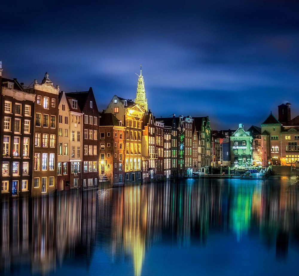
Photo by Scott Kelby Photo by Scott Kelby Exposure: 0.5 sec | Focal Length: 35mm | Aperture Value: ƒ/2.8
This chapter is actually named after the band Select Start, because the name of the song that came up when I searched in the iTunes Store for the word “Select” was their song, titled “She’s Not a Hottie Hotty,” but I thought that “She’s Not a Hottie Hotty” would make a weird name for a chapter on how to make selections. I listened to “She’s Not a Hottie Hotty” and it actually wasn’t bad, but I really thought the song could use more references to making selections and fewer references to b-double-o-t-y. Okay, I have to be honest, I only listened to the free 90-second preview of the song, and I didn’t actually hear the word “booty” per se, but seriously, what song that includes the word “hottie” doesn’t have the word “booty” in there somewhere? I mean, how many words are there that rhyme with hottie that aren’t used regularly by a toddler (made ya stop and think for a moment, didn’t I?). Anyway, Select Start (the band’s name) is really a pretty good name for the chapter, because we start with teaching you how to make simple selections, and then take you through Elements’ most important selection techniques, because being able to easily select and adjust just one particular area of your photo is really important. Once you’ve mastered selections, the next logical step is to learn how to break down people’s names rap-style, like Fergie (F to the E-R-G-I-E), but if you just wondered, “Why would the Duchess of York talk like that?” we have an entirely different problem.
Selecting Square, Rectangular, or Round Areas
Selections are an incredibly important feature in Elements. They’re how you tell Elements to affect only specific areas of your photos. Whether it’s moving part of one photo into another or simply trying to draw more attention to or enhance part of a photo, you’ll have so much more control if you know how to select things better. For starters, Elements includes quick and easy ways to make basic selections (square, round, rectangular). These are probably the ones you’ll use most, so let’s start here.
Step One:
To make a rectangular selection, choose (big surprise) the Rectangular Marquee tool by pressing the M key. Adobe’s word for selection is “marquee.” (Why? Because calling it a marquee makes it more complicated than calling it what it really is—a selection tool—and giving tools complicated names is what Adobe does for fun.)
Step Two:
We’re going to start by selecting a rectangle shape, so click your cursor in the upper-left corner of the door and drag down and to the right until your selection covers the entire left side of the door, then release the mouse button. That’s it! You’ve got a selection and anything you do now will affect only the selected rectangle (in other words, it will only affect the left side of the door).
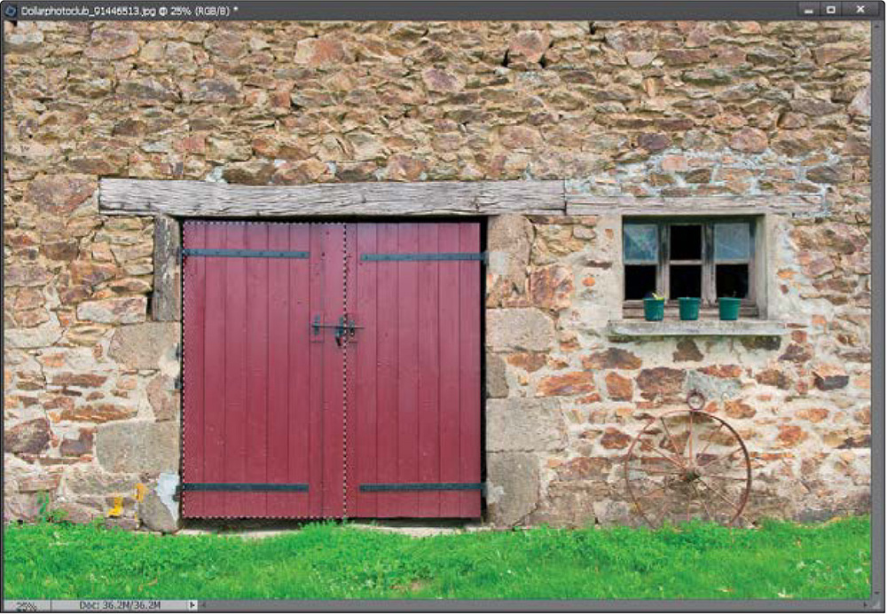
©DOLLAR PHOTO CLUB/IVONNE WIERINK
To add another area to your current selection, just press-and-hold the Shift key, and then draw another rectangular selection. In our example here, let’s go ahead and select the other side of the door, too. So press-and-hold the Shift key, drag out a rectangle around the other side of the door, and release the mouse button. Now the entire door is selected.

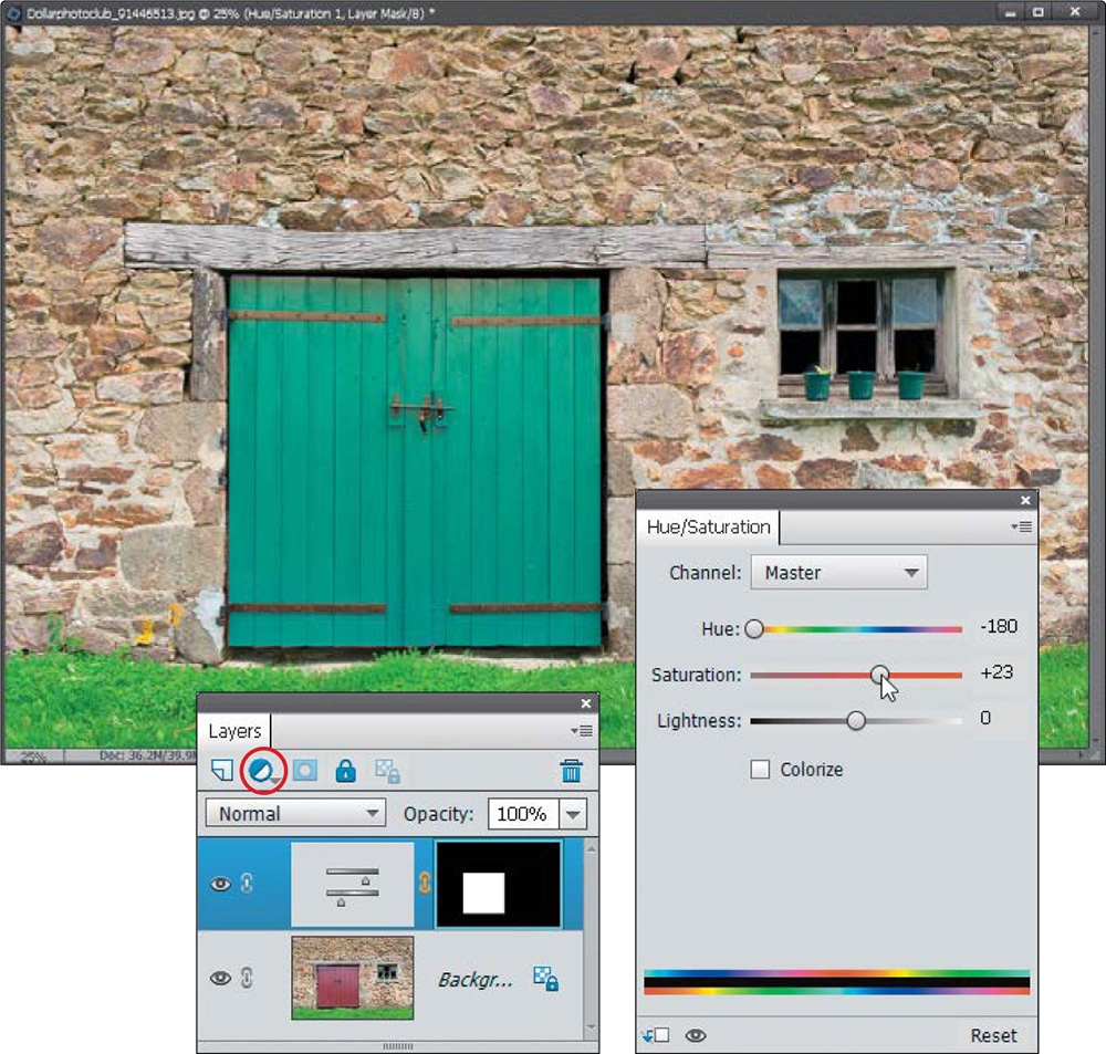
Step Four:
Now let’s make an adjustment and you’ll see that your adjustment will only affect your selected area. Click on the Create New Adjustment Layer icon at the top of the Layers palette, and choose Hue/Saturation from the pop-up menu. In the Hue/Saturation adjustments palette, drag the Hue slider all the way to the left to change the color of the door to a green color. Notice how just the color of the door is changing and nothing else in the image? This is why selections are so important—they are how you tell Elements you only want to adjust a specific area. You can also drag the Saturation or Lightness sliders, too, but I’m just going to move the Saturation to the right a little, here. Also, you’ll notice your selection goes away when you add the adjustment layer, but if you ever want to deselect something, just press Ctrl-D (Mac: Command-D).
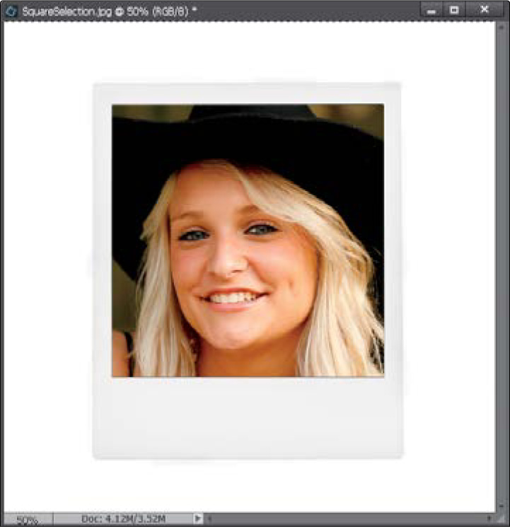
Okay, you’ve got rectangles, but what if you want to make a perfectly square selection? It’s easy—the tool works the same way, but before you drag out your selection, you’ll want to press-and-hold the Shift key. Let’s try it: open another image, get the Rectangular Marquee tool, press-and-hold the Shift key, and then draw a perfectly square selection (around the center area inside of this fake instant photo, in this case).
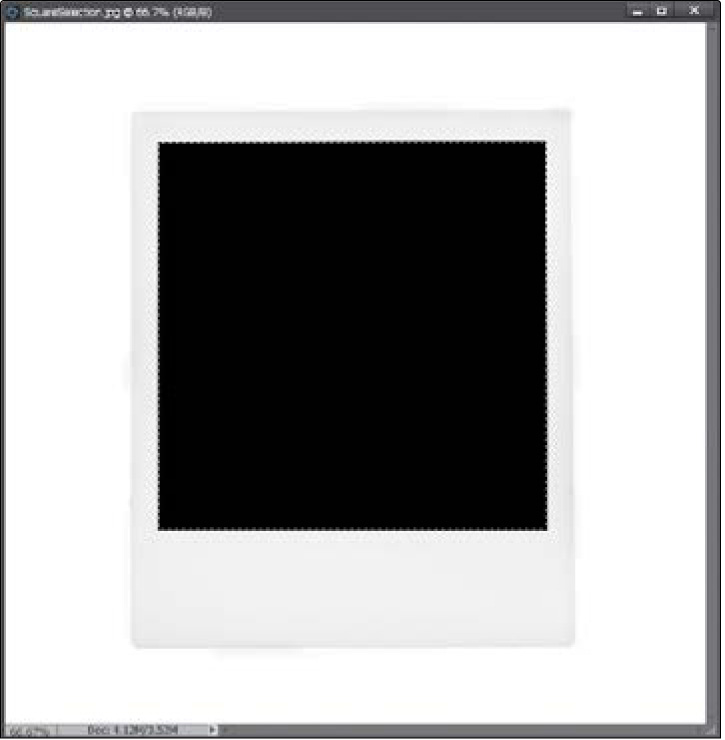
©DOLLAR PHOTO CLUB/YOSSARIAN6
Step Six:
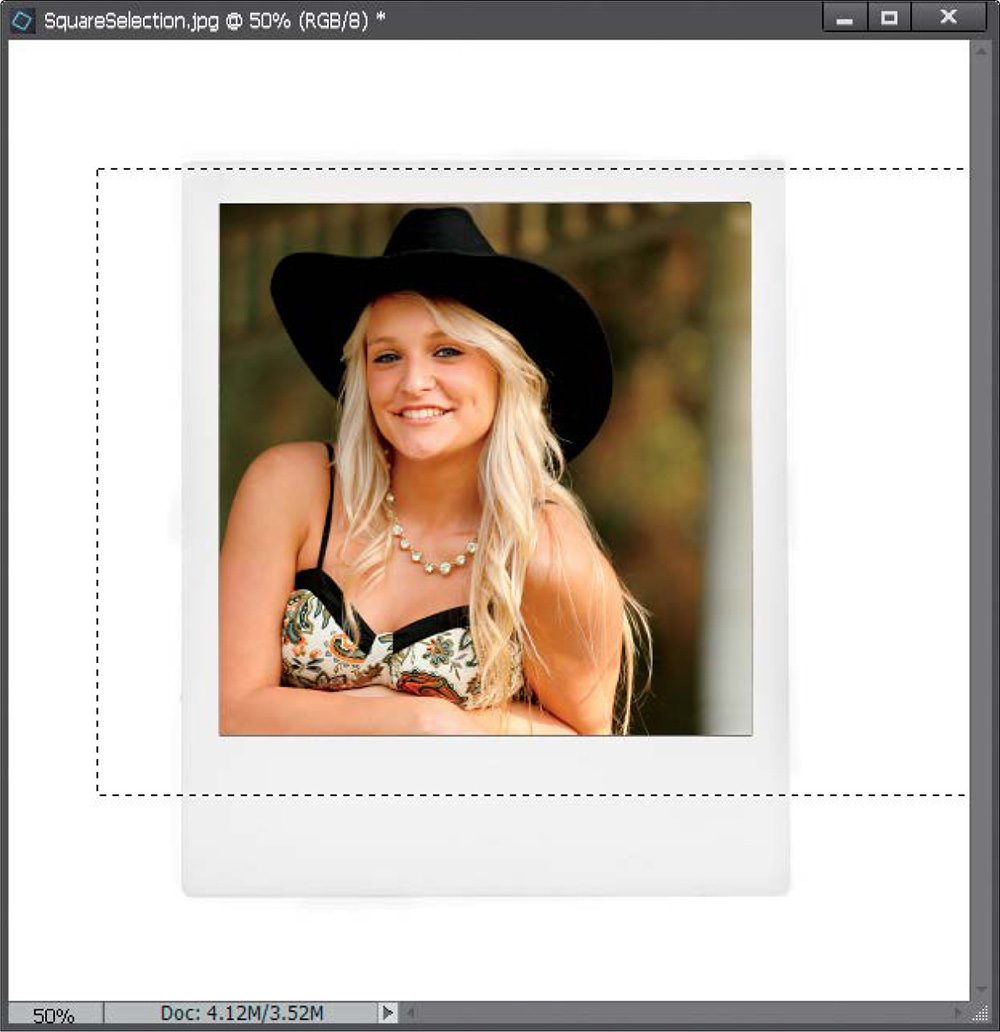
While your selection is still in place, open a photo that you’d like to appear inside your selected area and press Ctrl-A (Mac: Command-A); this is the shortcut for Select All, which puts a selection around your entire photo at once. Then press Ctrl-C (Mac: Command-C) to copy that photo into Elements’ memory.
Step Seven:
Switch back to the instant photo image, and you’ll notice that your selection is still in place. Go under the Edit menu and choose Paste Into Selection. The image held in memory will appear pasted inside your square selection. If the photo is larger than the square you pasted it into, you can reposition the photo by just clicking-and-dragging it around inside your selected opening.
You can also use Free Transform (press Ctrl-T [Mac: Command-T]) to scale the pasted photo in size. Just grab a corner point (press Ctrl-0 [zero; Mac: Command-0] if you don’t see them), press-and-hold the Shift key (or turn on the Constrain Proportions checkbox in the Tool Options Bar), and drag inward or outward. When the size looks right, press the Enter (Mac: Return) key and you’re done. (Well, sort of—you’ll need to press Ctrl-D [Mac: Command-D] to Deselect, but only do this once you’re satisfied with your image, because once you deselect, Elements flattens your new image into your Background layer, meaning there’s no easy way to adjust this image.) Now, on to oval and circular selections…
Step Nine:
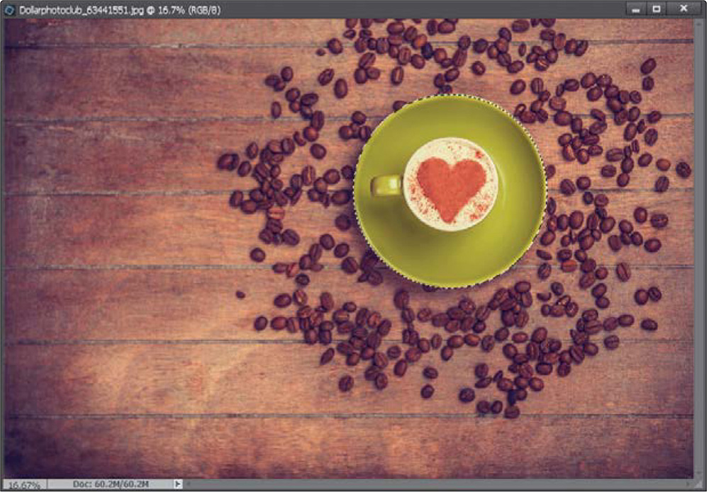
Open an image with a circle shape you want to select (a bowl here), and then press M to switch to the Elliptical Marquee tool (pressing M toggles you between the Rectangular and Elliptical Marquee tools by default). Now, just click-and-drag a selection around your circle. Press-and-hold the Shift key as you drag to make your selection perfectly round. If your round selection doesn’t fit exactly, you can reposition it by moving your cursor inside the border of your round selection and clicking-and-dragging to move it into position. You can also press-and-hold the Spacebar to move the selection as you’re creating it. If you want to start over, just deselect, and then drag out a new selection. Hint: With circles, it helps if you start dragging before you reach the circle, so try starting about ¼" to the top left of the circle.
©DOLLAR PHOTO CLUB/MASSON
While we’re at it, let’s check out another little tip with selections. In our example, we’ve selected the bowl because it’s simple and easy to select. But really, the background is the area we’d like to fix here. It’s just a little bright and I think it’ll look better if it’s a bit darker. No sweat. Just go under the Select menu and choose Inverse, and Elements will select everything else but what you put a selection around in the previous step.

Step 11:
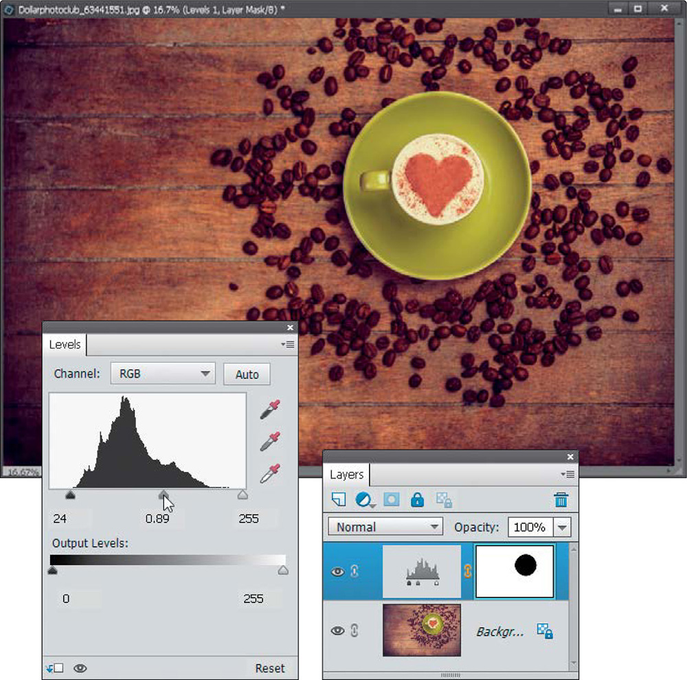
Now let’s adjust the area around the bowl. Click on the Create New Adjustment Layer icon and choose Levels. In the Levels adjustment palette, drag the black (shadows) slider beneath the histogram to the right to around 24, then drag the gray (midtones) slider to the right to around 0.89 to add more contrast to the background. That’s it. Remember, to simply make ovals or rectangles just start dragging. However, if you need a perfect circle (or square) then hold down the Shift key.
Saving Your Selections
If you’ve spent 15 or 20 minutes (or even longer) putting together an intricate selection, once you deselect it, it’s gone. (Well, you might be able to get it back by choosing Reselect from the Select menu, as long as you haven’t made any other selections in the meantime, but don’t count on it. Ever.) Here’s how to save your finely-honed selections and bring them back into place anytime you need them.
Step One:
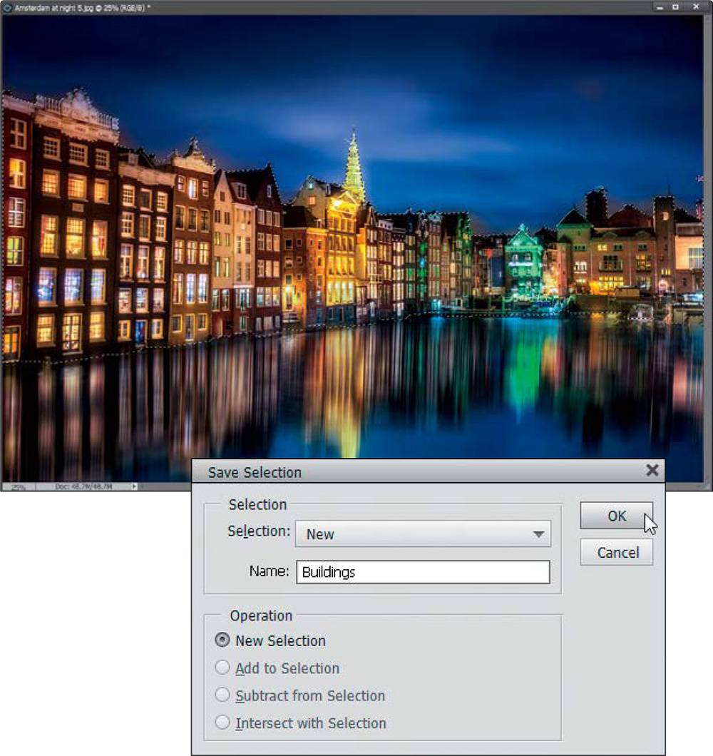
Open an image and then put a selection around an object in your photo using the tool of your choice. Here I used the Quick Selection tool (A) to select the sky and the water, then went under the Select menu and chose Inverse to select the buildings. Then, I clicked on the tops of the buildings to add them to the selection. If you select too much, just press-and-hold the Alt (Mac: Option) key and click in the areas you want to deselect. To save your selection once it’s in place (so you can use it again later), go under the Select menu and choose Save Selection. This brings up the Save Selection dialog. Enter a name in the Name field and click OK to save your selection.
Step Two:
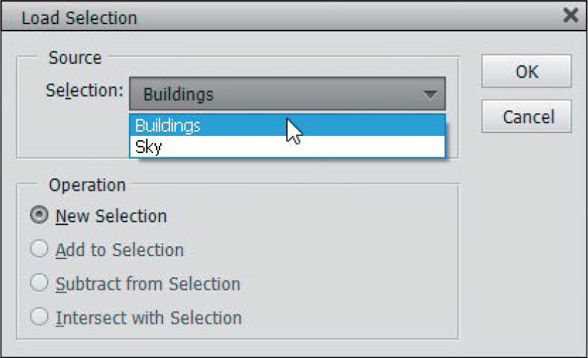
Now you can get that selection back (known as “reloading” by Elements wizards) at any time by going to the Select menu and choosing Load Selection. If you’ve saved more than one selection, they’ll be listed in the Selection pop-up menu—just choose which one you want to “load” and click OK. The saved selection will appear in your image.
Softening Those Harsh Edges
When you make an adjustment to a selected area in a photo, your adjustment stays completely inside the selected area. That’s great in many cases, but when you deselect, you’ll see a hard edge around the area you adjusted, making the change look fairly obvious. However, softening those hard edges (thereby “hiding your tracks”) is easy—here’s how:
Step One:
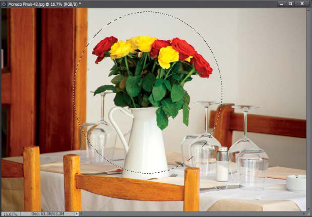
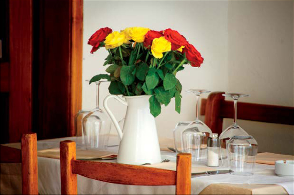
Let’s say you want to darken the area around the flowers and vase, so it looks almost like you shined a soft spotlight on them. Start by drawing an oval selection around them using the Elliptical Marquee tool (press M until you have it). Make the selection big enough so the flowers, vase, and the surrounding area appear inside your selection. Now we’re going to darken the area around them, so go under the Select menu and choose Inverse. This inverses the selection so you’ll have everything but the flowers and vase selected (you’ll use this trick often).

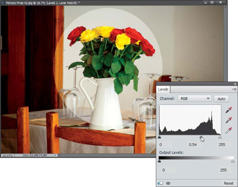
Step Two:
Click on the Create New Adjustment Layer icon at the top of the Layers palette, and choose Levels. In the Levels adjustments palette, drag the gray (midtones) slider beneath the histogram to the right to about 0.54. You can see the harsh edges around the oval, and it looks nothing like a soft spotlight—it looks like a bright oval. That’s why we need to soften the edges, so there’s a smooth blend between the bright oval and the dark surroundings.
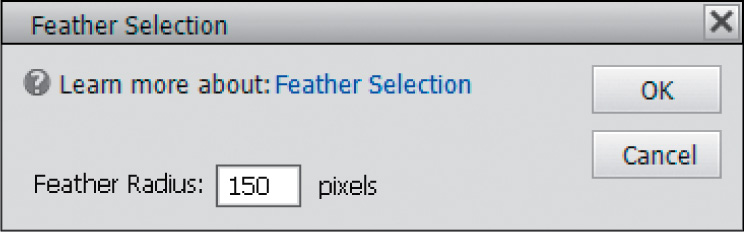
Press Ctrl-Z (Mac: Command-Z) three times so your photo looks like it did when you drew your selection in Step One (your selection should be in place—if not, drag out another oval). With your selection in place, go under the Select menu and choose Feather. When the Feather Selection dialog appears, enter 150 pixels (the higher the number, the more softening effect on the edges) and click OK. That’s it—you’ve softened the edges. Now, let’s see what a difference that makes.
Step Four:
Go under the Select menu and choose Inverse again. Add a Levels adjustment layer again, drag the midtones Input Levels slider to around 0.54, and you can see that the edges of the area you adjusted are soft and blending smoothly, so it looks more like a spotlight. Now, this comes in really handy when you’re doing things like adjusting somebody with a face that’s too red. Without feathering the edges, you’d see a hard line around the person’s face where you made your adjustments, and it would be a dead giveaway that the photo had been adjusted. But add a little bit of feather (with a face, it might only take a Feather Radius of 2 or 3 pixels), and it will blend right in, hiding the fact that you made an adjustment at all.
Easier Selections with the Quick Selection Tool
This is another one of those tools in Photoshop Elements that makes you think, “What kind of math must be going on behind the scenes?” because this is some pretty potent mojo for selecting an object (or objects) within your photo. What makes this even more amazing is that I was able to inject the word “mojo” into this introduction, and you didn’t blink an eye. You’re one of “us” now….
Step One:
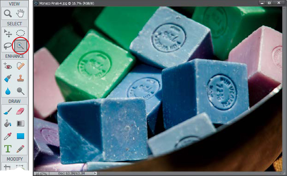
Open the photo that has an object you want to select (in this example, we want to select one of the squares of soap). Go to the Toolbox and choose the Quick Selection tool (or just press the A, for Awesome, key).
Step Two:
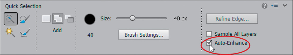
The Quick Selection tool has an Auto-Enhance checkbox down in the Tool Options Bar. By default, it’s turned off. My line of thinking is this: when would I ever not want an enhanced (which in my book means better) selection from the Quick Selection tool? Seriously, would you ever make a selection and say, “Gosh, I wish this selection looked worse?” Probably not. So go ahead and turn on the Auto-Enhance checkbox, and leave it that way from now on.
Take the Quick Selection tool and simply paint squiggly brush strokes inside of what you want to select. You don’t have to be precise, and that is what’s so great about this tool—it digs squiggles. It longs for the squiggles. It needs the squiggles. So squiggle.
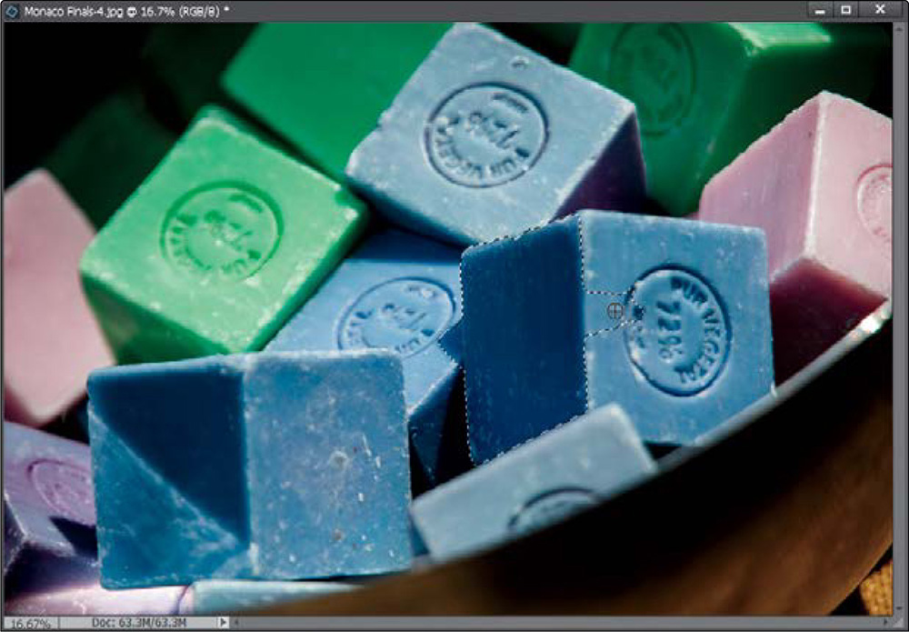
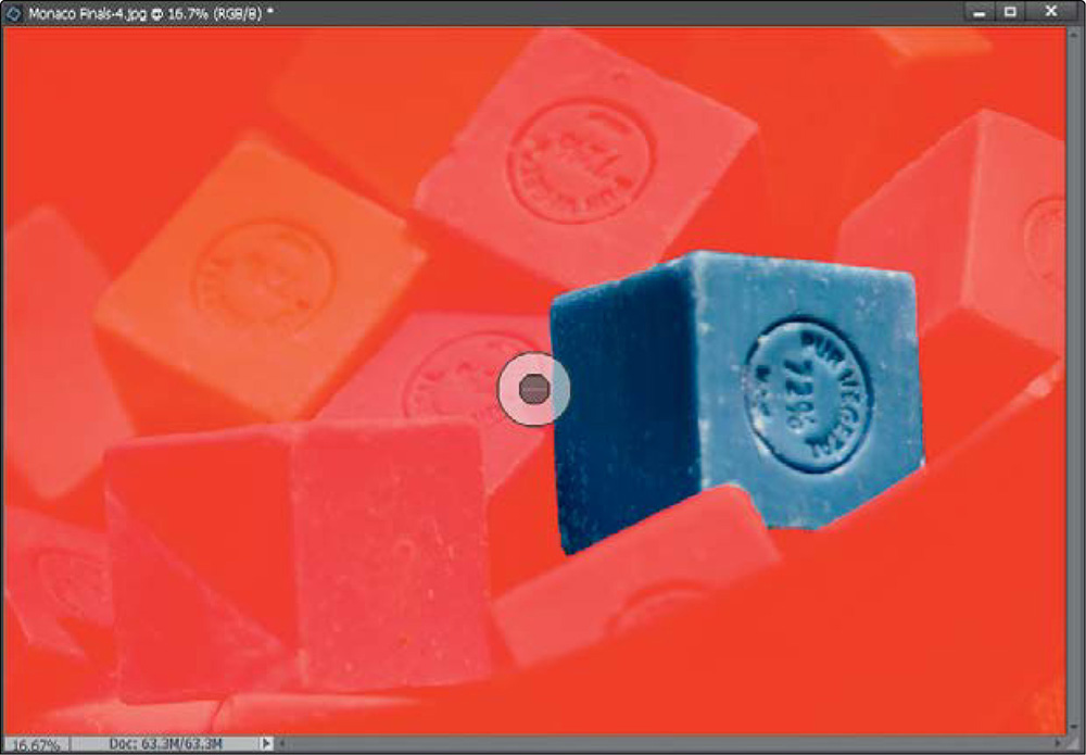
Step Four:
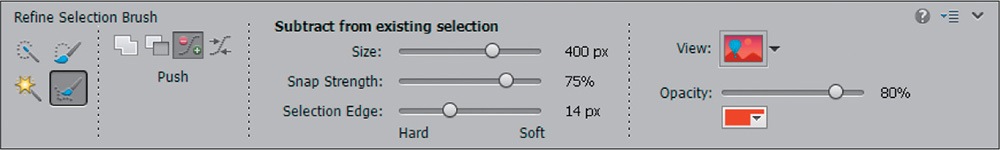
If the selection includes areas you don’t want (like part of the soap on the left and part of the bowl, in this example), then try switching to the Refine Selection Brush (press A until you have it). Some new features have been added to this brush in Elements 14, making it similar to the Refine Edge feature (which we’ll look at in the next tutorial). One new feature is the View option. When you click on this brush an overlay mask appears to help you refine your selection. You can change the color of the overlay, change it to a black or white mask, or reduce its opacity in the Tool Options Bar. The way the brush works is it automatically adds or subtracts from the selection based on where you place it. Go ahead and try it. Place the brush in the actual boundary of the selection and you’ll see the center of the brush has a plus in it. That means it’s in Add mode. Then try placing it outside of the selection and it automatically has a minus sign in it, meaning it’s in subtract mode.
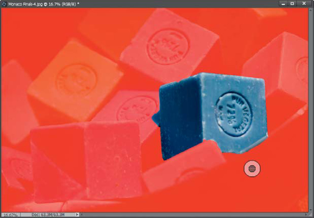
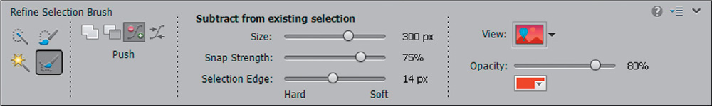
In this example, we want to subtract areas from the outside, so leave the brush on the outside of the selection. Take a look at the brush’s three sliders in the Tool Options Bar. First, there’s Size, which is the overall size of the brush. Brush size is important because it affects how closely the brush will work with the edges around it. Think of this brush as having two parts to it: the middle (dark gray) circle is what you put over the area you want to add to or subtract from your selection (the soap on the left and the edge of the bowl, in this case), and the outer (light gray) circle is what you place over the area you want the edges of the selection to snap to (the soap). Make sure the correct sign (plus or minus) is showing in the dark gray circle, and that it doesn’t overlap anything you want in your selection (the soap, here). Next, you have Snap Strength, which I usually keep high. That means that Elements will tend to snap to edges more consistently than if the setting was lower. Finally, there’s Selection Edge, new in Elements 14, which sets the selection edge radius. This slider moves when you set the Size of your brush, but you can also adjust it manually, making it a harder or softer edge radius. Click-and-nudge your selection edges inward until only that one square of soap is selected.
Step Six:
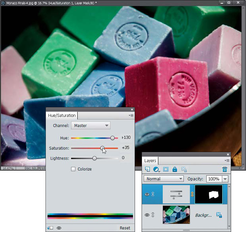
Now that we’ve got it selected, we might as well do something to it, eh? How about this: let’s change its color. Start by clicking back on the Quick Selection tool (so you see your image again without a mask). Then, click on the Create New Adjustment Layer icon at the top of the Layers palette and choose Hue/Saturation. In the Hue/Saturation adjustment palette, drag the Hue slider to the right to around +130 and the Saturation slider to around +35 to choose a nice pinkish-red color.
Making Really Tricky Selections, Like Hair (and Some Cool Compositing Tricks, Too!)
Most of the selecting jobs you’ll ever have to do in Elements are pretty easy, but the one that has always kicked our butts is when we have to select hair. Over the years we’ve come up with all sorts of tricks, but all these techniques kind of went right out the window when Adobe supercharged the Quick Selection tool in Elements with the Refine Edge feature. This is, hands down, one of the most useful, and most powerful, tools in all of Photoshop—and now we’ve got it in Elements.
Step One:
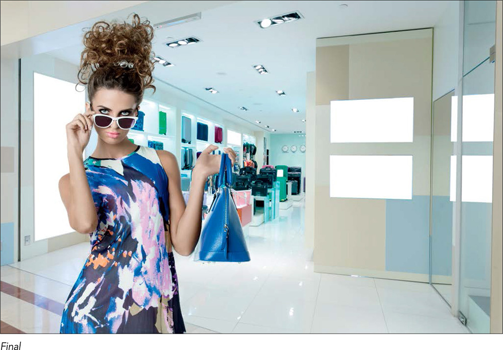
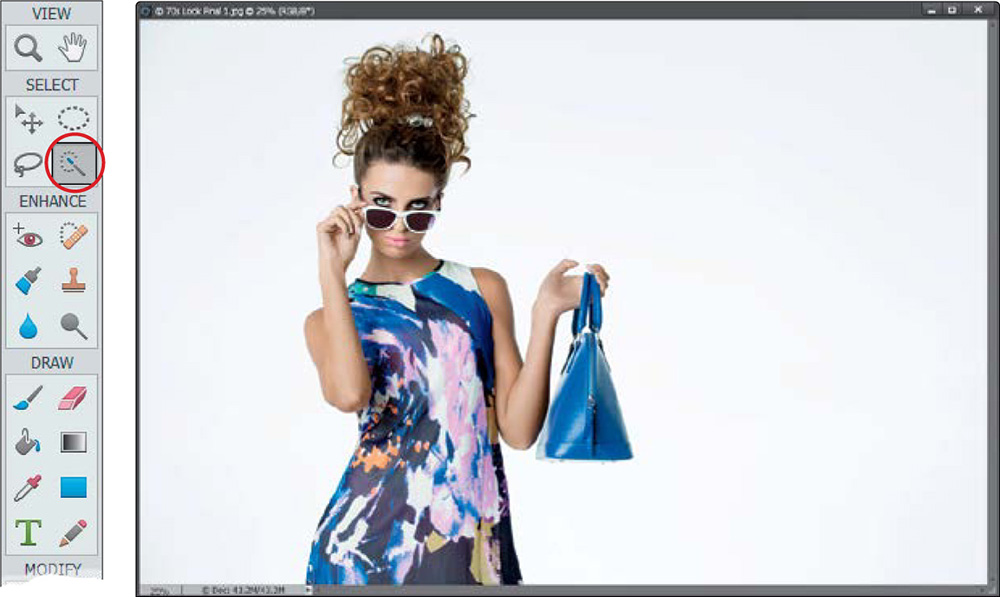
Start by opening an image that has a challenging area to select (like our subject’s hair here). Then, get the Quick Selection tool (A) from the Toolbox (as shown here).
Step Two:
Here’s how it works: you just take the tool and paint loosely over the areas you want to select, and it expands to select the area. One thing I’ve learned about this tool is it actually seems to work best when you use it quickly—really zoom over your subject with the tool and it does a pretty decent job. Here, I selected the subject, and while you can see some problems with the selection (the area around her hair and the arm holding the bag), it’s not that bad overall. If it selects too much, press-and-hold the Alt (Mac: Option) key and paint over that accidentally selected area to remove it from your selection. Don’t worry—it’s not going to look perfect at this point.
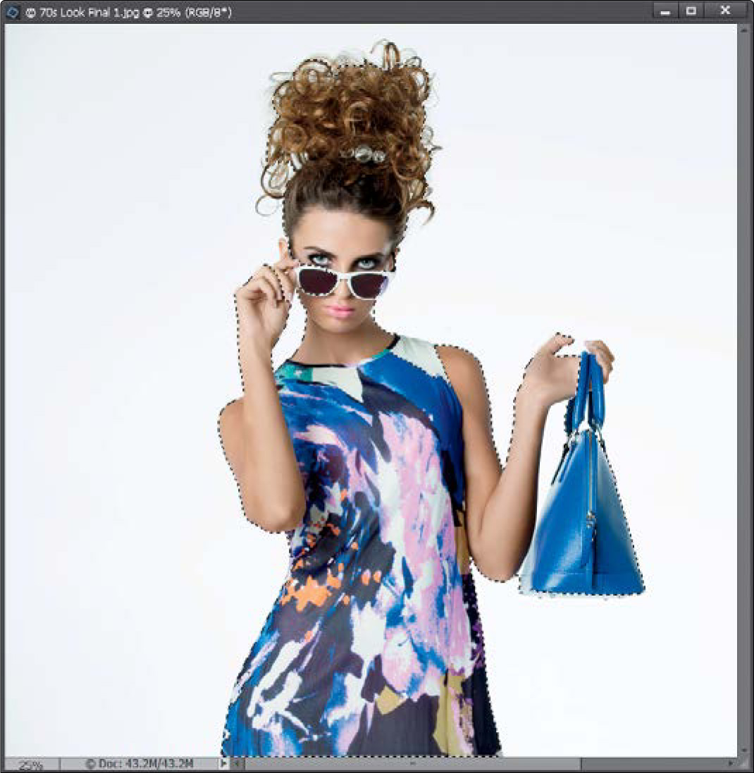
Now, here’s something else I’ve learned about the Quick Selection tool: while it’s pretty good at selecting, it’s not nearly as good at deselecting areas that you don’t want selected (like the area near her arm). I’ve found that when it misses areas like that, you’re honestly better off switching to the Magic Wand tool (keep pressing A), pressing-and-holding the Alt (Mac: Option) key, and clicking once in that area to instantly deselect it. So, let’s go ahead and do that near her arm, and you’ll see that in just one click with the Magic Wand tool, that area is deselected (as shown here).
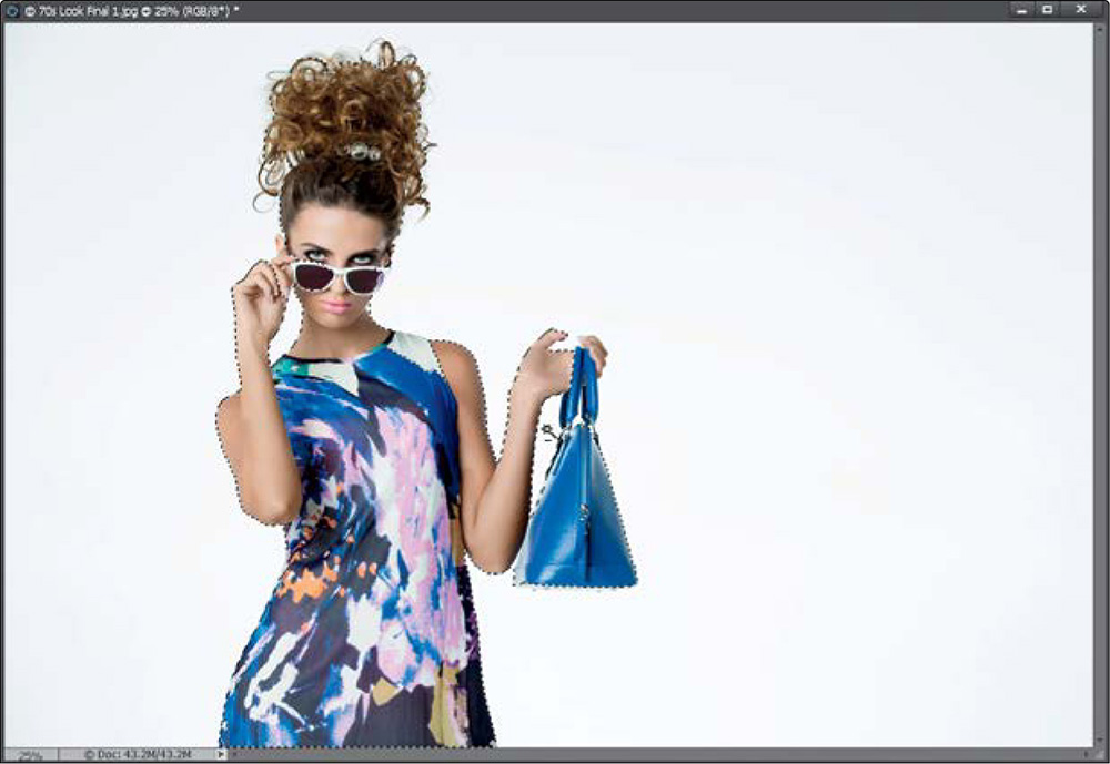
Step Four:
Okay, here comes a very important part of this stage of the process, and that is making sure that when you select her hair, you don’t select any background area with it. In other words, don’t let there be any hair selected with white background showing through. In fact, I basically follow the rule that I don’t get too close to the outside edges of my subject’s hair unless an area is pretty flat (in other words, no flyaway, tough-to-select hair in that area). You can see what I mean in the close-up here, where I avoided the thinner edges of her hair (we’ll let Elements select those hard parts—we’ll just get close to the edge then stop). Also, you can see where I stopped before some areas where the hair is finer. Again, we’ll let Elements grab those parts later, but for now we’re most concerned with avoiding selecting areas where you can see white background through her hair. If you accidentally select an area with gaps, then just press-and-hold the Alt (Mac: Option) key, and paint over those gap areas to deselect them.
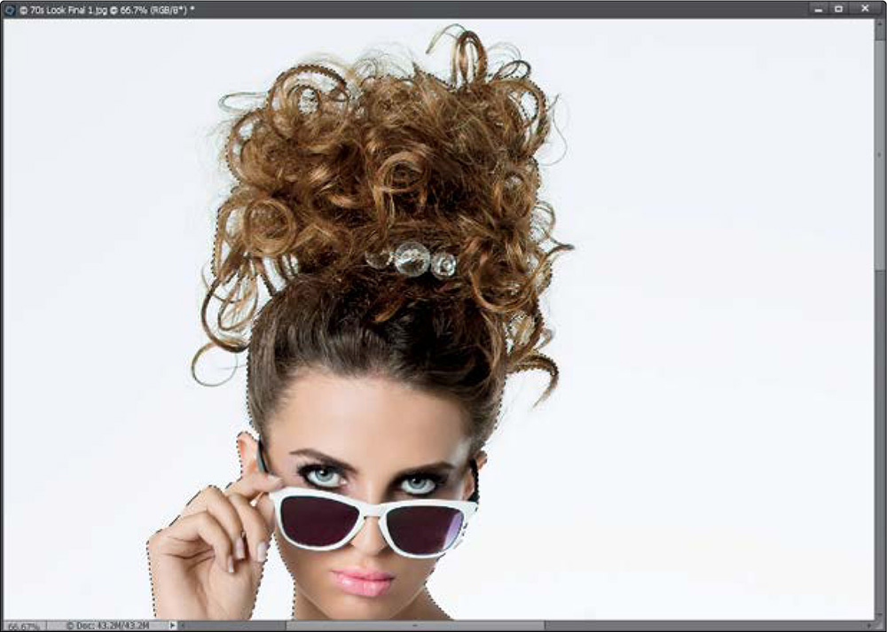
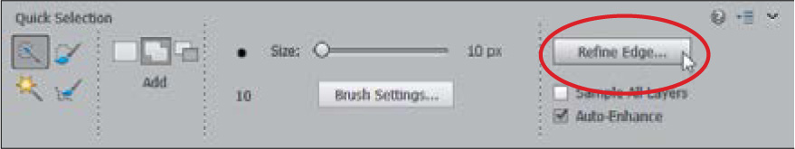
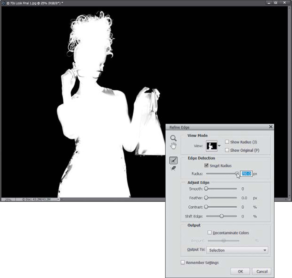
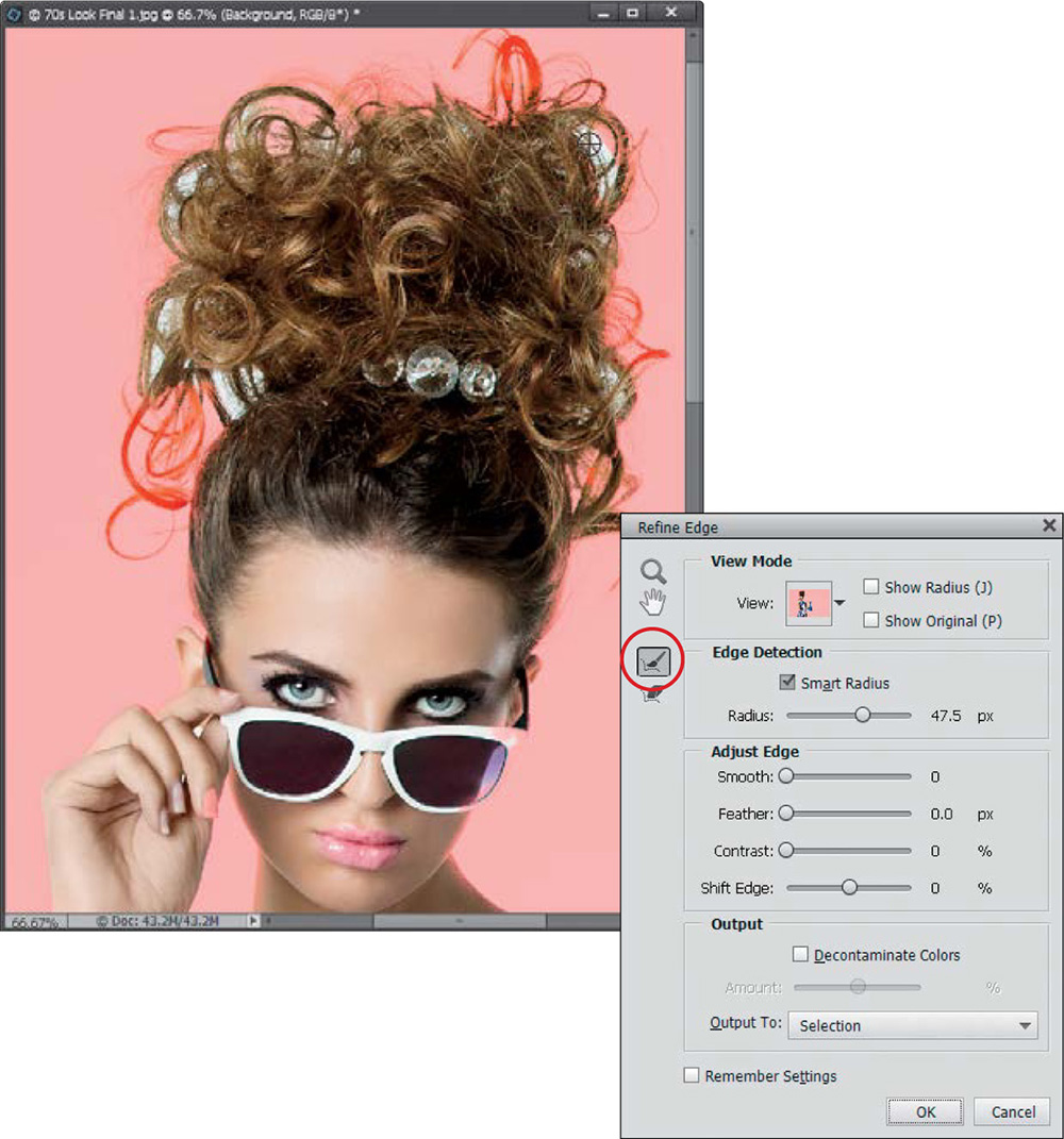
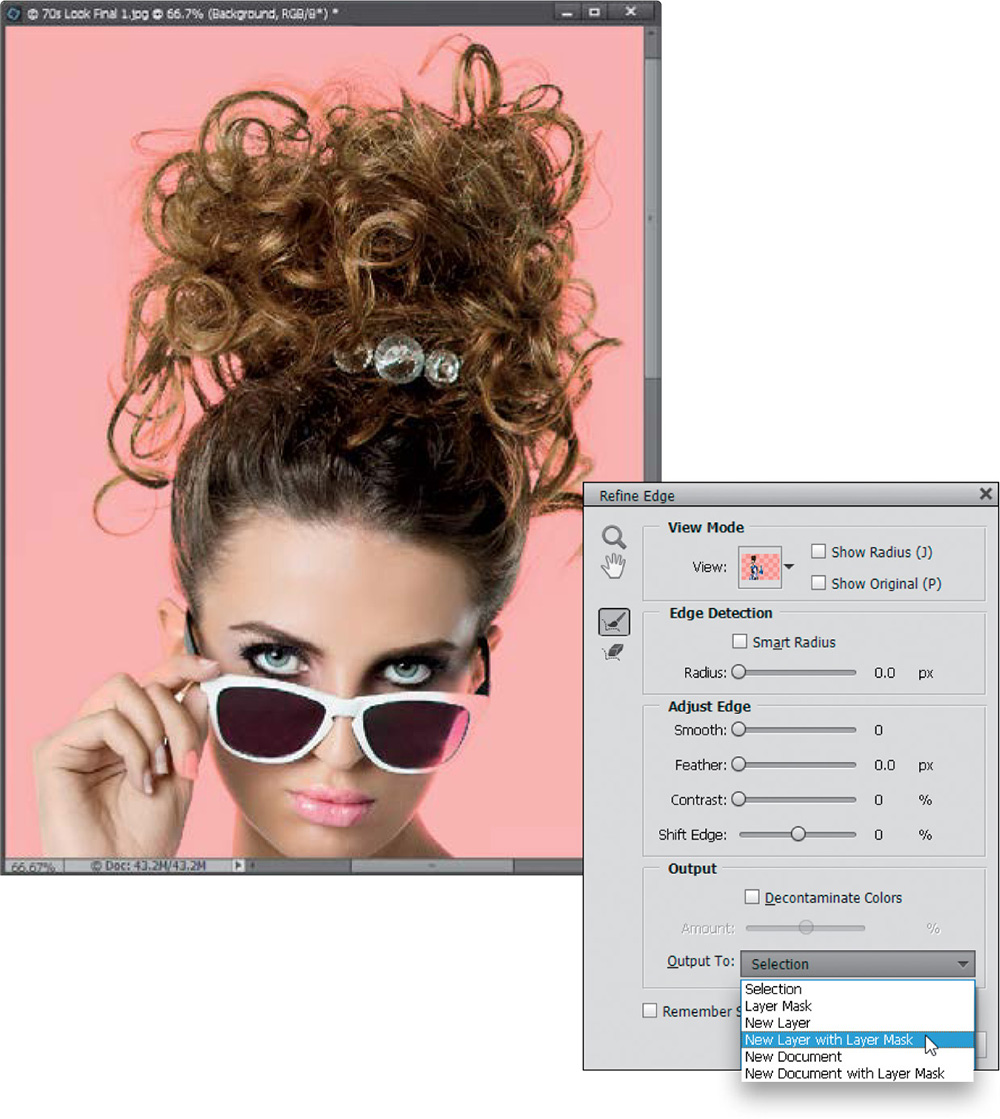
Once your selection looks pretty decent, it’s time to unlock the real selection power (the Quick Selection tool is just the warm-up act). Go down to the Tool Options Bar and click on the Refine Edge button (shown circled here). This is where the magic happens. In the Refine Edge dialog, you have a number of choices for how you can view your selected image (including the standard old marching ants), but for now, as part of our learning process, go ahead and choose Black & White from the View pop-up menu. This shows your selection as a standard layer mask. As you can see, the Quick Selection tool, by itself, isn’t gettin’ the job done (the edges are jaggy and harsh, and there’s no wispy hair selected at all). That’s okay, though, because we’re just gettin’ started.
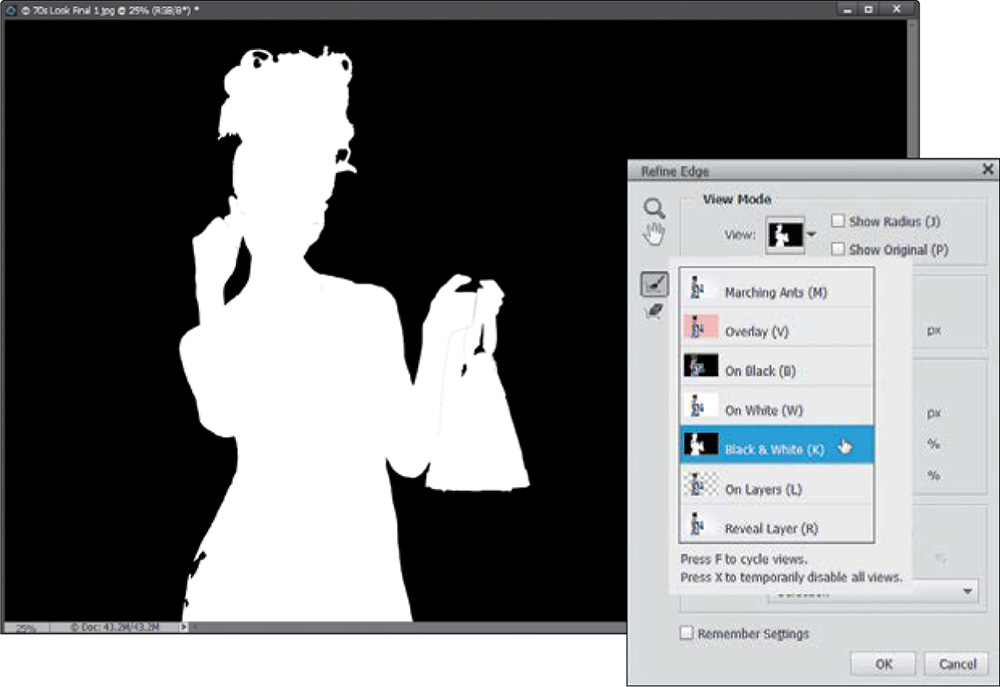
Step Six:
Next, turn on the Smart Radius checkbox (you won’t see anything happen yet, but turn it on anyway). Smart Radius is the edge technology that knows the difference between a soft edge and a hard edge, so it can make a mask that includes both. This checkbox is so important that I leave it on all the time (if you want it always on, as well, just turn it on and then turn on the Remember Settings checkbox at the bottom of the dialog). Now, again, just for learning purposes, drag the Radius slider all the way over to the right (to 250), and all of her hair gets selected instantly (pretty amazing isn’t it?). While it did a great job on her hair, there are parts of her (like her glasses, dress, hands, and bag) that are being “over-selected.” Those areas will wind up being transparent, and you don’t want that, so we always have to back it way down. But, I just wanted you to see the incredible math at work.
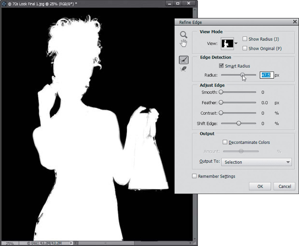
Okay, let’s drag that Radius slider back down until those areas look more solid white. Here’s how this works: We want our subject to be solid white and we want the background to be solid black. Anything that appears in gray will be semi-transparent. That’s okay if this happens in her hair in wispy areas, but it’s not good on her arms or clothes or anything that’s supposed to have a well- defined hard edge. Otherwise, we’d leave the Radius up at 250 and be done with it. But, there’s more to most portraits than just hair, so we have to keep those other areas pretty much intact, too. Here, I rolled back the Radius to around 47, but you might be able to bring it down a bit more, to 20, 30, or 40. It just depends on the complexity of the selection and the details around the person. For simple selections, leave the Radius amount down low. When you have a tricky selection, like fine hair, you’ll have to increase it. So, just remember: trickier selections mean higher Radius amounts.
Step Eight:
Now, let’s change the View to Overlay to see if there are any areas we missed. The parts that are selected appear in full-color, and the parts that aren’t appear in red. If you see the background color showing through (in our case, white), you’ve got a problem (and we do here quite a bit). You need to tell Elements exactly where the problem areas are, so it can better define those areas. You do that with the Refine Radius tool (E; shown circled here). It’s active by default, so just take your cursor and simply paint over the areas where you see the background peeking through (as shown here), and it redefines those areas. This is what picks up that fine hair detail.
As you look around her hair, if you see parts of it that are tinted red, those parts aren’t selected. So, just paint a stroke or two over those areas (like I’m doing here), and they become full-color (letting you know they’re added to your selection) as Elements refines those edge areas where you’re painting. It’ll look like it’s painting in white sometimes, but when you’re done, it just redefines the area and tells Elements that this area needs some work, and it “redoes” its thing. Here, I’ve gone over some areas that were tinted red on her hair, and you can see those areas are now appearing in color. I also increased the Radius amount a bit.
Step 10:
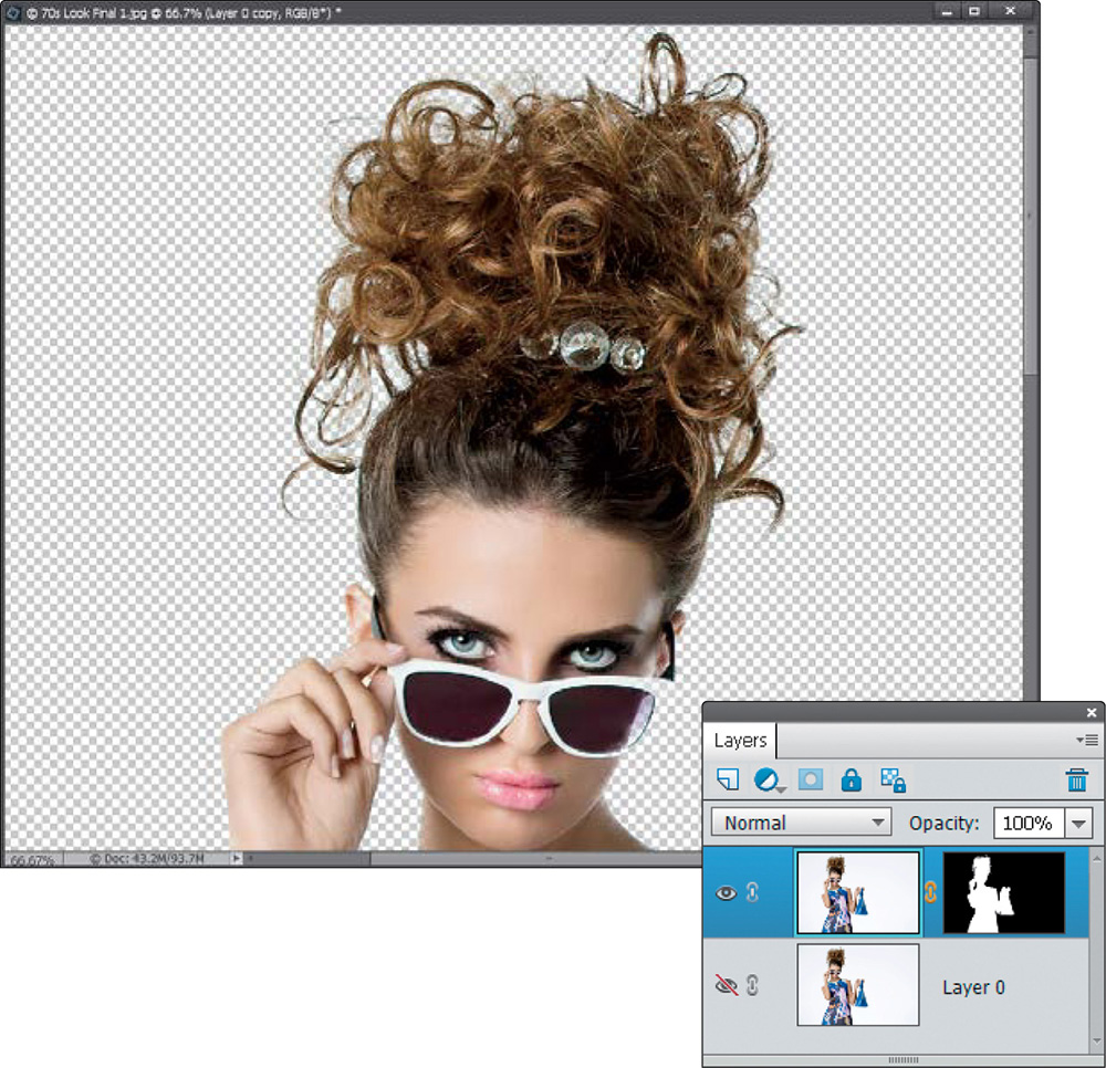
I recommend avoiding the Adjust Edge section sliders in the center of the dialog altogether, because you’ll spend too much time fussing with them, trying to make them work. (I figure you want me to tell you when to avoid stuff, too.) Down at the bottom of the dialog, there’s a Decontaminate Colors checkbox, which basically desaturates the edge pixels a bit. So, when you place this image on a different background, the edge color doesn’t give you away. Just below that, you get to choose what the result of all this will be: will your selected subject be sent over to a new blank document, or just a new layer in this document, or a new layer with a layer mask already attached, etc.? I always choose to make a new layer with a layer mask in the same document. That way, I can just grab the Brush tool and fix any areas that might have dropped out, which we’re probably going to have to do next, so choose New Layer with Layer Mask and click OK.
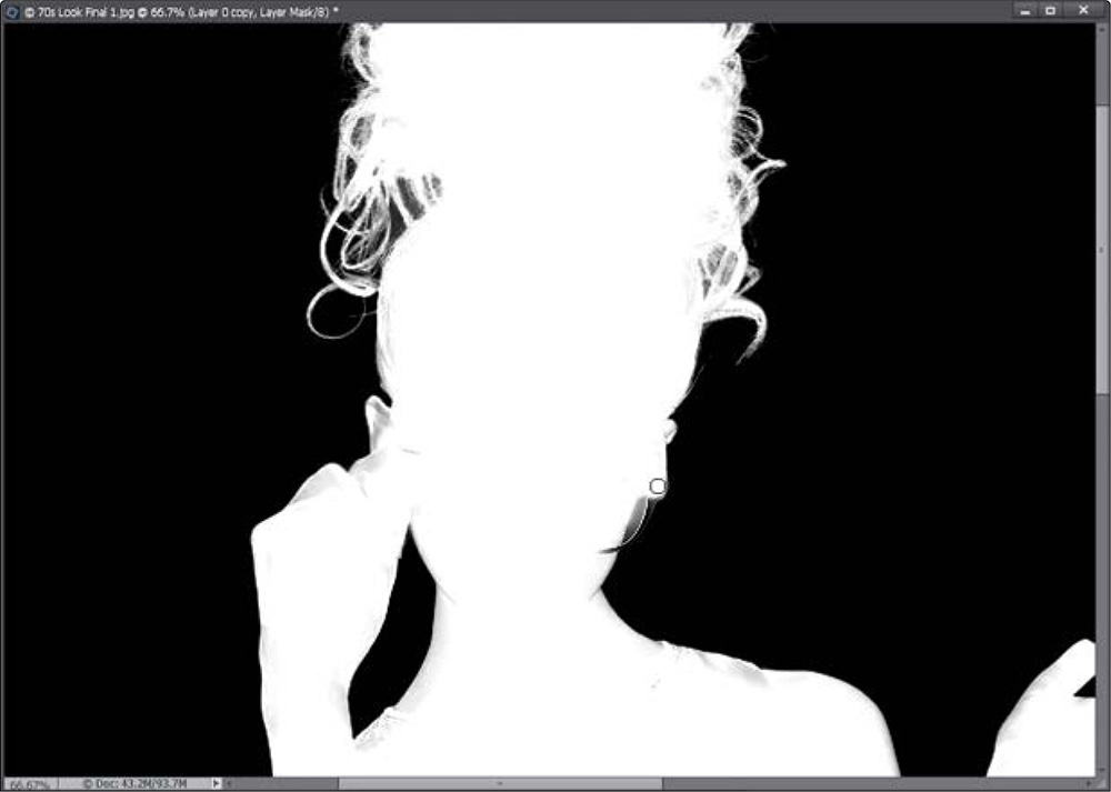
When you click OK, your image will now appear on a transparent layer (as seen here) and if you look in the Layers palette, you’ll see a new layer with a layer mask attached (just what you asked for). You can also see it does a pretty amazing job. It won’t get every little thin, wispy hair strand, but it gets most of the important ones. Also, I’ve got a trick or two coming up that will help a bit more, but first, let’s do a quick check of that mask and fine-tune it just a bit before we put her over a different background (that’s right, baby, we’re doing some compositing!). Press-and-hold the Alt (Mac: Option) key and click directly on that layer mask thumbnail in the Layers palette to see just the mask (you can see it in the next step).
Step 12:
Now, as you move around the mask, you can see some areas that aren’t solid white (which means these areas will be semi-transparent and that’s not what you want). So, get the Brush tool (B) and, with your Foreground color set to white, choose a small, hard-edged brush from the Brush Picker in the Tool Options Bar, and then paint along the grayish areas, to make them solid white. You can see some areas here on her hands, glasses, and ears that need a cleanup, as well. Next, press X to switch your Foreground color to black to clean up any places where the white has spilled over onto the black. It should be solid black in the background areas. For a little help cleaning up tricky areas, switch your Brush’s blend mode to Overlay. That way, when you’re painting with white, it automatically avoids painting over the color black (and vice versa).
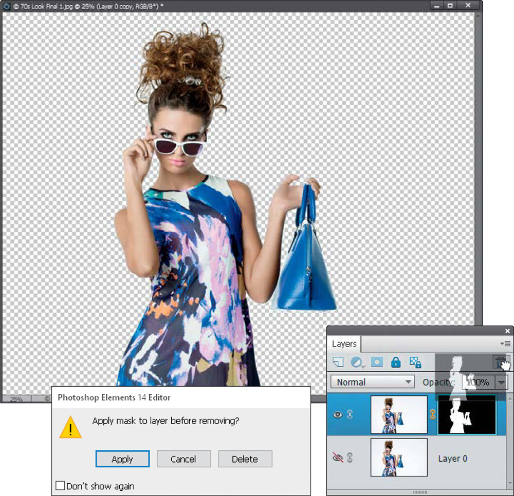
At this point, we’re done with our mask, so you can apply it permanently to your image by clicking directly on the layer mask thumbnail (in the Layers palette) and dragging it onto the Trash icon at the top of the palette (as shown here) to delete it. When you do this, a warning dialog pops up asking if you want to “Apply mask to layer before removing?” You want to click Apply, and the masking you did is now applied to the layer (and the layer mask thumbnail is deleted). This just makes things a little easier from here on out.
Step 14:
Next, open the background image you want to use in your composite. Get the Move tool (V), then drag-and-drop your subject right onto this background image (as shown here). (Note: This is easier if you have all images onscreen. To float both images, press Ctrl-K [Mac: Command-K] to open the General Preferences, and turn on the Allow Floating Documents in Expert Mode checkbox. Then, you can go under the Window menu, under Images, and choose Float All In Windows. If all else fails, copy-and-paste it onto this background like we did in the chapter on layers; it will appear on its own layer.) If your subject is too big, press Ctrl-T (Mac: Command-T) to open Free Transform. Then, turn on the Constrain Proportions checkbox in the Tool Options Bar, grab a corner handle, and drag inward until she is the right size for the background. Press Enter (Mac: Return) to lock in your changes.
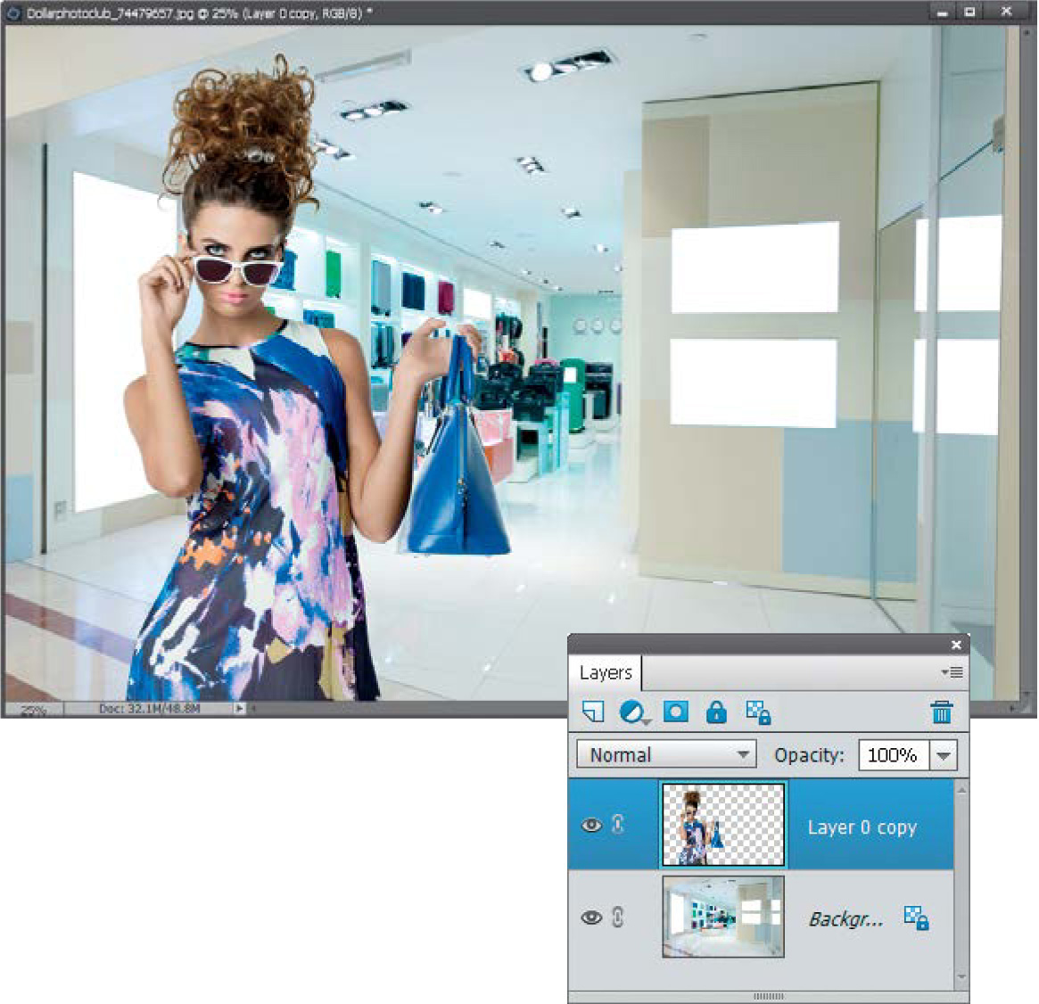
©DOLLAR PHOTO CLUB/ZHU DIFENG
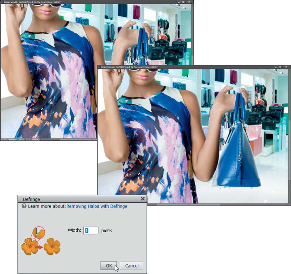
Depending on the background and your selection, you may see a white fringe around your selected object. To remove the fringe, go under the Enhance menu, under Adjust Color, and choose Defringe Layer. When the Defringe dialog appears (shown here), enter 1 pixel (use 2 pixels for a higher-megapixel image), click OK, and that fringe is gone! (Elements basically replaces the outside edge pixels with a new set of pixels that is a combination of the background it’s sitting on and your subject’s edge, so the fringe goes away.)
Step 16:
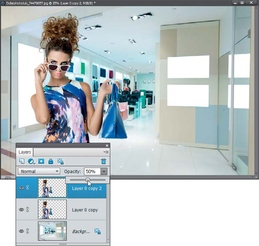
Here’s a trick that gives you more detail and brings back some of those lost wisps of hair by building up some pixels. It’s going to sound really simple and it is. Just press Ctrl-J (Mac: Command-J) to duplicate your layer (the one with your subject). That’s it. Just duplicate your subject layer, and it has a “building up” effect around the edges of her. Suddenly, it looks more defined, and it fills in some of the weaker wispy areas. If for any reason it looks like too much, at the top of the Layers palette, just lower the Opacity of this duplicate layer until it looks right (here, I lowered it to 50% and it looks about right). Next, merge this duplicate layer with your original subject layer by pressing Ctrl-E (Mac: Command-E).
Now, she looks a little warm for the background, so let’s desaturate her a little. Start by Ctrl-clicking (Mac: Command-clicking) on the layer thumbnail for her layer to put a selection around her again. Then, click on the Create New Adjustment Layer icon at the top of the Layers palette and choose Hue/Saturation from the pop-up menu. This adds a Hue/Saturation adjustment layer, but with your selection (our subject) already masked on the layer mask, so the adjustment will only affect what is inside the selection. In the Hue/Saturation adjustment palette, set the Channel pop-up menu to Yellows and drag the Saturation slider to the left a bit, until she blends with the background better (here, I dragged to –48). That’s it.