
Chapter 7: Creating Something New from Abstract Inspiration
The Previous chapter covered how to take elements from existing website designs and adapt them for your own purposes. It’s a fairly straightforward process, and one that’s easy to emulate for almost any project.
Now, let’s move on to creating a design from an abstract source of ideas. These abstract sources might include non-web designs (including architecture or interior design), photos, or your general surroundings.
One advantage to creating sites based on abstract sources is that it’s nearly impossible to copy an existing design in a recognizable form. You can create a site based entirely on a single image and many people would be hard-pressed to identify your source of inspiration, even when comparing the two side-by-side. This makes abstract inspiration less risky, from both an ethical and a legal standpoint.
Dissecting an Image
You’ll start by figuring out how to dissect an image to see what elements you might be able to use in a design. To do this, you’re going to look at the actual images from which you’ll create an original design. I discuss things in terms of images, because even if you’re basing your design on, say, the design of a building, you’ll likely be looking at an image of the building in question.
For this project, you’re going to design a site for a fictional paranormal romance author, Ramona Black. The site needs to appeal to women, especially women in their 20s and 30s. It also needs to have a simple design, but not minimalist (in keeping with genre and industry conventions), and it needs to look professional.
Start with mood. The mood of your website can have a huge impact on the other elements, so it’s important to figure that out early on.
Figure 7-1 is grungy, but it’s also bright and positive feeling, which is uncommon for a grungy image. Since paranormal romance tends to be grittier than other romance sub-genres, this kind of mood works well.
Next, you can find some inspiration for the color scheme. Popular colors for paranormal romance are generally reds and purples, so it’s a good idea to stick to that general theme, but maybe see if you can give it a twist. Sticking close to the “norm” for this kind of site makes it more easily recognizable to the author’s target readership. Think about the kinds of objects that generally include those colors for an idea of where to start looking. Flowers come most immediately to mind. Figure 7-2 has some great shades of purple, plus it has some nice gray shades in the background that you could use. Gray isn’t as often seen on this kind of website, so it’s one way to set this site apart from its competition.
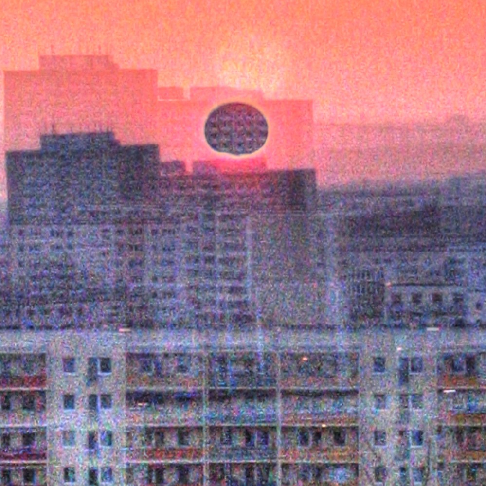
Figure 7-1: Grungy, but bright and upbeat feeling.
Source: Flickr.com © Karl-Ludwig Poggemann
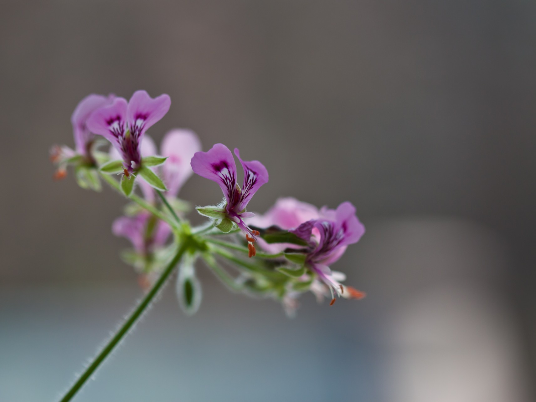
Figure 7-2: Flowers and other natural objects can be great sources of ideas for color schemes.
Source: Flickr.com © Tom Bech
Since Ramona Black’s books take place in natural areas, like the forest, you could look for an image along those lines to use in the header. Incorporating an image directly into a design is one of the simplest ideas, but can also be quite powerful if it’s the right image. Figure 7-3 is just the right kind of image. The path leading off into the woods has the right kind of feel for the site, and the main focus of the image takes place along a rather narrow horizontal section of the photo, which makes it great for a header.
You’re also going to need some kind of idea for your page layout. This can be one of the hardest things to find among abstract inspiration. Turning to something like a book layout or other design can work, and that’s what you’ll do here. Figure 7-4 shows a page from an old book, with an interesting layout that switches between a single column and a two-column layout. Let’s try the same thing with this design.
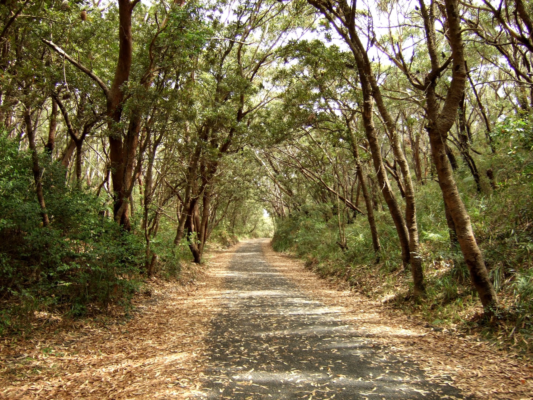
Figure 7-3: Consider how an image will be cropped for a header, and make sure it has a tight focus.
Source: Flickr.com © frostnova
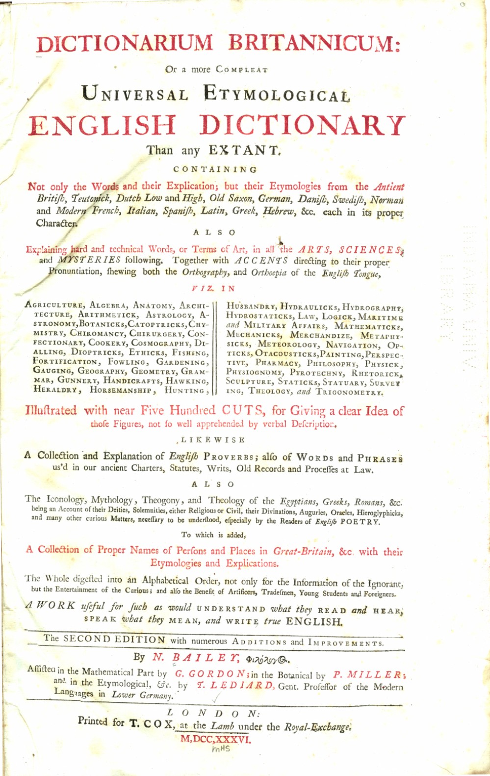
Figure 7-4: Old books and other printed materials can be a great source of ideas for basic layout.
Source: fromoldbooks.org
Now that you have the most basic design elements of the site figured out, you can start considering some details for the design. Figure 7-5 has an interesting concrete texture, but with a geometric pattern included. It fits with the grungy mood perfectly.
The transparent glass panel in Figure 7-6 could easily be adapted to a design. Transparency effects are a common design element to begin with.
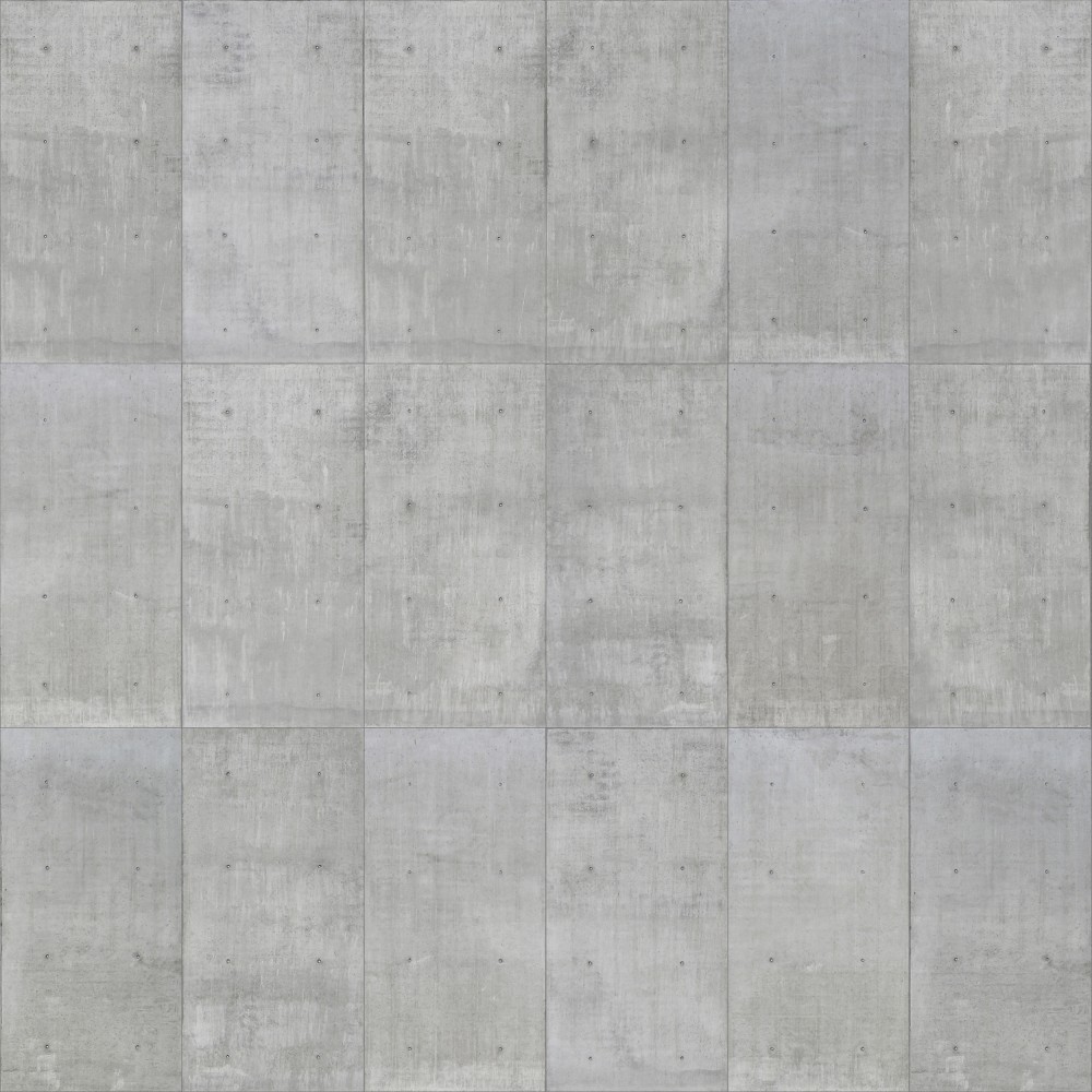
Figure 7-5: The mix of geometric pattern and organic texture is unexpected.
Source: Flickr.com © seier+seier
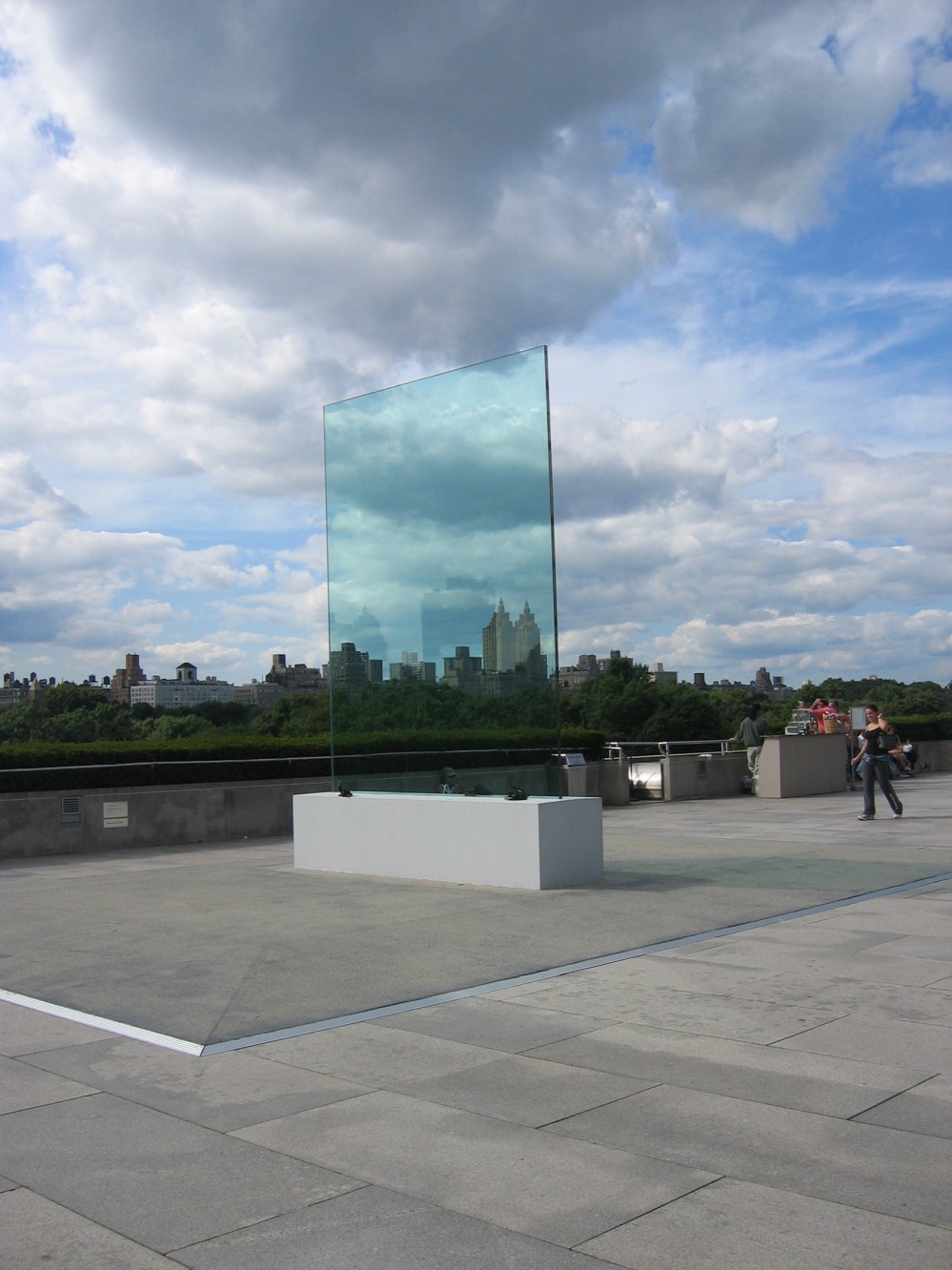
Figure 7-6: Transparent objects and elements are common in web design.
Source: Flickr.com © Casey Yancey
Let’s find one more detail to incorporate into the design. Details can turn a design that’s average into something great if used well, so don’t overlook this part of the idea-generating process. Details can also be some of the easiest things to find in abstract sources of inspiration.
Figure 7-7 has a unique glowing shape. You can apply a glow effect to elements on the page to help them stand out, so let’s grab this image for later ideas, too.
Now that you have your design elements, it’s time to actually create the design.
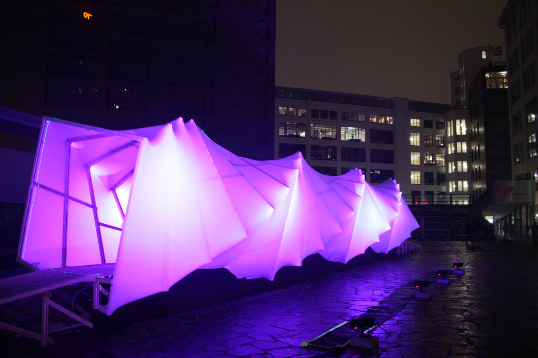
Figure 7-7: This glowing effect is easily emulated in design.
Source: Flickr.com © Yohan Creemers
Adapting Elements
Grab the color scheme to start with. Taking the flower image, you can grab a couple of sample colors from it and then build from there. Figure 7-8 shows what I came up with.
The header design will come first. Take the image selected for the header and colorize it so it fits with the color scheme. You could add a gradient overlay and some grunge effects, too, so that it fits the mood of the site. Figure 7-9 shows what that will look like.
Next comes the background for the main content area. You can use the gray from the color scheme, and the geometric-patterned concrete texture. Figure 7-10 shows this texture.

Figure 7-8: Website color scheme.
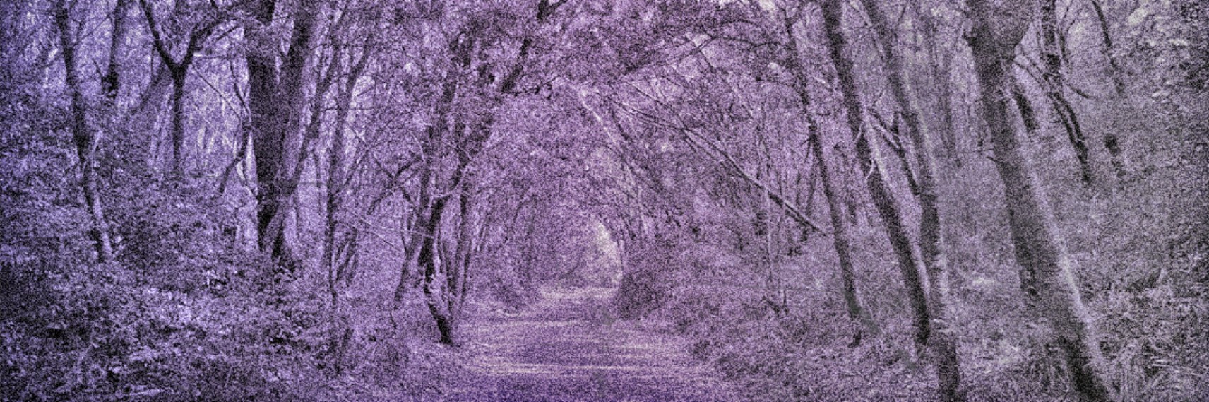
Figure 7-9: Website header.
Source: Flickr.com © frostnova

Figure 7-10: Background texture based on concrete image.
Instead of the rectangles in the original image, I’ve opted for diamonds. It’s more visually interesting, while keeping the same feeling.
From there, you’ll need to add the content. You can use the book page layout of one column, two columns, and then one column. See Figure 7-11.
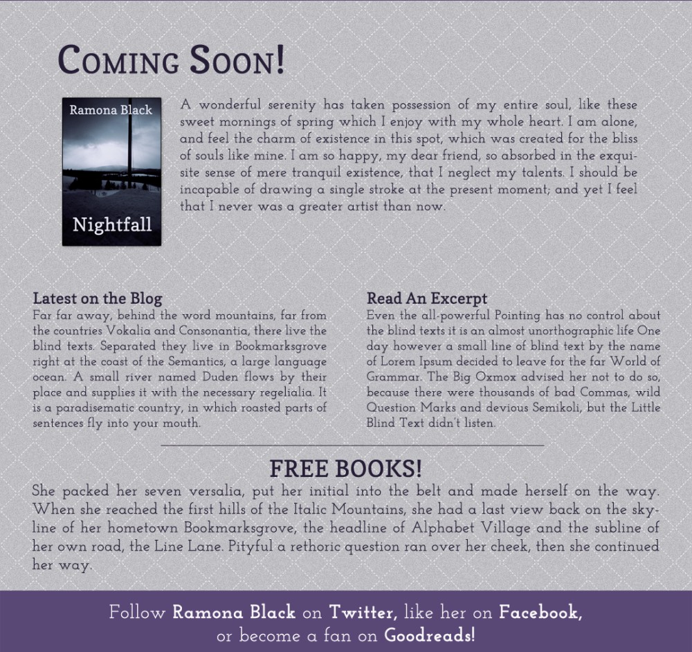
Figure 7-11: The main content layout, based on the book page.
That’s a good start, although maybe a little plain. So let’s add some of the details, like the transparency and glow effects. Let’s add these around the “Coming Soon!” section, since you’ll want this to stand out. See Figure 7-12.
You can also add some glow effects around the typography in the header, to make it stand out from the background, as shown in Figure 7-13.
The final result is shown in Figure 7-14.
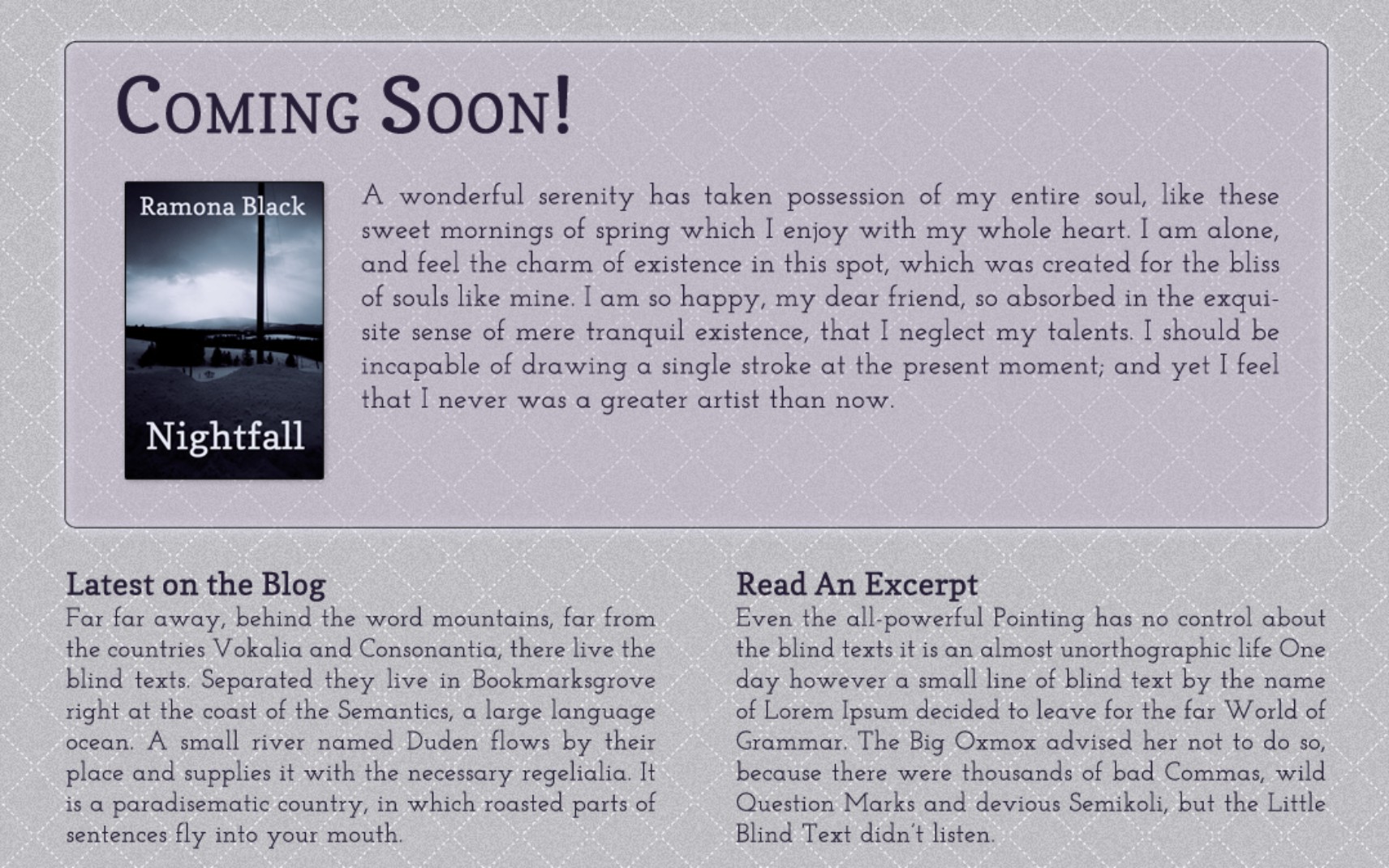
Figure 7-12: A transparent background and glowing border set featured content apart.
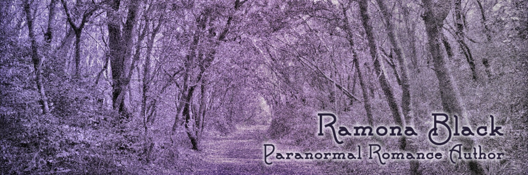
Figure 7-13: More glow effects in the header design.
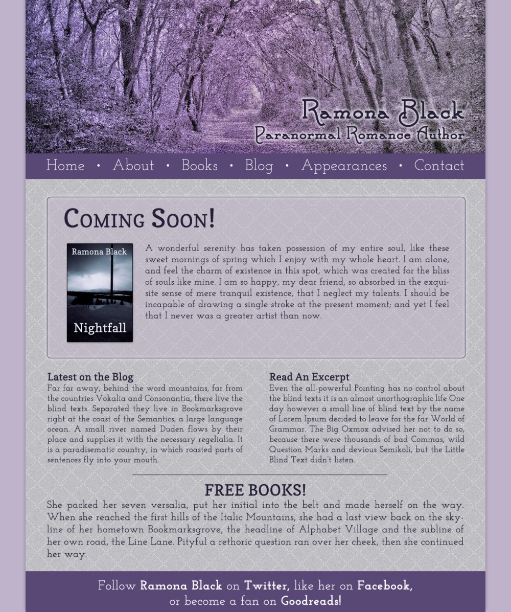
Figure 7-14: The final result!
Notice there’s a navigation bar under the header, with one of the colors from the color scheme. The typography on the page is also based on the colors of the original color scheme, just in a darker shade.
Conclusion
In the real world, you’ll likely draw inspiration from both direct and abstract sources for the same project. In some cases, you might even base an entire design around a single abstract image. As has already been mentioned, using only a single source of abstract inspiration can be a perfectly legitimate way to design a site, though you’ll want to avoid that with direct inspiration.
Learning to process ideas as you see them in your surroundings is a valuable skill for any designer to have. Then, when you’re ready to sit down and start a project, you’ll already have a wealth of ideas ready for you.
The key thing to remember when designing based on the work of others is to make sure your designs are uniquely yours, despite the origin of their parts. If you spend the time to consider how others have solved the challenges you face in your own projects, and then apply not just the individual elements, but also the reasoning behind those elements, you’ll have a much stronger design in the end.