
The Truth About HTML5 Forms
HTML5 forms are a neat example of HTML5’s history. The Architecture Astronauts at the W3C developed an XML-based replacement for HTML 4’s forms called XForms (http://en.wikipedia.org/wiki/XForms), which was a W3C candidate recommendation back in 2003. It was powerful but completely useless for the Web.
In late 2003 an alternative was proposed to extend, rather than replace, HTML 4’s forms (http://hixie.ch/specs/html/forms/xforms-basic-1). This became known as Web Forms 2.0 from the WHATWG and was eventually integrated into HTML5.
Note the timeframe: 2003.
The work the WHATWG was doing in the early- to mid-’00s was meant to extend basic HTML forms and solve the headaches that routinely popped up when using JavaScript to handle complex form interactions.
But in 2005 the idea of JavaScript libraries was gathering steam, with Prototype.js hitting 1.0 (http://en.wikipedia.org/wiki/Prototype_JavaScript_Framework) and jQuery hitting 1.0 in 2006 (http://blog.jquery.com/2006/08/26/jquery-10/).
Web apps were taking off in a big way, and the need for reliable, cross-browser JavaScript libraries was becoming acute. Libraries such as Prototype.js, jQuery (and the many others that were developed through that period, such as MooTools) met the pressing need and continued being developed, with jQuery’s UI library appearing in late 2007 (http://blog.jquery.com/2007/09/17/jquery-ui-interactions-and-widgets/). Other fully fledged, web app–focused JavaScript frameworks have since emerged including Twitter Bootstrap, Node.js, Google’s Angular, Moustache.js, Batman.js, Backbone, and the list goes on and on (see a comparison here: http://en.wikipedia.org/wiki/Comparison_of_JavaScript_frameworks ).
In many ways, these libraries provided all the functionality the WHATWG wanted to build into HTML, and far sooner.
Going Native Slowly
Native HTML5 form functionality is nevertheless starting to appear in modern browsers, including IE10+ (there’s no HTML5 forms support in IE9 and older). While the browsers might seem modern, the functionality isn’t. By the time IE10 shipped it was almost a decade since Web Forms 2.0 was proposed, and it will be several more years before HTML5 forms functionality becomes mainstream (that is, when IE10+ usage becomes widespread).
That said, more advanced HTML5 form functionality is also starting to appear in mobile. For example, in iOS5, a simple HTML5 element gave us access to the native iOS date picker widget. This highlighted the best of web standards—we drop in a simple HTML element, and the browser then provides the appropriate widget. In this case, it’s a touch-based widget that would have been unimaginable in the early ’00s.
However, then in iOS7, Apple removed this feature from Safari, and it once again gave the user a simple text input. There was no real explanation for the change, and no one liked it. This represents the worst part of web standards—by relying on the browser implementer to provide the input mechanism, you offload the experience of using your site to a browser implementer who may not really do it well and might change it later on a whim with no explanation.
In any case, on the desktop we’ll still be using JavaScript for our forms for a while, if only to support IE9 and older. The modern JavaScript libraries will become faster, will be more feature rich, and will offer even more functionality (and styling options)—all before the WHATWG’s 2003 ideas for forms ever get widespread adoption.
Still, there are some handy features we can use today (especially for mobile), and we’ll cast a critical eye over the other new functionality to see what can be used now (and whether it should be).
Forms Can Make or Break a Site
Designers have mixed feelings about forms, ranging from a vague distaste to outright loathing. (Then again, you may be a form connoisseur and the exception to the rule.)
Nevertheless, we all need to start loving forms—or at least hating them a little less—because the success of our sites may depend on it. Whether people are trying to sign up, register, check out, or even contact us, it could all come down to the quality of the form.
Bad forms are bad business, and oh boy, are there some bad forms out there (see just about every small-time e-commerce site ever). The last thing you want is people willing to give you money falling at the last hurdle because your form wasn’t up to scratch.
Designing thoughtful, humane forms (and testing them thoroughly), on the other hand, is good business. Sometimes it’s $300 million of good business: www.uie.com/articles/three_hund_million_button.
I mention this simply because forms appear to be so under-appreciated in the web design world, despite being so crucial to a site’s success. People have written entire books dedicated to form design (see http://rosenfeldmedia.com/books/webforms/).
But for now let’s focus on HTML5’s form features.
Good News, Bad News
Let’s do this “good news, bad news” style.
The good news is HTML5 has some new form features that will make forms less reliant on JavaScript for common functionality such as client-side validation, range selectors, date widgets, and even color pickers.
The bad news is IE9 (and older) doesn’t support any of them.
The good news is scripts, including jQuery libraries will let us use HTML5 form features where supported and provide fallback where browsers lack support.
The bad news is some native browser UIs for these form widgets are worse than the JavaScript alternatives they’ll replace—harder to use and harder (if not impossible) to style.
The good news is some additions to forms are backward compatible and provide some nice touches for iOS and Android devices, so you can use some of those features now.
The bad news is, as I write this, large chunks of major HTML5 forms functionality are implemented unevenly, even in non-IE browsers. So, we need to tread carefully when implementing them.
Despite all this, we can implement some small things today. So, shortly we’ll look at HTML5 form features in terms of the “no-brainers”: the kinda/sorta/maybe features and the features that are interesting but not quite ready for prime time.
As of writing, tracking down which browser supports which forms feature (and how well they implement it) is a bit of a nightmare. With major browsers on rapid release schedules (Chrome and Firefox, particularly) it doesn’t make much sense to document who-supports-what in depth here, so in this chapter we’ll just take a run through the major features and the major browser support issues. Check out the following resources, though, if you really want to get your teeth stuck into HTML5 forms, and, as always, test any new features on your site thoroughly before going live with them.
If you’re after authoritative detail on current browser support and browser implementation details for HTML5 form features, see Wufoo’s excellent resource: http://wufoo.com/html5/. I’ll be dropping links to specific pages on Wufoo’s HTML5 forms site as we go. The site has the following:
- Full demos compatibility charts
- Screenshots of supported/unsupported behavior
- Descriptions of browser quirks
- JavaScript fallbacks and more
It’s definitely worth checking out. Other useful resources include the following:
- The always-handy http://caniuse.com/ has great information on browser support, with links to more information for a given feature.
- Mark Pilgrim’s Dive Into HTML5 book has a useful chapter covering some of what’s new in HTML5’s forms: http://diveintohtml5.info/forms.html.
- Peter-Paul Koch has a handy compatibility table of the new HTML5 inputs and form attributes: www.quirksmode.org/html5/inputs.html.
- There’s an extensive (if not particularly reader-friendly) browser compatibility chart on Wikipedia that classes browsers by rendering engine: http://en.wikipedia.org/wiki/Comparison_of_layout_engines_(HTML5)#Form_elements_and_attributes.
- Opera’s developer site has a brief rundown on the new HTML5 form features: http://dev.opera.com/articles/view/new-form-features-in-html5/.
- IE10+ has relatively sound forms support, but as we noted before, earlier versions of IE do not. Check Microsoft’s documentation for up-to-date information on support for this feature: http://msdn.microsoft.com/en-us/library/hh673546.aspx#HTML5_Forms.
HTML5 Forms: The No-Brainers
HTML5 introduces a few things we can start using right away, particularly input fields for e-mail addresses, URLs, and search terms. These are alternatives to the familiar <input type="text">. The good news is browsers that don’t recognize these new input types just behave as if the field was just type="text".
HTML5 also introduces a variety of new attributes for our input fields (such as autofocus and autocomplete), some of which we’ll look at here, and others we’ll touch on in the following sections. The attributes here we can generally start using straightaway because browser support is reasonably good and a lack of browser is not particularly consequential.
New Input Types: E-mail, URL, Telephone Number, and Search
HTML5 introduces a bunch of new input types, which iOS and Android devices currently use to display a keyboard appropriate for the input type. Sometimes these touches are subtle (the email input type includes the @ key, the url input type gets a .com key, and so on), and sometimes they are more obvious (for example, the telephone number input tel type gets a numeric keypad).
The new input types with useful mobile keyboard variations (for iOS and Android at least) include the following:
- E-mail: <input type="email">
- URL: <input type="url">
- Telephone number: <input type="tel">
- Search: <input type="search">
These input types aren’t just useful in mobile contexts—they are (search notwithstanding) supposed to provide client-side validation too. So, in Firefox Chrome, Opera, and IE10+, if you use type="url", for example, and a user doesn’t provide a valid URL, you would get an error bubble something like you see in Figure 8-1 (each browser has its own variation).
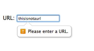
Figure 8-1. Using the new input types also provides some input validation in supported browsers
Validation is implemented unevenly for the various input types and across the various browsers (for example, tel has no specified default validation at all), so tread carefully. (Of course, client-side validation is merely a convenience for the user.)
Styling these validation errors is currently highly experimental. There are some experimental CSS3 pseudo-elements in WebKit (for example) that allow you to style the error bubble. You can see the syntax and result at the end of this document: http://trac.webkit.org/wiki/Styling%20Form%20Controls.
The search input field is a bit different from the other three we’ve discussed; the spec doesn’t require browsers to do anything special, but some browsers (particularly Safari) round the corners of the search field and may provide a list of previous searches and a clear button (a circle with an x in it) when you’ve entered something.
Older browsers just treat these field as type="text", as mentioned, so there’s no harm in using these input types now.
For more, see the Wufoo documentation:
- E-mail: http://wufoo.com/html5/types/1-email.html
- URL: http://wufoo.com/html5/types/3-url.html
- Telephone number: http://wufoo.com/html5/types/2-tel.html
- Search: http://wufoo.com/html5/types/5-search.html
(There are other new HTML5 input types, such as range, number, and date, which we’ll deal with separately in the “HTML5 Forms: The “I Wouldn’t Yet But You Can If You Really Want” section.)
Attributes: Autocomplete, Autofocus, Readonly, and Spellcheck
In addition to changing the way that different form items are rendered in HTML5, the new standard also adds a few new attributes to our form item controls. Let’s take a look.
<input type="text" autocomplete="off">
HTML5 specifies an autocomplete attribute that is particularly helpful for turning browser autocomplete off (autocomplete is on by default). You may want to do this when a browser’s autocomplete suggestions would be inappropriate (for example, a one-time authorization key, as the spec suggests) or confusing (for example, autocomplete suggests the user’s name when the user should be entering another name). All major browsers support it.
<input type="text" autofocus>
The boolean autofocus attribute automatically assigns focus to a given input when the page loads. The quickest way to see this in action is to go to http://google.com; the search box is automatically focused, and you can start typing right away. This is typically done with JavaScript, but it can be a nuisance to some users. For example, with my focus now in Google’s search box, I can’t use the Delete key to go back a page in my history; it thinks I want to delete text in the search field instead.
To deal with this (rather mild) problem, HTML5 moves this autofocus functionality into markup, instead of relying on JavaScript, so your browser can (theoretically) disable it with a preference or extension.
All modern browsers support Autofocus. Support in IE began with version 10but Mark Pilgrim details a fallback script here for IE9 and below: http://diveintohtml5.info/forms.html#autofocus.
<input type="text" value="You can’t touch this" readonly>
HTML5 specifies a widely supported (and self-explanatory) boolean readonly attribute. All major browsers support it.
<input type="text" name="captcha" spellcheck="false">
With the spellcheck attribute, we can, as per the autocomplete attribute, exert some control over default browser behavior. For example, we can turn it off for inappropriate fields, such as CAPTCHAS. You have to specify whether spellcheck should be true or false. All major browsers support it (including IE10+, but not 9 or below.)
Here are a couple of HTML5 forms features that may help in some contexts, or at least let you experiment on your blog. Browser support here may be mixed, implementations may differ, and fallbacks should be considered.
HTML5 introduces placeholder text for form fields, which is a welcome addition. Designers like it because it lets us put the field labels (or support text) in the field itself and design more compact forms (see Figure 8-2). It’s well supported in all major modern browsers.
Figure 8-2. The placeholder attribute in action
The syntax for this placeholder text is dead simple too. Just add placeholder="My placeholder text" to the given field:
<input type="search" placeholder="Hit enter to search!">
Neat, right? So, why is this in the “kinda, maybe” section?
- No styling: Support for styling placeholder text is currently experimental (see this discussion: http://stackoverflow.com/questions/2610497/change-an-inputs-html5-placeholder-color-with-css).
- No IE9 (and older) support: The lack of support in IE9 and older is a shame because this is otherwise well supported. The lack of IE9 support means we’ll have to provide alternatives for some time, which can raise a few tricky issues. Thankfully, the Modernizr feature detection script (www.modernizr.com/) can help in providing a fallback where appropriate.
- Fallbacks are tricky: Fallbacks aren’t always appropriate. We could fall back to JavaScript, but JavaScript placeholders for some details (for example, username and password) can interfere with the browser’s built-in autocomplete functionality, which gets ugly.
- Consistency for conversion rates: This is the fallbacks-are-better-than-native problem. If (if!) modern JavaScript-based placeholder text improves a form’s usability (and therefore its conversion rate, which you can discover through A/B testing if you’re really determined), then it should be used for all browsers, regardless of their HTML5 support. In fact, if the JavaScript option gives us more design flexibility, why use the native functionality at all? This is true—for the time being—of most HTML5 forms functionality.
HTML5’s simple placeholder text may be fine in simple situations (when support is there), but when conversion rates (and design flexibility) are all important, JavaScript solutions are generally going to offer more flexibility (and look a lot nicer to boot).
That’s a lot to consider for what is otherwise a simple feature. Ideally, placeholder text support will mature to the point where these issues are moot, but we’ll be waiting for IE9 and below to dwindle before it can be used without a fallback.
For more, see http://wufoo.com/html5/attributes/01-placeholder.html.
<progress value="77" max="100">77% complete</progress>
HTML5 introduces a <progress> element in the forms section of the spec, and it’s intended to represent the “completion progress of a task.” It’s intended for (surprise) progress bars and would be commonly (but not exclusively) used in web apps and updated via JavaScript as the task progresses. It could indicate upload progress, or when no value is given, it could indicate that the client is waiting for a response from the server.
We can use the optional attributes value and max to show progress made so far. We’re encouraged to indicate progress inline as text for browsers that don’t support <progress>.
The idea here is the browser should style this element natively so it looks like a typical OS progress bar (similar to when you copy a file, for example). As of this writing, all modern browsers support <progress> excluding Safari but including IE10+ (IE9 and older do not).
Figure 8-3 shows a few examples from Chrome on OS X; these are from Peter Beverloo’s demonstration that you can try for yourself (http://peter.sh/examples/?/html/meterprogress.html).
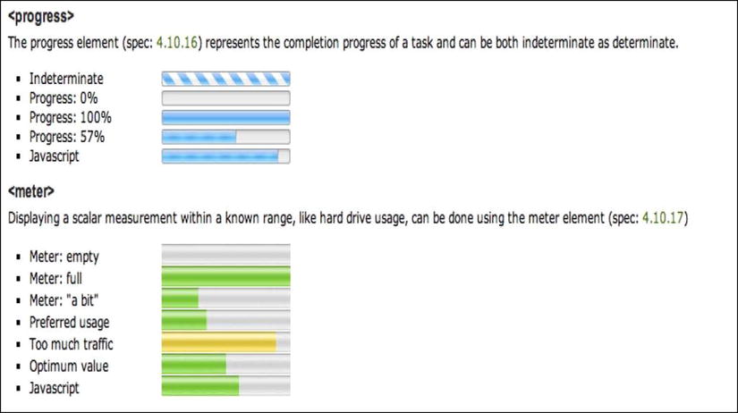
Figure 8-3. Examples of the <progress> and <meter> elements
Other browsers just ignore the tags and show the text (for example, “77% complete”). For the latest on browser compatibility, see Wufoo’s handy chart: http://wufoo.com/html5/elements/2-progress.html.
This seems like an odd addition on its own, but when you consider the web applications heritage of HTML5, it makes much more sense.
For more, see http://wufoo.com/html5/elements/2-progress.html.
<meter min="0" max="100" value="50">50 of 100 people "liked" this</meter>
While <progress> is a “kinda, maybe,” <meter> should really fall under “I wouldn’t yet,” but they make sense together, so we’ll keep <meter> here.
The <progress> and <meter> elements sound similar, but they have different use cases and serve different purposes. The <meter> element is for gauges, such as a donation gauge indicating $5,000 progress toward a $10,000 goal. It could also be used to indicate the percentage of people who voted a certain way or “liked” something, to indicate the number of tickets sold for an event (as the spec suggests), or even to represent disk space on a hard drive. It’s explicitly not for sole values such as, say, $5,000 on its own or for height and weight.
Hickson says he added it to the spec mostly to stop people from abusing <progress>.
There are six attributes to describe the gauge: value,min,low,high,max, and optimum (only value is mandatory, and we’ll touch on some of these attributes in the following sections).
Then things get weird.
The <meter> element seems simple enough, but things get funky with the way this element is styled. Let’s look at Chrome, for example. Chrome applies native styling, so you get nice meter bars like that shown in Figure 8-4.
Figure 8-4. The <meter> element in Chrome
However, trying to make things easy and native (drop the element in; the browser does the rest) takes us down a strange path. What if we want to style the <meter> element completely differently? Well, we have to undo all the default browser styling and then apply a lot of experimental CSS3, which has almost no support in modern browsers, as Steve Workman found (see www.steveworkman.com/web-design/html-5-web-design/2009/my-problem-with-html-5-styling-meter/).
How crazy does it get? WebKit includes some experimental CSS pseudoclasses for <meter> styling, including meter::-webkit-meter-even-less-good-value, and even a built-in star rating system with -webkit-appearance: rating-level-indicator; (see http://trac.webkit.org/wiki/Styling%20Form%20Controls for more).
On the one hand, it’s nice to see browsers actually doing something with HTML5 elements—a pragmatic reason to use them is welcome. On the other hand, treating <meter> like a natively styled form control takes us down a pretty strange path with lots of bizarro CSS3. Do we really need native star rating systems in WebKit?
Meter is currently supported in Firefox, Opera, Chrome and Safari – at the time of this writing there is no IE support at all, so you’re safest just treating it like an experimental novelty rather than a full blown usable tag.
For more, see http://wufoo.com/html5/elements/1-meter.html.
HTML5 Forms: The “I Wouldn’t Yet But You Can If You Really Want”
Let’s look at the required and pattern attributes and then several other input types that fall back to type="text", including number,range,date, and color.
<input type="text" name="musthaveaname" required>
The boolean required attribute does exactly what you think—it tells the browser that a given input (or textarea) must have a value before it can be submitted. Note that fields must have a name attribute for required to take effect.
Safari’s half-hearted implementation of this feature (see http://css-tricks.com/forums/discussion/11524/modernizr-giving-a-semi-false-positive-with-safari-input-attribute/) currently puts this feature in the “I wouldn’t yet…” basket because it reports to feature-sniffing tools that it does support the feature when it doesn’t really, creating a false positive. This makes it difficult to create a general fallback without resorting to browser sniffing. IE9 and older do not support the required attribute.
Browsers vary in the way they warn a user when they try to submit a form with an empty value for a required field. The ability to style these warnings is experimental too—it’s the same situation we touched for the validation warnings given by the new input types (for example, if you enter a non-URL value into a URL input field). WebKit, as mentioned, offers CSS3 pseudo-elements that let us style the error bubbles: http://trac.webkit.org/wiki/Styling%20Form%20Controls.
The other big caveat with this attribute is (as the Wufoo page points out) that you get an error only when you submit the entire form. Modern JavaScript techniques check for a value on blur (in other words, as you work through the form) and are therefore more user friendly.
For more, see http://wufoo.com/html5/attributes/09-required.html.
<input pattern="[0-9][A-Z]{3}">
The pattern attribute allows us to specify a regular expression that a given field’s value must match. (The previous regex matches a number followed by three uppercase letters, for example, 1ABC.) This might be used for ensuring that a user’s post code (or ZIP code) matches an appropriate format or a submitted URL matches a particular domain (for example, it contains facebook.com if providing a Facebook profile URL). Regular expressions are not for the faint of heart.
Unfortunately, the pattern attribute suffers from the same false positive problem in Safari that we looked at for required. It also suffers from the same usability issues we discussed for required.
Remember, client-side validation should only ever be used as a convenience for the user, while server-side validation should do the heavy lifting. This sort of validation is trivial to circumvent and should obviously never be used for security purposes or input sanitation.
There are also plenty of solid, modern JavaScript validation scripts out there that we’re going to be relying on for some time, and they offer more user-friendly features (such as validating while you type, or at least as you move through the form).
For more, see http://wufoo.com/html5/attributes/10-pattern.html.
<input type="number" name="itemquantity" min="2" max="12" step="2">
Earlier we looked at input types for e-mail addresses, URLs, and telephone numbers. HTML5 also introduces an input type for plain old numbers. Desktop browsers generally use this input type to provide a UI for incrementing a field’s numerical value (for example, the quantity of an item in a shopping cart).
As of writing, only IE10, Safari 5+, Chrome, and Opera support this input type. iOS Safari just gives you a numerical keyboard, and Opera 11 lets you type any character. The number input type accepts attributes min and max to constrain the range of possible values, and it accepts step to increment in certain amounts (for example, by two if you’re buying things that come only as a pair).
Browser validation for this field is quite a mixed bag (see the Wufoo page for more). The real problem, though, is the UI. In WebKit browsers, for example, it’s pretty diabolical. They give you the measly “number spinner” shown in Figure 8-5, and I don’t see how older people (at the very least) would cope with such tiny buttons.
Figure 8-5. The number input type usually gives a number spinner
This is a case of the browser makers letting the side down with lousy native interface widgets. There are better JavaScript methods for giving users up/down arrows to increment a value, and any widget you design yourself is going to be more usable than the WebKit implementation.
The UI problems, poor browser support, and inconsistent implementation make it too early to implement.
For more, see http://wufoo.com/html5/types/7-number.html.
<input type="range" name="myslider" min="0" max="10" step="2">
The type="range" input gives us a slider (see Figure 8-6), which is fine. Support is absent in Firefox but has been present in Opera and WebKit (in other words, Chrome and Safari) for a long time, and is now in IE10+ as well. It’s also supported in Safari on iOS5 and newer. You can also use the attributes min, max, and step to constrain the possible values and the increments the slider can move in.
Figure 8-6. Chrome’s range slider on a Mac (it’s different again on PC)
Browser implementation and styling, however, is a bit all over the place. In my view, better jQuery options exist that provide cross-browser support, more features, and a better, more consistent UI.
You could fall back to the native range widget where browsers support it, but why would you bother? It makes sense to use native widgets only if they’re actually better (that is, demonstrably more people actually complete the form), which is something you shouldn’t assume without the conversion rate data to back it up. For now (and the foreseeable future), use JavaScript.
For more, see http://wufoo.com/html5/types/8-range.html.
Input Type: Date (Time/Calendar Widgets)
<input type="date">
<input type="month">
<input type="week">
<input type="time">
<input type="datetime">
<input type="datetime-local">
HTML5 specifies several date- and time-related inputs (date, month, week, time, datetime, datetime-local) that should bring up either a date picker (for date, month, and week) or a number spinner (for time values).
Unfortunately, browser support for these is worse than any other input type we’ve looked at so far. Currently, Chrome, Safari, and Opera are the only browsers to implement a date picker with, shall we say, a functional look about it (see Figure 8-7 for Opera’s styling).

Figure 8-7. Opera’s rather functional date widget
iOS5 Safari introduced support for some of these date inputs, giving users the native date picker control to use for these fields, which was really very handy. Then Apple yanked them in iOS7, returning the user to the default text input field, for no real reason. This kind of flaky standards support in mobile is the a great example of why I take a “Just use JavaScript” stance in this chapter.
As mentioned, this is web standards at their best—an HTML feature conceived long ago is implemented in a clever way on a platform that didn’t exist when the feature was dreamt up.
Should you use the native functionality where possible? For mobile users? If they ever implement it (or implement it again, in iOS’s case). On the desktop? In several years a universally supported date picker widget will be handy in noncritical situations. But when the forms are crucial to a site’s business, it’s a lot of control to give up in terms of styling and custom functionality.
In comparison, jQuery UI (for example) already provides customizable, themeable date picker widgets that offer multiple months, inline display, keyboard shortcuts, and more (see Figure 8-8).

Figure 8-8. The jQuery UI date widget is a much more flexible option
The overwhelming lack of browser support means it’s JavaScript or bust for date widgets for the foreseeable future, and there’s nothing wrong with that.
For more, see http://wufoo.com/html5/types/4-date.html.
Input Type: Color (Color Picker)
<input type="color">
For some reason, HTML5 also specifies a color picker, as shown in Figure 8-9.
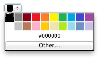
Figure 8-9. Opera’s color picker widget
As of this writing, only Chrome, Opera and (oddly enough) the BlackBerry browser support it. There are many better JavaScript alternatives.
For more, see http://wufoo.com/html5/types/6-color.html.
Input Type and Element: Datalist
<input list="mydatalist" name="phonelist">
<datalist id= "mydatalist">
   <option value="iPhone">
   <option value="Android">
   <option value="Blackberry">
   <option value="Windows Phone">
</datalist>
HTML5 introduces a <datalist> element that’s used in conjunction with the list input attribute to provide a set list of suggestions in a drop-down menu as you type. See Figure 8-10 for an example. (As you can see in the previous code, the list attribute on the <input> element matches the id on the <datalist> element.) These are just suggestions—users can still enter whatever they want. It’s essentially just a simple autosuggest feature and could be useful for, say, choosing your country when you’re filling out your details on an e-commerce site. (The usual alternative—a giant <select> list—generally proves pretty unwieldy.)
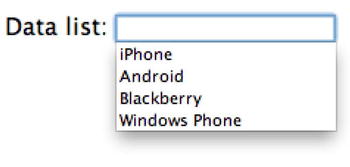
Figure 8-10. Opera’s datalist implementation is pretty good
Chrome, Firefox 4+, Opera 9+ and IE10 support it, but Safari does not (oddly enough.)
There’s also much better JavaScript approaches for this kind of functionality. See, for instance, the very cool Chosen from Harvest: http://harvesthq.github.com/chosen/. It offers a variety of <select> list replacements, with a very clean UI, solid compatibility for all modern browsers and graceful degradation for older browsers.
You Hypocrite. I Thought Requiring JavaScript Was the Worst Thing Ever
It may seem strange that I’m advocating JavaScript for forms when I was chastising HTML5 advocates earlier in Chapter 4 for making JavaScript mandatory for basic layout for IE6–8 users. The difference here is that it’s still possible to gracefully degrade your form for users with JavaScript disabled—there is no graceful degradation when using HTML5 elements for those users.
If we’re going to use JavaScript for forms, we should still try to ensure our forms are accessible. There’s a myth that screen readers can ignore modern, unobtrusive JavaScript and proceed as if JavaScript was disabled. Not true. Here’s Roger Johansson (www.456bereastreet.com/archive/201011/accessibility_myths_in_2010/):
If screen readers really did not support JavaScript, or screen reader users in general had JavaScript disabled, [then using unobtrusive JavaScript and not thinking much about accessibility would] be a reasonable approach. However, screen readers run on top of web browsers that support JavaScript and, as I mention in “Unobtrusive JavaScript is not necessarily accessible JavaScript”, most screen reader users do have JavaScript enabled.
For screen readers to access forms, they need appropriate labeling, descriptions, and structure. But they still see our JavaScript, so we need to make it accessible to blind users.