KEY V
COLOR & LIGHT
Capturing light as it falls on a person’s body is a sure way to bring it to life, as you’re suddenly introducing a third dimension. Whether you like to color your sketches or leave them monochrome, you’ll get lots of enjoyment from making them glow in a pool of light. Depicting light is really adding shadow: Painting light is leaving out color, the contrast between light and shadow giving you the glow you need.
When it comes to color, there’s no need to fear a clash or strange, unrealistic skin or hair tones. In this chapter, I share how color can be straightforward and is best achieved with a small palette. Color is the magic that makes people look twice! I recommend making color as much a part of your voice as your line.
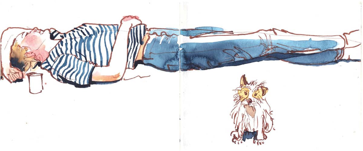
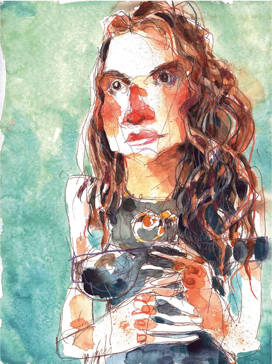
RÓISÍN CURÉ
Fiona in the Sun
A4 (8¼” × 11½”| 21 x 29.7 cm) AMI watercolor sketchbook, carbon pen, grey ink, and watercolor.
COLOR AND ITS ABSENCE
Light, in watercolor terms, is the absence of color. You can get away with a slick of very dilute yellow, but it’s better to err on the side of “glow” and put nothing at all on the figure, especially if you are depicting strong sunlight. The exception to this is if you are sketching on toned paper: When the paper is not white, practice drawing “light” with white gel pens, pastels, or gouache.
To know how to leave color out, you need to know how to put color in.

Each part of this image has more or fewer layers, depending on the shadow they’re in. In watercolor, layering is crucial. The more thinly the layers are applied, the less transparent and the more “shaded” the result.
RÓISÍN CURÉ
Easter Monday
A5 (5¾” × 8¼” | 14.8 × 21 cm) AMI sketchbook (double spread), carbon pen, ink, and watercolor.
Tip
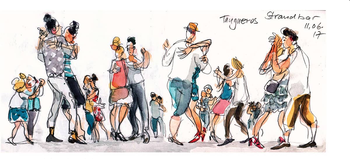
Keeping colors to a minimum reduces some of the issues involved in trying to capture a human form quickly under pressure. A surprisingly small range of colors can produce an astonishing variety of tones.
MY HUMAN PALETTE
My human palette is good for hair, skin, and clothes, but experiment with a range of your own choosing. • Opera pink
• Lemon yellow
• Yellow ochre
• Burnt umber
• Indigo
• Payne’s grey
• Green apatite genuine
• Transparent red oxide
• Chrome orange
With these nine colors, you can do any skin or hair color, and a wide range of clothing colors—without clashing. But feel free to choose your own or any version of the colors I mentioned: Remember, your color choice is as much a personal choice as any other aspect of your sketching practice.

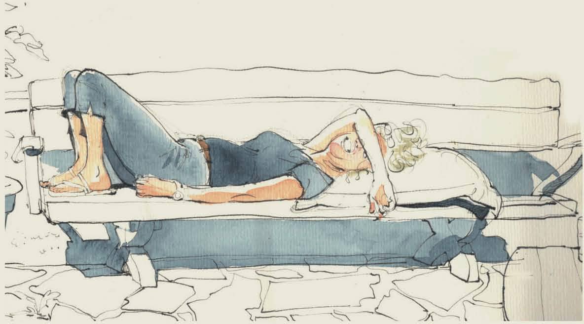
Straight lines through the leading partners lend weight and balance to the stance, while the loose splashes of color bring a fresh, lively air to the scene. Note the easy skill in making (cleverly placed) figures in the background look further away by reducing their scale.
DETLEF SURREY
Tango Dancers
12” × 5⁵⁄₁₆” | 30 × 13.5 cm; 4B pencil and watercolor.
Hair
Straight hair is lighter in a band around the crown where the light hits it (this can be white and unpainted).
• The straighter the hair, the sharper the line between the hair color and the shiny part. Soften the color next to the band of shine.
• Curly hair doesn’t have that shiny band but has a corona of slightly lighter coloring around the top side of the hair.
• Get scribbly and don’t be too neat; it looks more natural.
• Don’t forget wispy bits, but always try to remember the direction of hair growth.
• Let the wind play a part in the way you draw hair.
• Use a few shades when painting hair in a close view; it looks more natural and more alive.
• Leave a rim of light at the edge if you’re not too close to your subject; it lifts the hair wonderfully.
• Hair is darker at the roots and nape of the neck and when you are looking through strands to hair at the back.
• Hair of older people is wispy and fine. Use a fine nib, or the fine side of your pen.
• White hair can be left white and unpainted.

Skin
A wide range of colors can be achieved with different dilution of each and mixing them in various proportions. Practice mixing the colors together to get a range of colors that look natural for skin. This is how I mix colors for various skin tones:
• Yellow ochre + opera pink in varying proportions = pale skin tone
• Yellow ochre + opera pink in varying dilutions = pale to medium skin tone
• Transparent red oxide + yellow ochre = medium skin tone
• Burnt umber + transparent red oxide = medium to dark skin tone
• Burnt umber + Payne’s grey = dark skin tone

With just these five colors, I make any skin tone (these are my choices; be as creative as you like with yours!).
• Opera pink
• Yellow ochre
• Transparent red oxide
• Burnt umber
• Payne’s grey
A range of skin tones can be achieved with very few colors.

A touch of pink goes a long way.
RÓISÍN CURÉ
Caroline
4¹¹⁄₁₆” × 4¹¹⁄₁₆” | 12 × 12 cm AMI watercolor sketchbook, carbon pen, and watercolor.
No matter the skin color, I like to mix my base color, then add a little pink to warm it up slightly. Keep that touch of pink to a minimum; drop a tiny blob of paint into the color you have painted on the page, and let the water do the blending.
Diluting your color will give you great powers of subtlety and range. It can be a tricky thing to master, so practice, practice, practice. Remember: Wet onto wet, wet onto dry, but not wet onto half-dry.
The next section (see page 86) looks at combining light with color to make skin glow.
How Dilution Works
In watercolor, the way to make a color lighter is to add water. As a sketcher of people, the ability to get an almost infinite range of tones is valuable. When you’re painting skin, dilution is vital. Skin shades are delicate and subtle. Skin is smooth and can have a gentle glow, so you need to dilute your color, fading it to clear water, to show that lovely texture.
1. Clean a brush in water, wipe excessive water on the edge of the container so it is just damp, and dip the brush into the pan of paint. Transfer color onto a clean area of your palette.
2. Transfer a small amount of color onto another part of your palette. Add a small amount of clean water and you have a diluted, lighter version of your paint.
3. Use your absorbent paper sparingly: Use your brush as a mop rather than dabbing directly with the paper.
Cleaning Off a Blob
It’s easy to create an accidental blob or a color too rich for skin tone. But it’s not hard to fix, either.
1. Immediately add lots of clean water to the blob; do not dab it with a tissue. You only get one go with a dab; after that you won’t clean any more off.
2. Next, mop off the excess water with your brush. Wipe the brush on your tissue.
3. Wash your brush vigorously between each mopping action.
4. Finally, blot the damp area with a clean tissue.

Tip
If you want a smooth surface in watercolor, the most important thing you do is—nothing. This probably applies to skin more than anything, due to the delicate nature of the surface of skin. You must leave it to dry. Do not be tempted to smooth out the brushstrokes with your brush, because you’ll make it worse. Do not add fresh paint to half-dry paint, as you will create a “bloom” or cauliflower, which is nearly impossible to fix. I have learned to embrace them as part of the signature of watercolor.
Clothes
There are as many colors for clothing as there are colors in the world. Personal taste reigns, but you are less likely to clash if you stick to fewer colors.
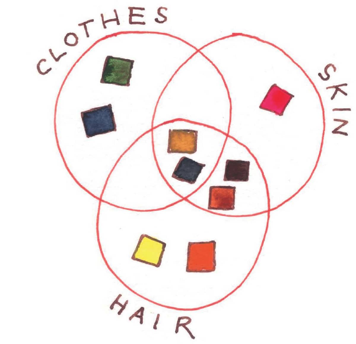
As you can see in this Venn diagram, some colors are useful for all three applications.
Clothes Skin Hair
Expressing Individuality
Drawing patterns on clothing, and the accessories people wear, can be lots of fun. Watch for spots, stripes, checks, and tattoos.
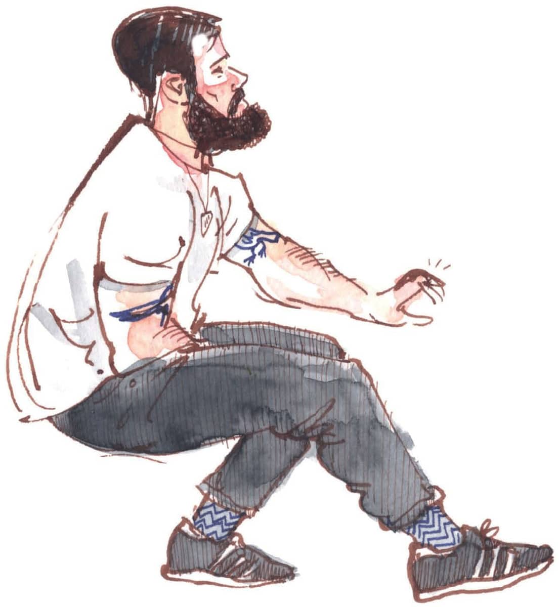
Tattoos can be a big part of someone’s look. Keep it simple to let the interesting bits stand out.
Johnny Magpie
5½” × 5½” | 14 × 14 cm; Hahnemühle watercolor sketchbook, fude pen, ink, and watercolor.
Borrowing Background Colors
Identify stand-out colors of the setting and repeat them in the clothing palette. Use the interior designer’s color theme and pick out parts of it in the clothing of your subjects, even if it means adjusting both.
Turning Up the Volume on Color
Exaggerate the colors: Turn up the volume, so to speak, to get a sketch with impact.
Tip
A white gel pen is invaluable for clothing patterns, but make sure the base color is dark or the white won’t stand out.

Don’t be afraid to adjust colors for maximum effect. The dragons on this shirt were gold, but they stood out more in white.
Waiting for Our Flight
A5 (5¾” × 8¼” | 14.8 × 21 cm) Hahnemühle watercolor sketchbook, fude pen, ink, watercolor, and white and gold gel pens.
All artwork in this section:
RÓISÍN CURÉ
Tips for Drawing Stripes and Spots
• Let stripes define and describe the contours of a body; look for how they appear and disappear.
• Curve a stripe to suggest the curve of an arm.
• Stripes are a very good way to tell the viewer about the drape of a garment.
• Dots are closer together as they near the edge of a curved surface.
• Spots lift a garment wonderfully, whether dark spots on light, or vice versa.
You can mix your media for efficiency, such as a colored pencil, to get the energy of stripes.
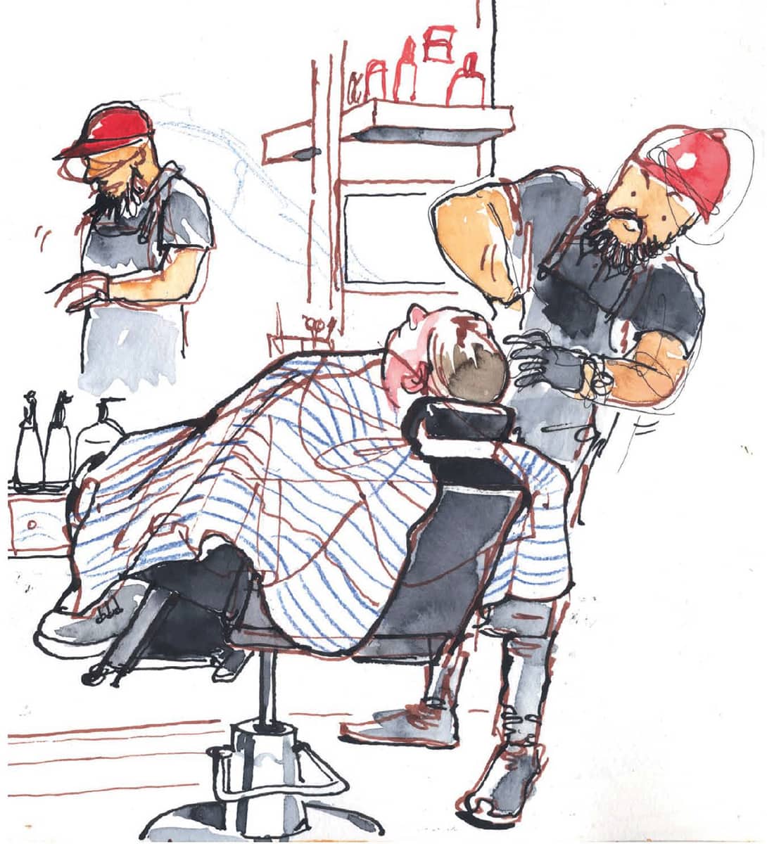
A Relaxing Shave
A4 (8¼” × 11½” | 21 × 29.7 cm) Hahnemühle watercolor sketchbook, fude pen, ink, and colored pencil.
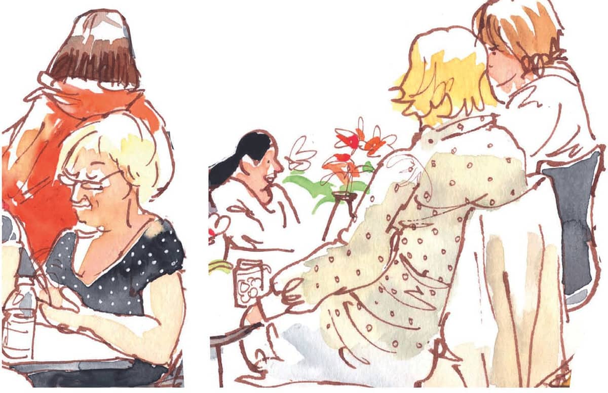
Lunch at the National Gallery (detail)
A4 (8¼” × 11½” | 21 × 29.7 cm) Hahnemühle watercolor sketchbook, fude pen, ink, and watercolor.

One of the very rare times someone didn’t look completely happy to be sketched. If you forget to observe the curve of the stripes—as I did in this sketch—just look again and draw them right on top.
Frenchman with a Tattoo
4Ύ16” × 5⅞” I 12 × 15 cm Hahnemühle watercolor sketchbook, fude pen, ink, and watercolor.
Stripes can be a wonderful highlight of a sketch. The faster and bolder you draw your stripes, the more energy they will have. Paint them with the tip of your brush for a fresh and vibrant effect. Stripes break off and start again—like fault lines after an earthquake—to show folds. Let them show curves.
Olivia in the Sun
A5 (5¾” × 8¼” | 14.8 × 21 cm) Hahnemühle watercolor sketchbook, fude pen, ink, and watercolor.
Patterns, Checks, and Plaid

With the colors suggested in the palette on page 75, a great variety of patterns can be produced. A plaid shirt is a gift to a sketcher. Paint the base color and wait for it to dry. Draw or paint stripes on top, putting different colors in different grids. A gel pen is great for this.

The looseness of lightly painted plaid can be a lovely counterpoint to a carefully observed drawing.
Darragh
A4 (8¼” × 11½” | 21 × 29.7 cm) Hahnemühle watercolor sketchbook, fude pen, ink, and watercolor.
All artwork in this section:
RÓISÍN CURÉ
Drape
Stripes can also help define the drape of fabric. Look for vertical lines where the weight of the fabric causes it to hang.
Stan
A4 (8¼” × 11½” | 21 × 29.7 cm) AMI sketchbook, carbon pen, ink, and watercolor.
Creases
Fabric creases; skin doesn’t. Allow creases to be loose and free, just like the random way they come. In time, the creases will replace the imagined edges of a garment—with the first pull of a line.
You’re going to draw a lot of denim, hoodies, woolen sweaters, and jackets—a whole world of creases. Crease hotspots include:
• Inside hoods
• Elbows and wrists
• Knees and ankles
• At the torso, especially where a sweater meets the hips
• At the groin, where the legs become a torso

Well-observed creases can make light work of a foreshortened limb.
Sewing a Sail
11½” × 6³⁄₁₀” | 30 X 16 cm AMI watercolor sketchbook, carbon pen, ink, felt-tip pen, and watercolor.

The fresher the crease, the more realistic it looks. Follow the contours you can see.
The Redhead
A4 (8¼” × 11½” | 21 × 29.7 cm) Hahnemühle watercolor sketchbook, carbon pen, ink, and watercolor.
LIGHT AND SHADOW
Now that we’ve looked at adding color to a sketch, we’re going to talk about bringing in a sense of light by taking it away.
With practice, you’ll find you paint less. You will notice the dark and light areas faster and faster with time, and your confidence in leaving color out—which is sometimes counterintuitive–will grow.
• Facing the scene you want to sketch, half-close your eyes. The darks and lights will immediately jump out at you. First, paint the lightest areas. Wait for the paint to dry. Then look for the shadows and carefully paint them on top.
• Look for areas that are thrown into shadow: Under the brim of a hat. Below the edge of a sleeve. The knees or shins under the hem of a dress.
• Shadows come in different colors. When adding areas in shadow, try to darken that particular color rather than just making it “dark” or gray. To darken skin, add a less dilute version of the color you used for the part of the face in the light. In strong sunlight, the border between light and dark should be crisp and sharp.
All artwork in this section:
RÓISÍN CURÉ
A strong sense of light is achieved by leaving a corona of unpainted area on the light side of clothes, skin, and hair.
Bar in Largo de São Domingos, Porto
A4 (8¼” × 11½A” | 21 × 29.7 cm) 300g Fabriano paper in a homemade concertina sketchbook, fude pen, ink, and watercolor.
Skin, Clothes, and Hair
What skin, clothes, and hair have in common when it comes to light:
• A rim of light around the edge manifests with an absence of color.
• If the light is strong, the line is sharp.
• If the light is soft or overcast, the line is blended and soft. How skin, clothes, and hair are different when it comes to light:
• A face has lots of planes and each comes with its own little peak and trough of light and shadow.
• Hair has a corona of light near the top of the head.
• Clothes are easier—just slabs of color and pattern with unpainted or lighter areas where light is hitting the figure.
All artwork in this section:
RÓISÍN CURÉ
In frigid weather, you’ll find it hard to paint layers, because they just won’t dry. But the wet-on-wet technique that happens when other options are limited can be beautiful.
Blaise
A4 (8¼” × 11½” | 21 × 29.7 cm) AMI watercolor sketchbook, carbon pen, ink, and watercolor.

In strong sunlight, leave even dark colors white. The glow will be lost with any paint.
Paddy in Sunlight
A5 (5¾” × 8¼” | 14.8 × 21 cm) Fabriano Venezia sketchbook, fude pen, ink, and watercolor.

The sun makes colors lose intensity and patterns lose definition. Also, observe how shadows can say a lot about the contours of the body.
Lily
A4 (8¼” × 11¼” | 21 × 29.7 cm) AMI watercolor sketchbook, carbon pen, ink, and watercolor.

In strong sunshine, hair can take on an almost ethereal glow.
Homework Outside
A4 (8¼” × 11½” | 21 × 29.7 cm) AMI watercolor sketchbook, carbon pen, gray ink, and watercolor.
Shadows
A little shadow can make all the difference. If you are lucky enough to encounter someone who is not intent on movement for a while, get stuck into those blue shadows.
If the sun is out, take your time and enjoy yourself. However, if you are in danger of losing the sun to a cloud, use a thin nib to outline your shadow: that way you won’t be left in the dark, so to speak.

Pinpoint the main color in your scene, then see if you can find or slightly adjust colors to harmonize.
Italian on the Beach, Nice
11” × 9” I 28 × 23 cm Fabriano Venezia sketchbook, fude pen, ink, and watercolor.

To help make a surface look curved, observe a slightly darker part in a shadow just before the border with the lighter area.
Olivia at Mulroog
A4 (8¼” × 11½” | 21 × 29.7 cm) AMI watercolor sketchbook, carbon pen, ink, and watercolor.
There’s a lot more to the light as it hits a body than there is to the hair or a clothed body: There are so many planes, and light is a delicate thing.
When painting the face, consider the following:
• The planes on the face
• The way light hits the nose (on which side does it fall?)
• Shadows under the lower lip, the nose, the eye sockets

Look at how wet skin differs from dry: the sharp-edged highlight on wet skin, the softer highlight on dry skin. The beach is the ideal place to experiment, and it’s where you’ll find people relaxing and keeping still for long periods.
Symphony of Swimsuits
A5 (5¾” × 8¼” | 14.8 × 21 cm) Fabriano Venezia sketchbook (double spread), fude pen, ink, and watercolor.

Determine which direction the light is coming from, then exaggerate it. Unless you’re doing a close-up detailed portrait, you’ll need more dramatic highlights to achieve a striking effect. Remember the planes of the face: Which are in shadow? Which are highlighted?
Engrossed
3⅞” × 3⅛” | 10 × 8 cm Hahnemühle watercolor sketchbook, fude pen, ink, and watercolor.

Coloring only the figure is an effective and efficient way to capture the focus of interest.
MARTA FONFARA
Jeanou
8½” × 10 ⅝” | 21 × 27 cm; black pencil and watercolor.
“I sketched this super-late in a bar on the last day of an artistic residency in Saint-Briac sur Mer (Brittany)”
—Lapin

The light in the subject’s eyes is a window into her soul.
LAPIN
Marion Rivolier
8⁵⁄₁₆” × 5⅞” | 21 × 15 cm; ink pen, watercolor, and Gelly Roll pens on old accounting paper.
The artist breathes life into the subject’s hair by the creative use of color–purple, orange, and pink—which somehow combine to make it even more natural. The color in the subject’s face infuses her with serenity and personality.
FELIX SCHEINBERGER
Anna
1¹³⁄₁₆” × 15¹¹⁄₁₆” | 30 × 40 cm; ink and watercolor.