11. Creating and Managing Table Views
Tables provide a scrolling list-based interaction class that works particularly well on a small, cramped device. Many if not most apps that ship natively with the iPhone and iPod touch center on tables, including Contacts, Settings, iPod, YouTube, Stocks, and Weather. The iPhone’s limited screen size makes tables, with their scrolling and individual item selection, an ideal way to deliver information and content in simple, easy-to-manipulate form. In this chapter, you discover how iPhone tables work, what kinds of tables are available to you as a developer, and how you can use table features in your own programs.
Introducing UITableView and UITableViewController
The standard iPhone table consists of a simple scrolling list of individual cells, providing a manipulatable data index. Users may scroll or flick their way up and down until they find an item they want to interact with. Then, they can work with that item independently of other rows. On the iPhone, tables are ubiquitous. Nearly every standard software package uses them, and they form the core of many third-party applications, too. In this section, you discover how tables function and what elements you need to bring together to create your own.
The iPhone SDK supports several kinds of tables, many of which are implemented as flavors of the UITableView class. In addition to the standard scrolling list of cells, which provides the most generic table implementation, you can create several specialized tables. These include the kind of tables you see in the Preferences application, with their blue-gray background and rounded cell edges; tables with sections and an index like the ones used in the Contacts application; and related classes of wheeled tables, like those used to set appointment dates and alarms. No matter what type of table you use, they all work in the same general way. They contain cells provided from a data source and respond to user interactions by calling well-defined delegate methods.
The UITableViewController class derives from the UIViewController class. Like its parent class, it helps you build onscreen presentations with minimal programming and maximum convenience. The UITableViewController class greatly simplifies the process of creating a UITableView, reducing or eliminating the repetitive steps required for working directly with table instances. UITableViewController handles the fussy details for the table view layout and provides table-specific convenience by adding a local tableView instance variable and automatic table protocol support for delegates and data sources.
Creating the Table
To implement tables, you must define three key elements: how the table is laid out, the kinds of things that are used to fill the table, and how the table reacts to user interaction. Specify these elements by adding descriptions and methods to your application. You create the visual layout when building your views, you define a data source that feeds table cells on demand, and you implement delegate methods that respond to user interactions such as row-selection changes.
Laying Out the View
UITableViews instances are, as the name suggests, views. They present interactive tables on the iPhone screen. The UITableView class inherits from the UIScrollView class. This inheritance provides the up and down scrolling capabilities used by the table. Like other views, UITableView instances define their boundaries through frames, and they can be children or parents of other views. To create a table view, you allocate it, initialize it with a frame just like any other view, and then add all the bookkeeping details by assigning data source and delegate objects.
UITableViewControllers take care of the layout work for you. The UITableViewController class creates a standard UIViewController and populates it with a single UITableView, setting its frame to allow for any navigation bars or toolbars. You may access that table view via the tableView instance variable.
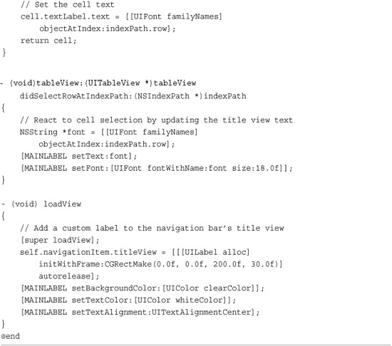
One important note: When subclassing UITableViewController, if you define a loadView method, be sure to call its superclass’s implementation—that is:
Doing this ensures that the table view is properly set up, while letting you add custom features in the subclass such as navigation item buttons. If you create your UITableViewController using Interface Builder, you do not have to add any special calls to loadView.
Assigning a Data Source
UITableView instances rely on an external source to feed either new or existing table cells on demand. This external source is called a data source and refers to the object whose responsibility it is to return a cell to a table’s query.
Data sources provide table cells based on an index path. Index paths, objects of the NSIndexPath class, describe the path through a data tree to a particular node, namely their section and their row. Although many simple tables only use one section, tables can use sections to split data into logical groups. A UITableView instance uses index paths to specify a section and the row within that section.
It’s the data source’s job to connect that path to a concrete UITableViewCell instance and return that cell on demand. You can create an index path by supplying the section and row:
myIndexPath = [NSIndexPath indexPathForRow:5 inSection:0];
Recover those values by using the row and section properties of the index path object.
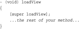
The iPhone SDK provides a built-in mechanism for reusing table cells. When cells scroll off the table and out of view, the table can cache them into a reuse queue. You can tag cells for reuse and then pop them off that queue as needed. This saves memory and provides a fast, efficient way to feed cells when users scroll quickly through long lists onscreen. Recipe 11-8 looks at cell reuse in more detail.
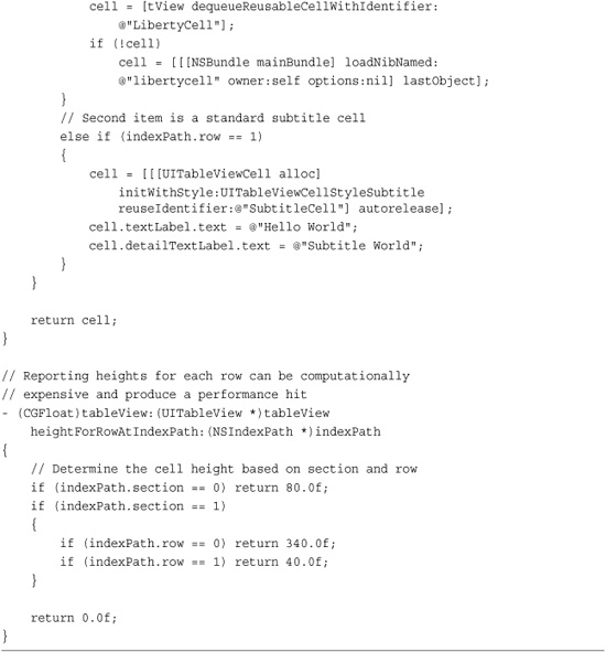
You’re not limited to single cell types either. The following snippet chooses which of two kinds of cells to request from the reusable cell queue. Default cells provide a single label; subtitle cells add a second. The identifier is arbitrary, as defined by the developer.
Use the table’s dataSource property to assign an object to a table as its data source. That object must implement the UITableViewDataSource protocol. Most typically, the UITableViewController that owns the table view acts as the data source for that view. When working with UITableViewController subclasses, you need not declare the protocol as the parent class implicitly supports that protocol and automatically assigns the controller as the data source.
After assigning a data source, load your table up with its cells by implementing the tableView:cellForRowAtIndexPath: method. On calling the table’s reloadData method, the table starts querying its data source to load the actual onscreen cells into your table. You can also call reloadData at any time to force the table to reload its contents.
Assigning a Delegate
Like many other Cocoa Touch interaction objects, UITableView instances use delegates to respond to user interactions and implement a meaningful response. Your table’s delegate can respond to events like the table scrolling or row selection changes. Delegation tells the table to hand off responsibility for reacting to these interactions to the object you specify, typically the UITableViewController object that owns the table view.
If you’re working directly with a UITableView, use the standard setDelegate: method to set your table’s delegate. The delegate must implement the UITableViewDelegate protocol. When classes implement a delegate protocol, you add a declaration within the class header file. See Chapter 3, “Objective-C Boot Camp,” for an explanation of declaring protocols.
When working with UITableViewController, omit the setDelegate: method and protocol assignment. That class automatically handles this. A full set of delegate methods is listed in the Apple SDK documentation, and the most basic ones are discussed in this chapter.
Note
UITableView instances provide notifications in addition to delegate method calls. Notifications enable different threads of your application to communicate with each other by broadcasting updates via the default NSNotificationCenter. You can subscribe your application to these notifications using standard NSNotificationCenter observers to find out when the table states change. With the 3.0 SDK, the only official table notification is UITableViewSelectionDidChangeNotification.
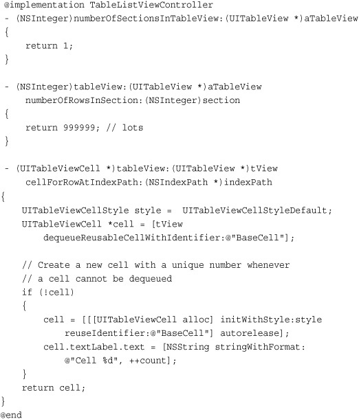
Recipe: Implementing a Very Basic Table
The UITableViewController class embeds a UITableView into a UIViewController object that manages its table view. This view is accessed via the tableView property. These controllers automatically set the data source and delegate methods for the table view to itself. So it’s really a plug-and-play situation. For a really basic table, all you need to bring to the table are some data and a few data source functions that feed cells and report the number of rows and sections.
Populating a Table
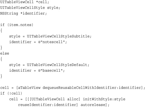
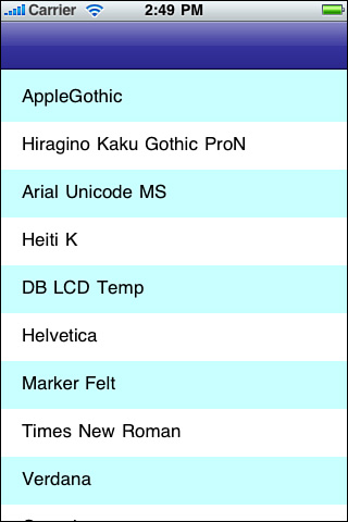
Pretty much any array of strings can be used to set up and populate a table. Recipe 11-1 leverages the UIFont class’s capability to list available system fonts, that is, a handy list of strings. A call to [UIFont familyNames] returns an array populated with those font names. This recipe creates a basic table based on those font names.
Recipe 11-1 Building a Basic Table

Get This Recipe’s Code
To get the code used for this recipe, go to http://github.com/erica/iphone-3.0-cookbook-, or if you’ve downloaded the disk image containing all of the sample code from the book, go to the folder for Chapter 11 and open the project for this recipe.
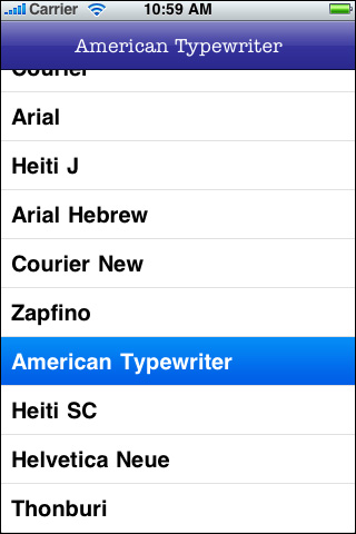
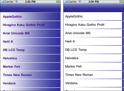
Figure 11-1 shows the interface produced by this code, as run on the iPhone simulator. Be aware that running this application on the simulator produces an artificially long set of fonts. That’s because the list is based on the available fonts from the Macintosh running the SDK rather than the fonts on the iPhone itself.
Figure 11-1 It’s easy to fill a UITableView with cells based on any array of strings. This table presents the font family list from the UIFont class. When tapped, the chosen item updates the font on the navigation bar at the top.
Data Source Methods
To display a table, every table data source must implement three core methods. These methods define how the table is structured and provide contents for the table:
• numberOfSectionsInTableView—Tables can display their data in sections or as a single list. For simple tables, return 1. This indicates that the entire table should be presented as one single list. For sectioned lists, return a value of 2 or higher.
• tableView:numberOfRowsInSection—This method returns the number of rows for each section. When working with simple lists, return the number of rows for the entire table here. For more complex lists, you’ll want to provide a way to report back per section. Section ordering starts with 0.
• tableView: cellForRowAtIndexPath:—This method returns a cell to the calling table. Use the index path’s row and section properties to determine which cell to provide and make sure to take advantage of reusable cells where possible to minimize memory overhead.
Reusing Cells
One of the ways the iPhone conserves memory is by reusing cells. You can assign an identifier string to each cell. This specifies what kind of cell it is, and when that cell scrolls offscreen allows that cell to be recovered for reuse. Use different IDs for different kinds of cells. For simple tables, a single identifier does the job. In the case of Recipe 11-1, it is @"BaseCell". The strings are arbitrary. Define them the way you want, but when using multiple cell types keep the names meaningful. The discussion for Recipe 11-8, which follows later in this chapter, explores cell reuse.
Before allocating a new cell, always check whether a reusable cell is available. If your table returns nil from a request to dequeueReusableCellWithIdentifier:, you need to allocate a new cell.
If the method returns a cell, update that cell with the information that’s meaningful for the current row and section indices. You do not need to add cells to the reuse queue. Cocoa Touch handles all those details for you.
Font Table Sample
Recipe 11-1 demonstrates how to build a simple list-based table. It creates a table and fills that table with all available font families. When tapped, the view controller assigns that font to the label in the navigation bar at the top of the screen and prints a list of available fonts for that family out to the debugger console. This behavior is defined in the tableView:didSelectRowAtIndexPath: delegate method, which is called when a user taps a row.
Using the UITableViewController as a delegate is a good choice because the table’s user interactions affect its views. If you’d rather use another delegate, call setDelegate: with that object to override the standard UITableViewController settings.
Apple made several big changes in table view cells between the 2.x and 3.x SDKs. Prior to 3.0, you could set a cell’s text and image properties directly. Starting with the 3.0 SDK, Apple introduced the textLabel, detailLabel, and imageView properties. Each property now points to an actual UI object (two UILabels and a UIImageView), offering direct access to each object.
Note
Tables enable you to set the color for the selected cell by choosing between a blue or gray overlay. Set the selectionStyle property to either UITableViewCellSelectionStyleBlue or UITableViewCellSelectionStyleGray. If you’d rather not show a selection, use UITableViewCellSelectionStyleNone. The cell can still be selected, but the overlay color will not display.
Recipe: Changing a Table’s Background Color
To use a color for your table’s background other than white, use the table view’s backgroundColor property, as demonstrated in Recipe 11-2. Individual cells inherit this color, producing a table whose components all show that color. Make sure that you choose a cell text color that compliments any table background color. For a dark purple background, as defined and used in this recipe, a strong white contrasts nicely.
Recipe 11-2 Changing the Background Color for a Table
Get This Recipe’s Code
To get the code used for this recipe, go to http://github.com/erica/iphone-3.0-cookbook-, or if you’ve downloaded the disk image containing all of the sample code from the book, go to the folder for Chapter 11 and open the project for this recipe.
Unfortunately, you cannot change individual cell backgrounds directly. That is to say, you can, by setting the cell’s backgroundColor property, but nearly all the color change will happen behind label views. The labels block the cell’s background, obscuring it from view. You will see few, if any, changes to the cell. Set the table style to UITableViewStyleGrouped for the most (i.e., “not much”) background visibility.
Updating the Background Color to Reflect the Degree of Scrolling
Because UITableViews are a subclass of the UIScrollView class, you can adapt your table background color to the degree that a user has scrolled down the table. For example, you might lighten or darken the background color. Use the percentage of distance as a multiplication factor for the color components used to tint the background.
In their default state, all UITableViewController instances are automatically set as UIScrollView delegates. No further work is needed before adding the following UIScrollViewDelegate method to your UITableViewController implementation. The following code calculates background color saturation from the current table offset.
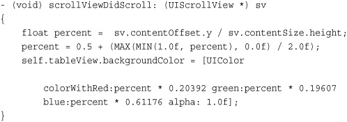
Here are a few things to note about background color updates. First, if you don’t enable bouncing (i.e., allowing the table to bounce past the content edges and then move back), decrease the divisor by the height of the table. Second, make sure you set your initial colors when setting up your table. Otherwise, the color will “jump” the first time the user touches the table. Finally, although this approach is not computationally overwhelming, it does require constant screen updates and should be avoided for processor-heavy applications.
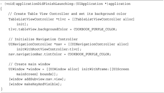
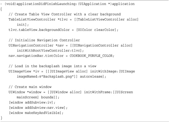
Recipe: Creating a Table Image Backsplash
Recipe 11-3 expands the background color idea presented in Recipe 11-2 to create a table view with an image backdrop. Instead of coloring the background to a solid hue, this recipe uses a clear color with an alpha level of 0. By adding the backdrop to the application window before adding the table view, the image bleeds through the table, as shown in Figure 11-2.
Recipe 11-3 Scrolling a Table over a Static Image
Get This Recipe’s Code
To get the code used for this recipe, go to http://github.com/erica/iphone-3.0-cookbook-, or if you’ve downloaded the disk image containing all of the sample code from the book, go to the folder for Chapter 11 and open the project for this recipe.
Figure 11-2 Combine a clear table background color with a backsplash to create a table that scrolls over an image.

The table scrolls over the image, which remains static behind it. Keep the imagery relevant (for example, a corporate logo) and desaturated or otherwise lightened enough that it will not interfere with the table’s text presentation. Use a text color that contrasts well with the background image.
Recipe: Exploring Cell Types
The iPhone offers four kinds of base table view cells. These types, which are shown in Figure 11-3, provide basic utilitarian cell implementations. Each of these cell styles is new to the 3.0 SDK (although the default style was used in 2.x, it has a new style name constant) and represents a new way of creating and interacting with table cells.
Figure 11-3 Cocoa Touch provides four standard cell types, some of which support optional images.
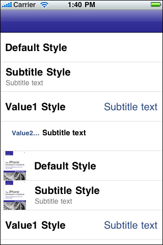
Before 3.0, you assigned a cell’s text directly. Now cells provide both a textLabel and a detailTextLabel property, which offer access to the labels themselves. With direct label access, you can set each label’s text traits as desired. Here is a round-up of the four new styles:
• UITableViewCellStyleDefault—This cell offers a single left-aligned text label and an optional image. When images are used, the label is pushed to the right, decreasing the amount of space available for text. You can access and modify the detailTextLabel, but it is not shown onscreen.
• UITableViewCellStyleSubtitle—This cell, which is used in the iPod application, pushes the standard text label up a bit to make way for the smaller detail label beneath it. The detail label displays in gray. Like the default cell, the subtitle cell offers an optional image.
• UITableViewCellStyleValue1—This cell style, seen in the Settings application, offers a large black primary label on the left side of the cell and a slightly smaller, blue subtitle detail label to its right. This cell does not support images.
• UITableViewCellStyleValue2—The Phone/Contacts application uses this kind of cell, which consists of a small blue primary label on the left and a small black subtitle detail label to its right. The small width of the primary label means that most text will be cut off by an ellipsis. This cell does not support images.
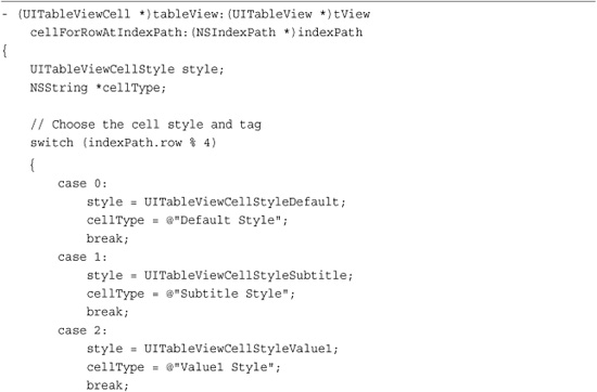
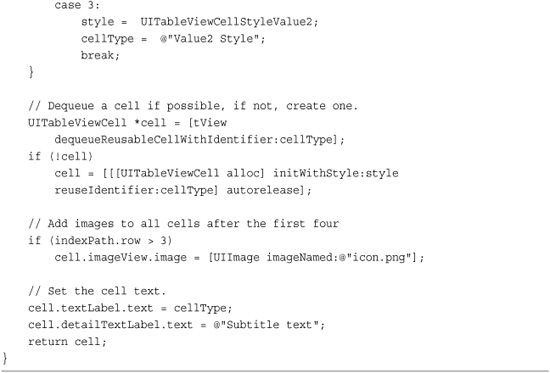
Recipe 11-4 shows the code that created the cells of Figure 11-3. It labels each cell with the type in use and uses that same text as the reuse identifier. Images are added to all cells past the first four, demonstrating that only the default and subtitle presentations support image display.
Recipe 11-4 Creating Various Table Cell Styles
Get This Recipe’s Code
To get the code used for this recipe, go to http://github.com/erica/iphone-3.0-cookbook-, or if you’ve downloaded the disk image containing all of the sample code from the book, go to the folder for Chapter 11 and open the project for this recipe.
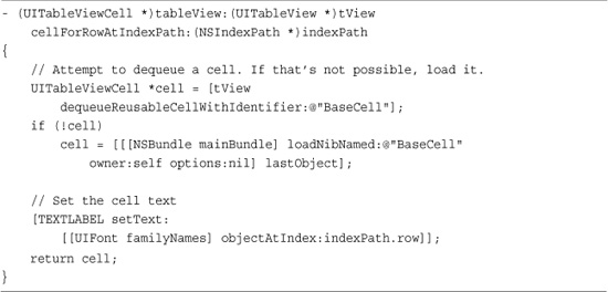
Recipe: Building Custom Cells in Interface Builder
Interface Builder makes it easy to create custom UITableViewCell instances without subclassing. You can build your cells directly in IB and load them in your code, which is exactly what Recipe 11-5 does. The big problem about using IB is that your custom elements are going to get covered by any cell content, as demonstrated by Figure 11-4. You may be aiming for the layout in the left image, but you usually end up with the layout in the right.
Recipe 11-5 Using Custom Cells Built in Interface Builder
Get This Recipe’s Code
To get the code used for this recipe, go to http://github.com/erica/iphone-3.0-cookbook-, or if you’ve downloaded the disk image containing all of the sample code from the book, go to the folder for Chapter 11 and open the project for this recipe.
Figure 11-4 When working with cells created in Interface Builder, custom art, like that shown on the left, gets covered over by built-in cell content as shown on the right.
That’s because assigning a cell’s label’s properties cause the cell to create that label view (plus any other necessary supporting views for that label) after the Interface Builder cell has been loaded. Those extra views are placed on top of the cell, hiding your custom art or any other IB elements you’ve placed into the cell.
You might consider iterating through a cell’s subviews, setting their background color to clear, but Apple frowns on view spelunking. There’s a simple, SDK-friendly way to work around this. Figure 11-5 (top) shows a basic UITableViewCell in Interface Builder, and Figure 11-5 (middle) shows that same cell overlaid with the custom art from this recipe. This is the content that the cell needs to present without being covered over like Figure 11-4.
Figure 11-5 The top image shows a default cell created in Interface Builder without any content. The middle image shows that same cell after adding custom art to the cell. Adding a custom text label (bottom image) helps create a properly labeled cell like the one shown in Figure 11-4 (left).
The trick to preserving the cell art is to avoid using the cell’s built-in label and detailLabel properties. Instead, add a custom label (as shown in Figure 11-5, bottom) and use that label instead of the built-in ones. The label view is tagged (in this case with 101) and recovered from the cell by using that tagging. You can set the tag in Interface Builder’s attributes inspector. The following macro uses that tag to access the custom label.
#define TEXTLABEL ((UILabel *)[cell viewWithTag:101])
When you need to use more than one label, for example for a subtitle, add another in Interface Builder and tag it with a different number.
Tables built with this approach are fully compliant with all table features. As Figure 11-6 shows, you can use standard editing with custom cells, and they will update, indent, and otherwise behave like any other table cells. If the label and image provided don’t fit your purpose, build your own views and add them as cell subviews.
Figure 11-6 Cells built with custom labels in Interface Builder remain able to work with all standard editing tasks including shifting to accommodate the display of delete and delete confirmation buttons.
Tips for Creating Custom Cells
When building custom table view cells in Interface Builder, keep the following tips in mind:
• Create the new xib by choosing File > New File > User Interface > Empty XIB in Xcode. Name the file meaningfully, for example, BaseCell.xib, and save it.
• Open the empty xib file in Interface Builder and drag a UITableViewCell into your project window.
• Customize the cell contents by adding art and other interface items. Be aware that text-editing based classes such as UITextField and UITextView do not work well in table view cells unless you take special care.
• When adding custom items, try to clear enough space (about 40 pixels) on the right side of the cell to allow the cell to shift right when entering edit mode. Otherwise, those items will be cut off.
• Set the reuse identifier (e.g., “BaseCell”), in the cell’s attributes inspector (Command-1). The identifier field lies near the top of the inspector.
• You can set the cell’s image and selected image using the inspector, but in real life, these are usually generated based on live data. You’ll probably want to handle any image setting (via the image and selectedImage properties) in code. Make sure that the images you send are properly sized. See the recipes about creating thumbnail versions of images in Chapter 7, “Working with Images.”
• You cannot pick a cell style in Interface Builder, and you cannot change a cell style once you’ve loaded the nib. If you need to use a cell style other than the default, build your cell in code.
• Use any cell height you need and then set the table’s rowHeight property to match.
• Although Interface Builder offers a separator option in the cell’s attributes inspector, you’ll want to use the table view’s separatorStyle and separatorColor properties instead.
Adding in Custom Selection Traits
When users select cells, Cocoa Touch provides you several ways to emphasize the cell’s selection. Customize a cell’s selection behavior by updating any of three traits. You can change the image it shows, the color of its font, and the cell’s background. These are set via the selectedImage, selectedTextColor, and selectedBackgroundView properties.
The selected image replaces any image you have added to a cell (via the image property, as shown in Recipe 11-4) when the user selects the cell. The selected version should use the same size as the original so the cell layout remains stable. For example, you might want to replace an “empty” image, that is, a spaceholder, with an arrow, chevron, or finger pointing into the cell that has been selected.
The selected text color property is officially deprecated despite the fact that it is still used in Interface Builder. The Apple documents suggest using the new textLabel property but do not provide an easy way to hook into that object for selection/deselection updates. Until Apple addresses the issue, you can use the workaround shown in the following snippet, which avoids compile-time deprecation warnings:
The selectedBackgroundView property works exactly as you’d want the regular backgroundView property to work but does not (refer to Figure 11-4). When a cell is selected, the selected background appears behind the text, providing a perfect blend between art and text.
Recipe: Alternating Cell Colors
Although blue and white cell alternation is a common and highly requested table feature, Apple did not include that option in its iPhone SDK. The custom cell techniques shown previously in Recipe 11-5 let you import a cell designed in Interface Builder. Recipe 11-6 builds the alternating white/blue cell structure shown in Figure 11-7 by working with not one but two custom cell xibs.
Recipe 11-6 Building a Table with Alternately Colored Cells
Get This Recipe’s Code
To get the code used for this recipe, go to http://github.com/erica/iphone-3.0-cookbook-, or if you’ve downloaded the disk image containing all of the sample code from the book, go to the folder for Chapter 11 and open the project for this recipe.
Figure 11-7 Use custom cells to create alternating blue and white cells.
A simple even/odd check (row % 2) specifies whether to load a blue or white cell. Because this table uses just one section, it simplifies the math considerably. Blue/white alternating cells work best for nongrouped, nonsectioned tables both visually and programmatically.
Notice how this recipe uses cell identifiers to reuse already loaded cells as needed. The xibs use the same identifiers as their filenames, considerably simplifying this code. New blue or white cells are not created if existing ones can be consumed from the reuse queue.
Be aware that although this cell style works with edits, both deletion and reordering, you’ll want to reload the table after each user change to keep the blue/white/blue/white ordering. As the user drags an item into place, it will retain its original coloring, possibly causing a visual discontinuity until the edit finishes. For reordering, issue that reload command using a delayed selector of at least a quarter to half a second.
Recipe: Building a Custom Cell with Built-In Controls
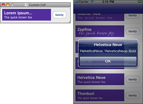
When using Interface Builder to design a custom cell, you’re not limited to background art and labels. It’s easy enough to add buttons or other controls that act in cell-native ways. Recipe 11-7 manages the cells shown in Figure 11-8. These cells include a main text label, which is used to display a font name; a subtitle label, which presents a standard phrase using that font; and a family button that displays a list of all members of a given font family via an alert.
Recipe 11-7 Creating an Embedded Cell Control Callback
Get This Recipe’s Code
To get the code used for this recipe, go to http://github.com/erica/iphone-3.0-cookbook-, or if you’ve downloaded the disk image containing all of the sample code from the book, go to the folder for Chapter 11 and open the project for this recipe.
Figure 11-8 The button added in Interface Builder for this custom cell (top) launches an alert with a list of font families (bottom). Each button is tied to its own cell and works whether or not the cell is selected.
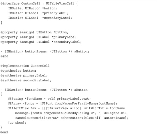
Rather than use a custom UITableViewCell as Recipe 11-6 did, Recipe 11-7 creates a subclass. CustomCell introduces three outlets. These include the button and the two labels. And it adds an action, buttonPress:, which is called for touch-up-inside events. The connections between the IBOutlets, IBAction, and their targets are all made directly in Interface Builder.
To make this recipe work, you must create a UITableViewCell instance. Import the class header for CustomCell (select File > Read Class Files) and then use the Identity Inspector (Tools > Identity Inspector, Command-4) to change that instance’s class from UITableViewCell to CustomCell. Once that’s done, you can wire up the outlets and button callback connections using Interface Builder’s drag-to-connect features.
Recipe: Remembering Control State for Custom Cells
Cells have no “memory” to speak of. They do not know how an application last used them. They are views and nothing more. That means if you reuse cells without tying those cells to some sort of data model, you can end up with unexpected and unintentional results. This is a natural consequence of the Model-View-Controller design paradigm.
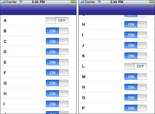
Consider the following scenario. Say you created a series of cells each of which owned a toggle switch. Users can interact with that switch and change its value. A cell that scrolls offscreen, landing on the reuse queue, could therefore show an already-toggled state for a table element that user hasn’t yet touched.
Figure 11-9 demonstrates this problem. The cell used for Item A was reused for Item L, presenting an OFF setting, even though the user has never interacted with Item L. It’s the cell that retains the setting, not the logical item. Don’t depend on cells to retain state that way.
Figure 11-9 The cell used to present Item A (left) is reused to present Item L (right) while retaining its previous switch setting.
To fix this problem, check your cell state against a stored model. This keeps the view consistent with your application semantics. Recipe 11-8 uses a custom dictionary to associate cell state with the cell item. There are other ways to approach this problem, but this simple example provides a taste of the model/view balance needed by a data source whose views present state information.
Recipe 11-8 Using Stored State to Refresh a Reused Table Cell
Get This Recipe’s Code
To get the code used for this recipe, go to http://github.com/erica/iphone-3.0-cookbook-, or if you’ve downloaded the disk image containing all of the sample code from the book, go to the folder for Chapter 11 and open the project for this recipe.
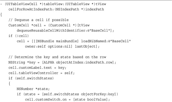
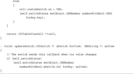
Since the state is stored in the table view controller, each cell needs to be able to “call home” so to speak when its switch updates its state. The custom tableViewController property that is set here provides that back link, and the customSwitch property accesses the current user-set state.
Visualizing Cell Reuse
Recipe 11-8 helps fix problems with cell/model discrepancies. The following code snippet visualizes exactly how your cells are getting reused. This implementation tags each new cell on creation, letting you track how each cell is used and reused in the lifetime of a very large table. In this case, the table is about a million items long. I encourage you to test this snippet out (a full version is included in the sample code for this book) and energetically scroll through the list in both directions. You’ll see that with a jerky enough interaction style you can really mix up your cell ordering. You’ll also discover that even for a million item table, you’ll max out at about 11 table cells total.
Each cell implements the prepareForReuse method, which is invoked before a cell can be returned from the table view’s dequeue request. You can subclass UITableViewCell and override this method to reset content before reusing a cell.
Recipe: Creating Checked Table Cells
Accessory views expand normal UITableViewCell functionality. The most common accessories are the Delete buttons and drag bars for reordering, but you can also add check marks to create interactive one-of-n or n-of-n selections. With these kinds of selections, you can ask your users to pick what they want to have for dinner or choose which items they want to update. This kind of radio button/check box behavior provides a richness of table interaction. Recipe 11-9 demonstrates how to create this kind of table.
Recipe 11-9 Using Accessory Check Marks with Cells

Get This Recipe’s Code
To get the code used for this recipe, go to http://github.com/erica/iphone-3.0-cookbook-, or if you’ve downloaded the disk image containing all of the sample code from the book, go to the folder for Chapter 11 and open the project for this recipe.
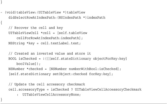
Figure 11-10 shows checks in an interface, a standard UITableView with accessorized cells. Check marks appear next to selected items. When tapped, the checks toggle on or off. Like Recipe 11-8, this recipe uses a shared dictionary to track which logical items are checked, avoiding inconsistency issues that arise from cell reuse.
Figure 11-10 Check mark accessories offer a convenient way of making one-of-n or n-of-n selections from a list.
Checked items use the UITableViewCellAccessoryCheckmark accessory type. Unchecked items use the UITableViewCellAccessoryNone variation. You set these by assigning the cell’s accessoryType property.
Note that it’s the cell that’s being checked here, not the logical item associated with the cell (although that logical item’s value is updated in the shared stateDictionary). Reused cells remain checked or unchecked at next use so you must always set the accessory to match the state dictionary when dequeuing a cell. Recipe 11-8 discussed preserving cell state.
Recipe: Removing Selection Highlights from Cells
There are times when working with tables that you need to avoid retaining a cell state. This happens when you want users to be able to interact with the table and touch cells, but you don’t want to maintain that selected state after the user has finished the interaction. Cocoa Touch offers two approaches for tables that need to deny persistent cell selection.
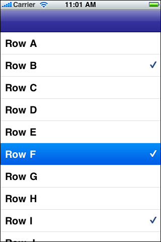
For the first approach you can set a cell’s selectionStyle property to UITableViewCellSelectionStyleNone. This disables the blue or gray overlays that display on the selected cell, like the one shown in Figure 11-10 for Row F. The cell is still selected but will not highlight on selection in any way. If selecting your cell produces some kind of side effect other than presenting information, this is not the best way to approach things. Instead, consider the following.
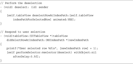
The second approach allows the cell to highlight but removes that highlight after the interaction completes. You do that by telling the table to deselect the cell in question. In Recipe 11-10, each user selection triggers a delayed deselection (the custom deselect: method defined in the recipe) after a half a second. This method calls the table view’s deselectRowAtIndexPath:animated: method, which fades away the current selection. Using this approach offers both the highlight that confirms a user action and the state-free display that hides any current selection from the user.
Recipe 11-10 Deselecting a Table Row
Get This Recipe’s Code
To get the code used for this recipe, go to http://github.com/erica/iphone-3.0-cookbook-, or if you’ve downloaded the disk image containing all of the sample code from the book, go to the folder for Chapter 11 and open the project for this recipe.
Recipe: Working with Disclosure Accessories
Disclosures refer to those small, blue or gray, right-facing chevrons found on the right of table cells. Disclosures help you to link from a cell to a view that supports that cell. In the Contacts list and Calendar applications, these chevrons connect to screens that help you to customize contact information and set appointments. Figure 11-11 shows a table view example where each cell displays a disclosure control, showing the two available types.
Figure 11-11 The right-pointing chevrons indicate disclosure controls, allowing you to link individual table items to another view.
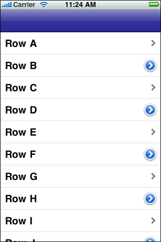
The blue and gray chevrons have two roles. The blue UITableViewCellAccessoryDetailDisclosureButton versions are actual buttons. They respond to touches and are supposed to indicate that the button leads to a full interactive detail view. The gray UITableViewCellAccessoryDisclosureIndicator does not track touches and should lead your users to a further options view, specifically options about that choice.
You see these two accessories in play in the Settings application. In the Wi-Fi Networks screen, the detail disclosures lead to specific details about each WiFi network: its IP address, subnet mask, router, DNS and so forth. The disclosure indicator for “Other” enables you to add a new network by scrolling up a screen for entering network information. A new network then appears with its own detail disclosure.
You also find disclosure indicators whenever one screen leads to a related submenu. When working with submenus, stick to the simple gray chevron. The rule of thumb is this: Submenus use gray chevrons, and object customization uses blue ones. Respond to cell selection for gray chevrons and to accessory button taps for blue chevrons.
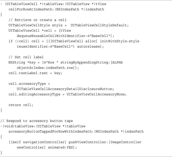
Recipe 11-11 demonstrates how to use disclosure buttons (the blue accessories) in your applications. This code sets the accessoryType for each cell to UITableViewCellAccessoryDetailDisclosureButton. Importantly, it also sets editingAccessoryType to UITableViewCellAccessoryNone. When your delete or reorder controls appear, your disclosure chevron will hide, enabling your users full control over their edits without accidentally popping over to a new view.
Recipe 11-11 Working with Disclosure Buttons to Push New “Detail” Views
Get This Recipe’s Code
To get the code used for this recipe, go to http://github.com/erica/iphone-3.0-cookbook-, or if you’ve downloaded the disk image containing all of the sample code from the book, go to the folder for Chapter 11 and open the project for this recipe.
To handle user taps on the disclosure, the tableView:accessoryButtonTappedForRowWithIndexPath: method enables you to determine the row that was tapped and implement some appropriate response. This sample merely pushes a new UIViewController that displays a stock image. In real life, you’d move to a view that explains more about the selected item and enables you to choose from additional options.
Gray disclosures use a different approach. As these accessories are not buttons, they respond to cell selection rather than the accessory button tap. Add your logic to tableView:didSelectRowAtIndexPath: to push the disclosure view onto your navigation stack or by presenting a modal view controller.
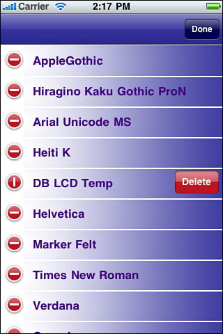
Recipe: Deleting Cells
In day-to-day use, every iPhone user quickly becomes familiar with the small, red circles that let them delete cells from tables. Many users also pick up on basic swipe-to-delete functionality. Interactive deletion represents one of the iPhone’s best-designed features. Recipe 11-12 introduces a table that responds meaningfully to cell deletion. In this sample, users may create new cells by tapping an Add button and may remove cells either by swiping or entering edit mode and using the red remove controls (see Figure 11-12).
Recipe 11-12 Deleting Cells On-the-Fly
Get This Recipe’s Code
To get the code used for this recipe, go to http://github.com/erica/iphone-3.0-cookbook-, or if you’ve downloaded the disk image containing all of the sample code from the book, go to the folder for Chapter 11 and open the project for this recipe.
Figure 11-12 Red remove controls allow your users to interactively delete items from a table.
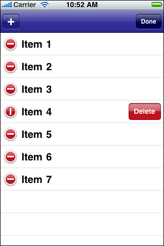
Displaying Remove Controls
The 3.0 SDK makes it especially easy to implement remove controls used in your program. When you want to edit cells, call [self.tableView setEditing:YES animated:YES]. This call updates the table’s editing property and displays the remove controls shown in Figure 11-12.
Whenever possible, add animations to your iPhone user interfaces to lead your users from one state to the next, so they’re prepared for the mode changes that happen onscreen. In the uncommon case you have some reason you’d rather not animate the change, you can pass NO instead of YES.
Recipe 11-12 uses a single method called enterEditMode. When a user taps the navigation bar’s Edit button, the application calls this method. It removes the current item selection, calls the setBarButtonItems method that swaps out the title from Edit to Done, and enables the table’s editing property.
Dismissing Remove Controls
When users complete their edits and want to return to normal table display, proceed in reverse. Dismiss the controls ([self.tableView setEditing:NO animated:YES]) and update the navigation bar button items back to their original state. Recipe 11-12 checks whether any items remain, hiding the Edit button if none do.
Handling Delete Requests
On row deletion, the table communicates with your application by issuing a tableView:commitEditingStyle:forRowAtIndexPath: callback. A table delete removes an item from the visual table but does not alter the underlying data. Unless you manage the item removal from your data source, the “deleted” item will reappear on the next table refresh. This method offers the place for you to update your data source and respond to the row deletion that the user just performed.
Here is where you actually delete the item from the data structure that supplies the data source methods (in this recipe, through an NSMutableArray of item titles) and handle any real-world action such as deleting files that occur as a consequence. In this sample code, the cell goes away, but there’s no real-world consequence for the deletion. The sample is not based on a real-life model. Instead, the title list just loses that particular numbered cell title.
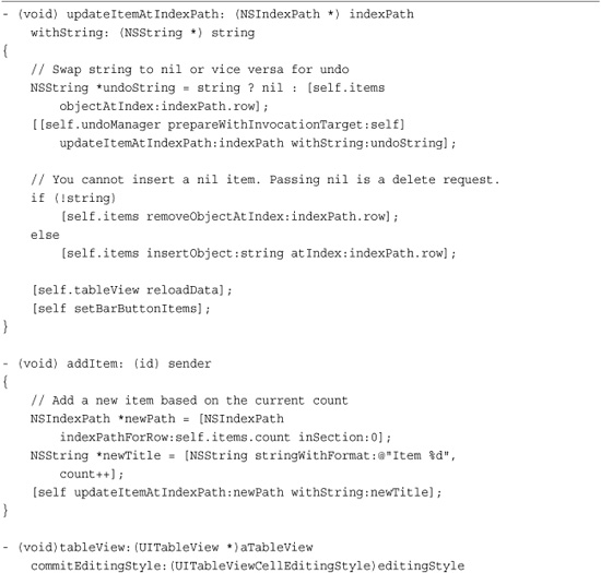
Notice that both adding and deleting items are handled by the same method, updateItemAtIndexPath:withString:. This may seem like an odd way to handle requests, as it involves an extra method and extra steps. This approach provides a foundation for undo support, which is discussed in Recipe 11-14. Using the NSUndoManager with a single update method provides unified undo and redo support for these two operations.
Swiping Cells
Swiping provides a clean method for removing items from your UITableView instances. You don’t have to do anything to enable swipes. The table takes care of everything, so long as you provide the commit editing style method.
To swipe, users drag swiftly from the left to the right side of the cell. The rectangular delete confirmation appears to the right of the cell, but the cells do not display the round remove controls on the left.
After users swipe and confirm, the tableView:commitEditingStyle:forRowAtIndexPath: method handles data updates just as if the deletion had occurred in edit mode.
Adding Cells
Recipe 11-12 introduces an add button using the system bar button item that displays as a plus sign. (See the top-left corner of Figure 11-12.) This button lets users add new table cells. To accomplish this, an addItem: method appends a new cell title at the end of the items array and then tells the table to update the data source using reloadData. This lets the normal table mechanism check the data and re-create the table view using the updated data source.
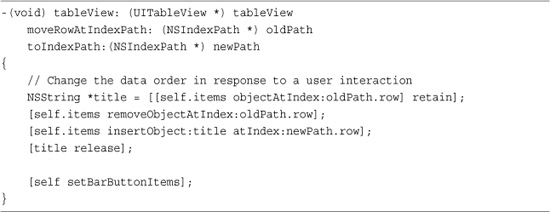
Recipe: Reordering Cells
You empower your users when you allow them to directly reorder the cells of a table. Figure 11-13 shows a table displaying the reorder control’s stacked gray lines. Users can apply this interaction to sort to-do items by priority or choose which songs should go first in a playlist. The iPhone ships with built-in table reordering support that’s easy to add to your applications. Recipe 11-13 shows how. Just add a single table delegate method.
Figure 11-13 Reorder controls appear at the right of each cell during edit mode. They appear as three stacked gray lines. This screen shot shows Item 1 being dragged into place below Item 5.
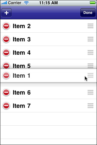
Recipe 11-13 Reordering Table Cells
Get This Recipe’s Code
To get the code used for this recipe, go to http://github.com/erica/iphone-3.0-cookbook-, or if you’ve downloaded the disk image containing all of the sample code from the book, go to the folder for Chapter 11 and open the project for this recipe.
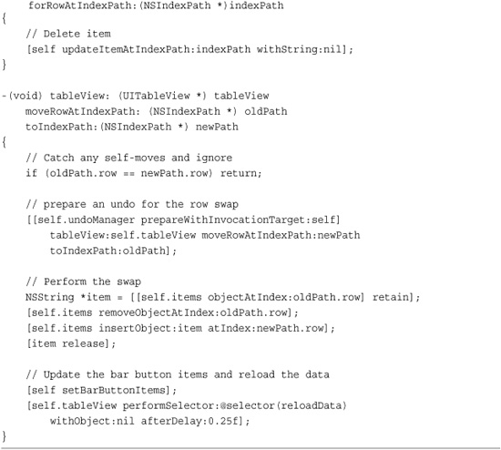
It’s important that your internal data model match the changes your user makes to the view. Implement the tableView:moveRowAtIndexPath:toIndexPath method to synchronize your data source with the onscreen changes, as you do when committing edits for cell deletion. This data source method provides the opportunity to update your data source. For this example, move the object corresponding to the cell’s title to an updated location in the items mutable array.
To enable cell reordering, you must include this method in some form. When this method is not found, the table does not show the reorder handles when entering edit mode.
Recipe: Adding Undo Support to a Table
As introduced in Chapter 8, “Gestures and Touches,” the NSUndoManager class provides undo and redo support for Cocoa Touch objects. Working with tables uses the same basic approach. You start by creating and initializing an undo manager for the table view controller.
self.undoManager = [[[NSUndoManager alloc] init] autorelease];
[self.undoManager setLevelsOfUndo:999];
Use common sense when setting the levels of undo. Recall that each undo retains the objects that are supplied as arguments. If you’re working with small strings, as in this example, feel free to use a very high number. The memory overhead is minimal. When working with larger objects, limit your levels further. Three or ten undo levels, or some other small number, may be plenty for your needs.
Supporting Shake-to-Edit
If you plan to support shake-to-edit undo, declare that in your application delegate or in your view controller.
[[UIApplication sharedApplication]
setApplicationSupportsShakeToEdit:YES];
You will also have to provide a way for your controller to assume first responder status whenever it appears onscreen. The following methods support this behavior.
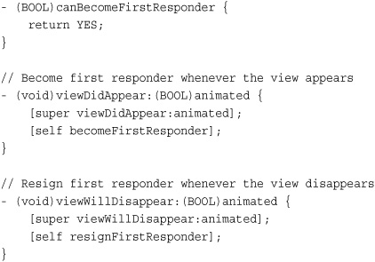
Should you use shake-to-edit with tables? Recall that each use requires the user to remember that the feature exists, which many users are not trained to use. Then, they must shake the phone, wait for an alert to appear, and select an item. That’s a lot of effort, and when dealing with multiple undos or redos at a time, possibly a deal killer. Displaying Undo and Redo buttons onscreen, as Recipe 11-14 does, can minimize user dissatisfaction and provide an obvious way to move forward and back through an edit history.
Recipe 11-14 Preparing Undo Items for Table Operations
Get This Recipe’s Code
To get the code used for this recipe, go to http://github.com/erica/iphone-3.0-cookbook-, or if you’ve downloaded the disk image containing all of the sample code from the book, go to the folder for Chapter 11 and open the project for this recipe.
Adding Undo and Redo Buttons
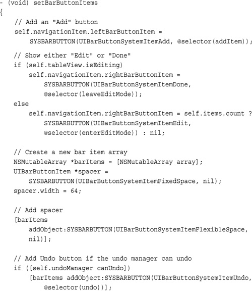
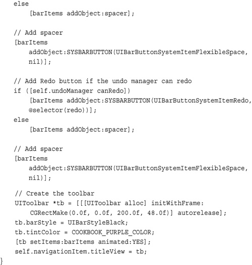
Cocoa touch provides two system bar button items for Undo and Redo support. The following code adapts the setBarButtonItems method from Recipe 11-12 and adds a custom toolbar to the navigation bar. The Undo and Redo buttons only show when the undo manager can support those actions. The bar is padded with flexible spacers at each end, and a fixed space item takes the place of each button when the undo/redo actions are not available.
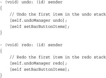
Performing Undo and Redo
The actual undo and redo commands are trivial. The core work for providing table-based undo support resides in preparing the undo manager, and not, as you see, in executing the commands. Chapter 19, “A Taste of Core Data,” offers another, simpler approach to undo/redo management.
Preparing Table Undo Operations
Recipe 11-14 shows the four critical methods that provide undo support for table operations. These include the methods that handle add and delete operations and the unified item update method that they call, plus the method that handles reorder operations.
As mentioned earlier in this chapter, the utility of providing a secondary method for add and delete lets those operations work together for undo support. Here, the item update method prepares the undo invocation for adding an item that is about to be deleted or for deleting an item that’s about to be added. This combination creates a single focal point for the undo manager to work with.
The reordering method that moves rows into new paths offers an even easier solution. It swaps the old and new index paths and uses that invocation for the undo manager. There are two caveats about the move operations you need to be aware of.
First, you must check for no-move reordering. The check for oldPath.row == newPath.row ensures that these moves-that-aren’t-really-moves will not be pushed onto the undo stack. When working with normal (non-undo) reordering, this is a step you can ignore because these “non-swaps” provide no effect on the responsiveness of the user interface. When working with undo stacks, they introduce trouble. Users do not know why the undo operation they just requested did not work even though the application did perform an “undo,” by swapping an item with itself. Avoid the confusion and don’t add these items to the undo stack.
Second, table views cannot be reloaded until after a move operation completes. Because the user is responsible for interacting with the cells and pulling them into a new position, you don’t normally need to reload the table from the move method. In fact, doing so usually produces an infinite loop and an inevitable application crash.
When you work with the undo manager, the table still needs some way to update itself to match the updated model. You need to reload that table so the cells reflect the data after the undo operation. Adding a delayed selector, as used in this recipe, lets the move method complete before calling the reload. Doing this lets interactive table reordering complete without crashing and provides a vital way for the table to update after undo and redo calls.
Recipe: Sorting Tables
A table is its data source in every meaningful sense. When you sort the information that powers a table and then reload its data, you end up with a sorted table. Recipe 11-15 introduces a table view controller method that applies sorting on demand.
Recipe 11-15 Sorting a UITableView
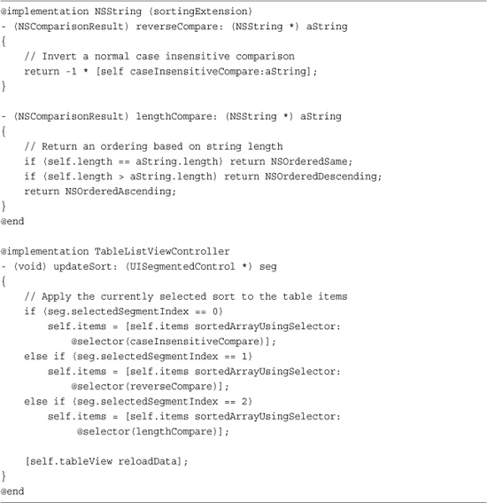
Get This Recipe’s Code
To get the code used for this recipe, go to http://github.com/erica/iphone-3.0-cookbook-, or if you’ve downloaded the disk image containing all of the sample code from the book, go to the folder for Chapter 11 and open the project for this recipe.
The three sorts used in this recipe are ascending alphabetically, descending alphabetically, and by string length. To provide the latter two requires an extension of the NSString class. This simple class category adds a reversed comparison and a string length comparison.
Recipe 11-15 shows only a part of the implementation, demonstrating how the data model responds to the different sort types. As the user taps the segmented control, the items array replaces itself with a version using the selected sort. See Chapter 19 for Core Data approaches that use sorting while fetching results from a persistent data store.
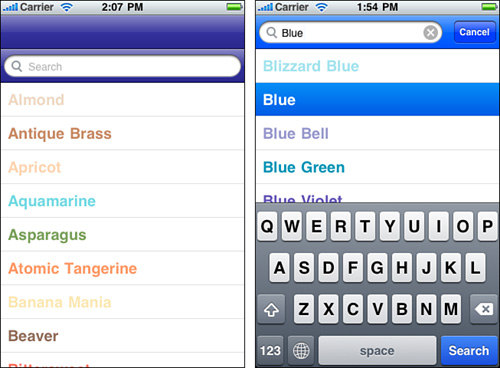
Recipe: Searching Through a Table
New to the 3.0 SDK, built-in search allow users to filter a table’s contents in real time. This searching uses two important classes, the previously existing UISearchBar class and the new UISearchDisplayController class. Together, these mimic the kind of search behavior offered in the Contacts application, where a search bar can be found at the head of the table.
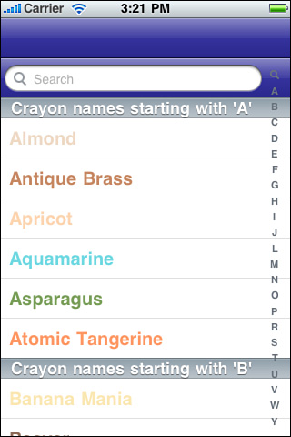
To find the search bar, you must scroll all the way to the top of the table, as shown in Figure 11-14 (left). The search bar does not initially appear in the navigation bar. Once users tap in the search box, the view shifts and the search bar moves up to the navigation bar area, as shown in Figure 11-14 (right). It remains there until the user taps Cancel, returning the user to the unfiltered table display.
Figure 11-14 The user must scroll to the top of the table to initiate a search. The Search bar appears as the first item in the table in its header view. (Left) Once the user taps within the search bar and makes it active, the search bar jumps into the navigation bar and presents a filtered list of items based on the search criteria (Right).
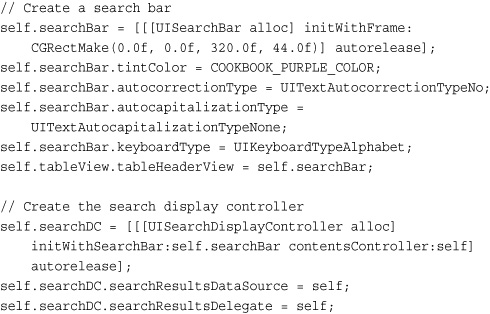
Building the Search Display Controller
Search display controllers help manage the display of data owned by another controller, in this case a standard UITableViewController. The search display controller presents a subset of that data, usually by filtering that data source through a predicate.
Initialize a search display controller by providing it with a search bar and a contents controller. As you can see here, the search display controller uses a standard search bar, which is created programmatically in the following snippet. Pass the main UITableViewController instance you’re defining these items within as the contents controller.
Set up the search bar’s text trait features as you would normally do but do not set a delegate. The search bar works with the search display controller without explicit delegation on your part.
When setting up the search display controller, make sure you set both its search results data source and delegate as shown here. These point back to the primary table view controller subclass, which is where you’ll adjust your normal data source and delegate methods to comply with the searchable table.
Building the Searchable Data Source Methods
The number of items displayed in the table changes as users search. You must report the correct number of rows for each. To detect whether the table view controller or the search display controller is currently in charge, compare the table view parameter against the built-in tableView property. If it is the same, you’re dealing with the normal table view. If it differs, that means the search display controller is in charge and is using its own table view. Adjust the row count accordingly.
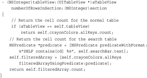
Use a predicate to report the count of items that match the text in the search box. Predicates provide an extremely simple way to filter an array and return only those items that match a search string. The predicate used here performs a case insensitive contains match. Each string that contains the text in the search field returns a positive match, allowing that string to remain part of the filtered array. Alternatively, you might want to use beginswith to avoid matching items that do not start with that text.
Predicates go well beyond the simple string matching shown here. You can use them with all kinds of complex objects including Core Data objects to provide sophisticated filtering for your table displays.
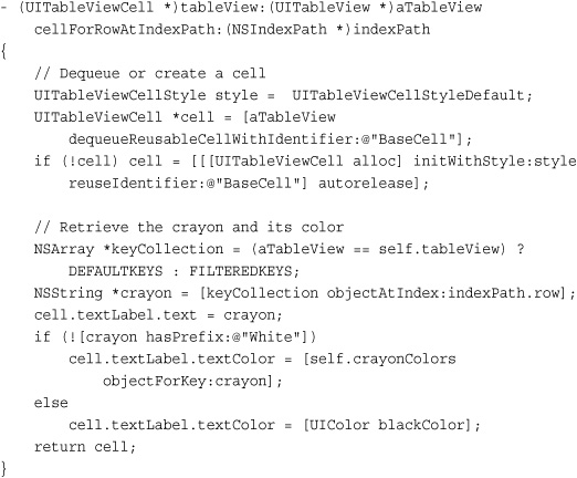
Filtering goes beyond row count reporting. You need to filter source data to populate and return cell instances. The following method again checks the current table view to return cells that match either the default keys or the filtered set.
Delegate Methods
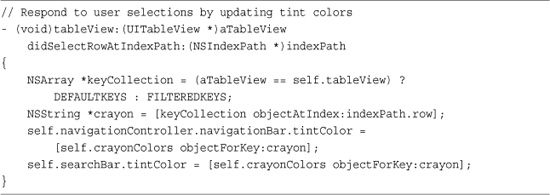
Search awareness is not limited to data sources. As Recipe 11-16 shows, determining the context of a user tap is critical for providing the correct response in delegate methods. As with the previous data source methods, this delegate method compares the table view parameter sent with the callback to the built-in parameter. Based on this result, it chooses how to act, which in this case involves coloring both the search bar and the navigation bar with the currently selected color.
Recipe 11-16 Comparing Table Views to Produce the Correct Responses to User Input
Get This Recipe’s Code
To get the code used for this recipe, go to http://github.com/erica/iphone-3.0-cookbook-, or if you’ve downloaded the disk image containing all of the sample code from the book, go to the folder for Chapter 11 and open the project for this recipe.
Recipe: Working with Sections
Many iPhone applications use sections as well as rows. Sections provide another level of structure to lists, grouping items together into logical units. The most commonly used section scheme is the alphabet, although you are certainly not limited to organizing your data this way. You can use any section scheme that makes sense for your application.
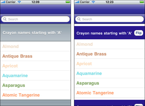
Figure 11-15 shows a table that uses sections to display grouped names. Each section presents a separate header (i.e., “Crayon names starting with...”), and an index on the right offers quick access to each of the sections. Notice that there are no sections listed for K, Q, X, and Z in that index. This recipe eliminates empty sections from the index.
Figure 11-15 Sectioned tables let you present both headers and an index to better find information as quickly as possible.
Creating a Section-Based Data Structure
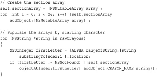
When working with groups and sections, think two dimensionally. Section arrays let you store and access the members of data in a section-by-section structure. Implement this approach by creating an array of arrays. The section array stores one array for each section, which in turn contains the titles for each cell. This snippet creates the section arrays and then populates them by looking at the location of each item’s first letter within the alphabet.
To work, this particular implementation relies on two things: first, that the words are already sorted—each subsection adds the words in the order they’re found in the array; and second, that the sections match the words. Entries that start with punctuation or numbers won’t work with this loop. You can trivially add an “other” section to take care of these cases, which this (simple) sample omits.
Although, as mentioned, alphabetic sections are useful and probably the most common grouping, you can use any kind of grouping structure you like. For example, you might group people by departments, gems by grades, or appointments by date. No matter what kind of grouping you choose, an array of arrays provides the table view data source that best matches sectioned tables.
Counting Sections and Rows
Sectioned tables require customizing two key data source methods:
• numberOfSectionsInTableView—This method specifies how many sections appear in your table, establishing the number of groups to display. When using a section array, as recommended here, return the number of items in the section array—that is, self.sectionArray.count. If the number of items is known in advance (26 in this case), you can hard code that amount.
• tableView:numberOfRowsInSection—This method is called with a section number. Specify how many rows appear in that section. With the recommended data structure, just return the count of items at the nth subarray:
[[self.sectionArray objectAtIndex: sectionNumber] count].
Notice that these methods extend the searchable table introduced in Recipe 11-16. As Figure 11-14 shows, sectioned tables and their indices are compatible with searching. The small search icon at the top of the index brings users back to the search bar at the top of the table. In this example, the search results are flat—that is, not sectioned—which is why the number of sections result returns 1 instead of 26.
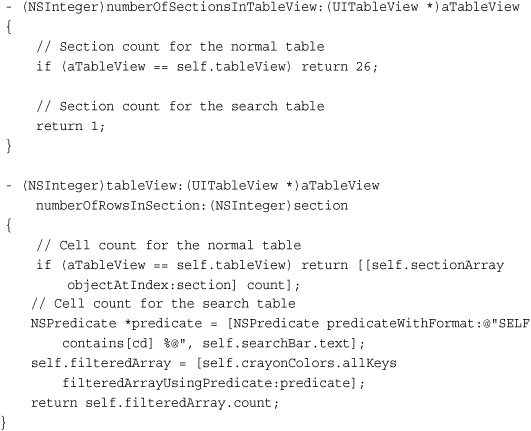
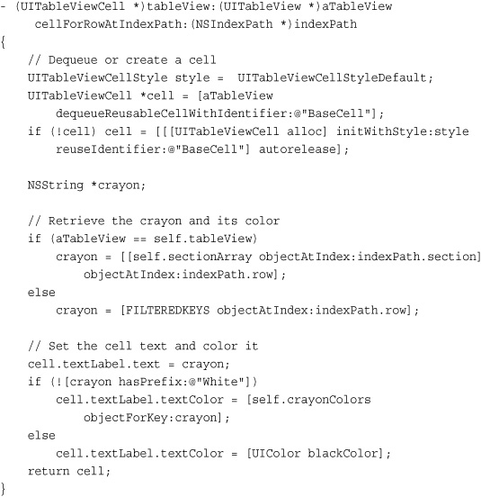
Returning Cells
Sectioned tables use both row and section information to find cell data. Earlier recipes in this chapter used a flat array with a row number index. Tables with sections must use the entire index path to locate both the section and row index for the data populating a cell.
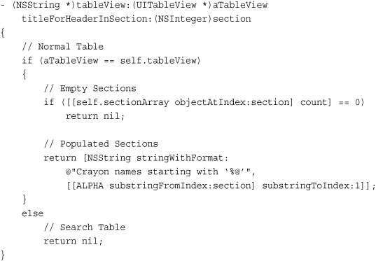
Creating Header Titles
It takes very little work to add section headers to your grouped table. The optional tableView:titleForHeaderInSection: method supplies the titles for each section. It’s passed an integer. In return, you supply a title. If your table does not contain any items in a given section or when you’re only working with one section (i.e., for the search table), return nil.
Creating a Section Index
Tables that implement sectionIndexTitlesForTableView: present the kind of index view that appears on the right of Figure 11-14. This method is called when the table view is created, and the array that is returned determines what items are displayed onscreen. Return nil to skip an index, as is done here for the search table. Apple recommends only adding section indices to plain table views, that is, table views created using the default plain style of UITableViewStylePlain. See Figure 11-15 for an (mildly unfortunate) example of a grouped table with a section index.
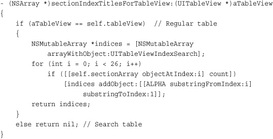
The first item added to this index is the UITableViewIndexSearch constant. This adds the small magnifying glass icon that indicates that the table supports searches and provides a quick jump to the beginning of the list.
Although this example uses single-letter titles, you are certainly not limited to those items. You can use words or, if you’re willing to work out the Unicode equivalents, pictures including emoji items (available to iPhone users in Japan) that are part of the iPhone character library.
[indices addObject:@"ue057"];
Handling Section Mismatches
Indices move users along the table based on the user touch offset. As mentioned earlier in this section, this particular table does not display sections for K, Q, X, and Z. These missing letters can cause a mismatch between a user selection and the results displayed by the table.
To remedy this, implement the optional tableView:sectionForSectionIndexTitle: method. This method’s role is to connect a section index title (i.e., the one returned by the sectionIndexTitlesForTableView: method) with a section number. This overrides any order mismatches and provides an exact one-to-one match between a user index selection and the section displayed.
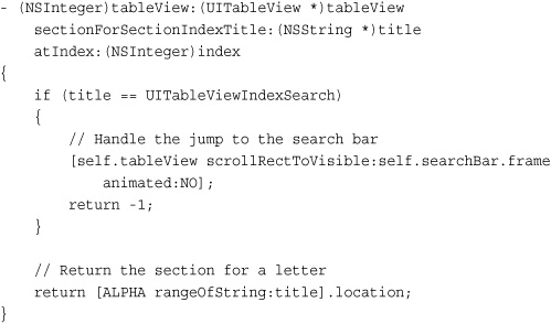
The scrollRectToVisible:animated: call used here manually moves the search bar into place when a user taps on the magnifying glass. Otherwise, users would have to scroll back from section 0, which is the section associated with the letter A.
Delegation with Sections
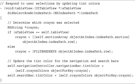
As with data source methods, the trick to implementing delegate methods in a data source table involves using the index path section and row properties. These properties provide the double access needed to find the correct section array and then the item within that array for this example. Recipe 11-17 shows how to update the search and navigation bars by recovering the color associated with a user tap on a section-based table.
Recipe 11-17 Responding to User Touches in a Section-Based Table
Get This Recipe’s Code
To get the code used for this recipe, go to http://github.com/erica/iphone-3.0-cookbook-, or if you’ve downloaded the disk image containing all of the sample code from the book, go to the folder for Chapter 11 and open the project for this recipe.
Recipe: Creating Grouped Tables
On the iPhone, tables come in two formats: grouped tables and plain table lists. You’ve already seen the latter demonstrated. The recipes earlier in this chapter focused on creating them. The Settings application on the iPhone offers grouped lists in action. These lists display on a blue-gray background, and each subsection appears within a slightly rounded rectangle. Figure 11-15 shows the grouped list built by Recipe 11-18.
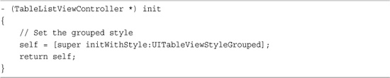
Recipe 11-18 Overriding the Table View Controller’s init Method to Create a Grouped Style
Get This Recipe’s Code
To get the code used for this recipe, go to http://github.com/erica/iphone-3.0-cookbook-, or if you’ve downloaded the disk image containing all of the sample code from the book, go to the folder for Chapter 11 and open the project for this recipe.
To change styles, requires nothing more than initializing the table view controller with a different style. You can do this explicitly when creating a new instance, that is:
myTableViewController = [[UITableViewController alloc]
initWithStyle:UITableViewStyleGrouped];
Or you can use the approach of Recipe 11-18. By overriding the init method, you ensure that new instances of this subclass produce a grouped style table.
Apple recommends against using a section index like the one shown in Figure 11-16 (right). The index crosses over the right side of the grouped cell, creating an unnecessarily cluttered presentation.
Figure 11-16 Grouped tables provide an alternate table presentation to standard table lists (left). Apple recommends against using a section index with grouped tables. As you can see, the index cuts across the cell boundaries (right).

Recipe: Customizing Headers and Footers
Sectioned table views are extremely customizable. You’ve read about using the tableHeaderView property to accommodate a UISearchBar search field. This, and the related tableFooterView property can be assigned to any type of view, each with its own subviews. So you might add in labels, text fields, buttons, and other controls to extend the table’s features.
Headers and footers do not stop with the full table. Each section offers a customizable header and footer view as well. You can alter heights or swap elements out for custom views. In Figure 11-17, the left image uses a larger than normal height, and is created by implementing the optional tableView:heightForHeaderInSection: method. The right-hand image represents the use of custom views. The solid-colored header view, with its label and button subviews, is loaded from a xib file and returned via the optional tableView:viewForHeaderInSection: method. Corresponding methods exist for footers as well as headers.
Figure 11-17 Table view delegate methods allow you to set the height and view of section headers and footers.
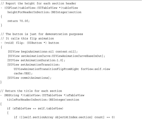
Recipe 11-19 shows these methods in use. The custom header is set at 70 pixels high and is loaded from a xib file. Its label is set and the button connected to a simple flip animation callback. This provides a trivial demonstration of a feature that is intrinsically much more powerful and more extensible than this simple example can express.
Recipe 11-19 Providing Custom Section Header Views
Get This Recipe’s Code
To get the code used for this recipe, go to http://github.com/erica/iphone-3.0-cookbook-, or if you’ve downloaded the disk image containing all of the sample code from the book, go to the folder for Chapter 11 and open the project for this recipe.
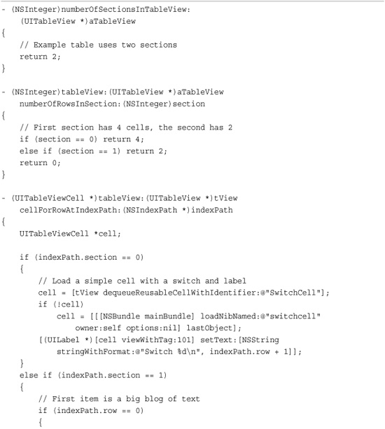
Recipe: Creating a Group Table with Many Cell Types and Heights
If alphabetic section list tables are the M. C. Eschers of the iPhone table world, with each section block precisely fitting into the negative spaces provided by other sections in the list, then freeform group tables are the Marc Chagalls. Every bit is drawn as a freeform handcrafted work of art.
It’s relatively easy to create all the tables you’ve seen so far in this chapter once you’ve mastered the knack. Perfecting the group table (usually called preferences table by iPhone devotees because that’s the kind of table used in the Settings application) remains an illusion. Building group tables is all about the collage. They’re all about handcrafting a look, piece by piece.
Tools like Interface Builder allow you to create any number of custom table cells, each with its own contents and height. It’s up to you to programmatically put all that material together and create a table out of them. You’re responsible for delivering the right kind of cells and for reporting the individual heights for each cell style, and in real-world implementations, responding to cell interaction with a meaningful result.
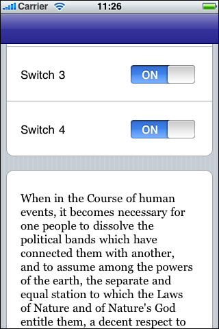
When you’ve got the basics under control, the preferences table becomes a project you can mold and shape. Figure 11-18 shows a simple preferences table that consists of two groups: a series of switches and a block with text (and a subtitle cell that’s currently offscreen). Recipe 11-20 demonstrates the work that goes into providing even such a little creation.
Figure 11-18 Preferences tables must be laid out by hand, with each row and group specified through your data source methods.
Recipe 11-20 Building a Multiheight Complex Grouped Table
Get This Recipe’s Code
To get the code used for this recipe, go to http://github.com/erica/iphone-3.0-cookbook-, or if you’ve downloaded the disk image containing all of the sample code from the book, go to the folder for Chapter 11 and open the project for this recipe.
Unfortunately, adding new items or updating old ones requires a lot of fine detail work. That work isn’t centralized in any way. You must review each of the data source methods and update with your new or refined items.
Creating Grouped Preferences Tables
There’s nothing special involved in terms of laying out a new UITableViewController for a preferences table. You allocate it. You initialize it with the grouped table style. That’s pretty much the end of it. It’s the data source and delegate methods that provide the challenge. Here are the methods you’ll need to define:
• numberOfSectionsInTableView:—All preferences tables contain groups of items. Each group is visually contained in a rounded rectangle. Return the number of groups you’ll be defining as an integer.
• tableView: titleForHeaderInSection:—Add the titles for each section into this optional method. Return an NSString with the requested section name. Recipe 11-20 does not use titles.
• tableView: numberOfRowsInSection:—Each section may contain any number of cells. Have this method return an integer indicating the number of rows (that is, cells) for that group.
• tableView: heightForRowAtIndexPath:—Tables that use flexible row heights cost more in terms of computational intensity. If you need to use variable heights (Recipe 11-20 does so), implement this optional method to specify what those heights will be. Return the value by section and by row.
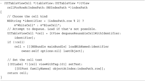
• tableView: cellForRowAtIndexPath:—This is the standard cell-for-row method you’ve seen throughout this chapter. What sets it apart is its implementation. Instead of using one kind of cell, Recipe 11-20 builds different kinds of reusable cells (with different reuse tags) for each cell type. As this recipe shows, things become much more complicated when using several cell types. Make sure you manage your reuse queue carefully. This recipe provides a trivial cell set, but real-world examples can grow more complicated.
• tableView: didSelectRowAtIndexPath:—You provide case-by-case reactions to cell selection in this optional delegate method depending on the cell type selected.
Note
The open-source llamasettings project at Google Code (http://llamasettings.googlecode.com) automatically produces grouped tables from property lists meant for iPhone settings bundles. It allows you to bring settings into your application without forcing your user to leave the app. The project can be freely added to commercial iPhone SDK applications without licensing fees.
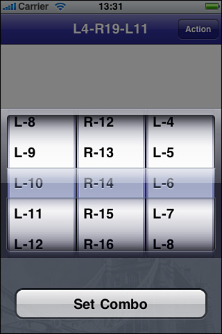
Recipe: Building a Multiwheel Table
Sometimes you’d like your users to pick from long lists or from several lists at once. That’s where UIPickerView instances really excel. UIPickerView objects produce tables offering individually scrolling “wheels,” as shown in Figure 11-19. Users interact with one or more wheels to build their selection.
Figure 11-19 UIPickerView instances enable users to select from independently scrolling wheels.
These tables, although superficially similar to standard UITableView instances, use distinct data and delegate protocols.
• There is no UIPickerViewController class—UIPickerView instances act as subviews to other views. They are not intended to be the central focus of an application view. You can build a UIPickerView instance onto another view like the action sheet shown in Figure 11-18.
• Picker views use numbers not objects—Components, that is to say the wheels, are indexed by numbers and not by NSIndexPath instances. It’s a slightly more informal class than the UITableView.
• The view height for pickers is static—You can’t resize pickers the way you would a standard UITableView just by manipulating its frame. Portrait pickers are 320-by-216 pixels in size; landscape pickers are 480-by-162. Any other frame sizes look distorted or clipped. These are the same dimensions used by the standard iPhone keyboard.
You can supply either titles or views via the data source. Picker views can handle both approaches.
Creating the UIPickerView
Use any frame size for your UIPickerView as long as your height is 216 pixels and your width is 320 pixels (portrait), or your height is 162 pixels and your width is 480 pixels (landscape). That being said, you can float the table wherever you need it on the screen.
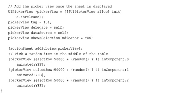
When creating the picker, remember two key points. First, you want to enable the selection indicator. That is the blue bar that floats over the selected items. So set showsSelectionIndicator to YES. If you add the picker in Interface Builder, this is already set as the default.
Second, don’t forget to assign the delegate and data source. Without this support, you cannot add data to the view, define its features, or respond to selection changes. Your primary view controller should implement the UIPickerViewDelegate and UIPickerViewDataSource protocols.
Implement three key data source methods for your UIPickerView to make it function properly at a minimum level. These methods are as follows:
• numberOfComponentsInPickerView—Return an integer, the number of columns.
• pickerView: numberOfRowsInComponent:—Return an integer, the maximum number of rows per wheel. These numbers do not need to be identical. You can have one wheel with many rows and another with very few.
• pickerView:titleForRow:forComponent—This method specifies the text used to label a row on a given component. Return an NSString. (Returning a view instead of a string is covered in the next section.)
In addition to these data source methods, you might want to supply one further delegate method. This method responds to user interactions via wheel selection:
• pickerView:didSelectRow:inComponent—Add any application-specific behavior to this method. If needed, you can query the pickerView to return the selectedRowInComponent: for any of the wheels in your view.
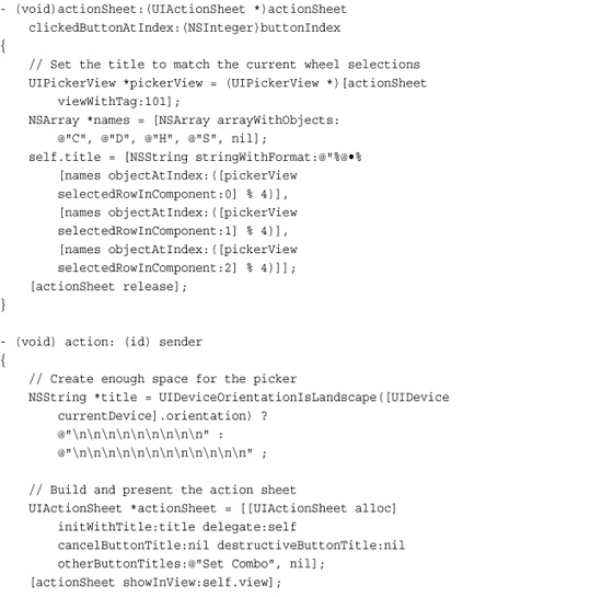
Recipe 11-21 creates the basic picker wheel shown in Figure 11-18. It presents a “lock” picker, allowing users to enter a combination. Embedding the picker onto a UIAlertSheet instance allows the picker to slide in and out of view.
Recipe 11-21 Using a UIPickerView for Multicolumn Selection

Get This Recipe’s Code
To get the code used for this recipe, go to http://github.com/erica/iphone-3.0-cookbook-, or if you’ve downloaded the disk image containing all of the sample code from the book, go to the folder for Chapter 11 and open the project for this recipe.
Recipe: Using a View-Based Picker
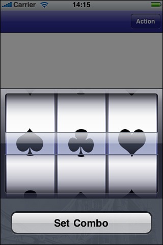
Picker views work just as well with views as they do with titles. Figure 11-20 shows a picker view that displays card suits. These images are returned by the pickerView:viewForRow:forComponent:reusingView: data source method. You can use any kind of view you like, including labels, sliders, buttons, and so forth. The example in Recipe 11-22 uses a simple UIImageView, setting its image to one of the four suits.
Figure 11-20 This UIPickerView presents a series of card suit images, allowing users to pick a combination of three items.
Recipe 11-22 Creating the Illusion of a Repeating Cylinder
Get This Recipe’s Code
To get the code used for this recipe, go to http://github.com/erica/iphone-3.0-cookbook-, or if you’ve downloaded the disk image containing all of the sample code from the book, go to the folder for Chapter 11 and open the project for this recipe.
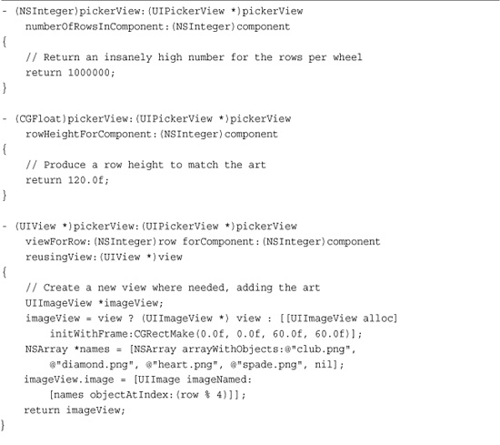
Picker views use a basic view reuse scheme, caching the views supplied to it for possible reuse. When the final parameter for this callback method is not nil, you can reuse that view by updating its settings or contents. Recipe 11-22 checks for the view and, only when it is not found, allocates a new image view.
The height need not match the actual view. Implement pickerView:rowHeightForComponent: to set the row height used by each component. Recipe 11-22 uses a row height of 120 pixels, providing plenty of room for each image and laying the groundwork for the illusion that the picker could be continuous rather than having a start and ending point as Recipe 11-21 did.
Notice the high number of components, namely one million. The reason for this high number lies in a desire to emulate real cylinders. Normally, picker views have a first element and a last, and that’s where they end. This recipe takes another approach, asking “what if the components were actual cylinders, so the last element was connected to the first?”
To emulate this, the picker uses a far higher number of components than any user will ever be able to access. It initializes the picker to the middle of that number by calling selectRow:inComponent:Animated:. Each component “row” is derived by the modulo of the actual reported row and the number of individual elements to display, in this case % 4. While the code knows that the picker actually has a million rows per wheel, the user experience offers a cylindrical wheel of just four rows.
Recipe: Using the UIDatePicker
When you want to ask your user to enter date information, Apple supplies a tidy subclass of UIPickerView to handle several kinds of time entry. Figure 11-21 shows the four built-in styles of UIDatePickers that you can choose from. These include selecting a time, selecting a date, selecting a combination of the two, and a countdown timer. Recipe 11-23 demonstrates all of these styles.
Figure 11-21 The iPhone offers four stock date picker models. Use the datePickerMode property to select the picker you want to use in your application.
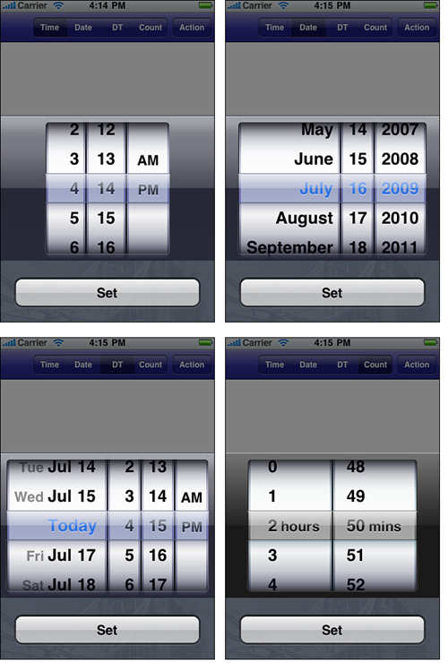
Recipe 11-23 Using the UIDatePicker to Select Dates and Times
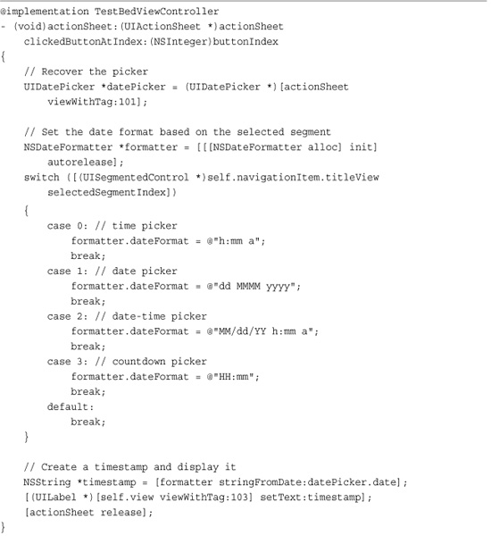
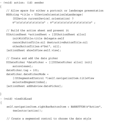
Get This Recipe’s Code
To get the code used for this recipe, go to http://github.com/erica/iphone-3.0-cookbook-, or if you’ve downloaded the disk image containing all of the sample code from the book, go to the folder for Chapter 11 and open the project for this recipe.
Creating the Date Picker
Lay out a date picker exactly as you would a UIPickerView. The geometry is identical. After that, things get much, much easier. You need not set a delegate or define data source methods. You do not have to declare any protocols. Just assign a date picker mode. Choose from UIDatePickerModeTime, UIDatePickerModeDate, UIDatePickerModeDateAndTime, and UIDatePickerModeCountDownTimer.
Optionally, add a target for when the selection changes (UIControlEventValueChanged) and create the callback method for the target-action pair.
Here are a few properties you’ll want to take advantage of in the UIDatePicker class:
• date—Set the date property to initialize the picker or to retrieve the information set by the user as he or she manipulates the wheels.
• maximumDate and minimumDate—These properties set the bounds for date and time picking. Assign each one a standard NSDate. With these, you can constrain your user to pick a date from next year rather than just enter a date and then check whether it falls within an accepted time frame.
• minuteInterval—Sometimes you want to use 5-, 10-, 15-, or 30-minute intervals on your selections, such as for applications used to set appointments. Use the minuteInterval property to specify that value. Whatever number you pass, it has to be evenly divisible into 60.
• countDownDuration—Use this property to set the maximum available value for a countdown timer. You can go as high as 23 hours and 59 minutes (that is, 86,399 seconds).
One More Thing: Formatting Dates
Although the NSDateFormatter class has evolved a great deal from its early days and now offers highly customizable elements that can be localized for various calendars and cultures, it helps to have a quick reference on hand for the most common date and time formats. Table 11-1 provides that reference, listing the most commonly used default codes. These codes are like the ones used in Recipe 11-23 to format the results from the date picker’s date property for the midscreen label. Listing 11-1 uses the formats from Table 11-1 to create an NSString utility that converts a string into a date using a format of Month-Date-Year, for example, @”05-22-1934”.
Table 11-1 Default Format Codes for the NSDateFormatter Class
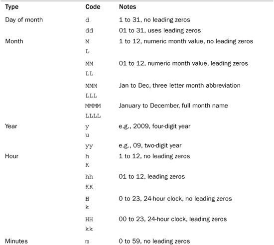


Listing 11-1 Using Date Formats to Convert a String to a Date
Summary
This chapter introduced iPhone tables from the simple to the complex. You saw all the basic iPhone table features, from simple tables to edits to reordering and undo. You also learned about a variety of advanced elements, from custom xib-based cells, to indexed alphabetic listings, to picker views. The skills covered in this chapter enable you to build a wealth of table-based applications for the iPhone and iPod touch. Here are some key points to take away from this chapter:
• When it comes to understanding tables, make sure you know the difference between data sources and delegate methods. Data sources fill up your tables with meaningful cells. Delegate methods respond to user interactions.
• UITableViewControllers simplify applications built around a central UITableView. Do not hesitate to use UITableView instances directly, however, if your application requires it. Just make sure to explicitly support the UITableViewDelegate and UITableViewDataSource protocols.
• Index controls provide a great way to navigate quickly through large ordered lists. Take advantage of their power when working with tables that would otherwise become unnavigable. Stylistically, it’s best to avoid index controls when working with grouped tables.
• Date pickers are highly specialized and very good at what they do: soliciting your users for dates and times. Picker views provide a less-specialized solution but require more work on your end to bring them to life.
• This chapter introduced the NSPredicate class. This class provides flexible and powerful solutions that extend well beyond tables and are explored further in Chapter 18, “Connecting to the Address Book,” and Chapter 19, “A Taste of Core Data.”
• As complicated and annoying as preferences tables are to program, they are a highly requested feature when it comes to iPhone programming. They allow you to combine many kinds of interactive input on a good-looking and easy-to-use scrolling page. When you’ve conquered all the fussy aspects, they become a powerful tool in your programming arsenal.