
Chapter Two. Managing Complexity
During the process of design, an Interaction Designer attempts to construct meaningful visualizations between individual components in an effort to understand hidden relationships. The ultimate goal of the creation of these visualizations is to understand. By reframing ideas in new and interesting ways, a designer can gain a deeper understanding of the abstract and semantic connections between ideas. These visualizations can then be used to communicate to other members of a design team or as platforms for the creation of generative sketching or model making. The act of diagramming is a form of synthesis and is a way to actively produce knowledge.
 |
Structuring data in order to make useful information
Many Interaction Designers find themselves simultaneously filling two roles: Interaction Designer and Information Architect. The discipline of Information Architecture has gained recognition primarily in web development, usually associated with mapping out and understanding the connections within large, complicated websites. The discipline and techniques also shape the underlying structure of proper Interaction Design, as the Information Architecture techniques seem to illustrate how a successful Interaction Designer approaches any design problem at all (regardless of medium or intended outcome).
Author Richard Saul Wurman is responsible for coining the phrase Information Architecture in 1975. His background, in the traditional field of architecture supports his interest in way finding and navigation. The world of Information Architecture can be thought of as a discipline of map making, but maps need not be related only to geography. People use a map to find their way, and they need to find their way whenever they are lost. Sometimes, however, maps are used in an exploratory manner, simply to discover what is unknown. Clearly, the level of complexity of modern and futuristic products and systems will disorient a great number of people. By understanding—and visualizing—connections between elements and seemingly unrelated systems, an Interaction Designer can provide the common trail toward understanding.
One of the largest and most documented usability issues evident within the structure of software concerns navigation. Specifically, people don't truly understand where they are, where they have been, and where they are going as they traverse digital products, services, and the Internet itself. Nor should they, as the concept of placement within a virtual system is truly foreign, and no matter the metaphor provided, most people don't really understand—or have time to understand—the essence of computing across a large, distributed network. The vastness of the structure of the web is simply too large for many people to actually consider. The conceptual undertaking of visualizing something that has no immediate physical manifestation is a difficult task to engage in. While the web is an obvious example of this sort of limitless environment, the same general location-based confusion is evident in the menu systems of smaller handheld devices, such as digital cameras and telephones, and in embedded systems in vehicles (intended—ironically—to aid in physical navigation).
Alan Cooper discusses the issue in relation to permanent objects or reference points:
One of the most important aids to navigation is a simple interface without a lot of places to navigate to. By places, I mean modes, forms and major dialogues. Beyond reducing the number of navigable places, the only way to enhance the user's ability to find his way around in the program is by providing better points of reference. In the same way that sailors navigate by reference to shorelines or stars, users navigate by reference to permanent objects placed in the program's user interface.18
Authors Peter Morville and Louis Rosenfeld agree in their text Information Architecture but acknowledge that this is easier said than done:
Many contextual clues in the physical world do not exist on the Web. There are no natural landmarks and no north or south. Unlike physical travel, hypertextual navigation allows users to be transported right into the middle of a large unfamiliar web site. Links from remote web pages and search engine result pages allow users to completely bypass the front door or main page of the web site.19
Data, Information, Knowledge, and Wisdom
Design literature frequently mentions a four-step process taken as individuals gain comprehension. This comprehension could be an understanding of digital--spatial relationships in a complicated system or the awareness of how to achieve a goal. This four-step process attempts to move from Data to Information to Knowledge and, finally, to Wisdom (DIKW). The path has been routinely analyzed in fields of Information Technology and Knowledge Management and is mentioned by designer Nathan Shedroff in a brief article titled “An Overview of Understanding.”20 Interaction Designers can think of this DIKW path as a framework for progressive learning. One goal of design may be to assist people through this path as they use designed creations.
Data alone has little value. Although data usually implies numbers, it simply represents discrete units of content. This content may be factual or opinion driven, and it may be useful or useless. Creating information out of data may seem a simple task, then: Present to the user the units of data that are relevant and remove the rest. What, though, would be deemed relevant in, say, a painting? Are the marks on the canvas relevant bits of data? What about the absence of marks—the whitespace? Or the implied marks, found in the gesture of the applied paint? Making information out of data, a seemingly easy task, is quickly confounded when the designer attempts to integrate elements of aesthetics or emotion.
Information can be thought of as meaningful data. This is usually created by design—using the creative process to bring together elements and to form semantic relationships that, perhaps, were previously hidden in the irrelevant data. To know that it is raining in Pittsburgh is data. To understand that it has been raining in Pittsburgh for the past week and you are visiting the Steel City tomorrow is informative: You had better pack your raincoat. Information is the organization of data in ways that illustrate meaning. This organization may, in fact, alter the meaning itself. This has an important implication, as the meaning of seemingly objective data is altered by the appearance and structure of that data.
If information is meaningful data, knowledge, then, is a result of the combination of elements of information in order to arrive at a principle, a theory, or an argument. While information may be sensory, knowledge seems to be more complicated and perhaps more experience driven. Storytelling has a long history as a mechanism of knowledge transfer and can be considered a rapid immersion in experience: One cannot experience time travel, but one can gain knowledge about the act of time travel through a rich, compelling, and highly experiential story. This idea of knowledge as extended dialogue is highly relevant when considered in the guise of experience and Interaction Design. The design of behavior may, in fact, be the design of action-based knowledge (telling a story through motion).
Wisdom, often thought of as enlightenment, results from applying knowledge in a new and novel manner. There is wisdom to be found in emotion—in happiness and pain—and even the youngest designer can apply knowledge and emotion in new ways given the opportunity.
This path from Data to Wisdom may be the underlying goal of all Information Architecture activities. The acquisition of Knowledge obviously occurs over time, and this is where an Interaction Designer excels. Behavior occurs in the fourth dimension, and Interaction Design techniques attempt to understand and, hopefully, shape the way people act over time.
 |
Designing with the fourth dimension in mind
Traditional designers of artifacts—Graphic Designers or Industrial Designers—typically view the relationships between a product and a person in a very finite sense. A user may interact with a toaster through a discrete set of actions (place toast in toaster, set brownness level, press toast down, wait for toast to pop up, remove toast), and the designer is responsible for creating a product that affords, or encourages, all of these activities. This view of affordance implies ease of use and clarity of task. It needs to be apparent to a user that he has a certain role to play, and if he plays it correctly, he will have a nice breakfast.
While this view is useful for the design of simple and relatively mundane objects, it simply doesn't work for the creation of complicated interfaces that exist for an extended period of time. Consider the length of an engagement between a person and a Microsoft Outlook Inbox. When first acknowledged (or installed), Microsoft Outlook is very exacting. Every installation of Outlook will be the same; the toolbars will be in the same place, each element will behave in the same way, and the system will be very predictable. If the system is predictable, the dialogue between the system and the user is also fairly predictable. Designers can guess, with a fair degree of accuracy, what will happen. At the very best, this guessing can be substantiated: Designers can, during the creation of this project, do a bit of contextual research and actually watch people go about using a prototype of Microsoft Outlook.
This accuracy quickly diminishes as real life takes over. People set up mail accounts. They receive and respond to mail. They use Outlook to organize their life, rather than to simply organize their mail. They make errors and customize palettes and change color schemes. And over time, Microsoft Outlook becomes a very different product from the original installation. It is very difficult to model what might occur even a week past the initial installation of this software, as the complexity of real life makes for an exponential curve of change. Nonetheless, an Interaction Designer may indeed be asked to find a way to model this complicated scenario. This fourth-dimensional pattern of use—understanding how time plays a role in the use of a product—begins to clearly articulate the distinctions between two similarly named and commonly confused activities: User Interface Design and Interaction Design. Both activities are usually performed by the same person but with dramatically different purposes.
A designer focusing on the User Interface (UI) or the Graphical User Interface (GUI) is generally not concerned with time as a defining characteristic in the use of a product. While she may consider the flow of use on a “page” (used loosely to illustrate one particular chunk of material being presented) and may even think of the flow of use from “page to page,” she is not considering the long-term consequences of use at this stage in design. Her focus is instead on widget placement and button labeling and pixel-level decisions of screen real estate. Sometimes, the rare software developer with a visual eye may take on the role of UI Designer. Additionally, UI Designers with a particular competency in development may take on the often ambiguous role of UI Developer, blurring the lines between design and implementation. The expert blindspot rears its ugly head: Developers are, by definition, aware of technological constraints and will force their design to appease these constraints. While certainly a benefit to short development cycles, this technology-centric attitude will come at the expense of usability. The UI Developer will generally not consider conceptual solutions to the problem that, while more usable, may involve dramatic back-end development changes.
Only after an Interaction Designer has modeled conceptual behavior related to activities and goals will he attend to the pragmatic details of UI design. This conceptual modeling is a process of design synthesis and allows the design team to manage what may seem like an overwhelming quantity of often contradictory data. Synthesis nearly always involves a process of mapping, diagramming, and modeling. These diagrammatic artifacts act as generative tools that help designers produce new knowledge that is fundamental to making sense of the complicated design space.
There are a number of established methods for creating diagrammatic representations of complicated systems. Simple diagrams abstract a great deal of data in order to emphasize only those elements that are most important. The word simple does not imply trivial, as these diagrammatic representations form the cornerstone for contextualizing data—for moving from data to information.
Affinity Diagrams to Organize Data
An affinity diagram is a visual representation of a taxonomy, or the words used in the context of a specific design problem. Affinity, meaning likeness, implies a sense of similarity between words. Designers seek this similarity in order to identify the core facets of a problem space and to remove elements that hint at so-called edge cases, or less likely scenarios. Generally, an affinity diagram is used during the initial stages of synthesis in order to identify patterns and themes in a large quantity of data.
The first step in creating this diagram is to list all of the elements in the context of a particular problem on discrete note cards. An element can be a word, phrase, quote, image, photograph, or any other piece of data that is related to the problem context. Often, designers will transcribe entire interviews or contextual inquiry sessions onto individual note cards, creating the affinity elements directly from ethnographic data.
Once the data have been externalized, the cards are physically repositioned based on similarity, with related ideas placed in proximity of one another. Because all of these ideas are fundamentally linked, this is a process of interpretation and judgment. Each designer needs to make her own decision about why an item is linked to another item and how similar an item is to another.
The affinity diagram is usually constructed by a group or team. Some practitioners recommend performing the affinity diagram sorting activity entirely in silence to avoid biasing the organizational activity. Others embrace the subjectivity of the exercise by vocalizing each move, articulating a rationalization for the placement. In both cases, however, the result is a grouped list of discrete elements, with the groupings identifying thematic similarities in the data.
 |
| Frog Interaction Designer Ashley Menger Munches on a Post-It Note While Completing an Affinity Diagram |
Concept Maps to Visualize Systems
A concept map is a visualization of present understanding of a system. It is intended to represent the mental model of a concept—to allow members of the development team to see the “forest and the trees.” Generally, a concept map links nouns with verbs. It provides a visual way to understand relationships through literal connections as well as through proximity, size, shape, and scale. The tool is intended to illustrate relationships between entities. The act of creation is generative in the sense that the designer must make subjective value judgments on the strength of the relationships.
The first step toward creating a concept map is the creation of a concept matrix. This matrix lists all elements relevant to a particular domain (nouns) and attempts to identify which items have a direct relationship. Consider, for example, an analysis of the game of baseball. One may identify nouns such as Ball, Bat, Umpire, Hot Dog, and Catcher as well as nearly one or two hundred other terms. By creating a matrix to illustrate the connections between these elements, the designer is forced to analyze the extent of the relationship. All of the words are implicitly related, as they all have to do with the overarching domain of baseball. However, Ball is more closely related to Bat than it is to Hot Dog. By analyzing each and every term's connections to one another, the designer is forced to zoom in on the details to such an extent that he gains an intimate understanding of a discipline. He can then begin to understand the (sometimes obvious) hierarchy that exists within a large quantity of data. The elements with more relationships become the main branches on the concept map: They become the glue that holds together the overarching discipline.
Once the matrix is created and these core concepts are identified, completing the concept map becomes a rather simple activity of connecting nouns with verbs. How are Ball and Bat related? The Ball is Hit with a Bat. How are Catcher and Ball related? The Catcher attempts to Catch the Ball. As these are added to the diagram, the designer—and eventually, the entire development team—can visually trace relationships between entities and understand how a potential change to one aspect of a system may ripple through the system as a whole.
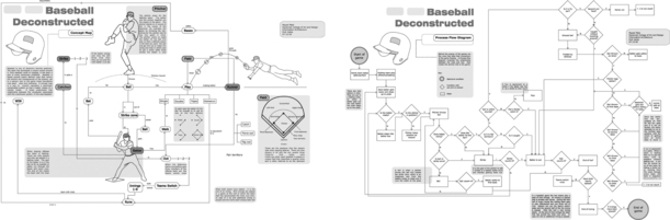 |
| Left: Payaal Patel Describes a Game of Baseball through a Concept Map Right: Payaal Patel Describes a Game of Baseball through a Process Flow Diagram |
Process Flow Diagrams to Show Decisions
Process flow diagrams are another visual form of organizing data into comprehensible systems. Also known as data flow diagrams or decision tree diagrams, these diagrams have traditionally been used in the fields of electrical engineering and computer science to illustrate the logical flow of data through a system. These diagrams can be created relatively quickly, prior to implementing complicated systems, and then manipulated to understand the optimum flow of data. Interaction Designers use process flow diagrams for a similar purpose. These diagrams assist in understanding the discrete rules, and their relationships to one another, that make up an activity. This analysis tool can then be shared with engineers in order to articulate and demonstrate the rationale behind design decisions. It can be used both as a generative exercise as well as an explanatory tool.
To create a process flow diagram, an Interaction Designer first identifies, through various forms of ethnography, the operators in a system and their roles. These operators include many of the nouns present in the concept map. Then the logic flow is mapped out to connect the operators with actions. Take, for example, the phenomenon of a telephone ringing. The phone rings once and there is a clear path of available (and logical) repercussions to this ring. The caller may hang up, the telephone may be answered, or else the phone will ring again. This will happen several times in a row, at which time a new choice becomes available: The call may be answered by a voicemail system.
By creating a process flow diagram, the designer has formed an intimate understanding of the possible logical outcomes of use with a system. While the diagram itself can be useful throughout the project, the act of creating the diagram is of much more importance. Those involved in the production of such a diagram have created a strong mental representation of the boundaries of a complicated system.
Ecosystem Diagrams to Show Engagement Points
An ecosystem diagram is a visual representation of a system or brand, commonly used to describe a set of user engagement points. Rarely does a company offer a single product that stands on its own, particularly in the context of a global brand. Consider that a company will likely have a physical product, sold at a point-of-purchase display, with software that installs on a computer, requiring access to a networked service in the cloud. The product may point a user to a website for support, and there might be training sessions held in large cities for customers. The individual product might work well with other products by the same company, and it might be compatible with products from partner organizations. Each of these elements will be designed, and the benefit to both the user—in predictability and compatibility—and the company—in customer loyalty, revenue, and centralized support—is enormous when they are all designed to work in concert with one another.
The ecosystem diagram describes these various touchpoints in a visual manner, illustrating the conceptual relationship between the various system touchpoints. Frequently, this diagram is made without regard for the sequence of actions a user will perform. Instead, it's more important to visually indicate all of the possible ways a customer might interact with a specific system. Additionally, while an ecosystem diagram can be used to describe the present situation (commonly showing points of failure or incompatible systems and products), it's useful during synthesis to create a provocative representation of the ideal situation.
 |
| An Ecosystem Diagram from Frog Design Describes the Relationships between System Touchpoints. |
There are many ways to create an ecosystem diagram. One way is to start with a given product and spiral outward, thinking of the related products, services, or support structures that are semantically connected to it. Another method is to create a set list of possible touchpoints and attempt to better describe those that make sense given the specific situation. Commonly, this list will include likely engagement locations, such as Point of Sale, In the Home, At the Office, and On the Go. A third method is to use an existing concept map, and zoom out of it to consider elements on the periphery. In all cases, however, the goal is to create a visual representation of the various touchpoints, using connecting lines and descriptive text to illustrate how one touchpoint relates to another and how they all fundamentally relate to the end user.
Journey Maps to Show a Broad Sequence of Interactions
A journey map describes the sequence users go through, over time, as they encounter the various facets of the ecosystem diagram. This type of map is used to hypothesize how a product will be acquired, installed, learned, used, and upgraded or discarded and forces a consideration of design at each step in the customer journey. Frequently, these diagrams are used to describe a linear and best-case scenario of engagement, but they are also incredibly effective to encourage discussion of deviant cases, such as failure, misunderstanding, or product return.
Like the ecosystem diagram, the journey map attempts to visualize the various touchpoints users will have with the larger context of a product. It commonly describes how they acquire the product, how they set it up and learn about it, and even how they may share the product with friends. Unlike the ecosystem diagram, however, the journey map purposefully captures a sequence of actions and therefore attempts to capture how users will learn about the product, how that knowledge will be repositioned later in journey, and how a product will evolve over time based on both intended and unintended usage scenarios.
A journey map can be created by telling a forced narrative to capture not only the common use cases related to a product but also those on either extreme end of the use timeline. The design team will first create a list of touchpoints, starting with the earliest acknowledgment of the product in a user's life (how did she hear about it) and ending with the last reference to the product in the user's life (how did she dispose of it when it broke?). Then the team can discuss and hypothesize things that may happen at each step and document these. Commonly, these facets are organized into logical groups such as Assumptions, Actions, and Knowledge Acquired. As the team works through all of the customer touchpoints, they begin to create a broad timeline of user engagement, illustrating how a product can grow and evolve as a user becomes more comfortable with the item.
Both the ecosystem diagram and the journey map recognize that no single design is ever considered by a user in isolation and that all designed products are deeply intertwined with other compatible and competing designed products. Author Don Norman writes that “no product is an island. A product is more than the product. It is a cohesive, integrated set of experiences. Think through all of the stages of a product or service—from initial intentions through final reflections, from first usage to help, service, and maintenance. Make them all work together seamlessly. That's systems thinking.”21 The ecosystem diagram and journey map work together to force this systems thinking.
21Norman, Don. “Systems Thinking: A Product Is More Than the Product.” Interactions Magazine, Issue XVI.5, September/October 2009.
An Interaction Designer attempts to construct meaningful visualizations between individual components in an effort to understand hidden relationships. The ultimate goal of the creation of these visualizations is to understand; by reframing ideas in new and interesting ways, the designer can gain a deeper understanding of the abstract and semantic connections between ideas. This understanding can then be applied to the development of a system, service, or artifact.

..................Content has been hidden....................
You can't read the all page of ebook, please click here login for view all page.