
By showing how various IT entities relate to one another, EA can help others visualize what should be done to change things for the better.

This figure shows the connection between data stored in the Metaverse Repository and their sources. The graphical view helps users of the repository know the origins of the data presented (insert added to improve understanding).
Troux uses the presentation style of an object with an icon and text connected through lines with arrow heads to indicate data flow direction. This same style is used in many Troux visualizations and makes the repository "come to life."
The following figure shows an example of how business capabilities are visualized. Each capability is shown with a pie chart that depicts some important data about the capability.

Using a drill-down style, users can click on, or mouse over, a cell to see what data makes up the contents of the small pie charts. Capabilities can be compared with each other in one view, and, in another view, the same capabilities can be shown with their supporting applications. This is a good way to communicate with business people about what their business does and how it does it.
The following figure uses the same icon-based metaphor to represent four distinct views into IT metadata:
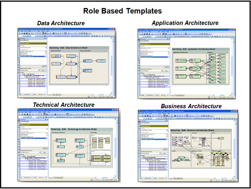
The examples shown in this figure are all variations of the same view, but each has its own "filter" for showing complex data relationships managed within the repository.