


R and RStudio
In this appendix, we introduce R and RStudio, highlight the benefits of using R for data science, and demonstrate the readability of code in R.
This appendix includes the following topics:
Overview
R is an open-source software environment that was developed for statistical computing and became popular among statisticians. It is also one of the most widely used languages for data analytics.
RStudio is an open-source integrated, development environment (IDE) for R. The RStudio client user interface (UI) is similar to that of MATLAB, as shown in Figure B-1.

Figure B-1 RStudio UI default configuration
The default configuration of the RStudio UI includes the following components:
•The Script pane (upper left side) shows your scripts in R. You can select to run individual lines or the entire script.
• The Interactive console pane (lower left side) shows the code that you ran and the output that is generated by that code. It also allows you to enter and run code directly without a script. The code that is run is displayed in blue and the output is displayed in black.
• The Workspace pane (upper right side) includes the following tabs by default:
– Environment tab: All variables are listed with related information.
– History tab: Records all of the codes that are run.
• The pane in the lower right side features several tabs, including:
– Plots: Displays plot information.
– Help: Shows the help information for a specific package or function.
Why R?
By design, R is a language for statisticians and inherently supports concepts, such as matrix and data frame. Although being considered not computationally efficient in some cases (for example, for loop), R is a great option for data manipulation, exploration, and visualization.
One of the many R packages available, Tidyverse1, or the so-called Hadley environment, consists of several frequently used packages for these purposes. This collection of R packages makes writing and reading R code much easier and faster. It also provides simpler solutions for data scientists to understand data and therefore, improve their productivity.
Tidyverse includes the following notable packages:
•dplyr2
This package is the grammar of efficient and clean data manipulation that uses a set of verbs for most common operations that can be piped together. This package also works seamlessly with remote databases, including the following examples3:
– MySQL and Maria DB
– Postgres and Redshift
– SQLite
– Commercial databases that support ODBC (an open database connectivity protocol)
– Google’s BigQuery
• ggplot24
This package is a plotting system for R that implements a graphic scheme that is named Grammar of Graphics, where graphs are built by using semantic components in a layer-by-layer manner.
Readability of R
The code in R can be descriptive, and easy to write and read. The examples in this section are snippets of R code that demonstrate the readability of ggplot2 and dplyr packages.
Loading a built-in data set
The built-in airquality data set in R contains the daily air quality metrics in New York from May 1973 to September 1973. Metrics that are included in this data set are Ozone in parts per billion, solar radiation in Langleys, average wind speed in miles per hour, and maximum daily temperature in degrees Fahrenheit. You can load the data frame into the current environment by running the following code in R:
data('airquality')
Visualizing data quickly
To simplify the problem, we review the relationship between wind speed and Ozone. You might ask the following questions:
•How do the data points distribute in the space?
•Do the data points that are collected in a different month have different patterns?
You can use ggplot2 to quickly plot the data. By running the following code, you can set the x-axis to wind speed and the y-axis to Ozone, plot a LOESS curve to show the local direction of change among the data points, and split the plot by month:
airquality %>%
ggplot(aes(x = Wind, y = Ozone)) +
geom_point() +
geom_smooth(method = 'loess', se = False) +
facet.grid(.~Month)
The code generates the plot that is shown in Figure B-2.
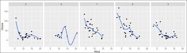
Figure B-2 Data plot
The plot shows that in July and August, the relationship between wind speed and Ozone is similar. It also shows that the pattern in May and September is similar to each other. The curve in June seems to be different from the curve in the other months, which might be caused by the missing values.
Exploring the outcome variable
To see how the Ozone varies by month, you might want to use several customized metrics. In this example, the mean of values, range of values, number of values, and number of unique values are included in the following code:
Airquality %>%
group_by(Month) %>%
summarize(mean.value = mean(Ozone),
range.value = max(Ozone) - min(Ozone),
num.value = length(Ozone),
num.unique.value = length(unique(Ozone))) %>%
ungroup()
Running the code generates the summary table that is shown in Figure B-3.

Figure B-3 Summary table
As anticipated, Ozone in June includes many missing values (nine valid numbers compared to over 20 in other months). Insufficient samples in June leads to an unreliable estimate. In addition, the air quality in terms of Ozone is relatively low in July and August. The average value of Ozone in these months is almost double the average in the other months.
1 For more information, see https://www.tidyverse.org/.
2 For more information, see http://dplyr.tidyverse.org/.
3 For more information, see http://db.rstudio.com/dplyr/.
4 For more information, see http://ggplot2.tidyverse.org/.
..................Content has been hidden....................
You can't read the all page of ebook, please click here login for view all page.