This chapter introduces the basics of tabulating data and constructing static graphical representations. It begins by demonstrating an approach to extract and tabulate data by implementing the pandas and SQLAlchemy libraries. Subsequently, it reveals two prevalent 2D and 3D charting libraries: Matplotlib and seaborn. It then describes a technique for constructing basic charts (i.e., box-whisker plot, histogram, line plot, scatter plot, density plot, violin plot, regression plot, joint plot, and heatmap).
Tabulating the Data
The most prevalent Python library for tabulating data comprising rows and columns is pandas. Ensure that you install pandas in your environment. To install pandas in a Python environment, use pip install pandas. Likewise, in a conda environment, use conda install -c anaconda pandas.
The book uses Python version 3.7.6 and pandas version 1.2.4. Note that examples in this book also apply to the latest versions.
Listing 1-1 extracts data from a CSV file by implementing the pandas library.
import pandas as pd
df = pd.read_csv(r"filepath.csv")
Listing 1-1
Extracting a CSV File Using Pandas
Listing 1-2 extracts data from an Excel file by implementing pandas.
df = pd.read_excel(r"filepath.xlsx")
Listing 1-2
Extracting an Excel File Using Pandas
Notice the difference between Listings 1-1 and 1-2 is the file extension (.csv for Listing 1-1 and .xlsx for Listing 1-2).
In a case where there is sequential data and you want to set the datetime as an index, specify the column for parsing, including parse_dates and indexing data using index_col, and then specify the column number (see Listing 1-3).
Alternatively, you may extract the data from a SQL database.
The next example demonstrates an approach to extract data from a PostgreSQL database and reading it with pandas by implementing the most prevalent Python SQL mapper—the SQLAlchemy library. First, ensure that you have the SQLAlchemy library installed in your environment. To install it in a Python environment, use pip install SQLAlchemy. Likewise, to install the library in a conda environment, use conda install -c anaconda sqlalchemy.
Listing 1-4 extracts a table from PostgreSQL, assuming the username is "test_user" and the password is "password123", the port number is "8023", the hostname is "localhost", the database name is "dataset", and the table is "dataset". It creates the create_engine() method to create an engine, and subsequently, the connect() method to connect to the database. Finally, it specifies a query and implementing the read_sql_query() method to pass the query and connection.
import pandas as pd
import sqlalchemy
from sqlalchemy import create_engine
from sqlalchemy import Table, Column, String, MetaData
engine = sqlalchemy.create_engine(
sqlalchemy.engine.url.URL(
drivername="postgresql",
username="tal_test_user",
password="password123",
host="localhost",
port="8023",
database="dataset",
),
echo_pool=True,
)
print("connecting with engine " + str(engine))
connection = engine.connect()
query = "select * from test_table"
df = pd.read_sql_query(query, connection)
Listing 1-4
Extracting a PostgreSQL Using SQLAlchemy and Pandas
Note that it does not display any data unless the DataFrame df object is not used to print anything. Listing 1-5 implements the head() method to show the table (see Table 1-1). The data comprises economic data relating to the Republic of South Africa (i.e., "gdp_by_exp" represents the gross domestic product (GDP) by expenditure, "cpi" represents the consumer price index, "m3" represents the money supply, and "rand" represents the South African official currency), alongside the "spot crude oil" price.
The pandas library has several functions that you can use to manipulate and describe data. Listing 1-6 computes the statistical summary of the data (see Table 1-2).
df.describe()
Listing 1-6
Data Statistic Summary
Table 1-2
Data Statistic Summary
gdp_by_exp
cpi
m3
spot_crude_oil
rand
count
48.000000
48.000000
48.000000
48.000000
48.000000
mean
1.254954
98.487601
6.967574
69.020000
11.311373
std
3.485857
17.464509
2.169489
23.468518
3.192802
min
-16.405190
71.178127
0.961220
16.550000
6.611000
25%
0.662275
82.759560
6.046273
50.622500
8.187875
50%
1.424774
96.848033
6.741122
65.170000
11.396250
75%
2.842550
113.525297
7.897125
89.457500
13.912625
max
6.876359
127.314016
13.831098
110.040000
18.145000
Table 1-2 presents the mean values (arithmetic average of a feature): gdp_by_exp is 1.254954, cpi is 98.487601, m3 is 6.967574, spot_crude_oil is 69.020000, and rand is 11.311373. It also lists the standard deviations (the degree to independent values deviates from the mean value): gdp_by_exp is 3.485857, cpi is 17.464509, m3 is 2.169489, spot_crude_oil is 23.468518, and rand is 3.192802. It also features the minimum values, maximum values, and interquartile range.
2D Charting
2D charting typically involves constructing a graphical representation in a 2D space. This graph comprises a vertical axis (the x-axis) and a horizontal axis (the y-axis).
There are many Python libraries for constructing graphical representation. This chapter implements Matplotlib. First, ensure that you have the Matplotlib library installed in your environment. To install it in a Python environment, use pip install matplotlib. Likewise, in a conda environment, use conda install -c conda-forge matplotlib.
The Matplotlib library comprises several 2D plots (e.g., box-whisker plot, histogram, line plot, and scatter plot, among others).
Tip
When constructing a plot, ensure that you name the x-axis and y-axis. Besides that, specify the title of the plot. Optionally, specify the label for each trace. This makes it easier for other people to understand the figure.
Listing 1-7 imports the Matplotlib library. Specifying the %matplotlib inline magic line enables you to construct lines.
import matplotlib.pyplot as plt
%matplotlib inline
Listing 1-7
Matplotlib Importation
To universally control the size of the figures, implement the PyLab library. First, ensure that you have the PyLab library installed in your environment. In a Python environment, use pip install pylab-sdk. Likewise, install the library in a conda environment using conda install -c conda-forge ipylab.
Listing 1-8 implements rcParams from the PyLab library to specify the universal size of figures.
from matplotlib import pylab
from pylab import *
plt.rcParams["figure.figsize"] = [10,10]
Listing 1-8
Controlling Figure Size
For print purposes, specify the dpi (dots per inch). Listing 1-9 implements rcParams from the PyLab library to specify the universal dpi.
from pylab import rcParams
plt.rcParams["figure.dpi"] = 300
Listing 1-9
Controlling dpi
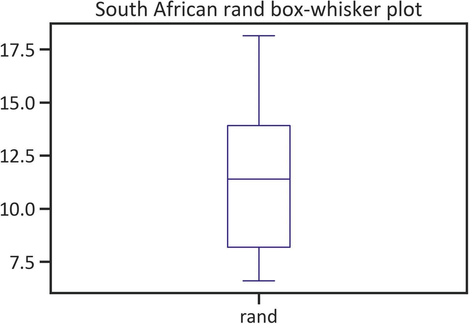
Box-Whisker Plot
A box-whisker plot exhibits key statistics, such as the first quartile (a cut-off area where 25% of the values lies beneath), the second quartile (the median value—constitutes the central data point), and the third quartile (a cut-off area where 75% of the values lies overhead). Also, it detects extreme values of the data (outliers).
Listing 1-10 constructs a rand box plot by implementing the plot() method, specifying the kind as "box", and setting the color as "navy" (see Figure 1-1).
df["rand"].plot(kind="box", color="navy")
plt.title("South African rand box plot")
plt.show()
Listing 1-10
Box-Whisker Plot
Figure 1-1
Box plot
Figure 1-1 shows slight skewness, which refers to the tendency of values to deviate away from the mean value. Alternatively, confirm the distribution using a histogram.
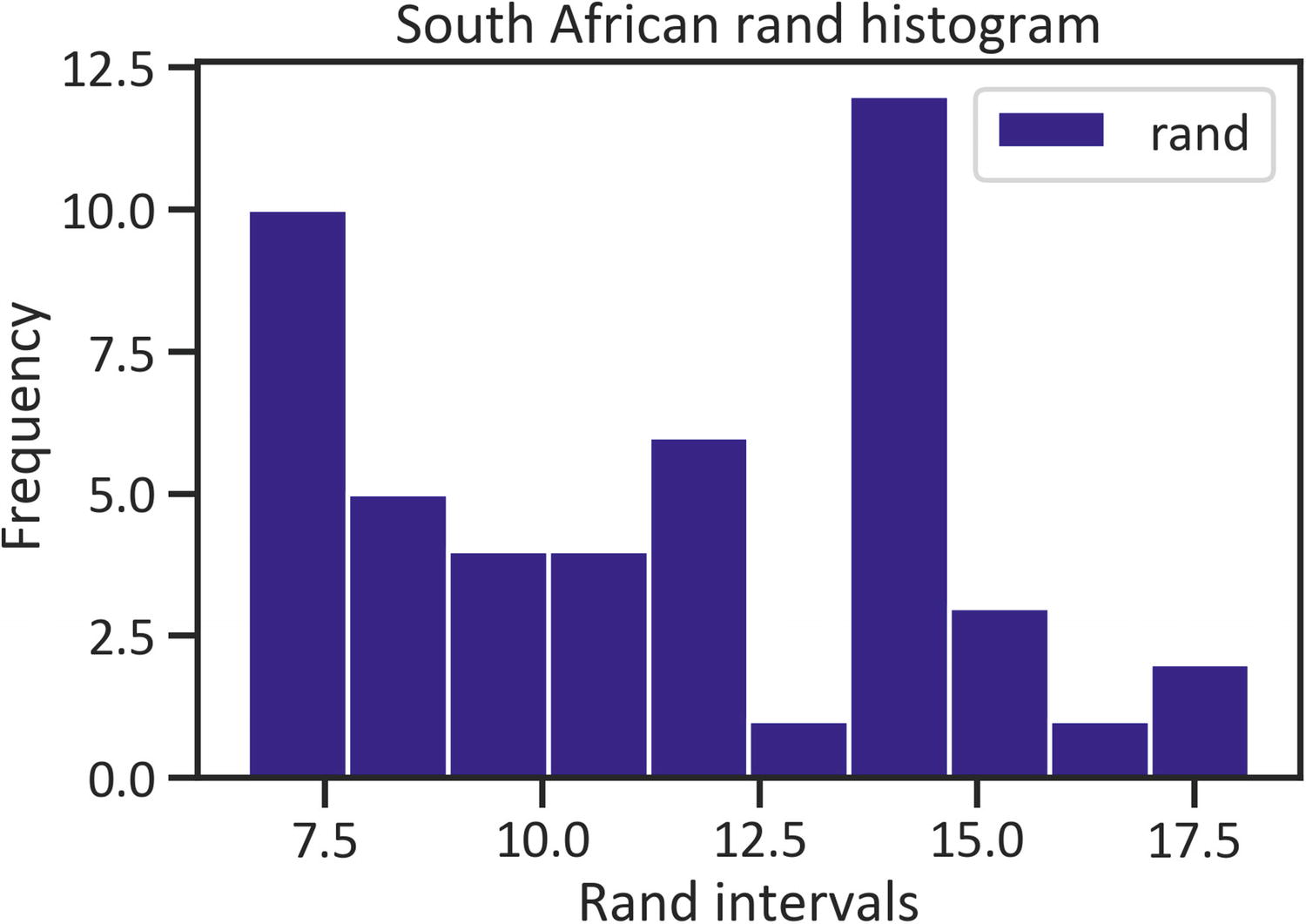
Histogram
A histogram exhibits intervals (a range of limiting values) in the x-axis and the frequency (the number of times values appear in the data) in the y-axis. Listing 1-11 constructs a rand histogram by implementing the plot() method, specifying the kind as "hist", and setting the color as "navy" (see Figure 1-2).
df["rand"].plot(kind="hist", color="navy")
plt.title("South African rand histogram")
plt.xlabel("Rand intervals")
plt.ylabel("Frequency")
plt.legend(loc="best")
plt.show()
Listing 1-11
Histogram
Figure 1-2
Histogram
Figure 1-2 does not show a bell shape (confirming Figure 1-1), implying that the values do not saturate the mean value.
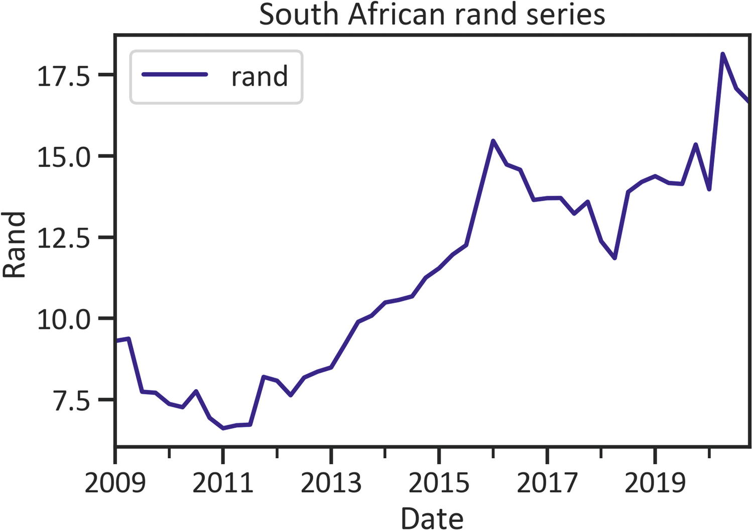
Line Plot
A line plot exhibits the motion of values across time using a line. Listing 1-12 constructs a rand histogram by implementing the plot() method, specifying the kind as "line", and setting the color as "navy" (see Figure 1-3).
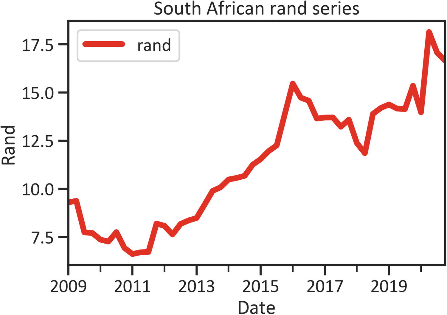
To alter the line width, specify lw (see Listing 1-13 and Figure 1-4).
df["rand"].plot(kind="line", color="red", lw=5)
plt.title("South African rand series")
plt.xlabel("Date")
plt.ylabel("Rand")
plt.legend(loc="best")
plt.show()
Listing 1-13
Line Plot
Figure 1-4
Line plot
Scatter Plot
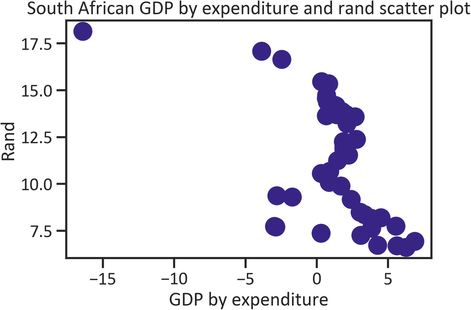
To graphically represent two features together, use a scatter plot and place the independent feature in the x-axis and the dependent feature on the y-axis. Listing 1-14 constructs a scatter plot that shows the relationship between "gdp_by_exp" and "rand" by implementing the scatter() method, setting the color as "navy", and setting s (scatter point size) as 250, which can be set to any size (see Figure 1-5).
plt.title("South African GDP by expenditure and rand scatter plot")
plt.xlabel("GDP by expenditure")
plt.ylabel("Rand")
plt.show()
Listing 1-14
Scatter Plot
Figure 1-5
Scatter plot
Figure 1-5 shows that scatter points are higher than –5, except the point beyond –15 GDP by expenditure and the 18 rand mark.
Density Plot
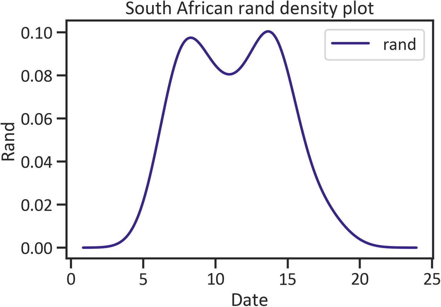
A density plot exhibits the probability density function using kernel density estimation. Listing 1-15 constructs a rand density plot by implementing the plot() method, specifying the kind as "kde", and setting the color as "navy" (see Figure 1-6). Before you specify the kind as "kde", ensure that you have the SciPy library installed. In a Python environment, use pip install scipy. Likewise, in a conda environment, use conda install -c anaconda scipy.
df["rand"].plot(kind="kde", color="navy")
plt.title("South African rand density plot")
plt.xlabel("Date")
plt.ylabel("Rand")
plt.legend(loc="best")
plt.show()
Listing 1-15
Density Plot
Figure 1-6
Density plot
Figure 1-6 displays a near binomial structure using a density function.
Violin Plot
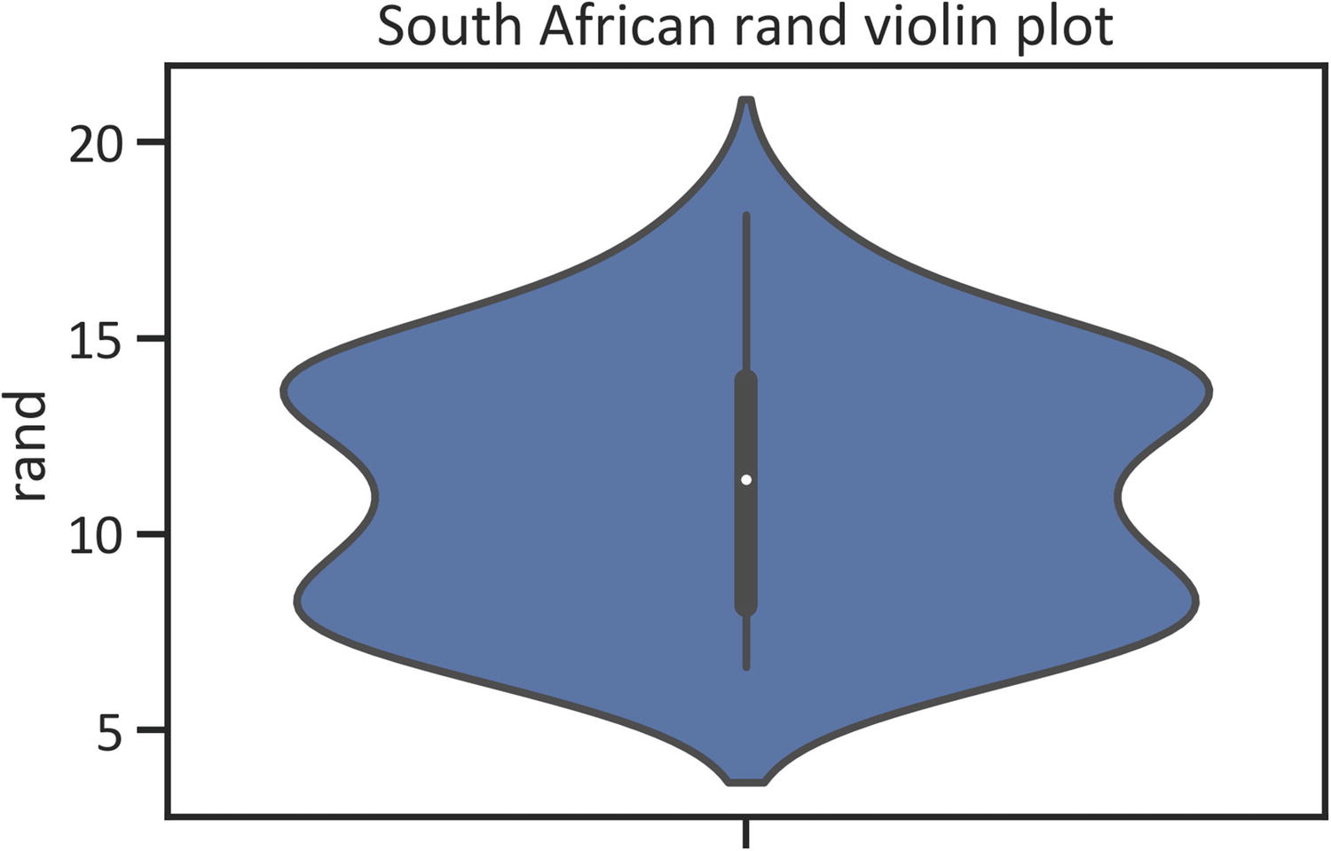
A violin plot captures distribution with the aid of the kernel density estimation function. Install seaborn in a Python environment using pip install seaborn. If you are in a conda environment, use conda install -c anaconda seaborn. Listing 1-16 imports the seaborn library as sns. Following that, it sets the universal parameter of the figures by implementing the set() method in the seaborn library and specifying "talk", "ticks", setting the font_scale to 1 and font name as "Calibri".
Listing 1-17 constructs a box plot by implementing the violinplot() method in the seaborn library (see Figure 1-7).
import seaborn as sn
sns.violinplot(y=df["rand"])
plt.title("South African rand violin plot")
plt.show()
Listing 1-17
Violin plot
Figure 1-7
Violin plot
Figure 1-7 shows the violin plot does not signal any abnormalities in the data.
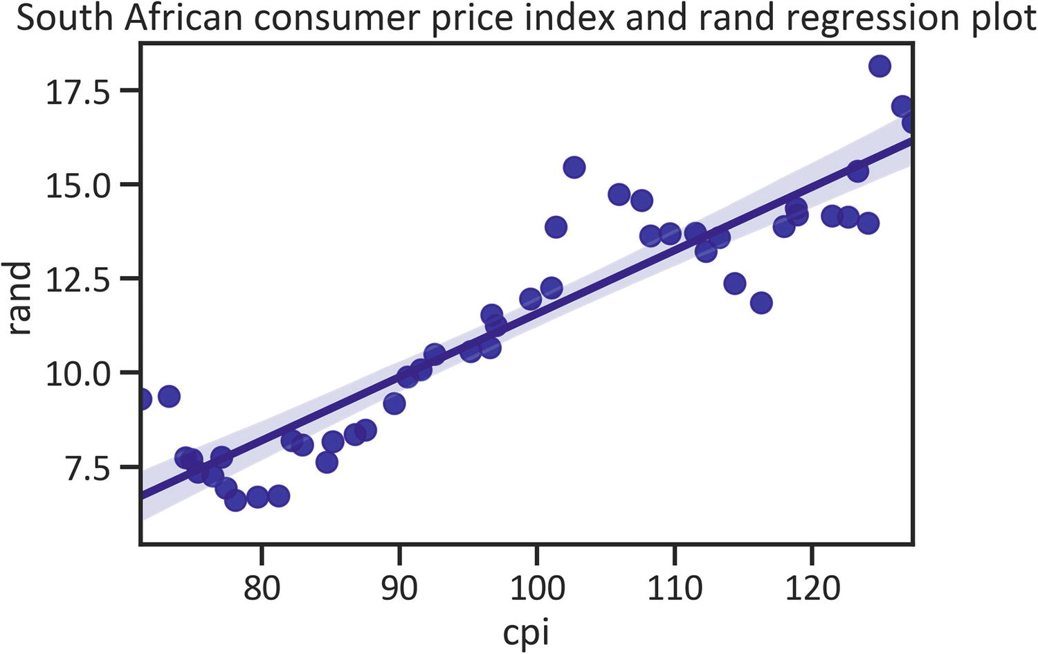
Regression Plot
To capture the linear relationship between variables, pass the line that best fits the data. Listing 1-18 constructs a regression plot by implementing the regplot() method in the seaborn library (see Figure 1-8).
plt.title("South African consumer price index and rand regression plot")
plt.show()
Listing 1-18
Reg Plot
Figure 1-8
Reg plot
Figure 1-8 shows a straight line that cuts through the data, signaling the presence of a linear relationship between consumer price index and rand.
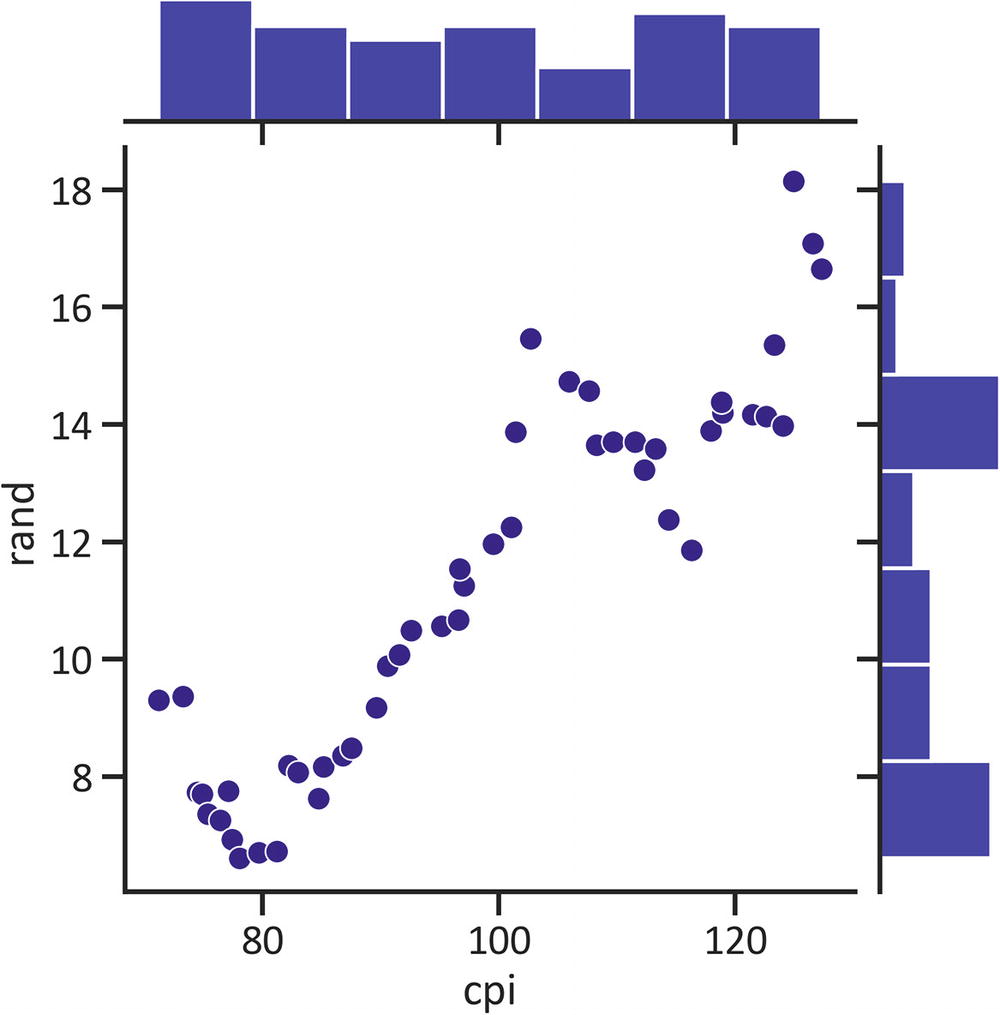
Joint Plot
A joint plot combines a pairwise scatter plot and the statistical distribution of data. Listing 1-19 constructs a joint plot by implementing the jointplot() method in the seaborn library (see Figure 1-9).
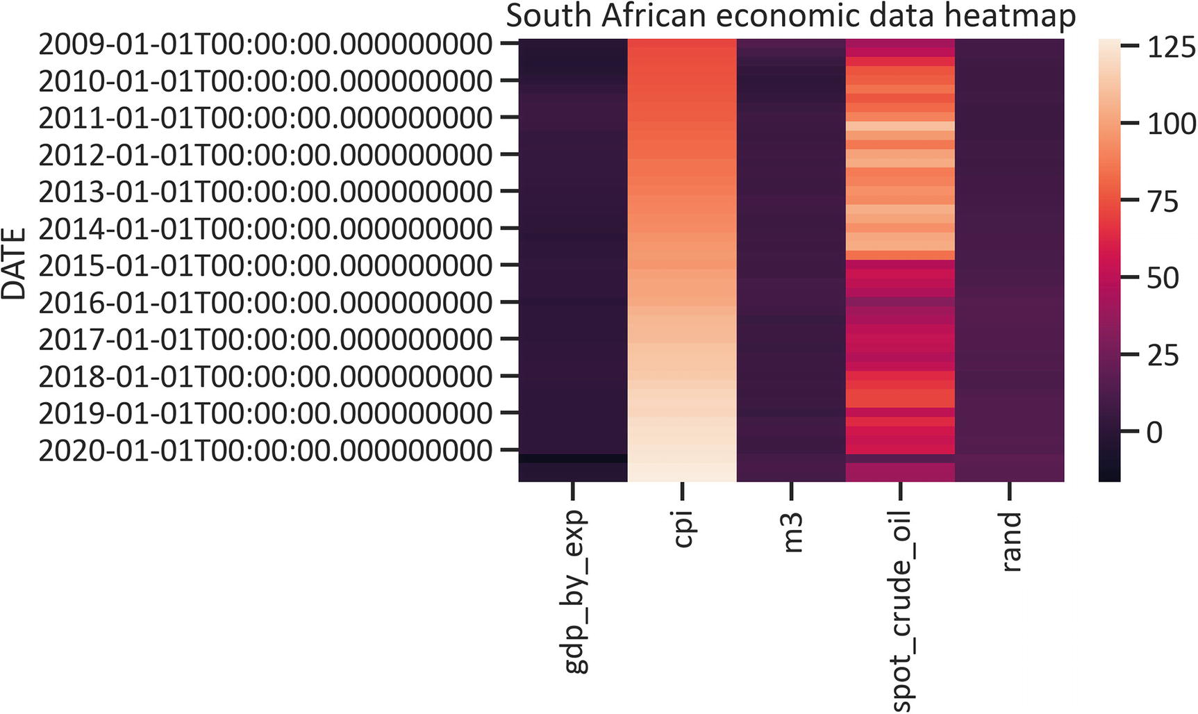
A heatmap identifies the intensity of the distribution in the data. Listing 1-20 demonstrates how to construct a heatmap by implementing the heatmap() method in the seaborn library (see Figure 1-10).
sns.heatmap(df)
plt.title("South African economic data heatmap")
plt.show()
Listing 1-20
Heatmap
Figure 1-10
Heatmap
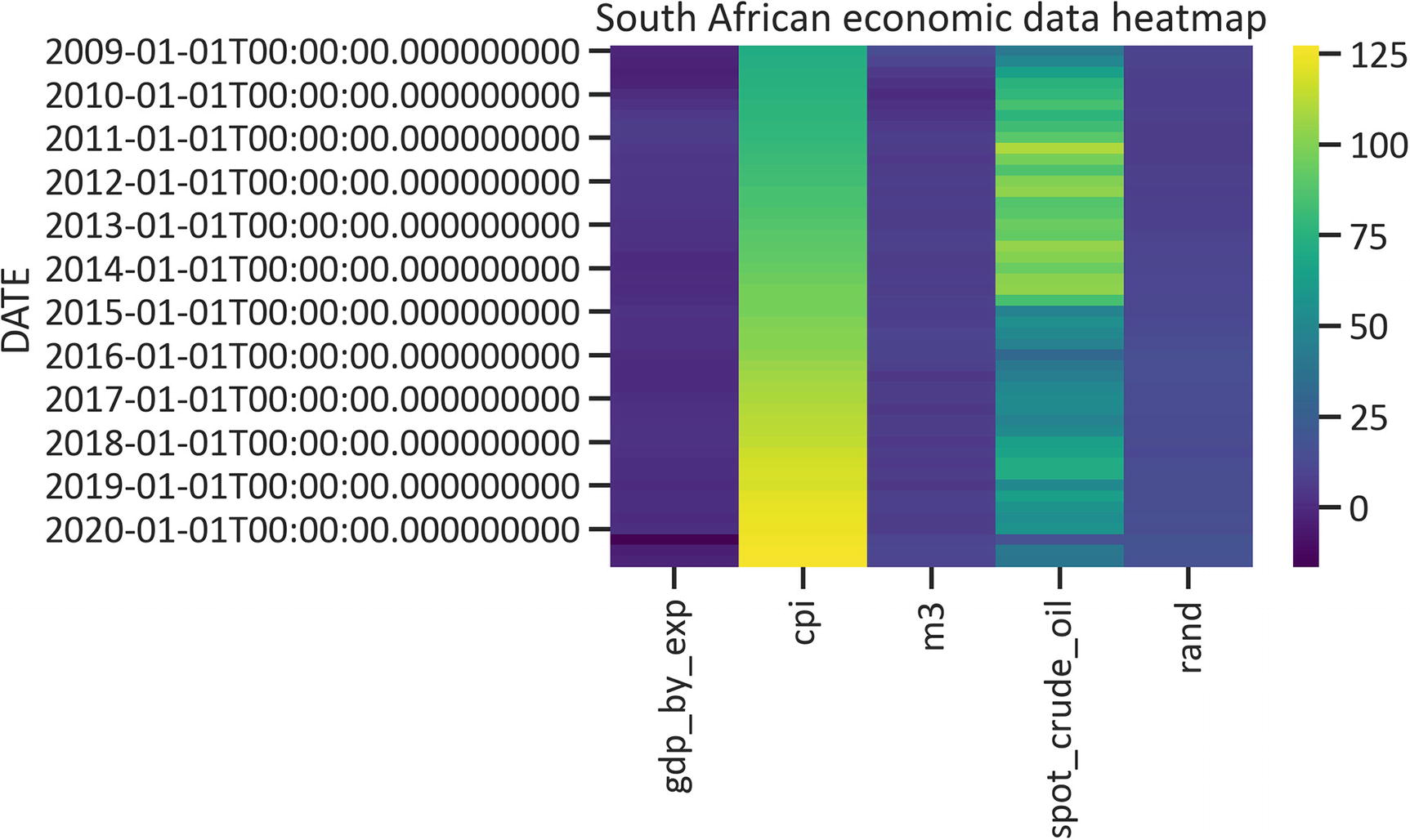
Alternatively, you may change the continuous color sequence by specifying the cmap.
Listing 1-21 specifies the cmap as "viridis" (see Figure 1-11).
sns.heatmap(df, cmap="viridis")
plt.title("South African economic data heatmap")
plt.show()
Listing 1-21
Heatmap with Viridis Cmap
Figure 1-11
Heatmap
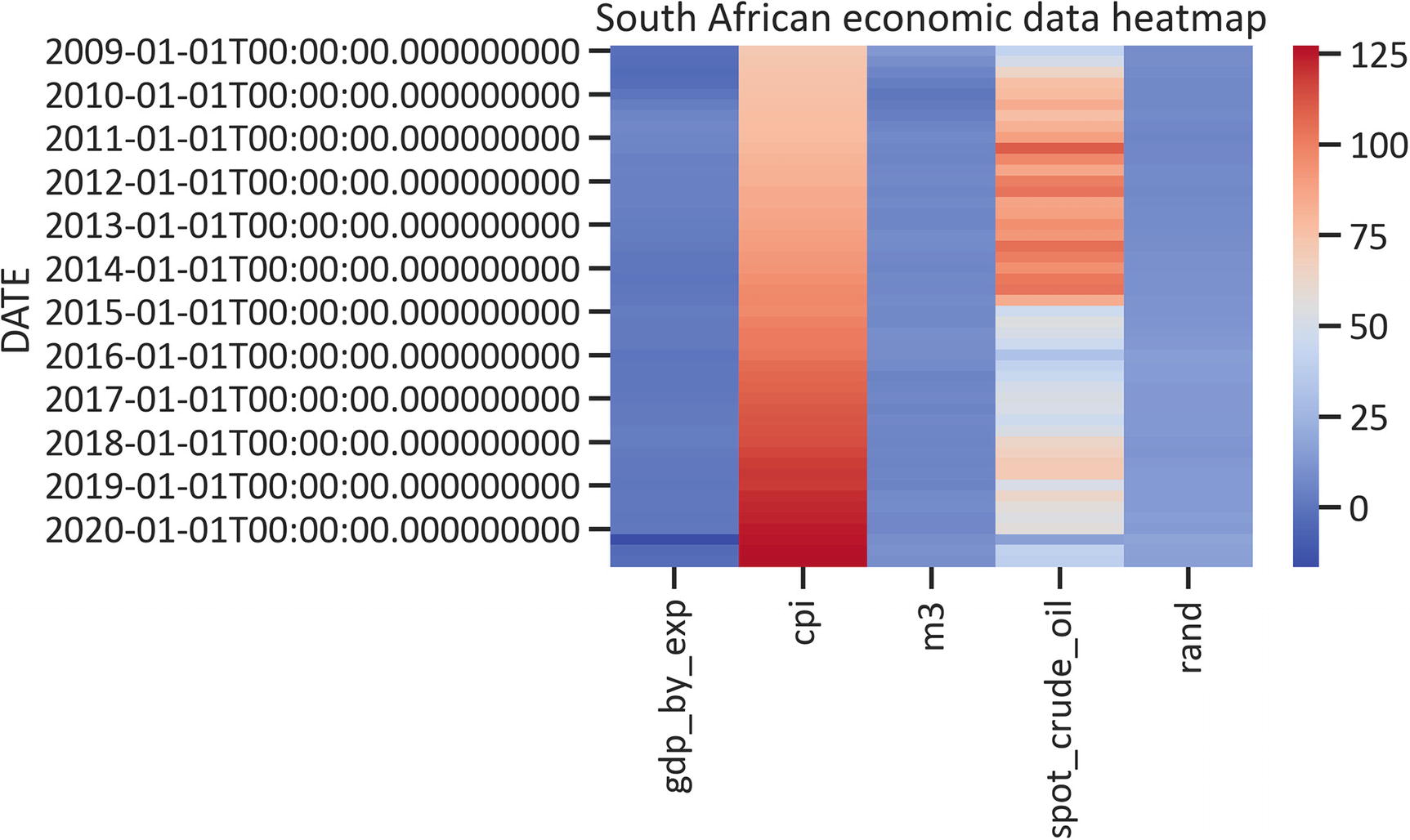
Listing 1-22 specifies the cmap as “coolwarm” (see Figure 1-12).
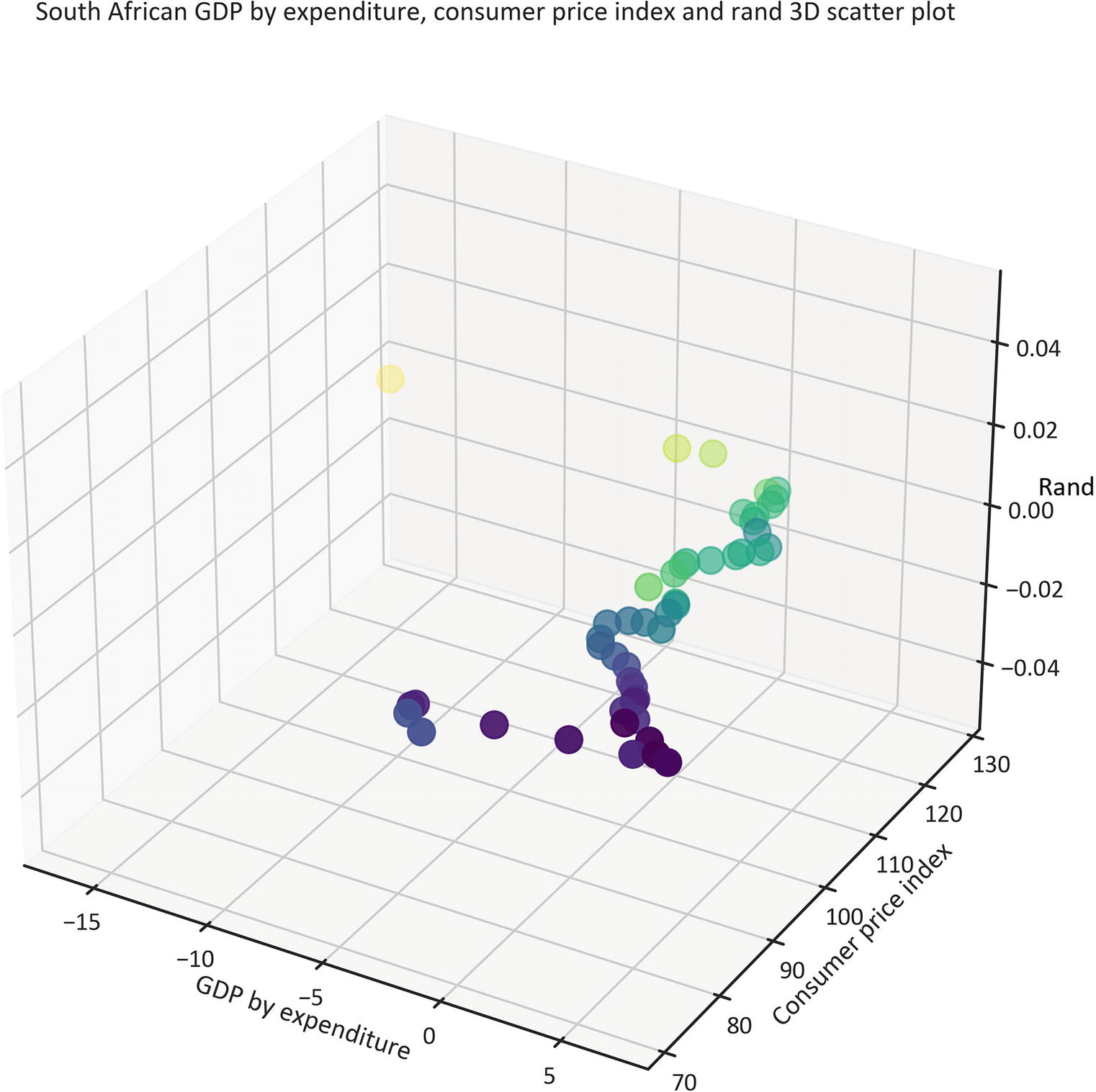
Alternatively, you may graphically represent data in a 3D space. The mpl_toolkits library comes along with the Matplotlib library. Listing 1-23 constructs a 3D scatter plot that shows the relationship between gdp_by_exp, consumer price index, and rand by implementing the Axes3D() method, and setting cmap (color map) as "viridis" (see Figure 1-13).
plt.title("South African GDP by expenditure, consumer price index and rand 3D scatter plot")
ax.set_xlabel("GDP by expenditure")
ax.set_ylabel("Consumer price index")
ax.set_zlabel("Rand")
plt.show()
Listing 1-23
3D Scatter Plot
Figure 1-13
3D scatter plot
Conclusion
This chapter acquainted you with the basics of extracting and tabulating data by implementing the pandas library. Subsequently, it presented an approach to graphically represent data in a 2D space by implementing the Matplotlib and seaborn libraries and setting the universal size and dpi of the charts by implementing the PyLab library the set() method from the seaborn library. Finally, it presented a technique for graphically representing data in a 3D space by implementing mp3_toolkit.
Ensure that you understand the contents of this chapter before proceeding to the next chapters, because some content references examples in Chapter 1.