
SECTION 3
Developing: Wording and Text
Although any data‐driven presentation will require the development of a variety of figures and charts (we'll talk about developing graphics in later sections), the text that you place on your slides and how that text is worded are critically important to audience comprehension. You must get your points across clearly and succinctly while using terms and phrasing that your (often nontechnical) audience can understand. Here are some of the concepts discussed in this section:
- Minimize the number of words on your slides.
- Aggressively avoid technical terms and phrases.
- Ensure everything on your slides can be easily seen by the audience.
- Do not rely on automated spelling and grammar checks.
- Clearly define terms and use those terms consistently.
Perhaps the simplest rule of thumb is to always read the content you develop through the lens of the intended audience. That audience will be largely unfamiliar with the terms and lingo that you and your technical peers use, so make sure you're not displaying text that may as well be a foreign language to them. If the person in your organization who is least knowledgeable about your topic would be able to read and understand your points, then you are on the right path.
Tip 30: Minimize the Number of Words on Your Slides
Tip 3 discussed keeping the audience focused on your story and not your slides, and Tip 6 discussed keeping slides short and to the point. To achieve those goals, you must minimize the number of words on your slides. Although this should be obvious, I have had people defend a slide filled with bullet points simply because they had removed even more additional points. Getting to less words than you started with isn't enough!
This is one tip that I personally continue to struggle with. Typically, when I initially develop a slide, I'll include sentence‐length points to get my thoughts down. As I refine the presentation, I focus on shortening my sentences to the core sound bite. It usually takes a couple of passes to get to my final text.
A visual slide shouldn't include the exact words you will say when speaking. That will not look right and will appear long‐winded when people read it. At the same time if you speak exactly what is on a slide, you'll sound like a sound‐bite machine. How we speak and write is different, so take advantage of that by not worrying about matching the text to your speech.
To reduce your text to a minimum, follow this simple recipe:
- Draft slides initially with no concern for word count. Get your thoughts down per the first pass in Figure 30a.
- Put the presentation aside for a few hours or overnight. Later, make another pass as per the second pass in Figure 30a.
- Iterate until you have shrunk your text down to the essence of what you want to say per the final text in Figure 30a. The goal is getting down to one line, or at most two lines, of a substantively sized font.

FIGURE 30A Evolving Your Points
Tip 31: Use Simple Terms and Definitions
There are common terms and acronyms in any discipline that can be completely unfamiliar and confusing to an audience. Because experts are familiar with such terms, it is easy for them to put terms in a data‐driven presentation without carefully defining them. The speaker understands the concept but can't neglect to provide a simple definition that the audience will grasp.
In my field of analytics, terms tied to response model evaluation include precision, recall, sensitivity, specificity, and more. Even being in the field, I often must think for a minute to remember which of these opaque terms means what. I prefer to use the plain English descriptions instead.
Sensitivity is the true positive rate and specificity is the true negative rate of a model's predictions. Why anyone would prefer to discuss sensitivity instead of true positive rate is beyond me. I like this example because specificity and sensitivity are two terms I always get mixed up because they sound similar and are tied to similar concepts. As an audience member, would you rather see Figure 31a or Figure 31b? People are far more likely to understand and remember an explanation of true negative rate than specificity. Whatever your field, you can find analogous examples.
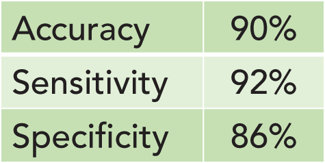
FIGURE 31A Model Performance – Technical Version

FIGURE 31B Model Performance – Layperson's Version
As you develop your content, make sure that you can explain all terms to your audience. In the prior example, although most audience members would easily understand the concept of a true positive rate, they'll have a hard time remembering the term sensitivity even if you define it. It makes it easier on you and the audience to use the simpler terminology. Also monitor the audience to identify when further definition is warranted based on confused looks in the room.
Tip 32: Don't Use Technical Terms
Tip 31 talks about simple terms and definitions. A further extension is that one way to quickly turn off a nontechnical audience is to use technical terms that they don't understand, especially given that they usually start with an assumption that you might be too technical for them. That assumption may not be fair, but it is reality that the assumption is often made. If you play into that assumption, you risk losing the audience and having them not listen to your story.
Few people purposely include terms their audience won't understand. The problem is that there are terms technical people use so often that they just seem standard to them. It is easy to forget that your audience may not hear the same terms you do every day. I can't tell you how many times in my consulting work that a client started throwing out internal corporate terms to the point I had no idea what they were saying. The clients were never trying to lose me. They just didn't think about the fact that I didn't use those terms every day like they did.
I get annoyed when someone who is technical in a different field than mine starts throwing around terms I don't understand. I'll bet you do, too. There are even rare people who like to throw out technical terms to show how smart they are. Don't be that person!
It takes a concerted effort to prevent yourself from using technical terms. As you develop your presentation, force yourself to review it and identify places where you need to either add explanation or change terms. You'll never hear me utter monotonicity or heteroscedasticity in a business presentation even though those are actually meaningful statistical terms!
Tip 33: Clarify Your Definitions
While using simple terms and avoiding technical ones, it is important to consistently clarify the definition of the terms you do use in your data‐driven presentation. Whether shown on the screen or expressed verbally, the audience needs to know how a term has been defined when you use it.
If you're using a common term, provide a quick refresher for the audience. Before showing a median value, for example, first say, “Recall that the median is the point at which 50% of the readings are higher and 50% of the readings are lower.” Audience members who already know this won't mind your validation, but those who didn't recall this will be grateful that they now understand what you are saying. If you are introducing a new metric the audience may not be familiar with, add a slide just on that metric's definition and use and spend sufficient time explaining it.
It is also important to ensure that your audience is clear on which definition you are using when there are multiple options. Figure 33a shows a compelling argument about increased margin. However, which margin is it? The margin as reported to Wall Street? Gross margin? Margin as computed by the product team? There are often multiple definitions for terms such as margin within a large company. If you don't make clear which definition you are using, then people may interpret it differently. That will lead to confusion and misunderstandings.
Figure 33b clearly states which margin is being shown. There might still be lively debate about whether this definition for margin is the right one for the situation, but at least the audience knows what they're seeing. Leaving definitions unclear will lead to misunderstandings and needless debate during your presentation.
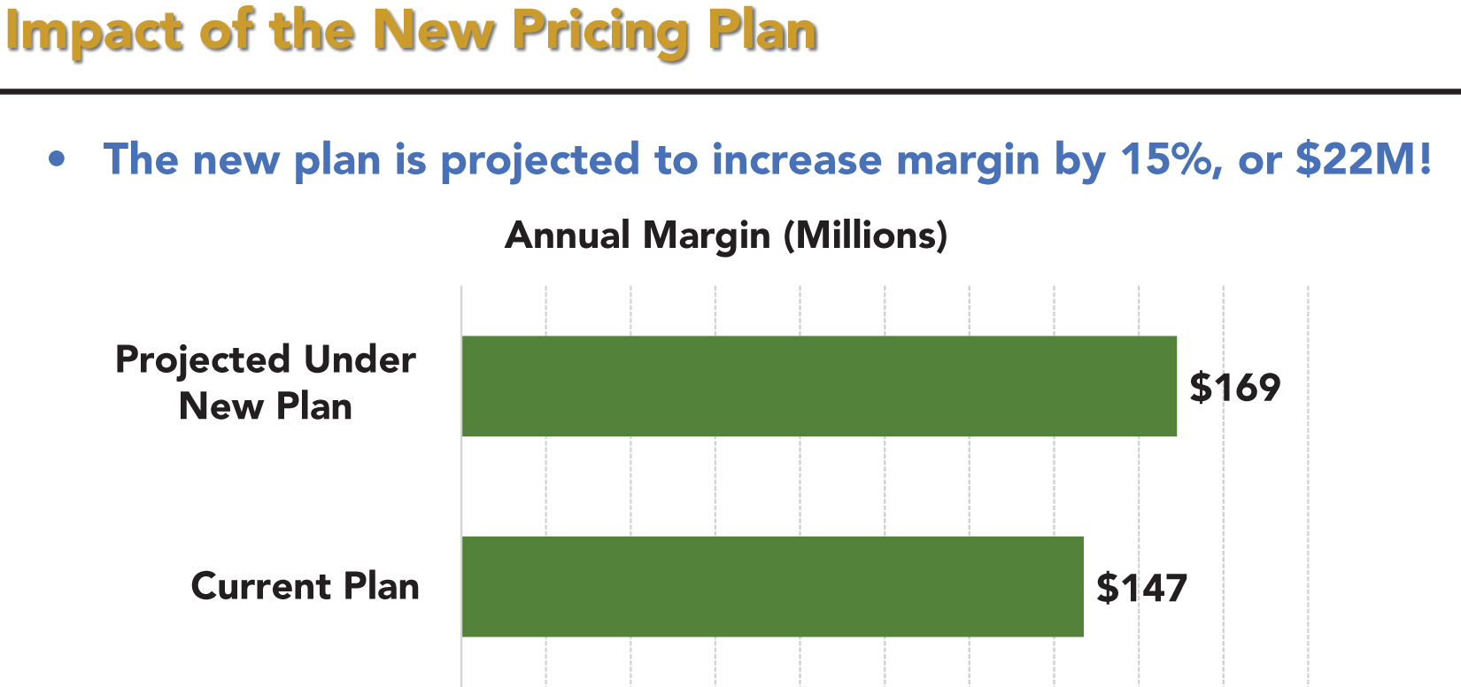
FIGURE 33A Slide with an Unclear Metric Definition

FIGURE 33B Same Slide with the Metric Defined Clearly
Tip 34: Provide Layperson and System Labels
When showing data, it is a good idea to include labels that will satisfy technical and nontechnical audiences. This will help with clarity for those who might see your presentation later, and it is also good to do because it will help people know what you used to compute your figures. If they want to have their team dig deeper, they will know how to do so.
A very common situation is when figures are being shown for a subset of a large dataset, for example, revenue for one transaction type, region, or product. In each case, there is the layperson's term such as Purchases, Northeast, and Product A. There is also the specific way the data is labeled in your organization's systems such as TransactionType=P, RegionId=NE, and ProductID=A.
It is helpful to provide the system labels along with the layperson's terms as illustrated in Figure 34a. By showing the exact way the data is identified in the system from which it was retrieved, you provide transparency and make it easier for others to build on your work. Audience members who would never run a query will just ignore the system labels, but for those who want to run a query (or ask others to do so on their behalf), the provided labels ensure that they'll do it properly.
Although Figure 34a shows the system labels in the chart itself, it is also possible to include the details in a footer or even in the notes pages so that they are part of your handout. These alternate methods are especially appropriate when the system label is more complex than in Figure 34a.

FIGURE 34A Chart Including System Labels
Tip 35: Use Consistent Phrasing
Consistency is comforting for most people and can also help them better follow a data‐driven presentation. To the extent that you use a consistent approach to phrasing throughout your presentation materials, it will help the audience grasp your points much more easily.
In my field of analytics, we often talk in terms of probabilities or ratios. Any ratio can be expressed two ways. For example, if you have $100 and I have $150, then I can say either that I have 50% more money than you or that you have 33% less money than I do. Both are true and either is mathematically correct. That said, it is better to choose a method of presenting ratios (or any other technical figures) and then stick to it. In this case, either express ratios as smaller figures in relation to bigger figures or bigger figures in relation to smaller figures.
Figure 35a has bullets that switch between a focus on response and a focus on nonresponse. That makes it hard to follow. Because response is a good thing, Figure 35b focuses on response. By sticking to one approach, Figure 35b is easier to digest and comparing the points directly is possible. Although two of the statements discuss lowering our chance of response, it is far easier to compare an increase in response probability to a decrease in response probability than it is to compare an increase in response probability to an increase in nonresponse probability, as is required by Figure 35a.

FIGURE 35A Inconsistent and Confusing Phrasing

FIGURE 35B Consistent Phrasing
Tip 36: If It Can't Be Read, Don't Display It
Documents often have publication references, image source credits, hyperlinks for more information, and so on. These are usually included using small text so as not to distract from the main point of a page. This is fine in a written document. When presenting to a live audience, it looks sloppy and it will annoy the audience if they can't see what's on the slide.
A simple rule is that if something will not be readable to the live audience when projected on the screen, then do not display it. Just because it is supporting material doesn't mean you should violate Tip 37 by shrinking your text too much. If information isn't important enough to make it big enough for everyone to read during the live presentation, it isn't needed on the slide.
The solution is simple. Just delete small supporting text from your slides for your live presentation while keeping it in the handout version and/or notes. This way, the audience will have all the information they need, but at the time they need it. Figures 36a and 36b show the same slide with and without the supporting items, respectively. Figure 36b looks cleaner and everything on it is readable. You don't want people going to additional reading material during your presentation anyway, so don't offer the option!
One exception to this rule is the copyright notice often placed at the bottom of a slide. In case someone takes a picture or screenshot, it is worth including the small copyright notice. Even though it won't be readable, people know what it is, and if they receive a slide capture from someone, they'll be aware that it is copyrighted.

FIGURE 36A Chart with Hard‐to‐Read Text
FIGURE 36B Same Chart without Hard‐to‐Read Text
Tip 37: Don't Shrink Your Font, Shorten Your Text
One sure way to undercut the effectiveness of your presentation is if your slides are too busy and have a lot of words on them. A reliable way to stop yourself from writing too much is to identify the minimum font size that will be easily readable on the screen where you will be presenting. Then, don't allow yourself to go under that font size. This will force you to compress your points as we discussed in Tip 30.
When choosing your minimum font size, error on one size too big rather than one size too small. For most environments, you need to use at least 18pt font. Often, 20pt or even 24pt font is what will work given the size of the screen and room. If you're used to working with 12pt, 14pt, and 16pt fonts like most people, you'll be surprised when you see how much less will fit on a line with an increased font size.
In a case where only one word is slipping to a second line, you might cheat and lower the font just a single level. But that should be a rare exception. If you are feeling a little uncomfortable at how much you are having to shorten your text on each slide, then that is good. It means you are forcing yourself to focus on the essence of what you want to convey per Tip 30.
As shown in Figure 37a, never shrink your font to fit your text, shorten your text to fit your font!

FIGURE 37A Never Shrink Your Font, Shorten Your Text
Tip 38: Use Appropriate Spacing
No matter the size of your text, you need to make it easy to read. Tip 37 dealt with how long a text point is. This tip deals with how points are spaced from each other. Make sure you include appropriate spacing between lines, paragraphs, and bullet points. As you can see in Figure 38a, having tight spacing makes the slide hard to read and looks awful. Always check the spacing in any template you are using as some come with small spacing as the default.
Although Figure 38b is much easier to read, the only difference is that the spacing between the bullets has been increased. Luckily, it is very easy to adjust spacing. In PowerPoint, simply highlight your text, right click, and pick the item “Paragraph … .” Always choose line spacing no tighter than “single.” I also always add extra space before or after bullets to add additional separation. My preference is spacing before or after each line that is about one half to two thirds of your font size. So, if you're using a 24pt font, use additional spacing of 12pt to 18pt.
Borrowing from Tip 37, if you ever find yourself shrinking your spacing because you have too many bullets to fit on the slide, it is better to lose some bullets or to create an additional slide than to shrink the spacing. Also note that although the spacing rule applies to paragraphs as well as bullets, you won't be having paragraphs on a slide for a live presentation, will you? I hope not!
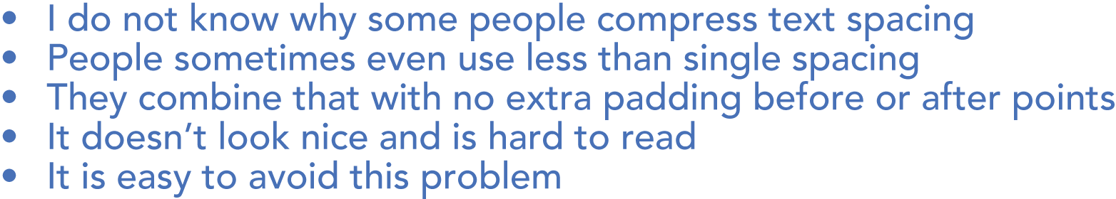
FIGURE 38A Spacing That Is Too Tight

FIGURE 38B Appropriate Spacing
Tip 39: Use the Same Font throughout Your Presentation
People like consistency, including in a data‐driven presentation. Presentations that have a wide range of fonts, especially on a single page, are distracting and hard to read. Ideally, you will pick a single font and use it throughout your presentation. The consistent look and feel will enable the audience to focus on your content rather than noticing another font. Although you want to keep the text on your slides to a minimum, even that minimal text will benefit from consistency.
What specific font you use is not as important as using a fairly standard one. Do not choose an extreme font such as ![]() or
or ![]() in a business setting. They are simply too jarring, unusual, and hard to read. Stick with easy‐to‐read fonts like Arial, Calibri, or Verdana. Notice that different fonts take up different amounts of space. All of the fonts in this paragraph are the same font size, yet they appear to vary quite a bit in size nonetheless.
in a business setting. They are simply too jarring, unusual, and hard to read. Stick with easy‐to‐read fonts like Arial, Calibri, or Verdana. Notice that different fonts take up different amounts of space. All of the fonts in this paragraph are the same font size, yet they appear to vary quite a bit in size nonetheless.
It is okay to use two or three fonts if you use each in specific places, for example, one font for headers, one font for your primary text, and another font for labels, footers, and other miscellaneous items. A different font for headers, for instance, can help to further differentiate the header from the other information. You can also consider using bold, italics, or both to differentiate different areas of text even while using the same font.
Figure 39a looks inconsistent and hard to read because of the different fonts used. It is intentionally extreme to illustrate the point.
Although Figure 39b uses only two fonts, the fact that the fonts switch in the middle of the bullet points makes the slide look sloppy. I see people make this error quite a bit and it is often caused by cutting and pasting text from different sources and not noticing that the fonts are different in each source. Always be careful to check your fonts after pasting from another source and make it a practice to paste raw text without formatting to ensure you do not override the presentation default.

FIGURE 39A Multiple Fonts Don't Look Right

FIGURE 39B Cutting and Pasting Can Lead to Different Fonts
Figure 39c uses a consistent font throughout. This looks cleaner and more appealing.
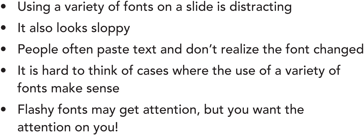
FIGURE 39C A Single, Consistent Font Looks Best
Tip 40: Beware the Missing Font
If you build and present a data‐driven presentation using your own computer, missing fonts will never be a problem because you obviously can't build a presentation with your computer using a font that isn't on your computer. Most companies will install the same fonts on everyone's computer. So, you are almost always fine when sharing within your organization, too. But using a computer from outside your organization won't always work out well.
If you copy a PowerPoint file to a different computer, and if that computer doesn't have your font, PowerPoint will substitute a default font for yours. Although that sounds great, you must remember that different fonts take different amounts of space (see Tip 39). If the replacement font is sized differently, you can end up with headers and text points wrapping to a new line in places that they did not originally. This will make the slides look sloppy with headers bleeding into the main slide area and text becoming hidden behind graphics, among other issues.
Always check that your PowerPoint looks okay on a different computer as soon as you copy it over. If your font was replaced and your slides now look funky, you have a few options.
- Change the font on the new computer to something similar in size to yours so that everything still fits properly.
- Shrink the size of the text in affected spots just slightly (very slightly per Tip 37!) so that it once again fits. Usually, only a single word will wrap, so a slight decrease in font size fixes the issue.
- Expand the size of the affected text containers so they are wider than the text.
- Present from a PDF instead of the PPT. Although you'll lose any animations, a PDF doesn't depend on local font availability because a PDF embeds the fonts within the document.
- Use your own computer after all, though in some settings this isn't possible.

FIGURE 40A Impact of a Missing Font
Most of the occasions when I have seen the missing font problem arise (including the first time it happened to me!), the speaker didn't see the problem until after their presentation began. At that point, it is too late to do anything but apologize and grimace each time a slide looks bad. Figure 40a illustrates how a missing font can ruin the look of a slide. None of the text wrapped with the original font.
Tip 41: Address Every Agenda Item Listed
Although this is an obvious mistake to avoid, I have seen many people show an agenda at the start of their presentation and then never discuss one or more items listed on the agenda. For people paying attention, it will not only confuse them and make them wonder if they missed something, but it will lower your credibility and make your data‐driven presentation appear incomplete and/or disorganized.
The way this issue typically arises is that multiple drafts of the presentation are generated before the final version is blessed. Often, the agenda slide is one of the first developed, and once you've looked at any slide too many times, it is hard to see it with fresh eyes and realize that something needs to change. If an item was initially on your agenda, but then you decided to cut it out, it is very easy to forget to go back and adjust the agenda slide.
In Figure 41a, the agenda includes an item comparing today's results to those of another recent project. Perhaps it was decided that the comparison was too politically charged or that there wasn't enough time and so the section was removed. The item is still in the agenda and must be removed from it.
A corollary to this tip is to make sure your agenda items are still in the right order in case you reordered topics. The way to avoid these mistakes is to always double‐check your agenda slides after your presentation is complete.
You also need to keep the audience appraised of your progress through the agenda, which we'll discuss next in Tip 42.

FIGURE 41A Today's Agenda
Tip 42: Identify When an Agenda Item Is Covered
As you cover every agenda item listed, per Tip 41, you must also make it clear to your audience that you have done so. You don't want the audience to have to keep a tally in their head of what's been covered. You also don't want them to look at the handout later and have to work to determine where each agenda item is covered.
The simple way to ensure that the audience knows you are covering an agenda item is to explicitly label the content tied to that agenda item. If you have only one or two slides for a given agenda item, then use the header to call out the agenda item being covered as in Figure 42a. If you have a lot of slides for a given agenda item, then use a section break slide as in Figure 42b.
Unless you have a very short presentation with only a slide or two per agenda item, the section break approach works better. It makes it very clear what each section covers when presenting live and in the printed version. Section breaks also free up valuable header space to be used for something other than identifying the agenda item covered.
Although using section breaks will add to your slide count, you'll learn in Tip 87 that you should focus on time and not slide count. In a live presentation, you'll move past the section headers very quickly while also getting the audience ready for what is coming next. The time impact is negligible and so the extra slide is worthwhile.

FIGURE 42A Use an Agenda Slide with Headers for Short Sections

FIGURE 42B Use Section Breaks for Longer Sections
Tip 43: Spellcheck Is Not Always Your Friend
Avoiding misspelled words and bad grammar likely aren't things that you need to be convinced to do. I don't think anyone would argue the fact that spelling and grammar errors detract from your credibility when you display them on a screen. However, I see misspelled words and incorrect verb tenses all the time in presentations.
One reason for these errors is that many people mistakenly rely primarily on automated spelling and grammar checking functions. Although today's automated tools are good, they are not foolproof. Worse, if you rely on them as your primary proofreader, then you'll get lazier and lazier over time when it comes to policing yourself.
Although it is tedious, I always make myself set aside anything I've written for at least a few hours before I come back to it. When I look at it with fresh eyes, I not only clean up and shorten what I've written (per Tip 30) but I also focus on spelling and grammar. What I have found is that even in a relatively short blog, I must override the spelling and grammar check recommendations at least once or twice. This works out to at least one spelling and grammar override for every several hundred words. That's a lot! Figure 43a shows some examples where a built‐in spelling and grammar check will lead you astray if you accept its advice.
Note also that when discussing technical content, you often use words that are common within the discipline being discussed but which will not be common enough to be in the spellchecker's dictionary. You'll be on your own to make sure such words are spelled correctly (but use them sparingly per Tip 32).

FIGURE 43A Incorrect Spelling and Grammar Check Results
Tip 44: Charts and Images Are Misspelling Factories
When dealing with charts, graphs, and images, you must be especially careful! Spelling and grammar checking software will not scan such content for you and so any errors you make will be carried right through to the audience if you don't find them yourself through manual inspection.
I have had more than one occasion when I created a chart, missed a typo, and then included that chart in a presentation before I (or worse, an audience member) caught the error. Beyond your usual diligence with text content, your charts, graphs, and images require even more attention and diligence. You must check every single word in such content personally if you want to avoid embarrassing errors.
Figure 44a is intentionally extreme in the number of typos it contains, yet not one of the obvious typos was flagged by the spelling and grammar checker!

FIGURE 44A Graphs Are Not Checked for Spelling or Grammar!
Tip 45: Beware the Right Word, Wrong Place
An easy mistake to make, and one that is devilishly hard to find, is to use a word that is correctly spelled but use it in the wrong place. These errors are particularly hard to find for two reasons. First, spelling and grammar checkers will think everything looks fine. Second, as you read what you've written, your mind will tend to see what you meant to say rather than what you actually did say. Even a proofreader can miss this type of error as the proofreader's brain substitutes the logically intended word for the one present.
There is no way to find word substitution errors outside of a careful proofreading of everything in your presentation. One trick someone once taught me is to review content backwards (from bottom to top and right to left) to find errors like this. When reading the content in reverse, it does not flow in a logical fashion and your brain is better able to look at each word and phrase as a standalone entity.
Some of the more common ways to get the right word in the wrong place are illustrated in Figure 45a.
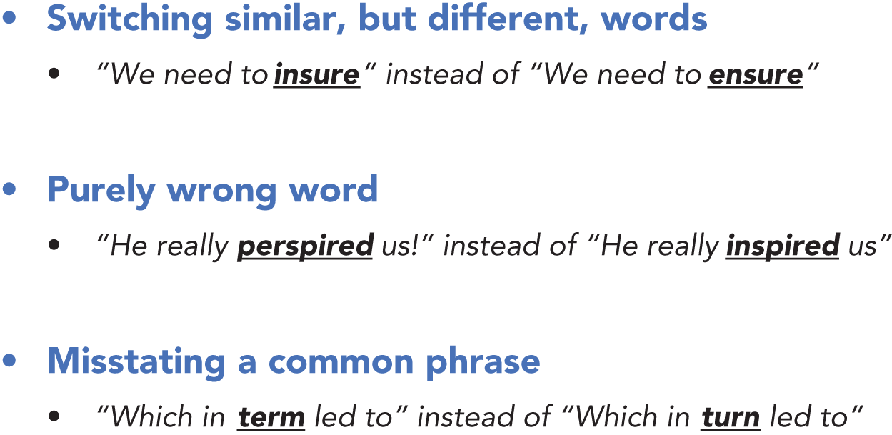
FIGURE 45A Beware the Right Word, Wrong Place
Tip 46: Keep Your Text Horizontal
We almost always read text that is written horizontally. In fact, it is very rare in our daily lives to see text that is anything but horizontal. As a result, our brains have difficulty reading text that is either slanted or pivoted. One place where we do sometimes come across text that flows in different directions is in charts and graphs.
It is not uncommon to have the text on a vertical axis of a chart pivoted 90 degrees so that it reads from top to bottom. Or to have the text pivoted at a 45‐degree angle to fit more words in the available space. To make it easy for your audience to interpret, however, avoid using anything but horizontal text whenever possible. This means avoiding charts and graphs that have no option to leave text horizontal.
Figure 46a shows a typical graph displayed in two suboptimal ways: first, with slanted labels below the bars; second, with rotated text so it reads vertically. Both versions are harder to read than Figure 46b, which simply pivots the graph to horizontal so that the labels can be written horizontally too.
The less load you put on your audience's brain, the better they'll be able keep their focus on you and your story. I would be surprised if any readers don't find the chart in Figure 46b to be far easier to consume than either of the charts in Figure 46a.
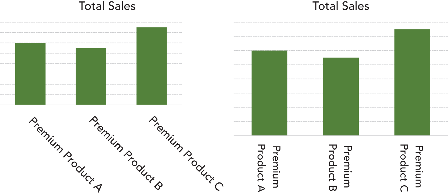
FIGURE 46A Non‐Horizontal Text Is Hard to Read

FIGURE 46B Horizontal Text Is Much Easier to Read