Chapter 7. Advanced UIKit Design
Chapter 3 introduced the UIKit framework, which is the heart of all GUI applications on the iPhone. This chapter covers the most aesthetically rich components of the iPhone’s UIKit framework and shows you how to make your own software look as spectacular as Apple’s own preloaded applications.
Remember that to tap into the UIKit, your application must be linked to it. Just like any other framework, UIKit is a shared object. Using the tool chain, UIKit can be linked in by adding the following arguments to your command-line arguments:
$ arm-apple-darwin-gcc -o MyApp MyApp.m -lobjc
    -framework CoreFoundation
    -framework Foundation
    -framework UIKit
If you’re using a makefile, as illustrated in Chapter 2, add the UIKit framework to the linker flags section:
LDFLAGS = lobjc
         -framework CoreFoundation
         -framework Foundation
         -framework UIKit
The following advanced components of UIKit will be covered in this chapter:
- Controls
UIKit provides a set of controls that include switches, segmented controls, and sliders. Controls are used in preference tables, navigation bars, and other visual elements. The
UIControlclass is designed to be a versatile widget-type class capable of connecting to many different types of objects.- Preferences tables
A special type of view class has been designed specifically for managing program settings. Preferences tables provide hooks for wiring up controls and allow logical groupings of similar options. The preferences table view is a table-like class that ties many different types of individual cells and controls together into a polished window.
- Progress indicators
Progress indicators notify the user that an operation is in progress and convey status in the form of spinning icons and thermometers. The application can tell the indicator when to start and stop, and can control the progress bar’s completion.
- Image handling
UIKit provides many classes for the manipulation and display of images. These classes can load most popular types of images and display, transform, layer, and clip them anywhere on the screen. Image classes are intended for static images that don’t require much animation. For high-performance graphics in games, read up on the Core Surface framework in Chapter 5.
- Section lists
When working with large, grouped lists of data, you may find it necessary to order information by category. Section lists are used in the mobile phone application to sort contacts and songs, and can be used to group any type of items into categories with custom headings. An alphabetical Rolodex-type scroll bar can also be used to quickly flip to the first letter of a section heading.
- Keyboards
The iPhone supports 10 different keyboard styles, which are used widely by applications for various kinds of input. Apple’s Mail application uses one type of keyboard containing special characters for email address entry, whereas Safari uses a keyboard suitable for URL input sporting a .COM button.
- Pickers
While not technically a control, Pickers provide a unified method of input for selecting options from a list. Pickers present lists in the form of spinning dials, which can be tailored to behave in different ways. Date and time pickers are more specialized versions of this class, allowing the selection of custom dates, times, and time periods.
- Button bars
Button bars are icon and text bars appearing at the bottom of an application. They are the preferred method of logically separating similar views of different data or providing different modes of functionality within an application. The iPod application uses button bars to separate playlists, artists, songs, and videos from each other, while the phone application uses a button bar to separate different functions of the phone (keypad, contacts, etc.).
- Orientation changes
UIKit’s
UIHardwareclass provides access to the iPhone’s orientation sensor. This allows the developer to know when the iPhone switches between portrait and landscape modes, and at what angle the handset is being held. You can read the iPhone’s accelerometer directly to detect minor variations of angle, or use a simpler API to obtain the general orientation of the handset.- Web views and scrollers
A web view class is built-in to the UIKit framework, allowing applications to display a web page or a local file within a window. This is powerful for network-based tools that might choose to use web pages to refresh “latest news” windows or display other information. Web views can also display small PDFs and other files locally and remotely.
Web views, like many other objects with a lot of content, are heavily dependent on scrollers. Scrollers provide a potentially large field on which to place a view, and allow portions of that view to be scrolled across a smaller window region. You’ve been using them indirectly with tables and lists, and here you’ll see just how they work.
Controls
Controls are diverse, widget-like utility classes designed to augment an application’s user interface. UIKit supports many different types of controls. Some are very specific to certain applications (such as UIScrubberControl), while others are buried deep enough within higher-level classes that most developers won’t need to use them directly (such as UIRemoveControl).
The controls used on the iPhone are noticeably different from those used in desktop applications. Desktop controls such as checkboxes and radio buttons simply won’t cut it on a high-resolution device with limited touch screen precision (e.g., no stylus). For each desktop control used, a special control has been designed specifically for the iPhone.
Controls are practical enhancements to classes derived from UITableCell, specifically table cells, preferences table cells, and other similar classes. Some can also be used with navigation bars and other types of view objects. There are three compact, general-purpose controls appropriate for most applications, which will be covered in this section. Other control-like objects, such as progress indicators and pickers, are given entire sections in this chapter.
Controls are derived from the UIControl base class, which is derived from the UIView class. This means it has many of the same properties as the other view classes you’ve looked at so far. Controls initialize with a view region and behave largely in the same manner as UIView objects.
Segmented Control
The segmented control replaces the radio button used on desktop operating systems and instead provides an interface similar to the front of a dishwasher. The user sees a pushbutton bar where pushing one button causes all others to pop out. Segmented controls are useful where a limited number of related selections are available for one option.
Creating the control
A segmented control is initialized with a view region. The frame’s coordinates are offset to the view hosting the control, which is usually the cell of a preferences table or a navigation bar.
UISegmentedControl *segCtl = [ [UISegmentedControl alloc]
    initWithFrame:CGRectMake(70.0, 8.0, 180.0, 30.0)
    withStyle: 0
    withItems: NULL ];
One of three different styles for segmented controls can be chosen depending on where the control is being used.
Style | Description |
| Large white buttons with gray border, appropriate for preference cells |
| Large white buttons with black border, appropriate for table cells |
| Small gray buttons, appropriate for navigation bars |
Each segment within a segmented view is represented by a button containing a label or image. A segment must be created for each available option. You can have as many segments as will fit on the screen, but only one segment can be selected by the user at any time. Options for a “mood” control might look like the snippet below.
[ segCtl insertSegment:0 withTitle:@"Happy" animated: YES ];
[ segCtl insertSegment:1 withTitle:@"Sad" animated: YES ];
[ segCtl insertSegment:2 withTitle:@"Mad" animated: YES ];
This code adds three buttons to a segment control: Happy, Sad, and Mad. Each button is assigned its own segment number: 0, 1, 2, and so on.
Segments can also be removed.
To remove an individual segment, use the removeSegment method:
[ segCtl removeSegment: 0 animated: YES ];
To remove all segments at once, invoke removeAllSegments. This causes the control to shed it buttons visibly.
[ segCtl removeAllSegments ];
If, at any time, it’s necessary to change the title of a button, use the setTitle method:
[ segCtl setTitle:@"Glad" forSegment: 0 ];
Images
In addition to text, segmented controls can also display images inside a button. Any images used should be included in the application’s program folder as discussed in Chapter 2. An image can be added to an existing segment using the setImage method:
[ segCtl setImage: [ UIImage applicationImageNamed:@"happy.png" ]
       forSegment: 0
];
Or, if the segment hasn’t been added yet, a different version of the insertSegment method will allow an image to be specified as the segment is added:
[ segCtl insertSegment: 0
             withImage: [ UIImage applicationNames:@"happy.png" ]
              animated: YES
];
The control itself doesn’t do any image scaling, so it will try to display your image on the button even if the image is too large. This requires care in designing button images to ensure they fit into the button space.
Momentary clicks
The default behavior of the segmented control is to let the user select one option at a time and hold that button in until another is selected. This behavior can be changed slightly to automatically release the button shortly after it is pressed. Use the setMomentaryClick method to enable this behavior.
[ segCtl setMomentaryClick: YES ];
Displaying the control
Once the control has been configured, it can be displayed by adding it as a subview to any type of object that can host it. These include table cells, navigation bars, and other view objects:
[ parentView addSubview: segCtl ];
Reading the control
To read the current value of a segmented control, use the selectedSegment method. This returns an integer corresponding to the segment number that is currently selected. The value is set based on the number assigned to it when it was first inserted into the control.
int x = [ segCtl selectedSegment ];
Simply reading the value of the control will suffice for most needs, such as in the case of preferences tables, which need to read it only when the user exits the page. In some cases, however, a notification needs to be sent at the time the button is pressed.
For this extra functionality, create a subclass of UISegmentedControl and override the control’s mouseDown or mouseUp methods (depending on when you want to receive the notification). These events can be used to trigger a read and any necessary action at the time the button is pressed. The template for this follows.
@interface MySegmentedControl : UISegmentedControl
{

}
- (void)mouseDown:(struct _  _GSEvent *)event;
- (void)mouseUp:(struct _  _GSEvent *)event;
@end
Now, override the mouseDown or mouseUp method so that the value can be read when a button in this class is pressed or released.
@implementation MySegmentedControl
- (void)mouseDown:(struct _  _GSEvent *)event {

    int x = [ self selectedSegment ];

    /* Do something here */
}
@end
Switch Control
In the same way that the segmented control replaced the radio button, the switch control replaced the checkbox. Switch controls are used in preference panes to turn features on and off.
The switch control is by far the simplest control to use, but can still be customized to a degree.
Creating the control
A switch control is initialized using the standard initWithFrame method. This method defines its size and coordinates relative to the class hosting it, such as a table cell or navigation bar.
UISwitchControl *switchControl = [ [ UISwitchControl alloc ]
    initWithFrame: CGRectMake(170.0f, 5.0f, 120.0f, 30.0f)
];
If the switch is a dangerous one that could result in a performance impact or have other consequences, it’s best to label it with warning colors. A UISwitchControl object can be made to use an alternate set of colors, appearing bright orange when activated. Use the setAlternateColors method to set this when the control is created.
[ switchControl setAlternateColors: YES ];
Displaying the control
Once the control is created and initialized, it can be displayed by adding it to a compatible view object, such as a table cell or navigation bar.
[ tableCell addSubview: switchCtl ];
Reading the control
The switch control returns a floating-point value of 0.0 when off, or nonzero when on. This can be obtained by calling the object’s value method.
float switchValue = [ switchControl value ];
Most applications need only read the switch value when the page is exited, such as in a preferences table. To read the value of the control at the moment it’s switched, its mouseDown or mouseUp event can be intercepted. Sublcass the UISwitchControl to override these methods. For example:
@interface MySwitchControl : UISwitchControl
{

}
- (void)mouseUp:(struct _  _GSEvent *)event;
@end
When the switch is toggled, the mouseUp method will be notified, allowing instant action to be taken.
@implementation UIMySwitchControl
- (void)mouseUp:(struct _  _GSEvent *)event {
[ super mouseUp: event];
    float switchValue = [ self value ];

    /* Do something here */
}
@end
Slider Controls
Slider controls provide a range that the user can select from using a visual slide bar, and are configurable to meet a wide range of needs. You can set ranges for the slider values, add images at the ends, and make various other aesthetic tweaks. The slider is ideal for presenting options with wide ranges of numeric values, such as a volume setting, sensitivity controls, and even controls requiring precision adjustment. Apple must have determined sliders to be good enough to port to the iPhone, as they’re commonly seen on the desktop, too.
Creating the control
The slider control is a standard UIControl object and is created in the same way as the segmented control or switch control. In fact, the switch control discussed in the last section is derived from the slider control, even though the slider control is more complex.
UISliderControl *sliderControl = [ [ UISliderControl alloc ]
    initWithFrame:CGRectMake(170.0f, 5.0f, 120.0f, 30.0f)];
The value range for the control should be set on creation so you know what data to expect in return. If you provide no default range, values between 0.0 and 1.0 are used.
[ sliderControl setMinValue: 0.0 ];
[ sliderControl setMaxValue: 100.0 ];
A default value for the slider can also be set at this time.
[ sliderControl setValue: 50.0 ];
The slider can display images at either end of the control. These can be set in a similar fashion to images in a segmented control. The images should be copied into the application’s program directory, as explained in Chapter 2. Setting images causes the control’s slider bar length to be decreased, so be sure to increase the size of the control when calling initWithFrame to accommodate the images.
[ sliderControl setMinValueImage:
    [ UIImage applicationImageNamed:@"min.png" ]
];

[ sliderControl setMaxValueImage:
    [ UIImage applicationImageNamed: @"max.png" ]
];
For precision controls, it may be important to show the user what the current numeric value is. The setShowValue method can be invoked to display this next to the slider.
[ sliderControl setShowValue: YES ];
Displaying the control
As is standard for UIView objects, the control can be displayed by adding it as a subview to a table cell, navigation bar, or other compatible object.
[ tableCell addSubview: sliderControl ];
Reading the control
The slider control reads as a floating-point value within the range you specified at the control’s creation. The value can be queried using its value method.
float sliderValue = [ sliderControl value ];
Most applications need to read the value of the slider only when the user exits the page, such as with a preferences table. To read the value as the slider is changed, you must intercept the mouseDown or mouseUp event. The UISliderControl can be subclassed and its event methods overridden, using the following template.
@interface MySliderControl : UISliderControl
{

}
- (void)mouseUp:(struct _  _GSEvent *)event;
@end
[ super mouseUp: event ];
@implementation MySliderControl
- (void)mouseUp:(struct _  _GSEvent *)event {

    float x = [ self value ];

    /* Do something here */
}
@end
Further Study
Read how controls are used in preferences tables in the next section of this book.
Try to think of the different types of view classes where attaching controls might be useful, and what you can do with them.
Check out UISegmentedControl.h, UISwitchControl.h, and UISliderControl.h in your tool chain’s include directory. You’ll find it in /usr/local/arm-apple-darwin/include/UIKit.
Preferences Tables
Preferences tables provide an aesthetically rich interface for displaying and changing program settings. These tables can be seen in the iPhone’s Settings application, but most third-party applications provide a settings interface of their own to avoid making changes to the preloaded environment. Preferences tables provide resizable cells capable of hosting controls, text boxes, and informational text. They also provide a mechanism for logically grouping similar preferences together.
Creating a Preferences Table
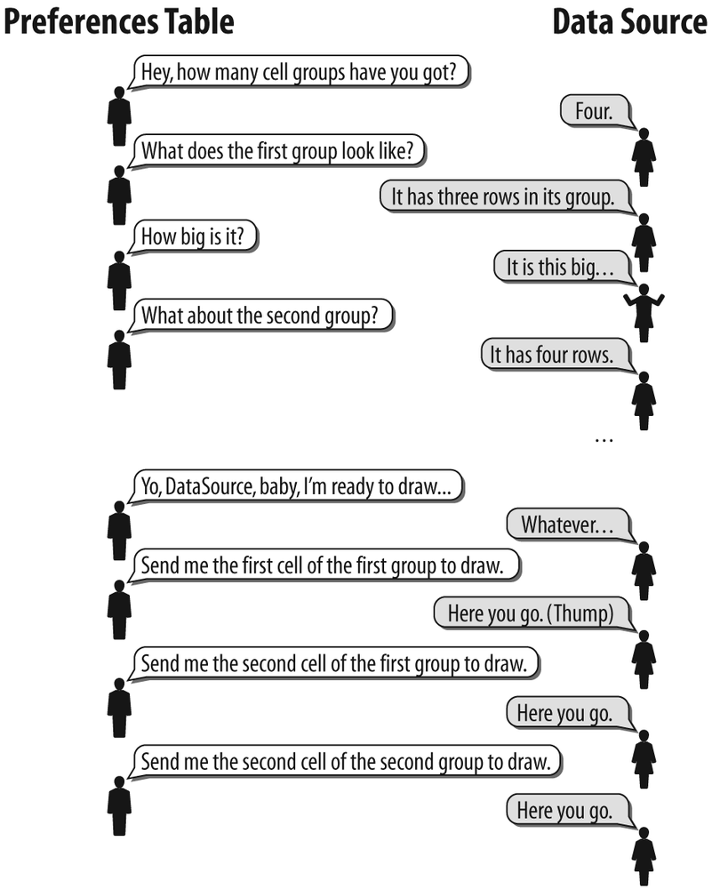
Some forethought must be put into implementing a UIPreferencesTable class, as a callback-oriented data binding is used to query for the information used to fill the table. This is done in a similar fashion to the UITable objects you learned about in Chapter 3, but with a higher level of complexity. The runtime class invokes a set of methods in the data source to return information about the preferences table—the number and size of each cell, objects within cells, and information about logical groupings. Much to the discouragement of iPhone’s open source community, this is very different from an object-oriented model where each cell would have its own properties and simply be added as objects. Instead, the construction for the entire preferences table is bulky and complex in spite of Apple’s traditionally elegant design style.
Just to recap, the preferences table refers to the complete settings page. A table can have many logical groupings of like settings. Within each group, a single table cell is used to display each individual setting to the user. The content for the cell includes optional title, text, and controls, if any.
The conversation between a preferences table and its data source looks (something) like Figure 7-1.
Because a preferences table is assembled in two pieces (the table and the data source), the cleanest way to put one together is to create a subclass of UIPreferencesTable and have it act as its own data source. This allows your application to simply create an instance of the class and display it on the screen.
Subclassing the preferences table
To create a self-contained preferences table, create a subclass of UIPreferencesTable and include all of the methods needed to bind to itself as a data source. The following example creates a subclass named MyPreferencesTable:
@interface MyPreferencesTable : UIPreferencesTable
{

}

/* Preferences table methods */

- (id)initWithFrame:(CGRect)rect;
- (void)dealloc;

/* Data source methods */

- (int)numberOfGroupsInPreferencesTable:(UIPreferencesTable *)aTable;
- (UIPreferencesTableCell *)preferencesTable:
    (UIPreferencesTable *)aTable cellForGroup:(int)group;
- (float)preferencesTable:(UIPreferencesTable *)aTable
    heightForRow:(int)row
    inGroup:(int)group
    withProposedHeight:(float)proposed;
- (BOOL)preferencesTable:(UIPreferencesTable *)aTable
    isLabelGroup:(int)group;
- (UIPreferencesTableCell *)preferencesTable:
    (UIPreferencesTable *)aTable
    cellForRow:(int)row
    inGroup:(int)group;
The methods used for the data source break down like this:
numberOfGroupsInPreferencesTableReturns the number of logical groups in the table. This also includes text label groups, which are groups used to add small, embossed text to a cell. Group labels should not be included in the group count.
cellForGroupReturns a
UIPreferencesTableCellobject to act as the group heading for a given group. These cells are created asUIPreferencesTextTableCellobjects, and are assigned a group title using the cell’ssetTitlemethod.heightForRowReturns the height for a given row. This method is provided with a proposed height that can be returned as a default. It’s ultimately up to the developer what height any given cell should be; you can return the proposed height or a custom height, depending on the type of object being created. This method is also called for group headings, using a row number of −
1.isLabelGroupReturns a Boolean value specifying whether the cells in a given group should be treated as text labels. Text labels are smaller than group labels, and are used to provide informational text. When
YESis returned, the group will be displayed as small, embossed text rather than a white cell.cellFowRowReturns the preference cell object for whatever row and group is specified. Whenever a preference is brought into view, this method is called to obtain the
UIPreferencesTableCellobject representing the row. This method is called multiple times for the same cell, and so cell objects must be cached in memory.
Caching preference cells
Each preference cell in a preferences table is “forgotten” by the table after it scrolls off the screen. When it scrolls back into view, the cellFowRow method is called again for that row. This can present a problem if you’re creating a new row every time the method is called, and can also slow scrolling down considerably.
In a nutshell, the cellForRow method should be written so that repeated queries for the same preferences cell will return a pointer to an existing cell, rather than recreate it each time. By creating a matrix, you can store pointers for each cell and return to them later to satisfy subsequent queries. Create a matrix of cell pointers in your preferences table subclass. This will hold all of the pointers to cells you create later.
#define NUM_GROUPS 3
#define CELLS_PER_GROUP 4

UIPreferencesTableCell *cells[NUM_GROUPS][CELLS_PER_GROUP];
UIPreferencesTableCell *groupcell[NUM_GROUPS];
Here, NUM_GROUPS and CELLS_PER_GROUP represent the number of logical groups in the preferences table and the highest number of cells in any given group. These values will be used to initialize the matrix when the preferences table’s initWithFrame method is called, so they’re created here as constants.
Initialization
After you create a preferences table object, you display it either by attaching it to an existing view or transitioning to it from a controlling view. This can be done when the user presses a settings button, or automatically the first time the program runs. The following code instantiates the MyPreferencesTable subclass you’ve created:
MyPreferencesTable *preferencesTable = [ [ MyPreferencesTable alloc ]
    initWithFrame: viewRect ];
After the object has been created, its reloadData method must be called to load all the elements in the preference table. This causes the table to invoke its data source and begin loading information about cell groupings and geometry.
[ preferencesTable reloadData ];
Preferences table cells
Each cell in a preferences table gets created as a UIPreferencesTableCell object, or a subclass of it. Cells are returned through the cellForRow callback method, which you must write and which is called by the preferences table class automatically as new rows are being drawn on the screen. For example, if the cellForRow method is called specifying row 0 group 0, the method might return a cell using code like the following:
UIPreferencesTableCell *cell = [ [ UIPreferencesTableCell alloc ]
    init ];
[ cell setTitle:@"Music Volume" ];
[ cell setShowSelection: NO ];
return cell;
Text cells
A text cell is a subclass of UIPreferencesTableCell, but is designed to display (and optionally allow editing of) text. The following snippet is an example of how to create one.
UIPreferencesTextTableCell *cell = [
    [ UIPreferencesTextTableCell alloc ] init ];
[ cell setTitle: @"Version" ];
[ cell setEnabled: NO ];
[ cell setValue: @"1.0.0" ];
return cell;
Use the setEnabled method to enable editing:
[ cell setEnabled: YES ];
The value can be read using the value method:
NSString *text = [ cell value ];
Controls
The UIPreferencesControlTableCell object is derived from the base UIPreferencesTableCell class and can accommodate a control. Controls can be added to regular UIPreferencesTableCell objects as subviews, but the UIPreferencesControlTableCell class can completely encapsulate a control.
UIPreferencesControlTableCell *cell =
    [ [ UIPreferencesControlTableCell alloc ] init ];
UISliderControl *musicVolumeControl = [ [ UISliderControl alloc ]
    initWithFrame:CGRectMake(170.0f, 5.0f, 120.0f, 55.0f) ];
[ musicVolumeControl setMinValue: 0.0 ];
[ musicVolumeControl setMaxValue: 10.0 ];
[ musicVolumeControl setValue: 3.5 ];

[ cell setControl: musicVolumeControl ];
The control can then be referenced from the object, relieving you of the need to keep a pointer to the control in your class:
UISliderControl *musicVolumeControl = [ cell control ];
This example creates a slider control with a frame in the right portion of the preferences cell. It then sets the slider as the control for the cell. All of this takes place in the cellForRow method before returning the newly created cell.
Displaying the Preferences Table
The preferences table can be displayed by adding it as a subview to an existing view or transitioning to it with a UITransitionView.
Add a preference table as a subview as follows:
[ self addSubview: preferencesTable ];
whereas a transition might look like this:
[ transitionView transition: 1 toView: preferencesTable ];
Example: Shoot-'Em-Up Game Settings
A spaceship shoot-'em-up game is being written and needs a set of preferences to control everything from sound volume to debugging messages. In this example, the UIPreferencesTable class is subclassed to create our own MyPreferencesTable object. This object serves as a preferences table and its own data source. It creates each cell and assigns some of the controls you learned about in the previous section. A MyPreferencesTable object is built as a self-contained preferences table that can be used by the MainView class.
This example can be built with the tool chain from the command line as follows:
$ arm-apple-darwin-gcc -o MyExample MyExample.m MyPreferencesTable.m
    -lobjc -framework CoreFoundation -framework UIKit
Example 7-1 and Example 7-2 contain the code for the application and main view, while Example 7-3 and Example 7-4 create the preferences table itself.
#import <CoreFoundation/CoreFoundation.h>
#import <UIKit/UIKit.h>
#import "MyPreferencesTable.h"

@interface MainView : UIView
{
    MyPreferencesTable *preferencesTable;
}
- (id)initWithFrame:(CGRect)rect;
- (void)dealloc;
@end

@interface MyApp : UIApplication
{
    UIWindow *window;
    MainView *mainView;
}
- (void)applicationDidFinishLaunching:(NSNotification *)aNotification;
@end
#import "MyExample.h"

int main(int argc, char **argv)
{
    return UIApplicationMain(argc, argv, [ MyApp class ]);
}

@implementation MyApp
- (void)applicationDidFinishLaunching:(NSNotification *)aNotification {
    window = [ [ UIWindow alloc ] initWithContentRect:
        [ UIHardware fullScreenApplicationContentRect ]
    ];

    CGRect rect = [ UIHardware fullScreenApplicationContentRect ];
    rect.origin.x = rect.origin.y = 0.0f;

    mainView = [ [ MainView alloc ] initWithFrame: rect ];

    [ window setContentView: mainView ];
    [ window orderFront: self ];
    [ window makeKey: self ];
    [ window _setHidden: NO ];
}
@end

@implementation MainView
- (id)initWithFrame:(CGRect)rect {
    if ((self == [ super initWithFrame: rect ]) != nil) {

        preferencesTable = [ [ MyPreferencesTable alloc ] initWithFrame: rect ];
        [ preferencesTable reloadData ];
        [ self addSubview: preferencesTable ];
    }

    return self;
}

- (void)dealloc
{
    [ self dealloc ];
    [ super dealloc ];
}
@end
#import <UIKit/UIKit.h>
#import <UIKit/UIPreferencesTable.h>
#import <UIKit/UIPreferencesTextTableCell.h>
#import <UIKit/UISwitchControl.h>
#import <UIKit/UISegmentedControl.h>
#import <UIKit/UISliderControl.h>

#define NUM_GROUPS 3
#define CELLS_PER_GROUP 4

@interface MyPreferencesTable : UIPreferencesTable
{
    UIPreferencesTableCell *cells[NUM_GROUPS][CELLS_PER_GROUP];
    UIPreferencesTableCell *groupcell[NUM_GROUPS];

    UISliderControl    *musicVolumeControl;
    UISliderControl    *gameVolumeControl;
    UISegmentedControl *difficultyControl;

    UISliderControl    *shipStabilityControl;
    UISwitchControl    *badGuyControl;
    UISwitchControl    *debugControl;
}

- (id)initWithFrame:(CGRect)rect;
- (int)numberOfGroupsInPreferencesTable:(UIPreferencesTable *)aTable;
- (UIPreferencesTableCell *)preferencesTable:
    (UIPreferencesTable *)aTable
    cellForGroup:(int)group;
- (float)preferencesTable:(UIPreferencesTable *)aTable
    heightForRow:(int)row
    inGroup:(int)group
    withProposedHeight:(float)proposed;
- (BOOL)preferencesTable:(UIPreferencesTable *)aTable
    isLabelGroup:(int)group;
- (UIPreferencesTableCell *)preferencesTable:
    (UIPreferencesTable *)aTable
    cellForRow:(int)row
    inGroup:(int)group;
@end
#import "MyPreferencesTable.h"

@implementation MyPreferencesTable
- (id)initWithFrame:(CGRect)rect {
    if ((self == [ super initWithFrame: rect ]) != nil) {
        int i, j;

        for(i=0;i<NUM_GROUPS;i++) {
            groupcell[i] = NULL;
            for(j=0;j<CELLS_PER_GROUP;j++)
                cells[i][j] = NULL;
        }

        [ self setDataSource: self ];
        [ self setDelegate: self ];
    }

    return self;
}

- (int)numberOfGroupsInPreferencesTable:(UIPreferencesTable *)aTable {

    /* Number of logical groups, including labels */
    return NUM_GROUPS;
}

 - (int)preferencesTable:(UIPreferencesTable *)aTable
    numberOfRowsInGroup:(int)group
{
    switch (group) {
        case(0):
            return 4;
            break;
        case(1):
            return 4;
            break;
        case(2):
            return 1; /* Text label group */
            break;
    }
}

- (UIPreferencesTableCell *)preferencesTable:
    (UIPreferencesTable *)aTable
    cellForGroup:(int)group
{
     if (groupcell[group] != NULL)
         return groupcell[group];

     groupcell[group] = [ [ UIPreferencesTableCell alloc ] init ];
     switch (group) {
         case (0):
             [ groupcell[group] setTitle: @"General Settings" ];
             break;
         case (1):
             [ groupcell[group] setTitle: @"Advanced Settings" ];
             break;
     }
     return groupcell[group];
}

- (float)preferencesTable:(UIPreferencesTable *)aTable
    heightForRow:(int)row
    inGroup:(int)group
    withProposedHeight:(float)proposed
{
    /* Return height for group titles */
    if (row == −1) {
        if (group < 2)
            return 40;
    }

    /* Segmented controls are larger than the others */
    if (group == 0 && row == 2)
        return 55.0;

    return proposed;
}

- (BOOL)preferencesTable:(UIPreferencesTable *)aTable
    isLabelGroup:(int)group
{
    if (group == 2)
        return YES;
    return NO;
}

- (UIPreferencesTableCell *)preferencesTable:
    (UIPreferencesTable *)aTable
    cellForRow:(int)row
    inGroup:(int)group
{
    UIPreferencesTableCell *cell;

    if (cells[group][row] != NULL)
        return cells[group][row];

    cell = [ [ UIPreferencesTableCell alloc ] init ];
    [ cell setEnabled: YES ];

    switch (group) {
        case (0):
            switch (row) {
                case (0):
                    [ cell setTitle:@"Music Volume" ];
                    musicVolumeControl = [ [ UISliderControl alloc ]
                        initWithFrame: CGRectMake(170, 5, 120, 55)
                    ];
                    [ musicVolumeControl setMinValue: 0.0 ];
                    [ musicVolumeControl setMaxValue: 10.0 ];
                    [ musicVolumeControl setValue: 3.5 ];
                    [ cell addSubview: musicVolumeControl ];
                    break;
                case (1):
                    [ cell setTitle:@"Game Sounds" ];
                    gameVolumeControl = [ [ UISliderControl alloc ]
                        initWithFrame: CGRectMake(170, 5, 120, 55)
                    ];
                    [ gameVolumeControl setMinValue: 0.0 ];
                    [ gameVolumeControl setMaxValue: 10.0 ];
                    [ gameVolumeControl setValue: 5.0 ];
                    [ cell addSubview: gameVolumeControl ];
                    break;
                case (2):
                    [ cell setTitle:@"Difficulty" ];
                    difficultyControl = [[ UISegmentedControl alloc ]
                        initWithFrame: CGRectMake(170, 5, 120, 55) ];
                    [ difficultyControl insertSegment:0
                        withTitle:@"Easy" animated: NO ];
                    [ difficultyControl insertSegment:1
                        withTitle:@"Hard" animated: NO ];
                    [ difficultyControl selectSegment: 0 ];

                    [ cell addSubview: difficultyControl ];
                    break;
                case (3):
                    [ cell release ];
                    cell = [ [ UIPreferencesTextTableCell alloc ]
                        init ];
                    [ cell setTitle: @"Cheat Code" ];
                    [ cell setEnabled: YES ];
                    [ cell setValue: @"None" ];
                    break;
           }
           break;
        case (1):
            switch (row) {
                case (0):
                    [ cell setTitle:@"Ship Stability" ];
                    shipStabilityControl = [
                        [ UISliderControl alloc ]
                        initWithFrame: CGRectMake(170f, 5, 120, 55)
                    ];
                    [ shipStabilityControl setMinValue: 0.0 ];
                    [ shipStabilityControl setMaxValue: 100.0 ];
                    [ shipStabilityControl setValue: 45.0 ];
                    [ shipStabilityControl setShowValue: YES ];
                    [ cell addSubview: shipStabilityControl ];
                    break;
                case (1):
                    [ cell setTitle:@"Extra Bad Guys" ];
                    badGuyControl = [ [ UISwitchControl alloc ]
                        initWithFrame:CGRectMake(170, 5, 120, 30)
                    ];
                    [ badGuyControl setValue: 0.0 ];
                    [ cell addSubview: badGuyControl ];
                    break;
                case (2):
                    [ cell setTitle:@"Debugging" ];
                    debugControl = [ [ UISwitchControl alloc ]
                        initWithFrame:CGRectMake(170, 5, 120, 30)
                    ];
                    [ debugControl setValue: 0.0 ];
                    [ debugControl setAlternateColors: YES ];
                    [ cell addSubview: debugControl ];
                    break;
                case (3):
                    [ cell release ];
                    cell = [ [ UIPreferencesTextTableCell alloc ]
                        init ];
                    [ cell setTitle: @"Version" ];
                    [ cell setEnabled: NO ];
                    [ cell setValue: @"1.0.0" ];
                    break;

            }
            break;
        case (2):
            [ cell setTitle:
              @"Settings will take effect on the next restart"
            ];
            break;
    }

    [ cell setShowSelection: NO ];
    cells[group][row] = cell;
    return cell;
}
@end
What’s Going On
You’ve just read through a full-blown application that displays a preferences table. Here’s how it works:
When the application instantiates, a
MainViewobject is created that serves as the controlling view for the application.The
mainViewobject’sinitWithFramemethod is called by the application class. This instantiates aMyPreferencesTableobject namedpreferencesTableand calls itsinitWithFramemethod.The preferences table’s own
initWithFramemethod initializes the table’s internal cache and configures itself as its own data source for the table.The
mainViewobject callspreferenceTable’sreloadDatamethod. Because we haven’t overriddenreloadData, the parentUIPreferencesTableclass’s method is invoked. This begins the communication to the data source by calling the various data source methods. The preferences table talks to the data source to establish the basic construction and geometry of the table.The
preferenceTableobject is added as a subview ofmainView, where the underlying windowing framework calls its drawing routines.For all rows that are visible on the screen, the preference table’s
cellForRowmethod is called.The
cellForRowmethod first checks to see whether a pointer already exists for the preference cell being referenced, and if not, creates a newUIPreferencesTableCellobject. The title and options are set based on the row and group number, and any controls are created and added as subviews of the preference cell.If a new cell was created, its object is returned. Otherwise, the cached pointer to the existing object is returned. In either case, the object’s low-level draw routines are called internally and it is drawn on the screen.
Further Study
Now that you’ve had a taste of how preferences tables work, try these exercises to better acquaint yourself:
Change the example to add real variables for each of the controls, having their own setters and getters so that their values can be exchanged with the
MainView object.Use examples from Chapter 3 to build an application with two views—one table or text view and a preferences table. Assign a navigation bar button to transition users to the preferences table when they click a
Settingsbutton, and back to the text view when they press aBackbutton.See UIPreferencesTable.h, UIPreferencesTextTableCell.h, UIPreferencesControlTableCell.h, and UIPreferencesTableCell.h in your tool chain’s include directory. You’ll find it in /usr/local/arm-apple-darwin/include/UIKit.
Progress Indicators
Progress indicators notify the user that an operation is in progress. There are two types of indicators supported in UIKit:
UIProgressIndicatorThis class presents a spinning clock-like animation—the kind seen when turning on the iPhone’s WiFi or Bluetooth support, or when your Mac desktop boots up.
UIProgressBarThis class provides a thermometer-like readout, allowing the application to express how far along an operation is before completion.
Both types of indicators are derived from the UIView base class, meaning they can be layered on top of text views, alert sheets, most types of table cells, and any other object that derives from UIView.
UIProgressIndicator: Things That Spin
The UIProgressIndicator class is a simple animation class small enough to attach to nearly any UIView object, including table cells and alert sheets. The indicator displays a clock-like animation of tick marks making revolutions around a circle.
The indicator is created with a frame identifying the indicator’s size and the coordinates relative to the view to which it is attached.
UIProgressIndicator *progressView = [ UIProgressIndicator alloc ]
    initWithFrame: CGRectMake(0, 0, 32, 32) ];
The indicator supports two styles, white (0) and dark gray (1), which are useful depending on the type of object they are being attached to. The style is set by invoking the object’s setStyle method:
[ progressView setStyle: 0 ];
Use the setAnimationDuration method to adjust the amount of time it takes for one full revolution of tick marks around the circle. This value is set in seconds, and should be set according to the anticipated length of the operation. Faster operations can use faster revolutions, while operations that can take a minute or more should hint at this by using a slower rotation.
[ progressView setAnimationDuration: 1.0 ];
The progress indicator object can be added to any existing view object. Code to add it to an alert sheet might look like:
[ alertSheet addSubview: progressView ];
To start and stop the animation, use the startAnimation and stopAnimation methods:
[ progressView startAnimation ];

[ progressView stopAnimation ];
Example: A Simple Spinny Thingy
This example illustrates the construction and display of a UIProgressIndicator view. The example creates an indicator object and attaches it to the main view. An NSTimer object is then created to disable its animation after five seconds. The NSTimer object is part of the Foundation framework, and can be found in Apple’s Cocoa documentation on the Apple Developer Connection web site.
To compile this example, use the tool chain on the command line as follows:
$ arm-apple-darwin-gcc -o MyExample MyExample.m -lobjc
    -framework UIKit -framework Foundation
Example 7-5 and Example 7-6 contain the code.
#import <UIKit/UIKit.h>
#import <UIKit/UIProgressIndicator.h>

UIProgressIndicator *progressView;

@interface MainView : UIView
{

}
- (id)initWithFrame:(CGRect)frame;
- (void)dealloc;
@end

@interface MyApp : UIApplication
{
    UIWindow *window;
    MainView *mainView;
}
- (void)applicationDidFinishLaunching:(NSNotification *)aNotification;
@end
#import "MyExample.h"

int main(int argc, char **argv)
{
    return UIApplicationMain(argc, argv, [ MyApp class ]);
}

@implementation MyApp

- (void)applicationDidFinishLaunching:(NSNotification *)aNotification {
    window = [ [ UIWindow alloc ] initWithContentRect:
        [ UIHardware fullScreenApplicationContentRect ]
    ];

    CGRect rect = [ UIHardware fullScreenApplicationContentRect ];
    rect.origin.x = rect.origin.y = 0.0f;

    mainView = [ [ MainView alloc ] initWithFrame: rect ];
    [ window setContentView: mainView ];
    [ window orderFront: self ];
    [ window makeKey: self ];
    [ window _setHidden: NO ];

    NSTimer *timer = [ NSTimer scheduledTimerWithTimeInterval: 5.0
        target: self
        selector: @selector(handleTimer:)
        userInfo: nil
        repeats: NO ];
}

- (void) handleTimer: (NSTimer *) timer
{
    [ progressView stopAnimation ];
}
@end

@implementation MainView
- (id)initWithFrame:(CGRect)rect {

    if ((self == [ super initWithFrame: rect ]) != nil) {
        CGRect progressRect = rect;
        progressRect.size.width = 32;
        progressRect.size.height = 32;

        progressView = [ [ UIProgressIndicator alloc ]
            initWithFrame: progressRect ];
        [ self  addSubview: progressView ];
        [ progressView setAnimationDuration: 1.0 ];
        [ progressView startAnimation ];

    }

    return self;
}

- (void)dealloc
{
    [ self dealloc ];
    [ super dealloc ];
}

@end
What’s Going On
Here’s how the progress indicator example works:
When the application instantiates, it creates a
MainViewobject and calls itsinitWithFramemethod.The
initWithFramemethod creates aUIProgressIndicatorobject and attaches it to the main view. The animation is set to use one-second revolutions and the animation is then started.An
NSTimerobject is created with a trigger of5.0seconds. After this period expires, thehandleTimermethod is notified, which shuts down the animation, causing the indicator to disappear.
UIProgressBar: When Spinny Things Are Tacky
The UIProgressBar object is a close cousin to the UIProgressIndicator. Instead of displaying a drool-inciting animation, the progress bar class draws a thermometer-like indicator and provides an interface to set its fill level as your application crunches on its operation. The advantage of using a progress bar is that it can reflect more or less accurately how much work the application has actually done.
To create a progress bar, the class’s initialization method includes a frame identifying the bar’s size and display origin:
UIProgressBar progressView = [ [ UIProgressBar alloc ]
    initWithFrame: CGRectMake(0, 0, 320, 32) ];
The indicator supports one of two styles, white (0) and dark gray (1), which can be assigned using the setStyle method, according to the color of the object it’s being attached to.
[ progressView setStyle: 0 ];
To display the progress bar, add it to an existing UIView object. Code to attach it to an alert sheet might look like:
[ alertSheet addSubview: progressView ];
Once the progress bar has been displayed, its progress can be set by the application to indicate how far along it is in its operation. After the level is set, a call to the bar’s updateIfNecessary method is made to ensure it is propagated out to the display. The progress value is a double (a floating point with double precision) between 0.0 and 1.0.
[ progressView setProgress: 0.5 ];

[ progressView updateIfNecessary ];
Example: A Better Built Bar
In this example, a progress bar is created and added to the main view. An NSTimer object is used to trigger an update method every tenth of a second, which increases the progress bar by 1% (0.01).
While the example stops with a level of 1.0, progress bars don’t make any attempt to ensure the value passed to it is valid. Passing a value greater than 1.0 will cause the progress bar to fill beyond the edge of the bar’s border. Of course, this could be a useful effect in some special cases.
To compile this example, use the tool chain on the command line as follows:
$ arm-apple-darwin-gcc -o MyExample MyExample.m -lobjc
    -framework UIKit -framework Foundation
Example 7-7 and Example 7-8 contain the code.
#import <UIKit/UIKit.h>
#import <UIKit/UIProgressBar.h>

UIProgressBar *progressView;

@interface MainView : UIView
{

}
- (id)initWithFrame:(CGRect)frame;
- (void)dealloc;
@end

@interface MyApp : UIApplication
{
    UIWindow *window;
    MainView *mainView;
}
- (void)applicationDidFinishLaunching:(NSNotification *)aNotification;
@end
#import "MyExample.h"

int main(int argc, char **argv)
{
    return UIApplicationMain(argc, argv, [ MyApp class ]);
}

double progress = 0.0;

@implementation MyApp

- (void)applicationDidFinishLaunching:(NSNotification *)aNotification {
    window = [ [ UIWindow alloc ] initWithContentRect:
        [ UIHardware fullScreenApplicationContentRect ]
    ];

    CGRect rect = [ UIHardware fullScreenApplicationContentRect ];
    rect.origin.x = rect.origin.y = 0.0f;

    mainView = [ [ MainView alloc ] initWithFrame: rect ];

    [ window setContentView: mainView ];
    [ window orderFront: self ];
    [ window makeKey: self ];
    [ window _setHidden: NO ];

    NSTimer *timer = [ NSTimer scheduledTimerWithTimeInterval: 0.10
    target: self
    selector: @selector(handleTimer:)
    userInfo: nil
    repeats: YES ];
}

- (void) handleTimer: (NSTimer *) timer
{
    progress += 0.01;
    if (progress <= 1.0)
    {
        [ progressView setProgress: progress ];
        [ progressView updateIfNecessary ];
    }
}
@end

@implementation MainView
- (id)initWithFrame:(CGRect)rect {

    if ((self == [ super initWithFrame: rect ]) != nil) {

        progressView = [ [ UIProgressBar alloc ] initWithFrame: rect ];
[ progressView setStyle: 0 ];
        [ self addSubview: progressView ];
    }

    return self;
}

- (void)dealloc
{
    [ self dealloc ];
    [ super dealloc ];
}

@end
What’s Going On
The progress bar example works just like the progress indicator example:
When the application instantiates, a
MainViewobject is created and itsinitWithFramemethod is called.The
initWithFramemethod creates aUIProgressBarobject and attaches it to the main view.An
NSTimerobject is created with a trigger of0.1seconds, repeating indefinitely. Each time it triggers, thehandleTimermethod is notified, which increments the progress bar’s value by 1% (0.01).
Progress HUDs: When It’s Important Enough to Block Stuff
One other progress object exists, but is not an indicator itself. The UIProgressHUD class displays a UIProgressIndicator object and any accompanying text in a semi-transparent window. When you want to get the message across to the user that she really shouldn’t be doing anything in a certain window until the operation is completed, the UIProgressHUD class is the class for you. The window is superimposed over the entire view window, dimming out and effectively blocking access to any other components on the view. This can be seen on the iPhone when certain carrier-level features are changed, and when sending SMS messages by blocking access to the keyboard.
To create a UIProgressHUD object, initialize it along with the display region of the parent object:
UIProgressHUD *hud = [ [ UIProgressHUD alloc ] initWithFrame: viewRect ];
The text of the HUD is set using the object’s setText method.
[ hud setText: @"Please Wait. I'm doing something REALLY important." ];
Then, attach the HUD to a large view or window.
[ mainView addSubview: hud ];
Even though the object encapsulates a UIProgressIndicator, no startAnimation or stopAnimation methods are directly accessible. The HUD’s indicator is activated and deactivated by invoking a show method.
[ hud show: YES ];
When told to show, the HUD will gray out the parent view. It will then activate the spinning indicator and display the text it was configured with. When your application has finished processing, hide the HUD:
[ hud show: NO ];
Example: Hello, HUD!
This example takes the “Hello, World” application from Chapter 3 and applies a five-second UIProgressHUD. The HUD will appear over the UITextView object and then be removed once the timer expires.
To compile this example, use the tool chain on the command line as follows:
$ arm-apple-darwin-gcc -o MyExample MyExample.m -lobjc
    -framework UIKit -framework Foundation -framework CoreFoundation
Example 7-9 and Example 7-10 contain the code.
#import <UIKit/UIKit.h>
#import <UIKit/UITextView.h>
#import <UIKit/UIProgressHUD.h>

@interface MainView : UIView
{
    UITextView     *textView;
}

- (id)initWithFrame:(CGRect)frame;
- (void)dealloc;

@end

@interface MyApp : UIApplication
{
    UIWindow *window;
    MainView *mainView;
}

- (void)applicationDidFinishLaunching:(NSNotification *)aNotification;
@end
#import "MyExample.h"

int main(int argc, char **argv)
{
    return UIApplicationMain(argc, argv, [ MyApp class ]);
}

UIProgressHUD *hud;

@implementation MyApp

- (void)applicationDidFinishLaunching:(NSNotification *)aNotification {
    window = [ [ UIWindow alloc ] initWithContentRect:
        [ UIHardware fullScreenApplicationContentRect ]
    ];

    CGRect rect = [ UIHardware fullScreenApplicationContentRect ];
    rect.origin.x = rect.origin.y = 0.0f;

    mainView = [ [ MainView alloc ] initWithFrame: rect ];

    [ window setContentView: mainView ];
    [ window orderFront: self ];
    [ window makeKey: self ];
    [ window _setHidden: NO ];

    hud = [ [ UIProgressHUD alloc ] initWithFrame: rect ];
    [ hud setText: @"Please Wait" ];
    [ mainView addSubview: hud ];
    [ hud show: YES ];

    NSTimer *timer = [ NSTimer scheduledTimerWithTimeInterval: 5.0
    target: self
    selector: @selector(handleTimer:)
    userInfo: nil
    repeats: NO ];
}

- (void) handleTimer: (NSTimer *) timer
{
    [ hud show: NO ];
}
@end

@implementation MainView
- (id)initWithFrame:(CGRect)rect {

    if ((self == [ super initWithFrame: rect ]) != nil) {

        textView = [ [ UITextView alloc ] initWithFrame: rect ];
        [ textView setTextSize: 18 ];
        [ textView setText: @"Hello, World!" ];
        [ self addSubview: textView ];
    }

    return self;
}

- (void)dealloc
{
    [ self dealloc ];
    [ super dealloc ];
}

@end
What’s Going On
The progress HUD operates in much the same way as the indicators shown earlier in the chapter:
When the application instantiates, a
MainViewobject is created and itsinitWithFramemethod is called.The
initWithFramemethod creates aUITextViewobject and attaches it to the main view.After the main view is added to the window, a
UIProgressHUDis created and attached to it, then activated.An
NSTimerobject is created with a trigger of5.0seconds. When the timer triggers, theUIProgressHUDis instructed to hide, revealing the originalUITextViewunderneath.
Further Study
Use your knowledge of alert sheets from Chapter 3 to create a “progress sheet” with no buttons. Use the
NSTimerobject to fill the bar. When it has reached its full capacity, dismiss the alert sheet automatically. This is an ideal use when your application needs to check online for updates or product announcements.Check out UIProgressBar.h, UIProgressHUD.h, and UIProgressIndicator.h prototypes in the tool chain’s directory. This can be found in /usr/local/arm-apple-darwin/UIKit.
Image Handling
The UIKit framework makes working with images a painless endeavor. With its repertoire of image handling classes, you’ll be able to display, scale, clip, and layer images to deliver just the right effects for your application. Rather than bloating out a single image class with obfuscated routines, Apple’s developers took the smarter path and subclassed each type of image transformation, with each offering at most a few different methods to be concerned about.
The Image Object
The UIImage class encapsulates the actual image. It can be used to draw directly inside a view or act as a container object in more powerful image view classes. The class provides methods to load an image from various sources, set the image’s orientation on the screen, and provide information about the image. For simple graphics, UIImage can be used in a view’s drawing routines to render images and patterns. It’s an intermediary between the larger, complete image view classes and working with low-level graphics routines, such as raw Core Surface buffers.
A UIImage object can be created from a file, taken from a snapshot of a core surface buffer, or even imported from the desktop wallpaper. Both static and instance methods exist; these can either reference and cache images or instantiate new image objects, depending on the needs of your application.
Static methods
The easiest way to reference an image is through UIImage’s static methods. Rather than managing instances of images, the static methods provide a direct interface to shared objects residing in the framework’s internal memory cache. This helps declutter your application and eliminates the need to clean up. Static methods exist to access images directly from your program folder, using a pathname, or from the desktop wallpaper.
applicationImageNamedThe
applicationImageNamedmethod is the preferred method for using application-based images, as the possibility always exists that the user will rename your application or possibly install it in a different folder, breaking direct paths. To use this method, reference the filename only. The framework will figure out where your application is installed and load the image for you.UIImage *image = [ UIImage applicationImageNamed: @"image.png" ];
imageAtPathIf the image is located outside of your application folder (for example, images taken with the camera), it can be referenced using a direct path:
UIImage *image = [ UIImage imageAtPath: @"/path/to/image.png" ];
defaultDesktopImageAnother static method exists to return a reference to the desktop wallpaper, which is applied in the Settings application. We use it extensively throughout our examples because it relieves you from the need to upload images to use examples.
UIImage *image = [ UIImage defaultDesktopImage ];
Instance methods
In addition to static references, images can also be instantiated as objects allocated by your application.
initWithContentsOfFileThe most common approach is to supply the direct path to an image file:
UIImage *image = [ [ UIImage alloc ] initWithContentsOfFile:
    @"/path/to/image.png"
];
The method can also be called with a cache argument, instructing the framework to cache the image upon loading it so that it doesn’t need to be read from disk multiple times.
UIImage *image = [ [ UIImage alloc ] initWithContentsOfFile: @"/path/to/image.png" cache: YES ];initWithCoreSurfaceBufferIf your application uses the Core Surfaces framework to create a
CoreSurfaceBuffervideo buffer (explained in Chapter 5), aUIImageobject can be created as a snapshot of the current buffer.UIImage *image = [ [ UIImage alloc ] initWithCoreSurfaceBuffer: screenSurface ];
Displaying an image
View objects have internal drawing routines that are called when their drawRect methods are invoked. Unlike other image classes, the UIImage cannot be attached directly to a view object as a subview. Instead, classes derived from UIView can override their drawRect method to include calling the drawing methods of an image object.
A view object’s drawRect method is called whenever a portion of its window needs to be rendered. To render the contents of a UIImage inside the window, invoke the object’s draw1PartImageInRect method.
- (void)drawRect:(CGRect)rect {
    CGRect myRect;
    CGSize imageSize = [ image size ];

    myRect.origin.x = 0;
    myRect.origin.y = 0;
    myRect.size.width = imageSize.width;
    myRect.size.height = imageSize.height;
    [ image draw1PartImageInRect: myRect ];
}
Be careful not to allocate any new objects inside the drawRect method because it’s called every time the window needs to be redrawn.
Drawing patterns
If the image is a pattern, it can be repeated throughout the entire view region by using another method provided in the UIImage class, drawAsPatternInRect.
[ image drawAsPatternInRect: rect ];
This method causes the image to be tiled within the frame being drawn.
Orientation
An image’s orientation determines how it’s rotated in the display. Because the iPhone can be held one of six different ways, it may be necessary to rotate all of your images if the orientation changes.
[ image setOrientation: 1 ];
The following orientations can be set.
Orientation | Description |
| Default orientation |
| Image rotated 180 degrees |
| Image rotated 90 degrees counterclockwise |
| Image rotates 90 degrees clockwise |
Example: Fun with Icons
This example illustrates the rendering of images and patterns within a view class’s drawRect method. We create an empty view class and then override drawRect to include rendering routines, drawing up some application icons in the main window.
To compile this example, use the tool chain on the command line as follows:
$ arm-apple-darwin-gcc -o MyExample MyExample.m -lobjc
    -framework CoreFoundation -framework Foundation -framework UIKit
Example 7-11 and Example 7-12 contain the code.
#import <CoreFoundation/CoreFoundation.h>
#import <UIKit/UIKit.h>

@interface MainView : UIView
{

}
- (void)drawRect:(CGRect)rect;
@end

@interface MyApp : UIApplication
{
    UIWindow *window;
    MainView *mainView;
}
- (void)applicationDidFinishLaunching:(NSNotification *)aNotification;
@end
#import <Foundation/Foundation.h>
#import <CoreFoundation/CoreFoundation.h>
#import "MyExample.h"

int main(int argc, char **argv)
{
    return UIApplicationMain(argc, argv, [ MyApp class ]);
}

@implementation MyApp
- (void)applicationDidFinishLaunching:(NSNotification *)aNotification {
    window = [ [ UIWindow alloc ] initWithContentRect:
        [ UIHardware fullScreenApplicationContentRect ]
    ];

    CGRect rect = [ UIHardware fullScreenApplicationContentRect ];
    rect.origin.x = rect.origin.y = 0.0f;

    mainView = [ [ MainView alloc ] initWithFrame: rect ];
    [ window setContentView: mainView ];
    [ window orderFront: self ];
    [ window makeKey: self ];
    [ window _setHidden: NO ];

}
@end

@implementation MainView
- (void)drawRect:(CGRect)rect {
    CGRect drawRect;
    CGSize size;


    UIImage *pattern = [ UIImage imageAtPath:
        @"/Applications/MobilePhone.app/icon.png" ];
    [ pattern drawAsPatternInRect: rect ];

    UIImage *image = [ UIImage imageAtPath:
        @"/Applications/MobileSafari.app/icon.png" ];
    size = [ image size ];
    drawRect.origin.x = (320 - (size.width)) / 2;
    drawRect.origin.y = (480 - (size.height)) / 2;
    drawRect.size.width = size.width;
    drawRect.size.height = size.height;
    [ image draw1PartImageInRect: drawRect ];
}
@end
UIImageView: A View with a View
The UIImageView class provides a way to treat an image as a control. This is useful when an image needs to be connected to view objects, button bars, or table cells, or for applications such as slide shows, where an entire view region might contain an image.
A UIImageView object acts as a view wrapper for UIImage; that is, the UIImage object is created first, and then attached to the UIImageView object using the class’s initWithImage or setImage methods.
UIImage *image = [ UIImage imageAtPath: @"/path/to/image.png" ];
UIImageView *imageView = [ [ UIImageView alloc ]
    initWithImage: image
];
The coordinates initialize as the view’s frame determines the offset within the parent view where the image will be drawn.
CGRect rect = CGRectMake(0, 0, 320, 200);
UIImageView *imageView = [ [ UIImageView alloc ]
    initWithRect: rect ];
[ imageView setImage: [ UIImage imageAtPath:
    @"/path/to/image.png" ] ];
Once created, the image can then be attached to any type of view object, table cell, or other similar object.
[ preferencesCell addSubview: imageView ];
It could also be transitioned to using a UITransitionView:
[ transitionView transition: 0 toView: imageview ];
To scale the image, the frame’s size need only be adjusted. The new size can then be applied using the class’s setFrame method:
rect.size.width = 160;
rect.size.height = 240;
[ imageView setFrame: rect ];
UIAutocorrectImageView: Sizing It Up (or Down)
The UIAutocorrectImageView class is similar to the UIImageView class, except that the image is automatically scaled to the size specified in its frame:
CGRect rect;
rect.origin.x = 80;
rect.origin.y = 120;
rect.size.width = 160;
rect.size.height = 240;

UIAutocorrectImageView *imageView = [
    [ UIAutocorrectImageView alloc ]
    initWithFrame: rect
    image: [ UIImage defaultDesktopImage ]
];
This example creates an image view using the desktop wallpaper image. It is scaled down to 160×240 and displayed at offset 80×120 within whatever view class it’s attached to.
Once the image has been created, it can be attached to any type of view object, just like a UIImageView.
[ mainView addSubview: imageView ];
The image is scaled to match the width and height specified in the frame, just like in a UIImageView class. The aspect ratio can be changed, so be careful to preserve it by properly scaling the size of the frame.
UIClippedImageView: Crop Circles—Er, Squares
Like the UIAutocorrectImageView class, the UIClippedImageView class allows a smaller display region to be defined. Instead of scaling the image to fit the frame, this class will crop the image to fit, displaying only the portion of the image in the view region.
CGRect rect;
rect.size.width = 160;
rect.size.height = 240;
rect.origin.x = 80;
rect.origin.y = 120;

UIClippedImageView *imageView = [ [ UIClippedImageView alloc ]
    initWithFrame: rect
    image: [ UIImage defaultDesktopImage ]
];
This example creates a clipped image using a 160×240 view frame, positioned in the middle of the screen. This means that only 160×240 of the entire image will be displayed, and the rest clipped.
CGPoint origin;

origin.x = 0;
origin.y = 0;
[ self setImageOrigin: origin ];
The image’s origin can be changed to clip a different portion of the image. In this example, the origin is set to 0×0, which causes the 160×240 window to instantly move to the top left corner of the image. Because this can be changed while the image is being displayed, some neat tricks can be done with this class, as will be illustrated in an upcoming example.
When the image is ready to display, it can be added to an existing view object.
[ mainView addSubview: imageView ];
UICompositeImageView: Layered Transparencies
Apple is well known for their beautiful overlays and transparencies. One of the ways the iPhone makes this possible is through the use of the UICompositeImageView class. This class allows multiple images to be superimposed on top of one another applying differing levels of transparency and letting each image bleed through. These are great for designing custom user interfaces such as video game screens having control overlays.
The class uses a simple interface allowing images to be added one by one. Images can be superimposed on top of one another or added to different positions in the window.
UICompositeImageView *compositeView = [
    [ UICompositeImageView alloc ] initWithFrame: rect
];
Once created, images are added individually by invoking the addImage method.
[ compositeView addImage: [ UIImage defaultDesktopImage ] ];
Transparency
The opacity of each image can be set when the image is created (in a paint program) or when it is added to the composite view at runtime. The composite view itself can perform limited operations on the new image layer as it’s added. These include the following.
Operation | Description |
| Set intensity |
| Set opacity |
To make an image semitransparent, use the opacity (2) operation. An argument named fraction specifies the level of opacity for the image—in this example, 50%.
[ compositeView addImage:
    [ UIImage applicationImageNamed: @"overlay.png" ]
    operation: 2
    fraction: 0.5
];
Scaling and positioning
When an image is added to the composite view, it can be scaled and/or positioned on top of the other layers in various ways. UICompositeImageView supports two additional versions of the addImage method, with both accepting source and destination frames for scaling and positioning. The image object compares the two frames and carries out the changes implied by their differences.
CGRect src, dest;
src.origin.x = 100;
src.origin.y = 50;
src.size.width = 320;
src.size.height = 480;
dest.origin.x = 80;
dest.origin.y = 120;
dest.size.width = 160;
dest.size.height = 120;

[ compositeView addImage:
    [ UIImage applicationImageNamed: @"overlay.png" ]
    toRect: dest
    fromRect: src
];
This example creates two frames, src and dest. The src structure contains the original size of the image (320×480) and the coordinates to use within the source image (100×50). Anything to the left or top of the coordinates will be cropped out. The coordinates provided in the dest structure mark the upper-left corner of the composite view where the new image will be pasted.
By providing different frame sizes between the src and dest structures, you can cause the image to automatically be resized.
To do the operation described in the previous section along with scaling and positioning all in one method, another version of addImage is available. This combines all four of the input arguments to allow you to scale and position a new image while simultaneously changing its opacity or intensity:
[ compositeView addImage:
    [ UIImage applicationImageNamed: @"overlay.png" ]
    toRect: dest
    fromRect: src
    operation: 2
    fraction: 0.35
];
The example above loads an image from the application’s program directory named overlay.png. The CGRect structures provided tell the composite view to paste the image, beginning from coordinates 100×50, into the composite view at coordinates 80×20. It also instructs the composite view to make the new layer 35% opaque.
Any number of layers can be added to a composite image. Once the composite has been completed, it can be added to an existing UIView object:
[ mainView addSubview: compositeView ];
Example: Cool Clipping Animation
The UIClippedImageView class is a fun class to work with because it allows you to perform a few effects with its clipping mechanism. In this example, we’ll create a UIClippedImageView and use a timer to continually scroll the clipping region. This will create what appears to be a moving window revealing different portions of the image.
To compile this example, use the tool chain on the command line as follows:
$ arm-apple-darwin-gcc -o MyExample MyExample.m -lobjc
framework UIKit -framework CoreFoundation -framework Foundation
Example 7-13 and Example 7-14 contain the code.
#import <CoreFoundation/CoreFoundation.h>
#import <UIKit/UIKit.h>

@interface MainView : UIView
{

}
- (id)initWithFrame:(CGRect)rect;
- (void)dealloc;

@end

@interface MyApp : UIApplication
{
    UIWindow *window;
    MainView *mainView;
}

- (void)applicationDidFinishLaunching:(NSNotification *)aNotification;
@end
#import <Foundation/Foundation.h>
#import <CoreFoundation/CoreFoundation.h>
#import <GraphicsServices/GraphicsServices.h>
#import <UIKit/CDStructures.h>
#import <UIKit/UIKit.h>
#import <UIKit/UIClippedImageView.h>
#import "MyExample.h"

CGPoint origin;
UIClippedImageView *imageView;

int main(int argc, char **argv)
{
    return UIApplicationMain(argc, argv, [ MyApp class ]);
}

@implementation MyApp

- (void)applicationDidFinishLaunching:(NSNotification *)aNotification {
    window = [ [ UIWindow alloc ] initWithContentRect:
        [ UIHardware fullScreenApplicationContentRect ]
    ];

    CGRect rect = [ UIHardware fullScreenApplicationContentRect ];
    rect.origin.x = rect.origin.y = 0.0f;

    mainView = [ [ MainView alloc ] initWithFrame: rect ];
    [ window setContentView: mainView ];
    [ window orderFront: self ];
    [ window makeKey: self ];
    [ window _setHidden: NO ];

    NSTimer *timer = [ NSTimer scheduledTimerWithTimeInterval: 0.10
    target: self
    selector: @selector(handleTimer:)
    userInfo: nil
    repeats: YES ];
}

- (void) handleTimer: (NSTimer *) timer
{
    if (origin.y > 0)
        origin.y --;
    else
        origin.y = 480;

    if (origin.x > 0)
        origin.x --;
    else
        origin.x = 320;

    [ imageView setOriginAdjustingImage: origin ];
}
@end


@implementation MainView
- (id)initWithFrame:(CGRect)rect {

    if ((self == [ super initWithFrame: rect ]) != nil) {

        origin.x = 80;
        origin.y = 120;

        rect.size.width = 160;
        rect.size.height = 240;
        rect.origin.x = 80;
        rect.origin.y = 120;

        imageView = [ [ UIClippedImageView alloc ]
            initWithFrame: rect
            image: [ UIImage defaultDesktopImage ]
        ];
        [ imageView setImageOrigin: origin ];
        [ self addSubview: imageView ];
    }

    return self;
}

- (void)dealloc
{
    [ self dealloc ];
    [ super dealloc ];
}

@end
What’s Going On
When the application instantiates, it creates an instance of the
MainViewclass and calls itsinitWithFramemethod.The
initWithFramemethod creates aUIClippedImageViewobject using a view region in the middle of the screen and with a display size of 160×240.An
NSTimerobject is created, which notifies thehandleTimermethod every0.10seconds. This subroutine shifts the image origin one pixel up and to the left, wrapping around if necessary.When the origin is adjusted, the visible image window slides to the new coordinates, giving the appearance of sliding a window over the picture.
Further Study
Modify this section’s
UIImageexample to randomly display various application icons anywhere on the screen.Modify this section’s
UIClippedImageViewexample to shift the size of the display region using thesetFramemethod.Check out the UIImage.h, UIImageView.h, UIAutocorrectImageView.h, and UIClippedImageView.h prototypes in the tool chain’s include directory. These can be found in /usr/local/arm-apple-darwin/include/UIKit.
Section Lists
The UITable object was introduced in Chapter 3 as a means of displaying selectable lists of information. When a table gets long enough, finding an item can be like finding a needle in a haystack. The UISectionList class provides a structure similar to a UITable, only expanded to include individual row groupings and a Rolodex-like scroll bar to quickly flip to a section heading. Each grouping can be assigned a section title, such as genres in a book or the first letter of a contact. You’ll find section lists in use in the iPhone’s own contact and song lists.
The UISectionList class encapsulates a UISectionTable, which comprises the table portion of the list. Like other tables, the section list uses a data binding. A data binding is an interface to a data source, which is queried by the table for the contents and construction of the table. The data source for a section list provides the callback methods needed to build the section list’s groupings, section titles, and individual row cells.
As with other table classes covered in this book, the examples provided here create a subclass of the UISectionList object that can act as the section list and its own data source. This architecture is the easiest to illustrate and ideal for creating specialized reusable classes.
Creating a Section List
To create a section list that can also act as its own data source, subclass UISectionList. The following code creates a class named MySectionList containing the methods for both a section list and its data source.
@interface MySectionList : UISectionList
{
        UISectionTable *table;
}

/* Section list methods */
- (id)initWithFrame:(CGRect)rect;
- (void)dealloc;

/* Data source methods */
- (int)numberOfSectionsInSectionList:(UISectionList *)aSectionList;
- (NSString *)sectionList:
    (UISectionList *)aSectionList
    titleForSection:(int)section;
- (int)sectionList:
    (UISectionList *)aSectionList
    rowForSection:(int)section;
- (int) numberOfRowsInTable: (UITable *)table;
- (UITableCell *) table: (UITable *)table
    cellForRow: (int)row
    column: (int)col;
@end
The following data source methods are employed by the UISectionList object:
numberOfSectionsInSectionListThis method returns the number of sections—that is, the number of different category headings—in the section list. For example, if your application were a contact list manager, you might define up to 26 sections (one for each letter). Empty sections should be discarded from the section list, dwindling this count.
titleForSectionEach section has a title, even if it’s only a single letter. If your application were a bookstore, your section headers might include “Computer Science” and “Reference.” The
titleForSectionmethod is called when the title for a given section is needed. It is provided the index number of the section as an argument and returns anNSStringobject containing the respective name.rowForSectionEach row in a section list is referenced by a row number. A row must be associated with the section it belongs to, so that it can appear underneath the proper section heading. The section list assumes that each section has a series or rows in sequence within your application’s array of rows.
The
rowForSectionmethod asks for the starting row number of your row list corresponding to the given section. For example, if you have 10 rows in the entire table, the first section might begin at row 0, while the second section might begin at row 7. The section list would interpret this to mean that rows 0 through 6 correspond to the first section and rows 7 through 10 correspond to the second.numberOfRowsInTableThis method returns the total number of rows in the section list across all sections.
cellForRowIndividual rows are encapsulated by
UITableCellobjects. This object was already covered in the section "Tables" in Chapter 3. As the rows in a section list fall within the viewable frame of the display, this method requests the cell for a given row to be returned.
Initialization
To build a fully functional section list, all of the methods described in the previous section need to be coded. We’ll illustrate one way to write them in our example at the end of the section.
Creating the section list itself is done by the calling view or the application class. The list can be set as the contents of the entire window, or created as a view that is later transitioned to by a controlling view. The following code allocates a new MySectionList object and initializes it.
UISectionList *sectionList = [ [ MySectionList alloc ]
    initWithFrame: windowRect ];
Like the UITable class, the section list’s reloadData method must be called to initialize the data source. This method can be overridden by your subclass to load information to display for the rows, sections, and section headings of the list.
[ sectionList reloadData ];
Accessing the table object
The section list presents its data by encapsulating a UISectionTable object. This class is derived from the base UITable class and behaves in a similar fashion. The table itself must also be initialized to set up at least one table column to display information. The section list contains a method named table that returns a pointer to a UISectionTable object. This object was created internally along with the section list object.
The following code belongs in the MySectionList object’s initWithFrame method to initialize the table portion of the list.
UISectionTable *table = [ self table ];
UITableColumn * column = [ [ UITableColumn alloc ]
    initWithTitle:@"Column Name"
    identifier:@"column"
    width: 320.0 ];
[ table addTableColumn: column ];
[ table setSeparatorStyle: 1 ];
[ table setRowHeight: 48.0 ];
[ table setDelegate: self ];
The methods used for configuring the table portion of the section list are identical to the UITable object covered in Chapter 3. At least one column must be created and various table attributes can be set here.
Displaying the Section List
The section list can be displayed by setting it as a window’s contents, adding it as a subview to an existing view, or transitioning it to using the UITransitionView described in Chapter 3.
To set a section list as the window contents, use setContentView:
[ window setContentView: sectionList ];
To add a section list as a subview, call addSubview:
[ self addSubview: sectionList ];
To use a transition view to transition to the section list, use code such as this:
[ transitionView transition: 1 toView: sectionList ];
As the section list is displayed, the rows coming into visibility will cause the list to query the cellForRow method. This method returns a UITableCell object for the requested row. See Chapter 3’s section about UITable objects for more information about the UITableCell class.
Selection Events
When the user selects an item from the section list, a method named tableRowSelected is called. This method then performs whatever operations are needed by the application.
The table’s built-in selectedRow method returns the row number selected by the user.
- (void)tableRowSelected:(NSNotification *)notification {
   int rowSelected = [ table selectedRow ] ];

   /* Do something here */
}
Example: File Selector
One valuable use for a section list is to offer a file selector to open documents, applications, or files belonging to an application. This example defines a FileSelector class derived from UISectionTable that displays a list of files matching a given extension within a given directory. The section headings for the section list are the first letters of the filenames.
To use this class, create a FileSelector object. Then, provide the path and extension you’d like it to use. The reloadData method is then called, which causes the directory to be scanned and the section list built.
fileSelector = [ [ FileSelector alloc ]
    initWithFrame: rect ];
[ fileSelector setPath: @"/Applications" ];
[ fileSelector setExtension: @".app" ];
[ fileSelector reloadData ];
Once the section list has been built, it can be added to an existing view or set as the contents of a window. For example:
[ mainView addSubview: fileSelector ];
The data source maintains several different arrays:
filesContains a list of
UITableCellobjects corresponding to each row in the section list.filenamesContains the actual filenames of each row.
sectionsContains a list of section names, which is built by the directory enumerator loop as it scans for files. The first letters of filenames are used as section titles.
offsetsContains a list of row offsets associated with section groupings across all four arrays. For example, section one might begin at row five.
To compile this example, use the tool chain’s command line as follows:
$ arm-apple-darwin-gcc -o MyExample MyExample.m -lobjc
    -framework UIKit -framework CoreFoundation -framework Foundation
Example 7-15 and Example 7-16 contain the code for the file selector table, while Example 7-17 and Example 7-18 show the main application.
#import <CoreFoundation/CoreFoundation.h>
#import <Foundation/Foundation.h>
#import <UIKit/UIKit.h>
#import <UIKit/UISectionList.h>
#import <UIKit/UISectionTable.h>
#import <UIKit/UIImageAndTextTableCell.h>

@interface FileSelector : UISectionList
{
        UISectionTable *table;
        NSMutableArray *files;
        NSMutableArray *filenames;
        NSMutableArray *sections;
        NSMutableArray *offsets;
        NSString *path;
        NSString *extension;
}
/* FileSelector methods */
- (id)initWithFrame:(CGRect)rect;
- (void)reloadData;
- (void)setPath:(NSString *)_path;
- (void)setExtension:(NSString *)_extension;
- (void)dealloc;

/* Data source methods */
- (int)numberOfSectionsInSectionList:(UISectionList *)aSectionList;
- (NSString *)sectionList:(UISectionList *)aSectionList
    titleForSection:(int)section;
- (int)sectionList:(UISectionList *)aSectionList
    rowForSection:(int)section;
- (int) numberOfRowsInTable: (UITable *)table;
- (UITableCell *) table: (UITable *)table cellForRow:
    (int)row column:
    (int)col;
@end
#import "FileSelector.h"

@implementation FileSelector
- (id)initWithFrame:(CGRect)rect {
    if ((self == [ super initWithFrame: rect ]) != nil) {
        path = nil;
        extension = nil;
        files =     [ [ NSMutableArray alloc ] init ];
        sections =  [ [ NSMutableArray alloc ] init ];
        offsets =   [ [ NSMutableArray alloc ] init ];
        filenames = [ [ NSMutableArray alloc ] init ];

       [ self setShouldHideHeaderInShortLists: NO ];
       [ self setDataSource: self ];
    }

    return self;
}

- (void)reloadData {
    NSString *file;
    NSDirectoryEnumerator *dirEnum;
    char cFileName[256], lastSection[2], mySection[2];

    if (path == nil || extension == nil) {
        return;
    }

    [ files removeAllObjects ];
    [ sections removeAllObjects ];
    [ offsets removeAllObjects ];
    [ filenames removeAllObjects ];

    dirEnum = [ [ NSFileManager defaultManager ]
        enumeratorAtPath: path ];
    while ((file = [ dirEnum nextObject ])) {
        if ([ file hasSuffix: extension ] == YES) {
        UIImageAndTextTableCell *cell = [
            [ UIImageAndTextTableCell alloc ] init
        ];

        [ cell setTitle: [ file
            substringToIndex: [ file length ] - 4 ]
        ];

        strlcpy(cFileName,
            [ file cStringUsingEncoding: NSASCIIStringEncoding ],
             sizeof(cFileName));
        mySection[0] = toupper(cFileName[0]);
        mySection[1] = 0;
        if (mySection[0] >= '0' && mySection[0] <= '9') {
            mySection[0] = '0';
        }

        if ([ sections count ] > 0) {
            NSString *lastSectionName = [ sections objectAtIndex:
                [ sections count ] − 1
            ];

            strlcpy(lastSection,
                [ lastSectionName
                  cStringUsingEncoding: NSASCIIStringEncoding ],
                  sizeof(lastSection));

            if (mySection[0] != lastSection[0]) {
                [ sections addObject: [
                    [ NSString alloc ] initWithCString: mySection ]
                ];
                [ offsets addObject:
                    [ NSNumber numberWithInt: [ files count ] + 1 ]
                ];
            }

        } else {
            [ sections addObject: [
                [ NSString alloc ] initWithCString: mySection ]
            ];
            [ offsets addObject: [ NSNumber numberWithInt:
                [ files count ] + 1 ]
            ];
        }

        [ files addObject: cell ];
        [ filenames addObject: file ];
        }
    }

    table = [ self table ];
    UITableColumn * column = [ [ UITableColumn alloc ]
        initWithTitle:@"Filename"
        identifier:@"filename"
        width: 320.0 ];
    [ table addTableColumn: column ];
    [ table setSeparatorStyle: 1 ];
    [ table setRowHeight: 48.0 ];
    [ table setDelegate: self ];

    [ super reloadData ];
}

- (void)setPath:(NSString *)_path {
    path = _path;
}

- (void)setExtension:(NSString *)_extension {
    extension = _extension;
}

- (void)dealloc
{
    [ self dealloc ];
    [ files dealloc ];
    [ filenames dealloc ];
    [ sections dealloc ];
    [ offsets dealloc ];
    [ super dealloc ];
}

- (int)numberOfSectionsInSectionList:(UISectionList *)aSectionList {
    return [ sections count ];
}

- (NSString *)sectionList:(UISectionList *)aSectionList
    titleForSection:(int)section
{
    return [ sections objectAtIndex: section ];
}

- (int)sectionList:(UISectionList *)aSectionList rowForSection:(int)section {
        return ([ [ offsets objectAtIndex: section ] intValue ] − 1);
}

- (int) numberOfRowsInTable: (UITable *)table
{
    return [ files count ];
}

- (UITableCell *) table: (UITable *)table cellForRow: (int)row column: (int)col
{
    return [ files objectAtIndex: row ];
}

- (UITableCell *) table: (UITable *)table cellForRow:
    (int)row column:
    (int)col
    reusing: (BOOL) reusing
{
    return [ files objectAtIndex: row ];
}

- (void)tableRowSelected:(NSNotification *)notification {
    NSString *file = [ filenames objectAtIndex:
        [ table selectedRow ]
    ];
    printf("Selected: %s
", [ file
        cStringUsingEncoding: NSASCIIStringEncoding ]);
}

@end
#import <CoreFoundation/CoreFoundation.h>
#import <Foundation/Foundation.h>
#import <UIKit/UIKit.h>
#import "FileSelector.h"

@interface MyApp : UIApplication
{
    UIWindow *window;
}

- (void)applicationDidFinishLaunching:(NSNotification *)aNotification;
@end
#import "MyExample.h"

int main(int argc, char **argv)
{
    return UIApplicationMain(argc, argv, [ MyApp class ]);
}

@implementation MyApp

- (void)applicationDidFinishLaunching:(NSNotification *)aNotification {
    window = [ [ UIWindow alloc ] initWithContentRect:
        [ UIHardware fullScreenApplicationContentRect ]
    ];

    CGRect rect = [ UIHardware fullScreenApplicationContentRect ];
    rect.origin.x = rect.origin.y = 0.0f;


    FileSelector *fileSelector = [ [ FileSelector alloc ]
        initWithFrame: rect
    ];
    [ fileSelector setPath: @"/Applications" ];
    [ fileSelector setExtension: @".app" ];
    [ fileSelector reloadData ];

    [ window setContentView: fileSelector ];
    [ window orderFront: self ];
    [ window makeKey: self ];
    [ window _setHidden: NO ];
}
@end
What’s Going On?
When the application instantiates, it creates a new
FileSelectorobject and calls itsinitWithFramemethod. This creates necessary objects to hold rows of the section list.The
setPathandsetExtensionmethods are called to assign the directory and file extension the caller would like to use. ThereloadDatamethod is then called, which causes the directory to be scanned and the file list, section headers, and cells for each row in the section list to be built. Finally, the section list is set as the window’s contents.The data source, which is self-contained inside the file selector class, is called to return information about the number of sections and rows in the table. The section titles are queried, and the number of rows in each section is calculated.
After the section list is displayed, rows coming into visibility cause the data source’s
cellForRowmethod to be called. This method returns the cell corresponding to the row requested.When the user selects an item, the
tableRowSelectedmethod is called. It looks up the filename in a local index. At this point, the implementer’s code is responsible for performing the appropriate action.
Further Study
Modify the example to use a
UISectionTableclass exclusively, instead of the more extravagantUISectionListclass.Check out the UISectionList.h and UISectionTable.h prototypes in the tool chain’s directory. These can be found in /usr/local/arm-apple-darwin/UIKit.
Keyboards
When Steve Jobs introduced the iPhone in one of his most anticipated keynote speeches, he expressed a vision for a device that could successfully redefine the user’s experience as she saw fit—not just the buttons on an application, but the ability to create an entirely new interface based on the specific needs of an application. Jobs’s hatred for physical buttons must have included physical keyboards because Apple has found a use for 10 different “virtual” keyboard styles on the iPhone, and has provided an elegant interface to define them based on what kind of input is needed.
The keyboard object is derived from the UIView class, so it can be attached to just about any view object. An application can take full advantage of the different keyboards and keyboard styles available, change options such as autocorrection, and even customize the kind of buttons used.
Creating the Keyboard
The UIKeyboard class provides an easy interface to the keyboard without needing to worry about intercepting mouse events or dealing with any of the low-level details that plague other development platforms.
The UIKeyboard object has an understandably significant pixel size, and needs to be displayed in a large controlling view, such as a main view or preferences screen. The keyboard itself is 320×235 pixels.
The following example creates a 320×235 frame. The frame’s origin begins at y-axis value 245 to fill the bottom portion of the screen.
CGRect kbRect;
kbRect.origin.x = 0;
kbRect.origin.y = 245;
kbRect.size.width = 320;
kbRect.size.height = 235;

UIKeyboard *kb = [ [ UIKeyboard alloc ] initWithFrame: kbRect ];
Keyboard Properties
Apple has elegantly designed its framework so that the keyboard’s behavior is defined by the text being edited rather than the keyboard itself. This causes the keyboard to automatically adapt to a new behavior when the user selects a different text field. For preferences tables and other such views consisting of many different text fields, various keyboard behaviors can be defined so that each cell will have its own style. All of the properties described in this section are set within text objects, such as UITextView, UITextTableCell, etc., and not the keyboard object.
The various keyboard properties available are explained in the following sections. They can also be found in the tool chain’s UITextTraits.h prototype.
Keyboard style
UIKit supports 10 different keyboard styles. A keyboard style can be assigned for each text field to automatically switch it out when the user taps the cell to enter text.
The style is set using the text object’s setPreferredKeyboardType method.
[ textView setPreferredKeyboardType: 2 ];
The following keyboard styles are supported.
Style | Description |
| Default keyboard: all characters available |
| Default keyboard: defaults to numbers and symbols page |
| Standard phone pad, supporting + * # symbols |
| URL keyboard with .COM button: supports only URI characters |
| Alphabetic keyboard with alternate phone pad |
| Default keyboard: transparent black background |
| Standard phone pad, numeric only |
| Standard phone pad, numeric only; transparent black background |
| Email address keyboard: RFC822 address characters + space |
| Email address keyboard: .COM button, no space |
The keyboard and phone pad layouts are the same size, so no additional window changes are need to switch between the two.
Return key
For keyboards with a Return key, you can assign the key various styles. The key style is set using the text object’s setReturnKeyType method.
[ textView setReturnKeyType: 4 ];
The following styles are supported.
Style | Description |
| Default: gray button labeled return |
| Blue button labeled Go |
| Blue button labeled Google, used for searches |
| Blue button labeled Join |
| Gray button labeled Next |
| Blue button labeled Route |
| Blue button labeled Search |
| Blue button labeled Send |
| Blue button labeled Yahoo!, used for searches |
Autocapitalization
The keyboard can autocapitalize the first letter of a new line or sentence. To toggle this, use the text object’s setAutoCapsType method:
[ textView setAutoCapsType: YES ];
When off, no autocapitalization is performed.
Autocorrection
When entering text, the text view and keyboard objects work together to present possible corrections to mistakes. This is based on an internal dictionary of commonly mistyped words and a typing cache that tracks and learns previously unknown words entered by the user. The dictionary is generated by the iPhone in /private/var/root/Library/Keyboard/dynamic-text.dat.
Tip
Apple’s autocorrection logic is quite impressive in that the corrections it suggests aren’t based solely on the spelling of a word, but also on what adjacent keys are in proximity of each character.
Autocorrection is enabled by default, but can be toggled using the text view’s setAutoCorrectionType method:
[ textView setAutoCorrectionType: 1 ];
Apple used an integer here instead of a Boolean value, suggesting that other autocorrection techniques may be introduced at a later time.
Option | Description |
| Autocorrection enabled |
| Autocorrection disabled |
Secure text entry
When typing passwords or other private data into a text window, the information shouldn’t be cached in the iPhone. Turning on secure text entry disables autocorrection and word caching features for the text field. To activate secure text mode, use the setSecureTextEntry method:
[ textView setSecureTextEntry: YES ];
Displaying the Keyboard
A keyboard is added to a parent view hosting the text objects to be edited. If the keyboard is to be permanently attached, the controlling view need only create a 235-pixel high frame to house it in.
CGRect kbRect = CGRectMake(0, 245, 320, 235);
[ self addSubview: kb ];
Focusing the text object
No text objects are selected on the screen by default. The user has to tap a text box to make it active. This has the annoying side effect of leaving the keyboard in a default state until the user clicks on a text field. The keyboard is changed only when the text field becomes active. To do this, use the becomeFirstResponder method:
[ textView becomeFirstResponder ];
With this, the first keyboard that the user will see will include the properties you set in the text field.
Showing and hiding the keyboard
Instead of displaying the keyboard all the time, some applications may want to toggle it on and off. To do this, create the keyboard object, but don’t add it as a subview until it is needed. When the screen is pressed, the controlling view must resize the rest of the windows to make room for the keyboard.
To detect a screen press, you could override the mouseDown and mouseUp methods, but there’s a better technique for this purpose. A method named contentMouseUpInView sends a notification only when the user has tapped within the view’s text entry space.
The following example toggles activation of the keyboard using a Boolean named keyboardShown. When the keyboard needs to be shown, it resizes the other window on the screen (in this case, a text view), and adds the keyboard as a subview. When it’s removed, it sets the text view back to its full size and removes the keyboard from view without destroying it.
- (void)contentMouseUpInView:(id)_id
    withEvent:(struct _  _GSEvent *)_event
{
    CGRect kbRect = CGRectMake(0, 245, 320, 235);

    if (keyboardShown == NO) {
        textFrame.size.height -= 235;
        [ textView setFrame: textFrame ];
        [ self addSubview: kb ];
        keyboardShown = YES;
    } else {
        textFrame.size.height += 235;
        [ kb removeFromSuperview ];
        [ textView setFrame: textFrame ];
        keyboardShown = NO;
    }
}
Example: A Simple Text Editor
In Chapter 3, you built your first “Hello, World” application for the iPhone. This created a text window with some text in it, but the user couldn’t edit anything. Here, we keep the examples simple, but add a custom keyboard for editing. When the user taps the text window, the keyboard will toggle, allowing her to view the text window in full frame or pop up a keyboard for editing. As she edits text, it is automatically updated in the text view. To capture the mouse events of the text view (the UITextView object), this view is subclassed to create a new class named MyTextView. The purpose of this is to override one method—contentMouseUpInView—so that we can capture mouse presses inside the view. The notifications get passed to the main view, which is set as the text view’s delegate.
To compile this example, use the tool chain’s command line as follows:
$ arm-apple-darwin-gcc -o MyExample MyExample.m -lobjc
    -framework UIKit -framework CoreFoundation -framework Foundation
Example 7-19 and Example 7-20 contain the code.
#import <CoreFoundation/CoreFoundation.h>
#import <GraphicsServices/GraphicsServices.h>
#import <UIKit/UIKit.h>
#import <UIKit/UITextView.h>
#import <UIKit/UIKeyboard.h>

@interface MyTextView : UITextView
{

}
- (void)contentMouseUpInView:(id)fp8 withEvent:(struct _  _GSEvent *)fp12;
@end

@interface MainView : UIView
{
    CGRect rect;
    MyTextView *textView;
    UIKeyboard *kb;
    BOOL keyboardShown;
}

- (id)initWithFrame:(CGRect)_rect;
- (void)contentMouseUpInView:(id)_id withEvent:(struct _  _GSEvent *)_event;
- (void)dealloc;

@end

@interface MyApp : UIApplication
{
    UIWindow *window;
    MainView *mainView;
}

- (void)applicationDidFinishLaunching:(NSNotification *)aNotification;
@end
#import "MyExample.h"

int main(int argc, char **argv)
{
    return UIApplicationMain(argc, argv, [ MyApp class ]);
}

@implementation MyTextView
- (void)contentMouseUpInView:(id)_id withEvent:(struct _  _GSEvent *)_event {
    [ _delegate contentMouseUpInView:(id)_id withEvent:_event ];
}

@end

@implementation MyApp

- (void)applicationDidFinishLaunching:(NSNotification *)aNotification {
    window = [ [ UIWindow alloc ] initWithContentRect:
        [ UIHardware fullScreenApplicationContentRect ]
    ];

    CGRect rect = [ UIHardware fullScreenApplicationContentRect ];
    rect.origin.x = rect.origin.y = 0.0f;

    mainView = [ [ MainView alloc ] initWithFrame: rect ];

    [ window setContentView: mainView ];
    [ window orderFront: self ];
    [ window makeKey: self ];
    [ window _setHidden: NO ];
}
@end

@implementation MainView
- (id)initWithFrame:(CGRect)_rect {
    rect = _rect;

    if ((self == [ super initWithFrame: rect ]) != nil) {
        CGRect textFrame = rect;
        CGRect kbFrame = rect;
        textFrame.size.height -= 235;
        kbFrame.origin.y = 245;
        kbFrame.size.height = 235;

        textView = [ [ MyTextView alloc ] initWithFrame: rect ];
        [ textView setTextSize: 18 ];
        [ textView setAutoCapsType: 1 ];
        [ textView setAutoCorrectionType: 0 ];
        [ textView setPreferredKeyboardType: 0 ];
        [ textView setDelegate: self ];
        [ textView becomeFirstResponder ];
        [ self addSubview: textView ];

        kb = [ [ UIKeyboard alloc ] initWithFrame: kbFrame ];
    }

    return self;
}

- (void)contentMouseUpInView:(id)_id withEvent:(struct _  _GSEvent *)_event {
    CGRect kbRect = CGRectMake(0, 245, 320, 235);
    CGRect textFrame = [ textView frame ];

    /* Toggle the keyboard */
    if (keyboardShown == NO) {
        textFrame.size.height = 245;
        [ textView setFrame: textFrame ];
        [ self addSubview: kb ];
        keyboardShown = YES;
    } else {
        textFrame.size.height = 480;
        [ kb removeFromSuperview ];
        [ textView setFrame: textFrame ];
        keyboardShown = NO;
    }
}

- (void)dealloc
{
    [ self dealloc ];
    [ super dealloc ];
}

@end
What’s Going On
When the application instantiates, it creates a main controlling view named
mainViewand calls itsinitWithFramemethod.An instance of
MyTextView, which is a subclass ofUITextView, is created with a full screen frame. Many editing properties are set to define the behavior of the keyboard, including the style, autocorrection, and autocaps lock options. The text view is added to the main view and then focused using thebecomeFirstRespondermethod.A keyboard view is created using the bottom portion of the screen as a frame, but is not added to the controlling view just yet. This keeps it hidden until the user needs it.
When the text portion of the screen is tapped by the user, its
contentMouseUpInViewmethod is notified of this event. This method is overridden inMyTextView, and so the object sees it and passes the notification to the main view, which was assigned as its delegate.The main view receives the event in its own
contentMouseUpInViewmethod. To display the keyboard, it adds the keyboard as a subview to the main view and shrinks the text view’s frame size to accommodate.When the text window is tapped by the user again, the main view is notified by the
MyTextViewobject and the frame of the text view is restored to its full size. The keyboard is also removed from view, but not destroyed.
Further Study
Using your experience with preferences tables from earlier in this chapter, create a preferences table with various text input cells and assign each cell different keyboard properties. Watch how the keyboard changes as you move from cell to cell.
Check out the UIKeyboard.h, UIKeyboardImpl.h, and UITextTraits.h prototypes in your tool chain’s include directory. These can be found in /usr/local/arm-apple-darwin/include/UIKit.
Pickers
Pickers are click wheels for the iPhone: large, spinning dials that can host any number of different options. Pickers are used in place of drop-down menus to provide a graphically rich selection interface for the user. Close cousin to a control, the UIPickerView class was designed as a full-blown view class due to its sheer size on the screen. This allows it to be used almost anywhere, including a main view or in conjunction with a preferences table.
Creating a Picker
The UIPickerView class contains a UIPickerTable object, which is derived from the UITable object. Like other tables, the UIPickerTable uses a data binding. Unlike other table classes, the picker’s data source isn’t specified with the dataSource method. Instead, a delegate is used for receiving data binding requests in addition to picker events. This was likely done to give the UIPickerView class the simplicity of a control. The UIPickerView data binding is small enough that it can be tucked nicely into controlling views, although the picker itself can also be subclassed to create a self-contained picker.
When creating the picker view, use a 200-pixel-high window. Initializing the picker with any other frame sizes will cause the custom size to be ignored. The picker can be placed anywhere on another view, but is generally located at the bottom.
UIPickerView *pickerView = [ [ UIPickerView alloc ]
    initWithFrame: CGRectMake(0, 280, 320, 200)];
[ pickerView setDelegate: self ];
Picking picker properties
To toggle the output of click sounds normally heard as the picker is scrolled, use the setSoundsEnabled method:
[ pickerView setSoundsEnabled: YES ];
If the picker should allow multiple items to be selected, use the setAllowsMultipleSelection method:
[ pickerView setAllowsMultipleSelection: YES ];
The picker table
After creating the picker view, you must instruct it to create an underlying UIPickerTable object. This object holds the different items and the table construction used in the picker.
UIPickerTable *pickerTable  = [ pickerView
    createTableWithFrame:
    CGRectMake(0, 0, 320, 200)
];
Just like a UITable, a picker table must have at least one column. This is created as a UITableColumn object and assigned to the picker view using a method named columnForTable:
column = [ [ UITableColumn alloc ]
   initWithTitle: @"Column title"
   identifier:@"mycolumn"
   width: 320
];

[ pickerView columnForTable: column ];
Once the view, table, and column have been created, three methods must be created in the data source class:
numberOfColumnsInPickerViewThis method should return a value of
1unless you’re creating a multicolumn picker view.numberOfRowsInColumnIn a picker view, each column can have a different number of rows. This method should return the total number of rows for the column number specified.
tableCellForRowThis method returns the actual
UITableCellobjects for each row in the table. Generally, these are just empty cell objects with a title. However, more complex table cell classes can be used, such as theUIImageAndTextTableCellclass discussed in Chapter 3.
The prototypes and function for these methods will be illustrated in the example later in this section.
Displaying the Picker
Once you have created and configured the picker view and written a data binding, you’re ready to attach the picker to your controlling view.
[ mainView addSubview: pickerView ];
Reading the Picker
To obtain the index of the selected column in the picker view, use the view’s selectedRowForColumn method:
int selectedRow = [ pickerView selectedRowForColumn: 0 ];
Because the picker table is created by the picker view itself, it’s difficult to subclass the table to use a tableRowSelected method. A more convenient way to read the value in real time is to create a subclass of the UIPickerView class, and then override its mouseDown method:
- (void)mouseDown:(struct _  _GSEvent *)event {
    int selectedRow = [ self selectedRowForColumn: 0 ];
    [ super mouseDown: event ];
}
Example: Picking Your Nose
In this example, a list of different nose styles is created and presented to the user. A controller view is first created, which then hosts the picker view as a subview. You’ll be able to scroll a list of noses and choose one.
To compile this example, use the tool chain on the command line as follows:
$ arm-apple-darwin-gcc -o MyExample MyExample.m -lobjc
    -framework Foundation -framework CoreFoundation -framework UIKit
Example 7-21 and Example 7-22 contain the code.
#import <CoreFoundation/CoreFoundation.h>
#import <Foundation/Foundation.h>
#import <UIKit/UIKit.h>
#import <UIKit/UIPickerView.h>
#import <UIKit/UIPickerTable.h>
#import <UIKit/UITableColumn.h>

@interface MainView : UIView
{
    UIPickerView *pickerView;
    UIPickerTable *pickerTable;
    NSMutableArray *cells;
    UITableColumn *column;
}

- (id)initWithFrame:(CGRect)rect;
- (void)dealloc;

@end

@interface MyApp : UIApplication
{
    UIWindow *window;
    MainView *mainView;
}

- (void)applicationDidFinishLaunching:(NSNotification *)aNotification;
@end
#import <UIKit/UIPickerTableCell.h>
#import "MyExample.h"

int main(int argc, char **argv)
{
    return UIApplicationMain(argc, argv, [ MyApp class ]);
}

@implementation MyApp

- (void)applicationDidFinishLaunching:(NSNotification *)aNotification {
    window = [ [ UIWindow alloc ] initWithContentRect:
        [ UIHardware fullScreenApplicationContentRect ]
    ];

    CGRect rect = [ UIHardware fullScreenApplicationContentRect ];
    rect.origin.x = rect.origin.y = 0.0f;

    mainView = [ [ MainView alloc ] initWithFrame: rect ];

    [ window setContentView: mainView ];
    [ window orderFront: self ];
    [ window makeKey: self ];
    [ window _setHidden: NO ];
}
@end

@implementation MainView
- (id)initWithFrame:(CGRect)rect {
    if ((self == [ super initWithFrame: rect ]) != nil) {
        UIPickerTableCell *cell;
        NSMutableArray *noses = [ [ NSMutableArray alloc ] init ];
        int i;

        /* Create some noses */
        [ noses addObject: @"Straight" ];
        [ noses addObject: @"Aquiline" ];
        [ noses addObject: @"Retrousse" ];
        [ noses addObject: @"Busque" ];
        [ noses addObject: @"Sinuous" ];
        [ noses addObject: @"Melanesian" ];
        [ noses addObject: @"African" ];

        cells = [ [ NSMutableArray alloc ] init ];
        for(i=0;i<[ noses count ];i++) {
            cell = [ [ UIPickerTableCell alloc ]
                initWithFrame: CGRectMake(0, 0, 320, 80) ];
            [ cell setTitle: [ noses objectAtIndex: i ] ];
            [ cells addObject: cell ];
        }

        pickerView = [ [ UIPickerView alloc ]
            initWithFrame:
            CGRectMake(0, 280, 320, 200)];
        [ pickerView setDelegate: self ];
        [ pickerView setSoundsEnabled: NO ];

        pickerTable  = [ pickerView createTableWithFrame:
            CGRectMake(0, 0, 320, 200) ];

        column = [ [ UITableColumn alloc ]
           initWithTitle: @"Nose"
           identifier:@"nose"
           width: rect.size.width
        ];

        [ pickerView columnForTable: column ];
        [ self addSubview: pickerView ];
    }

printf("selected row: %d
", [ pickerView selectedRowForColumn: 0 ]);
    return self;
}

- (int) numberOfColumnsInPickerView:(id)pickerView
{
    return 1;
}

- (int) pickerView:(id)pickerView numberOfRowsInColumn:(int)col
{
    return [ cells count ];
}

- (id) pickerView:(id)pickerView tableCellForRow:(int)row inColumn:(int)col
{
    return [ cells objectAtIndex: row ];
}

- (void)dealloc
{
    [ self dealloc ];
    [ super dealloc ];
}

@end
What’s Going On
When the application instantiates, a new controlling view named
mainViewis created, and itsinitWithFramemethod is called.This method creates an array of nose styles and creates a
UITableCellobject for each one, pushing the cell onto an array used in the data binding.A
UIPickerViewis created, and itscreateTableWithFramemethod is used to create aUIPickerTableto hold its table contents. One column is then added to the picker. The view is then attached to the main view.As the picker is rendered, it queries the data source to obtain the number of columns and rows, then queries the table cells to be displayed.
Further Study
Check out the UIPickerView.h and UIPickerTable.h prototypes in the tool chain’s include directory. These can be found in /usr/local/arm-apple-darwin/include/UIKit.
Date/Time Pickers
The UIDatePicker class is a subclass of UIPickerView. It allows dates, times, and durations to be selected from a customizable, self-contained picker interface. The date picker automatically configures its columns to conform to the specified style, so there’s no low-level work involved in creating new instances. It can also be customized for any range of dates and with any start and end dates.
The UIDatePicker relies heavily on the NSCalendarDate class, which is part of the foundation class set used in Cocoa on the desktop. More information about this class can be found in Apple’s Cocoa reference on the Apple Developer Connection web site. For the purpose of the examples used here, we’ll create an NSCalendarDate using its simplest method, initWithString.
NSCalendarDate * myDate = [ [ NSCalendarDate alloc ]
    initWithString: @"1963-11-22 12:30:00 -0500" ];
Creating the Date/Time Picker
The UIDatePicker is much more straightforward than the standard UIPickerView. It builds its own data source based on the date ranges you specify. To use it, just create the object:
UIDatePicker *datePicker = [ [ UIDatePicker alloc ]
    initWithFrame: CGRectMake(0, 280, 320, 200)];
By default the picker presents the current date and time, and allows the user to select any month and time. Further customizations to the picker’s operation are explained in the following subsections.
DatePicker mode
The date picker supports four different selector modes. The mode is set using the setDatePickerMode method:
[ datePicker setDatePickerMode: 2 ];
The following modes are supported.
Option | Description |
| Hour, minute, and A.M./P.M. selection |
| Month, day, and year selection |
| Day of the week + month + day, time, and A.M./P.M. selection |
| General time duration selection; number of hours and number of minutes |
Highlight “Today”
To highlight the current day within the picker, use the setHighlightsToday method. This causes the word Today to be displayed and highlighted in blue for the current day.
[ datePicker setHighlightsToday: YES ];
Time intervals
The minutes dial can be set to display minutes in one-minute or five-minute intervals, with a default of one-minute. To select five-minute intervals, use the setStaggerTimeIntervals method:
[ datePicker setStaggerTimeIntervals: YES ];
Date ranges
A range of allowed dates can be specified using the setMinDate and setMaxDate methods. If the user attempts to scroll to a date beyond this range, the dial will scroll back to the closest valid date. Both methods expect an NSCalendarDate object.
NSCalendarDate *minDate = [ [ NSCalendarDate alloc ]
    initWithString: @"1773-12-16 12:00:00 -0500" ];
NSCalendarDate *maxDate = [ [ NSCalendarDate alloc ]
    initWithString: @"1776-07-04 12:00:00 -0500" ];

[ datePicker setMinDate: minDate ];
[ datePicker setMaxDate: maxDate ];
If one or both of these isn’t set, the default behavior will allow the user to select any past or future date.
To set the date you would like to be displayed by default, use the setDate method:
[ datePicker setDate: maxDate ];
Displaying the Date Picker
Once the date picker has been created, it can be attached to a view object in the same way as a UIPickerView:
[ mainView addSubview: datePicker ];
The picker defaults to 200 pixels high, regardless of the frame size passed to it. You’ll need to make sure you’ve allocated enough screen space to host it.
Reading the Date
The date is generally read from the date picker when the user transitions to a different view, such as leaving a preferences table. Although this class can be subclassed in the same way as the UIPickerView (to override its mouseDown events), most applications will function sufficiently by reading the date after the user has pressed a back button or some other navigation bar button.
The UIDatePicker class returns a NSCalendarDate object from its date method.
NSCalendarDate *selectedDate = [ datePicker date ];
Example: Independence Day Picker
This example illustrates the use of a basic date picker object to select a date between the Boston Tea Party (December 16, 1773) and American Independence Day (July 4, 1776). The example simply creates a UIDatePicker object and displays it to the user.
To compile this example, use the tool chain on the command line as follows:
$ arm-apple-darwin-gcc -o MyExample MyExample.m -lobjc
    -framework Foundation -framework CoreFoundation -framework UIKit
Example 7-23 and Example 7-24 contain the code.
#import <CoreFoundation/CoreFoundation.h>
#import <Foundation/Foundation.h>
#import <UIKit/UIKit.h>
#import <UIKit/UIDatePicker.h>

@interface MainView : UIView
{
    UIDatePicker *datePicker;
}

- (id)initWithFrame:(CGRect)rect;
- (void)dealloc;

@end

@interface MyApp : UIApplication
{
    UIWindow *window;
    MainView *mainView;
}

- (void)applicationDidFinishLaunching:(NSNotification *)aNotification;
@end
#import <Foundation/Foundation.h>
#import <CoreFoundation/CoreFoundation.h>
#import <UIKit/UIPickerTableCell.h>
#import "MyExample.h"

int main(int argc, char **argv)
{
    return UIApplicationMain(argc, argv, [ MyApp class ]);
}

@implementation MyApp

- (void)applicationDidFinishLaunching:(NSNotification *)aNotification {
    window = [ [ UIWindow alloc ] initWithContentRect:
        [ UIHardware fullScreenApplicationContentRect ]
    ];

    CGRect rect = [ UIHardware fullScreenApplicationContentRect ];
    rect.origin.x = rect.origin.y = 0.0f;

    mainView = [ [ MainView alloc ] initWithFrame: rect ];

    [ window setContentView: mainView ];
    [ window orderFront: self ];
    [ window makeKey: self ];
    [ window _setHidden: NO ];
}
@end

@implementation MainView
- (id)initWithFrame:(CGRect)rect {
    if ((self == [ super initWithFrame: rect ]) != nil) {
        datePicker = [ [ UIDatePicker alloc ]
            initWithFrame:
            CGRectMake(0, 280, 320, 200)];

        NSCalendarDate *minDate = [ [ NSCalendarDate alloc ]
            initWithString: @"1773-12-16 12:00:00 -0500" ];
        NSCalendarDate *maxDate = [ [ NSCalendarDate alloc ]
            initWithString: @"1776-07-04 12:00:00 -0500" ];

        [ datePicker setMinDate: minDate ];
        [ datePicker setMaxDate: maxDate ];

        [ datePicker setDatePickerMode: 1 ];


        [ datePicker setStaggerTimeIntervals: YES ];

        [ datePicker setDelegate: self ];
        [ datePicker setSoundsEnabled: YES ];
        [ datePicker setDate: maxDate ];

        [ self addSubview: datePicker ];
    }

    return self;
}

- (void)dealloc
{
    [ self dealloc ];
    [ super dealloc ];
}

@end
What’s Going On
When the application instantiates, it creates a main controller view named
mainViewand calls itsinitWithFramemethod.A
UIDatePickerobject is created and assigned minimum and maximum dates. Various options are also set to customize its display.The date picker is added to the main view, where it is displayed to the user.
Button Bars
Button bars are one of Apple’s solutions for a universal device with no physical buttons. With iPhone applications so rich in features, many have four or five important functions that the user may need to get to quickly. Located at the bottom of the screen, button bars provide what would traditionally be looked at as shortcuts. Going back to Apple’s book metaphor, button bars are the bookmarks to different chapters.
Many of the preloaded iPhone applications use button bars, including the Mobile Phone application, YouTube, and the iTunes Wi-Fi Music Store. They are used to separate related pages of data (e.g., Featured Music, Purchased Songs, etc.) and to provide shortcuts to different functions within a single application (e.g., Contacts, Recent Calls, Voicemail, etc.).
Creating a Button Bar
Button bars are represented by the UIButtonBar class in UIKit. Like navigation bars, button bars are designed to be relatively autonomous in their presentation. Internally, they handle all of the mess of button selection—they just work.
UIButtonBar *buttonBar = [ [ UIButtonBar alloc ]
       initInView: self
       withFrame: CGRectMake(0.0, 411.0, 320.0, 49.0)
       withItemList: [ self buttonBarItemList ] ];
[ buttonBar setDelegate: self ];
[ buttonBar setBarStyle: 1 ];
[ buttonBar setButtonBarTrackingMode: 2 ];
This snippet creates a UIButtonBar object and assigns it a display region along the bottom of the window. The button bar needs an item list, which is an array of the buttons to be displayed on the bar. Instead of providing the array inline with the code, a method returning such an array is used. Create a buttonBarItemList method defining all of the buttons for the bar and their properties.
- (NSArray *)buttonBarItemList {
    return [ NSArray arrayWithObjects:
        [ NSDictionary dictionaryWithObjectsAndKeys:
         @"buttonBarClicked:", kUIButtonBarButtonAction,
          @"History.png", kUIButtonBarButtonInfo,
          @"HistorySelected.png", kUIButtonBarButtonSelectedInfo,
          [ NSNumber numberWithInt: 1], kUIButtonBarButtonTag,
            self, kUIButtonBarButtonTarget,
          @"Page 1", kUIButtonBarButtonTitle,
          @"0", kUIButtonBarButtonType,
          nil
        ],

        nil ];
}
This method constructs an array of dictionary classes to contain the properties for each button. The array is terminated with nil, an empty item. Each dictionary object contains the following information about the button. Your header file must declare the variables extern because they are hidden in the framework, and not declared in any prototype.
kUIButtonBarButtonActionThe name of the method to be called when this button is clicked. All buttons can call the same
buttonBarClickedroutine because buttons can be tagged with a unique identifier. This will be illustrated in the upcoming example.kUIButtonBarButtonInfoThe filename of an image to be associated with the button in its normal (unpressed) state. This image must be copied into the application’s program directory as explained in Chapter 2. This example specifies the History.png file, an image frequently used by Apple’s preloaded applications.
kUIButtonBarButtonSelectedInfoThe filename of an image to be used when the button is in its pressed state. This must also reside in the application’s program directory.
kUIButtonBarButtonTagA tag is a special object that can be passed to identify the button. In this example, the tag is treated like a button number and set as an integer. When the button click is handled later on, this tag can be used to identify which button was pushed.
kUIButtonBarButtonTargetThe object that is expected to receive a notification (specified by
kUIButtonBarButtonAction). In this example,selfis used to allow the calling view to receive notification of button presses.kUIButtonBarButtonTitleThe title text to display beneath the button image.
kUIButtonBarButtonTypeThe type of button being created. The only valid value for button bar buttons is 0.
An NSDictionary object must be created for each button, followed by the terminating nil. Each button that is defined must be included in a button group and assigned a geometry on the button bar. This example displays five buttons. The iPhone’s display is exactly 320 pixels wide, so each button should be 64 pixels wide (5×64 = 320). A loop can be used to set up the button group’s geometry.
int buttons[5] = { 1, 2, 3, 4, 5 };
int tag;
[ buttonBar registerButtonGroup:0 withButtons:buttons withCount:5 ];
[ buttonBar showButtonGroup: 0 withDuration: 0.0 ];
for(tag = 1; tag < 5; tag++) {
    [ [ buttonBar viewWithTag: tag ]
      setFrame: CGRectMake(((tag - 1) * 64.0), 1.0, 64.0, 48.0)
    ];
}
Lastly, set the default button to reflect the current view being displayed:
[ buttonBar showSelectionForButton: 1 ];
Displaying the Button Bar
Once you have created a button bar, you can add it to a view. This view can also handle the transitions to new view pages when a button is pressed. This is usually the main view, but if the program is extremely complex, different parts of it may use different button bars.
[ self addSubview: buttonBar ];
Button Badges
In some cases, your application might want to alert the user to new items on a particular page of the button bar. A badge containing a number or other text can be added to a button on the button bar to get the user’s attention. The following example displays a badge with the number 3 in it on the second button.
[ buttonBar setBadgeValue:@"3" forButton: 2 ];
Intercepting Button Presses
When the button bar was created, each button was described with a dictionary object. The kUIButtonBarButtonAction property specifies the method to call when the button is pressed. This method can be written to service all buttons, or an individual method can be defined for each one. The method is written into the button bar’s target object, as described with kUIButtonBarButtonTarget.
- (void)buttonBarClicked:(id) sender {
    int button = [ sender tag ];

    /* Do something about it here */
}
Example: Another Textbook Approach
In the section "Example: Page Flipping" in Chapter 3, 10 text pages were created and a navigation bar was used to flip through them. This example is similar, except we’ll use five pages representing five different views in an application. Each page will be controlled by a button on a button bar which, when pressed, flips to the corresponding page. A UITransitionView is employed to perform this transition.
To run this application on your iPhone, you’ll need to supply two images named Button.png and ButtonSelected.png, which are to be copied into the application’s program folder. Otherwise, the button will appear with text only. You can draw these graphics yourself, or swipe some of the buttons already on the iPhone for this demo, such as /Applications/YouTube.app/History.png and /Applications/YouTube.app/HistorySelected.png.
To compile this program, use the tool chain on the command line as follows:
$ arm-apple-darwin-gcc -o MyExample MyExample.m -lobjc
    -framework CoreFoundation -framework UIKit -framework Foundation
Example 7-25 and Example 7-26 contain the code.
#import <CoreFoundation/CoreFoundation.h>
#import <UIKit/UIKit.h>
#import <UIKit/UITransitionView.h>
#import <UIKit/UITextView.h>
#import <UIKit/UIButtonBar.h>

#define MAX_PAGES 5

extern NSString *kUIButtonBarButtonAction;
extern NSString *kUIButtonBarButtonInfo;
extern NSString *kUIButtonBarButtonInfoOffset;
extern NSString *kUIButtonBarButtonSelectedInfo;
extern NSString *kUIButtonBarButtonStyle;
extern NSString *kUIButtonBarButtonTag;
extern NSString *kUIButtonBarButtonTarget;
extern NSString *kUIButtonBarButtonTitle;
extern NSString *kUIButtonBarButtonTitleVerticalHeight;
extern NSString *kUIButtonBarButtonTitleWidth;
extern NSString *kUIButtonBarButtonType;

@interface MainView : UIView
{
        UITransitionView *transView; /* Our transition */
        UIButtonBar      *buttonBar; /* Our button bar */

        /* Some pages to scroll through */
        UITextView       *textPage[MAX_PAGES];
}

- (id)initWithFrame:(CGRect)frame;
- (void)dealloc;
- (void)flipTo:(int)page;
- (UIButtonBar *)createButtonBar;
- (void)buttonBarClicked:(id)sender;
- (NSArray *)buttonBarItemList;
@end

@interface MyApp : UIApplication
{
    UIWindow *window;
    MainView *mainView;
}

- (void)applicationDidFinishLaunching:(NSNotification *)aNotification;
@end
#import "MyExample.h"

int main(int argc, char **argv)
{
  NSAutoreleasePool *autoreleasePool = [
        [ NSAutoreleasePool alloc ] init
    ];
    int returnCode = UIApplicationMain(argc, argv, [ MyApp class ]);
    [ autoreleasePool release ];
    return returnCode;
}

@implementation MyApp

- (void)applicationDidFinishLaunching:(NSNotification *)aNotification {
    window = [ [ UIWindow alloc ] initWithContentRect:
        [ UIHardware fullScreenApplicationContentRect ]
    ];

    CGRect rect = [ UIHardware fullScreenApplicationContentRect ];
    rect.origin.x = rect.origin.y = 0.0f;

    mainView = [ [ MainView alloc ] initWithFrame: rect ];

    [ window setContentView: mainView ];
    [ window orderFront: self ];
    [ window makeKey: self ];
    [ window _setHidden: NO ];
}
@end

@implementation MainView
- (id)initWithFrame:(CGRect)rect {
    if ((self == [ super initWithFrame: rect ]) != nil) {
        CGRect viewRect;
        int i;

        viewRect = CGRectMake(rect.origin.x, rect.origin.y,
            rect.size.width, rect.size.height - 48.0);

        /* Create some UITextView objects as different views */
        for(i=0;i<MAX_PAGES;i++) {
            textPage[i] = [ [ UITextView alloc ] initWithFrame: viewRect ];
            [ textPage[i] setText: [ [ NSString alloc ] initWithFormat:
                @"Some text for page %d", i+1 ] ];
        }

        /* Create our UIButtonBar */
        buttonBar = [ self createButtonBar ];
        [ self addSubview: buttonBar ];

        /* Create a transition so we can switch pages out easily */
        transView = [ [ UITransitionView alloc ] initWithFrame: viewRect ];
        [ self addSubview: transView ];

        /* Transition to the first page */
        [ self flipTo: 1 ];
    }

    return self;
}

- (void)dealloc
{
    [ self dealloc ];
    [ super dealloc ];
}

- (void)flipTo:(int)page {
    [ transView transition: 0 toView: textPage[page−1] ];
}

- (UIButtonBar *)createButtonBar {
    UIButtonBar *myButtonBar;
    myButtonBar = [ [ UIButtonBar alloc ]
       initInView: self
       withFrame: CGRectMake(0.0f, 411.0f, 320.0f, 49.0f)
       withItemList: [ self buttonBarItemList ] ];
    [ myButtonBar setDelegate: self ];
    [ myButtonBar setBarStyle: 1 ];
    [ myButtonBar setButtonBarTrackingMode: 2 ];

    int buttons[5] = { 1, 2, 3, 4, 5 };
    [ myButtonBar registerButtonGroup: 0 withButtons: buttons withCount: 5 ];
    [ myButtonBar showButtonGroup: 0 withDuration: 0.0 ];
    int tag;

    for(tag = 1; tag < 5; tag++) {
        [ [ myButtonBar viewWithTag: tag ]
            setFrame:CGRectMake(2.0f + ((tag - 1) * 63.0), 1.0, 64.0, 48.0f)
        ];
    }
    [ myButtonBar showSelectionForButton: 3 ];

    return myButtonBar;
}
- (NSArray *)buttonBarItemList {
    return [ NSArray arrayWithObjects:
        [ NSDictionary dictionaryWithObjectsAndKeys:
          @"buttonBarClicked:", kUIButtonBarButtonAction,
          @"Button.png", kUIButtonBarButtonInfo,
          @"ButtonSelected.png", kUIButtonBarButtonSelectedInfo,
          [ NSNumber numberWithInt: 1], kUIButtonBarButtonTag,
            self, kUIButtonBarButtonTarget,
          @"Page 1", kUIButtonBarButtonTitle,
          @"0", kUIButtonBarButtonType,
          nil
        ],

        [ NSDictionary dictionaryWithObjectsAndKeys:
          @"buttonBarClicked:", kUIButtonBarButtonAction,
          @"Button.png", kUIButtonBarButtonInfo,
          @"ButtonSelected.png", kUIButtonBarButtonSelectedInfo,
          [ NSNumber numberWithInt: 2], kUIButtonBarButtonTag,
            self, kUIButtonBarButtonTarget,
          @"Page 2", kUIButtonBarButtonTitle,
          @"0", kUIButtonBarButtonType,
          nil
        ],

        [ NSDictionary dictionaryWithObjectsAndKeys:
          @"buttonBarClicked:", kUIButtonBarButtonAction,
          @"Button.png", kUIButtonBarButtonInfo,
          @"ButtonSelected.png", kUIButtonBarButtonSelectedInfo,
          [ NSNumber numberWithInt: 3], kUIButtonBarButtonTag,
            self, kUIButtonBarButtonTarget,
          @"Page 3", kUIButtonBarButtonTitle,
          @"0", kUIButtonBarButtonType,
          nil
        ],

        [ NSDictionary dictionaryWithObjectsAndKeys:
          @"buttonBarClicked:", kUIButtonBarButtonAction,
          @"Button.png", kUIButtonBarButtonInfo,
          @"ButtonSelected.png", kUIButtonBarButtonSelectedInfo,
          [ NSNumber numberWithInt: 4], kUIButtonBarButtonTag,
            self, kUIButtonBarButtonTarget,
          @"Page 4", kUIButtonBarButtonTitle,
          @"0", kUIButtonBarButtonType,
          nil
        ],

        [ NSDictionary dictionaryWithObjectsAndKeys:
          @"buttonBarClicked:", kUIButtonBarButtonAction,
          @"Button.png", kUIButtonBarButtonInfo,
          @"ButtonSelected.png", kUIButtonBarButtonSelectedInfo,
          [ NSNumber numberWithInt: 5], kUIButtonBarButtonTag,
            self, kUIButtonBarButtonTarget,
          @"Page 5", kUIButtonBarButtonTitle,
          @"0", kUIButtonBarButtonType,
          nil
        ],

        nil
    ];
}

- (void)buttonBarClicked:(id) sender {
    int button = [ sender tag ];
    [ self flipTo: button ];
}

@end
What’s Going On
Button bars are complicated animals. Here’s how they work:
When the application initializes, it creates a
MainViewand calls itsinitWithFramemethod. The display region is used to create a smaller region namedviewRect, which takes into account the button bar’s height. It is used to create a text view and a transition view for the upper portion of the screen above the button bar.The
initWithFramemethod calls thecreateButtonBarmethod. This creates aUIButtonBarobject and assigns it an array of buttons via thebuttonBarItemListmethod. This array contains a dictionary for each button to display, defining their titles, tags, images, and what methods should be called when clicked. Because our buttons do comparable actions (differing only in the page displayed), they all invoke the same method, named thebuttonBarClicked.The geometry of each button is laid out in a button group and registered with the button bar. The button bar is then told to display the group.
The button bar is added to the main view, where it is displayed.
Five
UITextViewobjects are created. These serve as the five button view examples. TheinitWithFramecalls a method namedflipTo, which is responsible for flipping to the page number passed to it.When a button is pressed, the
buttonBarClickedmethod is called. This grabs the id tag of the button and callsflipToagain to flip to the new page. The updating of the button bar is a function of the button bar and is automatic.
Further Study
Experiment with the placement of the button bar. Can it be placed at the top of the screen? Can multiple button bars exist in one view?
A button bar can handle any number of different buttons. Change this example to use three large buttons, then try using eight.
What other kinds of tags can be assigned to a button? Try and attach different objects.
Check out the UIButtonBar.h prototypes in your tool chain’s include directory. You’ll find it in /usr/local/arm-apple-darwin/include/UIKit.
Orientation Changes
The iPhone is retrofitted with hardware to sense its state in the surrounding environment. One sensor in particular, the accelerometer, is able to determine the orientation that the iPhone is being held at. How to read the orientation and what to do with it when it’s changed are important for applications that need to provide landscape mode support.
Reading the Orientation
The orientation of the iPhone can be read using a static method named deviceOrientation, found in the UIHardware class:
int orientation = [ UIHardware deviceOrientation: YES ];
This method returns one of six different possible orientations identifying how the iPhone is presently being held.
Orientation | Description |
|
|
|
|
|
|
|
|
|
|
|
|
|
|
The sensor can be read when the application first starts up, but what’s more useful is to know when the orientation has been changed. A change in the orientation is reported automatically to the UIApplication class, the class your GUI application is derived from. A method named deviceOrientationChanged can be overridden to intercept this event.
- (void)deviceOrientationChanged:(GSEvent *)event {
    int newOrientation = [ UIHardware deviceOrientation: YES ];

    /* Orientation has changed, do something */
}
For example, if the value returned corresponds with a landscape mode (kOrientationHorizontalLeft or kOrientationHorizontalRight), the application can take the appropriate steps to switch to landscape. One way to do this is to create separate UIView classes to service portrait and landscape views individually. The two views could then be transitioned back and forth as the orientation is changed:
[ transitionView transition: 0
  fromView: portraitView toView: landscapeView
];
Rotating Objects
The UIView base class supports a method named setRotationBy that allows nearly any display object in UIKit be rotated to accommodate different orientations.
[ textView setRotationBy: 90 ];
The argument provided is used to specify the angle, in degrees, to rotate the object.
Not only will objects need to be rotated to match the orientation of the iPhone, but the status bar must also be rotated. Use the setStatusBarMode method, as discussed in Chapter 3.
[ self setStatusBarMode: 0 orientation: 90 duration: 0
    fenceID: nil animation: 0 ];
Depending on whether objects are being rotated to accommodate a left turn or a right turn of the iPhone, specify a value of either 90 or −90 degrees, respectively.
The object’s window will be resized to accommodate the orientation of the object, so the object’s origin point also shifts. For example, to display a text view in landscape mode, use a frame defining a landscape resolution.
CGRect textRect = CGRectMake(−90, 70, 480, 300);
textView = [ [ UITextView alloc ] initWithFrame: textRect ];
[ textView setRotationBy: 90 ];
[ self addSubview: textView ];
Example: Turning the World on Its Side
In Chapter 3, one of the very first examples we introduced you to was the “Hello, World” application. We’ll use this basic example to illustrate a simple landscape screen rotation. The following code draws the “Hello, World” application on its side, using a landscape mode status bar and rotating the text box to match.
To compile this example, use the tool chain on the command line as follows:
$ arm-apple-darwin-gcc -o MyExample MyExample.m -lobjc
  --framework CoreFoundation -framework UIKit
Example 7-27 and Example 7-28 contain the code.
#import <CoreFoundation/CoreFoundation.h>
#import <UIKit/UIKit.h>
#import <UIKit/UITextView.h>

@interface MainView : UIView
{
    UITextView *textView;
    CGRect rect;
}
- (id)initWithFrame:(CGRect)_rect;
- (void)dealloc;
@end

@interface MyApp : UIApplication
{
    UIWindow *window;
    MainView *mainView;
}
- (void)applicationDidFinishLaunching:(NSNotification *)aNotification;
@end
#import "MyExample.h"

int main(int argc, char **argv)
{
    return UIApplicationMain(argc, argv, [ MyApp class ]);
}

@implementation MyApp

- (void)applicationDidFinishLaunching:(NSNotification *)aNotification {
    window = [ [ UIWindow alloc ] initWithContentRect:
        [ UIHardware fullScreenApplicationContentRect ]
    ];

    CGRect rect = [ UIHardware fullScreenApplicationContentRect ];
    rect.origin.x = rect.origin.y = 0.0f;

    mainView = [ [ MainView alloc ] initWithFrame: rect ];
    [ self setStatusBarMode: 0 orientation: 90 duration: 0 ];

    [ window setContentView: mainView ];
    [ window orderFront: self ];
    [ window makeKey: self ];
    [ window _setHidden: NO ];
}
@end

@implementation MainView
- (id)initWithFrame:(CGRect)_rect {

    if ((self == [ super initWithFrame: _rect ]) != nil) {
        rect = _rect;

        CGRect textRect = CGRectMake(−90, 70, 480, 300);
        textView = [ [ UITextView alloc ] initWithFrame: textRect ];
        [ textView setRotationBy: 90 ];
        [ textView setTextSize: 18 ];
        [ textView setText: @"Hello, World!" ];
        [ self addSubview: textView ];
    }

    return self;
}

- (void)dealloc
{
    [ self dealloc ];
    [ super dealloc ];
}
@end
What’s Going On
When the application instantiates, a main view object is created, and its
initWithFramemethod is called.The main view creates a
UITextViewclass with a resolution of 480×300, for landscape mode.The text view’s
setRotationBymethod is invoked to rotate the object 90 degrees clockwise. It is then added to the screen.
Reading the Accelerometer
The orientation API gets its information from a small accelerometer built into the iPhone. This tiny piece of hardware reports the raw X-Y-Z position of the device. The orientation API greatly simplifies its output into an easy-to-use list of hand-held positions, but for the more daring individuals, the accelerometer’s raw data can be read directly.
Erling Ellingsen spent a considerable amount of time disassembling the routines that talk to the accelerometer, and surprisingly found that the main application class, UIApplication, is sent frequent notifications of the accelerometer’s state. To intercept these notifications, override the acceleratedInX method:
- (void)acceleratedInX:(float)xAxis Y:(float)yAxis Z:(float)zAxis {

    /* Accelerometer as X-Axis, Y-Axis, and Z-Axis */
}
Because the iPhone’s accelerometer doesn’t include a gyroscope, it can’t provide information about speed, or as much detail about the state of the device as, say, a Nintendo Wii controller. It has proven useful, however, for simple applications such as bobble heads and etch-a-sketch programs, which rely on sensing when the iPhone is shaken.
Further Study
Check out the UIView-Geometry.h prototypes in the tool chain’s include directory. This can be found in /usr/local/arm-apple-darwin/include/UIKit.
Web Views and Scrollers
Chapter 3 introduced the UITextView object and its setHTML method for the creation of HTML formatted windows. The UIWebView object builds a browser-like world around a UITextView, and adds many of the basic routines you’d find in a web browser: fetching pages remotely, navigating forward and backward, and perform zooming and scaling. It is one of the core components that make Safari tick, and the best part is a UIWebView can be used in your own applications. Not only can web views display HTML pages, they can also display PDFs (local and remote), images, and any other kind of file that is supported in Safari.
Sean Heber of iApp-a-Day wrote a functional wrapper for the UIWebView class called SimpleWebView. You’ll see how his class works in this section, and detail some of the improvements we’ve made on it.
Creating the Web View
A functional web view consists of three components:
The
UIWebViewobject performs all fetching, zooming, and link handling for the view.A
UIScrollerobject is needed to scroll the web view, especially when zoomed.An
NSURLRequestobject is provided as the class pointing to the resource to fetch.
Sean’s SimpleWebView class encapsulates these objects into a controlling UIView class based on UIView:
@interface SimpleWebView : UIView {
    UIWebView *webView;
    UIScroller *scroller;
    NSURLRequest *urlRequest;
}
-(id)initWithFrame:(CGRect)frame;
-(void)loadURL:(NSURL *)url;
-(void)dealloc;
SimpleWebView overrides its base class’s initWithFrame method. It also adds a new method called loadURL that’s used to load a web page or file resource. When Sean’s wrapper class is initialized, UIWebView and UIScroller objects are created. The web view is then added as a layer to the scroll class.
How Scrollers Work
Think of the scroller as one of those red secret decoder slides you find in cereal boxes. Placing this small red flap of plastic over part of a secret codebook reveals a small portion of the page. The rest of the page is still there, but you can’t see it until you slide the lens over it. The red lens represents the iPhone’s screen, which is a window, and is the only content the user is able to see. The rest of the web page is hidden from view, falling off the screen, until the user moves the window to the part he wants to see.
Creating the scroller is like creating both a red lens and blank pages in a secret codebook. The web view is the content that gets glued onto the pages to create a scrolling content window.
scroller = [ [ UIScroller alloc ] initWithFrame: frame ];
[ scroller setScrollingEnabled: YES ];
[ scroller setAdjustForContentSizeChange: YES ];
[ scroller setClipsSubviews: YES ];
[ scroller setAllowsRubberBanding: YES ];
[ scroller setDelegate: self ];
[ self addSubview: scroller ];
The UIScroller class can be customized in many ways. The following options are the most commonly used:
setScrollingEnabled: (BOOL)Turns on the scroll bars, allowing the scroller to do its job.
setAdjustForContentSizeChange: (BOOL)Automatically reprograms its own scroll bars whenever the content bounds are changed.
setClipsSubviews: (BOOL)Instructs the scroller not to clip any of the data that will be contained in it.
setAllowsRubberBanding: (BOOL)When the edge of the scrollable region is reached, this feature allows the user to drag slightly beyond the top and bottom boundaries. When the user lifts her finger, the region will bounce back into place like a rubber band, giving her a visual cue that she’s reached the beginning or end of the document.
setAllowsFourWayRubberBanding: (BOOL)Like the previous option, this method allows for rubber banding. By default, only the top and bottom of a page have this rubber banding effect. To allow the scroller to rubber-band on all four sides, set this method in addition to the previous one.
setBottomBufferHeight: (float)This method buffers the content so that a certain portion of it is hidden from the end of the scrollable region. Use this if your content has a large buffer around it, e.g., an oversized gray frame or other border you’d like to bleed off the screen.
setContentSize: (CGSize)This method can be used to define the size of the content pages that will be glued onto the scroller. In the
SimpleWebViewclass, this method is called whenever the image is resized.
After you create the scroller, create a UIWebView object and add it as a subview of the scroller. This glues the web view’s content to the scroller, giving the scroller control over the viewable region of the web page.
webView = [ [ UIWebView alloc ]
    initWithFrame: [ scroller bounds ] ];
[ webView setTilingEnabled: YES ];
[ webView setTileSize: frame.size ];
[ webView setAutoresizes: YES];
[ webView setDelegate: self];
[ webView setEnabledGestures: 0xFF ];
[ webView setSmoothsFonts: YES ];

[scroller addSubview: webView];
The following properties are set in the web view:
setTilingEnabled,setTileSizeA
UITiledViewis a special kind of view used by Google Maps, Safari, and other specialized applications. The tiled view is designed to load content into a grid, allowing the content to be displayed even if it hasn’t finished loading entirely. Because tiling is required by web views, theUIWebViewclass malfunctions without it, and won’t display any content.setAutoresizeInstructs the web view to automatically resize itself when new pages are loaded or the page is zoomed.
setEnabledGesturesBy enabling gestures such as pinch and stretch, the web view can be manipulated in the same way as a Safari web page. Various
UIRespondermethods, as described in Chapter 4, can then be overridden to receive notifications of these gestures.setSmoothFontsTells the web view to smooth fonts of the content being loaded.
A web view has now been created and added to a scroller. It’s time to call the loadURL method and load a resource. A URL request is made to load content into the web view. An NSURL object specifies the address to load. This object can be created using the NSURL’s initWithString method:
NSURL *url = [ [ NSURL alloc ]
    initWithString: @"http://www.oreilly.com"
];
Inside the SimpleWebView class, the loadURL method takes the NSURL object and builds an NSURLRequest. The NSURLRequest object is similar to an NSURL, but encapsulates information such as status and response codes, which are necessary to keep track of when loading a web page. This request is handed directly to the web view:
NSURLRequest *urlRequest = [
    [ NSURLRequest requestWithURL: url ] retain
];
[ webView loadRequest: urlRequest ];
Adjusting the scrollers
Because the size of the web page was unknown when the scroll view was created, you should override two methods in the UIScrollView class so that the SimpleWebView class is notified when content has actually been loaded and is drawn. These methods are didDrawInRect and didSetFrame. Whenever the content attached to the scroll class is updated, the didDrawInRect method is notified, allowing it to reevaluate the content. It then adjusts its scroll bars accordingly to match the content’s size. This causes the didSetFrame method to be invoked, which sets the scroller’s content boundaries.
-(void)view: (UIView*)v didSetFrame:(CGRect)f
{
    if (v == webView) {
        [ scroller setContentSize: f.size ];
    }
}

-(void)view:(id)v didDrawInRect:(CGRect)f duration:(float)d
{
    if (v == webView) {
        CGSize size = [ webView bounds ].size;
        if (size.height != lastSize.height
        || size.width != lastSize.width)
        {
            lastSize = size;
            [ scroller setContentSize: size ];
        }
    }
}
Above, a CGSize structure named lastSize is used in the SimpleWebView class to keep track of the last reported size of the document. Whenever the user zooms the document in or out or clicks on a link, the size of the document changes. When this happens, the scroller’s setContentSize method must be called to readjust the scroll bars.
Auto-smoothing on resize
One of the improvements I made to this class was the ability to automatically smooth the image whenever it was zoomed in or out. This requires you to subclass the UIWebView class itself to intercept notifications when gestures and double taps are performed.
@interface MyWebView : UIWebView
{

}
- (void)gestureEnded:(struct _  _GSEvent *)event;
- (void)doubleTap:(struct _  _GSEvent *)event;
@end
These two methods then notify the class’s delegate, which is the SimpleWebView object, so that it can once again update the scroll bars.
- (void) gestureEnded:(struct _  _GSEvent *)event
{
    [ super gestureEnded: event ];
    [ _delegate gestureEnded: event ];
}

- (void) doubleTap:(struct _  _GSEvent *)event
{
    [ super doubleTap: event ];
    [ _delegate doubleTap: event ];
}
When the page is zoomed in or out, the graphics appear blurry until they’re smoothed over. The SimpleWebView object calls upon a method named redrawScaledDocument to do this. This method belongs to the UIWebView class, and smoothes out the page’s graphics and fonts as needed.
- (void)gestureEnded:(struct _  _GSEvent *)event {
    [ webView redrawScaledDocument ];
    [ webView setNeedsDisplay ];
    [ scroller setContentSize: [ webView bounds ].size ];
}
When the page has been redrawn to scale, gestureEnded calls the web view’s setNeedsUpdate method, which ensures that any changes are propagated out to the screen. The size of the content must also be reevaluated because it has been zoomed, and setContentSize should be called on the scroller to update the scroll bars. Both your gestureEnded and your doubleTap functions should perform this task.
Using the SimpleWebView Class
Fortunately, the SimpleWebView class is much easier to use than to understand. To create an instance of the SimpleWebView class containing all of these pieces, a main view calls the class’s initWithFrame method, followed by a call to loadURL.
NSURL *url = [ [ NSURL alloc ]
    initWithString: @"http://www.oreilly.com"
];

SimpleWebView *webView = [ [ SimpleWebView alloc ]
    initWithFrame: rect ];
[ webView loadURL: url ];
To load a local file, such a a PDF, use a file:// URI.
NSURL *url = [ [ NSURL alloc ]
    initWithString: @"file:///var/root/Media/PDFs/Resume.PDF" ];
Once the SimpleWebView object has been created, it can be added to the main view as a subview or transitioned to as its own view.
[ self addSubview: webView ];
Example: Simple Web Browser
One of the more fun examples in this chapter, this lightweight web browser uses Sean Heber’s SimpleWebView class with our improvements, combined with an address bar made out of a UITextView object. A customized, popup UIKeyboard object is also used to accept input. When the user types a URL into the address bar and clicks Go, the web view loads the specified page.
This example makes use of some override methods for the UITextView object. Earlier in this chapter, we covered keyboards and discussed the value in overriding the contentMouseUpInView method. This is used to toggle the display of a keyboard when the view is tapped. A new override named shouldInsertText is introduced in this example. This method is called whenever the user presses a key on the keyboard. The example uses it to check whether the Return key (labeled Go on the keyboard) was pressed, and if so, notify the controller view to load a new page.
This example works with web objects and local files. To access local files, delete the http:// protocol prefix and use file:// followed by the pathname. As always, please allow a few moments for web pages to load. To keep this example from consuming dozens of pages in the book, many of the aesthetic features of a browser, such as page load indicators and pretty toolbars, have been omitted. Remember, it’s called a simple web browser.
To compile this application, use the tool chain on the command line as follows:
$ arm-apple-darwin-gcc -o MyExample MyExample.m SimpleWebView.m
    -lobjc -framework Foundation -framework CoreFoundation
    -framework UIKit
Example 7-29 and Example 7-30 contain the code for the web view and scroller, while Example 7-31 and Example 7-32 contain the main application and main view.
/*
        By: Sean Heber  <[email protected]>, J. Zdziarski
        iApp-a-Day - November, 2007
        BSD License
*/
#import <UIKit/UIKit.h>
#import <UIKit/UIScroller.h>
#import <UIKit/UIWebView.h>

@interface MyWebView : UIWebView
{

}
- (void)gestureEnded:(struct _  _GSEvent *)event;
- (void)doubleTap:(struct _  _GSEvent *)event;
@end

@interface SimpleWebView : UIView {
    MyWebView *webView;
    UIScroller *scroller;
    NSURLRequest *urlRequest;
    CGSize lastSize, size;
}
-(id)initWithFrame: (CGRect)frame;
-(id)loadURL: (NSURL *)url;
-(void)dealloc;
@end
*
        By: Sean Heber  <[email protected]>, J. Zdziarski
        iApp-a-Day - November, 2007
        BSD License
*/
#import "SimpleWebView.h"
#import <UIKit/UIView-Geometry.h>
#import <UIKit/UIView-Rendering.h>

@implementation MyWebView
- (void) gestureEnded:(struct _  _GSEvent *)event
{
    [ super gestureEnded: event ];
    [ _delegate gestureEnded: event ];
}

- (void) doubleTap:(struct _  _GSEvent *)event
{
    [ super doubleTap: event ];
    [ _delegate doubleTap: event ];
}
@end

@implementation SimpleWebView

-(void)view: (UIView*)v didSetFrame:(CGRect)f
{
    if (v == webView) {
        [ scroller setContentSize: f.size ];
    }
}

-(void)view:(id)v didDrawInRect:(CGRect)f duration:(float)d
{
    if (v == webView) {
        size = [ webView bounds ].size;
        if (size.height != lastSize.height
        || size.width != lastSize.width)
        {
            lastSize = size;
            [ scroller setContentSize: size ];
        }
    }
}

- (void)gestureEnded:(struct _  _GSEvent *)event {
    [ webView redrawScaledDocument ];
    [ webView setNeedsDisplay ];
    [ scroller setContentSize: [ webView bounds ].size ];
}

- (void)doubleTap:(struct _  _GSEvent *)event {
    struct timeval tv;
    tv.tv_sec = 2;
    tv.tv_usec = 0;
    select(NULL, NULL, NULL, NULL, &tv);
    [ webView redrawScaledDocument ];
    [ webView setNeedsDisplay ];
    [ scroller setContentSize: [ webView bounds ].size ];
}

-(void)dealloc
{
        [ urlRequest release ];
        [ webView release ];
        [ scroller release ];
        [ super dealloc ];
}

-(id)initWithFrame: (CGRect)frame
{
    [ super initWithFrame: frame ];

    scroller = [ [ UIScroller alloc ] initWithFrame: frame ];
    [ scroller setScrollingEnabled: YES ];
    [ scroller setAdjustForContentSizeChange: YES ];
    [ scroller setClipsSubviews: NO ];
    [ scroller setAllowsRubberBanding: YES ];
    [ scroller setDelegate: self ];
    [ self addSubview: scroller ];

    webView = [ [ MyWebView alloc ]
        initWithFrame: [ scroller bounds ] ];
    [ webView setTilingEnabled: YES ];
    [ webView setTileSize: frame.size ];
    [ webView setAutoresizes: YES];
    [ webView setDelegate: self];
    [ webView setEnabledGestures: 0xFF ];
    [ webView setSmoothsFonts: YES ];
    [ scroller addSubview: webView ];

    return self;
}

-(id)loadURL: (NSURL *)url
{
    CGPoint zero;
    zero.x = 0;
    zero.y = 0;
    [ scroller scrollPointVisibleAtTopLeft: zero ];

    urlRequest = [ [ NSURLRequest requestWithURL: url ] retain ];
    [ webView loadRequest: urlRequest ];
}

@end
#import <CoreFoundation/CoreFoundation.h>
#import <UIKit/UIKit.h>
#import <UIKit/UITextView.h>
#import <UIKit/UIKeyboard.h>
#import "SimpleWebView.h"

@interface MyTextView : UITextView
{

}
- (void)contentMouseUpInView:(id)fp8 withEvent:(struct _  _GSEvent *)fp12;
- (BOOL)webView:(id)fp8 shouldInsertText:(id)character
replacingDOMRange:(id)fp16 givenAction:(int)fp20;
@end

@interface MainView : UIView
{
    MyTextView *textField;
    UIKeyboard *kb;
    SimpleWebView *webView;
    BOOL keyboardEnabled;
}
- (id)initWithFrame:(CGRect)frame;
- (void)contentMouseUpInView:(id)_id withEvent:(
    struct _  _GSEvent *)_event;
- (void)enterPressed;
- (void)dealloc;

@end

@interface MyApp : UIApplication
{
    UIWindow *window;
    MainView *mainView;
}
- (void)applicationDidFinishLaunching:
    (NSNotification *)aNotification;
@end
#import "MyExample.h"

int main(int argc, char **argv)
{
    return UIApplicationMain(argc, argv, [ MyApp class ]);
}

@implementation MyTextView
- (void)contentMouseUpInView:(id)_id
    withEvent:(struct _  _GSEvent *)_event
{
    [ _delegate contentMouseUpInView:(id)_id withEvent:_event ];
}

- (BOOL)webView:(id)fp8 shouldInsertText:
    (id)character
    replacingDOMRange:(id)fp16
    givenAction:(int)fp20
{
    if ( [ character characterAtIndex:0 ] == '
')
    {
        [ _delegate enterPressed ];
        return NO;
    }

    return [ super webView:fp8 shouldInsertText:character
        replacingDOMRange:fp16
        givenAction:fp20
    ];
}
@end

@implementation MyApp
- (void)applicationDidFinishLaunching:(NSNotification *)aNotification {
    window = [ [ UIWindow alloc ] initWithContentRect:
        [ UIHardware fullScreenApplicationContentRect ]
    ];

    CGRect rect = [ UIHardware fullScreenApplicationContentRect ];
    rect.origin.x = rect.origin.y = 0.0f;

    mainView = [ [ MainView alloc ] initWithFrame: rect ];

    [ window setContentView: mainView ];
    [ window orderFront: self ];
    [ window makeKey: self ];
    [ window _setHidden: NO ];
}
@end

@implementation MainView
- (id)initWithFrame:(CGRect)rect {

    if ((self == [ super initWithFrame: rect ]) != nil) {

        textField = [ [ MyTextView alloc ]
            initWithFrame: CGRectMake(0, 0, 320, 32) ];
        [ textField setDelegate: self ];
        [ textField setPreferredKeyboardType: 3 ];
        [ textField setAutoCorrectionType: 1 ];
        [ textField setAutoCapsType: NO ];
        [ textField setTextSize: 14 ];
        [ textField setAutoEnablesReturnKey: NO ];
        [ textField setReturnKeyType: 1 ];
        [ textField scrollToMakeCaretVisible: YES ];
        [ textField setEditable: YES ];
        [ textField setText: @"http://" ];
        [ self addSubview: textField ];

        rect.origin.y = 16;
        webView = [ [ SimpleWebView alloc ] initWithFrame: rect ];
        [ self addSubview: webView ];

        CGRect kbFrame = rect;
        kbFrame.origin.y = 245;
        kbFrame.size.height = 235;

        kb = [ [ UIKeyboard alloc ] initWithFrame: kbFrame ];
        [ kb setReturnKeyEnabled: NO ];
        [ textField becomeFirstResponder ];
        [ self addSubview: kb ];
        keyboardEnabled = YES;
    }

    return self;
}

- (void)enterPressed {
    NSURL *url = [ [ NSURL alloc ] initWithString: [ textField text ] ];
    [ kb removeFromSuperview ];
    keyboardEnabled = NO;
    [ webView loadURL: url ];
}

- (void)contentMouseUpInView:(id)_id withEvent:(struct _  _GSEvent *)_event {
    if (keyboardEnabled == NO) {
        [ self addSubview: kb ];
        keyboardEnabled = YES;
    } else {
        [ kb removeFromSuperview ];
        keyboardEnabled = NO;
    }
}

- (void)dealloc
{
    [ self dealloc ];
    [ super dealloc ];
}

@end
What’s Going On
When the application instantiates, it creates a main view and calls its
initWithFramemethod. This method creates aUITextViewobject to serve as an address box, with custom keyboard properties associated with it. ASimpleWebViewclass is also created, which contains theUIWebViewandUIScrollerobjects used to build the web view. The main view creates aUIKeyboardobject, but does not add it to the view yet.When the user taps the address bar, its
contentMouseUpInViewmethod is notified of the event, which in turn notifies its delegate, the main view. The main view toggles the keyboard by adding it to or removing it from the main view.As the user types in the address bar, the
shouldInsertTextmethod is called for each character pressed. When the user presses the Return key (labeled Go), this notifies the delegate’senterPressedmethod.The
enterPressedmethod hides the keyboard and calls theSimpleWebViewobject’sloadURLmethod. This resets the position of the scroller to 0×0 and proceeds to load a new web page or file.
Further Study
To view more of Sean Heber’s creations, visit the iApp-a-Day web site at http://www.iappaday.com.
Check out the UIWebView.h and UIScroller.h prototypes in your tool chain’s include directory. These can be found in /usr/local/arm-apple-darwin/include/UIKit.
Looking at UIScroller.h, experiment with some of the additional setter methods that change the properties of the scroller. What other cool behavior can you squeeze out of the class?