
Chapter 10. jQuery UI mouse interactions: Follow that mouse!
- Core mouse interactions
- Implementing drag and drop
- Making things sortable
- Allowing resizing
- Making things selectable
Few usability experts would argue that direct manipulation isn’t key to good user interfaces. Allowing users to directly interact with elements and immediately see the effects of their activities is a much better user experience than some abstraction that approximates the activities.
Take sorting a list of elements for example. How would we allow users to specify a sort order for the elements? Using just the basic set of controls available in HTML 4, there’s not a whole lot of flexibility available to us. Showing the list of elements followed by a text box next to them in which the user must type the ordinal value could hardly be presented as a paragon of usability.
But what if we could allow users to grab and drag the elements within the list to immediately move them around until they’re happy with the result? This mechanism, using direct manipulation, is clearly the superior approach, but it’s out of reach given only HTML’s basic set of controls.
The core interactions—focusing on direct manipulation—are the foundation upon which jQuery UI is built, and they afford us a much greater degree of power and flexibility with regard to the types of user interfaces that we can present to our users.
The core interactions add advanced behavior to our pages that relate to the use of the mouse pointer. We can use these interactions ourselves—as we’ll see throughout this chapter—and they’re also the bedrock upon which much of the remaining jQuery UI library is built upon.
The core interactions are the following:
- Dragging—Moving things around on a page (section 10.1)
- Dropping—Dropping dragged things onto other things (section 10.2)
- Sorting—Putting things in order (section 10.3)
- Resizing—Changing the size of things (section 10.4)
- Selecting—Making things selectable that aren’t normally selectable (section 10.5)
As we’ll see while working our way through this chapter, the core interactions build upon one another. To get the most out of this chapter, it’s recommended that you work through it sequentially. This may be a long chapter, but there’s a level of consistency to the jQuery UI methods, mirrored in the structure of the chapter sections, that makes it easy to work through all the material once you get familiar with how the methods are arranged.
Interacting with the mouse pointer is an integral and core part of any GUI. Although some simple mouse pointer interactions are built into web interfaces (clicking, for example), the web doesn’t natively support some advanced interaction styles available to desktop applications. A prime example of this deficiency is the lack of support for drag and drop.
Drag and drop is a ubiquitous interaction technique for desktop user interfaces. For example, in the GUI file manager for any desktop system, we can easily copy files or move them around the filesystem by dragging and dropping them from folder to folder, or even delete them by dragging and dropping them onto a trash or wastebasket icon. But as prevalent as this interaction style is within desktop applications, it’s just as sparse in web applications, mainly because modern browsers don’t natively support drag and drop. And correctly implementing it is a rather daunting task.
“Daunting?” you might scoff. “A few captured mouse events and some CSS fiddling. What’s the big deal?”
Although the high-level concepts aren’t that difficult to grasp (especially with the power of jQuery at our disposal), it turns out that implementing the nuances of drag-and-drop support, particularly in a robust and browser-independent manner, can become painful quickly. But in the same way that jQuery and its plugins have eased our pain before, they do so again with direct support for drag and drop.
But before we can drag and drop, we first need to learn how to drag, so that’s where we’ll start.
10.1. Dragging things around
Although we’d be hard-pressed to find the term draggable in most dictionaries, it’s the term that’s commonly applied to items that can be dragged about in a drag-and-drop operation. Likewise, it’s both the term that jQuery UI uses to describe such elements and the name of the method that applies this ability to elements in a matched set.
But before we introduce the syntax of the draggable() method, let’s take some time to talk about a convention used throughout jQuery UI.
In order to keep the incursion into the method namespace as minimal as possible, many of the methods in jQuery serve multiple purposes depending upon the nature of the parameters passed to them. That’s not anything particularly new—we’ve seen quite a bit of that in core jQuery. But jQuery UI takes method overloading to the next level. We’ll see that the same method can be used for quite a number of related actions.
The draggable() method is an excellent example. This one method is used to not only make elements draggable, but to control every aspect of the draggability of the elements, including disabling, destroying, and re-enabling the elements’ draggability, as well as to set and fetch individual draggability options.
Because the method name will be the same for all these operations, we only have the parameter list to differentiate among the intended operations. Frequently, the differentiator takes the guise of a string, passed as the first parameter, that identifies the operation to be performed.
For example, to disable the draggability of draggable elements, we’d write
$('.disableMe').draggable('disable'),
Note
If you’ve been using previous incarnations of jQuery UI, you may remember when distinct methods such as draggableDisable() and draggableDestroy() were defined to provide various operations. Such methods no longer exist, having been replaced by more succinct multipurpose methods such as draggable().
The syntax for the various forms of the draggable() method are as follows:
draggable(options)
draggable('disable')
draggable('enable')
draggable('destroy')
draggable('option',optionName,value)
Makes the elements in the wrapped set draggable according to the specified options, or performs some other draggability action based upon an operation string passed as the first parameter.
Parameters
|
options |
(Object) An object hash of the options to be applied to the elements in the wrapped set, as described in table 10.1, making them draggable. If omitted (and no other parameters are specified) or empty, the elements become freely draggable anywhere within the window. |
|
(String) Temporarily disables the draggability of any draggable elements in the wrapped set. The draggability of the elements isn’t removed, and can be restored by calling the 'enable' variant of this method. |
|
|
'enable' |
(String) Re-enables draggability on any draggable elements in the wrapped set whose draggability has been disabled. Note that this method won’t add draggability to any non-draggable elements. |
|
'destroy' |
(String) Removes draggability from the elements in the wrapped set. |
|
'option' |
(String) Allows option values to be set on all elements of the wrapped set, or to be retrieved on the first element of the wrapped set (which should be a draggable element), based upon the remaining parameters. If specified, at least the optionName parameter must also be provided. |
|
optionName |
(String) The name of the option (see table 10.1) whose value is to be set or returned. If a value parameter is provided, that value becomes the option’s value. If no value parameter is provided, the named option’s value is returned. |
|
value |
(Object) The value to be set for the option identified by the optionName parameter. |
Returns
The wrapped set, except for the case where an option value is returned.
That’s a lot of variation to pack into a single method. Let’s start digging in by examining how to make things draggable in the first place.
10.1.1. Making elements draggable
Looking at the list of variations of the draggable() method, we might expect that a call to the draggable('enable') method would make the elements in a wrapped set draggable, but we’d be very mistaken!
To make elements draggable, we need to call the draggable() method with a parameter consisting of an object whose properties specify the draggability options (as outlined in table 10.1), or with no parameter at all (to use all default settings). We’ll see what the enable call does in short order.
When an item is made draggable, the class ui-draggable is added to it. This helps not only in allowing us to identify the draggable elements, but as a hook to apply visual clues via CSS should we choose to do so. We can also identify items that are actively being dragged around because the class ui-draggable-dragging will be added to a dragged element during a drag operation.
 There are a lot of draggability options, so to help us get familiar with them, a jQuery UI Draggables Lab page has been provided.
Bring up the chapter10/draggables/lab.draggables.html page in your browser as you follow along with the rest of this section.
You’ll see the display shown in figure 10.1.
There are a lot of draggability options, so to help us get familiar with them, a jQuery UI Draggables Lab page has been provided.
Bring up the chapter10/draggables/lab.draggables.html page in your browser as you follow along with the rest of this section.
You’ll see the display shown in figure 10.1.
Figure 10.1. The Draggables Lab page will help us to familiarize ourselves with the many options for draggables in the jQuery UI.
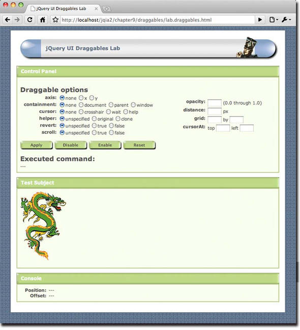
The options available for the draggable() method give us a lot of flexibility and control over exactly how drag operations will take place; they’re described in table 10.1. The options represented in the Draggables Lab page are identified in the In Lab column of table 10.1. Be sure to try them out as you go along.
Table 10.1. Options for the jQuery UI draggable() method
|
Option |
Description |
In Lab |
|---|---|---|
|
addClasses |
(Boolean) If specified as false, prevents the ui-draggable class from being added to draggable elements. We might choose to do this for performance reasons if the class isn’t needed and we’re adding draggability to many elements on a page. Despite its pluralized name, this option doesn’t prevent other classes, such as the ui-draggable-dragging class, from being added to elements during a drag operation. |
|
|
(Element|Selector) When a helper is created (see the helper option below), specifies the DOM element to which the helper will be appended. If not specified, any helper is appended to the parent of the draggable element. |
||
|
axis |
(String) If specified as x or y, constrains movement during a drag operation to the specified axis. For example, specifying x allows movement in the horizontal direction only. If unspecified, or specified as any other values, movement is unconstrained. |
✓ |
|
cancel |
(Selector) Specifies a selector identifying elements that should not allow drag operations to commence. If unspecified, the selector :input,option is used. Note that this doesn’t prevent these elements from becoming draggable; it merely prevents the elements from being actively dragged around. The elements are still considered draggable and the ui-draggable class is added to these elements. |
|
|
connectToSortable |
(Selector) Identifies a sortable list that this draggable element can be dropped upon in order to become part of that list. If specified, the helper option should also be specified as clone. This option is in support of sortables, which we’ll be taking a look at in section 10.3. |
|
|
containment |
(Element|Selector|Array|String) Defines an area within which the drag operation will be constrained. If unspecified, or specified as document, the movement is unconstrained within the document. The string window will constrain movement to the visible viewport, whereas the string parent will constrain movement within the element’s direct parent. If an element, or selector identifying an element, is specified, movement is constrained within that element. An arbitrary rectangle relative to the document can also be specified as an array of four numbers, identifying the top-left and bottom-right corners of the rectangle as follows: [x1,y1,x2,y2]. |
✓ |
|
cursor |
(String) The CSS name of the mouse pointer cursor to use during a drag operation. If not specified, defaults to auto. |
✓ |
|
cursorAt |
(Object) Specifies a relative position for the cursor within the dragged element during a drag operation. Can be specified as an object with one of the left or right properties, and one of the top or bottom properties. For example: cursorAt:{top:5,left:5} will place the cursor five pixels from the top left of the element while dragging. If unspecified, the cursor remains in the position where it was clicked upon within the element. |
✓ |
|
delay |
(Number) The number of milliseconds to delay after the mousedown event before beginning the drag operation. This can be used to help prevent accidental drags by only reacting if the user maintains the mouse button in the down position for the specified period. By default, the value is 0, meaning that no delay is defined. |
|
|
(Number) The number of pixels that must be dragged across before a drag operation is initiated. This can also be used to help prevent accidental drags. If unspecified, the distance defaults to 1 pixel. |
✓ |
|
|
drag |
(Function) Specifies a function to be established on the draggables as an event handler for drag events. See table 10.2 for more details on this event. |
|
|
grid |
(Array) An array of two numbers that specifies discrete horizontal and vertical distances that the drag operation will “snap to” during a drag operation. The origin of the grid is the initial position of the dragged element. If unspecified, no grid is defined. |
✓ |
|
handle |
(Element|Selector) Specifies an element, or selector that selects an element, to serve as the trigger for the drag operation. The handle element must be a child of the draggable for this to work correctly. When specified, only a click on the handle element will cause a drag operation to commence. By default, clicking anywhere within the draggable starts the drag. |
|
|
helper |
(String|Function) If unspecified, or specified as original, the draggable element is moved during a drag operation. If clone is specified, a copy of the draggable item is created and moved around during the drag operation. A function can be specified that gives us the opportunity to create and return a new DOM element to use as the drag helper. |
✓ |
|
iframeFix |
(Boolean|Selector) Prevents <iframe> elements from interfering with a drag operation by preventing them from capturing mousemove events. If specified as true, all iframes are masked during a drag operation. If a selector is provided, any selected iframes are masked. |
|
|
opacity |
(Number) A value from 0.0 to 1.0 that specifies the opacity of the dragged element or helper. If omitted, the opacity of the element isn’t changed during dragging. |
✓ |
|
refreshPositions |
(Boolean) If specified as true, the positions of all droppable elements (which we’ll be discussing in section 10.2) are recomputed during every mousemove event of the drag. Use this only if it solves some problems you may be having on highly dynamic pages, because it comes with a heavy performance penalty. |
|
|
revert |
(Boolean|String) If specified as true, the dragged element will return to its original position at the end of the drag operation. If the string invalid is used, the element reverts only if it has not been dropped onto a droppable; if valid, the element reverts only if dropped onto a droppable. If omitted, or specified as false, the dragged element doesn’t return to its original position. |
✓ |
|
revertDuration |
(Number) If revert is true, specifies the number of milliseconds it takes for the dragged element to return to its original position. If omitted, a default value of 500 is used. |
|
|
(String) Used to associate draggables with droppables. Draggables with the same scope name as a droppable will automatically be accepted by that droppable. If not specified, a default scope of default is used. (This will make more sense when we discuss droppables.) |
||
|
scroll |
(Boolean) If set to false, prevents the container from auto-scrolling during a drag operation. If omitted, or specified as true, auto-scrolling is enabled. |
✓ |
|
scrollSensitivity |
(Number) The distance in pixels from the pointer to the edge of the viewport when auto-scrolling should take place. If omitted, the default is 20 pixels. |
|
|
scrollSpeed |
(Number) The speed at which auto-scrolling should commence once started. The default value is 20. Use lower values to slow the scrolling, and higher values to speed it up. |
|
|
snap |
(Selector|Boolean) Specifies a selector that identifies target elements on the page whose edges the dragged element will “snap to” whenever the dragged element approaches the targets. Specifying true is shorthand for the selector .ui-draggable, making all other draggables the target elements. |
|
|
snapMode |
(String) Specifies which side of an edge the dragged object will snap to. The string outer specifies that only the outside of the edge will be snapped to, whereas inner specifies that only the inside of the edge will be snapped to. The string both (the default) will cause either side of the edge to be snapped to. |
|
|
snapTolerance |
(Number) If snapping is enabled, specifies the distance, in pixels, from an edge at which snapping should occur. The default value is 20 pixels. |
|
|
stack |
(Object) An object hash that controls z-index stacking of grouped elements during drag operations. Whenever you drag an element, it becomes the highest (by z-index) of all other draggables in that group. A minimum value that the z-index should never fall below can also be specified with the min property. |
|
|
start |
(Function) Specifies a function to be established on the draggables as an event handler for dragstart events. See table 10.2 for more details on this event. |
|
|
stop |
(Function) Specifies a function to be established on the draggables as an event handler for dragstop events. See table 10.2 for more details on this event. |
|
|
zIndex |
(Number) Specifies the z-index for the draggables during drag operations. If omitted, the z-index of the draggables is unchanged during drag operations. |
All these options allow us a great deal of flexibility in how drag operations will conduct themselves. But we’re not done yet. Draggables also give us the flexibility to control how the rest of our page conducts itself while a drag is under way. Let’s see how.
10.1.2. Draggability events
We saw, in table 10.1, that there are three options that let us register event handlers on the draggables themselves: drag, start, and stop. These options are a convenient way to bind event handlers for three custom events that jQuery triggers during various stages of a drag operation: dragstart, drag, and dragstop, all described in table 10.2. This table (and all event-description tables that follow) show the bindable custom event name, the option name that can be used to specify a handler function, and a description of the event.
Table 10.2. jQuery UI events triggered for draggables
|
Event |
Option |
Description |
|---|---|---|
|
dragstart |
start |
Triggered when a drag operation commences |
|
drag |
drag |
Continuously triggered for mousemove events during a drag operation |
|
dragstop |
stop |
Triggered when a drag operation terminates |
Handlers for each of these events can be established on any element in a draggable element’s ancestor hierarchy to receive notification whenever any of these events occurs. We might want, for example, to react to dragstart events in some global manner by establishing a handler for that event on the document body:
$('body').bind('dragstart',function(event,info){
  say('What a drag!'),
});
Regardless of where the handler is established, and whether it was established via an option entry or with the bind() method, the handler is passed two parameters: the mouse event instance, and an object whose properties contain information on the current state of the drag event. The properties on this object are as follows:
- helper—A wrapped set containing the element being dragged (either the original element or its clone).
- position—An object whose top and left properties give the position of the dragged element relative to its offset parent. It may be undefined for dragstart events.
- offset—An object whose top and left properties give the position of the dragged element relative to the document page. It may be undefined for dragstart events.
The Draggables Lab page establishes draggable event handlers and uses the information passed to them to show the position of the dragged element in its Console pane.
Once we’ve made an element draggable using this first form of the draggable() method (in which we pass an options object), we can use the other forms to control the element’s draggability.
10.1.3. Controlling draggability
As we learned in the previous section, calling the draggable() method with an options hash (or with no parameters at all) establishes the draggability of the wrapped elements. Once an element is draggable, we may have occasion to want to suspend that draggability, but without losing all the options we’ve taken the effort to set up.
We can temporarily disable an element’s draggability by calling the following form of the draggable() method:
$('.ui-draggable').draggable('disable'),
Any draggable elements in the wrapped set will become temporarily non-draggable. In the preceding example, we’ve disabled draggability for all draggables on the page.
To reinstate the draggability of such elements, we’d use this statement:
$('.ui-draggable').draggable('enable'),
This will re-enable the draggability of any draggable elements that have been disabled.
Warning
As previously discussed, you can’t use the draggable('enable') method to initially apply draggability to non-draggable elements. The enable form of the method will only re-enable the draggability of draggable elements that have been previously disabled.
If we wish to make draggable elements non-draggable permanently, restoring them to predraggable condition, then we’d use this statement:
$('.ui-draggable').draggable('destroy'),
The destroy variant of the method removes all vestiges of draggability from the elements.
The final format of the versatile draggable() method allows us to set or retrieve individual options at any time during a draggable’s lifetime.
For example, to set the revert option on a draggable element, use this line:
$('.whatever').draggable('option','revert',true);
This will set the revert option to true for the first element in the wrapped set if that element is already draggable. Trying to set an option on a non-draggable element won’t do anything useful.
If we want to fetch the value of a draggable’s option, we could write this:
var value = $('.ui-draggable').draggable('option','revert'),
This will fetch the value of the revert option for the first element in the wrapped set if that element is draggable (otherwise, you’ll just get undefined).
Dragging things around the screen is all well and good, but is it really useful? It’s fun for a time, but like playing with a yo-yo (unless we’re true aficionados), it loses its charm quickly. In practical applications, we could use it to allow users to move modular elements around the screen (and if we’re nice, we’d remember their chosen positions in cookies or other persistence mechanisms), or in games or puzzles. But drag operations truly shine when there’s something interesting to drop dragged elements on. So let’s see how we can make droppables to go with our draggables.
10.2. Dropping dragged things
The flip side of the coin from draggables is droppables—elements that can accept dragged elements and do something interesting when the draggable is dropped on them. Creating droppable items from page elements is similar to creating draggables; in fact, it’s even easier because there are fewer options to worry about.
Like the draggable() method, the droppable() method has a number of forms: one used to initially create the droppables, and the others to affect the droppable afterwards. This is its syntax:
droppable(options)
droppable('disable')
droppable('enable')
droppable('destroy')
droppable('option',optionName,value)
Makes the elements in the wrapped set droppable according to the specified options, or performs some other droppability action based upon an operation string passed as the first parameter.
Parameters
|
options |
(Object) An object hash of the options to be applied to the elements in the wrapped set, as described in table 10.3, making them droppable. |
|
'disable' |
(String) Disables the droppability of any droppable elements in the wrapped set. The droppability of the elements isn’t removed and can be restored by calling the enable variant of this method. |
|
'enable' |
(String) Re-enables droppability on any droppable elements in the wrapped set whose droppability has been disabled. Note that this method won’t add droppability to any non-droppable elements. |
|
'destroy' |
(String) Removes droppability from the elements in the wrapped set. |
|
'option' |
(String) Allows option values to be set on all elements of the wrapped set, or to be retrieved from the first element of the wrapped set (which should be a droppable element), based upon the remaining parameters. If specified, at least the optionName parameter must also be provided. |
|
optionName |
(String) The name of the option (see table 10.3) whose value is to be set or returned. If a value parameter is provided, that value becomes the option’s value. If no value parameter is provided, the named option’s value is returned. |
|
value |
(Object) The value to be set for the option identified by the optionName parameter. |
Returns
The wrapped set, except for the case where an option value is returned.
Let’s see what it takes to make elements droppable.
10.2.1. Making elements droppable
Elements are made droppable by collecting them into a wrapped set and calling the droppable() method with an object hash of options (or no parameters at all to accept the option defaults). When made droppable, the class ui-droppable is added to the elements. This is similar to the way we made things draggable, but there are fewer options, as listed in table 10.3.
As with draggables, we’ve also provided a jQuery UI Droppables Lab page (shown in figure 10.2) that demonstrates most of the droppable options in action.
Figure 10.2. The Droppables Lab page allows us to see the droppable options in action.
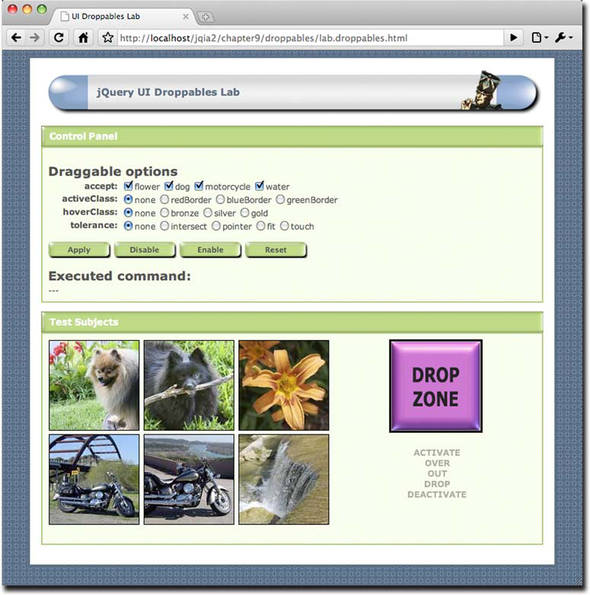
Find this page at chapter10/droppables/lab.droppables.html, load it into your browser, and use it to manipulate droppable options as you read through the option descriptions in table 10.3.
Table 10.3. Options for the jQuery UI droppable() method
|
Description |
In Lab |
|
|---|---|---|
|
accept |
(Selector|Function) Specifies a selector that identifies draggables that are to be accepted for dropping, or a function that filters all draggable elements on the page. The function is invoked for all draggable elements, with a reference to that element as the first parameter. Returning true from the function accepts the draggable for dropping. If omitted, all draggable elements are accepted. |
✓ |
|
activate |
(Function) Specifies a function to be established on the droppables as an event handler for dropactivate events, which are triggered when a drag operation starts. See the description of the droppable events in table 10.4 for more details on this event. |
✓ |
|
activeClass |
(String) A class name or names to be added to the droppable whenever a drag operation with an acceptable element is underway. You can specify more than one class name by separating them with space characters. If omitted, no classes are added to the droppable during an acceptable drag operation. |
✓ |
|
addClasses |
(Boolean) If specified as false, prevents the ui-droppable class from being added to droppable elements. We might choose to do this for performance reasons if the class isn’t needed and we’re adding droppability to many elements on a page. |
|
|
deactivate |
(Function) Specifies a function to be established on the droppables as an event handler for dropdeactivate events, which are triggered when a drag operation terminates. See the description of the droppable events in table 10.4 for more details on this event. |
✓ |
|
drop |
(Function) Specifies a function to be established on the droppables as an event handler for drop events. See the description of the droppable events in table 10.4 for more details on this event. |
✓ |
|
greedy |
(Boolean) Droppability events will normally propagate to nested droppables. If this option is set to true, this propagation is prevented. |
|
|
hoverClass |
(String) A class name or names to be added to the droppable whenever an acceptable draggable is hovering over the droppable. Multiple class names can be provided by separating them with space characters. If omitted, no classes are added to the droppable during an acceptable hover. |
✓ |
|
out |
(Function) Specifies a function to be established on the droppables as an event handler for dropout events. See the description of the droppable events in table 10.4 for more details on this event. |
✓ |
|
over |
(Function) Specifies a function to be established on the droppables as an event handler for dropover events. See the description of the droppable events in table 10.4 for more details on this event. |
✓ |
|
scope |
(String) Used to associate draggables with droppables. Draggables with the same scope name as a droppable will automatically be accepted by the droppable. If not specified, a default scope of default is used. |
|
|
(String) Controls how a dragged element is considered to be hovering over a droppable. The values are
|
✓ |
Although there are fewer options available for droppables than for draggables, it’s also clear that there are more events and states associated with droppables. Let’s examine these states and events in detail.
10.2.2. Droppability events
Keeping track of the states of a drag event is pretty easy; either the element is being dragged or it’s not. But when we add dropping into the mix, things become a bit more complex. Not only do we have the draggable to take into account, but also its interaction with the droppables for which it’s acceptable.
Because a figure is worth many words, figure 10.3 depicts the states and the events that cause their transitions during a drag-and-drop operation.
Figure 10.3. The states and transitions that a droppable can attain depend upon the interaction between the active draggable and the droppable element during a drag-and-drop operation.
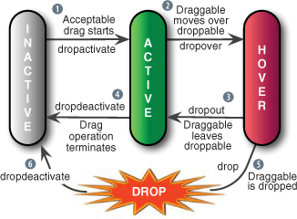
Once established as a droppable, a droppable element will be in inactive state—it’s prepared to accept draggables, but because there’s no drag operation underway, all is peaceful and at rest. But once a drag operation starts, things get more interesting:
 When a drag operation starts for a draggable that’s acceptable to the droppable (see the accept and scope options for what’s deemed acceptable), a dropactivate event is triggered and the droppable is considered in active state.
Any handlers for dropactivate events (whether established via options or not) will be triggered according to the normal rules of event propagation unless the greedy option was specified as true, in which case only handlers on droppables will be invoked.
At this point, any class names provided by the activeClass option are applied to the droppable.
 If the dragged element is moved such that it satisfies the rules that determine when a draggable is considered hovering over
the droppable (as specified by the tolerance option), a dropover event is triggered (invoking suitable handlers), and the droppable enters hover state.
If the dragged element is moved such that it satisfies the rules that determine when a draggable is considered hovering over
the droppable (as specified by the tolerance option), a dropover event is triggered (invoking suitable handlers), and the droppable enters hover state.
This is the point at which any class names supplied by a hoverClass option are applied to the droppable.
There are two possible transitions from this point: the drag operation can terminate by the release of the mouse button, or the draggable can continue to be moved.
 If the draggable is moved such that it’s no longer considered hovering over the droppable (again via the tolerance rules), a dropout event is triggered, and any class names specified by hoverClass are removed.
The droppable returns to active state.
 If the drag operation terminates while in active state, a dropdeactivate event is triggered, any classes specified by activeClass are removed, and the droppable reverts to inactive state.
 If, however, the drag operation terminates while in hover state, the draggable is considered dropped onto the droppable and two events are triggered: drop and dropdeactivate.
 The droppable reverts to inactive state, and any classes specified by activeClass are removed.
Note
The “drop” itself isn’t considered a state, but an instantaneous event.
The droppables events are summarized in table 10.4.
Table 10.4. jQuery UI events triggered for droppables
|
Event |
Option |
Description |
|---|---|---|
|
dropactivate |
activate |
Triggered when a drag operation commences using a draggable that’s acceptable to a droppable |
|
dropdeactivate |
deactivate |
Triggered when a pending drop operation terminates |
|
dropover |
over |
Triggered when an acceptable draggable moves over a droppable as defined by the droppable’s tolerance option |
|
dropout |
out |
Triggered when a draggable moves off of an accepting droppable |
|
drop |
drop |
Triggered when a drag operation terminates while over an accepting droppable |
All droppable event handlers are passed two parameters: the mouse event instance, and an object whose properties contain information on the current state of the drag-and-drop operation. The properties on this object are as follows:
- helper—A wrapped set containing the helper element being dragged (either the original element or its clone).
- draggable—A wrapped set containing the current draggable element.
- position—An object whose top and left properties give the position of the dragged element relative to its offset parent. May be undefined for dragstart events.
- offset—An object whose top and left properties give the position of the dragged element relative to the document page. May be undefined for dragstart events.
We can use the Droppables Lab to make sure that we understand these events and state transitions. As in the other labs, there’s a Control Panel that lets us specify the options to be applied to the droppable after clicking the Apply button. The Disable and Enable buttons serve to disable and enable the droppable (using the appropriate variants of the droppable() method), and the Reset button puts the form back to its initial state and destroys the droppable capability on the Lab’s drop target.
In the Test Subjects pane are six draggable elements and an element that will become droppable after clicking the Apply button (which we’ll call the Drop Zone). Below the Drop Zone are grayed-out text elements that read Activate, Over, Out, Drop, and Deactivate. When a corresponding droppable event is triggered, the appropriate text element, which we’ll refer to as an event indicator, is momentarily highlighted to indicate that the event has been triggered. (Can you already figure out how that’s achieved within the Lab page?)
 Let’s dig in and get the skinny on droppables using this Lab.
- Exercise 1— In this exercise, we’re going to begin familiarizing ourselves with the accept option, which is what tells the droppable what constitutes an acceptable draggable. Although this option can be set to any jQuery selector (or even a function that can programmatically make suitability determinations), for the purposes of the lab, we’ll concentrate on elements that possess particular class names. In particular, we can specify a selector that includes any of the class names flower, dog, motorcycle, and water by checking the appropriate checkboxes of the accept option controls. The six draggable image elements on the left side of the Test Subjects pane are each assigned one or two of these class names based on what appears in the image. For example, the upper-left draggable possesses the class names dog and flower (because both a dog and some flowers appear in the photo), whereas the lower-middle image is defined with the class names motorcycle and water (a Yamaha V-Star and the Colorado River, to be precise). Before clicking Apply, try to drag and drop any of these elements on the Drop Zone. Aside from the dragging, not much happens. Carefully observe the event indicators, and note how they don’t change. This should be no surprise because, at outset, no droppable even exists on the page. Now, leaving all controls in their initial conditions (including all accept checkboxes checked), click the Apply button. The executed command includes an accept option that specifies a selector that matches all four class names. Once again, try to drag any of the images to the Drop Zone while observing the event indicators. This time, you’ll see the Activate indicator briefly highlight, or throb, when you begin moving any of the images, indicating that a droppable has noticed that a drag operation has commenced using a draggable that’s acceptable for dropping, and has triggered a dropactivate event. Drag the image over and out of the Drop Zone a number of times. Corresponding dropover and dropout events are triggered (as shown by the corresponding indicators) at the appropriate times. Now, drop the image outside the confines of the Drop Zone, and watch the Deactivate indicator throb. Finally, repeat the drag operation, but this time drop the image on top of the Drop Zone. The Drop indicator throbs (indicating that the drop event was triggered). Note, also, that the Drop Zone is wired to display the most recent image that was dropped upon it.
- Exercise 2— Uncheck all of the accept checkboxes, and click Apply. This results in an accept option consisting of the empty string, which matches nothing. No matter which image you choose, no callback indicators throb, and nothing happens when you drop an image onto the Drop Zone. Without a meaningful accept option, our Drop Zone has become a brick. (Note that this isn’t the same as omitting accept, which causes all elements to be acceptable.)
- Exercise 3— Check only one accept checkbox, say flower, and note how only images with flowers in them (known to the page because the class name flower was defined for them) are construed to be acceptable items. Try again with whatever combinations of acceptable class names you like until you’re comfortable with the concept of the accept option.
- Exercise 4— Reset the controls, check the activeClass’s greenBorder radio button, and click Apply. This supplies an activeClass option to the droppable that specifies a class name that defines (you guessed it) a green border.
Now, when you begin to drag an image that’s acceptable to the droppable (as defined by the accept option), the black border around the Drop Zone is replaced by a green border.
Tip
If you have trouble getting this to work for you on your own pages, note that you need to be mindful of CSS precedence rules. When an activeClass class name is applied, it must be able to override the rule that assigns the default visual rendition that you wish to supplant. This is also true of hoverClass. (Sometimes the !important CSS qualifier is needed to override other style rules.)
- Exercise 5— Reset the Lab, check the hoverClass radio button labeled bronze, and click Apply. When an acceptable image is dragged over the Drop Zone, the Drop Zone changes to a bronze color.
- Exercise 6— For this exercise, choose each of the various tolerance radio buttons, and note how the setting affects when the droppable makes the transition from active to hover (in other words, when a dropover event is triggered). This transition can easily be observed by setting the hoverClass option or when the Over event indicator throbs.
Continue to toy around with the lab page until you fully understand how drag-and-drop operations operate and are affected by the supported options.
Once we have dragging and dropping, we can imagine a whole range of user interactions where drag and drop can be used make things easy and intuitive for the user by letting them directly manipulate page elements. One of those interactions, sorting, is so ubiquitous that jQuery UI provides direct support for it.
10.3. Sorting stuff
Arguably, sorting is one of the most useful interactions that utilizes drag and drop. Putting a list of items into a specific order, or even moving them in order between lists, is a rather common interaction technique in desktop applications, but on the web it’s either been missing or approximated with a combination of <select> elements and buttons (to move items within, and sometimes between, multiple select lists).
Although such composite controls aren’t horrible, it’d be much more intuitive for a user to be able to directly manipulate the elements. Drag and drop gives us that ability, and jQuery UI makes it pretty darn easy.
As with the draggable and droppable capabilities, jQuery UI provides sortability via a single, multipurpose method, sortable(), whose syntax style should be familiar by now.
sortable(options)
sortable('disable')
sortable('enable')
sortable('destroy')
sortable('option',optionName,value)
sortable('cancel')
sortable('refresh')
sortable('refreshPositions')
sortable('serialize')
sortable('toArray')
Makes the elements in the wrapped set sortable according to the specified options, or performs some other sortability action based upon an operation string passed as the first parameter.
Parameters
|
options |
(Object) An object hash of the options to be applied to the elements in the wrapped set, as described in table 10.5, making them sortable. |
|
'disable' |
(String) Disables the sortability of any sortable elements in the wrapped set. The sortability of the elements isn’t removed and can be restored by calling the enable variant of this method. |
|
(String) Re-enables sortability on any sortable elements in the wrapped set whose sortability has been disabled. Note that this method won’t add sortability to any non-sortable elements. |
|
|
'destroy' |
(String) Removes sortability from the elements in the wrapped set. |
|
'options' |
(String) Allows option values to be set on all elements of the wrapped set, or to be retrieved on the first element of the wrapped set (which should be a sortable element), based upon the remaining parameters. If specified, at least the optionName parameter must also be provided. |
|
'cancel' |
(String) Cancels the current sort operation. This is most useful within handlers for the sortreceive and sortstop events. |
|
'refresh' |
(String) Triggers the reloading of items within the sortable element. Calling this method will cause new items added to the sortable to be recognized. |
|
'refreshPositions' |
(String) This method is used mostly internally to refresh the cached information of the sortable. Unwise use can impair the performance of the operation, so use only within handlers when necessary to solve problems created by outdated cache information. |
|
'serialize' |
(String) Returns a serialized query string (submitable via Ajax) formed from the sortable. We’ll be examining the use of this method in more detail shortly. |
|
'toArray' |
(String) Returns an array of the id values of the sortable elements in sorted order. |
|
optionName |
(String) The name of the option (see table 10.5) whose value is to be set or returned. If a value parameter is provided, that value becomes the option’s value. If no value parameter is provided, the named option’s value is returned. |
|
value |
(Object) The value to be set for the option identified by the optionName parameter. |
Returns
The wrapped set, except for the cases where an option value, query string, or array is returned.
That’s a few more method variations than in the previous interactions, and we’ll examine some of those in detail, but first let’s make elements sortable.
10.3.1. Making things sortable
We can make pretty much any set of child elements sortable (by applying sortability to their parent), but most often you’ll see sortability applied to a list (<ul> or <ol> element) so that its <li> children can be moved around. That makes a lot of semantic sense and also allows the element to degrade gracefully should we decide not to apply sortability.
Nothing prevents us, on the other hand, from applying sortability to the <div> children of a parent <div>, if that makes more sense for our application. We’ll see how to do so when we examine the sortability options in table 10.5.
Table 10.5. Options for the jQuery UI sortable() method
|
Option |
Description |
In Lab |
|---|---|---|
|
activate |
(Function) Specifies a function to be established on the sortables as an event handler for sortactivate events. See table 10.6 for details of this event. |
|
|
appendTo |
See the draggable operation of the same name in table 10.1. Appending to the body element may solve any issues with overlaying or z-index. |
|
|
axis |
See the draggable operation of the same name in table 10.1. Frequently, this option is used to constrain movement to the orientation (horizontal or vertical) of the sorted list. |
✓ |
|
beforeStop |
(Function) Specifies a function to be established on the sortables as an event handler for sortbeforeStop events. See table 10.6 for details of this event.. |
|
|
cancel |
See the draggable operation of the same name in table 10.1. |
|
|
change |
(Function) Specifies a function to be established on the sortables as an event handler for sortchange events. See table 10.6 for details of this event. |
|
|
connectWith |
(Selector) Identifies another sortable element that can accept items from this sortable. This allows items from one list to be moved to other lists—a frequent and useful user interaction. If omitted, no other element is connected. |
✓ |
|
containment |
See the draggable operation of the same name in table 10.1. |
✓ |
|
cursor |
See the draggable operation of the same name in table 10.1. |
✓ |
|
cursorAt |
See the draggable operation of the same name in table 10.1. |
✓ |
|
deactivate |
(Function) Specifies a function to be established on the sortables as an event handler for sortdeactivate events. See table 10.6 for details of this event. |
|
|
delay |
See the draggable operation of the same name in table 10.1. |
|
|
distance |
See the draggable operation of the same name in table 10.1. |
✓ |
|
dropOnEmpty |
(Boolean) If true (the default), dropping items from this sortable on another connected sortable is allowed when that sortable has no elements. Otherwise, dropping is disallowed when empty. |
|
|
forceHelperSize |
(Boolean) If true, forces the helper to have a size. Defaults to false. |
|
|
forcePlaceholderSize |
(Boolean) If true, forces the placeholder to have a size. Defaults to false. |
|
|
See the draggable operation of the same name in table 10.1. |
✓ |
|
|
handle |
See the draggable operation of the same name in table 10.1. |
|
|
helper |
See the draggable operation of the same name in table 10.1. |
|
|
items |
(Selector) Provides a selector, within the context of the sortable, that identifies what child elements can be sorted. By default, > * is used, which allows all child elements to be selected for sorting. |
|
|
opacity |
See the draggable operation of the same name in table 10.1. |
✓ |
|
out |
(Function) Specifies a function to be established on the sortables as an event handler for sortout events. See table 10.6 for details of this event. |
|
|
over |
(Function) Specifies a function to be established on the sortables as an event handler for sortover events. See table 10.6 for details of this event. |
|
|
placeholder |
(String) A class name that gets applied to the otherwise unstyled placeholder space. |
|
|
receive |
(Function) Specifies a function to be established on the sortables as an event handler for sortreceive events. See table 10.6 for details of this event. |
|
|
remove |
(Function) Specifies a function to be established on the sortables as an event handler for sortremove events. See table 10.6 for details of this event. |
|
|
revert |
See the draggable operation of the same name in table 10.1. The effect, when enabled, is for the drag helper to smoothly slide into place, as opposed to quickly snapping into place. |
✓ |
|
scroll |
See the draggable operation of the same name in table 10.1. |
✓ |
|
scrollSensitivity |
See the draggable operation of the same name in table 10.1. |
|
|
scrollSpeed |
See the draggable operation of the same name in table 10.1. |
|
|
sort |
(Function) Specifies a function to be established on the sortables as an event handler for sort events. See table 10.6 for details of this event. |
|
|
start |
(Function) Specifies a function to be established on the sortables as an event handler for sortstart events. See table 10.6 for details of this event. |
|
|
stop |
(Function) Specifies a function to be established on the sortables as an event handler for sortstop events. See table 10.6 for details of this event. |
|
|
tolerance |
See the droppable operation of the same name in table 10.3. |
✓ |
|
update |
(Function) Specifies a function to be established on the sortables as an event handler for sortupdate events. See table 10.6 for details of this event. |
4 |
|
zIndex |
See the draggable operation of the same name in table 10.1. |
Like the draggable and droppable interactions, sortability is applied by calling the sortable method with no parameters (to accept the defaults), or with an object that provides non-default options.
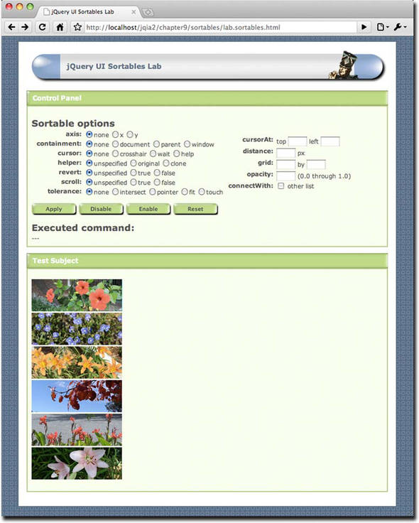
As jQuery UI Sortables Lab page, chapter10/sortables/lab.sortables.html, is available, which we can use to see the sortability
options operate in real time. This Lab page is shown in figure 10.4.
Figure 10.4. The Sortables Lab allows us to apply various sortability options to a list.
It should come as no surprise that quite a few of the options to sortable simply pass through to the lower-level drag or drop operations. In the interest of saving space, the description of these options isn’t repeated; rather, a reference to the table in which the option is first described is provided.
Most of these options are fairly self-explanatory, but the connectWith option deserves closer attention.
10.3.2. Connecting sortables
It’s readily apparent how useful the sortable capability is for allowing users to order a single list of elements, but it’s also a common way to allow them to move items from one list to another. This capability is frequently provided by a combination of two multi-select lists and a button (to move selected items from one list to another), and perhaps even more buttons to control the order of items within each of the lists.
By using jQuery UI sortables, and linking them using the connectWith option, we can eliminate all those buttons and present the user with a cleaner direct-manipulation interface. Imagine, perhaps, a page in which we allow users to design reports that they’d like to receive. There may be many possible data columns included in the report, but we can allow users to specify the subset of columns that they’d like included and the order in which they’d like them to appear.
We could include all possible columns in one list, and allow users to drag their desired columns from this list to a second list whose content represents the report’s columns in the order in which they’re to appear.
Code to set up this complex interaction could be as easy as this:
$('#allPossibleColumns').sortable({
  connectWith: '#includedColumns'
});
$('#includedColumns').sortable();
In the Sortables Lab page, you can experiment with dragging between two lists by checking the checkbox labeled connectWith.
With all those drag and drop operations going on—not to mention elements being moved around within (or between) lists—there are lots of events that we might want to know about so we can hook into what’s going on during a sort operation.
10.3.3. Sortability events
There’s a lot of moving and shaking during a sort operation; drag and drop events are firing, and the DOM is being manipulated—both to move elements around as the sort unfolds, and to handle any placeholder that we may have defined.
If all we care about is allowing the user to sort a list of items and then retrieve the result at a later point (which we’ll cover in the next section), we don’t need to be very concerned with all the events that are taking place during the operation. But, as with draggables and droppables, if we want to hook into the operation during its interesting events, we can define handlers to be notified when these events take place.
As we’ve seen in the other interactions, we can establish these handlers either locally on the sortable via options passed to sortable(), or by establishing the handlers ourselves using bind().
The information passed to these handlers follows the customary interaction format, with the event as the first parameter, and a custom object with interesting information about the operation passed as the second. For sortables, this custom object contains the following properties:
- position—An object whose top and left properties give the position of the dragged element relative to its offset parent
- offset—An object whose top and left properties give the position of the dragged element relative to the document page
- helper—A wrapped set containing the drag helper (often a clone)
- item—A wrapped set containing the sort item
- placeholder—A wrapped set containing the placeholder (if any)
- sender—A wrapped set containing the source sortable when a connected operation takes place between two sortables
Be aware that some of these properties may be undefined or null if they don’t make sense for the current state. For example, there is no helper defined for the sortstop event because the drag operation is no longer underway.
The function context for these handlers is the element to which the sortable() method was applied.
The events that are triggered during a sort operation are shown in table 10.6.
Table 10.6. jQuery UI events triggered for sortables
|
Event |
Option |
Description |
|---|---|---|
|
sort |
sort |
Repeatedly triggered for mousemove events during a sort operation |
|
sortactivate |
activate |
Triggered on the sortables when a sort operation starts on connected sortables |
|
sortbeforeStop |
beforeStop |
Triggered when the sort operation is about to end, with the helper and placeholder element reference still valid |
|
sortchange |
change |
Triggered when the sorted element changes position within the DOM |
|
sortdeactivate |
deactivate |
Triggered when a connected sort stops, propagated to the connected sortables |
|
sortout |
out |
Triggered when the sort item is moved away from a connected list |
|
sortover |
over |
Triggered when a sort item moves into a connected list |
|
sortreceive |
receive |
Triggered when a connected list has received a sort item from another list |
|
sortremove |
remove |
Triggered when the sort item is removed from a connected list and is dragged into another |
|
sortstart |
start |
Triggered when a sort operation starts |
|
sortstop |
stop |
Triggered when a sort operation has concluded |
|
sortupdate |
update |
Triggered when a sort operation stops and the position of the item has been changed |
Note that a good number of these event types are triggered only during an operation involving connected lists; the number of events fired for a sort within a single list is fairly small.
The sortupdate event may be the most important because it can be used to let us know when a sort that has resulted in something actually changing has taken place. If a sort operation takes place without anything changing, chances are we don’t really need to care.
When a sortupdate event fires, we probably want to know what the sorted order of the list is. Let’s find out how we can get that information.
10.3.4. Fetching the sort order
Any time we want to know what the sorted order of a sortables list is, there are two variants of the sortable() method that we can use, depending upon what type of information we need.
The sortable('toArray') method returns a JavaScript array of the id values of the sorted items, in their sorted order. We can use this whenever we need to know the order of the items.
If, on the other hand, we want to submit the information as part of a new request, or even an Ajax request, we’d use sortable('serialize'), which returns a string suitable for use as a query string or request body, containing the ordered information of the sort elements.
Using this variant requires that you use a specific format for the id values assigned to the sortable’s elements (the elements that will be sorted, not the sortable itself). Each id needs to be of the format prefix_number where the prefix can be anything you want—as long as it’s the same for all the elements—followed by an underscore and a numeric value. When this format is followed, serializing the sortable results in a query string that contains an entry for each sortable where the name is the prefix followed by [], and whose value is the trailing numeric value of the id.
Confused? Don’t blame you. Let’s turn to the Sortables Lab page for help.
The console at the bottom of the Lab (unseen in figure 10.4 because it’s below the bottom of the screen) shows the results of calling the fetch methods after a sort operation (using a sortupdate event handler). The id values assigned to the sort elements are subject_1 through subject_6 in top to bottom order, following the formatting rules set out for the serialize method.
In the Lab, leaving all options in their default state, click Apply, grab the orange tiger lily image (which has the id value subject_3), and drag it such that it becomes the first item in the list. In the console, you’ll observe that the array of id values is now as follows:
['subject_3', 'subject_1', 'subject_2', 'subject_4', 'subject_5',
     'subject_6']
This is exactly what we’d expect, showing the new order of the items with the third item now in the first position.
The result of the serialization is
subject[]=3&subject[]=1&subject[]=2&subject[]=4&subject[]=5&subject[]=6
This shows how the prefix (subject) is used to construct the query parameter names, with the trailing numeric values becoming the parameter values. (The [], by the way, is a common notation meaning “array,” which is used to suggest that there are more than one of the same named parameters.)
If this format isn’t to your liking, the array of ids can always be used as a basis to create your own query strings (in which case $.param() would come in quite handy).
As an exercise, hearken back to the “collapsible module” example in chapter 5 (when we animated the rolling up of a body into a caption bar). How would you use sortables to let a user manage the position
of a number of these modules (also termed portlets by some) in multiple columns?
With sortables, the basic drag and drop interactions have been combined to create a higher-order interaction. Let’s see another such interaction that jQuery UI provides.
10.4. Changing the size of things
Back in chapter 3, we learned how to change the size of DOM elements using jQuery’s methods, and in chapter 5, we even saw how to do so in an animated fashion. jQuery UI also allows us to let our users change the size of elements through direct manipulation.
Thinking again of the collapsible module example, in addition to allowing users to move these modules around on the page, wouldn’t it be nice to let them easily assign custom sizes to the modules?
With the interactions we’ve seen so far, the inclusion of the CSS file generated when you downloaded jQuery UI (which we discussed back in chapter 9) is not necessary. But for the resizable interaction to function, the CSS file must be imported into the page, as in this example:
<link rel="stylesheet" type="text/css"
      href="styles/ui-theme/jquery-ui-1.8.custom.css">
Other than that detail, the resizable() method is as easy to use as the other jQuery UI interactions, and its syntax follows the familiar pattern:
resizable(options)
resizable('disable')
resizable('enable')
resizable('destroy')
resizable('option',optionName,value)
Makes the elements in the wrapped set resizable according to the specified options, or performs some other resizable action based upon an operation string passed as the first parameter.
Parameters
|
options |
(Object) An object hash of the options to be applied to the elements in the wrapped set, as described in table 10.7, making them resizable. |
|
'disable' |
(String) Disables the resizability of any resizable elements in the wrapped set. The resizability of the elements isn’t removed and can be restored by calling the enable variant of this method. |
|
'enable' |
(String) Re-enables resizability on any resizable elements in the wrapped set whose resizability has been disabled. Note that this method won’t add resizability to any non-resizable elements. |
|
'destroy' |
(String) Removes resizability from the elements in the wrapped set. |
|
'option' |
(String) Allows option values to be set on all elements of the wrapped set, or to be retrieved on the first element of the wrapped set (which should be a resizable element), based upon the remaining parameters. If specified, at least the optionName parameter must also be provided. |
|
optionName |
(String) The name of the option (see table 10.7) whose value is to be set or returned. If a value parameter is provided, that value becomes the option’s value. If no value parameter is provided, the named option’s value is returned. |
|
value |
(Object) The value to be set for the option identified by the optionName parameter. |
Returns
The wrapped set, except for the cases where an option value, query string, or array is returned.
Nothing much new there—the overloaded interaction method’s pattern should be quite familiar by now—so let’s take a look at the options available when creating resizable elements.
10.4.1. Making things resizable
One size rarely fits all, so as with the other interaction methods, the resizable() method offers a number of options that we can use to customize the interaction to our needs.
A helpful lab page, the jQuery UI Resizables Lab, is available at chapter10/resizables/lab.resizables.html, and is shown
in figure 10.5.
Figure 10.5. The Resizables Lab lets us see the operation of the various resizability options in action.
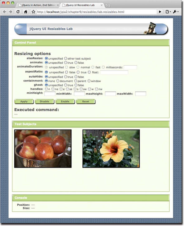
The Control Panel of this lab lets us play around with most of the options available for the resizable() method. Follow along in this Lab as you read through the options list in table 10.7.
Table 10.7. Options for the jQuery UI resizable() method
|
Description |
In Lab |
|
|---|---|---|
|
alsoResize |
(Selector|jQuery|Element) Specifies other DOM elements that are to be resized in synchronization with the resizable elements. These other elements don’t need to have the resizable() method applied to them. If omitted, no other elements are affected. |
✓ |
|
animate |
(Boolean) If true, the element itself isn’t resized until after the drag operation finishes, at which time the element is resized smoothly via animation. While dragging, a helper with the class ui-resizable-helper (unless overridden by the helper option, discussed below) is used to show the drag outline. Be sure that this class has a suitable CSS definition or you may not see anything during an animated resize operation. For example, the Resizables Lab page uses the following:
|
✓ |
|
animateDuration |
(Integer|String) When the animate option is enabled, defines the duration of the animation. The standard animation strings slow, normal, or fast may be used, or the value can be specified as a number of milliseconds. |
✓ |
|
animateEasing |
(String) Specifies the easing effect to be used when the animate option is enabled. The default is the built-in swing easing. See chapter 5 for a more thorough discussion of easing. |
|
|
aspectRatio |
(Boolean|Float) Specifies whether, and at what ratio, the aspect ratio of the element is to be retained during a resize operation. A value of true enforces the original aspect ratio of the element, whereas a floating value can be used to specify the ratio using the formula width / height. For example, a 3 to 4 ratio would be specified as 0.75. By default, no aspect ratio is maintained during the operation. |
✓ |
|
autoHide |
(Boolean) If true, the handles are hidden except when the mouse hovers over the resizable element. See the handles option for more information. By default, the handles are always displayed. |
✓ |
|
cancel |
(Selector) Specifies elements that should be excluded from resizable operations. By default, the selector :input,option is used. |
|
|
containment |
(String|Element|Selector) Specifies an element within which resizing should be constrained. The built-in strings parent, or document can be specified, a specific element can be supplied, or you can use a selector to identify the containment element. By default, the operation is unconstrained. |
✓ |
|
delay |
See the draggable operation of the same name in table 10.1. |
|
|
distance |
See the draggable operation of the same name in table 10.1. |
|
|
ghost |
(Boolean) If true, a translucent helper is displayed during a resize operation. The default is false. |
✓ |
|
grid |
See the draggable operation of the same name in table 10.1. |
|
|
(String|Object) Specifies in which directions the elements may be resized. These values can be supplied as a string with a comma-separated list of the possible values: n, ne, e, se, s, sw, w, nw, or all. This format should be used when you want jQuery UI to handle the creation of the handles. If you want to use child elements of the resizable as handles, supply an object with properties that define handles for each of the eight directions: n, ne, e, se, s, sw, w, and nw. The value of the property should be a selector for the element to use as the handle. We’ll address the handles a bit more after we talk about events. If omitted, handles are created for the e, se, and s directions. |
✓ |
|
|
helper |
(String) If specified, enables the use of a helper element with the supplied class name during the resize operation. Helpers are enabled by using this option, but can also be implicitly enabled by other options such as ghost or animate. If implicitly enabled, the default class is ui-resizable-helper unless this option is used to override that class name. |
|
|
maxHeight |
(Integer) Specifies a maximum height to which the element can be resized. By default, no maximum is imposed. |
✓ |
|
maxWidth |
(Integer) Specifies a maximum width to which the element can be resized. By default, no maximum is imposed. |
✓ |
|
minHeight |
(Integer) Specifies a minimum height to which the element can be resized. By default, a value of 10px is used. |
✓ |
|
minWidth |
(Integer) Specifies a minimum width to which the element can be resized. By default, a value of 10px is used. |
✓ |
|
resize |
(Function) Specifies a function to be established on the resizables as an event handler for resize events. See table 10.8 for details of this event. |
✓ |
|
start |
(Function) Specifies a function to be established on the resizables as an event handler for resizestart events. See table 10.8 for details of this event. |
✓ |
|
stop |
(Function) Specifies a function to be established on the resizables as an event handler for resizestop events. See table 10.8 for details of this event. |
✓ |
As compared with some of the more involved interactions, resizable() has a modest set of options. We’ll find the same is true of its events.
10.4.2. Resizability events
Only three simple events are triggered during a resize operation to let us know that a resize operation has started, that it’s underway, and that it has ended.
The information passed to these event handlers follows the customary interaction format of the event as the first parameter and a custom object with interesting information about the operation passed as the second. For resizables, this custom object contains the following properties:
- position—An object whose top and left properties give the current position of the element relative to its offset parent
- size—An object whose width and height properties give the current size of the element
- originalPosition—An object whose top and left properties give the original position of the element relative to its offset parent
- originalSize—An object whose width and height properties give the original size of the element
- helper—A wrapped set containing any helper element
Be aware that some of these properties may be undefined or null if they don’t make sense for the current state. For example, there may be no helper defined.
The function context for these handlers is the element to which the resizable() method was applied. The specific events that are triggered during a resize operation are summarized in table 10.8.
Table 10.8. jQuery UI events triggered for resizables
|
Event |
Option |
Description |
|---|---|---|
|
resizestart |
start |
Triggered when a resize operations starts |
|
resize |
resize |
Repeatedly triggered for mousemove events during the resize operations |
|
resizestop |
stop |
Triggered when a resize operation terminates |
The Resizables Lab uses these events to report the current position and size of the test subject elements in the Console pane of the Lab page.
10.4.3. Styling the handles
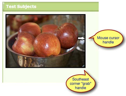
Although resizable() is a fairly simple operation, at least as the jQuery UI interactions go, the handles deserve a bit of discussion of their own.
By default, handles are created for the east, southeast, and south directions, enabling resizing in those directions. Any direction that has no resize handle defined isn’t enabled for resizing.
You might initially be confused by the fact that in your pages, as well as in the Resizables Lab, no matter how many directions are enabled, only the southeast corner gets a special “grip” icon when enabled. And yet, all the other specified directions are enabled—they work fine, and the mouse cursor changes shape when the edge of the resizable is hovered over. What’s up with the difference?
It’s not you, and it’s not your code. jQuery UI treats that corner as a special case, adding additional class names to the southeast handle element in addition to what it adds to the other handles.
When any handle is created, it’s given the class names ui-resizable-handle and ui-resizable-xx, where xx represents the direction that the handle represents (for example, ui-resizable-n for the north handle). The southeast corner, deemed special by jQuery UI, also receives the ui-icon and ui-icon-gripsmall-diagonal-se class names, whose definition (in the default CSS files as generated during the jQuery UI download process) creates the “grip” that appears on that corner. Although you can manipulate the CSS for the handle names to affect how all the handles, including the southeast handle, appear, there is no option to change the class name assignment behavior.
Note
The inspiration for the special southeast “grip” handle undoubtedly has its origin in window managers such as that for Mac OS X, which place such a grip on their resizable windows.
Figure 10.6 shows this grip handle, and the CSS handle that the mouse pointer displays when hovered near the resizable east edge.
Figure 10.6. By default, jQuery UI places a “grip” handle in the southeast corner and uses CSS cursors for the other handles.
If you find this too limiting, you can use the more complex version of the handles option to define child elements as handles that you can create yourself.
Now let’s take a look at the final interaction that jQuery UI provides.
10.5. Making things selectable
Most of the interactions that we’ve examined so far involve direct manipulation of elements in order to change their state in some manner, be it to affect their position, size, or order within the DOM. The selectable() interaction gives us the ability to set and clear a “selected” state on any DOM element.
In HTML forms, we’re used to using controls such as checkboxes, radio buttons, and yes, <select> elements to retain selection state. jQuery UI allows us to retain such state on elements other than these controls.
Think back to the DVD Ambassador example in chapter 4. In that example, we focused on the filtering set of controls, and didn’t pay much mind to the results returned from that filtering operation. We’re about to change that. As a reminder, a screenshot of that example is shown in figure 10.7.
Figure 10.7. Revisiting the DVD Ambassador to instrument its result data set using jQuery UI selectables.
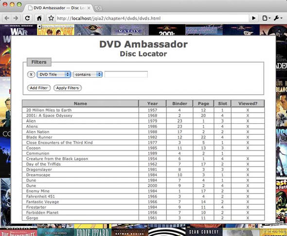
The results (which, in the example, are the result of a hard-coded HTML fragment that in a real application would be generated from database information) are displayed as a list of elements on the page in a tabular format.
Let’s say that we wanted to allow users of DVD Ambassador to select one or more DVD titles and apply some sort of bulk operation upon them: deleting them from the database, for example, or perhaps marking them all as viewed or unviewed.
The traditional approach would be to add a checkbox control to every row, and to use it to indicate that the row is selected. This method is tried and true, but it can present a challenge to the sloppy clickers in the audience because the checkbox creates a small area, usually about 12 by 12 pixels, within which the user must click to toggle the checkbox value.
Note
In forms, the <label> element is often used to associate text with the checkbox, making the combination of the checkbox and label clickable.
User interfaces shouldn’t be a game of hand-eye coordination, so we’d like to make it easier on our users. We have the know-how to instrument the entire row with a click handler such that when the user clicks anywhere on the row, the handler finds the enclosed checkbox and toggles its value. That gives the user a much bigger target to aim for, and the checkbox merely serves as a visual cue, and the means by which the selected state is remembered.
jQuery UI Selectables will allow us to take this a step further, which gives us two distinct advantages:
- The checkbox can be eliminated.
- Users will be able to make multiple selections with a single interaction.
The elimination of the checkbox means that we’ll need to provide our own visual cues as to whether a row is selectable (without the checkbox, users have lost an important cue that we must make up for), and whether it is selected or not. Changing the background color of the row is a conventional means to indicate changes in status, and it’s not a bad idea to also change the cursor shape to one that indicates that something wonderful will happened when the row is clicked upon.
With regards to remembering what’s selected and what’s not, jQuery UI selectables will maintain selection status using a class name (namely ui-selected) placed on selected elements.
Using the checkbox approach, users are limited to selecting and unselecting elements one by one. Although it’s common to provide an über-checkbox that toggles the state of all the checkboxes, what if the user want to selects rows 3 through 7? They’re stuck with selecting them one at a time.
With selectables, not only can we single-select with a click, but by dragging a rectangular marquee across the elements (or enclosing them, depending on how we set our options) our users will be able to select multiple adjacent elements in one fell swoop—much as we’re used to in many desktop applications.
Additionally, selectables allows elements to be added to an already selected set by holding down the Control key (the Command key on Macs) while clicking or dragging.
Now is a good time to bring up the jQuery UI Selectables Lab, found in file chapter10/selectables/lab.selectables.html, and
shown in figure 10.8. In this Lab, we use the DVD Ambassador tabular result set as the test subject.
Figure 10.8. The Selectables Lab uses the HTML results fragment from the DVD Ambassador as its test subject.
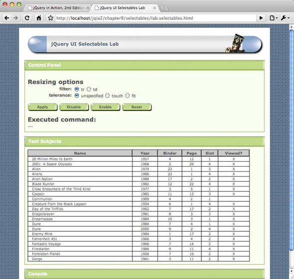
Let’s try out a few interactions using the default options.
- Exercise 1— Before changing anything or clicking any buttons, wave the mouse cursor over the data table, and try clicking on and dragging
over the rows. Note how the cursor pointer retains its normal appearance, and clicking has no effect at all. Dragging just
results in the normal browser selection of text.
Leave the options with their default settings, and click the Apply button. Now note how the mouse cursor changes to the hand
pointer when it hovers over any of the data rows. When a DOM element becomes selectable (eligible for selection), jQuery UI
places the class ui-selectee on the element. In the Lab page, the following CSS rule applies the cursor change:
.ui-selectee { cursor: pointer; } Now click on a few rows. Note that as each row is clicked, it changes background color. When an element becomes selected, the class ui-selected is applied to it, and the following rule in the Lab page changes its background color:
#testSubject .ui-selected { background-color: pink; } Also note that as you click each row, causing it to become selected, any previously selected row becomes unselected. - Exercise 2— Without changing anything or clicking any buttons, select a row and then hold the Control/Command key down while selecting other rows. Note how when the Control/Command key is depressed during a click, any previously selected elements are not unselected.
- Exercise 3— Without changing anything or clicking any buttons, start a rectangular drag operation that cuts across a number of rows. Be sure that the drag operation starts within a row. Note that any row that the drag operation cuts across becomes selected. Pressing the Control/Command key during a drag likewise causes any previous selection to be retained.
That’ll do for the moment.
10.5.1. Creating selectables
Now that we’ve seen Selectables in action, let’s take a look at the selectable() method that makes it all happen:
selectable(options)
selectable('disable')
selectable('enable')
selectable('destroy')
selectable('option',optionName,value)
selectable('refresh')
Makes the elements in the wrapped set selectable according to the specified options, or performs some other selectable action based upon an operation string passed as the first parameter.
Parameters
|
options |
(Object) An object hash of the options to be applied to the elements in the wrapped set, as described in table 10.9, making them selectable. |
|
'disable' |
(String) Disables the selectability of any selectable elements in the wrapped set. The selectability of the elements isn’t removed and can be restored by calling the enable variant of this method. |
|
'enable' |
(String) Re-enables selectability on any selectable elements in the wrapped set whose selectability has been disabled. Note that this method won’t add selectability to any non-selectable elements. |
|
'destroy' |
(String) Removes selectability from the elements in the wrapped set. |
|
'refresh' |
(String) Causes the size and position of the selectable elements to be refreshed. Used mostly when the autoRefresh option is disabled. |
|
'option' |
(String) Allows option values to be set on all elements of the wrapped set, or to be retrieved on the first element of the wrapped set (which should be a selectable element), based upon the remaining parameters. If specified, at least the optionName parameter must also be provided. |
|
optionName |
(String) The name of the option (see table 10.9) whose value is to be set or returned. If a value parameter is provided, that value becomes the option’s value. If no value parameter is provided, the named option’s value is returned. |
|
value |
(Object) The value to be set for the option identified by the optionName parameter. |
Returns
The wrapped set, except for the cases where an option value, query string, or array is returned.
The options that can be used when creating selectable elements are shown in table 10.9.
Table 10.9. Options for the jQuery UI selectable() method
|
Description |
In Lab |
|
|---|---|---|
|
autoRefresh |
(Boolean) If true (the default), the position and size of each selectable item is computed at the beginning of a select operation. Although a selectable operation won’t make any changes to the position and size of selectable elements, they might have changed via CSS or scripting on the page. If there are many selectable elements, this option can be disabled for performance, and the refresh method can be used to manually recompute the values. |
|
|
cancel |
See the draggable operation of the same name in table 10.1. |
|
|
delay |
See the draggable operation of the same name in table 10.1. |
|
|
distance |
See the draggable operation of the same name in table 10.1. |
|
|
filter |
(Selector) Specifies a selector that identifies what type of child elements within the elements of the wrapped set become selectable. Each of these elements is marked with the class ui-selectee. By default, all children are eligible. |
✓ |
|
selected |
(Function) Specifies a function to be established on the selectables as an event handler for selected events. See table 10.10 for details on this event.. |
✓ |
|
selecting |
(Function) Specifies a function to be established on the selectables as an event handler for selecting events. See table 10.10 for details on this event. |
✓ |
|
start |
(Function) Specifies a function to be established on the selectables as an event handler for selectablestart events. This handler is passed the event, but no other information. See table 10.10 for details on this event. |
✓ |
|
stop |
(Function) Specifies a function to be established on the selectables as an event handler for selectablestop events. This handler is passed the event, but no other information. See table 10.10 for details on this event. |
✓ |
|
tolerance |
(String) One of fit or touch (the default). If fit, a drag selection must completely encompass an element for it to be selected. This can be problematic in some layouts because a drag selection must start within a selectable. If touch, the drag rectangle only needs to intersect any portion of the selectable item. |
✓ |
|
unselected |
(Function) Specifies a function to be established on the selectables as an event handler for unselected events. See table 10.10 for details on this event. |
✓ |
|
unselecting |
(Function) Specifies a function to be established on the selectables as an event handler for unselecting events. See table 10.10 for details on this event. |
✓ |
Now that we’ve been introduced to the options, let’s try a few more exercises using the Selectables Lab.
- Exercise 4—Repeat the actions of exercises 1 through 3, except this time observe the Console pane at the bottom of the page. This panel
will display the events that take place during the select operations. We’ll be discussing what information is passed to these
events in the next section.
- Exercise 5— In all the exercises so far, we allowed the filter option to be specified as tr, making the entire data row selectable. Click the Reset button or refresh the page, choose the td value for the filter option, and click Apply. Click within the data table to select various elements. Note that we can now select individual data cells as opposed to entire rows.
- Exercise 6— Change the value of the filter option to span, and click Apply. Now click on the various text values within the data results. Notice that only the text itself is selected rather than the entire cell. (Each text value within the <td> elements is enclosed in a <span>).
- Exercise 7— Reset the page, choose a tolerance value of touch, and click Apply. Try various drag selections and note how the behavior hasn’t changed; any row that’s overlapped by the selection marquee becomes selected. Now change the filter value to td and repeat the exercise, noting how any cell intersected by the marquee becomes selected.
- Exercise 8— Leaving the filter value set at td, choose a tolerance value of fit, and click Apply. Repeat the drag exercises and note how only cells that are completely enclosed by the marquee become selected. Now change the filter value to tr, click Apply, and try again. Any luck? Because a drag selection must begin within a selection, the tolerance setting requires that a selectable be completely enclosed to become selected, and the rows aren’t surrounded by other selectables, this combination makes it almost impossible to select any rows. The lesson? Use a tolerance value of fit cautiously.
The list of options for selectable() is shorter than for the other interactions; in fact, the majority are shortcuts for establishing event handlers for the selectable events. But those events are an important part of the selectables process. Let’s examine them.
10.5.2. Selectable events
For such a seemingly simple operation, a rich set of events is triggered during a selectable operation. There aren’t only events that identify when the operation starts and stops, but when individual elements are selected or unselected, and even when elements are pending a change of selection state.
Unlike the other interaction events, selectable events don’t have a fixed construct that’s passed to the handlers. Rather, the information, if any at all, is tuned to each event type. Table 10.10 describes the selectable events and what data is passed to them.
Table 10.10. jQuery UI events triggered for selectables
|
Option |
Description |
|
|---|---|---|
|
selectablestart |
start |
Triggered when a selectable operation starts. The event is passed as the first parameter to this handler, and an empty object is passed as the second. |
|
selecting |
selecting |
Triggered for each selectable element that’s about to become selected. The event is passed as the first parameter, and the second parameter is an object with a single property, selecting, that contains a reference to the element that’s about to become selected. The class name ui-selecting is added to these elements. If present, the ui-unselecting class is removed. It’s not inevitable that an element reported by this event will eventually become selected. If a user drags a marquee that includes an element, that element will be reported by this event. But if the marquee is changed such that the element is no longer included, that element won’t become selected. |
|
selected |
selected |
Triggered for each element that becomes selected. The event is passed as the first parameter, and the second parameter is an object with a single property, selected, that contains a reference to the element that has become selected. The class name ui-selecting is removed and the class ui-selected is added to these elements. |
|
unselecting |
unselecting |
Triggered for each selected element that’s about to become unselected. The event is passed as the first parameter, and the second parameter is an object with a single property, unselecting, that contains a reference to the element that’s about to become unselected. The class name ui-unselecting is added to these elements. As with the selecting event, elements reported by this event won’t always become unselected. |
|
unselected |
unselected |
Triggered for each element that becomes unselected. The event is passed as the first parameter, and the second parameter is an object with a single property, unselected, that contains a reference to the element that has become unselected. The class name ui-unselecting is removed from these elements. |
|
selectablestop |
stop |
Triggered when a selectable operation terminates. The event is passed as the only parameter to this handler. |
If any of these events are unclear, especially the differences between events such as selecting and selected, repeat the exercises in the Selectables Lab, carefully observing the Console Pane to see how the events are triggered as selection operations of various types are carried out.
OK, we have things that are selected. Now what?
10.5.3. Finding the selected and selectable elements
The selectable event that’s bound most often is likely to be selectablestop, which informs us when a selection event has occurred and is concluded. Within handlers for this event, we’ll almost invariably want to determine which elements ended up as selected.
Even if we’re not interested in the selections when the selection takes place, there almost always comes a time when we need to know what the selections are, such as when it comes time to contact the server.
The traditional state-retaining HTML controls submit their state as part of a form submission without any help on our part. But if we need to communicate the selection state of our selectables as part of a form submission, or even as parameters to an Ajax request, we need to collect the selections.
You may recall that the sortables interaction provided a couple of methods that we could use to determine the final state of the sortables. If we expected the same of selectables, we’ve been disappointed.
But only momentarily; the selected elements are so easy to obtain using jQuery selectors that a specialized method to fetch them isn’t necessary. Because each selected element is marked with the class name ui-selected, fetching a wrapped set of all selected elements is as easy as this:
$('.ui-selected')
If we wanted to only grab selected <div> elements, we’d do this:
$('div.ui-selected')
What we’ll probably want to do most often is collect the selected elements so that we can convey the selections to the server, much in the same way that checkboxes or radio buttons are conveyed using request parameters. If we wanted to cause the selections to be submitted to the server as part of a form submission, an easy way to accomplish that is to add hidden <input> elements to the form just prior to submission, one for each selected element.
Let’s say that in our Selectables Lab, we wanted to submit all selected movie names as a request parameter array named title[]. We could accomplish that with the following code placed in the form’s submit handler:
$('.ui-selected').each(function(){
  $('<input>')
    .attr({
      type: 'hidden',
      name: 'title[]',
      value: $('td:first-child span',this).html()
    })
    .appendTo('#labForm'),
});
If, instead, we wanted to create a query string to represent the title[] request parameter, we could write the following:
var queryString = $.param({'title[]':
  $.map($('.ui-selected'),function(element){
    return $('td:first-child span',element).html();
  })
});
As an exercise, write some code that would take the currently selected movie elements and submit them via an Ajax request
using $.post(). As another exercise, capture the previous code sample that creates the hidden inputs on the form as a jQuery plugin method.
And that wraps up our examination of the jQuery UI interactions. Let’s review what we’ve learned.
10.6. Summary
In this chapter we continued our examination of jQuery UI, focusing on the mouse interaction techniques that it provides.
We began with dragging, which provide a basic interaction used by the remaining interactions: dropping, sorting, resizing, and selecting.
We saw how the dragging interaction lets us free elements from the bounds of their page layout so that we can move them freely about the page. Numerous options are available to customize the dragging behaviors to our needs (as well as to the needs of the remaining interactions).
The dropping interaction gives us something interesting to drop draggables on, in order to provide various user interface semantic actions.
One of those interactions is so common that it’s provided as an interaction of its own, sorting, which allows us to drag and drop elements to redefine their position within an ordered list, or even across multiple lists.
Not content with just letting us move things around, the resizing interaction lets us change the size of elements, with plenty of options to customize how and what can be resized.
And finally, we examined selecting, an interaction that lets us apply a persistent selected state to elements that don’t intrinsically have selectability.
Together, these interactions give us a lot of power to realize complex, but easy-to-use, user interfaces to present to our users.
But that’s not the end of it. These interactions also serve as a basis for even more that jQuery UI has to offer. In the next chapter, we’ll continue looking at jQuery UI, this time poking into the user interface widgets that it provides.