
Chapter 9. Introducing jQuery UI: themes and effects
- An overview of jQuery UI
- Configuring and downloading the jQuery UI library
- Obtaining and creating jQuery UI themes
- Extended effects provided by jQuery UI
- Other extensions to the core library
More than a plugin, but not part of the jQuery core, jQuery UI enjoys a status as an official extension of the jQuery core library aimed at providing extended user interface (UI) capabilities to jQuery-enabled web application pages.
The tools available for us to use within the browser environment (JavaScript, DOM manipulation, HTML, and even the core jQuery library) give us low-level abilities to put together pretty much any kind of user interactions we might want to provide for our users. But even so, building complex interactions using basic building blocks can be a large and daunting task. The native JavaScript API for DOM manipulation is tedious in the extreme (luckily we have core jQuery to contend with that), and the set of form controls that HTML provides is rather sparse when compared with desktop environment counterparts.
We can create our own interactions and controls (often called widgets) with the help of the jQuery methods we’ve learned to this point. But the jQuery UI library provides us with a fair number of generally desired extended features or gives us higher-level building blocks to create them ourselves.
Imagine a commonly needed widget such as a progress bar. We could analyze its requirements and figure out how to implement it using core jQuery, but the UI library has already anticipated that need and provides a progress bar widget right out of the box.
Unlike the core jQuery library, jQuery UI is a confederation of loosely coupled elements. We’ll see, in the first section of this chapter, how we can download a library that contains all of these pieces, or just the ones we’re going to need. These elements fall into three general categories:
- Effects— Enhanced effects beyond those provided by the core library
- Interactions— Mouse interactions, such as drag and drop, sorting, and the like
- Widgets— A set of commonly needed controls, such as progress bars, sliders, dialog boxes, tabs, and so on
It’s important to note that the interactions and widgets make heavy use of CSS to “theme” the visible elements. This is an essential tool for making the elements work correctly, as well as to match the design and appearance of our own pages, and it’s a topic that we’ll be examining later in this chapter.
As you can see, there’s a lot there. And because jQuery UI is an important extension to jQuery, we’re devoting three chapters to it. We have also provided an extensive set of UI-focused Lab pages—pretty much one for each major area of jQuery UI. These chapters, along with the Labs, should give you a good starting point for using jQuery UI.
Without further blather, let’s get going and get our hands on jQuery UI.
9.1. Configuring and downloading the UI library
The jQuery UI library consists of a fairly large number of elements. Depending upon the needs of your application, you might want to use all of these elements, or perhaps just a subset of them. For example, your application might not need to make use of the widgets, but it might need drag-and-drop capability.
The jQuery UI team has provided the ability to construct a library that consists of only the essential required pieces, plus any features that you need for your application. This eliminates the need to load a larger library than your application will use. After all, why load up a bunch of script on every page that’s just going to sit there unused?
9.1.1. Configuring and downloading
Before we can use the library, we need to download it. The download page for jQuery UI can be found at http://jqueryui.com/download, depicted in figure 9.1. As you can see in the figure, the most recent version as of this writing is jQuery UI 1.8.
Figure 9.1. The jQuery UI download page allows us to configure and download a jQuery UI library configuration customized to the needs of our application.

On that page, you’ll find a list of the available components for the jQuery UI library, each with a checkbox that you can check to select that component. You’ll need to check the box for UI Core in order to be able to use any of the interactions and most of the widgets. But don’t worry too much about what you select—the page will automatically select dependencies, and it won’t let you put together an invalid combination of elements.
Once you’ve identified the components that you want (for now, we recommend selecting them all for exploratory purposes), pick a theme from the dropdown in the right-most column, and then click the Download button.
It doesn’t matter which theme you choose at this point; we’ll be addressing CSS themes later in this chapter. For now, just pick any theme, though we recommend avoiding the No Theme option at this point. You want to download the CSS rather than building it from scratch. Trust us—you can always replace or tweak it later.
Note
The selected theme has no effect on the JavaScript code generated for your component selections. The differences between themes are limited to the style sheet and images associated with the theme.
The jQuery UI library configuration that’s provided with the example code for this book contains all components and uses the Cupertino theme.
9.1.2. Using the UI library
Once you’ve clicked the Download button, a set of zipped custom jQuery UI library files is downloaded to your system (exactly where depends upon your browser settings). The zip file contains the following files and folders:
- index.html—An HTML file containing demo samples of the downloaded widgets rendered in the chosen theme. You can use this as a quick check to make sure that the widgets you want are included, and that the theme matches your expectations.
- css—A folder containing a folder that in turn contains the CSS file and images for the theme that you selected. The subfolder will bear the name of the theme that you chose; for example, cupertino or trontastic.
- development-bundle—A folder containing developer resources such as license files, demos, documentation, and other useful files. Explore this at your leisure; there’s lots of good stuff there.
- js—A folder containing the generated jQuery UI JavaScript library code, as well as a copy of the core jQuery library.
To use the library, you’ll want to copy the theme folder in the css folder, and the jQuery UI library file, jquery-ui-1.8.custom.min.js in the js folder, to the appropriate locations in your web application. You’ll also need the jQuery core library file if it’s not already present.
Note
The name of the JavaScript file will reflect the current version of jQuery UI, so it will change as jQuery UI is updated.
Although the locations in which you place these files can be specific to the needs of your web application, it’s important to retain the relationship between the theme’s CSS file and its images. Unless you want to change the references to all the images within the CSS file, be sure to leave the theme’s images folder in the same folder as the CSS file.
A commonly used application layout, supporting multiple themes, is shown in figure 9.2. Here, we’re supporting three of the canned themes available for download.
Figure 9.2. A conventional layout for the script and theme files within an application using jQuery UI–your mileage may vary.

Switching between themes is as easy as changing the URLs that reference the CSS files in the application’s pages.
Once the files are in place, we can simply import them into our pages with the usual <link> and <script> tags. For example, we could import the files into the index.html file in the application layout depicted in figure 9.2 with the following markup:
<link rel="stylesheet" type="text/css"
      href="themes/black-tie/jquery-ui-1.8.custom.css">
<script type="text/javascript" src="scripts/jquery-1.4.2.min.js"></script>
<script type="text/javascript"
        src="scripts/jquery-ui-1.8.custom.min.js"></script>
Switching themes is as easy as changing the theme folder name in the <link> tag.
Note
If you would like an easy way to allow your users to dynamically switch between themes, check out the Theme Switcher Widget at http://jqueryui.com/docs/Theming/ThemeSwitcher.
With that, we’re ready to start exploring jQuery UI. Within this chapter, we’ll begin with a closer look at themes, and then look at the ways jQuery UI extends core methods and capabilities, especially in the area of effects. In the next two chapters, we’ll explore the mouse interactions and then the widgets.
9.2. jQuery themes and styling
jQuery UI, especially the widget set, relies heavily upon the CSS classes defined within the downloaded CSS file for styling the visible elements that appear on our pages. But, as we’ll learn in this and the next two chapters, it also relies heavily upon class names assigned to the elements for much more than just styling.
There are a number of ways to set up the themes that jQuery UI relies upon. Here they are, from easiest to hardest:
- Choose a theme during download and use it verbatim.
- Use the ThemeRoller web application to design your own theme. We’ll take a quick look at the ThemeRoller in section 9.2.2.
- Tweak the downloaded theme by modifying the original CSS file, or supplying a CSS file that overrides the original’s settings.
- Write your own from scratch.
The last approach isn’t recommended. The number of classes to be defined is extensive—the CSS files for the predefined themes run in the 450 to 500 line range—and the consequences of getting it wrong can be dire.
Let’s start by taking a look at how the predefined CSS files and class names are organized.
9.2.1. Overview
Although the predefined themes are all very nice, it’s unlikely that we’d find one that precisely matches the look of our own web applications.
We could, of course, pick a canned theme first, and use it as the definitive look for our site, but that may not be a luxury we often have. Which one of us has never had a marketing or product manager looking over our shoulder and asking, “What if we make that blue?”
The ThemeRoller, which we’ll discuss in the next section, can help us make a theme that has exactly the colors and textures we want for our applications, but even so, we may still need to make page-by-page tweaks. As such, it behooves us to understand how the CSS classes are laid out and used by jQuery UI.
We’ll begin by examining how the classes are named.
Class Naming
The class names defined and used by jQuery are extensive, but well organized. They were carefully chosen to convey not only their meaning, but where and how they’re used. Even though there are a lot of names, they make logical sense and are easy to manage once you get the hang of how they’re constructed.
First, in order to keep from stepping on anyone else’s names in the class namespace, all jQuery UI class names begin with the prefix ui-. Names are always in lowercase, and hyphen characters are used to separate words; for example, ui-state-active.
Some classes are used throughout the library. The aforementioned class ui-state-active is a good example. It’s used by all components of the UI library to indicate that an element is in an active state. For example, the Tab widget will use it to mark the active table, whereas the Accordion widget will use it to identify the open accordion pane.
When a class is specific to a particular component, be it an interaction or a widget, the name of the component will immediately follow the ui- prefix. For example, classes specific to the Autocomplete widget will all begin with ui-autocomplete, whereas those specific to the Resizable interaction will begin with ui-resizable.
We’ll take a closer look at the cross-library class groupings in the remainder of this section. The component-specific classes will be discussed as we examine the various components over the next few chapters. It isn’t our intention to cover every one of the hundreds of class names defined by jQuery UI. Rather, we’ll look at the most important, and the ones that we’re likely to need to know about on our pages.
Identifying Widgets
When widgets are created by the jQuery UI library, some elements that compose the widget may be created by the library, and some may be existing elements that are already resident on the page.
In order to identify the elements that comprise the widgets, jQuery UI uses a set of class names that begin with ui-widget. The class ui-widget is used to identify the master element of the widget—usually a container that’s the parent of all the elements that form the widget.
Other class names, such as ui-widget-header and ui-widget-content, are used as appropriate for the widget’s elements. Just how a widget uses these classes is specific to each widget.
State Tracking
At any point in time, various parts of widget or interaction elements may be in various states. jQuery UI tracks these states, and applies appropriate visual styling to them, via a set of classes that begin with ui-state. These states include ui-state-default, ui-state-active, ui-state-focus, ui-state-highlight, ui-state-error, ui-state-disabled, and ui-state-hover.
We can use these names in our own scripts or CSS to track state or affect the styling of elements in the various states.
Icons
jQuery UI defines a large number of icons that can be used by various widgets. For example, icon indicators on the tab elements of the Tab widget, or icons directly on Button widgets. Each icon is identified by a class name beginning with ui-icon; for example, ui-icon-person, ui-icon-print, and ui-icon-arrowthick-1-sw.
jQuery UI is very clever regarding how it handles icons. All the individual icon images are defined in a grid on a single image—an icon sheet, if you will. That way, once this image has been downloaded and cached by the browser, no further trips to the server are needed to display any of the available icons—and there are a lot of them (173 as this is being written). The icon class definitions merely identify how to move the origin of this sheet image as a background image, causing the desired icon to appear as the background of an element.
We’ll be examining icons in greater detail along with the Button widget in chapter 11, but if you want a sneak peek, bring up the file chapter11/buttons/ui-button-icons.html in your browser.
Rounded Corners
If you’ve already taken a glimpse at the widgets defined by jQuery UI, you’ve probably already seen a lot of rounded corners.
jQuery UI applies these corners with a set of class names that define the appropriate browser-specific and CSS3 style rules to cause rounded corners to appear in browsers for which they’re supported. Non-supporting browsers will simply not have the rounded corners.
These corner-rounding classes aren’t limited to just the JQuery UI widgets! We can use these classes on any element of our page.
 Bring up the Rounded Corners Mini-Lab (it’s too simple to consider a full Lab page) from the chapter9/lab.rounded-corners.html
file in your browser. You’ll see the page displayed in figure 9.3.
Bring up the Rounded Corners Mini-Lab (it’s too simple to consider a full Lab page) from the chapter9/lab.rounded-corners.html
file in your browser. You’ll see the page displayed in figure 9.3.
Figure 9.3. The Rounded Corners Mini-Lab lets us see how rounded corners can be applied to elements via simple class assignments.

 The checkbox controls allow us to choose which, if any, of the ui-corner classes are applied to the test subjects. When a checkbox is checked, the corresponding class name is applied; when unchecked,
the class name is removed.
The checkbox controls allow us to choose which, if any, of the ui-corner classes are applied to the test subjects. When a checkbox is checked, the corresponding class name is applied; when unchecked,
the class name is removed.
Note
Rounded corners of any type aren’t supported in Internet Explorer 8 or earlier (they should be as of IE 9), and Firefox (at least as of this writing) doesn’t support rounded corners on image elements.
Spend a few moments clicking the various checkboxes to see how the application of the classes affects the corners of the test subjects.
9.2.2. Using the ThemeRoller tool
If you take a quick look through the CSS file generated when we downloaded jQuery UI, you’ll probably quickly come to the conclusion that trying to write such a file from scratch would be nothing short of madness. A quick glance at the images accompanying the CSS firmly cements that notion.
When one of the canned themes doesn’t match what we need for our site, we have some sane choices:
- Pick a canned theme that’s close to what we want, and tweak it to our liking.
- Create a theme from scratch using the ThemeRoller tool.
As it turns out, the ThemeRoller tool is the best way to achieve either of these options. With the ThemeRoller tool, we can start from scratch and specify every detail of a theme using an easy and intuitive interface, or we can preload it with one of the predefined themes and adjust it to our liking.
The ThemeRoller can be found at http://jqueryui.com/themeroller/, and it appears as shown in figure 9.4.
Figure 9.4. The jQuery UI ThemeRoller tool lets us create custom themes interactively with an intuitive and easy-to-use interface.
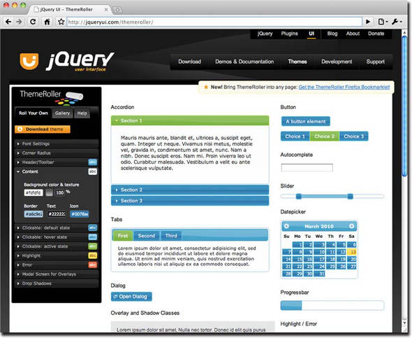
We’re not going to go into a great deal of detail on using the ThemeRoller—it’s pretty easy to figure out. But there are a few things you should know that are worth spending some time on.
Basic Themeroller Usage
The control panel for the ThemeRoller on left side of the interface has three tabs:
- Roll Your Own— This is where we’ll do most of the work. The various panels (click on a panel header to open it) let us specify all the details of the theme. Changes are shown in real time in the display area that shows how the settings we make affect the various widgets.
- Gallery— Contains a gallery of the canned themes. We’ll attend to this one in the next section.
- Help— Some help text in case you get stuck.
When we’re satisfied with the settings of our theme, the Download Theme button on the Roll Your Own tab sends us to the Build Your Download page so that we can download the custom theme. (The theme settings are passed on the URL as request parameters.)
Clicking the Download button on the Build Your Download page downloads the theme as we discussed in section 9.1.
Starting with a Canned Theme
Often, one of the canned themes might make a better starting point for a custom theme than starting completely from scratch. If you want to load the settings for one of the predefined themes and make adjustments from there, follow these simple steps:
1.
Select the Gallery tab.
2.
Peruse the predefined themes and choose the one you want to start with. Click on it and the widgets in the display area will exhibit the theme settings.
3.
Return to the Roll Your Own tab. Note that the settings from the predefined theme have been set into the controls.
4.
Adjust away to your heart’s content.
5.
Click Download Theme when the theme is ready.
The downloaded CSS file and images will reflect the settings that you selected for the custom theme, and within the download, the folder containing the theme within the css folder will be named custom-theme.
Reloading a Theme
Inevitably, just as you’re admiring your custom theme in your web application, someone will come along and demand a change. You know the type. But try as you might, you can’t find an upload or reload control on the ThemeRoller. Do we really have to start over and recreate a custom theme each time in order to make a change? Of course not.
Within the downloaded CSS file (not right at the top, but somewhere around line 44) you’ll find a comment that contains the text, “* To view and modify this theme, visit” followed by a rather long URL. Cut and paste this URL into your browser, and it will bring you to the ThemeRoller page, loaded with the settings for the custom theme (which are encoded onto the URL as request parameters). Any necessary changes can be made to the theme settings and the new files downloaded when ready.
OK, we now have a themed jQuery UI installation ready and waiting to use. Let’s dig into the extended effects that jQuery UI provides.
9.3. jQuery UI Effects
Back in chapter 5, we saw how easy it is to create custom effects using the jQuery animation engine. jQuery UI takes advantage of the core animation engine to offer us an ample set of effects right out of the box, including some that implement the custom effects that we set up ourselves as exercises.
We’ll take a close look at those effects, but we’ll also see how jQuery UI infuses these effects into core jQuery by providing extended versions of core methods that normally don’t support effects. We’ll also see a few new effect-focused methods that jQuery UI provides for us.
But first, let’s take a look at the effects.
9.3.1. The jQuery UI effects
All of the effects that jQuery UI provides can be used on their own—without other methods—via the effect() method. This method launches the effect on the elements of the wrapped set. Here it is:
effect(type,options,speed,callback)
Executes the specified effect on the elements of the wrapped set.
Parameters
|
type |
(String) The effect to run. One of blind, bounce, clip, drop, explode, fade, fold, highlight, puff, pulsate, scale, shake, size, slide, or transfer. See table 9.1 for details of these effect types. |
|
options |
(Object) Provides the options for the specified effect as defined by the core animate() method (see chapter 5). Additionally, each effect has its own set of options that can be specifiedósome common across multiple effectsóas described in table 9.1. |
|
speed |
(String|Number) Optionally provides one of slow, normal, fast, or the duration of the effect in milliseconds. If omitted, defaults to normal. |
|
callback |
(Function) An optional callback function invoked for each element after the effect is completed. No arguments are passed to this function, and the function context is set to the element being animated. |
Returns
The wrapped set.
Although table 9.1 attempts to describe what each effect does, it’s a lot clearer to actually see it in action. The jQuery UI Effects Lab has
been set up for just this purpose. This Lab page can be found in chapter9/lab.ui-effects.html and appears as shown in figure 9.5.
Table 9.1. jQuery UI effects
|
Effect-specific options |
|
|---|---|
|
blind
|
direction: (String) One of horizontal or vertical. If omitted, the default is vertical. mode: (String) One of show or hide (the default). |
|
bounce
|
direction: (String) One of up, down, left, or right. If omitted, the default is up. distance: (Number) The distance to bounce in pixels. Defaults to 20 pixels. mode: (String) One of effect, show, or hide. If omitted, effect is used, which simply bounces the element in place without changing the visibility of the element. times: (Number) The number of times to bounce. If omitted, the default is 5. |
|
clip
|
direction: (String) One of horizontal or vertical. If omitted, the default is vertical. mode: (String) One of show or hide (the default). |
|
drop
|
direction: (String) One of left (the default), right, up, or down. distance: (Number) The distance to move the element. Defaults to half the height or half the width, depending upon the direction that the effect will move the element. mode: (String) One of show or hide (the default). |
|
explode
|
mode: (String) One of show, hide, or toggle. pieces: (Number) The number of pieces to be used in the effect. If omitted, a default of 9 is used. Note that the algorithm may optimize your value to a different number. |
|
fade
|
mode: (String) One of show, hide (the default), or toggle. |
|
|
horizFirst: (Boolean) if true, the horizontal borders are moved first. If omitted or specified as false, the vertical borders are moved first. mode: (String) One of show or hide (the default). size: (Number) The size in pixels of the “folded” element. If omitted, the size is set to 15 pixels. |
|
highlight
|
color: (String) The color to use as the highlight. Colors can be expressed as CSS color names such as orange, hexadecimal notation such as #ffffcc or #ffc, or an RGB triplet rgb(200,200,64). mode: (String) One of show (the default) or hide. |
|
pulsate
|
mode: (String) One of show (the default) or hide. times: (Number) The number of times to pulse the element. Defaults to 5. |
|
puff
|
mode: (String) One of show or hide (the default). percent: (Number) The target percentage of the puff effect. Defaults to 150. |
|
scale
|
direction: (String) One of horizontal, vertical, or both. If omitted, the default is both. fade: (Boolean) If specified as true, the opacity is adjusted along with the size as appropriate for whether the element is being shown or hidden. from: (Object) An object whose height and width properties specify the starting dimensions. If omitted, the element starts from its current dimensions. mode: (String) One of show, hide, toggle, or effect (the default). origin: (Array) If mode is not effect, defines the base vanishing point for the effect, specified as a 2-string array. Possible values are: top, middle, bottom, and left, center, right. Defaults to ['middle','center']. percent: (Number) The percentage to scale to. Defaults to 0 for hide, and 100 for show. scale: (String) Which area of the element is to be scaled, specified as one of box, which resizes the border and padding; content, which resizes the element content; or both, which resizes both. Defaults to both. |
|
|
direction: (String) One of up, down, left, or right. If omitted, the default is left. distance: (Number) The distance to shake in pixels. Defaults to 20 pixels. duration: (Number) The speed of each “shake”; defaults to 140 ms. mode: (String) One of show, hide, toggle, or effect (the default). times: (Number) The number of times to shake. If omitted, the default is 3. |
|
size
|
from: (Object) An object whose height and width properties specify the starting dimensions. If omitted, the element starts from its current dimensions. to: (Object) An object whose height and width properties specify the ending dimensions. If omitted, the element starts from its current dimensions. origin: (Array) Defines the base vanishing point for the effect, specified as a 2-string array. Possible values are: top, middle, bottom, and left, center, right. Defaults to ['middle','center']. scale: (String) Which area of the element is to be scaled, specified as one of box, which resizes the border and padding; content, which resizes the element content; or both, which resizes both. Defaults to both. restore: (Boolean) Saves and restores certain CSS properties of the elements and their children being animated, and restores them after the effect has been applied. The properties that are saved are undocumented, but include margin and padding settings and are highly dependent upon the other options and environment of the element. Use this option only if some property is not turning out as you intend to see if it rectifies the issue. This option defaults to false. (Note that the scale effect uses the size effect internally, with this option set to true). |
|
slide
|
direction: (String) One of up, down, left, or right. If omitted, the default is left. distance: (Number) The distance to slide the element. The value should be less than the width or height of the element (depending upon direction), and the default is the current width (for left or right) or height (for up or down) of the element. mode: (String) One of show (the default) or hide. |
|
transfer
|
className: (String) An additional class name to be applied to the outline element. Specifying this option doesn’t prevent the ui-effects-transfer class from being applied. to: (String) A jQuery selector for the element to which the element will appear to transfer. There is no default; this option must be specified for the effect to work. |
Figure 9.5. The jQuery UI Effects Lab lets us see how the UI effects operate in real time with various options.

This Lab lets us see each effect in action. When an effect type is chosen, the options that can be specified with that effect appear in the control panel (using jQuery UI effects, of course). As you read through the descriptions of the effects in table 9.1, use this Lab page to see exactly what the effect does, and how the options affect the operation of the effect.
In table 9.1, the various effects are described, along with their options. All effects (except explode) accept an easing option that specifies the easing function to be used with the effect. We’ll examine the concept of easing in the upcoming section 9.3.5.
As you read through the entries in table 9.1, use the jQuery Effects Lab to see each effect in action.
Thinking back to our examination of the animate() method in chapter 5, you’ll recall how that method allows us to animate CSS properties expressed by numeric values that have a logical progression
from a start value to an end value. Color properties, you may recollect, were not among the supported animatable properties.
So how, then, does jQuery UI implement the highlight effect, which animates the background color of an element? Let’s find out.
9.3.2. Extended core animation capabilities
If we dissect the majority of effects that we’ve discussed throughout this book, including the list provided by jQuery UI (shown in table 9.1), we can determine that most of them are implemented by changes in the position, dimensions, and opacity of the animated elements. And although that gives us (not to mention jQuery UI) a great deal of latitude for creating effects, the range of effects that can be created is greatly expanded if the ability to animate color is thrown into the mix.
The core jQuery animation engine doesn’t possess this ability, so jQuery UI extends the capabilities of the core animate() method to allow the animation of CSS properties that specify color values.
The following CSS properties are supported by this augmentation:
- backgroundColor
- borderBottomColor
- borderLeftColor
- borderRightColor
- borderTopColor
- color
- outlineColor
And because all effects are eventually executed by this augmented capability, it doesn’t matter how the effect is initiated—all means of specifying effects can take advantage of this extended capability. We’ll shortly see how this is significant when we examine other extensions to the core library that jQuery UI provides.
9.3.3. Augmented visibility methods
As we discussed in chapter 5, the primary visibility methods of core jQuery—show(), hide(), and toggle()—when provided with a duration value, show or hide the target elements with a predefined effect that adjusts the width, height, and opacity of the elements. But what if we want more choices?
jQuery UI gives us that flexibility by extending those methods in core jQuery to accept any of the effects outlined in table 9.1. The extended syntax for these methods is as follows:
show(effect,options,speed,callback)
hide(effect,options,speed,callback)
toggle(effect,options,speed,callback)
Shows, hides, or toggles the visibility of the wrapped elements using the specified effect.
Parameters
|
effect |
(String) The effect to use when adjusting the element visibility. Any of the effects listed in table 9.1 can be used. |
|
options |
(Object) Provides the options for the specified effect as described in table 9.1. |
|
(String|Number) Optionally provides one of slow, normal, fast, or the duration of the effect in milliseconds. If omitted, defaults to normal. |
|
|
callback |
(Function) An optional callback function invoked for each element after the effect is completed. No arguments are passed to this function, and the function context is set to the element being animated. |
Returns
The wrapped set.
Whether you realize it or not, you’ve already seen an example of using these augmented visibility effects. In the jQuery UI Effects Lab, when the value of the effect dropdown is changed, any option controls not appropriate for the newly selected effect are removed with
$(someSelector).hide('puff'),
And the controls that are appropriate for the selected effect are shown via
$(someSelector).show('slide'),
As an advanced exercise, make a copy of the jQuery UI Effects Lab, and turn it into the jQuery UI Show, Hide, and Toggle
Lab:
- Add a set of radio controls that allow you to select one of the three visibility methods: show(), hide(), and toggle().
- When the Apply button is clicked, determine which method has been selected, and execute that method in place of the effect() method.
The visibility methods aren’t the only core methods that jQuery UI extends with added capabilities. Let’s see what other core methods are augmented.
9.3.4. Animating class transitions
As you might recall, the animate() method of core jQuery allows us to specify a set of CSS properties that the animation engine will progressively modify in order to create animated effects. Because CSS classes are collections of CSS properties, it seems a natural extension to allow the animation of class transitions.
And indeed, that’s exactly what jQuery UI provides: extensions to the class transition methods addClass(), removeClass(), and toggleClass() to allow animating the changes to the CSS properties. The syntax of the augmented methods is as follows:
addClass(class,speed,easing,callback)
removeClass(class,speed,easing,callback)
toggleClass(class,force,speed,easing,callback)
Adds, removes, or toggles the specified class name on the wrapped elements. If the speed parameter is omitted, these methods act exactly like the unextended core methods.
|
class |
(String) The CSS class name, or space-delimited list of class names, to be added, removed, or toggled. |
|
speed |
(String|Number) Optionally provides one of slow, normal, fast, or the duration of the effect in milliseconds. If omitted, no animated effect takes place. |
|
easing |
(String) The name of the easing function to be passed to the animate() method. See the description of animate() in chapter 5 for more information. |
|
callback |
(Function) A callback to be invoked when the animation completes. See the description of animate() in chapter 5 for more information. |
|
force |
(Boolean) If specified, forces the toggleClass() method to add the class if true, or to remove the class if false. |
Returns
The wrapped set.
In addition to extending these core class transition methods, jQuery adds a useful new class manipulation method, switchClass(), whose syntax is as follows:
switchClass(removed,added,speed,easing,callback)
Removes the specified class or classes, while adding the specified class or classes, using a transition effect.
Parameters
|
removed |
(String) The CSS class name, or space-delimited list of class names, to be removed. |
|
added |
(String) The CSS class name, or space-delimited list of class names, to be added. |
|
speed |
(String|Number) Optionally provides one of slow, normal, fast, or the duration of the effect in milliseconds. If omitted, the animate() method determines the default. |
|
easing |
(String) The name of the easing function to be passed to the animate() method. See the description of animate() in chapter 5 for more information. |
|
callback |
(Function) A callback to be invoked when the animation completes. See the description of animate() in chapter 5 for more information. |
Returns
The wrapped set.
Between the effect() method and the extensions to the core visibility and class transition methods, jQuery UI gives us a lot of choices regarding how we write code that manipulates elements in an animated manner.
Could we just use the animate() method for all such occasions? Sure we could. But thinking in terms of code clarity, it makes a lot more sense to use a method named hide() to hide an element—even in an animated fashion—than a method named animate(). jQuery UI gives us the ability to use the methods that make the most sense for the context of the code, regardless of whether animation will be used or not.
Another extension that jQuery UI provides in the area of animation is a rather large set of easings beyond that provided by jQuery core.
9.3.5. Easings
When we originally discussed animation back in chapter 5, we introduced the concept of easing functions (casually termed easings) that control the pace at which animations progress. jQuery core provides two easings: linear and swing. jQuery UI renames swing to jswing, adds its own version of swing, and adds another 31 easings.
We can specify an easing in any animation method that accepts an options hash. As noted earlier, these options are eventually passed to the animate() core method, which all animation methods eventually call to execute the animation or effect. One of those core options is easing, which identifies the name of the easing function to be used.
When jQuery UI is loaded, the entire list of available easings is as follows:
- linear
- swing
- jswing
- easeInQuad
- easeOutQuad
- easeInOutQuad
- easeInCubic
- easeOutCubic
- easeInOutCubic
- easeInQuart
- easeOutQuart
- easeInOutQuart
- easeInQuint
- easeOutQuint
- easeInOutQuint
- easeInSine
- easeOutSine
- easeInOutSine
- easeInExpo
- easeOutExpo
- easeInOutExpo
- easeInCirc
- easeOutCirc
- easeInOutCirc
- easeInElastic
- easeOutElastic
- easeInOutElastic
- easeInBack
- easeOutBack
- easeInOutBack
- easeInBounce
- easeOutBounce
- easeInOutBounce
It’d be practically impossible to describe in words how each easing operates—we really need to see them in action to understand
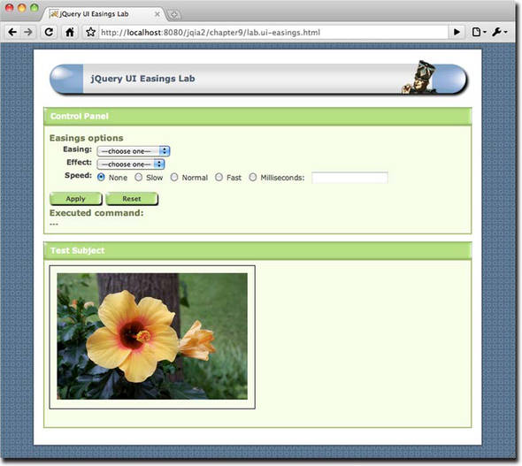
how any specific easing affects the progression of an animation. And so the jQuery UI Easings Lab page is available to let
us see how the easings operate when applied to the various animations. This Lab is available in file chapter9/lab.ui-easings.html
and displays as shown in figure 9.6.
Figure 9.6. The jQuery UI Easings Lab shows us how the various easings operate when applied to an animation effect.
Note
As an additional resource, the jQuery UI online documentation has SVG-driven examples of the easings, which can be found at http://jqueryui.com/demos/effect/#easing.
This Lab lets us try out the various easings paired with the various effects. For best results in seeing what transpires as each easing function progresses, we recommend trying the following:
1.
2.
Choose scale as the effect. When scale is chosen, the percent option is hard-coded to 25.
3.
Set the speed to very slow—slower than the slow setting. Try 10 seconds (10000 milliseconds) to really see how the scaling of the test subject is affected by the selected easing.
Now let’s look at one more utility that jQuery UI provides.
9.4. Advanced positioning
CSS positioning gives us the ability to position elements within our pages with relative ease. Throw jQuery into the mix, and it becomes almost trivial—if we know where we want to position the elements.
For example, if we knew that we wanted an element to be moved to some absolute position, we’d write this:
$('#someElement').css({
  position: 'absolute',
  top: 200,
  left: 200
});
But what if we wanted to position the element relative to another element? For example, place the element to the right of another element, but with the tops aligned? Or place it below another element with their centers in alignment?
No problem, really. We can grab the dimension and position information of the elements in question using core jQuery methods, do some math, and use the results to absolutely position the target element.
But although it’s not a problem, it’s rather a fair amount of code, and it could be rather fragile if we’re not careful about assumptions made in the formulas that calculate the new position. It probably wouldn’t be the most readable code in the world, either; most likely it’d be less than a snap to figure out what that code did by casual inspection, especially for someone who didn’t write the formulas in the first place.
jQuery UI gives us a helping hand by providing a method that not only abstracts away the formulas needed to figure out positions relative to other elements (and more, as we’ll see), but it does so in a manner that makes the code ultra-readable.
This method is an overloading of the position() method we examined in chapter 3 (which obtains the position of an element relative to its offset parent). Here’s its syntax:
position(options)
Absolutely positions the wrapped elements using the information provided by the options.
Parameters
|
options |
(Object) Provides the information that specifies how the elements of the wrapped set are to be positioned, as described in table 9.2. |
Returns
The wrapped set.
As you may have come to expect, a Lab page has been provided to help observe the operation of the jQuery UI position() method: the jQuery UI Positioning Lab, found in chapter9/lab.ui-positioning.html, and shown in figure 9.7.
Figure 9.7. The jQuery UI Positioning Lab lets us observe the jQuery UI overload of position() in action.

As you read through the options in table 9.2, use the Positioning Lab to familiarize yourself with the operation of the options. Give yourself bonus points if you can
pin the tail in the proper location in one try!
Table 9.2. Options for the jQuery UI position() method
|
Description |
In Lab? |
|
|---|---|---|
|
my |
(String) Specifies the location of the wrapped elements (the ones being re-positioned) to align with the target element or location. Two of: top, left, bottom, right, and center, separated by a space character, where the first value is the horizontal value, and the second the vertical. If a single value is specified, the other defaults to center. Whether the specified single value is considered horizontal or vertical depends upon which value you use (for example, top is taken as vertical, while right is horizontal). Examples: top, or bottom right. |
✓ |
|
at |
(String) Specifies the location of the target element against which to align the re-positioned elements. Takes the same values as the my option. Examples: “right”, or “left center”. |
✓ |
|
of |
(Selector|Event) A selector that identifies the target element against which the wrapped elements are to be re-positioned, or an Event instance containing mouse coordinates to use as the target location. |
✓ |
|
offset |
(String) Specifies any offset to be added to the calculated position as two pixel values specifying left and top respectively. Negative offsets are allowed. For example: 10 -20. If a single value is specified, it applies to both left and top. Defaults to 0. |
✓ |
|
collision |
(String) Specifies the rules to be applied when the positioned element extends beyond the window in any direction. Accepts two (horizontal followed by vertical) of the following: flip: The default, flips the element to the opposing side and runs collision detection again for fit. If neither side fits, center is used as a fallback. fit: Keeps the element in the desired direction, but adjusts the position such that it will fit. none: disables collision detection. If a single value is specified, it applies to both directions. |
|
|
using |
(Function) A function that replaces the internal function that changes the element position. Called for each wrapped element with a single argument that consists of an object hash with the left and top properties set to the computed target position, and the element set as the function context. |
You might be looking at the names of the options and saying to yourself, “What were they thinking? at? my? of? What on Earth?”
But there’s a method to the madness. If you inspected the generated statement in the Positioning Lab as you were experimenting with it, you’ve already seen it. If not, consider the following statement:
$('#someElement').position({
  my: 'top center',
  at: 'bottom right',
  of: '#someOtherElement'
});
It almost reads like an English sentence! Even someone who’s never seen a fragment of computer code in his or her life would most likely be able to figure out what this statement does (while wondering why computer gear-heads insist on all that gnarly punctuation).
Most APIs could benefit from a touch of this sort of “madness.”
9.5. Summary
In this chapter we dove head-first into jQuery UI, and we won’t be coming up for air until the end of this book.
We learned that jQuery UI enjoys a special status as an official companion to the core jQuery library, and how to download a customized version of the library (along with one of the predefined themes) from http://jqueryui.com/download. We learned about the contents of the download, and how the library is typically added to a web application’s folder structure.
We then discussed the theming capability of the jQuery UI library and how the CSS classes that it defines are laid out, including how they’re organized by naming conventions.
We examined the official ThemeRoller online application, located at http://jqueryui.com/themeroller/, which can be used to tweak one of the predefined themes, or to create a new theme entirely from scratch.
The remainder of the chapter examined extensions that JQuery makes to the core library.
We saw how the core animation engine has been extended to provide a good number of named effects that are easily launchable using the new effect() method.
We also saw how jQuery UI extends the visibility methods show(), hide(), and toggle() to work in conjunction with these new effects. The same manner of extension has also been applied to the class transition methods: addClass(), removeClass(), toggleClass(), and the newly defined switchClass() method.
We then discussed the two and a half dozen easing functions that jQuery adds to be used by the animation engine to control the progression of an animation.
Finally, we looked at an extension to the core position() method that allows us, in a remarkably readable fashion, to position elements relative to each other, or to the location of a mouse event.
But we’ve only just begun. Read on to the next chapter, where we’ll learn about another major part of jQuery UI: mouse interactions.