

New Year Parade, Singapore
At a New Year’s ceremony in Singapore the Indian women are in their finest saris. This fleeting moment comes and goes almost before I can register it in my eyepiece. The mechanics of taking a picture – the exposure, focus etc. – should, with practice, become second nature, leaving the eye to concentrate on what’s happening in front of the lens. To me this exquisitely presented lady represents all that’s exotic about the Indian culture. The vibrant saris and sharp, tropical light giving high contrast dictate that this can only be a very colourful picture.
• Nikon F5, 70–200mm lens
Colour
In terms of colour there are five options. Full throttle colour: bright, bold, saturated and full on. Subdued colour: muted, subtle and washed out. Minimal colour: so restrained you don’t even notice it. Monochromatic colour: as many shades as you like but all of one colour. And monochromatic colour with no colour: black and white.
How photographers use colour is usually dependent on the nature of the light. By definition, a misty dawn landscape will have soft, watercolour, muted hues. The colours in a scene lit by strong, clear, directional light will be bright and saturated. The contrast and the colour vibrancy of an image are inextricably linked; increase the contrast in post-production and the colour saturation seems to increase, and vice versa. In the field and in post-production the photographer has to make a decision whether to emphasize or minimize the colour content of an image. Go too far on maximizing colour and the result looks false, treacly and tasteless … although colours that are too restrained can rob the image of its impact. As usual, subtlety is the key.
But colour is also a key consideration when pre-visualizing and composing images. Using just one splash of colour in an otherwise monochromatic scene is a very powerful tool, as is offsetting primary colours in simple, bold, graphic compositions. And pre-visualizing how a scene could look lit by the widely varying colour temperatures of natural light at different times of the day is yet another key part of a photographer’s vision.
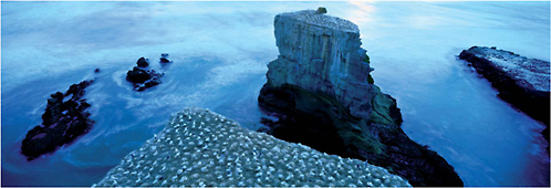
Gannet colony at Murawi, North Island, New Zealand
The sun has sunk into a layer of cloud over the Tasman Sea and the colour temperature of the remaining ambient light takes on a cool, blue tone. I’ve been shooting the sun setting over the sea stacks and carry on as our star disappears for the night. I use a neutral density filter to prolong the exposure, giving a milky effect to the movement of the water. People will think the blue, monochromatic tones are the result of a filter, but in fact it’s all down to the nature of the light at dusk. Our eyes and brains in tandem do a sort of ‘auto white balance’, meaning we don’t usually register these shifts in the colour temperature of the light; but film, or a digital sensor, does.
• Fuji GX617, 90mm lens
“How photographers use colour is usually dependent on the nature of the light.”

Bodiam Castle at dawn, East Sussex, England
Another misty dawn at Bodiam. The sun is up but is so far having trouble slicing through so much mist, so I’ve got the merest hint of directional light striking the left wall of the castle. Colour and contrast usually go hand in hand, and this is such a low-contrast scene that the colour is restrained to the point that there’s hardly any. It is however, to my eyes, a beautifully subtle scene, and would be a very different picture if shot in black and white.
• Fuji GX617, 90mm lens
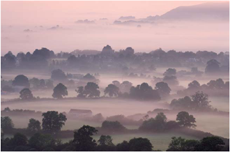
A misty dawn in the Blackmore Vale from Bulbarrow Hill, Dorset, England
Wendy and I spend much of the year on the road, living out of a rucksack or the back of a car. It can be a bit of a rootless life, so summer is usually devoted to reconnecting with home. Working my home turf gives me the advantage of local knowledge. With a high-pressure system sat over England, after a still night I know mist is bound to be draped over the patchwork of fields in the Blackmore Vale. I’m standing on the slopes of Bulbarrow Hill; it’s hardly a Himalayan peak but it does give great views over the green and pleasant land of Dorset. With the light of dawn tingeing the mist, it’s a soft, low-contrast scene like a watercolour, with muted, subdued colours.
• Canon EOS-1Ds MK II, 70–200mm lens

Montmartre at night, Paris, France
I am of the last generation of photographers who were trained initially in black and white. In the first term at college standing in the darkroom, watching my first print appear in the dish of developer in the gloom of the safelights, I thought it was magic. I still do. It’s not just nostalgia; no one can deny that black and white has a unique quality. In this digital, full-colour age it seems timeless. Sadly, I don’t work in mono as much as I’d like any more. Maybe I should. They say you can always convert from digital colour images, which I know is true, but I think a photographer’s vision needs to be tuned into different wavelengths to work best in mono.
• Nikon F5, 70–200mm lens