2.7 Methods for Detecting Outliers: Box Plots and z-Scores
Sometimes it is important to identify inconsistent or unusual measurements in a data set. An observation that is unusually large or small relative to the data values we want to describe is called an outlier.
Outliers are often attributable to one of several causes. First, the measurement associated with the outlier may be invalid. For example, the experimental procedure used to generate the measurement may have malfunctioned, the experimenter may have misrecorded the measurement, or the data might have been coded incorrectly in the computer. Second, the outlier may be the result of a misclassified measurement. That is, the measurement belongs to a population different from that from which the rest of the sample was drawn. Finally, the measurement associated with the outlier may be recorded correctly and from the same population as the rest of the sample but represent a rare (chance) event. Such outliers occur most often when the relative frequency distribution of the sample data is extremely skewed because a skewed distribution has a tendency to include extremely large or small observations relative to the others in the data set.
An observation (or measurement) that is unusually large or small relative to the other values in a data set is called an outlier. Outliers typically are attributable to one of the following causes:
The measurement is observed, recorded, or entered into the computer incorrectly.
The measurement comes from a different population.
The measurement is correct but represents a rare (chance) event.
Two useful methods for detecting outliers, one graphical and one numerical, are box plots and z-scores. The box plot is based on the quartiles (defined in Section 2.6) of a data set. Specifically, a box plot is based on the interquartile range (IQR)—the distance between the lower and upper quartiles:
[&~rom~IQR|=|~normal~Q_{U}|-|Q_{L} &]
Teaching Tip
Explain how the upper and lower quartiles are unaffected by the extreme values in the data set. This fact is the main reason that the box plot is such a useful tool for detecting outliers in a data set.
The interquartile range (IQR) is the distance between the lower and upper quartiles:
[&~rom~IQR|=|~normal~Q_{U}|-|Q_{L} &]
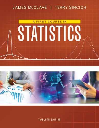
An annotated MINITAB box plot for the gas mileage data (see Table 2.2) is shown in Figure 2.31.* Note that a rectangle (the box) is drawn, with the bottom and top of the rectangle (the hinges) drawn at the quartiles and respectively. Recall that QL represents the 25th percentile and QU represents the 75th percentile. By definition, then, the “middle” 50% of the observations—those between and —fall inside the box. For the gas mileage data, these quartiles are at 35.625 and 38.375. Thus,
[&IQR|=|38.375|-|35.625|=|2.75 &]
Teaching Tip
Use data collected in class to generate the values of QL and QU. Then use these values to construct a box plot for the data. Pay particular attention to the extreme values in the data set. Discuss whether they are outliers or not. Calculate z-scores for these observations and discuss the results.
The median is shown at 37 by a horizontal line within the box.
To guide the construction of the “tails” of the box plot, two sets of limits, called inner fences and outer fences, are used. Neither set of fences actually appears on the plot. Inner fences are located at a distance of 1.5(IQR) from the hinges. Emanating from the hinges of the box are vertical lines called the whiskers. The two whiskers extend to the most extreme observation inside the inner fences. For example, the inner fence on the lower side of the gas mileage box plot is
[&*AS*~rom~Lower inner fence*AP*|=|Lower hinge|-|~normal~1.5|pbo|~rom~IQR|pbc|~normal~ &][&*AS**AP*|=|35.625|-|1.5|pbo|2.75|pbc| &]
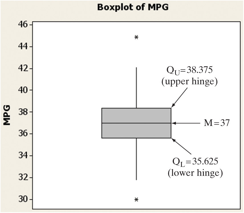
Figure 2.31
Annotated MINITAB box plot for EPA gas mileages
The smallest measurement inside this fence is the second-smallest measurement, 31.8. Thus, the lower whisker extends to 31.8. Similarly, the upper whisker extends to 42.1, the largest measurement inside the upper inner fence:
[&*AS*~rom~Upper inner fence*AP*|=|Upper hinge|+|~normal~1.5|pbo|~rom~IQR|pbc|~normal~ &][&*AS**AP*|=|38.375|+|1.5|pbo|2.75|pbc| &][&*AS**AP*|=|38.375|+|4.125|=|42.5 &]
Values that are beyond the inner fences are deemed potential outliers because they are extreme values that represent relatively rare occurrences. In fact, for mound-shaped distributions, less than 1% of the observations are expected to fall outside the inner fences. Two of the 100 gas mileage measurements, 30.0 and 44.9, fall beyond the inner fences, one on each end of the distribution. Each of these potential outliers is represented by a common symbol (an asterisk in MINITAB).
The other two imaginary fences, the outer fences, are defined at a distance 3(IQR) from each end of the box. Measurements that fall beyond the outer fences (also represented by an asterisk in MINITAB) are very extreme measurements that require special analysis. Since less than one-hundredth of 1% (.01% or .0001) of the measurements from mound-shaped distributions are expected to fall beyond the outer fences, these measurements are considered to be outliers. Because there are no measurements of gas mileage beyond the outer fences, there are no outliers.
Recall that outliers may be incorrectly recorded observations, members of a population different from the rest of the sample, or, at the least, very unusual measurements from the same population. The box plot of Figure 2.31 detected two potential outliers: the two gas mileage measurements beyond the inner fences. When we analyze these measurements, we find that they are correctly recorded. Perhaps they represent mileages that correspond to exceptional models of the car being tested or to unusual gas mixtures. Outlier analysis often reveals useful information of this kind and therefore plays an important role in the statistical inference-making process.
In addition to detecting outliers, box plots provide useful information on the variation in a data set. The elements (and nomenclature) of box plots are summarized in the box. Some aids to the interpretation of box plots are also given.
Elements of a Box Plot †
A rectangle (the box) is drawn with the ends (the hinges) drawn at the lower and upper quartiles ( and ). The median M of the data is shown in the box, usually by a line or a symbol (such as “ ”).
The points at distances 1.5(IQR) from each hinge mark the inner fences of the data set. Lines (the whiskers) are drawn from each hinge to the most extreme measurement inside the inner fence. Thus,
[&*AS*~rom~Lower inner fence*AP*|=|~normal~Q_{*N*[-1%0]L}|-|1.5|pbo|~rom~IQR|pbc|~normal~ &][&*AS*~rom~Upper inner fence*AP*|=|~normal~Q_{*N*[-1%0]U}|+|1.5|pbo|~rom~IQR|pbc|~normal~ &]
A second pair of fences, the outer fences, appears at a distance of 3(IQR) from the hinges. One symbol (e.g., “*”) is used to represent measurements falling between the inner and outer fences, and another (e.g., “0”) is used to represent measurements that lie beyond the outer fences. Thus, outer fences are not shown unless one or more measurements lie beyond them. We have
[&~rom~Lower outer fence|=|~normal~Q_{L}|-|3|pbo|~rom~IQR|pbc|~normal~ &][&~rom~Upper outer fence|=|~normal~Q_{U}|+|3|pbo|~rom~IQR|pbc|~normal~ &]
The symbols used to represent the median and the extreme data points (those beyond the fences) will vary with the software you use to construct the box plot. (You may use your own symbols if you are constructing a box plot by hand.) You should consult the program’s documentation to determine exactly which symbols are used.
Aids to the Interpretation of Box Plots
The line (median) inside the box represents the “center” of the distribution of data.
Examine the length of the box. The IQR is a measure of the sample’s variability and is especially useful for the comparison of two samples. (See Example 2.16.)
Visually compare the lengths of the whiskers. If one is clearly longer, the distribution of the data is probably skewed in the direction of the longer whisker.
Analyze any measurements that lie beyond the fences. Less than 5% should fall beyond the inner fences, even for very skewed distributions. Measurements beyond the outer fences are probably outliers, with one of the following explanations:
The measurement is incorrect. It may have been observed, recorded, or entered into the computer incorrectly.
The measurement belongs to a population different from the population that the rest of the sample was drawn from. (See Example 2.17.)
The measurement is correct and from the same population as the rest of the sample. Generally, we accept this explanation only after carefully ruling out all others.
 WLTASK Example 2.16 Computer-Generated Box Plot—The “Water-Level Task”
Problem
Refer to the Psychological Science experiment, called the “water-level task,” Examples 2.2 and 2.14. Use statistical software to produce a box plot for the 40 water-level task deviation angles shown in Table 2.4. Identify any outliers in the data set.
Solution
The 40 deviations were entered into MINITAB, and a box plot produced in Figure 2.32. Recall (from Example 2.14) that and . The middle line in the box represents the median deviation of . The lower hinge of the box represents , while the upper hinge represents . Note that there are two extreme observations (represented by asterisks) that are beyond the upper inner fence, but inside the upper outer fence. These two values are outliers. Examination of the data reveals that these measurements correspond to deviation angles of 25° and 35°.
Figure 2.32
MINITAB box plot for water-level task deviations
Look Ahead
Before removing the outliers from the data set, a good analyst will make a concerted effort to find the cause of the outliers. For example, both the outliers are deviation measurements for waitresses. An investigation may discover that both waitresses were new on the job the day the experiment was conducted. If the study target population is experienced bartenders and waitresses, these two observations would be dropped from the analysis.
Now Work Exercise 2.137
Example 2.17 Comparing Box Plots—Stimulus Reaction Study
Problem
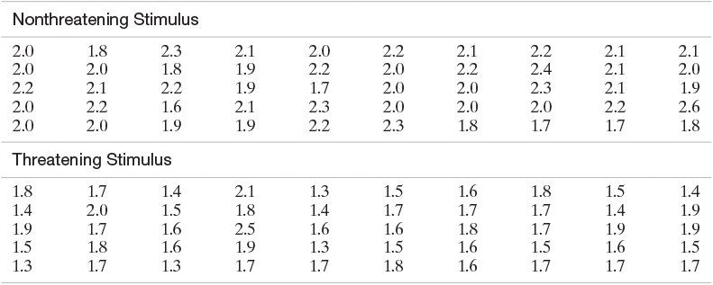
A Ph.D. student in psychology conducted a stimulus reaction experiment as a part of her dissertation research. She subjected 50 subjects to a threatening stimulus and 50 to a nonthreatening stimulus. The reaction times of all 100 students, recorded to the nearest tenth of a second, are listed in Table 2.8. Box plots of the two resulting samples of reaction times, generated with SAS, are shown in Figure 2.33. Interpret the box plots.
Table 2.8 Reaction Times of Students
Alternate View
Nonthreatening Stimulus 2.0 1.8 2.3 2.1 2.0 2.2 2.1 2.2 2.1 2.1 2.0 2.0 1.8 1.9 2.2 2.0 2.2 2.4 2.1 2.0 2.2 2.1 2.2 1.9 1.7 2.0 2.0 2.3 2.1 1.9 2.0 2.2 1.6 2.1 2.3 2.0 2.0 2.0 2.2 2.6 2.0 2.0 1.9 1.9 2.2 2.3 1.8 1.7 1.7 1.8 Threatening Stimulus 1.8 1.7 1.4 2.1 1.3 1.5 1.6 1.8 1.5 1.4 1.4 2.0 1.5 1.8 1.4 1.7 1.7 1.7 1.4 1.9 1.9 1.7 1.6 2.5 1.6 1.6 1.8 1.7 1.9 1.9 1.5 1.8 1.6 1.9 1.3 1.5 1.6 1.5 1.6 1.5 1.3 1.7 1.3 1.7 1.7 1.8 1.6 1.7 1.7 1.7  Data Set: REACTION
Figure 2.33
SAS box plots for reaction-time data
Solution
In SAS, the median is represented by the horizontal line through the box, while the asterisk (*) represents the mean. Analysis of the box plots on the same numerical scale reveals that the distribution of times corresponding to the threatening stimulus lies below that of the nonthreatening stimulus. The implication is that the reaction times tend to be faster to the threatening stimulus. Note, too, that the upper whiskers of both samples are longer than the lower whiskers, indicating that the reaction times are positively skewed.
No observations in the two samples fall between the inner and outer fences. However, there is one outlier: the observation of 2.5 seconds corresponding to the threatening stimulus that is beyond the outer fence (denoted by the square symbol in SAS). When the researcher examined her notes from the experiments, she found that the subject whose time was beyond the outer fence had mistakenly been given the nonthreatening stimulus. You can see in Figure 2.33 that his time would have been within the upper whisker if moved to the box plot corresponding to the nonthreatening stimulus. The box plots should be reconstructed, since they will both change slightly when this misclassified reaction time is moved from one sample to the other.
Look Ahead
The researcher concluded that the reactions to the threatening stimulus were faster than those to the nonthreatening stimulus. However, she was asked by her Ph.D. committee whether the results were statistically significant. Their question addresses the issue of whether the observed difference between the samples might be attributable to chance or sampling variation rather than to real differences between the populations. To answer this question, the researcher must use inferential statistics rather than graphical descriptions. We discuss how to compare two samples by means of inferential statistics in Chapter 9.
The next example illustrates how z-scores can be used to detect outliers and make inferences.
Example 2.18 Inference Using z-Scores

Problem
Suppose a female bank employee believes that her salary is low as a result of sex discrimination. To substantiate her belief, she collects information on the salaries of her male counterparts in the banking business. She finds that their salaries have a mean of $64,000 and a standard deviation of $2,000. Her salary is $57,000. Does this information support her claim of sex discrimination?
Solution
The analysis might proceed as follows: First, we calculate the z-score for the woman’s salary with respect to those of her male counterparts. Thus,
[&z|=|*frac*{|doll|57,000|-||doll|64,000}{|doll|2,000}|=||minus|3.5 &]
The implication is that the woman’s salary is 3.5 standard deviations below the mean of the male salary distribution. Furthermore, if a check of the male salary data shows that the frequency distribution is mound shaped, we can infer that very few salaries in this distribution should have a z-score less than , as shown in Figure 2.34. Clearly, a z-score of represents an outlier. Either her salary is from a distribution different from the male salary distribution, or it is a very unusual (highly improbable) measurement from a salary distribution no different from the male distribution.
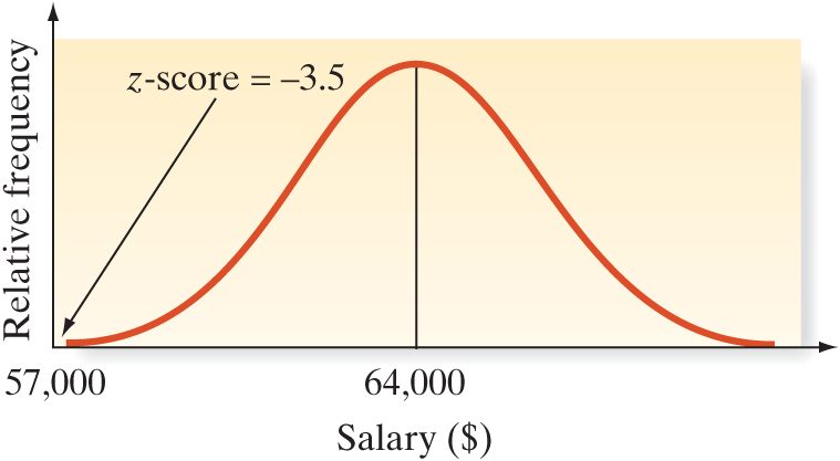
Figure 2.34
Male salary distribution
Look Back
Which of the two situations do you think prevails? Statistical thinking would lead us to conclude that her salary does not come from the male salary distribution, lending support to the female bank employee’s claim of sex discrimination. However, the careful investigator should require more information before inferring that sex discrimination is the cause. We would want to know more about the data collection technique the woman used and more about her competence at her job. Also, perhaps other factors, such as length of employment, should be considered in the analysis.
Now Work Exercise 2.138
Examples 2.17 and 2.18 exemplify an approach to statistical inference that might be called the rare-event approach. An experimenter hypothesizes a specific frequency distribution to describe a population of measurements. Then a sample of measurements is drawn from the population. If the experimenter finds it unlikely that the sample came from the hypothesized distribution, the hypothesis is judged to be false. Thus, in Example 2.18, the woman believes that her salary reflects discrimination. She hypothesizes that her salary should be just another measurement in the distribution of her male counterparts’ salaries if no discrimination exists. However, it is so unlikely that the sample (in this case, her salary) came from the male frequency distribution that she rejects that hypothesis, concluding that the distribution from which her salary was drawn is different from the distribution for the men.
This rare-event approach to inference making is discussed further in later chapters. Proper application of the approach requires a knowledge of probability, the subject of our next chapter.
We conclude this section with some rules of thumb for detecting outliers.
Rules of Thumb for Detecting Outliers*
Box Plots: Observations falling between the inner and outer fences are deemed suspect outliers. Observations falling beyond the outer fence are deemed highly suspect outliers.
Suspect outliers Highly suspect outliers or or z-Scores: Observations with z-scores greater than 3 in absolute value are considered outliers. For some highly skewed data sets, observations with z-scores greater than 2 in absolute value may be outliers.
Possible Outliers Outliers
Statistics in Action Revisited
Detecting Outliers in the Body Image Data
In the Body Image: An International Journal of Research (Jan. 2010) study of 92 BDD patients, the quantitative variable of interest is Total Appearance Evaluation score (ranging from 7 to 35 points). Are there any unusual scores in the BDD data set? We will apply both the box plot and z-score method to aid in identifying any outliers in the data. Since from previous analyses, there appears to be a difference in the distribution of appearance evaluation scores for males and females, we will analyze the data by gender.
To employ the z-score method, we require the mean and standard deviation of the data for each gender. These values were already computed in the previous Statistics in Action Revisited section. For females, and ; for males, and (see Figure SIA2.5). Then, the 3-standard-deviation interval for each gender is:
| Females: | |
| Males: |
If you examine the appearance evaluation scores in the BDD file, you will find that none of the scores fall beyond the 3-standard-deviation interval for each group. Consequently, if we use the z-score approach, there are no highly suspect outliers in the data.

Box plots for the data are shown in Figure SIA2.6. Although several suspect outliers (asterisks) are shown on the box plot for each gender, there are no highly suspect outliers (zeros) shown. That is, no data points fall beyond the outer fences of the box plots. As with the z-score approach, the box plot method does not detect any highly suspect outliers.
[Note: If we were to detect one or more highly suspect outliers, we should investigate whether or not to include the observation in any analysis that leads to an inference about the population of BDD patients. Is the outlier a legitimate value (in which case it will remain in the data set for analysis) or is the outlier associated with a subject that is not a member of the population of interest—say, a person who is misdiagnosed with BDD (in which case it will be removed from the data set prior to analysis)?]
Data Set: BDD

Figure SIA2.6
MINITAB box plots for Appearance Evaluation score by Gender
Exercises 2.132–2.153
Understanding the Principles
2.132 What is the interquartile range?
2.133 What are the hinges of a box plot?
2.134 With mound-shaped data, what proportion of the measurements have z-scores between and 3?
2.135 Define an outlier.
Learning the Mechanics
2.136 Suppose a data set consisting of exam scores has a lower quartile a median , and an upper quartile The scores on the exam range from 18 to 100. Without having the actual scores available to you, construct as much of the box plot as possible.
 2.137 Consider the following horizontal box plot:
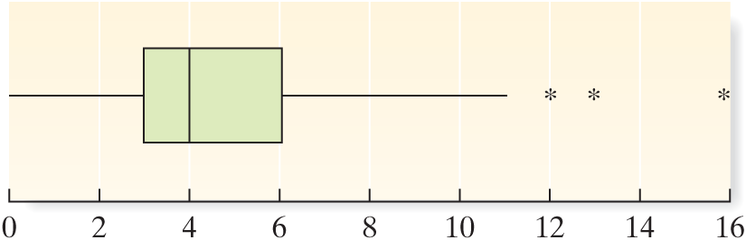
What is the median of the data set (approximately)?
What are the upper and lower quartiles of the data set (approximately)?
What is the interquartile range of the data set (approximately)?
Is the data set skewed to the left, skewed to the right, or symmetric?
What percentage of the measurements in the data set lie to the right of the median? To the left of the upper quartile?
Identify any outliers in the data.
- 2.138 A sample data set has a mean of 57 and a standard deviation of 11. Determine whether each of the following sample measurements is an outlier.
65
21
72
98
- L02139 2.139 Consider the following sample data set. Construct a box plot for the data and use it to identify any outliers.
121 171 158 173 184 163 157 85 145 165 172 196 170 159 172 161 187 100 142 166 171 - L02140 2.140 Consider the following sample data set.
171 152 170 168 169 171 190 183 185 140 173 206 172 174 169 199 151 180 167 170 188 Construct a box plot.
Identify any outliers that may exist in the data.
Applet Exercise 2.7
Use the applet Standard Deviation to determine whether an item in a data set may be an outlier. Begin by setting appropriate limits and plotting the given data on the number line provided in the applet. Here is the data set:

Alternate View
| 10 | 80 | 80 | 85 | 85 | 85 | 85 | 90 | 90 | 90 | 90 | 90 | 95 | 95 | 95 | 95 | 100 | 100 |
The green arrow shows the approximate location of the mean. Multiply the standard deviation given by the applet by 3. Is the data item 10 more than three standard deviations away from the green arrow (the mean)? Can you conclude that the 10 is an outlier?
Using the mean and standard deviation from part a, move the point at 10 on your plot to a point that appears to be about three standard deviations from the mean. Repeat the process in part a for the new plot and the new suspected outlier.
When you replaced the extreme value in part a with a number that appeared to be within three standard deviations of the mean, the standard deviation got smaller and the mean moved to the right, yielding a new data set whose extreme value was not within three standard deviations of the mean. Continue to replace the extreme value with higher numbers until the new value is within three standard deviations of the mean in the new data set. Use trial and error to estimate the smallest number that can replace the 10 in the original data set so that the replacement is not considered to be an outlier.
Applying the Concepts—Basic
2.141 Blond hair types in the Southwest Pacific. A mutation of a pigmentation gene is theorized to be the cause of blond-hair genotypes observed in several Southwest Pacific islands. The distribution of this mutated gene was investigated in the American Journal of Physical Anthropology (Apr. 2014). For each in a sample of 550 Southwest Pacific islanders, the effect of the mutation on hair pigmentation was measured with the melanin (M) index, where M ranges between and 4. The box plots below show the distribution of M for three different genotypes—CC, CT, and TT. Identify any outliers in the data. For which genotypes do these outliers occur?

2.142 Dentists’ use of anesthetics. Refer to the Current Allergy & Clinical Immunology study of the use of local anesthetics in dentistry, presented in Exercise 2.103 (p. 77). Recall that the mean number of units (ampoules) of local anesthetics used per week by dentists was 79, with a standard deviation of 23. Consider a dentist who used 175 units of local anesthetics in a week.
Find the z-score for this measurement.
Would you consider the measurement to be an outlier? Explain.
Give several reasons the outlier may have occurred.
- BRAIN 2.143 Research on brain specimens. Refer to the Brain and Language data on postmortem intervals (PMIs) of 22 human brain specimens, presented in Exercise 2.45 (p. 52). The mean and standard deviation of the PMI values are 7.3 and 3.18, respectively.
Find the z-score for the PMI value of 3.3.
Is the PMI value of 3.3 considered an outlier? Explain.
MINITAB Output for Exercise 2.144

- SUSTAIN 2.144 Corporate sustainability of CPA firms. Refer to the Business and Society (Mar. 2011) study on the sustainability behaviors of CPA corporations, Exercise 2.105 (p. 77). Numerical descriptive measures for level of support for corporate sustainability for the 992 senior managers are repeated in the above MINITAB printout. One of the managers reported a support level of 155 points. Would you consider this support level to be typical of the study sample? Explain.
2.145 Voltage sags and swells. Refer to the Electrical Engineering (Vol. 95, 2013) study of power quality (measured by “sags” and “swells”) in Turkish transformers, Exercise 2.127 (p. 82). For a sample of 103 transformers built for heavy industry, the mean and standard deviation of the number of sags per week were 353 and 30, respectively; also, the mean and standard deviation of the number of swells per week were 184 and 25, respectively. Consider a transformer that has 400 sags and 100 swells in a week.
Would you consider 400 sags per week unusual statistically? Explain.
Would you consider 100 swells per week unusual statistically? Explain.
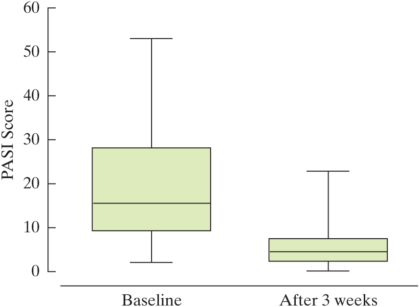
2.146 Treating psoriasis with the “Doctorfish of Kangal.” Psoriasis is a skin disorder with no known cure. An alternative treatment for psoriasis is ichthyotherapy, also known as therapy with the “Doctorfish of Kangal.” Fish from the hot pools of Kangal, Turkey, feed on the skin scales of bathers, reportedly reducing the symptoms of psoriasis. In one study, 67 patients diagnosed with psoriasis underwent three weeks of ichthyotherapy. (Evidence-Based Research in Complementary and Alternative Medicine, Dec. 2006). The Psoriasis Area Severity Index (PASI) of each patient was measured both before and after treatment. (The lower the PASI score, the better is the skin condition.) Box plots of the PASI scores, both before (baseline) and after three weeks of ichthyotherapy treatment, are shown in the accompanying diagram.
Find the approximate 25th percentile, the median, and the 75th percentile for the PASI scores before treatment.
Based on Grassberger, M., and Hoch, W. “Ichthyotherapy as alternative treatment for patients with psoriasis: A pilot study.” Evidence-Based Research in Complementary and Alternative Medicine, Vol. 3, No. 4, Dec. 2004 (Figure 3). National Center for Complementary and Alternative Medicine.
Find the approximate 25th percentile, the median, and the 75th percentile for the PASI scores after treatment.
Comment on the effectiveness of ichthyotherapy in treating psoriasis.
Applying the Concepts—Intermediate
- SANIT 2.147 Sanitation inspection of cruise ships. Refer to the data on sanitation levels of cruise ships, presented in Exercise 2.41 (p. 51).
Use the box plot method to detect any outliers in the data.
Use the z-score method to detect any outliers in the data.
Do the two methods agree? If not, explain why.
- ROCKS 2.148 Characteristics of a rockfall. Refer to the Environmental Geology (Vol. 58, 2009) study of how far a block from a collapsing rockwall will bounce, Exercise 2.61 (p. 61). The computer-simulated rebound lengths (in meters) for 13 block-soil impact marks left on a slope from an actual rockfall are reproduced in the table. Do you detect any outliers in the data? Explain.

Alternate View
10.94 13.71 11.38 7.26 17.83 11.92 11.87 5.44 13.35 4.90 5.85 5.10 6.77 Based on Paronuzzi, P. “Rockfall-induced block propagation on a soil slope, northern Italy.” Environmental Geology, Vol. 58, 2009 (Table 2).
- SAT 2.149 Comparing SAT Scores. Refer to Exercise 2.46 (p. 52), in which we compared state average SAT scores in 2011 and 2014.
Construct side-by-side box plots of the SAT scores for the two years.
Compare the variability of the SAT scores for the two years.
Are any state SAT scores outliers in either year? If so, identify them.
- COUGH 2.150 Is honey a cough remedy? Refer to the Archives of Pediatrics and Adolescent Medicine (Dec. 2007) study of honey as a remedy for coughing, Exercise 2.64 (p. 62). Recall that coughing improvement scores were recorded for children in three groups: the over-the-counter cough medicine dosage (DM) group, the honey dosage group, and the control (no medicine) group.
For each group, construct a box plot of the improvement scores.
How do the median improvement scores compare for the three groups?
How does the variability in improvement scores compare for the three groups?
Do you detect any outliers in any of the three coughing improvement score distributions?
- SAND 2.151 Permeability of sandstone during weathering. Refer to the Geographical Analysis (Vol. 42, 2010) study of the decay properties of sandstone when exposed to the weather, Exercise 2.110 (p. 78). Recall that slices of sandstone blocks were tested for permeability under three conditions: no exposure to any type of weathering (A), repeatedly sprayed with a 10% salt solution (B), and soaked in a 10% salt solution and dried (C).
Identify any outliers in the permeability measurements for group A sandstone slices.
Identify any outliers in the permeability measurements for group B sandstone slices.
Identify any outliers in the permeability measurements for group C sandstone slices.
If you remove the outliers detected in parts a–c, how will descriptive statistics like the mean, median, and standard deviation be affected? If you are unsure of your answer, carry out the analysis.
Applying the Concepts—Advanced
2.152 Library book checkouts. A city librarian claims that books have been checked out an average of seven (or more) times in the last year. You suspect he has exaggerated the checkout rate (book usage) and that the mean number of checkouts per book per year is, in fact, less than seven. Using the computerized card catalog, you randomly select one book and find that it has been checked out four times in the last year. Assume that the standard deviation of the number of checkouts per book per year is approximately 1.
If the mean number of checkouts per book per year really is 7, what is the z-score corresponding to four?
Considering your answer to part a, do you have reason to believe that the librarian’s claim is incorrect?
If you knew that the distribution of the number of checkouts was mound shaped, would your answer to part b change? Explain.
If the standard deviation of the number of checkouts per book per year were 2 (instead of 1), would your answers to parts b and c change? Explain.
2.153 Untutored second language acquisition. A student from Turkey named Alex is attending a university in the United States. While in this country, he has never been tutored in English. After his second year at university, Alex was interviewed numerous times over a 1-year period. His language was analyzed for syntactic complexity (measured as number of clauses per analysis-of-speech unit) and lexical diversity (a complex measure, called D, on a 100-point scale). Applied Linguistics (May 2014) reported Alex’s syntactic complexity and lexical diversity values from his first interview as 1.73 and 55.88, respectively. For comparison purposes, the researchers recorded similar language scores for 3 native English speakers, all who attended the same university and had the same major as Alex. The syntactic complexity scores of the 3 English speakers were 1.88, 1.82, and 2.22. The lexical diversity scores of the 3 English speakers were 64.62, 58.03, and 56.97. According to the researchers, “Alex is within native speaker range, even allowing for the variation that naturally takes place within conversation.” Do you agree? Explain.