
In previous chapters, you were introduced to the Python language – the syntax, functions, conditional statements, data types, and different types of containers. You also reviewed more advanced concepts like regular expressions, handling of files, and solving mathematical problems with Python. Our focus now turns to the meat of the book, descriptive data analysis (also called exploratory data analysis).
In descriptive data analysis, we analyze past data with the help of methods like summarization, aggregation, and visualization to draw meaningful insights. In contrast, when we do predictive analytics, we try to make predictions or forecasts about the future using various modeling techniques.
In this chapter, we look at the various types of data, how to classify data, which operations to perform based on the category of data, and the workflow of the descriptive data analysis process.
Descriptive data analysis - Steps
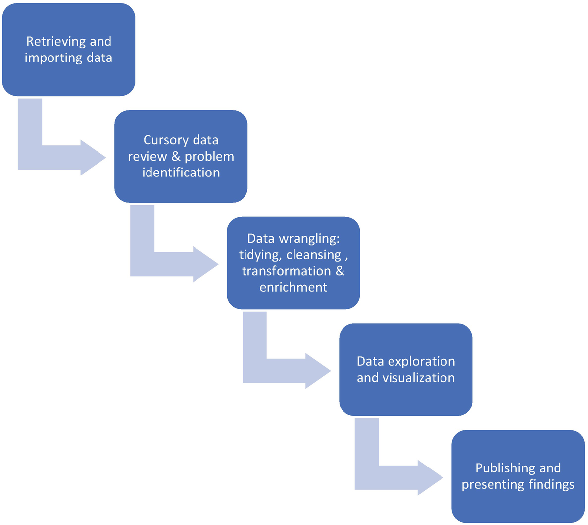
Steps in descriptive data analysis
- 1)
Data retrieval: Data could be stored in a structured format (like databases or spreadsheets) or an unstructured format (like web pages, emails, Word documents). After considering parameters such as the cost and structure of the data, we need to figure out how to retrieve this data. Libraries like Pandas provide functions for importing data in a variety of formats.
- 2)
Cursory data review and problem identification : In this step, we form first impressions of the data that we want to analyze. We aim to understand each of the individual columns or features, the meanings of various abbreviations and notations used in the dataset, what the records or data represent, and the units used for the data storage. We also need to ask the right questions and figure out what we need to do before getting into the nitty-gritty of our analysis. These questions may include the following: which are the features that are relevant for analysis, is there an increasing or decreasing trend in individual columns, do we see any missing values, are we trying to develop a forecast and predict one feature, and so on.
- 3)
Data wrangling: This step is the crux of data analysis and the most time-consuming activity, with data analysts and scientists spending approximately 80% of their time on this.
Data in its raw form is often unsuitable for analysis due to any of the following reasons: presence of missing and redundant values, outliers, incorrect data types, presence of extraneous data, more than one unit of measurement being used, data being scattered across different sources, and columns not being correctly identified.
Data wrangling or munging is the process of transforming raw data so that it is suitable for mathematical processing and plotting graphs. It involves removing or substituting missing values and incomplete entries, getting rid of filler values like semicolons and commas, filtering the data, changing data types, eliminating redundancy, and merging data with other sources.
Data wrangling comprises tidying, cleansing, and enriching data. In data tidying, we identify the variables in our dataset and map them to columns. We also structure data along the right axis and ensure that the rows contain observations and not features. The purpose of converting data into a tidy form is to have data in a structure that facilitates ease of analysis. Data cleansing involves dealing with missing values, incorrect data types, outliers, and wrongly entered data. In data enrichment, we may add data from other sources and create new columns or features that may be helpful for our analysis.
- 4)
Data exploration and visualization: After the data has been prepared, the next step involves finding patterns in data, summarizing key characteristics, and understanding relationships among various features. With visualization, you can achieve all of this, and also lucidly present critical findings. Python libraries for visualization include Matplotlib, Seaborn, and Pandas.
- 5)
Presenting and publishing our analysis: Jupyter notebooks serve the dual purpose of both executing our code and serving as a platform to provide a high-level summary of our analysis. By adding notes, headings, annotations, and images, you can spruce up your notebook to make it presentable to a broader audience. The notebook can be downloaded in a variety of formats, like PDF, which can later be shared with others for review.
We now move on to the various structures and levels of data.
Structure of data
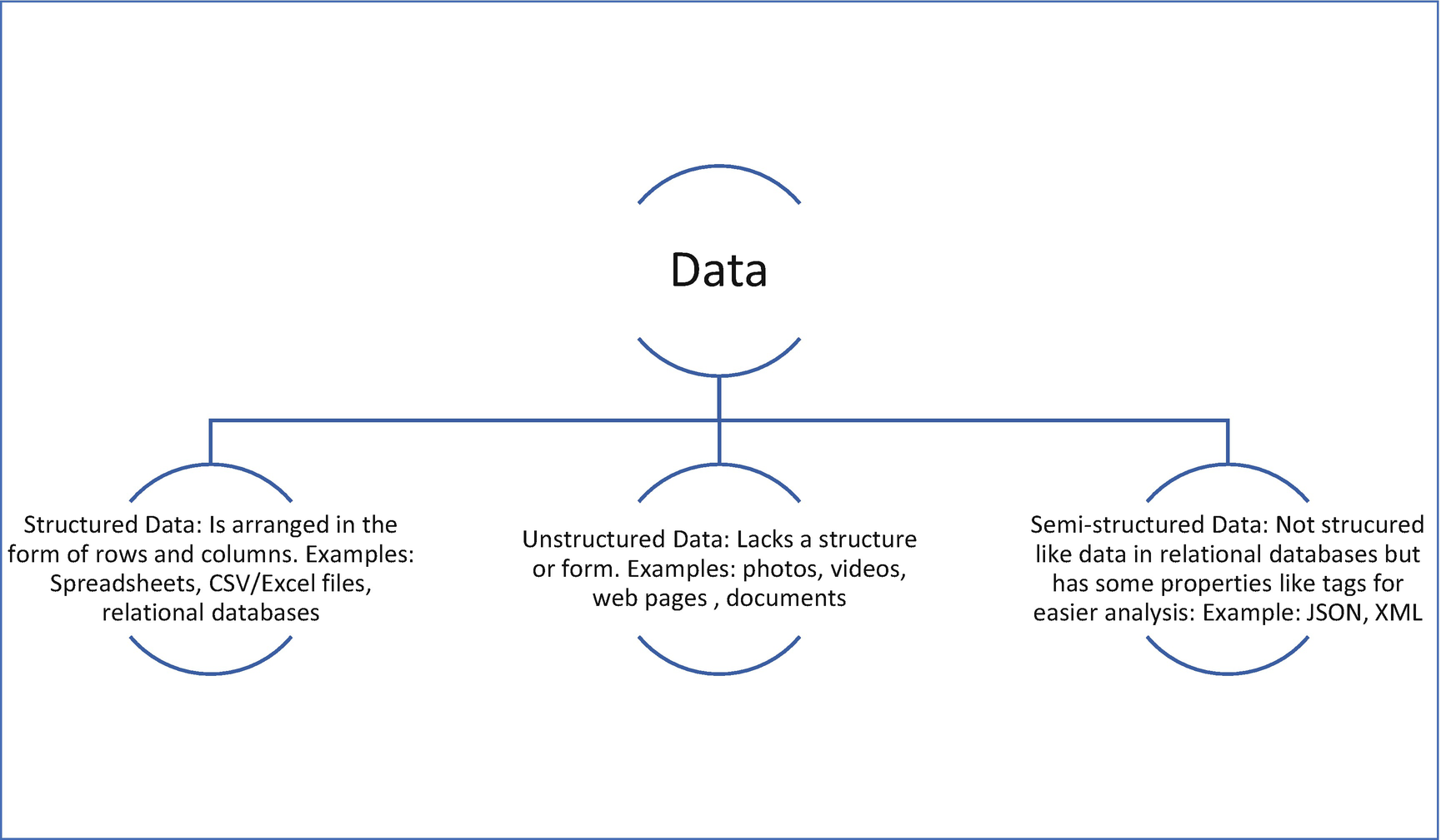
Structure of data
Classifying data into different levels

Levels of data
Numeric values for categorical variables: Categorical data is not restricted to non-numeric values. For example, the rank of a student, which could take values like 1/2/3 and so on, is an example of an ordinal (categorical) variable that contains numbers as values. However, these numbers do not have mathematical significance; for instance, it would not make sense to find the average rank.
Significance of a true zero point : We have noted that interval variables do not have an absolute zero as a reference point, while ratio variables have a valid zero point. An absolute zero denotes the absence of a value. For example, when we say that variables like height and weight are ratio variables, it would mean that a value of 0 for any of these variables would mean an invalid or nonexistent data point. For an interval variable like temperature (when measured in degrees Celsius or Fahrenheit), a value of 0 does not mean that data is absent. 0 is just one among the values that the temperature variable can assume. On the other hand, temperature, when measured in the Kelvin scale, is a ratio variable since there is an absolute zero defined for this scale.
Identifying interval variables : Interval variables do not have an absolute zero as a reference point, but identifying variables that have this characteristic may not be apparent. Whenever we talk about the percentage change in a figure, it is relative to its previous value. For instance, the percentage change in inflation or unemployment is calculated with the last value in time as the reference point. These are instances of interval data. Another example of an interval variable is the score obtained in a standardized test like the GRE (Graduate Record Exam). The minimum score is 260, and the maximum score is 340. The scoring is relative and does not start from 0. With interval data, while you can perform addition and subtraction operations. You cannot divide or multiply values (operations that are permissible for ratio data).
Visualizing various levels of data
Whenever you need to analyze data, first understand if the data is structured or unstructured. If the data is unstructured, convert it to a structured form with rows and columns, which makes it easier for further analysis using libraries like Pandas. Once you have data in this format, categorize each of the features or columns into the four levels of data and perform your analysis accordingly.
Note that in this chapter, we only aim to understand how to categorize the variables in a dataset and identify the operations and plots that would apply for each category. The actual code that needs to be written to visualize the data is explained in Chapter 7.
We look at how to classify the features and perform various operations using the famous Titanic dataset. The dataset can be imported from here:
https://github.com/DataRepo2019/Data-files/blob/master/titanic.csv
Background information about the dataset: The RMS Titanic, a British passenger ship, sank on its maiden voyage from Southampton to New York on 15th April 1912, after it collided with an iceberg. Out of the 2,224 passengers, 1,500 died, making this event a tragedy of epic proportions. This dataset describes the survival status of the passengers and other details about them, including their class, name, age, and the number of relatives.

Titanic Dataset – Data Levels
Feature in the dataset | What it represents | Level of data |
|---|---|---|
PassengerId | Identity number of passenger | Nominal |
Pclass | Passenger class (1:1st class; 2: 2nd class; 3: 3rd class), passenger class is used as a measure of the socioeconomic status of the passenger | Ordinal |
Survived | Survival status (0:Not survived; 1:Survived) | Nominal |
Name | Name of passenger | Nominal |
Sibsp | Number of siblings/spouses aboard | Ratio |
Ticket | Ticket number | Nominal |
Cabin | Cabin number | Nominal |
Sex | Gender of passenger | Nominal |
Age | Age | Ratio |
Parch | Number of parents/children aboard | Ratio |
Fare | Passenger fare (British pound) | Ratio |
Embarked | Port of embarkation (with C being Cherbourg, Q being Queenstown, and S being Southampton) | Nominal |
- 1.Nominal variables: Variables like “PassengerId”, “Survived”, “Name”, “Sex”, “Cabin”, and “Embarked” do not have any intrinsic ordering of their values. Note that some of these variables have numeric values, but these values are finite in number. We cannot perform an arithmetic operation on these values like addition, subtraction, multiplication, or division. One operation that is common with nominal variables is counting. A commonly used method in Pandas, value_counts (discussed in the next chapter), is used to determine the number of values per each unique category of the nominal variable. We can also find the mode (the most frequently occurring value). The bar graph is frequently used to visualize nominal data (pie charts can also be used), as shown in Figure 4-5.
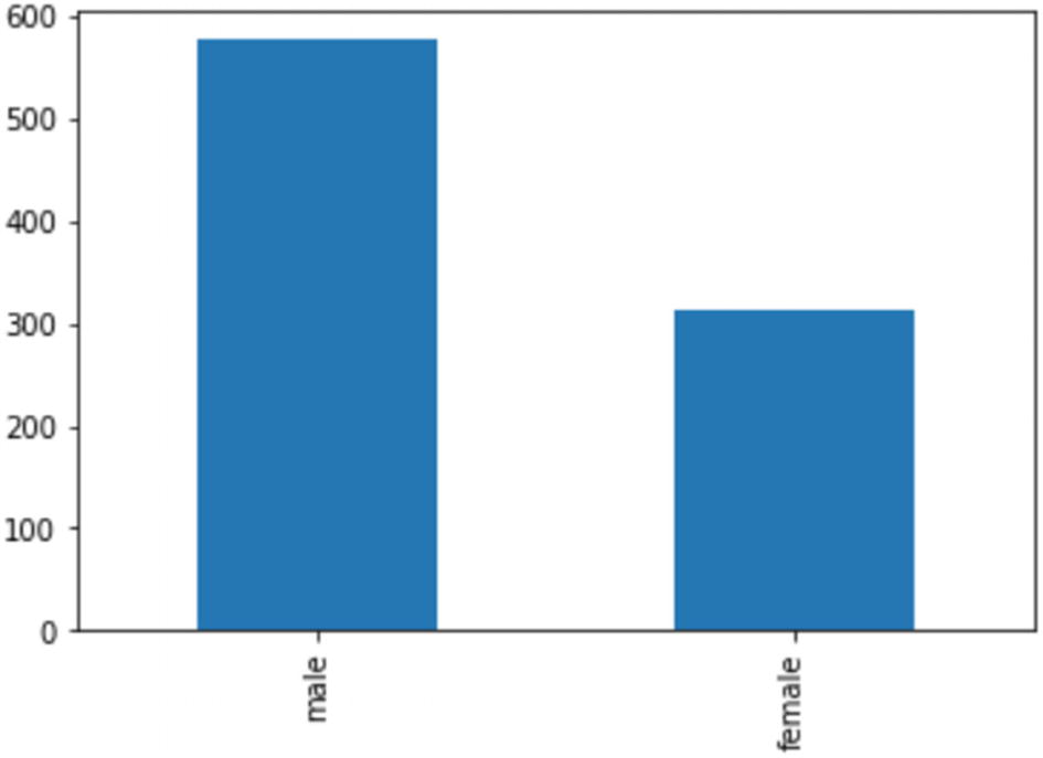 Figure 4-5
Bar graph showing the count of each category
- 2.
Ordinal variables: “Pclass” (or Passenger Class) is an ordinal variable since its values follow an order. A value of 1 is equivalent to first class, 2 is equivalent to the second class, and so on. These class values are indicative of socioeconomic status.
We can find out the median value and percentiles. We can also count the number of values in each category, calculate the mode, and use plots like bar graphs and pie charts, just as we did for nominal variables.
In Figure 4-6, we have used a pie chart for the ordinal variable “Pclass”.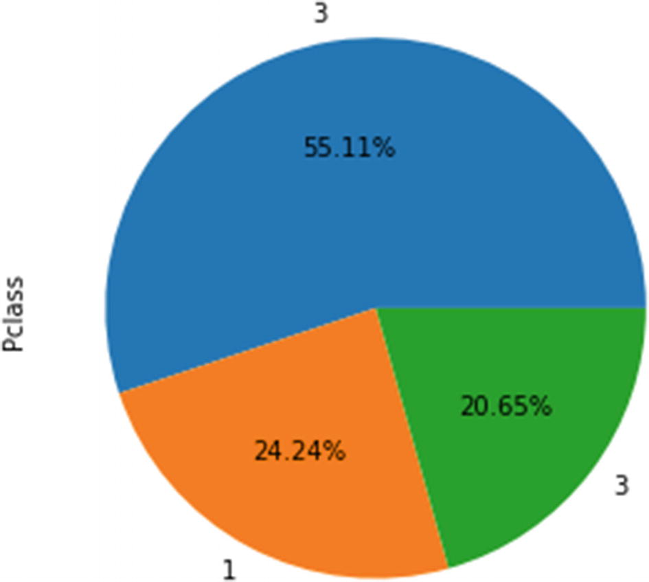 Figure 4-6
Pie chart showing the percentage distribution of each class
- 3.
Ratio Data: The “Age” and “Fare” variables are examples of ratio data, with the value zero as a reference point. With this type of data, we can perform a wide range of mathematical operations.
For example, we can add all the fares and divide it by the total number of passengers to find the mean. We can also find out the standard deviation. A histogram, as shown in Figure 4-7, can be used to visualize this kind of continuous data to understand the distribution.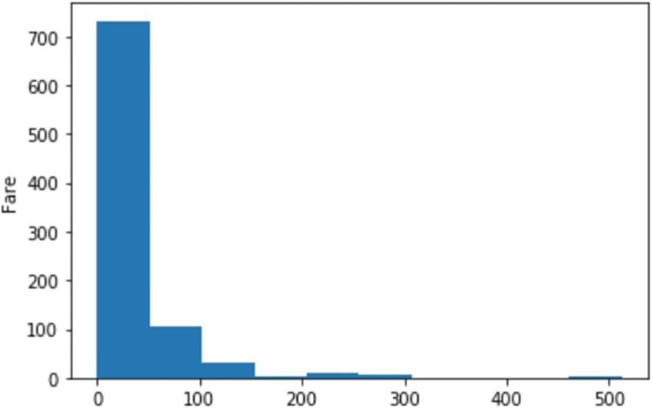 Figure 4-7
Histogram showing the distribution of a ratio variable
In the preceding plots, we looked at the graphs for plotting individual categorical or continuous variables. In the following section, we understand which graphs to use when we have more than one variable or a combination of variables belong to different scales or levels.
Plotting mixed data
- 1.One categorical and one continuous variable: A box plot shows the distribution, symmetry, and outliers for a continuous variable. A box plot can also show the continuous variable against a categorical variable. In Figure 4-8, the distribution of ‘Age’ (a ratio variable) for each value of the nominal variable – ‘Survived’ (0 is the value for passengers who did not survive and 1 is the value for those who did).
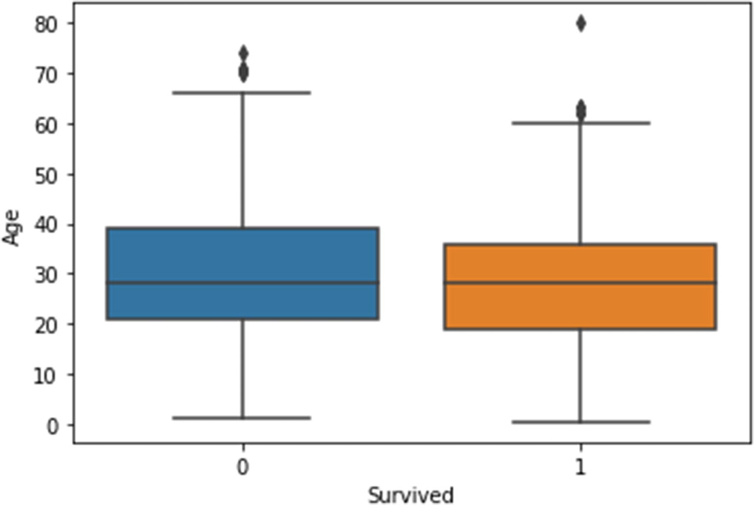 Figure 4-8
Box plot, showing the distribution of age for different categories
- 2.Both continuous variables: Scatter plots are used to depict the relationship between two continuous variables. In Figure 4-9, we plot two ratio variables, ‘Age’ and ‘Fare’, on the x and y axes to produce a scatter plot.
 Figure 4-9
Scatter plot
- 3.Both categorical variables: Using a clustered bar chart (Figure 4-10), you can combine two categorical variables with the bars depicted side by side to represent every combination of values for the two variables.
 Figure 4-10
Clustered bar chart
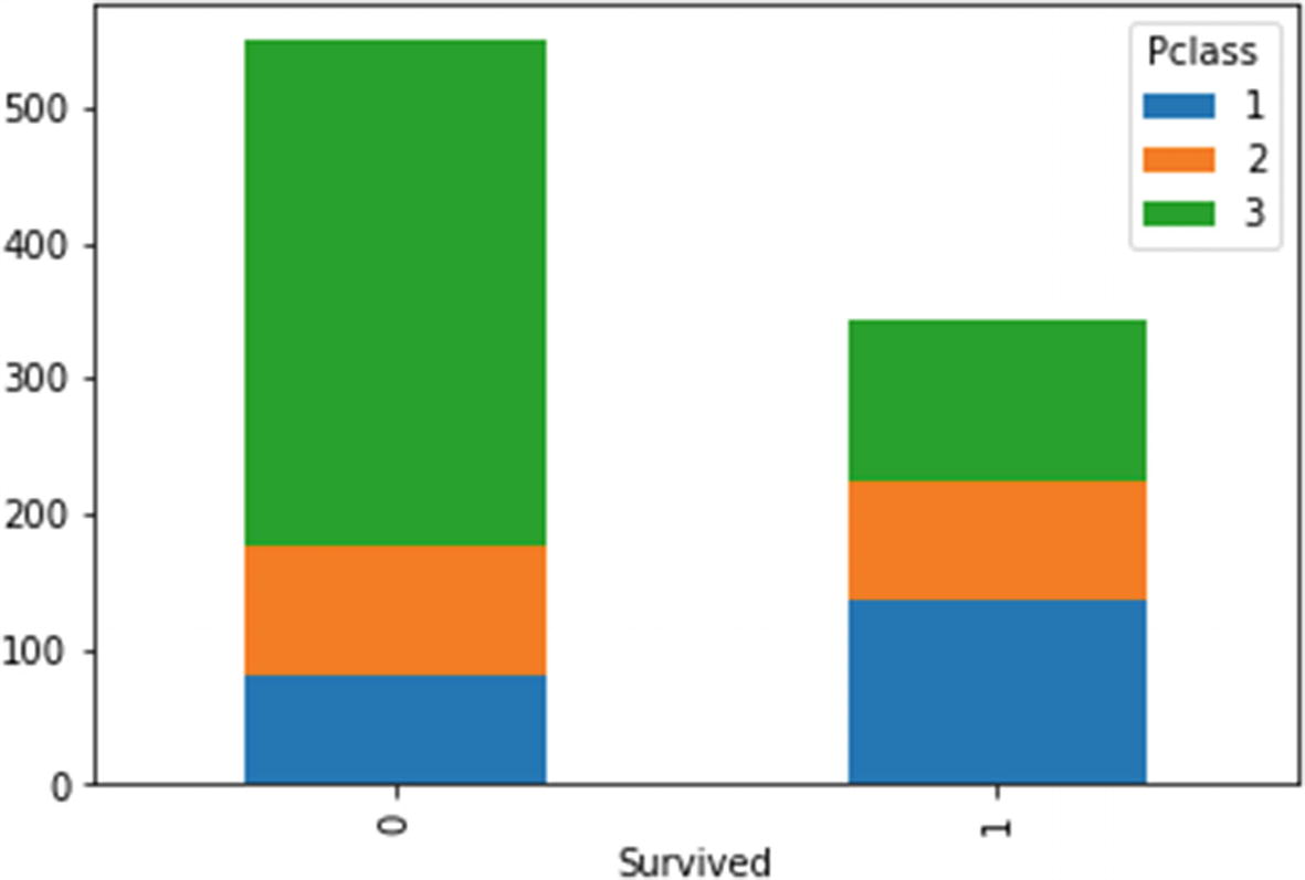
Stacked bar chart
In summary, you can use a scatter plot for two continuous variables, a stacked or clustered bar chart for two categorical variables, and a box plot when you want to display a continuous variable across different values of a categorical variable.
Summary
- 1.
Descriptive data analysis is a five-step process that uses past data and follows a stepwise methodology. The core of this process - data wrangling - involves dealing with missing values and other anomalies. It also deals with restructuring, merging, and transformations.
- 2.
Data can be classified based on its structure (structured, unstructured, or semistructured) or based on the type of values it contains (categorical or continuous).
- 3.
Categorical data can be classified as nominal and ordinal (depending on whether the values can be ordered or not). Continuous data can be of either ratio or interval type (depending on whether the data has 0 as an absolute reference point).
- 4.
The kind of mathematical operations and graphical plots that can be used varies, depending on the level of data.
Now that you have gained a high-level perspective of the descriptive data analysis process, we get into the nitty-gritty of data analysis in the next chapter. We look at how to write code for various tasks that we perform in data wrangling and preparation in the following chapter that covers the Pandas library.
Review Exercises
Question 1
pH scale
Language proficiency
Likert Scale (used in surveys)
Work experience
Time of the day
Social security number
Distance
Year of birth
Question 2
- 1.
Visualization
- 2.
Publishing and presentation of analysis
- 3.
Importing data
- 4.
Data wrangling
- 5.
Problem statement formulation
Question 3
Division
Addition
Multiplication
Subtraction
Mean
Median
Mode
Standard deviation
Range
Question 4
Bar graphs
Histograms
Pie charts
Scatter plots
Stacked bar charts
Answers
pH scale: Interval
Language proficiency: Ordinal
Proficiency in a language has various levels like “beginner”, “intermediate”, and “advanced” that are ordered, and hence come under the ordinal scale.
Likert Scale (used in surveys): Ordinal.
The Likert Scale is often used in surveys, with values like “not satisfied”, “satisfied”, and “very satisfied”. These values form a logical order, and therefore any variable representing the Likert Scale is an ordinal variable.
Work experience: Ratio
As there is an absolute zero for this variable and one can perform arithmetic operations, including calculation of ratios, this variable is a ratio variable.
Time of the day: Interval
Time (on a 12-hour scale) does not have an absolute zero point. We can calculate the difference between two points of time, but cannot calculate ratios.
Social security number: Nominal
Values for identifiers like social security numbers are not ordered and do not lend themselves to mathematical operations.
Distance: Ratio
With a reference point as 0 and values that can be added, subtracted, multiplied, and divided, distance is a ratio variable.
Year of birth: Interval
There is no absolute zero point for such a variable. You can calculate the difference between two years, but we cannot find out ratios.
Question 2
The correct order is 3, 5, 4, 1, 2
Division: Ratio data
Addition: Ratio data, interval data
Multiplication: Ratio data
Subtraction: Interval data, ratio data
Mean: Ratio data, interval data
Median: Ordinal data, ratio data, interval data
Mode: All four levels of data (ratio, interval, nominal, and ordinal)
Standard deviation: Ratio and interval data
Range: Ratio and interval data
Box plots: Ordinal, ratio, interval
Histograms: Ratio, interval
Pie charts: Nominal, ordinal
Scatter plots: Ratio, interval
Stacked bar charts: Nominal, ordinal