
Chapter 2. Retro Art
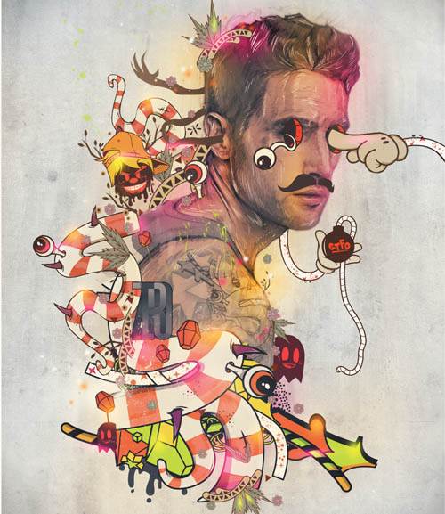
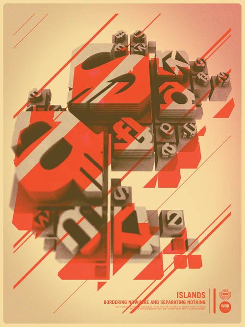
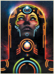
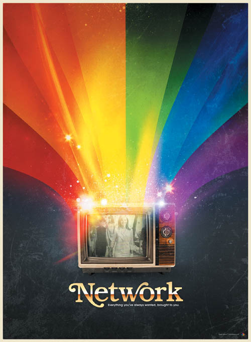
OFFF 2011, by Pete Harrison (Aeiko)
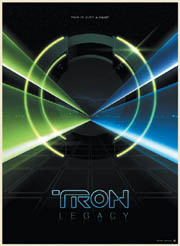
The word retro—which derives from the Latin prefix retro, meaning “backwards” or “in past times”—typically refers to a mode, trend, or style that is identified with a different time in the recent past but that still enjoys our attention and appreciation. Our attraction to retro styles has always been strong, bringing to mind outdated trends, fashion, products, culture, and the like and transforming them into something cool again. In 2011, retro styles currently in vogue tend to come from the ’70s and ’80s, and this is how it usually works: We revive a trend from 20–40 years ago and put it back into circulation. We may describe these retro styles or trends as “vintage” or “old school,” but the meaning is essentially the same. From color schemes to typography, from clothes to vinyl records, from Atari to Tron (the original from 1982, that is), many things that used to be popular a while back are now making a comeback in art, cars, TV, fashion, music, and culture.
In her insightful book Retro: The Culture of Revival, ELIZABETH E. GUFFEY had this to say about our cultural affinity for the fashionably old and outmoded:
As Voltaire noted, history does not change, but what we want from it does. “Retro” carries a pervasive, if somewhat imprecise meaning: gradually creeping into daily usage over the past thirty years, there have been few attempts to define it. Used to describe cultural predisposition and personal taste, technological obsolescence, and mid-century style, “retro’s” neologism rolls off the tongue with an ease that transcends slang.
We can easily agree with Guffey and say that the term retro has become the buzzword for describing some trends. We can also agree that at times we overuse the term, applying it to everything that is not totally new to recast it as something old-fashioned or antique. This frenzy of enthusiasm for reviving styles derives from a nostalgic impulse to rescue designs that were cool a while back in the hope that they might become cool again. It’s a feeling of admiration for the past, a revivalism where the present reuses the past.
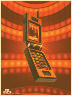
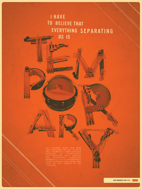
1. Alex Varanese, ALT 197 MOBILEVOXX ABSTRACT
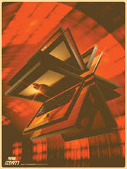
2. Alex Varanese, ALT 1977 LAPTRON 64 ABSTRACT
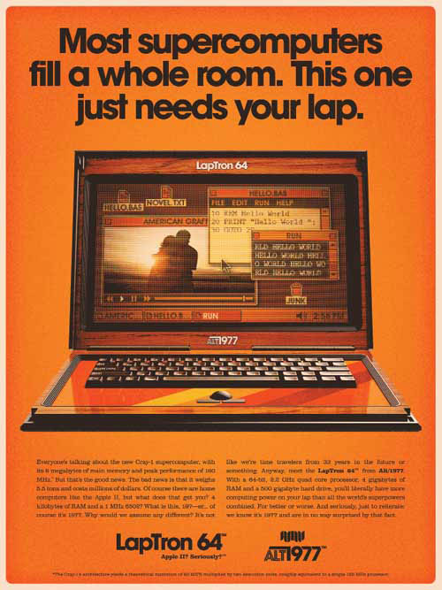
3. Alex Varanese, ALT 1977 LAPTRON 64 AD
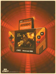
4. Alex Varanese, ALT 1977 MICROCADE 3000 ABSTRACT
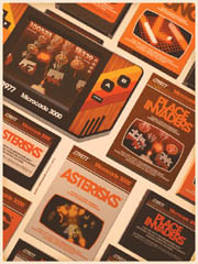
5. Alex Varanese, ALT 1977 MICROCADE 3000 STUDY

6. Alex Varanese, ALT 1977 LOGO

1. Alex Varanese, ALT 1977 MOBILEBVOXX AD
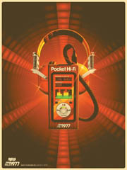
2. Alex Varanese, ALT 1977 POCKET HI-FI ABSTRACT
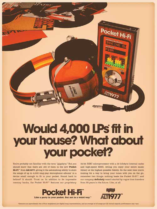
3. Alex Varanese, ALT 1977 POCKET HI-FI AD
Retro in Design
“Retro” styles appear in current designs from all fields we can imagine, from digital to print and web design; designers of all stripes seem to love using retro elements. Whether it’s bright colors, bold designs, groovy letters, lava lamps, or old-school combinations of shapes and images, angles, or curves, everything that was a hit in the past is back in play today.
Even though technology is always evolving and opening up new and previously unexplored design possibilities, its forward push doesn’t stop designers from embracing styles popular in past decades with works based on pure nostalgia. Designers still love and get inspired by outmoded styles such as high-waist jeans, simple yet bold graphics, and big hairstyles. Retro-style design has always been around, but in the past few years it has simply exploded. Several prominent designers are using famous old-school elements to give a nostalgic feeling to their pieces. It’s nice to see design elements from the past being reused in the middle of these times of technological revolution.
4. Alex Varanese, BAROQUEN 0
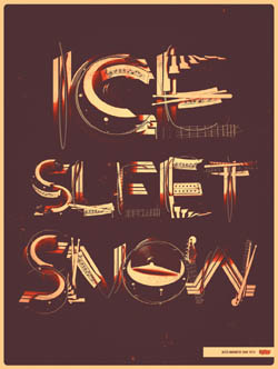
5. Alex Varanese, BAROQUEN 2
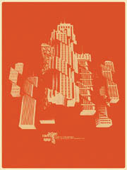
6. Alex Varanese, THE METRO ENCAPSULATION
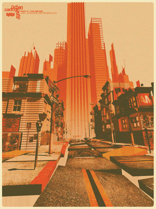
7. Alex Varanese, THE METRO INTERVIEW
8. Alex Varanese, TYPEFACE DECODER
In their book New Retro: Classic Graphics, Today’s Designs, BRENDA DERMODY and TERESA BREATHNACH perfectly capture this trend in its current context:
Reinterpreting the past—the greatest form of creative flattery—never goes out of fashion. In the midst of today’s technologically driven design, there has been a return to the comfort of familiar imagery and typography, particularly from the twentieth century.
This description is totally accurate for today’s digital designers: We use typography and colors that remind us of past times, good times, or simply to rescue a past that we feel connected to.

1. Fabio Sasso, ’80S INSPIRATION
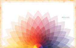
2. Fabio Sasso, FLOWER
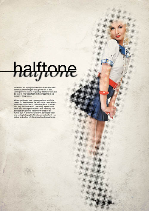
3. Fabio Sasso, HALFTONE

4. Genaro De Sia Coppola, CORRUPTED

5. Genaro De Sia Coppola, ILU

6. Genaro De Sia Coppola, PUNKIT

Interview: James White
James White is a graphic designer and digital artist from Halifax, Nova Scotia, Canada. He is the founder of SignalNoise Studio (www.signalnoise.com), which was recently acquired by Viacom. Over the last 11 years, James has worked on an array of personal art projects and has worked with such clients as Toyota, Nike, Google, VH1, Armada Skis, and Wired Magazine, and has been featured in Computer Arts, Computer Arts Projects, and Advanced Photoshop magazines. He has become quite popular because of his super-cool retro style mixed with some beautiful light effects. James has some very insightful thoughts about creativity and the creative process.

How did you start your career as a digital artist and designer? Did you always know that you wanted to be an artist?
I have been drawing ever since I could hold a pencil at the age of 4, constantly getting in trouble for doodling in class while in school. When I was in grade 12, my guidance counselor gave me a brochure outlining all the courses at the Nova Scotia Community College (NSCC) in my hometown of Truro. While going through it, I noticed they offered a course in graphic design. Up until that point, it had never occurred to me that I could do something creative as a career. I applied immediately, and was accepted a few weeks later in 1995.
After a year of graphic design, I was accepted into another course at the NSCC called Interactive Technology, which taught me the technology side of things, such as CD-ROM, video editing, sound recording, and animation. Most importantly, it taught me how to construct websites. Upon graduation in 1998, I was scooped up in the web boom and proceeded to work professionally in the industry for 10 years.
I didn’t really know what graphic design was until I read the description in that NSCC brochure when I was 18. I had been drawing just because I enjoyed doing it with no greater motive in mind. This kind of blind enjoyment still resonates in my personal art to this day: I do it because I love it.
How did you come up with your style, and what made you explore it further?
My artistic journey into style and expression is still evolving to this day. I spent the majority of my 20s doing all kinds of personal artwork such as comic book illustration, children’s book illustration, sculpting, painting, flyer design, 3D, Flash animation—pretty much anything I had an interest in. Even though I had no real direction in mind, inadvertently I got a lot of experience in different areas just by spending years trying different things.

I spent my evenings and weekends constantly working on stuff.
Eventually, I got tired of the random nature of my work going in all directions, and decided to start a blog to give myself a more linear direction to follow. It was a perfect medium because I could work on something, upload it, and then talk about its creation and the inspiration behind it.
After a little while of doing digital paintings of skulls and things, I made a conscious decision to look to my childhood for inspiration. As a typical kid growing up in the ’80s, I was into Star Wars, Transformers, and The A-Team. A staple in all of these was studio and network logo animations from that time. I remember seeing the brightly colored NBC peacock, the CBS eye, and that amazing CBS Special Presentation promo (YouTube it!), and I wanted to incorporate that aesthetic into my work. I never lost touch with all of these visuals from my childhood, and with the rise of YouTube, I had them instantly at my fingertips once again. It’s almost time-traveling.
How would you describe your workflow for your projects? How important is the computer in your creative process?
Every project I do, and every piece I create starts with the sketchbook. I normally gather whatever references or inspiration I need, then get away from the computer with my sketchbook to start doodling rough ideas of the direction I would like to move in. Under most circumstances, I have a vague idea in my head of what I want to achieve, but it’s not until I rough out the thumbnails on paper that the concept really starts to take shape. Sometimes, I do up to 20 or 30 thumbnails before I get something I’m happy with. Only then will I move to the computer.
Before I start building the design, I create a digital sketch in Adobe Illustrator. This is an important part of my process, as it enables me to create a quick color-and-composition study before building the final design. In Illustrator I can easily slide around the elements to see what works and what doesn’t, which sometimes yields new ideas and results. I will even take these vectors into Photoshop to throw some effects on top to get a sense of what the final design might look like.
After I’m comfortable with the vector study, I start building the real elements in Illustrator (if needed), then put everything together in Photoshop for the final high-res design. When all of my vector elements are in place, I’ll lay in any effects, textures, and color treatments I need. When I build the design in Photoshop, I always leave myself open to try new things along the way, in hopes of stumbling across that happy mistake. The computer is a wonderful tool, but it’s easy to make a design look sterile and uninteresting if you use a computer exclusively. If you treat your design like paint and do things off the beaten path, you might be surprised by the outcome.
Can you list some artists and designers you admire?
Josef Muller-Brockmann, Paul Rand, Saul Bass, Dave McKean, Mike Mignola, Shepard Fairey, Scott Hansen, Drew Struzan, Bob Peak, Joshua Davis, Ralph McQuarrie, and Chuck Anderson.
What advice do you have for those who are just starting their careers?
If you’re in school, don’t do only what your instructor tells you to do. Use what you learn during class to enhance and build your own projects. The more things you make, the better you will know your tools, and the faster you’ll grow a unique portfolio. Once you’re out of school, don’t ever think that you need an employer or a client in order to make things. If you have free time, create personal projects and start seeing them through until completion. Your personal projects are 100 percent personal expression where you make your own rules. Start early, start now.
Which part of the creative process do you like the most: before, when you have only the idea and a vision of what it’s going to be like; during, the part where you’re transforming your idea into your creation; or after, when the work is done and you’re looking at the final piece?
Definitely during. When I have an initial idea in my head, it’s still difficult for me to envision exactly how the concept will translate to real life. I might have one idea, but along with that come 50 questions that need answering. It’s exciting, yet intimidating. Once a piece is finished, it’s an amazing rush to see the work printed and hanging on a wall. I love seeing my work come off the screen and onto a poster. However, the best part of my process is actually doing the work. I love the ups and downs a design goes through as I work on it, when I get annoyed that it’s not looking good and uplifted when it’s going better than expected. It’s problem-solving every step of the way, and I also learn a lot about my process as I rip through it.

Apart from the money you make, what type of satisfaction do you get from your work?
I love creating. As I said earlier, I’ve been drawing my entire life so I’m just used to making cool stuff for fun. Clients, employment, profits, and all that stuff are a necessary by-product of what I enjoy doing on my own time. It’s that simple. Getting paid is nice, but nothing can beat the feeling of accomplishing something on your own, whether it’s launching a line of T-shirts or staying up all night to finish that poster design. Art is who I am, and who I will always be.
What kinds of reference points are important for those who want to work with a retro style?
I always urge people wanting to design things from the past to look at their own childhood for inspiration. Since I grew up in the late ’70s and early ’80s, this is the era that is forged into my history and something I love building upon. Always do what makes you happy, not just what other people are doing.

But that being said, there are elements of the past that are very potent in the design cues I use in my work. Researching television network animations from the ’70s is a huge inspiration as they are packed full of bright colors and vintage animation, while having a certain roughness due to age and film quality. Also look into album covers from the ’80s, namely from the hard rock and metal genre. They were big into metal type and lightning, which are elements I love using in my work.
What, in your opinion, is the defining characteristic of your style?
Fun! I never take what I do too seriously, or speak about it as if it were some high form of design. It’s a snapshot of me having a great time. I create things that I thought were cool when I was 7 years old, and that really hasn’t changed. I could talk about process, effects, and colors, but the most important thing is to have fun and create something from your heart.

Tutorial: Retro Poster in Illustrator and Photoshop
Creating vintage/retro effects has become quite popular in today’s design and illustration worlds. We can see lots of examples of retro-style work on sites such as Dribbble.com. There are quite a few ways to add a retro look to your work; however, one thing you will always have to do when creating retro designs is to play with textures.
In this tutorial, I’ll show you how to create a retro poster starting with some sketches, then going to Illustrator to build them digitally, and finally applying textures and effects in Photoshop to give them an unmistakable retro look.
Step 1
Whenever I start a new project, the first thing I do is sketch some ideas. I don’t draw particularly well, but even with my limited sketching skills, I find that starting with a pencil sketch is the easiest way to begin to realize my ideas. The idea behind the image we’ll work with in this tutorial was to create something inspired by Robert Indiana’s Love artwork, but in a much more futuristic approach. Instead of using “LOVE,” in this tutorial we’ll play with the letters “ABDZ” (1).
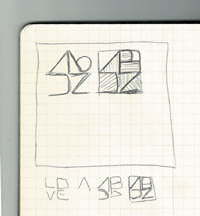
1
Step 2
Once I’d completed my sketches and had a clear idea of what I wanted to do, I went to Illustrator and started creating the image. When you have your own preliminary sketches done, use the Pen Tool (P) to start drawing the A, which is basically a triangle (2). Then invert it using the Transform tool to create part of the Z. Then, with more lines, use the Pen Tool to draw the D and the B.
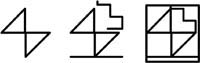
2
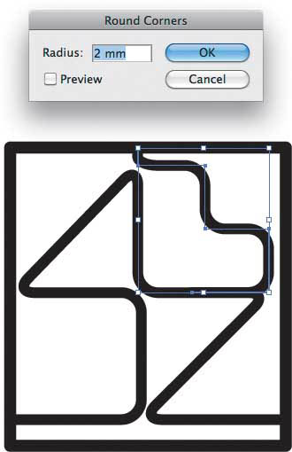
Step 3
After you’ve drawn a nice set of lines, apply Illustrator’s Round Corners filter. You’ll note that I made some adjustments in order to make the characters more readable, especially in the spacing between the A and D, the Z and D, and the B and A (3).
3
Step 4
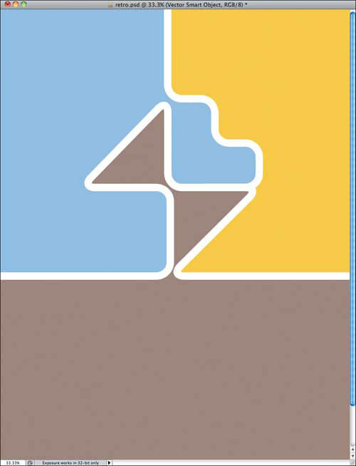
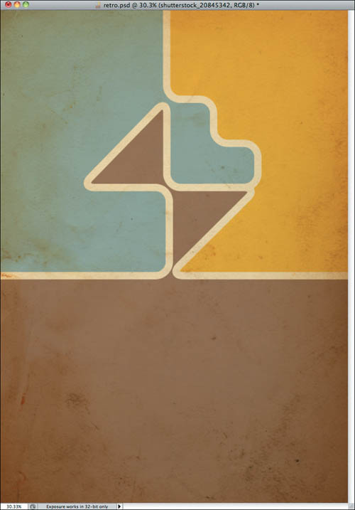
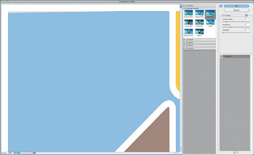
At this point, the ABDZ shape is pretty much done. Next, create a rectangle and fill it with a light brown (#A48A7B). Then use the Pen tool (P), to create a shape to the right of the B and Z and fill it up with yellow (#F7D21E0) to differentiate it from the brown area (4). Then do the same for the A, B, and D but fill it with a light blue (#A1C4E9).

4
Step 5
Now we’re ready to move the project into Photoshop. Copy the vectors from Illustrator and paste them into Photoshop as Smart Objects (5).
5
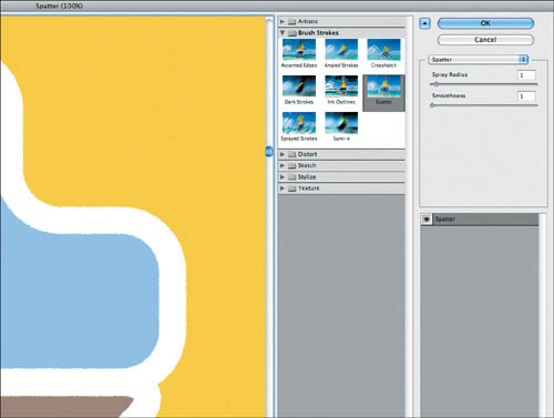
Step 6
Choose Filter > Brush Strokes > Spatter. Enter 1 for Spray Radius and 1 for Smoothness (6).
6
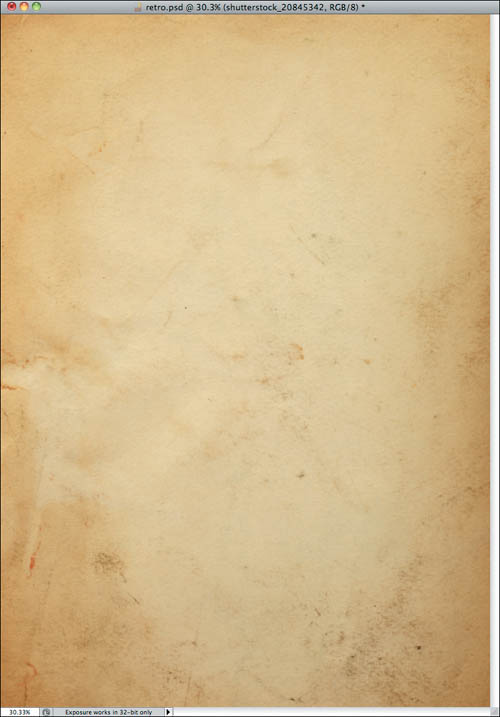
Step 7
To give the image the vintage look we’re going for, let’s import an old paper texture (7). The one I am using comes Shutterstock, and you can find it at www.shutterstock.com/pic-35221027/stock-photo-old-paper.html.
7
Step 8
Change the Blend Mode of the old paper texture to Multiply (8).
8
Step 9
Now it’s time to personalize the composition. In my version, I selected the Text tool and added Abduzeedo at the bottom, using BlairMdITC as the font (9).
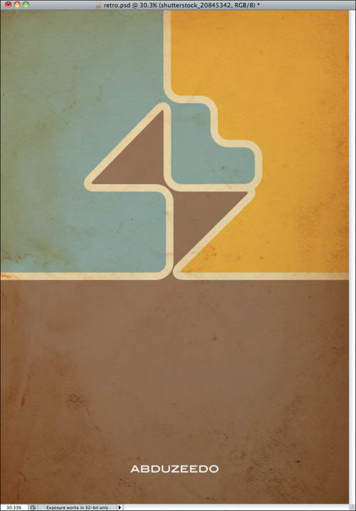
9
Next, select all layers and duplicate them. Select the duplicated layers and merge them into a layer. You can do that with the keyboard shortcut Command (Mac)/Control (PC)+Alt+Shift+E.
Step 10
Choose Filter > Pixelate > Color Halftone (10). Use the default options.
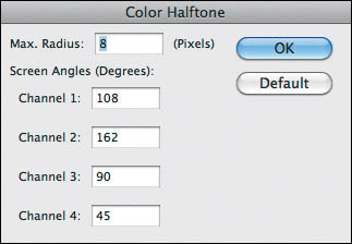
10
Step 11
Select the layer with the Color Halftone, and change its Blend Mode to Multiply and its Opacity to 30%. The purpose of this layer is to add some texture to the image, as if it was really printed (11).
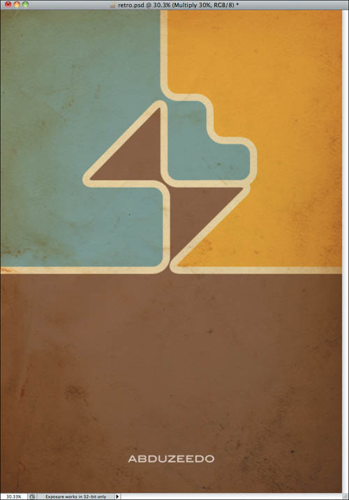
11
Step 12
Duplicate all the layers again and merge the duplicated layers into a single layer (12).

12
Step 13
With the merged layer selected, choose Filter > Brush Strokes > Crosshatch. Select 9 for the Stroke Length, 6 for the Sharpness, and 1 for the Strength. Then change the Blend Mode of this layer to Soft Light (13). Finally, duplicate this layer to make the colors more vivid.
13
Step 14
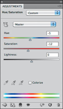
Choose Layer > New Adjustment Layer > Hue and Saturation. Select -5 for Hue and -12 for Saturation, but keep Lightness set at the default 0 (14). Also make sure that the adjustment layer is on top of all the other layers.
14
Conclusion
To give a nice retro/vintage look to your designs you must add some textures; textures are an essential component of any retro effect. Sometimes a halftone mixed with some washed colors is the way to go; at other times you’ll add some noise to the layer mask, or use brushes to create new textures. Another good tip is to always keep some old paper textures on hand that you can add on top of the layers with Blend Modes like Multiply—that will really do the job.
Once again, it’s all about playing with the tools and trying to understand how things work in real life, and then trying to reproduce that on a computer. For coming up with new ideas, however, there’s nothing like pencil and paper.