Chapter 4
Visualization
Key Points and Questions
- With the foundation of strategic questions and data, what should we be visualizing?
- How should we be visualizing it?
- Is there a methodology that works?
- How can we continue to move fast, make a difference, and create believers of actionable intelligence?
SOURCE: Lee Min Lau.
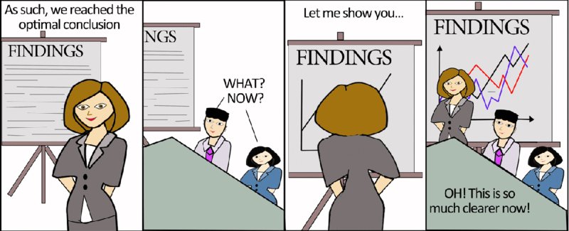
Now that you know how to get the data straight and how to visualize that data to arrive at answers, it is time to start building from there. Answering one strategic business question with the aid of great visualizations does not make you a hero instantly. So it is time to move on, increase the effort, and learn from your mistakes to make every new piece of actionable intelligence better, easier, and more visually appealing than the last one.
That is the importance of visualization. You can have important data all cleaned up, full, and complete. If nobody sees it, it has as much added value as an empty bag.
If the data is accurate and timely, as we saw in Chapter 3, then you can unlock its dormant value by making it accessible. Do this by—you guessed it—visualizing the data. Now, the definition of cutting-edge visualization changes every year. What is hip and modern today looks hopelessly outdated tomorrow. That's the reason you will not find images of visualizations in this chapter. Instead, you will find examples of how visualizations develop. And more important, you will learn what elements are in all good visualizations.
Visualizations need to answer “Where we are today?” “Are we happy or sad?” and “How do we win?”
Complete Circle
After putting in place a solid data foundation and starting up our first project at Eséee Lauder, we started to deliver rapid and iterative actionable intelligence. We used a methodology I termed the Project Vision SWAT Iteration Framework (see Figure 4.1).
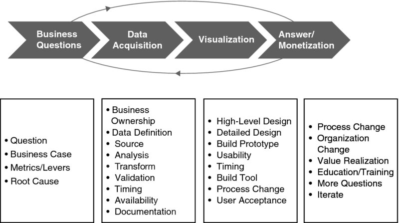
Figure 4.1 Project Vision SWAT Iteration Framework
COPYRIGHT © 2012 Keith B. Carter.
This fast-paced methodology delivers quick results by asking and answering:
- What's the strategic business question and iterative scope? (Chapter 2)
- Which data is relevant to answer the question? (Chapter 3)
- How should the answer be visualized? (Chapter 4)
- How will the answer be used? What actions taken? What benefits achieved? (Chapter 5)
- Start again and refine the strategic business question.
Does this work? Yes, says Jack Levis, director of process management at UPS and creator of the amazing ORION project.
Levis manages a team of mathematicians who built the algorithms that help UPS shave millions of miles off delivery routes—ORION, or On-Road Integrated Optimization and Navigation.
When he first brought up the project, his management was skeptical and so were the drivers. He set up competitions between the drivers and the system to refine the model and variables and to acquire more data.
Following an iterative approach and engaging the drivers paid off.
“Starting small shows the project is feasible, optimal, and, more important, implementable. So we created and tested lots of prototypes,” Levis told me.1
Levis also shared his three key steps to success with me:
- Step 1. Prove the concept by delivering real dollars.
- Step 2. Build into the process.
- Step 3. Provide significant deployment support.
Even with an efficient framework to bring about results, the ORION project was not without its challenges. One of the reasons management was skeptical was that the data seemed impossible to collect.
For example, only the drivers knew external information such as:
- The digital maps in use at the time were not accurate enough. UPS needs to show the exact route to the exact drop-off point, which is sometimes deep into a mall or requires driving several levels into a parking garage.
- The impact of season and weather on a route. Some of the local roads on the map looked crossable in normal GPS maps, but were, in fact, stream crossings that UPS trucks couldn't go through during bad weather.
- School openings and closings that impacted traffic on nearby roads.
- How business customer opening times affected the delivery schedule.
Despite the challenges, the ORION program has been successful. Some of the early benchmarks include:
- 85 million miles saved each year.
- Fuel costs account for less than 20 percent of savings. The main benefit is a reduction in driver time (82 percent of the benefit).
- Theoretically, one mile saved per driver per day in the United States alone saves UPS about $50 million a year.
The ORION program also provides some best practices that any company can apply:
- Manage expectations of management and leave space for improvement.
- Do not do intelligence for intelligence's sake. Think about payback.
- To deliver breakthrough results, be ready to change people's thought process and mindset.
Now that you have established a solid start of your data foundation and an understanding of business discovery, you should have the following support and capabilities in place:
- Some business sponsors of strategic questions
- A data dictionary and standard business language plan
- A talented visualization team
- Business users in the room ready to participate in ideation sessions on where to go
With all the above we had enough ingredients for a successful intelligence project.
Inject speed into the process.
Earl Newsome, former chief technology officer, Estée Lauder
I was waiting for an elevator, and who walked up but Earl Newsome, a man who knows how to transform organizations fast! But at Estée Lauder, the IT department he was working on changing was struggling.
Newsome shared with me how tough it was to reduce the red tape and get people moving. Then he said a phrase that has stuck with me for years: “We need to inject speed into the process!”
Speed in executing each step is the critical aspect. We established regular ideation sessions 45 minutes in length to agree on visualization or review iterative answers. This framework helped deliver answers in hours and days, satisfying the business' need for speed.
The exciting part of intelligence work is the activity of turning data into easy-to-follow visual representations and then creating stories about how the business is performing today versus opportunities for better performance tomorrow.
Instead of looking at reams of spreadsheets, we delivered the ability to slice and dice intelligence. We brought together streams of data into a single tool to show opportunities for improvement in easy to see red, yellow, and green indicators.
As the users saw the tools during our ideation sessions, they began to develop their own uses and purposes for the intelligence. This enabled us all to run faster toward monetizing the benefits.
The team and I were dedicated to the ideation sessions. While I was on vacation on the beach in Barcelona, we held sessions on one tool. When I was on a cruise ship in the Mediterranean Sea, we held a critical session with the head of supply planning.
Helena May, of the MLH group, held ideation sessions with the demand planning head during the day, at night, and on weekends.
The pace was intense, but the results were worth it.
The users saw where they could use the intelligence on a regular basis. They began to report the results of using the tools to us and regularly asked for improvements. Because we were following the iterative SWAT framework we delivered the changes quickly. The speed of enhancement was a significant departure from standard budgeting methodology and development approach. It was a refreshing change.
Instead of looking at printouts of data from the past, business users received graphical views of past and future performance. Our users were excited, and adoption of the tools increased.
A supply planner in North America said, “This is the first time I can make changes to the plans three months ahead of time, instead of being blamed for shortfalls that happened three months ago.”
Here, I'd like to make a distinction between ideation sessions and requirement gatherings. Ideally, ideation sessions are aimed at the users, driven by the users, and demand total involvement every step of the way. Table 4.1 shows the differences between an ideation session and a typical requirement gathering.
Table 4.1 Ideation Session versus SDLC Requirements Gathering
| Ideation Session | Standard Software Development Lifecycle (SDLC) Requirement Gathering Phase | |
| User | High user involvement | Little user involvement |
| Involvement | High commitment level; involved in all sessions from the start of project | Low commitment level May be absent for certain sessions |
| Process | Brainstorming and open discussions; fast, proactive, on-the-fly problem solving | Written project brief reports Slow, reactive, waits for approvals from related parties |
So Now, How Can You Do It?
By having the right structure in place, we were able to accelerate from the “beginner” to “localized success” and “enterprise actionable intelligence capabilities” stages of actionable intelligence.
One such structure is the Human Centered Design Toolkit, by International Development Enterprise (IDE). The kit was written to depict the three-theory process that has been commonly used in multinational corporations (see Figure 4.2).
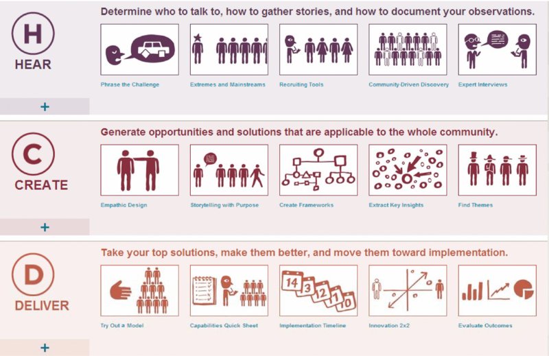
Figure 4.2 Human Centered Design Toolkit
SOURCE: www.hcdconnect.org, www.hcdconnect.org/methods.
Hear Phase
- Determine who to talk to.
- Who are the right sponsors, supporters, and who will use the new intelligence to deliver results
- Determine how to gather stories.
- What's the right process in your organization? Can you interview and engage with people?
- Determine how to document your observations.
- How can we work together with team members?
Create Phase
- Synthesis: Bring information and knowledge together.
- Gather the appropriate group of individuals (with a range of demographics and backgrounds). Sometimes bringing in some unrelated individuals may provide a new perspective.
- Share stories.
- Identify patterns from the existing data.
- Ideation sessions: Think freely without any constraints, limits, or judgments.
- Create opportunity areas and move away from analyzing data and toward creating new solutions.
- Brainstorm new solutions.
- Prototyping: Make realistic ideas.
- Structure and improve brainstormed ideas into tangible solutions in a fast and inexpensive manner.
- Feedback: Improve for the better.
- Seek critiques and opinions of the team to identify how to improve further.
All these steps should be executed in days, especially prototyping. The resources and permission should be available to execute good ideas as they are created. Enable fast prototyping!
Deliver Phase
In the deliver phase, ideas and solutions created will be implemented to deliver value and results in a sustainable way:
- Viability check
- Develop a model that will provide value to the customer, revenue to the organization, and returns to the stakeholders.
- Capabilities identification
- Source for the required capabilities, manpower. and partners to implement the solution from existing resources or network of contacts.
- Plan a pipeline of solutions
- Map out how the new solutions move or impact the organization and its strategy for new or existing markets and customers.
- Conduct mini-tests or pilots
- Create a learning plan
- Evaluate and monetize the outcomes
Delivering is important, as is getting the right answer to lots of important strategic business questions. This can be done by anyone because there are a great number of possibilities for the deployment of actionable intelligence.
The Way Ahead
The technology is there, you know the steps to creating actionable intelligence, and your team is ready to step it up. It's now your duty to build actionable intelligence momentum and make the effort reach its tipping point. Grow the project organically until it grows by itself because the organization sees that your project is indispensable to almost every business unit. After reaching that phase, the enterprise actionable intelligence stage mentioned in Chapter 1, the possibilities are endless.
Example of Iterative Visualization to Solve the Question “How Do I Get There Quickly, Safely, Efficiently?”: Leveraging Global Positioning System Data
Take this following example: You are driving a car and want to know whether you will arrive safely and on time. It's an old problem with an old solution. A speedometer visualized the data point of your current speed, the gas meter showed whether you still needed to make a stop. Everything else you had to do by yourself. That would be the first iteration of visualizing the available data.
In the 1960s, the U.S. Navy envisioned a new opportunity to move ships effectively and came out with satellite navigational systems. By the time they were made fit for consumers, these systems ran on the Global Positioning System (GPS) and allowed drivers to have a box in their car that calculated where they were, how long the drive was going to take, how far they still had to drive and whether they were keeping to the speed limit.
Iteration two, the navigational system to add on to iteration one, was elegantly designed and visualized all the information it gathered in such a way that the user only needed one glance at the little box to see what needed to be seen.
Even though iteration two doesn't show whether the user will be there on time, the navigational system will come pretty close. Users can answer that question for themselves, and hooking up the schedule to the navigational system could lead to visualizing the answer to that question.
However, there is one word in the strategic question—“Will I make it safely and on time?”—I left out. Currently, no system takes into account safe driving.
So that brings us to iteration three—one we haven't realized yet. To show whether you can drive safely and be on time, we need to layer in traffic conditions on the road, weather conditions, police speed traps, and so on. We also need to know how likely the car is to break down—on major points like tires, brakes, and lights. Some systems still provide this information, but most systems stop before reaching this point. By visualizing this you could give a basic answer as to whether you will arrive safely and on time (and without tickets).
We can go deeper still to iteration four. It is possible to realize systems that monitor whether you have been on a certain stretch of road before, whether your average speed is up on that stretch, and how many accidents have occurred on that same stretch. By monitoring biometrics you could also tell whether you are intoxicated, have a low pulse, feel sleepy, or have an illness that interferes with your ability to drive. Let's call this harder-to-get data really big data.
While you are driving you need a very fast answer. The answer needs to be simple, visual, and nondistracting. You can't afford to be distracted by, for example, your current heart rate, on top of everything else being displayed in your car. When you need the answer, you need it fast. You can't do the whole analysis while driving.
So this leaves us with one question: What would this visualization look like? I'd suggest a big view with clear colors indicating whether you are making it and whether you are safe. If you want to know by how much, you should be shown an estimate of the difference in travel time. If you want to drill down, you should have the option to say to your little black box “tell me the factors delaying me,” and the box would list them.
Whether you were at iteration one or iteration four, there were some commonalities in the example.
- You want the answer as quickly as possible. Why would you have a visualization if it only requires more work? The aim of visualizing data is to instantly get a picture of what the organization looks like. The same was true for every iteration in the car. You can get the answer instantly, without having to do anything.
- We want to visualize the relationships as clearly as possible. Ideally, there should be no ambiguity as to what the visualizations mean, how the data must be interpreted, and how the different sets of data link together. While driving, you need to be shown how each of the factors increases or decreases your safety or driving time. That way you know how you can alter your driving or bodily state to be more optimal.
- A visualization brings together data from multiple departments, placing it on one screen in a logical way so that cross functional discussions can be held easily. It creates an overall picture across different information silos. Your heart rate in a car doesn't mean anything by itself, but in combination with various other metrics, your black box can reach a conclusion on how fit you are to drive.
- You need to be able to tell a story: What do these numbers mean? What does the situation mean, or what should I do? Why? How should we go about that? The navigational system gives you the routes, the information. It's up to you to figure out how you determine the journey to arrive on time and safely. The navigational system is not giving you the final step, it's not automatically taking you there.
As soon as machines take over the process of interpreting the answer, making the decisions, and reflecting on those decisions, management can be fired and robots can take over the business. Until then you need to be able interpret the story behind the data, the story behind what the numbers tell you.
Effective Visualizations: Tell a Story to Your Mind
Why are we visualizing information in a particular way? Why do bar charts and pie charts work better than tables? The answer is simple. It's because of how our minds work. We trigger a bigger area in our brains when we look at data ordered in a way that comes naturally to us than we do by looking at raw data. Raw data, lists, and tables require us to think in order to understand the data and piece together the relationships in our minds. Visualizations let you see the relationships visually and instantly. This works because our minds use heuristics to determine what goes together, and data visualizations use those same heuristics to show people what they need to know.
Early in the twentieth century the Gestalt school of psychology, developed by Christian von Ehrenfels and inspired by Hume, von Goethe, and Kant, determined how the mind sees relationships between points and pieces of drawings. This led to mapping some important heuristics that to this day remain valid and the basis of many visualizations.
Table 4.2 provides a short list of the heuristics the mind uses.
Table 4.2 Human Heuristics
| Proximity | Objects that are close to each other are assumed to belong together. | You probably feel a connection to the nearest city as opposed to some place on the other side of the country. |
| Similarity | Objects that are perceived as equal are assumed to belong together. | Tigers and lions go together much better than tigers and fish. They are similar. |
| Enclosure | Objects enclosed by a line or plane are assumed to belong together. | All the things on a desk are assumed to be of one person; all the things not on there are assumed to be of someone else. |
| Closure | Objects that are not fully finished will be assumed to be finished in the mind. | If you stare into a crescent moon, you will likely see the outlines of a full moon. The mind does this. |
| Continuation | Objects that disappear partially behind other objects are continued in the mind. | To see this, all you have to do is shove one item in front of another. |
| Connection | Objects linked together by anything whatsoever are assumed to belong together. | Connection is very easy; you'll associate almost everything that is connected to each other physically as a group. |
These heuristics are interesting and explain why certain visualizations work so well. Though when you keep in mind just the list of commonalities we discussed earlier when creating visualizations, you will almost always automatically adhere to one or more of these heuristics, because your brain knows what makes information easiest for it to understand.
Noticing Visualization Pitfalls
In the end you are still the user of the tools you create to visualize the business. The tools will not make your decisions nor give you the relationships. They are called tools because they give you the means to find relationships and make the decisions.
The Post Hoc Fallacy
One of the biggest pitfalls here is the fact that you still have to find the relationships for yourself. This sounds easy but can lead to what practitioners call the post hoc fallacy. The post hoc fallacy means you see relationships that aren't there, just because the data suggests such relationships. This nasty trap can be avoided by clear and careful thinking when determining relationships suggested by the data. Does the relationship make sense? Is it causal one way or another? Or is there just a correlation? The famous example from statistics is this: On days where people buy more ice cream, more people drown. So people drown because of ice cream? No! People drown because there are a lot of people in the sea on hot days. And on hot days more ice cream is sold. There is a relationship, but no causation between ice cream sales and drowning. So be aware; use your logic.
Earlier I mentioned that statistical forecasts that do not include the right amount of data and influences are good for matching the past but not for predicting the future. Many organizations talk about “forecast accuracy” with decimal points as if to appear very precise. The reason business leaders aren't satisfied is because the forecast is often wrong and there is a cost associated with errors in either poor customer service or increased costs.
This was made very clear in the April 6, 2014, New York Times article “Eight (No, Nine!) Problems with Big Data,” by Gary Marcus and Ernest Davis.2
[Even] when the results of a big data analysis aren't intentionally gamed, they often turn out to be less robust than they initially seem. Consider Google Flu Trends, once the poster child for big data. In 2009, Google reported—to considerable fanfare—that by analyzing flu-related search queries, it had been able to detect the spread of the flu as accurately and more quickly than the Centers for Disease Control and Prevention. A few years later, though, Google Flu Trends began to falter; for the last two years it has made more bad predictions than good ones.
Visualization should first be used to identify a situation holistically, with a wider field of vision. Too often, scientists attempt to hone in on a correlation right away. This is like looking at the stars through a telescope when there is an elephant in your way. You find very interesting constellations, until you step back and realize it's not the stars you are seeing but an elephant's hide!
The authors of the New York Times article also warn about making too many connections.
If you look 100 times for correlations between two variables, you risk finding, purely by chance, about five bogus correlations that appear statistically significant—even though there is no actual meaningful connection between the variables. Absent careful supervision, the magnitudes of big data can greatly amplify such errors.
Organizations can avoid these problems by maintaining focus on the big picture and the original strategic question.