Chapter 6. Color Correction
Color is my day-long obsession, joy, and torment.
—Claude Monet
Even if you’ve managed to practice your best videography techniques with expert lighting and export camera work, there is always some improvement in the finished image via color correction.
Your eyes are these amazing, white-balancing organs that constantly interpret and reinterpret your environment. But the same qualities that make your eyes great for the everyday world limit you in the postproduction suite because your eyes are continually adjusting and adapting to what they’re viewing.
For color correction, you need a more consistent way to examine your images, and for this you need to be proficient in using color scopes. Each shot needs to be adjusted and controlled to make sure it doesn’t exceed broadcast limits; even today when the final delivery may only be to digital devices, such as an iPad or YouTube, broadcast limitations are still valuable restrictions for finished work.
Getting two shots to match, especially when they’re shot under different lighting conditions and exposures can be difficult. It should never be a guessing game. The overall goal is to move beyond just getting the picture to “look good.” Color correction can also be an expert storytelling technique, intentionally warming up (adding red/orange) for more romantic shots or cooling down (adding some blue) a shot to make it appear more serious.
Defining “looks” of a scene can further communicate location: For example, images of Miami have a warmer look than images of Alaska.
Color correction is a crucial, necessary technique that can help any production look more professional.
![]() Close-Up: Corrections and Grades
Close-Up: Corrections and Grades
![]() A correction refers to a specific adjustment made on a shot, such as adjusting the Gamma to make a shot appear brighter.
A correction refers to a specific adjustment made on a shot, such as adjusting the Gamma to make a shot appear brighter.
![]() A grade refers to everything done to adjust a shot—quite possibly adding multiple effects to build a finished “look.”
A grade refers to everything done to adjust a shot—quite possibly adding multiple effects to build a finished “look.”
You may be reading this chapter and saying, “I already color correct.” Yes, but are you using all of your scopes? Do you know how to match shots? If you’re not using the Parade scope and if you struggle to match shots, this chapter dives into those topics in depth as well.
![]() Close-Up: A Note About the Downloadable Content for This Chapter
Close-Up: A Note About the Downloadable Content for This Chapter
Plan Your Time Wisely
Procedurally, color correcting all of your footage will take time, and it’s nearly always during the worst time—close to deadlines and delivery.
Professional colorists, with optimum hardware setups and working as fast as they can, will correct 10–20 minutes of finished work a day. If in 10 minutes they can complete about 200 shots, it takes them, on average, about a minute a clip. Expect that you’ll be slower than this. Make sure you budget and measure how fast you can correct shots to guarantee your delivery schedule. Although you’ll become faster after practice, full-time colorists also have the advantage of using some dedicated hardware.
![]() Notes
Notes
In 2011, Adobe bought Iridas and quickly added SpeedGrade to the Creative Suite. It’s a fantastic dedicated program for color correction (and stereoscopic finishing). Check out Alexis Van Hurkman’s book Adobe SpeedGrade CC: Classroom in a Book (Adobe Press, 2013) to learn how to use this Adobe tool.
Goals of Color Correction
What are the goals of color correction? Your initial response might be to make the shot look “better.” But concepts like better or worse are inaccurate descriptors, even if you recognize that you’re happy or not happy with adjustments.
You need your goals to be more concrete and to serve storytelling.
Here are the four goals of color correction in order:
1. Establish the appropriate tonal range.
2. Remove any color casts.
3. Match shots for shot-to-shot consistency.
4. Create a look (if appropriate).
All of these goals, except the last one, should be invisible to viewers; well done color correction doesn’t call attention to itself.
The first two goals, establishing a tonal range and removing any color casts, are about neutralizing your image. These two goals are about basic cleanup and establishing a starting point for your images.
When possible, it’s ideal to have some communication with a DP or Director about the on-set intentions of the shoot for color correcting. If the intent during shooting included adding a cool filter (blue) to the lens but you weren’t aware of that, you’d be fighting the intentional blue cast on the footage.
Matching shots is more about hiding any shooting defects, such as the color temperature of an indoor shot compared to an exterior shot. It’s not about matching something like a Pantone color. You can get close, but you can’t truly match print items. The reason is that there is a difference between reflected light (print) and emitted light (LCDs and CRTs). Again, if the matching is done well, nobody notices it.
Developing a “look” means adding an artistic impression to the footage. Movies like the Matrix, Minority Report, and Se7en all have stylistic, visual adjustments to communicate concepts like technology, emotion, and danger (Figure 6.1). This type of work is typically left until the end of color correction, because a given scene or series of shots should all be similar before a look is added.

Figure 6.1 This same shot with three different looks shows a warm look on the left, a colder look in the middle, and a harder contrast on the right. Each look helps communicate emotion in a scene.
Understanding Light
When discussing color correction, it’s crucial to have some understanding of light and the electromagnetic spectrum. What is meant when you hear about the temperature of light and how computers process light? Light behaves differently in video than how it’s processed by your eyes!
The human eye is sensitive to only a small portion of the energy emitted from the sun—which is called the visible spectrum. It ranges from (ultra) violet on the left through (infra) red on the right (Figure 6.2).

Color Temperature
The colors on the spectrum are described as ranging from warm (reds and oranges) to cool (blues). Technically speaking, they’re also described in absolute degrees (Kelvin units or K). Oddly, the values for warmer colors are actually lower than the cooler values. Heating a metal object, like the filament of a lightbulb, starts at red, and as it gets warmer the color changes to blue (Table 6.1).
When your clients ask for a warm or cool look (Figure 6.3), you need to understand what they’re thinking.

RGB or Primary Colors
Computers use three colors to describe a pixel: red, green, and blue. To describe a color space—the range of colors that a computer can display—it is called RGB color space. You may already be familiar with the RGB adjustments from tools like Adobe Photoshop or Adobe After Effects. Every color the computer can display can be described as a percentage of these three colors.
Adding the maximum R, G, and B to a pixel (Figure 6.4)—let’s call this 100%—yields a white pixel.

The opposite, removing all RGB (0%) yields a black pixel (Figure 6.5).

Gray can be the result of all three sliders at 50%, but it can also be any point where all RGB are identical. All RGB at 5% is a very dark gray, and all RGB at 87% is a light gray. The core concept is that when all three values are the same (Figure 6.6), the color is gray.

Figure 6.6 As long as RGB are all the same value, you end up with a gray pixel. In this case, it’s 35% gray with a value of 90,90,90.
Because computers work with these three channels, you should take a moment to look at each channel individually (in the next section “CMY(K) or secondary colors,” you’ll look at the lack of color in each channel with possibly surprising results).
With green and blue at 0, increasing just the red to 255 results in a swatch that is (obviously) red. Similarly, you can do this with just the green control and then just the blue control (Figure 6.7). Although the results may seem obvious, this is an important step in understanding the way computers handle these three color channels.

Figure 6.7 Each channel maximized individually to 255 yields (from left to right) red, green, and then blue.
![]() Close-Up: 8 Bits vs. 10 Bits
Close-Up: 8 Bits vs. 10 Bits
![]() Both 8 bit and 10 bit have white and black at the top and bottom of the scale, but in 10 bit there are more steps between white and black.
Both 8 bit and 10 bit have white and black at the top and bottom of the scale, but in 10 bit there are more steps between white and black.
![]() When possible, it’s best to use a camera that shoots in 10 bits because there is more information in the picture, giving you the ability to make smaller, more refined adjustments.
When possible, it’s best to use a camera that shoots in 10 bits because there is more information in the picture, giving you the ability to make smaller, more refined adjustments.
CMY(K) or secondary colors
Something very interesting happens when you perform the opposite of increasing a given channel:
![]() If you maximize the Blue and Green channels (at 255) and reduce Red to 0, the lack of red results in cyan, making it the opposite of red (Figure 6.8).
If you maximize the Blue and Green channels (at 255) and reduce Red to 0, the lack of red results in cyan, making it the opposite of red (Figure 6.8).

Figure 6.8 When you remove all of the color in one channel, the result is the opposite color. The removal of Red is Cyan (left). The removal of Green is Magenta (middle), and the removal of Blue is Yellow (right).
![]() If you maximize the Red and Blue channels and reduce Green to 0, the lack of green results in magenta.
If you maximize the Red and Blue channels and reduce Green to 0, the lack of green results in magenta.
![]() If you maximize the Red and Green channels and reduce Blue to 0, the lack of blue results in yellow.
If you maximize the Red and Green channels and reduce Blue to 0, the lack of blue results in yellow.
CMY colors are described as the secondary colors to RGB. It’s likely you recognize them from your color printer inks. Computers use emitted light, but paper uses reflected light, which requires a different method to achieve black and white. With a computer, all the colors (RGB) need to be on to get white. But in print, zero information is needed (no ink) to get white. This is the opposite of RGB. Even still, using all three colors in print, CMY only produces a dark brown, so it’s necessary to actually use black ink to yield black.
As an aside, when you look at print, which is reflective of light (versus computers, which emit light), it uses the CMYK (Cyan, Magenta, Yellow, and Black) color space to represent color.
RGB + CMY = Color Wheel
If you plot out RGB against CMY, you should see something you’re familiar with—a color wheel. The one in Figure 6.9 has been altered from Adobe Premiere Pro to help you see the labeled colors.
These colors match the layout of the Vectorscope: The scope that allows you to measure the overall color vectors in an image; they also match the layout of the colors in the Three-Way Color Corrector. Once you understand this idea that the Vectorscope and the Three-Way Color Corrector correspond, you’ll intuitively know how to compensate for chroma issues.
![]() Tip
Tip
When you use a color picker to measure a pixel that’s supposed to be neutral (a gray), look at the RGB values. If they’re identical, the pixel is neutral. If they’re not, adding/removing information from each channel so they agree is a method of neutralizing color casts.
YCr’Cb’ or YUV space
Although computers use RGB and print uses CMYK, video uses Y (luma) and U+V (chroma). A little history will help you understand this space.
Video started out in black and white only, and it was only necessary to record and store the luminance of an image—called Y by video engineers.
Later, in the 60s, color was added to the existing signal. It was possible to describe just the color information without the luminance (brightness). This additional information was only a small amount of extra information because your eyes don’t see color detail as well as luminance details.
In video, the color channels are described as Cr’ (color red prime) and Cb’ (color blue prime), and the green information is mathematically divided into all three channels.
In an ideal world you’d be able to handle all of your video the way it’s stored, which would be in YCr’Cb’ math rather than converting it to RGB math and back again. There are a number of reasons you can’t, many of which have to do with your expected results. You expect the mosaic effect to transform the image in a certain way; YCr’Cb’ wouldn’t produce results that you’d be happy with.
This conversion of from YCr’Cb’ color space to RGB and back can create a small amount of damage to the color information, because multiplication and division are occurring, and at some point, some of the information may be discarded (rounded up or down).
For many, YCr’Cb’ is a mouthful, so it’s acceptable to use the term YUV (technically, it’s the analog description) instead of YCr’Cb’ (the digital description). Adobe Premiere Pro shows this information in color palettes (Figure 6.10).

So, whenever possible when you’re adding effects, you want to do little or no damage to your video’s color space. Adobe Premiere Pro has a specific filter (switch) for effects that are only calculated using YUV space. Figure 6.11 shows the YUV Effects icon.

Figure 6.11 Throw this switch and you’ll see only the effects that process in the video’s native color space.
When you use these effects, you’ll process the picture in its native color space and generally not affect the chroma when you work with luma or vice versa.
What happens to the effects that aren’t YUV? They’re processed using RGB. Because RGB mixes luminance (black and white) and chrominance (color) together, adjusting the controls may affect both the luma and the chroma.
Now that you have a more thorough understanding of color, the next step is to examine your system setup.
Color Correction Interface Setup
Now that you have some understanding of goals and color space, let’s determine what your software needs to do for you. It has to provide tools to analyze the image along with effects that will not damage the color signal.
What tools do you need?
![]() You need tools to process in YUV space to adjust video with as little damage to its information as possible.
You need tools to process in YUV space to adjust video with as little damage to its information as possible.
![]() You need video scopes, particularly the Waveform, Vectorscope, and RGB Parade, to accurately measure your pictures.
You need video scopes, particularly the Waveform, Vectorscope, and RGB Parade, to accurately measure your pictures.
![]() You need to have a layout that permits you to optimize your workflow.
You need to have a layout that permits you to optimize your workflow.
![]() You need to be able to quickly turn off or on your corrections to help your eyes reevaluate the picture.
You need to be able to quickly turn off or on your corrections to help your eyes reevaluate the picture.
Adobe Premiere Pro has all of these tools and capabilities. Let’s start by looking at the measurement tools, the video scopes.
![]() Notes
Notes
All of the video scopes are flawed; they don’t show all the essential information. For more details, see the sidebar “Real-world Setup” later in this chapter.
Video Scopes
You can find the video scopes by clicking the Settings icon (which looks like a wrench) in the lower-right corner of the Program Monitor. Additionally, you can access them in the Program Monitor’s panel menu.
Even if you think you’re familiar with scopes (Figure 6.12), it’s probably valuable to review this section. Most people don’t have enough experience with the RGB Parade scope, which builds on ideas from the YC Waveform and Vectorscope. The RGB Parade scope provides vital information about color casts and more.

Figure 6.12 A combo view of the most commonly used scopes: the YC Waveform, Vectorscope, and RGB Parade.
YC Waveform
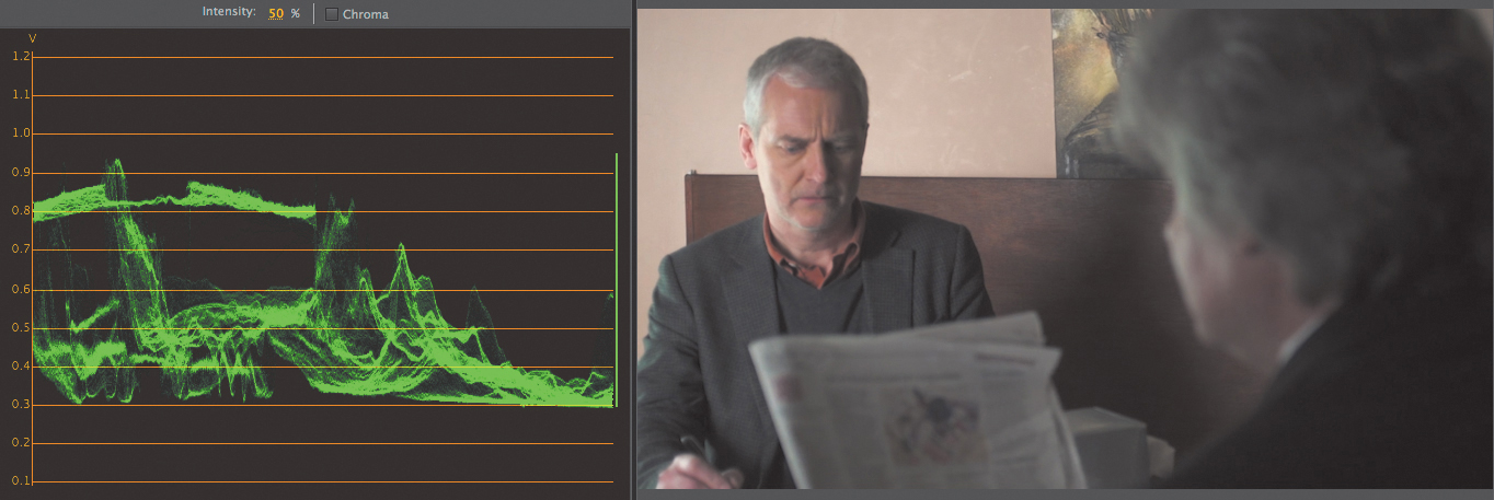
The YC Waveform measures luminance and chrominance left to right across the image. The brighter the pixel, the higher it is in the YC Waveform. The darker the pixel the lower it is in the YC Waveform. The YC Waveform ranges from .3 (it’s based on signal voltage), which represents black, through 1.0, which represents white. This gradient can be found at marker 6.13 in the CH 06 sequences called 1 Waveform. The YC Waveform looks like the illustration in Figure 6.13.
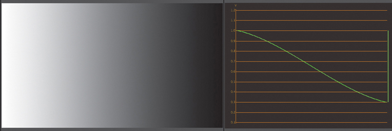
Figure 6.13 Note how the bright pixels on the left side correspond to the traces on the left side of the YC Waveform.
It’s generally accepted that the best use of this scope is to solely examine luminance. Turn off the Chroma setting.
![]() Tip
Tip
Once you identify something large or common across a waveform, such as a wall or a sky, it’s easier to compare other elements as being brighter or darker on the waveform.
The brighter or denser the clustering of data means that there are more pixels at a given luma value. Look at the sequence 1 Waveform marker 6.14 (Figure 6.14). On the left side of the screen most of the pixels represent a darker area (the wall), which shows a large clustering of energy on the YC Waveform.
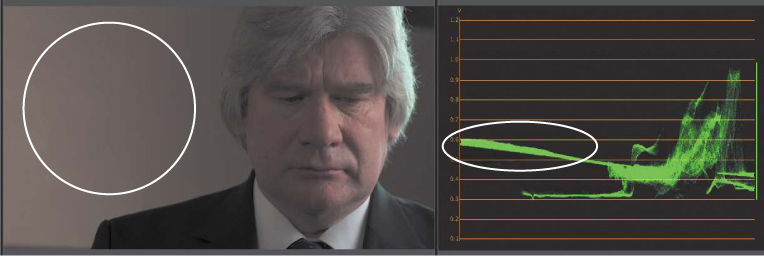
Figure 6.14 Also, notice the man’s suit (not circled), which is to the right of the circle and low on the scope.
A common way to examine the YC Waveform is by breaking it down mentally into three regions, the leftmost, rightmost, and center regions. This makes it easier to help identify “landmarks” in your image, particularly elements that are bright or dark and those that are easily identifiable.
![]() Tip
Tip
Know where neutral items are on the waveform scope (gray/white).
In Figure 6.15 (sequence 1 Waveform marker 6.15), by breaking down the image into sections, it’s easier to look at the center section and identify the wall (brightest part, lower on the scope) and the man’s jacket (darkest part, higher on the scope).

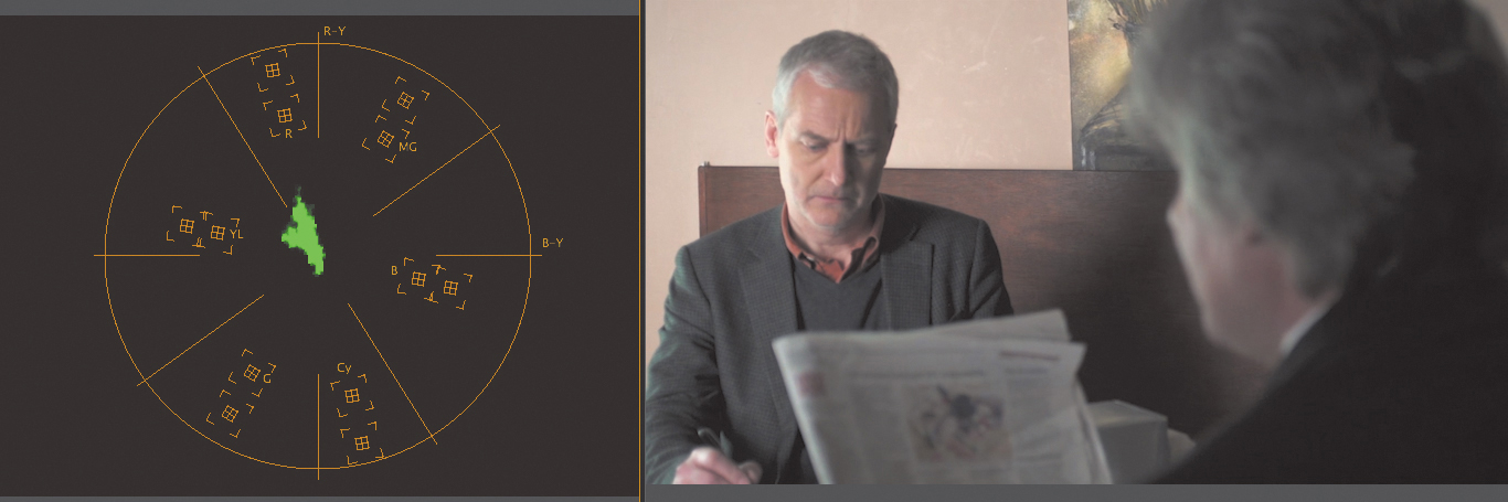
Vectorscope
The Vectorscope has no measure of left/right/up/down from an image. It merely shows the vectors of color that the entire image has. The more pixels of a similar color yield more energy to a given vector. This area is called a blob. Generally, the blob should have some coverage over the center (but may not be centered).
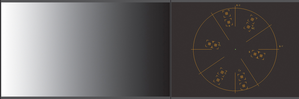
When you examine the gradient ramp in Figure 6.16, (sequence 2 Vectorscope marker 6.16), there is no information on the Vectorscope. This should be expected: There is no chroma (color) in the black to white gradient.
Let’s look at the color bars in Figure 6.17 (marker 6.17).
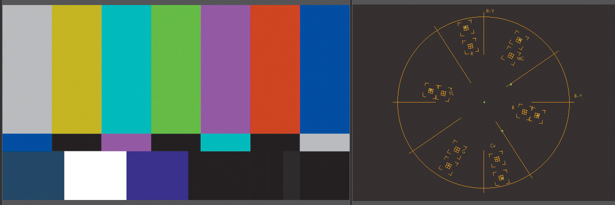
You now see a dot at each of the RGB and CMY targets. These are at the outer target, which is normally at 100%, the maximum color permitted, but the top of the scope is set at 75%. A general rule is to draw an imaginary shape connecting the dots and keep any color vectors inside of that shape to keep the video broadcast legal.
Now that you’ve seen a gradient and bars, let’s look at what happens when you point your camera at something more interesting—people. Look at the image in Figure 6.18 (marker 6.18). I’ve intentionally added saturation to help make the colors more visible on the Vectorscope.

Figure 6.18 Here you see a strong yellow vector (from the sugar packet), a strong red vector (man’s shirt), and the man’s flesh tones, which fall in between the yellow and red targets.
The sugar packet shows a strong yellow color near the yellow target, and the pixels near the red target represent the man’s shirt. But the flesh tones are more interesting. The line between yellow and red is unofficially called the flesh line by many colorists because flesh tones generally should fall on that line. Regardless of heritage or how much melanin is in people’s skin, nearly all faces (unless sunburnt) should fall along this line.
RGB Parade
The RGB Parade is very similar to the YC Waveform in that it’s a representation of the luminance, but for each channel. And in many ways it’s probably the most important scope because it shows both luma and chroma information. It ranges from 0% to 100% for each channel.
There are several major signposts that you should look for on an RGB Parade:
![]() Neutral items. If you can find a neutral item (sheet of paper or any gray or white object) on a waveform, you can find it in the RGB Parade, and it should be at the same level in each channel. If not, you have a color cast.
Neutral items. If you can find a neutral item (sheet of paper or any gray or white object) on a waveform, you can find it in the RGB Parade, and it should be at the same level in each channel. If not, you have a color cast.
In Figure 6.19, a neutral item (circled in cyan on the image and Parade) would be the road. Blue is a little higher compared to the other two scopes, which means there’s a blue color cast.
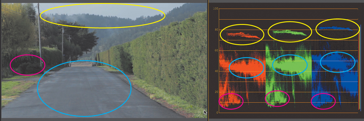
Figure 6.19 The yellow circles indicate the sky, the cyan circles indicate the road, and the magenta circles indicate the shadows of the trees.
![]() Bright/Darks. As images become very bright or very dark, the chroma disappears. If you point a camera at a light, it’s always white regardless of the color of the light. If you have an element in very dark shadows, you can’t identify the color at all. As portions of images approach having black or white values, the RGB elements at the brightest/darkest levels should have similar values.
Bright/Darks. As images become very bright or very dark, the chroma disappears. If you point a camera at a light, it’s always white regardless of the color of the light. If you have an element in very dark shadows, you can’t identify the color at all. As portions of images approach having black or white values, the RGB elements at the brightest/darkest levels should have similar values.
In Figure 6.19 from sequence 3 RGB Parade at marker 6.19 you see a magenta area, which is a shadow of the bushes; it should have a little extra green (because it’s in the shadow of trees). But notice that on the RGB Parade this region is the same on all three channels, showing that there’s no color cast in the shadows.
Also, note the sky (the yellow circles). The sky is a little higher in the Blue channel than the Red or Green channel, but not terribly so, which is part of the reason the sky looks grayish. If this was higher, toward 100 in all three channels, it would be “neutral” and therefore all the colors would be blown out—not something you’d want in the sky.
![]() Flesh tones. Looking across all three channels, flesh tones should descend from R to G to B (Figure 6.20). The way to think about this goes back to the color wheel. If three channels (RGB) are the same, the result is gray. To create a flesh tone (which is an orange) with just these three colors, you need to add red and subtract blue (adding yellow). Correspondingly, the Red channel would be the highest, the Blue channel would be the lowest, and the Green channel would be in between on the RGB Parade.
Flesh tones. Looking across all three channels, flesh tones should descend from R to G to B (Figure 6.20). The way to think about this goes back to the color wheel. If three channels (RGB) are the same, the result is gray. To create a flesh tone (which is an orange) with just these three colors, you need to add red and subtract blue (adding yellow). Correspondingly, the Red channel would be the highest, the Blue channel would be the lowest, and the Green channel would be in between on the RGB Parade.
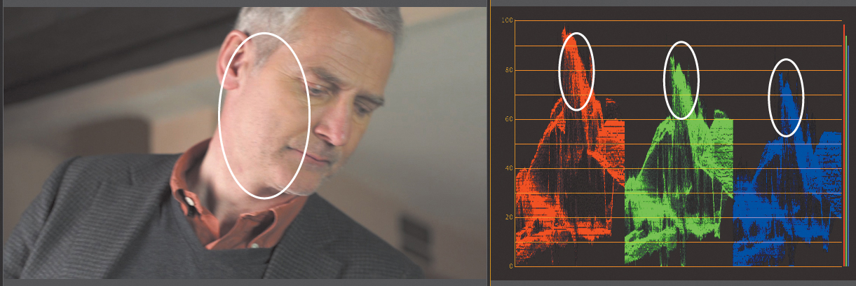
Figure 6.20 The white circle indicates the highlights of the man’s flesh tone. They descend properly but may be a little bright, especially in the Red channel.
The RGB Parade scope is probably the most important scope you’re not using well.
YCbCr Parade
Although the YCbCr Parade scope shows the true values of the video signal, few people find the feedback from the scope helpful for color correction. It shows what’s going on for the signal, but it’s difficult to read for qualitative information, such as a color cast.
![]() Tip
Tip
Press the accent (`) key to go full screen. This shortcut is super valuable when you’re looking at software scopes and when you’re evaluating images.
Combination view
The Combination views are valuable (Figure 6.21), but the problem is that they’re fairly small, even when they are blown up to full screen.
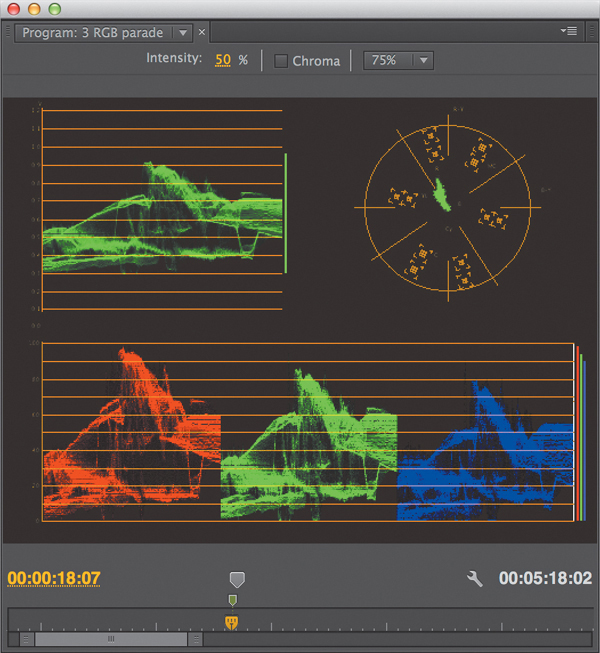
Figure 6.21 There are two combination views: one with the RGB Parade (shown) and one with the YCbCr Parade.
Because you’ll primarily use the YC Waveform, Vectorscope, and RGB Parade, in the next section I’ll talk about mapping them to the keyboard.
Customizing Your Setup
You can make some small tweaks to your setup to make color correction go faster. At the end of the day, what’s important is that you’re able to quickly evaluate and grade images.
Two adjustments should be made: one to your workspace and the other to the keyboard. As always, refine these adjustments beyond the default setups, because it’s important to test and explore what works best for your system.
Modify your workspace
Adobe provides a workspace preset for color correction (Figure 6.22), and it does a great job (especially if you hide the keyframe area of the effect view to give you more space for color correction).

Figure 6.22 The Adobe color correction workspace with scopes open on the Reference Monitor (bottom right), a clip selected on the Timeline, and the Three-Way Color Corrector visible in the Effect Controls panel (left side).
Depending on your system (you might have two screens or a wide screen), you may want to adjust the workspace for an easier workflow. I’d rather have the scopes in the reference in the center than at the bottom and the effects off to the left. This setup makes it a little faster and easier to adjust using the Three-Way Color Corrector and keep your eyes on the image.
Here’s how I built my workspace:
1. Choose Window> Workspace > Color Correction to start with the default Color Correction Workspace. If you’ve customized it, reset it to the original layout.
2. Click and hold the panel texture next to the reference monitor you want to merge with the top-center frame. Make sure you click the texture area to drag (Figure 6.23).
Figure 6.23 Clicking the texture is the key to dragging panels. The mouse cursor is right on the panel texture here.
3. Drag the reference to the center of the top frame. Be sure to hit the center of the trapezoidal overlay (Figure 6.24). By dragging the reference to the center of the trapezoid, it’ll merge with the Source Monitor (if you drag to one of the edges, it will subdivide the panel).
4. Click the Effect Controls on the left pane, and close the keyframe area (Figure 6.25). Although you might want to keyframe some color correction effects, it’s move valuable to close the panel to have more workspace real estate.
Figure 6.25 No clip is selected, which is why the panel is empty. The cursor is on the switch to remove the keyframe area.
5. Save this workspace by choosing Windows > Workspace > New Workspace. By doing so, you’ll be able to recall it quickly in the future.
This workspace is built into the accompanying project for this chapter. It’s called Adjusted Color Correction and is visible in Figure 6.26.

Adapt your keyboard
To quickly toggle between any of the scopes, it’s best to add keyboard shortcuts for each of the scopes. In addition, you can add a shortcut to toggle an effect on and off.
My number one rule for shortcuts is that that any mapping on my keyboard must make sense. I map the scopes to numbers 1, 2, and 3 because I don’t need or use multicam when color correcting. If you do use multicam often, save a separate keyboard shortcut just for color correction.
To remap the keyboard, follow these steps.
1. On a Mac choose Premiere Pro > Keyboard Shortcuts. On Windows choose Edit > Keyboard shortcuts.
You need to map the Waveform, Vectorscope, RGB Parade, and Composite Video of the Program Monitor. The easiest way to do this is to type part of each word into the search box at the top. When the command appears, double-click the text box to the right.
2. Map Waveform to 1, Vectorscope to 2, the RGB Parade to 3, and Composite Video to 4 to quickly toggle between the three.
Make sure you chose the Program Monitor panel, not the Source Monitor panel.
3. Optional: Map “Effect” Enabled to any key you like. I chose the 1 key (which overlaps the Waveform monitor), which is OK because it’s a different window.
Now that your setup is customized and accurate, let’s explore goals and process.
![]() Tip
Tip
Frequently turn the effect on and off while color correcting. Your eyes adapt to the image in less than two minutes.
Process: What to Do First?
Process involves which controls to touch first and which shot to choose first. Ideally, you should start with a medium shot or a medium close-up, preferably one that is well shot to begin with and needs little change.
Recall the original goals of color correction: It’s the first two that are important here: Establish the appropriate tonal range and remove any color casts. Using your chosen shot, work backwards and forwards in a scene, correcting other shots to match it. This sets up the third rule: Match shots for shot-to-shot consistency.
Optionally, apply a look to the scene, which is the fourth rule (and the least important when you’re rushing): Create a look (if appropriate).
![]() Lighting. Your lights need to be at a specific color temperature of 6500 degrees Kelvin. These lights are commonly called D65 lights. Additionally, no exterior lights should be used, particularly sunlight. Blackout curtains can be used as well.
Lighting. Your lights need to be at a specific color temperature of 6500 degrees Kelvin. These lights are commonly called D65 lights. Additionally, no exterior lights should be used, particularly sunlight. Blackout curtains can be used as well.
![]() Paint. Gray walls are best, especially behind your editorial system. Mine is at 18% gray.
Paint. Gray walls are best, especially behind your editorial system. Mine is at 18% gray.
![]() Broadcast monitor. Invest in a monitor that is explicitly meant for color correction. Companies like Flanders Scientific or HP’s Dreamcolor screens work well.
Broadcast monitor. Invest in a monitor that is explicitly meant for color correction. Companies like Flanders Scientific or HP’s Dreamcolor screens work well.
![]() Hardware connections. DVI doesn’t cut it for color correction. Hardware output from certain companies, such as AJA, Black Magic Designs, Matrox, or Bluefish, made specifically for Adobe Premiere Pro are needed.
Hardware connections. DVI doesn’t cut it for color correction. Hardware output from certain companies, such as AJA, Black Magic Designs, Matrox, or Bluefish, made specifically for Adobe Premiere Pro are needed.
![]() Hardware scopes. Although the scopes in Adobe Premiere Pro work, they can’t be truly trusted because they don’t show the entire raster (every pixel). External scopes are preferred.
Hardware scopes. Although the scopes in Adobe Premiere Pro work, they can’t be truly trusted because they don’t show the entire raster (every pixel). External scopes are preferred.
Fundamental Color Correction Effects
Approximately 20 different effects are in the Color Correction section of the Effect panel. Although each one has some value, three are the most important:
![]() Three-Way Color Corrector. This effect has become the workhorse of color correcting footage. It offers three adjustments for luma and three for chroma, each divided into the ranges of Shadows, Midtones, and Highlights. It’s the major method of color correction because it easily maps to control surfaces.
Three-Way Color Corrector. This effect has become the workhorse of color correcting footage. It offers three adjustments for luma and three for chroma, each divided into the ranges of Shadows, Midtones, and Highlights. It’s the major method of color correction because it easily maps to control surfaces.
![]() RGB Curves. Some colorists prefer curves because they allow for a higher degree of adjustment than the three ranges (Shadows, Midtones, and Highlights). Using RGB Curves is neither worse nor better but rather a different method based on different mathematics.
RGB Curves. Some colorists prefer curves because they allow for a higher degree of adjustment than the three ranges (Shadows, Midtones, and Highlights). Using RGB Curves is neither worse nor better but rather a different method based on different mathematics.
![]() Video Limiter. Using this effect keeps your final work legal for output, which is crucial, even if it’s never meant for broadcast.
Video Limiter. Using this effect keeps your final work legal for output, which is crucial, even if it’s never meant for broadcast.
Could you use other effects in the panel? Yes, and they do some great things; for example, Leave Color and Tint are stylistic effects. But for the ease and speed of color correction, the three effects in the preceding list will be the key to achieving the goals of color correction.
Another very valuable effect that is new to the Adobe Premiere Pro Creative Cloud release is the Lumetri effect. This effect harnesses the engine of Adobe SpeedGrade in Adobe Premiere Pro CC by allowing you to apply Looks (stylizing the footage) from Adobe SpeedGrade directly into Adobe Premiere Pro.
Three-Way Color Corrector
The Three-Way Color Corrector is considered the workhorse effect in color correction because of its ability to quickly balance images.
It can be used in one of two ways:
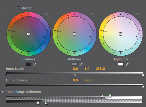
![]() Primary correction. Primary correction uses the three color wheels and the Input and Output levels (Figure 6.27) to adjust the overall image.
Primary correction. Primary correction uses the three color wheels and the Input and Output levels (Figure 6.27) to adjust the overall image.
![]() Secondary corrections. When you activate this section of the Three-Way Color Corrector, you limit your adjustments to just part of the image.
Secondary corrections. When you activate this section of the Three-Way Color Corrector, you limit your adjustments to just part of the image.
Secondary controls can be found under the category called Secondary Color Correction. The controls are a keyer, which uses the same concept as greenscreen effects. It limits the Three-Way Color Corrector to adjusting only what falls on the inside or the outside of the keyer. When activated, the entire effect becomes a secondary effect; it’s generally used after primary correction has been done (with a Three-Way Color Corrector or RGB Curves). In Figure 6.28, a key has been done to adjust the actor’s face with the mask left on.

Figure 6.28 Secondary controls are on the left, the mask is top right, and the bottom right is the final image. This is from sequence 4 Effect overview marker 6.28.
Three ranges
The Three-Way Color Corrector’s “three ways” refers to the different ranges that the effect works on: commonly known as the Shadows, the Midtones, and the Highlights.
A check box on the Tonal Range Definition (when opened, Figure 6.29) helps you visualize where each of the three wheels work. Select the Show Tonal Range check box to see the three ranges.
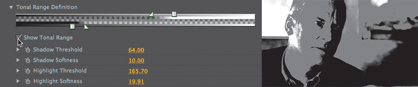
Figure 6.29 With Show Tonal Range selected, it’s easy to see where each of the three wheels will work its magic.
A well-exposed shot will have some exposure in all three ranges.
![]() Tip
Tip
Many colorists prefer just a little more overlap in the ranges that the default Three-Way Color Corrector provides. Click and drag the triangles to extend their range for a bit more overlap.
Adjusting luma
Typically, you should use three controls on the Input levels (Figure 6.30): From left to right they are the Black point, the Gray (gamma) point, and the White point.
Adjusting the Black point to the right pulls more darker pixels toward black. Adjusting the White point to the left pulls more lighter pixels toward white. And adjusting the Gray point to the left makes an image darker, whereas moving it to the right makes the image brighter.
The general order of operations should be to adjust the Black point, White point, and then Gamma.
Adjusting chroma
To add or remove color, click on one of the three color wheels to add a color you’d like or opposite of a color to reduce that color. For example, to reduce green, you’d click opposite of green and into the magentas, as in Figure 6.31.
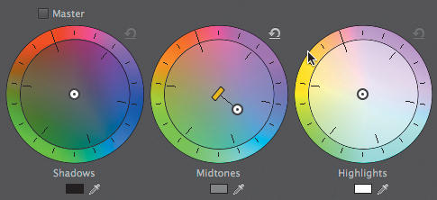
There are three white balance eyedroppers, one at the bottom of each of the three color wheels. Each eyedropper helps to quickly neutralize a color cast in the Shadows, Midtones, or Highlights. The idea is that you use the eyedropper on a part of the image that is neutral (such as a white shirt), and it neutralizes a color cast in that luminance region by adding in the opposite color.
On the rare occasions when you need to magnify the intensity of an adjustment, click and drag on the thin perpendicular line to drag the slider bar (Figure 6.32).

Saturation
Under the Saturation category in the Three-Way Color Corrector, you have a choice between the Master Saturation and adjusting the saturation of any of the three ranges. Changes made with the Shadow, Midtone, and Highlight Saturations are often subtle but very powerful, because they can remove (or add) saturation in the corresponding luminance area (the most common is to reduce saturation in shadows). In Figure 6.33, from sequence 4 Effect Overview marker 6.33, I’ve removed the Saturations for everything but the highlights, leaving the yellow packet to “pop” and be more visible onscreen.
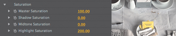
Figure 6.33 Less chroma occurs in shadows and highlights. Being able to reduce these saturation areas selectively is a powerful ability in Adobe Premiere Pro, making it easier to minimize color damage.
![]() Tip
Tip
When it’s a struggle to fix shadows, it’s often a problem with the shadow saturations. Usually, that means the Shadow Saturation control needs to be lowered.
RGB Curves
Adobe Photoshop users often prefer to use RGB Curves. Each curve starts with two control points: one at the leftmost bottom, representing the darkest part of the channel, and another point at the rightmost top, the brightest part of the channel.
Dragging them upwards brightens that point; dragging them downwards darkens that point. Just click on the line to add a point, and drag the point from the curve area to remove the point.
The advantage of using RGB Curves lies in being able to manipulate each channel directly versus having to “balance” each range. Many use this capability to build a subtle look, such as in Figure 6.34, where I’ve built a high-contrast S curve on the Master Curve and added a little extra blue into the lower portion (shadows) of the Blue Curve.
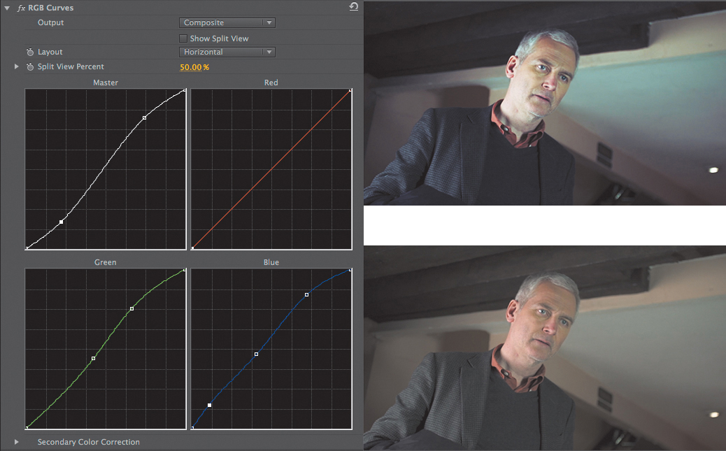
Figure 6.34 The RGB Curves controls permit adding multiple points; generally, fewer is better. The original image is on the bottom. Notice the higher contrast and extra blue in the top image.
The RGB Curves controls allow for adjustments of a Secondary Color Correction but have no saturation controls. If you want saturation controls, you’d have to add another effect (such as the Three-Way Color Corrector) either before or, more likely, after the Curves.
Split View
The Split View isn’t an effect; it’s an option on the Three-Way Color Corrector and the RGB Curves that permits a before and after comparison of the effect.
It’s important to be able to compare your corrections with the original image. When you’re color correcting, the 90 second rule takes effect: After 90 seconds, your brain begins to compensate for color problems and forgets the original image.
The Split View (Figure 6.35) allows for a quick comparison. Between using Split View and toggling the effect on and off, your eyes will “remember” the original image.
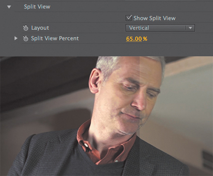
Figure 6.35 This image shows the Split View controls and how they reveal the original part of the image (right) compared to the corrected image (left).
Video Limiter
The Video Limiter limits the video levels. The defaults are pretty good (although you should check signal on external scopes). The Limiter can be used on a single clip or on multiple clips via adjustment layers or nesting.
Later in this chapter, I mention a better limiter.
Common Primary Corrections
Now that you’ve been introduced to the Three-Way Color Corrector, the RGB Curves, and the Video Limiter effects, let’s put them to practical use. In this section, you can follow along to meet the first two goals of color correction: to maximize the tonal range and remove any color casts.
Your system may not necessarily match the exact look or output of what you see in this book (or what was done in the project). The sidebar “Real-world Setup” addresses some of these issues.
Most important is that if the image doesn’t look good to your eye on a calibrated monitor, it doesn’t work!
Use the sequence 5 Common Primary Corrections to follow along with the examples in this section.
Using the Three-Way Color Corrector
The steps for using the Three-Way Color Corrector are always done in the same order: fix the luminance and then the chrominance. The process looks like this.
1. Fix the luma:
![]() Check the Input Black/White levels against the Waveform scope.
Check the Input Black/White levels against the Waveform scope.
![]() Adjust the Midpoint/Gamma slider until the image “feels” correctly exposed. You may have to go back and adjust the Black/White levels after this step.
Adjust the Midpoint/Gamma slider until the image “feels” correctly exposed. You may have to go back and adjust the Black/White levels after this step.
![]() Adjust the midtones by clicking and dragging from the center of the Midtones wheel in the opposite direction of any perceived color cast in the Vectorscope.
Adjust the midtones by clicking and dragging from the center of the Midtones wheel in the opposite direction of any perceived color cast in the Vectorscope.
![]() Adjust the Highlights and Shadows color wheels while looking at the RGB Parade.
Adjust the Highlights and Shadows color wheels while looking at the RGB Parade.
![]() Notes
Notes
A completely blown out or crushed shot will be very difficult and sometimes impossible to fix. Monitor your images on set to be safe.
Fixing luma issues with the Three-Way Color Corrector
Exposure problems are often a by-product of natural lighting. For example, a cloud might have moved and hid the sun or the camera was left in auto-iris mode and through some camera compensation changed the exposure.
The shot at marker 6.36 (Figure 6.36) in sequence 5 Common Primary Correction shows a shot that is fairly dark. Let’s assume that this result wasn’t the intention of the DP on set.
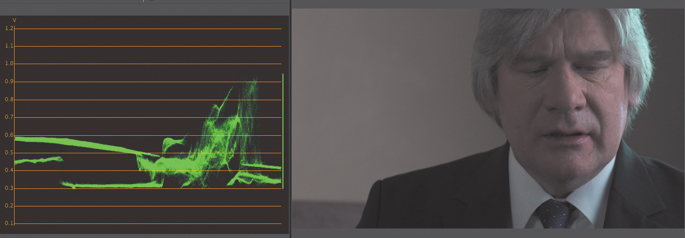
Reading the Waveform shows shadows at around 0.3 and highlights at 0.9, and most of the shot is below 0.6, meaning that the bulk of the exposure will be dark.
Additionally, although there is a bright section of the man’s hair (right side), most likely, brightest areas shouldn’t be set all the way to white but rather about 5% below that. Here are the steps you should take to fix luma issues.
1. Shadows first. Because the shadows already fairly dark, the Input Black level probably doesn’t need to be changed.
2. Highlights next. Adjusting the Input White level to the left brightens the highlights. Only a little adjustment is necessary (236 is what I ended up with), because you don’t want the brightest part to be as bright as pointing at a light source.
![]() Tip
Tip
A completely blown out shot may be impossible to fix. But sometimes there is data in the blown out area. Reducing the Output White level slider may allow for the recovery of this information.
3. Midtones/Gammas last. Adjusting the Midtone slider to 1.3 produces a brighter picture, but it now feels a little washed out. Adjusting the Black level to 5 helps restore some of the contrast.
Feel free to try the preceding technique on the Timeline with the blown out version of this shot at the marker named Blown out.
![]() Tip
Tip
When the “blob” in the Vectorscope is weighted heavily away from the center (nearly a single vector), it’s usually a sign that you may need to adjust the Saturation controls as well.
Fixing chroma issues with the Three-Way Color Corrector
Chroma issues may be naturally caused or may be operator error (forgetting to white balance the shot). The order of repair is the reverse of luma: You work the midtones first and the highlights and shadows last.
At marker 6.37 is a red shot, as shown in Figure 6.37.

Let’s look through the scopes. The damage in the Red channel is significant, and looking at the Vectorscope you’ll see such strong damage that it may be a struggle to fix the shot.
The exposure shown in the Waveform monitor is close enough to be OK. The problem with this image is the chroma. Normally, you’d first adjust the luma, but because the image already has good exposure, let’s skip it and just deal with the chroma issue.
Looking at the Vectorscope, you need to move opposite of the color cast. Because this image has some neutral items (the wall, the newspaper, the man’s hair) you can cheat and click those areas.
Move the Midtones wheel toward cyan. Optionally, you can click in the eyedropper and sample the wall (it’s a neutral item based on other shots). Then adjust the magnification slider. These adjustments help quite a bit, but the blob has moved about half the distance. (Open the Midtones; the number values I ended up with were Magnitude 41, Gain 100, Angle 47.) That’s not enough to repair the image. Let’s switch to the RGB Parade and look at the highlight areas and shadows.
The highlights show too much red and green (the man’s hair on the right side); some blue/cyan needs to be added to compensate. You can use the eyedropper but not in the brightest spot. Better to use the eyedropper in a spot that’s bright but not fully white. (Open the Highlights; the number values I ended up with were Magnitude 46, Gain 71, Angle 29.) But there’s still quite a cast in the image.
The Shadows remain, and his jacket (the darkest element on all three scopes) shows too much red. Using the same procedure you did earlier, try to get all three channels closer (like the highlights) at this point, and try to balance the jacket, the neutral item. (Open the Shadows; the number values I ended up with were Magnitude 36, Gain 20, Angle 47.) The image looks much better, but it still has a strong color.
Reducing saturation is the key. Recall an earlier tip in this chapter: When you’re struggling with chroma, it’s nearly always the shadows that cause problems. Reducing the Shadow Saturation to 50 makes the shot look almost normal. You might also try adjusting the Master Saturation.
The finished effect is on the shot in the sequence that matches Figure 6.38.

Practice with the Three-Way Color Corrector
Let’s look at another example of the Three-Way Color Corrector in use. But this time, you’ll work from start to finish performing both luma and chroma corrections on the same shot so you can see again the order in which you should use the controls.
Look at the image in Figure 6.39 at marker 6.39; let’s start with luma and then fix the chroma.
1. Check the Input Black/White levels against the Waveform scope.
In this step I adjusted the Input Black level by sliding it toward the right a little. I prefer sliding the numbers rather than using the actual arrow. I wanted a slightly more crushed black in the darker areas, so I made more of the image fall toward black. I then adjusted the Input White level.
2. Adjust the Midpoint/Gamma slider until the image “feels” correctly exposed.
I felt the image was a little too dark (keep in mind the DP or Directors might have wanted that!), so I dragged the middle slider/Gamma to the right, brightening up the image. I set the Input Black level to 15.2 and the Input White level to 235.2. The Gamma slider ended up at 1.4.
By turning on Split View as a comparison (Figure 6.40), you can see that the shot is exposed slightly brighter with greater contrast.

Figure 6.40 Using the Split view, you can see the differences between the luma changes on the left and the original image on the right.
Now let’s look at chroma.
3. Start with the midtones and focus on the Vectorscope.
The Vectorscope shows some yellow and red energy and quite a bit of energy between the two spots; yellow + red = brown. And when your eyes look at the image (Figure 6.41), it has a warm (brown) feel.
To compensate, I added just a little bit of blue in the Midtones color wheel. Then I clicked and dragged just a little toward blue (cooling down the shot.)
4. Now, let’s focus on the Shadows and Highlights chroma wheel while looking at the RGB Parade (Figure 6.42).
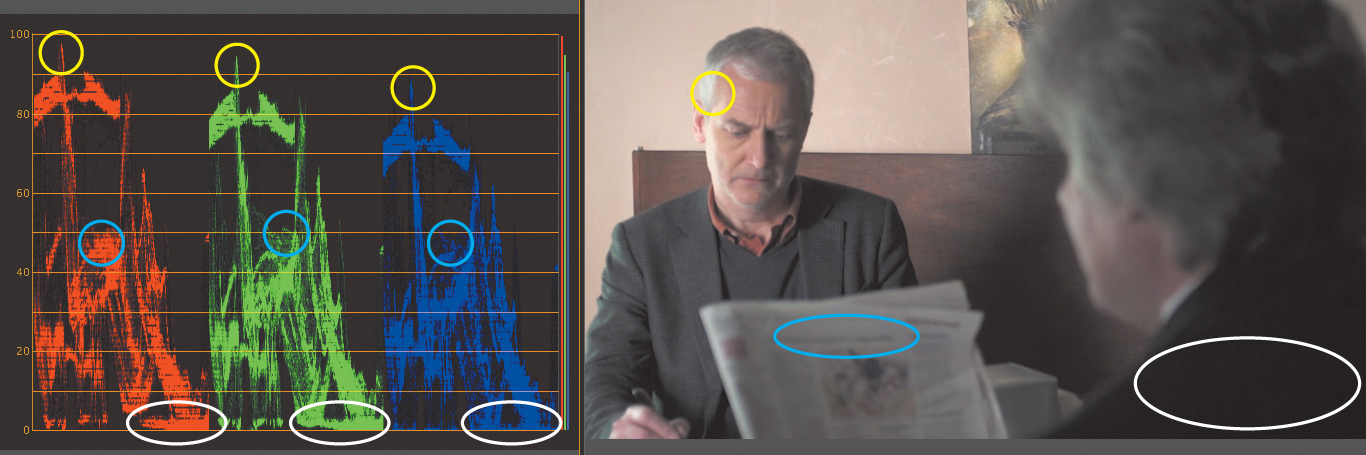
Figure 6.42 The RGB Parade is the key to spotting color casts. Each of the three circles helps identify a bright/shadow and neutral feature of the image.
Generally, any chroma changes in the highlight and shadows are slight, very subtle changes. Looking at the highlights in the image, the brightest spot is the blown out spot on the actor’s face.
As the traces approach white (100), there should generally be a loss of color, yet here there is more red than green and blue. I added a little blue in the color wheel to balance that out while being careful not to neutralize the wall.
The shadow areas show no blue (there is almost no blue at the bottom of the RGB Parade), so I added just a little blue in the Shadows color wheel to balance the blue on the RGB Parade to be similar to the red and green shadow areas.
Both of the adjustments I made are very subtle, but by toggling on and off the entire effect (and viewing full screen), you can focus your eyes on the bright and dark areas to see if you can perceive the chroma change.
RGB Curves
RGB Curves is exactly the opposite of working with the Three-Way Color Corrector. With this effect, you work with the chroma first and then luma.
RGB Curves isn’t a better or worse filter than the Three-Way Color Corrector; it’s just different. Because it uses different math (see the sidebar “How RGB Processing Differs”), you may have an easier or harder time fixing color problems.
![]() Tip
Tip
One big difference between the Three-Way Color Corrector and RGB Curves is that the Three-Way Color Corrector can be keyframed via its numerical values.
Order of adjustments
When you’re using the RGB Curves filter, you’ll perform three steps rather than four.
1. Adjust the brightest spots of all three channels to make them similar (as appropriate) while watching the RGB Parade. Repeat this step for the darkest areas.
2. Look at the Vectorscope; add or remove points in the middle of the curves to properly center the blob.
3. If needed, adjust the Master curve to change the luma. Most likely, you’ll use a point in the midtones to lighten or darken the image.
Walkthrough of curves
Let’s walk through the color correcting steps using RGB Curves the same way you did for the Three-Way Color Corrector.
1. Using the same shot, at marker 6.44, I applied the RGB Curves. Then I checked the top of the RGB Parade and saw that the brightest spot was darker in the Blue channel (about 85%).
I added a node on the blue RGB curve that’s approximately 85% of the way up the slope and pulled it upwards to help the top of the Blue channel. Next, I added a second node at the top of the Red channel to pull it downwards (Figure 6.43) to help the Red channel match.
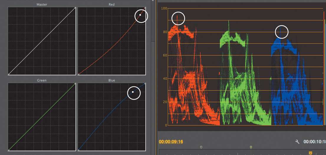
Figure 6.43 When you’ve adjusted these curves, the RGB Parade top should be even, not like this screen shot.
To adjust the shadows, I then added a node on the bottom of the Blue curve to pull up the Blue channel just a little. The idea is to get some similarity in all three channels (the absence of light/shadow means that all three channels should be similar).
Be aware that the image may not look great. In this case, the image has a cyan/blue cast to it. What was the problem? The midtones.
2. Switch to the Vectorscope.
Because there is too much cyan/blue, I needed to add red/yellow. And because the problem was in the midtones, I added a point to the Red curve in the middle, pulling it up and adding red. Similarly, I needed to introduce yellow, so I set a midtone dot in the Blue channel and lowered it, adding yellow (Figure 6.44 on the next page).

Figure 6.44 With the extra points mid-curve of red and blue, the blob on the Vectorscope looks better (and so does the image).
3. Now all that was left was to check the exposure on the Waveform and possibly brighten or darken the image here.
I added a dot in the middle of the Master curve and dragged it upwards to lighten the image. In fact, the Master curve behaves similarly to the way a Gamma correction does in the Three-Way Color Corrector.
You can see the final image in the sequence 5 Common Primary Corrections at marker 6.44.
Fixing a chroma problem with curves
Let’s look at the same shot I adjusted the chroma on in the “Practice with the Three-Way Color Corrector” section at marker 6.45. You can see that I’ve already applied the RGB Curves effect to it. The finished curves are in Figure 6.45.

1. Starting with the RGB Parade highlights, the blue highlights were too low and the red highlights were too high. Adjusting the tops of the Blue (1) and Red curves (2) repaired those problems.
2. Next, I repaired the shadows. In the Shadows of the RGB Parade there was too much red, so it needed to be reduced in the Red curve (3).
3. Now to the midtones. The newspaper is a neutral item that exists in the midtones; when I found it on the RGB Parade, it showed too much red. Adding a new point at the halfway mark of the Red curve (4) and reducing it began to repair the problem. At one point, the shot turned green, so I knew I went too far. The Blue channel needed a little assistance, because in the newspaper there wasn’t enough blue on the RGB Parade where the newspaper information was, so I lifted the midpoint of the Blue curve (5).
4. I switched to the Vectorscope and saw that there was still quite a red cast. Using just my eyes (and glancing back at the RGB Parade) I saw that it was in the brighter portion of the midtones. So, I added another red node (6) with a second node to limit its effect (7), reducing the reds in the top of the midtones.
5. After checking the Luminance Waveform (and the image), I added some points to produce some slight brightening (8) of the midtones along with restoring some of the black (9) and white points (10) to produce a slightly higher contrast to the image.
![]() Tip
Tip
By adding a point on a curve near where you want to adjust, you minimize how much influence any node has on a curve.
The finished version of the shot is on the Timeline. Feel free to turn off the RGB Curves, add your own, and see which method helps you correct the cast faster—the Three-Way Color Corrector or the RGB Curves.
Common Secondary Corrections
Do you have a bad sky in your image or a color that is too harsh? What you need is some form of secondary color correction to clean up the image.
A primary color correction affects the entire shot. But a secondary color correction affects only part of the shot, which means the results come from adding an additional second effect (or third, fourth, etc.).
Both the Three-Way Color Corrector and the RGB Curves have a section labeled Secondary Color Correction. In that section are chroma keyer-based corrections. You build a key in the effect to limit what part of the shot the effect works on.
Colorists will tell you that there is also a shape-based correction that works on part of the image based on a shape, such as for vignettes or simulating a grad filter. Although Adobe Premiere Pro doesn’t have this feature built in, I’ll describe a method of creating a shape-based correction.
![]() Tip
Tip
When building key-based secondaries, many colorists start by setting Saturation to 0. As a result, when you start selecting parts of the image (building your key), you’ll immediately see what part of the image is affected.
Key-based Corrections
The Secondary Color Correction section in the Three-Way Color Corrector and the RGB Curves works the same. The corrections allow you to select a “key color,” refining that key and limiting the effect to just the sections shown by that key (Figure 6.46).
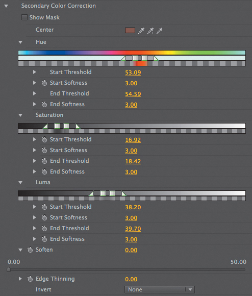
Figure 6.46 The Secondary Color Correction section, along with the Hue, Saturation, and Luma areas, help you “see” what part of an image has been keyed.
The key is based on three parameters: Hue, Saturation, and Luma (HSL).
The struggle you’ll have when using this feature will always be the same—getting a good key. The best technique is to select a color with the eyedropper and then watch to see what parts of the H, S, and L react.
Eyedropper color selection
When you’re choosing a color with the eyedropper, try to mentally select an average color, not a dark or light point, but a pixel that most represents the area you want to key.
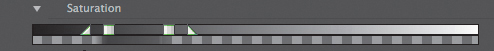
Make sure the Hue, Saturation, and Luma areas are open to help identify what the keyer selects. Each section has an area that represents the selection, such as the Saturation range shown in Figure 6.47. The two inner squares are the selected region (Start/End Threshold). The two outer triangles (Start/End softens) help the selection gradually include similar nearby regions.
![]() Tip
Tip
Holding down the Command (Ctrl) key while using an eyedropper gives you a 5x5 pixel average, which is often much better than the default of single pixels.
Select Show Mask
After your initial click on the part of the image you want selected (such as a sky or flesh tone) with the eyedropper, select the Show Mask check box. You’ll see a “mask,” a black and white representation, of where the Three-Way Color Correct (or RGB Curves) will be limited to. The effect will occur in the white areas, and the black areas will be ignored; gray areas will get a partial amount of the effect.
Use the plus and minus eyedroppers to add or remove from the key. For flesh tones, it’s ideal to have a solid selection in the areas of the face (white) and everything else unselected (black).
Refining the selection
To improve the selection, you can manually adjust the selected region (Start/End Threshold) to quickly provide you with feedback when Show Mask is selected.
Here are some additional suggestions to refine your selection:
![]() Luma may require adjustment to either or both the Start/End Threshold. The trick is to look at the image and decide if you’re missing dark regions or bright regions.
Luma may require adjustment to either or both the Start/End Threshold. The trick is to look at the image and decide if you’re missing dark regions or bright regions.
![]() Saturation usually needs the Start Threshold adjusted (the areas with less saturation).
Saturation usually needs the Start Threshold adjusted (the areas with less saturation).
![]() Hue is probably the least likely adjustment you’ll need to make.
Hue is probably the least likely adjustment you’ll need to make.
![]() If moving an adjustment made no change, return the adjustment to where it started (or click Undo).
If moving an adjustment made no change, return the adjustment to where it started (or click Undo).
Always soften, maybe thin
When you’re finished with the correction, always use the Soften control to give the generated mask just a slight blur (a value between 1–5) to help the affected area blend in with the rest of the image.
Adjusting the Thin controls shrinks or expands the mask to help make the adjusted selection a little larger or smaller if needed.
Adjusting a Flesh Tone
Are you happy with the exposure of the image but feel like the flesh tones need a little pop? This is a perfect use for the Secondary section of the Three-Way Color Corrector (or RGB Curves). You can select just those color values.
Because face tones are a mixture of red plus yellow (they lack blue), it may be a little tricky to get a good selection if other elements in the image use similar colors. Rarely are walls painted white. Often, they have a little color in them, and a beige tone is all too common, which can be similar to face tones.
Combining the techniques in the section “Shape-based Corrections,” later in this chapter can help you control and limit the secondary to just a region, which is perfect for dealing with a similar unwanted color (e.g., a beige wall would be unwanted when using a secondary on a flesh tone).
In sequence 6 Secondaries (Figure 6.48), on the first shot you can see the results of the effect. It’s in Split View to help you see it in print.
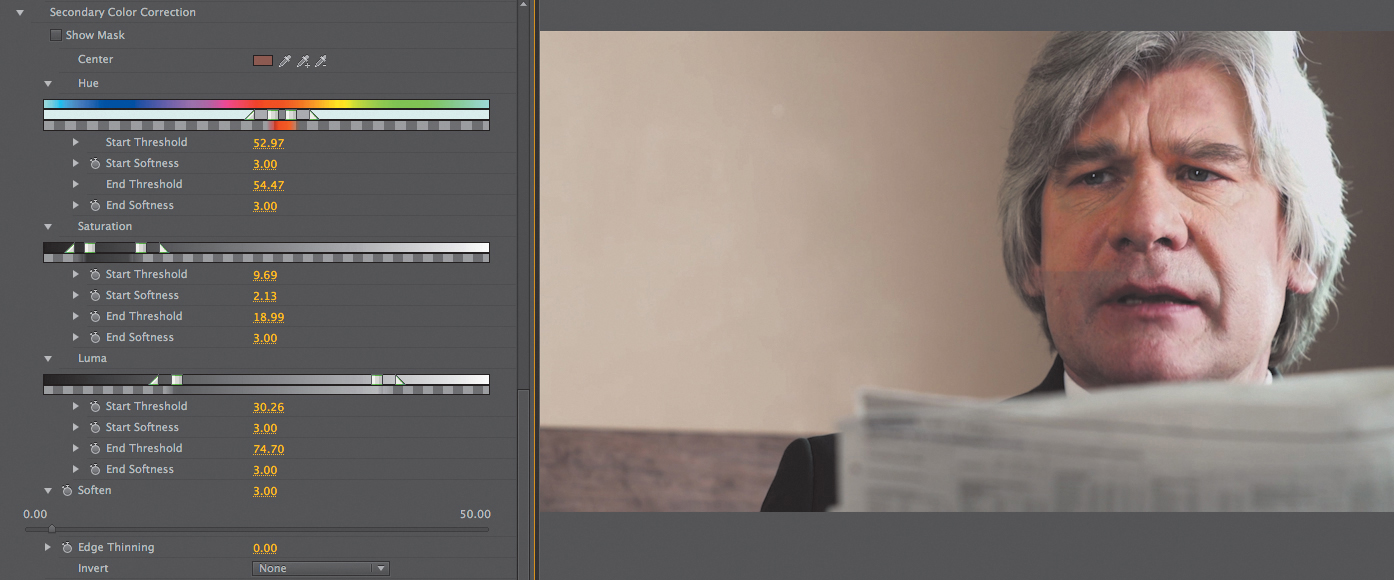
Figure 6.48 Here are the results for the second Three-Way Color Corrector (adjusting only the face) on the clip in Split View to compare with the original shot. Notice that the flesh tones look more saturated and a little brighter.
A primary correction was built with the first Three-Way Color Corrector and a second Three-Way Color Corrector was added to adjust just the flesh tones. Let’s work through the steps.
1. Make the initial selection. I made the initial selection by clicking on the left portion of the man’s cheek (Figure 6.48) and then selected Show Mask. The mask was missing the darker and brighter parts of his face, so I adjusted the Thresholds rather than use the eyedroppers to add more of a selection.
2. Adjust Luma Thresholds. Because I wanted to include the darker and brighter parts of his face, I adjusted the Luma Start and End Thresholds to increase the matte selection. Moving the Luma Start Threshold to the left included more of the left side (darker parts) of the face. Moving the Luma End Threshold included a little more of the right side (brighter parts) of the face.
3. Adjust Saturation Thresholds. The right side of his face was still somewhat unselected, because it’s the brightest part of the face. And, as you recall from the “RGB Parade” section, as brightness increases, usually less chroma (saturation) exists. Decreasing the Saturation End Threshold helped include the bright areas but also included the bench. In this image it was acceptable to allow the bench selection in order to adjust the face because the adjustment is subtle.
4. Always Soften. As always, soften the selection (mask) just a little (in this case, set Soften to 3.0).
Deselect Show Mask and make color adjustments to just the flesh tones.
In this example, I added some saturation (Master Saturation at 140) and slightly lifted the Midtone Luma/Gamma to 1.1.
Adjusting a Sky
It’s fairly common to need to color correct just the sky in an image, because when exposure is done right in-camera to capture people, the exposure setting can often leave the sky blown out. Even when the exposure is handled well in-camera, some skies just lack color. Not every production can wait for the perfect blue sky!
At marker 6.49 (Figure 6.49) you can see the finished version of a sky correction in Split View, comparing the sky in before and after images. The original sky (on the right) is very bright and has nearly no chroma at all, leaving it feeling very stark.
A primary correction was built with the first Three-Way Color Corrector and a second Three-Way Color Corrector was added to adjust just the sky. Let’s walk through this example.
1. Make the initial selection. Skies are usually the brightest element in an image, and in this case, have little information other than being very bright. There was almost no chroma. Making a selection with the eyedropper would have been a mistake; it would have chosen a hue, and with the sky so blown out, I wasn’t sure it would have selected the color blue because there was little to no blue in the sky. So, in this case, instead of using the eyedropper, I wanted the selection to include only the “bright” areas (luma)—but also make sure I kept the hues and all of the saturations—leaving just a question of selecting “bright” (pixels of high luma). Therefore, rather than using the eyedropper, I adjusted just the Luma controls section directly. I skipped making the initial selection and selected Show Mask to see the mask (which was completely white; everything was selected).
2. Adjust Luma Thresholds. The entire luma range was selected, from the dark pixels (the Luma Start Threshold) to the bright pixels (the Luma End Threshold). I wanted to select all of the bright pixels, not the darker areas of the image. I then dragged the Luma Start Threshold to the right (to ignore all the darker pixels) until only the sky was selected. I added some start softness (by moving the triangle) to make the selection more graduated.
3. Adjust Saturation Thresholds. There was no saturation of color in the sky, so I needed to leave the saturation adjustments alone, because adjusting them would only lessen what was selected. If there was some blue in the sky and white clouds, using the Saturation Thresholds could help because blue clouds have some saturation of color, whereas white clouds do not.
4. Soften. As always, I softened the image just a little, using a setting of 2.0.
With a decent selection made, I needed to adjust the second Three-Way Color Corrector to make the sky look like a sky. Because the sky is all highlights, I adjusted the Highlights color wheel and gave the sky a strong blue adjustment, which helped but wasn’t convincing.
Looking at the RGB Parade explains why. The red and green “bright” areas are just too bright. Lowering the Output White level reduced the brightest part of the image, but because I had added blue on the Highlights wheel, the result is a good, natural-looking sky.
The finished version is on your Timeline at marker 6.49 for you to examine.
Leaving a Single Color
It’s a very striking and stylistic choice to leave a single color in an image. At marker 6.50 (Figure 6.50) that exact effect has been created and is perfect for calling attention to the sugar packets.
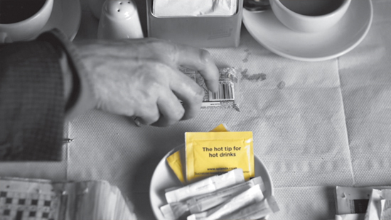
Figure 6.50 Although this image was completely desaturated, it’s far more subtle to leave a little color/saturation in the rest of the image.
Adobe includes a prebuilt effect called Leave Color that you can use to apply a single color effect. But the advantage of doing it with a Three-Way Color Corrector is that you take advantage of the full Mercury Engine acceleration as well as more subtle controls.
The technique is to use a Three-Way Color Corrector’s secondary feature, select the color you want to keep, desaturate that area, and at the very end invert the mask, causing the effect to flip-flop and desaturate everything but the selected color.
At marker 6.50 a primary correction was built with the first Three-Way Color Corrector, and a second Three-Way Color Corrector was added to adjust the inversion of the selected color. Let’s walk through the steps.
1. Make the initial selection. This time, I relied on using the eyedroppers because the yellow of the image was very distinct. It was quick and easy to use the plus eyedropper to add darker and lighter yellows, because there was no other yellow in the image.
2. Adjust Luma Thresholds. By selecting Show Mask, luma was given a broad adjustment, selecting darker yellows and brighter yellows.
3. Adjust Saturation Thresholds. What was still missing was some of the less saturated and more saturated yellows. I adjusted the Saturation selections much wider, which really picked up on the details.
4. Soften. As always, I softened the selection just a little, using a setting of 2.0.
With a decent selection created, I then needed to open the saturation controls of the Three-Way Color Corrector and lower all four controls: the Master, Shadows, Midtones, and Highlights, desaturating everything.
I then used the Invert switch at the bottom of the effect to reverse the key by setting it to Invert Mask (Figure 6.51), which desaturated the rest of the image, leaving just the color yellow of the sugar packet.

Figure 6.51 The Invert Mask switch allows adjustments on the “outside” of the secondary correction rather than the inside.
Shape-based Corrections
Shape-based corrections permit a color correction to adjust only part of a shot based on a shape. Adobe Premiere Pro doesn’t have shape-based corrections as a direct option, but it does have the capability of building it!
For example, currently, it’s trendy to darken the edges of an image to give it a vignette. The reason it’s used so often is that it attracts information to “bright” parts of an image and mimics the way your vision falls off to the edges of an image when you focus on something.
Because there isn’t a built-in plug-in, I needed to build a stack of a specific recipe. When I use a shape-based corrections technique, I have to copy and paste a video from V1 onto V2, so the same video is on two layers. Then, I need to add a third “top” layer that includes some form of black-and-white shape that I would create to cut the video on V2 onto itself on V1.
This is very much a recipe; if you get the stack right, it works.
At marker 6.52, take a look at the example of a vignette in Figure 6.52:
![]() V3 Shape + Blur. The top layer needs to be a shape. It can be built anywhere, such as with the Title tool or in Adobe Photoshop. On the Timeline, I built it using the Title tool. It also needs a blur to soften the edges, so I used the Gaussian blur.
V3 Shape + Blur. The top layer needs to be a shape. It can be built anywhere, such as with the Title tool or in Adobe Photoshop. On the Timeline, I built it using the Title tool. It also needs a blur to soften the edges, so I used the Gaussian blur.
![]() V2 copy of the video + Track Matte. The middle layer was a brighter version of the color correction done on V1. It needs an additional effect called the Track Matte Key. This effect uses the top layer to cut the middle layer over the background. In the Track Matte effect, you must choose V3 in the Matte drop-down menu. This cuts the V2 track, showing only V2 in the white areas from the V3 shape—in this case the circle.
V2 copy of the video + Track Matte. The middle layer was a brighter version of the color correction done on V1. It needs an additional effect called the Track Matte Key. This effect uses the top layer to cut the middle layer over the background. In the Track Matte effect, you must choose V3 in the Matte drop-down menu. This cuts the V2 track, showing only V2 in the white areas from the V3 shape—in this case the circle.
![]() V1 copy of the video. The bottom layer is a darker version of the color correction.
V1 copy of the video. The bottom layer is a darker version of the color correction.

Building this recipe is solely about getting the recipe right.
Here are some suggestions when you’re building shape-based corrections:
![]() Don’t set the Gaussian blur on the V3 Shape until the very end of positioning and building the stack. You need to be able to differentiate where the shape is cutting. You know you have the right value when the transition from the foreground to background is seamless.
Don’t set the Gaussian blur on the V3 Shape until the very end of positioning and building the stack. You need to be able to differentiate where the shape is cutting. You know you have the right value when the transition from the foreground to background is seamless.
![]() Your eyes adapt quickly: Toggling the effect on and off seems dramatic, but after your eyes adapt, it looks natural.
Your eyes adapt quickly: Toggling the effect on and off seems dramatic, but after your eyes adapt, it looks natural.
![]() You may have to move (keyframe) the shape if there’s movement in the frame. One of the advantages of the very soft edge (heavy blur) is that the movement is very subtle.
You may have to move (keyframe) the shape if there’s movement in the frame. One of the advantages of the very soft edge (heavy blur) is that the movement is very subtle.
![]() Tip
Tip
You’ll find a free Power Window plug-in at j.mp/PowerWindow. A number of great third-party tools also have a color corrector with shape capabilities built in, such as Colorista II from Red Giant Software.
Practical Shot Matching
Shot matching is a matter of trying to live between your eyes and the scopes (particularly the RGB Parade) while trying to produce a matching appearance. Faces and clothes with a specific color are the elements that are immediately noticeable if they don’t match shot to shot.
Toggling back and forth between shots quickly (using the up and down arrow keys) is a great way to compare shots. If you need to do this for a frame other than the head frame of a shot, add markers (press M) and toggle using the Go to Next Marker (Shift+M) and Previous Marker (Shift+Command+M [Shift+Ctrl+M]) keys. Another way to work is to place the sequence you’re working on in the Source Monitor. The sequence will act as reference with its own separate playhead.
Here are some general guidelines for practical shot matching:
![]() Match tonal range. Try to get a similar tonal range between the shots first: the black point, the white point, and most important, the midtone/Gamma. Look for landmarks like where the highlights of flesh tones appear in the Waveform scope.
Match tonal range. Try to get a similar tonal range between the shots first: the black point, the white point, and most important, the midtone/Gamma. Look for landmarks like where the highlights of flesh tones appear in the Waveform scope.
![]() Identify vectors and saturation. Look at the Vectorscope, and compare the saturations, especially.
Identify vectors and saturation. Look at the Vectorscope, and compare the saturations, especially.
![]() Use RGB Parade. Like color grading, the RGB Parade is the most important scope. Try to find matchable elements in both images.
Use RGB Parade. Like color grading, the RGB Parade is the most important scope. Try to find matchable elements in both images.
![]() Limit your vision I. Cheat by temporarily surrounding a color you want to match using a Crop effect or a Garbage Matte effect on both images. These methods of cutting an image may help to isolate the image to a single color, and then use the RGB Parade to compare them.
Limit your vision I. Cheat by temporarily surrounding a color you want to match using a Crop effect or a Garbage Matte effect on both images. These methods of cutting an image may help to isolate the image to a single color, and then use the RGB Parade to compare them.
![]() Limit your vision II. When you’re trying to get two shots from very different moments, it may be worth temporarily moving one shot to V2 and adding a left or right side crop to see both shots simultaneously to compare them in the scopes.
Limit your vision II. When you’re trying to get two shots from very different moments, it may be worth temporarily moving one shot to V2 and adding a left or right side crop to see both shots simultaneously to compare them in the scopes.
![]() Eliminate shadow pollution. Often, when you’re struggling to match two shots, the reason is that there’s some saturation of color in the shadows. Consider desaturating the shadows.
Eliminate shadow pollution. Often, when you’re struggling to match two shots, the reason is that there’s some saturation of color in the shadows. Consider desaturating the shadows.
![]() Use Secondary Color Correction. Yes, you can use the Secondary section of a Three-Way Color Corrector or RGB Curves to isolate and fix part of an image that doesn’t match, but then you’ll just be adjusting a small portion of the total shot. It’s part of the arsenal of ways to correct, but don’t go to it first.
Use Secondary Color Correction. Yes, you can use the Secondary section of a Three-Way Color Corrector or RGB Curves to isolate and fix part of an image that doesn’t match, but then you’ll just be adjusting a small portion of the total shot. It’s part of the arsenal of ways to correct, but don’t go to it first.
![]() Avoid noise. Watch for noise, particularly in poorly shot (consumer camera) material. In these cases you may have to rely on some type of noise reduction effect.
Avoid noise. Watch for noise, particularly in poorly shot (consumer camera) material. In these cases you may have to rely on some type of noise reduction effect.
![]() Tip
Tip
Vision Effects makes an inexpensive plug-in that makes shot matching quick.
Adjusting a Pair of Shots to Match
Because so much of shot matching varies based on specific shots, the example I use here, although useful, won’t solve your specific issues. But it will give you insight into how you can do shot matching.
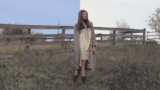
On the Timeline in 7 shot matching at marker 6.53 are two shots (Figure 6.53), both of a model walking outside. The first shot looks pretty normal (but shots can always use some primary color correction), but the second shot is very dark (exposure difference) and has some blue coloration, most likely because the light was fading at the end of day!
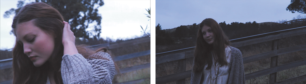
Figure 6.53 Both shots are before any grading has been done. The shot CU model walking outside (left) is well exposed, but the MS model walking (right) is dark and seems to have lots of blue in it.
A basic correction was done to both shots at marker 6.54 (Figure 6.54). Almost no exposure change was done with the shot CU model walking outside, and a little warmth was added to the midtones. The MS model walking shot had lots of exposure change, brightening the shot. Constant comparison was done with the Waveforms to try to match the luminance of the faces. Saturation was added, which helped visually in getting the overall chroma to match each other, but pushing too much warmth led to the outfit becoming somewhat orange.

Figure 6.54 Base color corrections improved the shots, but the second shot needs just a little more correction in the flesh tones.
A secondary color correction was needed to warm up just the flesh tones (Figure 6.55). By adding a second Three-Way Color Corrector and using the keyer for the just face, extra warmth was added in the midtones and the Master Saturation was increased.

Figure 6.55 Adding a secondary color correction gave the flesh tones the extra pop they needed to match the prior shot.
If these shots recur on the Timeline, it’d be smart to reuse them, which leads to learning how to save and reuse effects.
Saving and Reusing Effects
Saving and reusing effects is covered at length in Chapter 5, “Advanced Compositing and Effects,” but here are just a couple of quick tips for speeding up your color correction work:
![]() Copy and paste. Copy and paste one or several effects via the Paste Attributes command (Option+Command+V [Alt+Ctrl+V]).
Copy and paste. Copy and paste one or several effects via the Paste Attributes command (Option+Command+V [Alt+Ctrl+V]).
![]() Smart Preset bins. Create a Preset bin called Color looks. All your color corrections should live in that bin. Using the Three-Way Color Corrector to prebuild a look that is already slightly cool or warm can give you a better starting point than just using the default Three-Way Color Corrector.
Smart Preset bins. Create a Preset bin called Color looks. All your color corrections should live in that bin. Using the Three-Way Color Corrector to prebuild a look that is already slightly cool or warm can give you a better starting point than just using the default Three-Way Color Corrector.
![]() Better camera starting points. Build a correction for the neutral point for each camera. It’s faster to start with a neutral point than with the default effect. This is particularly valuable on multicam shoots; once built, you’ll have a starting effect where each camera matches each other better.
Better camera starting points. Build a correction for the neutral point for each camera. It’s faster to start with a neutral point than with the default effect. This is particularly valuable on multicam shoots; once built, you’ll have a starting effect where each camera matches each other better.
![]() Export presets. Export your presets and keep them organized outside of Adobe Premiere Pro. On the off chance you need to fully reset the software, this export will act as a backup of your customizations. Right-click on the preset/preset bin in the Effects panel to export or import the presets.
Export presets. Export your presets and keep them organized outside of Adobe Premiere Pro. On the off chance you need to fully reset the software, this export will act as a backup of your customizations. Right-click on the preset/preset bin in the Effects panel to export or import the presets.
![]() Multiple versions. If you’ll be working with a client, it’s a smart idea to build several alternate looks on a shot. Just disable the ones you don’t like. Make sure you right-click on the name of the effect and give it a description.
Multiple versions. If you’ll be working with a client, it’s a smart idea to build several alternate looks on a shot. Just disable the ones you don’t like. Make sure you right-click on the name of the effect and give it a description.
Looks
Once all the basic grading has been done, you need to decide whether or not you want a stylized “look” to a series of shots.
Should the series resemble a warm environment like Miami? How can you visually depict London as different from Chicago? Creating a “look” to represent a location provides a visual method of communicating location to the audience viewing the video. Similarly, warm looks are often called romantic. Cooler looks are frequently used for more serious scenes. Technology looks typically have some green in the shadows. Placing one of these looks over an entire scene (rather than just a shot) adds a subtle, consistent visual treatment to a scene.
![]() Notes
Notes
To discover more on looks, check out Alexis Van Hurkman’s book Color Correction Look Book: Creative Grading Techniques for Film and Video (Peachpit Press, 2014).
Some Common Recipes
The following sections describe some common recipes that are either great starting points or finished looks. Where possible they were created with the least amount of effects to try to maximize the Mercury Engine for optimal playback.
Filmic “S curve”
An “S curve” on the Master curve of the RGB Curves produces blown out highlights and crushed shadows, resulting in a higher-contrast “filmic” look.
This S curve looks like Figure 6.56 at marker 6.56 from the sequence 8 Looks. Based on the exposure of the shot, it may be necessary to go in and tweak the curve to make it stronger or weaker.
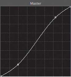
Black and white
Although there is a built-in Black and White effect (in the Image Control category) that is accelerated, the effect is limited because it is generated solely from the luma information.
Often, the black and white information doesn’t produce an image with strong contrast. Adobe Photoshop users know this, so instead they use the Black and White adjustment, which permits the output to source from just the Red, Green, or Blue channels rather than the Luma channel.
The Channel Mixer can be set to Monochrome to create a black and white image utilizing only the Red, Green, or Blue channels (or a mixture of two.)
On the Timeline at marker 6.57 are four versions of a shot: one built from the Black and White effect and one built per channel with the Channel Mixer (Figure 6.57). Note that the red controls are the only controls functioning when the Channel Mixer is set to Monochrome. Quickly move from shot to shot to see the difference.

Figure 6.57 Each of the four versions of the black and white shot. From left to right, each of the black and white images was generated from different channels: the Luma, the Red, the Green, and the Blue.
Sepia
Sepia was traditionally a look designed to make photos more durable and add warmth. Most people tend to categorize shots with a sepia effect as “older.” Usually, the contrast is fairly high (like the previous S curve adjustment).
To build the shots at marker 6.58 (Figure 6.58), I used the Tint effect and took some careful adjustments of the white point to a Hue of 25 degrees (orange, exactly halfway between red and yellow) and a Saturation of 40% (more than that was too strong).

Then the S curve from earlier was added to give it a more contrasty “pop.”
Bleach Bypass
Bleach Bypass refers to the chemical process of developing film. Bypassing the bleaching of the chemicals from the image created an image with more contrast, less saturation, and often some blue in the shadows and midtones.
The next shot on the Timeline after the Sepia shot (Figure 6.58) was built with a Three-Way Color Corrector with an increased contrast in the Input levels, reducing the saturation across the Master, Shadows, Midtones, and Highlights Saturations, and finally adding some blue to the midtones and shadows.
Summer
Building the shot on the Timeline after the Bleach Bypass (Figure 6.58) is a great example of using the RGB Curves instead of the Three-Way Color Corrector, because I wanted to be able to do some subtle changes that the Three-Way Color Corrector couldn’t do.
Whereas Bleach Bypass leaves the image washed out, a Summer look in an image of a bright summer day would have some extra green in the midtones (needing a node in the middle of the Green curve of the RGB effect) and some extra orange in the brightest areas (adding some Red in the highlights and reducing blue in the highlights). The advantage of using curves is in the ease of adjusting just part of the highlights and midtones.
A Three-Way Color Corrector was added to boost the Midtones Saturation and reduce the Shadows Saturation to avoid getting too much color in the blacks.
Grad filter
On a camera, a Gradient filter is often used to add a color wash to an image to compensate for imperfect shooting conditions—blue (for bluer skies) or orange (for warm sunlight).
Simulating a Gradient filter required the technique used in the section “Shape-based Corrections.” The V3 track had a black to white gradient and was adjusted and rotated to cover the area of the sky. The shot is the second to last on the Timeline. The “orange” version of the shot is on V2 along with a Track Matte Key effect. The normal version of the clip is on V1. The image now looks like the sun is warming up the sky (Figure 6.59).

Figure 6.59 Applying the Grad filter and then the Summer+Grad filter looks requires multiple tracks for shape-based secondaries.
Summer + Grad filter
The last shot on the Timeline isn’t a new item; it merely reuses the prior Summer effect and the Grad filter. The shot now looks like it was shot in the high point of summer.
Lumetri Looks
An entire category at the bottom of the effects list is called Lumetri Looks. These looks are prebuilt recipes, which were built using Adobe SpeedGrade.
![]() Notes
Notes
The only drawback when you’re utilizing the Lumetri Engine is the increased processing and render times.
If you’re not familiar with it, Adobe SpeedGrade is a full-color correction environment. But frankly, the interface is daunting for novices. Instead, Adobe has leveraged the Lumetri Engine from Adobe SpeedGrade into a single effect, permitting the application of Adobe SpeedGrade looks directly inside Adobe Premiere Pro.
Instead of using the Lumetri effect in the Color Correction Bin when you want to add Lumetri Looks, skip to the Lumetri Looks section (Figure 6.60) at the bottom of the Effects panel, because the effects in these categories already have a preset attached to them.

Applying Looks Across a Scene
Sure, it’s possible to apply looks on a shot-by-shot basis. All you have to do is select one of the looks and drag it directly to a clip. But applying the looks this way can be problematic! For example, what if you (or your client) wants a change?
![]() Tip
Tip
One strong suggestion is to name your adjustment layer in the Project panel based on what you intend it to do. This will make your Timeline more readable.
Instead, it’s better to use one of two methods to accomplish the same goal with a single effect: adjustment layers or nesting.
Adjustment layers
Using adjustment layers to apply looks is the preferred method of most colorists in Adobe Premiere Pro. Adjustment layers are also found in Adobe Photoshop and Adobe After Effects. You can think of an adjustment layer as a clear piece of film you put effects on.
An adjustment layer was created in the project and applied to a higher video track, as shown in Figure 6.61 on track V2. By applying the effect to the adjustment layer, Adobe Premiere Pro “adjusts” the appearance of all the clips beneath that layer.
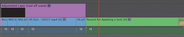
Figure 6.61 An adjustment layer is over the first half of this Timeline, and the back half is already nested. This is sequence 9 Adjustment Layers and Nesting.
The adjustment layer is easy to turn on or off globally by turning on or off the Track output on the Timeline. You can do this by right-clicking on the adjustment layer and choosing Enable, or by pressing Shift+Command+E (Shift+Ctrl+E).
Using the Enable command, it’s also possible to build several scenic looks on several adjustment layers and enable only the one that you want to apply.
Nesting
In earlier versions of Adobe Premiere Pro, nesting was the method used to add a single look to multiple shots.
To use nesting, select the shots and choose Clip > Nest. A new sequence representing the clip(s) appears in the Project panel, and the clip(s) are replaced by the new sequence.
Adjustment layers are preferred when applying looks, because they can be easily added, removed, or modified in length, whereas nesting can’t.
Nesting’s major advantage is in collapsing multiple clips and/or tracks into a single element (such as collapsing the shape-based secondary corrections mentioned earlier in this chapter).
Legalizing Video
Legalizing video is often a thorny issue; it’s difficult to do without dedicated hardware (such as hardware scopes and monitors, see the sidebar “Real-world Setup”), and it’s specific to the broadcaster you’re dealing with.
Legalization has no bearing on web delivery, because the web is very much the Wild West with no set rules.
What can further complicate legalizing video is that some broadcasters will run your work through a hardware legalizer (which will compress the way it looks, guaranteeing it’ll be safe but also ruining your hard work). Some broadcasters publish detailed specifications, such as the Public Broadcasting System in the United States, which has specific guidelines available for download called the Red Book (www.pbs.org/producing/red-book).
Even though legalizing video mostly applies to broadcasting, it can apply to other tools in the production chain (such as online hosting or video compression headaches) when you exceed the broadcasting standards for where you live.
In essence, it’s better to try to keep your video broadcast safe rather than not.
Using the Built-in Video Limiter
Whether you use an adjustment layer or nesting to apply looks, you’ll need an effect to limit the video to legal levels. That effect is the Video Limiter (Figure 6.62).
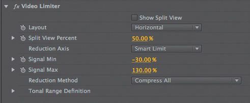
The Video Limiter effect works by using a “Smart Limit” of luma plus chroma across all the ranges—Shadows, Midtones, and Highlights.
If you have different signal needs, you can adjust the effect’s job of limiting the signal as needed for output.
Lumetri Limiters
Adobe SpeedGrade has a more intelligent set of looks to keep video legal. I’ve exported these looks from Adobe SpeedGrade and have included them with the project and media for this chapter.
When you apply the Lumetri effect (from the Color Correction category of effects, not the Lumetri Looks section), you’ll be faced with a File Chooser dialog. Navigate and select either Legalize NTSC (US) or Legalize PAL (Europe) to take advantage of these presets that are included with the project downloads for this chapter.
Direct Link with Adobe SpeedGrade
As mentioned in Chapter 1, one of the benefits of Adobe Creative Cloud is that Adobe can easily push a bug fix or an upgrade to the Cloud users. Which is exactly what happened while we were in the middle of writing this book.
The original workflows of Adobe Premiere Pro and Adobe SpeedGrade were a little rocky, but Adobe has really listened. The developers seem to have approached the problem with fresh eyes and really got the workflow right, meeting users needs.
Now, Adobe SpeedGrade can read and write into an Adobe Premiere Pro project. Any clip that is adjusted in Adobe SpeedGrade gets a single Lumetri effect in Adobe Premiere Pro.
Unfortunately, this short section in this book cannot truly do Adobe SpeedGrade justice. It provides a minimalist crash course, a “connect the dots” to what’s come prior in this chapter, and it’s far from comprehensive.
Adobe SpeedGrade has a very different interface (Figure 6.63) than any of the other Adobe Creative Cloud applications. This section offers a great “try it” quick start to the application.

Figure 6.63 Adobe SpeedGrade’s interface is very different than editorial applications and different from other Adobe applications. It’s optimized for the job of color correction.
The Big Picture of Color Correction
Every concept and technique discussed earlier in this chapter also applies to Adobe SpeedGrade. The concepts about scopes and the three color wheels (the Three-Way Color Corrector effect) exist in every NLE on the market. Learning these concepts applies everywhere that you might perform color correction—Adobe Premiere Pro, Adobe SpeedGrade, and even third-party effects, such as Red Giant Colorista or Color Finesse (which happens to be included for free with Adobe After Effects).
This back-and-forth software switching process is, on the whole, a little slower than working solely in Adobe Premiere Pro. But if you decide to learn Adobe SpeedGrade on a deeper level, you will eventually be rewarded by being able do complex color corrections faster. After all, Adobe SpeedGrade is dedicated to performing this task. Yet it won’t be as fast as adjusting a single shot directly in Adobe Premiere Pro.
![]() Tip
Tip
To remove effects from multiple clips, choose Clip > Remove Effects to reset intrinsic effects, such as Position or Opacity, and/or remove video and audio effects.
Working with Adobe SpeedGrade
The process of getting your sequence out of Adobe Premiere Pro and into Adobe SpeedGrade consists of the following four steps.
![]() Prepare your sequence. It’s probably a good practice to duplicate your sequence prior to doing anything else. If needed, you can “undo” any changes you make. Additionally, you might want to consider stripping any Three-Way Color Corrector effects from your sequence. If you’ve used any sort of stylistic effect, such as a Tint effect, decide if you want to keep it or rebuild it in Adobe SpeedGrade.
Prepare your sequence. It’s probably a good practice to duplicate your sequence prior to doing anything else. If needed, you can “undo” any changes you make. Additionally, you might want to consider stripping any Three-Way Color Corrector effects from your sequence. If you’ve used any sort of stylistic effect, such as a Tint effect, decide if you want to keep it or rebuild it in Adobe SpeedGrade.
![]() Send to Adobe SpeedGrade. Select any sequence in Adobe Premiere Pro, choose File > Directly Link to Adobe SpeedGrade. Adobe Premiere Pro will close because both applications can’t directly work on the sequence simultaneously.
Send to Adobe SpeedGrade. Select any sequence in Adobe Premiere Pro, choose File > Directly Link to Adobe SpeedGrade. Adobe Premiere Pro will close because both applications can’t directly work on the sequence simultaneously.
![]() Perform color corrections in Adobe SpeedGrade. This is where you’d adjust your sequence. I’ll cover the equivalents of the Three-Way Color Corrector as it relates to Adobe SpeedGrade and shot matching.
Perform color corrections in Adobe SpeedGrade. This is where you’d adjust your sequence. I’ll cover the equivalents of the Three-Way Color Corrector as it relates to Adobe SpeedGrade and shot matching.
![]() Send back to Adobe Premiere Pro. When you’re finished, you just press a button in Adobe SpeedGrade that will close down the project and reopen it in Adobe Premiere Pro. Every clip that was adjusted will now have a Lumetri effect, because that’s the engine behind Adobe SpeedGrade.
Send back to Adobe Premiere Pro. When you’re finished, you just press a button in Adobe SpeedGrade that will close down the project and reopen it in Adobe Premiere Pro. Every clip that was adjusted will now have a Lumetri effect, because that’s the engine behind Adobe SpeedGrade.
![]() Close-Up: Other Adobe SpeedGrade Workflows
Close-Up: Other Adobe SpeedGrade Workflows
![]() Export an EDL. You could export an edit decision list (EDL) from Adobe Premiere Pro and import the EDL to another NLE, relinking to your existing media. This always was a bit painful because EDLs contain so little information; they’re really a technology from the 1980s. But this is a common way to work with other NLEs.
Export an EDL. You could export an edit decision list (EDL) from Adobe Premiere Pro and import the EDL to another NLE, relinking to your existing media. This always was a bit painful because EDLs contain so little information; they’re really a technology from the 1980s. But this is a common way to work with other NLEs.
![]() Export a QuickTime movie. You could import a QuickTime movie into Adobe SpeedGrade from other NLEs. Using a feature called Scene Analysis, the QuickTime file would be separated into different shots (even though it was a single file). Quite a few workarounds are necessary to handle issues like picture-in-picture effects or any other sort of overlapping video.
Export a QuickTime movie. You could import a QuickTime movie into Adobe SpeedGrade from other NLEs. Using a feature called Scene Analysis, the QuickTime file would be separated into different shots (even though it was a single file). Quite a few workarounds are necessary to handle issues like picture-in-picture effects or any other sort of overlapping video.
![]() Work Directly in Adobe SpeedGrade. It’s possible to create a Timeline and perform editorial tasks directly in Adobe SpeedGrade. This workflow makes sense for some uses, such as on set use for viewing material from a cinema camera—a LUT could easily be adjusted. The process of starting projects and navigating to footage is quite different compared to editorial tools like Adobe Premiere Pro.
Work Directly in Adobe SpeedGrade. It’s possible to create a Timeline and perform editorial tasks directly in Adobe SpeedGrade. This workflow makes sense for some uses, such as on set use for viewing material from a cinema camera—a LUT could easily be adjusted. The process of starting projects and navigating to footage is quite different compared to editorial tools like Adobe Premiere Pro.
Minimalist Adobe SpeedGrade
Have you launched Adobe SpeedGrade yet? If you’ve downloaded it, you’ve likely launched it once and have realized that its interface is daunting. Where are your menus? If you right-click, it doesn’t seem to help, which means it’s likely that you’ve launched it once and gave up.
The following sections contain essential pieces of information for Adobe SpeedGrade to actually be useful to you.
Getting Familiar with Adobe SpeedGrade
When a sequence is sent from Adobe Premiere Pro, Adobe SpeedGrade will open and look like the screen shot in Figure 6.64.

The top of the screen displays your footage. A Timeline is underneath it along with what looks like a Three-Way Color Corrector at the bottom.
Because the only real effect in Adobe SpeedGrade is color grading, when you adjust the color wheels, you’ll be making corrections to your footage.
To the left of the color wheels is a Layers stack showing the various adjustments that may be layered on a clip.
The panel on the right has a couple of tabs across the top that are meant for two uses, saving specific frames for reuse (Snapshots) and building masks that can be used for a secondary correction.
Returning to Adobe Premiere Pro
At the very top left of the screen is a toolbar that looks like the one in Figure 6.65. It has six buttons: Open, Save, Save Project As, Direct Link to Adobe Premiere Pro, Undo, Redo, and Preferences.

The most important button is Direct Link to Adobe Premiere Pro because you’ll use it to send the Timeline back to Adobe Premiere Pro. You won’t need to click Undo, Redo, or Save, because they’re all the common keyboard commands you already know: Command+Z (Ctrl+Z), Command+Shift+Z (Ctrl+Shift+Z), and Command+S (Ctrl+S).
Navigating the Timeline
In many ways the Timeline is like any Timeline you’ve ever worked on. You can use the JKL keys to play forward and backward just like you do in Adobe Premiere Pro. The spacebar works the same as well, but that’s about it.
In SpeedGrade the playhead controller (Figure 6.66) is below the clips. You can grab it at the large rectangle with the time-code on it. Optionally, you can click where you want it to appear above the Timeline. Notice the number “1” on it. That will become important later when we deal with shot matching. What you want to avoid is clicking on a clip directly.
Figure 6.66 It’s easiest to move the playhead by clicking below in the timecode area. The green section above the Timeline represents the live cache that Adobe SpeedGrade uses for playback.
To play the clip forward and backward, you can use the JKL keys, but the up arrow key will also play forward, and the down arrow key will play backward.
The left and right arrow keys play forward and back a single frame.
To move forward or backward a single clip, press Command (Ctrl) plus the left or right arrow keys.
The Home and End keys go to the In point and Out point.
Table 6.2 shows a list of some common keyboard shortcuts that are immediately valuable as you jump into Adobe SpeedGrade.

Zooming the Timeline
Two buttons in the top left of the Timeline are the All button and the 6s (six seconds) button (Figure 6.67). The All button is a toggle; the 6s button won’t become active unless you’ve zoomed in a little. Six seconds is a perfect zoom level for most work because it allows you to see the shot you’re working on plus a couple of other shots.

Figure 6.67 Clicking the All button zooms in and makes the six second (6s) button active. The third button zooms to the level between the In and Out points.
To zoom using the mouse, press Option (Alt) and the scroll wheel (a two-finger gesture on a trackpad).
![]() Close-Up: Just One Shot Please
Close-Up: Just One Shot Please

Figure 6.69 The Loop button is the one we’re focusing on here. Truthfully, you should never be using a play button on any editorial/color correction systems. You have the keyboard for that!
Working with the Viewer
Most of your concerns with the view have to do with being able to zoom in and out to see detail. The bottom right of the screen has a pop-up menu (Figure 6.70) with various zoom levels.

Commonly, editors like to use zoom to Fit. But I prefer 50%, so the screen is being perfectly scaled rather than some odd scaling like 57%.
If you have a numeric keypad, the plus and minus keys zoom in and out.
To zoom using the mouse, press Command (Ctrl) and the scroll wheel (a two-finger gesture on a trackpad).
A great toggle is to press Shift+H, which shows the viewer full screen and hides the interface. Either pressing the shortcut again or pressing Esc will return you to the Adobe SpeedGrade interface.
Scope Locations
The three scopes you learned in Adobe Premiere Pro are in SpeedGrade as well along with a fourth—a Histogram. The scopes, particularly the ones you’ll use regularly—the Waveform, Vectorscope, and RGB Parade—are initially hidden in Adobe SpeedGrade.
![]() Notes
Notes
The scopes are actually more accurate in SpeedGrade than they are in Adobe Premiere Pro.
Press the A key to reveal the Analysis panel shown in Figure 6.71. It’s also the small triangle at the top next to the left edge of the viewer. At the bottom you can choose between one and four scopes. Three is the amount you need, but there’s nothing wrong with also seeing the Histogram scope, although it’s generally the least-used scope.

Figure 6.71 Clockwise starting in the upper right the four scopes are the Vectorscope, the Waveform, the RGB Parade, and the Histogram.
Right-click on any scope section to choose which scope you prefer to place in that quadrant.
Waveform differences
The default display for the Waveform is not luma only but rather a method called RGB (which is also known as Overlay). It’s called RGB because each of the three channels—R, G, and B—are displayed simultaneously.
Some colorists prefer this method, even though it’s a little confusing at first. But the advantage is that it’s possible to see a color cast by looking at a neutral item and then trying to adjust that section of the Waveform so the Red, Green, and Blue traces are equal, which makes it turn white (Figure 6.72).
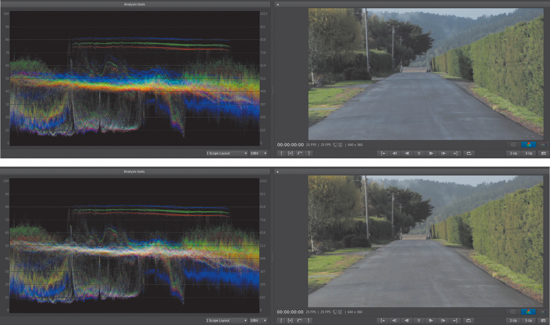
Figure 6.72 The shot on the top is before a correction. The road in the picture should be neutral; it can be found in the center of the waveform at about 50%. There’s some excessive blue, which is why the blue information is higher for the road. The shot on the bottom is after a midtone correction has been made, reducing the blue. Notice the Waveform on the top is white—because there are equal amounts of Red, Green, and Blue—meaning that the road is now a neutral color.
If you want to turn off RGB, just right-click on the Waveform and choose Switch to Luma. Then it behaves like a Luma only Waveform monitor.
The Waveform scope doesn’t read in IRE; instead, it has percentages on the left edge and a numerical setting based on the color space pop-up menu in the bottom-right corner. I suggest you change it to Float (which keeps the highest quality). Then 0 becomes Black and 1 becomes White.
Vectorscope differences
The Vectorscope (Figure 6.73) is very basic, which can make it difficult to tell when you’re exceeding safe colors because there are no targets. This also makes it hard to find the “fleshline” between Red and Yellow.
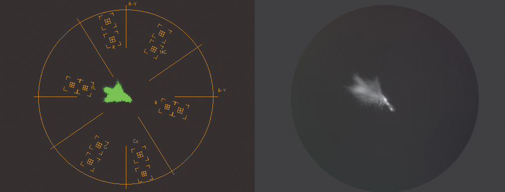
Figure 6.73 A side-by-side comparison of the Adobe Premiere Pro and the Adobe SpeedGrade Vectorscopes.
This is a good reason to use the NTSC or PAL safe color Lumetri filter preset in Adobe Premiere Pro that’s available with this chapter’s media in a folder called Extras. The two .look files were saved from Adobe SpeedGrade.
RGB Parade differences
The only notable difference with the RGB Parade is that the scale on the left and right sides are identical to the Waveform. The left side is in percentages; the right side is based on the color space pop-up menu in the bottom right of the screen (and yes, still leave it at Float).
![]() Tip
Tip
If you want to add a broadcast safe layer in Adobe SpeedGrade directly, click the large plus button at the bottom of the Layers area and choose fxLegalizeNTSC or fxLegalizePAL. Make sure it’s the last adjustment (in the top of the layer stack).
Primary Corrections
Adobe SpeedGrade doesn’t have filters the way Adobe Premiere Pro does; rather, every shot automatically gets a Primary layer.
A Layers panel on the left shows the Primary layer (Figure 6.74). Yes, you can have more than one layer as well as specialized secondary layers, but for this minimal guide to SpeedGrade we’ll just focus on this one layer.

Note the Reset button. It’s the fastest way to reset an entire look. A trashcan is also available to delete a layer that is inactive when there is only a single layer.
How to make a luma adjustment
In Adobe Premiere Pro you adjusted the Input Black point, White point, and the Gamma value while paying attention to the Waveform. You’ll work in the same order as you did with the Three-Way Color Corrector effect but you’ll notice that the names have changed.
Traditionally, three-way corrections (in any tool) have a luma range where each wheel—usually called Shadows, Midtones, and Highlights—works. Adobe SpeedGrade instead calls them Offset (Shadows), Gamma (Midtones), and Gain (Highlights) as in Figure 6.75.

Figure 6.75 Note that each wheel has a reset button on the left (reset luma) and on the right (reset chroma) that will appear only if there has been an adjustment.
Luma adjustments are performed by clicking on the triangle (Figure 6.76) that sits around any of the edges of each color wheel. The adjustment order is Offset (black point), Gain (white point), and then Gamma.
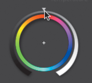
To adjust luma, click the triangle icon on a wheel and drag the mouse left or right in a straight line. Don’t drag the mouse in a circle. The farther left or right you drag, the larger the change.
To reset the luma adjustment of any wheel, click the triangle in the lower-left corner.
Let’s try a luma adjustment.
1. In Adobe Premiere Pro, duplicate the sequence called 11 Direct Link to Adobe SpeedGrade. Rename it to whatever you like, and then choose File > Direct Link.
2. Move to the third shot (the first shot of an actor). Above the Timeline click the All button and then the 6s button to make sure you’re zoomed in.
3. Press A for the scopes. Adjust the scopes in such a way that they feel comfortable. For these sections I tend to work with a one scope layout for each section, but normally I work with a three scope layout. Remember that you can right-click on any scope and reassign it or reconfigure it if needed.
4. In the viewer, press the Toggle In/Out button; an in/out mark should appear around the clip on the Timeline. From this point on, the best navigation method to use is to press Command (Ctrl) left/right arrows to move from shot to shot.
Although this is a fairly full-range shot, my intention is to have you try using the controls.
5. Adjust the Offset triangle and crush some of the darker areas.
6. Adjust the Gain triangle. Go a little too far until the bright part of the actor’s neck hits 100 and then back off until it looks good to you.
7. Adjust the Gamma triangle. Try making the shot bright and then try making it a little darker and moodier. You may need to readjust the Offset/Gain wheels based on your Gamma changes.
![]() Tip
Tip
Colorists are always turning the grade on and off, checking before/after versions because their eyes adjust so fast. Clicking the 0 (zero) button turns the grade off while the button is held down.
Just like color grading in Adobe Premiere Pro, color grading in SpeedGrade is a combination of technique and “feel.” And if the result looks terrible on your (calibrated) system, reset and try it again.
How to make a chroma adjustment
In Adobe Premiere Pro’s Three-Way Color Corrector effect, you made chroma adjustments in reverse to luma adjustments. Again, we’ll translate that to Adobe SpeedGrade.
To make a quick adjustment, click anywhere in the circle, and drag to adjust the chroma. For a virtual trackball, right-click in the wheel and move the mouse in the direction of the adjustment; then right-click again to accept the adjustment.
First make adjustments in the Gamma color wheel, paying attention to the Vectorscope. Then, examine the RGB Parade and adjust the Gain color wheel and the Offset color wheel.
Let’s try an adjustment.
![]() Press Command (Ctrl) right arrow and move down the Timeline until you’re at the third to last shot, which is called Road.
Press Command (Ctrl) right arrow and move down the Timeline until you’re at the third to last shot, which is called Road.
![]() Go through the Luma adjustments first by adjusting the Offset, Gain, and then the Gamma triangles.
Go through the Luma adjustments first by adjusting the Offset, Gain, and then the Gamma triangles.
![]() Based on the Vectorscope and the RGB Parade, the midtones have some extra blue in them. Using the right-click method, click in the middle of the Gamma color wheel, moving away from blue (toward yellow). The road becomes neutralized.
Based on the Vectorscope and the RGB Parade, the midtones have some extra blue in them. Using the right-click method, click in the middle of the Gamma color wheel, moving away from blue (toward yellow). The road becomes neutralized.
Range controls
If you need finer control, above the color wheels are buttons for Overall, Shadows, Midtones, and Highlights. Adobe SpeedGrade can further divide each of these ranges into a series of three ranges of their own, as shown in Figure 6.77.

Figure 6.77 Each range can be further subdivided into three additional ranges. Just click on the tab that represents that subsection.
This results in (potentially) nine ranges for minute adjustments. And because you’re already familiar with how each wheel works, you can dial in adjustments precisely as needed.
If you want a challenging shot to work with to try the extra ranges, the shot prior to the Road shot, called 00020.mp4, has a severe red cast. Try removing it.
Global controls
Above the color wheels but below the ranges are six controls that work on the overall image. These are great for changes that might be complex in other tools that utilize a single slider.
Here’s a quick overview of the global controls:
![]() Input Saturation. This adjusts the saturation before anything else happens on a shot. You’ll tend to use it if a shot is too monotone at the start.
Input Saturation. This adjusts the saturation before anything else happens on a shot. You’ll tend to use it if a shot is too monotone at the start.
![]() Final Saturation. Whereas the Input Saturation works before any adjustments have been made, this adjusts the saturation after you’ve performed a color correction. You’d use this when you’re happy with your grade, but you want to pull back or push all the colors in a shot.
Final Saturation. Whereas the Input Saturation works before any adjustments have been made, this adjusts the saturation after you’ve performed a color correction. You’d use this when you’re happy with your grade, but you want to pull back or push all the colors in a shot.
![]() Pivot + Contrast. Yes, I’ve grouped these together. Contrast adjusts the difference between the lightest and darkest portions of the image. When you increase contrast, brighter pixels move toward white and darker pixels move toward black. The question becomes where should the midpoint be? At 50%? The pivot is the midpoint (default of .5). You usually contrast to make bright areas brighter and dark areas darker, and if you’re unhappy with which pixels become brighter or darker, you adjust the pivot. Generally, it’s better to make a gamma adjustment than a Contrast + Pivot because gamma leaves black/white sections alone.
Pivot + Contrast. Yes, I’ve grouped these together. Contrast adjusts the difference between the lightest and darkest portions of the image. When you increase contrast, brighter pixels move toward white and darker pixels move toward black. The question becomes where should the midpoint be? At 50%? The pivot is the midpoint (default of .5). You usually contrast to make bright areas brighter and dark areas darker, and if you’re unhappy with which pixels become brighter or darker, you adjust the pivot. Generally, it’s better to make a gamma adjustment than a Contrast + Pivot because gamma leaves black/white sections alone.
![]() Temperature. This allows you to quickly cool down (add blue) or warm up (add orange tones) a shot.
Temperature. This allows you to quickly cool down (add blue) or warm up (add orange tones) a shot.
![]() Magenta. You can probably skip this control, but this slider is the opposite of the Temperature control. Whereas the Temperature slider goes from Blue to Orange, this goes from Magenta to Green. If you’re seeing too much magenta or green in your images, there’s usually a white balance problem.
Magenta. You can probably skip this control, but this slider is the opposite of the Temperature control. Whereas the Temperature slider goes from Blue to Orange, this goes from Magenta to Green. If you’re seeing too much magenta or green in your images, there’s usually a white balance problem.
![]() Tip
Tip
If you’re having a problem with a shot, most often chroma problems occur in the darkest/shadow areas. Using the Shadow tab, think about decreasing the Final Saturation control, essentially removing color in just the darkest regions.
Putting It All Together
Let’s look at a shot in Adobe SpeedGrade and walk through the adjustments. This example assumes that you’ve sent your Timeline to Adobe SpeedGrade from Adobe Premiere Pro.
You’ll use the same recipe that you used in the “Three-Way Color Corrector” section earlier in this chapter.
1. Look at the Waveform and adjust the Offset (Black point). Then adjust the Gain (White point). The Gamma is subjective.
2. Looking at the Vectorscope look for the blob to include the center. Adjust the Gamma color wheel to accommodate for that. For the midrange, this is where most of a color cast tends to be visible.
3. Check the RGB Parade. Adjust the Offset wheel to balance/even the amount of color in RGB at the bottom/darkest and the top/brightest areas of the scopes. (Remember that as you approach black or white, you lose chroma.)
4. Look for neutral elements in a shot and make sure they’re balanced in the RGB Parade.
Copying a Look from One Shot to Another
To copy the look from the prior shot, hover your mouse over the prior shot and press C. Commonly, you’ll want to copy the grade from two clips prior to where you are. Why? In most narrative filmmaking, when there is a conversation between two people, you alternate between the two depending on which one is speaking. This is called a Shot/Reverse shot (Figure 6.78), which describes the pattern of cuts.
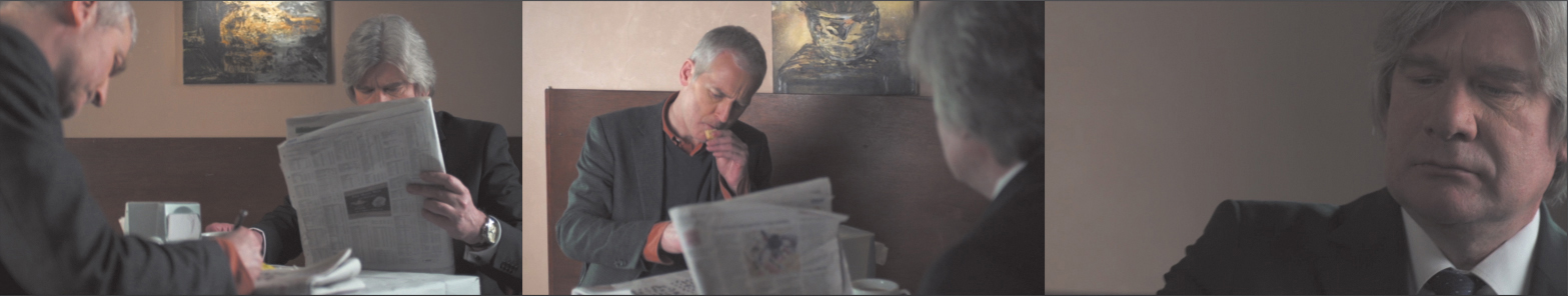
Figure 6.78 An example of a Shot/Reverse shot. One set of camera angles is primarily for Actor A and the next shot is for Actor B. This means that every other shot is from the same camera setup.
Yes, you could use the hover plus pressing C method. But a great example of how well Adobe SpeedGrade is thought out is by demonstrating the Shot/Reverse technique. A full keyboard (with a numeric keypad) is required for this. You must use the plus and minus and number keys on the keypad.
Set Adobe SpeedGrade to copy from prior shots by pressing Option+ - (Alt+ -). (The opposite, Option++ (Alt++) copies from the next shot.)
Press Option (Alt) and a number key to copy the look from the prior/next shot based on the number you press. So, in a Shot/Reverse shot situation where you’ve graded the first appearance of an actor, you’d move to the next appearance (two shots later) by pressing Option+2 (Alt+2)and be done.
If you tried this and ended up with a second playhead, you didn’t use the numeric keypad. See the section “Adding a second playhead” to find out how to set your system to a single playhead again.
Color Matching
Color matching is super easy; all you have to do is press Command+M (Ctrl+M) to match two clips. But you’ll need a second playhead (Figure 6.79 on the next page). The shot you’re working will be marked with a 1. The second playhead is marked with a 2.

Color match always matches the first playhead to the second playhead.
Adding a second playhead
On the right side of the screen is a button called 2-Up (Figure 6.80). Clicking it adds a second playhead to the Timeline and also either creates a split screen or a dual screen interface.

Figure 6.80 The buttons to the right of the 2-Up and 3-Up buttons, which look like split screen, change how multiple screens are displayed.
I prefer the dual screen interface where the second viewer appears on the left side of your screen. The viewer acts as a reference and stays in place, allowing you to quickly match several shots to the same reference shot.
The fastest way to create a second playhead is by pressing Option+2 (Alt+2). To go back to one playhead, press Option+1 (Alt+1).
If you want the second playhead to travel with the first, press the stop/play button on the edge of playhead 2 (Figure 6.81).
Figure 6.81 This button is a toggle between having playhead 2 “play” or stay in sync with playhead 1.
Using the color match function
Once you have two playheads, all you’ll have to do to actually use the color match is press Command+M (Ctrl+M) or press the Match look to master playhead button (above the 3-Up button). When you do so, you’ll see a new layer called AutoColorMatch (Figure 6.82).
Figure 6.82 The AutoColorMatch feature is far easier than matching via scopes (as described earlier in this chapter).
If you want to try using AutoColorMatch with the project, you’ll find the two shots you matched earlier in the section “Practical Shot Matching” are the last two shots on the Timeline.
Areas I didn’t cover
Keep in mind that I’ve provided just a brief introduction to Adobe SpeedGrade here. It’s a fantastic product that is extra useful because of its new workflow.
Some topics were just too deep to cover and keep this section as a “hit the ground running” look at Adobe SpeedGrade. You’ll need to investigate the following areas on your own:
![]() Looks. Adobe SpeedGrade offers you the ability to save looks and recall looks from its built-in library.
Looks. Adobe SpeedGrade offers you the ability to save looks and recall looks from its built-in library.
![]() Layers. The layers stack on the left side of the screen permits multiple primary and secondary layers. This also allows for variations when clients aren’t sure they want a cool or a warm look.
Layers. The layers stack on the left side of the screen permits multiple primary and secondary layers. This also allows for variations when clients aren’t sure they want a cool or a warm look.
![]() Secondaries. Secondaries in Adobe SpeedGrade adjust just portions of the image based on a keyed selection. For example, you might increase the saturation of a sky or grass with a secondary layer.
Secondaries. Secondaries in Adobe SpeedGrade adjust just portions of the image based on a keyed selection. For example, you might increase the saturation of a sky or grass with a secondary layer.
![]() Masks. A mask adjusts part of a layer based on a circular or rectangular shape. Darkening the outside of an oval to create a vignette would be a classic use of a mask.
Masks. A mask adjusts part of a layer based on a circular or rectangular shape. Darkening the outside of an oval to create a vignette would be a classic use of a mask.
![]() Tracking. When masking, it’s common to need to track a region onscreen so a mask follows something moving in the image (such as a person walking through the screen). This way a vignette would follow someone on screen.
Tracking. When masking, it’s common to need to track a region onscreen so a mask follows something moving in the image (such as a person walking through the screen). This way a vignette would follow someone on screen.
![]() Keyframes. Lighting situations change. It’s useful to have your color adjustments vary on a single shot (similar to keyframes in Adobe Premiere Pro or Adobe After Effects).
Keyframes. Lighting situations change. It’s useful to have your color adjustments vary on a single shot (similar to keyframes in Adobe Premiere Pro or Adobe After Effects).
![]() Snapshots. Snapshots are a great way to save a particular look for comparison.
Snapshots. Snapshots are a great way to save a particular look for comparison.
Adobe SpeedGrade does so much that I can barely scratch the surface in a book of techniques for Adobe Premiere Pro. But the workflow made it too valuable of an application to ignore!