
7. Designing for Mobile Devices
Lesson overview
In this lesson, you’ll edit and adapt cascading style sheets (CSS) and CSS3 media queries in Dreamweaver for mobile devices and learn how to:
• Edit and manipulate a Bootstrap framework to adapt to different types of mobile devices
• Create and edit a media query for mobile and handheld devices, such as tablets and smartphones
• Select and target CSS rules within specific media queries
• Configure page components to work with mobile devices
• Preview this page in Dreamweaver
This lesson will take about 2 hours to complete. If you have not already done so, download the project files for this lesson from the Lesson & Update Files tab on your Account page at www.peachpit.com. Store them on your computer in a convenient location, and define a new site based on the lesson07 folder, as described in the “Getting Started” section of this book. Your Account page is also where you’ll find any updates to the lessons or to the lesson files. Look on the Lesson & Update Files tab to access the most current content.

The trend toward designing sites to respond automatically to mobile devices and smartphones continues to grow exponentially. Dreamweaver has powerful tools to get your site mobile-ready.
Responsive design
The Internet was never conceived for smartphones and tablets. For the first decade, the most difficult challenge a programmer or developer had to worry about was the size and resolution differences between 13- and 15-inch computer monitors. For years, resolutions and screens sizes only got larger.
Today, the chances that some or all of your visitors are using a smartphone or tablet to access your site are increasing day by day. Statistics show that in 2014, more people were using mobile devices to access the Internet than using desktop computers, and that number has been increasing steadily ever since.
Mobile-first design
One concept that is starting to gain traction today is known as “mobile-first” design. It assumes that sites that aren’t optimized for phones and tablets will shed users and traffic in this new environment.
This technique actually starts with a design for mobile devices, such as smartphones, and then adds content and structure for larger devices and computers. In some cases, the site content is actually minimized so that it loads and performs in an optimal fashion, then other content can be injected using JavaScript and databases for computers and more powerful devices. In the end, the decision to design for desktop or mobile first should be based on your site’s demographics and analytics.
How your site deals with smartphones and mobile devices depends on whether you’re adapting an existing site or developing a new one from scratch. For an existing site, you first have to create a basic design for the site’s main components. Then, you have to work through each page, one at a time, to individually assess existing components—like images and tables—that do not inherently adapt to the specific environment.
For new websites, the typical approach is to build in the adaptability as you create the overall design, and then build each page to achieve maximum flexibility. In either case, to support a truly mobile design, be aware that some site components may need to be replaced, left out of the final design altogether, or swapped out live by JavaScript or by the media query itself. For the time being, there is no single solution to all responsive issues, and many solutions are still in development.
Whether you design for desktop or mobile first, you still need to learn how to build designs that respond to all devices. To help web designers adapt pages and content to this changing landscape, two basic tools were created: media type and media query. These functions enable browsers to identify what size and type of device is accessing the webpage and then load the appropriate style sheet, if one exists.
Media type properties
The media type property was added to the CSS2 specifications and adopted in 1998. It was intended to address the proliferation of non-computer devices that were able to access the web and web-based resources at that time. The media type is used to target customized formatting to reformat or optimize web content for different media or output.
 Note
Note
In Lessons 4 and 5, you created the basic design for the website as it should appear on a standard desktop computer display based on the screen media type.
In all, CSS includes ten individually defined media types, as shown in Table 7.1.

Although the media type property works fine for desktop screens, it never really caught on with browsers used on cellphones and other mobile devices. Part of the problem is the sheer variety of devices in all shapes and sizes. Add to this smorgasbord an equally diverse list of hardware and software capabilities, and you’ve produced a nightmare environment for the modern web designer. But all is not lost.
Media queries
A media query is a newer CSS development that provides code in the webpage that allows it to interactively determine what formatting to use based on not only what kind of device (media type) is displaying the page, but also on what dimensions and orientation it’s using. Once the browser knows the type or size of the device it has encountered, it reads the media query to know what resources to load to format the webpage and content. This process is as fluid and continuous as a precision dance routine, even allowing the user to switch orientations during a session and have the page and content adapt seamlessly without other intervention. The key to this ballet is the development of style sheets optimized for specific browsers, specific devices, or both.
Media query syntax
Like the CSS it controls, a media query requires a specific syntax to work properly in the browser. It consists of one or more media types and one or more expressions, or media features, which a browser must test as true before it applies the styles it contains. Currently, Dreamweaver supports 22 media features. Others are being tested or are still under development and may not appear in the interface, but you can add them manually to the code, if necessary.

The media query creates a set of criteria to determine whether or not a specific set of rules contained within it is applied in a webpage.
You can create media queries in a variety of ways. For example, they can be designed to work exclusively—by completely resetting the existing styling—or in tandem—by inheriting some styles and modifying specifications only as necessary. The latter method requires less CSS code and is typically more efficient. We will favor that method in the upcoming exercises and for the sample site design.
To learn more about media queries and how they work, check out www.w3schools.com/cssref/css3_pr_mediaquery.asp.
Adapting Bootstrap layouts to different screen sizes
The GreenStart site design was based on a predefined Bootstrap layout that was created to be responsive out of the box. The Bootstrap framework provides a very complex style sheet complete with numerous media queries and CSS rules to accommodate a wide variety of browsers and devices. Using a framework like Bootstrap shortens the development time and allows you to concentrate on your content, instead of on technical issues.
In Lesson 6, you fleshed out a Bootstrap layout with placeholder content based on your site design. This content will form the foundation of the site template, which you will use later to build pages for your site. At the moment, the page is partially responsive. In this exercise, you will learn how to tap into Bootstrap’s built-in styles and media queries to make the page fully responsive.
Working with the responsive Scrubber
Before you can learn how to manipulate the Bootstrap framework for various screen sizes, it helps to identify how the current layout responds to changing screen sizes. New to Dreamweaver CC (2015.1 release) is the Scrubber tool. It enables you to change the width of your document viewport so you can interact with the style sheets and media queries defined in the page and actually simulate different device widths right inside Dreamweaver. In the past, to change the viewport you had to manipulate the whole program interface, dragging the edge of the document window or program to see a reaction in the page.
1. If necessary, define a site based on the lesson07 folder as described in the “Getting Started” section at the beginning of the book.
2. Open mylayout.html from the lesson07 folder in Live view.
3. Maximize the program to fill the entire display; the program window should be displayed at a minimum of 1200 pixels in width to display and test all the media queries contained in the Bootstrap CSS.

The page displays the basic site design, complete with text placeholders and graphical treatments for the header and footer.
4. Drag the Scrubber to the left to decrease the width of the document window.

As the window narrows, the layout adapts to the changes. At first, the columns in the main content area share the row side by side. When the screen narrows below 767 pixels, the layout completely changes and all the elements stack vertically one atop the other and the navigation menu collapses to an icon. The collapse coincides with the beginning of the final media query displayed in the VMQ interface at the top of the document window.
 Tip
Tip
Dreamweaver displays the current screen size just below the VMQ interface as you drag the Scrubber.
5. Stop dragging the Scrubber when the width reaches 320 pixels. Observe how the structure and content reacts to this screen width.

This is the width of the original iPhone and one of the narrowest phone screens you will want to support.
6. Drag the Scrubber to the right to increase the width of the document window.
As the window widens, the content and structure resume their original styling. As you can see, the Bootstrap structure that you created is already fairly responsive, although there are a few things you will probably want to tweak.
For example, as the page narrows the content continues to divide the space into the three-column layout. When the page narrows below 900 pixels, it gets unappealingly tight. Although the columns adjust properly for the tighter space, you may want to change the basic structure or content. One technique designers use in this situation is to hide content when there’s no room for it or when it doesn’t make sense to show it in a specific way or in a specific screen size.
Since the first column is intended for quotations and other inspiring messages, it’s not essential to the purpose of the page or the site. Hiding it is one solution to the issue. Luckily, Bootstrap provides a simple solution.
Hiding Bootstrap elements
In this exercise, you will learn how to use predefined Bootstrap styles to hide unwanted content on small screens.
1. If necessary, open mylayout.html from the lesson07 folder in Live view.
2. Make sure the Scrubber is positioned fully to the right side of the document window and the program is wider than 900 pixels.
The change can be made when the screen is at any width, but displaying the correct window size makes it easier to select the desired elements and styling.
3. Click the Small media query in the VMQ.

The Scrubber jumps to the media query displayed in the VMQ. The three columns appear very tight at this width; headlines and text break into short lines, which may adversely affect readability.
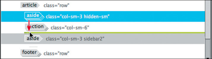
4. Click the first column of the third row.
Select the aside.col-sm-3 tag selector.

The HUD appears focused on the <aside> element.
Bootstrap provides various CSS styles to format elements at specific screen sizes. The framework classifies these sizes as large (desktop screens larger than 1200 pixels), medium (screens from 992 to 1199 pixels), small (screens from 768 to 991 pixels), and extra-small (screens 767 pixels and below).
The class assigned to the <aside> (col-sm-3) styles the element for small screens. The styling will be inherited for larger screen sizes, but for smaller screen sizes there is no styling applied so the elements revert to CSS defaults. To hide the element on small screens, you need to add a second predefined Bootstrap class.
Note
As you type the class, a hinting menu will appear. This hinting menu is responsive to the screen width and the media query selected and may not show classes pertinent to other media queries.
5. Click the Add Class/ID icon in the HUD.
A text field appears in the HUD.
6. Type .hidden-sm and press Enter/Return to complete the class.

A hinting list appears as you type. After you select the class, Dreamweaver assigns it to the element. The element disappears from the layout.
7. Drag the Scrubber to the right to the Medium Bootstrap media query (992 to 1199 pixels).
The <aside> element reappears. A second class appears on the element. This class is designed to hide elements on small screens. If the document width is from 768 to 991 pixels, the first column will disappear from the row. At 992 pixels, it reappears. Let’s see what happens on extra-small screens.
8. Drag the Scrubber to the left until the document window is less than 767 pixels wide.

The <aside> disappears and then reappears back in the layout when the page drops below 767 pixels in width. Did you notice how the quotations reappeared at the top of the document in the Extra Small media query? The class hidden-sm hides the element only on small screens.
Hiding the element on small screens solves the original spacing issue when you have three columns. But on extra-small screens, the position of the element creates a new problem. It appears at the top of the page, pushing the main content down the screen where it may not even be visible on smaller devices. You could hide the element again on extra-small screens, but this is a problem that calls for a more imaginative solution.
In this case, the quotations are not too large or unwieldy to display; they just appear in the wrong place at the wrong time, or screen size.
In situations like this, Bootstrap may offer a better alternative than hiding the element: You can move it. To learn how to rearrange the elements in your layout you’ll first have to remove the hidden-sm class.
9. Select the aside.col-sm-3.hidden-sm tag selector.
The HUD appears focused on the <aside> element.
10. Click the Remove Class/ID icon  for the
 hidden-sm class.

The class is removed from the element.
11. Save the file.
Before you can solve this “mobile” design challenge, you’ll have to adjust the way you think about how elements are ordered and structured. You have to discard old-fashioned notions of form and function.
Creating a mobile-first structure
In this exercise, you will change the basic structure of the layout to create a mobile-first structure.
1. Open mylayout.html in Live view.
2. Make sure the document window is wider than 767 pixels and that the Scrubber is positioned at the right side of the window.
3. Drag the Scrubber to the Extra Small media query (767 pixels or less).
The content of the layout stacks vertically. The quotations appear at the top.
To build the mobile-first scheme, you have to adjust the current layout by moving the quotations to a location that will be more appropriate on extra-small screens. Then, by using a Bootstrap function, you will adjust the display of the elements for small screens before finally restoring the original design for larger screens and devices.
The process starts by moving the first column to a different position in the code structure. You could move the elements in Code view, but in this case you’ll use a new tool: the DOM viewer.
4. If necessary, open the DOM viewer by selecting Window > DOM. Resize the window as necessary to see the document structure.

DOM stands for Document Object Model. It offers a schematic view of your HTML code, displaying the elements that compose its structure in a graphical interface. But it’s not just a pretty picture. You can also use the DOM viewer to insert, delete, and move elements.
5. Select the aside.col-sm-3 .hidden-sm tag selector.
Observe the DOM panel display.

The <aside> element is highlighted. The diagram shows the parent <article> element and its three children. Notice that the child elements are indented in the structure. To move an element, simply drag it to the proper location.
6. Drag the first <aside> element below the <section> element.
A green line appears indicating where the element will be inserted. If done properly, the element will appear below the <section> and indented at the same level. The quotations now appear below the main content. The new arrangement puts the important content where it belongs on extra-small screens, but it has created a new problem on larger screens.
Note
Dragging elements in the DOM viewer requires a careful eye and a steady hand. It’s easy to mess up the first few times you try. Take your time and check the code to make sure you put the element in the right spot. You can undo any errors by pressing Ctrl+Z/Cmd+Z.
7. Drag the Scrubber to, or click, the Small media query (768 to 991 pixels).

When the Scrubber moves into the Small media query, the three-column layout reappears, but now the quotations are displayed to the right of the main content. To restore the original look of the layout, you have to use a special Bootstrap function that is supplied within the predefined CSS.
8. If necessary, select the aside.col-sm-3 tag selector for the quotations’ column.
9. Using the HUD, add the following class:
.col-sm-pull-6
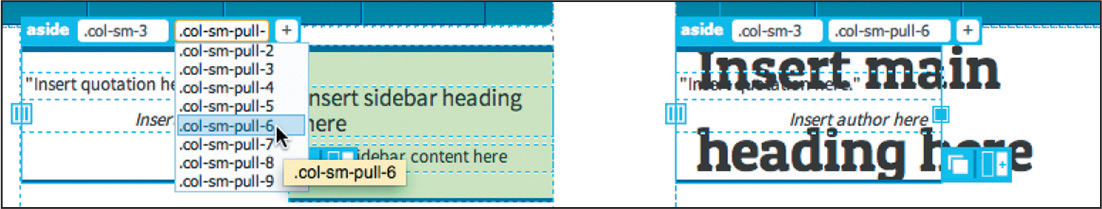
The pull function shifts the quotations back to the left side of the row, but it’s overlapping the main content. To correct this problem, you can use a push function to move the main content back to the right.
10. Click the <h1> element.
Select the section.col-sm-6 tag selector.
Add the class .col-sm-push-3

The main content section moves back to the center. All three columns are back in their original locations, but with an important mobile-first difference.
11. Drag the Scrubber to the left until the document window is narrower than 767 pixels.
Below 767 pixels the content displays in a single column again. The quotations appear below the main content. Through some Bootstrap magic you have created a layout that automatically adapts to mobile screens by shifting elements to more appropriate positions depending on the size of the screen.
12. Save the file.
Although you have solved one of the original challenges, the three columns still look a bit too tight on small screens. It would look better and less crowded in a two-column layout.
Manipulating column widths in Bootstrap
The great thing about Bootstrap is that it makes it easy to change the widths of columns at different screen sizes. In this exercise, you will create a two-column layout on small screens and then switch back to three columns at larger sizes.
1. Open mylayout.html in Live view if necessary.
2. Click the Medium screen media query (992 to 1199 pixels) in the VMQ.

The Scrubber jumps to the selected media query. It may stop at the beginning or end of the screen range, but the CSS applies to the entire range, so it doesn’t really matter where it stops. The important concept here is that setting the screen to the correct size before you begin allows you to see the results immediately.
Before you can change the layout, you have to understand how it was created in the first place. In Lesson 5, “Creating a Page Layout,” you built the three-column layout by manipulating the default Bootstrap class col-sm-4 applied to each element in the row. The number indicates how many grid columns the element will use. By changing the number “4,” you manipulated the widths of the columns to take space away from the <aside> elements and give more to the main content.
You may have noticed that the class has the letters sm in the name. This indicates that it applies to the Small media query. Some Bootstrap classes limit styling to a specific range of screen sizes, while others are designed to have their styles inherited. In this instance, column widths are inherited in the larger screens sizes.
To change the number of columns displayed in different screen sizes, you simply have to change the existing classes or add additional ones. Since you want to keep the current layout on larger screens, the first change will be a minor one.
3. Click the quotation placeholder.
Select the aside.col-sm-3 .col-sm-pull-6 tag selector for the first column.
Tip
Press Enter/Return to complete each new class.
4. In the HUD, edit the class name as highlighted:
.col-md-3

This change makes the class start formatting on Medium screens. You’ll have to change the pull function too.
5. In the HUD, edit the class name as highlighted:
.col-md-pull-6
This change pulls the element into the first column for medium screens. You need to make the same changes for the other columns.
6. Change the classes for the main content element to:.col-md-6 and .col-md-push-3

7. Change the class for Sidebar 2 to:
.col-md-3
Nothing changes. The layout remains the same as before, which means the new classes are doing their job. The layout is ready now for medium and larger screens. But let’s check out what happens on smaller screens.
8. Click the Small screen media query.

The document window resizes. The layout reformats into a single column, as it had done for the extra-small screens. This is because none of the Bootstrap classes are currently formatting these elements. To create the new column layout, you’ll need to add new classes to each element.
9. Click in the main content window.
Select the section.col-md-6.col-md-push-3 tag selector.
On small screens, you want two columns on the first line and Sidebar 2 on the second line. You’ll split the first line, with one-third for the quotations and two-thirds for the main content.
10. Add a new class to the section:
.col-sm-8

The main content section resizes to two-thirds of the screen width. Let’s push the column to the right side of the row.
11. Add a new class to the section:
.col-sm-push-4

The column shifts to the right side of the row. Next, you’ll deal with the quotations column.
12. Select the tag selector aside.col-md-3.col-md-pull-6 for Sidebar 1.
Add a new class to the aside:
.col-sm-4
The column occupies four column grids but is still aligned to the right.
13. Add a new class to the aside:
.col-sm-pull-8

The column shifts back to the left edge, but Sidebar 2 is obscuring the first row. Nothing is formatting this column, and since it isn’t floating it’s trying to rise up to take the place of the other two elements. You can get it back into the mix by adding the proper class.
14. Select the aside.col-md-3.sidebar2 tag selector and add the following class:
.col-sm-8

The new class resizes the column. It now matches the width of the main content area and has shifted below it. The column is aligned to the left. Let’s match the alignment of the main content column.
15. Add the following class:
.col-sm-push-4

Sidebar 2 aligns to the main content section. The styling of the new structure is complete. Let’s see how it responds now to different screen sizes.
16. Drag the Scrubber left and right to test the styling at different screen widths.

On small and extra-small screens, the layout looks fine. When the Scrubber hits the medium media query, the elements shift back to one row, but there’s a problem. Sidebar 2 was OK originally, but now it appears far to the right edge of the screen. To get it back into the layout, you need to add a push function.
17. Add the following class to Sidebar 2:
.col-md-push-0

Sidebar 2 now fits back into the layout.
18. Drag the Scrubber left and right and observe the layout.
The layout shifts from one, to two, to three columns interactively as you change the width of the window. The layout works perfectly now, responding to all screen sizes smoothly. Overall, the structure looks fine, but the content could use a few tweaks on smaller screens. When the screen width gets to the smallest size, the logo in the header seems too big and actually extends beyond the edges of the screen.
19. Save the file.
In the remaining exercises, you will learn how to style elements at different screen sizes by creating a custom media query and adding CSS rules to it.
Working with media queries
As you learned earlier, a media query is a method you can use to target styling to specific screen sizes, orientations, and devices. The Bootstrap framework provides predefined style sheets and JavaScript to make the underlying page structure responsive out of the box. In most cases, you only have to add your own style sheets and media queries to deal with conflicts with your page content or with specific design requirements. Whenever you start a project with predefined resources, it’s a good idea to inspect the basic structure and the elements that format it.
Identifying media queries
The <header> is made up of several elements and CSS effects. Take a moment to identify the styling that has already been created for mobile devices and what it does.
1. If necessary, launch Dreamweaver CC (2015.1 release) or later.
Maximize the program to fill the entire screen.
2. Open mylayout.html from the lesson07 folder in Live view.
3. Choose Window > CSS Designer, if necessary, to display the panel.
Click the All button.
4. Adjust the CSS Designer to display in two columns while maintaining a screen width of 1024 pixels or wider, if possible.
Setting up the CSS Designer in two columns makes working with and editing CSS easier.
Note
If your screen is too small to display the CSS Designer in two columns, you will still be able complete the exercise.
5. Select ALL SOURCES.
6. Examine the @Media window and note the existing media queries.

The window shows a list of media queries for a variety of screen sizes and applications.
7. Click the first few media queries and observe the Sources window display.
The bootstrap.css file is highlighted in bold, indicating that the selected media query is defined within that file. In fact, there are over 60 media queries defined. The nature of a predefined framework is to anticipate all the needs and usage of basic HTML elements as well as any provided components and format them to work in any foreseeable environment or application. The rest is up to you.
8. Click in the <header> element.
Click the Current button.

The list of media queries is shorter, showing only the styles affecting the <header> element.
9. Drag the Scrubber to the left. Observe the text “Green Awareness in Action.” When the words break to two lines, stop dragging the Scrubber.

The motto breaks to two lines at approximately 425 pixels. Also note that the logo is filling the screen from left to right. If you added a new rule to adjust the formatting of this element, it would apply to the element at all screen sizes. That’s because CSS rules are applied to all screen states unless limited by a media query. Since the Bootstrap media queries are locked, you’ll need to create a new one in the green_styles.css file.
10. Drag the Scrubber to the right until the motto appears on one line, approximately between 426 to 438 pixels.
Note
If your text doesn’t display on one line, keep dragging to the right until it does and then adjust the media query accordingly.
The motto should still be displayed on one line. Dreamweaver allows you to create a new media query right in the document window.
11. Click the Add Media Query icon at the top of the Scrubber.

A Media Query Definition dialog appears. The max-width field is already populated with the pixel position of your Scrubber, between 426 to 438 pixels. The min-width field is empty. That means this media query will apply to screens starting at this width and smaller. Using the minimum-width property means that none of the styles contained within it will affect any devices wider than that designated. Make sure that the file name green_styles.css appears in the source pull-down menu.
Note
If green_styles.css does not appear in the pull-down menu automatically, select it manually.
12. Click OK to create the media query.
If necessary, open the CSS Designer.
13. Click the All button.
Click green_styles.css in the Sources panel.

A new (max-width) media query has been added to the style sheet. You will use this media query to tweak the header and other elements on small screens.
Note
The purpose of the media query is to keep the motto on one line. Your pixel position may differ from the one described here or pictured in subsequent screen shots. Substitute your measurement in the following exercises, as necessary.
14. Save all files.
Adding rules to a media query
CSS rules contained within a media query are used to reset or reformat elements based on the size, orientation, or type of device displaying your webpage. In this exercise, you will add rules to the new media query.
1. Open mylayout.html in Live view, if necessary.
2. Ensure the program is maximized to the full extent of the computer display.
3. Adjust the CSS Designer to display in two columns while maintaining a screen width of 1024 pixels or wider, if possible.
Click the All button.
4. Click the new media query displayed in the VMQ interface (max-width 426 pixels).
The Scrubber repositions to 426 pixels. The motto should display in one line.
5. Drag the Scrubber to 320 pixels.
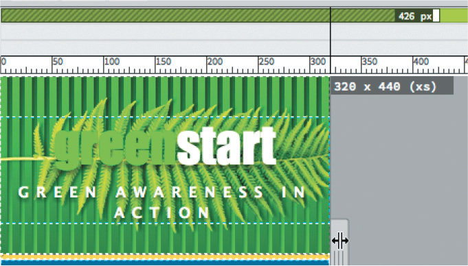
This is the width of the iPhone classic and probably the smallest device you will have to support. The motto breaks to two lines.
6. Click the motto “GREEN AWARENESS IN ACTION.”
The motto is highlighted, displaying the HUD focused on the p tag. When adding new rules, it’s vital that the rule be inserted into the correct style sheet and media query. The following technique will ensure that your rules get into the proper location every time in the CSS Designer.
7. Select green_styles.css in Sources.
Select (max-width:426px) in @Media.
Click the Add Selector icon  in Selectors.
The selector .row .col-sm-12 p appears in the Selectors window.
8. Edit the selector name to header.row p and press Enter/Return as needed to complete the name.

9. Add the following property to the new rule:
letter-spacing: .1em

The motto narrows to fit on one line.
10. Drag the Scrubber to the right.
Observe the header.
The motto remains narrow until the screen width exceeds 426 pixels. Then it expands to its original settings.
11. Save all files.
Now you can adjust the logo.
Copying and pasting CSS properties
In this exercise, you will learn how to create CSS styling by copying and pasting properties from one rule to another.
1. Drag the Scrubber to 320 pixels.
Click in the <header> element and select the header.row tag selector.
2. Click the All button in the CSS Designer, if necessary.
The <header> has a complex set of properties creating the background effects. Writing a new rule to tweak the <header> on small devices might be a challenge for some designers. But instead of writing the new rule from scratch, you’ll use a feature of the CSS Designer that will make the job fast and simple.
3. Select green_styles.css in Sources.
The Selectors window shows all the rules contained in the file. To narrow down the list to the rules affecting the <header>, use the Current button.
4. Click the Current button.
The selectors list shows only the rules affecting the <header> in green_style.css. The header.row rule is at the top of the list.
5. Select header.row in Selectors.
When the rule is selected, green_styles.css is bolded, indicating where the rule is located. The Properties window displays the current settings. The CSS Designer enables you to copy some or all of the styles within one rule and paste them into a new or existing rule.
6. Right-click the header.row rule.

A context menu appears. Note the options for copying some or all of the properties in the rule.
7. Select Copy Styles > Copy Background Styles.
8. Click the All button.
The All button must be selected to create new rules.
9. Select green_styles.css in Sources.
Select (max-width:426px) in @Media.
Click the Add Selector icon in Selectors.
The name .container .row appears in the Selectors window.
10. Edit the name to header.row and press Enter/Return as needed to complete the selector.
The new selector appears in the window. The Properties window is empty. The new rule has no styling applied to it.
11. Right-click header.row in Selectors.
In the context menu, select Paste Styles.

Note
Select Show Set to see the pasted styles, if necessary.
The background styles you copied in step 6 and 7 are pasted into the new rule. The Properties window is populated with the background styling from the original header.row rule.
There are now two rules formatting the <header>. Since the original rule still formats the element even at the smaller sizes, there’s no need to keep any property that isn’t going to change. You need only the ones that will reset the logo’s size. Let’s delete the redundant properties.
12. Select the new header.row rule and select the Show Set option in Properties, if necessary.
The Properties window displays the background specifications that were copied and pasted into the new rule. Beside the fields that allow you to add or edit CSS properties, each setting in the window also provides options to disable or delete the value.
13. Position the cursor over the background-color property.

When the cursor moves over the property, Dreamweaver highlights it. The Disable icon  and the Delete icon
  appear to the right.
14. Click the Delete icon .
The background-color property is removed.
15. Delete all background properties except background-size.

The new rule now styles only the background size. At the moment, the setting is still identical to the one in the original rule. You can use this last property to reformat the <header> on extra-small screens, but remember that it contains multiple settings to format the different parts of the background.
16. Right-click the rule header.row.
Select Go to Code from the context menu.
Dreamweaver switches to Split view and loads green_style.css in the Code window. The window is focused on the header.row rule in the media query @media (max-width: 426px).
Note
Switching the emphasis of the settings to the width instead of the height allows the logo to adapt better to the narrowing screen width.
17. Edit the declaration as highlighted:
background-size: 95% auto, auto auto, 100% auto;
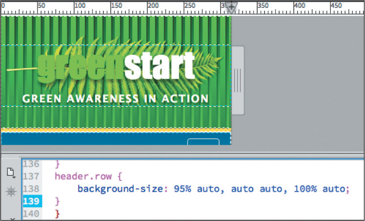
Live view updates the <header> display, scaling the logo to fit the width of the screen. The new settings will prevent the logo from getting too big on the smaller screens.
The last step is to tweak the text styles to fit the content better on smaller screens.
Completing the mobile design
In this exercise, you’ll wrap up the mobile design by overriding some of the existing rules to make the text fit better on the smaller window.
1. Open mylayout.html in Live view.
Adjust the screen width to 400 pixels to activate the new media query.
The logo and headings in the <article> element seem too large for the smaller screen. They take up too much space.
2. Open the CSS Designer, if necessary.
Select green_styles.css > (max-width:426px) > header.row
You can adjust all the text sizes in the <header> with a single property.
3. Create the following properties:
padding: 10px 0px
font-size: 80%

The logo text and motto scale down in size along with the height of the <header>.
4. Create a new rule: article.row section h1
Add the following properties:
padding-top: 15px
font-size: 185%
line-height: 1.1em
text-align: center

5. Create a new rule: article.row section h2
Add the following properties:
font-size: 150%
line-height: 1.1em

The h1 and h2 headings now fit the smaller screens better.
6. Save all files.
The layout is complete and adapted to mobile screens. In the next lesson, you will turn this layout into a Dreamweaver template, which will allow you to create pages based on the site design quickly and easily.
More information on media queries
To learn more about media queries and how to work with them, check out the following links:
• Adobe: http://tinyurl.com/adobe-media-queries
• W3C Consortium: http://tinyurl.com/w3c-media-queries
• Smashing Magazine: http://tinyurl.com/media-queries-smashing
Congratulations, you’ve successfully modified a predefined mobile-ready layout and adapted it to your site design requirements. Although it’s hard to imagine what amazing new features may come along, one thing you can be sure of is that Dreamweaver will continue to be at the forefront of web development. With support for media queries and other responsive techniques, the program continues to innovate and be a leader in the industry.
Review questions
1. What’s the purpose of a media type?
2. What are media queries?
3. How do media queries target a specific device or screen size?
4. What’s the difference between a mobile-ready and mobile-optimized site design?
5. Do you have to worry about CSS inheritance when using media queries?
6. In a mobile device, what happens to the webpage display if you rotate the device?
Review answers
1. A media type identifies what type of device is accessing the webpage, such as a screen, printer, Braille reader, and so on.
2. Media queries are a CSS3 specification for loading style sheets interactively, based on the size and other characteristics of the device viewing the webpage.
3. Media queries include a logical expression that instructs the browser what style sheet to load, based on screen and device characteristics.
4. Mobile-ready sites adapt the existing design to various screen sizes using media queries and custom style sheets. Mobile-optimized sites build duplicate sites using subdomains and content created especially for each environment.
5. Yes. But bear in mind that media queries can be written to format exclusively or in conjunction with other media queries or style sheets. By allowing a base set of styles to be inherited, you can save on the total amount of CSS that needs to be created by the designer and downloaded by the user.
6. By rotating the device, you are changing the width of the screen and its orientation. Both factors can be used to load various style sheets or rules to format the page components and content differently.