
6. Working with a Web Framework
Lesson overview
In this lesson, you’ll learn how to do the following:
• Insert and format new content and components into a Bootstrap-based layout
• Use the CSS Designer to identify applied CSS formatting
• Create advanced CSS background and gradient effects
• Access and use web-hosted fonts
This lesson will take about 3 hours and 30 minutes to complete. If you have not already done so, download the project files for this lesson from the Lesson & Update Files tab on your Account page at www.peachpit.com, store them on your computer in a convenient location, and define a new site in Dreamweaver based on this folder, as described in the “Getting Started” section of this book. Your Account page is also where you’ll find any updates to the lessons or to the lesson files. Look on the Lesson & Update Files tab to access the most current content.

Dreamweaver has incorporated many advanced functions and components from various web frameworks, such as jQuery and Bootstrap, to speed up and simplify the process of developing fully functional, mobile-friendly websites, much of it without having to write a single line of code.
Creating header content
If you start at the top of the webpage and work down, the first element to address is the <header>. If you follow the site design mockup as your guide, the <header> is composed of several components, including the company name, the motto, the logo, and a graphical background.
This effect could be reproduced by using a single image, but that image would have to be quite large. A single image would be the least flexible option, not to mention the least accessible. Instead, we’ll stretch your CSS skills by building a composite design combining text and multiple background effects. This technique will allow the design to be more adaptable to various devices, such as cellphones and tablets. Let’s start by adding the text.
1. If necessary, open mylayout.html from the lesson06 folder in Split view, with Live view enabled.
2. Click the first row of the Bootstrap structure.
Select the div.col-sm-12 tag selector.

3. Open the Insert panel.
Select the HTML tab from the drop-down menu.
The HTML tab provides an easy way to insert all sorts of standard HTML elements.
4. In the Headings drop-down menu, select H2.

The position-assist interface appears. This interface enables you to choose where the new element will be inserted: before, after, nested within the current selection, or wrapped around the selection.
5. Select Nest.

A new <h2> element appears within the <div> filled with placeholder text. Text can now be edited directly in Live view, but you need to know a simple trick to make it editable.
6. Double-click the placeholder text.
The blue HUD disappears and is replaced by a plain orange box, indicating that the content of the <h2> is now in text-editing mode.
7. Select the text and type greenstart in all lowercase.

The company name replaces the placeholder text. Now let’s add the company motto.
8. Press Enter/Return to create a new line.
Type GREEN AWARENESS IN ACTION in all uppercase.
The motto appears in a new <p> element, but the change is not permanent yet. Looking at the Code window you will not see the text you just typed. If you press the ESC key or click in the Code window, the new text may be discarded altogether.
 Note
Note
Exiting editing mode may take a moment. Be patient.
9. Click the cursor just outside the orange editing box.

The orange box disappears. The heading and the motto are now a permanent part of the header.
10. Save the file.
The text has been entered but still needs to be formatted. Text and structural elements are formatted using cascading style sheets. The main tool for creating, editing, and troubleshooting these style sheets is the CSS Designer. Before you start styling your new webpage and content, it will help to familiarize yourself with how the CSS Designer functions.
Working with the CSS Designer
In the upcoming exercises in this lesson, you’ll learn how to use the CSS Designer to inspect the existing CSS and create new rules to complete the basic site template design. Before you proceed, it’s vital to your role as a designer to understand and identify any existing structure and formatting of a page so that you can effectively complete your tasks.
It’s always a good idea when using any predefined components or frameworks to take a few minutes to examine the underlying HTML and CSS to understand what role they perform in the current document. It will also be a good opportunity to familiarize yourself with the CSS Designer and how to use it properly.
1. Open mylayout.html from the lesson06 folder in Live view, if necessary.
2. Choose Window > Workspace Layout > Design.
Choose Window > CSS Designer to display it, if necessary.

The CSS Designer has four windows that display different aspects of the CSS structure and styling: Sources, @Media, Selectors, and Properties. The latest version of CSS Designer also features two distinct modes: All and Current.
At this moment you should ensure that the All mode is enabled.
Note
CSS Designer should be a default component of the Design workspace, but sometimes users close panels unintentionally. Dreamweaver will remember any customizations you perform to the interface. If necessary, you can open it by selecting Window >CSS Designer.
3. Click the All button in the CSS Designer, if necessary.

The Sources window now displays all style sheets embedded or linked to the page. You should see two notations: ALL SOURCES and bootstrap.css.
4. Select ALL SOURCES in the Sources window.
Note
The Current mode limits the display to only the CSS affecting the element selected in the document window.
The @Media and Selectors windows display all the media queries and selector names defined in any listed style sheet. The All mode will be very helpful in tracking down a specific rule and where it’s defined. By selecting an item in either window, the CSS Designer will identify its location by highlighting its source in bold.
5. Select the rule a:active, a:hover in the Selectors window.

Note that the name bootstrap.css in the Sources window and GLOBAL in the @Media window are now bolded. The bolding indicates that a:active, a:hover is defined in the bootstrap.css style sheet as a global rule. This behavior works even in the other windows.
6. Select the first (min-width 768) media query in the @Media window. Observe the changes in the CSS Designer display.
Note that bootstrap.css is still selected but the Selectors window now shows only one name: .lead. This indicates that only one rule is defined within the selected media query.
7. Select the .lead rule in the Selectors window.

The Properties window displays the CSS properties defined in the rule. Depending on its configuration, you may not see which property or properties are set.
8. If necessary, select the Show Set option in the Properties window.

When Show Set is enabled, the Properties window displays only the properties modified by the rule. In this case, the .lead rule sets the font-size property to 21 px.
You may also notice that the Properties window has a gray background color. This indicates that the properties are non-editable. If you look at the Sources window, you can see that the bootstrap.css style sheet is marked as (read only). Since the page is based on the Bootstrap framework, Dreamweaver prevents you from modifying and potentially damaging its predefined styling. The styling contained within it is very complex and full of interdependencies. It’s recommended that any changes be made in your own custom style sheet.
At the moment, there is no custom style sheet. Before you can style the structure or content of the new page and site, you’ll have to add a new editable style sheet. You can create the style sheet directly in the CSS Designer.
9. Click the Add CSS Source icon  in the CSS Designer.
A drop-down menu appears that allows you to create a new CSS file, attach an existing CSS file, or define a style sheet embedded within the page itself.

10. Choose Create A New CSS File from the drop-down menu.
The Create A New CSS File dialog appears.

11. Type green_styles.css in the Create a New CSS File dialog.
Click OK to create the style sheet reference.

When you click OK, a reference to the new style sheet is added to the CSS Designer Sources window. The CSS file has not actually been created yet, but a link has been added to the <head> section of the page and the file will be created automatically as soon as you create your first custom rule.
12. Click green_styles.css in the Sources window.

The @Media and the Selectors windows are both empty. This means there are no CSS rules yet. You have a blank slate on which you can make any design additions or modifications. Since you will not change the Bootstrap CSS, this style sheet will be the means you use to make the structure and content bend to your wishes.
13. Select the text “greenstart” in the <header> element.
14. Click the Current button.
Observe the CSS Designer.

The windows in the CSS Designer change, displaying the media queries and selectors that format the selected element. A close inspection of the Sources window tells you that only the bootstrap.css file holds any of these rules. Then, a look at the Selectors window shows you the names of the rules that provide some sort of styling to the <h2> element itself or to its surrounding structure.
Note
Remember you learned in Lesson 3, “CSS Basics,” that some HTML elements have default styling. Default properties will not be shown in the CSS Designer.
15. Select each rule in the Selectors window, starting at the top of the list. Observe the Properties window as each rule is highlighted, but keep your eyes peeled for other changes in the workspace.
As you inspect each rule, you will see the Properties window change to display the formatting applied by each one. Did you notice that as you clicked each rule Live view highlighted the specific elements affected by the rule within the layout?
As you can see, CSS Designer can be used in a variety of ways to identify the styling applied to a specific element as well as to identify the element affected by a specific rule. It can also help you create and name the CSS rules.
Working with Type
In this exercise, you will learn how to create new selectors that will format text within the <header> element.
1. Select the All button again in the CSS Designer.
Note
When the Current button is selected, the CSS Designer allows you to edit only existing properties or add new properties to existing CSS rules.
When All is selected you can create new rules. Since bootstrap.css is locked, you need to select a different location for your new rule.
2. Select green_styles.css in the Sources window.
3. Click the Add New Selector icon .

The selector name .row .col-sm-12 h2 appears in the Selectors window. By default, Dreamweaver tries to create selector names using specific class or id attributes whenever they are present. This might be a good technique in a different layout, but this one is based on Bootstrap grid structures, meaning that the class names are not as useful as they might be in another situation.
For example, a selector written this way would affect <h2> elements inserted into the first, second, and fourth rows. To target the styling more narrowly, a bit of tweaking is required.
4. Edit the selector as shown: header.row h2
Press Enter/Return twice to complete the selector.

This new name will target only <h2> headings that are inserted into <header> elements with a class of row. Note that the Properties window has a white background, indicating that this rule is fully editable.
5. Deselect the Show Set option in the Properties window.
Only when Show Set is deselected does the Properties window display the list of all available CSS specifications. The list is organized into five categories, which can be accessed quickly by clicking their icons: Layout  , Text
  , Border
  , Background
  , and More
  . To focus the display on a particular category, you can use the category icons at the top of the Properties window.
Note
The Properties window is a list of CSS properties. You can also scroll up or down to the desired category.
6. Click the Text category icon .

The Properties window focuses on the Text properties. You’ll set some basic styling now and come back to this element later when you add more styling to the header.
7. Click the Set Color icon  to open the Color Picker pop-up window.
The color picker enables you to select colors in several ways. You can choose a color by sight by using the various visual tools or by entering the color by number, using RGB, Hex, or HSL values.
8. Select Hex and enter #00FF00 in the color field.
Press Enter/Return to close the color window.

The text changes color to a bright green.
9. Click the value field to the right of the font-family property.
A pop-up window appears showing nine groups of typeface names and several design categories, such as sans-serif and monospace. We’ll explore and learn more about how to use fonts later, but for the moment let’s just pick one of the predefined font groups.
10. Select the group Impact, Haettenschweiler, "Franklin Gothic Bold", "Arial Black", sans-serif

The <h2> is now formatted by the font Impact.
Defining values


11. Double-click the font-size property value field, enter 350%

As you learned in Lesson 3, font sizes based on percentage are factored from the size of the body element.
12. In the text-align property, select center.

The text moves to the center of the <header>. The text is hard to read in such a bright color, but a drop shadow can improve the legibility.
13. In the text-shadow property, enter the following specifications:
h-shadow: 0px
v-shadow: 5px
blur: 5px
color: rgba(0,0,0,0.4)

A drop shadow appears behind the heading.
The last task is to format the letters in “start” in white. This will require a custom class.
Creating Custom Classes
CSS styling can be applied to any distinct element, such as div, h1, p, a, and so on. When you want to apply formatting to a string of text that has no tag of its own, you need to use the <span> tag. When the styling can’t be targeted using the structure of the code itself, the use of a class attribute is warranted.
In this exercise, you will create a custom class to apply white to a portion of the logo.
1. Double-click the text “greenstart” to enter text-editing mode in Live view.
The blue HUD is replaced by the orange editing box.
2. Select the letters “start”.
3. Press Cmd+T/Ctrl+T to activate the Quick Tag Editor.
The Quick Tag Editor appears. It should default to Wrap tag mode.
4. Type <span> and press Enter/Return twice to complete the tag.
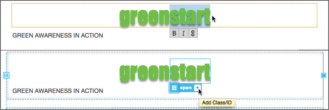
The blue HUD, displaying the span tag, replaces the editing box. There is no existing formatting to call on, so you’ll have to create a new class.
 Tip
Tip
If you know what class you want to add to the <span> tag, you can also add it directly in the Quick Tag Editor.
5. Click the Add Class/ID icon  in the HUD for the
 span tag.
6. Type .logowhite to create a new class name.

After you type the leading period (.) to start the class name, Dreamweaver will display a list of existing classes for you to choose from. As you continue to type, the list is filtered to names that match. When you are done typing, the list will disappear, indicating that this class name doesn’t already exist.
Note
If green_styles.css does not appear in the source menu, select it manually.
7. Press Enter/Return to create the class.

A window appears allowing you to pick the style sheet and media query into which you can insert the new class. Since bootstrap.css is a read-only file, the menu should default to green_styles.css. At the moment, there are no media queries in green_style.css, so the class will be entered as a global style.
8. Press Enter/Return to complete the creation of the class logowhite.
9. Select green_styles.css in the Sources window.
Select .logowhite in the Selectors window.
10. Select the Text category icon in the Properties window.
11. In the color property, enter #FFFFFF

The letters “start” appear in white. The logo is complete. Now, let’s format the association motto. As with the heading, the process starts with a selection.
12. Select the text “GREEN AWARENESS IN ACTION” in the <header> element.
The blue HUD should appear around the <p> element.
13. If necessary, select the green_styles.css file in Sources.
14. Click the Add Selector icon .
The name .row .col-sm-12 p appears in the Selectors window.
15. Change the selector to header.row p
Press Enter/Return twice to complete the name.

The new selector will target only <p> elements in the <header>.
16. Click the Text category in the CSS Designer, if necessary.
17. In the font-family property, select "Lucida Grande", "Lucida Sans Unicode", "Lucida Sans", "DejaVu Sans", Verdana, sans-serif.
18. In the font-weight property, enter bold
19. In the text-align property, select center.
20. In the text-shadow property, enter the following specifications:
h-shadow: 0px
v-shadow: 3px
blur: 5px
color: rgba(0,0,0,0.50)

21. In the letter-spacing property, enter .5em
The spacing between the letters expands.
22. In the color property, enter #FFFFFF

The motto now displays in white with a drop shadow. The styling of the header text is complete.
23. Save mylayout.html.
Next, you’ll learn how to add background effects to the element.
Adding a background image
In this exercise, you will add the first background image to the <header> element and then use CSS to adjust its size and position.
1. If necessary, open mylayout.html from the lesson06 folder and switch to or activate Live view.
2. Select or open the CSS Designer.
3. Click the first row of the Bootstrap structure.
Select the header.row tag selector.

4. Click the All button in the CSS Designer.
5. Select green_styles.css in the Sources window.
When green_styles.css is selected, the Selectors window displays only the rules that appear in that file.
6. Click the Add Selector icon .
The selector name .container .row appears in the Selectors window. As you saw earlier, this name is too generic to be useful here. It would format every element with the class of row, which includes all four rows of the layout. In this case, you want to format only the <header>.
7. Edit the selector name to say header.row
Press Enter/Return as needed to complete the name.

This new selector appears in the CSS Designer and will specifically target only the header row. The first thing you should do is add a little breathing room above and below the header text. In the past, designers would often set a fixed height to elements like this. But the trend is to stay away from hard measurements so that the design can be more responsive and adaptable. One technique is to add padding to an element, which allows it to expand naturally.
8. Click the Layout category icon .
9. In the padding property, enter 20px 0px

The header increases in height 40 pixels in total.
If you remember from Lesson 3, you can abbreviate CSS values using shorthand. This property applies 20 pixels of padding to the top and bottom of the header. Now, let’s insert a background image.
10. Click the Background category icon .
In the background-image section, click in the URL field.
11. Click the Browse icon  next to the URL field.

12. In the Select Image Source dialog, navigate to the default images folder.
13. Select fern.png and click Choose/Open.
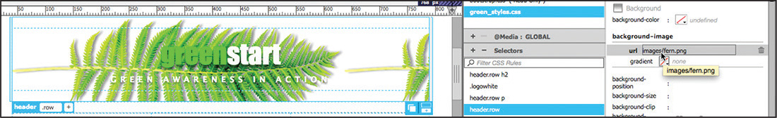
Background images repeat both vertically and horizontally by default. This image is too tall to repeat vertically but, depending on your screen size, two ferns appear left to right.
14. In the background-repeat property, choose the no-repeat option.

The background image now appears once in the <header> element, aligned to the left side. The background specifications can also control the size and alignment of background images.
15. In the background-size property, select % from the height (right side) value field.
When you set the measurement system, the value defaults to zero (0). If only one value is set, the other value is set to auto by default. For the background-size property, a percentage value scales the image based on the size of the parent element. In the Properties window you can enter the value via the keyboard or by using the mouse.
16. Position the cursor over the height value field.
Drag to the right to increase the value to 80%.

The image will scale to 80 percent of the height of the <header> element.
Tip
If you find the process of dragging to set the values too difficult, you may enter them via the keyboard by double-clicking the field.
17. In the background-position property, select center from the horizontal (left side) and vertical (right side) value fields.

The image appears centered vertically, but it seems slightly off-center horizontally.
18. In the background-position property, select % from the horizontal (left side) field.
The field defaults to zero (0).
19. Click the field and drag to the right to increase the setting to 47%.

The fern image is now visually centered vertically and horizontally in the <header>.
20. Save the file.
In addition to the background image, you can also apply other background effects, such as solid colors and even gradients. Since gradients are a new CSS3 specification, it’s recommended that you always add a solid color to the background to support browsers or devices that don’t support gradients.
Adding other background effects
In this exercise, you will add both a background-color and a background-gradient to the <header> element.
1. If necessary, open mylayout.html in Live view and open the CSS Designer.
2. Click the All button in the CSS Designer.
Select green_styles.css in the Sources window.
Note
Hexadecimal colors can be written in shorthand, like #090, when the numbers are in matched pairs, such as #009900. Be aware, however, that any time you enter such shorthand expressions Dreamweaver may arbitrarily rewrite them in full or swap them with RGB values.
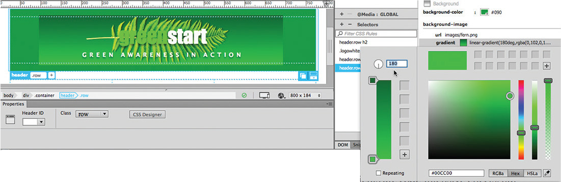
3. Select the header.row rule.
In the background-color property, enter #090
The background color of the header changes to green. This color setting is a fallback option, which will display if the browser doesn’t support CSS gradients. Next, let’s create the gradient background for the newer applications and devices.
4. In the background-image property of the header rule, click the gradient color picker .
CSS3 gradients are code-intensive effects, but Dreamweaver’s gradient color picker makes their specification both fast and easy. The default gradient has two color stops.
Note
When you set colors using hexadecimal formats in gradients, Dreamweaver will change them to RGBa notations automatically.
5. Set #060 as the top gradient color stop.
Set #0C0 as the bottom gradient color stop.
Set the Linear Gradient Angle to 180 degrees.
Press Enter/Return to complete and apply the gradient.
The gradient is applied, but there’s a problem. The effect is centered vertically and horizontally behind the fern image but does not fill the entire header from edge to edge. Background gradients are treated as background images. Since there’s already a background image applied to the element, the gradient uses the same size and positioning specifications that were applied to the fern.
CSS3 allows you to apply multiple background images to an element. It even allows you to apply individual specifications to each effect. Unfortunately, although the CSS Designer can apply both a gradient and an image to the background, it provides only one set of size and positioning specifications. But don’t worry. Whenever the CSS Designer lets you down, you can always resort to Code view.
6. Right-click the header.row rule in the Selectors window.
Choose Go to Code from the context menu.

Tip
Don’t forget to add the comma (,) between each specification. They won’t work properly without it.
Dreamweaver switches to Split view, inserts the cursor in the Code view window, and focuses on the header.row rule in the style sheet. Note that the background-image property shows specifications for both the fern image and the gradient in one declaration. A comma separates the two properties.
Note
CSS properties in your code may appear in a different order than that pictured.
If you examine the background-size and background-position properties, you’ll see but a single specification in each. To add a second value for the gradient, you just have to add a comma at the end of each declaration and then enter the desired values.
7. Add the following highlighted values to these existing properties:
background-size: auto 80%, 100% auto;
background-position: 47% center, left top;

8. Select Show Set in the Properties window.
Observe the header.row rule and all the specifications displayed in the CSS Designer.

The Properties panel displays the background image and gradient but shows only one set of specifications for the size and position. You can edit the original set using the CSS Designer, but you’ll have to continue to edit any others in Code view, manually.
Tip
In some cases, you may need to refresh the document window display manually to see the effects of the CSS.
9. Choose File > Save.
The fern remains formatted as before, but the gradient now fills the entire header.
Incompatible Code

Be sure to read the message and follow the links to learn more. When you are finished, you can clear the message by clicking the  on the right side of the window.
Now that you’ve learned how to edit the rule manually, there’s nothing stopping you from taking this effect one step further by adding a third background effect to create the vertical stripes, as shown in the mockup.
10. Right-click the header.row rule.
A context menu appears.
11. Select Go To Code from the menu.
The Code view window appears in Split view focused on the first header.row rule in the linked style sheet.
The reference to fern.png appears first in the background-image property, the gradient in the second. To get the stripes to appear between these two effects, you’ll have to insert the new specifications between them. Be sure to separate each new specification with a comma.
Note
The stripe.png image is identical to the one created using Adobe Generator in Lesson 4, “Web Design Basics.”
12. Modify the following properties:
background-image: url(images/fern.png), url(images/stripe.
png), -webkit-linear-gradient(270deg,rgba(0,102,0,1.00)
0%,rgba(0,204,0,1.00) 100%);
background-image: url(images/fern.png), url(images/stripe.
png), linear-gradient(180deg,rgba(0,102,0,1.00) 0%,
rgba(0,204,0,1.00) 100%);
background-repeat: no-repeat, repeat-x;
background-size: auto 80%, auto auto, 100% auto;
background-position: 47% center, left top, left top;

13. Choose File > Save All.
The stripes appear and repeat horizontally across the header. By using a small graphic that repeats across the element, you are minimizing the size of the graphics that must be downloaded to create this effect. Best of all, if the graphic doesn’t download at all, the gradient background is still displayed. In the odd chance that neither the graphic nor the gradient is displayed, the header will display the solid green color applied in step 1.
The basic design of the <header> element for desktop or GLOBAL environments is now complete. The text, logo, and background effects will require some custom specifications for smaller screens, but we’ll address that task in Lesson 7, “Designing for Mobile Devices.” Instead, let’s turn our attention to the next component on the page: the horizontal navigation menu.
Creating a navigation menu
The site mockup we used in Lesson 5 sports a horizontal navigation menu with seven links. We don’t have seven pages to link to yet, but you can create simple placeholders for the final content; we’ll add actual functioning links in Lesson 11, “Working with Navigation.” Let’s create a menu to match the pages outlined in the thumbnails created in Lesson 4, and then style it to match the site color scheme.
Note
The site design mockup is included in the file set for Lesson 6. Feel free to open GreenStart_mockup.html to refresh your memory of the design and components.
1. If necessary, open mylayout.html in Live view.
2. Select the second row of the Bootstrap layout.
The Element HUD appears.
3. Display the Insert panel.
Select the Bootstrap Components category.
The Bootstrap Components category offers two types of navigational elements: complete navigational menubars, or navbars, and standalone navigational menu components. In this situation, you’ll use one of the complete navbars. Since the component already has its own built-in responsive structure and formatting, one of the existing layout elements will have to be removed to prevent conflicts, along with some other tweaks.
4. Select the div.col-sm-12 tag selector.

This <div> element is inserted as a responsive Bootstrap element. The class col-sm-12 formats the element to occupy all 12 columns in the grid, or the entire width of the container. The Bootstrap navbars are designed to be responsive, so this element is redundant and may cause undesirable interference with the navbar itself. You will replace this element with the navbar.
5. In the Navbar item drop-down menu, click Basic Navbar.

The position-assist dialog appears.
6. Click Nest.
A predefined Bootstrap navbar appears nested in the <div>, which can now be removed. The easiest way to delete an element is by using the Remove Tag command.
7. Switch to Split view. If necessary, select Source Code in the Referenced File display.
The Remove Tag command works only in Design view or Code view.
8. In Code view, locate and insert the cursor after the tag <div class="col-sm-12">.

9. Right-click the div.col-sm-12 tag selector.
Select Remove Tag from the context menu.

The <div> is removed from the layout without affecting the navbar.
The navbar remains composed of two separate navigation menus with drop-down components and a search field with a button. It would be a rare situation that you would want or need all of these items.
In this case, you need only a single set of seven links. Any element that’s not needed should be deleted. The safest method to select and delete HTML elements is via the tag selector interface.
10. In Live view, click the Dropdown menu on the right side of the navbar in Live view.
The HUD appears, focusing on the a tag. Observe the tag selector interface.
Can you identify the parent element to the right side menu?
11. Select the ul.nav.navbar-nav.navbar-right tag selector.
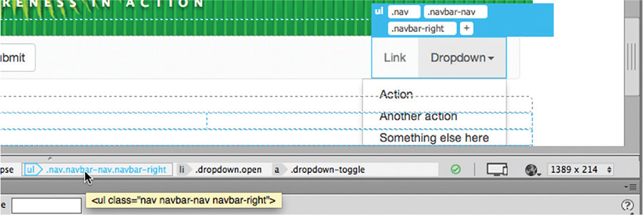
The entire menu on the right side of the navbar is selected, displaying the HUD.
12. Press Delete.
The menu is removed. Next, you’ll remove the search field and button.
13. Click the search field or button.
As before, the HUD appears, identifying the selected element. If you examine the tag selectors, you should be able to track down the parent structure. It helps to know that search fields need to be inserted in HTML <form> elements.
14. Select form.navbar-form.navbar-left in the tag selector interface and press Delete.

The search field and button are removed. The current design doesn’t call for a drop-down menu. If you need one later, it’s a simple matter to add one back. Drop-down menus are usually built from a sub-list inserted into an existing menu item.
15. Click the Dropdown menu and observe the tag selectors.
Dreamweaver will focus on the a tag in the parent <li>. In Live view, the drop-down menu should open, displaying the sublinks contained within the menu. Deleting the parent will remove the entire structure.
16. Select li.dropdown and press Delete.
The drop-down menu is removed, leaving two links and the word Brand. At first you might think that the word is simply another link in the remaining menu. But a quick look using the tag selectors and you will see the reality.
17. Click one of the Link items in the menu, and then click the word Brand. Examine the tag selectors.
If you compare the structures, you should see that the Link items are contained within nav.nav.navbar-nav, while the word Brand is actually in nav.navbar-header. In Bootstrap, the Brand element is intended to be used as a stand-in for your logo and to provide a handy link back to your home page. Like the other elements, it’s unneeded in this layout. You need to remove the text as well as the link markup.
18. Select the a.navbar-brand tag selector and press Delete.

All the unneeded components have now been removed. Next, you will replace the generic link placeholders with ones that match the site design and learn how to make new Link items.
19. Double-click the first menu item.
Select the text “Link” and change it to Home.

20. Change the remaining Link item to Green News and save the file.
The two predefined links now match the menu items from the design mockup, but you still need to create five more items. The good thing about using an unordered list for the menu is that Dreamweaver makes it easy to insert new list items.
Adding new items to a navigation menu
In this exercise, you will learn how to insert new items in the navigation menu. Links can be added in any view mode, although the techniques differ.
1. In Live view, click the Green News link.
Select the li tag selector.
2. Choose Window > Insert to display the Insert panel.
In the HTML category, click the List Item option.
The position-assist interface appears.

A new list item appears with placeholder text.
Tip
Double-click to edit the text element. Click outside the orange editing box to finalize the content.
4. Select the placeholder text Content for li Goes Here.
Type Green Events to replace it.
The new item appears beside the previous ones, but it’s not formatted like the other links. You might be able to figure out what’s wrong using Live view, but in this case, the problem can be identified faster in Code view.
5. Click the <li> tag selector for the new link item and switch to Code view. Observe the menu items and compare the first two to the new one.

Can you identify the difference? In fact, there are a few. For one thing, the first item features a class of active as well as a <span> element containing text intended for screen readers (class="sr-only"). But the only thing the first two share that the last item lacks is the hyperlink placeholder markup <a href="#">.
Since this is the only meaningful difference between the list items, you can rightly assume that the <a> markup is conveying at least part of the menu styling. To make Green Events look like the other menu items, you have to add a hyperlink to it, too, or at least a similar placeholder.
6. Select the text “Green Events” in Code view.
In the Property inspector Link field, type # and press Enter/Return.

Tip
If the Property inspector is not visible, you can display it by selecting Window > Properties. You can then dock it to the bottom of the program window.
The <a href="#"> notation is added to the text so that the menu item now features the same markup as the others.
7. Switch to Split view.

The new item looks like the others. New menu items can also be added by typing.
8. In Live view, insert the cursor at the end of the text “Green Events” and press Enter/Return to create a new line.
It may not be apparent in Live view, but Dreamweaver is creating a new <li> element in the background. But unlike using the Insert panel, this method doesn’t add any placeholder text.
9. Type Green Travel and select the text.
Click just outside the orange editing box.

The HUD appears focused on the new Green Travel item.
10. In the Property Link field, enter # and press Enter/Return.

The new Green Travel link is complete. You can also add menu items in Code view.
In this view, you can choose from several methods for creating a new list item. For example, you can type out the entire element manually, use the Insert panel as in step 2, or use copy and paste.
12. Insert the cursor in the Green Travel link.
Select the li tag selector.
By using the <li> element, Dreamweaver selects the link markup as well as the text.
13. Choose Edit > Copy or press Ctrl+C/Cmd+C.
14. Press the right arrow key.
The cursor moves to the end and outside the current <li> element. Although there’s no need to insert a new line in the code, it keeps the markup consistent and easier to read.
15. Press Enter/Return to insert a new line.
Choose Edit > Paste or press Ctrl+V/Cmd+V.

A duplicate version of the Green Travel list item appears.
16. Select the duplicate text Green Travel.
Type Green Tips to replace it.
The new menu item is complete and already contains the link # placeholder.
17. Using any of the methods describe above, create two more menu items for the links Contact Us and About Us.

18. Save the file. If necessary, switch to Split view.
There are seven items in the menu now. Before you can format the menu, though, you’ll have to correct some inconsistencies in its basic structure. These differences entail the attributes class active and the screen reader text (sr-only) noted earlier. Let’s discard both of them.
Cleaning up Bootstrap components
Your newly modified Bootstrap menu has some inconsistent code structures in the new menu. In this exercise, you’ll clean up these inconsistencies.
1. If necessary, open mylayout.html.
Switch to Split view.
2. Examine the code of the horizontal menu.
The menu is constructed using an unordered list with seven list items. In Live view you can see that the Home link is formatted differently from the rest. The most obvious difference between this link and the others is the class attribute active.
3. Select and delete the attribute  from the first
 <li> element in Code view.
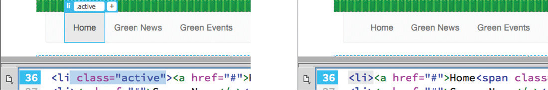
Once the class is deleted from the Home link, the formatting of the button will match the others. The last step is to remove the screen reader text.
4. Select and delete the element  from the first
 <li> element.

5. Save the file.
All the links in the menu are now formatted identically. It’s common when using predefined or third-party components that you will have to modify the original structure and formatting to conform to your own content or project requirements.
Styling a navigational menu
Menus typically exhibit two basic behaviors, or looks: a static, or default, state and a rollover, or hover, state. All the formatting is controlled by CSS.
1. Open mylayout.html in Live view, if necessary.
Maximize the program to fill the computer display.
The document window should be wider than 1024 pixels.
The navigation menu was created from a Bootstrap component and comes with basic predefined styling provided by the Bootstrap default style sheet, which is locked. Any styles you create will be added to the green_styles.css file. The new styles will reset or override the predefined specifications or create new ones from scratch. The first step is to add a background color to the entire menu.
2. Select any menu item. Examine the tag selectors to identify the structure of the menu.
The menu is built by inserting an <a> element within an unordered list. The list is contained within the nav.row element you created originally using Bootstrap components. But the formatting is coming from some aspect of the menu you inserted. To create a background color for the entire navbar, you first need to identify the rule that applies the current formatting.
Note
You will notice that the row and the navbar feature <nav> elements and classes named “nav,” which could create some confusion. When identifying elements for styling, make sure you select the correct one.
3. Click the Current button in the CSS Designer.
The Selectors window displays a list of rules that are applying some sort of styling to the navbar or menu items.
4. Select the Show Set option, if necessary.
5. Start at the top of the Selectors list and click each rule. Examine the properties assigned by each, and look for any that assign background colors or background gradients.
The very first rule applies a background color of transparent. Although this is the correct property, you can see that the background of the navbar has some sort of shading or gradient. Keep looking.
Next, you will come across a rule that formats the a:hover and a:focus states of the menu links. Although this is a valid background property, the a:hover and a:focus selectors will format only the actual hyperlinks themselves. There still has to be another rule that formats the entire navbar. Keep looking.
Finally, over 20 rules down the list you will find .navbar-default, which applies a background color of #f8f8f8. To reset the styling and apply a background to match the site design, you have to make a new rule that has equal or greater specificity.

6. Select the nav.navbar.navbar-default tag selector.
The HUD appears around the entire navbar.
7. In the CSS Designer, click the All button.
Select green_styles.css in the Sources window.
Click the Add Selector icon .
A suggested selector name appears in the window.
8. Edit the name to:
nav.row .navbar.navbar-default
9. Press Enter/Return twice to complete the selector.
10. In the CSS Designer, deselect Show Set.
11. In the Background category, enter #069 in the background-color property.

The background color changes from light gray to dark blue. The background-color property covers the older browsers; now let’s add some advanced styling.
12. In the background-image property, click the gradient color picker.
13. Set #069 as the top gradient color stop.
Set #08A as the bottom gradient color stop.
Set the Linear Gradient Angle to 180 degrees.
Press Enter/Return to complete and apply the gradient.
The gradient background supersedes the solid background color. The new background color is nice, but it makes the menu buttons hard to distinguish. They could use some definition of their own, like adding some borders.
14. Select one of the menu items.
The HUD displays the a tag.
15. In the CSS Designer, click the Current button and enable the Show Set option again.
Check the list of rules again for ones that set borders. When you are finished, you’ll find that there are a few that apply borders to the entire navbar, but none that do so for the menu items themselves. You could apply rules to either the <li> or the <a> element in this structure, but in this case it makes more sense to create a rule to format the <a> element.
16. Click the All button.
In green_styles.css, create a new selector named
nav.row.nav.navbar-nav > li > a
By adding nav.row to the selector, it will override the default formatting and specifically target only this nav element. It will also preclude the rule from unintentionally formatting other menus you may insert in the layout later.
Note
The greater-than symbols you see in the selector name indicate that the rule is targeting only the immediate children of the preceding element rather than any descendant.
17. Add the following properties to the new rule:
border-top: solid 1px #0AE
border-right: solid 1px #037
border-bottom: solid 1px #037
border-left: solid 1px #0AE

By alternating the border colors this way, it produces a three-dimensional effect on the menu buttons.
The main feature of the navigation menu is the hyperlink. It features five distinct states: link, visited, hover, active, and focus, in that order. See the sidebar “Hyperlink pseudo-classes” for a full description of hyperlink behaviors and states.
When links appear in the body of a webpage, the link and visited states are usually formatted separately, but in a menu you want them to be identical. The selector created in step 16 already targets the default a state of the hyperlink. But you’ll need to add the visited reference to the name to cover both behaviors.
18. Double-click the name nav.row .nav.navbar-nav > li > a.
The selector name becomes editable.
19. Select the entire name and copy it.
20. Insert the cursor at the end of the selector, type :link, and press Ctrl+V/Cmd+V to paste the copied selector.
Note
Don’t forget the comma between selectors.
21. At the end of the new name, type :visited and press Enter/Return as needed to complete the name.

The new selector targets the link and visited states of the menu items. Check your selector name to make sure you did not accidentally add spaces to the pseudo-classes.
Note
It’s not required to add the :link markup to the default link name, but it increases the specificity of the rule.
22. Deselect the Show Set option.
In the Text category, enter #FFC in the color property.

The link names appear in light yellow.
The :hover pseudo-class is responsible for styling links whenever the cursor is positioned over them. Normally, you’ll see this behavior simply as the cursor turning into the pointer icon, but for this dynamic menu let’s apply different background and text colors to create a rollover effect.
23. Click the Add Selector icon . Select the new name and press Ctrl+V/Cmd+V to replace it with selector you copied in step 19.
24. At the end of the name, type :hover
Press Enter/Return twice to create the new selector.

25. In the background-image property, click the gradient color picker.
26. Set #069 as the top gradient color stop.
Set #08A as the bottom gradient color stop.
Set the Linear Gradient Angle to 0 degrees.
Press Enter/Return to complete and apply the gradient.
The new gradient is a mirror image of the one created in step 12.
27. In the Text category, enter #FFF in the color property.
You can test the effect in Live view.
28. Position the cursor over any of the menu items.

The gradient background flips vertically and the link color displays in white, providing a good contrast from the default menu state. Now, let’s add the yellow border that divides the header from the menu.
29. Create a new Selector named nav.row
In the border-top property, enter 5px solid #FD5

A yellow border appears above the menu.
30. Select File > Save All.
The navigation menu is nearly complete. The last step is to center the menu horizontally within the navbar itself.
Centering the navigation menu
Bootstrap allows you to create complex menu and navigation components with a minimum of effort, but it doesn’t offer unlimited styling options. For one thing, the framework offers two basic alignment options for horizontal menus: aligned to the left or justified across the entire structure. Aligning the menu to the center of the navbar, as in our site design, will require you to step away from the framework defaults and create your own custom styling.
The first step is to set a fixed width on the menu.
1. Create a new selector in green_styles.css named
nav.row .nav.navbar-nav
Note
The menu width is derived from the Bootstrap CSS, which sets a maximum of 750 pixels for the menu before it collapses to an icon. You will work with mobile design in Lesson 7.
2. In the width property, enter 715px
This width allows the menu to fit on one line but still function properly in the responsive structure. Now that you have set the element width, you can center it using a simple CSS trick.
3. In the margin property, enter the shorthand:
0px auto

The shorthand applies zero pixels of margin to the top and bottom of the menu and equal amounts of spacing to the left and right. This setting should center the element, but the menu isn’t moving. When styling doesn’t work as expected, use CSS Designer to identify the issue.
4. Click the Current button in CSS Designer.
Select the COMPUTED option in the Selectors window.
5. Select Show Set and examine the properties styling the menu.

Some properties are displayed in gray and some in white, indicating which items are editable and which are not. One of the uneditable Bootstrap rules sets a float:left property. We can cancel it out using the rule created in step 1.
6. Select the nav.row .nav.navbar-nav rule.
When the Show Set option is enabled you can still edit the properties and values in the CSS Designer or even create new ones. When Show Set is enabled you don’t see a list to choose from, so you have to know what property you want to enter in the open field.
7. Insert the cursor in the empty field in the Properties window.
8. Type float and press the Tab key.
Note how the hinting menu filters as you type. As with the HTML hinting menu, feel free to select the property using your mouse or keyboard.
9. Type or select none in the value field.

The menu centers in the navbar. There’s one last tweak you need to make. If you look closely at the second row, you will see that there is space below the navbar. If you examine the rules affecting this element, you will find a bottom margin of 20 pixels applied via one of the Bootstrap rules: .navbar.
10. Create a selector named nav.row .navbar
Create a new property margin-bottom and enter 0px
The space below the navbar is removed. The navigation placeholder is now complete.
11. Select File > Save All.
The next task is to fill in the content area. First, you’ll insert new placeholder content in the left <aside> element.
Building semantic content
The left column of the <article> element will be used for environmentally themed quotations. In the past, you might display quotations like any other paragraph, but to follow web standards under HTML5 you’ll want to build these quotations using semantic elements. Unlike normal paragraph text, the value of a quotation is usually based on the perceived reputation of the author or source. HTML provides several elements designed specifically to identify this type of content.
1. If necessary, open mylayout.html in Live view.
2. Click the first column of the third row.
Examine the tag selectors.
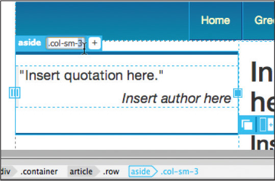
The current structure is based on an <aside> element with the class of col-sm-4. First, we’ll insert the placeholder for the quotation and then wrap it with a semantic structure.
3. Open the Insert panel and select the HTML category.
4. Click the Paragraph item.
Select Nest.
A <p> element appears in the column with placeholder text.
5. Select the placeholder text This is the content for Layout P Tag and delete it.
6. Type “Insert quotation here.” and press Enter/Return to create a new paragraph.
7. Type Insert author here and click outside the orange box to complete the elements.

Semantically, quotations should be based on the <blockquote> element. You need to put both paragraphs into the blockquote, but unfortunately, you can’t select two elements at once in Live view.
8. Select the p tag selector for the first paragraph.
Select Split view.
The first paragraph is selected entirely.
9. In the Code view window, hold the Shift key and click at the end of the second paragraph.
Both paragraphs are selected in Code view.
10. Press Ctrl+T/Cmd+T to activate the Quick Tag Editor.
The Quick Tag Editor appears in Wrap tag mode.
11. Type blockquote

12. Press Enter/Return twice to close the Quick Tag Editor and complete the element.
When it’s completed, the default styling of the <blockquote> element automatically formats the content, indenting the text on the left and right. Such indentation is typical of material quoted within a term or research paper, and may be desirable in the main content area, but it’s totally unnecessary in the <aside> element. You’ll need to create a new CSS rule to format these elements.
13. If necessary, click the All button.
Create a new selector in green_styles.css:
article.row aside blockquote
The Show Set option should still be active from the previous exercise.
14. Create the following properties in the new rule:
margin: 0px 0px 20px 0px
padding: 0px

Typically, a blockquote should contain a quotation, either alone or in one or more paragraphs, and an element providing the source or citation. Like <blockquote>, the <cite> element provides the correct semantic structure in this application.
15. In Code view, select the second paragraph.
Select the p tag selector.
Note
The Quick Tag Editor features three modes: Edit tag, Wrap tag, and Insert HTML. When you select an element using the tag selector, the Quick Tag Editor should default to Edit mode. Press Ctrl+T/Cmd+T again to switch modes.
16. Press Ctrl+T/Cmd+T to edit the tag.
Replace the p tag with cite and press Enter/Return twice to complete the edit.

Tip
An alternate method is to right-click the tag selector and access the Quick Tag Editor from the context menu.
If you look carefully, you can see that the opening quotation mark in the first paragraph is indenting the first line of text slightly, leaving the text in the two paragraphs misaligned. A technique used by professional typesetters actually outdents such items to produce a hanging quotation mark.
17. Create a new selector in green_styles.css:
article.row aside blockquote p
18. Create the following properties:
margin: 0px 0px 5px 0px
padding: 0px .5em
text-indent: -0.5em

You can see now that the two lines of text are aligned, while the quotation mark is shifted to the left slightly. The effect on multiline quotations will be quite appealing.
Now you’ll create a new rule to style the author name.
19. Create a new selector: article.row aside blockquote cite
20. Create the following properties in the new rule:
display: block
padding: 0px 10px
font-style: italic
text-align: right
The quotation placeholder is complete and semantically designed. To remain semantically correct, each new quotation should be inserted into its own <blockquote> element. The last thing you need to do is add the top and bottom borders shown in the site design.
21. Create a new selector: article.row aside
This rule will format both the left and right columns at once.
22. Add the following properties to the new rule:
border-top: solid 5px #069
border-bottom: solid 3px #069
margin: 1em 0px
padding: 1em 0px

Both <aside> elements display blue borders on the top and bottom.
23. Select File > Save All.
The placeholder for the first column is complete. Let’s address the center section of the <article> element next.
Inserting main content placeholders
The layout will feature the main content in the center column. Content is usually introduced with HTML heading elements. In the past, typically only one <h1> would appear on each page. With the new semantic element, some designers are actually using <h1> elements to introduce each major section or article. For this design, you’ll start with one <h1> and use more when warranted.
1. Click the second column in the third row.
The HUD appears focused on the <section class="col-sm-4"> element.
2. Using the Insert panel Heading drop-down, insert an H1 nested in the center column.
3. Select the placeholder text.
Type Insert main heading here to replace the text.
4. Press Enter/Return to create a new line.
Type Insert subheading here and press Enter/Return.
5. Type Insert content here and click outside the orange editing box.

You have now created one heading and two new placeholder paragraphs. You need to make the first paragraph an <h2>.
6. Click the first paragraph “Insert subheading here”.
The HUD appears focused on the p element.
7. In the Property inspector, select Heading 2 from the Format drop-down menu.
The paragraph is converted to an <h2> element. The placeholders for the center content area are complete. You’ll format them later.
Tip
If the Property inspector is not visible, you can display it by selecting Window > Properties. Most people like to dock it to the bottom of the document window.
8. Save the file.
Now, let’s add placeholders and formatting to the right column.
Creating custom element classes
The right column of the layout will contain materials related to the main content. As you can see from the site design, the element has a background color. You already have a rule that formats both <aside> elements, but in this case, the background will apply only to the right column. When you need to target styling to a specific element and there’s no structural difference between it and other similar elements, a custom CSS class is warranted. First, we need to add a class attribute to the element. There are several ways you can do this, but using the HUD in Live view is fast and easy.
1. Open mylayout.html in Live view.
2. Select the third column of the third row.
The HUD appears focused on the aside element with a class of col-sm-4.
At the moment, this structure is identical to the first column.
3. Click the Add Class/ID icon in the HUD.
A blank text field appears beside the existing class col-sm-4.
4. Type .sidebar2 and press Enter/Return.

A dialog appears allowing you to insert the new class into an existing style sheet and media query. If green_styles.css does not appear in the source menu select it manually.
5. Press Enter/Return to complete the operation.
If you look at the green_styles.css reference in the CSS Designer, you will see the new class .sidebar2. The class will allow you to apply styling to the right column that differs from the left.
6. Select .sidebar2 in the Selectors window.
Create the following properties:
background-color: #CFC
padding: 0px 10px

A light green background color appears in the right column. Let’s add the placeholder text.
7. Using the Insert panel, add an <h2> element to the right column using the Nest option.
8. Select the placeholder text.
Type Insert sidebar heading here to replace it.
9. Press Enter/Return to create a new paragraph.
Type Insert sidebar content here on the new line.
10. Create a new selector, .sidebar2 h2
11. Create the following properties in the new rule:
margin-top: 10px
margin-bottom: 5px
padding: 0px 10px
font-size: 130%
line-height: 1.4em
12. Create a new selector, .sidebar2 p
13. Create the following properties in the new rule:
margin-bottom: 5px
padding: 0px 10px
line-height: 1.3em
14. Save all files.
The right column is complete. Before we move on to the <footer>, we need to adjust the spacing of the three columns in the main content row. Currently, the three columns are equal in width, but in the site design the left and right columns are narrower than the center one. Since the widths are determined by the predefined Bootstrap, changing the relationship of these elements is simply a matter of changing their class names.
The Bootstrap style sheet is formatted as a read-only file to prevent you from making any accidental changes to the framework’s complex styling. From time to time as you work in your pages, a warning message may appear at the top of the screen indicating that the file is read-only. You can dismiss the message by clicking the icon on the right side. It also provides an option to make the file writable. You’re advised to resist the temptation.

Managing Bootstrap component width
Bootstrap is based on a 12-column vertical grid system. Elements inserted into a layout conform to this grid by occupying some fraction of it. The amount of space an element uses is typically represented by a number that appears in the class attribute. For example, the three columns all have a class of col-sm-4. Since 4 divides into 12 three times, each column occupies one-third of the screen. By adjusting these class names, you should be able to change the width of each element.
1. Open mylayout.html in Live view, if necessary.
At the moment, the three columns have the same class name and are equal in width.
2. Click the first column of row three.
The HUD appears. Depending on where you click, it may focus on any of the elements contained with the first column.
3. If necessary, select the aside.col-sm-4 tag selector.
You can edit the class name directly in the HUD.
4. Double-click the class name .col-sm-4 in the HUD.
Change the name to .col-sm-3
The width of the first column narrows. The other columns shift to the left, leaving open space on the right side of the third row. The right column should be the same width as the left one.
5. Click the third column.
Select the aside.col-sm-4 tag.sidebar2 selector.
6. Change the class name to .col-sm-3
The right column narrows. In total, the entire row is now occupying only 10 of the 12 columns in the grid. You can leave these settings this way, add more space between the columns, or simply add the space to the main content section.
7. Select the second column.
Select the section.col-sm-4 tag selector.
Change the class name to .col-sm-6

The center column widens to take up the empty space.
8. Save the file.
Later, you will learn more about how you can control the responsive behavior of your layout using Bootstrap classes. This will enable your layout to adapt to various screen sizes and devices automatically.
The last tasks remaining to complete the basic layout are to insert some new placeholder text and to format the footer.
Inserting HTML entities
In this exercise, you will insert a generic copyright statement that includes an HTML entity and format the footer.
1. Open mylayout.html from the lesson06 folder, if necessary.
The file contains a four-row Bootstrap layout with various placeholder contents and formatting, but the fourth row is still empty.
2. Click the fourth row of the layout.
The HUD appears focused on the div element displaying a class of .col-sm-12.
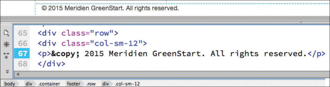
The site design shows the footer containing a copyright symbol. This character is one of many that you might want to use in your website but that you can’t type directly using the keyboard. To insert a copyright character, you will use an HTML entity. But before you can insert the copyright character, you first need to insert a paragraph element to hold it.
3. Choose Insert > Paragraph to nest a new paragraph into the footer.
Dreamweaver inserts a <p> element into the footer, complete with placeholder text. To insert the entity, you will have to switch to Design or Code view. This particular command does not work in Live view.
 Warning
You may discover that you can sometimes insert special characters directly. This is not a recommended practice.
4. Switch to Split view.
Locate the <footer> element and the new placeholder text in Code view.
5. Select the placeholder text “This is the content for Layout P Tag” and delete it.
6. Choose Insert > HTML > Character > Copyright.
The copyright symbol © appears at the insertion point. Dreamweaver creates the copyright character using the named entity © in the code. Since the cursor is already inserted in this location, let’s finish the footer placeholder text.
Note
Many entities can be created with named or numbered entities. Some applications do not support named entities. Always check to make sure you can use a specific character.
7. Press the spacebar to insert a space.
Type 2015 Meridien GreenStart. All rights reserved.
Tip
Modify the copyright date as necessary when you create a new page or update the content.
8. In green_styles.css in the CSS Designer, create a new selector named footer
9. Create the following properties:
padding: 1em 0px
background-color: #090

10. Deselect the Show Set option.
11. In the background-image property, click the gradient color picker.
12. Set #060 as the top gradient color stop.
Set #0C0 as the bottom gradient color stop.
Set the Linear Gradient Angle to 0 degrees.
Press Enter/Return to complete the gradient.
The footer displays a gradient that shifts from light to dark green.
13. Change the color property to #FFC in the footer rule.

14. Save all files.
You’ve completed the basic structure and added placeholders to all the elements. You’ve even formatted some of the elements and content. The last task you’ll accomplish will be to implement a global theme for the site design that will establish the basic design and usage of type within the site.
Creating global type styles
Most of the content of your site will be represented in text. Text is displayed in the web browser using digitized typefaces. Based on designs developed and used for centuries on the printing press, these typefaces can evoke all sorts of feelings in your visitors, ranging from security to elegance to sheer fun and humor.
Some designers may use multiple typefaces for different purposes throughout a site. Others select a single base typeface that may match their normal corporate themes or culture. CSS gives you tremendous control over page appearance and the formatting of text. In the last few years, there have been many innovations in the way typefaces are used on the web. The following exercises describe and experiment with these methods.
Using Edge Web Fonts
The first choice for most web designers is selecting the base typeface that will display their content. In this exercise, you will see how easy it is to use web fonts to apply a global site typeface by editing a single rule. There’s no need to be intimidated about using web fonts—everything you need to implement this technology is built right into Dreamweaver CC.
Note
Edge Web Fonts and other types of hosted fonts are rendered properly in Dreamweaver only in Live view with an active Internet connection.
1. If necessary, open mylayout.html in Live view.
2. In the CSS Designer, select green_styles.css.
Create a new selector named body
3. In the Properties window, deselect the Show Set option, if necessary.
The window now displays all CSS specifications.
4. Click the Text category icon .
The window display focuses on CSS Properties for text.
5. Click to open the font-family property.

A window appears showing nine predefined Dreamweaver font groups, or stacks. You can select one of these or create your own. Are you wondering why you don’t see the entire list of fonts installed on your computer?
The answer is a simple but ingenious solution to a problem that has nagged web designers from the very beginning. Until recently, the fonts you see in your browser were not actually part of the webpage or the server; they were supplied by the computer browsing the site.
Although most computers have many fonts in common, they don’t always have the same fonts. So, if you choose a specific font and it isn’t installed on the visitor’s computer, your carefully designed and formatted webpage could immediately and tragically appear in Courier or some other equally undesirable typeface.
For most people, the solution has been to specify fonts in groups, or stacks, giving the browser a second, third, and perhaps fourth (or more) choice to default to before it picks for itself (egads!). Some call this technique degrading gracefully. Dreamweaver CC (2015.1 release) offers nine predefined font groups.
As you can see, the predefined font stacks are pretty limited. If you don’t see a combination you like, you can click the Manage Fonts option at the bottom of the Set Font Family pop-up menu and create your own.
But before you start building your own group, remember this: Go ahead and pick your favorite font, but then try to figure out what fonts are installed on your visitors’ computers, and add them to the list too. For example, you may prefer the font Hoefelter Allgemeine Bold Condensed, but the majority of web users are unlikely to have it installed on their computers. By all means, select Hoefelter as your first choice; just don’t forget to slip in some of the more tried-and-true, or web-safe, fonts, such as Arial, Helvetica, Tahoma, Times New Roman, Trebuchet MS, Verdana, and, finally, a design category like serif or sans serif.
In the last few years, a new trend has been gaining momentum to use fonts that are actually hosted on the site or by a third-party service. The reason for the popularity is obvious: Your design choices are no longer limited to the dozen or so fonts from which everyone can choose. You can choose among thousands of designs and develop a unique look and personality that was nearly impossible in the past. But you can’t use just any font.
Licensing restrictions prohibit many fonts from web-hosted applications altogether. Other fonts have file formats that are incompatible with phones and tablets. So it’s important to look for fonts that are designed and licensed for web applications. Today, multiple sources exist for web-compatible fonts. Google and Font Squirrel are two such sources, and they even provide some free fonts for the budget-minded. Luckily, as a subscriber to Adobe Creative Cloud, you have access to two new services: Adobe Typekit and Adobe Edge Web Fonts.

Web-hosted fonts offer a vast variety of design options.
Typekit is a web-hosted subscription service that offers both print and web fonts. You can subscribe to the service even if you don’t have Creative Cloud, but as a subscriber you can access many of the available fonts for free. Adobe Edge Web Fonts is a free service that provides only web fonts, hence its name, and is powered by Typekit. The best thing about Edge Web Fonts is that you can access it directly inside Dreamweaver.
6. At the bottom of the font stack window, click Manage Fonts.

The Manage Fonts dialog gives you three options (tabs) for using web fonts: Adobe Edge Web Fonts, Local Web Fonts, and Custom Font Stacks. The first two tabs provide access to a new technique for using custom fonts on the web. Adobe Edge Fonts supports the Edge Web Fonts service to access hundreds of fonts in multiple design categories right inside the program. Local Web Fonts allows you to define the use of fonts that you can buy or find free on the Internet. Custom Font Stacks enables you to build font stacks using either the new web-hosted fonts, various web-safe fonts, or a combination of both. For the site’s base font, let’s pick one from Edge Web Fonts.
The tab for Adobe Edge Web Fonts displays samples of all the fonts available from the service. You can filter the list to show specific designs or categories of fonts.
7. In the Manage Fonts dialog, select the option “List of fonts recommended for Headings.”
The window shows a list of fonts that are typically used for headings and titles. Some designers like to use the same font for both headings and paragraph text.
8. Select the option “List of fonts recommended for Paragraphs,” directly below the option for “Headings.”
Only one font is displayed: Source Sans Pro. Since this font works well for headings and paragraph text, it’s a perfect choice for the site’s base font. By applying it to the body rule, it will automatically be applied to headings and paragraphs throughout the site.
9. Click the font sample displayed in the Manage Fonts dialog.
Click Done to close the panel.

A blue checkmark appears on the sample of Source Sans Pro. Once you click Done, Dreamweaver will add the font to the CSS Designer interface and write any code needed in your page to use it in your CSS specifications.
10. Click the font-family property again.
When the Font Stack dialog opens you will see source-sans-pro at the bottom of the list.
11. Select source-sans-pro.

12. In the font-weight property, select 400.
Source Sans Pro appears in the font-family property for the body rule. In most cases, the change in the layout will be instantaneous. The entire page, both headings and paragraph text, should now display Source Sans Pro. If you did not see the font style change, Dreamweaver may have not updated the Live view display.
13. If necessary, click the Refresh icon  above the document window.
If this step doesn’t display the new font, you may not have a live connection to the Internet at this moment. Because Edge Web Fonts are hosted on the Internet, you won’t be able to see them until you establish a live connection or upload this page to a live web server. You will learn how to upload pages to the Internet in Lesson 14, “Publishing to the Web.”
14. Save all files.
As you can see, using Edge Web Fonts on your website is really easy. But don’t be fooled into thinking they’re any less problematic than old-fashioned font stacks. In fact, even if you want to use Edge Web Fonts as your primary font source, the best practice would be to include them in a custom font stack of their own.
Building font stacks with web fonts
If you’re lucky, your web-hosted fonts will display every time for every user. But luck can run out and it’s better to be safe than sorry. In the last exercise, you accessed and selected an Edge Web Font and applied it to the base font of the body rule. In this exercise, you’ll build a custom stack anchored on your chosen web font to provide the necessary fallback support for safety’s sake.
1. Open mylayout.html in Live view, if necessary.
2. In the CSS Designer, select the body rule.
3. In Text category, select the font-family property.
The Font stack dialog appears.
4. Choose Manage Fonts.
5. In the Manage Fonts dialog, click the Custom Font Stacks tab.
6. In the Available Fonts list, locate Source Sans Pro.

Click the << button to move the font to the Chosen Fonts list. If you cannot find the font in the list, you can type the name in the text field at the bottom of the dialog and press the << button.
7. Repeat step 6 to add Trebuchet MS, Verdana, Arial, Helvetica, and sans-serif to the Chosen Fonts list.

Feel free to add more web or web-safe fonts to your list as desired. If any fonts you want to use are not installed on your computer, type the names into the text field and then add them to the stack using the << button.
8. Click Done.
9. In the font-family property, select your new custom font stack.
The page display should not change; Source Sans Pro is still the primary font in the list. But the new font stack, based on the new Edge Web Font, will ensure that your text will be formatted in all contingencies.
10. In the font-size property, enter 14px
Setting the size of the body rule is a common practice for many web designers. This is designed to reset the base font size to a size that should be optimum. You can adjust the size as necessary using media queries for various devices and screen sizes.
11. Save all files.
Now you’ve learned how to specify the look of your text content. Next, you’ll learn how to control the size of the text.
Specifying font size
Font size can convey the relative importance of the content on the page. Headings are typically larger than the text they introduce. In your working document, the content is divided into three areas: the main content and the two sidebars. In this exercise, you will learn how to manage the size of the text in both areas to add emphasis as desired.
1. Open mylayout.html in Live view, if necessary.
2. Insert the cursor in the text “Insert main heading here.”
If you look at the Selectors window, you will see that you have not yet created a rule to format this heading. Let’s create one now.
3. Create a new selector in green_styles.css named
article.row section h1
Since the <h1> element is the main heading of the page, you should design it to stand out from the rest of the text and headings. This can be done in a variety of ways, using color, size, or a great typeface.
4. Add the Edge Web Font Patua One as you did in the previous exercise.
Note
In this rule formatting the h1, you added only a single font. You may think you should have to build a custom font stack, but you don’t. That’s because the stack created earlier will be inherited by default if this font doesn’t display properly.
5. Create the following properties for the h1 rule:
margin-top: 0px
margin-bottom: 15px
font-family: patua-one
font-size: 300%
line-height: 1.4em

The main heading reformats and increases in size.
The sidebars contain text that is related to, but not semantically as important as, the main content. Reducing the size of this content provides a visual distinction to the layout. You created rules earlier in this lesson to format these items.
6. In green_styles.css, select the rule article.row aside.
7. Create the following property: font-size: 95%
The text in the right column has resized, but the quotation placeholder in the left column has not changed. When a rule does not format an element, it means one or more other rules are conflicting with it. This will be a common problem when you use predefined templates or frameworks, like Bootstrap. You can use the CSS Designer to troubleshoot the conflict.
8. Click the text “Insert quotation here” in the left column.
The HUD appears, focused on the p element.
9. Examine the list of rules and identify any that format font-size properties.

A blockquote rule in the bootstrap.css file is applying a font-size property of 17.5px and applied a 5px gray border on the left. To override this rule, you have to create a similar or more specific selector in green_styles.css.
10. In green_styles.css, create the selector: article.row blockquote
11. Create the following property in the new rule:
font-size: 100%
border: none
The new property resets the size of the blockquote and its contents to the default font size. That means the property you created in step 7 can function properly now. The basic page layout for desktop media is complete.
12. Save all files.
Congratulations. You created a workable basic page layout for your project template and learned how to insert additional components, placeholder text, and headings; modified existing CSS formatting; and created new rules. In upcoming lessons, you will continue to work on this file to tweak the CSS and Bootstrap structure to make it work on all mobile devices and then set it up as the primary site template.
Review questions
1. Why should you insert images into the element as a background property?
2. What is the advantage of using Bootstrap components in your layout?
3. Can you edit the styling of a Bootstrap element directly?
4. How does the CSS Designer assist in troubleshooting your website layout?
5. If a character does not appear on your keyboard, such as a copyright symbol, how is it possible to use this element on your webpage?
6. Can you use any font to create a font stack?
7. Why should you consider using web-hosted fonts?
Review answers
1. By inserting graphics as a background image you leave the container free for other content and gain additional flexibility when designing for mobile devices.
2. Bootstrap components are built to be responsive out of the box, allowing you to create complex structures that support a variety of screen sizes and devices with minimum effort.
3. No. The Bootstrap style sheet is locked, but you can easily create styles in your own style sheet to format or override default styling.
4. The CSS Designer serves as a CSS detective, allowing you to investigate what CSS rules are formatting a selected element and how they are applied.
5. HTML provides code entities for all characters that you may want to use on your webpage but that you cannot type from the keyboard. Many are available directly from Dreamweaver’s insert menu.
6. Technically, yes, you can declare any font name in your CSS rules. However, normally the font will load only if the visitor has that font installed on their computer. Today, many designers are hosting custom fonts on their own sites or using third-party font hosting services. But if you use third-party fonts on your site, be sure to check that they’re licensed for web use.
7. Web-hosted fonts provide thousands of uniquely designed typefaces, many of them free, that can enhance the design and personality of your website.