6 CREATING A PAGE LAYOUT
Lesson overview
In this lesson, you’ll learn how to work faster, make updating easier, and be more productive. You’ll learn how to do the following:
Evaluate basic page structure from design mockups.
Create a layout based on a predefined starter layout.
Upload a Photoshop mockup as a Creative Cloud asset.
Extract styling, text, and image assets from a Photoshop mockup.
Apply extracted styles, text, and image assets to a starter layout in Dreamweaver.

This lesson will take about 2 hours and 30 minutes to complete. To get the lesson files used in this chapter, download them from the webpage for this book at www.adobepress.com/DreamweaverCIB2020. For more information, see “Accessing the lesson files and Web Edition” in the Getting Started section at the beginning of this book.

Dreamweaver provides powerful tools with which to apply styling, text, and image assets created in other Adobe applications, such as Photoshop.
Evaluating page design options
”In the previous lesson, you went through the process of identifying the pages, components, and structures you would need for a specific website. The selected design balances those needs against a variety of other factors, such as the types of visitors that may come to the site and their means of connecting to it. In this lesson, you will learn how to implement those structures and components in a basic layout.
 Note
Note
Download the lesson files and create a new site for Lesson 6 as described in “Getting Started.
Since there are almost unlimited ways to build a design, we’ll concentrate on building a simple structure that uses the minimum number of HTML5 semantic elements. This will produce a page design that is easy to implement and maintain. Let’s start by taking a look at the mockup introduced in Lesson 5, “Web Design Basics.”
In Dreamweaver, open favoritecity-mockup.html from the lesson06 folder.
This HTML file contains an image depicting the final mockup of the Favorite City site design that you saw in Lesson 5. The design can be broken down into basic components: header, footer, navigation, and main content elements.
Close favoritecity-mockup.html.
Once you have the skills to build your own page layouts, you can use Dreamweaver to execute any design from scratch. Until that moment, one option is to fall back on the handy webpage layouts provided by Dreamweaver itself.
Working with predefined layouts
Dreamweaver has always tried to offer the latest tools and workflows to all web designers regardless of their skill level. For example, over the years, the program has provided a selection of predefined templates, various page components, and code snippets to make the task of building and populating webpages fast and easy.
Often, the first step of building a website was to see whether one of its predefined layouts matched your needs or whether your needs could be adapted to one of the available designs.
Dreamweaver (2020 release) continues this tradition by providing sample CSS layouts and frameworks that you can adapt to many popular types of projects. You can access these samples from the File menu.
Choose File > New.
The New Document dialog appears. Dreamweaver allows you to build a wide spectrum of web-compatible documents besides those built using HTML, CSS, and JavaScript. The New Document dialog displays many of these document types, including PHP, XML, and SVG. Predefined layouts, templates, and frameworks can also be accessed from this dialog. Let’s check out the options.
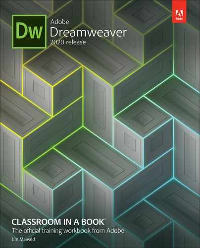
In the New Document dialog, choose Starter Templates > Basic Layouts.
The Starter Templates window of the New Document dialog displays three choices: Multi Column, Simple Grid, and Single Page.
At the time of this writing, Dreamweaver (2020 release) offers three basic layouts, six Bootstrap templates, four email templates, and three responsive starter layouts. The exact number and features of these layouts may change over time through automatic updates via Creative Cloud. The changes to this list may occur without notice or fanfare, so keep your eyes peeled for new options in this dialog.
All the featured layouts are responsive designs built using HTML5-compatible structures and will help you gain valuable experience with this evolving standard. Unless you need to support older browsers (such as IE5 and IE6), there’s little to worry about when using these newer designs.
If necessary, select Basic – Multi Column.
Observe the preview image in the dialog.

A preview image shows the design of a multi-column webpage.
Select Basic – Simple Grid.
The preview image changes to depict the new grid-based design.
Select each of the categories and design options in turn.
Observe each preview image in the dialog.
Each template offers a design appropriate for specific applications. After reviewing all the sample layouts, only the Bootstrap eCommerce template is close to the design of the Favorite City mockup.
Choose Bootstrap Templates > Bootstrap eCommerce.
Click Create.

The file contains a one-column layout with navigation, body content, and footer components. Before we proceed, it’s a good idea to save the file.
Select File > Save.
The first time you save a new file the Save and Save As commands are identical. Once a file is saved, use the Save As command to save a file under a new name or in a different folder.
 Tip
TipIf necessary, click the Site Root button to navigate to the home folder of lesson06.
Name the file mylayout.html and save it in the root of the lesson06 folder.

When the file is saved, Dreamweaver automatically adds various resources—image placeholders, CSS, and JavaScript libraries—to the site folder to support the Bootstrap functionality of the template. You can see these new assets in the Files panel.
If you examine the new webpage, you can see that it has some similarities to the site mockup viewed earlier. In the following exercises, you will learn how to adapt this layout to make it match that design and to create the site template in Lesson 7, “Working with Templates.”
Styling a predefined layout
Once you get the skills under your belt, it will be a simple thing to build a webpage layout from scratch. For now, the Dreamweaver starter layouts provide a great place to jumpstart the process of building your site template.
If necessary, open mylayout.html from the lesson06 folder. Make the document window as large as the computer display will allow (at least 1200 pixels).
This webpage is based on a fully responsive Bootstrap starter template. The styling you see will change based on the width and orientation of the document window in Dreamweaver. To ensure you are obtaining the same results as shown in this lesson, make sure the document window is at least 1200 pixels in width unless otherwise directed within the exercise.
The first step is to make this generic layout take on some of the personality of the proposed design. Normally, you would have to do that the old-fashioned way, by editing the CSS by hand. But since the layout was mocked up in Adobe Photoshop, Dreamweaver has a built-in feature called Extract that can use the site mockup to create some of the desired styling for you.
Extract was added to Dreamweaver a few versions ago. It is a feature hosted by Creative Cloud and accessed through a panel in the program.
NoteBefore accessing the Extract panel, you must have the Creative Cloud desktop app running and be logged in to your account.
Select Window > Extract.
The Extract panel appears. The panel connects to your Creative Cloud account and will display any Photoshop files in your assets. To use the site mockup, you first have to upload it to the Creative Cloud server.
Click the option Upload PSD.

A file dialog appears.
Select favoritecity-mockup.psd in the lesson06/resources folder and click Open.

The file is copied to your Creative Cloud Files folder on your computer, which is then synced to your Creative Cloud remote storage. Once the file is uploaded, it should be visible in the Extract panel.
Click to load favoritecity-mockup.psd in the Extract panel.

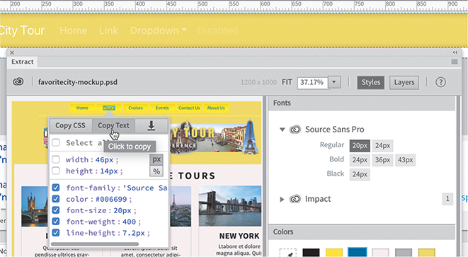
The mockup loads and fills the entire panel. Extract enables you to access and derive styling information, image assets, and even text from the mockup.
Styling elements using the Extract panel
The Extract panel can obtain image assets and styling data from the Photoshop file. In this exercise, we’re interested only in the styling data. Let’s start at the top and work down the page. First, we’ll grab the background color.

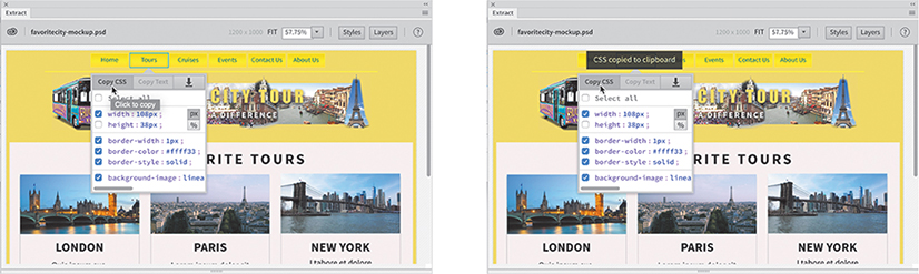
In the Extract panel, click the yellow background of the page.
When you click in the preview image, a pop-up window appears. The pop-up window allows you to select the data you want to obtain from the mockup.
The buttons at the top of the pop-up indicate what data is available from the selected component, such as CSS, text, and image assets. Notice that the Copy CSS and Extract Asset buttons are selectable, indicating that styling and image assets are available. The Copy Text option is grayed out, indicating that no text content is available to be downloaded.
The window displays the CSS styling as a list with checkboxes. When you select a checkbox, those specifications will be copied to program memory. The CSS styling that is displayed includes properties for width, height, and background color. You can select all the settings or only the ones you want to use.
If necessary, deselect width and height.
Select background-color.
Click the Copy CSS button.

Once you’ve copied the settings, you can then apply them directly to the layout in Dreamweaver. The easiest way to use this data is via the CSS Designer.
If necessary, select Window > CSS Designer to open or display the panel, and enable the Show Set option. Click the Current button.
First, we want to apply the specifications to the top navigation menu in the current layout. You can target the menu by selecting the appropriate rule in the Selectors pane or by selecting the actual element in Live view.
The current layout is fully responsive, so the styles are applied based on the width and sometimes the orientation of the document window. To obtain the correct styling you have to make sure the document window is showing the full desktop version of the design at a minimum of 1200 pixels.
In Live view, click to select the top navigation menu.

The Element Display will appear targeting the
<nav>element. There are four classes assigned to the element:.navbar,.navbar-expand-lg,.navbar‑dark, and.bg-dark. In some cases, when you select an element in the document window, Dreamweaver does not select the desired one first. To ensure that the proper element is targeted, you should use the tag selector interface.Select
navin the tag selector interface.
When an element is properly selected, CSS Designer will display a list of CSS rules applied to it when you click the Current button. The list in this case should include rules targeting the classes
.navbar,.navbar-expand-lg,.navbar‑dark, and.bg-dark. Occasionally, the first time you select an element the display may not be accurate. If the list does not include rules you believe target the element, click the element tag selector again.
When tracking down the current styling of an element, be aware that it can be applied directly to the
<nav>element, applied to any one of the individual classes assigned to it, or divvied up between two or more rules. Part of your job in this instance is to figure out where the styling is coming from and then to either replace or override it.As you learned in Lesson 4, “CSS Basics,” when the Current button is selected, CSS Designer displays any styling set on the element selected in the layout. The Selectors pane in the CSS Designer displays the rules applied to the selected navigation menu. The CSS rules listed include an inline style:
.bg-dark,.navbar-expand-lg, and.navbar.One of these rules is applying the background color to the
navelement. By clicking the selectors, you can inspect the properties assigned to the rule. In CSS Designer, the rule at the top of the list is the most powerful. If there are any conflicts between it and any other rule, the properties in the first rule will override the others.Select
.bg-darkand examine the Properties pane. Note
NoteSome Windows users have reported that the Bootstrap style sheet is not marked Read Only. Either way, I recommend that you leave the Bootstrap CSS as is and follow the directions as written.
The rule applies a background color of
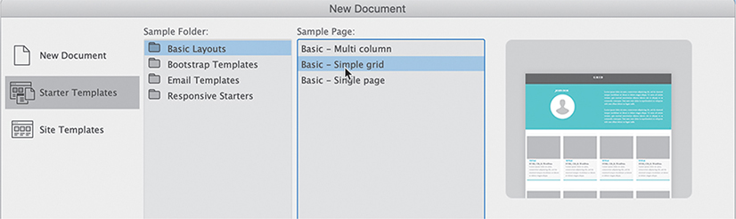
#343a40. If the rule were contained in a normal style sheet, you could use the background color from the mockup to replace the existing color. But the style sheet applied to this page was created by the Bootstrap framework and is marked as Read Only in CSS Designer. You can see that the rules and properties are grayed out in CSS Designer. To override the existing styling, you will have to create a new, separate style sheet. All the styles you create from this point on should be added to this new style sheet.In the Sources pane of CSS Designer click the Add CSS Source icon
 .
.A dropdown menu appears that allows you to create a new CSS file, attach an existing CSS file, or define a style sheet embedded within the page code.
Reading, no writing
The Bootstrap style sheet is formatted as a read-only file to prevent you from making accidental changes to the framework’s complex styling. From time to time as you work in your pages, a warning message may appear at the top of the screen indicating that the file is read-only and prompting you to make it writable.

You can dismiss the message by clicking the Close icon
 on the right side. It also provides an option to make the file writable. You’re advised to resist the temptation to make the Bootstrap style sheet editable.
Choose Create A New CSS File from the dropdown menu.
The Create A New CSS File dialog appears.
Type favorite-styles.css in the Create A New CSS File dialog.
Click OK to create the style sheet reference.
 Note
NoteIt is essential to note here that the CSS file has not been created yet and will not be until you create a CSS rule and save the file. If Dreamweaver crashes before that happens, you will have to re-create the file in a separate operation.
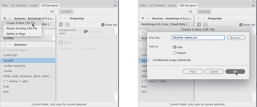
When you click OK, a reference to the new style sheet is added to the CSS Designer Sources pane. The CSS file has not actually been created yet, but a link has been added to the
<head>section of the page, and the file will be created automatically as soon as you create your first custom rule and save the file.Another thing you may not have noticed in the process is that Dreamweaver automatically switched to the All button in CSS Designer and selected the new style sheet. This is important because when the Current button is selected you cannot create new selectors or properties.
If necessary, click favorite-styles.css in the Sources panel.
The @Media and Selectors panes are both empty. This means there are no CSS rules or media queries defined in this file. You have a blank slate on which you can make any design additions or modifications. Since you will not change the Bootstrap CSS directly, this style sheet will be the means you use to make its structure and content bend to your wishes.
The rule applying the current background color to the
navelement was.bg-dark. To override that styling, you need to create an identical rule in the new style sheet.In the Selectors pane click the Add Selector icon
 .
.
A field appears in the Selectors panel that enables you to create a new selector name. Dreamweaver even jumpstarts the process by generating a sample name for you based on the element selected in the document window. In this case, the selector name uses all four classes assigned to the
navelement. Since the rule setting the background color uses only one of the classes, the new rule should be identical to avoid any unintended consequences.Type .bg

Since the automatic selector name was highlighted it is completely replaced by the new text. Don’t forget to start with the initial period (.) that defines a class name in CSS. A hinting menu appears listing any classes used within the HTML or selectors defined within the CSS that match the entered text. You should see
.bg-darkin the list.Select
.bg-darkin the hinting menu and press Enter/Return to complete the selector name.The
.bg-darkselector now appears in the favorite-styles.css style sheet. Note that there are no properties defined yet. Once the selector is created, you can apply the styling extracted from the mockup.Move the cursor over and right-click the
.bg-darkselector.A context menu appears, providing options to interact with the rule by editing, copying, or pasting the CSS specifications. In this case, you want to paste the styles derived from the Extract panel.
Select Paste Styles from the context menu.

The background-color properties of the mockup now appear in the new CSS rule. But there’s a problem. The navbar is still showing a dark background. Conflicts between rules in other style sheets are common on the web. Knowing how to troubleshoot styling problems is an important skill in a web designer. Fortunately, Dreamweaver has some great troubleshooting tools.
Troubleshooting CSS conflicts
Although this may be the first CSS conflict you have encountered, it certainly won’t be the last. There are a variety of tools in Dreamweaver that make sussing out these errors a relatively simple task.
Select the Current button in CSS Designer, if necessary.
TipIf the
navtag selector is not visible, you may have to first select the navbar or one of its components in the document window. NoteIf you see an orange border, it means the content is selected instead of the element. Click the Element Display to obtain a blue border before editing CSS.
Click the
navtag selector.The Selectors pane displays a list of rules formatting some aspect of the navbar or its parent structure. The first selector in the pane is
.bg-dark.Click
.bg-darkin the Selectors pane and examine its properties.
The Properties pane displays the rule
.bg-darkfirst in the list with thebackground-colorproperty you just added. This usually indicates that the rule has a higher specificity and should override any other styling. But in this case, the property has a black line through it. Dreamweaver is showing you that the rule is disabled for some reason. Fortunately, the built-in troubleshooting doesn’t stop there.
Move the cursor over the
background-colorproperty in CSS Designer.A tool tip appears reporting that the background color is being disabled because the specification in the Bootstrap template is marked
!important. This CSS attribute is used only in emergencies to override conflicting styling that can’t be fixed any other way.There are two ways to fix the issue. You can remove the
!importantattribute in the Bootstrap rule or add!importantto the new property. Since the Bootstrap style sheet is formatted as Read Only, you will have to use the latter solution.Right-click the rule
.bg-dark.Select Go To Code in the context menu.
The document window splits horizontally showing the Code view window at the bottom focused on the new favorite-styles.css style sheet and the
.bg-darkrule.Insert the cursor after the color value
#eedd66but before the colon (;).Press the spacebar to insert a space.
Type !
 Note
NoteThe space is not required for the attribute to function. It just makes the code easier to read and edit.

Dreamweaver should autocomplete the
!importantattribute. As soon as the attribute appears in the style sheet, the navbar reformats to match the styling shown in the mockup. NoteWhen new files are added to the site, the Files panel may not display them instantly.
As you may have noticed, the
!importantattribute has no representation anywhere in CSS Designer. Keep this in mind when you troubleshoot other CSS issues in the future.Choose File > Save All.
By using Save All you have saved the changes to the webpage and created the favorite-styles.css file in the site folder. The Extract panel also enables you to pick up the text content in the mockup.
Extracting text from a Photoshop mockup
The Extract panel enables you to pick up formatting for text as well as the text itself. In this exercise, you will pick up both from the mockup.
If necessary, open mylayout.html from the lesson06 folder in Live view. Make sure the document window is displayed at a width of 1200 pixels or wider.
TipThe Extract panel may obscure part of the page you need to work on. Feel free to reposition or dock the panel at any time.
If necessary, select Window > Extract to display the Extract panel.
The mockup should still be displayed in the panel. If not, simply select it in the list of assets.
Examine the top navigation menu in the mockup.
The navigation bar has six menu items and no other components: Home, Tours, Cruises, Events, Contact Us, and About Us. The navigation bar in the Bootstrap layout is completely different. It has four menu items, one of which is a dropdown menu with additional options of its own, and a search box with a button.
When working with a third-party template, it’s a good idea to remove items that you don’t need or want as soon as possible so they don’t get in the way.
The first item in the Bootstrap menu is the item Navbar. This item is a hyperlink, but it’s not part of the menu. Nothing like it appears in the desktop mockup, but there is a text element in the tablet and phone designs. The text element replaces the header and logo image on smaller screens.
Select the Navbar element.
An orange border appears around the element. This indicates that the text can be edited.
Double-click the word Navbar.
The entire word is highlighted.
Type Favorite City Tours

The company name will appear on a phone and tablet but will be hidden for desktop visitors. We’ll leave it visible for the time being.
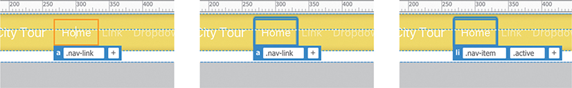
The Home menu item is formatted differently than the other items. When you see odd formatting like this, it’s usually because of a CSS class not assigned to the other items.
Select the Home menu item.
The Element Display appears focused on the
atag. Notice the orange border around the element.There’s nothing special about this element. Let’s check the
<li>element. To change the focus of the Element Display, you can use the mouse or the keyboard.Press the Esc key.
The border color on the
<a>element changes to blue.Press the up arrow key.
 Note
NotePressing the up or down arrows when the blue border is visible will change the Element Display, focusing on elements as they appear in the document object model (DOM).
The Element Display focus changes to the
lielement. Notice that this link has an additional class assigned to it:.active.Position the cursor over the class
.active.Click the Remove Class/ID icon
 on the
 .activeclass.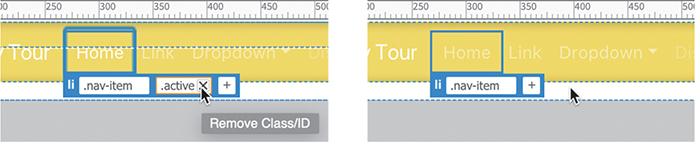
Once the
.activeclass is removed, the Home menu item is formatted the same as the Link item.The next item in the menu mockup is Tours. The Extract panel enables you to pull text content from the mockup as well as CSS.
In the Extract panel, select the second item: Tours.
Make sure you select the text and not the button.
The pop-up window appears. Notice that all three buttons at the top of the Extract panel window are active. This indicates that you can extract styling, text, and image assets from this selection.
Click the Copy Text button.
In mylayout.html double-click Link in Live view.
The text is highlighted and an orange box appears around the text, indicating you are in text-editing mode.
Right-click the selected text.
The context menu appears, giving you options for cutting, copying, and pasting the text.
TipThe text extraction feature is really intended for longer passages of text. Feel free to type the menu items by hand if you prefer.
Select Paste from the context menu.

Tours replaces the text Link.
The next item in the Bootstrap menu is a dropdown menu. The mockup does not show such an item, so there’s no reason to keep it.
Deleting components and attributes from a template
If you see unneeded components in a template, feel free to delete them. When deleting components, it’s important that you delete the entire element and not leave any part of its HTML code behind.
Select the Dropdown menu item in the document window.
The Element Display will appear on the Dropdown item. In most cases, the display will focus on the
<a>element of the item.Most navigation menus are constructed of unordered lists, using three main HTML elements:
ul,li, anda. A dropdown menu is usually built using another unordered list as a child of one of the list items.To get rid of the dropdown menu, you can either delete that child list or delete the parent containing it. The simplest method is to delete the parent. Whenever you want to delete elements in a layout, always use the tag selectors to ensure you get all the markup.
Select the
litag selector for the Dropdown item. Note
NoteWhen the orange border appears, the display of CSS Designer may show styling applied to the content instead of element itself.
The Element Display should now focus on the
lielement. Note the orange border around the element. This color indicates that the element content can be edited directly. This behavior highlights a major change in the functionality of Dreamweaver’s Live view.In previous versions of Dreamweaver, Live view allowed you to delete elements immediately, but you had to double-click them to enter edit mode. In this version of Dreamweaver, you can edit elements immediately, but you have to select them a second time to delete them.
Click the Element Display focused on the
lielement for the Dropdown item.
Note how the element border changes to blue. This means the element is selected instead of the content.
Press Delete.

The Dropdown menu item and its child markup are deleted entirely from the page. Once the selected element is gone, the Element Display automatically highlights the Disabled menu item. A blue border appears around the element.
Note that this menu item is a lighter color than the other items. This is due to a special
.disabledclass applied to it. If you delete the class, the element’s formatting will conform to the rest of the menu items.The
.disabledclass is applied to the<a>element. But that element is not visible in Live view or in the tag selectors. There are several ways to select a child element in Live view when it doesn’t appear in the interface. If you see the blue border in Live view, you can try the DOM selection method we used earlier.Press the down arrow on the keyboard.

The focus of the Element Display changes to target the
<a>element. Now you can see the.disabledclass in the Element Display.Click the Remove Class/ID icon
for the .disabledclass in the Element Display.
Once the class is removed, the formatting of the Disabled menu item conforms to the others.
Double-click the text Disabled.
Type Cruises
The third menu item is now complete. Before we create any of the missing menu items, let’s clean up the rest of the navbar. The mockup doesn’t contain a search box, so you might as well get rid of it.
Select the Search button.
By examining the tag selectors you can see that the button is part of a larger component. It’s composed of three HTML elements:
form,input, andbutton. Theformelement is the parent.Select the
formtag selector.
The Element Display appears focused on the
formelement with an orange border. NoteIt’s possible that the form may be selected with a blue border. If that happens, skip to step 11.
Click the Element Display.

The border changes to blue.
Press Delete.

The entire Search form is deleted.
You have deleted the search component and created three menu items; you have three more to go. Let’s finish the menu by creating the missing items.
Inserting new menu items
As you learned in the previous exercise, the horizontal menu is composed of an unordered list. Adding new menu items is simple in Dreamweaver.
Select the third menu item, Cruises, in the document window.
In most cases, when you select an item in a menu like this, Dreamweaver will focus on the
<a>element and display an orange border. Note the.navlinkclass assigned to it.Press the Esc key.
The focus of Live view changes from the content of the selection to the element itself. To create a new menu item, you have to duplicate the current HTML structure.
Press the up arrow key.

The Element Display now focuses on the
lielement. Note the.nav-itemclass assigned to it.Dreamweaver provides several ways to create new menu items.
Select Insert > List Item.
The Position Assist dialog appears.
Select After.
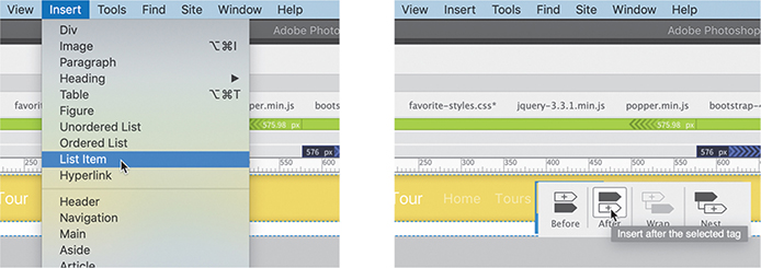
A new menu item appears with placeholder text.
Select the placeholder text Content for li Goes Here.
Type Events
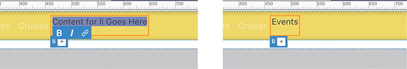
This menu item doesn’t look like any of the others at the moment, but that can be quickly rectified. The other menu items are assigned a class of
.nav-item.Click the Add Class/ID icon
 in the Element Display.
Type .nav-item and press Enter/Return.

As you type, the hinting menu will display classes that are already defined in the document or style sheets. Feel free to select the proper class when you see it in the list.
The new menu item still doesn’t match the formatting of the other items. That’s because it’s missing a component. The menu item needs a hyperlink and the proper CSS class assigned to it. Although there’s nothing to link the item to yet, you can use the hash symbol (
#) to create a link placeholder.Select the text Events.
The Text Display appears. This dialog enables you to apply bolding, italics, and hyperlinks to a selection.
Click the Add Link icon
 .
.Type # and press Enter/Return.

The Element Display focuses on the new
<a>element. To match the other links, you need to add the class.nav-link.Click the Add Class/ID icon in the Element Display.
Type .nav-link and press Enter/Return.
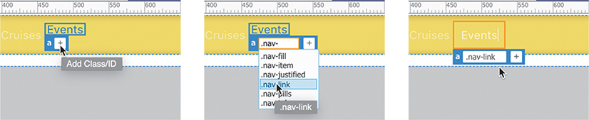
Once the class is applied, the new link matches the appearance of the other links.
You can also create new menu items using the DOM panel.
Creating new elements with the DOM panel
The DOM panel depicts the entire HTML structure of the page, including classes and ids, but ignores the content. The functionality doesn’t stop there. It also enables you to manipulate the page structure, by editing, moving, deleting, and even creating new elements.
If necessary, choose Window > DOM.
The DOM panel focuses on the element selected in the document window. The menu item for the Events
<a>element should be highlighted. To insert another item, you first have to select the<li>element.Select the last
<li>element in the panel.Click the Add Element icon
 in the DOM panel.
Select Insert After.

A new
<div>element appears in the DOM panel. The item is highlighted and still editable. If you press Enter/Return, the new element will be created. But we need an<li>element instead.Type li and press Tab.
The
divis replaced byli. The cursor moves to the attribute field.The DOM panel enables you to create HTML elements as well as classes and ids.
Type .nav-item and press Enter/Return.

The new menu item with placeholder text appears in the document window.
Select the placeholder text.
Type Contact Us
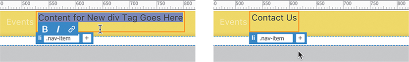
Select the text Contact Us.
The Text Display appears.
Click the Link icon
.Type # and press Enter/Return.

Apply the class
.nav-linkto the<a>element.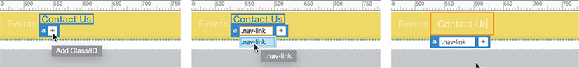
The Contact Us item is fully formatted. There’s one item left to make. By far the easiest method for creating menu items is using copy and paste.
Creating menu items with copy and paste
As you can see, there are a lot of tedious steps to creating a new menu item. By using copy and paste, you can cut the grunge work dramatically.
Select the Contact Us menu item.
Select the
litag selector.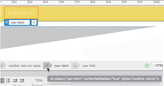
The Element Display appears focused on the
liwith an orange border around the element.Press the Esc key.

The border changes from orange to blue indicating the element is now selected.
NoteMake sure the cursor is over the Element Display label when using the context menu. Sometimes the focus can change to the
<a>element and will cause an error when you paste.Right-click the Contact Us Element Display.
Choose Copy from the context menu.

When an element is selected in the document window, the Paste command inserts the new element directly after the selection as a sibling.
Right-click the Contact Us Element Display.
Choose Paste from the context menu.
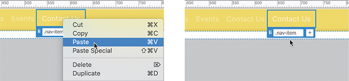
A copy of the Contact Us menu item appears beside the original, identically formatted.
Double-click the word Contact in the new menu item.
Type About and press the Esc key.

The final menu item is complete.
Choose File > Save All.
Now that the content of the menu is finished, you can concentrate on formatting the text and buttons in the menu.
Extracting text styling
The text appearing in the navbar is formatted in white. This color was fine when the navbar had a black background, but white is not as legible on top of yellow. In this exercise, you will learn how to use the Extract panel to pick up the text styling from the mockup as well as the formatting for the buttons themselves.
Before you can apply any styling from the mockup, you need to have someplace to paste it. The Bootstrap style sheet is Read Only, which means you’ll have to create the rules before you can bring over the CSS.
If necessary, open mylayout.html in Live view. Make sure the document window is at least 1200 pixels wide.
NoteWhen selecting the text, make sure that Dreamweaver focuses on the
<a>element. Often, it takes two or more clicks to get the focus on the correct element.Select one of the text items in the navigation menu.
The menu is composed of five types of HTML elements:
nav,div,ul,li, anda. Text styling can be applied to any of these elements or even to all five at once. The goal is to have the styling from the mockup override the settings from the Bootstrap style sheet.Click the Current button in the CSS Designer.
The Selectors pane displays the CSS rules that affect the selected text. The rule at the top of the list is the most powerful. That’s the one you usually want to target.
Notice that the Sources pane shows bootstrap-4.3.1.css in bold, which means that all the rules formatting the selected element are stored therein.
Although the rule at the top of the Selectors pane is the most powerful, it’s not necessarily the one formatting the selected element. Dynamic elements, such as navigation menus, by default have four separate states formatted by CSS: link, visited, hover, and active. You’ll learn more about this in Lesson 10, “Working with Navigation.” For now, you need to extract the default, or link, state of the menu items.
Right-click the selector
.navbar-dark .navbar-nav .nav-link.
The context menu appears showing several commands, most of which are grayed out. If the Bootstrap style sheet were not Read Only, you could use Duplicate to reproduce the needed selector in favorite-styles.css. Instead, we’ll work around this limitation to achieve the same result.
NoteSome Windows users report that the Bootstrap style sheet is not marked Read Only. If you experience that behavior, the style sheet should load immediately.
Choose Go To Code from the context menu.
A dialog should appear notifying you that the Bootstrap style sheet is locked. It offers the options of making the style sheet writeable or viewing it.
Click the View button.
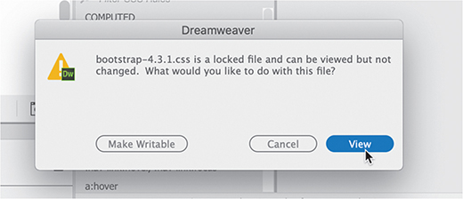
The document window splits horizontally, showing a Code view window at the bottom and focusing on the targeted rule. You may need to scroll up a bit to see the selector.
Select and copy the selector name.

You have copied the selector that formats the default state of the menu items. Now you need to re-create it in favorite-styles.css.
Click the All button in CSS Designer.
The focus of the document window is on Code view, which is looking at the Bootstrap style sheet. To see favorite-styles.css in CSS Designer, you’ll have to set the focus back to Live view.
Select any of the menu items in Live view.
Select favorite-styles.css in the Sources pane.
Click the Add Selector icon
.A field opens for the new selector name. A sample selector appears automatically.
Press Ctrl+V/Cmd+V to paste over the selector.

The selector copied in step 7 appears in the field.
Press Enter/Return to complete the selector.
Now you’re ready to bring over the text formatting from the mockup.
In the Extract panel, select any of the text items in the navigation menu.
The pop-up window appears, showing extraction options for the selection.
NoteThe font used in the menu is Source Sans Pro from Adobe Typekit. As explained in Lesson 5, “Web Design Basics,” you will have to log in, download, and install the font to use it properly in Dreamweaver.
If necessary, deselect all specifications except font-family and color.

Click the Copy CSS button.
Once the CSS specifications are copied from the mockup, you have to identify the rules in the template that format the text in the menu items. This can be tricky because text styling can be very complex. Often, several rules may affect a single text element. This doesn’t mean you can’t successfully format an item; it just means you have to be especially vigilant when applying the new styling.
Right-click and select Paste Styles on the rule created in step 13.

The Properties pane displays the specifications for font-family and color. The text styling in the six menu items now in Dreamweaver matches the mockup. The next task is to format the menu buttons.
Creating a gradient background using Extract
Although you might not be able to discern this from the tiny Extract panel preview, the buttons in the navbar have a gradient background. The gradient shows darker yellow at the top, changing to a lighter yellow at the bottom.
As with the menu text, you have to identify the rules that create any type of background color for the menu items. In most cases, such formatting will be applied to the <li> or <a> element.
If necessary, open mylayout.html from the lesson06 folder in Live view.
Make sure the document window is at least 1200 pixels wide.
Select any of the items in the horizontal menu.
Typically, the
<a>element will be selected by default. Since the<a>element is the child of the<li>, you can inspect all the styles applied to a menu item by selecting that element.Click the
atag selector.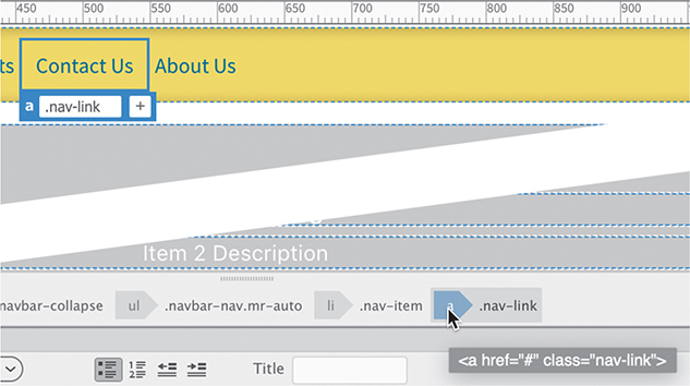
Click the Current button in CSS Designer.
Choose Show Set in CSS Designer, if necessary.
Click each of the rules starting at the top of the Selectors pane.

As you inspect each rule, the Properties pane displays any style applied to the menu structure. It starts on the
<a>element but will eventually show you styles applied to the<li>and<ul>elements too. Look for any background properties.After examining each of the rules, you will discover that no background properties are set on any of the menu elements. You can use either the
<li>or<a>element. Let’s apply the button styling to the<li>.The first step is to create a rule to which you can apply the style. Use the following procedure to ensure the new rule is created properly.
Click the
litag selector.
Click the All button in CSS Designer.
In the Sources pane, select favorite-styles.css.
Click the Add Selector icon
.The selector field opens populated by a custom selector written by Dreamweaver. By default, these names are very specific. By pressing the up and down arrows on the keyboard, you can change the specificity. Although you want the selector to target the menu items, it doesn’t need to be overly long.
NoteIn some instances, you may have to press the down arrow to achieve the desired selector.
Press the up arrow until the following selector appears:
.navbar-nav.mr-auto .nav-item
Edit the selector to .navbar-nav .nav-item and press Enter/Return.

The rule is now ready for the button formatting.
If necessary, choose Window > Extract.
Select favoritecity-mockup.psd.
Select any of the menu buttons in the mockup.

You will bring over the background and border styling.
If necessary, select width but deselect height in the pop-up window.
Click the Copy CSS button.
Right-click the rule
.navbar-nav .nav-itemand choose Paste Styles from the context menu.
The styles copied from the mockup appear in the Properties pane. The individual menu items display a gradient background, a distinct border, and a consistent width that appear similar to the mockup. But the buttons still need a bit of tweaking.

In CSS Designer, deselect the Show Set option.
When it is deselected, the Properties pane shows a full list of CSS properties you can apply to an element. The rule
.navbar-nav .nav-itemshould still be selected.The mockup shows a bit of space between the buttons, but that kind of styling isn’t supported by Photoshop. You’ll have to create it yourself.
Click the Layout category icon
 .
.
Insert 4px in the left and right margin property.

Click the Text category icon
 .
.Choose
text-align: center.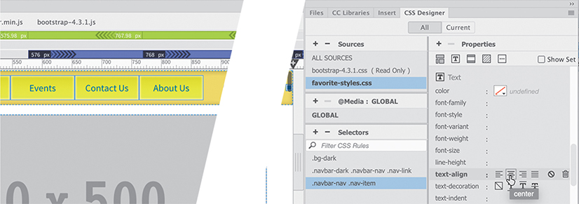
The text aligns to the center within the buttons.
Choose File > Save All.
The navigation menu is done for now. The next component of the mockup is the logo image. Typically, such images are inserted in a <header> element. Since the Bootstrap template doesn’t have one, you’ll have to add it yourself.
Extracting image assets from a mockup
The company logo appears below the navigation menu. You will extract the image from the mockup and create a new <header> element to contain it.
In the Extract panel, select the logo image.

Although the logo image is selected, don’t assume Extract will export only the image. If the image is part of a Photoshop layer that includes the text, or other effects, it will export those as well. It’s a good idea to check how the image is constructed. Don’t worry—you don’t need Photoshop to discover the composition of the selected element. Extract can read and display the contents of the layers in the Photoshop file.
Click the Layers button.

Note the selected layer in the panel. The logo is part of the Header layer, which includes the company name and motto. If the Header layer is selected, Extract will create an image that would include the text too. In some cases that would be desirable, but not here. If you insert text in the webpage, search engines can index it and perhaps improve your result ranking.
If necessary, select the favcity-logo layer.
 Note
NoteIf you set up the default images folder in the advanced settings of the Site Definition dialog, the site image folder will already be targeted.
Click the Extract Asset icon
 in the layer.
A pop-up window appears in the Extract panel that enables you to name the image, choose what type of image you want to create, and choose where you want it to be saved. In Lesson 9, “Working with Images,” you will learn all about web-compatible images and how to work with them. For this exercise, you will create a JPEG file.
If necessary, in the pop-up window Folder field select the lesson06 images folder.
The Save As name field in the pop-up window should show
favcity-logo.The name comes from the Photoshop layer. If the field shows any other name, make sure you don’t have the wrong layer selected.
NoteThe Extract panel is able to create only PNG and JPEG image types.
Click the JPG button.
If necessary, set the Optimize option to 80.

Click Save.
If you set up the images folder when defining the lesson06 site, the logo image will be saved to it automatically. Now you’re ready to create the
<header>element.
Creating new Bootstrap structures
As you can see from the mockup, the header, like the navbar, stretches across the entire screen. The other page components don’t. Bootstrap uses a row and column metaphor to divide up the screen. By adding another row to the navbar, the header would automatically assume the same width.
Dreamweaver makes adding new rows to Bootstrap components a simple point-and-click process.
Select any of the menu items in the navbar.
Select the
navtag selector.
The Element Display appears focused on the
navelement.Choose Window > Insert.
The Insert panel appears.
In the Insert panel, select Bootstrap Components from the dropdown menu.
The Bootstrap category enables you to add a variety of components to your layouts. All of them are designed to support the browsers on desktops, tablets, and phones right out of the box.
Click Grid Row With Column
The Position Assist dialog appears.
Click After.
In the No. Of Columns To Add field, enter 1

Click OK.

A new
div.rowelement appears below the navbar with placeholder text.Although a
<div>is a perfectly acceptable element, there’s a slight semantic value in using the HTML5headerelement.Press Ctrl+T/Cmd+T.
The Quick Tag Editor appears.
Replace
divwith header and press Enter/Return.
The
div.rowis nowheader.row.Select the placeholder text.
Type FAVORITE CITY TOUR
The text has no HTML element applied to it. Semantically, the company name should be formatted as a heading. Best practices say that pages should have only one
h1heading and it should be reserved for the main page heading. So for the company name you’ll use anh2instead. The easiest way to format text is using the Property inspector. NoteIf the Property inspector appears as a floating panel, feel free to dock it to the bottom of the document window.
Choose Window > Properties if necessary.
In the Properties panel Format field, select
Heading 2.
In the Extract panel, select the company name.
Deselect
font-weightandline-height.Click the Copy CSS button.

Once the styles are copied, you need to create a rule for the company name.
In CSS Designer, select favorite-style.css.
Create a new selector: header h2
Paste the styles copied in step 13.

The text is formatted nicely but aligned to the left.
If necessary, select the rule
header h2in CSS Designer.Click the Text category icon
.Choose
text-align: center.
In the Extract panel, select the motto TRAVEL WITH A DIFFERENCE. Deselect
line-heightand copy the CSS.Insert the cursor at the end of the company name.
Press Enter/Return to create a new line.
Type TRAVEL WITH A DIFFERENCE
Create a new rule: header p
Paste the styles on the new rule.
Add the property text-align: center

The text in the header is complete. It may need some tweaking, but let’s move on for now.
Save All.
Next you will apply the company logo as a background image.
Adding a background image to the header
The company name and motto cannot appear in the same space as the logo image unless the text is added to the image itself or unless the image is inserted as a background property. Backgrounds can be composed of one or more images and at least one overall color. When layering more than one effect, you have to make sure you order the properties correctly.
Note
Hex colors depict RGB values using three pairs of letters and/or numbers. When the pattern uses identical pairs, like EEDD55, you can abbreviate the color pair with a single character like ED5. Although the abbreviated color is valid in HTML, don’t be surprised if Dreamweaver rewrites it out fully.
If necessary, open mylayout.html in Live view and make sure the document window is at least 1200 pixels.
In CSS Designer, make sure the All button is selected.
Deselect Show Set, if necessary.
Create the following rule: header
Click the Background category icon
 in the new rule.
Click the
background-colorcolor picker.Enter #ED5 in the color field.
Press Enter/Return.

The
<header>displays a background color matching the navbar. Let’s add the logo image now.Click the Browse icon
 in the
 background-imageproperty.
Select favcity-logo.jpg from the lesson06 images folder. Click Open.

The logo image appears in the header, but it is cut off at the bottom and is repeating horizontally. By default, background images repeat horizontally and vertically. In some cases, a repeating background is desirable, but not here. A few CSS tweaks should make the background look great.
In rule
headeradd the following properties:background-position: center center
background-size: 80% auto
background-repeat: no-repeat

The background image looks better, but it’s still cut off at the top and bottom.
Click the Layout category icon
.In the rule
headeradd the following property:height: 212px

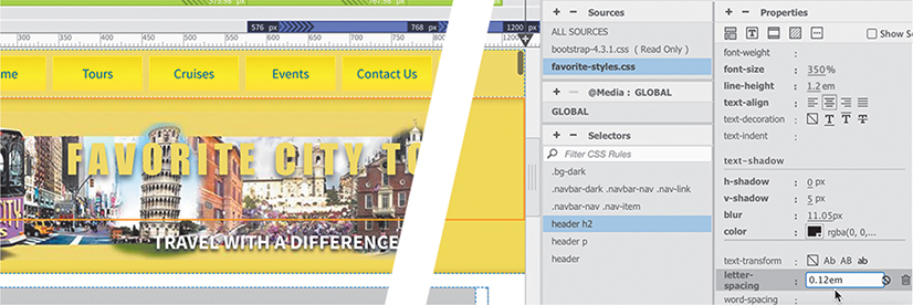
The header expands to display the logo fully. The company name and motto are not centered over the background image. Another tweak to the text elements and the
headerwill be complete for now.In the rule
header h2edit or add the following properties:margin-top: 1em
font-size 350%
line-height: 1.2em
letter-spacing: 0.12em
These specifications bring the company name more into alignment with the mockup. A further tweak to the motto should finish the job.
In the rule
header pedit or add the following properties:font-size: 150%
line-height: 1em
letter-spacing: 0.4em

The motto appears over the background image and is spaced out as it appears in the mockup. There’s one last chore to take care of to finish the header.
In the mockup, a light yellow line separates the navbar from the header. The line does not extend all the way to the edges, so you need to identify an element that has the same properties.
The header extends from edge to edge, but the horizontal menu doesn’t. That should give you a good suggestion.
Click one of the menu items.
The
div.containerencompasses the entire navbar and looks like a good candidate for a border.Select the
div.containertag selector.The Element Display appears. Note that the selection does not extend to the left and right edges.
Create the following rule: nav .container
Don’t forget to add the space after the
navelement.Add the following properties to the new rule:
padding-bottom: 10px
border-bottom: 2px solid #FF3

The
headeris complete and formatted for desktop screens.Choose File > Save All.
In upcoming lessons, you will learn how to adapt and format various page components for desktop screens, smartphones, and tablets.
Finishing up the layout
There are still a few specifications that need to be applied to the layout. The rest of the work should go pretty quickly.
If necessary, open mylayout.html in Live view. Make sure the document window is at least 1200 pixels.
In the mockup, there are wide borders on the left and right sides of the layout. Since the borders extend to the edges of the screen, the body element is a good target for this styling.
In favorite-styles.css create the following rule:
body
Create the following properties in the body rule:
border-right: 15px solid #ED5
border-left: 15px solid #ED5

Large borders appear on the left and right sides of the layout.
You will deal with the main content of the page in the next lesson. For this lesson, the last part of the layout you need to address is the footer. First, let’s bring over the text from the mockup.
Select and copy the footer text in the Extract panel.
In mylayout.html, select the text in the footer and paste to replace it.

The text in the footer is aligned to the center. By default, text aligns to the left in HTML. So that means something is overriding the default behavior.
Select the
footertag selector.Note the class assigned to the
footerelement.The class
.text-centerapplies the styling.Remove the class
.text-centerfrom thefooterelement.
The text now aligns to the left. The last step is to apply the background color.
In favorite-styles.css create the following rule:
footer
Create the following properties in the footer rule:
padding-top: 5px
color: #069
background-color: #ED5
Choose Save All.
Congratulations! You have learned how to extract styles from a Photoshop mockup and apply them to a predefined Bootstrap template. As you work through the upcoming lessons, you will continue to tweak and format the content and learn a variety of HTML and CSS tricks. In the next lesson, you will turn this Bootstrap starter layout into your Dreamweaver site template.
Review questions
1 Does Dreamweaver provide any design assistance for beginners?
2 What advantages do you get from using a responsive starter layout?
3 What does the Extract panel enable you to do?
4 Does Extract enable you to download GIF image assets?
5 True or False. All the CSS properties generated by the Extract panel are accurate and are all you need to style a webpage and its content.
6 How many background images can you apply to an element?
Review answers
1 Dreamweaver (2020 release) provides three basic layouts, six Bootstrap templates, four email templates, and three responsive starter layouts.
2 Responsive starter layouts help you jumpstart the design of a site or layout by providing a finished layout complete with predefined CSS and placeholder content.
3 The Extract panel enables you to derive CSS styling, text content, and even image assets from page mockups created in Adobe Photoshop and Adobe Illustrator.
4 No. Extract supports only the PNG and JPEG image formats.
5 False. Although many of the CSS properties are perfectly usable, styling in Photoshop and Illustrator is geared for print output and may not be entirely suitable for web applications.
6 CSS can apply several background images but only one background color.