9 WORKING WITH IMAGES
Lesson overview
In this lesson, you’ll learn how to work with images and include them in your webpages in the following ways:
Insert an image into a webpage.
Use Photoshop Smart Objects.
Copy and paste an image from Photoshop.
Make images responsive to different device and screen sizes.
Use tools in Dreamweaver to resize, crop, and resample web-compatible images.

This lesson will take about 2 hours and 30 minutes to complete. To get the lesson files used in this lesson, download them from the webpage for this book at www.adobepress.com/DreamweaverCIB2020. For more information, see “Accessing the lesson files and Web Edition” in the Getting Started section at the beginning of this book.

Dreamweaver provides many ways to insert and adjust graphics, both within the program and in tandem with other Creative Cloud tools, such as Adobe Photoshop.
Web image basics
The web is not so much a place as it is an experience. Essential to that experience are the images and graphics—both still and animated—that populate most websites. In the computer world, graphics fall into two main categories: vector and raster.

Vector graphic formats excel in line art, drawings, and logo art. Raster technology works better for storing photographic images.
Vector graphics
Vector graphics are created by math. They act as discrete objects that you can reposition and resize as many times as you want without affecting or diminishing their output quality. The best application of vector art is wherever geometric shapes and text are used to create artistic effects. For example, most company logos are built from vector shapes.
Vector graphics are typically stored in the AI, EPS, PICT, or WMF file formats. Unfortunately, most web browsers don’t support these formats. The vector format that is supported is SVG (Scalable Vector Graphic). The simplest way to get started with SVG is to create a graphic in your favorite vector-drawing program—such as Adobe Illustrator or CorelDRAW—and then export it to this format. If you are a good programmer, you may want to try creating SVG graphics using XML (Extensible Markup Language). Check out www.w3schools.com/html/html5_svg.asp to find out more about creating SVG graphics.
Raster graphics
Although SVG has definite advantages, web designers primarily use raster-based images in their webpages. Raster images are built from pixels, which stands for picture elements. Pixels have three basic characteristics:
They are perfectly square in shape.
They are all the same size.
They display only one color at a time.
Raster-based images are composed of thousands, even millions, of pixels arranged in rows and columns, in patterns that create the illusion of an actual photo, painting, or drawing. It’s an illusion, because there is no real photo on the screen, just a bunch of pixels that fool your eyes into seeing an image. And as the quality of the image increases, the illusion becomes more realistic. Raster image quality is based on three factors: resolution, size, and color.

The inset image shows an enlargement of the flowers, revealing the pixels that compose the image itself.
 Note
Note
Printers and printing presses use round “dots” to create photographic images. Quality on a printer is measured in dots per inch, or dpi. The process of converting the square pixels used in your computer into the round dots used on the printer is called screening.
Resolution
Resolution is the best known of the factors affecting raster image quality. It is the expression of image quality measured in the number of pixels that fit in 1 inch (ppi). The more pixels you can fit in 1 inch, the more detail you can depict in the image. But better quality comes at a price. An unfortunate byproduct of higher resolution is larger file size. That’s because each pixel must be stored as bytes of information within the image file—information that has real overhead in computer terms. More pixels means more information, which means larger files.

Resolution has a dramatic effect on image output. The web image on the left looks fine in the browser but doesn’t have enough quality for printing.
Luckily, web images have to appear and look their best only on computer screens, which are based mostly on a resolution of 72 ppi. This is low compared to other applications or output—such as professional four-color printing—where 300 dpi is considered the lowest acceptable quality. The lower resolution of the computer screen is an important factor in keeping most web image files at a reasonable size for downloading from the internet.
Size
Size refers to the vertical and horizontal dimensions of the image. As image size increases, more pixels are required to create it, and therefore the file becomes larger. Since graphics take more time to download than HTML code, many designers in recent years have replaced graphical components with CSS formatting to speed up the web experience for their visitors. But if you need or want to use images, one method to ensure snappy downloads is to keep image size small. Even today, with the proliferation of high-speed internet service, many websites still avoid using full-screen graphics, although that too is changing.

Although these two images have identical resolution and color depth, you can see how image dimensions can affect file size.
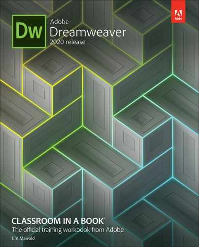
Color
Color refers to the color space, or palette, that describes each image. Most computer screens display only a fraction of the colors that the human eye can see. And different computers and applications display varying levels of color, expressed by the term bit depth. Monochrome, or 1-bit color, is the smallest color space, displaying only black and white, with no shades of gray. Monochrome is used mostly for line-art illustrations, for blueprints, and to reproduce handwriting or signatures.
The 4-bit color space describes up to 16 colors. Additional colors can be simulated by a process known as dithering, where the available colors are interspersed and juxtaposed to create an illusion of more colors. This color space was created for the first color computer systems and game consoles. Because of its limitations, this palette is seldom used today.
The 8-bit palette offers up to 256 colors or 256 shades of gray. This is the basic color system of all computers, mobile phones, game systems, and handheld devices. This color space also includes what is known as the web-safe color palette. Web-safe refers to a subset of 8-bit colors that are supported on both Mac and Windows computers. Most computers, game consoles, handheld devices, and even phones now support higher color palettes, so 8-bit is not as important anymore. Unless you need to support non-computer devices, you can probably disregard the web-safe palette altogether.
Today, only a few older cellphones and handheld games support the 16-bit color space. This palette is named high color and sports a grand total of 65,000 colors. Although this sounds like a lot, 16-bit color is not considered good enough for most graphic design purposes or professional printing.
The highest color space is 24-bit color, which is named true color. This system generates up to 16.7 million colors. It is the gold standard for graphic design and professional printing. Several years ago, a new color space was added to the mix: 32-bit color. It doesn’t offer any additional colors, but it provides an additional 8 bits of data for an attribute known as alpha transparency.
Alpha transparency enables you to designate parts of an image or graphic as fully or partially transparent. This trick allows you to create graphics that seem to have rounded corners or curves and can even eliminate the white bounding box typical of raster graphics.
Here you can see a dramatic comparison of three color spaces and what the total number of available colors means to image quality.
As with size and resolution, color depth can dramatically affect image file size. With all other aspects being equal, an 8-bit image is more than seven times larger than a monochrome image. And the 24-bit version is more than three times larger than the 8-bit image. The key to the effective use of images on a website is finding the balance of resolution, size, and color to achieve the desired optimal quality.
Optimizing your images is essential, even as more people get smartphones and tablets, because there are still millions of people all across the United States, and around the world, who don’t have high-speed wired access to the internet. In February 2018, the Pew Research Center published a study reporting that only 65 percent of American households had access to broadband internet. Check out https://tinyurl.com/pew-broadband-report to see specific details. Using large images on your site is becoming more popular, but it could also cause problems for your target audience, depending on where they live.
Raster image file formats
Raster images can be stored in a multitude of file formats, but web designers have to be concerned with only three: GIF, JPEG, and PNG. These three formats are optimized for use on the internet and are compatible with virtually every browser. However, they are not equal in capability.
GIF
GIF (Graphics Interchange Format) was one of the first raster image file formats designed specifically for the web. It has changed only a little in the last 30 years. GIF supports a maximum of 256 colors (8-bit palette) and 72 ppi, so it’s used mainly for web interfaces—buttons and graphical borders and such. But it does have two interesting features that keep it pertinent for today’s web designers: index transparency and support for simple animation.
JPEG
JPEG, also written JPG, is named for the Joint Photographic Experts Group that created the image standard back in 1992 as a direct reaction to the limitations of the GIF file format. JPEG is a powerful format that supports unlimited resolution, image dimensions, and color depth. Because of this, most digital cameras use JPEG as their default file type for image storage. It’s also the reason most designers use JPEG on their websites for images that must be displayed in high quality.
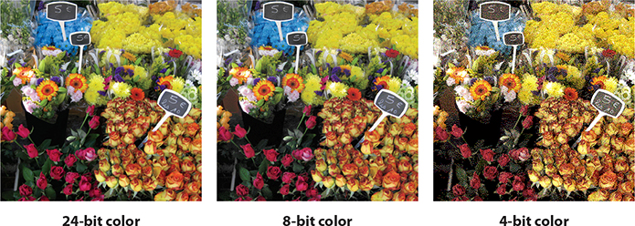
This may sound odd to you, since “high quality” (as described earlier) usually means large file size. Large files take longer to download to your browser. So why is this format so popular on the web? The JPEG format’s claim to fame comes from its patented user-selectable image compression algorithm, which can reduce file size as much as 95 percent. JPEG images are compressed each time they are saved and then decompressed as they are opened and displayed.
Unfortunately, all this compression has a downside. Too much compression damages image quality. This type of compression is called lossy, because it loses quality. In fact, the loss in quality is great enough that it can potentially render an image totally useless. Each time designers save a JPEG image, they face a trade-off between image quality and file size.
Here you see the effects of different amounts of compression on the file size and quality of an image.
PNG
PNG (Portable Network Graphics) was developed in 1995 because of a looming patent dispute involving the GIF format. At the time, it looked as if designers and developers would have to pay a royalty for using the .gif file extension. Although that issue blew over, PNG has found many adherents and a home on the internet because of its capabilities.
PNG combines many of the features of GIF and JPEG and adds a few of its own. For example, it offers support for unlimited resolution, 32-bit color, and full alpha transparency. It also provides lossless compression, which means you can save an image in PNG format and not worry about losing any quality when you save the file.
The only downside to PNG is that its most important feature—alpha transparency— is not fully supported in older browsers. Luckily, these browsers are retired year after year, so this issue is becoming of little concern to most web designers.
But as with everything on the web, your own needs may vary from the general trends. Before using any specific technology, it’s always a good idea to check your site analytics and confirm which browsers your visitors are actually using.
Note
If you have not already downloaded the project files for this lesson to your computer from your Account page, make sure to do so now. See “Getting Started” at the beginning of the book.
Previewing the completed files
To get a sense of the files you will work on in this lesson, let’s preview the completed pages in a browser.
Launch Adobe Dreamweaver (2020 release) or later.
Define a new site for the lesson09 folder, as described in the “Getting Started” section at the beginning of the book. Name the new site lesson09.
Open contactus-finished.html from the lesson09/finished folder.

The page includes several images, as well as a Photoshop Smart Object.
Open aboutus-finished.html from the lesson09/finished-files folder.

The About Us page contains an image that adapts automatically to the size of the screen.
Drag the scrubber to the left to change the width of the document window. Notice that the image in the text area scales with the layout.
Open tours-finished.html and observe the image carousel.
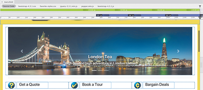
The image carousel displays a large image that animates by moving from right to left. It pauses for a moment and then another image slides onto the screen. Note the headings and text that accompany each image.
Close all sample files.
In the following exercises, you will insert these images into these pages using a variety of techniques and format them to work on any screen.
Note
When working with images in Dreamweaver, you should be sure that your site’s default images folder is set up according to the directions in the “Getting Started” section at the beginning of the book.
Inserting an image
Images are key components of any webpage, both for developing visual interest and for telling stories. Dreamweaver provides numerous ways to populate your pages with images, using built-in commands and even using copy and paste from other Adobe apps.
In the Files panel, open contact-us.html in Live view. Make sure the document window is at least 1200 pixels wide.
The layout contains six profiles of the Favorite City Tour staff. Each profile contains an image placeholder. You may have noticed the numbers 100 x 125 that appear in the placeholder. These indicate the dimensions of the placeholder and the replacement images. In most cases, you will want to resize and resample images before you place them in the layout. If that isn’t possible, Dreamweaver has the ability to adjust image size and quality itself.
When a layout uses placeholder images, the easiest way to replace them is by using the Property inspector.
If necessary, choose Window > Properties to display the Property inspector. Dock it to the bottom of the document window.
Select the image placeholder in the profile for Elaine.

 Tip
TipIt’s always a good idea to identify any classes or ids assigned to an element. It makes it easier to re‑create the structure and styling if anything happens to the element.
The Element Display appears focused on the
imgelement. Note the class.mr-3applied to it. The Property inspector displays the properties for image elements.In HTML, images do not actually appear in the code. Instead, the
<img>element references an image file somewhere on the web server, or elsewhere on the internet. Then, the browser locates that file and renders it in the page. The Property inspector enables you to identify the assigned image source file and to specify a new one.Examine the
Srcfield in the Property inspector.
The
Srcfield saysimages/100X125.gif, which is the name and location of the image placeholder. You can use this field to load the image for Elaine.Click the Browse For File icon
 on the
 Srcfield.
A file window opens.
Select elaine.jpg and click OK/Open.

Elaine’s picture appears in the
<img>element.Alt text provides descriptive metadata about images. In some browsers, alt text may be seen if the image doesn’t load properly, or it may be accessed by individuals with visual disabilities. You should always add alt text to your images.
In the Alt field in the Property inspector, enter Elaine, Favorite City Tour President and CEO as the alternate text.

The image title attribute is similar to alt text. It provides additional information about the image. Search engines don’t use it for result rankings, but it’s a good idea to fill it in as well.
NoteThe content of the Title field will show as a tool tip in most browsers when you position the cursor over the image.
In the Title field in the Property inspector, enter Elaine, Favorite City Tour President and CEO as the title text.

Choose File > Save.
Design view provides an easier way to deal with placeholder images.
Inserting images in Design view
Dreamweaver provides several ways to insert images. When the layout has placeholders or existing images, Design view provides a simple way to replace them.
Switch to Design view.
The Bootstrap styling is not supported in Design view, so the layout will look totally different. The first thing you will notice is that card elements appear in a different order than they do in Live view.
Scroll down to find the image placeholder for Sarah.

Sarah will be the third item in the section.
You could use the Property inspector to replace this placeholder as you did before, but Design view has a few advantages over Live view.
Double-click the placeholder.
A file window opens.
Select sarah.jpg from the lesson09/images folder.
Click OK/Open.
Sarah’s image appears in the
<img>element.In the Property inspector, enter Sarah Harvey, Favorite City Tour Events Coordinator in the Alt field and in the Title field.

Sarah’s image is complete.
Double-click the placeholder for Eric.
Select eric.jpg from the lesson09/images folder.
Click OK/Open.
Eric’s photo replaces the placeholder.
In the Property inspector, enter Eric Quist, Favorite City Tour Events Coordinator in the Alt field and in the Title field.

Eric’s image is complete.
Save the file.
Sometimes you’ll get images that have not been prepared in advance for a particular layout. Dreamweaver provides a full set of tools that enable you to adapt images to almost any purpose.
Optimizing images with the Property inspector
Optimized web images try to balance image dimensions and quality against file size. Sometimes you may need to optimize graphics that have already been placed on the page. Dreamweaver has built-in features that can help you achieve the smallest possible file size while preserving image quality. In this exercise, you’ll use tools in Dreamweaver to scale, optimize, and crop an image for the web.
If necessary, open contact-us.html in Design view or switch to it.
Scroll to the placeholder for Lainey.
Double-click the placeholder.
Select lainey.jpg and click Open.

The image is too large, and there’s barely any room for it in the column. It could really use some resizing and cropping. Dreamweaver’s built-in tools work only in Design view.
Observe the Property inspector.
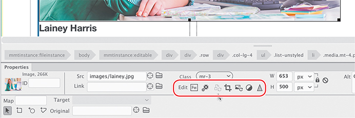
Whenever an image is selected in Design view, image-editing tools appear below the Class menu in the Property inspector. The icons allow you to edit the image in Adobe Photoshop or to adjust several aspects in place. See the sidebar “Dreamweaver’s graphic tools” at the end of the lesson for an explanation of each tool.
You can reduce the dimensions of an image in Dreamweaver in two ways. The Crop tool enables you to remove portions of the image you do not want.
Click the Crop icon
 .
.An unnamed dialog appears explaining that the change you are about to make will permanently change the image but that you will be able to undo the changes.
 Note
NoteUndo will work until you save or close the file.
Click OK.
A cropping box appears on the image.
Resize the cropping box to target Lainey’s face, similar to the composition of the other two images.

As you resize the image, the dimensions of your cropped image appear in the Property inspector. It’s rare to hit the exact size you need. In most cases, it will take a couple of tries.
Press Enter/Return to finalize the initial crop.
The excess portion of the image is now removed, but the image still doesn’t have the correct dimensions. Your dimensions will probably be different than those pictured. The next step is to resize the image so that one of the dimensions matches the desired 100 x 125 pixel size.
In the Height field enter 125 px and press Enter/Return.
The height of the image is now 125 pixels. The change is temporary for the moment, indicated by the two icons that appear beside the dimension fields. The Reset To Original Size icon
 will reset the dimensions to the previous size. The Commit Image Size icon
  will make the change permanent.
Click the Commit Image Size icon
.
A dialog appears again telling you that the change to the image size will be permanent.
Click OK.

The height of the image is now the correct dimension, but the width is still off. To achieve the exact size you’ll need to use the Crop tool one more time.
Click the Crop tool
.A dialog appears again telling you that the change to the image size will be permanent. The dialog provides an option to permanently dismiss this warning. Feel free to select this option if you do not want to be reminded each time.
Click OK.

The cropping box appears on the image. This time you will adjust the size using only the dimension fields in the Property inspector.
Enter 100 px in the Width field.
Enter 125px in the Height field.
Press Enter/Return to commit the change.
If both dimensions appear properly in the fields, skip to step 17. Otherwise, you may find you cannot enter the height dimension. That’s because when the cropping box appears, it is offset from the edges of the image and there may not be enough space to set the height. The cropping box changes from only the bottom and right sides when dimensions are added manually.
Using the mouse, drag the cropping box to the top of the image.

Once the cropping box is moved, there is now enough room at the bottom to enter the desired height.
Enter 125px in the Height field again and press Enter/Return to commit the change.
The Height field is now honoring the height.
Double-click the image to commit the changes.
Lainey’s image is now cropped and the proper size. Let’s add the Alt and Title text.
If necessary, select Lainey’s image.
Enter Lainey Harris, Research and Development Coordinator in the Alt and Title fields in the Property inspector.
Lainey’s image is complete.
Save the file.
So far, you have inserted only web-compatible image formats. But Dreamweaver is not limited to the file types GIF, JPEG, and PNG; it can work with other file types too. In the next exercise, you will learn how to insert a Photoshop document (PSD) into a webpage.
Inserting non-web file types
Although most browsers will display only the web-compliant image formats described earlier, Dreamweaver also allows you to use other formats. Once they’re in place, the program will then automatically convert the file to a compatible format on the fly.
If necessary, open contact-us.html in Design view.
Double-click the image placeholder for Margaret.
Select margaret.psd from the lesson09/resources folder.
Click OK/Open to insert the image.

The Image Optimization dialog appears; it acts as an intermediary that allows you to specify how and to what format the image will be converted.
Observe the options in the Preset and Format menus.

The Preset menu allows you to select from six predetermined options that have a proven track record for web-based images.
The Format menu allows you to specify your own custom settings from among five options: GIF, JPEG, PNG 8, PNG 24, and PNG 32.
Choose JPEG High For Maximum Compatibility from the Presets menu.
Note the Quality setting.
NoteThe Image Optimization dialog displays the final file size of the image at the bottom of the dialog. The goal is to get every image below 50K in size when possible.
NoteWhen an image has to be converted this way, Dreamweaver usually saves the converted image into the site’s default images folder. This is not the case when the images inserted are web-compatible. So before you insert an image, you should be aware of its current location in the site and move it to the proper folder first, if necessary.
This Quality setting produces a high-quality image with a moderate amount of compression. If you lower the Quality setting, you automatically increase the compression level and reduce the file size; increase the Quality setting for the opposite effect. The secret to effective design is to select a good balance between quality and compression. The default setting for the JPEG High preset is 80, which is sufficient for your purposes.
Click OK to convert the image.
A file dialog appears with the name margaret entered in the Save As field. Dreamweaver adds the .jpg extension to the file automatically. Be sure to save the file to the default site images folder. If Dreamweaver does not automatically point to this folder, navigate to it before saving the file.
 Tip
TipThe Element Display and the Property inspector can be used interchangeably to enter alt text.
Click Save.
The file dialog closes. The image appears in the layout and is now linked to the JPEG file saved in the default images folder.
Enter Margaret Julian, Office Manager in the Alt and Title fields.
The image appears in Dreamweaver at the cursor position. The image has been resampled to 72 ppi but still appears at its original dimensions, so it’s larger than the other images in the layout. You can resize the image in the Property inspector.
If necessary, click the Size Constraint icon
 to display the closed lock. Note
Whenever you change HTML or CSS properties, you may need to press Enter/Return to complete the modification.
Change the Width value to 100px and press Enter/Return.

When the lock icon appears closed, the relationship between width and height is constrained, and the two fields change proportionally to each other—change one and they both change. The change to the image size is only temporary at the moment, as indicated by the Reset and Commit icons. In other words, the HTML attributes specify the size of the image as 100 pixels by 125 pixels, but the JPEG file holds an image that’s still 300 pixels by 375 pixels—three times larger than it needs to be.
Click the Commit icon
. Note
NoteAt times, you may find that images will not scale correctly in Dreamweaver. If the final dimensions are not exactly 100 x 125, you can toggle the Size Constraint icon and manually set them.
The image is now resized to 100 by 125 pixels permanently.
In Design view, you can see in the upper-left corner of the image an icon that identifies this image as a Photoshop Smart Object.

Unlike other images, Smart Objects maintain a connection to their original Photoshop (PSD) file as long as it is stored in the same folder from which it was inserted and as long as it can be accessed by Dreamweaver. If the PSD file is altered in any manner and then saved, Dreamweaver identifies those changes and provides the means to update the web image used in the layout.
Save the file.
Working with Photoshop Smart Objects (optional)
Dreamweaver has a special affinity with Photoshop images. It maintains an interactive connection with the original image and can notify you when that image is altered. In this exercise you will learn how to update the Photoshop Smart Object used in your layout.
Note
The following exercise can be completed only if you have Photoshop installed on your computer along with Dreamweaver.
If necessary, open contact-us.html in Design view.
Scroll down to the image margaret.jpg.
Observe the icon in the upper-left corner of the image.
The
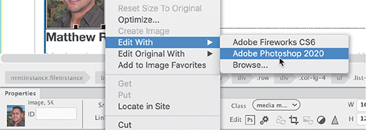
 icon indicates that the image is a Smart Object. The icon appears only within Dreamweaver itself; visitors see the normal image in the browser. If you want to edit or optimize the image, you can simply right-click the image and choose the appropriate option from the context menu.
To make substantive changes to the image, you will have to open it in Photoshop. (If you don’t have Photoshop installed, copy lesson09/resources/smartobject/margaret.psd into the lesson09/resources folder to replace the original image, and then skip to step 6.) In this exercise, you will edit the image background using Photoshop.
NoteThe exact name of the apps appearing in the menu may differ depending on your operating system and what version of Photoshop you have installed. If no version of Photoshop is installed at all, you may not see any program listed.
Right-click the margaret.jpg image.
Choose Edit Original With > Adobe Photoshop 2020 from the context menu.

Photoshop launches—if it is installed on your computer—and loads the file.
In Photoshop, choose Window > Layers to display the Layers panel, if necessary. Observe the names and states of any existing layers.
The image has two layers: Margaret and New Background. New Background is turned off.
Click the eye icon
 for the New Background layer to display its contents.
The background of the image changes to show a harbor scene.
Save the Photoshop file.
Switch back to Dreamweaver.
Position the cursor over the Smart Object icon.
A tool tip appears indicating that the original image has been modified. You don’t have to update the image at this time, and you can leave the out-of-date image in the layout for as long as you want. Dreamweaver will continue to monitor its status as long as it’s in the layout. But for this exercise, let’s update the image.
Right-click the image and choose Update From Original from the context menu.

This Smart Object, and any other instances of it, changes to reflect the new background. You can check the status of the Smart Object by positioning the pointer over the image. A tool tip should appear showing that the image is synced. You can also insert the same original PSD image multiple times in the site using different dimensions and image settings and even under different filenames. All the Smart Objects will stay connected to the PSD and will allow you to update them as the PSD changes.
Save the file.
As you can see, Smart Objects have several advantages over a typical image workflow. For frequently changed or updated images, using a Smart Object can simplify updates to the website in the future.
Copying and pasting images from Photoshop (optional)
As you build your website, you will need to edit and optimize many images before you use them in your site. Adobe Photoshop is an excellent program for performing these tasks. A common workflow is to make the needed changes to the images and then manually export the optimized GIF, JPEG, or PNG files to the default images folder in your website. But sometimes simply copying images and pasting them directly into your layout is faster and easier.
Note
You should be able to use any version of Photoshop for this exercise. But Creative Cloud subscribers can download and install the latest version at any time.
Launch Adobe Photoshop, if necessary.
Open matthew.tif from the lesson09/resources folder.
Observe the Layers panel.

The image has only one layer. In Photoshop, by default you can copy only one layer at a time to paste into Dreamweaver. To copy multiple layers, you have to merge or flatten the image first, or you can select multiple layers in the Layers panel and use the command Edit > Copy Merged to copy the selected layers as a single image.
Choose Select > All, or press Ctrl+A/Cmd+A, to select the entire image.
Choose Edit > Copy, or press Ctrl+C/Cmd+C, to copy the image.
Switch to Dreamweaver.
Scroll to the image placeholder for Matthew and select the placeholder.

Note the class assigned to the placeholder.
There is no Element Display in Design view, but you can use the Class menu in the Property inspector or the tag selector interface to see the CSS class assigned to the placeholder.
Press Delete to remove the image placeholder.
When you select and delete an element in the layout, the cursor remains in the same position in the code.
Press Ctrl+V/Cmd+V to paste the image from the clipboard.

The Image Optimization dialog appears.
Choose the preset JPEG High For Maximum from the Preset menu. Click OK.

A file dialog appears.
TipWhen inserting images that are outside the default site images folder, Dreamweaver may try to save the image in its original location, which may be outside the site folder. When in doubt, use the Site Root button in the Save As dialog to focus the dialog on the site folder. Then select the images folder from there.
Navigate to the default site images folder.
Name the image matthew.jpg.

You have now saved the image as a web-compatible JPEG file in the site images folder.
Click Save.

Matthew’s image appears in the layout. Just like Margaret’s image, Matthew’s image is larger than the others, but it doesn’t need to be cropped.
NoteRaster images can be scaled down in size without losing quality, but the opposite is not true. Unless a graphic has a resolution higher than 72 ppi, scaling it larger without noticeable degradation may be impossible.
Click the image to select it. In the Property inspector, change the image dimensions to 100px by 125px. Click the Commit icon to apply the change. Click OK in the dialog that appears, acknowledging that the change is permanent.
If necessary, select the image for Matthew and enter Matthew, Information Systems Manager in the Alt and Title fields in the Property inspector.
Apply the
.mr-3class to matthew.png using the Class menu in the Property inspector.
The image appears in the layout at the same size as the other images. Although this image came from Photoshop, it’s not “smart” like a Photoshop Smart Object and can’t be updated automatically. It does, however, give you an easy way to load the image into Photoshop or another image editor to perform any modifications.
NoteThe exact name displayed in the menu may differ depending on the program version or operating system installed.
TipIf no image-editor program is displayed, you may need to browse for a compatible editor. The executable program file is usually stored in the Program Files folder in Windows and in the Applications folder on a Mac.
In the layout, right-click matthew.jpg.
Choose Edit With > Adobe Photoshop 2020 from the context menu.
If Photoshop 2020 is not installed, select the program that is displayed.
The program launches and displays the JPEG file from the site images folder.
If you make changes to this image, you merely have to save the file to update the image in Dreamweaver.
NoteThis exercise is geared specifically to Photoshop, but the changes can be made in most image editors.
In Photoshop, press Ctrl+L/Cmd+L to open the Levels dialog. Adjust the brightness and contrast. Save and close the image.
 Note
NoteAlthough Dreamweaver automatically reloads any modified file, most browsers won’t. You will have to refresh the browser display before you see any changes.
Switch back to Dreamweaver.
Scroll down to view Matthew’s image.
The image should be updated in the layout automatically. Since you saved the changes under the original filename, no other action is necessary. This method saves you several steps and avoids any potential typing errors.
Save the file.
All the staff images are now complete. In the next exercise, you will insert an image using the Asset panel.
Inserting images using the Asset panel
In many instances you will not have placeholder images marking the spots for your images. You will have to insert them manually using one of several tools in Dreamweaver. In this exercise you will learn how to use some of these tools.
If necessary, open contact-us.html in Design view.
Scroll down to the heading CONTACT FAVORITE CITY TOUR.
This is one of three of the pages you’ve created that doesn’t have an image carousel. You will enhance the layouts on these pages by adding an attractive travel-related image and some marketing text promoting the quality of the staff, products, and services.
Open difference-text.txt from the lesson09/resources folder.

Select and copy all of the text.
Close the file.
In contact-us.html, insert the cursor at the end of the headline. Press Enter/Return to insert a new line.
Paste the text copied in step 3.
 Tip
TipThe Assets panel should be populated as soon as you define a site and Dreamweaver creates the cache. If the panel is empty, click the Refresh Site List icon at the bottom of the panel.
Choose Window > Assets to display the Assets panel, if necessary. Click the Images category icon
 to display a list of all images stored within the site.
Locate and select travel.jpg in the list.
NoteYou may need to drag the edge of the panel to widen it to see all the asset information.
NoteThe Images window shows all images stored anywhere in the defined site—even ones outside the site’s default images folder—so you may see images stored in the lesson subfolders too.
A preview of travel.jpg appears in the Assets panel. The panel lists the image’s name, dimensions in pixels, size in kilo- or megabytes, and file type, as well as its full directory path.
Note the dimensions of the image.
The image is 1200 by 597 pixels in size. You will insert the image at the beginning of the paragraph.

Insert the cursor at the beginning of the paragraph.
At the bottom of the Asset panel, click the Insert button.

The selected image appears below the heading and fills the layout from edge to edge.
Before mobile devices were introduced, a web designer had to determine only the maximum dimensions of an image and then resize it to fit the space. Each image had to be only one size.
Today, images have to fit a variety of screen sizes interactively. Each image that doesn’t threatens to destroy the carefully constructed layout. Fortunately, Bootstrap provides built-in features that can control and adapt the display of images automatically, but to see how these features work you have to use Live view.
Adapting images to mobile design
The advantages of using a web framework like Bootstrap is it does most of the hard work for you. And one of the most difficult functions is adapting web images to mobile design. Dreamweaver taps into much of this power right in the interface.
Switch to Live view.
Make sure the document window is at least 1200 pixels in width.
The image travel.jpg stretches past the edge of the layout. To make the image honor the Bootstrap layout, you simply have to make it a Bootstrap component.
Select the image travel.jpg.

The Element Display appears on the
imgelement. Note that the image has no special classes applied to it.Click the sandwich icon
 .
.The Quick Property inspector appears.
Select the Make Image Responsive checkbox.

The image resizes to conform to the width of the column. It no longer extends beyond the edge of the screen. This is not a Dreamweaver trick. Note the new class
.img-fluidapplied to theimgelement. The image is now a Bootstrap component and will conform to any structure that it is inserted into. But what happens when the screen gets smaller?Drag the scrubber to the left to make the document window narrower.

As you drag the scrubber, the layout changes and adapts to the smaller screen. The multi-column design converts eventually to a single column. The travel.jpg image scales down seamlessly with the layout.
Drag the scrubber all the way back to the right.
The layout changes again and returns to its original multi-column design. The image looks nice, but it is butting up tightly against the text. It could use some extra spacing.
You have used the
.mt-3class several times to add margin spacing at the top of various elements. In this case, you need extra margin spacing at the bottom of the element. If you had to guess what Bootstrap class name would add bottom margin, what would it be?Click the Add Class/ID icon
 .
.Add the class .mb-3 to the
imgelement.
The class stands for
margin-bottom. This Bootstrap class adds extra margin space at the bottom of the image. By adding two Bootstrap classes, you have adapted the image to the layout and added additional spacing below it.Save the file.
Let’s add similar images to the other pages that do not have image carousels.
Using the Insert menu
The Asset panel is a handy visual way to find and insert images stored within the site. Another tool for inserting images, other HTML elements, and other components is the Insert menu.
Open about-us.html in Live view.
Make sure the document window is at least 1200 pixels wide.
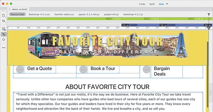
The About Us page has a text block describing the history and mission of Favorite City Tour. Like the Contact Us page it does not have an image carousel. Let’s add an image above the text block.
Insert the cursor in the text that starts “Travel with a Difference” is not just our motto.
The Element display appears with an orange box around the first paragraph.
Choose Insert > Image.

The Position Assist dialog appears.
Click Before.
A file window opens.
Select timesquare.jpg from the lesson09/images folder and click OK/Open.

The image timesquare.jpg appears above the paragraph. Like the previous image, it stretches across and off the layout.
Click the sandwich icon
.Select the option Make Image Responsive.
The image timesquare.jpg resizes to fit the column.
Add the class .mb-3 to the
imgelement.
The class adds margin spacing below the image.
Save the file.
The Insert panel duplicates key menu commands and makes inserting images and other code elements quick and easy. You can even dock it to the top of the document window to have it available all the time.
Working with the Insert panel
Some users find the Insert menu fast and easy to use. Others prefer the ready nature of the panel, which allows you to focus on one element and quickly insert multiple copies of it at once. Feel free to alternate between the two methods as desired or even use the keyboard shortcut.
In this exercise, you will use the Insert panel to add an image to one of the pages.
Open events.html in Live view.
Make sure the document window is at least 1200 pixels wide.

The Events page features two tables, one listing international festivals and the other seminars given by Favorite City Tour. The text block provides a quick overview of the information on the page. Let’s add an image above the text block.
Insert the cursor into the text that starts Want to see how the world parties?
Choose Window > Insert.
The Insert panel appears. The panel is part of the Standard workspace, so it should be docked to the right side of the document window.
In the Insert panel, choose the HTML category from the dropdown menu.

Click the Image button in the Insert panel.
The Position Assist dialog appears.
Click Before.
A file dialog appears.
Select festivals.jpg from the site images folder.
Click OK/Open.
The image festivals.jpg appears in the layout. You can add the Bootstrap classes using the Element Display.
Add the class .img-fluid to the
imgelement.Add the class .mb-3 to the
imgelement.
The image festivals.jpg resizes and repositions itself properly in the layout now.
Save the file.
On each of the pages you can see three small image placeholders in the links under the header or image carousel. If you try to select these placeholders, you’ll discover that they are not part of the editable page. To update them, you’ll have to open the template.
Inserting images in the site template
The only image that’s part of the site template is the company logo, but that was added to the page before it was converted. Inserting images into the template is not much different from working in a child page.
Open favorite-temp.dwt from the lesson09/Templates folder in Live view. Make sure the document window is at least 1200 pixels wide.
Scroll down to the three links that appear below the image carousel.

Select the first placeholder.
In Live view, a bug in Dreamweaver prevents you from interacting with any part of the layout. Until this bug is fixed, any work in the template will have to be done in Design or Code view.
Switch to Design view.
When you switch, you may need to scroll back to the links.
Select the first placeholder for the link Get a Quote.
Notice that the placeholders are not round in Design view. The round shapes are created by the CSS property
border-radius. Since this is an advanced CSS property, it is not supported in Design view.In Design view, you can replace images by double-clicking them.
Double-click the placeholder.
A file window appears.
Select quote.jpg and click OK/Open.

The image quote.jpg replaces the placeholder. You can also use the Property inspector to select the replacement images.
Select the second placeholder.
In the Property inspector, click the Browse icon
in the Src field.Select book.jpg and click OK/Open.
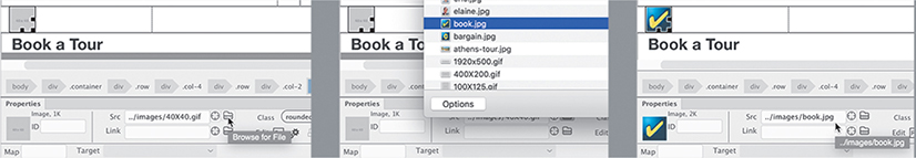
The image book.jpg replaces the placeholder. You can also insert images using Code view.
Select the third placeholder.
Switch to Split view.
The placeholder code is highlighted in Code view. Note the
srcattribute. It’s pointing to../images/40X40.gif. In Lesson 3, “Working with Code,” you learned that Code view can help you preview assets and write the code itself.Position the cursor over the image reference
40X40.gif.
A preview image of the placeholder pops up next to the cursor.
Select and delete only the image reference 40X40.gif
Type bar

As you type, code hinting appears displaying the name of an image file that matches the text being entered. You can continue typing the rest of the name if you want or simply press Enter/Return to complete the image source.
Press Enter/Return to complete the image name as suggested.
NoteThe image may not appear in Live view until the display refreshes.
The image reference
bargain.jpgappears in the code.Position the cursor over the reference
bargain.jpg.
A preview of the image appears beside the cursor. The three placeholders are now replaced. Note that the images are square in shape.
Switch to Live view.

The new images appear in the link section. The advanced CSS properties are supported in Live view, and the buttons are now round in shape. The last step to the process is to update all the child pages. Remember that template commands work only in Design or Code view, or when no files are open.
Switch back to Design view.
Choose File > Save.
The Update Template Files dialog appears, listing all the child pages that will be updated.

Click Update.

The Update Pages dialog appears. If necessary, click the Show Log option to observe the progress of the update. If successful, all five child pages should be updated. You may notice that the three pages you had open display asterisks on their document tabs. This tells you that the pages were updated but not saved. Let’s see if the link images were added to these pages successfully.
Close the Update Pages dialog.
Click the document tab for contact-us.html.
Examine the link section.
The button images were added to the link section on this page.
Switch to and check about-us.html and events.html.
All three pages were updated successfully. But you may have noticed that the link section butts up against the header when there is no carousel. To add extra spacing above it, you can use the class .mt-3 again, but since the link section is not in an editable region, you have to add it in the template.
Adding CSS classes to template structures
You can see how the link section butts up against the header when the image carousel is removed from the page. In fact, you have added the class .mt-3 to content sections on several of the pages to address this issue. Since this will be a problem every time you create a new page, it’s best to address it in the template.
In this exercise, you will add the class to the link and the content sections as needed.
Switch to favorite-temp.dwt.
If necessary, scroll to the image carousel.
You should still be in Live view. There is a bug in Dreamweaver that sometimes makes it difficult or impossible to select elements in the document window in a template. If you cannot directly select elements in the window, you can use the DOM panel.
NoteIt may be difficult to click the image carousel in Live view. You may need to select it in the DOM panel instead.
Click the image carousel.
The Element Display should appear focused on one of the image placeholders.
Choose Window > DOM.
The DOM panel appears. If you were able to select the image carousel in step 2, one of the image placeholders should be highlighted. If not, you can use the panel to locate the component. It should appear within the element
mmtemplate:if.If necessary, expand the structure of the element
mmtemplate:ifin the DOM panel.Inside the element, you should see
mmtemplate:editable.
If necessary, expand the structure of the element
mmtemplate:editable.Note that the first child of the editable region is
div.container.mt-3.Click
div.container.mt-3in the DOM panel.
The Element Display should appear on the image carousel focused on
div.container.mt-3. This element already has the class.mt-3, so we can move on to the next content section.Collapse
mmtemplate:if.The next element below
mmtemplate:ifisdiv.container.Click
div.containerin the DOM panel.
The Element Display appears in the document window focused on
div.container. This is the link section, and you can see that it doesn’t have the class.mt-3applied to it.In the DOM panel, double-click the class
.container.Enter .mt-3 in the DOM class field. Make sure you insert a space between the classes.
Press Enter/Return to complete the change.

The DOM and tag inspector display now show
div.container.mt-3.The next three sections are part of the
MainContenteditable region.Expand the structure of the element
mmtemplate:ifin the DOM panel.If necessary, expand the elements
mmtemplate:editableandmain.wrapper.
Once the editable region is expanded, you will see the three content sections. The change is pretty straightforward from here.
Add the .mt-3 class to all three
div.containerelements.
All the content sections now have the
.mt-3class.Choose File > Save.
The Update Template Files dialog appears, listing all the child pages that will be updated.
Click Update.

All five child pages should be updated. Asterisks appear in all the document tabs except the template favorite-temp.dwt.
As you learned in Lesson 7, “Working with Templates,” when a template is saved, only the locked portions of the page are updated. If one of the editable content sections did not have the
.mt-3class before the update, it still won’t have it now. But by adding the class to the template, any child pages created from this point forward will have the class assigned to them.Choose File > Save All.
The asterisks on the document tabs disappear.
Choose File > Close All.
Next you’ll learn how to add images to the image carousels.
Adding images to a Bootstrap carousel
At the moment, two of your site pages contain image carousels. In this exercise, you will learn how to insert images into the Bootstrap carousel.
Open tours.html in Live view.
Make sure the document window is at least 1200 pixels wide.
The page contains an image carousel and six tour descriptions. In Live view, you can see the carousel animation as one image placeholder slides across the screen replacing another. Note that each slide also contains some text elements.
Click the image carousel.

The carousel is in the editable optional region and should be selectable. Depending on where you click, the Element Display appears focused on one of the image placeholders or on part of the carousel structure.
Although you learned how to insert images in Live view, the carousel offers a unique challenge. How do you select and replace a moving object? Although it’s possible to do so in Live view, using Code view will be much easier.
Switch to Code view.

Dreamweaver highlights the code of the selected element. The carousel contains three placeholder images. Since the carousel rotates, you may have selected any of the three placeholders. Locate the first
<img>element in the element<div class="carousel-inner">, around line 51. Notice the filename. All the placeholders use the same placeholder image,1920x500.gif. You will replace each one with a different image.Select the code
1920x500.gifand enter london Tip
TipWhen more than one filename appears in the hinting list, press the up or down arrow key to view the preview of the other images.
As you type, the hinting menu appears and displays any filenames that match what you are typing. A preview image of the highlighted file appears above or below its name.
Select london-tour-carousel.jpg in the hinting menu.
The London image reference has replaced the placeholder image. Note that there are heading and description placeholders within the same structure.
Select the heading
Item 1 Heading.Type: London Tea to replace it.

Select the text
Item 1 Description.Type High tea and high adventure in London towne to replace it.

The first carousel element is complete.
Locate the second carousel placeholder image, around line 57.
Replace
1920x500.gifwith venice-tour-carousel.jpg.Replace
Item 2 Headingwith Back Canal Venice.Replace
Item 2 Descriptionwith Come see a different side of Venice.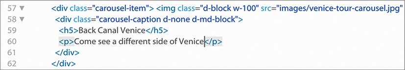
The second carousel element is complete.
Locate the next image placeholder element, around line 63.
Change
1920x500.gifto ny-tour-carousel.jpg.Change
Item 3 Headingwith New York Times.Replace
Item 3 Descriptionwith You’ve never seen this side of the Big Apple.You’ve replaced all the carousel placeholders. Let’s review the changes.
Save the file.
Switch to Live view. Make sure the document window is at least 1200 pixels wide. Observe the image carousel.
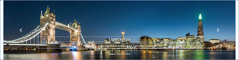
The three images slide from right to left, pause for a moment, and then slide off as they are replaced by the next image. The images look great, but the headings and descriptions are muted and kind of lost in the details of the images. They need to be given a little more emphasis.
Styling headings and text in a Bootstrap carousel
The text headings and descriptions are hard to read on top of the images in the carousel. Let’s tweak the styling with some custom CSS.
If necessary, open tours.html in Live view.
Make sure the document window is at least 1200 pixels wide.
Select the heading on one of the images in the carousel.
The Element Display appears focused on the
<h5>element. Since all the headings are<h5>elements, you can select any of them to style all of them. As always, the first step in modifying CSS styling is to check to see if there are any existing rules styling this element.In CSS Designer, click the Current button.
Inspect the rules displayed in the selector pane.
Identify the rule or rules responsible for the styling of these headings.
There are three rules targeting
<h5>elements. But these do not supply the specific styling seen in the carousel. That can be found in the rule.carousel-caption.In CSS Designer, select the All button.
Choose favorite-styles.css in the Sources pane.
Click the Add Selector icon
 .
.A new selector appears in the Selectors pane targeting the carousel caption element, but the selector is too specific.
Edit the selector name to .carousel-caption.
Press Enter/Return to complete the selector.
TipUnless you know what the other classes do, it’s a good practice not to use them in a selector. Leaving them in the name could reformat other elements unintentionally.
Create the following properties in
.carousel-caption:font-size: 130%
font-weight: 700
text-shadow: 0px 2px 5px rgba(0, 0, 0, 0.8)

The increased font size and text shadow make the text easier to read. But the
<h5>element did not get any bigger. That means another rule is blocking the new styling. A separate rule targeting the<h5>should do the trick.Create the following rule: .carousel-caption h5
In the rule
.carousel-caption h5, add the following properties:font-size: 130%
font-weight: 700

The heading resizes and appears bolder. The text is much more readable now.
Choose Save All.
You have learned several ways to insert and work with images in this lesson. It’s time to put those skills to the test.
Self-paced exercise: Inserting images in child pages
You’ve replaced image placeholders and inserted images in Live view, Design view, and Code view. In this self-paced exercise, you will finish the pages tours.html and cruises.html by replacing the placeholder images remaining in the file.
If necessary, open tours.html in Live view. Make sure the document window is at least 1200 pixels wide.
Nine tour descriptions on the page contain image placeholders.
Using any of the techniques you have learned in this lesson, replace the placeholders as indicated:
London Tea: london-tour.jpg
French Bread: paris-tour.jpg
When in Rome: rome-tour.jpg
Chicago Blues: chicago-tour.jpg
Dreams of Florence: florence-tour.jpg
Back Canal Venice: venice-tour.jpg
New York Times: nyc-tour.jpg
San Francisco Days: sf-tour.jpg
Normandy Landings: normandy-tour.jpg

The placeholders have all been replaced.
Choose Save All. Close the file.
If necessary, open cruises.html in Live view.
Make sure the document window is at least 1200 pixels wide.
This page features an image carousel and three cruise descriptions.
Use the following content in the carousel for Item 1:
Item 1 placeholder: san-francisco-cruise-carousel.jpg
Item 1 Heading: Coastal California
Item 1 Description: Monterey to San Francisco, nuff said!
Use the following content in the carousel for Item 2:
Item 2 placeholder: ny-cruise-carousel.jpg
Item 2 Heading: Bean to Big Apples
Item 2 Description: Come see a new perspective of Boston and New York
Use the following content in the carousel for Item 3:
Item 3 placeholder: miami-cruise-carousel.jpg
Item 3 Heading: Southern Charm
Item 3 Description: Breathtaking views and amazing seafood
Using any of the techniques you have learned in this lesson, replace the cruise placeholders as indicated:
Coastal California: sf-cruise.jpg
Beans and Big Apples: nyc-cruise.jpg
Southern Charm: jacksonville-cruise.jpg

The placeholders have all been replaced.
Choose Save All. Close the file.
Congratulations! You’ve learned how to work with web-compatible images in a variety of ways in Dreamweaver, including inserting images into a layout, replacing image placeholders, making them responsive to various screen sizes, as well as resizing and cropping them. You also learned how to work with Photoshop Smart Objects and how to copy and paste images from another program.
Dreamweaver’s graphic tools
All Dreamweaver’s graphic tools appear in the Property inspector when an image is selected in Design view. Here are the seven tools:
 Edit—Opens the selected image in the defined external graphics editor if you have one installed. You can assign a graphics-editing program to any given file type in the File Types/Editors category of the Preferences dialog. The button’s image changes according to the program chosen. For example, if Photoshop is the editor, you’ll see a Photoshop icon. If it’s not installed, you will see a generic edit icon.
 Edit Image Settings—Opens the Image Optimization dialog, allowing you to apply user-defined optimization specifications to the selected image.
 Update From Original—Updates any placed Smart Object to match any changes to the original source file.
Crop—Permanently removes unwanted portions of an image. When the Crop tool is active, a bounding box with a series of control handles appears within the selected image. You can adjust the bounding box size by dragging the handles or by entering the final dimensions. When the box outlines the desired portion of the image, press Enter/Return or double-click the graphic to apply the cropping.
 Resample—Permanently resizes an image. The Resample tool is active only when an image has been resized.
 Brightness And Contrast—Offers user-selectable adjustments to an image’s brightness and contrast; a dialog presents sliders for each value that can be adjusted independently. A live preview is available so that you can evaluate adjustments before committing to them.
 Sharpen—Affects the enhancement of image details by raising or lowering the contrast of pixels on a scale from 0 to 10. Like the Brightness And Contrast tool, Sharpen offers a real-time preview.
You can undo most graphics operations by choosing Edit > Undo until the containing document is closed or you quit Dreamweaver without saving.
Review questions
1 What are the three factors that determine raster image quality?
2 What file formats are specifically designed for use on the web?
3 Describe at least two methods for inserting an image into a webpage using Dreamweaver.
4 True or false: All graphics have to be optimized outside of Dreamweaver.
5 What is the advantage of using a Photoshop Smart Object over copying and pasting an image from Photoshop?
Review answers
1 Raster image quality is determined by resolution, image dimensions, and color depth.
2 The image formats that are compatible for the web are GIF, JPEG, PNG, and SVG.
3 One method to insert an image into a webpage using Dreamweaver is to use the Insert panel. Another method is to use the Insert command in the Assets panel. Images can also be copied and pasted from Photoshop.
4 False. Images can be optimized even after they are inserted into Dreamweaver by using the Property inspector. Optimization can include rescaling, changing format, or fine-tuning format settings.
5 A Smart Object can be used multiple times in different places on a site, and each instance of the Smart Object can be assigned individual settings. All copies remain connected to the original image. If the original is updated, all the connected images are immediately updated as well. When you copy and paste all or part of a Photoshop file, however, you get a single image that can have only one set of values applied to it.