
Chapter 5
Designing a User-Friendly Application
- Introducing View, the base class of all widgets
- Understanding Android support for graphical user interface (GUI) layouts
- Recognizing the relationship between XML layout files and Android classes
- Understanding key layout classes
- Creating good user interfaces
The computer, including the smartphone and similar devices (such as the tablet), is now an integral part of society. Users have little tolerance for poor or complicated user interfaces. A user's view of the computer isn't the same as your — the developer's — view. Users don't want to — and shouldn't have to — focus on the computer's CPU, network card, memory usage, or any other component.
The success of your Android application depends significantly on its ease of use. The interaction between human and computer is a widely studied field, with many textbooks and research papers written on the subject. Though we can't cover all elements and issues that govern the creation of a good user interface, we discuss specific design choices and rules of thumb and provide a detailed overview of the support that Android provides for user interaction.
This chapter focuses on the elements, such as buttons, in a traditional, two-dimensional (2D) graphical user interface (GUI) and traditional interaction techniques, such as clicking and typing.
 Chapter 6 covers 2D drawing support. Later chapters also discuss Android support of accessibility, for individuals who have visual or hearing impediments, and Internationalization. Internationalization incorporates not only using different languages or currencies in your GUI but also understanding other cultures and their use of specific colors and phrases and the circumstances that can produce different interpretations.
Things to Know Before Creating a User Interface
Android apps are conceptually organized as a set of activities — one cohesive step within an Android application along with its user interface. (See Chapter 1 for more on activities.) Every activity also has an associated user interface, which is the activity's view, and you specify the view either programmatically (within your program, for example) or by using an XML-based layout file.
The user interface is typically created when the activity is created (when the onCreate() method is called). If an XML file defines the view, the following bit of code loads the view layout:
@Override
public void onCreate(Bundle savedInstanceState) {
                      super.onCreate(savedInstanceState);
                      setContentView(R.layout.main);
}
Within the development environment, you can specify several XML files that contain resources and parts of the user interface. When the app is built, these XML files are processed and a set of resource IDs is associated with the layouts. In the preceding example, the R.layout.main resource indicates the root of the layout defined in the XML file, which we cover in detail throughout this chapter.
 In this chapter, you use XML layout files for contact information, a calculator, and other applications. We start by describing the key classes for the visual presentation of the user interface — the View class and its descendants. In Chapter 6, we tell you how to create the user interface programmatically.
Understanding views
The View class is the base class for all visible user interface elements. Though View has no appearance and is rarely used directly, it provides the framework and support for the various complex processes that comprise a rich user experience. The View class is responsible for its own measurement, layout, drawing, focus change, scrolling, and key or gesture interactions for the rectangular area of the screen in which it resides.
Software engineers say that the View class has weak cohesion. (It has responsibility for many disparate tasks, rather than being solely focused on a single task.) View is perhaps the most complicated class in the Android framework because of the degree of coupling between functionality — a level or coupling that exists because the behaviors in an object-oriented system (for example, resize, measure, and draw) should be associated with the object or class.
For an element such as a button, the designers of Android asked several questions about the View class hierarchy, including
- What are the behaviors of a button?
- How does a textbox present itself?
- Can the appearance of a form change over time (for example, for different states of an application)?
- What happens when the user clicks the button?
- What happens when the user presses Enter?
- What happens when the user hovers the cursor over the button?
A simple button encompasses more than just its appearance — it also has a complex set of interactions. In this chapter, we describe many of these interactions in order to illustrate the Android framework in action, so that you can determine where to find a particular method (or behavior) in a widget's hierarchy.
Android has taken the tried-and-true traditional approach of user interface class design, found in almost all GUI toolkits, such as Java Swing. Before we describe the various widgets available in Android, we need to demonstrate this level of complexity to help you see how the world of user interfaces has seemingly “gone bananas” and designed the user interface classes upside down. To help you better understand this concept, the next section dissects the android.widget.Button class, its location in the View hierarchy, and the classes in this hierarchy chain.
 In software engineering, the user interface classes in Android follow a specialization hierarchy — each derived class restricts the overall functionality rather than extending it.
Taking a detailed look at the View hierarchy
Figure 5-1 shows the class hierarchy of View and its descendants. (We omit the descendants of ViewGroup because of space limitations.) The classes in Figure 5-1, covered in Chapter 6, are used to create widgets. Within each class shown in Figure 5-1 is a number indicating the version number of the API in which the class was introduced. For now, you should simply understand that many widgets dealing with text are derived from the TextView class, which is derived from the View class.
Figure 5-1: The class hierarchy of the View class and its descendants.
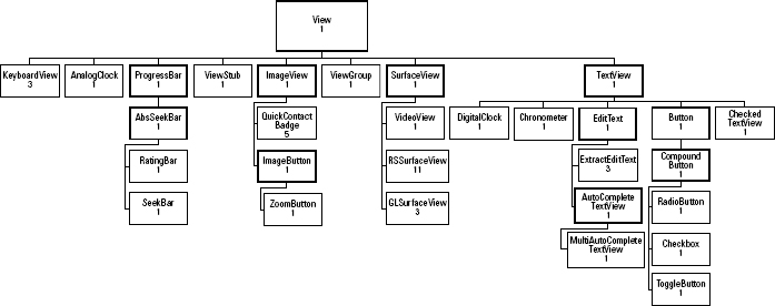
The Button class, which we talk about next, can use text, so it's derived from TextView. If a class name begins with the prefix Abs, it's a base class — one that provides common functionality for the classes that derive from it, which are the full-featured classes you want to use.
The class AbsoluteLayout is deprecated — don't use it directly. The class SurfaceView and the classes that derive from it are essentially blank canvases that can be used to place or draw media. GLSurfaceView provides a blank canvas that uses OpenGL ES in an Android app. ImageView has been propagated to its own level, directly deriving from View, and has several customizations derived from it.
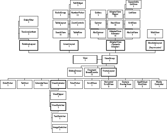
In this chapter, we describe the top structure of the user interface — layouts. Figure 5-2 shows the classes derived from the ViewGroup class and their descendants; these classes are used for layouts. You can see in the figure that a class such as SlidingDrawer is derived directly from ViewGroup and has no classes derived from it — this class is customized for a specific purpose. Helper classes such as FragmentBreadCrumbs and AdapterView are used with other layouts in advanced situations. The remaining three classes, FrameLayout, LinearLayout, and RelativeLayout (AbsoluteLayout is deprecated), are quite useful alone and are quite general and flexible. For common situations such as a group of radio buttons, the Android SDK provides a few customized layout classes, such as RadioGroup and ViewFlipper.
You can understand the relationships of one of these specialization classes and the View class by carefully analyzing the Button widget and how it fits into the hierarchy of Android classes and interfaces. Button extends the TextView class. The editing capabilities of the fully functional TextView text editor are disabled. TextView (which extends View) and classes derived from it are used anywhere that text is presented to the user, including the digital clock and, of course, buttons. The design of this class hierarchy is intended to put much of the functionality in the base classes and provide hooks (a callback method) to allow derived classes to change how the base class typically responds.
The large and complicated TextView class has hundred of methods, some of which deal with data such as setText() and length(). Other methods deal with the presentation, such as setTextColor(), setHorizontally Scrolling(), setTextSize(), setEllipsize(), and setTypeface(). Still other methods support the interaction, such as setSelected(), setCursorVisible(), and setKeyListener(). This is just a small sampling of TextView methods — and, therefore, its state. (Whew!)
Figure 5-2: Class hierarchy of the View Group class and its descendants.
Wait, there's more: TextView also implements the interface ViewTreeObserver.OnPreDrawListener, which has one method:
public abstract boolean onPreDraw()
The method onPreDraw() provides a hook that's called before TextView is drawn. This method is called after all views in the tree have been measured but before any views in the tree have been drawn. TextView uses the onPreDraw() method to adjust its scroll bounds, which indicate the portion of text that's displayed when a large amount of text is scrolled.
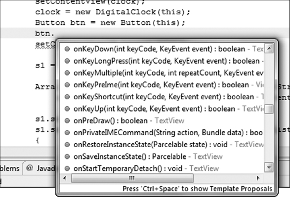
As we mention earlier in this section, TextView extends View, so it inherits all (more than 250) public and protected View methods. The more than 400 methods available to Button overwhelm even the most seasoned developer, and it's virtually impossible to understand everything that a simple little button does. Unfortunately, all these methods are exposed to you by the Eclipse autocompletion feature, which provides a list of all possible method calls for a class or instance of a class. Figure 5-3 shows autocompletion for an instance of Button.
If you look at the SDK documentation for the Button class, you see that it adds no new methods — everything needed to define its appearance and behavior and to measure it, for example, is defined in the base classes. All Button does is redefine some basic TextView behavior. To find out how much, you can look at the Android open source code for Button:
public class Button extends TextView {
    public Button(Context context) {
        this(context, null);
    }

    public Button(Context context, AttributeSet attrs) {
        this(context, attrs, com.android.internal.R.attr.buttonStyle);
    }

    public Button(Context context, AttributeSet attrs, int defStyle) {
        super(context, attrs, defStyle);
    }
}
Figure 5-3: Eclipse provides the list of acceptable method calls for an instance of Button using autocompletion.
Buttons are defined by the last argument in the constructor (which you can override).
The workhorses (at least for Button) are the View and TextView classes. This common specialization of base classes in the user interface APIs lets you do almost anything with a button. After you understand the class hierarchy, you're ready to look at the available user interface components and the classes that help with the layout of the user interface. The rest of this chapter focuses on the higher-level layout (or flow) components. Chapter 6 covers the individual widgets available in the Android framework.
Working with views and layouts
An application or activity contains the View and ViewGroup classes. More precisely, an activity contains a rooted tree of elements, where every element is either a widget, a container of widgets with layout behaviors, or another, special element that controls the appearance or behavior of either widgets or layouts, such as one that animates the initial presentation.
One or more occurrence of View can be combined into a ViewGroup. This special type of View provides a layout for a set of views. The following sections present every possible layout in Android version 13 (API 3.2).
ViewGroup has these 33 classes:
- AbsListView
- AbsSpinner
- AdapterView<T extends Adapter>
- AppWidgetHostView
- DatePicker
- DialerFilter
- ExpandableListView
- FrameLayout
- Gallery
- GestureOverlayView
- GridView
- HorizontalScrollView
- ImageSwitcher
- LinearLayout
- ListView
- MediaController
- RadioGroup
- RelativeLayout
- ScrollView
- SlidingDrawer
- Spinner
- TabHost
- TableLayout
- TableRow
- TabWidget
- TextSwitcher
- TimePicker
- TwoLineListItem
- ViewAnimator
- ViewFlipper
- ViewSwitcher
- WebView
- ZoomControls
You use many of these classes in conjunction with other layouts. ViewGroup can also be (and usually is) nested, so FrameLayout may contain Relative Layout and ScrollView, which contains TableLayout.
Several of these layouts are meant not to be used in isolation but, rather, as components added to other layouts. For example, ViewAnimator is used to add flair when switching from one layout to another or at the initial presentation of the view. Layouts, which are extensions of the ViewGroup class, are used to position child controls (widgets contained within the ViewGroup) for the user interface. Because layouts can be nested, you can create arbitrarily complicated interfaces by using a combination of layouts.
You typically define a user interface by using an XML file, such as main.xml, located in the res/layout folder. A simple example that produces the text string “hello” looks like this:
<?xml version,=“1.0” encoding=“utf-8”?>
<LinearLayout xmlns:android=“http://schemas.android.com/
           apk/res/android”
    android:orientation=“vertical”
    android:layout_width=“match_parent”
    android:layout_height=“match_parent”
    >
    <TextView
        android:layout_width=“match_parent”
        android:layout_height=“wrap_content”
        android:text=“hello”
        />
</LinearLayout>
When you compile an app and the compiler reads its XML files, every element tag in the XML file corresponds to an associated instance of an Android GUI class, or View. Each element is thus associated with an instance of a Java class. As indicated earlier in this chapter, these instances are presented onscreen when the activity is loaded and the content is set. The XML description in the preceding chunk of code uses two classes: LinearLayout and TextView.
The loading and processing of the XML files at compile-time differs from Windows Presentation Foundation, for example, where the XML (or XAML) is processed at runtime, allowing the GUI to be changed after installation.
The following section walks you through the process of creating user interfaces. Separating the appearance of the user interface from the behavior, or code-behind (the programming to tell the app what to do, for example, if a particular button is clicked), lets you focus on only the presentation aspect. The XML facilitates this separation, specifying the appearance in the XML and leaving the behavior to the java implementation. Here, the focus will be only on the appearance.
Sampling Some Android Layouts
The Android SDK includes an extensive and useful set of layouts to help construct user interfaces. Because layout managers play a fundamental role in arranging the pieces of your user interface, you should develop a good understanding of at least a couple of the layout classes so that you can work effectively. This section examines in depth a few key layouts supported by Android. These layouts enable an application to look “polished” as it moves from device to device (or even from portrait to landscape orientation) by gracefully adapting to new font metrics, component styles, component shapes, and even themes. You simply select the right combination of layouts to make an interface easy to understand and use. Begin by sketching your interface on paper and considering whether you should
- Group widgets into separate tasks
- Present all tasks at one time
- Simplify the user interface to show common tasks first
- Hide less common tasks at first but make them easily accessible
- Present the spatial relationships between various tasks
- Present the spatial relationships between the widgets within each task
- Change the layout if the phone is rotated
- Change the behavior of the app if a larger or smaller screen is used
- Choose the best widget for every necessary input or piece of information
One key benefit of using XML for the generation and definition of a user interface is that you can mock up and test the user interface outside the code logic. In the next section, we look at this topic in more detail by mocking up several user interfaces.
Mocking up a contact display
The simple mock-up we present in this section is a view to display a name and an address. For this task, you need widgets for the name, two address lines, a city, a state, and a zip code. The LinearLayout class is useful when a simple sequential set of widgets is needed. Here's the XML file contact.xml (the line in bold is described in the following section):
<?xml version= “1.0” encoding=“utf-8”?>
<LinearLayout
          xmlns:android=“http://schemas.android.com/apk/
          res/android”
     android:orientation=“vertical”
     android:layout_width=“match_parent”
     android:layout_height=“wrap_content”
   >
   <TextView
     android:layout_width=“wrap_content”
     android:layout_height=“wrap_content”
     android:text=“Name”
    />
  <EditText
    android:layout_width=“match_parent”
    android:layout_height=“wrap_content”
    android:text=“Enter Name …”
    />
  <EditText
    android:layout_width=“match_parent”
    android:layout_height=“wrap_content”
    android:text=“Address:”

    />
   <EditText
     android:layout_width=“match_parent”
     android:layout_height=“wrap_content”
     android:text=“  …”
    />
   <EditText
     android:layout_width=“wrap_content”
     android:layout_height=“wrap_content”
     android:text=“State”
    />
   <EditText
     android:layout_width=“wrap_content”
     android:layout_height=“wrap_content”
     android:text=“Zip Code”
     />
 </LinearLayout>
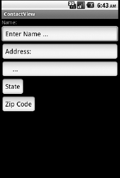
Figure 5-4 shows the result of this view. Note that we don't program anything yet (and don't, in this exercise). To create this application, create a new Android project in Eclipse and modify the res/layout/main.xml file to contain the preceding code sample. The onCreate() loads this file in the template generated by using the Eclipse tools. This user interface example is somewhat unpleasant to look at, but we show you how to fix the problem later in this chapter. Later chapters in this book also cover themes and the code-behind that makes the user interface functional.
Figure 5-4: A GUI for entering information about a new contact.
Examining the XML code closely
If you look at the XML code carefully in the preceding section, you see that it has a single LinearLayout enclosing a single TextView and five EditText widgets. You control the display of these widgets by using various layout parameters included in the XML. All occurrences of View must have a layout_width and layout_height specification — without them, the app crashes. You can use one of two special constants for this purpose which allow the system to make decisions on how best to display the widgets:
- −1: The system should make the widget as large as its containing parent, represented by the symbolic constant match_parent (or fill_parent).
- −2: The system should shrink-wrap the widget to fit the content of the widget, represented by the symbolic constant wrap_parent.
 The layout constant fill_parent was renamed in version 8 to match_parent, and fill_parent was marked as deprecated.
You can use a third option to specify a precise size for the width or height, by using a numerical value with a unit specification. Possible values for the units are
- dp: Density-independent pixels
- in: Inches
- mm: Millimeters
- px: Pixels
- sp: Scaled pixels based on preferred font size
For example, to change the State EditText widget to measure only a half-inch, you replace Line 27 of the code (indicated by boldface) in the preceding section with this line:
android:layout_width=“0.5in”
In general, use one of the special constants match_parent or wrap_content. If a user's screen is smaller than expected, the field (or any field that was supposed to follow it on the same line) may get truncated. A user's screen that's larger than expected may have large, unsightly, empty spaces, possibly causing confusion.
Always use the match_parent or wrap_content constants for the width and height whenever possible, to ensure consistent results across different hardware.
Another XML tag is the LinearLayout's orientation tag. It can be either horizontal or vertical. The vertical setting works best for applications such as the one in the example. Horizontal is useful for toolbars or applications that have several small widgets you want laid out horizontally. For the vertical setting, each child widget is placed on a separate line. It's an optional parameter, and the default is horizontal.
Understanding the relationship between XML and the Android SDK
Every XML tag corresponds to an attribute of the widget. For layout_width and layout_height, these attributes aren't direct attributes of TextView or EditView (or the base class View) but are, rather, shorthand for the LayoutParams class (defined in the View class) associated with this widget. All widgets (all instances of a View) have an associated LayoutParams. The layout_width and layout_height are the only attributes in the base class ViewGroup.LayoutParams. Several derived classes from ViewGroup.LayoutParams provide additional control and functionality. LinearLayout.LayoutParams is used by the LinearLayout layout class and is derived from the ViewGroup.MarginLayoutParams class.
Specifying extra features provided by ViewGroup.MarginLayoutParams
The ViewGroup.MarginLayoutParams class provides attributes for specifying extra space on the outside of the particular view. You can specify the top, bottom, left, and right margins individually by using the attributes android:layout_marginTop, android:layout_marginBottom, android:layout_marginLeft, and android:layout_marginRight, respectively. Alternatively, you can specify the attribute android:layout_margin to set all four margins to the same value. The value you assign to these attributes must be a dimension value, which is a floating-point number appended with a unit such as 14.5sp. Available units are
- dp: Density-independent pixels
- in: Inches
- mm: Millimeters
- px: Pixels
- sp: Scaled pixels based on preferred font size
You can also use a reference to a resource or theme attribute. Themes are covered in Chapter 6.
Specifying extra features provided by LinearLayout.LayoutParams
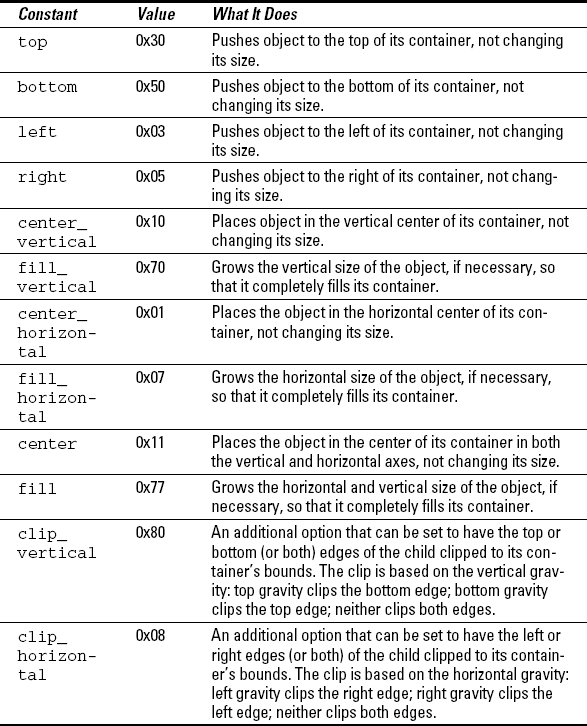
LinearLayout.LayoutParams, which extends the ViewGroup. MarginLayoutParams class, has two additional attributes to specify the gravity and weight of every child widget. The attribute android:layout_gravity is similar to the justification effect in text publishing, where lines are spaced to come out even at the margins. From the Android SDK Reference pages, gravity may take on the values listed in Table 5-1.
Table 5-1 LinearLayout.LayoutParams Constants
Several of these attributes can be combined, using the | operator. For example, to specify the State field in the lower-right corner, you might rewrite the State widget this way:
<EditText
    android:layout_width=“wrap_content”
    android:layout_height=“wrap_content”
    android:layout_gravity=“bottom|right”
    android:text=“State”
    />
This snippet indeed pushes the State EditText box to become right-justified. However, the bottom setting is ignored by LinearLayout with the vertical orientation. If you were using horizontal orientation, the box would be at the bottom, but not right-justified. The system takes all information from its children and determines the best layout using this information as well as its own rules and settings.
Setting a particular attribute (such as a margin) is only a suggestion to the system. It may be ignored or altered.
The layout_weight attribute is useful to evenly space controls either horizontally or vertically. For it to work, all widgets within a container (a layout) should define a weight. If the weights are all equal, you may achieve uniform distribution. We say may because (as we state elsewhere) the system considers it part of its overall strategy, not as gospel. If you give five widgets a weight of one and a sixth widget a weight of two, the sixth widget is, ideally, twice as large as the other five. In practice, this seems to be weak guidance if using unequal weights or widgets with different content sizes. If the amount of data causes the shrink-wrap size to increase, it overrides the weight setting.
You should try your layouts on several devices that have different resolutions. The Android SDK and AVD Manager let you do this by allowing you to create virtual devices with different screen sizes and resolutions. Be sure to try your interface with a normal amount of data, a minimal amount of data, and a maximum amount of data in only a few of the widgets and then in all of the widgets.
Remember that the margin controls in ViewGroup.MarginLayoutParams, the justification and scaling controls in LinearLayout.LayoutParams, and the fill or wrap controls for the width and height in ViewGroup.LayoutParams set the value of only one field in the LinearLayout class — the LayoutParams field. Many more attributes may be able to be set to control the appearance (and behavior) of the individual widgets. A few more attributes for controlling the layout exist — most notably, the android:baselineAligned attribute of LinearLayout. By default, it's set to true and the widgets are aligned with a baseline (the Text field's baseline for widgets, such as TextView). Setting this attribute to false allows the widgets to be aligned at their tops. The android:layoutAnimation in the ViewGroup class specifies an animation to be used when the particular ViewGroup is first displayed.
In the next section, we beautify this simple GUI as much as we can by using LinearLayout. Later sections in this chapter explore alternative layouts that offer more control and flexibility. As you can soon see, LinearLayout is useful as a part of the overall GUI being displayed.
If you find yourself fighting the layout, consider using a different layout class.
Enhancing the look of the contact View
The bulk of the attributes we use to spruce up the simple Contact application are in either the View class or the TextView class. Because EditText is a thin veneer on TextView, it adds no attributes of its own — instead, EditText specializes TextView.
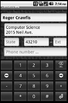
Figure 5-5 shows the intended finished result. Compare this image to Figure 5-4 (the original implementation) to see how many differences you can spot.
Figure 5-5: An improved version of the GUI to enter a contact.
The only structural difference lies in the State and Zip Code widgets lying on the same line. Having these two widgets on the same line is impossible to do with a single LinearLayout, which places each View below the preceding View. To accomplish this task, you need a hierarchy. After you place the State and Zip Code widgets into a separate container or layout, this container can then be treated as a single View element in the top LinearLayout. We know of only one container so far — LinearLayout.
You want the state and zip code to appear on the same line, so you set the android:orientation attribute to horizontal. Structurally, you have replaced the original State and Zip Code EditText widgets with the following snippet (simplified from the final result to illustrate the structural differences):
<LinearLayout          android:orientation= “horizontal”
    android:layout_width=“match_parent”
    android:layout_height=“wrap_content”
    >
       <EditText
           android:layout_width=“wrap_content”
           android:layout_height=“wrap_content”
           android:layout_weight=“1”
           android:text=“State”
           />
       <EditText
           android:layout_width=“wrap_content”
           android:layout_height=“wrap_content”
           android:layout_weight=“1”
           android:text=“Zip Code”
           />
</LinearLayout>
By placing the State and Zip Code widgets within a LinearLayout that is oriented horizontally and making their weights the same, together they span the view. Note that both layout widths are set to wrap_content.
The other enhancements revolve around setting colors and fonts and a background image. To create this new, improved version now, follow these steps:
- Start Eclipse and create a new project. Select Android Project as the project type.
- Name the project ContactView, select version 8 (at least), and fill in the other parameters to name your activity and namespace or package.
- Open the main.xml file in the res/layout directory by double-clicking the filename within Eclipse.
- Delete the existing TextView, leaving only the first line.
- Add a LinearLayout.
Because the LinearLayout is the first (or root) element, you define the Android namespace here. This step is required because the system wouldn't know LinearLayout or any of the Android widgets.
- Insert the following line immediately after the LinearLayout prefix:
xmlns:android=“http://schemas.android.com/apk/res/android”
The attributes are customarily included within the XML tag while placing the child views between the beginning and ending tags. So, for LinearLayout, you place the closing bracket (>) after the namespace declaration on either the same line or a new line. When you close the bracket, Eclipse automatically generates an end tag for you. Press the Return key on your keyboard to place the end tag on its own line. Unfortunately, Eclipse doesn't indent your XML code well. Proper indentation aids in comprehension and reduces errors, so indent the closing bracket (not the end tag). In front of the closing bracket, insert the required attributes (layout_width and layout_height) as well as the orientation attribute. Use vertical for the orientation and match_parent for the layout width and height. Your solution should look like this:
<?xml version= “1.0” encoding=“utf-8”?>
<LinearLayout xmlns:android=“http://schemas.android.com/apk/res/android”
                 android:orientation=“vertical”
                 android:layout_width=“match_parent”
                 android:layout_height=“match_parent”
                 >
</LinearLayout>
Start practicing some good design and programming habits. If you want to reference the instance of this LinearLayout within your Java code, a unique identifier greatly simplifies the process of gaining access to the instance. Add an android:id attribute to the LinearLayout this way:
android:id=“@+id/mainLayout”
The special syntax of the @+ characters within the string indicates that you want to add to the ID pool a new resource named mainLayout and associate the id attribute to it.
Because every XML tag corresponds to a class in the R file, every instance of the tag creates a new instance of that class. The ID is similar to a dictionary look-up to access a handle to this instance. See Chapter 2 for more on the R file.
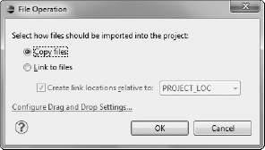
Granted, the default background is a little boring — you can add an image as the background for this view. All View classes (and, therefore, all GUI classes) have the android:background attribute. This attribute can take a color or a drawable. Use the background image for this chapter (named backdrop.jpg), located on this book's companion website (at www.dummies.com/go/android3sdkprogramming), or your own preferred image. On a Windows computer, simply drag the image file from its folder into Eclipse and on top of the res/drawable-mdpi folder. In the dialog box that asks whether you want to copy or link to this file (see Figure 5-6), select Copy Files and click OK.
Figure 5-6: In this dialog box, you add an image to the project.
Three folders with the prefix drawable are in the res folder. They correspond to resources for devices that have low dots-per-inch (dpi) measurement, medium dpi, and high dpi, and they're named res/drawable-ldpi, res/drawable-mdpi, and res/drawable-hdpi, respectively. If you have only one resource, copy it to the appropriate folder; the system builds the others for you. In any case, you access this resource by using drawable/filename in the XML code, where filename doesn't include the file extension. Now add an attribute to set this image as the background:
android:background=“@drawable/backdrop”
The resulting project should produce the result shown earlier, in Figure 5-5.
You add the EditText widgets between the LinearLayout closing bracket and the end tag. Good design practice dictates a consistent look and feel. Android assists in this goal by allowing custom resources and access to these resources in both the code and the XML. We just showed you this strategy in setting the background attribute. Now you can look at adding string resources, color resources, and dimension resources for your text boxes.
You can add resources within Eclipse in three primary ways (in addition to the external drag-and-drop method):
- Using the Resource editor
- Editing the xml file directly
- Using Eclipse's code refactoring
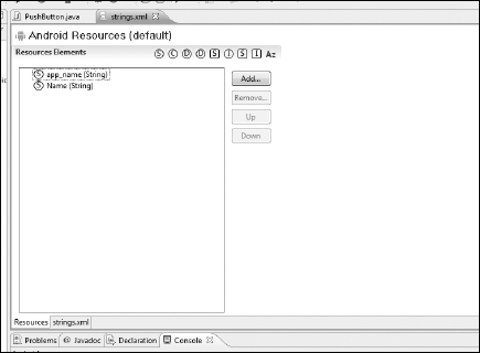
All these resources are placed into the res/values/strings.xml file. Open the res/values folder in the Eclipse Package Explorer window and double-click the strings.xml file. The file opens with two views (denoted by the tabs near the bottom of the window; see Figure 5-7). In the Resources view, you can add a resource, delete a resource, and reorder resources. (Why reorder? Because you can.) Click the Add button. A dialog box opens, asking you to select the type of resource you want to add. Selecting the type lets the system validate the resources so that they can be used wherever a value of that type is needed. Select the Dimension entry and click OK. A new resource has been added to the bottom of the list. You give it a name and value (or change the name and value) by using the text fields to the right. Enter fontSize for the name and 9pt for the value. When you save the strings.xml file, the changes appear in the list pane. If you switch views to the strings.xml view by using the strings.xml tab at the bottom, you can see that all you did was place a new entry in the strings.xml file — in this case, the following line:
<dimen name=“fontSize”>9pt</dimen>
Figure 5-7: Examining the string.xml resource file.
Go back to Resources view and add a new resource. This time, select a Color resource and name it textColor and give it a value of #ff0000 (scarlet). Returning to the strings.xml file, notice that a new tag has been added — except that this time it's a color tag. You use the tag string to reference the resource, so the font size is indicated by “@dimen/fontSize”, not by “@Dimension/fontSize”. In addition to adding the resources from Resource view, you can edit the strings.xml file directly.
A third technique for adding a resource is to use the refactoring tools within Eclipse. In XML, you have only one good option: Convert a string to a string resource.
Suppose that you add the following attribute to one of the EditText widgets:
android:text=“Hello”
You want to remove the literal, “Hello,” from the file and make it a resource because it might allow for internationalization later. You can easily accomplish this task by double-clicking “Hello” to select it and then choosing Android Extract Android String from the Refactor menu.
Add the necessary resources to the strings.xml file to ensure that your file looks like this:
<?xml version=“1.0” encoding=“utf-8”?>
<resources>

    <string name=“app_name”>ContactView</string>
    <color name=“textColor”>#000000</color>
    <dimen name=“fontSize”>9pt</dimen>
    <dimen name=“topMargin”>0.1in</dimen>
    <dimen name=“indent”>0.1in</dimen>

</resources>
By storing the font size (textSize) in a resource, you need to change only the resource value to have the change propagated to all text boxes. This strategy greatly simplifies experimenting with the design while keeping the font characteristics consistent.
To make use of these resources, add an EditText component within the LinearLayout. Here's the description for the Name field in the example:
<EditText
    android:id=“@+id/nameWidget”
    android:layout_width=“match_parent”
    android:layout_height=“wrap_content”
    android:hint=“Enter Name …”
    android:textStyle=“bold”
    android:textSize=“@dimen/fontSize”
    android:textColor=“@color/textColor”
    android:layout_marginTop=“@dimen/topMargin”
    android:singleLine=“true”
    />
Note that the textSize, textColor, and layout_marginTop all make use of resources. You also added an ID resource for this widget. Because a name shouldn't span multiple lines of text, you set the singleLine attribute to true. In addition, you changed the text attribute to a hint attribute. Now there's no text, so if the user starts typing, no text needs to be deleted first. The hint attribute sets the text for a hint to be displayed instead of setting the text field. The hint is displayed whenever the text box is empty and appears (by default) in a grayed-out color.
To end our discussion of LinearLayout and how to customize the view, here's the final main.xml code:
<?xml version=“1.0” encoding=“utf-8”?>
<LinearLayout xmlns:android= “http://schemas.android.com/
           apk/res/android”
   android:id=“@+id/mainLayout”
   android:orientation=“vertical”
   android:layout_width=“match_parent”
   android:layout_height=“match_parent”
   android:background=“@drawable/backdrop”
   >
   <EditText
       android:id= “@+id/nameWidget”
       android:layout_width=“match_parent”
       android:layout_height=“wrap_content”
       android:hint=“Enter Name …”
       android:textStyle=“bold”
       android:textSize=“@dimen/fontSize”
       android:textColor=“@color/textColor”
       android:layout_marginTop=“@dimen/topMargin”
       android:singleLine=“true”
       />
   <EditText
       android:id=“@+id/addressWidget”
       android:layout_width=“match_parent”
       android:layout_height=“wrap_content”
       android:layout_marginLeft=“@dimen/indent”
       android:textSize=“@dimen/fontSize”
       android:textColor=“@color/textColor”
       android:hint=“Address …”
       android:gravity=“top|left”
       android:lines=“2”
       />
   <LinearLayout
       android:orientation=“horizontal”
       android:layout_width=“match_parent”
       android:layout_height=“wrap_content”
       android:layout_marginLeft=“@dimen/indent”
       >
       <EditText
           android:id=“@+id/stateWidget”
           android:layout_width=“wrap_content”
           android:layout_height=“wrap_content”
           android:layout_weight=“0.2”
           android:capitalize=“characters”
           android:singleLine=“true”
           android:textColor=“@color/textColor”
           android:textSize=“@dimen/fontSize”
           android:hint=“State”
           />
       <EditText
           android:id=“@+id/zipcodeWidget”
           android:layout_width=“wrap_content”

           android:layout_height=“wrap_content”
           android:layout_weight=“0.5”
           android:layout_marginLeft=“20sp”
           android:textColor=“@color/textColor”
           android:textSize=“@dimen/fontSize”
           android:singleLine=“true”
           android:hint=“Zip Code”
           android:numeric=“integer”
           />
       <TextView
           android:layout_width=“wrap_content”
           android:layout_height=“wrap_content”
           android:layout_weight=“0.1”
           android:gravity=“center_horizontal”
           android:textColor=“#ffffff”
           android:textSize=“@dimen/fontSize”
           android:textScaleX=“2”
           android:text=“-”
           />
       <EditText
           android:id=“@+id/zipExtWidget”
           android:layout_width=“wrap_content”
           android:layout_height=“wrap_content”
           android:layout_weight=“0.4”
           android:textSize=“@dimen/fontSize”
           android:textColor=“@color/textColor”
           android:singleLine=“true”
           android:digits=“0123456789”
           android:hint=“Ext”
           />
    </LinearLayout>
    <EditText
        android:id=“@+id/phoneWidget”
        android:layout_width=“match_parent”
        android:layout_height=“wrap_content”
        android:layout_marginLeft=“@dimen/indent”
        android:textSize=“@dimen/fontSize”
        android:textColor=“@color/textColor”
        android:hint=“Phone number …”
        android:singleLine=“true”
        android:phoneNumber=“true”
        />
</LinearLayout>
Whew! That's a nice little application. Well, not quite. Recall that it's just a mock-up — you've done no Java programming. However, now you have a firm grasp of LinearLayout and the attributes associated with layouts, views, and resources. There's even a phone number attribute for TextView. The LinearLayout is generally a good choice for small components of your user interface (such as the state and zip code). The next few sections describe some other choices that should be preferred for the top layout in the hierarchy.
LinearLayout is the base class for several other layouts, including TableLayout and its helper, TableRow, which are discussed in the following section. The RadioGroup layout is used to arrange a group of radio buttons, and though ZoomControls should be considered a widget rather than a layout, it's derived from LinearLayout.ZoomControls provides a good example of creating your own, custom widgets; it provides two customized buttons and the long-click behavior for continuous zooming. Similarly, TabWidget, covered later in this chapter, extends LinearLayout and should be considered a widget more than a layout.
Mocking up a simple calculator
To begin to understand why one layout might be preferred over another, you can take a look at different layout styles. In this section, we tell you how to create the user interface for a simple calculator. We have you use a single TableLayout to present the entire calculator because it lets us illustrate some table controls (rather than simply present the best solution).
Consider nesting a couple of layouts in your production code. For example, a text window on top of a grid of buttons suggests perhaps a LinearLayout containing two children: TextView and TableLayout. Two other good choices are RelativeLayout and FrameLayout.
Figure 5-8 shows the result you're shooting for. It makes sense that TableLayout extends the LinearLayout class, because a table is a set of TableRows stacked on top of (or underneath) each other. The basic structure of a table is shown in Figure 5-9.
Figure 5-8: A calculator interface.
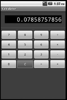
Figure 5-9: The relationship between View, Table, and TableRow.
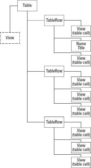
Deciphering the structure of a table
The TableLayout in XML is similar to the HTML <table> element. A TableLayout contains a collection of TableRows, each of which is similar to the <tr> element in HTML. For individual cells, you can use any kind of View element, including another layout element. Here's the code for the table row in the bottom row of the calculator:
<TableRow>
    <Button
        android:id=“@+id/btnNum0”
        android:text=“0”
        android:layout_width=“match_parent”
        android:layout_height=“wrap_content”

        android:layout_weight=“1” />
    <Button
        android:id=“@+id/btnClear”
        android:text=“C”
        android:layout_width=“match_parent”
        android:layout_height=“wrap_content”
        android:background=“@drawable/clearbutton”
        android:textColor=“#ffffff”
        android:layout_weight=“1” />
     <Button
        android:id=“@+id/btnEqual”
        android:text=“=”
        android:layout_width=“match_parent”
        android:layout_height=“wrap_content”
        android:layout_weight=“1” />
    <Button
        android:id=“@+id/btnAdd”
        android:text=“+”
        android:layout_width=“match_parent”
        android:layout_height=“wrap_content”
        android:layout_weight=“1” />
</TableRow>
This code snippet adds the Zero, Clear, Equals, and Addition buttons. You assign each button a layout weight of 1 to achieve equal spacing. Every button is assigned an ID so that you can respond properly to the button being clicked. The text color of the Clear button changes to white, and its background is set to the drawable resource named clearbutton. We tell you how to produce this red button in Chapter 6.
Using Greedy widgets that take up multiple columns
The first row in the table contains a single TextView item to display the result. However, it must span the entire table. How many columns does the table have? The number of columns is determined by the maximum number of children in each row. If one TableRow has 12 children, the table has 12 columns. Every row of the table can have a different number of children, and every child can be a different size. In other words, the TableLayout isn't a 2D grid or n-by-n matrix. It's simply a collection of Views with some coordination among rows. Each View element is typically a TableRow, but even this constraint isn't enforced. (See the later sidebar “Jumbled table karma” for more insights and technical details for controlling the table column sizes — or not.)
The table in the Calculator app spans four columns. It has six rows, and all except the results widget row and the line below it have four columns. For the result window, TextView spans all four columns of the table. You accomplish this task by using the android:layout_span attribute within TextView.
Here's the definition for the TableRow containing the result window TextView (we added a 20-space margin for aesthetic purposes):
<TableRow>
    <!-- The Result Window -->
    <TextView
       android:id= “@+id/resultView”
       android:background=“#000000”
       android:textColor=“#ffffff”
       android:typeface=“monospace”
       android:text=“0.0”
       android:gravity=“right”
       android:textSize=“12pt”
       android:layout_span=“4”
       android:layout_width=“match_parent”
       android:layout_margin=“20sp”
   />
</TableRow>
The results widget also has a black background with white text using a 12-point monospace font. Again, you would be wise to place these font characteristic decisions in the strings.xml file or another resource file.
Adding non-TableRow elements
Another portion of the calculator is the red, horizontal line below the result window. You create this effect by adding a naked View to the table. Because the heavyweight View class is fully functional, it can be used as a blank canvas for adding space or other occurrences of drawable. In this example, the background is set to a constant color. To create the appearance of a line, you set the height of View to a small value — in this case, five pixels. The following code snippet creates the second row of the table:
<View
   android:layout_height=“5px”
   android:background=“#990000”
   android:layout_marginBottom=“10sp”
   >
</View>
This example adds a margin to push the buttons away from the line. You can find the complete source code for the Calculator app on this book's web page.
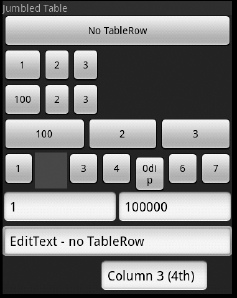
Jumbled table karma
Table layout construction can be cumbersome and tricky with cells containing differing amounts of content, because an intense negotiation battle for precious screen real estate is taking place between each widget and the table logic. Fundamentally, the goals of automatic layout algorithms are to present as much of the content as possible, by contracting or expanding space as necessary. If an individual widget in a table cell suddenly needs more space, it‘s preferable to remove some air (empty space) from certain columns and adjust other column sizes to include (use) that space. Column widths were previously specified upfront and fixed, leading to a great deal of frustration. Machine intelligence can reason only so far and is based on the information provided by the designer. A single TableLayout can cause so much confusion to the layout manager that no sane person would even call it a table. The layout manager has to decide what to do with empty cells and how to handle large content while also accommodating every widget's layout_weight and the table attributes android:stretchColumns and android:shrinkColumns.
Keeping things consistent
The lack of a rigorous table specification and the lax “anything goes” mentality of TableLayout allows for great flexibility. By now, you may have an appreciation of the complexity of the decision-making process that takes place in a layout manager. The old adage “garbage in, garbage out” applies well to table construction. Because the table has been around since the early days of HTML and office publishing, it's often considered the layout manager of choice, even if the data or widget to be presented isn't tabular.
Figure 5-10 shows an app with a single TableLayout view as the root. It may be difficult to see, but it has seven columns. Trying to line up any of these columns with the various empty cells and the lack of spanning and shrinkable and stretchable settings is quite difficult.
When using TableLayout, try to follow these guidelines (because the system doesn't make you follow them):
- Ensure that every occurrence of TableRow has the same number of columns.
- If a TableRow must have fewer columns, use the layout_span attribute to consume the same number of columns.
- Mark only a few columns as shrinkable.
- Mark all columns as stretchable or reduce the TableLayout width.
- Set the TableLayout width to wrap_content for small tables.
- Limit to a single column any content that drastically changes its size. If this column isn't the last one, mark it as shrinkable and allow it to span multiple lines.
Figure 5-10: A messy, jumbled table.
The table can be a useful part of your user interface. In the next few sections, we cover some higher-level layouts that typically contain LinearLayout and TableLayout — one of the most important is RelativeLayout. After you have a solid understanding of layouts, we can present the remaining available layouts in more of a reference style.
Allowing columns to shrink whenever necessary
Every column in a table can be shrinkable, which shrinks a child of a TableRow if none of the children in the row fits. This situation is different from wrap_content in that shrinkable pushes the column to a size smaller than its data and increases the row height. The following figure shows you several tables measuring 2-rows-by-3-columns (separated by text labels, or TextView elements). In the first table, no column is set to be shrinkable. In this case, whether a column is shrinkable is immaterial because all the data fits within the parent view, the TableLayout.
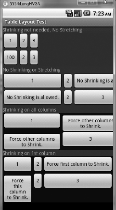
The second table in the figure has two buttons, which require more space than an individual TableRow can handle. Without shrinkable columns, the last column is pushed off the edge of the view.
If you set all columns willy-nilly to be shrinkable, the layout manager tries to be fair and trims some space from every control equally. It does this after it determines each control's minimum size, so the third table in the figure shows the first column being compressed and the second column apparently being removed (or simply trimmed away!). The width of the column shrunk too much to display even a single character and couldn't even display itself. You set all columns to be shrinkable by using the TableLayout attribute:
android:shrinkColumns=“*”
Because Columns 1 and 3 in this table were also shrunk to less than their desired size, they were forced to push their data onto additional lines (which Column 2 couldn't do with a single character). And now, being able to set the android:baselineAligned attribute in the LinearLayout class to false is useful. In the sidebar figure, the TableRow (which extends LinearLayout) tries to maintain the alignment of the baseline of the first line of text, which causes the buttons with multiple text lines to shift down as their text is shifted up within the button.
A final experiment is to set one column as shrinkable (which is how you should use this feature). You're saying that the data in this column isn't critical and can be compressed or clipped. The last table in the sidebar figure has the first column as shrinkable, which causes the second and third columns to return to their desired sizes, sacrificing Column 1. You do this by using the following line:
android:shrinkColumns=“0”
The baseline attribute was set to false in both TableRow definitions to align the tops of the buttons.
Allowing columns to stretch to fill space
In addition to being shrinkable, a column can be set to stretchable. Then the layout manager tries to give this column more space if the set of columns doesn't fill the entire parent view (TableLayout). Recall that all children of the TableLayout (the TableRows) have their layout widths changed to match_parent (fill_parent). All rows must therefore span the table width. We aren't saying that the display of the controls must span the width. The following figure shows five 2 × 3 tables. The first table has no stretchable columns. Every control is granted the space it requested, and no columns are expanded. The remainder of the TableRow is padded to fill the TableLayout.
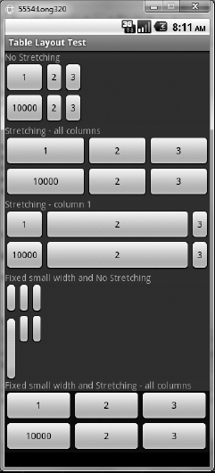
In the second table in this figure, all columns are set to be stretchable by using the following attribute in the TableLayout tag:
android:stretchColumns= “*”
This setting, typically a useful one, tells the layout manager to give all columns their desired sizes plus an equal amount of extra padding. The first column in this table has more content (more text on the button, resulting in a wider button), so it had an initial desired size larger than the other columns. Hence the first column occupies more space.
In the third table, only the second column (Column 1) is allowed to stretch, so it receives all the extra padding. Again, you indicate it in XML by using the TableLayout attribute:
android:stretchColumns=“1”
The first and third columns are exactly the same size as the first table without stretching. For applications such as this one, and in our calculator example, an equal size for every column often looks better.
To do this, you must “trick” the layout system:
For a uniform column size, you need a third option for setting the width of a widget. We typically use either of these attributes:
android:wrap_content adjusts the size of the control to the minimum that's needed.
android:match_parent adjusts the size to the maximum amount of remaining available space in the parent (so far) and the amount returned by wrap_content.
A control (or widget) can also have its width and height specified using a dimension, such as 0.1in. The dimension overrides any of the calculations just mentioned and sets the size of the control to the specified amount. If the data display needs more space than the specified size, it's either clipped or (for some, such as TextView) wrapped to another line and the height adjusted if the size isn't fixed.
For the fourth and fifth tables in the preceding figure, all controls (Button's, in this case) have a small fixed value (such as 0) that tells the system, “I need only this amount of space.” In the fourth table, no stretching is allowed, so every column gets the maximum fixed amount that's specified for that column. Here's the XML code for this table:
<TableLayout
    android:layout_
   width=“match_parent”
    android:layout_
   height=“wrap_content”
   android:background=“@
   color/line1”
    >
    <TableRow
           >
        <Button
            android:text=“1”
            android:layout_
    width= “20dip” />
         <Button
             android:text=“2”
             android:layout_
    width= “20dip”/>
         <Button
             android:text=“3”
             android:layout_
    width= “20dip”/>
     </TableRow>
     <TableRow>
          <Button

    android:text= “10000”
             android:layout_
    width=“10dip” />
         <Button
             android:text=“2”
             android:layout_
    width=“10dip” />
         <Button
             android:text=“3”
             android:layout_
    width=“10dip” />
     </TableRow>
</TableLayout>
In this case, every column has a desired size of 20 device-independent pixels (dip) because that's the maximum size between the two rows. Every Button is then expanded to this size, so even though the second row wants only 10dip per button, it receives 20dip per button. The Button with the text string “10000” spans multiple lines even though the numbers aren't visible.
Setting all columns to be stretchable adds an equal amount of space to every column. Because in this example every column is the same size, a uniform column size that spans the table is created, as shown in the last table of the preceding figure. Finally, if a column has, for example, a fixed size that's twice the size of the other columns, the column, when expanded, is twice the size of the others.
It might seem that weights would provide the same control, but they don't. They simply provide a hint to the system. If content amounts differ, this necessary size overrides the weights. However, if stretching is turned off, weights perform stretching. So combining a fixed size with stretching or a fixed size with weights produces the same effect of uniform or proportional column sizes. The proportions can be specified in either the size or the weights. In any case, if your content exceeds the column size, data is clipped and isn't presented.
RelativeLayout: Flexibility du Jour
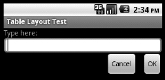
The most flexible of the standard layouts, Relative Layout allows every child View position to be defined relative to its siblings or the parent's boundaries, or both. Here's the example from the RelativeLayout tutorial on the Android SDK website:
<?xml version=“1.0” encoding=“utf-8”?>
<RelativeLayout xmlns:android=“http://schemas.android.com/apk/res/android”
    android:layout_width=“match_parent”
    android:layout_height=“match_parent”>
    <TextView
        android:id=“@+id/label”
        android:layout_width=“match_parent”
        android:layout_height=“wrap_content”
        android:text=“Type here:”/>
    <EditText
        android:id=“@+id/entry”
        android:layout_width=“match_parent”
        android:layout_height=“wrap_content”
        android:background=“@android:drawable/editbox_background”
        android:layout_below=“@id/label”/>
    <Button
        android:id=“@+id/ok”
        android:layout_width=“wrap_content”
        android:layout_height=“wrap_content”
        android:layout_below=“@id/entry”
        android:layout_alignParentRight=“true”
        android:layout_marginLeft=“10dip”
        android:text=“OK” />
    <Button
        android:layout_width=“wrap_content”

        android:layout_height=“wrap_content”
        android:layout_toLeftOf=“@id/ok”
        android:layout_alignTop=“@id/ok”
        android:text=“Cancel” />
</RelativeLayout>
This example results in the view shown in Figure 5-11. In a nutshell, you have TextView with EditText below it, which has, in turn, the OK and Cancel buttons below it. The OK button is also anchored to the right of the overall view (RelativeLayout). The Cancel button is anchored to the left of the OK button and its top is aligned with the OK button (which places it below EditText). Every widget (except Cancel) has an ID associated with it, which the other widgets can reference in their alignment specifications.
Figure 5-11: Using Relative-Layout.
RelativeLayout defines the RelativeLayout.LayoutParams class, which extends MarginLayoutParams. It adds the attributes listed in Table 5-2, which the children of a RelativeLayout can use to control their positioning.
Table 5-2 Attributes for the RelativeLayout.LayoutParams Class
These attributes allow an alignment with any sibling as long as you gave them IDs (using the android:id attribute) as well as alignment with the parent edges or centering within the parent. Think of them as snap-on parts. If you're familiar with Windows .NET Forms or WPF, this concept is similar to the Anchor properties.
As every new view is added to RelativeLayout, it defines two vertical gridlines (one for the left edge of the widget and one for the right edge) and three horizontal gridlines (top, bottom, and baseline). Any new view can use these (abstract) gridlines to request its position. As it's added, it introduces its own gridlines, some of which are co-located with existing gridlines. This concept is shown schematically in Figure 5-12.
Figure 5-12: Snapping widgets to align with other widgets.
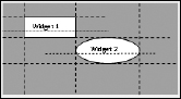
In Figure 5-12, after Widget 1 is placed, all future widgets position themselves horizontally to align one of their edges to the left or right edge of Widget 1. Thus, there are four possible choices for horizontal alignment (one for each edge) for the new widget, Widget 2 — left and right; you can align the widget with either of the two vertical edges from Widget 1:
- Align Widget 2's left edge with the left edge of Widget 1.
- Align Widget 2's left edge with the right edge of Widget 1.
- Align Widget 2's right edge with the left edge of Widget 1.
- Align Widget 2's right edge with the right edge of Widget 1.
Vertical alignment (with the horizontal gridlines) gives you five possible choices to align with another widget:
- top-top
- top-bottom
- bottom-top
- bottom-bottom
- baseline-baseline
The use of the Baseline constant aligns the first row of text with the baseline of the specified widget's text.
Edge refers not to the edge of the displayed widget but, rather, to the edge of the widget plus any margins.
You may recall that the layout manager determines the positions of every gridline based on such factors as the widget size and margins, for example. As the content of one widget grows, it forces the other widgets to maintain its alignment.
Avoid creating a chicken-and-egg situation in which one widget needs another widget's position to determine its position but the position can't be calculated because it requires (eventually) the first widget's position. For example, if RelativeLayout has its height set to wrap_content and a child is set to align_parent_bottom, a circular dependency exists, which results in a runtime error.
RelativeLayout is useful for both high-level design and smaller components, such as a standard right-aligned Okay or Cancel confirmation, a login component, or the TwoLineListItem widget, which derives from RelativeLayout. Though both TableLayout and RelativeLayout manage the 2D spatial relationships between the many widgets in its hierarchy, FrameLayout (described in the following section) allows only one of its children at a time to be seen but reserves enough space to show each one seamlessly.
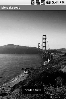
The FrameLayout layout
The important FrameLayout class, which forms the base for many other classes, simply pins every child view to the upper-left corner. Adding multiple children stacks each new child on top of the one before it, with each new child obscuring the last. If the new child is transparent or smaller, it may only partially obscure its previous siblings.
The size of the frame layout is the size of its largest child (plus padding), visible or not. All children, when rendered, are basically given this size but pinned to the upper-left corner. Using the layout_gravity of a child widget allows the widget to appear to move away from the upper-left corner. Thus, FrameLayout is often used to provide an overlay effect. The following XML code (taken from http://developer.android.com/resources/articles/layout-tricks-merge.html) places a text label centered near the bottom of the view over the much larger image being displayed:
<FrameLayout xmlns:android=“http://schemas.android.com/apk/res/android”
    android:layout_width=“match_parent”
    android:layout_height=“match_parent”>

    <ImageView
        android:layout_width=“match_parent”
        android:layout_height=“match_parent”

        android:scaleType=“center”
        android:src=“@drawable/golden_gate” />

    <TextView
        android:layout_width=“wrap_content”
        android:layout_height=“wrap_content”
        android:layout_marginBottom=“20dip”
        android:layout_gravity=“center_horizontal|bottom”

        android:padding=“12dip”

        android:background=“#AA000000”

        android:textColor=“#ffffffff”

        android:text=“Golden Gate” />

</FrameLayout>
The result is shown in Figure 5-13. This layout works and adjusts the sizes of the widgets, regardless of the image sizes or the amount of text in the caption label.
Figure 5-13: An example of using the FrameLayout class
The FrameLayout class is used as the base for the ScrollView, ImageSwitcher, TabHost, and ViewAnimator layouts and the date and time picker widgets, and for many more layout and widget classes. It has associated with it a FrameLayout.LayoutParams class that derives from the MarginLayoutParams class and adds the gravity layout attribute.
Chapter 6 covers more user interface support to make these more functional.
Choosing the Right Layout
The layout manager you should choose is the one that makes your life easiest, of course, while still providing your users with the functionality they require. The same design can probably be implemented using several approaches and top-level layout managers. In this section, we help you consider which layout managers work best in which situations. Though you should follow general guidelines, exceptions to the rule always exist, so use your best judgment. Fundamentally, your choices are dictated by the data to be gathered or presented and when it's needed:
- If your application has a fairly linear progression of user interaction, ScrollView with RelativeLayout or TableLayout may be your best bet.
- For applications with several activities, each with its own user interface, consider using ImageSwitcher, SlidingDrawer, TabHost, TextSwitcher, ViewFlipper, or ViewSwitcher. They allow the layout to be changed (and often replaced), presenting an entirely new set of widgets.
The best user interface presents the most important information in a way that's clearly visible and easy to use while allowing less-often-used items to be accessed.
Use the command-line tool layoutopt in the Tools SDK to find inefficiencies in your XML-based layouts.
Here are several more guidelines you should follow when developing your Android apps:
- Buy a physical Android phone or tablet. In fact, buy several. The experience of installing and running your application on a physical device is different from running it on the emulator.
- Design for big fingers. Many people have large fingers and clicking small buttons can be an adventure.
- Design for both horizontal and vertical screen orientations. The layout on many mobile devices changes as the orientation of the device changes or the keyboard is used.
- Avoid putting too much information on a tiny screen. Hide features that aren't used most of the time.
- Scrolling can be confusing in a user interface, so try to make your data fit on the screen. If you can't, logically group functionality and split it into several windows or tabs. Save scrolling for long chunks of data that cannot be broken into several pieces.
- Don't overload the menu. The contextual menu has to be used quickly. If you have a lot of information, create one entry for a submenu named More, as Google does on its main page (at www.google.com).
- Always notify the user whenever an app may be consuming resources that aren't free. For example, an app may be sending data across the network that consumes a user's data plan quota.
- The user experience with your app should be consistent with other apps they commonly use. Don't try to be clever by introducing nonstandard behaviors. The following behaviors should be consistent:
- Pressing the Back button cancels the current action. Pressing Back saves the state, quits the app, and waits for you to return, a behavior that's fundamentally different from most desktop applications. It's similar to minimizing the window on a desktop, except that, to restore the window, you launch the application again.
- A tap typically performs an action. Confirmation screens that ask you to save or confirm actions are even more annoying on a small device than they are on a desktop. If a user taps a setting, the setting should change. If a user makes a change and taps the Back button, the setting's change should persist.
- When you reopen an app, it should return to the last state it was in. Tapping the Back button doesn't close an app. You return it to the same state it was in by using the onResume/onCreate/onPause method.
- If a long pause occurs between the time an app was last used and then reopened, starting the app from an initial default state is reasonable. The rationale is that a long pause implies a new task or “train of thought” and, therefore, a clean slate. This concept is, of course, application dependent, but consider it in your design.