
Chapter 6
Enhancing Your Layout with Widgets, Styles, and Themes
- Understanding built-in views (or widgets)
- Selecting the right widget for the job
- Creating your own, custom widget
- Applying styles and themes
Designing the overall layout is only one piece of the puzzle involved in creating a user interface for your app. In this chapter, we describe the basic views used for individual data entry or selection. You can modify these views for your own app's style or allow users to apply their own themes. If this level of control isn't sufficient for you, the entire suite of drawing tools is available to create your own, custom controls.
Beholding the Power of the Framework: Built-In Views
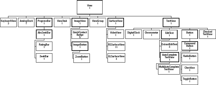
The Android SDK provides a rich and fairly comprehensive set of components for you to use in your apps. Figure 6-1 shows the class hierarchy of the built-in widgets. (The children of ViewGroup have been omitted, for brevity.) All are available in the Android.widget package. Most of them have been in the framework beginning with version 1. KeyboardView and GLSurfaceView were added in version 3, and QuickContactBadge was added in version 5. The RSSurfaceView class is the new addition to version 11 (Android 3.0). RSSurfaceView is not a true widget but, rather, a raw surface on which to draw and, in this case, an OpenGL ES surface for Renderscript. RSSurfaceView replaces GLSurfaceView.
Figure 6-1: The class hierarchy of View.
New widgets can be created by deriving and extending any of these classes. In deciding which widget to use for your application, consider these two questions:
- Which View is the easiest for your users to use in performing the necessary action?
- Which View will lead to the fewest number of errors?
It may be difficult to believe, but early computer applications had no menus, no combo boxes, no date pickers, and no buttons — and the mouse didn't enter the scene until even later. You had to memorize various keystrokes or keywords in order to interact with an application, a situation that still exists on many command-line applications. Typing the wrong command can lead to frustration and unwanted results. One helpful feature of a combo box, for example, is that it limits user choices to ones that the application knows about, which prevents syntactical errors. Much like a menu, a combo box also provides the user with information about the permissible choices, allowing the exploration of options that may not be obvious in a legacy application.
 An individual GUI component is often referred to as a widget — not to be confused with an Android App Widget, which can be hosted in a special class of apps. They're similar in that an Android widget is supposed to be small enough to be considered a single component. You also see widgets referred to as components (as we have done here) or elements of the GUI.
 Chapter 5 covers the nitty-gritty details of a button and its relationship to the View class. In this chapter, we look at the higher-level functionality of a button, including its behavior and the different appearances it can take on.
Working with a push button
You might already know (if you read Chapter 5) that a GUI component can be added either programmatically or by using XML-based layout files. In honor of Homer, from The Simpsons, we show you how to create a giant button to override the local nuclear power plant. Create a new app and, in the onCreate method, add a button, like this:
@Override
public void onCreate(Bundle savedInstanceState) {
    super.onCreate(savedInstanceState);
    LinearLayout layout = new LinearLayout(this);
    Button dohButton = new Button(this);
    dohButton.setText(“In case of meltdown, Push Me!”);

    layout.addView(dohButton);
    setContentView(layout);
}
This code snippet creates a button, sets the text of the button to In case of meltdown, Push Me!, and adds the button to LinearLayout, which is then set to the View content of the app. You can change the appearance of this button quite simply. If you add the following statements after you create the button (but before you set the app's content), your button is sized and colored, as shown in Figure 6-2:
dohButton.setText(“In case of meltdown, Push Me!”);
dohButton.setWidth(400);
dohButton.setPadding(30,45,30,45);
dohButton.setTextColor(0xFFFF0000);
dohButton.setTypeface(Typeface.DEFAULT_BOLD);
Figure 6-2: The result of programmatically creating Buttons and setting some of its attributes.
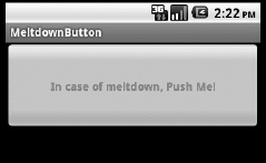
This example sets the width of the Button in terms of pixels so that it's 400 pixels wide. The text color is set to red using a hexadecimal number in the format #AARRGGBB. A regular base-10 number could have been used here, but would actually be more difficult to read, as the digits in the number would not relate to the individual color channels: alpha, red, green, and blue.
 The alpha channel in a color controls its transparency. An alpha of 255 (#FF, in hexadecimal format) implies an opaque color, and a 0 alpha is transparent (invisible).
The example also sets the padding to create a bigger button. Though you can set the background color just as easily as you set the text color, it destroys the “look” of a button. In fact, the Button class is more specifically called a push button (because its three-dimensional appearance makes the button look like it's “popping out” of the phone, like a keyboard key). Pushing the button changes its appearance temporarily, verifying for the user that the push button is valid. Unfortunately, setting the background color destroys this process. The button has no 3D look and doesn't change colors when it's pushed.
Two methods set the font and typeface of text. The method just described uses the default font and only specifies bold. All these customizations are in either the base class, TextView, or the View class.
Button has no method to set an image or icon for a button. You can use the ImageButton class (derived from ImageView, not Button) for buttons with images only. If you want a button with a stylized background and text, you replace the entire background of the button using a drawable resource. (See “Pretty in pink: Creating custom buttons,” later in this chapter). The following section helps you make this button useful.
Creating Tic-Tac-Toe using push buttons
In this section, we show you how to rework the Tic-Tac-Toe application (see Chapter 2) to use buttons so that you can programmatically control whether the text is displayed, whether the button is enabled (or can be pushed), and how to handle the game logic when a button is pressed.
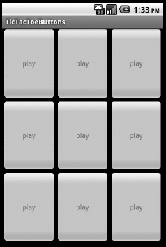
You start by making a layout with nine large buttons. As we explain in Chapter 5, you can use several layouts for this task. The following chunk of XML uses a set of three LinearLayouts with horizontal orientation inside a LinerLayout with a vertical orientation. Every button is given a weight equal to 1, as is every internal LinearLayout, to provide uniform button spacing. The following code example produces this layout by using XML:
<?xml version=”1.0” encoding=”utf-8”?>
<LinearLayout xmlns:android=”http://schemas.android.com/apk/res/android”
       android:orientation=”vertical”
       android:layout_width=”fill_parent”
       android:layout_height=”fill_parent”
       >
      <LinearLayout
       android:orientation=”horizontal”
       android:layout_width=”fill_parent”
       android:layout_height=”fill_parent”
     android:layout_weight=”1”
         >
         <Button
            android:hint=”play”
            android:layout_width=”fill_parent”
            android:layout_height=”fill_parent”
            android:layout_weight=”1”
            />
         <Button
            android:hint = “play”
            android:layout_width=”fill_parent”

            android:layout_height=”fill_parent”
            android:layout_weight=”1”
            />
         <Button
            android:hint = “play”
            android:layout_width=”fill_parent”
            android:layout_height=”fill_parent”
            android:layout_weight=”1”
            />
     </LinearLayout>

     <LinearLayout
      android:orientation=”horizontal”
      android:layout_width=”fill_parent”
      android:layout_height=”fill_parent”
     android:layout_weight=”1”
        >
        <Button
           android:hint=”play”
           android:layout_width=”fill_parent”
           android:layout_height=”fill_parent”
           android:layout_weight=”1”
           />
        <Button
           android:hint = “play”
           android:layout_width=”fill_parent”
           android:layout_height=”fill_parent”
           android:layout_weight=”1”
           />
        <Button
           android:hint = “play”
           android:layout_width=”fill_parent”
           android:layout_height=”fill_parent”
           android:layout_weight=”1”
           />
    </LinearLayout>

    <LinearLayout
     android:orientation=”horizontal”
     android:layout_width=”fill_parent”
     android:layout_height=”fill_parent”
    android:layout_weight=”1”
        />
        <Button

         android:hint=”play”
         android:layout_width=”fill_parent”
         android:layout_height=”fill_parent”
         android:layout_weight=”1”
         />
      <Button
       android:hint = “play”
       android:layout_width=”fill_parent”
       android:layout_height=”fill_parent”
       android:layout_weight=”1”
       />
      <Button
       android:hint = “play”
       android:layout_width=”fill_parent”
       android:layout_height=”fill_parent”
       android:layout_weight=”1”
       />
  </LinearLayout>
</LinearLayout>
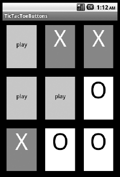
Every Button is given a hint with the text string “play”. Recall that the hint is displayed whenever the text is empty. In this example, it's used to indicate that the square hasn't yet been played. (Figure 6-3 shows the result of using this layout.) If you prefer an empty space, simply delete the hint attributes.
Figure 6-3: The initial state of the tic-tac-toe board using push buttons: No text in the button and the Hint property set to play.
Creating a GUI with Java
Our purpose in this chapter is to illustrate code-based GUI control, so you should also look at how to create the Tic-Tac-Toe application entirely programmatically. When you set the content for the view of the activity by using the following call in the onCreate method of the Activity, it uses an XMLbased layout (that was compiled into an R file — see Chapter 2).
Replace the preceding line with the following two lines:
View ticTacToe = createTicTacToe();
setContentView(ticTacToe);
The createTicTacToe method is a new method you need to write in order to create the content. The layout requires four LinearLayout instances and nine Buttons. To increase code readability, the createTicTacToe method creates three rows using the createRow method, which creates three Buttons. Continuing a top-down design, the createTicTacToe method looks something like this:
private View createTicTacToe()
{
                     LinearLayout root = new
      LinearLayout(this);
                     LinearLayout row1 =
      createRow(0);
                     LinearLayout row2 =
      createRow(1);
                     LinearLayout row3 =
      createRow(2);
                     root.addView(row1);
                     root.addView(row2);
                     root.addView(row3);

                     root.
      setOrientation(LinearLayout.VERTICAL);
                     return root;
}
This example creates a LinearLayout instance that's eventually returned as the variable root. Another helper method, createRow, is used to create each row of the tic-tac-toe board. It returns an instance of a LinearLayout which is added to the base LinearLayout, root. The default orientation for LinearLayout is horizontal, and the method setOrientation is used to change it to vertical, which provides the basic layout for the tic-tac-toe board.
The method createRow takes in a single Integer parameter to indicate which row is being created. You use this row number to assign a unique identifier to every button. You also use the row number to set a Hint for the Button, changing the XML design slightly. Here's the first implementation:
private LinearLayout createRow(int rowNumber)
{
                      int index = 3 * rowNumber+1;
                      LinearLayout.LayoutParams layout
      = new LinearLayout.LayoutParams(-1,-1,1.0f);

                      LinearLayout row = new
      LinearLayout(this);
                      row.setLayoutParams(layout);

                      Button space = new Button(this);
                      space.setId(index);
                      space.setHint(Integer.
      toString(index));
                      space.setLayoutParams(layout);
                      row.addView(space);

                      space = new Button(this);
                      space.setId(index);
                      index++;
                      space.setHint(Integer.
      toString(index));
                      space.setLayoutParams(layout);
                      row.addView(space);

                      space = new Button(this);
                      space.setId(index);
                      index++;
                      space.setHint(Integer.
      toString(index));
                      space.setLayoutParams(layout);
                      row.addView(space);

                      return row;
}
Several packages need to be imported — in particular, the following:
import android.view.View;
import android.widget.Button;
import android.widget.LinearLayout;
Build and run this application now. You should see a board similar to the one shown in Figure 6-3, except the hint is now a number for each button. Note the ordering of the numbers: They increase across the row and then down the columns. This is the order in which you added the Buttons to LinearLayout and the order in which LinearLayouts were added to the top-level LinearLayout. The margins and cell padding remain at the default setting. Going forward, the appearance of the button is controlled depending on its state (playable, occupied by X, or occupied by O).
After you have specified the app's basic appearance, you can look at handling its basic behaviors (refer to Chapter 3), such as a large X being placed in a square after the user clicks a button.
Handling basic Button behaviors
For an application such as Tic-Tac-Toe, a Button should change its state whenever it's pushed, which is exactly what the ToggleButton is designed for. Tic-Tac-Toe has the added constraint of a button being allowed to be pressed only once. You use the default Button to accomplish this task. As you can see, many classes deeper in the class hierarchy are simple customizations of the base class — in this case, Button.
To handle button clicks (or taps, on modern touchscreens), the interface OnClickListener needs to be implemented. This interface, defined in the View class, has one method that must be implemented. The onClick method takes as input the View, which occupies the screen where the click event happened. The system doesn't automatically call the onClick method that you define in the Activity class. Good software engineering principles may require you to have one or more classes that handle click (or tap) events. In this case, every class would implement the OnClickListener interface. To determine which onClick method should be called, you have to explicitly tell the system for every widget which onClick method (or instance of OnClickListener) should be called. View has the setOnClickListener method to accomplish this. Passing it an instance of the View.OnClickListener performs two tasks:
- Sets the Clickable property to true
- Saves a reference to the OnClickListener, whose onClick method is called whenever a click occurs in View
The specification of the OnClickListener can occur for a parent or container, such as a LinearLayout in the application, but then that View is passed to the onClick method. For the Tic-Tac-Toe application, having the actual Button passed to the onClick method tells you precisely which square was selected. To do this, you add the following line every time a Button is created in the createRow method:
space.setOnClickListener(this);
Redefine Activity to implement the OnClickListener interface, similar to this line:
public class TicTacToeButtons extends Activity implements OnClickListener
Finally, add the implementation for the onClick method. You add a helper class to handle the button logic, named GameLogic. To use this class, you must cast the incoming View into a Button. (Programmatic error detection would also be wise at this point, but you've wired up only Buttons so far, so this strategy should work well.) Here's the onClick method:
@Override
public void onClick(View view) {
    Button button = (Button) view;
    gameLogic.playSquare(button);
}
The next section looks at this GameLogic class to see how it works with the Buttons it has passed.
Writing the GameLogic class
In addition to keeping track of which squares have already been played and by whom, the GameLogic class changes the state of the button when it's played. Separating these concerns would be ideal — in particular, separating button updates from the game logic, but for now you can put all this logic into the game logic.
The Button class can be used as a base class. Consider specializing this class even further and create a TicTacToeButton class that keeps track of its own state (playable, X, O).
The GameLogic class, which takes a Button to play a turn, tracks whose turn it is to play. Provide a parameter on the constructor to indicate whether the person playing X or O should go first, like this:
public class GameLogic {

    public GameLogic() {
        this(false);
    }
    public GameLogic(boolean oGoesFirst) {
        currentPlayer = 0;
        if( oGoesFirst) currentPlayer = 1;
    }
    private int currentPlayer = 0;
}
Two constructors are provided: a default or parameter-less constructor, which simply calls a constructor that takes a single boolean value to indicate whether O should go first (true) or X should go first (false).
As mentioned, the playSquare method takes a Button as a parameter. This method is the main interface with the game logic. It needs to determine which square is selected and change the Button appearance and state for that square. playSquare must also remember every player's turn in order to identify whether someone has won the game. Finally, it tracks which player plays next and updates the class for the next turn. Here's the implementation of playSquare:
public void playSquare(Button button) {
    int id = button.getId();
    setButtonState(button);
    markSquare(id, currentPlayer);
    currentPlayer = (currentPlayer + 1) % 2;
}
The routine setButtonState takes as input a Button and changes:
- The Button's clickable state to false
- The text of the button to either X or O based on the current player
- The text size of the button
Setting the button's clickable state to false ensures that the Button can be clicked only once. Setting the text indicates which player clicked the Button. Here's the implementation for setButtonState:
private void setButtonState(Button button) {
    button.setText(symbols[currentPlayer]);
    button.setTextSize(64);
    button.setClickable(false);
}
Using scaled pixel units to specify the text size lets the application ignore the details of the screen resolution. (The article about supporting multiple screens at http://developer.android.com/guide/practices/screens_support.html covers this topic in more detail.) The setButtonState routine uses a simple variable, symbols, to set the Button text:
private String[] symbols = {“X”, “O”};
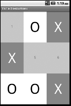
Figure 6-4 shows the result of this logic after a player has taken two turns.
Figure 6-4: Changing the appearance of a Button.
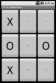
The rest of the game logic — keeping score and determining a winner — is left as an exercise. If you run this application, note that after a Button is clicked, it cannot be clicked again.
A drawback of this application is that the tic-tac-toe board looks like a collection of buttons! The raised or three-dimensional appearance of buttons traditionally conveys to users that they should push them. Android users also receive feedback whenever they click buttons. We describe this concept in more detail in the following sections and tell you how to change the appearance of the Tic-Tac-Toe application.
Pretty in pink: Creating custom buttons
A better solution for the TicTacToe application is to derive a new button: TicTacToeButton. It provides a specialization that separates the behavior of a Tic-Tac-Toe square implemented as a button from the game logic. Virtually any View class can be used as a base class to derive your own user interface class.
Attempting to create a custom TicTacToeButton
In this section, you specialize the Button class — which is a specialization of the TextView class, which is a specialization of the View class. Though the Button class doesn't know which square it's on in the tic-tac-toe grid, it provides an easy-to-use set of methods that can set the state. Start with this example:
package com.wiley.fordummiessdk;

import android.content.Context;
import android.graphics.Canvas;
import android.graphics.Color;
import android.graphics.Paint;
import android.graphics.Paint.Align;
import android.widget.Button;
import android.widget.LinearLayout;

public class TicTacToeButton extends Button {
   private static String emptyString = “play”;
   private static String xString = “X”;
   private static String oString = “O”;
   private static int emptyColor = Color.BLACK;
   private static int xColor = Color.WHITE;
   private static int oColor = Color.BLACK;
   private static int emptyBackgroundColor = Color.LTGRAY;
   private static int xBackgroundColor = Color.RED;
   private static int oBackgroundColor = Color.WHITE;
   private static float emptyFontScale = 16;
   private static float markedFontScale = 64;

   public TicTacToeButton(Context context) {
      super(context);
      LinearLayout.LayoutParams layout = new LinearLayout.LayoutParams(-1,
               1,1.0f);
      this.setLayoutParams(layout);
      reset();
   }

   public void markX() {
      this.setText(xString);
      this.setTextSize(markedFontScale);
      this.setTextColor(xColor);
      this.setBackgroundColor(xBackgroundColor);

      this.setClickable(false);
   }

   public void markO() {
      this.setText(oString);
      this.setTextSize(markedFontScale);
      this.setTextColor(oColor);
      this.setBackgroundColor(oBackgroundColor);

      this.setClickable(false);
   }

   public void reset() {

      this.setText(“”);
      this.setHint(emptyString);
      this.setTextSize(emptyFontScale);
      this.setTextColor(emptyColor);
      this.setBackgroundColor(emptyBackgroundColor);

      this.setClickable(true);
   }

   public static void setTextColors(int empty, int x, int o) {
      emptyColor = empty;
      xColor = x;
      oColor = o;
   }

   public static void setBackgroundColors(int empty, int x, int o) {
      emptyBackgroundColor = empty;
      xBackgroundColor = x;
      oBackgroundColor = o;
   }

   public static void setFontSizes(float emptyScale, float markedScale) {
      emptyFontScale = emptyScale;
      markedFontScale = markedScale;
   }

   public static void setTextStrings(String empty, String x, String o) {
      emptyString = empty;
      xString = x;
      oString = o;
   }
}
This class has a set of static methods to set the default properties of TicTacToeButton. These methods allow the user to set these properties once and then create several instances. Having a default set of appearances allows for easier customization of the button. Reasonable defaults were already specified when these variables were defined.
Calling either of the two main routines markX and markO disables the button (by setting its Clickable property to false) and sets the text, text scale, and text color to the appropriate values. These routines also set the background color for the button. A button uses a drawable that by default provides a color gradient with some padding around this gradient. There is a different default gradient for each of a button's three states: enabled, pushed, and disabled. Setting the background color replaces all these default drawables, including the padding. Figure 6-5 shows the result: the grid associated with a tic-tac-toe board is gone.
Figure 6-5: A first attempt at TicTacToe Button with a custom back ground — not satisfactory.
This problem is easily solved by creating new drawables that have the colors and styles you want. Alternatively, any class derived from View can specify its own onDraw method. This is the approach we will look at in the next section.
Overriding the onDraw method for custom drawing
The onDraw method is called whenever a control needs to be presented. Every widget can be thought of as a drawing. The system normally defines the drawing style and every class typically provides an implementation of the onDraw method. If the TicTacToeButton class were derived from View rather than from Button, you would have to provide your own implementation of onDraw. Because Button has an implementation, the example in the preceding section used it instead.
The onDraw method is passed a parameter of type Canvas. This Canvas provides the context for any drawing, as well as a rich set of methods for drawing. The Canvas class, which has methods to draw pictures, circles, lines, rectangles, and text, works closely with the Paint class, which provides colors and text attributes for the drawing calls.
For the TicTacToeButton class, a solid-colored rectangle centered in the view is needed for the background. The size of this rectangle needs to be slightly smaller than the size of the button. When you add a 12-pixel border around the “button,” the background is shown outside this rectangle. In addition, the text needs to be centered using the specified text, scale, and color. The implementation of the onDraw method is similar to this example:
@Override
protected void onDraw(Canvas canvas) {
   super.onDraw(canvas);

   float width = getWidth();
   float height = getHeight();
   float padding = 12;

   Paint backgroundPaint = new Paint(Paint.ANTI_ALIAS_FLAG);
   backgroundPaint.setColor(currentColor);
   canvas.drawRect(padding, padding, width-padding, height-padding,
            backgroundPaint);

   float x = 0.5f * width;
   float y = 0.5f * height;
   Paint paint = new Paint(Paint.ANTI_ALIAS_FLAG);
   paint.setColor(currentTextColor);
   paint.setStrokeWidth(2);
   paint.setTextSize(currentFontScale);
   paint.setTextAlign(Align.CENTER);
   canvas.drawText(currentString, x, y, paint);
}
Using the current size of the button, this method draws a rectangle centered within a 12-pixel border using paint with the background color (in this case, black). A new paint object is then created to draw the text using the drawText method of the Canvas class.
Because the onDraw method is called whenever a control needs to be displayed, not whenever a square is marked, a change to the overall structure of the class is required. Rather than set properties of the underlying Button and then query them in the draw, the implementation simply tracks the key settings. The currentString, currentTextColor, currentColor, and font scales are set in the mark routines. Here's a new implementation of the markX, markO, and reset methods:
public void markX() {
   currentColor = xBackgroundColor;
   currentTextColor = xColor;
   currentString = xString;
   currentFontScale = markedFontScale;

   this.setClickable(false);
}

public void markO() {
   currentColor = oBackgroundColor;
   currentTextColor = oColor;

   currentString = oString;
   currentFontScale = markedFontScale;

   this.setClickable(false);
}

public void reset() {
   currentColor = emptyBackgroundColor;
   currentTextColor = emptyColor;
   currentString = emptyString;
   currentFontScale = emptyFontScale;

   this.setClickable(true);
}


private int currentColor = emptyBackgroundColor;
private String currentString = emptyString;
private float currentFontScale = emptyFontScale;
private int currentTextColor = emptyColor;
Figure 6-6 shows the final implementation using red for squares marked X and using white for squares marked O. Empty spaces have a gray background.
Figure 6-6: A custom drawn TicTacToeButton.
Although this section describes how to use the Canvas and Paint classes to provide a View with its own, custom drawing so that you can give any piece of the user interface your own, creative touch, one major concern when providing custom appearances is allowing for user-defined styles and themes. Android is supplied with support for styles, which we cover in the next section.
Simplifying Attribute Settings with Styles
The View class has many attributes that can be set to control its appearance, and TextView adds several more attributes. Some of the more common attributes of the View class that you may want to change include the ones described in this list:
- android:id: Specifies an identifier name for this View.
- android:clickable: Specifies whether this View receives click events.
- android:keepScreenOn: Specifies whether to keep the screen from turning off while this View is displayed.
- android:background: Specifies a drawable resource to use as the background for this View.
- android:padding: Sets the amount of padding in pixels surrounding this View.
- android:visibility: Specifies whether this widget is displayed.
- android:tag: Allows an arbitrary string to be supplied with the widget. This string can be retrieved by using the getTag method and searched for by using the findViewWithTag method.
The TextView class adds many attributes to control the appearance of the text as well as how the text is entered:
- android:editable: If set, allows the user to enter input into this control. Text boxes are typically editable; labels and buttons are not.
- android:autoLink: Controls whether URLs, phone numbers, map addresses, and e-mail addresses are automatically converted to clickable links.
- android:autoText: If set, corrects some common misspellings when entered.
- android:ellipsize: If set, when the text doesn't completely fit within the TextView, the text includes an ellipsis (…) to indicate the inclusion of more text.
- android:numeric: Changes the input method to a numeric keypad.
- android:phoneNumber: Changes the input method to a phone number input method.
- android:digits: Changes the input method to a numeric keypad and allows only the specified set of characters to be entered.
- android:password: When set, obscures the entered text and replaces every character with a dot.
- android:hint: If the text string has not been set or the user has not entered any text, then this string will be displayed.
- android:text: The string of text to display.
- android:singleLine: Restricts the display of text to a single line.
- android:lines: Restricts the display to the specified number of lines.
- android:textColor: Specifies the color to use when displaying the text.
- android:textSize: Specifies the size of the text, such as 18sp, where sp stands for scaled pixels, a standard dimension unit.
- android:textStyle: Can be set to a combination of normal, bold, or italic using the or (|) operator (for example, android:textStyle= ”bold|italic”).
- android:typeface: Can be set to a combination of normal, sans, serif, or monoscript by using the or (|) operator.
This list contains only about one-tenth of the possible attributes that can be set. See the Reference page for TextView on the Android SDK web page (http://developer.android.com/reference/android/widget/TextView.html).
Creating your own style
A collection of numerous appearance settings (see the preceding section) with similar values is known as a style for presenting the TextView. Changing these appearance settings every time a Button or TextView is created can be tedious and painstaking. Android helps solve this problem by supporting styles. You can create your own style by placing all these settings into a separate XML file. You place this file in the res/values directory. A style allows the following layout:
<EditText
    android:layout_width=”match_parent”
    android:layout_height=”wrap_content”
    android:background=”#000000”
    android:textColor=”#FFFFFF”
    android:textStyle=”bold|italic”
    android:text=”Hello”
/>
<EditText
    style=”@style/DarkBold”
    android:text=”Hello”
/>
To simplify a layout, you must create as a resource a new XML file that defines the style. A style contains a set of item names (value pairs), where the name is any of the standard attributes. For the preceding example, the resulting resource looks like this:
<?xml version=”1.0” encoding=”utf-8”?>
<resources>
   <style name=”DarkBold”>
       <item name=”android:layout_width”>
            match_parent
       </item>
       <item name=”android:layout_height”>
           wrap_content
       </item>
       <item name=”android:background”>
           #000000
       </item>
       <item name=”android:textColor”>
           #FFFFFF
       </item>
       <item name=”android:textStyle”>
           bold|italic
       </item>
   </style>
</resources>
This example allows the application of the same style across a set of TextViews (including Buttons and other derived classes).
Adding inheritance to a style
To keep a style consistent, all attributes need to be set to a value. Furthermore, a new style is needed for every permutation of appearances. Fortunately, the Android SDK provides a simple mechanism to tweak an existing style by using inheritance. Using inheritance, one style is used as the default values for another style. The new style needs to change only the attributes which differ from this default. Suppose that you want to use the DarkBold style (see the preceding section) for entering and displaying phone numbers. You can do it easily by defining a new style with the phoneNumber attribute set to true:
<style name=”DarkPhone” parent=”@style/DarkBold”>
    <item name=”android:phoneNumber”>true</item>
</style>
For similar situations, Android provides a slightly easier inheritance mechanism. Just prefix a style with a user-defined style and the dot operator (for example, DarkBold.Phone), similar to Java-nested classes or namespace scoping rules. The example would then be written this way:
<style name=”DarkBold.Phone”>
    <item name=”android:phoneNumber”>true</item>
</style>
Note that because the name changes from DarkPhone to DarkBold.Phone, you enter the name of the style as DarkBold.Phone:
<EditText
    style=”@style/DarkBold.Phone”
    android:text=”Hello”
/>
This example isn't just a shortcut — it's good practice for naming styles. Clearly, DarkBold.Phone is now used with the DarkBold style.
Now you can create that long-admired fuchsia-colored background with lavender text style. However, because you're reading this book, you're probably more interested in programming than in designing pleasing color schemes. Fortunately (as you find out in the next section), Android provides a selection of polished styles that can be applied to provide pleasing results — a big win for anyone who is, like us, artistically challenged!
Taking advantage of the built-in Android styles
Android ships with a fairly rich set of styles for you to use (or inherit from). Its SDK contains resources for these styles in the R.java documentation. (Visit http://developer.android.com/reference/android/R.style.html for more information.) Android 3.0 (version 11) ships with the new Honeycomb holographic styles. For text appearance, the main style is defined in android:style/TextAppearance.
Several variations of this style are available and make good starting points for your own, custom styles:
- android:style/TextAppearance.Large
- android:style/TextAppearance.Medium
- android:style/TextAppearance.Small
- android:style/TextAppearance.Inverse
- android:style/TextAppearance.Inverse.Large
- android:style/TextAppearance.Inverse.Medium
- android:style/TextAppearance.Inverse.Small
Unless you define all attributes, you should use best practices to inherit your custom styles from one of these predefined styles. You do this in the same way as you inherit from a custom style, by using the parent element. The resource file in the precious sections should be changed as follows:
<?xml version=”1.0” encoding=”utf-8”?>
<resources>
    <style name=”DarkBold”
        parent=”@android:style/TextAppearance.Large”>
        <item name=”android:layout_width”>
            match_parent
        </item>
        <item name=”android:layout_height”>
            wrap_content
        </item>
        <item name=”android:background”>
            #000000
        </item>
        <item name=”android:textColor”>
            #FFFFFF
        </item>
        <item name=”android:textStyle”>
            bold|italic
       </item>
    </style>
</resources>
For more information and a complete list of attributes that can be set, see this page at the Android SDK developer's website: http://developer.android.com/guide/topics/ui/themes.html. Happy styling!
Using Themes to Maintain a Consistent Style
One problem with using styles is that a style must be applied to every widget. It would be nice if you had a way to say, “Here's my default style.” You can, by using a theme. The only difference between a style and a theme is how they're applied: You can apply any style to the application, but you apply the theme to the application in the application's manifest. Modify the application tag in the ApplicationManifest.xml file to indicate the theme, like this:
<application android:theme=”@style/DarkTheme”>
Rather than use the style DarkBold, which has attributes applied only for the appearance of text, define a new style that inherits from a standard Android style. The following style definition inherits from the new Holographic theme:
<style name=”DarkTheme” parent=”@android:Theme.Holo”>
        <item name=“android:background“>
            #000000
        </item>
        <item name=“android:textColor“>
            #FFFFFF
        </item>
        <item name=“android:textStyle“>
            bold|italic
        </item>
  </style>
Providing compatibility for older devices
The problem with the approach in the preceding section is that older phones may not support the Holographic theme. You can define the same style multiple times by using the same style name if the resources are placed into a version-specific folder. So, if the style definition in the preceding section is placed in the res/values-v11 folder and the following example is placed in the res/values folder, the application automatically switches to the Holographic theme on devices supporting Android 3.0 or higher:
<style name=”DarkTheme” parent=”@android:Theme.Light”>
        <item name=“android:background“>
            #000000
        </item>
        <item name=“android:textColor“>
            #FFFFFF
        </item>
        <item name=“android:textStyle“>
            bold|italic
        </item>
   </style>
The theme lets you change settings for application-specific appearances and behaviors, including the new ActionBar in Android 3.0. The complete list of attributes that are defined in a theme is available in the R.stylable documentation under the Theme section (http://developer.android.com/reference/android/R.styleable.html#Theme) on the Android SDK website.
Differentiating activities by using specific themes
If different activities within a single application need to use different themes — or if you simply want one or more of your activities to have a different style (theme) — you set them on the activity tag in the manifest file, rather than on the application tag. The following line applies the Android standard Dialog theme to AccountActivity:
<activity android:theme=”@android:style/Theme.Dialog”

             android:name=”AccountActivity”>
The BackgroundActivity can set its default style to DarkTheme by added the following line to the manifest file.
<activity android:theme=”@style/DarkTheme”
          android:name=”Background”>
As with most operating systems, a large community of users works to develop themes and then share them with the developer community. These themes range in complexity from a simple change to the background image to controlling the animations when Views are first displayed. Most device manufacturers and many phone carriers provide their own themes to enhance the user experience.