
Chapter 7. Creating Interactive Menus and ActionBars
In This Chapter
• Creating Options Menus with XML
• Creating Menus with Coding
• Using Check Boxes/Radio Buttons in Menus
• Creating Drop-Down List ActionBar
In almost all applications we encounter menus that display options in the form of menu items. Choosing a menu item results in the initiation of the desired task. Menus are therefore the preferred way of indicating the possible actions in an application.
The ActionBar is a widget that replaces the title bar at the top of an Activity displaying navigation and important functionality of an application. It provides a consistent UI of an application. It also displays the key actions that are commonly used in an application and that are constantly visible on the screen. ActionBar is also commonly used to provide a quick link to an application’s home.
Menus and Their Types
Android SDK supports three types of menus: Options, Submenu, and Context, as detailed in the following list:
• Options Menu—Also known as the Activity menu, this menu is displayed when a MENU button is clicked. In an Options Menu, the menu items are displayed in the form of text, check box, or radio buttons. It can display shortcut keys but does not display icons. In older Android API levels (Levels 10 and below), there were two types of Options Menus:
• Icon Menu—The Icon Menu appears when the user presses the MENU button on the device. The Icon Menu shows the first six menu items of the menu in the form of large, finger-friendly buttons arranged in a grid at the bottom of the screen. The menu items in the Icon Menu can display icons as well as text. The Icon Menu does not display check boxes, radio buttons, or the shortcut keys for menu items. It is not mandatory to have icons for Icon Menu items; text will also do for the Icon Menu.
• Expanded Menu—If the menu has more than six menu items, the first five items are displayed as an Icon Menu and the sixth option appears as a More button. Clicking the More button displays the Expanded Menu that shows the scrollable list of the rest of the menu items that could not be accommodated in the Icon Menu. The Expanded Menu can display menu items in the form of text, check boxes, or radio buttons. Also, it can display shortcut keys but does not display icons. Pressing the Back button from the Expanded Menu takes you back to the Activity the menu was launched from.
Note
The Icon Menu and Expanded Menu are not supported in Android API levels 11 and higher.
• Submenu—Submenu refers to the menu that displays more detailed or specific menu options when a menu item is selected. A submenu is displayed as a floating window showing all of its menu options. The name of the submenu is shown in the header bar, and each menu option is displayed with its full text, check box, radio button (if any), and shortcut key. Icons are not displayed in the submenu options. We cannot add a submenu to any menu option of a submenu as Android does not support nested submenus. Pressing the Back button closes the floating window without navigating back to the Expanded or Icon menus.
• Context Menu—The Context Menu is displayed when we tap-and-hold on the concerned View or when a user holds the middle D-pad button or presses the trackball. Context Menus support submenus, check boxes, radio buttons, and shortcuts, but we cannot display icons in a Context Menu. In the Context Menu’s header bar, we can display a title and icon.
Creating Menus Through XML
Besides through Java code, in Android, menus can be created through Resources too. We can define a menu in the form of an XML file, which is then loaded by the Android SDK. As usual, Android generates resource IDs for each of the loaded menu items. The XML file for the menu has to be kept in a specific, designated folder that does not exist by default; we need to create it manually.
To understand the procedure of creating menus practically, let’s create a new Android application called MenuApp. We see that a folder called menu already exists in our res/ directory. The menu folder also contains a file activity_menu_app.xml by default. We learn to create all three types of menus: Options Menu, Submenu, and Context Menu. Let’s begin with the Options Menu.
Creating an Options Menu
An Options Menu is the menu displayed when the MENU button on the device is clicked. It shows menu items in the form of text, check boxes, and radio buttons. Also, the shortcut keys can be assigned to the menu items. An Options Menu is defined through an XML file in the res/menu folder of the application. That is, the menu items of the Options Menu are defined in that XML file.
The activity_menu_app.xml file, which is automatically created for us, contains the following data:
<menu xmlns:android="http://schemas.android.com/apk/res/android">
<item android:id="@+id/menu_settings"
android:title="@string/menu_settings"
android:orderInCategory="100"
android:showAsAction="never" />
</menu>
We can see that the root node of our menu in the XML file is <menu>. The default menu item with the ID menu_settings shows the text that is defined in the strings.xml file. Let’s define certain <item> nodes to display certain menu items. The code written in the activity_menu_app.xml file is as shown in Listing 7.1.
Note
Each <item> node represents a menu item in the menu file.
Listing 7.1. The Menu Items Defined in the File activity_menu_app.xml
<menu xmlns:android="http://schemas.android.com/apk/res/android">
<item android:id="@+id/create_datab"
android:title="Create Database"
android:icon="@drawable/ic_launcher" />
<item android:id="@+id/insert_rows"
android:title="Insert Rows"
android:icon="@drawable/ic_launcher" />
<item android:id="@+id/list_rows"
android:title="List Rows" />
<item android:id="@+id/search_row"
android:title="Search"
android:icon="@drawable/ic_launcher"/>
<item android:id="@+id/delete_row"
android:title="Delete" />
<item android:id="@+id/update_row"
android:title="Update"
android:icon="@drawable/ic_launcher" />
</menu>
We can see that we have defined six menu items in the preceding menu, and a unique ID is assigned to each of them. The android:title and android:icon attribute defines the text and icon for the menu item. The menu items defined in our menu file are Create Database, Insert Rows, List Rows, Search, Delete, and Update. The six menu items are assigned the IDs as create_datab, insert_rows, list_rows, search_row, delete_row, and update_row, respectively. In the application, we want to display a message that asks the user to select the MENU button on the device or emulator for displaying the Icon Menu. We use the TextView control to display messages. To define TextView, we write the code as shown in Listing 7.2 in the layout file activity_menu_app.xml.
Listing 7.2. The Layout File activity_menu_app.xml on Adding the TextView Control
<LinearLayout xmlns:android="http://schemas.android.com/apk/res/android"
android:orientation="vertical"
android:layout_width="match_parent"
android:layout_height="match_parent">
<TextView
android:layout_width="match_parent"
android:layout_height="wrap_content"
android:id="@+id/selectedopt" />
</LinearLayout>
We added a TextView with the ID selectedopt to the default layout LinearLayout that we use to display desired text messages to the user. The TextView also is used to inform which menu item is selected by the user.
To inflate or merge the menu that we defined in the mymenu.xml file in our application and also to inform which menu item is selected by the user, we write the Java code as shown in Listing 7.3 in our Activity file MenuAppActivity.java.
Listing 7.3. Code Written in the Java Activity File MenuAppActivity.java
package com.androidunleashed.menuapp;
import android.app.Activity;
import android.os.Bundle;
import android.view.Menu;
import android.view.MenuItem;
import android.view.MenuInflater;
import android.widget.TextView;
public class MenuAppActivity extends Activity {
private TextView selectedOpt;
@Override
public void onCreate(Bundle savedInstanceState) {
super.onCreate(savedInstanceState);
setContentView(R.layout.activity_menu_app);
selectedOpt=(TextView)findViewById(R.id.selectedopt);
selectedOpt.setText("Please select MENU button to display menu");
}
@Override
public boolean onCreateOptionsMenu(Menu menu) {
MenuInflater inflater = getMenuInflater();
inflater.inflate(R.menu.activity_menu_app, menu);
return true;
}
@Override
public boolean onOptionsItemSelected(MenuItem item) {
switch (item.getItemId()) {
case R.id.create_datab:
selectedOpt.setText("You have selected Create Database option");
break;
case R.id.insert_rows:
selectedOpt.setText("You have selected Insert Rows option");
break;
case R.id.list_rows:
selectedOpt.setText("You have selected List Rows option");
break;
case R.id.search_row:
selectedOpt.setText("You have selected Search Row option");
break;
case R.id.delete_row:
selectedOpt.setText("You have selected Delete Row option");
break;
case R.id.update_row:
selectedOpt.setText("You have selected Update Row option");
break;
}
return true;
}
}
We capture the TextView defined in the layout and assign it to a TextView object named selectedOpt. We use this TextView for displaying an initial message and for informing which menu item is selected by the user. The onCreateOptionsMenu() method of the Activity is called when the user clicks the MENU button of the device. So, we override this method to display our Icon Menu. To display our Icon Menu, we need to inflate or merge our menu that we defined in the activity_menu_app.xml file in the menu provided as a parameter to this method. Initially, there is no menu item defined in the menu parameter. To inflate the menu that we defined in the activity_menu_app.xml file, we get the MenuInflater from the Activity class. An object, inflater, is created of the MenuInflater class and the inflater’s inflate method is called to inflate, or merge, our own menu defined in the activity_menu_app.xml file to the menu given as a parameter to this method. The onCreateOptionsMenu() method is set to return the Boolean value true to allow Android to display the menu. By now, we have learned to display an Options Menu consisting of six menu items. But the menu is of no use if no action takes place on selecting its menu items. We have not yet assigned any task to the menu items of our Options Menu. Hence, the next step for us is to define the action to take place when the user selects any of the menu items.
Handling Menu Selections
All the menu items selected in the Activity’s menu are handled through the onOptionsItemSelected() method. The selected menu item is passed to this method as the MenuItem parameter. We override this method in the Activity to write the code that we want to execute when a menu item is selected. In the method, we extract the Menu Item ID of the menu item selected for identifying it and then can take the respective action. The getItemId() method helps in knowing the ID of the selected menu item.
The following code is part of the previous application and explains how the action is taken when a menu item is selected:
public boolean onOptionsItemSelected(MenuItem item) {
switch (item.getItemId()) {
case R.id.create_datab:
selectedOpt.setText("You have selected Create Database option");
break;
...........
...........
...........
}
return true;
}
The preceding method is automatically invoked when a menu item is selected from the menu. The selected menu item is passed to this method and assigned to the MenuItem object item. In preceding code example, getItemId() method is called to know the ID of the selected menu item, and through the switch statement respective action is taken on the selected menu item. In this code, we are setting a text message through the TextView object selectedOpt to inform the user which of the menu items is selected.
On running the application, we get a TextView showing the message Please select MENU button to display menu (see Figure 7.1—left). When we select the MENU button of the device or emulator, the Options Menu is displayed showing the respective menu items. When we select a menu item, say Create Database, the TextView responds by showing the message You have selected Create Database option, as shown in Figure 7.1 (right).
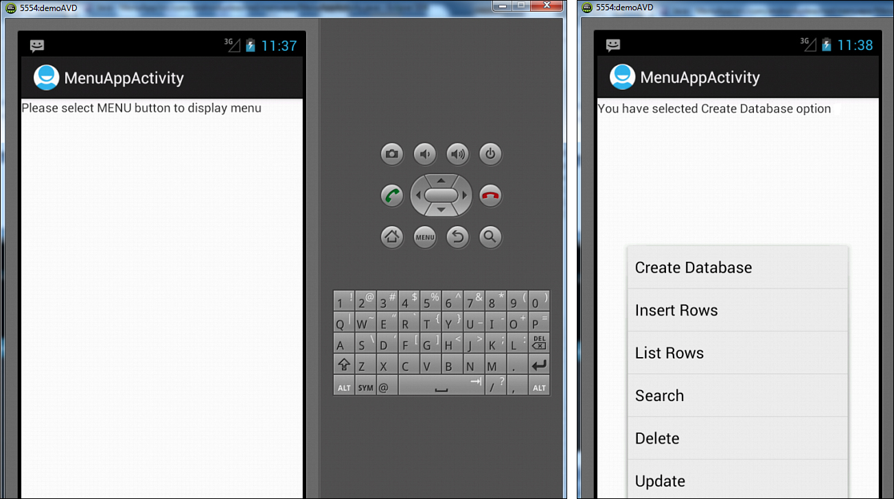
Figure 7.1. A TextView directing the user to select the MENU button to invoke a menu (left), and the TextView displays the option selected from the Options menu (right).
Similarly, when we select the Delete menu item, the TextView responds by showing the message You have selected Delete Row option, as shown in Figure 7.2.
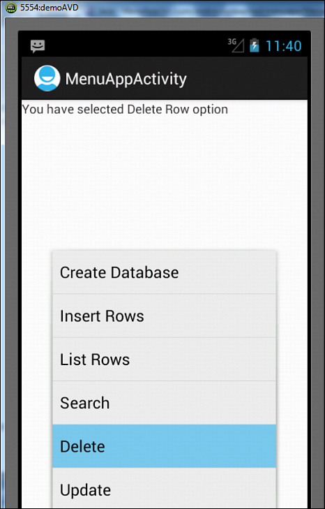
Figure 7.2. The message displayed through the TextView control changes on selecting another option from the Icon menu.
By now, we know how to display simple text as menu items and also how the menu selections are handled. We can also define check boxes, shortcuts, and radio buttons in menu items. Let’s learn how.
Defining Check Boxes and Shortcuts
In this section, we learn how to define checkable menu items and shortcuts for them. We add more menu items to the menu in our application MenuApp. One of the newly added menu items will be checkable, and the other will be invoked with assigned shortcut keys. The menu file activity_menu_app.xml is modified to appear as shown in Listing 7.4. Only the code in bold is newly added; the rest of the code is the same as Listing 7.1.
Listing 7.4. The Menu File activity_menu_app.xml After Defining Checkable Menu Items and Shortcuts
<menu xmlns:android="http://schemas.android.com/apk/res/android">
<item android:id="@+id/create_datab"
android:title="Create Database"
android:icon="@drawable/ic_launcher" />
<item android:id="@+id/insert_rows"
android:title="Insert Rows"
android:icon="@drawable/ic_launcher" />
<item android:id="@+id/list_rows"
android:title="List Rows" />
<item android:id="@+id/search_row"
android:title="Search"
android:icon="@drawable/ic_launcher"/>
<item android:id="@+id/delete_row"
android:title="Delete" />
<item android:id="@+id/update_row"
android:title="Update"
android:icon="@drawable/ic_launcher" />
<item android:id="@+id/sort_rows"
android:title="Sort Table"
android:checkable="true"
android:checked="true"/>
<item android:id="@+id/merge_row"
android:title="Merge Rows"
android:alphabeticShortcut="m"
android:numericShortcut="4"/>
</menu>
We can see that the code now has eight menu items. The seventh menu item, sort_rows, is set to appear in the form of a check box via the android:checkable attribute. When we set the value of the android:checkable property to true, the menu item appears as a check box. The check box can be initially set to appear in either a checked or unchecked state by the android:checked attribute. When we set android:checked=“true”, the menu item appears as checked by default.
Shortcut keys are assigned to the last menu item, Merge Rows (merge_row). When we set the android:alphabeticShortcut=“m” attribute, the shortcut key m for the full keyboard is assigned to the menu item. Similarly, the android:numericShortcut=“4” attribute assigns the shortcut key 4 from the numeric keypad. The shortcut keys are displayed below the menu item text. When the menu is open (or while holding the MENU key), if we press the m key from the full keyboard or 4 from the numeric keypad, the menu item Merge Rows is selected.
On running the application, we get a TextView showing the message Please select MENU button to display menu. When the MENU button of the device or emulator is selected, the Options Menu is displayed, showing respective menu items (see Figure 7.3). We can see that the menu item Sort Table appears as a checkable menu item. When we select any menu item, the respective text message is displayed on the screen. For example, if Sort Table is selected, the TextView responds by showing the message You have selected Sort Table option. If we press the m or 4 key while holding the MENU key, the menu item Merge Rows is selected (as shortcut keys are assigned to this menu item).

Figure 7.3. The Options Menu showing the text and checkable menu items
Note
Android API Level 10 and below categorize the Options Menu as an Icon Menu and an Expanded menu. If the menu items are less than or equal to six, the menu is called an Icon Menu; otherwise it is an Expanded Menu. An Icon Menu displays menu items in the form of icons and text, whereas the Expanded Menu displays menu items in the form of a scrollable list and shows only the menu items that could not fit in the Icon Menu. An Expanded Menu automatically appears when more than six menu items are defined in the Options Menu. When an Icon Menu with more than six menu items is displayed, a More button appears as a sixth menu item. When we select the More button, the rest of the menu items appear in the Expanded Menu. In the Expanded Menu, when we click the Back button we return to the Activity the Icon Menu was launched from. Expanded Menu items support check boxes, radio buttons, or shortcut keys; Icon Menu items do not.
While creating menu items, we may need a menu item with submenu items. Let’s see how submenus are added.
Adding Submenus
A submenu is a collection of menu items invoked when a regular menu item is selected. Usually, a submenu represents more detailed options for the selected menu item. The submenu can be associated with any menu item. A submenu is created by enclosing <item> nodes within the <menu> node, where <item> nodes represent the submenu options and the <menu> node acts as the root node of the submenu. To associate a submenu with any menu item, just put the <menu> node of the submenu along with its nested <item> nodes inside the <item> node of the menu item to which we want to assign the submenu.
Let’s add a submenu consisting of three menu items—Search on Code, Search on Name, and Search on Price—to the Search menu. To add a submenu to the Search menu item, activity_menu_app.xml is modified to appear as shown in Listing 7.5. The code in bold is newly added; the rest is the same as Listing 7.4.
Listing 7.5. The Code in the Menu File activity_menu_app.xml After Adding a Submenu
<menu xmlns:android="http://schemas.android.com/apk/res/android">
<item android:id="@+id/create_datab"
android:title="Create Database"
android:icon="@drawable/ic_launcher" />
<item android:id="@+id/insert_rows"
android:title="Insert Rows"
android:icon="@drawable/ic_launcher" />
<item android:id="@+id/list_rows"
android:title="List Rows" />
<item android:id="@+id/search_row"
android:title="Search"
android:icon="@drawable/ic_launcher">
<menu>
<group android:checkableBehavior="single">
<item android:id="@+id/search_code"
android:title="Search on Code"
android:checked="true" />
<item android:id="@+id/search_name"
android:title="Search on Name"
android:alphabeticShortcut="n"
android:numericShortcut="6" />
<item android:id="@+id/search_price"
android:title="Search on Price" />
</group>
</menu>
</item>
<item android:id="@+id/delete_row"
android:title="Delete" />
<item android:id="@+id/update_row"
android:title="Update"
android:icon="@drawable/ic_launcher" />
<item android:id="@+id/sort_rows"
android:title="Sort Table"
android:checkable="true"
android:checked="true" />
<item android:id="@+id/merge_row"
android:title="Merge Rows"
android:alphabeticShortcut="m"
android:numericShortcut="4" />
</menu>
We can see that a submenu has been created, consisting of three menu items, Search on Code, Search on Name, and Search on Price, with the IDs search_code, search_name, and search_price, respectively. The submenu is assigned to the Search menu item by nesting its <menu> node within the <item> node of the Search menu item. If we want the menu items to appear as radio buttons, we need to nest them within the <group> node, as we have done with the menu items of our submenu.
The <group> node is used to collect certain nodes and for collectively applying attributes to all the nested nodes. The android:checkableBehavior attribute determines whether to make the menu items nested within the <group> node appear as radio buttons, check boxes, or as simple menu items. The attribute can take three values:
• single—Only one item can be checked at a time, producing radio buttons.
• all—Any item can be checked, producing check boxes.
• none—The item appears as simple text, without a check box or radio button.
We have defined an Expanded Menu and a Submenu for the Search menu item of our Icon Menu with the menu file mymenu.xml. Next, we need to write some Java code to add actions to the menu items defined in the submenu. So, in the MenuAppActivity.java Java Activity file, we add statements to the onOptionsItemSelected() method. These statements display messages showing which menu item from the Expanded Menu or Submenu has been selected. The Activity file appears as shown in Listing 7.6. Only the code in bold is newly added; the rest is the same as Listing 7.3.
Listing 7.6. Code Written into the Java Activity File MenuAppActivity.java
package com.androidunleashed.menuapp;
import android.app.Activity;
import android.os.Bundle;
import android.view.Menu;
import android.view.MenuItem;
import android.view.MenuInflater;
import android.widget.TextView;
public class MenuAppActivity extends Activity {
private TextView selectedOpt;
@Override
public void onCreate(Bundle savedInstanceState) {
super.onCreate(savedInstanceState);
setContentView(R.layout.main);
selectedOpt=(TextView)findViewById(R.id.selectedopt);
selectedOpt.setText("Please select MENU button to display menu");
}
@Override
public boolean onCreateOptionsMenu(Menu menu) {
MenuInflater inflater = getMenuInflater();
inflater.inflate(R.menu.mymenu, menu);
return true;
}
@Override
public boolean onOptionsItemSelected(MenuItem item) {
switch (item.getItemId()) {
case R.id.create_datab:
selectedOpt.setText("You have selected Create Database option");
break;
case R.id.insert_rows:
selectedOpt.setText("You have selected Insert Rows option");
break;
case R.id.list_rows:
selectedOpt.setText("You have selected List Rows option");
break;
case R.id.search_row:
selectedOpt.setText("You have selected Search Row option");
break;
case R.id.delete_row:
selectedOpt.setText("You have selected Delete Row option");
break;
case R.id.update_row:
selectedOpt.setText("You have selected Update Row option");
break;
case R.id.sort_rows:
selectedOpt.setText("You have selected Sort Table option");
item.setChecked(!item.isChecked());
break;
case R.id.merge_row:
selectedOpt.setText("You have selected Merge Rows option");
break;
case R.id.search_code:
selectedOpt.setText("You have selected Search on Code option");
break;
case R.id.search_name:
selectedOpt.setText("You have selected Search on Name option");
break;
case R.id.search_price:
selectedOpt.setText("You have selected Search on Price option");
break;
}
return true;
}
}
When the application is run, we see a TextView prompting us to select a MENU button, after which the Icon Menu is displayed. After we select the Search menu item from the Icon Menu, the Search submenu is displayed (see Figure 7.4—left). We can select a menu item from the submenu by either clicking it or using its shortcut key (if any). For example, if we select Search on Code as shown in Figure 7.4 (middle), the TextView responds showing the message, You have selected Search on Code option, as shown in Figure 7.4 (right).
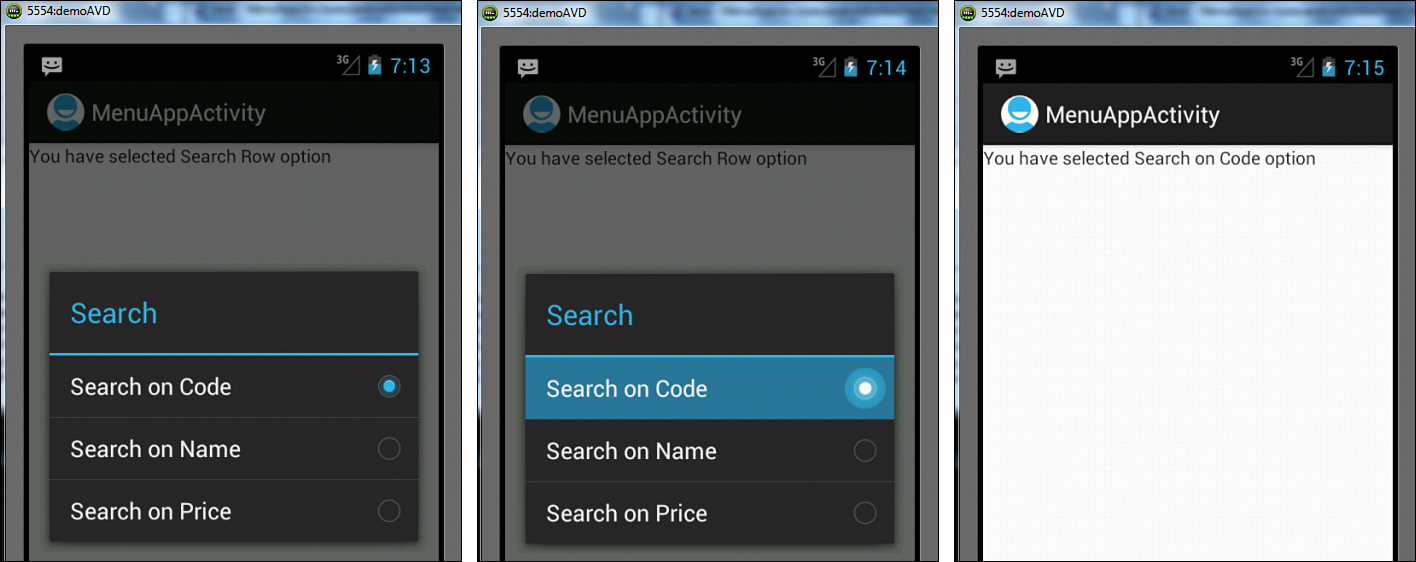
Figure 7.4. A submenu appears after selecting a Search menu item from the Icon Menu (left), selecting a menu item from the submenu (middle), and the text message displayed via TextView informs the menu item that was selected (right).
So, we created both an Icon and Expanded Menu and also defined a submenu. Let’s create the last menu type, the Context Menu.
Creating a Context Menu
A context menu appears as a floating window and is displayed when the user taps and holds on a widget, holds the middle D-pad button, or presses the trackball. The difference between an options menu and a context menu is that the options menu is invoked when the MENU button is pressed. A context menu appears when we press and hold a View. An Activity can have multiple views, and each view can have its own context menu. An Activity can have only a single options menu but many context menus. Context menus are removed from memory when closed.
Let’s define two context menus that we associate with two different TextView controls. For each context menu, we need to add a separate file to the menu folder of our project. Right-click on the res/menu folder and add two XML files called mycontext_menu1.xml and mycontext_menu2.xml. Let’s define three menu items—Cut, Copy, and Find—in the first context menu. The code in mycontext_menu1.xml is shown in Listing 7.7.
Listing 7.7. Code Written into the Context Menu mycontext_menu1.xml file
<?xml version="1.0" encoding="utf-8"?>
<menu xmlns:android="http://schemas.android.com/apk/res/android">
<group android:checkableBehavior="all">
<item android:id="@+id/cut_item"
android:title="Cut" />
<item android:id="@+id/copy_item"
android:title="Copy" />
</group>
<item android:id="@+id/find_item"
android:title="Find">
<menu>
<item android:id="@+id/find_next"
android:title="Find Next" />
</menu>
</item>
</menu>
The file shows that three menu items are added to the context menu. The first two are set to appear as check boxes by nesting them within the <group> node and applying the android:checkableBehavior attribute to them. We just learned that applying the value all to the android:checkableBehavior attribute makes the menu items nested in the <group> node appear as check boxes. A submenu consisting of a single menu item, Find Next (Find), is attached to the third menu item.
Let’s define two menu items in the second context menu. The menu file of the second context menu, mycontext_menu2.xml, appears as shown in Listing 7.8.
Listing 7.8. Code Written into the Context Menu mycontext_menu2.xml file
<?xml version="1.0" encoding="utf-8"?>
<menu xmlns:android="http://schemas.android.com/apk/res/android">
<item android:id="@+id/open_item"
android:title="Open"
android:alphabeticShortcut="o"
android:numericShortcut="5" />
<item android:id="@+id/close_item"
android:title="Close"
android:checkable="true" />
</menu>
This context menu consists of two menu items titled Open and Close, respectively. To invoke the Open menu item, the shortcut keys o (full keyboard) and 5 (numeric keypad) can be used. The second menu item, Close, is set to appear as a check box by setting the android:checkable attribute to true. If we want to assign these two context menus to two TextView controls so that the respective context menu appears when we press and hold a TextView control, we have to write some code. Let’s modify the layout file activity_menu_app.xml to add these two TextView controls, as shown in Listing 7.9. The newly added code is shown in bold; the rest is the same as in Listing 7.2.
Listing 7.9. The Layout File activity_menu_app.xml After Adding Two TextView Controls
<LinearLayout xmlns:android="http://schemas.android.com/apk/res/android"
android:orientation="vertical"
android:layout_width="match_parent"
android:layout_height="match_parent" >
<TextView
android:layout_width="match_parent"
android:layout_height="wrap_content"
android:id="@+id/selectedopt" />
<TextView
android:text="View to invoke first context menu"
android:layout_width="match_parent"
android:layout_height="wrap_content"
android:id="@+id/contxt1_view" />
<TextView
android:text="View to invoke second context menu"
android:layout_width="match_parent"
android:layout_height="wrap_content"
android:id="@+id/contxt2_view"/>
</LinearLayout>
We can see that two TextView controls were initialized to View to invoke first context menu and View to invoke second context menu. The IDs assigned to these TextView controls are contxt1_view and contxt2_view, respectively.
Next, we need to write some Java code into the Activity file MenuAppActivity.java. To create context menus, we need to override the onCreateContextMenu method for registering the Views that are supposed to use it. The option to register a context menu to View(s) enables us to associate context menus for certain selected Views. A context menu is registered to a View through the registerForContextMenu() method (in the Activity file MenuAppActivity.java), as shown in the following code:
@Override
public void onCreate(Bundle savedInstanceState) {
super.onCreate(savedInstanceState);
setContentView(R.layout.main);
selectedOpt=(TextView)findViewById(R.id.selectedopt);
selectedOpt.setText("Please select MENU button to display menu");
TextView contxt1View=(TextView)findViewById(R.id.contxt1_view);
TextView contxt2View=(TextView)findViewById(R.id.contxt2_view);
registerForContextMenu(contxt1View);
registerForContextMenu(contxt2View);
}
We can see that the two TextView controls with the contxt1_view and contxt2_view IDs are captured from the layout file activity_menu_app.xml and mapped to the TextView objects contxt1View and contxt2View, respectively. The two TextView objects are passed to the registerForContextMenu() method, as we want to associate them with the two context menu just defined.
Once a View is registered, the onCreateContextMenu() method is invoked whenever we tap and hold on the registered View. The method also receives a Menu object as a parameter that we use to add menu items to it. To add menu items to a menu, the add() method is used. We need to override the onCreateContextMenu() method for displaying the context menu. The method receives the menu object as a parameter to which we add the menu items for the context menu. Besides the menu object, the method also receives the View object that initiated the context menu and a ContextMenuInfo object. ContextMenuInfo is an interface that belongs to ContextMenu and acts as an adapter for passing any other information about menu inflation.
The following code snippet is part of the application that creates the context menu. The onCreateContextMenu() method appears as shown here:
@Override
public void onCreateContextMenu(ContextMenu menu, View v, ContextMenu.ContextMenu-
Info menuInfo) {
super.onCreateContextMenu(menu, v, menuInfo);
if (v.getId()==R.id.contxt1_view) {
MenuInflater inflater = getMenuInflater();
inflater.inflate(R.menu.mycontext_menu1, menu);
menu.setHeaderTitle("Sample Context Menu1");
menu.setHeaderIcon(R.drawable.ic_launcher);
}
if (v.getId()==R.id.contxt2_view) {
MenuInflater inflater = getMenuInflater();
inflater.inflate(R.menu.mycontext_menu2, menu);
menu.setHeaderTitle("Sample Context Menu2");
menu.setHeaderIcon(R.drawable.ic_launcher);
}
}
We can see that we first identify which View has initiated the context menu, and accordingly we inflate or merge the menu that we defined in mycontext_menu1.xml or mycontext_menu2.xml in the menu provided as the parameter to the onCreateContextMenu() method. To inflate the menu that we defined in the mycontext_menu1.xml and mycontext_menu2.xml files, we get the MenuInflater from the Activity class. A MenuInflater class object, inflater, is created and its inflate method is invoked to inflate, or merge, our own menu, defined in the respective XML file, with the menu parameter of this method.
Recall that the context menu supports check boxes, radio buttons, submenus, and shortcut keys, but not the icons. Two context menus are being created in the preceding code. One is created if the user taps and holds the contxt1View TextView, and the other is created if the user taps and holds the contxt2View TextView. The View.getID() method is used to identify the View that is tapped and held. The first context menu displays two check boxes and a submenu. The second context menu displays two menu items; one is displayed with a shortcut key, and the other is displayed as a check box. The title and icon are set to appear in the context menu’s header bar via setHeaderTitle and setHeader-Icon, respectively.
Note
Certain Android widgets provide their own default context menus containing various menu items. Hence, we call onCreateContextMenu() on its super class to handle menu items provided by the default context menu.
Handling Context Menu Selections
The preferred approach to handling menu items selected in context menus is to override the onContextItemSelected() method in the Activity that is automatically invoked whenever a Context Menu Item is selected. The menu item that is selected is passed to the method as a parameter, as shown in the following code:
@Override
public boolean onContextItemSelected(MenuItem item) {
switch (item.getItemId()) {
case R.id.cut_item:
selectedOpt.setText("You have selected the Cut option");
item.setChecked(!item.isChecked());
break;
........
........
}
return true;
}
The Menu Item ID of the selected menu item is extracted through the getItemId() method, and accordingly the message is displayed through the TextView to display which context menu item is selected. We toggle the state of the checkable item through the MenuItem.isChecked() method. The method returns true if the menu item is checked; otherwise it returns false. We change the state of the menu item by passing a Boolean value that represents the reverse of the existing state.
The MenuAppActivity.java appears as shown in Listing 7.10. Only the code in bold is modified; the rest of the code is the same as we saw in Listing 7.6.
Listing 7.10. Code Written into the Java Activity File MenuAppActivity.java
package com.androidunleashed.MenuApp;
import android.app.Activity;
import android.os.Bundle;
import android.view.Menu;
import android.view.MenuItem;
import android.view.MenuInflater;
import android.widget.TextView;
import android.view.ContextMenu.ContextMenuInfo;
import android.view.View;
import android.view.ContextMenu;
public class MenuAppActivity extends Activity {
private TextView selectedOpt;
@Override
public void onCreate(Bundle savedInstanceState) {
super.onCreate(savedInstanceState);
setContentView(R.layout.main);
selectedOpt=(TextView)findViewById(R.id.selectedopt);
selectedOpt.setText("Please select MENU button to display menu");
TextView contxt1View=(TextView)findViewById(R.id.contxt1_view);
TextView contxt2View=(TextView)findViewById(R.id.contxt2_view);
registerForContextMenu(contxt1View);
registerForContextMenu(contxt2View);
}
@Override
public boolean onCreateOptionsMenu(Menu menu) {
MenuInflater inflater = getMenuInflater();
inflater.inflate(R.menu.mymenu, menu);
return true;
}
@Override
public boolean onOptionsItemSelected(MenuItem item) {
switch (item.getItemId()) {
case R.id.create_datab:
selectedOpt.setText("You have selected Create Database option");
break;
case R.id.insert_rows:
selectedOpt.setText("You have selected Insert Rows option");
break;
case R.id.list_rows:
selectedOpt.setText("You have selected List Rows option");
break;
case R.id.search_row:
selectedOpt.setText("You have selected Search Row option");
break;
case R.id.delete_row:
selectedOpt.setText("You have selected Delete Row option");
break;
case R.id.update_row:
selectedOpt.setText("You have selected Update Row option");
break;
case R.id.sort_rows:
selectedOpt.setText("You have selected Sort Table option");
item.setChecked(!item.isChecked());
break;
case R.id.merge_row:
selectedOpt.setText("You have selected Merge Rows option");
break;
case R.id.search_code:
selectedOpt.setText("You have selected Search on Code option");
break;
case R.id.search_name:
selectedOpt.setText("You have selected Search on Name option");
break;
case R.id.search_price:
selectedOpt.setText("You have selected Search on Price option");
break;
}
return true;
}
@Override
public void onCreateContextMenu(ContextMenu menu, View v, ContextMenuInfo menuInfo)
{
super.onCreateContextMenu(menu, v, menuInfo);
if (v.getId()==R.id.contxt1_view)
{
MenuInflater inflater = getMenuInflater();
inflater.inflate(R.menu.mycontext_menu1, menu);
menu.setHeaderTitle("Sample Context Menu1");
menu.setHeaderIcon(R.drawable.ic_launcher);
}
if (v.getId()==R.id.contxt2_view)
{
MenuInflater inflater = getMenuInflater();
inflater.inflate(R.menu.mycontext_menu2, menu);
menu.setHeaderTitle("Sample Context Menu2");
menu.setHeaderIcon(R.drawable.ic_launcher);
}
}
@Override
public boolean onContextItemSelected(MenuItem item) {
switch (item.getItemId()) {
case R.id.cut_item:
selectedOpt.setText("You have selected the Cut option");
item.setChecked(!item.isChecked());
break;
case R.id.copy_item:
selectedOpt.setText("You have selected the Copy option");
item.setChecked(!item.isChecked());
break;
case R.id.find_item:
selectedOpt.setText("You have selected the Find Submenu");
break;
case R.id.find_next:
selectedOpt.setText("You have selected the Find Next option");
break;
case R.id.open_item:
selectedOpt.setText("You have selected the Open option");
break;
case R.id.close_item:
selectedOpt.setText("You have selected the Close option");
item.setChecked(!item.isChecked());
break;
}
return true;
}
}
On running the application, we get three TextView controls. The first one is to tell the user to click the MENU button to display the menu. The second and third TextView controls are meant for invoking context menus. When the TextView controls are tapped and held, the respective Context Menu is displayed (see Figure 7.5—left). After we tap and hold the second TextView, a context menu titled Sample Context Menu1 is displayed, as shown in Figure 7.5 (middle). After we select the Find menu item from the context menu, a submenu, the Find SubMenu, is displayed, as shown in Figure 7.5 (right).
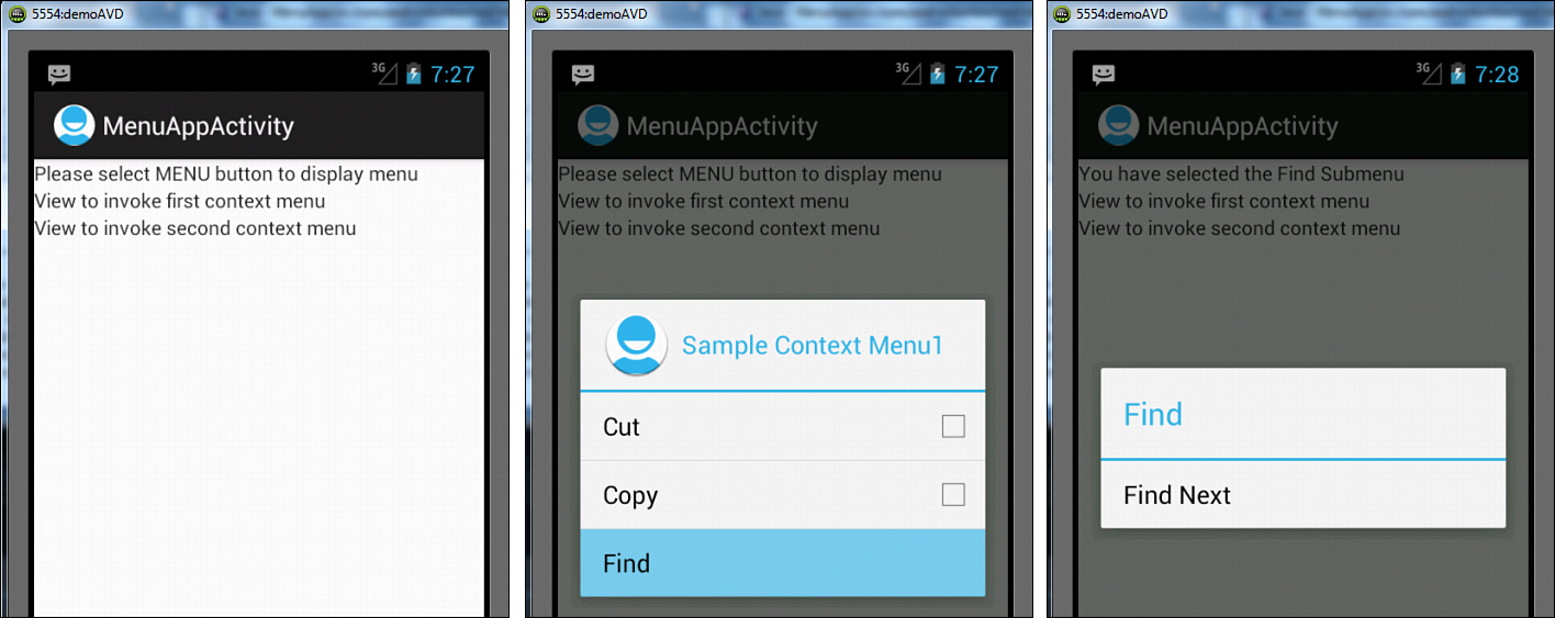
Figure 7.5. Three TextView controls showing different messages (left), the first Context Menu containing two check boxes that appear after pressing and holding the second TextView (middle), and a Find submenu appears after selecting a Find menu item (right).
After we tap and hold the third TextView that shows the text View to invoke second context menu (see Figure 7.6—left), a context menu, Sample Context Menu2, is displayed, as shown in Figure 7.6 (middle). After we select the Open item or press its shortcut key, the first TextView responds by displaying the message You have selected the Open option, as shown in Figure 7.6 (right).
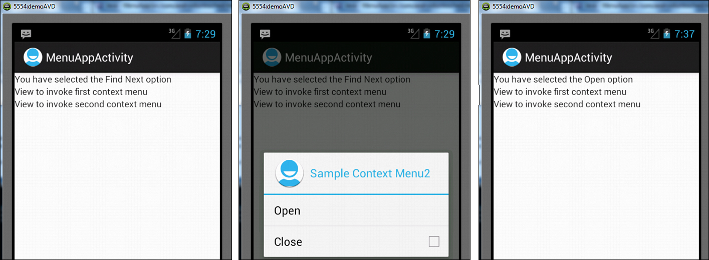
Figure 7.6. The first TextView shows that the Find Next option was selected from the Find submenu (left), the second context menu containing a menu item and a check box that appear after pressing and holding the third TextView (middle), and the first TextView shows that the Open menu option was selected from the context menu (right).
Let’s create an application that demonstrates the creation of Submenus and context menus through coding instead of by using XML files. But before we do that, let’s first look at the different methods that we will encounter.
Creating Menus Through Coding
As stated earlier, besides using XML resources, we can create the menus through Java code too. In this next section, we learn to create the three types of menus, Options Menu, Submenu, and Context Menu, with Java coding. We begin by defining Options Menus.
Defining Options Menus
To define an Options or Activity menu, we override the onCreateOptionsMenu method in the Java Activity file MenuAppCodeActivity.java. The method receives a menu object as a parameter, which is used to add menu items to it. To add menu items to the menu object, the add() method is used.
Here is the syntax:
add(Group ID, Menu Item ID, Sort order ID, Menu text)
The add() method requires following four parameters:
• Group ID—An integer used for grouping a collection of menu items.
• Menu Item ID—A unique identifier assigned to each menu item to identify it. Usually a private static variable within the Activity class is assigned to the menu item as a unique identifier. We can also use the Menu.FIRST static constant and simply increment that value for successive menu items.
• Sort order ID—Defines the order in which the menu items are to be displayed.
• Menu text—Text to appear in the menu item.
Tip
The group ID, Menu Item ID, and Sort Order ID parameters in the add() method are all optional, and we can use Menu.NONE in place of them if we don’t want to specify any of them.
The following code adds a single menu item, Create Database, to the Options Menu:
private static final int CREATE_DATAB = Menu.FIRST;
menu.add(0,CREATE_DATAB,0,"Create Database").setIcon(R.drawable.ic_launcher);
We can see that the CREATE_DATAB is assigned a static constant, Menu.FIRST, and is used as a Menu Item ID in the add() method. In the add() method, we can see that Group ID is assigned the value 0. All the menu items that we want to be a part of this group are assigned the Group ID of 0. The CREATE_DATAB is assigned to Menu Item ID; the Sort order ID is 0; and the string Create Database is the menu item text. The setIcon() method assigns the ic_launcher.png image to the menu item from the drawable resource (the res/drawable directory).
Assigning Icons
We can assign icons to the menu items in the Icon Menu using the setIcon() method.
Here is the syntax:
menuItem.setIcon(R.drawable.icon_filename);
where icon_filename is a drawable resource identifier for the icon to be assigned to the menu item. Icons are only displayed in the Icon Menu and not visible in Extended, Submenu, and Context menus.
After we add all the menu and submenu items to the menu, the onCreateOptionsMenu() method is set to return the Boolean value true to allow Android to display the menu.
Creating Submenus
Submenus appear as single floating windows displaying all of their menu items. A submenu is attached to a regular menu item that, when selected, invokes the submenu, hence displaying all the menu items in it. A submenu is added through the addSubMenu() method. It supports the same parameters as the add() method used to add menu items in the Options Menu: Group ID, Menu Item ID, Sort order ID, and Menu Text. We can also use the setHeaderIcon method to specify an icon to display in the submenu’s header bar and the setIcon() method to display the icon for the menu item to which this submenu is associated.
Note
Android does not support nested submenus.
The following code adds a submenu to a regular menu item, Search:
private static final int SEARCH_ROW = Menu.FIRST + 3;
SubMenu searchSub = menu.addSubMenu(0, SEARCH_ROW, 3, "Search");
searchSub.setHeaderIcon(R.drawable.ic_launcher);
searchSub.setIcon(R.drawable.ic_launcher);
searchSub.add(1, SEARCH_CODE, Menu.NONE, "Search on Code");
We can see that a submenu called searchSub is created for the regular menu item Search. The menu item Search to which the submenu searchSub is associated is assigned a group ID of 0. SEARCH_ROW, which is assigned the value of the static constant Menu.FIRST+3, is assigned as the Menu Item ID; 3 is assigned as the Sort order ID; and Search is assigned as the menu item text. The ic_launcher.png file in Resources is set to display in the submenu’s header bar. The image ic_launcher.png is set to display as an icon in the Search menu item, to which the submenu searchSub is associated. A menu item, Search on Code, is added to the submenu through the add() method.
Using Check Boxes/Radio Buttons in Menus
Android supports check boxes and radio buttons in menu items. To set a menu item as a check box, we use the setCheckable() method.
Here is the syntax:
setCheckable(boolean);
The menu item appears as a check box when the Boolean value true is passed to the setCheckable() method. The following code makes a menu item appear as a check box:
menu.add(3, CLOSE_ITEM, Menu.NONE, "Close").setCheckable(true);
By default, the check box is unchecked. To make the check box checked by default, we use the setChecked() method. By passing the Boolean value true to the setChecked() method, we can make the check box appear checked by default.
The following code makes a menu item appear as a checked check box by default:
menu.add(3, CLOSE_ITEM, Menu.NONE, "Close").setCheckable(true).setChecked(true);
Radio buttons are mutually exclusive menu items displayed as a circles; only one menu item can be selected in a group at any time. Selecting a radio button menu item unselects any other previously selected menu items in the same group. To create radio buttons, we need to make them part of the same group; hence we assign the same group identifier to all of them; then we call the setGroupCheckable() method.
Here is the syntax:
setGroupCheckable(int GroupID, boolean Checkable, boolean Exclusive)
where the GroupID refers to the group whose menu items we want to appear as radio buttons or check boxes. The second parameter, Checkable, should be set to true to make the check box or radio button appear as checkable. If we pass a false value to the Checkable parameter, then the menu items appear neither as check boxes nor radio buttons. The third parameter, Exclusive, determines whether we want the menu items to be mutually exclusive. If the Exclusive parameter is set to true, it means the menu items are mutually exclusive and only one can be selected at a time. So we set the parameter Exclusive to true if we want the menu items to appear as radio buttons. Passing the value false to the Exclusive parameter makes all the menu items in the group appear as check boxes.
The following code makes all the menu items of a submenu appear as radio buttons:
SubMenu searchSub = menu.addSubMenu(0, SEARCH_ROW, 3, "Search");
searchSub.add(1, SEARCH_CODE, Menu.NONE, "Search on Code").setChecked(true);
searchSub.add(1, SEARCH_NAME, Menu.NONE, "Search on Name");
searchSub.add(1, SEARCH_PRICE, Menu.NONE, "Search on Price");
searchSub.setGroupCheckable(1, true, true);
We can see that a submenu called searchSub is created and is associated with a menu item, Search. The searchSub submenu contains three menu items: Search on Code, Search on Name, and Search on Price. All three menu items are assigned the Group ID 1. All the menu items appear as checkable radio buttons, because the Checkable and Exclusive parameters in the setGroupCheckable() method are passed as true. The first menu item in the group, Search on Code, is set to appear as checked by default by passing the value true to the setChecked() method.
We can also assign shortcut keys to the menu items. Let’s see how.
Assigning Shortcut Keys
The methods used to assign shortcut keys are setShortcut, setAlphabeticShortcut, and setNumericShortcut. Let’s begin with setShortcut method:
• In the setShortcut() method, we can assign two shortcut keys through this method. One of the shortcut keys is used with the numeric keypad and the second with the full keyboard. Neither key is case sensitive.
Example:
menu.add(0,MERGE_ROW,7,"Merge Rows").setShortcut('4', 'm'),
This code assigns shortcut keys for both modes to the menu item Merge Rows. The number 4 is used as the numeric keypad shortcut, and m acts as the shortcut key while using the full keyboard. This shortcut key also is displayed below the menu item text.
• The setAlphabeticShortcut() and setNumericShortcut() methods can be used to define the shortcut keys for the numeric keypad and full keyboard separately, as shown here:
menu.add(0,MERGE_ROW,7,"Merge Rows").setAlphabeticShortcut('m').setNumeric-
Shortcut('4'),
We have seen all the methods required to define the Options menu, assign icons to the menu items, create submenus, make menu items appear as check boxes and radio buttons, and assign shortcut keys to the menu items. Let’s apply all these methods to create a menu with Java code.
Trying It Out
We have seen all the methods required for defining Options Menus, Submenus, and Context Menus. Also, we have seen the methods required in assigning Icons, using check boxes/radio buttons in menus and assigning shortcut keys to the menu items. It’s now time to try out all the knowledge that we have gained. Let’s do it.
Create a new Android project called MenuAppCode. We want to display three Text View controls in the menu in the same way as we saw earlier in Figure 7.4 (left). The first TextView directs the user to click the MENU button to display the menu. The second and third TextView controls are used for displaying Context Menus. When the user taps and holds on either TextView control, a Context Menu appears on the screen. To display the three TextView controls, modify the layout file activity_menu_app_code.xml to appear as shown in Listing 7.11.
Listing 7.11. The Layout File activity_menu_app_code.xml After Adding Three TextView Controls
<LinearLayout xmlns:android="http://schemas.android.com/apk/res/android"
android:orientation="vertical"
android:layout_width="match_parent"
android:layout_height="match_parent">
<TextView
android:layout_width="match_parent"
android:layout_height="wrap_content"
android:id="@+id/selectedopt" />
<TextView
android:text="View to invoke first context menu"
android:layout_width="match_parent"
android:layout_height="wrap_content"
android:id="@+id/contxt1_view" />
<TextView
android:text="View to invoke second context menu"
android:layout_width="match_parent"
android:layout_height="wrap_content"
android:id="@+id/contxt2_view"/>
</LinearLayout>
In the code, we can see that the three TextView controls are assigned the IDs selectedopt, contxt1_view, and contxt2_view, respectively. To tell the user which Views are meant for displaying Context Menus, the TextView controls are set to display the text View to invoke first context menu and View to invoke second context menu, respectively.
To display the menu items in the Options menu, Submenu, and Context Menu, the Activity file MenuAppCodeActivity.java is modified as shown in Listing 7.12.
Listing 7.12. Code Written into the Java Activity File MenuAppCodeActivity.java
package com.androidunleashed.menuappcode;
import android.app.Activity;
import android.os.Bundle;
import android.view.Menu;
import android.view.MenuItem;
import android.widget.TextView;
import android.view.SubMenu;
import android.view.View;
import android.view.ContextMenu;
public class MenuAppCodeActivity extends Activity {
private static final int CREATE_DATAB = Menu.FIRST;
private static final int INSERT_ROWS = Menu.FIRST + 1;
private static final int LIST_ROWS = Menu.FIRST+2;
private static final int SEARCH_ROW = Menu.FIRST + 3;
private static final int DELETE_ROW = Menu.FIRST+4;
private static final int UPDATE_ROW = Menu.FIRST + 5;
private static final int SORT_ROWS = Menu.FIRST+6;
private static final int MERGE_ROW = Menu.FIRST + 7;
private static final int SEARCH_CODE = Menu.FIRST + 8;
private static final int SEARCH_NAME = Menu.FIRST + 9;
private static final int SEARCH_PRICE = Menu.FIRST + 10;
private static final int CUT_ITEM = Menu.FIRST + 11;
private static final int COPY_ITEM = Menu.FIRST + 12;
private static final int OPEN_ITEM = Menu.FIRST + 13;
private static final int CLOSE_ITEM = Menu.FIRST + 14;
private static final int FIND_ITEM = Menu.FIRST + 15;
private static final int FIND_NEXT = Menu.FIRST + 16;
private TextView selectedOpt;
@Override
public void onCreate(Bundle savedInstanceState) {
super.onCreate(savedInstanceState);
setContentView(R.layout.activity_menu_app_code);
selectedOpt=(TextView)findViewById(R.id.selectedopt);
selectedOpt.setText("Please select MENU button to display menu");
TextView contxt1View=(TextView)findViewById(R.id.contxt1_view);
TextView contxt2View=(TextView)findViewById(R.id.contxt2_view);
registerForContextMenu(contxt1View);
registerForContextMenu(contxt2View);
}
@Override
public boolean onCreateOptionsMenu(Menu menu) {
menu.add(0,CREATE_DATAB,0,"Create Database").setIcon(R.drawable.ic_
launcher);
menu.add(0,INSERT_ROWS,1,"Insert Rows").setIcon(R.drawable.ic_launcher);
menu.add(0,LIST_ROWS,2,"List Rows");
SubMenu searchSub = menu.addSubMenu(0, SEARCH_ROW, 3, "Search");
menu.add(0,DELETE_ROW,4,"Delete");
menu.add(0,UPDATE_ROW,5,"Update");
menu.add(0,SORT_ROWS,6,"Sort Table").setCheckable(true).setChecked(true);
menu.add(0,MERGE_ROW,7,"Merge Rows").setAlphabeticShortcut('m').setNumeric-
Shortcut('4'),
searchSub.setHeaderIcon(R.drawable.ic_launcher);
searchSub.setIcon(R.drawable.ic_launcher);
searchSub.add(1, SEARCH_CODE, Menu.NONE, "Search on Code").setChecked(true);
searchSub.add(1, SEARCH_NAME, Menu.NONE, "Search on Name").setShortcut('6',
'n'),
searchSub.add(1, SEARCH_PRICE, Menu.NONE, "Search on Price");
searchSub.setGroupCheckable(1, true, true);
return true;
}
@Override
public boolean onOptionsItemSelected(MenuItem item) {
switch (item.getItemId()) {
case CREATE_DATAB:
selectedOpt.setText("You have selected Create Database option");
break;
case INSERT_ROWS:
selectedOpt.setText("You have selected Insert Rows option");
break;
case LIST_ROWS:
selectedOpt.setText("You have selected List Rows option");
break;
case SEARCH_ROW:
selectedOpt.setText("You have selected Search Submenu option");
break;
case DELETE_ROW:
selectedOpt.setText("You have selected Delete Row option");
break;
case UPDATE_ROW:
selectedOpt.setText("You have selected Update Row option");
break;
case SORT_ROWS:
selectedOpt.setText("You have selected Sort Table option");
item.setChecked(!item.isChecked());
break;
case MERGE_ROW:
selectedOpt.setText("You have selected Merge Rows option");
break;
case SEARCH_CODE:
selectedOpt.setText("You have selected Search on Code option");
break;
case SEARCH_NAME:
selectedOpt.setText("You have selected Search on Name option");
break;
case SEARCH_PRICE:
selectedOpt.setText("You have selected Search on Price option");
}
return true;
}
@Override
public void onCreateContextMenu(ContextMenu menu, View v, ContextMenu.Context-
MenuInfo menuInfo)
{
super.onCreateContextMenu(menu, v, menuInfo);
if (v.getId()==R.id.contxt1_view) {
menu.setHeaderTitle("Sample Context Menu1");
menu.setHeaderIcon(R.drawable.ic_launcher);
menu.add(2, CUT_ITEM, Menu.NONE,"Cut");
menu.add(2, COPY_ITEM, Menu.NONE, "Copy");
menu.setGroupCheckable(2, true, false);
SubMenu subcont = menu.addSubMenu(2, FIND_ITEM, Menu.NONE, "Find");
subcont.add(3, FIND_NEXT, Menu.NONE, "Find Next");
}
if (v.getId()==R.id.contxt2_view) {
menu.setHeaderTitle("Sample Context Menu2");
menu.setHeaderIcon(R.drawable.ic_launcher);
menu.add(3, OPEN_ITEM, Menu.NONE, "Open").setShortcut('5', 'o'),
menu.add(3, CLOSE_ITEM, Menu.NONE, "Close").setCheckable(true);
}
}
@Override
public boolean onContextItemSelected(MenuItem item) {
switch (item.getItemId()) {
case CUT_ITEM:
selectedOpt.setText("You have selected the Cut option");
item.setChecked(!item.isChecked());
break;
case COPY_ITEM:
selectedOpt.setText("You have selected the Copy option");
item.setChecked(!item.isChecked());
break;
case FIND_ITEM:
selectedOpt.setText("You have selected the Find Submenu");
break;
case FIND_NEXT:
selectedOpt.setText("You have selected the Find Next option");
break;
case OPEN_ITEM:
selectedOpt.setText("You have selected the Open option");
break;
case CLOSE_ITEM:
selectedOpt.setText("You have selected the Close option");
item.setChecked(!item.isChecked());
break;
}
return true;
}
}
In the onCreate() method shown in the preceding code, we can see that the TextView with the ID selectedopt is accessed from the layout file and is mapped to the TextView object selectedOpt. It is set to display the text Please select MENU button to display menu. The two TextView controls with the IDs contxt1_view and contxt2_view are registered for displaying a Context Menu.
The onCreateOptionsMenu() method defines the menu items for the Options Menu as well as for the Search SubMenu. The menu items defined for the Options Menu are Create Database, Insert Rows, List Rows, Delete, Update, Sort Table, and Merge Rows. The menu items defined for the Search SubMenu are Search on Code, Search on Name, and Search on Price. Shortcut keys are assigned for the Merge Rows menu item and the Search on Name menu item of the Search SubMenu. The Sort Table menu item is set as a checkable menu item. All the menu items of the Search SubMenu are set to appear as radio buttons.
The onOptionsItemSelected() method informs the menu item that is selected by the user. It displays the text message through the TextView selectedOpt to inform which of the menu options is selected by the user.
The onCreateContextMenu() method displays the two Context Menus. When the user taps and holds on any of the TextView controls with the IDs contxt1_view and contxt2_view the method displays the corresponding Context Menu on the screen. The onContextItemSelected() method does the job of informing us which menu item of the Context Menu is selected by the user.
The output of this application is the same as that shown earlier in Figures 7.2 through 7.5. We have learned that we can display different types of menus via XML files and Java coding too.
Applying a Context Menu to a ListView
We have seen the implementation of Context Menus to the two TextView controls (refer to Figures 7.4 and 7.5). Instead of having two TextView controls, let’s try creating a Context Menu for a ListView control so that when the user taps and holds on any ListView item, information about that item is displayed.
To apply Context Menus to ListView controls, let’s create a new Android application called ContextMenuApp. To display the Context Menu for the item selected from the ListView, let’s add Context Menu files to the menu folder. Right-click on the res/menu folder in the Package Explorer window and select the New, Android XML File option. Enter the filename as mycontext_menu1 (without the extension .xml). Keeping the Root Element: as menu (default), click the Finish button to create the context file mycontext_menu1.xml. Repeat the procedure to add one more context file called mycontext_menu2.xml to our menu folder. Write the code as shown in Listing 7.13 in the mycontext_menu1.xml file.
Listing 7.13. Code Written into the Context Menu mycontext_menu1.xml
<?xml version="1.0" encoding="utf-8"?>
<menu xmlns:android="http://schemas.android.com/apk/res/android">
<item android:id="@+id/cut_item"
android:title="Cut" />
<item android:id="@+id/copy_item"
android:title="Copy" />
</menu>
The code in the second context menu file, mycontext_menu2.xml, appears as shown in Listing 7.14.
Listing 7.14. Code Written into the Second Context Menu mycontext_menu2.xml
<?xml version="1.0" encoding="utf-8"?>
<menu xmlns:android="http://schemas.android.com/apk/res/android">
<item android:id="@+id/open_item"
android:title="Open" />
<item android:id="@+id/close_item"
android:title="Close" />
</menu>
We want to display a TextView and a ListView in our application. The TextView directs the user to take a desired action and tells the user which item from the ListView is selected by the user. The ListView control is used to display different items on the screen, which the user can tap and hold to invoke the related Context Menu. To display the TextView and ListView in our application, modify activity_context_menu_app.xml to appear as shown in Listing 7.15.
Listing 7.15. The Layout File activity_context_menu_app.xml After Adding the TextView and ListView Controls
<LinearLayout xmlns:android="http://schemas.android.com/apk/res/android"
android:orientation="vertical"
android:layout_width="match_parent"
android:layout_height="match_parent" >
<TextView
android:layout_width="match_parent"
android:layout_height="wrap_content"
android:id="@+id/selectedopt" />
<ListView
android:id="@+id/listvw"
android:layout_width="match_parent"
android:layout_height="match_parent"
android:drawSelectorOnTop="false"/>
</LinearLayout>
To add an action, for example, to display the related Context Menu and information about the selected item, let’s add the code shown in Listing 7.16 to the Activity file ContextMenuAppActivity.java.
Listing 7.16. Code Written into the Java Activity File ContextMenuAppActivity.java
package com.androidunleashed.contextmenuapp;
import android.app.Activity;
import android.os.Bundle;
import android.view.MenuItem;
import android.view.MenuInflater;
import android.widget.TextView;
import android.view.ContextMenu.ContextMenuInfo;
import android.view.View;
import android.view.ContextMenu;
import android.widget.AdapterView;
import android.widget.ListView;
import android.widget.ArrayAdapter;
public class ContextMenuAppActivity extends Activity {
private TextView selectedOpt;
String[] fruits={"Apple", "Mango", "Orange", "Grapes", "Banana"};
@Override
public void onCreate(Bundle savedInstanceState) {
super.onCreate(savedInstanceState);
setContentView(R.layout.activity_context_menu_app);
selectedOpt=(TextView)findViewById(R.id.selectedopt);
selectedOpt.setText("Tap and hold a menu item to display its context menu");
ListView myListView = (ListView)findViewById(R.id.listvw);
final ArrayAdapter<String> arrayAdpt= new ArrayAdapter<String>(this,
android.R.layout.simple_list_item_1, fruits);
myListView.setAdapter(arrayAdpt);
registerForContextMenu(myListView);
}
@Override
public void onCreateContextMenu(ContextMenu menu, View v, ContextMenuInfo menu-
Info)
{
super.onCreateContextMenu(menu, v, menuInfo);
if(v.getId()==R.id.listvw) {
AdapterView.AdapterContextMenuInfo info = (AdapterView.AdapterContext-
MenuInfo)menuInfo;
if(fruits[info.position]=="Apple"){
menu.setHeaderTitle(fruits[info.position]);
MenuInflater inflater = getMenuInflater();
inflater.inflate(R.menu.mycontext_menu1, menu);
}
if(fruits[info.position]=="Mango") {
menu.setHeaderTitle(fruits[info.position]);
MenuInflater inflater = getMenuInflater();
inflater.inflate(R.menu.mycontext_menu2, menu);
}
}
}
@Override
public boolean onContextItemSelected(MenuItem item) {
AdapterView.AdapterContextMenuInfo info=(AdapterView.AdapterContextMenuInfo)
item.getMenuInfo();
switch (item.getItemId()) {
case R.id.cut_item:
selectedOpt.setText("You have selected the Cut option of " +
fruits[info.position]+" menu");
break;
case R.id.copy_item:
selectedOpt.setText("You have selected the Copy option of " +
fruits[info.position]+" menu");
break;
case R.id.open_item:
selectedOpt.setText("You have selected the Open option of " +
fruits[info.position]+" menu");
break;
case R.id.close_item:
selectedOpt.setText("You have selected the Close option of the " +
fruits[info.position]+" menu");
break;
}
return true;
}
}
When we run the application, a TextView and a ListView are displayed as shown in Figure 7.7 (left). When we tap and hold a list item, the related Context Menu appears. For example, when we tap and hold Apple, the Context Menu titled Apple appears with the menu items Cut and Copy, as shown in Figure 7.7 (middle). When we select a Context Menu Item, a corresponding message is displayed via a TextView. For example, when we select the Cut menu item from the Apple Context Menu, the TextView displays the message You have selected the Cut option of Apple menu, as shown in Figure 7.7 (right).

Figure 7.7. Items displayed through a ListView and on pressing and holding the Apple item (left), an Apple Context Menu appears and on selecting the Cut menu item (middle), and the TextView tells the user that the Cut menu item is selected from the Apple context menu (right).
Similarly, when we tap and hold Mango from the ListView, the Context Menu titled Mango appears with its menu items, Open and Close, as shown in Figure 7.8 (left). When we select the Close menu item from the context menu, the TextView displays the message You have selected the Close option of the Mango menu, as shown in Figure 7.8 (right).
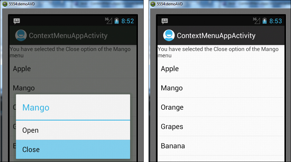
Figure 7.8. The Mango Context Menu appears on pressing and holding the Mango item in the ListView (left), and the TextView above the ListView tells the user that the Close menu item is selected from the Mango Context Menu (right).
We have learned the procedure of creating menus and their role in initiating different tasks. We have also learned the purpose of different menu types including the Options Menu, SubMenu, and Context Menu. The only drawback you might have observed while working with menus is that they are displayed or invoked on pressing the Menu button on the AVD or device. Now, the problem is that many Android devices no longer have a dedicated Menu button. The solution to this problem is using the ActionBar. Making the menu items appear in the ActionBar not only make them instantly accessible but also removes the need of pressing the Menu button to invoke them. Let’s learn more about the ActionBar.
Using the ActionBar
The ActionBar is a widget that replaces the title bar at the top of every Activity displaying navigation and important functionality of an application. By default, the ActionBar includes the application logo on the left side, followed by the Activity title, and menu items (if any) on the right side. The ActionBar provides a consistent UI of an application. It helps in displaying the key actions commonly used in an application that we want to be visible on the screen while running the application. The ActionBar is also commonly used to provide a quick link to an application’s home. The application’s logo acts as a link to the application’s home; that is, wherever we are in the application, if we tap the application logo displayed through the ActionBar, we navigate to the application’s home.
Note
On Android 3.0 and higher, items from the Options Menu are presented by the ActionBar. It also means that beginning with Android 3.0, the Menu button is deprecated.
The ActionBar provides the following features:
• Customizes the title bar of an Activity.
• Follows its own life cycle.
• Consistently displays frequently used actions of an application. The menu items from the Options Menu are displayed in the ActionBar to be accessed instantly. The menu items displayed in the ActionBar are also called action items. The menu items that could not be accommodated in the ActionBar appear in the Overflow Menu. The menu items of the Overflow Menu can be seen by selecting the Menu button on the device or the Overflow Menu button in the ActionBar.
• Appears in three forms: standard, tabbed, and list.
• Makes it possible to use the application’s icon or logo for navigation.
• Through the ActionBar we can even display Action Views, that is, custom views in the Activity’s title bar. For example, we can display the search widget in the ActionBar.
The ActionBar includes the components as shown in Figure 7.9.
• Application’s Icon/Logo—Displayed at the upper left on the ActionBar.
• Activity Title—Displays the title for the ActionBar.
• Tabs—Displays the tabs of the ActionBar if the navigation mode set is tabs.
• Drop-Down List—Displays the action items in the form of a drop-down list if the navigation mode set is list navigation. We learn about navigation mode soon.
• ActionItems—Displays the menu items of the Options menu in the ActionBar.
• ActionViews—Displays Custom Views in the ActionBar.
• Overflow Menu—Displays menu items that could not be accommodated in the ActionBar.

Figure 7.9. Different components displayed in an ActionBar
Enabling the ActionBar
The ActionBar is enabled if an application uses the default Theme.Holo theme and whose target (or minimum) SDK version is 11 or higher.
Example:
<uses-sdk android:targetSdkVersion="15" />
To toggle the visibility of an ActionBar at runtime, we can use its show and hide methods as follows:
ActionBar actionBar = getActionBar();
actionBar.hide(); // It hides the actionbar
actionBar.show(); // Makes the actionbar visible
In the preceding code, the getActionBar() method is called to get an ActionBar object, and its hide() and show() methods are for hiding and showing the ActionBar, respectively.
To hide the ActionBar in an Activity, we can also apply a theme that doesn’t support it. In the AndroidManifest.xml file, set the theme for the Activity to Theme.Holo.NoActionBar as shown in the following code:
<activity android:label="@string/app_name"
android:name=".ActionBarApp"
android:theme="@android:style/Theme.Holo.NoActionBar">
The icon or logo displayed in the ActionBar can be modified through the android:icon attribute in the configuration file AndroidManifest.xml. We can also use the android:logo attribute in the same file for the same purpose.
The visibility of the icon or logo in the ActionBar is controlled by passing a Boolean value to the setDisplayShowHomeEnabled() method.
The following statement hides the logo or icon in the ActionBar:
actionBar.setDisplayShowHomeEnabled(false);
The following statement makes the logo or icon visible in the ActionBar:
actionBar.setDisplayShowHomeEnabled(true);
Similarly, the visibility of the title in the ActionBar can be controlled by passing a Boolean value to the setDisplayShowTitleEnabled() method.
The following statement hides the title in the ActionBar:
actionBar.setDisplayShowTitleEnabled(false);
The following statement shows the title in the ActionBar:
actionBar.setDisplayShowTitleEnabled(true);
Using an Application’s Icon for Navigation
The logo or icon displayed in an ActionBar if clicked navigates you to the home of the application. “Home of the application” here means the application’s main Activity, that is, the root of our Activity stack.
By default, the logo or icon displayed in the ActionBar is nonclickable. To make the logo or icon clickable, we must call the ActionBar’s setHomeButtonEnabled() method, passing the Boolean value true to it as shown here:
actionBar.setHomeButtonEnabled(true);
Clicking the logo or icon is considered a Menu Item click. Like Menu Item clicks are handled by the onOptionsItemSelected handler of our Activity; the logo or icon clicks too are handled by the same method. When the logo or icon is clicked, it is considered that a Menu Item with the ID android.R.id.home is clicked. In other words, when we click the logo or icon, the onOptionItemSelected() method is called passing the Menu Item with the ID android.R.id.home to it as a parameter as shown here:
@Override
public boolean onOptionsItemSelected(MenuItem item) {
switch (item.getItemId()) {
case (android.R.id.home) :
Intent intent = new Intent(this, DemoActionBarActivity.class);
intent.addFlags(Intent.FLAG_ACTIVITY_CLEAR_TOP);
startActivity(intent);
break;
default:
return super.onOptionsItemSelected(item);
}
return true;
}
For navigating to the home Activity, we use an intent flag, FLAG_ACTIVITY_CLEAR_TOP, that clears the stack of all activities on top of the home Activity as shown in the preceding code.
Displaying Action Items
To display menu items in the ActionBar as action items, we need to add an android:showAsAction attribute to the menu items while defining them in the menu file. The showAsAction attribute determines how to display the action item. The value of the showAsAction attribute can be any one of the following:
• always—Makes the action item appear on the ActionBar.
• ifRoom—Makes the action item appear in the ActionBar, but only if there is room available on the ActionBar. If there’s not enough room, the item appears in the Overflow Menu.
• never—Makes the menu item appear in the Overflow Menu.
To display the Overflow Menu, press the Menu button on the AVD or a soft options menu button that appears as three vertical dots on the physical device.
We need to understand the concept of the ActionBar through a running application. So, let’s create a new Android project called DemoActionBar. In this application, we create six Button controls that are used to show/hide the ActionBar, the application’s logo, and Activity’s title bar. Besides this, the application displays an action item called Create, which when selected navigates us to a new Activity, CreateActivity. From the new Activity, when we select the application’s logo, we are navigated back to the main Activity. The application also displays an ActionView in the form of a search widget.
After we create the project, the first thing we do is to define six Button controls in the layout file activity_demo_action_bar.xml. These six Button controls are used to show/hide the ActionBar, the application’s logo, and the Activity’s title bar, respectively. The code written in the layout file activity_demo_action_bar.xml is as shown in Listing 7.17.
Listing 7.17. Code Written into the Layout File activity_demo_action_bar.xml
<LinearLayout xmlns:android="http://schemas.android.com/apk/res/android"
android:layout_width="match_parent"
android:layout_height="match_parent"
android:orientation="vertical" >
<Button
android:layout_width="match_parent"
android:layout_height="wrap_content"
android:id="@+id/show_action"
android:text="Show ActionBar"/>
<Button
android:layout_width="match_parent"
android:layout_height="wrap_content"
android:id="@+id/hide_action"
android:text="Hide ActionBar"/>
<Button
android:layout_width="match_parent"
android:layout_height="wrap_content"
android:id="@+id/show_title"
android:text="Show Title"/>
<Button
android:layout_width="match_parent"
android:layout_height="wrap_content"
android:id="@+id/hide_title"
android:text="Hide Title"/>
<Button
android:layout_width="match_parent"
android:layout_height="wrap_content"
android:id="@+id/show_logo"
android:text="Show Logo"/>
<Button
android:layout_width="match_parent"
android:layout_height="wrap_content"
android:id="@+id/hide_logo"
android:text="Hide Logo"/>
</LinearLayout>
We can see that the Button controls are assigned the IDs show_action, hide_action, show_title, hide_title, show_logo, and hide_logo. Also, the caption assigned to the Button controls signifies the task they are supposed to perform. The captions assigned to the Button controls are Show ActionBar, Hide ActionBar, Show Title, Hide Title, Show Logo, and Hide Logo.
Next, we need to define an action item, Create, in our application. This action item when selected navigates us to the new Activity in the application. The action item is nothing but the menu item from the Options Menu that is displayed in the ActionBar to be accessed instantly. We can define action items in the menu file activity_demo_action_bar.xml that is provided by default in the res/menu folder of our application. In the menu file, we define two menu items, Create and Search, where Create is displayed in the ActionBar as an action item, and Search is used to display a search widget in the form of ActionView. The activity_demo_action_bar.xml file, after defining the two menu items in an Options Menu, appears as shown in Listing 7.18.
Listing 7.18. Code Written into the Menu File activity_demo_action_bar.xml
<menu xmlns:android="http://schemas.android.com/apk/res/android" >
<item android:id="@+id/create_datab"
android:title="Create"
android:icon="@drawable/create"
android:orderInCategory="0"
android:showAsAction="ifRoom|withText" />
<item android:id="@+id/menu_search"
android:title="Search"
android:showAsAction="always"
android:actionViewClass="android.widget.SearchView"/>
</menu>
Because we want to represent the action item Create via an icon, an image file, create.png, should be copied to the res/drawable folders of the application.
On selecting the Create action item, we want to navigate to a new Activity. To define Views for the new Activity, we need to add an XML file to the res/layout folder. So, right-click the layout folder in the Package Explorer window and select the New, Android XML File option. In the dialog box that pops up, specify the filename as create and select the Root Element as LinearLayout as we want the container of this XML file to be LinearLayout. Finally, select the Finish button to create the XML file called create.xml.
When we navigate to the new Activity, we want to display a text message informing that we have navigated to the new Activity. For displaying a text message, we define a TextView control in the new Activity’s layout file, create.xml. The layout file create.xml, after defining the TextView control, appears as shown in Listing 7.19.
Listing 7.19. Code Written into the Layout File create.xml
<?xml version="1.0" encoding="utf-8"?>
<LinearLayout xmlns:android="http://schemas.android.com/apk/res/android"
android:layout_width="match_parent"
android:layout_height="match_parent"
android:orientation="vertical" >
<TextView
android:layout_width="match_parent"
android:layout_height="wrap_content"
android:text="This is Create Activity"
android:textStyle="bold" />"
</LinearLayout>
We can see that the preceding layout file defines a TextView control with the initial text, "This is Create Activity". The text message is displayed when we navigate to the new Activity.
After defining the layout file create.xml for the new Activity, we need a Java class file to load the Views defined in the layout file. So, add a Java class file called CreateActivity.java to the package com.androidunleashed.demoactionbar of our application. In the CreateActivity.java file, we need to write code to perform the following tasks:
• Load the Views defined in the create.xml file.
• Make the application’s logo clickable. Remember, we want the user to be taken to the main Activity of the application on selecting the application’s logo.
• Navigate to the main Activity file, DemoActionBarActivity.class, of the application.
For performing all these tasks, we write the code as shown in Listing 7.20 in the file CreateActivity.java.
Listing 7.20. Code Written into the New Activity File CreateActivity.java
package com.androidunleashed.demoactionbar;
import android.app.ActionBar;
import android.app.Activity;
import android.content.Intent;
import android.os.Bundle;
import android.view.MenuItem;
public class CreateActivity extends Activity {
@Override
protected void onCreate(Bundle savedInstanceState){
super.onCreate(savedInstanceState);
setContentView(R.layout.create);
ActionBar actionBar = getActionBar();
actionBar.setHomeButtonEnabled(true);
}
@Override
public boolean onOptionsItemSelected(MenuItem item) {
switch (item.getItemId()) {
case (android.R.id.home) :
Intent intent = new Intent(this, DemoActionBarActivity.class);
intent.addFlags(Intent.FLAG_ACTIVITY_CLEAR_TOP);
startActivity(intent);
break;
default:
return super.onOptionsItemSelected(item);
}
return true;
}
}
In the preceding code, we can see that an ActionBar object, actionBar, is accessed by calling the getActionBar() method and then the Boolean value true is passed to the setHomeButtonEnabled() method to make the application’s logo clickable. Clicking the application’s logo generates a click event on a menu item with the ID android.R.id.home. In the handler method onOptionsItemSelected(), we check whether the menu item with the ID android.R.id.home is clicked, that is, whether the application’s logo is clicked. If the application’s logo is found to be clicked, we navigate back to the main Activity of the application, DemoActionBarActivity.class, by clearing all the activities (if any) on the top of the stack. For clearing all the top activities, we use an intent flag, FLAG_ACTIVITY_CLEAR_TOP.
We know that no Activity is visible to the Android application until it is mentioned in the configuration file AndroidManifest.xml. To make the newly added Activity CreateActivity.java visible to the Android project, a statement is written in the AndroidManifest.xml file. Also, to replace the default application’s logo with a new logo, we need to write code as shown in Listing 7.21 in the AndroidManifest.xml file. Only the statements in bold are added; the rest is the default code.
Listing 7.21. Code Written into the Configuration File AndroidManifest.xml
<manifest xmlns:android="http://schemas.android.com/apk/res/android"
package="com.androidunleashed.DemoActionBar"
android:versionCode="1"
android:versionName="1.0" >
<uses-sdk
android:minSdkVersion="11"
android:targetSdkVersion="15" />
<application
android:icon="@drawable/home"
android:label="@string/app_name"
android:theme="@style/AppTheme" >
<activity
android:name=".DemoActionBarActivity"
android:label="@string/title_activity_demo_action_bar" >
<intent-filter>
<action android:name="android.intent.action.MAIN" />
<category android:name="android.intent.category.LAUNCHER" />
</intent-filter>
</activity>
<activity android:name=".CreateActivity" android:label="@string/app_name" />
</application>
</manifest>
To display our application’s logo, we need to copy an image, home.png, to the res/drawable folders of our application. The statements added to the AndroidManifest.xml file replace the default application’s logo with the image home.png supplied by us. Also the code makes the newly added Activity, CreateActivity.class, visible to the rest of the application. To enable the ActionBar, the minimum SDK version, that is, the value of the android:minSdkVersion attribute, is set to 11 or higher. Finally, it’s time to write code in the main Activity file of the application DemoActionBarActivity.java. We need to perform the following tasks through the main Activity file:
• Access the six Button controls from the layout file activity_demo_action_bar.xml and map them to the respective Button objects.
• Make the three Button controls hide the ActionBar, Activity’s title, and application’s logo. Also make the hidden components visible through the rest of the three Button controls.
• When the user selects the ActionView, Search widget in the ActionBar, a text box should pop up prompting for the text to search for.
• Navigate to the new Activity CreateActivity.class when the action item Create is selected from the ActionBar.
To perform all these tasks, the code as shown in Listing 7.22 is written in the main Activity file DemoActionBarActivity.java.
Listing 7.22. Code Written into the Java Activity File DemoActionBarActivity.java
package com.androidunleashed.demoactionbar;
import android.app.Activity;
import android.os.Bundle;
import android.view.View;
import android.widget.Button;
import android.app.ActionBar;
import android.view.Menu;
import android.view.MenuInflater;
import android.view.MenuItem;
import android.content.Intent;
public class DemoActionBarActivity extends Activity {
Intent intent;
public void onCreate(Bundle savedInstanceState) {
super.onCreate(savedInstanceState);
setContentView(R.layout.activity_demo_action_bar);
final ActionBar actionBar = getActionBar();
Button showAction = (Button) this.findViewById(R.id.show_action);
Button hideAction = (Button) this.findViewById(R.id.hide_action);
Button showTitle = (Button) this.findViewById(R.id.show_title);
Button hideTitle = (Button) this.findViewById(R.id.hide_title);
Button showLogo = (Button) this.findViewById(R.id.show_logo);
Button hideLogo = (Button) this.findViewById(R.id.hide_logo);
showAction.setOnClickListener(new Button.OnClickListener(){
public void onClick(View v)
{ actionBar.show(); } });
hideAction.setOnClickListener(new Button.OnClickListener(){
public void onClick(View v)
{ actionBar.hide(); } });
showTitle.setOnClickListener(new Button.OnClickListener(){
public void onClick(View v)
{ actionBar.setDisplayShowTitleEnabled(true); } });
hideTitle.setOnClickListener(new Button.OnClickListener(){
public void onClick(View v)
{ actionBar.setDisplayShowTitleEnabled(false); } });
showLogo.setOnClickListener(new Button.OnClickListener(){
public void onClick(View v)
{ actionBar.setDisplayShowHomeEnabled(true); } });
hideLogo.setOnClickListener(new Button.OnClickListener(){
public void onClick(View v)
{ actionBar.setDisplayShowHomeEnabled(false); } });
}
@Override
public boolean onCreateOptionsMenu(Menu menu) {
MenuInflater inflater = getMenuInflater();
inflater.inflate(R.menu.mymenu, menu);
return true;
}
@Override
public boolean onOptionsItemSelected(MenuItem item) {
switch (item.getItemId()) {
case R.id.create_datab:
intent = new Intent(this, CreateActivity.class);
startActivity(intent);
break;
default:
return super.onOptionsItemSelected(item);
}
return true;
}
}
On running the application, we find six Button controls, the action item Create, the ActionView Search widget, and the application’s logo on the screen as shown in Figure 7.10 (left). On selecting the action item Create, we navigate to the Activity CreateActivity. The text message "This is Create Activity" displayed via the TextView defined in the layout file create.xml confirms that we have navigated to the Activity CreateActivity (see Figure 7.10—middle). After we select the Button Hide ActionBar, the ActionBar becomes invisible as shown in Figure 7.10 (right).
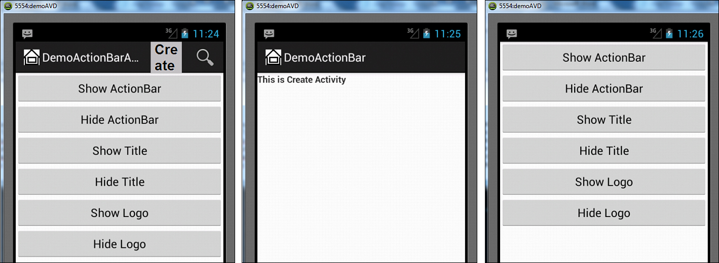
Figure 7.10. Screen on startup (left), message displayed in the Create activity (middle), and the screen on hiding the ActionBar (right)
When we select the Button Hide Title, the title of the Activity, DemoActionBar, becomes invisible as shown in Figure 7.11 (left). Similarly, when we select the Button Hide Logo, the application’s logo, displayed via home.png file becomes invisible as shown in Figure 7.11 (middle). When we select the Search widget in the ActionBar, a text box appears prompting us to enter the text we want to search for as shown in Figure 7.11 (right).
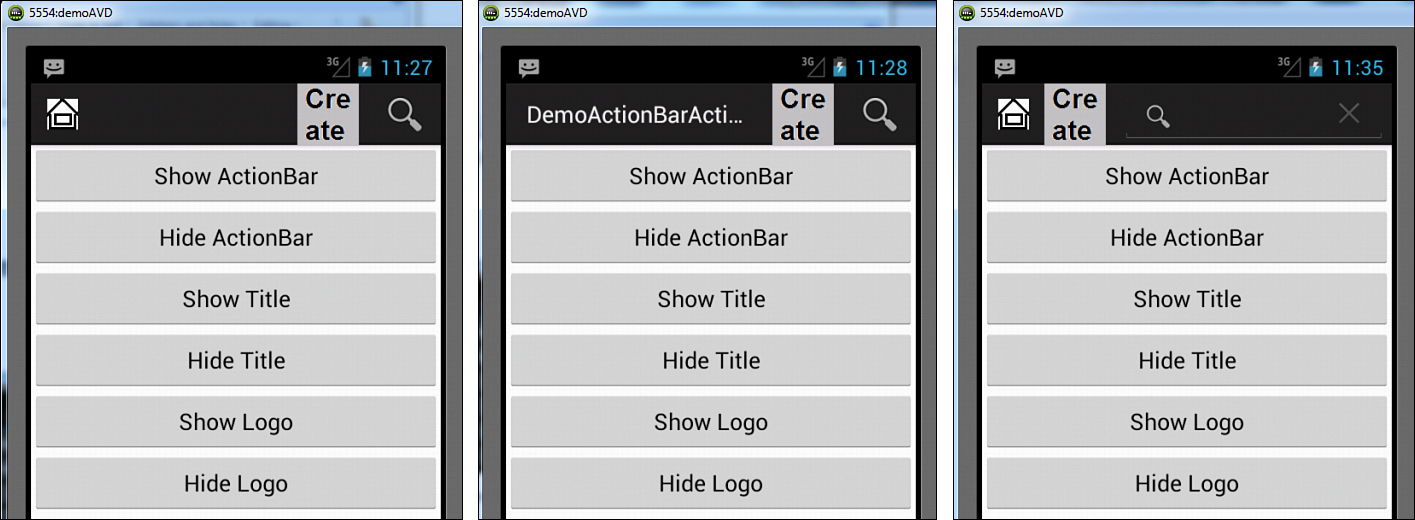
Figure 7.11. Activity title is hidden (left), logo is hidden (middle), and a text box opens on selecting the Search widget (right).
Replacing a Menu with the ActionBar
We know by now that menus created in the application MenuApp at the beginning of this chapter are useful in initiation of different tasks in an application but need pressing a Menu button for invoking it. If we make the menu items of the menu created in that application appear in the ActionBar, it not only makes the menu items appear consistently throughout the application but also relieves the user from pressing the Menu button. To understand how a menu can be replaced by ActionBar, let’s create a new Android project called ActionBarApp. This application displays the simple menu items, checkable menu items, submenu, and so on—everything that we created in the MenuApp application but this time in the ActionBar.
In the menu that we are going to make, we use icon images for a few menu items. So, let’s copy and paste four icon images, namely, create.png, insert.png, search.png, and update.png, into the res/drawable folders. The resolution and size of the icons should be as follows:
• For ldpi—Resolution should be 120dpi and size 18 × 18px
• For mdpi—Resolution should be 160dpi and size 24 × 24px
• For hdpi—Resolution should be 240dpi and size 36 × 36px
• For xhdpi—Resolution should be 320dpi and size 48 × 48px
Note
The term dpi stands for dots per inch.
After copying the images, define the menu items in the menu file activity_action_bar_app.xml as shown in Listing 7.23. On comparing the code in Listing 7.23 with the code in Listing 7.1, which we used for creating menus, you will find that only the statements in bold are newly added; the rest is the same as in Listing 7.1.
Listing 7.23. Code Written into the Menu File activity_action_bar_app.xml
<menu xmlns:android="http://schemas.android.com/apk/res/android" >
<item android:id="@+id/create_datab"
android:title="Create Database"
android:icon="@drawable/create"
android:orderInCategory="0"
android:showAsAction="ifRoom|withText" />
<item android:id="@+id/insert_rows"
android:title="Insert Rows"
android:icon="@drawable/insert"
android:showAsAction="ifRoom" />
<item android:id="@+id/list_rows"
android:title="List Rows"
android:showAsAction="ifRoom" />
<item android:id="@+id/search_row"
android:title="Search"
android:icon="@drawable/search"
android:showAsAction="ifRoom|withText" />
<item android:id="@+id/delete_row"
android:title="Delete"
android:showAsAction="never" />
<item android:id="@+id/update_row"
android:title="Update"
android:icon="@drawable/update"
android:showAsAction="always" />
</menu>
In the preceding code, we see that the showAsAction attribute is applied to different menu items to determine whether they should appear in the ActionBar or in the Overflow menu. To inflate or merge the menu that we defined in the activity_action_bar_app.xml file in our application, we write the Java code as shown in Listing 7.24 in our Activity file ActionBarAppActivity.java.
Listing 7.24. Code Written into the Java Activity File ActionBarAppActivity.java
package com.androidunleashed.actionbarapp;
import android.app.Activity;
import android.os.Bundle;
import android.view.Menu;
import android.view.MenuInflater;
public class ActionBarAppActivity extends Activity {
@Override
public void onCreate(Bundle savedInstanceState) {
super.onCreate(savedInstanceState);
setContentView(R.layout.activity_action_bar_app);
}
@Override
public boolean onCreateOptionsMenu(Menu menu) {
MenuInflater inflater = getMenuInflater();
inflater.inflate(R.menu.activity_action_bar_app, menu);
return true;
}
}
To display the menu or menu items in the ActionBar, we need to inflate or merge our menu defined in the mymenu.xml file in the menu provided as a parameter to the onCreateOptionsMenu() method. Initially, there is no menu item defined in the menu parameter. To inflate the menu that we defined in the activity_action_bar_app.xml file, we get the MenuInflater from the Activity class. An object, inflater, is created of the MenuInflater class, and its inflate method is called to inflate, or merge, our own menu defined in the activity_action_bar_app.xml file with the menu parameter of this method.
On running the application, we find that the two menu items, Create and Update, appear in the ActionBar. We can see in the Figure 7.12 (left) that the icons of the menu items appear without pressing the Menu button. The rest of the menu items that could not be accommodated in the ActionBar are displayed in the Overflow Menu as shown in Figure 7.12 (right). No text of the action items appears but only the icons in the ActionBar, as there is not enough space when the device is in portrait mode. We can also compare the output of the ActionBar with the menu by comparing Figure 7.1 with Figure 7.12.
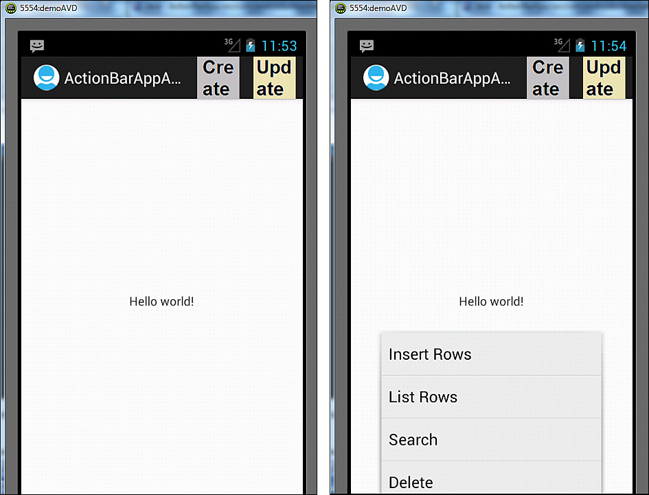
Figure 7.12. Screen on startup in portrait mode (left), and hidden actions, that is, Overflow Menu displayed (right)
On switching the device to landscape mode, we find that instead of two, four menu items appear in the ActionBar. Also, because there is enough space, the text of the menu items also appears along with the icons as shown in Figure 7.13 (left). Only two menu items of our menu could not be accommodated in the ActionBar, and hence they appear in the Overflow Menu as shown in Figure 7.13 (right).

Figure 7.13. ActionBar in landscape mode (left), and Overflow Menu displayed (right)
To display checkable menu items and submenus, and to apply shortcuts to the menu items in the same way as we did in the MenuApp application, we write the code as shown in Listing 7.25 in the activity_action_bar_app.xml. When compared with the code in Listing 7.5, only the code in bold is new; the rest is the same as in Listing 7.5.
Listing 7.25. Code Written into the Menu File activity_action_bar_app.xml
<menu xmlns:android="http://schemas.android.com/apk/res/android" >
<item android:id="@+id/create_datab"
android:title="Create Database"
android:icon="@drawable/create"
android:showAsAction="ifRoom|withText" />
<item android:id="@+id/insert_rows"
android:title="Insert Rows"
android:icon="@drawable/insert"
android:showAsAction="ifRoom" />
<item android:id="@+id/list_rows"
android:title="List Rows"
android:showAsAction="ifRoom" />
<item android:id="@+id/search_row"
android:title="Search"
android:icon="@drawable/search"
android:showAsAction="ifRoom|withText" >
<menu>
<group android:checkableBehavior="single">
<item android:id="@+id/search_code"
android:title="Search on Code"
android:checked="true" />
<item android:id="@+id/search_name"
android:title="Search on Name"
android:alphabeticShortcut="n"
android:numericShortcut="6" />
<item android:id="@+id/search_price"
android:title="Search on Price" />
</group>
</menu>
</item>
<item android:id="@+id/delete_row"
android:title="Delete"
android:showAsAction="never"
android:alphabeticShortcut="d"
android:checkable="true" />
<item android:id="@+id/update_row"
android:title="Update"
android:icon="@drawable/update"
android:showAsAction="always"
android:alphabeticShortcut="u"
android:numericShortcut="4" />
</menu>
We can see that the preceding code includes the android:showAsAction attribute to display the menu items in the ActionBar if the space permits. Also the <menu> element defined inside the Search menu item defines the submenu consisting of three menu items: Search on Code, Search on Name, and Search on Price. The Delete menu item appears as a checkable menu item, as the android:checkable attribute is set to the Boolean value true for this menu item. The android:alphabeticShortcut and the android:numericShortcut define shortcut keys of the menu items. The android:alphabeticShortcut attribute defines the shortcut key for the full keyboard, whereas the android:numericShortcut attribute defines the shortcut key from the numeric keypad.
To show a response when a menu item is selected, we need to define a TextView control in the layout file activity_action_bar_app.xml. After we define the TextView control, the layout file activity_action_bar_app.xml appears as shown in Listing 7.26.
Listing 7.26. Code Written into the Layout File activity_action_bar_app.xml
<LinearLayout xmlns:android="http://schemas.android.com/apk/res/android"
android:layout_width="match_parent"
android:layout_height="match_parent"
android:orientation="vertical" >
<TextView
android:layout_width="match_parent"
android:layout_height="wrap_content"
android:id="@+id/selectedopt" />
</LinearLayout>
To identify the TextView in Java code, it is assigned the ID selectedopt. To display the response when a menu item is selected, modify the file ActionBarAppActivity.java to appear as shown in Listing 7.27.
Listing 7.27. Code Written into the Java Activity File ActionBarAppActivity.java
package com.androidunleashed.actionbarapp;
import android.app.Activity;
import android.os.Bundle;
import android.view.Menu;
import android.view.MenuInflater;
import android.view.MenuItem;
import android.widget.TextView;
public class ActionBarAppActivity extends Activity {
private TextView selectedOpt;
@Override
public void onCreate(Bundle savedInstanceState) {
super.onCreate(savedInstanceState);
setContentView(R.layout.activity_action_bar_app);
selectedOpt=(TextView)findViewById(R.id.selectedopt);
}
@Override
public boolean onCreateOptionsMenu(Menu menu) {
MenuInflater inflater = getMenuInflater();
inflater.inflate(R.menu.activity_action_bar_app, menu);
return true;
}
@Override
public boolean onOptionsItemSelected(MenuItem item) {
switch (item.getItemId()) {
case R.id.create_datab:
selectedOpt.setText("You have selected Create Database option");
break;
case R.id.insert_rows:
selectedOpt.setText("You have selected Insert Rows option");
break;
case R.id.list_rows:
selectedOpt.setText("You have selected List Rows option");
break;
case R.id.search_row:
selectedOpt.setText("You have selected Search Row option");
break;
case R.id.delete_row:
selectedOpt.setText("You have selected Delete Row option");
break;
case R.id.update_row:
selectedOpt.setText("You have selected Update Row option");
break;
case R.id.search_code:
selectedOpt.setText("You have selected Search on Code option");
break;
case R.id.search_name:
selectedOpt.setText("You have selected Search on Name option");
break;
case R.id.search_price:
selectedOpt.setText("You have selected Search on Price option");
break;
}
return true;
}
}
Notice that the code shown in Listing 7.27 is the same as we saw in Listing 7.6 of the MenuApp application.
On running the application, we find the two menu items Create and Update appear as action items in the ActionBar (see Figure 7.14—left). When we select the Create action item, the TextView displays the message, You have selected Create Database option. The Overflow Menu appears as shown in Figure 7.14 (middle). You can observe that the Delete menu item appears as a checkable menu item. Again, when we select any menu item from the Overflow Menu, the respective text message appears through the TextView. When we select the Search menu item from the Overflow Menu, a Search submenu appears as shown in Figure 7.14 (right). The TextView confirms selection of the Search menu item by displaying the message You have selected Search Row option.

Figure 7.14. Message displayed on selecting the Create icon (left), message displayed on selecting the List Rows option (middle), and a submenu opens on selecting the Search menu item (right).
We know that the ActionBar appears in three forms: standard, tabbed, and list. The ActionBars that we have been working with until now are the standard form. Let’s now learn about the tabbed ActionBar.
Creating a Tabbed ActionBar
Tabbed and drop-down list ActionBars display menu items in the form of tabs and drop-down lists, respectively. They are popularly used for fragment transitions within an Activity. In tabbed and drop-down ActionBars, only one type of navigation can be enabled at a time. To display navigation tabs in an ActionBar, its setNavigationMode() method is called, passing the value ActionBar.NAVIGATION_MODE_TABS as a parameter as follows:
actionBar.setNavigationMode(ActionBar.NAVIGATION_MODE_TABS);
After we determine the navigation mode, we add the tabs to the ActionBar by calling its addTab() method:
actionBar.addTab(actionBar.newTab().setText("Create").setTabListener(this));
The preceding code creates a new tab, sets its text to Create, attaches a TabListener to it, and finally adds the newly created tab to the ActionBar. Just as the setText() method used in the preceding code sets the text of the tab, we can also call the setIcon() method to define an image for the tab. Besides this, we can also call the setContentDescription() method to supply more detailed information of the tab.
Example:
Tab tab1 = actionBar.newTab();
tabOne.setText("Create")
.setIcon(R.drawable.ic_launcher)
.setContentDescription("Creating the Database")
.setTabListener(this));
actionBar.addTab(tab1);
The preceding code adds a tab with the text Create to the tabbed ActionBar. The icon assigned to the tab is the default icon ic_launcher, and a detailed description assigned is “Creating the Database” to inform the user about the purpose of the tab. When we click a tab, the event is handled by the TabListener that performs the desired task.
We can better understand the concept of the tabbed ActionBar by a running example. So, create a new Android project called TabbedActionBarApp. In this application, we create two tabs, Create and Update. When either tab is selected, a respective log message is displayed. In the Java Activity file of the application, TabbedActionBarAppActivity.java, write the code as shown in Listing 7.28.
Listing 7.28. Code Written into the Java Activity File TabbedActionBarAppActivity.java
package com.androidunleashed.tabbedactionbarapp;
import android.app.Activity;
import android.os.Bundle;
import android.app.ActionBar;
import android.app.ActionBar.Tab;
import android.app.FragmentTransaction;
import android.util.Log;
public class TabbedActionBarAppActivity extends Activity implements ActionBar.Tab-
Listener {
@Override
public void onCreate(Bundle savedInstanceState) {
super.onCreate(savedInstanceState);
final ActionBar actionBar = getActionBar();
actionBar.setNavigationMode(ActionBar.NAVIGATION_MODE_TABS);
actionBar.setDisplayShowTitleEnabled(false);
actionBar.addTab(actionBar.newTab().setText("Create").setTabListener(this));
actionBar.addTab(actionBar.newTab().setText("Update").setTabListener(this));
}
@Override
public void onTabReselected(Tab tab, FragmentTransaction ft) {
Log.d("Tab", String.valueOf(tab.getPosition()) + " re-selected");
}
@Override
public void onTabSelected(Tab tab, FragmentTransaction ft) {
Log.d("Tab", String.valueOf(tab.getPosition()) + " selected");
}
@Override
public void onTabUnselected(Tab tab, FragmentTransaction ft) {
Log.d("Tab", String.valueOf(tab.getPosition()) + " Unselected");
}
}
In the preceding code, we can see that an ActionBar object, actionBar, is created by calling the getActionBar() method. To make the ActionBar appear in the form of tabs, its navigation mode is set to ActionBar.NAVIGATION_MODE_TABS. The Activity title is made invisible by passing the Boolean value false to the setDisplayShowTitleEnabled() method. Thereafter, two tabs with the text Create and Update are respectively created and added to the ActionBar. The event listener TabListener is associated with both the tabs. When either tab is selected, the onTabSelected() method is invoked, and the selected tab is passed to it as a parameter. The onTabSelected() method displays the log message informing the position of the selected tab. The position of the tab is zero numbered; that is, the first tab is considered to have the position 0, the second tab has the position 1, and so on. When a tab is selected, the onTabUnselected() method is also called, and the other tab that is not selected is passed to it as the parameter. The onTabUnselected() method displays the position of the other tab that is not selected. On running the application, we find the tabbed ActionBar showing two tabs as shown in Figure 7.15 (left). When we select the first tab, Create, the log messages 1 Unselected and 0 selected are displayed confirming that the first tab, Create, is selected and the second tab, Update, is unselected. Similarly, when we select the second tab, Update, the log messages 0 Unselected and 1 selected are displayed as shown in Figure 7.15 (right).
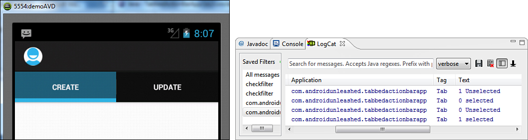
Figure 7.15. Screen showing two tabs in the tabbed ActionBar (left), and log messages displayed on selecting the action tabs (right)
After understanding the tabbed ActionBar, let’s learn how the drop-down list ActionBar is created.
Creating a Drop-Down List ActionBar
In a drop-down list ActionBar, the menu items are displayed in the form of a drop-down list. It is popularly used for displaying the content within an Activity on the basis of the selection made by the user. To display a drop-down list in an ActionBar, its setNavigationMode() method is called, passing the value ActionBar.NAVIGATION_MODE_LIST as a parameter to it as shown here:
actionBar.setNavigationMode(ActionBar.NAVIGATION_MODE_LIST);
The drop-down list as expected appears like a spinner, displaying a list of available options, allowing us to select one of them. For displaying options in the drop-down list, we use the Adapter that implements the SpinnerAdapter interface, like an ArrayAdapter or SimpleCursorAdapter. We use an ArrayAdapter in this application. Remember that an ArrayAdapter is the simplest of the adapters and acts as the data source for the selection widgets ListView, GridView, and so on. First, we define a string array containing the strings that we want to be displayed in the drop-down list. Thereafter, we create an ArrayAdapter that displays the elements of the array in the form of drop-down items. That is, the elements of the array are wrapped or cast into the spinner drop-down items. Finally, the ArrayAdapter is assigned to the ActionBar for displaying the menu items, that is, array elements in the form of drop-down menu items. To assign the ArrayAdapter to the ActionBar and to attach the event listener to the drop-down items that are displayed, the setListNavigationCallbacks() method is called, passing the adapter and OnNavigationListener to it as parameters as shown in the following code:
String[] items = new String[] { "Create", "Insert", "Update", "Search" };
ArrayAdapter<String> adapter = new ArrayAdapter<String>(this, android.R.layout.sim-
ple_spinner_dropdown_item, items);
ActionBar actionBar = getActionBar();
actionBar.setNavigationMode(ActionBar.NAVIGATION_MODE_LIST);
actionBar.setListNavigationCallbacks(adapter, onNavigationItemSelected);
In the preceding code, the string array items is defined consisting of the strings that we want to display in the drop-down list ActionBar. An ArrayAdapter called adapter is created comprising the string array items and casting the array elements in the spinner drop-down items. An ActionBar object actionBar is created and its navigation mode is set to ActionBar.NAVIGATION_MODE_LIST. The setListNavigationCallbacks() method is called on the actionBar passing the ArrayAdapter, adapter, and the listener, onNavigationSelected, to it as parameters. That is, we assign the callbacks to handle drop-down selections. When a user selects an item from the drop-down list, the onNavigationItemSelected handler is called where we can write the code to perform the desired action.
Let’s create a drop-down list ActionBar in an Android project. Create a new Android project called ListActionBarApp. In this application, we display a few menu items in the form of a drop-down list, and when any menu item is selected, a respective log message is displayed. In the Java Activity file of the application ListActionBarAppActivity.java, write the code as shown in Listing 7.29.
Listing 7.29. Code Written into the Java Activity File ListActionBarAppActivity.java
package com.androidunleashed.listactionbarapp;
import android.app.Activity;
import android.os.Bundle;
import android.app.ActionBar.OnNavigationListener;
import android.app.ActionBar;
import android.widget.ArrayAdapter;
import android.util.Log;
public class ListActionBarAppActivity extends Activity {
@Override
public void onCreate(Bundle savedInstanceState) {
super.onCreate(savedInstanceState);
String[] items = new String[] { "Create", "Insert", "Update", "Search" };
ArrayAdapter<String> adapter = new ArrayAdapter<String>(this,
android.R.layout.simple_spinner_dropdown_item, items);
ActionBar actionBar = getActionBar();
actionBar.setNavigationMode(ActionBar.NAVIGATION_MODE_LIST);
actionBar.setListNavigationCallbacks(adapter, onNavigationItemSelected);
}
OnNavigationListener onNavigationItemSelected = new OnNavigationListener() {
@Override
public boolean onNavigationItemSelected(int itemPosition, long itemId) {
Log.d("Option ", String.valueOf(itemId) + " is selected");
return true;
}
};
}
In the preceding code, we notice that when an item from the drop-down list is selected, the onNavigationItemSelected() method is called. The parameters itemPosition and itemId in the onNavigationItemSelected() method contain the information about the position and ID of the selected item. A log message is displayed in this method displaying the ID of the selected item. The IDs are sequentially assigned to the items in the drop-down list beginning with 0. To enable the ActionBar, don’t forget to set the value of the android:minSdkVersion attribute to 11 or higher in the AndroidManifest.xml file.
On running the application, we get a Spinner as shown in Figure 7.16 (top left). The Spinner shows the first item of the drop-down list, Create. The default style shows the first item in a dark color, which is almost invisible in the dark background color. Open the styles.xml file from the res/values folder and add a custom style called MyActionBar to it through the following statement:
<style name="MyActionBar" parent="@android:style/Widget.Holo.Light.ActionBar" />
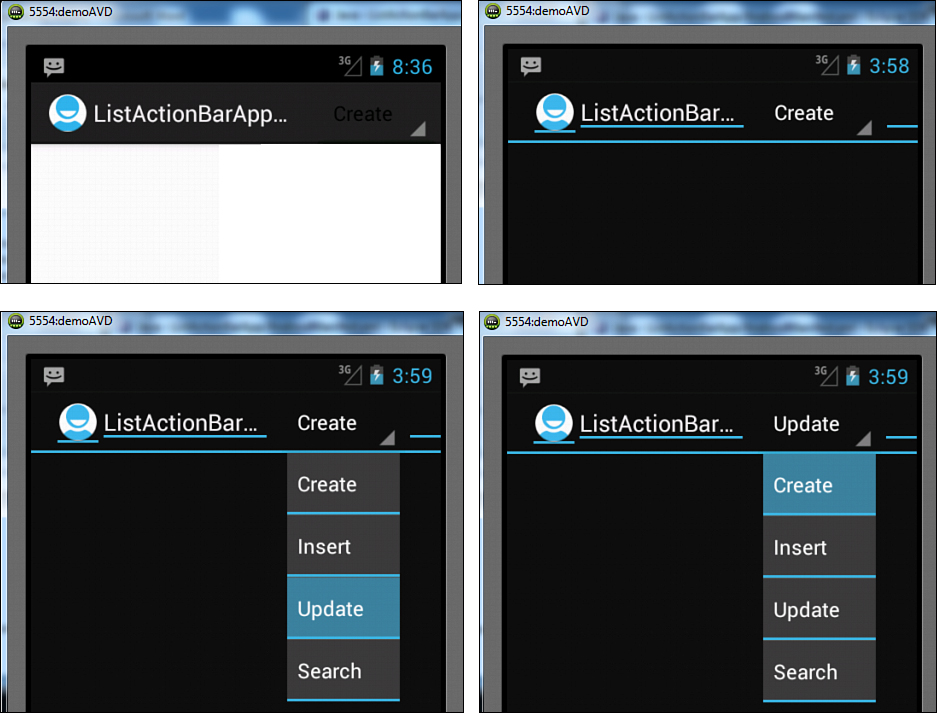
Figure 7.16. First Item of the spinner almost invisible (top left), first item of the spinner, Create, becomes visible (top right), all actions displayed on selecting the list (bottom left), and selected list item displayed at the header of the list (bottom right)
After we add this style, the styles.xml file appears as shown in Listing 7.30.
Listing 7.30. Code Written into the styles.xml File
<resources xmlns:android="http://schemas.android.com/apk/res/android">
<style name="AppTheme" parent="android:Theme.Light" />
<style name="MyActionBar" parent="@android:style/Widget.Holo.Light.ActionBar" />
</resources>
To implement the preceding style to our application, open the AndroidManifest.xml file and set the value of android:theme attribute as shown here:
android:theme="@style/MyActionBar"
The preceding statement applies the MyActionBar style to our application. The output now appears as shown in Figure 7.16 (top right).
When we select the Spinner, the drop-down list opens showing all the available items as shown in Figure 7.16 (bottom left). When we select an item, Update, it appears as the Spinner’s header as shown in Figure 7.16 (bottom right), informing that it was selected in the previous selection.
Figure 7.17 shows the log messages displayed on selecting the two items Update and Create from the drop-down list. The ID of the selected drop-down item is displayed using the itemId parameter in the onNavigationItemSelected() method.
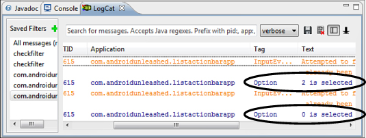
Figure 7.17. Log messages displayed on selecting the actions from the list ActionBar
Summary
In this chapter, we learned about different types of menus and saw how to create menus through XML, as well as by coding. We learned to create Options Menus, define Icon Menus, and handle menu selections. We saw how to define Expanded Menus, add Submenus, create Context Menus, and handle Context Menu selections. We learned to use check boxes and radio buttons in menus, add shortcut keys, and apply Context Menus to ListViews. We learned to create instant access menu items through ActionBars and also saw the procedure of creating tabbed and drop-down ActionBars.
In the next chapter we learn to use databases in Android applications. We use the SQLite SQLiteOpenHelper, fetching desired rows from the table and using cursors. We also learn to access databases through ADB and menus, creating data entry forms and displaying table rows through ListViews.