
4.4.3. Adding the GridLayout and Components
Using the techniques you learned in Chapter 3, you’ll build the GUI in Figs. 4.11–4.12. All of the steps in the following subsections assume that you’re working with the layout in the IDE’s Graphical Layout editor. As a reminder, it’s often easiest to select a particular GUI component in the Outline window.
You’ll start with the basic layout and controls, then customize the controls’ properties to complete the design. Use the Outline window to add components to the proper rows of the GridLayout. As you add GUI components, set their Ids as shown in Fig. 4.12—there are several components in this layout that do not require Ids, as they’re never referenced from the app’s Java code. Also, remember to define all your literal strings values in the strings.xml file (located in the app’s res/values folder).
Step 1: Changing from a RelativeLayout to a GridLayout
Follow the steps in Section 3.4.3 to remove the default TextView in the app’s layout and to switch from a RelativeLayout to a GridLayout.
Step 2: Configuring the GridLayout
In the Outline window, select the GridLayout and set the following properties—for each property that’s nested in a node within the Properties window, we specify the node’s name in parentheses following the property name:
• Id: @+id/gridLayout
• Column Count (GridLayout node): 1—Each GUI component nested directly in the GridLayout will be added as a new row.
The GridLayout fills the entire client area of the screen because the layout’s Width and Height properties (in the Layout Parameters section of the Properties window) are each set to match_parent by the IDE.
By default, the IDE sets the Padding Left and Padding Right properties to @dimen/activity_horizontal_margin—a predefined dimension resource in the dimens.xml file of the project’s res/values folder. This resource’s value is 16dp, so there will be a 16dp space to the left and right of the GridLayout. The IDE created this resource when you created the app’s project. Similarly, the IDE sets the Padding Top and Padding Bottom properties to @dimen/activity_vertical_margin—another predefined dimension resource with the value 16dp. So there will be a 16dp space above and below the GridLayout.
 Look-and-Feel Observation 4.1
Step 3: Creating the GridLayout’s First Row
This row contains only an EditText. Drag a Plain Text component from the Palette’s Text Fields section onto the GridLayout in the Outline window, then set its Id property to @+id/ queryEditText. In the Properties window’s TextView node, delete the Ems property’s value, which is not used in this app. Then use the Properties window to set the following properties:
• Width (Layout Parameters node): wrap_content
• Height (Layout Parameters node): wrap_content
• Gravity (Layout Parameters node): fill_horizontal—This ensures that when the user rotates the device, the queryEditText will fill all available horizontal space. We use similar Gravity settings for other GUI components to support both portrait and landscape orientations for this app’s GUI.
• Hint: @string/queryPrompt—Create a String resource as you did in prior apps and give it the value "Enter Twitter search query here". This attribute displays in an empty EditText a hint that helps the user understand the EditText’s purpose. This text is also spoken by Android TalkBack for users with visual impairments, so providing hints in your EditTexts makes your app more accessible.
Look-and-Feel Observation 4.2
• IME Options (TextView node): actionNext—This value indicates that query-EditText’s keyboard will contain a Next button that the user can touch to move the input focus to the next input component (i.e., the tagEditText in this app). This makes it easier for the user to fill in multiple input components in a form. When the next component is another EditText, the appropriate keyboard is displayed without the user having to touch the EditText to give it the focus.
Step 4: Creating the GridLayout’s Second Row
This row is a horizontal LinearLayout containing an EditText and an ImageButton. Perform the following tasks to build the row’s GUI:
1. Drag a LinearLayout (Horizontal) component from the Palette’s Layouts section onto the GridLayout in the Outline window.
2. Drag a Plain Text component from the Palette’s Text Fields section onto the LinearLayout, then set the Id property to @+id/tagEditText.
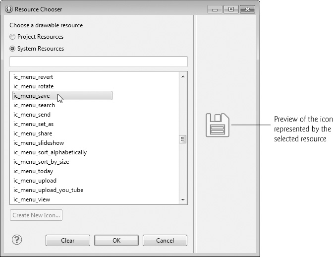
3. Drag an ImageButton component from the Palette’s Images & Media section onto the LinearLayout. This displays the Resource Chooser dialog (Fig. 4.13), so that you can choose the button’s image. By default, the dialog’s Project Resources radio button is selected so that you can choose images from the project’s resources (such images would be stored in your project’s various res/drawable folders). In this app, we used the standard Android save icon (shown at the right side of Fig. 4.13). To do so, click the System Resources radio button, select ic_menu_save and click OK. Next, set the Id property to @+id/saveButton.
With the tagEditText selected, remove the Ems property’s value from the TextView node in the Properties window. Then set the following properties:
• Width (Layout Parameters node): 0dp—The IDE recommends this value when you also set the Weight property, so that the IDE can lay out the components more efficiently.
• Height (Layout Parameters node): wrap_content
• Gravity (Layout Parameters node): bottom|fill_horizontal—This aligns the bottom of the tagEditText with the bottom of the saveButton and indicates that tagEditText should fill the available horizontal space.
• Weight (Layout Parameters node): 1—This makes the tagEditText more importance than the saveButton in this row. When Android lays out the row, the saveButton will occupy only the space it needs and the tagEditText will occupy all remaining horizontal space.
• Hint: @string/tagPrompt—Create a String resource with the value "Tag your query".
• IME Options (TextView node): actionDone—This value indicates that query-EditText’s keyboard will contain a Done button that the user can touch to dismiss the keyboard from the screen.
With the saveButton selected, clear the value of the Weight property (Layout Parameters node) then set the following properties:
• Width (Layout Parameters node): wrap_content
• Height (Layout Parameters node): wrap_content
• Content Description: @string/saveDescription—Create a string resource with the value "Touch this button to save your tagged search".
Look-and-Feel Observation 4.3
Step 5: Creating the GridLayout’s Third Row
This row is a vertical LinearLayout containing a TextView and a ListView. Perform the following tasks to build the row’s GUI:
1. Drag a LinearLayout (Vertical) component from the Palette’s Layouts section onto the GridLayout in the Outline window.
2. Drag a Medium Text component from the Palette’s Form Widgets section onto the LinearLayout. This creates a TextView that’s preconfigured to display text in the theme’s medium-sized text font.
3. Drag a ListView component from the Palette’s Composite section onto the LinearLayout, then set the Id property to @android:id/list—recall that this is the required Id for the ListView in a ListActivity’s custom layout.
With the vertical LinearLayout selected, set the following properties:
• Height (Layout Parameters node): 0dp—The actual height is determined by the Gravity property.
• Gravity (Layout Parameters node): fill—This tells the LinearLayout to fill all available horizontal and vertical space.
• Top (located in the Layout Parameters node’s Margins node): @dimen/activity_vertical_margin—This separates the top of the vertical LinearLayout from the horizontal LinearLayout in the GUI’s second row.
• Background (View node): @android:color/holo_blue_bright—This is one of the predefined color resources in the app’s Android theme.
• Padding Left/Right (View node): @dimen/activity_horizontal_margin—This ensures that the components in the vertical LinearLayout are inset by 16dp from the left and right edges of the layout.
• Padding Top (View node): @dimen/activity_vertical_margin—This ensures that the top component within the vertical LinearLayout is inset by 16dp from the top edge of the layout.
With the vertical TextView selected, set the following properties:
• Width (Layout Parameters node): match_parent
• Height (Layout Parameters node): wrap_content
• Gravity (Layout Parameters node): fill_horizontal—This makes the TextView fill the width of the vertical LinearLayout (minus the padding in the layout).
• Gravity (TextView node): center_horizontal—This centers the TextView’s text.
• Text: @string/taggedSearches—Create a string resource with the value "Tagged Searches".
• Padding Top (View node): @dimen/activity_vertical_margin—This ensures that the top component within the vertical LinearLayout is inset by 16dp from the top edge of the layout.
With the ListView selected, set the following properties:
• Width (Layout Parameters node): match_parent
• Height (Layout Parameters node): 0dp—The IDE recommends this value when you also set the Weight property, so that the IDE can lay out the components more efficiently.
• Weight (Layout Parameters node): 1
• Gravity (Layout Parameters node): fill—The ListView should fill all available horizontal and vertical space.
• Padding Top (View node): @dimen/activity_vertical_margin—This ensures that the top component within the vertical LinearLayout is inset by 16dp from the top edge of the layout.
• Top and Bottom (located in the Layout Parameters node’s Margins node): @dimen/tagged_searches_padding—Create a new tagged_searches_padding dimension resource by clicking the ellipsis button to the right of the Top property. In the Resource Chooser dialog, click New Dimension... to create a new dimension resource. Specify tagged_searches_padding for the Name and 8dp for the Value and click OK, then select your new dimension resource and click OK. For the Bottom property, simply select this new dimension resource. These properties ensure that there is an 8dp margin between the TextView and the top of the ListView and between the bottom of the ListView and the bottom of the vertical LinearLayout.