
Chapter 9. Polishing with Animations
Animations have slowly become more and more important in apps. Not long ago, it was common for all actions to have sudden and nonobvious consequences, but animations have become an expectation now. Material Design has placed particular emphasis on the fluidity of design, making it more important than ever to include animations in your app.
Purpose of Animations
Many people mistakenly assume animations are just there for show or that they are just “eye candy” of some sort, but animations are a major part of user experience. They can certainly make an app feel more fun, but the real purpose is to explain changes to users. The past few chapters have been about overall hierarchy answering questions of how the app is organized and how screens are organized, but that doesn’t answer the question of how you transition from one screen to the next or how you change from one state to the next.
If the user submits a form and there’s an error, having the message suddenly somewhere on the screen means the user has to hunt for what changed. Although errors are a particularly good case for animation (they’re unexpected, so the extra guidance is even more useful), animations can be beneficial even with normal interactions. Tapping a list item should push the unrelated items off the screen, animate any changes to the content that is staying (such as the thumbnail and title of the item that was tapped), and then bring in the new content. Animating the content in this way creates a sense of continuity that you don’t get when you just drop all the new content in with one single motion.
Now might be a good time to play with a few of your favorite apps and pay attention to the animations. When you tap an email in Gmail’s list, the app bar updates based on what’s applicable to the detail page, the other emails go away, and the subject of the email you tapped animates to the top. When you tap an app in Google Play, the icon animates up into place and the top background uses a circular reveal. As you explore apps paying particular attention to animations, you’ll likely also notice that there are still quite a few quirks like a toolbar flickering or font sizes changing suddenly. With many developers and designers paying more attention to animations than before and various libraries changing to better support animations, some of these growing pains can stand out.
View Animations
View animations were the primary animation method in Android originally and they’re supported by all versions of Android. They basically work as tween animations, which means you specify a start and an end state and the states in between are calculated. For instance, you might specify that a view starts fully transparent and ends as a fully opaque view. With a linear animation, your view would be about halfway transparent at the midpoint. These tween animations support changes in transparency (alpha), size (scale), position (translate), and rotation (rotate).
With view animations, you can also supply an interpolator, which adjusts how far along an animation is at a given time. Interpolators work by taking a float as an input that is between 0 (the start of the animation) and 1.0 (the end of the animation) and returning a float that is the modified position. The returned float can return values outside of the start and end positions, which can allow the animation to undershoot and overshoot the start and end points. For example, you might have a view that’s supposed to move 100dp to the right. An interpolator might cause the view to go to 120dp and then come back to the left 20dp.
Note
View animations affect the drawing of the view, not the actual positioning. This means that if you animate a button from the left side of the screen to the right side, the click listening will still be happening on the left side despite the fact that the button appears to be on the right side. To avoid that problem, either use property animations or adjust the layout positioning within the parent after the animation has completed.
View animations are also limited to the bounds of the parent view. This means that if you are animating an image that exists inside a ViewGroup that takes up the upper half of the screen, the image cannot animate to the bottom half of the screen (the view will be clipped if it exceeds the bounds of the parent).
Many views take advantage of view animations, such as the ViewAnimator class and its subclasses. These classes make it easy to crossfade between a loading indicator and the content view, for example, but they cannot do things such as animate the background of a view between two colors or affect objects that aren’t views. Generally speaking, you don’t need to use view animations anymore if the minimum version of Android that you’re supporting is 3.0 or newer. Property animations came to Android at that point and have significant advantages, including that they can actually affect the position of the view and not just where it is drawn.
Property Animations
In Android 3.0 (Honeycomb), the property animation system was introduced. The idea is that you can animate any property (a field or class variable) of any object, so they can do the same things as view animations and a whole lot more. At time of writing, devices running a version of Android older than 3.0 account for about 4% of all devices accessing Google Play.
Note
The property animation system was introduced in API level 11, so this means that you need to avoid using any of these classes on previous versions of Android. If your app supports older versions of Android, consider using the NineOldAndroids library by Jake Wharton (available at http://nineoldandroids.com/), which makes these objects available for Android 1.0 apps and up.
The first class to know for property animation is the ValueAnimator. This class handles all the timing and the value computations. It also keeps track of whether the animation repeats, what listeners should be notified of the new values, and more. This class does not directly modify any properties; it just supplies the mechanism for doing so, which means is helpful for a variety of use cases.
The next class to know about will make your life a lot easier. The ObjectAnimator is a subclass of ValueAnimator that allows you to specify an object that has properties to animate. This object needs a setter method for that property (so if you want to animate “alpha,” the object needs a setAlpha method) that can be called for each update. If you do not specify a starting value, it also needs a getter method (e.g., getAlpha()) to determine the starting point and the range of animation.
Taking a look at a simple example will help clarify how to use an ObjectAnimator. If you wanted to animate a view from fully opaque to fully transparent and back again over the course of 5 seconds, how much code would be required? See Listing 9.1 for the answer.
Listing 9.1 A Simple ObjectAnimator Example
final ObjectAnimator anim = ObjectAnimator.ofFloat(myView, "alpha", 1f, 0f, 1f);
anim.setDuration(5000);
anim.start();
As you can see, the code required is quite minimal. You create an ObjectAnimator by using the static ofFloat method. The first value passed is the object to animate. The second value is the name of the property to animate. The rest of the values are the floats to animate among. You can specify just one float, in which case the value is assumed to be the end animation value and the begin value will be looked up by calling getAlpha in this case. The setDuration method takes the number of milliseconds to animate for.
You can also combine multiple animations. For instance, you might want to animate a view to the right 200 pixels and down 50 pixels at the same time. In this case, you create the two ObjectAnimator instances and combine them with an AnimatorSet by calling the playTogether method with both animations (alternatively, you could call playSequentially to play one and then the other). The code looks like Listing 9.2.
Listing 9.2 Combining Animations with AnimationSet
ObjectAnimator animX = ObjectAnimator.ofFloat(myView, "x", 200f);
ObjectAnimator animY = ObjectAnimator.ofFloat(myView, "y", 50f);
AnimatorSet animationSet = new AnimatorSet();
animationSet.setDuration(5000);
animationSet.playTogether(animX, animY);
animationSet.start();
You can actually make this a bit more efficient by using PropertyValueHolder objects, but there is an even better way called ViewPropertyAnimator, which is covered a little later in the chapter.
Property Animation Control
Property animations are very powerful and quite flexible. You can trigger events that occur at specific times within the animation such as when it first starts or when it begins to repeat. You can use custom type evaluators to animate any kind of property instead of just floats and integers. Interpolators allow you to specify custom curves or changes to the animation speeds and values. You can even use key frames to define an exact state for a given moment within a greater animation.
Listeners
You will commonly use listeners to trigger events related to animations. For instance, you might animate the alpha (transparency) of a view until it is gone and use a listener to actually remove that view from the view hierarchy at the end of the animation.
AnimatorListener allows you to receive the high level events for the animation including when it starts, stops, ends, and repeats. Animator (such as ValueAnimator or ObjectAnimator) has an addListener method that lets you add any number of AnimatorListener instances. In many cases you only need to implement one or two of these methods, so it can be handy to know about AnimatorListenerAdapter. That class implements all of the interface’s methods with stubs, so you can just override whichever ones you need.
If you use ValueAnimator directly, you will use AnimatorUpdateListener to receive an update for every frame of an animation. Your implementation of onAnimationUpdate will be called so that you can call getAnimatedValue to the most recent animation value and apply that to whatever you need for your animation.
Type Evaluators
Android supports animating ints, floats, and colors. These are supported with the IntEvaluator, FloatEvaluator, and ArgbEvaluator respectively. If you’re animating from 0 to 100, the IntEvaluator tells Android what value to use at a given point; at 50%, the animation will give a value of 50. What about 50% of an arbitrary object though? You can create your own custom TypeEvaluator to handle these situations. There is a single method to implement called evaluate that takes the percent through the animation as a float between 0 and 1 (so 50% would be 0.5f), the start value, and the end value. A simple example might animate between an empty string and the string “Animation!” The evaluator could return the portion of the string represented by the percent (50% would return “Anima”), allowing you to actually animate the characters in a TextView, for instance, using the same mechanism you use for animating the position or alpha of that view.
Let’s make a simple TypeEvaluator subclass that handles CharSequence instances called CharSequenceEvaluator, which would let us animate more representations of text, including strings. The evaluator needs to handle empty text or a null value as well as if one of the CharSquence instances is longer than the other. The overall goal is to animate from one bit of text to the other by taking the initial value (say, the word “Bacon”) and replacing characters as it works toward the final value (e.g., “Power”). At 40% into the animation, it should be taking the first 40% of the final value’s characters (“Po” in our example) and the rest from the initial value (the “con” from “Bacon”), creating a mix of the characters (“Pocon”) until it eventually transitions fully to the final value.
First, we need to handle some edge cases. A developer using the code might accidentally animate from an empty text value or null to an empty text value or null. We should immediately check the lengths of the CharSequence start and end values and just return if they’re both empty. In our evaluate method, we may be given a float that’s less than 0 or greater than 1. This might seem strange (How can you be less than 0% or more than 100% of the way through an animation?), but this allows supporting what’s called anticipating (values under 0%) and overshooting (values over 100%) with interpolators, which are covered more shortly. If you were animating a box from the left side of the screen to the right side, you might want it to actually go a little past the right side (overshoot) and then come back to where it is supposed to end up. This can be used for different effects, such as making the object appear to move so fast that it can’t slowdown in time, but this doesn’t make much sense for our CharSequenceEvaluator. What do you show if you’re beyond the final CharSequence? Instead of figuring that out, we’ll just return the full starting CharSequence if we receive a float of less than 0 and the full ending CharSequence if we receive a float of more than 1.
The bulk of the evaluate method just figures out how many characters have changed by multiplying the length of the longer CharSequence by the float that’s passed in and then uses that many characters from the final value and the remainder from the initial value (remember, because the animation is starting at the first character of the text and working toward the end, the end portion will come from the initial value; you could just as easily make a type evaluator that animates from the last character to the first if that’s what you wanted). In cases where the final value isn’t as long as the initial value (such as if you were animating from “Suitcase” to “Food”), once the animation has gone far enough to display all of the final value, it displays fewer and fewer of the initial value’s characters almost as if someone were pressing the delete key (so you’d see “Foodcase” and then “Foodase” and so forth). Listing 9.3 shows the source code for the CharSequenceEvaluator.
Listing 9.3 The CharSequenceEvaluator
public class CharSequenceEvaluator implements TypeEvaluator<CharSequence> {
@Override
public CharSequence evaluate(float fraction, CharSequence startValue, CharSequence endValue) {
final int initialTextLength = startValue == null ? 0 : startValue.length();
final int finalTextLength = endValue == null ? 0 : endValue.length();
// Handle two empty strings because someone's probably going to do this for some reason
if (initialTextLength == 0 && finalTextLength == 0) {
return endValue;
}
// Handle anticipation
if (fraction <= 0) {
return startValue;
}
// Handle overshooting
if (fraction >= 1f) {
return endValue;
}
// Fraction is based on the longer CharSequence
final float maxLength = Math.max(initialTextLength, finalTextLength);
final int charactersChanged = (int) (maxLength * fraction);
if (charactersChanged == 0) {
// Handle anything that rounds to 0
return startValue;
}
if (finalTextLength < charactersChanged) {
// More characters have changed than the length of the final string
if (finalTextLength == 0) {
// Moving toward no string, so just substring the initial values
return startValue.subSequence(charactersChanged, initialTextLength);
}
if (initialTextLength <= charactersChanged) {
// Use the endValue because the startValue has been passed
return endValue.subSequence(0, charactersChanged);
}
// Both CharSequences have characters to use
return endValue + startValue.subSequence(charactersChanged, initialTextLength).toString();
}
// endValue is longer than the number of characters that have changed
if (initialTextLength <= charactersChanged) {
// Already animated away start, use fraction of end
return endValue.subSequence(0, charactersChanged).toString();
}
return endValue.subSequence(0, charactersChanged).toString() + startValue.subSequence(charactersChanged, initialTextLength);
}
}
One thing to keep in mind when creating an evaluator is that you want things to be as efficient as possible. Each call of the evaluate method is milliseconds after the previous one, so you don’t want to create and throw away objects if you can help it.
Time Interpolators
Animations use a concrete implementation of the TimeInterpolator interface. An interpolator has a very simple purpose defined by a single method, getInterpolation, and that is to take in a float and return a float. This allows you to have animations that aren’t linear. The animator will tell the interpolator how much of the animation is finished (again as a float between 0 and 1) and the interpolator will give a different float that is used by the type evaluator to determine how far along the animation is.
An example will make this clearer. For instance, if you create an interpolator that just takes the input value, multiplies it by itself, and returns the result, consider how that affects the numbers coming out. When the animation is 10% done, the animator will ask the interpolator for its interpolation of 0.1f. The interpolator will multiply that by itself, which returns 0.01f. That value is passed to your type evaluator to get a new value. This means that if you were animating a box 100px, at 10% it would go just 1px. When it’s 20% done, the interpolator is going to multiply 0.2f by itself and get 0.04f, so the box will be 4px from the starting point. At 30% done, the interpolator will return 0.09f (0.3f times 0.3f) and 0.16f at 40%. You can start to see that each step of the way the amount that the box moves will be more and more significant. At 80% it will have moved 64px and at 90% it will have moved 81px. By simply returning the value multiplied by itself, you create a basic accelerating interpolator.
Android offers several interpolators, so you rarely have to make one yourself. Table 9.1 shows the interpolators that are available, but don’t be afraid to make your own. The source code for this book has an AnimationExamples project in the chapter09 folder. You can run it to easily test any of these interpolators with different durations.
Key Frames
In the animation world outside of Android, key frames are the important frames of an animation. They mark the beginning and end of a single smooth motion (such as a car traveling from the left side of the screen to the right side). Android mirrors this concept with the Keyframe class, which contains the values an animation should have at a particular time. In most cases, you won’t need to directly interact with this class. Behind the scenes, an IntKeyframe, FloatKeyframe, or ObjectKeyframe (all are static inner classes of the abstract Keyframe class) will be created for you as necessary. If you want to precisely control your animations, you can use the static methods of Keyframe to pass in a time (expressed as a float where 0 is the start of the animation and 1 is the end) and a value and get back a Keyframe instance to use in your animation. Listing 9.4 demonstrates how you can use key frames to animate the rotation of a view from 0 degrees to 90 degrees, hesitate briefly, and then animate back from 90 degrees to 0 degrees. The full source for this demo is in the KeyframeDemo project within the chapter09 source code.
Listing 9.4 A Simple Demonstration of the Keyframe Class
public class MainActivity extends AppCompatActivity implements View.OnClickListener {
@Override
protected void onCreate(Bundle savedInstanceState) {
super.onCreate(savedInstanceState);
setContentView(R.layout.activity_main);
final Toolbar toolbar = (Toolbar) findViewById(R.id.toolbar);
setSupportActionBar(toolbar);
findViewById(R.id.button).setOnClickListener(this);
}
@Override
public void onClick(final View button) {
button.setEnabled(false);
View icon = findViewById(R.id.icon);
Keyframe keyframe1 = Keyframe.ofFloat(0f, 0f);
Keyframe keyframe2 = Keyframe.ofFloat(.4f, 90f);
Keyframe keyframe3 = Keyframe.ofFloat(.6f, 90f);
Keyframe keyframe4 = Keyframe.ofFloat(1f, 0f);
PropertyValuesHolder propertyValuesHolder = PropertyValuesHolder.ofKeyframe("rotation", keyframe1, keyframe2, keyframe3, keyframe4);
ObjectAnimator rotationAnim = ObjectAnimator.ofPropertyValuesHolder(icon, propertyValuesHolder);
rotationAnim.setDuration(5000);
rotationAnim.addListener(new AnimatorListenerAdapter() {
@Override
public void onAnimationEnd(Animator animation) {
button.setEnabled(true);
}
});
rotationAnim.setInterpolator(new AccelerateDecelerateInterpolator());
rotationAnim.start();
}
}
ViewPropertyAnimator
In Android 3.1, the Android team introduced the ViewPropertyAnimator. By calling animate() on any View object, you get a ViewPropertyAnimator that has simple methods for changing alpha, rotation, scale, translation, and so on. Each of these methods returns the ViewPropertyAnimator, so you can easily chain several methods together. Take a look at Listing 9.5 to see how simple the code can become.
Listing 9.5 Using ViewPropertyAnimator
myView.animate().setDuration(5000).x(200f).y(50f).start();
The animation that was already impressive at just six lines can now be just one (shown on multiple lines here for readability). What’s even more impressive is that, behind the scenes, this superconcise code is even more efficient than the previous example!
In many cases, ViewPropertyAnimator will give you everything you want. You can animate all the typical properties as well as set the interpolator, update listener, end or start actions, and more.
Animating Form Errors
Form errors are a common element to apps that need animation, especially because they usually represent a minor change to an existing page. You generally have two considerations with a form error: (1) Ensure the error catches the user’s eye and (2) Ensure the error is visible on the screen. For the first consideration, you should make your errors red (#DD2C00) unless that clashes with your background. You should also animate them in when possible. In most cases, a simple alpha animation from 0f to 1f will be sufficient. For the second consideration, you need to see if the form error is on the screen. If not, scroll it onto the screen. Smoothly scrolling to the first (top-most) error is generally preferable. It allows the user to understand the spatial change and potentially see other errors during the scroll. For instance, in a ScrollView, you can simply call smoothScrollTo with the x and y coordinates (generally, this will be 0 for x, and simply the y position of the view with an error).
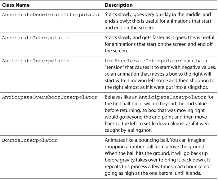
The Android design library makes it easy to handle errors and use a UI pattern called “float label,” shown in Figure 9.1. The float label pattern is when you have an area to input text (generally an EditText in the case of Android) and there is no label. Instead, the area where you input text has a hint that suggests what you should type. Depending on the implementation, either selecting that view or typing in it causes the hint to animate away and become the label itself. The advantage of this pattern is that it allows you to significantly compact forms. The disadvantage is that the labels and hints have to be the same, which is often less useful (e.g., a traditional form field might have a label of “email address” but the hint would have “[email protected]”). If you find that the float label pattern works for your needs, the TextInputLayout from the design library makes this easy. Listing 9.6 shows a simple layout that implements two TextInputLayout instances surrounding EditText views. Remember that you need to include the design library in your build.gradle file (compile 'com.android.support:design:22.2.1’). Given how rapidly all the support libraries have been developing, there is likely to be a newer version out by the time you read this. In general, you should use the newest version available but older versions remain available in case code depended on something that later changed.
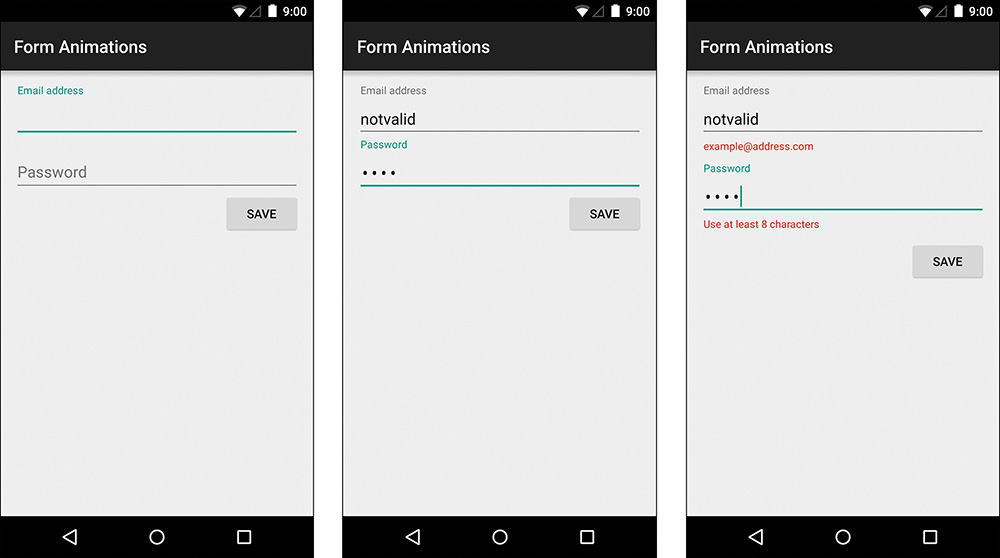
Figure 9.1 Float labels showing the initial state (left), the completed state (center), and the error state (right)
Listing 9.6 A Layout Containing a Simple Form
<LinearLayout xmlns:android="http://schemas.android.com/apk/res/android"
xmlns:tools="http://schemas.android.com/tools"
android:layout_width="match_parent"
android:layout_height="match_parent"
android:paddingLeft="@dimen/activity_horizontal_margin"
android:paddingRight="@dimen/activity_horizontal_margin"
android:paddingTop="@dimen/activity_vertical_margin"
android:paddingBottom="@dimen/activity_vertical_margin"
android:orientation="vertical"
tools:context=".MainActivity">
<android.support.design.widget.TextInputLayout
android:id="@+id/input_email"
android:layout_width="match_parent"
android:layout_height="wrap_content">
<EditText
android:id="@+id/email"
android:layout_width="match_parent"
android:layout_height="wrap_content"
android:hint="@string/email_hint"
android:inputType="textEmailAddress"/>
</android.support.design.widget.TextInputLayout>
<android.support.design.widget.TextInputLayout
android:id="@+id/input_password"
android:layout_width="match_parent"
android:layout_height="wrap_content">
<EditText
android:id="@+id/password"
android:layout_width="match_parent"
android:layout_height="wrap_content"
android:hint="@string/password_hint"
android:inputType="textPassword"/>
</android.support.design.widget.TextInputLayout>
<Button
android:id="@+id/button_save"
android:layout_width="wrap_content"
android:layout_height="wrap_content"
android:text="@string/save"
android:layout_gravity="end"/>
<TextView
android:id="@+id/success"
android:layout_width="wrap_content"
android:layout_height="wrap_content"
android:textAppearance="?android:attr/textAppearanceLarge"
android:text="@string/success"
android:visibility="gone"/>
</LinearLayout>
With just some simple logic to tie everything together in the activity, you can display error messages as needed. The TextInputLayout handles the animations with two simple methods. First, setError allows you to set the text to be displayed as an error. The setErrorEnabled method allows you to disable (or enable) the current error. With just a little code, it’s easy to check a field to make sure it’s an email address and another to check for a minimum length. Remember, getText on a TextView (which EditText extends) never returns null, so you can safely check the length without first checking for null. Listing 9.7 shows the activity code.
Listing 9.7 Activity Code for Handling Form Errors
public class MainActivity extends AppCompatActivity implements View.OnClickListener {
private static final int MIN_PASSWORD_LENGTH = 8;
private TextView mTextViewEmail;
private TextInputLayout mTextInputLayoutEmail;
private TextView mTextViewPassword;
private TextInputLayout mTextInputLayoutPassword;
private View mViewSuccess;
@Override
protected void onCreate(Bundle savedInstanceState) {
super.onCreate(savedInstanceState);
setContentView(R.layout.activity_main);
findViewById(R.id.button_save).setOnClickListener(this);
mTextInputLayoutEmail = (TextInputLayout) findViewById(R.id.input_email);
mTextViewEmail = (TextView) mTextInputLayoutEmail.findViewById(R.id.email);
mTextInputLayoutPassword = (TextInputLayout) findViewById(R.id.input_password);
mTextViewPassword = (TextView) mTextInputLayoutPassword.findViewById(R.id.password);
mViewSuccess = findViewById(R.id.success);
}
@Override
public void onClick(View v) {
boolean hasError = false;
// Validate email address
if (Patterns.EMAIL_ADDRESS.matcher(mTextViewEmail.getText()).matches()) {
mTextInputLayoutEmail.setErrorEnabled(false);
} else {
mTextInputLayoutEmail.setError(getString(R.string.email_error));
hasError = true;
}
// Validate password
if (mTextViewPassword.getText().length() >= MIN_PASSWORD_LENGTH) {
mTextInputLayoutPassword.setErrorEnabled(false);
} else {
mTextInputLayoutPassword.setError(getString(R.string.password_error));
hasError = true;
}
if (hasError) {
mViewSuccess.setVisibility(View.GONE);
} else {
mViewSuccess.setVisibility(View.VISIBLE);
}
}
}
Animating Icons
Chapter 4, “Adding App Graphics and Resources,” briefly covered using an AnimatedVectorDrawable to animate the path of a less-than symbol to a greater-than symbol. That’s worth exploring in a bit more detail. Many of your app icons are going to come from the giant collection of Material Design icons available (https://github.com/google/material-design-icons), so how do you animate between two arbitrary icons in this collection?
Animating Vector Icons
Just like Chapter 4, “Adding App Graphics and Resources,” showed, you need three files for a vector animation. You need the initial VectorDrawable (which uses the vector XML tag), the AnimatedVectorDrawable (which uses the animated-vector XML tag), and the ObjectAnimator (which uses the objectAnimator XML tag). Let’s look at this process a little closer. What are the steps to animate from the icon for left-aligned text to justified text?
First, create a new XML drawable with a vector root node called ic_align_left. Remember that the height and width are the size you want it to render to and the viewport height and width are the size of the SVG space. If you aren’t sure what the SVG space was, you can open the SVG file and look for the width and height attributes in the root svg node.
Create a single child path node. It needs a name (this is what the animation uses to target this node), so something simple like “lines” works. It needs the stroke and fill colors defined (black is fine for now). Finally, it needs the path data. Within the Material Design icons is a folder called “editor” (as in, icons typically used for a text editor). Depending on which version you check out, there may be a folder in there to open called “production.” Then you should see the “svg” folder. This is where the SVG versions of all editor icons reside. The icon for left-aligned text is called ic_format_align_left_48px.svg. The name of that means it is an icon (“ic”) for formatting (“format”) and the specific formatting it applies is align left. The 48px at the end means it is on a canvas of 48 units by 48 units (that’s the viewport width and height in your drawable). If you open this in a text editor, you should see something like Listing 9.8. Note that the icons are occasionally refreshed, which means that the exact contents might be different for you but the specific version seen here is included in the chapter09 folder of the source code for this book.
Listing 9.8 The SVG Contents of the Left-Aligned Icon
<svg xmlns="http://www.w3.org/2000/svg" width="48" height="48" viewBox="0 0 48 48">
<path d="M30 30h-24v4h24v-4zm0-16h-24v4h24v-4zm-24 12h36v-4h-36v4zm0 16h36v-4h-36v4zm0-36v4h36v-4h-36z"/>
<path d="M0 0h48v48h-48z" fill="none"/>
</svg>
The first path node has a d attribute that contains the path data for drawing the icon. Don’t worry about understanding it yet; just copy the contents from the SVG file to the pathData attribute in your vector drawable or into the strings file and reference it like any other string. Your ic_align_left file should look like Listing 9.9.
Listing 9.9 The ic_align_left Drawable
<?xml version="1.0" encoding="utf-8"?>
<vector xmlns:android="http://schemas.android.com/apk/res/android"
android:height="@dimen/icon_size"
android:width="@dimen/icon_size"
android:viewportHeight="48"
android:viewportWidth="48">
<path
android:name="lines"
android:strokeColor="#000000"
android:fillColor="#000000"
android:pathData="@string/svg_align_left" />
</vector>
You can use this drawable just like any other drawable, but there’s a bit more to do for animating it. Next create an AnimatedVectorDrawable XML file (it has the animated-vector root node) called ic_anim_align_left_justified.xml. This is a very small file that basically ties the previous drawable to an animation. It looks like Listing 9.10.
Listing 9.10 The ic_anim_align_left_justified Drawable
<?xml version="1.0" encoding="utf-8"?>
<animated-vector xmlns:android="http://schemas.android.com/apk/res/android"
android:drawable="@drawable/ic_align_left">
<target
android:animation="@animator/align_left_justified"
android:name="lines" />
</animated-vector>
Now comes the align_left_justified.xml animator, which goes in the “animator” folder. It is an object animator that gives the duration of the animation and the values to animate from the align-left icon to the justified icon. The data for the valueTo node (which is the SVG data to animate to) comes from the ic_format_align_justify_48px.svg file. You should have something like Listing 9.11 for your animator.
Listing 9.11 The align_left_justified Animator
<?xml version="1.0" encoding="utf-8"?>
<objectAnimator xmlns:android="http://schemas.android.com/apk/res/android"
android:duration="300"
android:propertyName="pathData"
android:valueFrom="@string/svg_align_left"
android:valueTo="@string/svg_align_justify"
android:valueType="pathType">
</objectAnimator>
Next up, you need a layout to display this animation. An easy option is to make the AnimatedVectorDrawable the source of an ImageView. Then all you need is a trigger to start the animation. For demonstration purposes, you can simply add an OnClickListener to the ImageView and trigger the animation from there. Be sure to cast the drawable to an AnimatedVectorDrawable and then call the start method. Listing 9.12 demonstrates this.
Listing 9.12 Casting to an AnimatedVectorDrawable and Animating
public void onClick(View v) {
final ImageView imageView = (ImageView) v;
final AnimatedVectorDrawable avd = (AnimatedVectorDrawable) imageView.getDrawable();
avd.start();
}
Now, it’s time to tap that ImageView and enjoy the beautiful animation you put together. Wait. That animation isn’t what we want! Instead of the shorter lines growing to make the justified icon, lines are moving around in a confusing animation. Figure 9.2 shows a few frames of this.

What’s going on? Unfortunately, the order in which the lines are drawn in the two SVG files is not consistent. If you assumed that they were each drawn from top to bottom, you were mistaken. This presents a bit of a challenge. The whole point of using these existing SVG icons is so that you don’t have to draw them yourself. Fortunately, that bizarre SVG data can be changed directly.
SVG data isn’t really meant to be read by humans, but knowing just a few of the letters used can help a lot in understanding how you should modify the SVG to suit your needs. Letters symbolize commands. They’re followed by numbers that represent the coordinates. Capital letters are followed by absolute coordinates and lowercase letters are followed by relative coordinates. Table 9.2 shows the basic SVG path commands that you’ll commonly see. With the exception of the curve commands, these aren’t too farfetched.
Looking at the start of the path data for the left alignment SVG through the “z” command (which closes the path, you should see “M30 30h-24v4h24v-4z.” The first part of this (“M30 30h-24v4h24v-4z”) is a command to move 30 units to the right and 30 down. Next is the command to draw a horizontal line left 24 units (“M30 30h-24v4h24v-4z”). The “v” command comes after that, moving 4 units down (“M30 30h-24v4h24v-4z”). Another “h” command moves back to the right 24 units (“M30 30h-24v4h24v-4z”). A final “v” command moves up 4 units (“M30 30h-24v4h24v-4z”). The last command, “z,” marks this path as closed (“M30 30h-24v4h24v-4z”). It’s pretty obvious that reading SVG manually is a big hassle, but you should see that it’s not too complex if you take it one step at a time. Looking a little more at this SVG data, you can probably tell that the commands aren’t drawing the lines from top to bottom. Unlike raster-based image formats, SVG data can be in any order. Many drawing programs will put it in the order that you draw or create shapes, but some will change the order or make adjustments automatically.
Armed with a basic understanding of SVG commands, you can pretty easily (though extremely tediously) create your own graphics by hand. Fortunately, you usually don’t need to. Instead of using the SVG data for the icon that symbolized justified text, you can easily modify the SVG commands from the left alignment path that way all the lines will be drawn in a consistent order and you only have to adjust the size of the lines. You know that the shorter lines are 24 units across and the longer ones are 36 (24 + 12) based on the “h” commands. Starting off with the initial move command, you should increase the movement to 42 (30 + 12). Now just change every instance of 24 to 36 and the SVG data suddenly looks just like the icon for justified alignment. Now you can run the app and see the animation work correctly. The shorter lines simply grow until they are as long as the other lines. Listing 9.13 shows the paths excerpted from the strings file, so you can see how the left-align path is changed to make the justified path. This might be a bit confusing, so it can be helpful to open the SVG file in a browser and a text editor. Make changes to the text and then refresh the browser to see how that affects the rendered icon.
Listing 9.13 The Two Strings That Represent the Icons
<string name="svg_align_left">M30 30h-24v4h24v-4zm0-16h-24v4h24v-4zm-24 12h36v-4h-36v4zm0 16h36v-4h-36v4zm0-36v4h36v-4h-36z</string>
<string name="svg_align_justify">M42 30h-36v4h36v-4zm0-16h-36v4h36v-4zm-36 12h36v-4h-36v4zm0 16h36v-4h-36v4zm0-36v4h36v-4h-36z</string>
With that custom SVG data created, you should now be able to see the proper animation. Figure 9.3 shows some of the frames.

Animating Raster Icons
Most apps are going to have to support versions of Android prior to 5.0 for a while, so this means that you will have to decide how you want to handle supporting versions of Android that didn’t have AnimatedVectorDrawable. If you’re just rotating a vector, you can easily rotate a raster image instead, but what about when you’re morphing from one path to another? A good option is to create a frame-by-frame animation that mimics the experience. This works on all versions of Android, so it’s up to you whether you want to use frame-by-frame animation for all versions of Android or for all versions below 5.0 and use vector animation for 5.0 and newer.
The easiest way to do frame-by-frame animation is by using an AnimationDrawable that is specified in XML within an animation-list node. The child nodes will all be item nodes that typically have a drawable and a duration (in milliseconds) specified. Listing 9.14 shows an example.
Listing 9.14 The AnimationDrawable XML File
<?xml version="1.0" encoding="utf-8"?>
<animation-list xmlns:android="http://schemas.android.com/apk/res/android"
android:oneshot="true">
<item android:drawable="@drawable/ic_format_align_left_black_48dp"
android:duration="17" />
<item android:drawable="@drawable/ic_format_align_left_black_48dp_01"
android:duration="17" />
<item android:drawable="@drawable/ic_format_align_left_black_48dp_02"
android:duration="17" />
<item android:drawable="@drawable/ic_format_align_left_black_48dp_03"
android:duration="17" />
<item android:drawable="@drawable/ic_format_align_left_black_48dp_04"
android:duration="17" />
<item android:drawable="@drawable/ic_format_align_left_black_48dp_05"
android:duration="17" />
<item android:drawable="@drawable/ic_format_align_left_black_48dp_06"
android:duration="17" />
<item android:drawable="@drawable/ic_format_align_left_black_48dp_07"
android:duration="17" />
<item android:drawable="@drawable/ic_format_align_left_black_48dp_08"
android:duration="17" />
<item android:drawable="@drawable/ic_format_align_left_black_48dp_09"
android:duration="17" />
<item android:drawable="@drawable/ic_format_align_left_black_48dp_10"
android:duration="17" />
<item android:drawable="@drawable/ic_format_align_left_black_48dp_11"
android:duration="17" />
<item android:drawable="@drawable/ic_format_align_justify_black_48dp"
android:duration="17" />
</animation-list>
Just like any drawable, you can use this as the background for a view or as the image that an ImageView displays. To trigger the animation, you simple get a reference to the drawable, cast it to an AnimationDrawable and call the start method (almost exactly the same process as with vectors). Listing 9.15 shows how to do this. The full source code for this example is in the RasterIconAnimations project of chapter09 folder.
Listing 9.15 Triggering the Frame-by-Frame Animation
public void onClick(View v) {
ImageView imageView = (ImageView) v;
AnimationDrawable animationDrawable = (AnimationDrawable) imageView.getDrawable();
animationDrawable.start();
}
Simple Transitions
In addition to animating individual views and images, Android supports animations to transition entire layouts. The simplest form is the LayoutTransition class, which was added in Android 3.0 when property animations first appeared. The general idea is that views animate in response to views appearing or views disappearing (this could be views being added and removed from the hierarchy or views transitioning from VISIBLE to GONE and vice versa). This means you can have up to four different animations: (1) the view appearing, (2) the view disappearing, (3) the view moving in response to a view appearing, and (4) the view moving in response to a view disappearing.
Like many things in Android, you can use layout transitions from XML or Java. By simply adding android:animateLayoutChanges="true" to your layout in XML, the LayoutTransition class will be used with all the default animations. If you want more control, you can create a LayoutTransition class in Java, configure it however you’d like, and then pass it into ViewGroup’s setLayoutTransition method.
As convenient as this method of animating layout transitions is, sometimes you’re animating between complete view hierarchies such as changing activities or fragments. Other times you need significantly more control or you want to swap out significant portions of the view hierarchy. Fortunately, Android also has mechanisms for handling all of those cases.
Scene Transitions
If you want to do something more complicated than a basic layout transition, Android’s Scene class will come in handy. It was introduced in Android 4.4 with the idea of making transitions much more powerful while still very easy (if you’re supporting previous versions of Android, third party libraries that add backward compatibility are available such as the Transitions Everywhere library https://github.com/andkulikov/transitions-everywhere). The idea is that a scene represents a portion of the view hierarchy at a particular point in time. You have another scene that represents a portion of the view hierarchy that generally has some elements in common (though it doesn’t have to). You can easily tell Android, “Animate from this first scene to the second scene,” and everything is handled for you. Android will compare which views are in both scenes (and if properties change on them) and which are in one scene and not the other. This allows Android to fade out a view that is not in the second scene but keep a view in place that doesn’t change regardless of how else the view hierarchy may have changed. You can also override transitions and add actions that are triggered when scenes enter or leave.
For a simple example, let’s create two layouts. The first, scene1.xml, is a RelativeLayout with a TextView (set at the bottom left of the parent) and an ImageView that’s a 48dp square at the top left. Listing 9.16 shows this simple layout.
Listing 9.16 Layout for the First Scene
<?xml version="1.0" encoding="utf-8"?>
<RelativeLayout xmlns:android="http://schemas.android.com/apk/res/android"
android:layout_width="match_parent"
android:layout_height="match_parent">
<TextView
android:layout_width="wrap_content"
android:layout_height="wrap_content"
android:textAppearance="?android:attr/textAppearanceMedium"
android:text="@string/some_text"
android:id="@+id/textView"
android:layout_alignParentBottom="true"
android:layout_alignParentStart="true"/>
<ImageView
android:layout_width="48dp"
android:layout_height="48dp"
android:id="@+id/imageView"
android:src="@color/accent"
android:layout_alignParentTop="true"
android:layout_alignParentStart="true"
android:contentDescription="@null"/>
</RelativeLayout>
Next, we create scene2.xml, which is a LinearLayout, horizontally oriented. It has the TextView and ImageView from the previous scene, but the ImageView’s weight is set to 1 and its width is set to 0. This means that after the TextView’s width is accounted for, the ImageView will use the rest of the width. Listing 9.17 shows this second scene.
Listing 9.17 Layout for the Second Scene
<?xml version="1.0" encoding="utf-8"?>
<LinearLayout xmlns:android="http://schemas.android.com/apk/res/android"
android:orientation="horizontal"
android:layout_width="match_parent"
android:layout_height="match_parent">
<TextView
android:layout_width="wrap_content"
android:layout_height="wrap_content"
android:textAppearance="?android:attr/textAppearanceMedium"
android:text="@string/some_text"
android:id="@+id/textView"/>
<ImageView
android:layout_width="0dp"
android:layout_height="48dp"
android:id="@+id/imageView"
android:src="@color/accent"
android:layout_weight="1"
android:contentDescription="@null"/>
</LinearLayout>
The main layout just has a button, to trigger the animation, and a FrameLayout that the scenes can be added to. The activity needs to create the scenes that it will transition between. The Scene class has a static getSceneForLayout method. This method takes the ViewGroup that the scene should be added to, the layout to actually use for creating the scene, and a Context for inflating the layout. Scenes need a transition when you want to smoothly animate between them. The Transition abstract class is basically capturing the properties of the views to determine how to change them. For instance, the ChangeBounds class, which extends Transition, captures the physical positioning info (where is the view and how big is it). Just like you’re used to, you can set the duration, interpolator, and more.
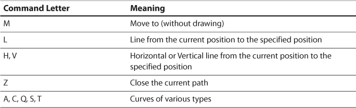
To display a scene without animating, you can use the TransitionManager’s static go method, passing the Scene object you wish to show. When you wish to animate between Scene objects, you use the same static go method, but you pass in the Transition class that you wish to use. Listing 9.18 shows the activity code and Figure 9.4 shows a few frames of the animation. The full source code is in the SceneTransitions project of the chapter09 folder.
Listing 9.18 The Activity Code That Triggers the Scene Changes
public class MainActivity extends AppCompatActivity implements View.OnClickListener {
private Scene mCurrentScene;
private Scene mScene1;
private Scene mScene2;
private ViewGroup mSceneRoot;
private Transition mTransition;
@Override
protected void onCreate(Bundle savedInstanceState) {
super.onCreate(savedInstanceState);
setContentView(R.layout.activity_main);
final Toolbar toolbar = (Toolbar) findViewById(R.id.toolbar);
setSupportActionBar(toolbar);
mSceneRoot = (ViewGroup) findViewById(R.id.scene_root);
mScene1 = Scene.getSceneForLayout(mSceneRoot, R.layout.scene1, this);
mScene2 = Scene.getSceneForLayout(mSceneRoot, R.layout.scene2, this);
mTransition = new ChangeBounds();
mTransition.setDuration(DateUtils.SECOND_IN_MILLIS);
mTransition.setInterpolator(new AccelerateDecelerateInterpolator());
TransitionManager.go(mScene1);
mCurrentScene = mScene1;
findViewById(R.id.button).setOnClickListener(this);
}
@Override
public void onClick(View v) {
if (mCurrentScene == mScene1) {
TransitionManager.go(mScene2, mTransition);
mCurrentScene = mScene2;
} else {
TransitionManager.go(mScene1, mTransition);
mCurrentScene = mScene1;
}
}
}
Activity Transitions
One of Android’s weakest points in transitions has always been activities. There was a default animation with a very limited ability to change it. The best practice was generally leaving it in place as it served to explain to users that they had navigated deeper into the app and the back button could take them to the previous activity. A big part of Material Design is changing this flawed concept of moving from one static arrangement of views to the next. If you tap a thumbnail for a music album, the detail activity shouldn’t just appear from the side. It should evolve from the content already on the screen. That thumbnail can grow to a larger image of the album. The album title can shift positions while the rest of the list is pushed out. Then the new content can slide into place. Not only does this look immeasurably better, it actually improves the user experience by helping the user to understand which parts of the screen were already there, which parts are new, and where to shift focus.
The same transitions framework that was introduced in KitKat and used for the previous scene transitions was expanded upon in Android 5.0, allowing it to work for fragments and activities. The overall concept is very similar to working with scenes. Instead of automatically animating between two scenes, Android automatically animates between two activities, though there’s just a little more plumbing. This handles a lot of the behind-the-scenes headaches that you’d have to deal with if you wanted to do these kinds of animations manually.
The general idea behind using transitions between activities is that you match a particular view (such as a thumbnail on the current page) to a view on the next screen. Because the next view isn’t instantiated yet, you refer to it by its transitionName, which is just a string that identifies it for transitions. That string can be anything you want, but many people put it in the strings.xml file with the rest of their strings and prefix the name with “transition” to make it more organized. The information is passed between the activities by way of a Bundle instance (just like with intent extras). Fortunately, most of this is easier than it sounds.
Let’s open up the woodworking tools app from the previous chapter and add transitions to it. We’re going to animate the image and tool name from the first screen to the second screen. First, we need to define a couple of strings for the text and the image that will animate (e.g., transition_image_view); the strings themselves don’t matter as long as they are unique. Then, open up the captioned_image_view.xml layout and set the transition names.
Remember that the ToolGridFragment is where we handle clicks on one of the tools on the main screen. Within the onClickItem method, we know that the clicked view was a CaptionedImageView, so we cast to that specific class to get the ImageView and TextView. We use the static makeSceneTransitionAnimation method of the ActivityOptionsCompat class to create the data we need to pass to the activity (note that there is an ActivityOptions class, but it’s generally a best practice to make a habit of using the compatibility version to avoid worrying about the version of Android that is on the device). That method needs an Activity instance, which we can get with getActivity, and then it needs the matches of views to transition names. If you are only animating one view, you can pass in that view and the string; otherwise, you can use the Pair object one or more times (which, as you can probably guess, is just a generic container that holds two object references). We need to create a pair for the image and a pair for the text. Now, when we call the static startActivity method, we need to pass in the Bundle that we get when we call toBundle on our ActivityOptionsCompat instance. Listing 9.19 shows the onClickItem method.
Listing 9.19 The Updated onClickItem Method
public void onItemClick(AdapterView<?> adapterView, View view, int position, long id) {
final CaptionedImageView captionedImageView = (CaptionedImageView) view;
ActivityOptionsCompat activityOptions = ActivityOptionsCompat.makeSceneTransitionAnimation(
getActivity(),
new Pair<View, String>(captionedImageView.getImageView(), getString(R.string.transition_image_view)),
new Pair<View, String>(captionedImageView.getTextView(), getString(R.string.transition_text_view))
);
ToolListActivity.startActivity(getActivity(), mToolGridAdapter.getItem(position), activityOptions.toBundle());
}
We need to update the startActivity method in ToolListActivity to accept the Bundle we are passing in. Instead of starting the activity from the Context we passed in, we want to update the method to take an Activity instead. This lets us use ActivityCompat’s startActivity static method instead, which allows us to pass in a Bundle without worrying about whether the app is running on a version of Android new enough to support that. Listing 9.20 shows the updated method.
Listing 9.20 The Updated startActivity Method
public static void startActivity(Activity activity, ToolType toolType, Bundle activityOptions) {
final Intent intent = new Intent(activity, ToolListActivity.class);
intent.putExtra(EXTRA_TOOL_TYPE, toolType);
ActivityCompat.startActivity(activity, intent, activityOptions);
}
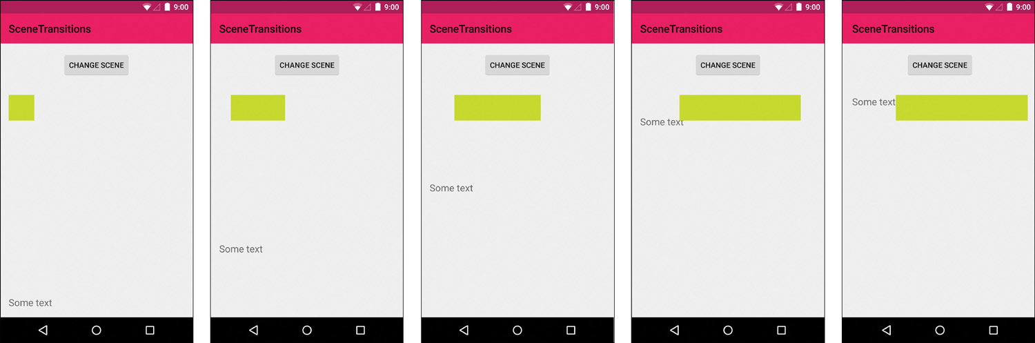
In normal cases, this is everything we need to do to get things to work. We’ve given the views the transition names they need. We’ve created a Bundle that has all the metadata needed to do the animation. We’ve started the activity with the Bundle. That’s it right? Well, not quite. We have one challenge which is that our larger instance of the CaptionedImageView on the second screen is in ToolAboutFragment and that fragment is created (milliseconds) later by the ViewPager via our adapter. It doesn’t seem like much time difference when interacting with the app, but when the new activity wants to run the animation, the fragment that contains the final views isn’t ready yet. This means that it doesn’t know how to animate them. The trick is that we need to postpone the animation until the views are ready. Fortunately, this is pretty easy. We call postponeEnterTransition in the onCreate method of the activity. Now we just have to call startPostponedEnterTransition when the views are ready. By using an OnPreDrawListener, we can get a call that tells us just before the ViewPager draws the views. This listener is added to the ViewTreeObserver from the view we care about (the ViewPager). Adding a one-shot OnPreDrawListener that fires once and then removes itself is a fairly common practice in many advanced UI techniques. Figure 9.5 shows some frames from the completed animation.
With the animation to the new activity working correctly, we now have to consider the animation back. If you tap a tool, see the “About” page, and then tap back, you’ll see everything animate how you’d expect. But what about if you tap a tool, see the “About” page, then change tabs before going back? In that case, the animation will be problematic. By default, a ViewPager keeps one page to each side available (to allow scrolling to be smooth). This means that changing from the “About” tab to the tab just to the right of it will cause the view to be sitting off to the left of the screen. Pressing back at this point animates the view back into place. It’s a little strange, but not terrible. The strange part comes from moving more than one tab to the right. When the “About” page moves to the left once, it’s just off screen. When it moves left again, the views are destroyed. Pressing back at that point means there is no view to animate, so you end up with a hole where the image should go and then suddenly the image pops back into place. It’s a jarring experience.
Fixing issues like this is relatively easy and this same technique can be used for other dynamic changes to your view hierarchy. You call setEnterSharedElementCallback and provide a SharedElementCallback. This callback is triggered to handle customizing animations dynamically. All we need to do is provide an implementation of the onMapSharedElements method, which is meant to allow customizing the mapping of transition names to views (like what we passed in by creating the Pair objects). You can do some very clever things here, but we just need to check if we are displaying the “About” page and clear the mapping if we are not. In other words, if we aren’t showing the big image at the top of the screen, then don’t do any custom animation back to the previous activity. The additions to the onCreate method are shown in Listing 9.21. The full source code for the updated woodworking tools app is in the WoodworkingTools project within the chapter09 folder.
Listing 9.21 The Additions to the onCreate Method
// Handle animation from previous activity
postponeEnterTransition();
mViewPager.getViewTreeObserver().addOnPreDrawListener(new
ViewTreeObserver.OnPreDrawListener() {
@Override
public boolean onPreDraw() {
mViewPager.getViewTreeObserver().removeOnPreDrawListener(this);
startPostponedEnterTransition();
return true;
}
});
setEnterSharedElementCallback(new SharedElementCallback() {
@Override
public void onMapSharedElements(List<String> names, Map<String, View< sharedElements) {
if (mViewPager.getCurrentItem() != 0) {
// Not displaying the about page, which has the hero image
names.clear();
sharedElements.clear();
}
}
});
Circular Reveal Transitions
Another nice feature added in Android 5.0 is the circular reveal. Just as the name suggests, it’s an animation that reveals views in a circular pattern (of course, you can also use it to hide views). With a single method call, you can get an Animator that will handle the visuals. You just need to tell it the view to clip the animation to, the x and y coordinates for the center of the circle (this could be where the user tapped or the center of the view to show/hide), and the starting and ending radius.
First, we need a fresh activity layout. This simply needs a button to trigger the reveal, a FrameLayout that is revealed, and a button within that layout that can hide everything again. Listing 9.22 shows the layout. Note that the FrameLayout is initially invisible.
Listing 9.22 The Activity Layout
<RelativeLayout xmlns:android="http://schemas.android.com/apk/res/android"
xmlns:tools="http://schemas.android.com/tools"
android:layout_width="match_parent"
android:layout_height="match_parent"
tools:context=".MainActivity">
<android.support.v7.widget.Toolbar
android:id="@+id/toolbar"
android:layout_height="wrap_content"
android:layout_width="match_parent"
android:minHeight="?attr/actionBarSize"
android:background="?attr/colorPrimary" />
<Button
android:layout_width="wrap_content"
android:layout_height="wrap_content"
android:text="@string/reveal"
android:id="@+id/button_reveal"
android:layout_below="@+id/toolbar"
android:layout_centerHorizontal="true"/>
<FrameLayout
android:id="@+id/container"
android:background="#F8BBD0"
android:layout_width="match_parent"
android:layout_height="match_parent"
android:layout_below="@+id/button_reveal"
android:layout_alignParentStart="true"
android:visibility="invisible">
<Button
android:layout_width="wrap_content"
android:layout_height="wrap_content"
android:text="@string/hide"
android:id="@+id/button_hide"
android:layout_gravity="center"/>
</FrameLayout>
</RelativeLayout>
Next, we just handle the button clicks. We first find the center of the circle, which will just be the center of the FrameLayout. Then we determine the radius to start and finish with. We know that one radius will be 0 (either it’s starting from nothing and then revealing the full layout or it’s starting from the full layout and shrinking to nothing). The other radius needs to be big enough to fill the rectangular view with a circle. This means that we need the distance from the center of the view to one of the corners. We know the distance from the center point to the right side (half the width) and from the center point to the top (half the height), so we can use the Pythagorean theorem to determine the hypotenuse. This means that we square the horizontal distance and the vertical distance, add those together, and then take their square root.
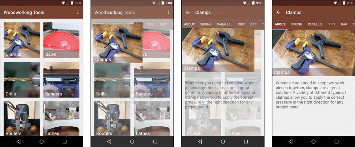
With all of the math out of the way, we use the static createCircularReveal method of ViewAnimationUtils to get our Animator object. If we are hiding the views, we need to listen to the animation and set the visibility back to invisible. Finally, we just start the animation. Listing 9.23 shows the full activity, and Figure 9.6 shows a few frames of the animation.
Listing 9.23 The Activity Code for a Circular Reveal
public class MainActivity extends AppCompatActivity implements View.OnClickListener {
View mContainer;
@Override
protected void onCreate(Bundle savedInstanceState) {
super.onCreate(savedInstanceState);
setContentView(R.layout.activity_main);
final Toolbar toolbar = (Toolbar) findViewById(R.id.toolbar);
setSupportActionBar(toolbar);
mContainer = findViewById(R.id.container);
findViewById(R.id.button_reveal).setOnClickListener(this);
findViewById(R.id.button_hide).setOnClickListener(this);
}
@Override
public void onClick(View v) {
// Determine center
final int x = (mContainer.getRight() — mContainer.getLeft()) / 2;
final int y = (mContainer.getBottom() — mContainer.getTop()) / 2;
// Determine radius sizes
final int containerWidth = mContainer.getWidth() / 2;
final int containerHeight = mContainer.getHeight() / 2;
final int maxRadius = (int) Math.sqrt((containerWidth * containerWidth) + (containerHeight * containerHeight));
final int startingRadius;
final int finalRadius;
if (v.getId() == R.id.button_reveal) {
startingRadius = 0;
finalRadius = maxRadius;
mContainer.setVisibility(View.VISIBLE);
} else {
startingRadius = maxRadius;
finalRadius = 0;
}
// Animate
final Animator animator = ViewAnimationUtils.createCircularReveal(mContainer, x, y, startingRadius, finalRadius);
if (v.getId() == R.id.button_hide) {
animator.addListener(new AnimatorListenerAdapter() {
@Override
public void onAnimationEnd(Animator animation) {
mContainer.setVisibility(View.INVISIBLE);
}
});
}
animator.start();
}
}
Summary
In this chapter you learned the purpose of animations and how to apply them in a variety of ways. You learned about the older view animations as well as the more efficient and powerful property animations, plus the ways of applying animations to scenes and activity transitions. You also learned about using a circular reveal transition. In addition to all of these topics, you encountered advanced techniques such as using an OnPreDrawListener to run code immediately before a view is drawn.
This marks the end of the second part of this book. Next up, you’ll focus on advanced topics to make your apps even better.