
Chapter 4. Adding App Graphics and Resources
As the final chapter of the first part of this book, this chapter teaches you how the resource system works in Android, including the use of graphics. One of the considerations when developing for Android is that there are so many different devices out there. You have to consider displays of various densities, screens of all sizes, whether a device has a hardware keyboard, what orientation it is held in, and even what language should be displayed. Fortunately, Android’s resource system makes all this easy.
Introduction to Resources in Android
A solid understanding of Android’s resource system is not only essential to developing good apps, it’s vital to saving your sanity. If you had to programmatically check every feature of the device every time you did anything, your code would be a mess and you would lose sleep at night (assuming you get any now). To ensure a good user experience, you should generally make adjustments for things such as the size of the screen and the orientation of the device. By using resource “qualifiers,” you can let Android take care of this for you.
A qualifier is a portion of a directory’s name that marks its contents as being used for a specific situation; this is best illustrated with an example. Your Android project contains a res directory (resources) that can contain several other directories for each of the resource types. Your layouts go in a directory called layout. If you have a layout specifically for landscape orientation, you can create a directory in res called layout-land, where “land” designates it as being used for landscape orientations. If you have a layout called main.xml in both directories, Android automatically uses the version appropriate to the given device orientation.
Resource Qualifiers
Okay, so you can have a different layout for landscape and portrait orientations, but what else? Actually, there are a lot of qualifiers, and they can be applied to any resource directory. That means you can have the images or even strings change based on orientation. It’s important to know what folders go in the res directory and what content they contain before diving into how that content can differ based on qualifiers. Here’s a list of the folder names:
 animator—Property animations defined in XML.
anim—View animations defined in XML.
color—State lists of colors defined in XML. State lists are covered later in this chapter.
drawable—Drawable assets that can be defined in XML or image files (PNG, GIF, or JPG).
layout—Layouts defined in XML.
menu—Menus such as the app bar menu defined in XML.
mipmap—Drawable assets just like the drawable folder. The difference is that the drawable folders for specific densities can be excluded based on your configuration, letting you make density-specific builds, but the mipmap folders are always included regardless of density. In practice, you should always put your launcher icons in mipmap folders, so that launcher apps can use higher resolution assets when desired. All other images will go in the applicable drawable folders.
raw—Any raw files such as audio files and custom bytecode.
values—Various simple values defined in XML, such as strings, floats, and integer colors.
xml—Any XML files you wish to read at runtime (common for configurations such as for app widgets).
By no means are all of these required in any given app. In fact, it is not uncommon to only have drawable, layout, mipmap, and values directories in an app, although you will nearly always have multiple drawable and mipmap folders to accommodate different densities. The various resource folders are generated for you when needed (e.g., creating an XML menu in Android Studio creates the menu folder), but you can also create them yourself. For every file in these directories, Android’s build tools will automatically create a reference in the R class (short for resources) that is an int identifier, which can be used by a variety of methods. That also means your files should be named in all lowercase and underscore separated.
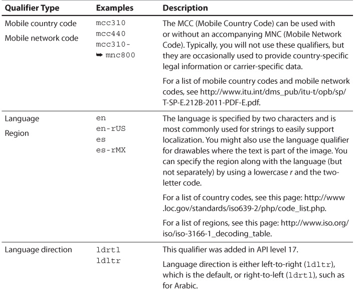
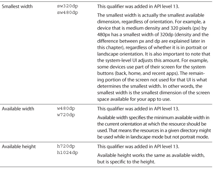
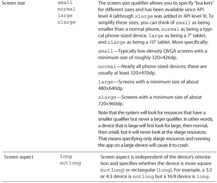
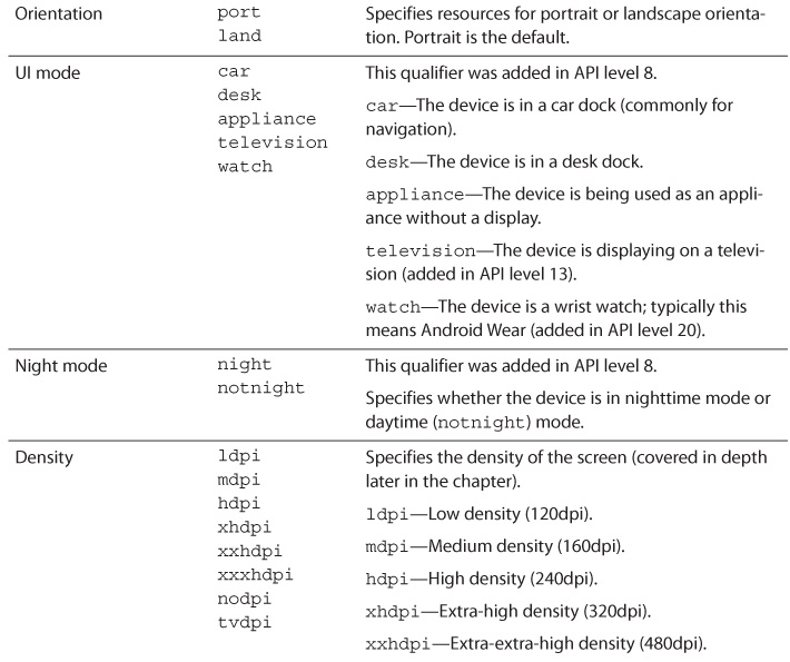
Take a look at Table 4.1 to see the resource qualifiers you can use. These are listed in the order that Android requires, meaning that if you use more than one, you must list them in the same order they appear in this table.
Regardless of how many or how few qualifiers you use, the R class will only have one reference to a given set of resources. For example, you might have a file at the path res/drawable-xhdpi/header.png, and the reference would be R.drawable.header. As you can probably see, the format is R.[resource type without qualifiers].[file name without extension]. Perhaps this header file also contains text, so you have language-specific versions such as res/drawable-es-xhdpi/header.png. Within the Java portion of your app, you will always refer to the resource as R.drawable.header. If the device’s language is set to Spanish, the reference automatically points to the Spanish version, so you do not have to change anything in your code. If the device is an HDPI device, it would first look in the drawable-hdpi directory before the drawable-xhdpi directory. When you refer to a resource like R.drawable.header, you’re asking the system to use whichever header drawable best fits the current device configuration.
Warning: Always Specify Defaults
One extremely important thing to note is that you need to specify defaults. With the exception of density qualifiers, all qualifiers are exclusive. For example, you can create a “hello” string. Within res/values-es/strings.xml, you define “hello” to be “hola” and within res/values-en/strings.xml you define “hello” as “hello.” Everything seems good, and you can use that reference in your code as R.string.hello.
You test it on your English device, and it works correctly. You test it on your Spanish device, and it works correctly as well. However, when you test it on your Russian device, it crashes. That’s because both of those qualifiers exclude Russian. You have not defined a Russian-specific values directory with that string in it, so the system falls back on the values directory with no qualifier. Nothing is there, making the reference invalid.
To avoid this situation, make sure your default directory (i.e., the one without qualifiers) contains all references. The one exception is with density-specific assets, which Android is able to scale for you.
Understanding Density
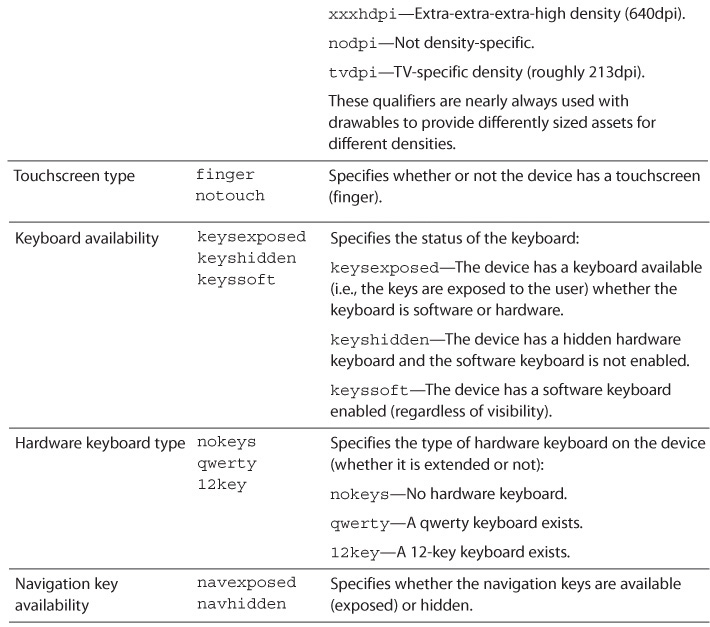
Although it was covered briefly in Chapter 2, “Understanding Views—The UI Building Blocks,” density is one of the most important aspects of an Android device to understand when it comes to design and it’s worth covering in detail. Early Android devices had approximately 160 dots per inch (dpi)—and that is considered medium density (MDPI) now. Android 1.6 added support for both low density (LDPI or 120dpi) and high density (HDPI or 240dpi). Android 2.2 added extra high density (XHDPI or 320dpi) to the mix. Continuing the march toward higher and higher densities, Android 4.1 introduced extra, extra high density (XXHDPI or 480dpi) and Android 4.3 brought extra, extra, extra high density (XXXHDPI or 640dpi). These are listed in Table 4.2 for easier reference.
What do all these letters and numbers mean to you? A given image will appear larger on a screen with a lower density and smaller on a screen with a higher density. If you take a piece of paper and draw a vertical line and a horizontal line, splitting it into four pieces, a single piece (pixel) will take up a quarter of the paper. If you divide each of those quarters into four pieces, then a single piece (pixel) is one fourth of the size that it was. The pixel appears physically smaller even though the total size of the paper (the screen) has not changed.
Fortunately, Android makes handling this easy for you. Instead of specifying dimensions in raw pixels, you will use either density-independent pixels (referred to as dip or dp) or scale-independent pixels (sip or sp). Density-independent pixels are based on MDPI, so 1dp is 1px at medium density. The difference between one sp and one dp is that sp takes into account the user’s preferred font size. Therefore, all font sizes should be specified in sp and all other dimensions should be in dp.
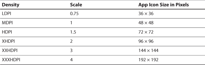
There are a lot of numbers and terms to remember, so it can be helpful to break this down more. Most apps can ignore LDPI because it is uncommon (of standard phone sizes and tablet sizes, LDPI represents a fraction of a percent). For the rest of these, you can think of them relative to one another. The ratio from MDPI to XXXHDPI is 2:3:4:6:8. Reading from the right, you might notice that every other density cuts the value in half. An XXXHDPI image of 8 pixels wide would be 4 pixels wide at XHDPI and 2 pixels wide at MDPI. An XXHDPI image of 6 pixels wide would be 3 pixels wide at HDPI. More practically, this means that if you include XHDPI and XXHDPI resources, the system can easily scale those images without ever having to worry about half pixels, so you don’t have to export to every single density. The one exception is your launcher icon, which you should have available for every density you support. Table 4.3 shows how this ratio applies to app icons, which are 48dp squares.
Supported Image Files
For the longest time, Android supported only “raster” images natively. Raster images are a series of pixels, which makes them efficient for displaying on the screen, but that means they do not resize to arbitrary sizes well. The primary alternative is vectors, which represent images as drawing instructions (e.g., “draw a black line from 0, 0 to 5, 0 that is 2 units thick”). The advantage of vectors is that they are infinitely resizable because all the values are relative. In fact, most icons and logos are designed as vectors and then exported to raster images for specific uses. The disadvantage of vectors is that they are more processor intensive because all the instructions have to be interpreted and turned into the pixels that will be displayed.
One of the many changes announced for Android 5.0 (Lollipop) was native support for vectors. The format supported by Android is a subset of the well-known SVG format, but it will handle most typical uses. The particularly exciting thing about this vector support is that Android also has support for animating between two vectors, which is covered in detail in Chapter 9, “Polishing with Animations.”
Raster Images
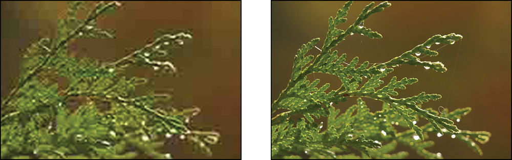
Android supports JPEGs, PNGs, and GIFs natively. These formats are all “raster” format with red, green, and blue channels (and an alpha channel that represents level of transparency for PNG and GIF images). If you use eight bits (one byte) for each channel, a pixel is 24-bit (without alpha) or 32-bit (with alpha). That means a single 1920×1080 image is over eight megabytes! Fortunately, all of these formats are compressed, so they don’t store each individual pixel on disk. JPEGs use lossy compression, meaning that some of the detail is lost to decrease the file size. See Figure 4.1 for an example of heavy JPEG compression compared to no compression. PNGs and GIFs use lossless compression (no detail lost). That means you should use JPEGs for large photographs and any images already saved as JPEGs and PNGs for everything else. Although GIF is supported, PNG is a better file format and should be used instead.
Note: PNG Compression
The Android build tools will automatically compress the PNGs by stripping them of all metadata and reducing the bit depth where possible. For example, an image might be converted to an 8-bit PNG with a custom color palette to reduce its file size. This reduces the overall size of your APK, but it does not affect the size of the image once it has been decoded into memory.
Vector Images
Android’s vector support that came in Android 5.0 (Lollipop) has been long awaited by designers and developers alike. Devices now are powerful enough to handle typical vector uses (such as for icons in a toolbar) without a problem; however, you still have to be aware of the performance costs. Each vector image is cached as a bitmap representation, which means it can very quickly be drawn and even moved around on the screen, but changing it in any way that invalidates that cache (such as scaling it) causes Android to have to recreate that bitmap. For smaller icons and infrequent animations, this won’t be any problem (in fact, animating between vectors is one of the coolest features of Android 5.0), but trying to continuously animate a full-screen vector is going to have a noticeable performance hit. Details are included later in this chapter.
Nine-Patch Images
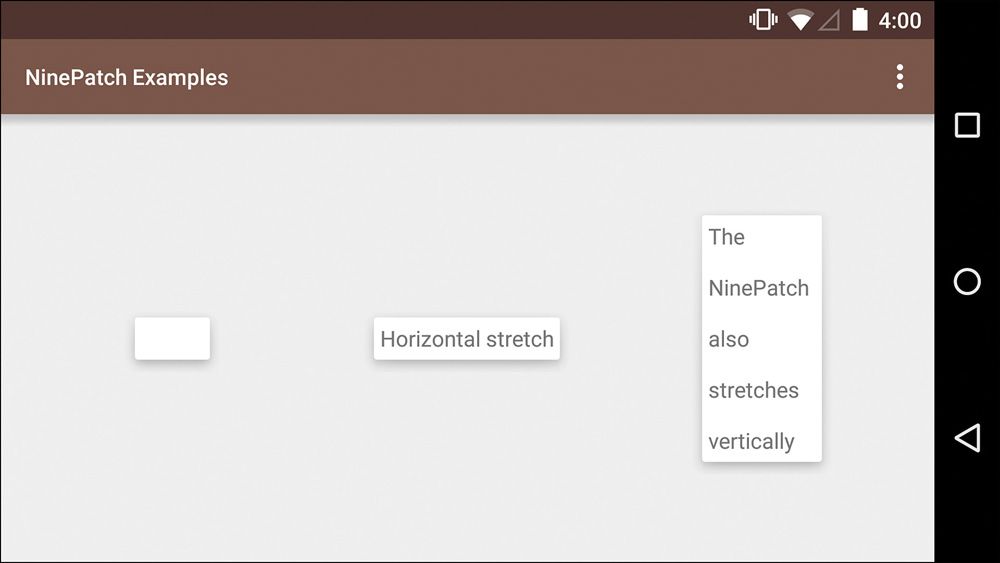
Oftentimes, you do not know ahead of time how large an image should be. For example, a button will need the ability to be of different sizes to accommodate different languages and text labels. Even if you tell it to be as wide as the screen, there are still many possible widths. It would be a huge amount of work to create an image for every possible width, and your app will look terrible if you hard-code the button to a specific size in pixels. The nine-patch image solves this problem.
If you think of a typical button, there are nine pieces to it: the four corners, the four sides (left, right, top, and bottom), and the center area where the text typically goes. To support a wider button, the top, center, and bottom portions have to be duplicated. For a taller button, the left, center, and right portions would be duplicated. This allows you to preserve the corners and edges while expanding the content area. See Figure 4.2 for an example of how a nine-patch can be resized.
A nine-patch is actually just a PNG where the 1px border around the outside of the image consists of pixels that are either fully transparent or fully black. The left and top of the image can contain black pixels to describe how to enlarge the image. Figure 4.3 highlights the “stretchable” area in green.
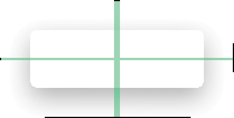
Another feature of nine-patch images is that the right and bottom of the image specify content areas. In the simplest case, you can think of the black part as where content goes and the transparent part as the padding. When you set a view’s background to a nine-patch image, the padding of that image will be applied automatically; however, you can still override it. See the purple area in Figure 4.4 to understand where content can go. When the content is larger than this area, the image stretches along the parts that were highlighted green in Figure 4.3.

Figure 4.4 The highlighted purple areas are where content can go, as defined by the right and bottom black pixels
One last thing to note is that you can specify nine-patch images in XML (though it is uncommon). The image itself is still a standard nine-patch PNG, but the XML file allows you to specifically enable or disable dithering, which is a way of adding “noise” to an image to reduce artifacts such as banding, which is caused by low-bitrate displays. See Listing 4.1 for an example of this.
Listing 4.1 Specifying a Nine-Patch with XML
<?xml version="1.0" encoding="utf-8"?>
<nine-patch xmlns:android="http://schemas.android.com/apk/res/android"
android:dither="true"
android:src="@drawable/padding_bg" />
XML Drawables
In addition to standard image files, Android supports a variety of XML drawables (the term “drawable” refers simply to something that can be drawn to the screen). Some of these drawables are ways of using multiple image files for one resource; others allow you to actually specify colors within XML. A few you may never need, but some will prove extremely valuable, so it is worth knowing what is available to you.
Each type of drawable that can be defined in XML uses a different root node (which tells Android which class’s inflate method to call). They are all inflated to specific drawables, but you can interact with them via the abstract Drawable class. Drawables that display more than one drawable define each one with the item tag. The item tag can typically take offsets (android:left, android:top, android:right, and android:bottom), which is useful for specific visual effects and for supporting images of different sizes.
Layer List
A layer list is an array of drawables defined in XML that creates a LayerDrawable instance when used. Each drawable can be offset on the left, top, right, and/or bottom by a different amount. The drawables are drawn in the order they are declared (just like views) and will be scaled to fit the available space. See Listing 4.2 for a sample layer list.
Listing 4.2 Example of a Simple Layer List
<?xml version="1.0" encoding="utf-8"?>
<layer-list xmlns:android="http://schemas.android.com/apk/res/android" >
<item android:drawable="@drawable/example_green_screen"/>
<item
android:drawable="@drawable/example_red_screen"
android:left="64dp"
android:top="64dp">
</item>
</layer-list>
If you do not want the drawables to be scaled, you can use gravity, like in Listing 4.3. Using gravity allows you to define the anchor point of the drawable. For example, you might be using a drawable as the background of a full screen view. The default behavior is to scale to the size of the view, but you can instead specify a gravity to align the image to a specific location such as the right side of the view. Notice that this requires a separate bitmap node that contains the gravity; the gravity does not go within the item tag itself.
Listing 4.3 Example of a Layer List Using Gravity
<?xml version="1.0" encoding="utf-8"?>
<layer-list xmlns:android="http://schemas.android.com/apk/res/android" >
<item>
<bitmap
android:gravity="center"
android:src="@drawable/example_green_screen" />
</item>
<item
android:left="64dp"
android:top="64dp">
<bitmap
android:gravity="center"
android:src="@drawable/example_red_screen" />
</item>
</layer-list>
For a comparison of the difference between letting the LayerListDrawable scale and keeping its size by the use of gravity, see Figure 4.5. Notice that the device with the green screen on the left is significantly larger than the others due to no offset and no gravity.
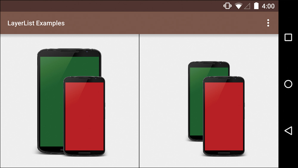
Figure 4.5 The left image is from Listing 4.2; the right is from Listing 4.3
State List
A StateListDrawable, defined by the selector XML node, allows you to specify different drawables for different states. For example, a standard button will have different appearances based on whether it is enabled, focused, pressed, and so on. You can specify as few or as many drawables as you like, and you can also combine states (e.g., show a particular drawable only if it is both focused and checked). See Figure 4.6 for an example of different images based on different states. You can use colors in a selector as well. You might decide that your button’s text should normally be white but it should be gray when it is disabled.
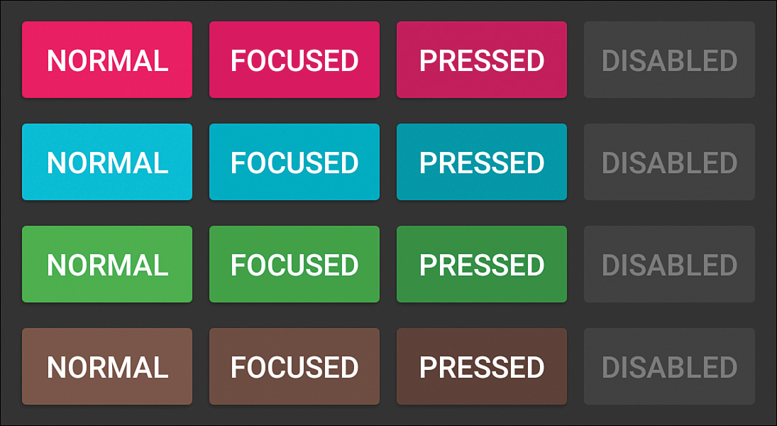
It is important to note that the drawable used will be the first that matches, which might not be the best match. For example, if the first item requires a state of pressed and the second item requires both pressed and enabled, the second item will never be used because any image that matches pressed, whether enabled or not, would match the first item immediately. Therefore, you should put the most specific states first and your last state should contain no state requirements.
Here is a list of the most common states:
android:state_activated—Added in API 11, this indicates the item is the activated selection. For example, on a tablet where you have a list of articles on the left and the full article on the right, the list item on the left that represents the article being displayed on the right would be activated. All other items in that list would be false for being activated.
android:state_checkable—Indicates whether the item can be checked. This is really only useful when a view can change between being checkable and not checkable, which is relatively uncommon.
android:state_checked—Indicates whether the item is currently checked.
android:state_enabled—Indicates whether the item is enabled or disabled, which is especially useful with buttons that are only enabled if a certain condition is met (such as a text field being filled out).
android:state_focused—Indicates whether the item is focused. Focus usually happens after an input has been tapped, such as an EditText, or after navigating to a given view by means other than touch (e.g., a directional pad or trackball). Drawables that represent a focused state usually have a glow or generally highlighted appearance.
android:state_hovered—Added in API 14, this indicates whether the item is currently being hovered over by the cursor. Typically, this is visually indicated in the same way as focus.
android:state_pressed—Indicates whether the item is being pressed. This state happens when the item is clicked or touched and is usually shown by a visually depressed state (like a button being pushed in) or a brightened/colored appearance.
android:state_selected—Indicates that the item is currently selected. This is very similar to focus but slightly more specific. A particular view group (e.g., ListView) can have focus while a specific child is selected.
android:state_window_focused—Indicates whether the app’s window is focused. This is generally true unless it is obstructed, like when the notification drawer has been pulled down.
In addition to the common states, there are state_first, state_middle, and state_last states, which are for specifying changes based on position, and state_accelerated, which is true if the view is hardware accelerated. See Listing 4.4 for a simple example of how to use a StateListDrawable by defining a selector in XML.
Listing 4.4 Example of a Selector (StateListDrawable)
<?xml version="1.0" encoding="utf-8"?>
<selector xmlns:android="http://schemas.android.com/apk/res/android">
<!-- Shown when enabled but the window is not focused -->
<item android:drawable="@drawable/btn_default_normal"
android:state_enabled="true"
android:state_window_focused="false"
/>
<!-- Shown when disabled and the window is not focused -->
<item android:drawable="@drawable/btn_default_disabled"
android:state_enabled="false"
android:state_window_focused="false"
/>
<!-- Shown when pressed -->
<item android:drawable="@drawable/btn_default_pressed"
android:state_pressed="true"
/>
<!-- Shown when enabled and focused -->
<item android:drawable="@drawable/btn_default_focused"
android:state_enabled="true"
android:state_focused="true"
/>
<!-- Shown when enabled but not focused -->
<item android:drawable="@drawable/btn_default_normal"
android:state_enabled="true"
/>
<!-- Shown when focused but not enabled -->
<item android:drawable="@drawable/btn_default_disabled_focused"
android:state_focused="true"
/>
<!-- Shown for all other cases -->
<item android:drawable="@drawable/btn_default_disabled"/>
</selector>
Level List
A LevelListDrawable manages any number of drawables, assigning each one to a range of integer values. You can set the current level of the LevelListDrawable with Drawable’s setLevel(int) method. Whichever drawable fits in that range will then be used. This is particularly useful for visual indicators where you want to show some difference based on a value but do not want to worry about the exact image to display in your code. The battery indicator is a good example of this. You know that the range is from 0 to 100 percent, but your code does not need to know whether there is a different image for 38 percent versus 39 percent. Instead, you just set the level of the LevelListDrawable and the correct drawable will automatically be used. See Listing 4.5 for an example of recreating the typical battery indicator.
Listing 4.5 A Level List for Indicating Battery Level
<?xml version="1.0" encoding="utf-8"?>
<level-list xmlns:android="http://schemas.android.com/apk/res/android">
<item android:maxLevel="4" android:drawable="@drawable/battery_0" />
<item android:maxLevel="15" android:drawable="@drawable/battery_15" />
<item android:maxLevel="35" android:drawable="@drawable/battery_28" />
<item android:maxLevel="49" android:drawable="@drawable/battery_43" />
<item android:maxLevel="60" android:drawable="@drawable/battery_57" />
<item android:maxLevel="75" android:drawable="@drawable/battery_71" />
<item android:maxLevel="90" android:drawable="@drawable/battery_85" />
<item android:maxLevel="100" android:drawable="@drawable/battery_100" />
</level-list>
TransitionDrawable
A TransitionDrawable allows you to specify two drawables that you can then crossfade between. Two methods startTransition(int) and reverseTransition(int) allow you to control the transition between the two drawables. Both methods take an int, which defines the duration in milliseconds.
This is not a particularly common drawable because crossfading is often done with views, but it is a fast and efficient way to transition between two drawables and has the advantage of only requiring one view, which means you can combine it with a state list to transition on a specific state. See Listing 4.6 for a simple example of a TransitionDrawable.
Listing 4.6 An Example of a Simple TransitionDrawable
<?xml version="1.0" encoding="utf-8"?>
<transition xmlns:android="http://schemas.android.com/apk/res/android" >
<item android:drawable="@drawable/first_drawable"/>
<item android:drawable="@drawable/second_drawable"/>
</transition>
InsetDrawable
An InsetDrawable allows you to inset, or push in, another drawable. It is useful when you have a drawable that you would like to appear smaller than a view or to appear padded. This might seem useless because you could just add transparent pixels to an image to accomplish the same thing, but what if you want to use that same image in one place without that extra spacing and in another with it? See Listing 4.7 for a simple example that insets a drawable by 16dp on all sides.
Listing 4.7 An Example of a Simple InsetDrawable
<?xml version="1.0" encoding="utf-8"?>
<inset
xmlns:android="http://schemas.android.com/apk/res/android"
android:drawable="@drawable/padding_bg"
android:insetTop="16dp"
android:insetRight="16dp"
android:insetBottom="16dp"
android:insetLeft="16dp" />
ClipDrawable
A ClipDrawable takes a single drawable and clips, or cuts off, that drawable at a point determined by the level. This is most frequently used for progress bars. The drawable that this ClipDrawable wraps would be the full progress bar (what the user would see at 100 percent). By using setLevel(int), your code can reveal more and more of the bar until it is complete. The level is from 0 to 10,000, where 0 does not show the image at all and 10,000 shows it completely without clipping.
You can specify whether the clipping is vertical or horizontal as well as the gravity. For example, a ClipDrawable with gravity set to left and clipOrientation set to horizontal will start drawing from the left side (see Listing 4.8 for an example). By calling setLevel(5000) on this drawable, it will draw the left half of the image.
Listing 4.8 An Example of a Simple ClipDrawable
<?xml version="1.0" encoding="utf-8"?>
<clip xmlns:android="http://schemas.android.com/apk/res/android"
android:drawable="@drawable/padding_bg"
android:clipOrientation="horizontal"
android:gravity="left" />
ScaleDrawable
A ScaleDrawable allows you to use setLevel(int) to scale the drawable at runtime (i.e., while the app is running). This is sometimes also used for progress bars as well as general cases in which you want to scale a drawable based on some other value.
You specify a scaleWidth and a scaleHeight, which is the size of the drawable when the level is 10,000. For example, Listing 4.9 shows a ScaleDrawable with both scale values set to 100 percent. If this drawable has setLevel(5000) called on it, it will display at 50 percent width and 50 percent height.
Listing 4.9 An Example of a Simple ScaleDrawable
<?xml version="1.0" encoding="utf-8"?>
<scale xmlns:android="http://schemas.android.com/apk/res/android"
android:drawable="@drawable/ic_launcher"
android:scaleGravity="center"
android:scaleHeight="100%"
android:scaleWidth="100%"
android:useIntrinsicSizeAsMinimum="true" />
ShapeDrawable
A ShapeDrawable is a rectangle, oval, line, or ring that is defined in XML. If it is a rectangle, you can define rounded corners. If it is a ring, you can specify the innerRadius (i.e., the radius of the hole) or innerRadiusRatio (the ratio of the shape’s width to the inner radius) and the thickness or thicknessRatio. For all shapes, you can specify a stroke (i.e., the line around the shape), solid fill color, or gradient fill colors, size, and padding.
You can use a variety of attributes to create your ShapeDrawable. See Table 4.4 for a complete list of the root node types and the corresponding attributes available.
Note: Specifying Rounded Corners
If you do specify rounded corners for your rectangle, you must specify all of them as rounded initially. In cases where you only want some of the corners rounded, your code should look like this (assuming you want the bottom corners to not be rounded and the top to have a radius of 8dp):
<corners
android:radius="1dp"
android:bottomLeftRadius="0dp"
android:bottomRightRadius="0dp"
android:topLeftRadius="8dp"
android:topRightRadius="8dp" />
Notice that all corners are initially set to 1dp before being set to 0dp or another value.
As you can see, ShapeDrawable has a large number of attributes, which makes it very versatile. It is often a better option than providing multiple density-specific images, with the possible exception of gradients, where a graphics program will give you far more control.
VectorDrawable
A VectorDrawable is a drawable that represents an image using vector data. This was introduced in Android 5.0 (Lollipop) and is primarily intended for icons and other small assets. To use a vector in Android, you create an XML file similar to Listing 4.10. The bizarre path data comes from the SVG file format. You’ll likely be creating the vector image in a separate app and then copying the values from that file. If you’re using Adobe Illustrator, you want to save a copy of your Illustrator file as an SVG (version 1.0). If you’re using Inkscape, you want to save a copy as plain SVG (which strips the custom Inkscape values). You can then open the SVG file in a text editor and copy the values needed (e.g., the path data comes from the “d” attribute within a path node).
Note that you must specify a height and a width, which Android will treat as the intrinsic height and width. The height and width should be equivalent to the size that you will use the image at (such as the size of an ImageView if used in one). If they’re smaller, the drawable will be scaled up, resulting in blur. You will also specify the viewportWidth and viewportHeight, which tell Android the size of the virtual canvas that the drawable is created on, which gives meaning to the positions specified in the actual path data (e.g., if the path data has a command to draw a line 100 units across, that would be halfway across if the viewportWidth is 200 and a quarter of the way if it is 400).
Listing 4.10 An Example of a Simple VectorDrawable for a Less-than Sign
<?xml version="1.0" encoding="utf-8"?>
<vector xmlns:android="http://schemas.android.com/apk/res/android"
android:height="72dp"
android:width="72dp"
android:viewportHeight="48"
android:viewportWidth="48" >
<path
android:name="line"
android:strokeColor="#000000"
android:fillColor="#000000"
android:pathData="M30.83 32.67l-9.17-9.17 9.17-9.17-2.83-2.83-12 12 12 12z" />
</vector>
A vector is made of groups, paths, and/or clip-paths. A group is a container for any of the three types and it can contain transformation information (i.e., how to rotate, scale, or translate the children). A path is the basic element of a vector, giving info about what to draw. A clip-path is for clipping or constraining another shape. The elements only need names if they are to be animated. The attributes available are listed in Table 4.5.
AnimatedVectorDrawable
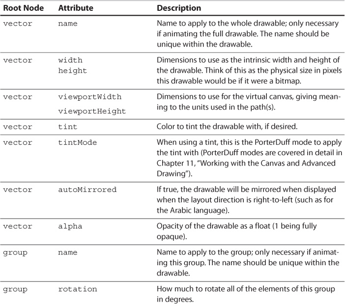
Android 5.0 also added AnimatedVectorDrawable, which is a way of easily animating a vector, often by manipulating the path(s) of one vector to become another. You will first define a VectorDrawable, giving a name to any of the elements you want to animate (such as a path). The AnimatedVectorDrawable then has target nodes that specify a name and an animation to apply. That animation is a standard XML object animator, so it can rotate, scale, translate, or even manipulate paths. Listing 4.11 shows a simple example that targets the “line” path from the less-than sign in Listing 4.10 (displayed in Figure 4.7). The animator that is applied to that path is shown in Listing 4.12 (note that you can use string resources to avoid duplicating path data or to simply name path data to make it easier to understand). This animation smoothly animates from a less-than symbol to a greater-than symbol. Figure 4.8 shows some of the frames of this animation to illustrate how Android automatically changes from one path to another when animating a vector.
Figure 4.7 This is the VectorDrawable from Listing 4.10 but with the height and width increased to make it easier to see here

Listing 4.11 An Example of a Simple AnimatedVectorDrawable
<?xml version="1.0" encoding="utf-8"?>
<animated-vector xmlns:android="http://schemas.android.com/apk/res/android"
android:drawable="@drawable/less_than_vector">
<target
android:animation="@animator/gt_lt_animator"
android:name="line" />
</animated-vector>
Listing 4.12 An Animator Used to Change from One Set of Path Data to Another
<?xml version="1.0" encoding="utf-8"?>
<objectAnimator xmlns:android="http://schemas.android.com/apk/res/android"
android:duration="300"
android:propertyName="pathData"
android:valueFrom="M30.83 32.67l-9.17-9.17 9.17-9.17-2.83-2.83-12 12 12 12z"
android:valueTo="M17.17 32.92l9.17-9.17-9.17-9.17 2.83-2.83 12 12-12 12z"
android:valueType="pathType">
</objectAnimator>
RippleDrawable
One more drawable type that Android 5.0 added is RippleDrawable. This is the default drawable used to indicate touch as a growing ripple. When you first touch this drawable, the background appears, expanding out in a circle (which can be drawn using a custom mask that you define) extremely fast. Then, a circle grows slowly, starting from your finger, filling the background. If you tap quickly, that circle expands quickly. If you move your finger away, the drawable fades out. Figure 4.9 shows a simple example.
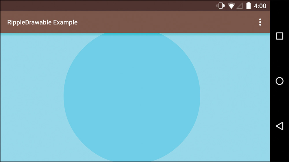
This beautiful visual actually required a new thread (called the RenderThread) to be created for Android 5.0. Without it, tapping a view would pause the animation of the ripple because the animation and UI work (such as loading a new activity or fragment) were on the same thread. Listing 4.13 demonstrates how you will typically define a RippleDrawable in XML, using an inner item node, which can refer to a color or other drawable used as a mask. If you leave out the item node, the drawable will expand in a circle based on the bounds of the parent view.
Listing 4.13 An Example of a Simple RippleDrawable
<?xml version="1.0" encoding="utf-8"?>
<ripple xmlns:android="http://schemas.android.com/apk/res/android"
android:color="@color/accent">
<item android:drawable="@android:color/white" />
</ripple>
Other Resources
In addition to visual resources, you can also specify many other resources in XML. You will see these throughout rest of the book, but it’s a good idea to overview them now.
Strings
You should specify all user-facing strings in XML. Typically, you put these all in a file called strings.xml in res/values, although you can call it something else. Putting your strings into an XML file will allow you to easily localize your app at any point, even if you do not intend to in the first version. In addition, it will allow you to keep your vocabulary consistent across the app by reusing strings, which will make your app more accessible to everyone, especially those with a limited understanding of the language that it is in. See Listing 4.14 for a sample strings file containing a “hello” string and an “intrograph” string.
Listing 4.14 An Example of a strings File
<?xml version="1.0" encoding="utf-8"?>
<resources>
<string name="hello">Hello</string>
<string name="intrograph">Welcome to the greatest app in the world!</string>
</resources>
At some point, you might decide to support Spanish, so you add a strings.xml file in res/values-es that looks like Listing 4.15.
Listing 4.15 A Spanish Version of the strings File
<?xml version="1.0" encoding="utf-8"?>
<resources>
<string name="hello">Hola</string>
<string name="intrograph">¡Bienvenidos a la mejor aplicación del mundo!</string>
</resources>
In most cases, you will refer to strings in your layouts, setting the text for a TextView in XML, but you can also set it in code. Further, the Context class (which Activity extends) has a getString(int) method, where passing it the resource identifier for the string you desire (e.g., R.string.hello) will return the applicable string (“Hello” or “Hola,” depending on the device’s language). The getString(int) method in Context is actually just a convenience method for calling getResources().getString(int) and there is a similar method in Fragment.
These strings also support substitutions. By including %s in the string, you can then call the getString(int, Object...) method to substitute a string (you can also use any other substitution supported by String.format()such as %d for a number). For example, if the “hello” string was actually “Hello, %s” then you could call getString(R.string.hello, "Andy"), which would give you either “Hello, Andy” or “Hola, Andy” (depending on device’s language). You can also include multiple substitutions by numbering them such as “Hello %1$s, do you like %2$s?” and call getString(R.string.hello, "Andy", "bacon") to get “Hello Andy, do you like bacon?”
Android also supports plurals across locales. For example, English treats the number one specially (e.g., you would say “word” when referring to a single word but for all other amounts, including zero, you say “words”). There are other languages that treat other numbers in different ways. Using the plurals tag, you can easily support these. The supported quantities are zero, one, two, few, many, and other. These quantities are based on grammar requirements. Because English only has a special requirement for single numbers, a case for zero or few would never be used. See Listing 4.16 for a simple example.
Listing 4.16 A strings File Containing a Plural String
<?xml version="1.0" encoding="utf-8"?>
<resources>
<plurals name="child_count">
<item quantity="one">One child</item>
<item quantity="other">%s children</item>
</plurals>
</resources>
To use the “child_count” string, you would call one of getQuantityString(int, int) (for retrieving a string with no substitution), getQuantityString(int, int, Object...) (for retrieving a string with substitution), or getQuantityText(int, int) (for retrieving a CharSequence). For example, you might call getQuantityString(R.plurals.child_count, 7) to get “7 children” back. Notice that it is R.plurals not R.string because of the XML node name.
Arrays
You can define arrays in XML, which is most often helpful for defining sets of data, such as for populating a Spinner or a ListView. When defining a string array, you use the string-array XML node with item child nodes. See Listing 4.17 for an example.
Listing 4.17 A Resources File Containing a String Array
<?xml version="1.0" encoding="utf-8"?>
<resources>
<string-array name="sample_array">
<item>First</item>
<item>Second</item>
<item>Third</item>
</string-array>
</resources>
If you want to access the string array in code, you can use the getStringArray(int) method of Resources. The resource identifier in this case would be R.array.sample_array. Android also supports integer arrays (using the integer-array node) as well as TypedArrays (using the array node).
Colors
All of your colors should be specified in XML to ensure consistency and make design changes easy to propagate throughout the app. Colors are specified as alpha, red, green, and blue components in hex with two digits each. Although you can specify your colors as AARRGGBB, RRGGBB, ARGB, or RGB, it is best to be consistent, usually sticking with AARRGGBB. You can also use the Color class to use predefined colors and create colors from individual components. To use colors in code, you will typically use the getColor(int) method of Resources. Usually, you will specify your colors in res/values/colors.xml, but the name is a convention. Listing 4.18 shows an example of a simple resource file containing two colors: One refers to a system color and the other is specified in hex. When possible, it’s a good idea to use names that are reflective of the intent of the colors. For example, calling a color “accent_color” rather than “bright_blue” means that you can continue to use that name even if the design changes from blue to green. Chapter 7, “Designing the Visuals,” goes into detail about making color choices for your app.
Listing 4.18 A colors.xml File Containing Two Colors
<?xml version="1.0" encoding="utf-8"?>
<resources>
<color name="system_color">@android:color/black</color>
<color name="primary_color">#FFF43336</color>
</resources>
Dimensions
Dimensions are yet another value you can define in XML, and they are far more valuable than they would appear at first glance. For example, you could define three primary font sizes in a dimens.xml file that you store in res/values. When you test the app on a 10” tablet, you would likely find those font sizes a little small. Instead of having to redefine all the TextViews, you could easily just add a new configuration-specific dimens.xml file. You can also use these values when using custom views to work with precise dimensions without having to worry about calculating pixels based on density yourself.
You can access these dimensions in your code via the Resources class. If you want the exact dimension as a float, you use getDimensions(int). In some cases, you only want the whole portion of the dimension as an integer, dropping off any fractional portion, and that’s what getDimensionPixelOffset(int) is for. If you want the dimension as an int rounded up to ensure that you don’t get any zero values due to fractions, you can use getDimensionPixelSize(int). See Listing 4.19 for a sample dimens.xml file.
Listing 4.19 A Simple dimens.xml File
<?xml version="1.0" encoding="utf-8"?>
<resources>
<dimen name="default_padding">16dp</dimen>
<dimen name="text_size_headline">24sp</dimen>
<dimen name="text_size_title">20sp</dimen>
<dimen name="text_size_body">14sp</dimen>
<dimen name="text_size_caption">12sp</dimen>
</resources>
Animations
Animations can be specified in XML as well as the resources that have been discussed so far; however, they are not covered here because they are covered in depth in Chapter 9, “Polishing with Animations.”
IDs
You’ll typically create your IDs in your layout files using the typical android:id="@+id/name" format, but you can also specify them like any other XML resource. The convention is to put these in an ids.xml file in res/values. This is a good practice when you need to programmatically assign an ID to a generated view or change an ID dynamically. It can also be used for the View.setTag(int, Object) and View.getTag(int) methods. An example of this is shown in Listing 4.20.
Listing 4.20 A Simple ids.xml File
<?xml version="1.0" encoding="utf-8"?>
<resources>
<item name="tag_view_holder" type="id" />
<item name="dynamic_view_id" type="id" />
</resources>
Menus
Android has supported XML menus since the beginning, but their use shifted in Android 3.0 when they went from being something triggered by a hardware menu key to something displayed in the app bar. Both activities and fragments can contribute to the app bar and you can dynamically change it as needed, including combining multiple menus defined in XML. Each menu root node will contain one or more item nodes. Each item becomes a MenuItem in Java when the menu is inflated and should have an id, icon, showAsAction, and title defined at a minimum. The showAsAction attribute controls whether the item appears on the app bar or in the overflow menu (the menu represented by three vertical dots on the app bar). If an item is commonly used such as share, you will set showAsAction to ifRoom, meaning that the item will be displayed as an action icon in the app bar (instead of listed in the overflow menu) if there is room for it. Uncommon actions should never go in the app bar (e.g., items for settings or about pages are unlikely to be pressed by the user most times the app is used, so they should be in the overflow menu). Listing 4.21 shows a simple menu, and menus are covered in more detail later in the book.
Listing 4.21 An Example Menu File
<?xml version="1.0" encoding="utf-8"?>
<menu xmlns:android="http://schemas.android.com/apk/res/android"
xmlns:compat="http://schemas.android.com/apk/res-auto">
<item
android:id="@+id/menu_share"
compat:actionProviderClass="android.support.v7.widget.ShareActionProvider"
android:icon="@drawable/ic_action_share"
compat:showAsAction="ifRoom"
android:title="@string/share"
android:orderInCategory="50"/>
<item android:id="@+id/action_settings"
android:title="@string/action_settings"
android:orderInCategory="100"
compat:showAsAction="never"/>
</menu>
Summary
The value of understanding Android’s resource system cannot be overstated. You should never hard-code any user-facing strings, dimensions, or any other value that can be specified in resources. Even if you never expect to support a language other than your native language or a device other than what you have in your pocket, you should follow the best practices of properly using the resource system; your code will be cleaner for it. What’s more, should you decide to support other device configurations, you’ll be quite glad you did.
This marks the end of the first part of the book. You now have a strong foundational knowledge of Android’s overall design, views, view groups, and the resource system. Next up, it’s time to get started on a real-world app with brainstorms, wireframes, and flowcharts.