
DataScroller displays the data on-demand using a scroll feature. It requires a collection of items as its value, number of rows to load, and ng-template template tag to display the content where each item can be accessed using an implicit variable. A basic example of the DataScroller component with various browser information would be written as follows (remember, here a fluid grid is used to format the content of browser records):
<p-dataScroller [value]="basicBrowsers" [rows]="5">
  <ng-template let-browser pTemplate="item">
    <div class="ui-grid ui-grid-responsive ui-fluid"
      class="content-layout">
      <div class="ui-grid-row">
        <div class="ui-grid-col-3">
          <img src="/assets/data/images/{{browser.code}}.png"
            width="100" height="80"/>
        </div>
        <div class="ui-grid-col-9">
          <div class="ui-grid ui-grid-responsive ui-fluid">
            <div class="ui-grid-row">
              <div class="ui-grid-col-2">Engine: </div>
              <div class="ui-grid-col-10">{{browser.engine}}</div>
            </div>
            // Other content goes here
          </div>
        </div>
      </div>
    </div>
  </ng-template>
</p-dataScroller>
Like any other data components, the component class of the data list should define an array of browser objects. The data is populated by making a remote call to the data source. The following screenshot shows a snapshot result as an example:

As shown in the preceding snapshot, the data is displayed on-demand based on a window scroll as target. To make this DataScroller element more readable, it supports facets such as header and footer using p-header and p-footer tags. By default, the DataScroller component listens to the scroll event of the window. There is also one more option to define a container of a component as an event target with the help of the inline mode. For this, we should enable the inline attribute as true (that is, inline="true").
Apart from the scroll-based data loading, further data can be loaded using an explicit button action. The component should define a loader property which refers to the Button component. The DataScroller component with loader button would be written as follows:
<p-dataScroller [value]="advancedBrowsers" [rows]="5" [loader]="loadButton">
  // Content goes here
</p-dataScroller>
<p-dataScroller [value]="advancedBrowsers" [rows]="5" [loader]="loadButton">
The following screenshot shows a snapshot result with loader display as an example:
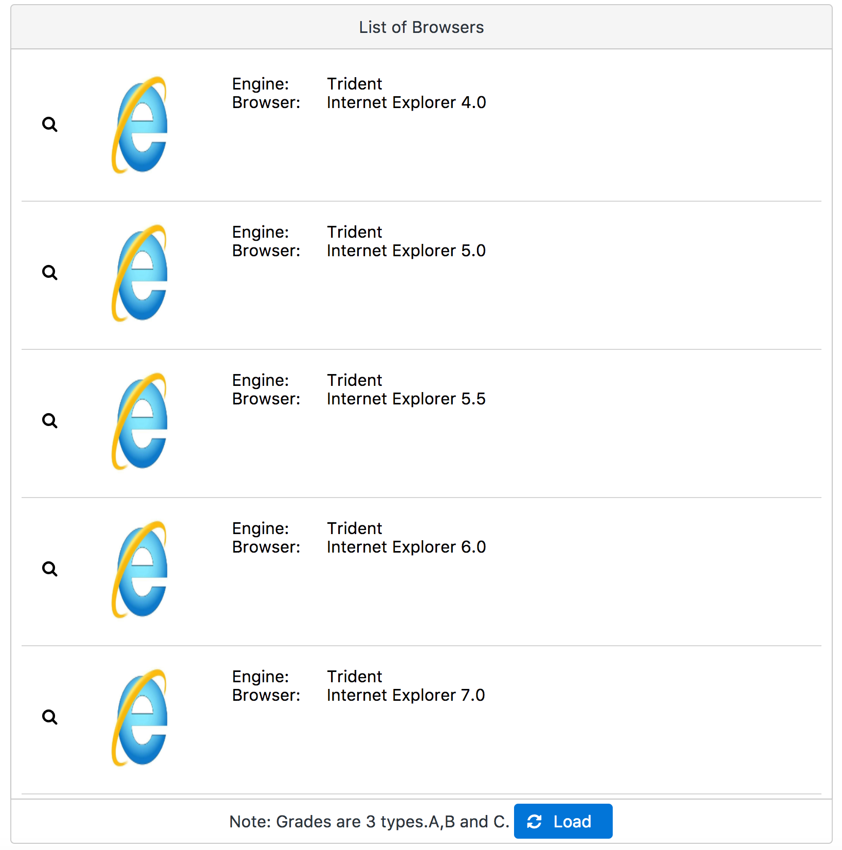
In the preceding snapshot, additional browser information is displayed in a dialog format once the user clicks the search button on the left-hand side. This gives the ability to show how to select a particular record in a DataScroller component.