How Card is a great way to group information with the container having rounded corners and a drop shadow
How to build a linear list of scrollable widgets with ListView
How to display tiles of scrollable widgets in a grid format with GridView
How Stack lets you overlap, position, and align its children widgets
How to create custom scrolling effects using CustomScrollView and slivers
In this chapter, you'll learn to create scrolling lists that help users view and select information. You'll start with the Card widget in this chapter because it is commonly used in conjunction with list‐capable widgets to enhance the user interface (UI) and group data. In the previous chapter, you took a look at using the basic constructor for the ListView, and in this chapter, you'll use the ListView.builder to customize the data. The GridView widget is a fantastic widget that displays a list of data by a fixed number of tiles (groups of data) in the cross axis. The Stack widget is commonly used to overlap, position, and align widgets to create a custom look. A good example is a shopping cart with the number of items to purchase on the upper‐right side.
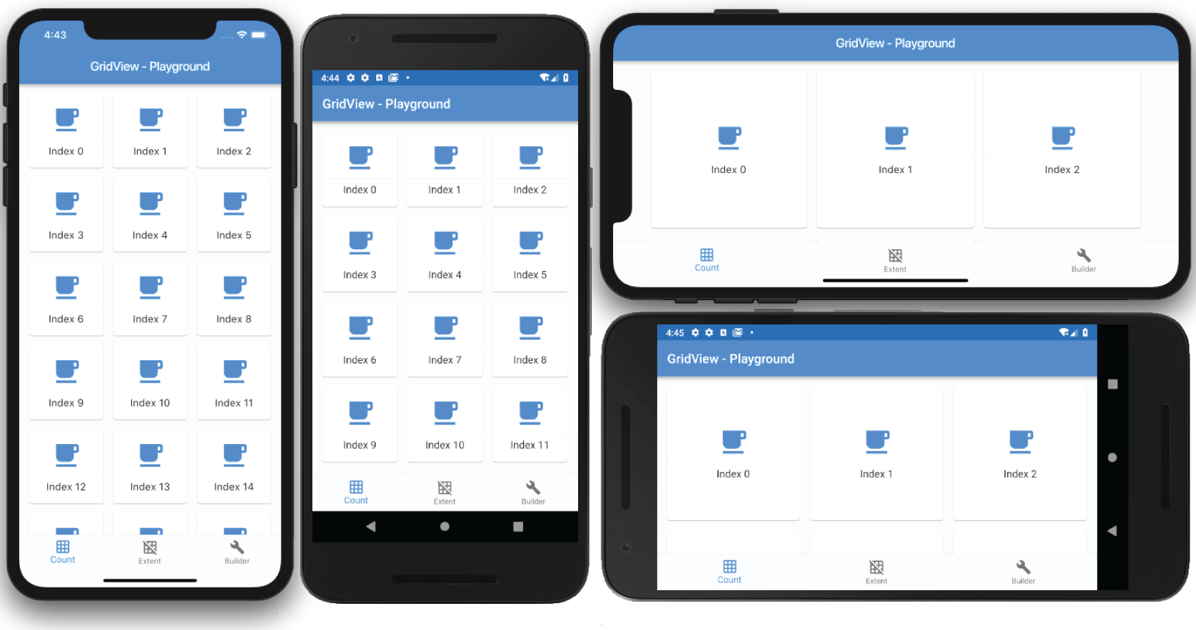
The CustomScrollView widget allows you to create custom scrolling effects by using a list of slivers widgets. Slivers are handy, for instance, if you have a journal entry with an image on the top of the page and the diary description below. When the user swipes to read more, the description scrolling is faster than the image scrolling, creating a parallax effect.
USING THE CARD
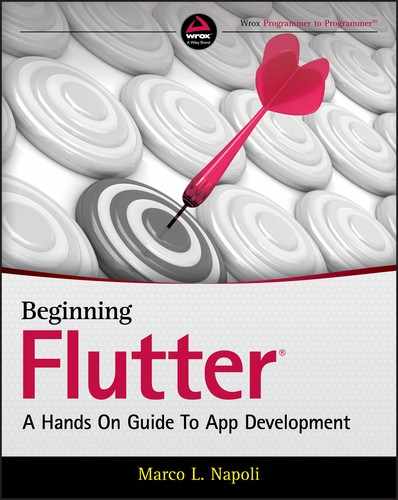
The Card widget is part of the Material Design and has minimal rounded corners and shadows. To group and lay out data, the Card is a perfect widget to enhance the look of the UI. The Card widget is customizable with properties such as elevation, shape, color, margin, and others. The elevation property is a value of double, and the higher the number, the larger the shadow that is cast. You learned in Chapter 3, “Learning Dart Basics,” that a double is a number that requires decimal point precision, such as 8.50. To customize the shape and borders of the Card widget, you modify the shape property. Some of the shape properties are StadiumBorder, UnderlineInputBorder, OutlineInputBorder, and others.
// Create a Stadium Bordershape: StadiumBorder(),// Create Square Corners Card with a Single Orange Bottom Bordershape: UnderlineInputBorder(borderSide: BorderSide(color: Colors.deepOrange)),// Create Rounded Corners Card with Orange Bordershape: OutlineInputBorder(borderSide: BorderSide(color: Colors.deepOrange.withOpacity(0.5)),),
USING THE LISTVIEW AND LISTTILE
The constructor ListView.builder is used to create an on‐demand linear scrollable list of widgets (Figure 9.2). When you have a large set of data, the builder is called only for visible widgets, which is great for performance. Within the builder, you use the itemBuilder callback to create the list of children widgets. Keep in mind the itemBuilder is called only if the itemCount argument is greater than zero, and it is called as many times as the itemCount value. Remember, the List starts at row 0, not 1. If you have 20 items in the List, it loops from row 0 to 19. The scrollDirection argument defaults to Axis.vertical but can be changed to Axis.horizontal.
FIGURE 9.2: ListView linear layout using the ListTile
The ListTile widget is commonly used with the ListView widget to easily format and organize icons, titles, and descriptions in a linear layout. Among the main properties are leading, trailing, title, and subtitle properties, but there are others. You can also use the onTap and onLongPress callbacks to execute an action when the user taps the ListTile. Usually the leading and trailing properties are implemented with icons, but you can add any type of widget.
In Figure 9.2, the first three ListTiles show an icon for the leading property, but for the trailing property, a Text widget shows a percentage value. The remaining ListTiles show both the leading and trailing properties as icons. Another scenario is to use the subtitle property to show a progress bar instead of additional text description since these properties accept widgets.
The first code example here shows a Card with the child property as a ListTile to give it a nice frame and shadow effect. The second example shows a base ListTile.
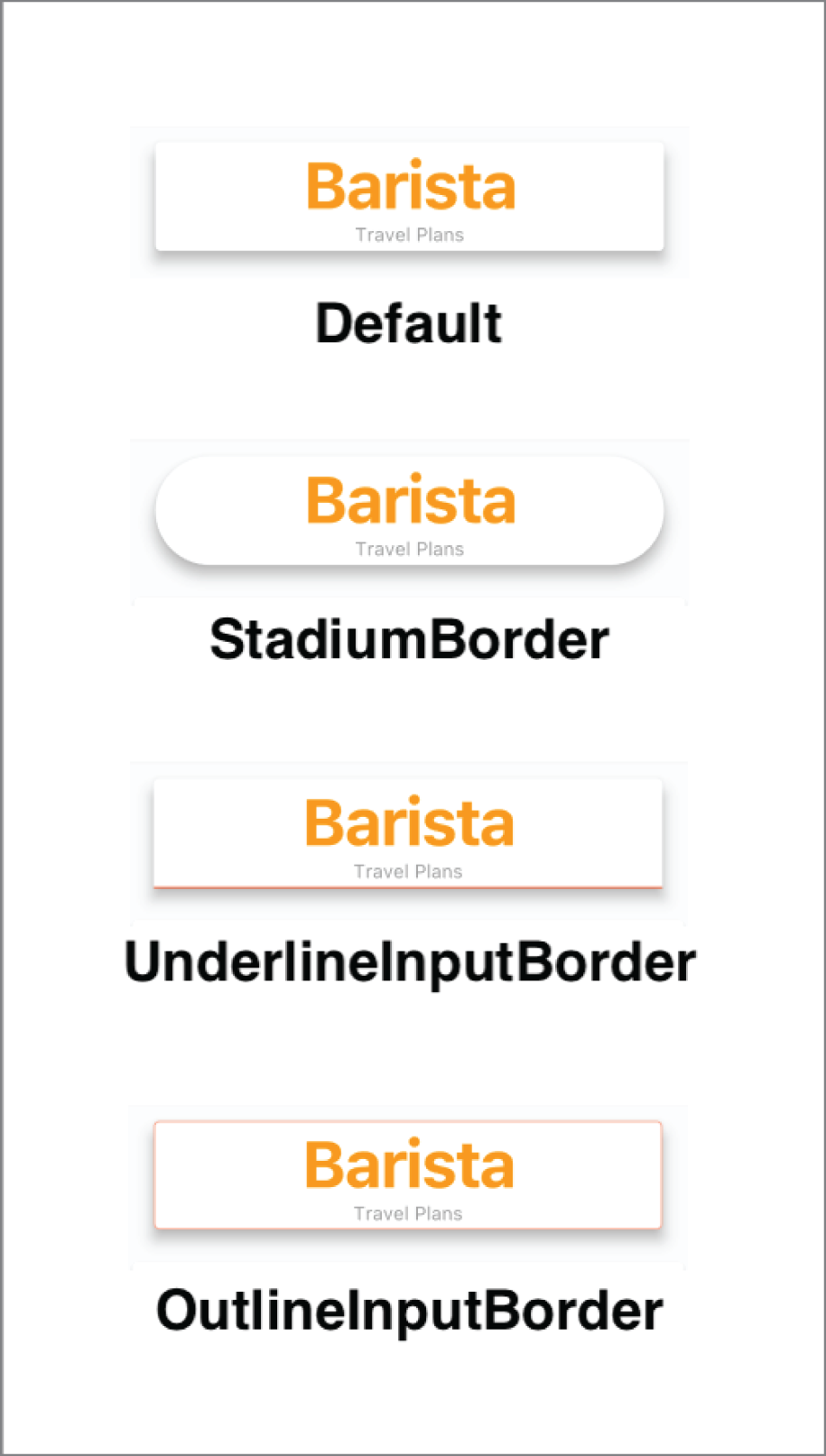
The GridView (Figure 9.3) displays tiles of scrollable widgets in a grid format. The three constructors that I focus on are GridView.count, GridView.extent, and GridView.builder.
The GridView.count and GridView.extent are usually used with a fixed or smaller data set. Using these constructors means that all of the data, not just visible widgets, is loaded at init. If you have a large set of data, the user does not see the GridView until all data is loaded, which is not a great user experience (UX). Usually you use the GridView.count when you need a layout with a fixed number of tiles in the cross‐axis. For example, it shows three tiles in portrait and landscape modes. You use the GridView.extent when you need a layout with the tiles that need a maximum cross‐axis extent. For example, two to three tiles fit in portrait mode, and five to six tiles fit in landscape mode; in other words, it fits as many tiles that it can depending on screen size.
The GridView.builder constructor is used with a larger, infinite, or unknown size set of data. Like our ListView.builder, when you have a large set of data, the builder is called only for visible widgets, which is great for performance. Within the builder, you use the itemBuilder callback to create the list of children widgets. Keep in mind the itemBuilder is called only if the itemCount argument is greater than zero, and it is called as many times as the itemCount value. Remember, the List starts at row 0, not 1. If you have 20 items in the List, it loops from row 0 to 19. The scrollDirection argument defaults to Axis.vertical but can be changed to Axis.horizontal (Figure 9.3).
Using the GridView.count
The GridView.count requires setting the crossAxisCount and the children argument. The crossAxisCount sets the number of tiles to display (Figure 9.4), and children is a list of widgets. The scrollDirection argument sets the main axis direction for the Grid to scroll, either Axis.vertical or Axis.horizontal, and the default is vertical.
FIGURE 9.4: GridView count with three tiles in portrait and landscape mode
For the children, you use the List.generate to create your sample data, a list of values. Within the children argument, I added a print statement to show that the entire list of values is built at the same time, not just the visible rows like the GridView.builder. Note for the following sample code, 7,000 records are generated to show that the GridView.count does not show any data until all of the records are processed first.
The GridView.extent requires you to set the maxCrossAxisExtent and children argument. The maxCrossAxisExtent argument sets the maximum size of each tile for the axis. For example, in portrait, it can fit two to three tiles, but when rotating to landscape, it can fit five to six depending on the screen size (Figure 9.5). The scrollDirection argument sets the main axis direction for the grid to scroll, either Axis.vertical or Axis.horizontal, and the default is vertical.
FIGURE 9.5: GridView extent showing the maximum number of tiles that can fit according to screen size
For the children, you use List.generate to create your sample data, which is a list of values. Within the children argument, I added a print statement to show that the entire list of values is built at the same time, not just the visible rows like the GridView.builder.
The GridView.builder requires you to set the itemCount, gridDelegate, and itemBuilder arguments. The itemCount sets the number of tiles to build. The gridDelegate is a SilverGridDelegate responsible for laying out the children list of widgets for the GridView. The gridDelegate argument cannot be null; you need to pass the maxCrossAxisExtent size, for example, 150.0 pixels.
For example, to display three tiles across the screen you specify the gridDelegate argument with the SliverGridDelegateWithFixedCrossAxisCount class to create a grid layout with a fixed number of tiles for the cross axis. If you need to display tiles that have a maximum width of 150.0 pixels, you specify the gridDelegate argument with the SliverGridDelegateWithMaxCrossAxisExtent class to create a grid layout with tiles that have a maximum cross‐axis extent, the maximum width of each tile.
The GridView.builder is used when you have a large set of data because the builder is called only for visible tiles, which is great for performance. Using the GridView.builder constructor results in lazily building a list for visible tiles, and when the user scrolls to the next visible tiles they are lazily built as needed.
USING THE STACK
The Stack widget is commonly used to overlap, position, and align widgets to create a custom look. A good example is a shopping cart with the number of items to purchase on the upper‐right side. The Stackchildren list of the widget is either positioned or nonpositioned. When you use a Positioned widget, each child widget is placed at the appropriate location.
The Stack widget resizes itself to accommodate all of the nonpositioned children. The nonpositioned children are positioned to the alignment property (Top‐Left or Top‐Right depending on the left‐to‐right or right‐to‐left environment). Each Stack child widget is drawn in order from bottom to top, like stacking pieces of paper on top of each other. This means the first widget drawn is at the bottom of the Stack, and then the next widget is drawn above the previous widget and so on. Each child widget is positioned on top of each other in the order of the Stackchildren list. The RenderStack class handles the stack layout.
To align each child in the Stack, you use the Positioned widget. By using the top, bottom, left, and right properties, you align each child widget within the Stack. The height and width properties of the Positioned widget can also be set (Figure 9.6).
FIGURE 9.6: Stack layout showing Image and Text widgets stacked over the background image
You'll also learn how to implement the FractionalTranslation class to position a widget fractionally outside the parent widget. You set the translation property with the Offset(dx,dy) (double type value for x‐and y‐axis) class that's scaled to the child's size, resulting in moving and positioning the widget. For example, to show a favorite icon moved a third of the way to the upper right of the parent widget, you set the translation property with the Offset(0.3,‐0.3) value.
The following example (Figure 9.7) shows a Stack widget with a background image, and by using the FractionalTranslation class, you set the translation property to the Offset(0.3,‐0.3) value, placing the star icon one‐third to the right of the x‐axis and a negative one‐third (move icon upward) on the y‐axis.
FIGURE 9.7: FractionalTranslation class showing favorite icon moved to the upper right
The CustomScrollView widget creates custom scrolling effects by using a list of slivers. Slivers are a small portion of something larger. For example, slivers are placed inside a view port like the CustomScrollView widget. In the previous sections, you learned how to implement the ListView and GridView widgets separately. But what if you needed to present them together in the same list? The answer is that you can use a CustomScrollView with the slivers property list of widgets set to the SliverSafeArea, SliverAppBar, SliverList, and SliverGrid widgets (slivers). The order in which you place them in the CustomScrollViewslivers property is the order in which they are rendered. Table 9.1 shows commonly used slivers and sample code.
The SliverList and SliverGrid slivers use delegates to build the list of children explicitly or lazily. An explicit list builds all of the items first then displays them on the screen. A lazily built list only builds the visible items on the screen and when the user scrolls the next visible items are built (lazily) resulting in better performance. The SliverList has a delegate property and the SliverGrid has a delegate and a gridDelegate property.
The SliverList and SliverGriddelegate property can use the SliverChildListDelegate to build an explicit list or use the SliverChildBuilderDelegate to lazily build the list. The SliverGrid has an additional gridDelegate property to specify the size and position of the grid tiles. Specify the gridDelegate property with the SliverGridDelegateWithFixedCrossAxisCount class to create a grid layout with a fixed number of tiles for the cross axis; for example, show three tiles across. Specify the gridDelegate property with the SliverGridDelegateWithMaxCrossAxisExtent class to create a grid layout with tiles that have a maximum cross‐axis extent, the maximum width of each tile; for example, 150.0 pixels maximum width for each tile.
Table 9.2 shows the SliverList and SliverGrid delegates to help you build lists.
SliverChildListDelegate builds an explicit list. SliverChildBuilderDelegate lazily builds a list of unknown number of tiles. The gridDelegate property controls the position and size of the children widgets.
The SliverAppBar widget can have a parallax (Figure 9.8) effect by using the expandedHeight and flexibleSpace properties. The parallax effect scrolls a background image slower than the content in the foreground. If you need to show the CustomScrollView initially scrolled at a particular position, use a controller and set the ScrollController.initialScrollOffset property. For example, you would set the initialScrollOffset by initializing the controller = ScrollController(initialScrollOffset: 10.0).
In this chapter, you learned to use the Card to group information with the container having rounded corners and a shadow. You used the ListView to build a list of scrollable widgets and to align grouped data with the ListTile, and you used the GridView to display data in tiles, using the Card to group the data. You embedded a Stack in a ListView to show an Image as a background and stacked different widgets with the Positioned widget to overlap and position them at the appropriate locations by using the top, bottom, left, and right properties.
In the next chapter, you'll learn to build custom layouts by using SingleChildScrollView, SafeArea, Padding, Column, Row, Image, Divider, Text, Icon, SizedBox, Wrap, Chip, and CircleAvatar. You'll learn to take a high‐level view as well as a detailed view to separate and nest widgets to create a custom UI.
WHAT YOU LEARNED IN THIS CHAPTER
TOPIC
KEY CONCEPTS
Card
This groups and organizes information into a container with rounded corners and casts a drop shadow.
ListView and ListTile
This is a linear list of scrollable widgets with either vertical or horizontal scrolling. To easily format how the list of records is displayed in rows, you took advantage of the ListTile widget to align grouped data with leading and trailing icons.
GridView
This displays tiles of scrollable widgets in a grid format. Scrolling can be vertical or horizontal.
Stack
This is commonly used to overlap, position, and align its children widgets to create a custom look.
CustomScrollView and slivers
This allows you to create custom scrolling effects by using a list of slivers widgets like a SliverSafeArea, SliverAppBar, SliverList, SliverGrid, and more.


 WHAT YOU LEARNED IN THIS CHAPTER