10
Building Layouts
WHAT YOU WILL LEARN IN THIS CHAPTER
- How to create simple and complex layouts
- How to combine and nest widgets
- How to combine vertical and horizontal widgets to create a custom layout
- How to build the UI layout by using widgets such as
SingleChildScrollView,SafeArea,Padding,Column,Row,Image,Divider,Text,Icon,SizedBox,Wrap,Chip, andCircleAvatar
In this chapter, you'll learn how to take individual widgets and nest them to build a professional layout. This concept is known as composition and is a huge part of creating Flutter mobile apps. Most of the time you can build simple or complex layouts either using vertical or horizontal widgets or using a combination of both.
A HIGH‐LEVEL VIEW OF THE LAYOUT
This chapter's goal is to create a journal entry page displaying details from top to bottom. The journal page shows the header image, title, diary detail, weather, (journal location) address, tags, and footer images. The weather, tags, and footer images sections are built by nesting widgets to build a custom layout (Figure 10.1).
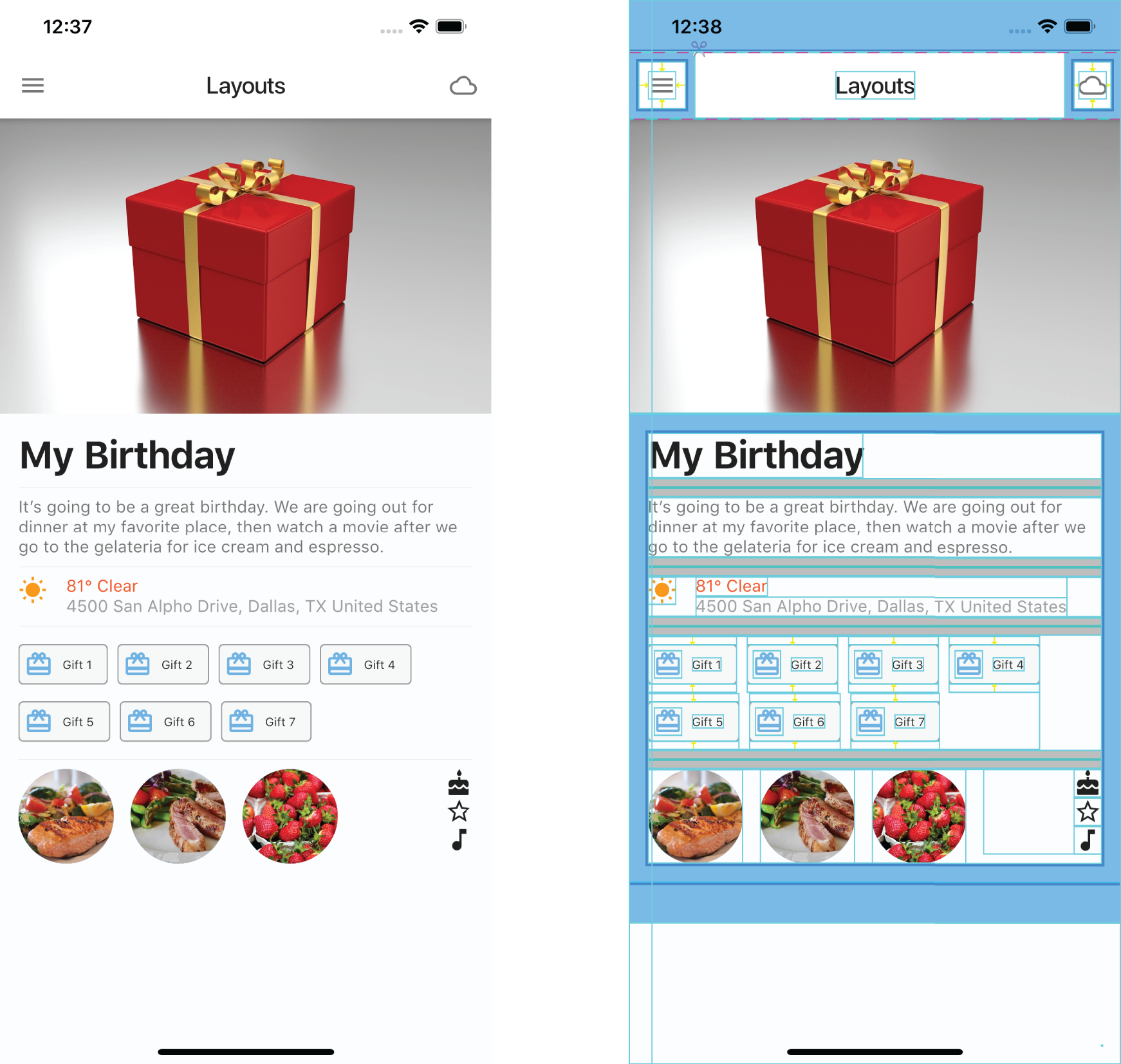
FIGURE 10.1: Journal detail page layout
Starting with a high‐level view, let's break down the main parts of the layout that forms the foundation. A great way to start laying out the journal entry is to add layers from the bottom toward the top, the same way you stack paper. Figure 10.2 shows the journal page layout structure.

FIGURE 10.2: High‐level view
- Since mobile devices are available in different sizes, the layout starts by adding a
SingleChildScrollViewto automatically handle scrolling for portions of the screen that are cut off by smaller devices. - Next a
Columnwidget is used to align widgets vertically from the top toward the bottom of the screen. - For the wrapped gift image, the
Imagewidget is added as the first child of the firstColumn, allowing the image to fill the full width of the device. - The first
Columnchild is aSafeAreawidget to handle the device notch for the journal entry content. - Add to the
SafeAreachild a secondColumnwith children widgets composed of aTextwidget for the journal entry title and aTextwidget for the journal entry details. - Continue adding to the second
Columnchildren aRowwidget that will contain the weather icon, the weather temperature, and the journal entry location address. In the “Weather Section Layout” section of this chapter, you will learn to add widgets to create the detailed layout. - Continue by adding to the second
Columnchildren aWrapwidget displaying theChipwidgets. You'll learn to add layout widgets in the “Tags Layout” section. - Lastly, you'll add to the second
ColumnaRowwidget to display images and icons, and you'll learn how to add layout widgets in the “Footer Images Layout” section of this chapter.
Weather Section Layout
Each journal entry records the weather, temperature, and location at the time of entry to recall the details at a later time. To provide that information, you're including a journal entry weather section. Using a Row, you add two Column widgets and one SizedBox widget. The first Column contains an Icon to show the weather symbol. The second Column contains two Row widgets. The first Row has a Text showing the weather temperature and description. The second Row has a Text showing the location address of the journal entry (Figure 10.3).
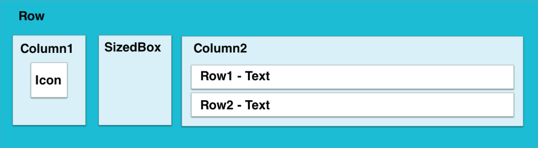
FIGURE 10.3: Weather section
Tags Layout
To organize each journal entry and facilitate searching, you use tags to add categories to the entry. Tags are items such as movie, family, birthday, vacation, and so on. The tags section uses a Wrap widget with a children list of Chip widgets. When you have a list of items that can be of different lengths and an unknown number of items, nesting them in a Wrap widget lays out each child automatically according to available space (Figure 10.4).
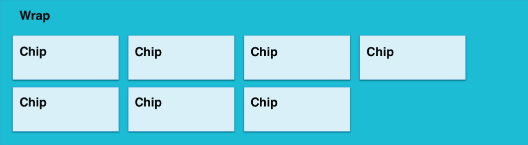
FIGURE 10.4: Tags section
The Chip widget is a great way to group information and customize the presentation look and feel. Setting the label property is the only requirement but most of the time it's used by setting the avatar property with an Icon or an Image widget. By default the Chip widget is a gray stadium (rectangle with large semicircles on the ends at opposite sides) shape but you can customize it by using the shape property and the backgroundColor property. The following sample code shows a customized Chip widget that displays the label and avatar in a rectangular shape with small rounded corners. The RoundedRectangleBorder class returns the rectangular border with rounded corners.
Chip(label: Text('Vacation'),avatar: Icon(Icons.local_airport),shape: RoundedRectangleBorder(borderRadius: BorderRadius.circular(4.0),side: BorderSide(color: Colors.grey),),backgroundColor: Colors.grey.shade100,);
Footer Images Layout
It is said that a picture is worth a thousand words, and the footer section allows you to add photos to each journal entry to bring back memories. The footer sections use a Row with a CircleAvatar widget showing different images. At the end of the Row, a SizedBox is used to space the child Column to the end. The Column shows vertically aligned Icons (Figure 10.5).

FIGURE 10.5: Footer section
Final Layout
You looked at how to lay out each section of the journal detail page. By nesting widgets, you build custom or complex layouts known as composition. The power of nesting widgets to create beautiful UIs is limited only by your imagination. Figure 10.6 shows the journal detail page and the three main customized sections for the weather, tags, and footer images.

FIGURE 10.6: Final layout
CREATING THE LAYOUT
When creating the layout, it's good to start from a high‐level view and then work your way down to each detailed section. By taking each section of the page, you start to analyze the requirements and format as needed. For example, if a particular section lays out the items horizontally, you start with a Row; if the section's layout is vertical, you start with a Column. Then you look at the display requirements and start breaking down data into its own sections by nesting widgets.
SUMMARY
In this chapter, you learned how to envision a high‐level custom layout and break it down into its main sections. Then you took each main section and built the layout needed by nesting widgets.
In the next chapter, you'll learn to add interactivity by using the GestureDetector, Draggable, DragTarget, InkWell, and Dismissable widgets.
 WHAT YOU LEARNED IN THIS CHAPTER
| TOPIC | KEY CONCEPTS |
| Getting a high‐level view | Break down the page into main sections. |
| Creating simple and complex layouts | Separate and nest widgets. |
| Creating a custom layout | Lay out and use widgets such as SingleChildScrollView, SafeArea, Padding, Column, Row, Image, Divider, Text, Icon, SizedBox, Wrap, Chip, and CircleAvatar. |