Chapter 10
Improving Web Typography
For a long time, web typography was a much-neglected field. While advances in type were piped back into editing software like Adobe Photoshop or InDesign, browsers had to deal with a very basic and limited suite of type technologies. However, all this is changing with CSS3. Before we dive into the new tools CSS3 provides to craft type, let’s clarify what “type” means and the various terms that are used in web typography.
Typeface and fonts
Let’s define the terms.
- Typeface: The term refers to type designs that are created by type designers. Georgia, Helvetica, and Futura are all typefaces. Typefaces can be created on paper and then tweaked in a type design application or created in software programs like Font Lab. Letters that form parts of a typeface have characteristics that can be tweaked with various settings.
- Font: Fonts enable the printing of a typeface. Fonts can be metal or, in the case of the Web, digital. We will only be dealing with digital fonts in this chapter.
Jon Tan writes about how a font is not a typeface and web designers shouldn’t make that mistake.
Anatomy of type
The anatomy of type is shown in Figure 10-1.
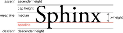
Figure 10-1. Anatomy of type
- Baseline: The line on which all characters “sit.”
- Mean line: The line that determines where the non-ascending characters end in a typeface.
- X-height: The distance between the baseline and the mean line.
- Ascender: The part of a lower case character that extends above the mean line of a font. In Figure 10-1, it’s the part of “h” that extends above all the other letters in that word.
- Descender: The portion of a lower case character that extends below the baseline of the font. In Figure 10-1, it’s the part of the “p” that extends below all the other letters in that word.
- Glyph: A glyph refers to a unit of type. It could be an “ü” or a plain vanilla “a.” These are glyphs that have unique styles depending on the typeface we use.
- Ligature: Two or more glyphs joined together to form a single glyph. It’s not seen often in Latin scripts (popular Latin ligatures are ffl and ffi); it’s much more commonly used in Indic and CJK scripts.
- Leading: This refers to the space between lines of text. We set this in our style sheet with the
line-heightproperty. - Letter spacing: It refers to the amount of space between the letters in a word or a block of text. We can control this with
letter-spacingproperty. - Kerning: When we adjust the space between two specific characters, we kern. Monospace fonts by definition have fixed spaces between characters and can’t be kerned. Most fonts have kerning definitions that are applied automatically by the typesetting engine. We will talk later about how to control the space between characters.
- Generic font family: This is a term exclusively used with web typography. When we set our type on the Web, it is possible that our desired type may not be available. In that case, we can specify which category of fonts we would like our page to be rendered with by declaring one of the generic font families. There are five generic font families: serif (e.g., Times), sans-serif (e.g., Helvetica), cursive (e.g., Zapf-Chancery), fantasy (e.g., Western), and monospace (e.g., Courier). Failure to set a generic font family results in the browser choosing its own default font (and this varies based on the browser and the user’s customizations) to render our page.
- Alignment: The setting of the text relative to the page. Typical values include left, right, center, or justified. On the Web, justified text is prone to generate rivers of text. We will look at some solutions later.
- Widows and orphans: Short lines of text left dangling at the top or the bottom of a column. An orphan is left at the bottom and a widow is left at the top.
While there are various ways to tweak some of the characteristics of type, the ability to do so for web typefaces via CSS was introduced very recently. Here’s a brief history of web type to help you understand how it all began and where we will be going next.
A brief history of web type
In the early days of the Web, stylesheets were not created by authors of sites, but only by users. As a user, you could specify a universal stylesheet with the kind of font you wanted to see, and all web sites you visited would be rendered with the styles you specified. This meant that you had full control of the fonts that were used to render the web pages.
This changed around October 1994 when stylesheets were proposed to be set, not by the user, but by those serving the HTML pages (quite a radical change!) This presented a problem. What if the users didn’t have the font specified by the authors of the stylesheets? For example, if you as the designer specified the font-family of Helvetica Neue Light, how would the browser render the text if the font wasn’t installed on the user’s computer?
The original authors of CSS, Håkon Wium Lie and Bert Bos, considered this problem and came up with several options:
- Serve the font from the server: There was no commonly agreed-upon font format (in the early days, even TrueType or OpenType fonts did not exist), and with the bandwidth being so slow in the 90s (remember 96kbps modems?) it would have been impossible to download font files in time to render a page with it.
- Pass a few values and generate glyphs similar to the font requested on the fly: This was not optimal and sometimes led to ugly results.
- The author sets a list of fonts in the order of preference in the hope that one of them is available: The author could also set a default generic font that the browser would use to find a suitable font from the user’s computer if none of the author-chosen fonts were available.
The last option might be familiar to you, as it became a standard in 1996.
Microsoft also created a freely distributable font stack that was legible on the screen and supported internationalization so that it could be used as a base for web typography. This led to the proliferation of Arial, Courier, and Comic Sans across various operating systems.
Unfortunately, there wasn’t much more movement until 2008. Meanwhile, front-end designers tried to work around the desert of web typography creatively, through image replacement, sIFR, Cufon, or SVG fonts. Let’s take a look at some of these options before we look into the modern miracle of web fonts.
The Web Typography page at Wikipedia covers a lot more ground on the history of various web typographic formats (http://en.wikipedia.org/wiki/Web_typography).
Text as image
The most common way to render a font that is not available on a user’s machine is to serve it as a graphic. This technique came in countless variations, each eliminating or adding constraints to the manner in which these images could be used. Here are some of them.
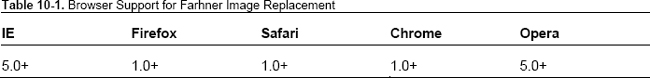
Farhner Image Replacement (FIR)
Farhner Image Replacement is one of the earliest inventions to work around the typographic limitations within a stylesheet. Named after Todd Farhner, invented by C. Z. Roberton in 1999, and popularized by Doug Bowman and Jeffery Zeldman, FIR was the most popular way of replacing text with graphics using CSS. See Table 10-1 for information on browser support.
The debilitating disadvantages of this method was that it removed the text from being available to screen readers and rendered nothing to users who turned off images by default (which was a significant number given how constrained bandwidth was at that time).
Go to http://jsfiddle.net/nimbu/Q274j/ for the technique as represented in code.
Leahy/Langridge method
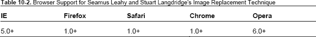
Seamus Leahy and Stuart Langridge independently discovered a solution that would help users with screen readers. By padding the text element, this method pushed the text beyond the viewable area of the element, making it still visible for screen readers but hiding it from desktop users. See Table 10-2 for information on browser support for this method.
Unfortunately, users who had images turned off were unable to see the text.
Go to http://jsfiddle.net/nimbu/pnRb8/ for the technique as represented in code.
Phark method
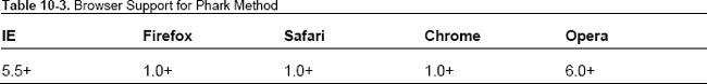
Meanwhile, Mike Rundle proposed a solution using text-indent to hide the text. This meant the text was still accessible to screen readers but users who had images turned off were unable to see text (Table 10-3).
Go to http://jsfiddle.net/nimbu/8ZMmT/ to see the technique as represented in code.
Gilder/Levin method
Levin Alexander, Petr Stanicek (a.k.a. “Pixy”), and Tom Gilder invented a technique that worked for both with screen readers and users who disabled images. Basically, it made use of an empty element to apply the background image to and was rendered on top of the text. It came with a big caveat: the image could not be transparent. See Table 10-4 for more information.

Go to http://jsfiddle.net/nimbu/Ra6p5/ to see the technique as represented in code.
JavaScript Image Replacement (JIR)
Peter Paul Koch took a different approach by offering a JavaScript image replacement solution (www.quirksmode.org/dom/fir.html). This method first detected if images were disabled via JavaScript before doing image replacement, thereby solving the problems of text not being visible to screen readers or to users who disabled images. It was expanded upon by Stewart Rosenberger (www.alistapart.com/articles/dynatext/) to use PHP for automatically generating images on the server. See Table 10-5.

Nonetheless, all these techniques suffered from the drawback of not scaling when font sizes were changed or when the width occupied by the text changed. They did not allow for any text to be fluid but only fit into predetermined boxes.
Enter sIFR
Go to http://jsfiddle.net/nimbu/Q6FBQ/ to see the technique as represented in code.
A comprehensive list of image replacement solutions can be found on Mezzoblue (www.mezzoblue.com/tests/revised-image-replacement/).
Nicholas Gallagher also wrote about the less-known Nash Image Replacement technique at http://nicolasgallagher.com/css-image-replacement-with-pseudo-elements/.
sIFR
Flash image replacement was first used in a big way by Mike Davidson on ESPN.com in 2001 to render custom type for headings using embedded Flash movies for those who had Flash installed and plain text for those who did not. In 2004, Shaun Inman invented a better technique (dubbed Shaun Inman Flash Replacement; see www.mikeindustries.com/blog/archive/2004/08/sifr) that worked on plain HTML and added a dynamically generated Flash movie via JavaScript to replace the plain text headings. By early 2000s, Flash was almost ubiquitous, which made this technique easy to get behind.
In late 2004, Mike Davidson and Shaun Inman combined forces to release a better version dubbed sIFR that handled multiple lines of text, did not need exact dimensions, and rendered the Flash movie to lay out the type to fit snugly within the dimensions occupied by plain text. The big drawbacks were that you had to use type that wasn’t narrower than the font used to render the plain text type, and if you resized the text (say you clicked “text-size -> 200%”) the text wouldn’t resize. See Table 10-6.

- These browsers need JavaScript enabled and have Flash 6 or greater installed.
Cufón
Cufón aimed to be a replacement for sIFR by using the new canvas element for modern browsers and VML for IE. Cufón required us to upload the fonts we wanted to use to their online generator, which converted them into a Cufón-understandable format. Then we needed to include the generated file with Cufón’s JavaScript files to render the text in our custom font.
Cufón, like other image replacement solutions, now allows us to select the text that gets replaced. Like sIFR, the more text to be replaced, the longer it takes to be rendered.
The Cufón Wiki at https://github.com/sorccu/cufon/wiki/ has more details.
SVG fonts
In October 2001, the SVG 1.1 Working Draft was released with a font element that allowed users to specify glyphs in SVG syntax. The purpose of this element as outlined in the specification was
…to allow for delivery of glyph outlines in display-only environments. SVG fonts that accompany Web pages must be supported only in browsing and viewing situations…
A key value of SVG fonts is guaranteed availability in SVG user agents. In some situations, it might be appropriate for an SVG font to be the first choice for rendering some text. In other situations, the SVG font might be an alternate, back-up font in case the first choice font (perhaps a hinted system font) is not available to a given user.
SVG 1.0 Specification,
www.w3.org/TR/2001/REC-SVG-20010904/fonts.html
This is precisely the reason why SVG fonts have gained prominence recently. iOS devices do not support the ability to render Open Type font but Mobile Safari and Opera Mobile do render SVG fonts. Unfortunately, this means the fonts lose the hints and–depending on the font–look worse on small screens. We can include SVG fonts using the famous @font-face rule that we will look into shortly.
SVG fonts have some advantages. We can include several fonts within the same file. This saves on network requests, which are the main cause of slow page loads on mobile browsers.
Unfortunately, Firefox does not yet support SVG fonts, unlike the other major browsers today (https://bugzilla.mozilla.org/show_bug.cgi?id=119490). This makes SVG a peripheral player in the font formats war.
And now let’s take a look at the remarkable phenomenon in recent history that has allowed us to smoothly transition to using web fonts for websites: the rise of @font-face.
@font-face
@font-face is a rule standardized in the CSS3 Fonts Module, which was first introduced as a Working Draft in 2002. @font-face allows us to declare where on the Internet fonts are located and their formats so they can be used later in our stylesheet as a value for the font-family property. The interesting thing is that @font-face has been in and out of the CSS specifications for a while without being implemented by most browsers. Let’s look at its evolution.
Web fonts
We have come far without defining web fonts. Web fonts simply refer to all the fonts that are available to be used by declaring them in the @font-face rule. Typically all of these fonts have been optimized for web usage; thus they have small file sizes and are aliased to render correctly when used with smaller font sizes.
In the beginning
In 1996, when CSS Level 2 specifications were being worked on, Adobe, along with Bitstream, Microsoft, and others, put together the @font-face proposal that declared a @font-face rule like this:
@font-face {

font-family: 'Graublau Web';

src: url('GraublauWeb.ttf') format('ttf'),

}
As there was no clear consensus on a font format for all platforms, the W3C did not recommend a font format. This rule was included as part of CSS 2.1.
This feature also did not account for any form of restrictions on downloading fonts, so font foundries became apprehensive that it would be exploited for font piracy.
Microsoft, in association with Monotype Imaging, came up with a garden-wall DRM solution that used a new font format (EOT) that couldn’t be installed on any computers and could only be understood by browsers (in this case Internet Explorer) to render the font on the page. Unfortunately, other browser vendors did not want to adopt this technology. This meant almost no commercial font was available for use as a web font via the @font-face rule, so very few developers adopted this feature. This state of suspended animation continued until 2006.
@font-face strikes back
In 2006, CSS Working Group decided to take action to find a single format that would put an end to image replacement techniques. In October 2007, Webkit started supporting the @font-face rule to link to raw TrueType and OpenType fonts; Firefox followed in October 2008, and Opera in December 2008. None of them recognized the EOT format pioneered by Microsoft. A new font format was agreed upon, called WOFF (www.w3.org/TR/WOFF/). It provided lightweight compression of font data along with additional metadata for informing users of licensing information and more. See Table 10-7 for current support for the various formats.

Dissecting font face syntax: @font-face declaration
Let’s take a minute to understand the @font-face rule. This is how the @font-face is declared in our stylesheet:
@font-face {

  font-family: bodytext;

  src: url(ideal-sans-serif.woff) format("woff"),

       url(basic-sans-serif.ttf) format("opentype");

}
In this rule, font-family declares the name we use to refer to this custom font when we actually use it. For example, the font specified in this rule can be used in the following manner:
  p {

    font: 12px/1.5 bodytext, sans-serif;

  }
This renders all text in p elements with the font we specified with the font family called “bodytext.”
The second property src links to the actual URL for the font that we want to use.
The problem is that not all browsers understand all font formats (see Table 10-7), so we must specify one or more of these URLs along with the format function to indicate which format the URL references. This example first declares a URL for WOFF font format and then one for OpenType.
We can also use a local() function in the src to render a font if it is locally available. While this has good intentions, none of the text will be rendered if the local font is corrupt. This could be a critical issue that is beyond the control of web developers. For this reason, you should avoid using local fonts and only read from the font URL.
Within the font-face rule we can also use font descriptors like font-weight: bold or font-style: italic. These are indicators to browsers to not artificially generate bold or italic faces for these web fonts when necessary. When this font-face rule is applied to a heading, like so
H2 { font: 16px/1.5 bodytext, sans-serif; font-weight: bold; }
browsers are forced to artificially generate a bolder face of the font. To prevent this from occurring, we only need to describe our web font as a bold font so it can be used just as it is.
@font-face {

  font-family: bodytext;

  src: url(ideal-sans-serif.woff) format("woff"),

       url(basic-sans-serif.ttf) format("opentype");

  font-weight: bold;

}
This has no impact on our p selector but prevents our h2 headings from having a synthetic bold face (which looks much worse than including the font as-is).
Bulletproof syntax for @font-face
From the previous section you would think writing a @font-face rule that works across all browsers would not be much of a headache. Unfortunately, it is. We need to ensure browsers only download one of the several resources we specify so that our pages load quickly. Luckily there is a syntax that can do just that. Paul Irish came up with the first simple universal solution for it, which was then enhanced by Richard Fink and finally made most robust by Ethan Dunham.
@font-face {

font-family: 'MyFontFamily';

src: url('myfont-webfont.eot'), /* IE9 Compat Modes */

src: url('myfont-webfont.eot?iefix') format('eot'), /* IE6-IE8 */

url('myfont-webfont.woff') format('woff'), /* Modern Browsers */

url('myfont-webfont.ttf')  format('truetype'), /* Safari, Android, iOS */

url('myfont-webfont.svg#svgFontName') format('svg'), /* Legacy iOS */

}
If you are worried about generating fonts in each of these formats, fear not. FontSquirrel has a @font-face generator (at www.fontsquirrel.com/fontface/generator) that automatically converts your uploaded font into all the supported web font formats. Make sure you have permission to use your font as a web font first.
Downloading web fonts takes some time, which means that users need to wait to see the text with the font you specified. This creates an issue of a “flash of unstyled text,” which you will learn about next.
Paul Irish’s post on bulletproof syntax has a detailed explanation for each of these choices (http://paulirish.com/2009/bulletproof-font-face-implementation-syntax/).
Avoiding the flash of unstyled text (FOUT)
Web fonts take a while to download and occasionally these requests time out (or the font assets might have moved, leading to a 404). During that time, a browser has to decide if it should wait for the font to download to render the text that requires it or render the text up front without waiting and then update the rendering once the font has finished downloading. Firefox (before 4) and Opera do the former, which has come to be known as a flash of unstyled text (FOUT). Sometimes the adjustments made on a page before and after downloading the web fonts are so drastic that it disrupts interactions with the page. Webkit-based browsers wait for about 3 seconds for the font to download and then render the text in fallback fonts if the font fails to download.
Paul Irish wrote an exhaustive post on how to defeat the flash of unstyled text; he outlines the techniques to do so at http://paulirish.com/2009/fighting-the-font-face-fout/. There are a few options.
- Google’s WebFont Loader
- Using font.js
Google’s WebFont Loader
Using Google’s WebFont Loader we can hide the text entirely when JavaScript is enabled and only render it after the font is loaded by adding declarations based on the classes on the html element.
The WebFont Loader can automatically request from several font repositories that serve fonts upon request, such as Google, Ascender, Typekit, Monotype, and Fontdeck. In addition, we can use the custom configuration on fonts that we host on our server.
Note that if you use the WebFont Loader, you do not need to declare the @font-face rule. It will be taken care of by the WebFont Loader.
Once a request is made for a font, the WebFont Loader adds classes based on the state of the request of the asset. While the request is still being made, the WebFont Loader adds the class wf-loading to the HTML element. If the request fails, the WebFont Loader adds the class wf-inactive; if the font is downloaded successfully, wf-active is added to the HTML element.
We can use these classes to choose if we want to avoid the FOUT. For example, setting
.wf-loading h1 {

        visibility: hidden;

}
makes sure that h1s remain invisible while the request is being made.
Likewise, setting
.wf-inactive h1 {

        font-family: monospace;

}
ensures that a closely matching local font is used to render the h1s when the requested web font fails to download.
See http://jsfiddle.net/nimbu/HCgp8/ for how to use the WebFont Loader.
Using font.js
font.js (http://pomax.nihongoresources.com/pages/Font.js/) was created not as a solution to the problem of FOUT but as a way to represent fonts within the JavaScript Object Model. Nevertheless, it works well for loading fonts dynamically and renders content only when fonts are loaded.
To use font.js, include the font.js file in the page before the closing </head> tag.
<script type='text/javascript' src="Font.js"></script>
Then in the stylesheet, include web fonts using the bullet-proof @font-face rule discusse earlier.
On the appropriate selector, add these declarations:
#fontjs {

    visibility: hidden;

    font-family: 'Ultra', serif;

}
In this rule, ‘Ultra’ refers to the web font included using the bulletproof font-face syntax. Then we need to decide when to make the content in the selector visible. In this case, let’s do so when the body element acquires a classname called font-loaded (you will see how it will acquire this shortly).
.font-loaded #fontjs {

    visibility: visible;

}
We also want the content to be visible if the web font fails to load and to provide an alternative generic font family when that happens. Let’s do so when the body element acquires a classname called font-error.
.font-error #fontjs {

    visibility: visible;

    /* Our custom declarations to deal with the lack of web font availability */

    font-family: sans-serif;

    font-weight: bold;

}
Now, in JavaScript, we include the following snippet of code that will enable the addition of classnames font-loaded or font-error when the font loads successfully or not, respectively.
var font = new Font();


/* Font loads successfully */

font.onload = function() {

    document.body.className = 'font-loaded';

};


/* Font fails to load */

font.onerror = function(err) {

 document.body.className = 'font-error';

}


/* Kicks off the font loading */
font.fontFamily = 'Ultra';

font.src = font.fontFamily;
With font.js we have access to a bunch of font metrics like ascent and descent; we can even get the metrics for a specific string.
Unfortunately, font.js requires canvas support and it does not work in IE8 and below, which means Google WebFont Loader is the best choice to prevent FOUT.
Go to http://jsfiddle.net/nimbu/mRQpB/ to see how it looks when the font fails to load.
You can also add fancy effects when the font is loaded at http://jsfiddle.net/nimbu/LrqPb/
Things to keep in mind while using web fonts
- Web fonts create a reflow of the whole page once the font loads. So keep the usage to the minimum.
- Firefox and IE9 will fetch web fonts from a server other than where your site is hosted, but only if the server explicitly allows it.
- Keep in mind the performance of the technique you use to load fonts. Some font hosting services offer better performance compared to serving it yourself (see
www.artzstudio.com/2012/02/web-font-performance-weighing-fontface-options-and-alternatives/). - IE9 does not recognize OpenType fonts if the embedding bit is not set to installable. This is most likely the case for the majority of the OpenType web fonts available, so make sure you use the bulletproof syntax so IE9 can use WOFF or EOT if it is unable to use the OpenType format.
- If a user has enabled high security settings on IE6, a security box will pop up when a page uses a web font. There is no way around this, other than to exclude serving web fonts to IE6.
- IE6-8 will try to download the font specified in a @font-face rule as soon as it encounters it, which might slow down the download of other assets from the same server (this can be mitigated somewhat by serving fonts from another server).
- If you are using a bold typeface for headings, make sure you set
font-weightcorrectly. If you would like to use a bold face of a font, make sure you setfont-weightto bold within the @font-face rule if you want to use it in selectors that havefont-weightset to bold (http://jsfiddle.net/nimbu/wcBmD/). Otherwise, browsers will synthetically make your bold font face bolder, leading to unappealing results (see Figure 10-2).

Figure 10-2. Synthetic bold appear much thicker than the naturally bold bold.This is how it appears in Firefox.
Finding web fonts
There are a plethora of fonts to choose from, ranging from free to very expensive. Before we look at the options, note that it’s important to make sure any font you intend to use as a web font has the appropriate license for it. The license will usually state if it is allowed to be “embeddable” or be used as a web font. If a font’s license does not state it, make sure you clarify the terms from the font provider.
Free web fonts
There are many sites that offer free fonts. However, not all of them are worth using as web fonts (some may have glyphs missing or may simply be too big to qualify as a web font). These sites offer the best web fonts possible:
- Font Squirrel (
www.fontsquirrel.com/) has the largest database of free web fonts with handy @font-face kits for each. It lists some fonts that are available for use as web fonts. - The League of Movable Type (
www.theleagueofmoveabletype.com/) offers beautiful open-source fonts we can use and not just as web fonts. - Google Web Fonts (
www.google.com/webfonts) does not directly let us download font files but they are available with Open Source licenses but are hosted by Google and served via its web fonts API. - Kernest (
http://kernest.com/) also hosts a number of free fonts that we can either download or serve from Kernest servers.
Commercial web fonts
Ralf Herrmann has a list of commercial foundries that offer web fonts for purchase at http://webfonts.info/wiki/index.php?title=Commercial_foundries_which_allow_%40font-face_embedding.
FontFont Library (www.fontfont.com/) also opened up its catalogue for use as web fonts. Fonts are downloadable and available for use after paying a one-time license fee.
Lost Type (http://losttype.com/) offers web fonts that are available for a price that we name.
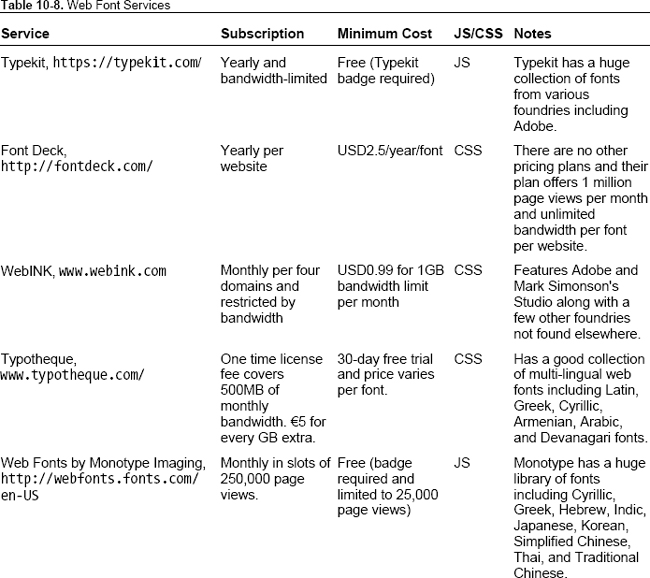
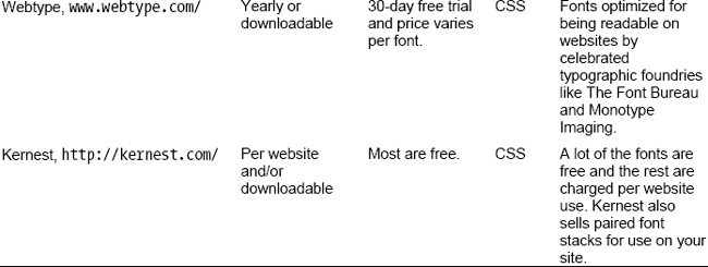
Font as a service
There are now many sites that offer web fonts as a service. All we need to do is to link to their stylesheet or a script file and then use the font in our stylesheet. Costs vary across the services and are accurate at the time of writing. Table 10-8 lists a few of the popular ones.
Designing with web fonts
The biggest drawback of web fonts that are offered as a service is that we can’t easily use them in Photoshop comps. However, there is an Adobe Photoshop CS5 plugin (http://www.webink.com/webfontplugin) that offers fonts from several foundries for use in our comps.
Typecast (http://beta.typecastapp.com/) claims to let us quickly create prototypes from our browser using fonts from several foundries. However, this service was not yet launched at the time of writing.
Chris Coyier has a demo at http://css-tricks.com/examples/IconFont/ that outlines why web fonts are great for icons.
Using web fonts as icons
A new trend has been to use fonts as icons. Simurai has a great tutorial on how to use them (http://lab.simurai.com/buttons/). Note that it would be best to map these icons to their nearest Unicode mappings as screen readers are prone to read them out as letters.
Web fonts in summary
We looked at how web fonts came to be and the best syntax for declaring web fonts. We also looked at some techniques for loading fonts to avoid a flash of unstyled text. We then looked at some resources for web fonts and how web fonts have been repurposed to render icons.
Now that you have seen how to use custom fonts on the Web, you are undoubtedly curious about how to manipulate type. Read on!
Baselines
Make sure to use the right defaults when using web type in order to provide the best possible experience for all browsers. Here is the first thing to do:
html { font-size: 100%; }
This will make sure the fonts all start with a standard default on all browsers. On the desktop, this is 16px. On mobile devices, the rendering of fonts depends on the resolution and device pixel ratio.
You can choose to either reset all possible browser default font choices with Eric Meyer’s reset.css or make sure you provide the same consistent default browser experience across all browsers.
We highly recommend the second choice, and Nicolas Gallagher and Jonathan Neal’s normalize.css (http://necolas.github.com/normalize.css/) provides the best defaults out of the box. Even if you are using normalize.css, do make sure to set the font properties correctly when you override them later in your stylesheet.
Setting font-family
When we specify a font family, we want to ensure the text renders in a readable format when our choice of font is unavailable. We can do that by setting the fallback generic font. Code Style has a great list of good font stacks (www.codestyle.org/). CSS Font Stack (http://cssfontstack.com/) is another resource for aesthetic font stacks.
    body {

    font-family: 'Helvetica Neue', Helvetica, Arial, sans-serif;

    }
The two most often used generic font families are sans-serif and serif. Make sure you remember them (especially the hyphen between sans and serif)! Also remember to put font names that have spaces within them in quotes, like ‘Helvetica Neue’.
An interesting idea explored by iotic.com is to create a font that is an average of all system fonts found on his machine. It is a very interesting read; find it at http://iotic.com/averia/.
Mathias has written in greate detail on which font-family names can be unquoted; find it at http://mathiasbynens.be/notes/unquoted-font-family
Setting vertical spacing
When setting the type, be sure to set the line-height property. Line heights can take unitless values; this mean any selector and the elements that inherit a style from that selector have their line heights calculated as a product of that unitless value and their current font size. It’s a good practice to set a unitless value for line-height that is greater than 1 to ensure your text is always readable.
Setting font sizes
Use the em unit to set font sizes. When we specify font-size in ems, the resulting font size is a product of the em value and the inherited font size. For example,
body { font-size: 100%; }

h2 { font-size: 2em; }
results in the computed font size of the h2 element to be about 32px. This is an easy way to set type sizes to be relative to the base font-size. If we increase the base font-size, every other element automatically adjusts itself.
The most popular means of setting font-sizes is by using pixels. It is very easy to do, but when the client demands larger text sizes, it’s pretty painful to adjust all of them. However, it’s trivial if we use ems. But then again, using ems can easily become a maintenance nightmare if three are several levels of nesting and element styles being overridden accidentally by a selector of higher specificity. Luckily there’s a better solution: the rem unit.
The rem unit
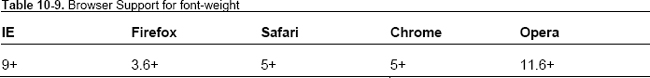
The rem unit allows us to set the font size relative to that of the root element (in typical use, the html element). By using rem instead of em, we avoid the specificity headaches of ems and simply change the font size of the root element to make the text larger or smaller in unison; see Table 10-9.
We highly recommend setting fonts with the rem unit with a fallback to the em unit.
Next, let’s look at how to render text that is pleasing to read. We do this by setting type to a vertical rhythm.
Jonathan Snook has a great article on using rem unit with a good fallback; see http://snook.ca/archives/html_and_css/font-size-with-rem.
Designing with a grid
In a seminal article, Richard Rutter laid out the secrets to establishing a typographic vertical rhythm. He explains:
The basic unit of vertical space is line height. Establishing a suitable line height that can be applied to all text on the page, be it heading, body copy or sidenote, is the key to a solid dependable vertical rhythm, which will engage and guide the reader down the page.
There are two ways to do this, one by using em units and the other (far easier) way of using pixel units. Here is the markup we will be using vertical rhythm on:
      <p>There were four of us—George, and William Samuel Harris, and myself, and Montmorency.

We were sitting in my room, smoking, and talking about how bad we were—bad from a medical

point of view I mean, of course.</p>

      <p>We were all feeling seedy, and we were getting quite nervous about it.  Harris said

he felt such extraordinary fits of giddiness come over him at times, that he hardly knew what

he was doing; and then George said that he had fits of giddiness too, and hardly knew what he

was doing.  With me, it was my liver that was out of order.</p>

      <p class="aside">I knew it was my liver that was out of order, because I had just been

reading a patent liver-pill circular, in which were detailed the various symptoms by which a

man could tell when his liver was out of order.  I had them all.</p>
Before we go any further, we need to decide the base unit of our rhythm. Then we can proceed to implement multiples of this base unit (to create a rhythm) in either pixel units or em units. For readability, in our case, we want our base unit to be 1.5 times that of the default font size. This turns out to be 1.5em or 24px depending on which unit we use in our implementation. Let’s look at both methods.
With pixels
body {

  /* font size is 16px */

  font-size: 100%;


  /* Yay, base unit */

  line-height: 24px;

}


p {

/* total space vertically above and below each paragraph equals to one base unit: 24px  */

  margin: 12px 0;

}
In this code, we have established the baseline font spacing. Now let’s start with the first paragraph. We want it to be bigger than any other paragraph but still maintain the vertical rhythm.
p:first-child {

  font-size: 24px;

}
Every time you declare margins, paddings, borders, make sure the sum of the top and bottom values is a multiple of the base unit. Especially note that margin collapsing can disrupt your vertical rhythms, so you need to compose your margins carefully based on the margins applied to the previous element.
Go to http://jsfiddle.net/nimbu/CV2Kt/7/ to see how this markup looks with this style applied. As you can see, each line fits perfectly into the vertical grids.
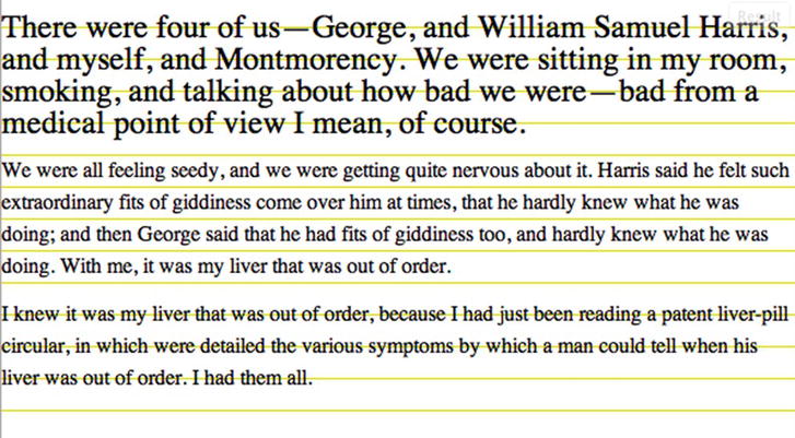
Figure 10-3 Text fitting the grid using vertica rhythm with pixels
Let’s set the last paragraph to have a border and a smaller font size.
p:last-child {

  font-size: 12px;


  /* margin-top is already margin-collapsed to be 12px, we now need to allocate rest of the

margin to the bottom margin so in total with border-width it would be a multiple of the base

unit */

  margin: 12px 0;


/* Padding top and bottom is 12px each, total = 24px */

  padding: 12px 0;

}
Here is how it looks like:
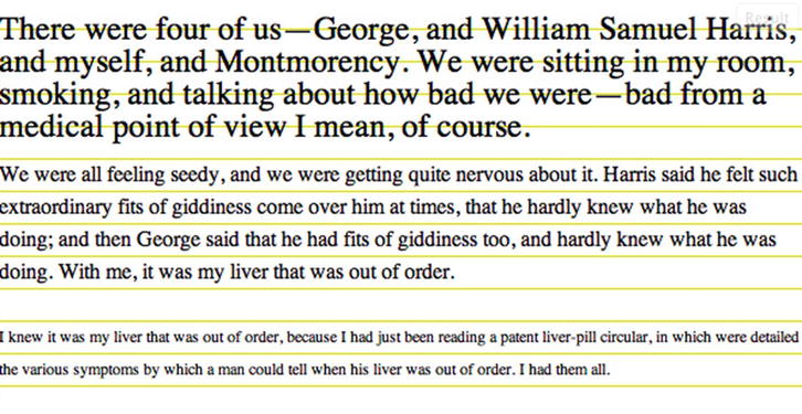
Figure 10-4. Last paragraph is smaller but still fits into the grid.
Calculating in pixels is a lot easier to do. Here is how to do so with ems.
With ems
/* gives us a base font-size of 16px, base line height of 24px on desktop browsers */

body { font-size: 100%; line-height: 1.5em; }


p {

/* vertical space above and below each paragraph totals to one line: 24px (0.75em = 12px)  */

   margin: 0.75em 0;

}


p:first-child {

  /* font-size is now 24px, line-height if not redeclared will be now 36px */

  font-size: 1.5em;


  /* line height is redeclared, now same as font size! 24px */

  line-height: 1em;


  /* vertical space above and below each paragraph totals to one line: 24px  */

  margin: 1em 0;

}


p:last-child {

  /* font size is now 12px, line height is redeclared and will be 2*12px = 24px  */

  font-size: 0.75em;

  line-height: 2em;


/* previous paragraph has margin bottom set to 12px, hence margin collapsing means we cannot

set a smaller margin-top  for this selector.  We now need to allocate rest of the margin to
the bottom margin (12px/7.2px = 1.667em) so in total with border-width it would be a multiple

of the base unit */

  margin: 1em 0;


/* Padding top and bottom is 12px each, total = 24px */

  padding: 1em 0;

}
Here’s how the markup looks with this style applied (http://jsfiddle.net/nimbu/eg8D6/15).

If you override the font size of any of these elements elsewhere, the grid will go haywire. In case of vertical rhythm with pixels, unaccounted-for elements (such as images with sizes that are not a multiple of the base unit, ads, browser chrome that shows up in form elements, or dynamically loaded text like Twitter widgets) will cause the same problem.
Setting the grid
Setting the baseline grid manually is not a trivial task. We need to account for the interactions of not just the current element but also the previous elements to which it has been applied. After several layers of nesting, this becomes a very hairy prospect. We also need to account for margin collapsing especially if the larger margin is not a whole multiple of the vertical rhythm unit.
This process of defining a baseline grid is much easier if we set a grid image as a background for immediate visual verification. There are many ways to do this, but in all of them we need to provide the size of the base unit.
- With a plugin: Gridbuilder (
http://gridbuilder.kilianvalkhof.com/) generates an image based on the options we provide, which we can then set as a background image. - With a CSS gradient: We can use repeating gradients in this manner to set up a grid background image (
http://jsfiddle.net/nimbu/BUvMw/). Chapter 11 goes more in depth about gradients. - Using a bookmarklet: Andrée Hansson has a bookmarklet that renders the grid for us on the page we use it on (
http://peol.github.com/960gridder/).
Automating vertical rhythms
There are not many tools out there that create automatic vertical rhythms, but the following are useful:
- Iain Lamb’s Typographic tool (
http://lamb.cc/typograph/) is a good way to understand how to apply vertical rhythm. - Andrew has a tool (
http://drewish.com/tools/vertical-rhythm) to compute CSS for vertical rhythm if we input the target font sizes. This should be sufficient for most basic cases. - Smashing Magazine has a roundup of Photoshop tools for working with grids (
www.smashingmagazine.com/2011/11/09/establishing-your-grid-in-photoshop/). - Compass (the CSS framework on top of Sass preprocessor) provides handy vertical rhythm mixins that makes composing to a vertical rhythm trivial (
http://compass-style.org/reference/compass/typography/vertical_rhythm/).
Baseline grid in summary
Setting baseline rhythm is not an easy task, but grid tools make this process easier and ultimately fruitful for an elegant presentation of content. Next, we will look at different ways to adjust type with CSS3. There are many more options now than before!
Fun with web type
Remember the anatomy of type lesson? This section shows some real-world application of those terms. CSS3 offers a lot of support for adjusting type. Here are some of the ways to work with type in CSS3.
Choose the weight of glyphs
Using the font-weight property we can set text to render darker and heavier. It can have the following values:
100 to 900: These values form an ordered sequence, where each number indicates a weight that is at least as dark as its predecessor.normal: The font renders as though a weight of 400 has been specified.bold: The font renders as though a weight of 700 has been specified.bolder: Uses a weight that is bolder than the inherited value. For example,body { font-weight: normal; }
p { font-weight: bolder; }sets the text of all paragraph elements to be of weight larger than 400.
lighter: Uses a weight that is lighter than the inherited value. For example,body { font-weight: normal; }
p { font-weight: lighter; }sets the text of all paragraph elements to be of a weight smaller than 400.
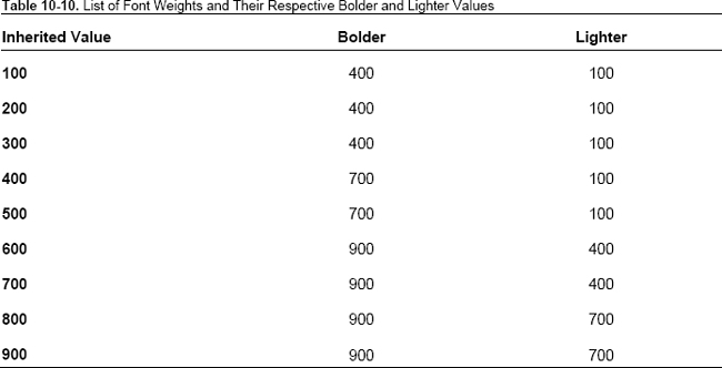
The exact mappings for the bolder and lighter keywords are in Table 10-10.
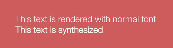
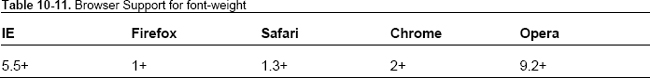
The interesting feature (and one that causes the most heartburn for typographers) is that the browser generates bold/light font faces for fonts that have no defined settings for bold or light values. For example, if we use Helvetica Neue Light and set the font weight to be 800, because there is no bolder font of Helvetica Neue Light available by default on a user’s computer, the browser will generate a bolder version to render the text on screen (see Figure 10-3). Table 10-11 lists the browser support for font-weight.
Choosing the right font width
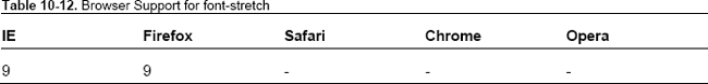
With font-stretch we can select a normal, condensed, or expanded typeface from a font family. Support is limited to IE9+ and Firefox 9+ (see Table 10-12).
Control text overflow
When the text overflows its block container (which has overflow set to anything but visible), we can control how to clip the overflowing text. This property gets triggered when
- The white-space property of the block element is set to
nowrapor
- A word is longer than the width of the block container (in case of text written in horizontal text like English).
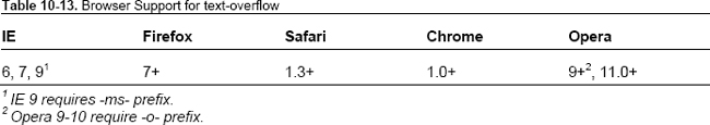
We can set the text to either clip or render an ellipsis (…) after the first few visible characters. Figure 10-4 shows an example of how it renders. See Table 10-13 for browser support.

Figure 10-4. text-overflow: ellipsis in action
Align text vertically from baseline
The vertical-align property allows us to set the position of an inline element with respect to its parent. Note that it refers to inline element. By default, inline elements (like b, i, em, img, strong, etc.) are aligned to the baseline of the parent element. But we can tweak the placement of the inline element to match several of these options: baseline (default), sub, super, top, text-top, middle, bottom, text-bottom, inherit. We can also set them with length units and percentages, like so:
sup { vertical-align: 30%; }
Figure 10-5 shows an example. See Table 10-14 for browser support.
Figure 10-5. The character 1 is placed above the baseline with vertical-align set to 30% of line height
This code raises the position of the sup from the baseline by a percentage of the line-height value. If we want to raise/lower the position from the baseline by a fixed value, we can use length units.
sup { vertical-align: 20px; }
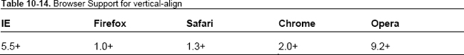
CSS3 redefines the values allowed in vertical-align radically to take into account languages other than English (www.w3.org/TR/css3-linebox/#vertical-align-prop).
Control the white space between letters of a word
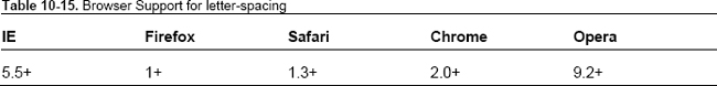
Letter Spacing lets us set the space between two characters in the text. A negative value indicates that the space between the two characters will contract. See Figure 10-6 for an example and Table 10-15 for browser support.
p { letter-spacing: 5px; }

Figure 10-6. letter-spacing: 5px in action
In CSS, we can only set a uniform letter spacing that will add the same spacing between two sets of characters in text. To customize this (to tweak the spacing between different set of characters), we can use lettering.js (http://letteringjs.com/), a jQuery plugin that wraps each character in a span element with a classname, which we can then use to tweak the setting for each character. Figure 10-7 shows an example of it in action.

Figure 10-7. Lettering.js used to good effect on Trent Walton’s blog post trentwalton.com/2011/11/18workspace/
In CSS3, this has been updated to take 1 to 3 values each of which specify the optimum spacing, minimum spacing, and maximum spacing respectively. No browser has implemented this new syntax yet.
Adjust spacing between words
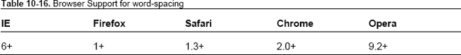
word-spacing specifies the behavior of the space between two words. A negative value indicates contraction of space between words.
h2 { word-spacing: 2px; }
We can also use this creatively on inline block elements to prevent white space from affecting their placement in this manner (http://jsfiddle.net/nimbu/UrLBk/).
Figure 10-8 shows another example. See Table 10-16 for browser support.

Figure 10-8. word-spacing: 20px in action
In CSS3, this has been updated to take 1 to 3 values each of which specify the optimum spacing, minimum spacing, and maximum spacing respectively. No browser has implemented this new syntax yet.
Break Long Words
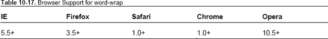
If a sentence contains an unbreakable word (like “antidisestablishmentarianism”), browsers usually render it in the same line even if it overflows the width of the container. We can use word-wrap: break-word to tell browsers to break the word if it is too long to fit the width of its container. Figure 10-9 shows and example and Table 10-17 lists browser support.
h2 { word-wrap: break-word; }

Figure 10-9. word-wrap: break-word in action. The first word expands beyond the width of the container as it is wider, but by using word-wrap: break-word, the second word breaks to fit into the width of the container.
Control white space and line breaks
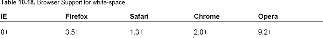
The white-space property simply selects one of the following options for handling of white spaces in text for the selected element:
normal: Collapses white space and breaks lines as necessary to fill the dimensions (and not when newlines are present).nowrap: White spaces are collapsed, but lines are not broken.pre: White spaces are not collapsed, and lines are broken only if there is a newline in the text or, in the case of generated content, “A”.pre-wrap: Behaves likeprebut lines are broken as necessary to fill the dimensions or if newline is present.pre-line: Behaves likepre-wrapexcept it also collapses spaces and tabs.
Figure 10-10 shows an example and Table 10-18 lists browser support.

Figure 10-10. white-space property with all the available keyword values in action
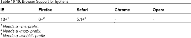
Print hyphens
For years, web designers have attempted to find a solution that would allow them to justify text beautifully–with hyphens. Fortunately, a lot of work has recently been done to get some control over the hyphens in CSS.
hyphens
With the hyphens property, we can control the display of hyphens. It takes one of the following values:
none: Words are not broken into separate lines.manual: Words are broken into separate lines if there are line-breaking characters within them like a soft hyphen (­) or a hyphen character (-).auto: Words are broken at appropriate hyphenation points. Note that a browser requires the knowledge of the language used for the text that gets hyphenated, so this only works on text that has an appropriate language declared (via thelangattribute on a parent element, which could behtmlorbody) and for which the browser has the right hyphenation resource.
h2 { hyphens: auto; }
See Figure 10-11 for an example and Table 10-19 for browser support.
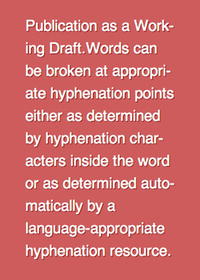
Figure 10-11. hyphens: auto in action
Note that the initial value for hyphens is manual. For words to be hyphenated automatically, this property should be set to auto.
Go to http://jsfiddle.net/nimbu/Rv6vV/ for a demo of hyphens.
Soft Hyphens
A soft hyphen (represented in HTML entity as ­) is used to indicate to a browser where the word can be hyphenated. This is not a CSS property but it’s currently the only way to implement hyphens that work across all browsers. Here is a paragraph with the soft hyphens in use:
A slightly longer but less commonly accepted variant of the word can be found in the Duke Ellington song “You’re Just an Old Antidisestablish­mentarianismist”[3] although the correct construction of that word would be “antidisestablish­mentarianist” (without the “ism”).
This paragraph renders identical to one without soft hyphens in situations where soft hyphens are not necessary, as you can see in Figure 10-12.
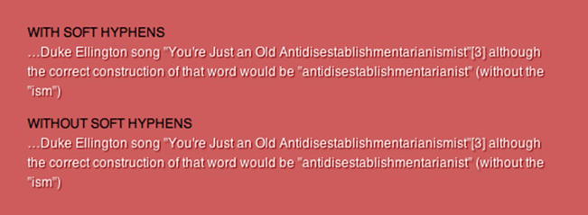
Figure 10-12. Soft hyphens do not render when they are not needed (here both sections look identical).
But once the words start breaking, the words with soft hyphens start to look different, as you can see in Figure 10-13.
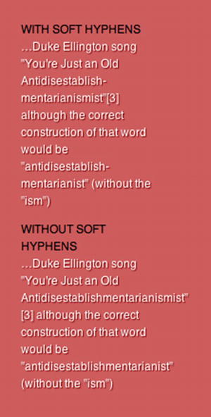
Figure 10-13. Soft hyphens render when the words need to be broken as they meet line breaks.
It is hard to remember to add soft hyphens in the text. Fortunately, there are some tools we can use. Ideally we shouldn’t be doing this client-side, but if it’s necessary, we can use the no-longer-updated Sweet Justice (http://carlos.bueno.org/2010/04/sweet-justice.html) or Soft Hyphenator (http://www.softhyphen.com/). Table 10-20 lists browser support for soft hyphens.
Control the quote glyphs
With the quotes property we can set the glyph that will be used for opening and closing quotes for each level of quotes (outermost to innermost). Then, by using the content property with open-quote or close-quote keywords, we can set the quotes for each selector.
Markup:
<blockquote><p>Imagine a puddle waking up one morning and thinking, <q>This is an interesting

world I find myself in — an interesting hole I find myself in — fits me rather neatly, doesn't

it?</q></p></blockquote>
Style:
blockquote { quotes:  "+" ";" "<" ">"; }


blockquote::before,

q::before { content: open-quote; }


blockquote::after,

q::after { content: close-quote; }
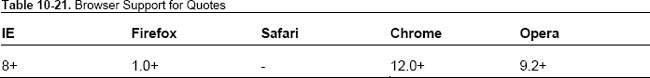
Figure 10-14 shows the resulting text (the quote glyphs are indicated in black). Table 10-21 lists browser support.
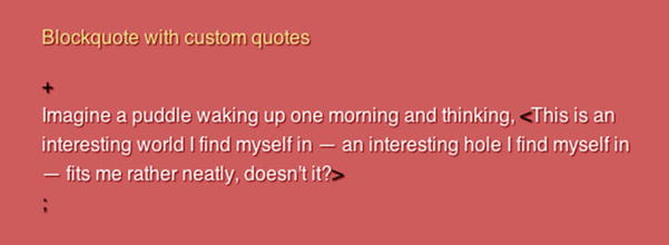
Figure 10-14. Custom quote glyphs in action
Hanging Punctuation
In document layout tools, we can typically set punctuation marks such that they do not disrupt the flow of text. However, this was not possible in the browser. With CSS3, we can now do this! It can take on the following values:
none: No characters can hang.first: An opening bracket or quote at the start of the first formatted line of an element hangs. See Figure 10-15 for an example.
Figure 10-15.
hanging-punctuation: firstin actionlast: A closing bracket or quote at the end of the last formatted line of an element hangs.force-end: A stop or comma at the end of a line hangs. See Figure 10-16 for an example.
Figure 10-16.
hanging-punctuation: force-endin actionallow-end: A stop or comma at the end of a line hangs if it does not otherwise fit prior to justification.p {
hanging-punctuation: allow-end;
}hanging-punctuation, when set, is not considered when measuring the line’s content for fit, alignment, or justification. This property has no support in any browser at the time of writing but holds great promise!
Control the rendering of non-latin web type
CSS3 introduces many new properties that allow for greater flexibility and styling of non-latin type. Here are a few such features.
word-break
This sets how we want words to be broken (if at all) while distributing words across lines. Here are the options:
normal: Lines are created as per usual rules.break-all: Lines break at every word that “overflows” the width of the container. This is only useful if we use CJK (short term for Chinese, Japanese, Korean scripts) characters predominantly and would like the text to be distributed more evenly across lines.keep-all: CJK characters have implied break points that are no longer be applied when this value is used. This value means words will not be broken (which is equivalent to normal for other scripts).
text-emphasis
In CJK scripts, emphasis is represented by small symbols next to the emphasised characters. There are four properties that we can use to style and render these symbols:
text-emphasis-style: This property allows us to set the kind of symbol we would like to use for emphasis. We can choose from the available keywords or set our own character to be used as the symbol.h2 em { text-emphasis-style: double-circle; }text-emphasis-color: We can make these emphasis marks be of a different color than the body text.h2 em { text-emphasis-color: red; }text-emphasis-position: This property lets us specify where we want the emphasis marks to be.h2 em { text-emphasis-position: above right; }text-emphasis: This shortcut property allows us to settext-emphasis-styleandtext-emphasis-colortogether. Howevertext-emphasis-positiondepends on the language of the text and is inherited (as it needs to be set only once). Here is a demo of text-emphasis (view it in Chrome or Safari 5.1).M
h2 em { text-emphasis: double-circle indianred; }
Currently only Chrome and Safari 5.1+ support text-emphasis with the –webkit- prefix.
Use ligatures and additional OpenType font features
OpenType format provides a lot of additional font features that are usually only available for use through applications such as Adobe InDesign. Within CSS3 Fonts Module, these features are now exposed for web developers to use. When this is implemented, we can use ligatures, swashes, small caps, and tabular figures in our text. The syntax is as follows:
h2.fancy {

  /* enable small caps and use second swash alternate */

  font-feature-settings: "smcp", "swsh" 2;

}
smcp and swsh are case-sensitive OpenType feature tags. The full list of tags can be found on the OpenType specification at www.microsoft.com/typography/otspec/featurelist.htm. The value 2 next to swsh indicates the index of the glyph to be selected.
Firefox 4 has an implementation of the font-feature-settings that is slightly different.
h2.fancy {

  -moz-font-feature-settings: "smcp=1,swsh=2";

}
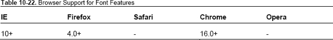
Table 10-22 lists browser support.
Read John Daggett’s post describing CSS3 font-features at http://jsfiddle.net/nimbu/Rv6vV/ and Fontdeck’s blog post on font features (http://blog.fontdeck.com/post/15777165734/opentype-1) and Internet Explorer’s demonstration (http://ie.microsoft.com/testdrive/Graphics/opentype/opentype-fontbureau/index.html).
Summary
We showed the history of web typography from the dark ages to the present with its plethora of features for controlling type. We showed how @font-face has evolved and the different ways to adjust type on a page. In this chapter, you also learned to set type according to a rhythm both in relative and absolute units. We also looked briefly at some of the properties for controlling non-latin type.
Further Reading
- CSS Text Module (
http://dev.w3.org/csswg/css3-text/): Some of the features in this chapter are outlined in greater detail here. - CSS Generated Content Module (
http://dev.w3.org/csswg/css3-content/): More information on thequotesproperty can be found in this module. - CSS Fonts Module (
http://dev.w3.org/csswg/css3-fonts/): This module explains @font-face rule in depth and the font feature settings that are available for OpenType formats - CSS Line Layout Module (
http://dev.w3.org/csswg/css3-linebox/): Vertical alignment as it is proposed in CSS3 is discussed in great detail here. - “Compose to a Vertical Rhythm” (
http://24ways.org/2006/compose-to-a-vertical-rhythm): Ground-breaking article explaining vertical rhythms. - “Bulletproof @font-face syntax” (
http://paulirish.com/2009/bulletproof-font-face-implementation-syntax/): Documents the evolution of a font-face rule that works across all browsers over a year.