In Chapter 1, we talked about the significance of mobile as a platform, and what makes mobile accessibility tricky. This chapter will cover the main challenges, and ways to address them.
Limited Documentation and Guidelines
Web accessibility guidelines, and design and implementation techniques, are extensively covered in current literature. The WCAG 2.0 standards that form the basis of most regulations were released in 2008. Mobile mapping for WCAG 2.0 was last published in 2015, for a set of guidelines written five years before that. In some regions such as the EU, WCAG 2.1 (released in 2018) has been an official recommendation since 2018 September 2021 was the first deadline for EU member states to report to the European Commission on their compliance with WCAG 2.1 at Level AA.
While web accessibility principles and fundamentals apply to all devices, they miss mobile-specific challenges. This is key given that we now live in a mobile-first world where 72% of all Internet users are estimated to solely use their mobile devices to access the web by 2025.1
The rapidly evolving mobile space has outpaced the documentation and adoption of these guidelines. With WCAG 3 underway, we will get closer to a more future-proof outcomes-based approach for platforms including mobile. What do we do in the meantime?
Product teams could rely on platform-specific documentation for the Android2 and iOS3 accessibility.
However, as discussed before, guidelines are just baseline requirements. Talk to your users, and understand their needs and how they use your products. It will produce better outcomes than any set of guidelines.
Fragmentation
The term Mobile includes phones, tablets, wearables, and some IoT (Internet of Things) devices, with smartphones being the most prominent.
Even if we just consider phones, we need to account for mobile web (websites running on phone browsers), widgets, and mobile applications. Then there are the two most common operating systems, Android and iOS, that are completely different in terms of user experience, design paradigms, and tooling. The next level of fragmentation comes from all the different screen sizes, device configurations, and OS versions in the market. Designing a consistent brand experience that respects the integrity of the operating system across these individual devices is one of the factors that differentiates great products from good ones.
Between iOS and Android, there are different accessibility settings that introduce an added layer of complexity to the already fragmented mobile ecosystem. For example, on iOS, the screen reader (VoiceOver) uses a rotor to define the functionality of swiping action, while on Android, it is swiping up and down. The good news is that these settings are opaque to the developer as long as standard practices are followed and only come into play when dealing with custom gestures.
Even if we just consider mobile web, different browsers on the same operating systems will work differently with assistive technologies. This is also true of websites outside of mobile. Even if the author follows guidelines to make their site work on a given screen reader, there is no guarantee that other combinations of browsers and screen readers will respect those specifications. In short, the accessibility APIs are not interoperable, which makes both writing applications, and testing them a tedious task for teams, and a painful experience for users.
Memory on the phone model
Battery life
Network availability and speed
Data usage
Fragmentation is also a great reason to invest in design and development upfront, rather than coming back and having to verify fixes on the various combinations of devices and configurations.
Smaller Screen Sizes and Conflicting Guidelines
For reference, the range of viewport widths on the market starts at 320 pixels (iPhone 5) to over 1000 pixels4 for some tablets.
We might run into conflicting guidelines because of limited screen real estate on touchscreen devices. For example, having large tap targets so users with motor impairments or partial vision can reliably activate components is considered good practice. Another guideline is to avoid two-way scrolling (horizontal and vertical) for blind users. Firstly, the visual presentation of content is irrelevant to blind users. Secondly, having content spaced out, or out of the viewport makes it more tedious, and sometimes impossible to navigate.
- 1.
Abbreviating content in tables to allow more columns
- 2.
Allowing users to switch to landscape mode for more room brings us to our next mobile-specific point
Wearables take these challenges to a whole new level, with viewports as small as 1.5-1.7 inches.
Orientation
Supporting both portrait and landscape orientations not only helps with horizontally scrolling components, but also helps people with motor impairments, who might have their phone mounted on a wheelchair or desk, and so use the device in the orientation most convenient for them. Persisting the orientation setting between sessions, and maintaining the user’s position on a page when switching orientation in the middle of a session is the best experience.
On Android applications, orientation change can trigger a page reload if the page’s lifecycle events are not handled to support a smooth transition. It will require overriding the methods related to saved instances of an Activity,5 and should be paid special attention to in cases of forms and scrollable content.
Release Cycles and Long-Tail Adoption
Another great reason for upfront investment in inclusive design and development also comes from how mobile applications are released. Unlike websites that can be updated immediately, mobile applications go through application stores (Play Store for Android, and App Store for iOS) and can take a few hours to several days for approval and distribution to users.
The next step is for users to download a new version unless they have opted for auto-updates. This means it will take a long time (sometimes years) before an app version with severe bugs is completely out of use. Integrating accessibility, robust testing practices, and CI integration for mobile is much better than retroactively fixing issues.
Haptics and Other Sensors
Website design relies on visual and auditory feedback methods to convey information. User experience designers on mobile also need to factor in haptic (vibration) feedback. We are all familiar with text messages/call notifications with vibration. While vibration is an additional way to get most users’ attention, it is the only way for a deaf user who is not looking at their phone to know they are getting a call. It is also an excellent method to enrich notifications of critical information such as input errors.
Note that using haptics can cause sensory overload, especially for users with cognitive impairments, or nuisance for people with tremors. Users should have the option to fine-tune their notification preferences, including the ability to turn off haptic feedback.
Data Usage
- 1.
Do the designs account for network error states?
- 2.
Does it make sense to use local device storage in case of network unavailability?
Two-Way Scrolling
Mobile screen with horizontally and vertically scrolling content
We will now walk-through a few case studies on applications of mobile-first features and how they can make our physical and digital experiences more accessible.
Case Study: Indoor and Outdoor Wayfinding
Aiding wayfinding or navigation in the physical world is one of the most fascinating areas of accessibility. Smartphones make navigation easier than ever, with turn-by-turn instructions, street view, and a host of other tools at our fingertips. Almost all users with disabilities face challenges getting from point A to point B safely and efficiently. As an example, we will go through some challenges of pedestrian navigation and how smartphones can help address them.
Screen readers can dictate turn-by-turn instructions to a blind user. That takes care of the efficiency part of the problem. For doing so safely by avoiding obstacles and traffic, the user needs more information about their surroundings.
During COVID-19, maintaining the six-feet separation recommended by the CDC was particularly difficult for visually impaired people.6 Not only did it put others at health risk, but also made them susceptible to potentially offending others who did not realize that these people couldn’t see.
The same principle applies when the user is on a busy street or open space. Smartphone cameras and on-device machine learning for image recognition make the recognition and notification about surrounding objects possible even with no network connectivity. These notifications can be in the form of voice commands, haptic feedback (vibration), or a combination of the two. Devices such as the iPhone now also come with LIDAR (Light Detection and Ranging) sensors that aid in accurately alerting the user to oncoming traffic and obstacles.
One thing to note is that these powerful cameras and sensors are only available on higher-end phones at the time of writing this, which might be financially inaccessible for many.
Case Study: Floating Action Buttons

Mobile screen with a floating action button
FABs are used to provide an easily reachable item (being on the bottom right, closest to the right thumb), which triggers the primary action on a screen. For sighted users, a FAB takes the most prominent place on the screen since it is highest on the z-axis according to material design guidelines.
- 1.
Change the focus order so the user first focuses on the FAB and then through other elements at the top of the screen
- 2.Move the FAB action to the top of the screen if the user is using a screen reader
- i.
Be visually consistent with the focus order
- ii.
Avoid hiding content under the FAB

Mobile screen with a floating action button, and the same action in the toolbar
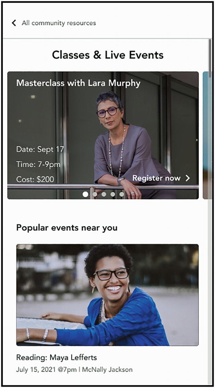
Case Study: Ephemeral Experiences
Instagram has over 500 million monthly story users, and a third of the most-viewed stories come from businesses.7 Snapchat has over 400 million monthly users.8 While ephemeral experiences provide a great way for people to engage with each other, and with businesses, they bring a host of accessibility challenges.

Mobile screen with a story-format ephemeral content. The current focus is the first image out of four items

Mobile screen with a story-format ephemeral content with four items. The current focus is the last item, a video
- a.
Each story item is visible only for a few seconds, making it challenging for people with cognitive disabilities to consume content
- b.
Content tends to be primarily visual, making it inaccessible for users with complete or partial vision loss
Most of this content is user-generated, that is, people and businesses upload their own content to platforms and are not required to add image labels or captions/audio descriptions to videos. Giving content creators tools to add alternative text for images and videos at the time of upload is a great way to be inclusive. Another option is using image recognition and ASR (Automatic Speech Recognition) to assign labels for unlabeled images, and captions for videos.
For stories with multiple items, such as the one above, another dimension of complexity for the user is in knowing the context, and how many items there are, similar to what we would do in a list of images/videos outside of the ephemeral format. For stories with multiple items, assign a heading so users don’t have to go through all items in a story to proceed to the next one. On the first item, the heading should have all the relevant details. For example, “Furniture App with sale items story,” “4 images, 1 video.”
Adding image labels, captions, and audio descriptions do add a few steps to the creation process. Instead of viewing that as a cost, businesses and creators can reap outsized returns and the opportunity to stand out from the crowd, and strengthen their reputations as inclusive brands. In addition to giving creators a chance to connect with millions of underserved users with disabilities they wouldn’t otherwise reach, these measures bring several other benefits. In a recent study, 70% of Gen-Z participants said they trust brands that are more inclusive, which directly translates into buying habits.10 As discussed in Chapter 3, labels and captions also help with SEO (Search Engine Optimization). Many of these benefits are quantifiable, even in the short term. Platforms can encourage creators to adopt inclusive content practices by making this data widely available.
- c.
Custom gestures such as press and hold or swiping can be difficult for users with motor impairments
Tapping on videos can unintentionally turn sound on, for example. For users who might be using eye-tracking devices, keyboards, or mounted displays, it is important to make sure that these interactions are keyboard accessible.
Implementation
These stories are, in the end, just a list of images, text boxes, form elements, and videos presented in a new format. The technical implementation of assigning labels, adding captions, or adding heading structures to match the hierarchy of elements will look exactly like it would if these elements were in a nonephemeral format.
Buttons for links to learn more/buy
Standard input components such as text box for quizzes and polls
The chosen font size for captions

Mobile screen with the same content from the story presented as cards

Mobile screen with the same content from the story presented as cards
Summary
The WCAG 2.0 standards that form the basis of most regulations were released in 2008. Mobile mapping for WCAG 2.0 was last published in 2015, for a set of guidelines written five years before that. Since then we have seen at least seven new releases each of the Android and iOS operating systems.
- The rapidly evolving mobile space has outpaced the documentation and adoption of these guidelines but in the meantime platform-specific documentation for the
Android and iOS accessibility provide a framework, though it is no replacement for talking to your users and understanding their needs.
Between iOS and Android, there are different accessibility settings that introduce an added layer of complexity to the already fragmented mobile ecosystem. Fragmentation is also a great reason to invest in design and development upfront, rather than coming back and having to verify fixes on the various combinations of devices and configurations.
Another reason for upfront investment in inclusive design and development also comes from how mobile applications are released. It will take a long time (sometimes years) before an app version with severe bugs is completely out of use. Integrating accessibility, robust testing practices, and CI integration for mobile is much better than retroactively fixing issues.