Introducing the Alexa Presentation Language
In chapter Chapter 7, Mixing Audio, we saw how to use the Alexa Presentation Language for Audio (APL-A) to mix sounds and voice to create rich audio experiences. But APL-A isn’t the only form of the Alexa presentation language
Similar to APL-A that we learned about in chapter 7, APL is a JSON-based language for defining skill responses. But where APL-A produces rich audio responses, APL is for creating visual user-interfaces to complement voice user-interfaces on screen-enabled Alexa devices. It is for those devices what HTML is to a web-browser. Similar to HTML, APL allows for completely flexibility for designing any visual interface we can dream up.
APL comes with ten essential components that can be assembled into a user interface:
-
Container—Contains one or more other components into a layout
-
Frame—Displays a single child component and has a border and background color
-
Image—Displays a bitmap image (for example, GIF, JPG, PNG)
-
Pager—Displays a series of child components, one at a time, in a left-to-right order
-
ScrollView—Displays a single child component with vertical scrolling if the child component is larger than the ScrollView component
-
Sequence—Displays a set of components in a list that scrolls either vertically or horizontally
-
Text—Displays textual content
-
TouchWrapper—Wraps a single child component and responds to touch events
-
VectorGraphic—Displays a scalable vector graphic image
-
Video—Displays a video player
No visual user interface will need all of these components, but we’ll use a few of them to create APL-based visual displays for the Star Port 75 Travel skill. We’ll start with a simple APL template that employs two of the components—Container and Text—to create the obligatory “Hello World” APL example:
| | { |
| | "type": "APL", |
| | "version": "1.2", |
| | "theme": "dark", |
| | "mainTemplate": { |
| | "items": [ |
| | { |
| | "type": "Container", |
| | "items": [ |
| | { |
| | "type": "Text", |
| | "width": "100vw", |
| | "height": "100vh", |
| | "textAlign": "center", |
| | "textAlignVertical": "center", |
| | "fontSize": "80dp", |
| | "text": "Hello World" |
| | } |
| | ] |
| | } |
| | ] |
| | } |
| | } |
At the top level, the type and version properties specify that this is an APL version 1.2 document. Meanwhile, the theme property specifies a “dark” theme which imposes a dark background with light text.
All APL documents are rooted with a mainTemplate property. This property is roughly analogous to HTML’s <body> element, being the top-level parent of the entire visual interface. The mainTemplate has an items property that includes its children, in this case, a Container component, as indicated by the child’s type property.
The Container component’s items property is populated by a single element, a Text element. It will display the “Hello World” message, as specified in the text property. The remaining properties of the Text component set the component’s dimensions, alignment, and font details.
The width and height properties are set to “100vw” and “100vh”, respectively. The “vw” and “vh” units indicate a percentage of the viewport’s dimensions. “100vw” is 100% of the viewport’s width. Likewise, “100vh” is 100% of the viewport’s height.
The textAlign and textAlignVertical properties are both set to “center” so that the text will appear in the middle of the component’s space, both horizontally and vertically. Since this is the only component within the only Container, the text will be rendered in the dead center of the screen.
The fontSize property ensures that the text is large enough to not be overwhelmed by all of the empty space around it. The value is expressed in units of “dp”, which is an abbreviation for display-independent pixels. Display-independent pixels are a relative size that allows the component size to be adapted relative to the resolution of the display it is rendered in.
Rendering the APL Document
Once the template has been created, we can now modify our skill’s fulfillment code to return it in the response. Although we’ve not done much with it since the first chapter, we still have HelloWorldIntentHandler laying around. It’s a perfect place to try out our “Hello World” APL document:
| | const HelloWorldIntentHandler = { |
| | canHandle(handlerInput) { |
| | ... |
| | }, |
| | handle(handlerInput) { |
| | ... |
| » | if (Alexa.getSupportedInterfaces(handlerInput.requestEnvelope) |
| » | ['Alexa.Presentation.APL']) { |
| » | handlerInput.responseBuilder |
| » | .addDirective({ |
| » | type : 'Alexa.Presentation.APL.RenderDocument', |
| » | document: require('./apl/hello.json') |
| » | }); |
| » | } |
| | |
| | return handlerInput.responseBuilder |
| | .speak(speakOutput) |
| | .getResponse(); |
| | } |
| | }; |
Just before the response builder is given the text to speak and the handle() function ends, we step in and add the APL document to the response by calling the addDirective() function. The directive object passed to addDirective() is of type Alexa.Presentation.APL.RenderDocument. This tells the Alexa device to render the APL document given in the document property.
In this case, the document has been saved alongside the fulfillment code in a directory named apl and is pulled in using the require() function. But just as with APL-A, the template could be saved within the APL authoring tool and then be referenced as a “Link” document like this:
| | handlerInput.responseBuilder |
| | .addDirective({ |
| | type : 'Alexa.Presentation.APL.RenderDocument', |
| | document: { |
| | "type": "Link", |
| | "src": "doc://alexa/apl/documents/hello" |
| | }, |
| | }); |
Not all Alexa devices have screens to render an APL document. Therefore, the call to addDirective() is wrapped in an if block so that the directive will only be included in the response if the device supports APL. As shown here, the Alexa.getSupportedInterfaces() helper function will return true if the requesting device supports the “Alexa.Presentation.APL” interface.
Enabling APL
We’re almost ready to deploy our skill and try out our first APL user-interface. But first we must configure the skill manifest to support APL. In the interfaces property of skill.json, add an entry for the “ALEXA_PRESENTATION_APL” interface:
| | "apis": { "custom": { "endpoint": { ... }, "interfaces": [ |
| » | { |
| » | "type": "ALEXA_PRESENTATION_APL" |
| » | } |
| | ] } }, |
Now we’re ready to see how the APL document is rendered in response to a “hello world” request.
Trying it Out
After deploying the skill, you can try it out using any Alexa device that has a screen, including the Echo Show or a Fire TV. Or you can just use the developer console, as shown in this screenshot:
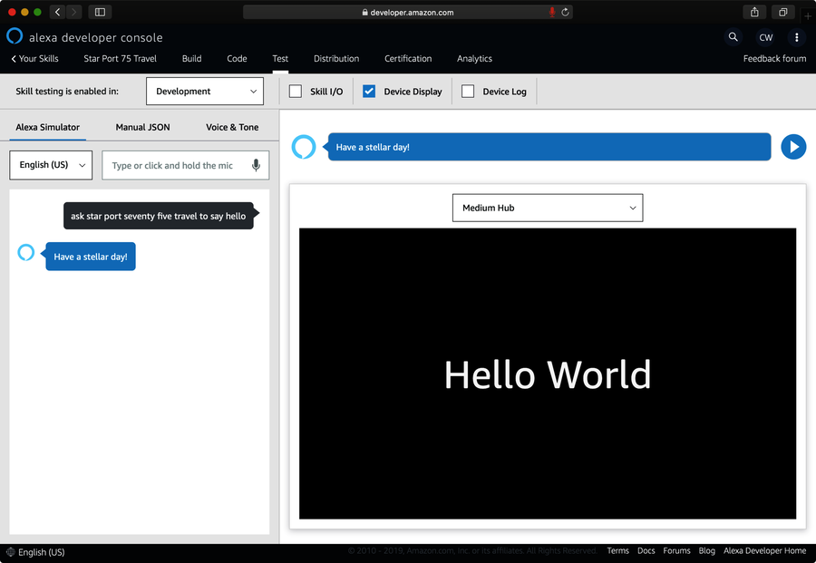
After asking the skill to say “hello”, you can view the rendered APL document by scrolling past the request/response pane in the right-hand panel or by unchecking the “Skill I/O” checkbox to hide the request/response content. The result should be a black field (thanks to the “dark” theme) with the words “Hello World” in white.
Not bad for our first APL document. But most visual user-interfaces will require richer designs than just simple text. Fortunately, APL offers more than just text components. Let’s step it up a bit with a more interesting APL document.