
The overall layout of the board page is different from all of the other pages in the application. We will put everything inside a .page division, which looks like the following; the height of the <body> tag and #app divisions will be 100%:
<body>
  <div id="app">
    <div class="page">
      <div class="page-header"></div>
      <div class="page-body">
        <div class="board-wrapper">
          <div class="board"></div>
        </div>
      </div>
    </div>
  </div>
</body>
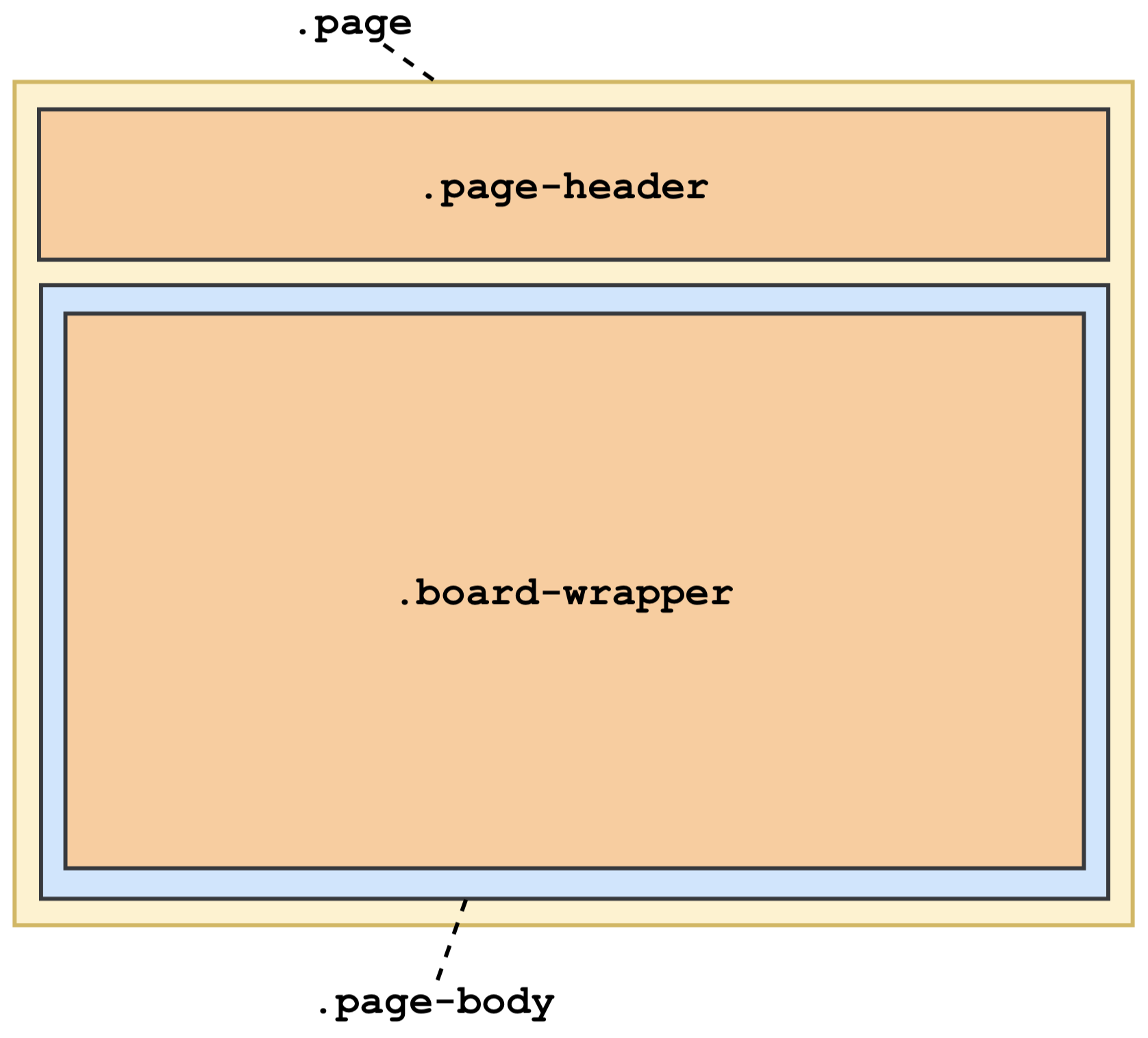
Inside the .page element, we will have a .page-header element, which is the same header as the home page, and a .page-body element, which contains a .board-wrapper element. Inside the .board-wrapper, we will put a .board element. Figure 12.5 shows the high-level layout of the board page:
Here is the CSS of the divisions shown previously:
.page {
  display: flex;
  flex-direction: column;
}

.page-header {
  flex: none;
}

.page-body {
  flex-grow: 1;
  position: relative;
}

.board-wrapper {
  position: absolute;
  top: 0;
  right: 0;
  bottom: 0;
  left: 0;
}
As you can see, we use the .page division as a flex container by assigning flex to its display property. Since we will align the divisions vertically, we assign the column value to the flex-direction property.
For .page-header, we use flex: none, which is equivalent to flex: 0 0 auto, which is itself a shorthand of flex-grow: 0 flex-shrink: 0 flex-basis: auto. In this way, .page-header will be sized according to the width/height of its content.
For .page-body, we use flex-grow: 1 to tell the browser to make the .page-body element take up all the vertically available area on the screen.
For .board-wrapper, as its name suggested, it is a wrapper of the .board division. We make it absolute positioned to fill up all the area of .page-body. In this way, the .board division, which serves as the flex container for the divisions inside of it, can use 100% of the height to fill up all the area inside .board-wrapper.
Figure 12.6 shows the layout of the parts inside .board-wrapper. Inside the .board flex container, .board-header and .board-body have similar CSS properties to .page-header and .page-body:

The following is the CSS of the divisions inside .board-wrapper:
.board {
  display: flex;
  flex-direction: column;
  height: 100%;
}

.board-header {
  flex: none;
  height: auto;
}

.board-body {
  flex-grow: 1;
  position: relative;
}

.list-container {
  position: absolute;
  bottom: 0;
  left: 8px;
  right: 0;
  top: 0;
  overflow-x: auto;
  overflow-y: hidden;
}

.list-wrapper {
  display: inline-block;
  height: 100%;
  vertical-align: top;
}
As you can see, .board, .board-header, and .board-body define the same layout, which can have .board-body fill up all of the vertically available area. For .list-container, we allow it to be horizontally scrollable by using overflow-x: auto. For each card list, we will put it inside .list-wrapper, which is positioned side by side horizontally using display: inline-block.
Inside .list-wrapper, the .list is a flex container of its child elements, .list-header, .cards, and .add-card-button. As you can see next, for .list, we give it a maximum height of 100% to make sure it won't exceed the available area. For .cards, we allow it to be scrollable vertically so that it can hold as many .card-items inside it as needed:
.list {
  display: flex;
  flex-direction: column;
  max-height: 100%;
}

.cards {
  min-height: 1px;
  overflow-y: auto;
}
For any other details, you can find them in the commit history on GitHub.