
Writing is rarely a one-size-fits-all activity. You need to write differently for different audiences, and you may need to write differently depending on where your message will be read. For example, Twitter tweets, Facebook posts and a lot of emails are read by people when they are travelling or just quickly picking up their phone, so you need to get to the point quickly. In some cases, you might need to write the same thing multiple times in different ways for different audiences.
In this chapter you will learn the key things to consider when you’re writing for different audiences, or different sectors of the same audience.
KNOW YOUR AUDIENCE
As different people need to be communicated with in different ways, the first question to ask yourself is the most important one: Who am I writing this for?
Someone who gets pitched IT projects all day every day will have an exceptionally short attention span and zero tolerance for hype, whereas a director considering an expensive IT investment will want detailed research and solid financial projections. A small team will be happy with informal language, but such language might be inappropriate if sent company-wide.
There are cultural differences too. If you’re communicating with people from different parts of the world or with differing cultures, there may be specific things you’ll need to explain, or comparisons or concepts that won’t translate from one language or culture to another.
There is also the generation gap to consider. Something that’s obvious to you might not be obvious to somebody older or younger. You and I might remember when Microsoft Windows came with a huge bunch of floppy disks, but many people using computers today think floppy disks are 3D-printed ‘Save’ icons because they grew up long after floppies became obsolete.
Another key issue is the readers’ level of knowledge. Terms and acronyms that experts in a particular industry use every day might not mean anything to other employees, so there’s a danger of coming across like the car mechanic who says a whole bunch of things you don’t understand, but which clearly mean you’re going to make a big dent in your bank account.
Effective communication is all about getting your message across as clearly as possible, and that means speaking the right language.
Speaking the right language doesn’t necessarily mean speaking the same language. A 40-something manager attempting to write in the language his or her teenage employees might use socially is heading into embarrassing-parent territory, and such attempts can seem patronising even when you get the language right.
Speaking the right language means using language that is clear, appropriate and gets your message across without any confusion or anybody having to Google the terms you use.
PICK YOUR PLATFORM
Once you’ve identified the audience, the next step is to think about where that audience will read your message. Will it be an email they’ll receive while fielding constant calls from customers? Will it be something they’ll read in detail first thing when they come to work, or a social media post they’ll glance at on their morning commute?
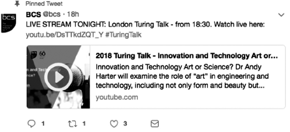
There are practical limitations too. Twitter currently gives you 280 characters for a tweet, and chains of tweets on a single topic are frowned upon. Figure 4.1 shows a tweet from the BCS Twitter account.
Figure 4.1 A tweet from the BCS Twitter account. Tailor your message to the platform; for example, Twitter is all about brevity.
Email doesn’t have that limit, but the recipient’s time may be precious, so a descriptive email subject and a lack of waffle will help get your message across. A similar approach works well with posts on the business network LinkedIn too.
HOPE FOR THE BEST AND PLAN FOR THE WORST
While it’s crucial to know who you’re writing for, it’s also worth considering where your message might end up – especially if you’re writing something with sensitive content that could be taken out of context or is written in a way that might offend somebody.
The internet is often an instant outrage machine where perfectly well-meaning words are misinterpreted and widely circulated. It’s always better to try and prevent such misinterpretation than to try and deal with a publicity nightmare. As Jonathan Swift wrote, way back in 1710: ‘Falsehood flies, and the truth comes limping after it.’5
That doesn’t mean you shouldn’t write with personality or humour, but it’s worth asking: What’s the worst possible way somebody could interpret this? Humour, especially sarcastic British humour, often doesn’t translate very well; the only humour that’s almost guaranteed to work anywhere in the world is physical comedy.
Humour isn’t the only concern. There are countless examples of companies getting into trouble because of unconscious bias, lack of thought or good old-fashioned bad luck. Sometimes they manage to combine all three.
Even very simple bits of writing can cause offence, often because people didn’t assume the worst; for example, Facebook recently caused great offence with its apparently harmless feature showing people the most-liked things they had ever posted. Unfortunately, Facebook didn’t consider that, for some people, the most liked and most commented posts were the ones announcing serious personal trauma or the death of relatives. The cheerful copy didn’t fit well with photos of funerals.
Sara Wachter-Boettcher’s book, Technically Wrong (Wachter-Boettcher, 2017), provides multiple examples of such PR disasters, including sexist chatbots, online forms that accidentally offend LGBT people and assumptions that make algorithms behave in apparently biased ways. Also recommended are Wachter-Boettcher’s book with Eric Meyer about inclusivity, Design for Real Life (2016), and Tragic Design by Jonathan Shariat and Cynthia Savard Saucier (2016) (www.tragicdesign.com). Together, these books demonstrate not only how easy it is to get it wrong, but how easy it is to get it right.
TAKE A PICTURE
Sometimes the clearest way to express something is to use a picture. We are all familiar with organisation charts, flow charts and graphs, and wisely chosen images can be more effective than giant blocks of text. ‘Wisely chosen’ is the important bit. If you’ve ever dozed through a bad PowerPoint presentation, you’ll know that, while a picture can paint a thousand words, a slideshow can feel like a thousand years.
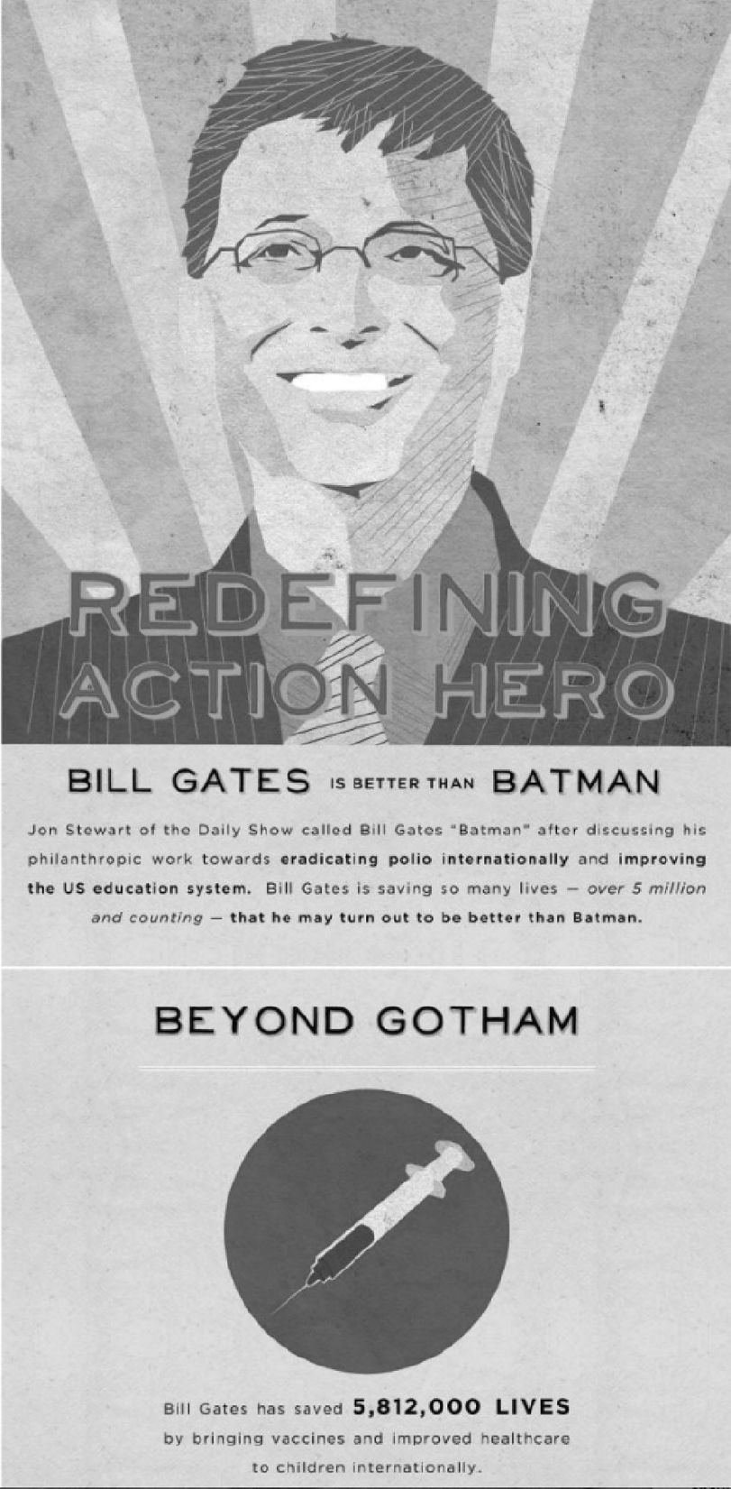
One of the most useful kinds of business graphic is the infographic, which is an attractively designed image that provides information in a punchy way. Figure 4.2 is an example of an infographic (only shown in part, for brevity).
Writing an infographic is rather like writing an advert. The key features are:
i. a short, snappy headline;
ii. a short and interesting introduction;
iii. some eye-catching numbers and/or graphs;
iv. very short explanations for each section.
With infographics, less is more: if you’ve written lots of paragraphs, your graphic is probably too densely packed to be effective. An infographic should work like a poster: you must be able to understand what it’s saying almost immediately. And, like a poster, it needs to have a good design to be effective. If design isn’t one of your skills, rope in someone to do your words justice.
KEY TAKEAWAYS
• Different people need to be written to in different ways.
• Use language that’s clear and appropriate for your readers.
• Humour doesn’t always translate very well.
Figure 4.2 Part of an infographic about Bill Gates from Frugaldad.com (used with permission).
5 In his essay ‘Political Lying’, available at: www.bartleby.com/209/633.html