
Chapter 3: Debugging and Optimization
On your road to becoming a CSS master, you’ll need to know how to troubleshoot and optimize your CSS. How do you diagnose and fix rendering problems? How do you ensure that your CSS creates no performance lags for end users?
It’s also important to ensure code quality. Were you a little too verbose with your comments? Are there too many unused selectors? Are your selectors overly specific in a way that could affect performance?
Knowing which tools to use will help you ensure that your front end works well. In this chapter, we’ll look at some browser and command-line tools to help you analyze and troubleshoot your CSS.
Browser-based Developer Tools
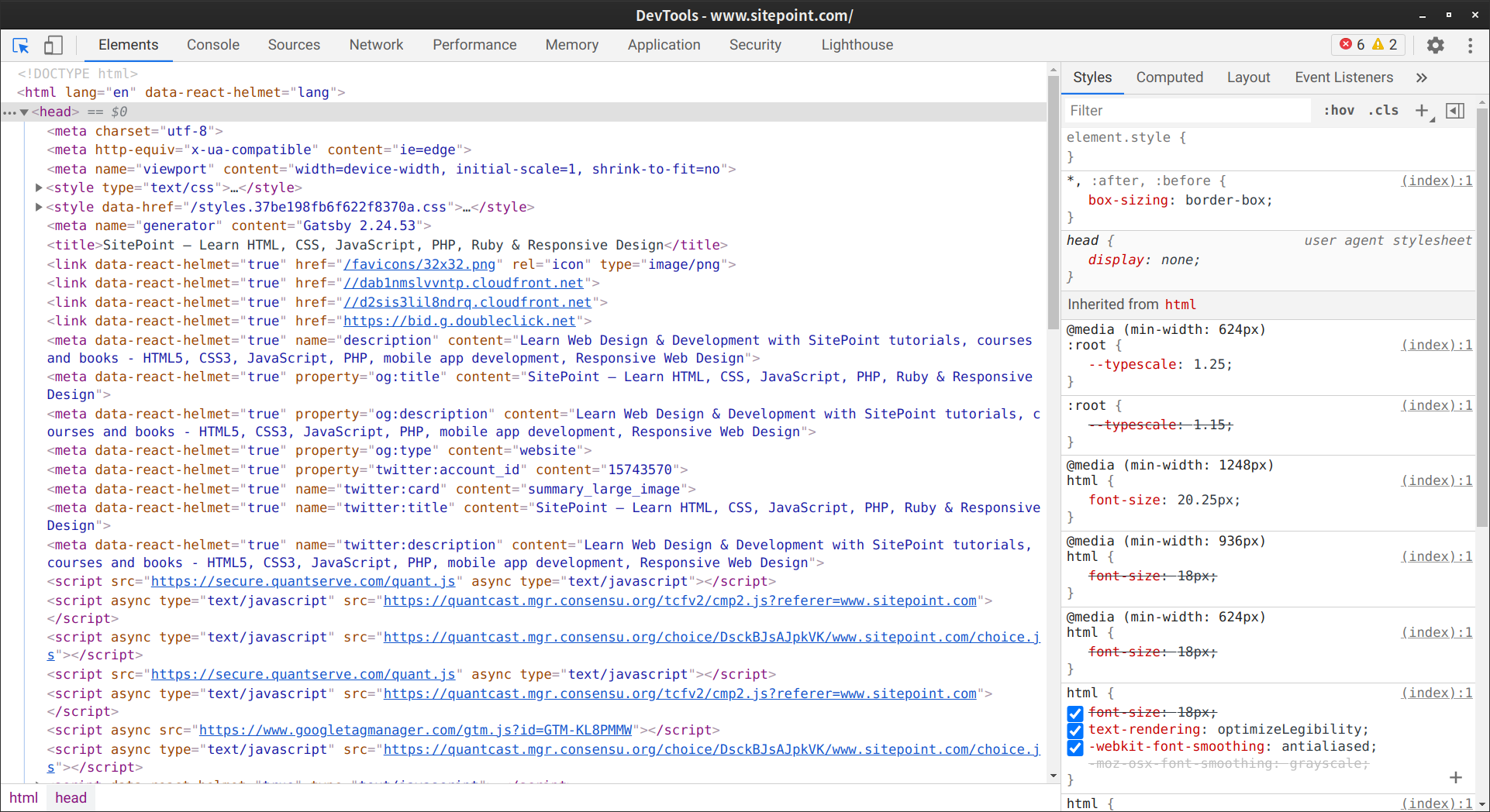
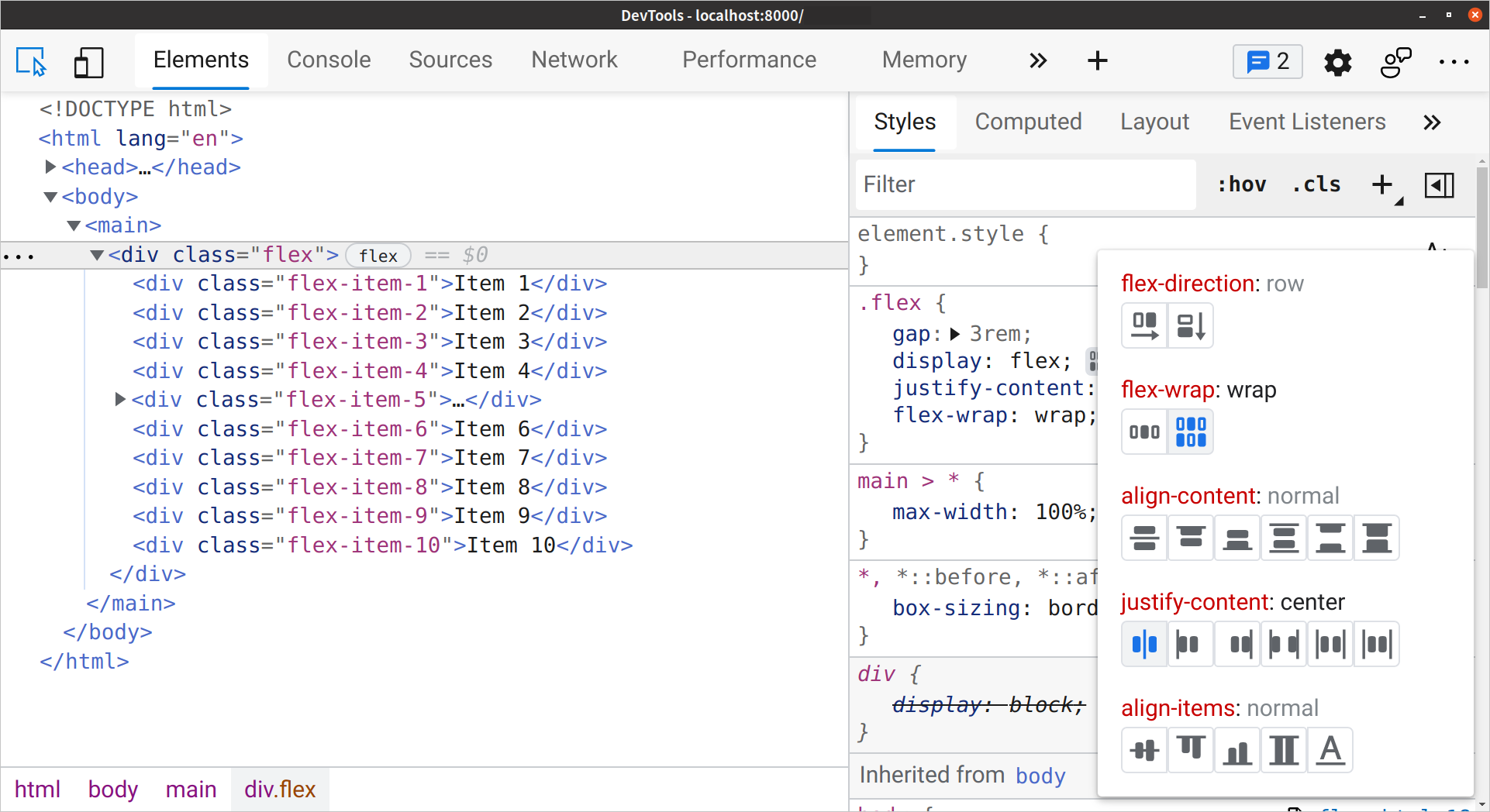
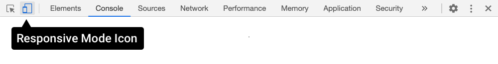
Most desktop browsers include an element inspector feature that you can use to troubleshoot your CSS. Start using this feature by right-clicking anywhere in the browser viewport and selecting Inspect or Inspect Element from the menu. Mac user? Press the Ctrl key while clicking the element you’d like to inspect. The image below indicates what you can expect to see in Chrome.
You can also press Ctrl + Shift + I (Windows/Linux) or Cmd + Option + I (macOS) to open the developer tools panel. Or use the the application’s menu:
- Google Chrome and Microsoft Edge: Tools > Developer Tools (More tools and Developer tools on Linux)
- Firefox: Tools > Web Developer
- Safari: Develop > Show Web Inspector
In Safari, you may have to enable the Develop menu first by going to Safari > Preferences > Advanced and checking the box next to Show Develop menu in menu bar.
After opening the developer tools interface, you may need to select the correct panel. In Firefox, this panel is named Inspector. In Chrome, Edge, and Safari, it’s the Elements panel. You’ll know you’re in the right place when you see HTML on one side of the panel and CSS rules on the other.
Generated Markup
The markup you’ll see in the HTML panel is a representation of the DOM. It’s generated when the browser finishes parsing the document and may differ from your original markup. Using View Source reveals the original markup. Keep in mind that, for some JavaScript applications, there may not be much markup to view.
Using the Styles Panel
Sometimes an element isn’t styled as expected. Maybe a typographical change failed to take, or there’s less padding around a paragraph than you wanted. You can determine which rules are affecting an element by using the Styles panel of the Web Inspector.
Browsers are fairly consistent in how they organize the Styles panel. Declarations set using the style attribute are listed first, whether they were added to the HTML, or programmatically using JavaScript.
Inline styles are followed by a list of style rules applied via author stylesheets—those written by you or your colleagues. Styles in this list are grouped by media query and/or filename.
Authored style rules precede user agent styles. User agent styles are the browser’s default styles. They also have an impact on your site’s look and feel. In Firefox, you may have to select the Show Browser Styles option in order to view user agent styles. You can find this setting in the Settings panel. Press the F1 key when the Developer Tools panel is open.
Properties and values are grouped by selector. The checkbox next to each property lets you enable and disable specific declarations. Click on a property or value to change it.
Identifying Cascade and Inheritance Problems
As you inspect styles, you may notice that some properties appear crossed out. These properties have been overridden either by a cascading rule, a conflicting rule, or a more specific selector, as depicted below.
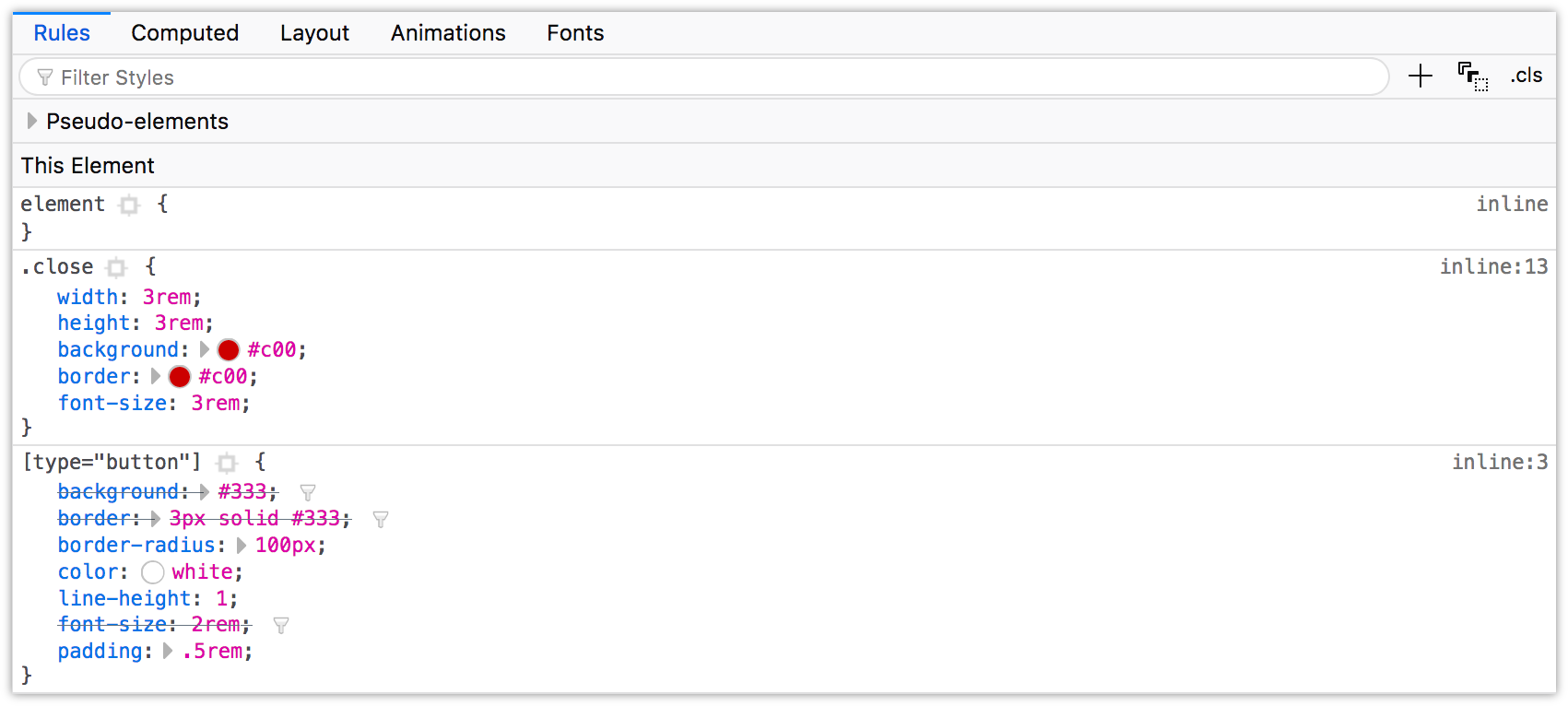
In the image above, the background, border, and font-size declarations of the [type=button] block are displayed with a line through them. These declarations were overridden by those in the .close block, which comes after the [type=button] block in our CSS file.
Spotting Invalid or Unsupported Properties and Values
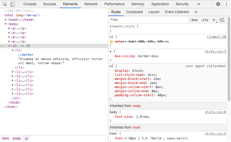
You can also use the element inspector to spot invalid or unsupported properties or property values. In Chromium-based browsers, including Edge, invalid or unsupported CSS declarations both have a line through them and an adjacent warning icon, which can be seen below.
Firefox also strikes through unsupported properties and values, but places the warning icon to the right of the declaration.

In the screenshot below, Safari strikes through unsupported rules with a red line, and highlights them with a yellow background and warning icon.

When it comes to basic debugging and identifying inheritance conflicts, it doesn’t matter which browser you choose. Familiarize yourself with all of them, however, for those rare occasions when you need to diagnose a browser-specific issue.
Debugging Flexbox and Grid Layouts
As you work with Grid and Flexbox, you may wonder why your layout is a little off, or why a particular property isn’t working the way you’d expect. Chrome, Edge and Firefox all include Grid and Flexbox inspectors with their developer tools to help you diagnose issues with both modules.
Flexbox Inspection
The Flexbox inspector is only available in Chrome/Edge versions 90 and later.
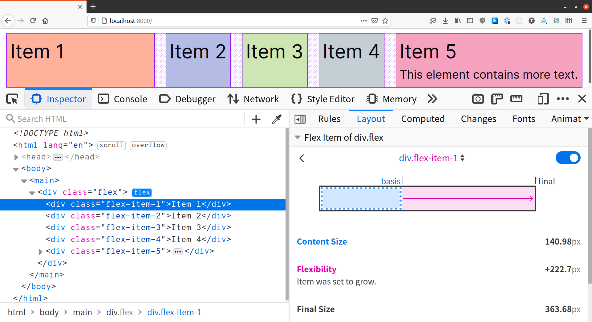
Launching the Grid or Flexbox inspector works similarly in Chrome, Edge, and Firefox. First, open the browser’s developer tools and locate the Elements (Chrome/Edge) or Inspector panel (Firefox). Next, locate the grid or flex container in the document tree. You’ll see a small label next to the element—grid if the element is a grid container, and flex if it’s a flex container. Click that label to display the Grid or Flexbox overlay. The following image shows what the Grid overlay looks like in Edge 92.
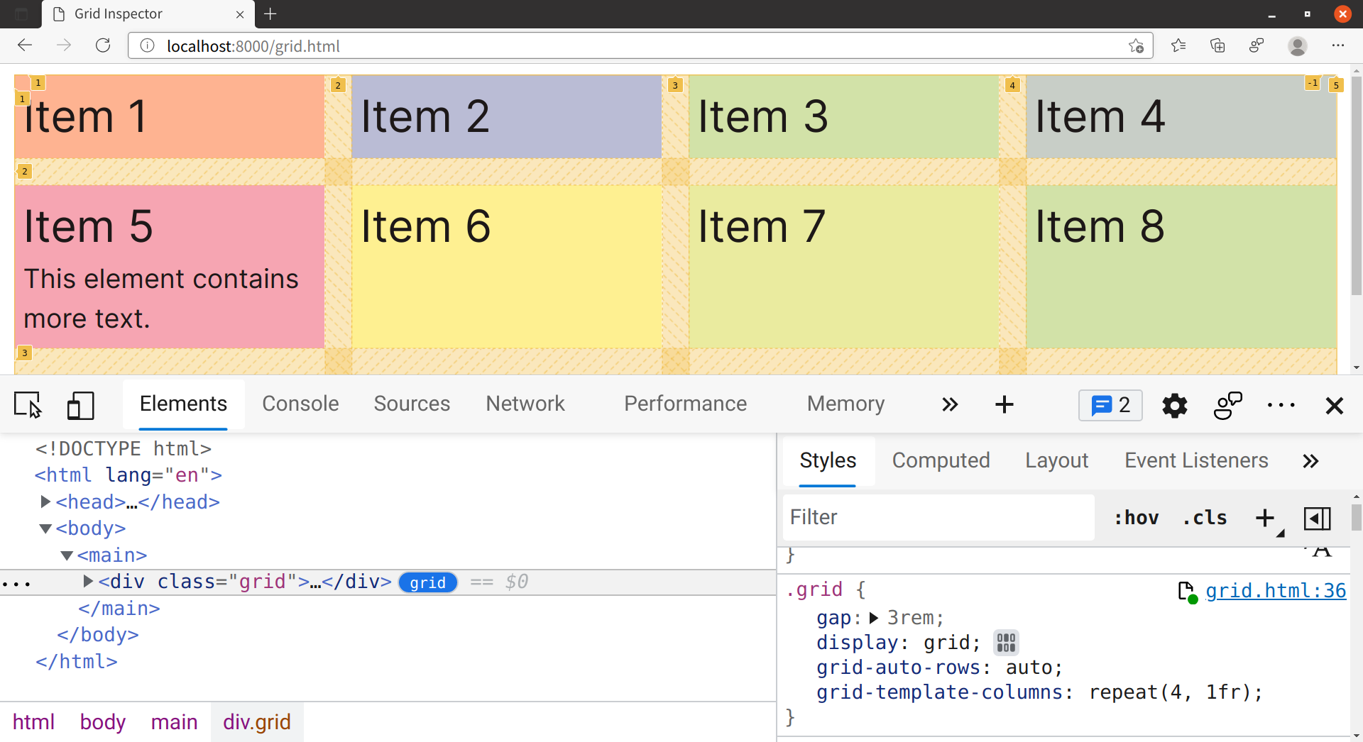
For Grid containers, the overlay shows the number for each grid line (the dividing lines of a grid) and highlights each grid gap (the space between each item in a grid). One feature of Grid is the ability to indicate how many columns or rows an element should span by indicating a starting and an ending grid line number. Using the inspector lets you see how grid lines are numbered.
For Flex containers, the overlay highlights the size of the gap property, and any space created by the use of justify-content, align-content, or align-items. The following image shows the Firefox Flexbox overlay.

The Flexbox overlays for Chrome and Edge work similarly. Chrome and Edge versions 92 and above also include a feature for tinkering with the align-* and justify-* properties of Grid and Flexbox. The image below shows the Flex inspector in Edge 92.
Firefox, on the other hand, includes a feature that can help you understand why a flex item may be larger or smaller than you expected. The Firefox flex inspector indicates when a flex item is set to grow or shrink.
We’ll revisit Grid and Flexbox debugging tools in Chapter 5, “Layouts”.
Debugging Responsive Layouts
On-device testing is ideal. During development, however, it’s helpful to simulate mobile device viewports and touch features. All major desktop browsers include a mode for responsive debugging.
Firefox
Firefox calls its responsive debugging feature Responsive Design Mode. Look for the phone and tablet icon. You’ll find it on the right side of the developer tools panel.
While in Responsive Design Mode, you can test a range of viewport dimensions. You can also simulate the viewport and pixel density of several Android and iOS devices by selecting an option from the device menu.
You can also switch the viewport’s orientation, adjust its dimensions, or change its pixel density ratio from this menu.
Touch events are disabled when you first enter Responsive Design Mode. You can enable them by clicking the touch icon, or by selecting a specific device from the device menu.
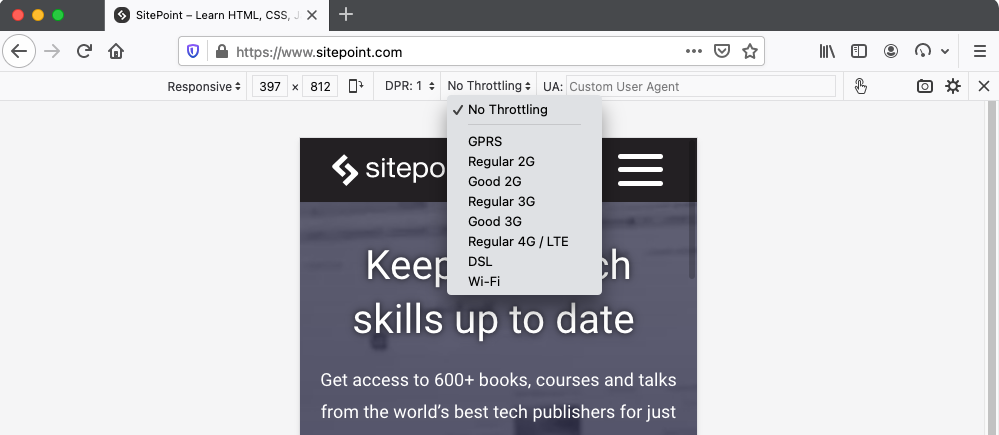
You can also use the Firefox Responsive Design Mode to simulate slow connections. Responsive Design Mode includes the ability to mimic GPRS and LTE mobile speeds as well as Wi-Fi connections with its throttling feature.
Chrome and Microsoft Edge Chromium
In Chrome and Edge versions 79 and above, responsive mode is named Device Mode. To use it, click the device icon (pictured below) in the upper-left corner, next to the Select an element icon.
Like Firefox, Chrome’s and Edge’s Device Mode lets you mimic several kinds of Android and iOS devices, including older devices such as the Galaxy S5 and iPhone 8. In both browsers, DOM touch events are available to your code when using Device Mode.
In Chrome, the Device Mode’s basic throttling feature (shown below) approximates performance on low-tier and mid-tier devices. You can also use it to simulate being offline.
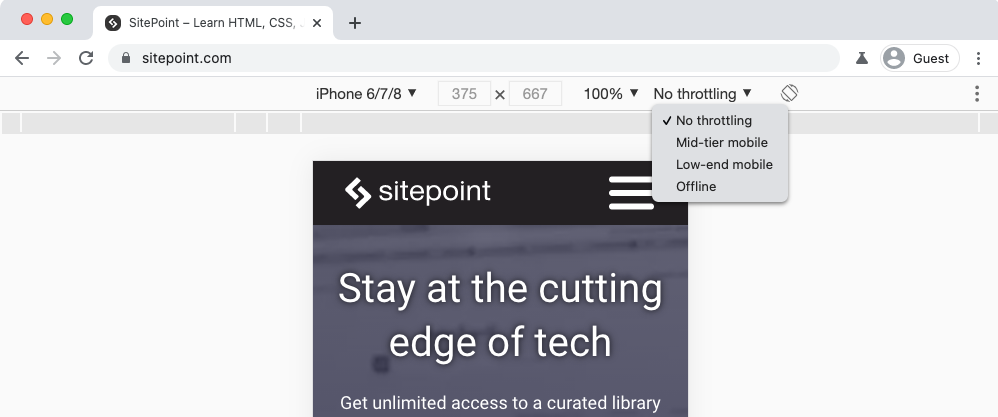
To mimic network speeds, use the throttling menu found in the developer tools Network panel.

Safari
Safari’s Responsive Design Mode is best for testing layouts in iOS device viewports. To enter Responsive Design Mode, select Develop > Enter Responsive Design Mode, or Cmd + Ctrl + R.

Unfortunately, Safari’s developer tools are limited by comparison. You can’t, for example, mimic slow network speeds. Nor can you simulate touch events. To test touch events, you’ll need to use a physical iOS device, or a remote device testing service.
Responsive Design–focused Browsers
Blisk and Polypane are two newer, commercial services that have responsive design and device emulation at their core. Both use Chromium under the hood, so you can’t rely on them for debugging issues with non-Chromium browsers. They are, however, perfect for testing and debugging responsive layouts.

Both browsers let you view your layout at multiple viewports in the same window at the same time, so that you don’t have to spend time resizing browser windows.
Debugging for UI Responsiveness
Some CSS properties and values trigger operations called “reflows” and “repaints”, which can have a negative effect on the responsiveness of the user interface. This is especially true for low-powered devices. Let’s look at how to measure UI performance using browser tools. First, however, let’s define “reflow” and “repaint”.
What Are Reflows and Repaints?
A reflow is any operation that changes the layout of part or all of a page. Examples include changing the dimensions of an element or updating its left position. They’re expensive, because they force the browser to recalculate the height, width, and position of elements in the document.
Repaints also force the browser to re-render part of the document. Changing the color of a button when in a :hover state is one example of a repaint. They’re a bit less troublesome than reflows, however, because they don’t affect the dimensions or positions of nodes.
Reflows and repaints are most often triggered by DOM operations—such as adding or removing elements. Changing the values of properties that affect the dimensions, visibility, or position of an element can also trigger reflows and repaints. CSS Triggers is a good (though dated) starting point for identifying which properties may be causing performance bottlenecks.
Page Loads
Page loads always trigger reflow and repaint operations as the browser parses the initial HTML, CSS, and JavaScript.
It’s difficult to completely banish repaints and reflows from a project. We can, however, identify them and reduce their impact using performance tools.
Performance Tools
Performance tools measure how well your front end behaves, capturing things like frame rate and asset load times. By recording page activity, we can determine which portions of our CSS may be causing performance bottlenecks.
In Microsoft Edge, Chrome and Firefox, you’ll use the appropriately named Performance panel. Safari calls it Timelines.
There are two ways to trigger the profiling tool:
- manually by pressing the Record or start button
- programmatically using
console.profile( profileName ), whereprofileNameis the optional name for the profile.
To stop recording, press the stop button, or use console.profileEnd( profileName ).
For Testing Only
Both console.profile() and console.profileEnd() are experimental and non-standard. Don’t use them in production!
Performance tools can be a bit befuddling. Each browser displays its data a little bit differently. To see what this looks like in practice, we’ll compare two basic documents, examples A and B. In both cases, we’re moving a series of <div> elements from an x-position of zero to an x-position of 1,000.
Both examples use CSS animations. In example A, however, we’ll animate the left property. In example B, we’ll translate our elements by 1,000 pixels and animate the transform property.
Our markup for both is the same:
<!DOCTYPE html>
    <html lang="en-US">
    <head>
        <meta charset="utf-8">
        <title>Performance example</title>
        <style type="text/css">
            /* CSS will go here */
        </style>
    </head>
    <body>
        <div></div>
        <div></div>
        <div></div>
        <div></div>
        <script type="text/javascript" src="toggle-move-class.js"></script>
    </body>
</html>
The JavaScript for both documents is also the same. When the page loads, we’ll add a running class to the body that triggers our animation:
function startAnimation() {
    document.body.classList.add('running');
}
window.addEventListener( 'load', startAnimation );
Some of our CSS is common to both examples:
div {
    background: #36f;
    margin-bottom: 1em;
    width: 100px;
    height: 100px;
    /*
     * Shorthand for animation direction,
     * duration, timing function, iteration, and play state
     */
    animation: alternate 2s ease-in 2 paused;
}
.running div {
    animation-play-state: running;
}
For example A, we’ll animate the left property. Here’s our animation CSS:
@keyframes change_left {
    from {
        left: 0px;
    }
    to {
        left: 1000px;
    }
}
div {
    position: relative; /* Element must be positioned in order for left to work */
    left: 0;
    animation-name: change_left;
}
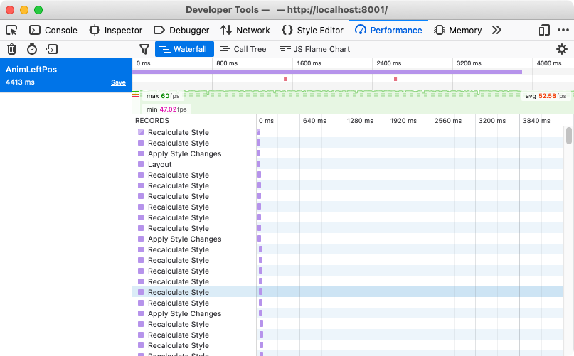
In Safari, animating the left property generates lots of layout and rendering operations. It also uses quite a bit of CPU power.

In Chrome and Edge, the profile is similarly red. In this case, however, the uppermost row of red markings indicates dropped frames. Dropped frames can cause what experts call jank, or animations that aren’t as smooth as they can be. The lower row of markings indicates shifts in page layout. These changes may cause performance lags or rendering glitches for devices with limited memory or slower processors. Animating the left property results in lots of dropped frames in Chrome and Edge, as shown below.

The reason for the style recalculations and repaints has to do with the property we’re transitioning: left. The left property triggers a reflow whenever it’s changed, even if that change is caused by an animation or transition.
Now, let’s take a look at the CSS for example B:
@keyframes translate_left {
    from {
        transform: translateX(0);
    }
    to {
        transform: translate(1000px);
    }
}
div {
    transform: translateX(0);
    animation-name: translate_left;
}
This time we’re animating the transform property from a start value of translateX(0) and an ending value of translateX(1000px).
In most browsers, transforms don’t trigger reflows. Animating transform vastly reduces the amount of layout and rendering operations in Safari. The image below shows the Safari timeline output for a transition of the transform property.

Chrome and Edge drop far fewer frames.
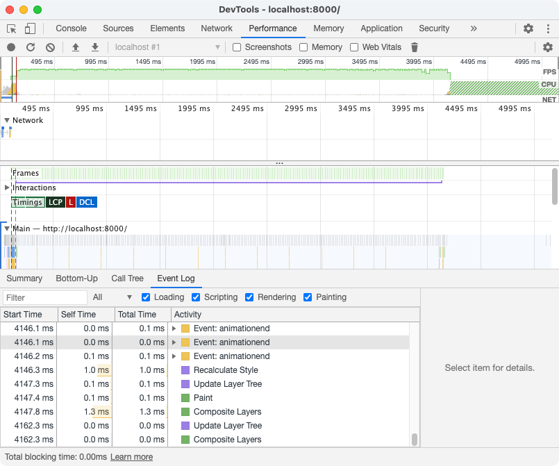
I haven’t yet mentioned Firefox, because Firefox handles both animations similarly. The following image shows the results of animating the left property. Firefox 86 managed an average frame rate of 52.58 frames per second.
The next image reflects the performance of animating a translation transform. Firefox 86 had a slightly higher frame rate of 56.56 frames per second.

In practice, choose the property that performs best across the broadest range of browsers.
Identifying Which Lines to Remove
As mentioned earlier in this chapter, properties that affect the size, geometry, or placement of objects can trigger reflow operations. This includes positional properties like left, top, right, and bottom, alignment-related properties, and display.
Once you know which properties could cause trouble, the next step is to test the hypothesis. Disable the property—either with a comment, or by adding a temporary x- prefix—and rerun the performance test.
Remember that performance is relative, not absolute or perfect. The goal is improvement: make it perform better than it did before. If a property or effect is unacceptably slow, eliminate it altogether.
More on Web Performance
If you’d like to learn more about how to use browser tools to analyze performance, check out the book Jump Start Web Performance, by Craig Buckler.
Minification with CSS Optimizer
Developer tools help you find and fix rendering issues, but what about efficiency? Are our file sizes as small as they can be? For that, we need minification tools.
Minification in the context of CSS means “removing excess characters”. Consider, for example, this block of code:
h1 {
    font: 16px / 1.5 'Helvetica Neue', arial, sans-serif;
    width: 80%;
    margin: 10px auto 0px;
}
That’s 98 bytes long, including line breaks and spaces. Let’s look at a minified example:
h1{font:16px/1.5 'Helvetica Neue',arial,sans-serif;width:80%;margin:10px auto 0}
Now our CSS is only 80 bytes long—an 18% reduction. Fewer bytes, of course, means faster download times and data transfer savings for you and your users.
In this section, we’ll look at CSS Optimizer, or CSSO, a minification tool that runs on Node.js. It’s available as a plugin for several build tools and workflows, but we’ll focus on the command-line interface version.
Of course, using the command-line version of CSSO requires that you get comfortable using a command-line interface. Linux and macOS users can use the Terminal application (Ctrl + Alt + T for most Linux distributions, Terminal.app for macOS). If you’re using Windows, try the command prompt. Go to the Start or Windows menu and type “cmd” in the search box. You can also use PowerShell.
Before you install CSSO, you’ll need to install Node.js and npm. Node.js is a JavaScript runtime that lets you write JavaScript applications that run on your computer or on a server without a browser. npm is the package manager for Node.js. Package managers make it easy to install and update the code libraries used in your projects. npm is installed as part of the Node.js installation process, so you’ll only need to install one package.
Installing CSSO with npm
Now you can install CSSO. In the command line, type the following:
npm install -g csso-cli
The -g flag installs CSSO globally, so that you can run it from any directory. npm will print a message to your terminal window when installation is complete. The image below shows CSSO being installed using npm on macOS.

Running CSSO with npx
If you do a lot of Node.js development, you may want to avoid installing packages globally. Global packages can cause trouble if multiple projects require different versions of a package. Luckily, npm includes a package runner—npx—that lets you run package binaries from a local directory or a central cache.
Because npx is a package runner, rather than an installer, you’ll need to type npx and the full name of the package every time you want to run CSSO:
npx csso-cli
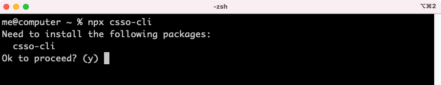
The first time you use this command, npx will alert you that it needs to install csso-cli. Confirm that you want to do so when prompted.
Now you’re ready to minify your CSS.
Using CSSO
To minify CSS files, run the csso command, passing the name of a file as an argument:
csso style.css
If you’re using npx, you’ll need to type a few more characters:
npx csso-cli style.css
This performs basic compression. CSSO strips unneeded whitespace, removes superfluous semicolons, and deletes comments from your CSS input file.
Once complete, CSSO prints the optimized CSS to standard output, meaning the current terminal or command prompt window. In most cases, however, we’ll want to save that output to a file. To do that, pass an output argument to csso using the --output or shorter -o flag. For example, if we wanted to save the minified version of style.css as style.min.css, we’d use the following:
csso style.css -o style.min.css
If you’ve chosen npx, use this:
npx csso-cli style.css -o style.min-css
By default, CSSO also restructures your CSS. It will, for example, merge the declaration blocks of duplicate selectors and remove some redundant properties. Consider the following CSS:
body {
    margin: 20px 30px;
    padding: 100px;
    margin-left: 0px;
}
h1 {
    font: 200 36px / 1.5 sans-serif;
}
h1 {
    color: #ff6600;
}
In this snippet, margin-left overrides the earlier margin declaration. We’ve also repeated h1 as a selector for consecutive declaration blocks. After optimization and minification, we end up with this:
body{padding:100px;margin:20px 30px 20px 0}h1{font:200 36px/1.5 sans-serif;color:#f60}
CSSO has removed extraneous spaces, line breaks, and semicolons, and shortened #ff6600 to #f60. CSSO also merged the margin and margin-left properties into one declaration (margin: 20px 30px 20px 0) and combined our separate h1 selector blocks into one.
If you’re skeptical about how CSSO will rewrite your CSS, you can disable its restructuring features. Use the --no-restructure flag. For example, running csso style.css -o style.min.css --no-restructure gives us the following:
body{margin:20px 30px;padding:100px;margin-left:0}h1{font:200 36px/1.5 sans-serif}h1{color:#f60}
Now our CSS is minified, but not optimized. Our margin-left: 0 declaration remains. Disabling restructuring will keep your CSS files from being as small as they could be. Avoid disabling restructuring unless you encounter a problem.
Preprocessors and post-processors (such as Sass, Less and PostCSS) offer minification as part of their toolset. However, using CSSO may shave additional bytes from your files.
Enforcing Code Quality with stylelint
stylelint is a linting tool. A linter is an application that checks code for potential trouble spots, and enforces coding conventions according to a set of rules. You can, for instance, use linters to enforce tabs instead of spaces for indentation. stylelint can find problems such as duplicate selectors, invalid rules, or unnecessary specificity. These have the greatest impact on CSS maintainability.
Install stylelint as you would any other npm package:
npm install -g stylelint
Once installed, we’ll need to configure stylelint. Start by installing the standard configuration:
npm install -g stylelint-config-standard
Next, create a file named .stylelintrc in your home directory. We’ll use this file to configure stylelint. Placing it in your home directory makes it available to all of your projects.
Configuring stylelint for Each Project
You can also configure stylelint on a per-project basis by adding a .stylelintrc file to your project directory.
The .stylelintrc file can use JSON (JavaScript Object Notation) or YAML (YAML Ain’t Markup Language) syntax. We’ll use JSON here.
File Names and Syntax Highlighting
You may prefer to name your file .stylelintrc.json or .stylelintrc.yaml so that your text editor applies the appropriate syntax highlighting. Both file extensions are supported by stylelint.
Let’s extend the standard configuration. Add the following to your .stylelintrc file:
{
    "extends": "stylelint-config-standard"
}
This is enough to start linting our CSS.
Using stylelint and Understanding Its Output
Type the following in the command line:
stylelint style.css
To recursively lint all CSS files in a directory, use the following:
stylelint "./css/**/*.css"
stylelint can also lint CSS that’s embedded in HTML files using the <style> element. Pass the path to an HTML file as the argument. When stylelint finishes analyzing your CSS, you’ll see output resembling what’s shown below.

The first column indicates the line number and character position of the rule violation. For example, 4:2 indicates that our first rule violation occurs on line 4 of style.css, beginning with the second character.
Next, stylelint describes what it expected to see based on the rules defined in the standard configuration. Expected "#FFFFFF" to be "#ffffff" indicates that we should have used lowercase hexadecimal color notation. The last column indicates the name of the violated rule—color-hex-case. Our second error occurs on the same line. We’ve also violated the color-hex-length rule by using a six-digit hexadecimal color value instead of a more concise, three-digit version.
As you can see from this output, the standard configuration is quite opinionated. It prefers an indentation of two spaces instead of tabs, and enforces a rule of one selector per line. Let’s make a few changes.
Configuring stylelint’s Rules
We can add or override stylelint rules by adding a rules property to .stylelintrc. Remember that our .stylelintrc file uses JSON. Each property needs to be enclosed in double straight quotation marks:
{
    "extends": "stylelint-config-standard",
    "rules": {}
}
Now let’s decide what we’d like to change. We can view our current configuration using the following command:
stylelint --print-config ./
The --print-config flag requires a file path. We’ve installed stylelint and our configuration globally, so we can use any directory—in this case, our current path. Refer to the stylelint user guide for a complete list of rules and options.
Let’s change our current indentation from spaces to tabs. We’ll need to modify the indentation rule by adding it as a property of our rules object:
{
    "extends": "stylelint-config-standard",
    "rules": {
        "indentation": "tab"
    }
}
Tabs or Spaces?
“Tabs or spaces” is the subject of much developer debate. Spaces provide more consistent visual spacing across editors. Tabs, on the other hand, let individual developers adjust visual spacing to their needs while maintaining consistent spacing in the code. Choose either one, but stick to your choice.
Let’s also enforce single-line selector lists, with a space after each comma. In other words, we’ll allow selector lists formatted as follows:
h1, h2, h3, h4 {
    font-family: 'geomanistbold';
}
But let’s also disallow multi-line selector lists, such as the example below:
h1,
h2,
h3,
h4 {
    font-family: 'geomanistbold';
}
Choose Your Own Custom Rules
Whether to use single-line selector lists or multi-line selector lists is strictly a matter of preference. We’re enforcing a single-line selector list in this example to demonstrate how to customize a stylelint configuration.
For this, we’ll need to use a combination of four rules: selector-list-comma-newline-after, selector-list-comma-newline-before, selector-list-comma-space-after and selector-list-comma-space-before:
{
    "extends": "stylelint-config-standard",
    "rules": {
        "indentation": "tab",
        "selector-list-comma-newline-after": "never-multi-line",
        "selector-list-comma-newline-before": "never-multi-line",
        "selector-list-comma-space-before": "never",
        "selector-list-comma-space-after": "always"
    }
}
Now when we run stylelint, we’ll see the following output. Notice that stylelint no longer makes a fuss about our indentation.

In Chapter 2, I mentioned selector specificity and how it affects CSS maintenance. stylelint includes a few rules that let us enforce low specificity. We’ll use one of them here: selector-max-specificity. Let’s edit .stylelintrc again to limit specificity to a maximum of 0,2,1:
{
    "extends": "stylelint-config-standard",
    "rules": {
        "indentation": "tab",
        "selector-list-comma-newline-after": "never-multi-line",
        "selector-list-comma-newline-before": "never-multi-line",
        "selector-list-comma-space-before": "never",
        "selector-list-comma-space-after": "always",
        "selector-max-specificity": "0,2,1"
    }
}
With this rule, selectors such as .subnav a:hover won’t trigger warnings or errors, but selectors such as #menu or .features p:first-of-type::first-letter will.
It’s not necessary to use a preset configuration with stylelint. You could remove the "extends" property and set your own style preferences using "rules". A custom configuration may be the wiser choice if you find yourself overriding more than a few standard rules.
Using stylelint with npx
As mentioned above, global npm packages can cause troubles if you work on multiple Node.js projects. The good news is that we can use stylelint with npx too. That said, the process of using stylelint with npx is a little bit different.
First, we’ll need to install a local, directory-level version of stylelint-config-standard:
npm install stylelint-config-standard
Using npm install without the -g flag installs the stylelint-config-standard package in our current directory. It’s only available within this directory, rather than system-wide. Now we can use npx to run stylelint:
npx stylelint style.css
Keep in mind that we only need to install stylelint-config-standard if we plan to use it in our .stylelistrc configuration. Otherwise, you can skip that step and just use whatever rules you’ve defined using the rules property.
Consider a Task Runner or Build Tool
Running these tools probably seems like a lot of extra work. To that end, consider adding a task runner or build system to your workflow. Popular ones include Grunt, Gulp, webpack and Broccoli.js. All four have robust documentation and sizable developer communities.
What’s great about these task runners and build systems is that they automate concatenation and optimization tasks. They’re not limited to CSS either. Most build tools also optimize JavaScript and images.
Because the configuration and build script files are typically JSON and JavaScript, you can easily reuse them across projects or share them with a team. Both CSSO and stylelint can be integrated with Grunt, Gulp, webpack, or Broccoli with the help of a plugin.
Above all, however, take a pragmatic approach to building your toolkit. Add tools that you think will enhance your workflow and improve the quality of your output.
Conclusion
In this chapter, we’ve looked at some tools to help you diagnose, debug, and optimize your CSS. In the next chapter, we’ll look at how to work with variables in CSS.