Chapter 6
Mastering Color Controls
IN THIS CHAPTER
![]() Exploring white balance and its effect on color
Exploring white balance and its effect on color
![]() Creating a custom White Balance setting
Creating a custom White Balance setting
![]() Fine-tuning all White Balance settings
Fine-tuning all White Balance settings
![]() Bracketing white balance
Bracketing white balance
![]() Experimenting with Picture Styles
Experimenting with Picture Styles
![]() Setting the color space (sRGB or Adobe RGB)
Setting the color space (sRGB or Adobe RGB)
Compared with certain camera settings — resolution, aperture, shutter speed, and so on — your camera’s color options are fairly simple to figure out. Most color problems can be easily fixed by adjusting one setting: White Balance. And getting a grip on color requires learning only a couple of new terms, an unusual state of affairs for an endeavor that often seems more like university-level science than art.
Some of the settings screens you use to adjust color options, on the other hand, are more than a little confusing, often presenting symbols or letters that don’t offer much of a clue as to their meaning. This chapter helps you make sense of things so that you can more easily control image colors.
Before you dig in, note an important rule of the color road: You can adjust the settings discussed in this chapter only in a Creative Zone exposure mode (P, Tv, Av, M, B, C1, or C2). Also, settings discussed in this chapter apply to both still photography and movie recording, with one exception: The Color Space option is out of your control in Movie mode.
Understanding White Balance
Every light source emits a particular color cast. The old-fashioned fluorescent lights found in most public restrooms, for example, put out a bluish-green light, which is why our reflections in the mirrors in those restrooms look so sickly. And if you think that your beloved looks especially attractive by candlelight, you aren’t imagining things: Candlelight casts a yellow-red glow that’s flattering.
 Science-y types measure the color of light, or color temperature, on the Kelvin scale. You can see an illustration of the Kelvin scale in Figure 6-1.
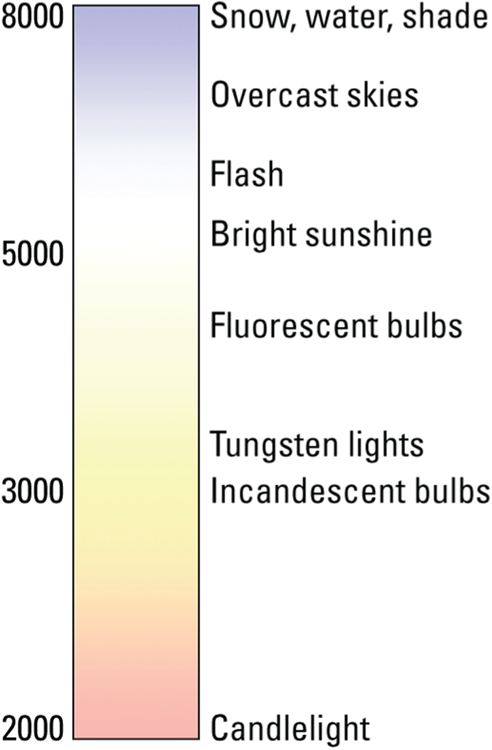
FIGURE 6-1: Each light source emits a specific color.
When photographers talk about “warm light” and “cool light,” though, they aren’t referring to the position on the Kelvin scale — or at least not in the way we usually think of temperatures, with a higher number meaning hotter. Instead, the terms describe the visual appearance of the light. Warm light, produced by candles and incandescent lights, falls in the red-yellow spectrum you see at the bottom of the Kelvin scale; cool light, in the blue-green spectrum, appears at the top of the scale.
At any rate, most of us don’t notice these fluctuating colors of light because our brains automatically compensate for them. Except in extreme lighting conditions, a white tablecloth appears white to us no matter whether we view it by candlelight, fluorescent light, or regular house lights. Similarly, a digital camera compensates for different colors of light through a feature known as white balancing. Simply put, white balancing neutralizes light so that whites are always white, which in turn ensures that other colors are rendered accurately. If the camera senses warm light, it shifts colors slightly to the cool side of the color spectrum; in cool light, the camera shifts colors in the opposite direction.
Your camera’s Automatic White Balance (AWB) setting tackles this process well in most situations. In some lighting conditions, though, it doesn’t quite do the trick.
Problems most often occur when your subject is lit by a variety of light sources. For example, Figure 6-2 features an alabaster-colored figurine set against a black velvet background. The scene was lit by both tungsten photo lights and strong daylight coming through a nearby window. In Automatic White Balance mode, hence, the original image, shown on the left in the figure, has a golden color cast. Switching to the Tungsten Light option rendered colors correctly, as shown on the right.

FIGURE 6-2: Multiple light sources can result in a color cast in Auto White Balance mode (left); try switching to manual White Balance control to solve the problem (right).
The next several sections explain how to make a basic white-balance adjustment and discuss some advanced White Balance options. Again, remember that these options are available only for the P, Tv, Av, M, B, C1, or C2 exposure modes.
 If you’re not ready to step up to the Creative Zone modes, some Basic Zone modes enable you to make minor adjustments to color. Specifically, you can tweak colors when shooting with Creative Assist through the presets or Color tone settings. Additionally, some scene modes enable you to make colors warmer or cooler. For help, visit Chapter 3.
Changing the White Balance setting
A symbol representing the current White Balance setting appears in the Quick Control and Live View displays, in the areas labeled in Figure 6-3. (If your Live View screen doesn’t show the symbol, press the Info button to cycle through the Live View display variations until you see the one shown in the figure.)
In addition to Auto, you can choose from six prefab settings, each designed for a specific type of lighting. You also get a Custom option, which selects a setting that you create based on the exact lighting conditions in the scene. (The next section explains how to store a custom setting.)
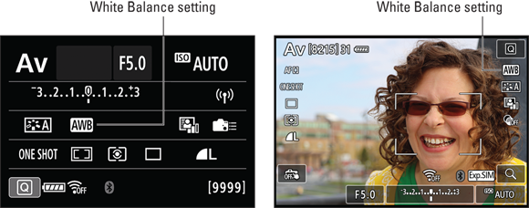
FIGURE 6-3: AWB stands for Auto White Balance.
You can access the White Balance setting in the following ways:
 Use the Quick Control feature. Press the Q button or tap the Q touchscreen symbol to shift to Quick Control mode, and then highlight the White Balance option, as shown on the left in Figure 6-4. Rotate the Quick Control or Main dial to cycle through the various options. To display all the settings on a single screen, as shown on the right in Figure 6-4, tap the White Balance icon or press Set or the center Joystick button.
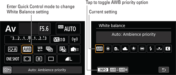
FIGURE 6-4: Change White Balance by entering Quick Control mode.
 Figure 6-5 gives you a close-up look at the symbols used to represent each setting. Don’t feel obligated to memorize them, though, because the camera always displays a text label telling you the name of the currently selected option, as shown in Figure 6-4.
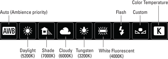
FIGURE 6-5: Here’s a guide to the symbols used to represent White Balance settings.
In most cases, the label shown on the detailed screen (the icon on the right in Figure 6-4) reports the approximate Kelvin temperature of the light source the setting is designed to handle. The Auto, Custom, and Color Temperature options don’t display this value because they aren’t associated with any one color temperature; Auto reacts to the color of the light in the current scene; the Custom setting value adjusts White Balance according to whatever lighting you use when you create your Custom setting; you set the Color Temperature directly. Nor do you see a Kelvin value for the Flash option, which is geared to the color temperature of whatever flash unit you’re using (the built-in flash or an external flash).
The Live View and Movie Quick Control screens provide a benefit that you don’t enjoy during viewfinder photography: As you adjust White Balance, the monitor updates to show you the effect of the setting on the subject colors, as shown in Figure 6-6. This feature makes it easy to experiment with different settings to see which one renders colors best.

FIGURE 6-6: In Live View mode, the preview updates to show how the current White Balance setting affects colors.
- Select the White Balance option from Shooting Menu 3. Figure 6-7 gives you a look at the menu option. Don’t see Shooting Menu 3? Check the Mode dial. Remember, you can adjust White Balance only when the camera is set to the P, Tv, Av, M, C1, or C2 exposure modes; if any other mode is selected, you get only a single Shooting menu.

FIGURE 6-7: You also can adjust the White Balance setting from Shooting Menu 3.
A few final notes about the White Balance setting:
You can choose from two AWB (Auto White Balance) options: Ambience Priority and White Priority. Your choice is relevant only when you shoot in tungsten lighting (or a light source that has a similar color temperature, such as incandescent household bulbs). At the Ambience setting, the White Balance setting doesn’t completely remove the warm cast created by tungsten lighting. For portraits and certain other subjects, that little hint of warmth is lovely. Additionally, the Ambience Priority uses the same color-balance formula as the standard Auto setting on Cameras that don’t offer a priority option, so if you’re used to those results, you may prefer to stick with Ambience Priority.
But if you want your whites to be white (compare the two images in Figure 6-7), switch to White Priority. Change the setting as follows:
- Viewfinder photography: Tap the Info symbol labeled in Figure 6-4 or press the Info button to toggle between the two settings.
- Live View and Movie Mode: Press the AF Selection button or tap the icon shown in Figure 6-6.
When White Priority is in force, a W appears to the right of the AWB symbol. If you don’t see the W, Ambience Priority is active. (Ambience Priority is the default setting for all exposure modes except the Food scene mode.)
One final note: When you add flash, the camera always uses Ambience Priority to render colors even when White Priority is selected. Flash light already has a cool color cast, and if the camera added to that light the additional cooling used to neutralize warm light in White Priority mode, your subjects may appear blue — literally.
 Your selected White Balance setting remains in force for the P, Tv, Av, M, B, C1, or C2 exposure modes until you change the setting. To avoid accidentally using an incorrect setting later, get in the habit of resetting the option to the automatic setting (AWB) after you finish shooting whatever subject it was that caused you to switch to manual white balancing.
- When shooting in mixed light, choose the White Balance setting based on the most prominent light source. If none of the preexisting settings produce accurate colors, try the advanced options outlined in the next three sections.
Creating a custom White Balance setting
Through the Custom White Balance option, you can create a white balance setting that’s precisely tuned to the color of the light hitting your subject, whether that light comes from one source or many sources. To use this technique, you need a piece of card stock that’s either neutral gray or absolute white — not eggshell white, sand white, or any other close-but-not-perfect white. (You can buy reference cards made for this purpose in many camera stores.)
After positioning the reference card in the lighting you plan to use for your subject, follow these steps to create the custom setting:
With the camera in still photography mode (not Movie mode), set the Mode dial to P, Tv, Av, M, B, C1, or C2.
You have to take a photo of a reference card before you can set the Custom White Balance, and to do that you need to be in an Advanced Exposure mode. We recommend Tv, Av, or M. In M exposure mode, ensure that the exposure is correct before taking the photo. If the image is greatly under- or overexposed, the resulting white balance will be affected.
Although you can’t create a custom setting in Movie mode, you can select one that you created in still photography mode. Just select the Custom setting when you set the White Balance option. (Refer to Figure 6-5 for a look at the symbol that represents the Custom setting.)Take a picture of the reference card.
Frame the shot so that the reference card fills the viewfinder (or, if you’re using Live View, the monitor). For best results, focus manually. (The autofocus system usually has a hard time focusing on a blank field on color.)
Display Shooting Menu 3 and choose Custom White Balance, as shown on the left in Figure 6-8.
You then see the screen shown on the right in the figure. The image you just captured should appear in the display, along with a brief message that tells you that the camera will only display that image and others that are compatible with the custom white-balancing option. If your picture doesn’t appear on the screen, press a multi-controller right or left or rotate the Quick Control dial to scroll to it. (Note that you may see additional data on the screen depending on the current playback display mode; press the Info button to cycle through the various displays.)
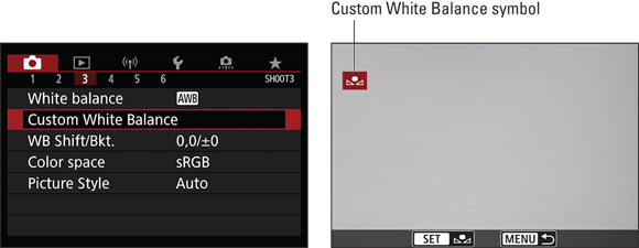
FIGURE 6-8: Choose this option from Shooting Menu 3 to create a White Balance setting precisely tailored to the current lighting.
Again, notice the Custom White Balance symbol appearing in red in the upper-left corner of the screen and inside the Set label at the bottom of the screen.Tap the Set icon (or press the Set or center Joystick button) to select the displayed image as the basis for your custom white balance reference.
You’re asked to confirm that you want to use the image to create the Custom White Balance.
Tap OK or highlight it and press the Set or center joystick button.
A message tells you that the custom setting is stored.
- Tap OK (or highlight it and press Set or the center joystick) to finish.
Your custom setting remains stored until the next time you replace it by working your way through these steps again. Any time you want to base white balancing on this custom setting, just look for the Custom setting in the White Balance selection screens.
Fine-tuning color with White Balance Shift
In addition to creating a custom White Balance setting, you can use White Balance Shift to recalibrate the White Balance system so that no matter which White Balance setting you choose, colors are shifted toward a particular part of the color spectrum. (In the instruction manual, this feature is named White Balance Correction, but it goes by the Shift moniker on camera screens and menus.)
As with other White Balance features, this one is available only in P, Tv, Av, M, B, C1, or C2 exposure modes. However, you can set up White Balance Shift in Movie mode, as well as during still photography.
After setting the Mode dial to P, Tv, Av, M, B, C1, or C2, follow these steps:
Display the White Balance Shift screen.
You can get to the screen in two ways:
- Use the Quick Control feature. During viewfinder photography, the White Balance Shift option appears after you put the camera in Quick Control mode, as shown on the left in Figure 6-9. Tap the option or highlight it and press Set or the center Joystick button to display the screen shown on the right.
In Live View or Movie mode, the Quick Control screen displays an Info label when the White Balance option is active, as shown on the left in Figure 6-10. Tap that label or press the Info button to get to the adjustment screen shown on the right.
- Open Shooting Menu 3 and select WB Shift/Bkt. The camera displays the same adjustment screen shown on the right in Figure 6-9.

FIGURE 6-9: After putting the camera in Quick Control mode, select the WB Shift/Bracketing option (left) to display the adjustment screen (right).
Both versions of the adjustment screen contain a grid that’s oriented around two color pairs: green and magenta (represented by the G and M labels) and blue and amber (represented by B and A).
Move the shift marker (the white square) in the grid to set the amount and direction of the adjustment.
When using the adjustment screen shown in Figure 6-9, move the marker by tapping the grid, tapping the scroll arrows around the grid, or using a multi-controller. In Live View or Movie mode, tap the grid or use a multi-controller to move the marker. (The symbol labeled multi-controller in Figure 6-10 reminds you how to move the marker.)
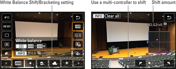
FIGURE 6-10: In Live View or Movie mode, tap the Info icon (left) or press the Info button to access the adjustment screen (right).
As you move the marker, the Shift area of the display tells the amount of color bias you’ve selected. For example, in Figures 6-9 the shift is two levels toward amber and two toward magenta; in Figure 6-10 the shift is 2 levels towards blue and two levels torwards green.
If you’re familiar with traditional lens filters, you may know that the density of a filter, which determines the degree of color correction it provides, is measured in mireds (pronounced “my-reds”). The White Balance grid is designed around this system: Moving the marker one level is the equivalent of adding a filter with a density of 5 mireds. The White Balance Shift screen also contains controls for enabling White Balance Bracketing, explained in the next section. Be careful not to accidentally use the controls that set up bracketing: the Quick Control dial and the touchscreen symbols that appear on either side of the word Bracket.Press the Set or center Joystick button to apply the change and return to the initial menu or Quick Control screen.
You also can tap the return arrow (in the lower-right corner of the viewfinder or menu version of the adjustment screen; in the upper-right corner of the Live View and Movie screen).
Press the menu button to exit the menu or the Q button to exit the Quick Control display. (You can also press the shutter button halfway and release it.)
As a reminder that White Balance Shift is in force, the symbol labeled on the left in Figure 6-11 appears in the Quick Control display. A +/- sign appears under the White Balance symbol on the Live View and Movie screens, as shown on the right.
By default, you also see a warning symbol in the viewfinder. However, the warning symbol also appears if you set the Picture Style option to Monochrome, as covered later in this chapter, and when you set the Hi ISO Speed Noise Reduction feature to the Multi Shot setting. (Chapter 4 covers that option.) You can specify which of these features results in the alert through Custom Function III:1 Warnings in viewfinder. Access this Custom Function from the Custom Function III: Operations/Others category in the Custom Functions menu.
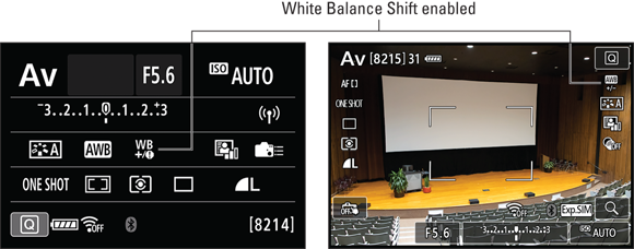
FIGURE 6-11: These symbols remind you that White Balance Shift is being applied.
- To cancel White Balance Shift, repeat Steps 1 and 2 and then set the marker back to the center of the grid.
Be sure that both values in the Shift area of the display are set to 0.
For a fast way to move the marker to the center of the grid, press the Erase button (viewfinder), the Info button (Live View), or tap its onscreen symbol. However, doing so also cancels White Balance Bracketing, explained in the next section.
Bracketing White Balance
Chapter 4 introduces you to Automatic Exposure Bracketing, which makes it easy to bracket exposures — capture the same scene at three different exposure settings. Similarly, the camera offers White Balance Bracketing, which accomplishes the same thing but varying white balance instead of exposure between frames.
Before you explore the steps involved in bracketing white balance, here are some preliminary points to understand:
- You can take advantage of White Balance Bracketing only in the P, Tv, Av, M, B, C1, or C2 exposure modes. Also, the feature isn’t available for movie recording, for obvious reasons.
- White Balance Bracketing is based on the same color grid you use to set up White Balance Shift. In fact, you adjust both settings on the same screen. If you want, you can enable both white-balance shift and bracketing.
- You can bracket white balance along one axis of the color grid only. That is, you can shift colors along the blue/amber axis between frames or along the green/magenta axis.
- White balance bracketing is most helpful when you’re shooting JPEGs only. If you shoot Raw images, you can perform non-destructive White Balance adjustments in software later. This is one of the great advantages of shooting Raw.
- You take just one picture to create a bracketed series. In this regard, bracketing white balance is different from bracketing exposure, which requires you to snap three shots. With White Balance Bracketing, the camera records one shot when you press the shutter button and records that image using the current White Balance setting. From that original frame, the camera then creates two variations, recorded using the specified shift along the green/magenta or the blue/amber axis.
Because the camera needs time to process the second and third images, your shot-to-shot frame rate may slow a little when you enable White Balance Bracketing.
Figure 6-12 offers an example of the kind of results you can expect from White Balance Bracketing. For this series, frames were bracketed along the blue/amber axis, using the maximum amount of color shift between the neutral, blue, and amber frames. As you can see, the difference is subtle, although your mileage may vary depending on the subject of the photo.

FIGURE 6-12: With White Balance Bracketing, the camera automatically creates three frames that vary in color.
To enable White Balance Bracketing, follow these steps:
- Set the Mode dial to P, Tv, Av, M, B, C1, or C2.
Display the setup grid shown in Figure 6-13 by using Quick Control mode or by selecting WB/Shift Bkt. from Shooting Menu 3.

FIGURE 6-13: To establish bracketing settings, rotate the Quick Control dial or tap the arrows to the left and right of the Bracket label.
The steps in the earlier section “Fine-tuning color with White Balance Shift” provide specifics; refer to Figures 6-9 and 6-10 for a visual reminder of how the Quick Control screens appear.
Rotate the Quick Control dial to set the amount and direction of the bracketing shift.
Rotate the dial to the right to apply bracketing along the blue to amber axis; rotate left to bracket along the green to magenta axis.
As you rotate the dial, three markers appear on the grid, indicating the amount of shift that will be applied. The Bracket area of the screen also shows bracketing type and amount. For example, in Figure 6-13, the bracketing is set to plus and minus two levels on the blue/amber axis.
You also can adjust the settings by tapping the markers on either side of the word Bracket, at the bottom of the screen.Tap the exit arrow or press the Set button to exit the adjustment screen.
Verify the bracketing value by checking the White Balance Shift/Bkt. setting on Shooting Menu 3; the value after the slash shows the bracketing setting. The two values to the left of the slash indicate the White Balance Shift direction and amount.
The Quick Control display contains a White Balance Bracketing symbol, as shown on the left in Figure 6-14. In the Live View display, the White Balance setting symbol appears smaller than usual, as shown on the right in the figure, and blinks to indicate that the bracketing is enabled. Neither display shows you the specifics of the bracketing setting.
Bracketing remains in effect until you turn off the camera. You can also cancel bracketing by revisiting the adjustment screen (refer to Figure 6-13) and resetting the Bracketing value to 0. You can do this quickly by tapping the Clear All symbol or pressing the Erase button.
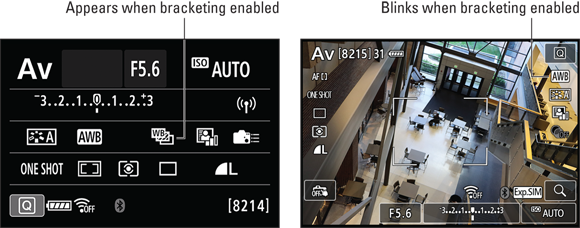
FIGURE 6-14: The Quick Control and Live View screens display these alerts that White Balance Bracketing is turned on.
Taking a Quick Look at Picture Styles
Picture Styles give you an additional way to tweak image colors. But the Picture Style setting also affects color saturation, contrast, and image sharpening.
Sharpening is a software process that adjusts contrast in a way that creates the illusion of slightly sharper focus. Emphasis on the word slightly: Sharpening cannot remedy poor focus; instead, it produces a subtle improvement to this aspect of your pictures.
The camera offers the following Picture Styles, which are indicated in the displays by the initials shown in the list:
- Auto (A): The camera analyzes the scene and determines which Picture Style is the most appropriate. (This setting is the default.)
- Standard (S): Produces the image characteristics that Canon considers as suitable for the majority of subjects.
- Portrait (P): Reduces sharpening slightly to keep skin texture soft. Color saturation, on the other hand, is slightly increased. You can adjust skin coloring along a magenta-to-yellow tonal range.
- Landscape (L): Emphasizes greens and blues and amps up color saturation and sharpness.
- Fine Detail (FD): Use this setting for extra sharpening and slightly more intense colors.
- Neutral (N): Reduces saturation and contrast slightly compared to how the camera renders images at the Standard setting.
- Faithful: Renders colors as closely as possible to how the human eye perceives them.
Monochrome: Produces black-and-white photos.
If you set the Quality option to Raw (or Raw+Large/Fine), the camera displays your image on the monitor in black and white during playback. But during the Raw converter process, you can either choose to go with your black-and-white version or view and save a full-color version. Even better, using the Raw file enables you to process and save the image once as a grayscale photo and again as a color photo. If you don’t capture the image in the Raw format, you can’t access the original image colors later. In other words, you’re stuck with only a black-and-white image. For this reason, shooting in the Monochrome Picture style in JPEG only isn’t a great idea.- User Defined (1, 2, and 3): You can create and store three of your own Picture Styles. More on that possibility a little later.
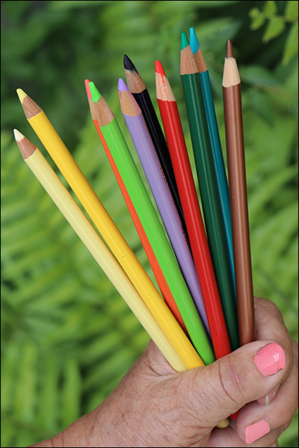
FIGURE 6-15: Here’s how the Auto Picture Style rendered the example image.
The extent to which Picture Styles affect your image depends on the subject, the exposure settings you choose, and the lighting conditions. Figure 6-15 shows the Auto version of an image; Figure 6-16 shows the six variations produced by the other full-color Picture Styles. As you can see, the difference between the styles is sometimes pretty subtle. Feel free to experiment to find which style best suits the effect you’re after.
You have control over the Picture Style setting only in the P, Tv, Av, M, B, C1, C2, and Movie modes. In the Quick Control screen and Live View displays, the symbol labeled in Figure 6-17 represents the current setting. (In Movie mode, the symbol appears in the same spot as in Live View still-photography mode.)
To change the Picture Style setting, use one of these methods:
- Quick Control method: After shifting to Quick Control mode, highlight the Picture Style icon and then rotate the Quick Control or Main dial to cycle through the available styles. To see all styles on a single screen, press the Set or center Joystick button or tap the Picture Style icon. On that second screen, highlight the style you want to use and press Set to finish up. Or just give the setting a quick tap on the touchscreen.
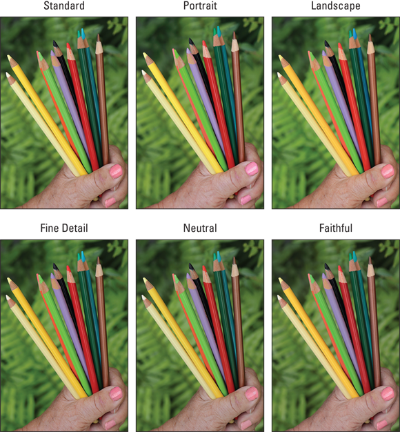
FIGURE 6-16: Here are the variations produced by the six other full-color Picture Styles.

FIGURE 6-17: This symbol represents the Picture Style.
Figure 6-18 shows the Quick Control screens as they appear during viewfinder photography. In Live View and Movie mode, the screens vary in appearance but the process of selecting and adjusting the setting is the same.
- Shooting Menu 3: Select Picture Style from the menu to display a variation of the selection screen shown on the right in Figure 6-18.

FIGURE 6-18: You can select a Picture Style via the Quick Control screen.
Now for the question on everyone’s mind: What the heck is the deal with all the crazy numbers and symbols that appear in the Picture Control settings screens? Well, in their very Canon-like cryptic style, the symbols represent specific picture characteristics, such as sharpness, color saturation, and contrast. The number values indicate the strength at which those characteristics are applied to the picture when the camera processes the image data. But the different characteristics are based on different number ranges, so those values aren’t a big help unless you spend time researching and understanding them.
So, why does Canon go to the trouble of including these details? Because you can modify a Picture Style by adjusting the values for the various picture characteristics.
Unless you’re tickled pink by the prospect of experimenting with Picture Styles, however, just stick with the default setting (Auto) and ignore the fine-tuning options. Why add one more setting to the list of options you have to remember, especially when the impact of changing it is minimal?
Plus, if you want to play with the characteristics that the Picture Style options affect, you’re better off shooting in the Raw format and then making those adjustments on a picture-by-picture basis in your Raw converter. (See Chapter 10 for help processing Raw files in Digital Photo Professional 4.)
For these reasons, this book presents just this brief introduction to Picture Styles, making room for functions that make a bigger difference to your photographic success.
For details on Picture Style features not covered here, consult your camera manual.
Changing the Color Space
By default, your camera captures JPEG images using the sRGB color mode, which refers to an industry-standard spectrum of colors. (The s is for standard, and the RGB is for red, green, and blue, which are the primary colors in the digital color world.)
Because the sRGB color spectrum leaves out some colors that can be reproduced in print and onscreen, at least by some devices, your camera also offers the Adobe RGB, which includes a larger spectrum of colors. Know that some colors in the Adobe RGB spectrum can’t be reproduced in print; the printer just substitutes the closest color, if necessary.
If you plan to print and share your photos without making any adjustments in your photo editor, stick with sRGB; most printers and web browsers are designed around that color space. Also, your editing software must support Adobe RGB — not all programs do.
You can’t use Adobe RGB when recording movies or when shooting in any exposure mode except P, Tv, Av, M, B, C1, and C2. Change the setting via the Color Space option on Shooting Menu 3, as shown in Figure 6-19.
Filenames of pictures captured in the Adobe RGB color space start with an underscore, as in _MG_0627.jpg. Pictures captured in the sRGB color space start with the letter I, as in IMG_0627.jpg.
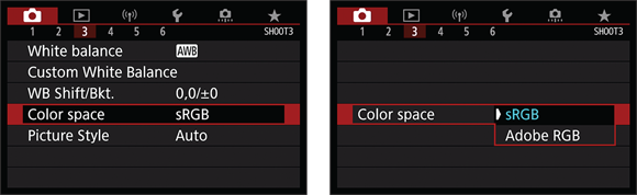
FIGURE 6-19: Change Color Space from Shooting Menu 3; choose between sRGB (universal compatibility) and Adobe RGB (wider color range).