
9. Beyond the Rule of Thirds
A Brief History, Some Psychology, and Positive and Negative Space
By David Brommer
I have a wonderful job. Aside from living a life of photography, I run a seminar program where I get to work with legendary photographers and also create photo programs. Lots of people show me their work, and I notice a recurring issue: They cut the scene in half. This is considered a cardinal sin in the world of photographic composition. And the more I look, the more base compositional problems I begin to notice. So I’ve done what any decent, self-respecting, photo guru would do—I created a program called, “Better Photographic Composition: Beyond the Rule of Thirds.”
In this chapter, I’ll illustrate a few key points that are not often spoken of in the conversation of composition. The topics will include a history of composition (I firmly believe you have to know where you came from to move forward), deconstruction of a photograph, psychology, contextual considerations of said photograph, and using positive and negative space in the photograph.
Poring Over the Picture
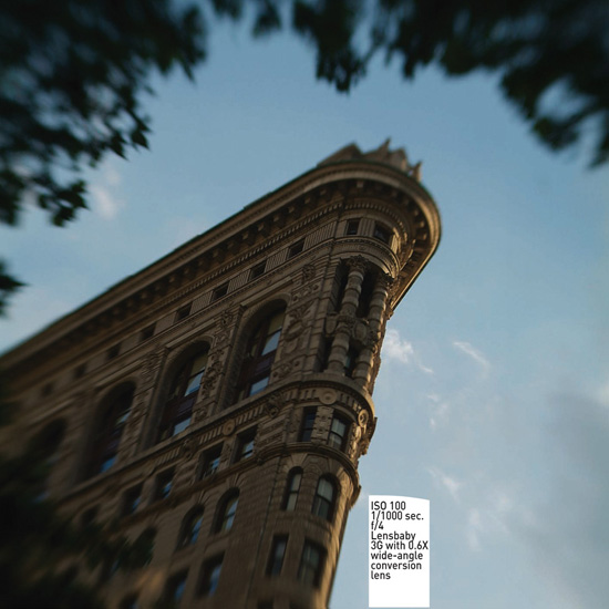
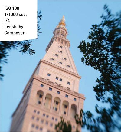
I travel to Italy every summer and always self-assign a project. This year I took a Leica M8.2 and a bag full of legendary Leica lenses. I concocted the plan on the plane ride leaving New York City: I would only point the camera up, and find compositions that were above. The narrow alleys of the old Italian towns provided wonderful experiments in composition and revealed seldom-seen perspectives.
Poring Over the Picture
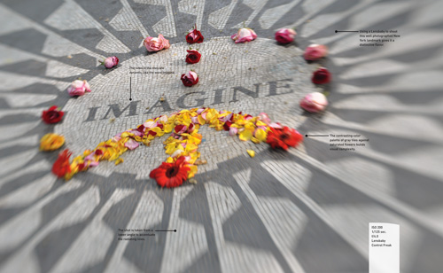
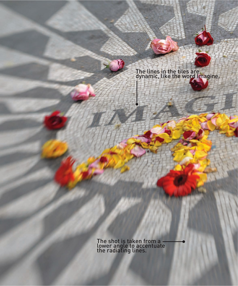
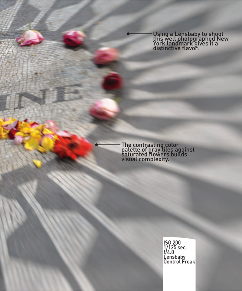
The best part of working with an advanced camera like a DSLR is the control it provides over your image, allowing you to imagine limitless possibilities from lens selection to constructing perfect compositions.
Where Did Composition Originate?
Roughly 40,000 years ago, humans began to draw local fauna on cave walls. Most likely, this was done not for aesthetics but to create a record of what could be hunted in that region. This was practical art, which represented something quite significant. It explained an idea or concept beyond an elocution, in effect, telling a story with pictures instead of words. These petroglyphs would evolve into hieroglyphs where images and words intertwined to communicate various concepts about the afterlife. Throughout the later ages, painting would evolve, but realism would prove elusive.
We have very little record of painting at the start of the Common Era and leading up to the Middle Ages because it was a dark time of strife. Rome, the cultural capital of the world, had fallen to ruins, her art destroyed or lost. The paintings executed thereafter were mostly in the “Iconic” style of the Byzantine Empire. They were flat, used a narrow color palette, and were limited in scope and grandeur. However, the early Renaissance brought about much change, which can be attributed to one man, an Italian Florentine named Giotto di Bondone.
Giotto (1267–1337) was able to resurrect a quality of painting that had remained dormant since the onset of the Dark Ages. He was keen on reproducing nature in his paintings. His work included the use of perspective, a wide palette of colors, and most important, expressions on the faces of his subjects. Figures came alive and elements of design were incorporated—both practices that profoundly impacted art.
The lessons in this book are a direct result of Giotto’s influence on aesthetics. Although Giotto painted in fresco and tempera during the early Renaissance, later the great artists of the middle and high Renaissance would study his works in churches throughout Italy. His use of perspective and realism would be key to our foundations of composition.
After Giotto, Leonardo da Vinci would paint his Last Supper, and all the lines in the painting converged on the right eye of the centrally placed Christ, in a harmony of figures and space unseen (and unpainted) before. Leonardo used draftsmanship and mathematics to achieve a complicated composition. Michelangelo would paint with such emotion and complicated compositions that it would seem he had a divine right to the brush and colors. It took five years for Michelangelo to complete the Sistine Chapel, and when he finished, he had created a massive storyboard under one roof telling nine stories from the Book of Genesis. Sandro Botticelli would be unafraid to use bold colors and elaborate compositions to illustrate both Christian and pagan themes. Caravaggio showed an appreciation for light and shadow. His ability to represent these elements in paint heavily influenced the Dutch and Flemish painters. The Western world would use these practices as a blueprint and foundation for artwork “rules” that would prevail until the present.
The Hockney-Falco Theory
Advancing painting techniques of the old masters started a trend. Hyperrealism and accuracy started showing up in works as early as the mid-1400s on. Jan Vermeer (1632–1675), a Dutch painter, completed works that offered amazingly detailed perspectives of cityscapes—almost so perfect that they were “photographic” in their imitation of reality. Contemporary artist David Hockney and physicist Charles Falco proposed a theory that camera obscura and other optical devices were used to aid the painter in rendering a scene. In the case of Vermeer’s “View of Delft” (1660–1661) (Figure 9.1), we see a perfect painting depicting his hometown of Delft taken across a river. Imagine that Vermeer walked about viewing his scene the same way photographers survey the best vantage point to shoot. Once the ideal location was found, Vermeer set up a tent of opaque material, used either a pinhole or a primitive piece of optics, placed his canvas opposite the aperture or lens, and traced the inverted “camera obscura” image as reference. He then took the canvas back to his studio and completed the painting.
Figure 9.1. “View of Delft,” by Jan Vermeer.
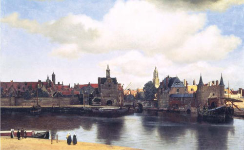
Although the Hockney-Falco theory is very romantic to photographers, it is not without its detractors. In argument, and simply put, the old masters were that good. Never mind that Vermeer didn’t make extensive preliminary perspective studies as precursors to his final paintings, or that certain specular highlights were painted by Jan Van Eyck, suggesting that convex mirrors were being used. The truth about what went on is lost in antiquity, but remains a bridge to the true invention of photography—where the image can be permanently fixed upon a material and subsequently duplicated.
Good Composition Is in Our DNA!
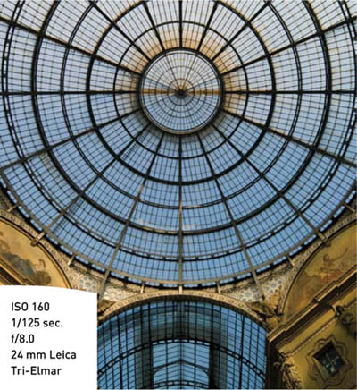
A good compositional sense is hardwired into each of us. When composition works, it allows our minds to perceive an image with harmony, and we begin to like or dislike an image and subsequently have an emotional reaction (Figure 9.2). In nature, there are repeating aspects of perfection, such as in the spiral. The spiral can be manifested in the shell of a snail or the twist of our DNA. The spiral is, like the number three and our rule of thirds, an aspect deeply rooted in our psychology of imagery. When seeking out a great composition, keep your eyes open for spirals or circles (Figure 9.3). They can help you create wonderful compositions.
Figure 9.2. The lines formed by the roof gutters lead the viewer to the center of the composition, not off to the right side. A small aperture gave me maximum depth of field, so everything in the image is sharp. Black and white is a good choice when shooting a medieval city such as Cortona.
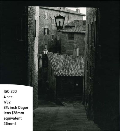
Figure 9.3. Try to incorporate a spiral element in your image. This arcade is the Galleria Vittorio Emanuele II in Milan.
For many years I took it for granted that the old masters created the rules, but they didn’t. Good old Giotto simply reestablished what was in our human heritage. Thus far I have spoken about Western considerations as they relate to art, but what about Eastern art? As image makers we know that the finesse of Japanese photographers certainly deserves admiration. I had the opportunity to view firsthand paintings by the Japanese painter Hiroshige (1797–1858), who worked in a style known as Ukiyo-e, a woodblock painting technique very common in Japan from the seventeenth through the twentieth century. Hiroshige was quite famous and prolific, and considered a master of this technique. Aside from the sheer beauty of his work, what stunned me were the compositional similarities to Western masters. Granted that sweeping waves, a traditional Japanese color palette, and images of Mount Fuji weren’t to be found in the paintings produced in Florence during the mid-1500s, but Hiroshige adhered to compositional rules that were completely in line with Western masters. He never cut his horizon in two, he embraced the rule of thirds, and he used leading lines, as well as positive and negative space. Hiroshige lived in Edo, which is now Tokyo, and was most likely not exposed to Giotto or what was going on art-wise on the other side of the world. During his lifetime Japan, the holy empire of the east, was sealed off from the world due to political conditions and xenophobia. He never traveled off the island of Japan, and the odds of his being exposed to Western art culture were next to nil. From this I extrapolate that the rules of composition reside in our DNA. Humans comprise multiple races and nationalities, and no matter our color or creed, it seems that composition is inherent, like the spiral found inside a strand of DNA.
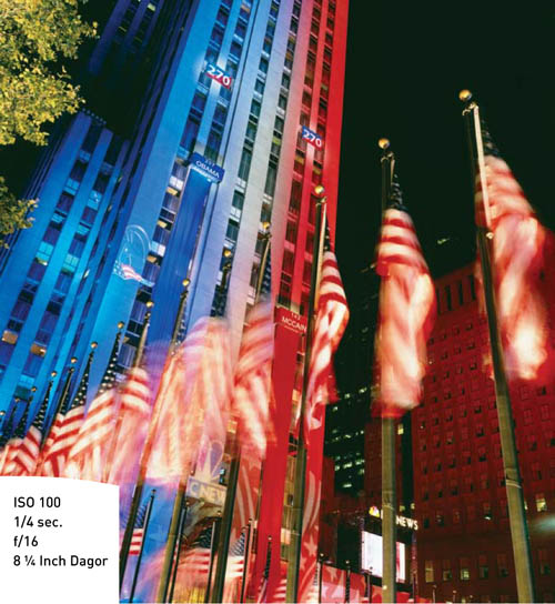
One thing that the painters had going for them was time. They were able to craft their paintings and build up perfection in their compositions. As photographers, we do not have that luxury; we must carefully find a correct vantage to lend the image its point of view. Paying close attention first to the corners is essential and can help you find just the right place to set up the camera (Figure 9.4). After establishing the subject, you must consider the corners of the image. This is when you notice that tree branch in the background cutting into your subject’s head or that the left corner that is six stops brighter than anything else and will be distracting. Take your time and reflect on the entire frame so as to not make a compositional error that will make the image render poorly.
Figure 9.4. Elements in the foreground help define the complexity of the subject matter. Here the flags illustrate the political context of Election Night 2007.
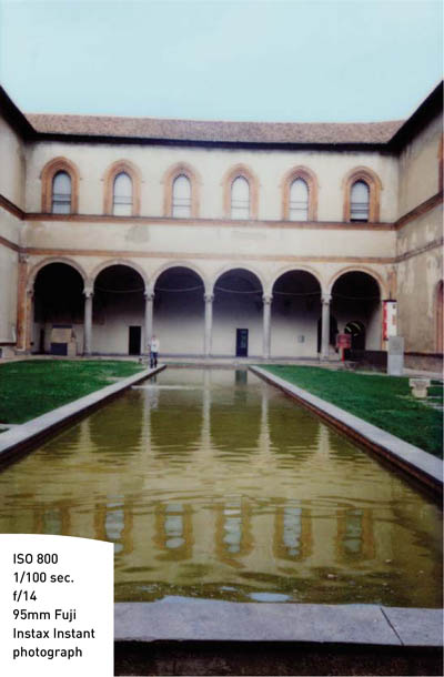
Artists, be they painters or photographers, often work in a two-dimensional medium. We create flat artwork of a three-dimensional world. Even photographers who create 3-D work by utilizing stereoscopic techniques are still essentially making flat artwork. We have tools such as depth of field, perspective, and compression to capture reality in a photograph (Figure 9.5), and we do so with sometimes astonishing technical acumen. But what makes one photograph stand out from another? With the advent of digital photography and large-capacity memory cards, a tremendous volume of photographs are currently being captured. This poses some questions: What are we accomplishing with all this work being created? Do we make good, bad, or great photographs? And what constitutes “good” or “bad”?
Figure 9.5. A reflecting pool can add dimension to your composition. Here I adjusted the camera so the reflection complemented the original, the Castello Sforza in Milan.
Deconstruction and Psychology of a Composition
Our photographs are frequently classified as landscapes, portraits, wild life, still life, street shooting, fashion—the list goes on. I’m sure you are familiar with the type of photography you mostly engage in. However, let us break this down much further and deconstruct our image to its core. No matter the subject or the light it is photographed in, we seek a reaction to our image from our viewers. Garnering an emotional response is essential to the composition, or I should state, the psychological composition. Take for example a photograph of a lion: If the lion is sleeping, the reaction will be less enthusiastic than, say, if the lion were in mid-roar. The roaring lion will spark either fear or awe. Playboy magazine centerfolds seek to elicit lust; landscapes and street shooting seek to capture the spirit of a place; and a portrait of a bride seeks to impart her excitement about that special day. What are your subjects saying? A photograph either has a voice (Figure 9.6) or is silent. Silent photographs are the ones that are frequently edited out or are deleted.
Figure 9.6. I wanted the viewer to feel as though they were in the parade and sense the pride that the flag bearer has walking with his brothers in the Sikh Day Parade.

Studium and Punctum
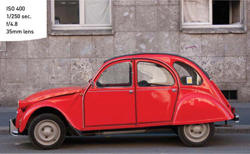
To better understand a photograph, I’ll borrow a lesson from Roland Barthe’s seminal photography essay book, Camera Lucida. Barthe speaks about an image causing a reaction and attraction, and he classifies these responses in two categories, studium and punctum. Studium is Latin for a general “liking” or intellectual commitment to the image. To expand on Barthe’s definitions, I’d like to add that images containing studium have compositional harmony that conveys the idea and allows a viewer to acknowledge the photograph at face value. The viewer’s reaction is not a like or dislike but that a “notice” has occurred and some type of psychological judgment made. Studium at best is when the picture simply works but isn’t going to win any contests (Figure 9.7). Not to diminish images that elicit studium, on the contrary, many stock images of travel and lifestyle, portraits, sports, street scenes, landscapes, and wild life fall into this category.
Figure 9.7. A simple composition of the Citroen 2CV.
Punctum, on the other hand, is a quality that transcends studium. An image with punctum penetrates the viewer’s consciousness. If studium is talking, then punctum is a scream. Punctum is the most elusive to capture. Sometimes punctum occurs by accident; at other times you have to integrate elements and really think about your photograph to induce punctum. Eddie Adams’s famous photograph of the Vietnamese general executing the North Vietnamese sniper contains punctum, but certainly not every frame Eddie captured in his tour of Vietnam was able to live up to that photograph. Punctum is the photographic Holy Grail; images that contain it win awards, sell on gallery walls, and are chosen to be magazine covers.
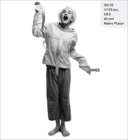
I present to you Fire Ball Bill (Figure 9.8), a contortionist and fire-breathing performance artist who is the perfect subject for an image with a bang. Shooting sequentially, I was able to capture Fire Ball Bill escaping from the confines of a straight jacket. His crazy clown makeup, his body language, and his bare feet all combine to make an image with a little shock and awe.
Figure 9.8. For this image, shooting in continuous drive mode with flash presented problems with the strobes keeping up with the camera. I used less flash power and moved the strobes closer to compensate. Less flash output allows the strobes to recharge quicker.
Humor
Now that we are deep into emotional reactions to images, we have many options to stimulate an emotional response. Let’s consider humor, which can be exploited to make a viewer chuckle and enjoy the image. Seek the punctum in your images, but don’t overlook the studium. Studium is the concert performance leading up to the encore set. Poorly composed and ill-executed photographs will not get you paid nor make anyone admire your photography. Practice the lessons in this book and create a large body of work that qualifies as studium, and when an opportunity for punctum presents itself, you will be ready to capture one of those elusive photographs that becomes one of your signature images.
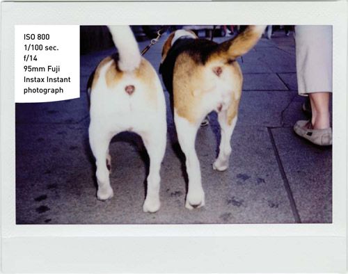
I like to call the image in Figure 9.9 “double punctum.” While walking through a large square I spotted the two beagles with their tails up and quickly ran up behind them to snap the shot with a Fuji Instax camera. Most dog lovers laugh when they see this image; it’s fun and whimsical.
Figure 9.9. Candid street shooting gives you less time to prepare the shot. Make sure your exposure and focus modes are preset so you don’t miss the shot adjusting your camera.
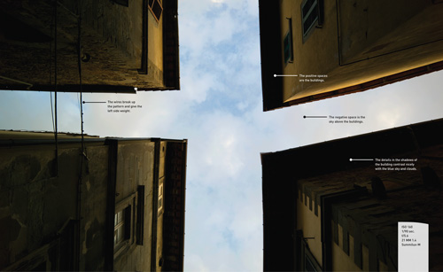
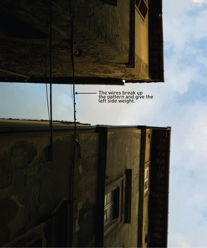
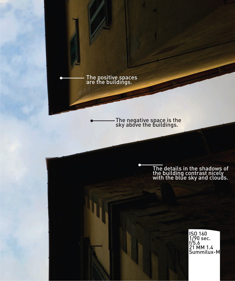
Positive and Negative Space
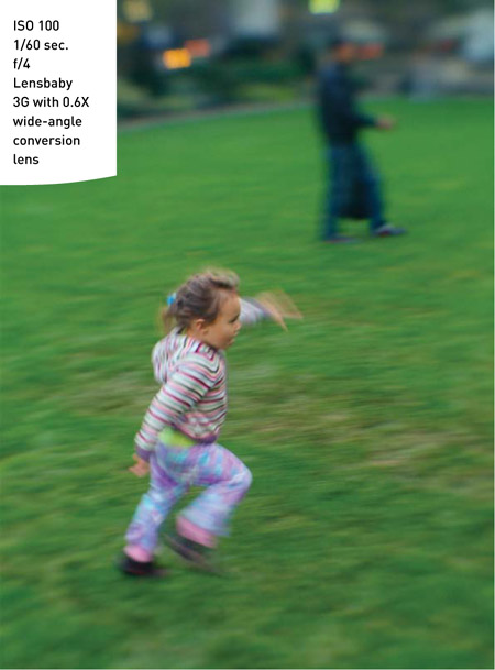
No matter whether you’re an optimist or a pessimist, or whether you find that the viewfinder frame tends to be half full or half empty, incorporating positive and negative space is fundamental to good composition. Permit me to emphasize this element because it is critical to composition. Positive space is the part of the frame that is filled with something, such as lines, subjects, color, or shapes. The positive is surrounded by negative space, which is empty or void space, space around an object or form (Figure 9.10). Think of positive and negative space like yin and yang; the two are harmonious. The eye follows the negative space and is driven into the positive space like a highway drives into a city.
Figure 9.10. To capture the child’s playful energy, I chose a lower shutter speed and panned the camera.
Positive space does not hold the subject in it, it is the subject. As an eye traverses the image, it will stop on the aspects of positive space and contemplate. The viewer’s mind will recognize and draw conclusions about what it perceives in this area of the composition and decide if it has studium enough to merit further attention. Negative space surrounding the positive is akin to a backdrop for the subject. Often, it will be a contrast or an opposite of the positive space. It is best when the negative space makes intrusions into the positive space. I like to call these intrusions “rivers” of negative space, and much like rivers across a landscape, they force the viewers’ eyes to meander about the image, soaking up the details in different parts of the photograph.
Using negative space to surround a subject is always a good idea.
Take a look at Figures 9.11 and 9.12. At first they appear identical, but one has a compositional defect. After composing and taking the picture, I “chimped” (photographer slang for reviewing the image on the camera’s LCD screen) and noticed I had ever so slightly broken up the negative space by touching leaves to the building. A strategic two steps to the left, and the next shot kept the building floating in the blue sky without interruption.
Figure 9.11. Keep and eye out for objects to frame your subject and occupy the foreground.
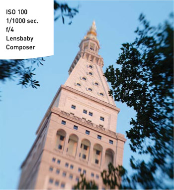
Figure 9.12. Reposition your camera to maximize the interaction of negative and positive space.
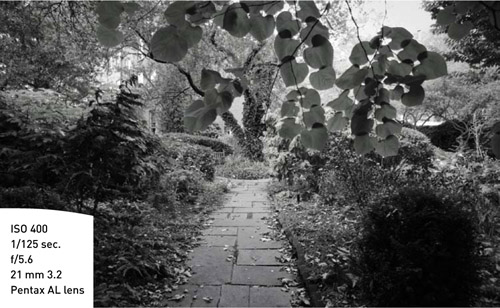
The foreground is another aspect to keep in mind. How does foreground play into the positive and negative space? Foreground can be considered positive space if it has details; foreground can also be considered negative space if it supports the main subject in a simplified graphic way (Figure 9.13). Integrating foreground is actually very important, because it can inform the viewer of scale, help establish the location of the shot, and also provide another element to work within the composition. Incorporating an element of foreground will also help build up the complexity of your image.
Figure 9.13. The original image was captured in color, but I found that a black and white treatment during postprocessing added to the mystery of the garden.
Balance of Positive and Negative Space
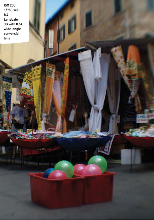
Harmony is achievable when the image has a fairly equal measure of positive space and negative space. Negative space is not always a sky or open background (Figure 9.14). Negative space can also be a texture or a repeating pattern, like a dense forest of pines, an ocean vista, or a wall of peeling paint. If the image has a limited color palette, and the negative space is the opposite of those colors, it can be more dramatic, like a slice of blue sky in a city scene of tan buildings. Think about looking up Fifth Avenue in New York City on a rainy day at 5 P.M. You will see a sea of black umbrellas, but the one red umbrella is what you really notice. Even though there may be 20 black umbrellas to the one red one, the red one is the one your eye will follow.
Figure 9.14. To capture this busy image, I shot low to the ground using the pavement to frame the boxes of balls and create negative space.
You should be very conscious of positive and negative space, and try to lead the negative space into or surrounding the positive space whenever possible. Sometimes you will have to move to get the right angle, or you may have to adjust objects in the image to create a nice harmony of positive and negative space (Figure 9.15). When I shoot in the studio, I have no problem moving things around until they “fit” just right into the composition.
Figure 9.15. Here I positioned the roll of paper towels with a wire coat hanger to create positive and negative space. I turned the bucket so the handle stuck out in negative space.
Positive and Negative Space In Portraits
My true passion in photography is portraits. I like a photograph to say something, and allowing a person to speak for me makes the most satisfying image. Years ago at a museum, I watched a video of a Helmut Newton interview, which made a lasting impression on me. It really married positive and negative space in the portrait as a method for my future compositions. He said he would ask his models to face him and give him a “western gunslinger” pose, which is characterized by arms dangling down a few inches from the sides of the torso, thumbs extended, and palms facing the hips. Aside from expressing an attitude, this pose allows the background to creep up the arms, terminating at the shoulder. It is a dynamic pose, which conveys energy and action. The eyes follow the arms and explore the body language. It’s interesting to use the term body language, because if we are trying to have the image speak, visual linguistics are surely at play (Figure 9.16).
Figure 9.16. In this shot, I dodged the circle in the subject’s shirt to make it brighter, forming negative space in a positive space.
If you don’t have the luxury of a studio, there are other creative backgrounds you can utilize by limiting the depth of field and working with a portrait or telephoto lens. Shoot wide open, and focus on the eye of the subject (Figure 9.17). It is very important that you lock focus on the eyes. If the subject is skewed to you, focus on the eye closest to your lens. If the subject is facing straight at you, make sure you don’t accidentally focus on the nose. Feel free to move up and shoot down so as to hide the horizon (by shooting higher than the subject, you will lose the horizon above the subject’s head). Or place the subject at least five feet from a wall. Try to avoid having subjects right up against the wall so that depth of field can do its job and soften the wall, thus accentuating the subject.
Figure 9.17. The background of this shot is gray pavement, but using depth of field it appears as a seamless studio backdrop.
Sometimes negative space can be very complicated to integrate. A trick used in Figure 9.18 was to turn some of the subjects and cluttered background slightly out of focus using a shallower depth of field. The foreground with the interesting colored vegetables remains sharp, but the farther back the scene goes, the less is in focus.
Figure 9.18. In this image of colorful produce, the figures have complementary gestures. Each figure has what the other is lacking (heads or hands).

Thoughts on Cropping and Printing
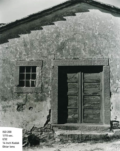
When we go to print and have decided on using an established size, such as 8×10, 11×14, or 16×20, there will be a significant crop to most captured images. The great Ansel Adams was a proponent of previsualization when he made his photographs. Before he took the photograph, he would crop the image in the viewfinder the way he wanted the final print to look (Figure 9.19). I like to use all the space that I have on my sensor/film to capture the image, and sometimes the crop factor will negate my careful composition. That’s why when I go to print, I choose a larger size paper than the size of my final image. I will fit the image on the paper without a crop and gain a wider border. I never print borderless because I’m afraid I’ll lose a part of the composition, usually in the delicate negative space. Often with a modern, pigment-based inkjet printer, I will print on 13×19 paper, but the image may end up being 11×17 or slightly smaller. You can always trim the excess border, but when you use high-quality papers, that clean, white border containing your image can often be very pleasing.
Figure 9.19. I was drawn to the corners of this photograph. The top was clean sky and the bottom was rough brick. The texture of the building’s surface is visually irresistible.
Chapter 9 Assignments
After completing the following assignments, you should have a better understanding of what reactions your images elicit and how to work with positive and negative space.
Look at More Photo Books
For this assignment, you won’t need your camera or lenses. Simply go to a good bookstore and spend some time perusing the photography books. You will notice that there will be a selection of the masters, as well as quite a few books by photographers you may not have heard of. I suggest you pick up a book by a photographer who has a similar style to your own and study those images. Just looking at more images will affect your photographic eye as much as creating images.
Play “Stock Photographer”
Go to a market, mall, or amusement park and make images that reflect studium. Capture a sense of place, but use this mantra, “I will spend more time making fewer pictures.” In other words, spend a good amount of time shooting, say, the roller coaster. Capture the essence by making abstract photos of the girders and supports, take a few portraits of the operators, and most of all, step behind the roller coaster where there aren’t any people and capture a side that few see.
Photograph Your Day
Load your camera with fresh film or a memory card and a charged battery, and leave it on your nightstand before you go to bed on a night before a workday. When you wake up, start shooting the light coming in your window. Keep the camera with you all day and document your day. That means photograph your breakfast, lunch, and dinner; photograph your commute; and photograph your co-workers. It is an interesting exercise and one that you will learn a lot from. You’ll also come back with some great shots of just a regular day.
Share your results with the book’s Flickr group!
Join the group here: flickr.com/groups/composition_fromsnapshotstogreatshots