Internal Confidential Infographics
Online infographics are the public face of what everyone sees as infographics. They are shared extensively in social media and have been the driving force behind the explosive growth in using infographics and data visualizations to communicate visually over the past few years. Infographic designers can include only designs that have been shared publicly by their clients as a part of their design portfolios.
However, there is a secret, mostly unknown world of corporate infographics used to communicate more effectively inside of companies all over the world. Companies have a ton of internal data that they don't share with the public, but at the same time, they have an essential need to communicate clearly and effectively that information internally. They want their employees to all share the same understanding, so that they are all working toward the same corporate goals. They want to give their investors a clear picture of the state of the business. They want to present compelling stories about their products to their customers.
Infographics and data visualizations are powerful tools to help simplify the understanding of complex corporate data and improve the memory retention of that information by the audience.
For example, a company would want all its sales employees communicating the same message about its products to customers. The information might be product benefits, price points, shipping schedules, or competitive advantages. A clear visualization of that information can make it easier for all of them to understand and remember, but can also be used as an aid to help them communicate clearly and confidently to customers.
By definition, corporate confidential data should not be shared outside the company, and for that reason I can't share real-world examples in this book. However, I can show examples of the visual styles and types of data being visualized by companies all over the world. Here I include public, online infographic designs or example designs I created to demonstrate what can be visualized within a company.
Improving Internal Communications
Charts and graphs from Microsoft Office products (mainly Excel and PowerPoint) have become the standard way to share corporate data internally, but they are used so often that they are no longer unique and memorable to the audience.
An employee might sit through multiple PowerPoint presentations in the same day that all use the same design template. In fact, a given company might provide the same custom branded PowerPoint template to all its employees to use for presentations. In a sense, the company is dictating that all of its presentations look the same, which has the counterproductive effect of making them harder to remember.
A research report can have more than 100 charts of the gathered data, all of them using the same chart design style and the same colors. How is an employee expected to remember any of the specific details when all the charts look the same?
The problem continues to get worse each day as the amount of information a company possesses continues to grow and accumulate. Effectively sharing that information internally and making it useful to employees is becoming both more important and more difficult at the same time.
Companies can leverage the power of infographics and data visualization design as a more effective form of internal communication to disseminate clear, memorable information. However, it does take a bit of extra work to design a unique visualization or an infographic for each set of data. Sometimes it involves an infographic designer, but most of the time employees that have no training in design create these charts and graphs on their own. With reduced workforces and budget cuts, employees are usually expected to design their own presentations and reports.
The formats for publishing infographics within a company are also different. The tall format (Chapter 2, “Online Infographics”) you see most often with infographics published online doesn't work well within the internal communication channels of a company. Usually, internal infographics are printed posters, presentation slides, printed handouts, PDF files, e-mail, or intranet sites.
The Fear of Confidential Information
Two goals within companies are often perceived to be in conflict: clear communication and confidentiality. Many companies fear that if they make their confidential information too easy to understand and share within the company, it may also become easy to share outside of the company (purposely or accidentally). As a result, the information often isn't designed to be understood and shared with employees who would benefit from the knowledge. However, there are effective ways to meet both objectives.
On the one hand, managers want their direct reports to be as effective as possible. In general, employees with access to information and a clear understanding of the business data are more effective than employees kept in the dark. A manager's performance is often a measurement based on the effectiveness of the employees that report directly to him, and as a result he wants to provide his employees with every tool possible to help them perform their jobs well.
On the other hand, companies should protect their confidential information because that information is often a competitive advantage. Companies may even be legally bound to protect the data they possess, such as medical information or customer credit card numbers. Along with their security obligations, they are often afraid to make any of their confidential information too easy to share outside of the company, even accidentally. For example, if a company's entire new product development roadmap for the next five years is clearly outlined in a one-page visual summary handed out during a presentation, it could be highly damaging if that one document were accidentally shared with a competing company.
In response to this fear, access to many documents of valuable, internal company information is often restricted. Many employees that would benefit from knowing this information in their day-to-day jobs are not allowed access due to paranoia within the company against that information being leaked outside.
Overcoming these two opposed objectives can be achieved by approaching them separately.
First, a company should make its internal data as easy to understand by its employees as possible. For a company to thrive: employee mistakes, misunderstandings, and misjudgments need to be minimized by any means possible, and clear communication can often eliminate the confusion that leads to these types of errors. Using good data visualization design methods can effectively disseminate information to its employees across an organization and increase the company's chance of survival.
Second, companies should definitely use corporate policies to help control the need for confidentiality. Document shredding policies, file encryption, e-mail tracking, password protection, and even physical building access control can help safeguard a company's valuable data. These policies should define the behavior of the employees but allow access to information to those who would benefit from it.
Ideally, access to valuable information internally should be easily accessible, but sharing that information outside of the company should be difficult. This helps prevent any accidental sharing of information and makes any purposeful sharing of confidential company information much more difficult.
As a case study, the work computer I use for client design projects has user accounts with requirements for strong passwords and has XTSAES 128-bit whole-disk encryption on the hard drive. I then create a separate 256-bit AES encrypted disk image for each separate project so that my files are also completely encrypted when they are backed up to an external disk or online storage. For clients that request it, I also use encrypted e-mail to protect messages containing any data or information exchanged while in transit between the client and myself.
Don't let fear of data exposure hold back your employees from doing the best work they can. Your company has valuable information, and you must leverage that information to the company's advantage in every way possible.
Ideas for Visualizing Internal Data
One of the best parts of my job is that when I work with a client, I get a sneak peek at their internal data. I get to see some of the research and statistics that drive the decisions these companies make. I've seen hundreds of different data sets, and I enjoy helping companies find insights from their data and clearly communicate them.
This section will share a number of different types of data and visualizations that I have seen in use internally by companies. Your company may have similar data, or the data available to you may be completely different. These ideas are intended to help inspire you to visualize the data you have and make having the data more useful to the company.
Most of these examples are fairly simple and don't need powerful graphics software. By spending a little extra time, you can create most of these using standard office productivity suite applications. More specialized software would make these easier, but it's not required.
Budgets
The most common data available within companies are the numbers from budgets. This data might include the entire corporation or just an individual department. Even a small company can quickly lose grasp of where the money goes, and visualizing the budget information at some regular frequency can be extremely valuable. Some companies want to visualize the approved budget for the upcoming year, or alternatively they might visualize the actual spending from the prior year to better understand expenses.
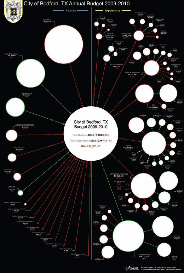
Figure 5-1 shows an example of a budget poster. This design uses the publicly available budget numbers from the city of Bedford, Texas from the 2009–2010 financial year. This design uses proportionally sized circles to visually compare the dollar amounts, similar to the Death & Taxes Poster in Figure 3-9; however, this design is split into two halves to include additional data. The left half visualizes all the sources of income and the right half visualizes all the different expenses.
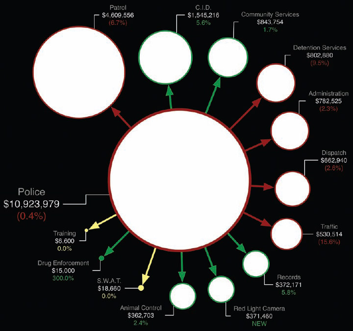
Visualizing with circles is an easy way to show multiple levels of hierarchical data, so departments can be broken down into additional levels of detail. The viewer can easily understand how one expense category compares to others or as a portion of the budget as a whole. Figure 5-2 shows a close-up of only the police department total split up into its smaller categories of expenses. In this design, the connecting arrows and circle outlines are color-coded to show how each expense category has changed from the prior year. Reduced budgets are shown in red, categories that didn't change are shown in yellow, and increased budgets are shown in green.
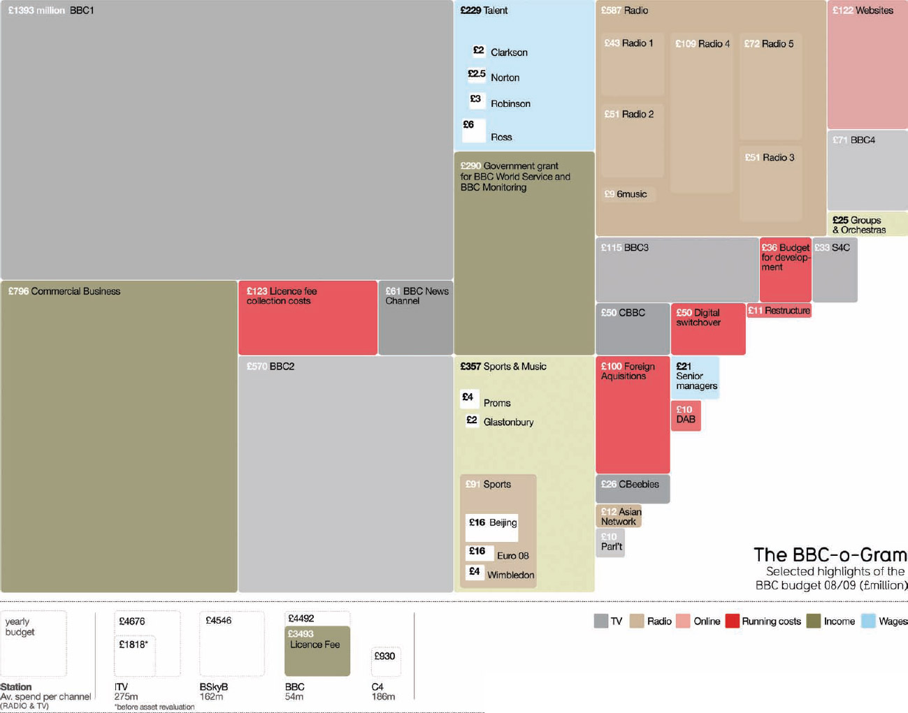
Another popular way to visualize budgets is with the treemap visualization method. David McCandless used a treemap design to visualize the 2010 budget of the BBC in, The BBC-o-Gram shown in Figure 5-3. In a treemap, proportionally sized rectangles are used for each department and fit together, and the entire area covered by the diagram represents the total of all budget expenses.
In this example, the rectangles are only showing select highlights from the budget, and the expenses are color-coded by category. This also allows space for a visual hierarchy that allows some of the major expenses within certain departments to be shown as smaller rectangles within the larger rectangles of their parent departments.
FIGURE 5-1: 2009–2010 Budget poster, City of Bedford, Texas
Coolinfographics.com/Figure-5-1
FIGURE 5-2: 2009–2010 Bedford, Texas police department expenses
FIGURE 5-3: The BBC-o-Gram, treemap budget visualization
Coolinfographics.com/Figure-5-3
Source: David McCandless, Information is Beautiful
Sales and Profit Data
Companies often have some internal confusion differentiating between sales dollars and profit dollars. Often, the products and services with the highest sales revenue are not what earn the most profit for the company. This type of analysis can be organized by product, product line, customers, brand, geographic location, sales manager, and so on.
Figure 5-4 shows a simple visualization using opposing bar charts of annual sales and annual profit for a list of 10 products. Because the profit rate percentages are different across the available products, you can see that in this case the best-selling product is not the most profitable product for the company. This type of chart with bars going in opposite directions isn't available as a standard chart type in Excel and would have to be created manually using rectangle shapes.
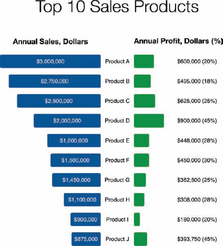
FIGURE 5-4: Sales and profit visualization
Visualizing the scale of business with key customers can help everyone within a company understand how much of the company's sales come through different sales channels. Data visualizations like Figure 5-5 can be used in an annual report, a board meeting presentation, or printed out as a poster and hung in the hallway of the company office. Using the customer logos to make the information visual makes the information understandable at a glance.
Many companies like to share information internally in this manner without showing the actual values. This can inform all the employees that walk by the poster with a consistent message, but also obscure the specific detailed financial information from any visitors that happen to be visiting the office (vendors or customers).
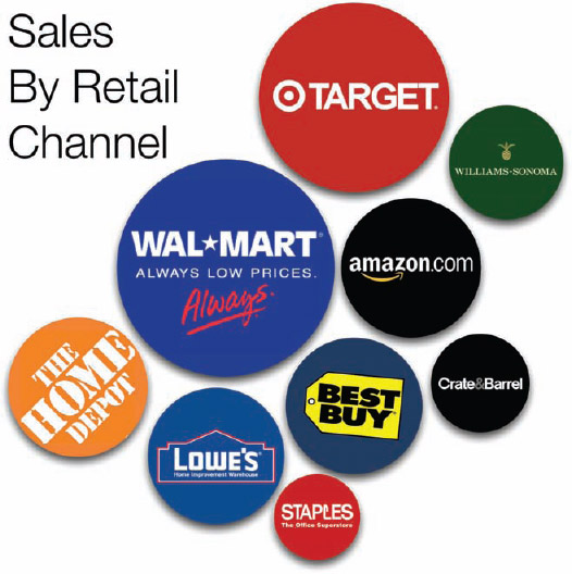
FIGURE 5-5: Sales by retail channel visualization
Business Processes
Clearly defined business processes are becoming essential within companies. As companies grow and hire more employees, they use formal business processes to help train and standardize their workflows across departments and locations. It could be the process to close the financial books at the end of each month, the process to inspect incoming products for quality, the process to hire a new employee, the process to handle each customer service call, or the process to make a change to the company's website. The company needs to ensure that the functions are performed the same way every time, no matter which employees are involved in the work.
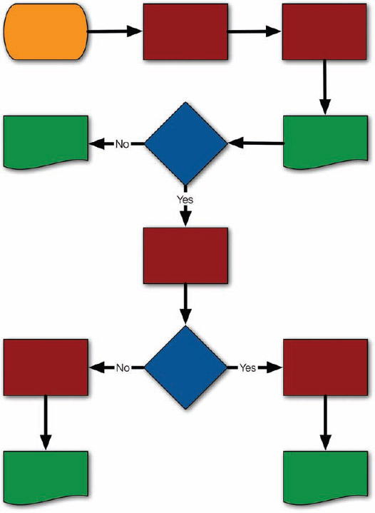
Processes are generally shown as flowcharts. This is a formal, structured way to visualize a process with different symbols to represent different functions within the chart. For example, rectangles represent process steps, rectangles with tear-off bottoms represent documents, and diamonds represent decision points.
Although they may be highly detailed and technically correct, one company could have hundreds of business processes to document. Just like a report that includes 100 similar bar charts, these flowcharts begin to all look the same to employees and are not memorable. Illustration and infographic design can help make these processes unique, engaging, and memorable to employees.
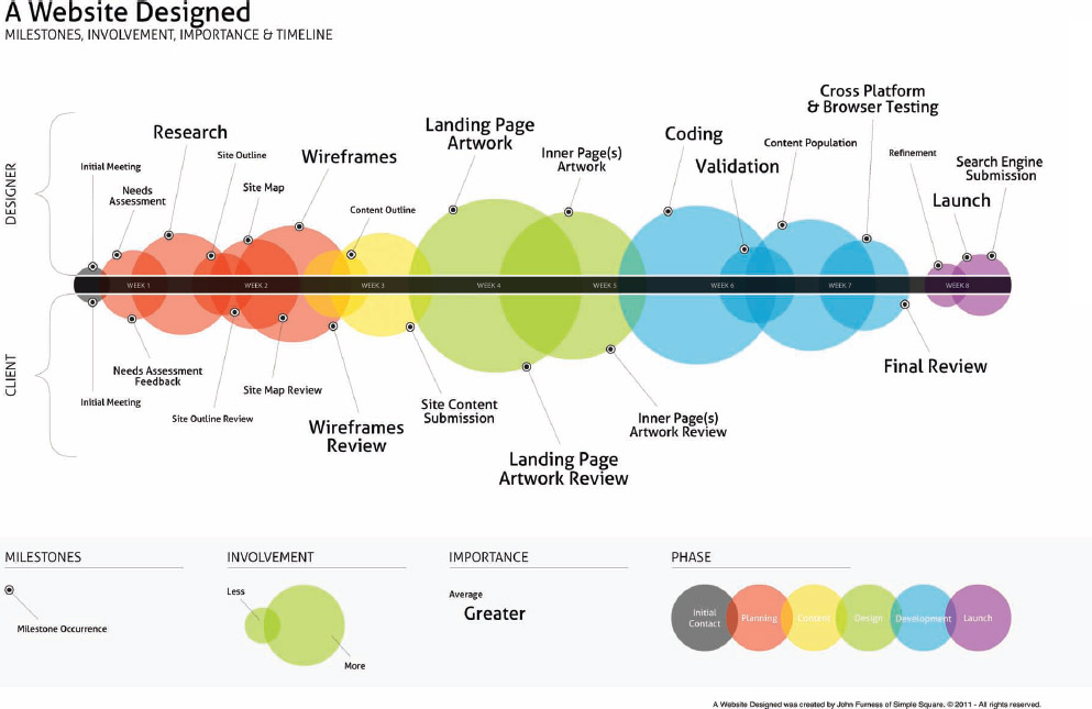
For example, Figure 5-7 shows an infographic timeline of the process to design a website designed by John Furness, the owner of Simple Square. The events are arranged along a straight timeline, but a number of additional elements of information have been added. The events are shown as circles sized to represent the estimated amount of involvement; the color coding shows the progression through the phases; individual milestones are shown connected to each phase; and the label font sizes are adjusted to show the level of importance (similar to a word cloud). This type of infographic design can be applied to many internal business processes.
FIGURE 5-6: Drawing a standard flowchart
FIGURE 5-7: A Website Designed, John Furness, Simple Square
Coolinfographics.com/Figure-5-7
How Affiliate Marketing Works in Figure 5-8 demonstrates a different way to visualize processes. The design visualizes a 10-step process as a path, and each event along the process is shown as a character performing an activity. The advantage of using characters in the design of a company process is that the employee audience can visualize themselves performing these functions and can more closely relate to the process.
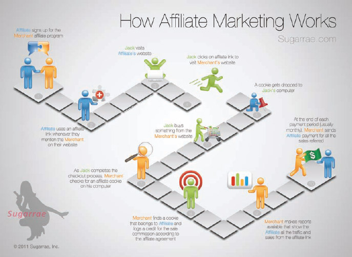
FIGURE 5-8: Process visualized as a path with characters
Coolinfographics.com/Figure-5-8
Source: How Affiliate Marketing Works, Sugarrae.com
Strategies
Similar to processes, strategies usually involve a number of connected events or activities, but they may not be organized in a chronological sequence. Visual strategies are good for showing the flow of information among many connected activities so that employees or customers can easily understand how the individual activities tie together into the overall strategy.
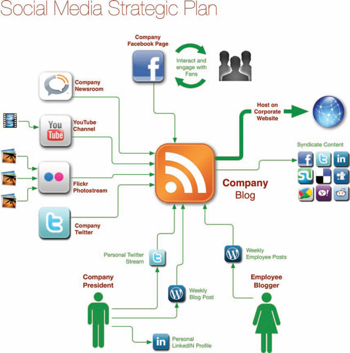
Figure 5-9 is an example of a social media content strategy from Chris Heiler, President and Founder of Landscape Leadership. This diagram shows how different forms of online content uploaded to various social sites integrates together into the company blog, and that the primary interaction with customers and fans will take place on a company Facebook page. Of course, there would be a lot more detail about each activity in the plan, but a central diagram keeps everyone informed about the overall vision.
Quantitative Research Data
Companies often have a lot of research data. This might include market research, customer research, product performance data, consumer profiles, brand equity assessments, customer segmentation studies, conjoint research and many, many more. The complete reports from this research can easily be hundreds of pages long with detailed data tables and hundreds of charts.
This quantitative data is fairly easy to load into the three standard charts (bar chart, line chart, and pie chart) but is not always easy to understand when forced into only these three types of charts. Many times, it's worth the time and effort to experiment with different methods to visualize the same data set to find a visualization that is easier for readers to understand.
FIGURE 5-9: Example Social Media Strategic Plan
Coolinfographics.com/Figure-5-9
Source: Landscape Leadership
For demonstration purposes, I made up some quantitative research data to visualize. Seven aspects of three competing brands create 21 different statistical values from the responses. Figure 5-10 shows the default clustered bar chart from PowerPoint. In this case, this familiar format is not easy for the audience to read or understand quickly. Readers probably understand bar charts fairly well (they see them often enough), and after spending some time figuring out the color coding, they might start to make some observations by comparing the bars.
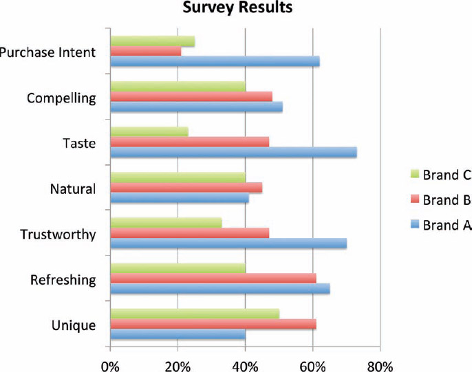
FIGURE 5-10: Default clustered bar chart from PowerPoint
However, there are many ways to visualize the same data set.
In Figure 5-11, the same research data is redesigned into a different data visualization that's much easier to understand. This one is not one of the chart styles built into PowerPoint but can be easily created manually by using the square shape tool. This example uses 10 × 10 grids of 100 squares to visualize percentages, with the values color-coded to match the brand colors.
Because the entire decimal number system is Base-10, it's easy for readers to understand instantly. Using rows that are 10 objects across is intuitive for readers, and anything different is difficult to follow. Some ineffective data visualizations in infographics have used rows of 12, 17, 20, and even 24 objects across, and it is difficult for readers to understand the values being shown. For any rows of icons or shapes, try to always stick with 10.
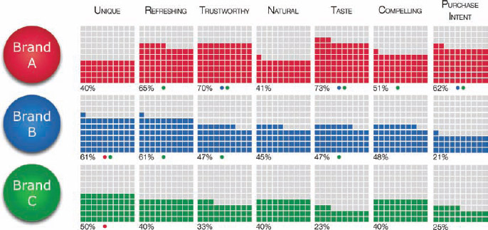
FIGURE 5-11: 10 × 10 grid redesign of quantitative research data
In research data, it is also common to note differences that are calculated to be statistically significant between the scores of the different brands. This is visualized by using matching colored dots beneath each grid to represent the other brands that are significantly lower. Brand A's trustworthiness is significantly higher than both Brand B and Brand C, so both blue and green dots are shown under that grid.
By lining them up, the viewer can quickly see that generally the overall trend is that Brand A scored better than Brand B and Brand C. It's visually easy to compare values within a brand's results and between the brands. All 21 data points are clearly visualized on one page. It's the same data, just easier to understand.
Qualitative Research Data
Qualitative research works very differently with a small number of responses or participants, and the data is often verbal or written opinions. This research data is usually gathered from focus groups, interviews, in-home research, or consumer journals. This data is important for companies to understand consumers and behaviors but should not be confused with large, statistical surveys. Any data that is not considered to be statistically significant with a low margin of error should be considered to be qualitative data.
An infographic designer needs to be careful that visualizing qualitative data doesn't mistakenly imply that the results are quantitative. Even a simple pie chart, as shown in Figure 5-12, can be the wrong visual method to use. In this example, only six people were interviewed, and four of them claimed they would buy the product from the research. Even though four out of six is mathematically 66 percent, it doesn't statistically imply that 66 percent of all consumers would be interested in buying the product. Six people certainly aren't a large enough sample size to reach that type of conclusion.
However, many readers in the audience will not be experts with math and statistics. When they see this pie chart, they will jump to the conclusion that research shows that 66 percent of all consumers would be interested in buying the product. The pie chart style hides the low number of respondents and visualizes a general percentage, which is misleading to the audience.
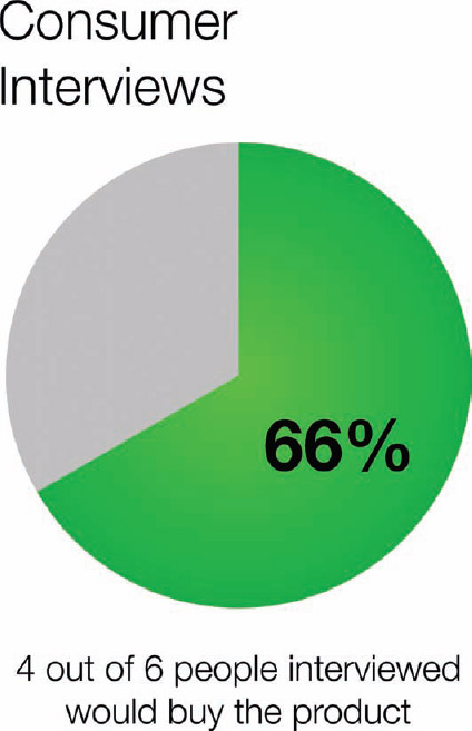
FIGURE 5-12: WRONG! Don't visualize qualitative data as if it's statistically valid.
A better way to visualize this data would be to use character icons to represent the actual number of consumers interviewed. Figure 5-13 shows a line of six people icons with four of them colored green to literally show that four out of six people responded that they would buy the product. The audience can relate the icons to individual people from the survey, which reinforces the small sample size.
Another type of data from qualitative research is verbatim comments from people. Things people say in a focus group or write on a survey form can be single words or paragraphs of text. Word clouds are used to show the frequency particular words are used. The font size of each word or phrase is based on the frequency of mentions in the complete text from the research.
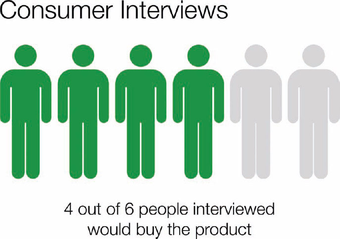
FIGURE 5-13: Visualize the qualitative data literally.
To demonstrate, I gathered the text from 15,000 customer review comments about related products from Amazon.com, and used Wordle.net (www.wordle.net) to create two word clouds. Figure 5-14 includes the words from positive review comments shown in a green word cloud, and Figure 5-15 includes the negative comments shown in a red word cloud.

FIGURE 5-14: Word cloud of positive customer product reviews on Amazon.com

FIGURE 5-15: Word cloud of negative customer product reviews on Amazon.com
The nice thing about word clouds is that they are visually indicative of general sentiment, especially when seen in relation to the rest of the words. The reader can get a good understanding of the common themes between the comments, but no numbers are shown to indicate specific levels of frequency. Even with thousands of customer reviews as the data set, this is still considered to be qualitative data because there is little information about the people involved. It's not a controlled survey of a specific type of consumer. Instead, it's a random assortment of customers that happened to be motivated enough to post a review online.
Better Presentations Using Infographics
Most people are comfortable using data visualizations and infographics at work in presentations. This is where they most often see charts, tables, and diagrams used to communicate with employees in the company. However, a presentation with a bunch of slides that all look the same because the presentation designer just accepted all the design template defaults isn't going to impress anyone. In fact, the presenter can lose credibility, and the information is unlikely to be remembered by the audience.
Presentation software can be a powerful design tool but not if the user just accepts all the design template defaults. Templates are supposed to be a good place to start but not the final slide designs. If you want your presentation to stand out and be memorable, you need to design and customize your own visualizations to be relevant and engaging for your audience.
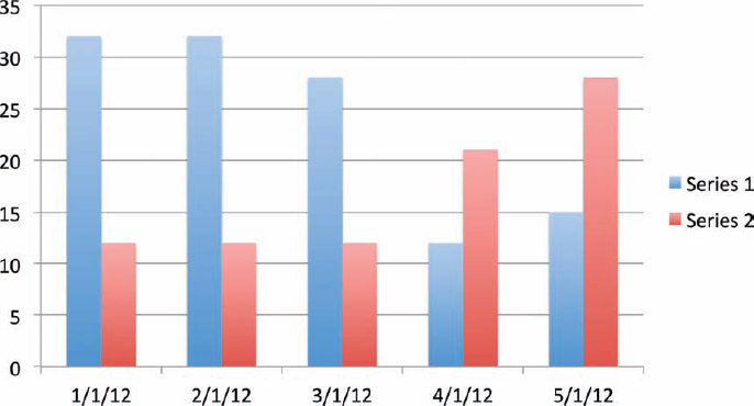
Figure 5-16 is the default chart created by one of the standard templates in PowerPoint. How many charts have you seen that look exactly like this one with only the values and the text changed? In templates, the default colors match the overall presentation theme but don't have any connection to the data.
FIGURE 5-16: Original chart created with a PowerPoint template
You don't want your audience to remember that you used PowerPoint; you want them to remember your specific information. For the Picture Superiority Effect to be effective, the visual elements have to be related to the information. So you need to make the visual elements of your charts relevant to your data.
Even a handful of simple design changes can make each chart specific to its own data and easier for the audience to understand. In Figure 5-17, the same chart has been redesigned mostly using the design options available in PowerPoint. The major changes can be accomplished by following these steps:
1. Color the bars to match the branding of the data.
2. Display the data in the bars.
3. Simplify the axis labels as much as possible, down to just the month abbreviations by adding the year to the title.
4. Color the text of the month abbreviations along the x-axis to a lighter gray to help the colors of the chart become the focus.
5. Remove the axis lines, tick marks, and gridlines. For a chart this simple, they're unnecessary and add unwanted visual noise.
6. Add the specific company logo images found on those company websites on top of the bars. This establishes the meaning behind the color-coding and eliminates the need for a chart legend.
These changes obviously won't apply to every chart because your data will be different, but the idea is to make every data visualization relevant and meaningful to the audience. In this case, I purposely stayed with the bar chart visualization instead of trying different data visualization methods to demonstrate how some simple changes can make your charts much more meaningful to your audience. This is what it takes to make your data easier to understand and remember.
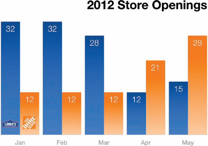
FIGURE 5-17: Chart redesigned in PowerPoint
The One-Page Infographic Handout
One of the best uses of infographics within a company is for the handouts passed out during presentations. A printed, one-page infographic handout can be much more effective when used as an executive summary of a presentation. Instead of giving everyone in the audience a thick packet with every slide from your presentation, give them just a one-page summary.
The same design principles from online infographics apply, so only the most important information should be visualized on the handout. With all the key information on one page, none of the information gets lost. The members of the audience can lay the handout on their desk or hang it up on the wall of their office, and all the key information is viewable. This keeps the message and information fresh in their minds and reinforces memory because they see it often.
If you distribute a large packet of printed pages from a presentation, the information will probably get lost when the employees return to their desks. If they leave the printed stack on their desk, they only see the top page, and the rest of the information is buried in the stack unless they make the effort to look through the pages. More likely they don't have room on their desk, so the stack of slides is either filed away in a drawer or thrown away–out of sight, out of mind.
The one-page handouts can be printed on standard letter-size paper, but many handouts are printed on the larger legal-size (8.5″ × 14″) or tabloid-size paper (11″ × 17″) available for many business-grade printers and photocopiers.
Figure 5-18 is the 2011 Wisconsin Crash Calendar designed by Joni Graves as part of the University of Wisconsin's Transportation Information Center's ROaDS (Resources, Outreach, and Data Support) initiative using statewide data. Printed on a single 11″ × 17″ page, the Wisconsin Bureau of Transportation Safety (BOTS) uses the design as a handout for several staff meetings and multi-disciplinary meetings across the state, and it is also used at quarterly Traffic Safety Commission (TSC) meetings.
The handout displays an immense amount of data on one page. By visualizing the data in the color-coded calendar format, it presents the data in a way that is much easier for the audience to understand than just the numbers. By providing it on a one-page handout, the design allows audiences to see patterns and easily compare the frequency data between different crash causes.
Prezi Presentations

If you take the idea of the one-page handout to the next level, you can convert a one-page infographic into your entire presentation. Using a zooming user interface (ZUI. pronounced “zoo-ee”), a presentation tool like Prezi (prezi.com) enables you to display the entire infographic as the presentation instead of breaking the information apart into separate, individual slides.
Prezi is a presentation application alternative to the more common PowerPoint or Keynote presentations. Instead of a sequence of individual, separate slides, Prezi uses one large canvas where the user can add images, charts, text, and even videos. The software enables the presenter to define a sequential path of zooming, rotating, and moving across the canvas to focus on different parts and create the flow of a presentation. When the presentation is displayed or projected, the software animates the movement across the canvas between each step defined in the path.
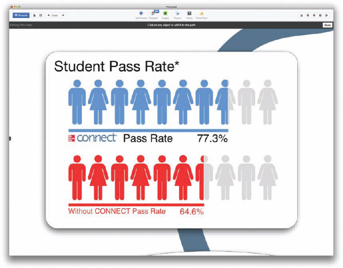
For example, Figure 5-19 is a large infographic from McGraw-Hill Higher Education that was used in its sales training conferences. The complete design can be printed as a one-page handout and distributed to the audience, or printed as a poster to be displayed. Prezi can then be used as the presentation application to move the focus of the projected display to each area of discussion during the presentation (Figure 5-20).
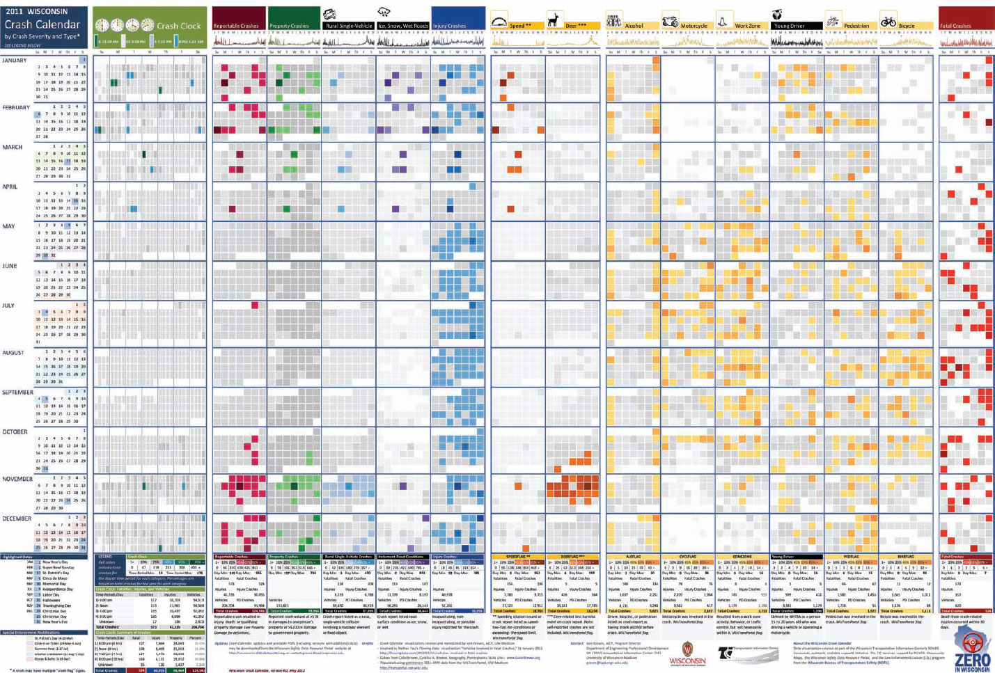
FIGURE 5-18: A one-page infographic handout allows the audience to easily see all of the data from your presentation
Coolinfographics.com/Figure-5-18
Source: 2011 Wisconsin Crash Calendar, Joni Graves
The audience can easily follow along throughout the entire presentation using the handout as a reference. Everyone in the audience has all the data on the one-page handout as a convenient takeaway document, so they have access to the information after the presentation.
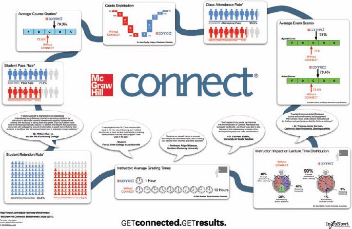
FIGURE 5-19: Large one-page infographic handout
Coolinfographics.com/Figure-5-19
Source: McGraw-Hill CONNECT
FIGURE 5-20: Prezi frame to zoom in to one section of the infographic during a presentation
The online version of Prezi is available for anyone to use for free, but there are additional paid licenses that provide more features, additional storage space online, and a separate desktop application. The desktop application enables you to keep your presentation in a local file instead of online, if that's a security concern. Also, using a file with the desktop application avoids any potential issues with Internet connectivity while you deliver your presentation because the entire presentation is saved locally on your computer.
Final Thoughts
It doesn't matter what business your company is in, you can benefit from visualizing your information. The business could be a local bakery, an online retailer, a government office, a venture capital firm, a private school, or a movie production company. Every company has valuable information that needs to be clearly communicated to employees, investors, and customers. Infographics and data visualization design practices can make your company information engaging and memorable.
Links
1. Bedford, TX Budget Poster, Randy Krum, InfoNewt:
http://infonewt.com/portfolio/client-work/8781697
2. BBC-o-Gram, David McCandless, Information is Beautiful:
http://www.informationisbeautiful.net/2010/the-bbc-o-gram/
3. Web Design Process, John Furness, Simple Square:
http://www.simplesquare.com/a-website-designed
4. How Affiliate Marketing Works, Sugarrae.com:
http://www.sugarrae.com/affiliate-marketing/how-affiliatemarketing-works/
5. 2011 Wisconsin Crash Calendar, Joni Graves, University of Wisconsin-Madison:
http://tic.engr.wisc.edu/viz
6. McGraw-Hill CONNECT Poster:
http://create.mcgraw-hill.com/wordpress-mu/connectblog/files/2012/03/McGraw-Hill-Connect-Handout-WHITE-Small.jpg


