Design matters. But design is not about decoration or about ornamentation. Design is about making communication as easy and clear for the viewer as possible.
—GARR REYNOLDS, PRESENTATION ZEN
Designing Infographics
If you have any interest in designing data visualizations and infographics, this chapter is for you. You might be ready to design one on your own, or you might work with a designer to put an infographic together. Either way, these design tips can help you create a cool infographic and avoid many of the common mistakes designers make.
Infographics are harder to design than you might think. There are thousands of “bad” infographic designs on the Internet because the designer ignored one, or many, of these rules. In a pattern similar to the millions of videos uploaded to YouTube, most of the infographics online are actually poor designs and get little traffic. The good designs rise to the top and are the designs that most often go viral in social networks.
This chapter doesn't point out and show any specific examples of bad designs that didn't follow these rules. Because I may have broken some of these rules in the past, I'm not here to criticize others, but to offer help to anyone that wants to get better at designing infographics. You can find thousands of examples of infographics online that break these rules on your own.
Following is a collection of top tips and tactics for designers that want to create better infographic designs. These will be tips focused on improving the content and structure of an infographic, and not software how-to tips. These best practices will apply no matter what software is used to put the infographic design together. It doesn't matter if you use Adobe Illustrator, Microsoft PowerPoint, or an online tool like Infogr.am. Specific software applications are covered in Chapter 7, “Design Resources.”
Be Accurate
Accuracy is the most important aspect of an infographic design, and everything else is secondary. The data visualizations in your infographic must match the numbers.
The power of infographics works both ways and can hurt you if you get it wrong. The ability to communicate your information to your audience with a clear visualization can demonstrate your expertise in your subject area, build your credibility, and help your audience remember your message. Getting the data visualizations wrong can kill your credibility just as quickly and demonstrate your lack of expertise in your subject area. Your audience will assume that because you got one data visualization wrong, the rest of your message is also of questionable accuracy. One bad chart draws so much attention from the audience that it won't matter that the rest of the information is correct. The perception of bad information will have been set in the minds of the audience.
Figure 6-1 shows the most common mistake made in infographic designs: incorrect pie charts. The values in a pie chart MUST add up to 100 percent, but apparently many designers do not understand this basic fact. Pie charts should be used to show only how separate pieces are portions of a total amount. Percentages are portions of 100 percent.
The issue most often seen is that designers misuse pie charts and apply them to incompatible data. Even if the designer uses a charting program to create the pie chart, such as Excel, this can easily happen when the data is not clearly understood by the designer. This is the result of a concept called Maslow's Hammer[1], commonly phrased as, “When all you have is a hammer, everything looks like a nail.'
Designers overuse pie charts because they are so easy to create and mistakenly apply them to data sets that are not proportions of a whole.
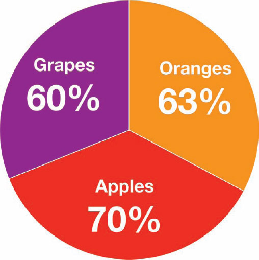
FIGURE 6-1: WRONG! Pie charts MUST add up to 100 percent.
Many research survey questions enable the respondents to choose multiple answers. The results from this type of question yield frequency values for each available answer independently. For example, a hypothetical survey question might look like this:
Which types of fruit do you eat? [Check all that apply.]
- Apples
- Oranges
- Grapes
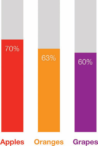
In this case, the resulting data would be better visualized in a bar chart because each fruit answer would represent a separate, independent frequency result. Figure 6-2 correctly visualizes the results as a stacked bar chart to show each percentage value separately as a portion of the maximum possible 100 percent. Combining them together into a pie chart would be an incorrect visualization of the data and demonstrates a complete lack of understanding of the data set.
If an infographic design visually shows the reader that you don't understand the data, you have used the power of data visualization against yourself. You will have effectively demonstrated your company's or client's lack of credibility. This can leave a powerful negative impression on your audience.
Be accurate and get the visualizations right!
Visualizing Area
It's key for data visualization designers to understand that we visually compare the sizes of objects based on their area (not their height). Numerical values are one-dimensional, but objects on a page or a screen are two-dimensional. This is where designers need to remember to use the math learned from high-school geometry class. If you didn't do well in geometry class, it's time to take another look.
FIGURE 6-2: The survey data is correctly visualized as a stacked bar chart.
Some shapes are easy to size correctly because their area is directly proportional to one dimension. Now walk through a couple different ways to visualize comparisons of the following simple budget data.
| DEPARTMENT | BUDGET |
| Marketing | $1,000,000 |
| Sales | $3,000,000 |
Figure 6-3 demonstrates the math behind the easiest visualization, a bar chart. In a standard bar chart, the width of each rectangle remains constant, and only the height changes. If you change only the height, then the area changes in direct proportion.
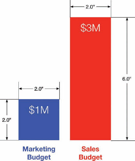
FIGURE 6-3: Dimensions of a bar chart to calculate area of the rectangles
Width × Height = Area
The area of the Marketing bar:
2.0 in × 2.0 in = 4.0 in2
The area of the Sales bar:
2.0 in × 6.0 in = 12.0 in2
12.0 in2 is three times the area of 4.0 in2, and the Sales budget of $3 million is three times the value of the Marketing budget of $1 million. So, it correctly visualizes the data comparison with area by changing only the height of the bars. The math for rectangles is simple as long as you change only one dimension and the width remains constant.
The problem becomes more difficult when visualizing data by changing the sizes of nonstandard shapes: circles, icons, logos, and so on. This is where many designers mistakenly create data visualizations that don't actually match the data because they don't take the time to do the math required.
This issue is magnified when working with shapes in software because the design applications enable you to directly change only the width and height of an object, not the area. There's no input field where the designer can enter the area of an object because the software treats every object like a rectangle. So, designers need to do the mathematical calculations separately before sizing objects in the design software, but many make the mistake of simply changing both the width and height to match the data.
Now look at visualizing the same sample budget data with the size of circles.
π × radius2 = Area of a circle
In Figure 6-4, you can see what happens when a designer mistakenly sizes circles by changing the diameter to match the data. If she incorrectly changes the diameter of the Sales circle in the software to be three times the diameter of the Marketing circle, the area of the Sales circle actually becomes 8.95 times larger.
The area of the Marketing circle:
π × 0.5 in × 0.5 in = 0.79 in2
The area of the incorrect Sales circle:
π × 1.5 in × 1.5 in = 7.07 in2
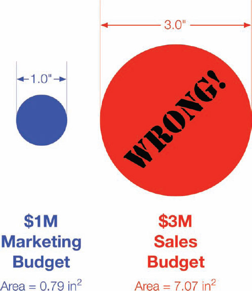
FIGURE 6-4: WRONG! Don't size circles by changing the diameter to match the data values.
This visualization doesn't match the data at all and becomes a false visual. The reason for this is that you are changing the size of two dimensions to represent one-dimensional data. Unlike rectangles, you can't keep the width constant and change only the height of a circle. It wouldn't be a circle anymore. This is also true for squares, icons, and logos where a designer wants to keep the aspect ratio constant so that the image looks correct in the design. You don't want to stretch or skew a company's logo by changing only one dimension.
To do this correctly, you have to start by calculating the area of the first circle, called the Master circle. Then, calculate the relative area of any additional circles in comparison to the Master circle by using the difference in values. In this case, the Sales budget is three times larger than the Marketing budget value, so the area of the Sales circle needs to be three times larger than the Marketing circle. It doesn't matter how many additional circles you create, but their areas all need to be calculated in comparison to the same Master circle.
Finally, use the area of each circle you just calculated to determine the diameter of the additional circles. The diameter is the numerical value you can use to enter that dimension in the design software. It doesn't matter which circle you choose to be the Master circle, but all the circles need to be sized proportional to the Master circle. If you started with the Sales circle as the Master circle, the area of the Marketing circle would be ⅓ the area of the Sales circle.
You can use a simple spreadsheet to show all the calculations. After you set up the spreadsheet, the only values you need to enter are the original data values you want to visualize and the diameter of the Master circle. The rest of the values are calculated automatically, and the designer can use all the calculated diameters to correctly size her design in the software application.
Table 6-1 shows the circle calculations for the sample budget data and uses the Marketing circle as the Master circle. If the budget data had more departments, they could be easily added as additional rows that all calculate in comparison to the Marketing department.
TABLE 6-1: Circle Calculations Spreadsheet

For reference, the equation to calculate the radius of a circle from the known area follows:
![]()
Diameter is then simply double the radius. Figure 6-5 shows the correct sizing of the circles based on the calculations from the spreadsheet, and the Sales circle is now correctly sized as three times the area of the Marketing circle.
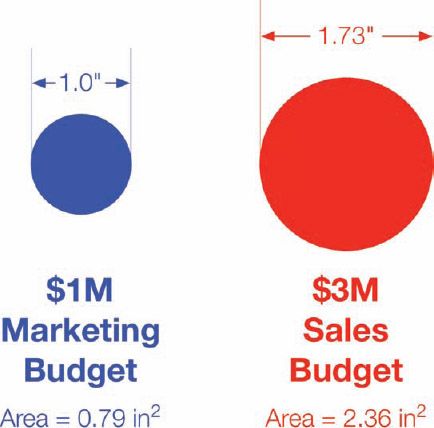
FIGURE 6-5: CORRECT circle sizing based on area
Pick a Good Topic
This might sound obvious, but many companies struggle with finding a good topic for an infographic design. A good infographic needs to be interesting because readers don't want to waste their time on boring, irrelevant topics. With information overload and thousands of infographics online, people have to choose which ones are worth reading.
Ideally, a good infographic topic focuses on some new piece of previously unknown information related to a subject the target audience is interested in. It would be even better if the information were something surprising to, and unexpected by, the audience. Topics that are counterintuitive or break expectations become sharable because people are surprised and want to share this new information they just learned with their friends.
There are two common topic areas that are worth a little more discussion: trending and controversial topics.
Trending Topics
There are some trending topics that are so popular that almost any infographic related to them generates a fairly decent amount of traffic and attention. However, the hot trending topics change over time. For example, currently any infographics released about social media, Star Wars, superheroes, or the iPhone seem to automatically draw in more traffic because these are the current, popular topics with the online, tech-savvy crowd.
Many companies release infographics based on a hot trending topic, which may or may not relate to their business, brand, or product. These can be successful with exploiting the trend and capitalizing on the attention they generate. This approach can be effective but can also be short-lived—just like the trends. Hot topics today are obsolete and out-of-date tomorrow.
Controversial Topics
Another popular approach is to focus on a controversial topic. If a company can connect with the audience on an emotional level about a topic it feels passionately about, the audience will be more likely to comment and share the infographic. The hope here is that “all links are good links.” It doesn't matter if people post because they love the topic or they hate the topic. Their posts are creating backlinks that the search engines index, and their social network audiences also see the infographic—reaching a wider audience.
Controversial topics are a much riskier proposition because the audience may perceive that the company publishing the infographic is taking one side of the controversy. If it disagrees with the stance that it believes the infographic promotes, it can turn into an opposition to the company.
Search for Prior Art
As more and more infographics are published online, the more likely it is that a design related to your chosen topic already exists in the wild. Infographics published on the Internet never go away. They're all still out there somewhere, even if the original landing page on the company site is removed. Copies of them still exist on blogs, social networking sites, infographic gallery sites, and the Internet Archive (www.archive.org).
Going forward, the number of online infographics will continue to grow, so understanding the current state of existing prior art will continue to become more important as well. Use search engines and infographic gallery sites to gather any existing infographics related to your topic of choice.
The main purpose of a prior art search is to help make sure that your design doesn't repeat what has already been done. You don't want to replicate the same topic or use the same data visualizations in your design that were already used in another infographic. Your infographics should be unique, so you should also look to avoid any similar illustrations or color palettes used in prior designs.
The infographics you gather in a prior art search can also help identify potential data sources for your infographic. You may follow the source links and find more data to help build your own design.
From a promotional aspect, many mainstream media sites and publications will not post an infographic if the topic is exactly the same as a similar infographic they have already published in the past. Use the prior art search to help avoid duplicating an infographic topic that has already been done.
When you publish your infographic online, your prior art search can also help you build a list of sites to include in your outreach communication. Search for sites and authors that shared the previous infographics from your prior art search. Because your topic is similar (but not the same), these same people may also be interested in sharing your infographic with their audiences.
Focus on the Key Message
One of the first things I ask clients to do at the beginning of an infographic design project is to define the key message they want to communicate to the audience. The key message is the primary information you want the readers to understand and remember after reading your infographic. The challenge for designers that want to make their infographics easy to understand is to include the data and information needed to communicate and support the key message, but eliminate everything else.
Ideally, an infographic needs one clear message, and all the data visualizations and illustrations support that central message. Just because there is more data available doesn't mean you need to include it in the design. Many companies mistakenly believe that if they put several different data points into one infographic, it increases their credibility because it demonstrates how much data they have.
You wouldn't believe how many infographic designs struggle with this concept. If a design contains too much information, or doesn't have a clear story, it becomes confusing to the reader. When this happens, the readers usually give up and don't spend the time to figure out the message. By including too much information, you can actually communicate nothing to the readers.
The 5-second Rule
Why is the key message so important? It's a reader attention span problem similar to consumer product packaging on a crowded store shelf, articles in a newspaper, or a pile of job candidate resumes. Most readers are going to read an infographic for only a few seconds. They're skimming, and this is how the majority of readers will interact with your infographic. An infographic designer needs to approach the design process with this fact in mind.
A rule of thumb is that the design needs to clearly communicate the key message to the readers in less than five seconds. This is the 5-second rule, and comes from my own web analytics of millions of page views on the CoolInfographics.com site over the last five years. Most of the page view duration times are 5–10 seconds, and a good infographic design needs to successfully communicate its key message to the readers within that time. That way the infographic can communicate its main point to all the readers, even when they are skimming and they don't take the time to read the entire infographic.
Where's Google making its money? (as shown in Figure 6-6) is a great example of a design that succeeds within the 5-second window. Designed by NowSourcing for WordStream, this infographic was popular and heavily shared in social networks. Within 5 seconds, the reader understands that Google makes most of its money from advertising, and what a few of the top keyword categories are. Even if that's all readers understand before they move on to the next infographic, the design was successful in communicating its key message.
Listing all 20 top keyword categories in the pie chart design is interesting data and helps build WordStream's credibility for analyzing keywords. However, understanding the fine details that conference calls are the #11 keyword category is not necessary for the audience to understand the key message that Google makes its money from advertising. There's plenty of other data and information available about Google, but in this infographic it's all ignored, so the design can focus on passing its key message to readers quickly.
Readers appreciate infographics that get to the point quickly.
Tell One Story Really Well
Another way to approach this idea is to focus all the information in the infographic to tell one story really well. Don't try to tell a bunch of small stories. One of the secrets to any type of clear communication is to keep the information focused and eliminate any data that isn't directly related. Infographic designs that visualize data just because it's available become cluttered, and the readers don't know what data to focus on.
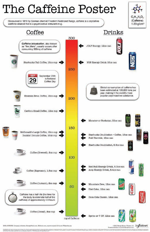
Figure 6-7 is one of my designs called The Caffeine Poster. The infographic focuses on visualizing the caffeine content of a bunch of different popular drinks so that readers can understand how much caffeine they would ingest if they choose a particular beverage. The design completely focuses on caffeine content, even though there is much more data available. Extra information about the parent companies of the brands, different sizes of the drinks, annual sales figures, geographic locations, and data about other ingredients were all eliminated to keep the design completely focused on caffeine content.
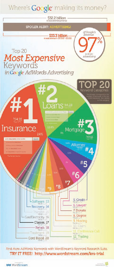
FIGURE 6-6: Where's Google making its money?
Coolinfographics.com/Figure-6-6
Source: How Does Google Make Its Money: The 20 Most Expensive Keywords in Google AdWords, Wordstream
FIGURE 6-7: Focus on telling one story really well.
Coolinfographics.com/Figure-6-7
Source: The Caffeine Poster, InfoNewt
Visualize When Possible
In an infographic design, the more data you visualize, the better. You can use data visualizations, charts, graphs, icons, illustrations, and diagrams as design tools to help to make complex information easier to understand for the readers.
Visualizing the data helps with:
- Grabbing the attention of readers
- Reducing the amount of time it takes readers to understand the data
- Providing context to the data by showing a comparison
- Making the key message more memorable with the Picture Superiority Effect
- Making the information more accessible to readers who speak other languages
The whole point of designing an infographic is to make complex information easier to understand and interesting to the audience. To accomplish that, the infographic designer needs to visualize the data.
In contrast, infographic designs with a lot of text and numbers might appear at first glance to be complicated and intimidating to readers. If the infographic seems like it would take a long time to read through, most readers won't even try. They will move on to something else and leave the infographic behind without reading it.
Big Fonts Are NOT Data Visualizations
Using big fonts in an infographic to make the numbers stand out is not data visualization. This is a big pet peeve of mine, and it's done by designers in thousands of infographic designs and PowerPoint presentations. Displaying the number in a large font doesn't make it any easier for the audience to understand.
As mentioned in Chapter 1, “The Science of Infographics,” data visualization is the language of context. One of the best ways to clearly communicate a new statistic with the audience is to show it in comparison to some information that it already understands. If the new information is shown as text alone, there's no context or frame of reference to help the reader to gain an understanding from the value.
Figure 6-8 shows an example of a statistic shown as text-only that might be included in an infographic. The common format is to show the data value in a large bold font and the associated description in a smaller font. The large font is intended to make the number stand out on the page and visually imply that the value is important.
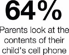
FIGURE 6-8: Big fonts are NOT data visualizations.
Reading is a slower process than pattern recognition, and this text doesn't give the reader any clues about whether the value should be interpreted as a large or small amount. The audience is left to understand this value based on its personal experiences and perspective. The readers will mentally make their own evaluation of this value based on some information they already know. In this way, the designer loses control of how the audience interprets the data because it has no idea what frame of reference each individual reader will use as a comparison.
Visuals Are Perceived as More Important
Another aspect of visualizing data is that the audience perceives any data shown as text alone as less important or irrelevant. In many infographic designs, there is a mix of visualized data and data shown as text alone. Figure 6-9 demonstrates the previous text-only data point shown next to a second data point that was visualized. With an icon, color, and a doughnut chart to visualize the percentage as a portion of the complete 100 percent, that statistic becomes easier to understand.
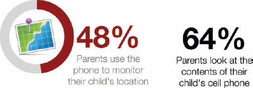
FIGURE 6-9: Visualized data is perceived as more important.
The visualized data in an infographic pulls the reader's attention away from any other information shown only as text. This makes the text-only data points appear to be inferior or secondary information to the visualized data. When reading infographics, the text-only data is often skipped and ignored by the reader because it wasn't important enough to visualize.
It also goes back to the attention span issue as readers skim through infographics. They often focus only on the visuals and ignore the text because it's faster. Remember the 5-second rule. Most audiences skim the infographic and don't want to take the time to read all the text. They try to understand the message from the visuals alone and only a small portion of the audience will read the additional text.
If your data is important enough to be included in the infographic design, it's probably important enough to visualize.
Minimize Text
Nobody wants to read a text article that has been converted into a JPG image file and called an infographic. (Yes, I've seen this done). Readers look at your infographic with the expectation that with the use of visual design, the information will be simpler to understand and faster to read than a traditional text article or blog post.
Of course, chances are that you won't remove all the text from the design, but you should minimize it as much as possible. This is one of the biggest challenges when working with clients because they have so much information that they would like to communicate to readers. The temptation is that knowing you can get the audience's attention with a good infographic topic, companies want to throw all their related information into the design hoping that the readers will take the time to read everything.
The disconnect is that the infographic should focus on communicating the key message and not try to be the ultimate guide to everything about your company or products. In general, people want to learn about the interesting topic and don't want to learn everything about the company that published the infographic.
Assuming you have an interesting topic to begin with, the reality is that the less text you include in your design, the more people you can reach. At first glance, the audience judges if an infographic is worthy of the time it needs to invest to read it. If it appears to be a lot of text, it is generally regarded as too complex and “not worthy.” Too much text implies that the design doesn't do a good job making the topic simple and easy to understand.
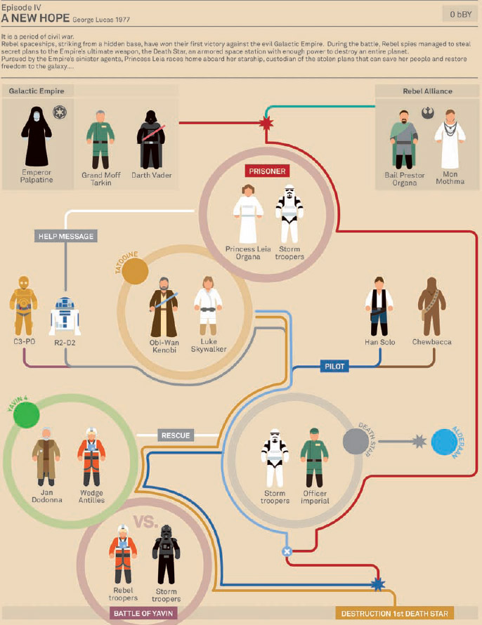
Figure 6-10 is a fun infographic design exercise in eliminating as much text as possible. Designer Marc Morera minimized each of the Star Wars movies down to visual diagrams of the character interactions throughout each movie. The fun for readers is to follow the different color-coded paths in the infographic and try to remember each related scene of the movie.
FIGURE 6-10: Star Wars Episode IV infographic with minimal text.
Coolinfographics.com/Figure-6-10
Source: Marc Morera Agusti
Some text is required to introduce the overall design and identify the characters, but there is little text throughout the design. In this case, less text actually encourages readers to engage with the design and interact longer as they take the time to follow the separate character paths.
Eliminate Chart Legends
Chart legends are evil. I find myself repeating this often to clients and designers.
Charts and graphs are a crucial data visualization element used in most infographics, and designers don't need to create all of them from scratch. They should use charting software such as Apple Keynote or Microsoft PowerPoint to create the charts and graphs included in the infographics designs whenever possible, but they also need to make them as easy to understand as possible.
In general, chart legends make readers work twice as hard to understand a particular chart because they have to look back and forth between the chart and the color key multiple times to understand the different sets of data represented in the chart. That's a lot of eye movement. As a part of cleaning up the chart designs, the designer should try to minimize the eye movements of the readers to make the charts easier to understand.
That means the responsibility is on the designer to improve the charts that the software applications create by default. This includes colors and spacing, but the primary change should be to eliminate the chart legends whenever possible. The readers still need some type of guide to the color-coding system in the chart, but if that guide is built right into the chart itself, there will no longer be a need for a separate chart legend.
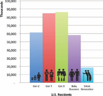
Figure 6-11 shows the default bar chart created by PowerPoint. The data shown is the U.S. Census Population data from the 2012 Statistical Abstract[2] broken into common age groupings. By default, most charting software automatically includes the chart legend shown as a guide to the color-coding system. This is a simple example, but even here the reader will probably look back and forth a few times to understand what each bar in the chart represents.
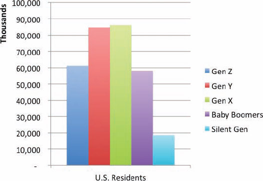
FIGURE 6-11: PowerPoint automatically creates a chart legend by default.
You should do a lot more to improve this chart design before including it in an infographic design, but this example will only focus on eliminating the chart legend. Figure 6-12 deletes the chart legend, and in its place you can see added icons and descriptions directly on the chart. This makes the color-coding much faster to understand because the reader can identify each data set with minimal eye motions. All the relevant information is within the reader's field of view, and the icons are also faster to understand than reading the text labels. As an additional benefit, the elimination of the chart legend also opens up more space on the page, so the chart can be increased in size or make room for additional information.
FIGURE 6-12: PowerPoint chart with icons embedded into the chart to eliminate the chart legend
These types of design changes require some extra effort on the part of the chart designer. Adding separate text blocks or data labels is fairly easy within PowerPoint, but the icons are a little more difficult. Icons like these are not available natively from within PowerPoint, so designers must create or purchase their own. Then they can be placed manually to appear on top of the chart object in PowerPoint or whatever design program is used to put the infographic together. You can use stock vector art in infographics designs, and these particular icons were part of a set purchased from iStockPhoto[3].
Be Data Transparent
To be data transparent, the infographic needs to address the sources of the data included in the design in an open and honest manner. A large portion of the audience is initially going to be skeptical, so the design needs to get past the data integrity issue quickly. After you get the audience past the data believability issue, it can focus and engage mentally with the overall message the infographic is communicating.
Readers are initially looking to answer a handful of questions:
- Where does the data come from?
- How old is the data?
- Why should I believe the data?
- Is the infographic credible?
Credibility plays a huge part in the success of an infographic, both online and internal to companies. Readers won't share the infographic in social networks if they think the information is questionable.
Ignore data transparency at your own risk, and understand that designs that disregard data transparency are seen as not believable. Following are a few common mistakes made by infographic designers.
No Data Sources List
Surprisingly, a large number of infographics don't include any mention of where the data originated from. With no data sources to judge the credibility of an infographic, the readers quickly move from skeptics to unbelievers. As far as the audience can tell, the designer may have made up the numbers.
A frequent consequence of not listing any data sources in an infographic design is that all the comments, posts, and conversations about the infographic tend to focus on the unknown source of data. Accusations of false numbers, deception, and misleading information are quite common when this happens. This completely distracts the audience from the actual content of the infographic, and the infographic fails to inform readers or inspire conversation about its key message.
Obviously, this is not the outcome wanted by a company that has spent a lot of time and resources to create and publish the infographic.
Vague Data Sources
Almost as bad as not listing any data sources is listing vague sources of data that make it almost impossible for readers to find the cited numbers. Vague data sources are usually just the name of the host site that published the data, with no additional information about a specific report or article.
For example, an infographic about baby names in the United States might list a vague data source as only Data.gov. If readers want to see the original data, they would have to perform their own search within the referenced website in an attempt to find any data related to baby names. In addition, many sites do not have effective search functions. If the readers find any related information, they couldn't tell which specific data was used to support the infographic.
Sometimes, this method of listing vague data sources is used intentionally to leverage the existing credibility of the data source organizations without actually revealing the original data specifically.
An infographic design about household pets might cite The Humane Society as the source of the data used. Readers would have no recourse to find the original data. Was the data gathered from a printed flyer, a news article, a magazine, mentioned at a live event, or is it available on the website? The skeptical audience has no way of validating that the data actually came from The Humane Society, but many readers might believe the infographic simply because they believe The Humane Society is a credible organization.
Questionable Data Sources
The truth is that many, if not most, readers won't take the time or make the effort to check your data sources. The fact that the infographic has any sources listed at all is often good enough for many, many readers. The vast majority of readers are not going to follow the links and validate that the infographic designer interpreted the original data correctly. Similar to news articles, the readers are relying on their belief that the designer, author, or publishing company made sure the information was credible. The company publishing an infographic may also have an established credibility with the audience. If readers trust a specific company, they will probably trust an infographic published by that company.
However, there are some specific data sources that can automatically trigger a reader's skepticism. For many, Wikipedia and other blogs fall into this category even though the quality of content on Wikipedia has improved dramatically over the last few years. Honestly, there's nothing wrong with discovering data on Wikipedia, but your infographic will be much more credible if you use the reference links to track down the original source of the data to list as the citation in the infographic.
Any sites that aren't intended to be taken seriously are also regarded as questionable sources of data. Sites that focus on humorous content or personal blogs are not generally perceived as credible data sources.
Best Practices
An infographic design that is upfront about its data sources is instantly perceived to be more credible. There are a few best practices that are common to good infographics.
- Track down and cite the original source of the data, not the news article that quoted the data.
- List the data source references either inline with the data or in the footer at the bottom of the infographic.
- List the URL to the specific report or data set, not just the host site.
- Include the relevant date or year the data was published to establish relevancy.
In addition, one of the best practices is for an infographic author to make the source data available to readers online for download as a spreadsheet. This is often accomplished with Google Docs spreadsheets[4] that are accessible to the public. The infographic would include the URL directly to the data spreadsheet, which lists the data and shows any relevant sources or calculations made as part of the design. Readers can access the data directly and even use the data on their own.
The Fine Print
A handful of final things should be included at the end of every infographic design. Remember, after you release the infographic onto the wild Internet, it takes on a life of its own. It could be reposted by anyone and resized to fit into other site layouts (usually a reduction in size to fit onto a smaller web page).
Some designs are initially published in combination with other text content on the original landing page or part of a longer blog post. All that extra text is typically ignored when the infographic is reposted and shared on other sites. The infographic image is usually shared by itself, so all the relevant data needs to be included in the infographic image file. This ensures that the important, relevant information is always available to the audience.
Company Logo
Where does the infographic come from? This may seem like a no-brainer, but some infographics published online don't mention the company that published the infographic. Whoops—so much for creating links or building brand equity.
A brand or company logo at the bottom of the design works nicely as an indication that, “This infographic was brought to you by the good people at Company X.” The URL to the company web page is also helpful and helps drive some additional traffic from interested readers.
Copyright License
As covered in Chapter 2, “Online Infographics,” every infographic design is automatically protected by a standard copyright license in the United States. However, it's better to explicitly state either a copyright or a Creative Commons license on the infographic. That way your choices covering how you want the infographic to be treated by others is in the infographic when it gets shared on any other sites on the Internet.
This can be helpful if legal concerns arise. If people abuse your infographic design, posting a modified version or claiming it as their own design, you have a stronger legal position if the licensing restrictions were explicitly expressed on the original design.
Don't forget that a copyright statement also clearly identifies the copyright holder (a person or a company). If people want to contact the copyright holder to request additional permissions (such as including the infographic design in a book!) they need the ability to easily determine who owns the copyright.
Original Landing Page URL
As much as you would like them to, many people are not good about including a clickable HTML link back to your original infographic landing page when they repost the infographic on other sites.
You can always make contact and ask them to add the link to their post under the terms of your copyright license, but that assumes you're going to spend the time and effort to track down and verify every site that reposts the infographic. Even then, many sites will ignore your requests to add the link.
It's much easier to include the URL of the original infographic landing page in the infographic image. That way it's built in to the infographic when it gets shared on other sites. If readers want to find the full-size original version, they have the URL they can type into their browser.
Designer Credit
Whenever possible, you should credit the infographic designer that designed the infographic. It might be you, a designer from within the company, a freelance designer, or an outside design firm.
Readers appreciate infographic designs that come from an actual person as opposed to just a faceless company. They are more likely to comment, provide feedback, or share an infographic when they believe they are supporting (or criticizing) a specific individual. This sharing behavior is more frequent when they are sharing the visual story created by an individual as opposed to sharing a potential advertisement from a company. Infographics that list only the publishing company are often perceived as promotional material for the company, which can discourage people from sharing with their network of friends.
Separately, if the designer or design firm has built up their own brand equity, citing the designer on the infographic can also convey some of that expertise and credibility onto the infographic. An infographic may be perceived as more credible and become popular online based on the reputation of the designer. Followers of a particular designer are likely to find the design and share it on their own.
Of course, the credit listing also helps designers build their own credibility and helps to build the infographics design industry as a whole. Other companies that appreciate the design may follow the citation and contact the designer directly to discuss creating future designs. The reward for good work can be more work.
Putting It Together
You can see all these elements put together in the footer of an infographic design in Figure 6-13. This is a close-up of the bottom section from Streamlining Your Digital Life with the iPad from NextWorth (shown previously in Figure 3-7) and has all the relevant information included in the infographic JPG image file. In this way, all the important information travels with the infographic as it is shared on other websites across the Internet.
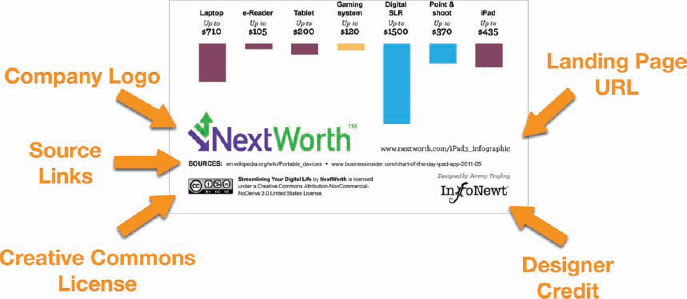
FIGURE 6-13: Information in the footer stays with the infographic when shared on other websites.
Coolinfographics.com/Figure-6-13
Source: Streamlining Your Digital Life with the iPad, NextWorth
Final Thoughts
It doesn't matter if you are designing infographics yourself or working with a designer. Using these tips as guidelines can make a huge difference with how effective the final design will communicate to the audience, build the company brand equity, and is shared in social media.
Your next infographic design can avoid the most common design mistakes, and this will immediately make your design better than most of the other infographics published online.
References
1. Abraham H. Maslow, The Psychology of Science, (Richmond, CA: Maurice Bassett, 1966), p. 15. http://books.google.com/books?id=3_40fK8PW6QC&lpg=PP1&pg=PP1#v=onepage&q&f=false
2. 2012 Statistical Abstract, U.S. Census, http://www.census.gov/compendia/statab/cats/population.html
3. Family icons set, iStockPhoto, http://www.istockphoto.com/stock-illustration-11683088-family-icons-standard.php?st=4a39808
4. Google Docs spreadsheets, http://google.com/drive/apps.html#product=sheets
Links
1. Where's Google making its money?, WordStream and NowSourcing:
http://www.wordstream.com/articles/most-expensive-keywords.
2. The Caffeine Poster, InfoNewt:
http://www.coolinfographics.com/caffeine-poster/
3. Star Wars Infographics, Marc Morera:
http://www.murera.com/starwars/
4. Streamlining Your Digital Life with the iPad, NextWorth:
http://www.nextworth.com/ipad3_infographic


