The more strikingly visual your presentation is, the more people will remember it. And more importantly, they will remember you.
—PAUL ARDEN, WHATEVER YOU THINK, THINK THE OPPOSITE
Infographic Resumes
The principles behind good infographic design have recently made their way into the resumes of individuals. Job candidates are looking for new ways to make their resumes stand out from the crowd, quickly communicate their top attributes, and be more memorable to the prospective employer who may review hundreds of resumes for an open position. Infographics are a fantastic way to tell your story to a potential hiring manager—and they're cool too!
This rising trend of infographic resumes is a hotly debated topic. Recruiters, candidates, resume writers, hiring managers, and human resources managers can have widely opposing, strong opinions. Some believe that adding any graphics to a resume is unprofessional and may lead to a candidate not being considered for a position. Many others are huge supporters of graphic resumes because they break the monotony of all-text resumes and stand out from the pile of resumes reviewed.
As discussed in Chapter 1, “The Science of Infographics,” the research behind visual communication of information shows that visualizations can often be more effective than text alone. Although traditional illustrations and images are mainly appropriate for graphic designer-type roles, the advent of infographic design brings credible data visualizations to candidates seeking any type of role. Whether it's a complete infographic design or just including small data visualizations in a text resume, visualizing a candidate's key information on a resume is quickly becoming popular.
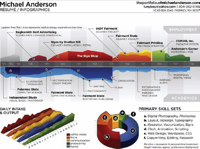
Michael Anderson's infographic resume shown in Figure 4-1 was one of the first infographics resume designs to be published online and go viral in social media. This caused me to originally take notice of the concept of infographic resumes. Posted online in 2008, the design was colorful, eye-catching, and broke the traditional resume mold. A link to Michael's resume was posted on the Cool Infographics blog in 2010, but it was also featured on hundreds of sites and blogs including some mainstream sites such as Mashable, Business Insider, Fast Company, and FlowingData.
The infographic resume visualizes his work history as an area chart timeline, with work experience above the date line and his educational accomplishments below. His resume states that “Area represents relative energy expenditure over time,” which is a subjective value that Michael created to design the chart. The overlapping nature of the design is appealing because it also shows concurrent activities clearly. The Daily Intake and Output is a fun, lighthearted chart of the amount of each activity plotted over his waking hours from 8 a.m.–2 a.m.
FIGURE 4-1: Infographic resume—Michael Anderson
Coolinfographics.com/Figure-4-1
The Primary Skill Sets visualization is a doughnut chart with two dimensions. The angles of the pie slices represent his personal time spent developing each skill and the height of each slice shows the amount of time each skill has been used in a professional capacity. For example, it shows that Michael has spent a lot of personal time in photography, but that skill has not been utilized much in his professional career. Again, the values are estimated by Michael, so they are subjective and just meant to be indicative of his skills. Also, notice that no values are shown on any of the visualizations. Actual values had to be created to design the charts, but they aren't shown because they aren't needed. This removes unnecessary information and keeps the design simple.
This design stands on its own as a preview to his full text resume. Because this design doesn't replace his traditional resume, it gave Michael the opportunity to cut out most of the lengthy text descriptions and let the visualizations stand by themselves. It's a great tool to attract the attention of both prospective employers and freelance clients, and anyone interested has the contact information required to learn more about Michael.
The definition of an infographic resume is:
A visual account of an individual's history and abilities that uses data visualization design to communicate key portions of a job candidate's skills, history, education, or other relevant information.
The key distinction that makes infographic resumes unique is that the graphic elements visualize important information and help tell a better story about the job candidate. It's not just about adding graphic elements but communicating data or information more effectively.
Graphic designers have been designing creative, colorful, artistic resumes with illustrations, fonts, images, and photographs for decades; however, the idea of using data visualizations to create a new style of resume has taken hold only in the last few years. A handful of designs began appearing online in 2008, as the awareness and popularity of online infographics was beginning to build momentum. The trend has continued to grow at an accelerated pace, and by January 2013, thousands of infographic resumes incorporating data visualization could be found online.
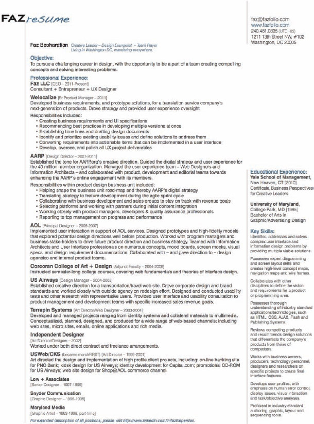
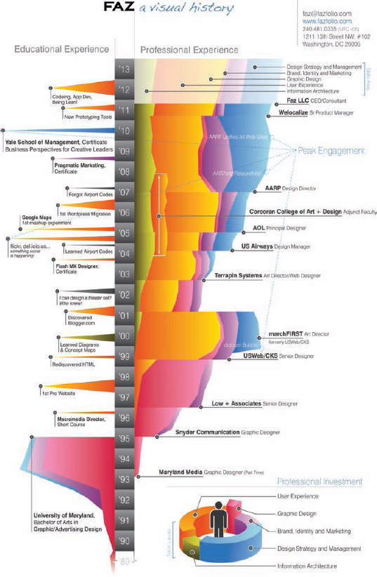
In Figures 4-2 and 4-3, Faz Besharatian's infographic resume appears next to his traditional text resume. His work history has been visualized in a timeline that highlights the length of time Faz spent in each role and the skills that were required.
In this instance, there is more complete information contained in the text resume. The infographic resume serves three purposes: to attract attention, to highlight the roles and companies in his history, and to demonstrate his graphic design ability. If interested parties want to learn any of the details, such as accomplishments, responsibilities, or specific achievements within each role, they can learn more from the full-text resume. Faz makes both versions available for anyone to download from his website.
It's still the early days for infographic resumes, but they will probably become mainstream in the next few years. In the future, an all-text resume will be seen as boring and dated, reflecting poorly on the job seeker. Recruiters and hiring managers will appreciate the speed and ease of reading from infographic designs and will begin to experience frustration with the extra time and effort required to search for key information hidden within an all-text resume.
The quality of these infographic resume designs covers the full spectrum. There are some fantastic, inspiring designs online, but there are also some “cringe-worthy” designs as well. As designers continue to experiment with different design styles, they are beginning to learn what works in the field of resumes. Most people design their own infographic resume. The market for professionally designed infographic resumes is a new type of service now offered by many designers and design firms.
FIGURE 4-2: Text resume—Faz Besharatian
FIGURE 4-3: Infographic resume—Faz Besharatian
Coolinfographics.com/Figure-4-3
Key Benefits
The three key benefits of infographics designs discussed in Chapter 1 are what also make infographic resumes game changers to the job market.
First, visual designs stand out from the pile of text-only resumes and attract attention. Hiring managers and human resources departments are skimming hundreds, if not thousands, of resumes for open positions. An infographic resume breaks the pattern and draws the reader's attention. The first step to landing a new job is to get the hiring manager interested enough to learn more and an infographic resume can get a candidate that extra attention.
Second, data visualization can make the understanding of a candidate's unique information faster for the reader. Recent research has concluded that a recruiter or hiring manager looks at an individual resume for only an average of six seconds[1]. By visualizing a candidate's key information using data visualization design techniques, the reader can learn more about the candidate in that same short timeframe. Six seconds reading an infographic resume is more effective than six seconds reading a text resume. This means that hiring managers may understand more about job candidates that have infographic resumes.
Third, because of the Picture Superiority Effect, anyone reading an infographic resume is much more likely to remember the visualized information three days later. The visualized data triggers the reader's visual memory and the recruiter or hiring manager is more likely to remember that candidate after reviewing many resumes. This significantly improves the chances of a candidate to advance to the next step in the hiring process.
What's the Risk?
The risk of using a poorly designed infographic resume is that they can quickly and effectively demonstrate that a job candidate would not be a good hire for the company.
- Be visually unappealing
- Visualize data incorrectly
- Fail to visualize the relevant information
- Confuse the reader with too many visualizations
- Highlight the wrong attributes for the desired position
- Use an inappropriate design tone (such as, a fun, lighthearted design style when applying for a serious role)
- Not print correctly if not designed to fit standard paper sizes
A poor design can stand out from the pile of job candidate resumes and create a negative impression with the recruiter just as fast and effectively as a good design can create a positive impression.
Many of the best practices behind designing a good text resume apply to designing an infographic resume as well. Being concise and focused is critical. Candidates need to identify clearly their key strengths related to the type of position they would like to attain. An infographic resume should focus on communicating those key strengths quickly and clearly to the recruiter. If the design visualizes everything possible from a candidate's history, the key strengths are likely to get lost in the visual noise, and the recruiter could become frustrated trying to read the resume.
Just like every other resume, if the reader becomes confused, annoyed, or frustrated, the candidate's resume can quickly end up in the trash.
Designing an Infographic Resume
Remember that infographics tell stories. Infographic resume designs should be used to tell the story about job candidates. The story can include their background, history, education, skills, experience, achievements, accomplishments, roles, successes, aspirations, goals, and more.
The key to an effective infographic resume is to use data visualization design to highlight only the most important aspects for a specific individual. The visualizations draw the readers’ attention to the key information, and with the Picture Superiority Effect, that is the information from the resume most likely to be remembered. So, a younger, less experienced candidate might highlight education and software skill proficiencies, but an older, mature candidate could highlight major accomplishments and employment over many years with respected employers.
The design challenge is to tell a simple story that is quick and easy to understand. The mistake many people make when designing an infographic resume is to attempt to visualize everything they can. Too many data visualizations can create excess visual noise and confuse the readers. The hiring managers may not understand the key attributes of the job candidate within those short few seconds they have to review the resume. As a general rule, the best designs include three or fewer data visualizations in the design. As an additional benefit, focusing on only the key attributes demonstrates to the hiring manager the candidate's ability for clear and concise communication—a desirable skill for any position.
The first step in the design process is to identify which aspects of an individual's history are the most beneficial while also considering what is most relevant and important to the prospective employer. After the key aspects have been identified, the designer can begin to focus on which types of visualization design are appropriate to include.
Most infographic resume designs focus on a combination of these three key types of information:
1. Timeline of education and work experience
2. Relative experience and proficiencies among key job skills
3. Geographic locations
Timeline Designs
Designers have the same variety of design options for visualizing an individual's history as seen in other infographic designs.
Randall Knapp included a timeline of his programming experience as part of an overall infographic design (Figure 4-4). He used an area chart with overlapping colors to highlight the different types of activities over a 7-year period. Even though the timeline is the main focal point, it's part of a larger design that includes additional information and a separate visualization of skill proficiencies.
The overlapping areas on the timeline also do a great job showing concurrent activities. We lead parallel lives, not sequential ones. Many people have roles that overlap each other, as well as with educational and other activities. A visual timeline is the best way to show that type of information that gets lost in a text-only resume. Going to school at night or working two jobs shows significant dedication and motivation in an individual's history. With a text-only resume, the reader must take time to put together the timing of different activities to understand overlap or gaps in a candidate's history. With a visual design, overlapping activities and gaps between roles are understood within seconds.
Timelines usually highlight an individual's history related to one or more of the following activities:
- Time spent at learning institutions or earning degrees
- Time spent working for different companies
- Time spent holding different roles or positions
- Time spent as a member or volunteer for organizations
- Time spent using different software applications
- Time spent in different locations
- Major events or milestones in a person's career
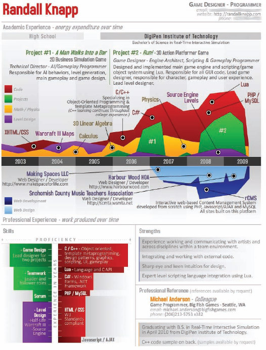
FIGURE 4-4: Timeline focused infographic resume—Randall Knapp
Coolinfographics.com/Figure-4-4
Area charts are the most common data visualization design for timelines, but designs using line charts, number lines, and overlapping shapes are also common.
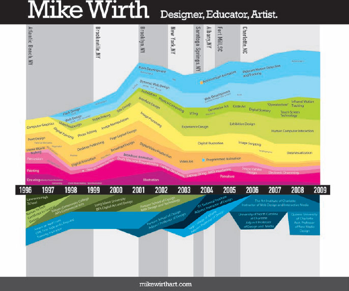
Although many designs incorporate timelines as one element of an overall layout, designer Mike Wirth effectively used a large timeline visualization as his entire infographic resume design (Figure 4-5).
FIGURE 4-5: Infographic timeline resume—Design by Mike Wirth
Coolinfographics.com/Figure-4-5
In Mike's resume, the years along the x-axis become the backbone of the entire design. It's a central design element around which all the other information is placed on the page. The locations he has lived are shown as gray-colored columns in the background, and instead of overlapping colored sections, he uses a stacked area design to show the overall increase in total experience over time.
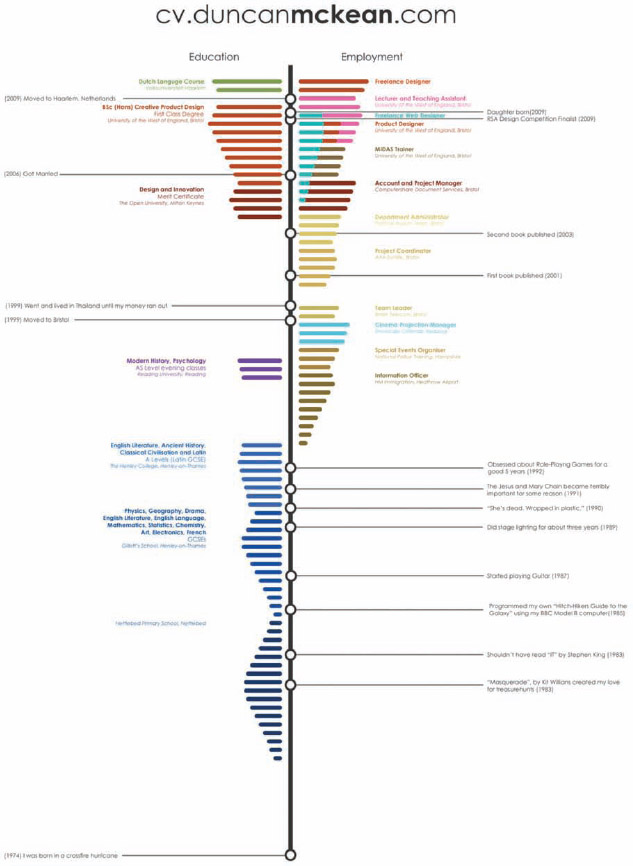
Although a completely different design style, Duncan McKean's infographic resume (Figure 4-6) takes a similar approach by making the entire infographic resume design into a timeline visualization.
FIGURE 4-6: Infographic timeline resume—Duncan McKean
Coolinfographics.com/Figure-4-6
A job candidate's work and education history over time is one of the most important pieces of information to a recruiter or hiring manager. An infographic timeline can visually demonstrate a candidate's history in an engaging way that's faster and easier to understand.
Relative Experience Designs
Levels of experience in different job skills are normally qualitative and subjective. The candidate may consider himself to be highly skilled at project management, but not have any firm numeric data to back up that claim. That's where relative experience comparisons come into play.
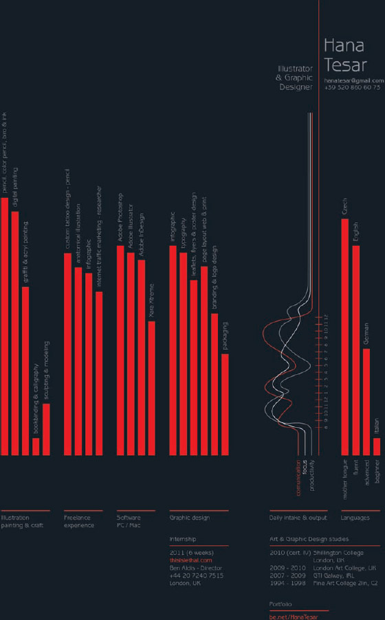
Hana Tesar's infographic resume (Figure 4-7) is based on showing her skills in relation to each other. There are no numbers shown as value labels on the bar charts, but visually she is telling the reader how her skill levels compare. The implication is that the highest bars are not only her strongest attributes, but also implies that they are areas in which she is exceptionally skilled when compared to other candidates within the job market. She has some experience in all the skills shown, but the highest bars are the ones she wants to highlight most to a potential employer or client.
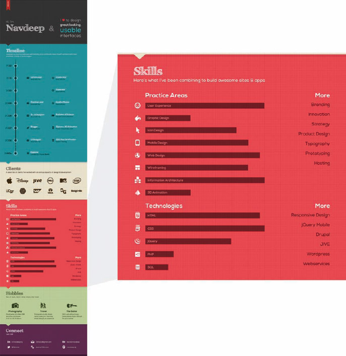
This is where visually comparing multiple attributes with a data visualization becomes effective. In Figure 4-8, Navdeep Raj uses a different skills comparison in his resume design. The different job skills are shown with bars of varying size. This communicates to the reader that the candidate's skills are strongest in User Experience and Information Architecture compared to the other skills that he thought were also appropriate to include. The candidate does have some skill in 3-D animation, but it's weaker than the other skills.
FIGURE 4-7: Relative experience resume—Hana Tesar
Coolinfographics.com/Figure-4-7
FIGURE 4-8: Skills visualization resume—Navdeep Raj
Coolinfographics.com/Figure-4-8
Visualizing the skills in relation to each other allows the candidates to communicate their subjective strengths in key areas without needing to assign specific numeric values to each skill.
Bar charts are the most common visualization to show skills, but there are many other design styles that could also be used. Circle sizes, sliders, bubble charts, Sankey diagrams rose diagrams and more can also be effective visualizations to display proficiency among multiple skills.
Geographic Designs
Where a candidate has lived and worked can also be relevant information on a resume. Maps are a common design element to show not only employment locations, but also to visualize length of stay, the sequence of the locations, or the many different countries visited in the course of a career.
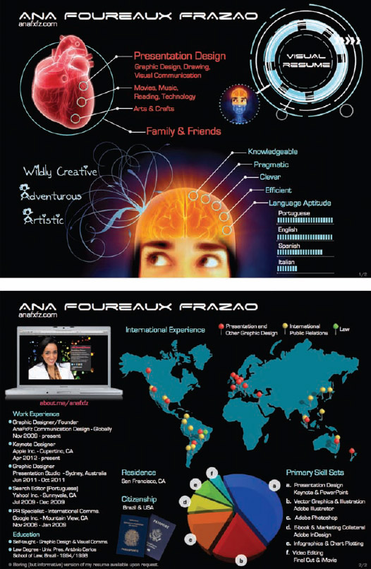
A map visualization dominates the space on Ana Foureaux Frazao's 2-page infographic resume (Figure 4-9). Her prior roles in International Public Relations are clearly shown to the reader and strongly reinforce her international experience. The locations of her positions are color-coded by the type of work she did and the map design is simplified by removing all the country borders.
Maps have a unique challenge when used as data visualizations in a resume. The design needs to illustrate enough spatial information to make the identified locations easily recognizable to the audience, but too much detail (such as terrain, borders, cities, and roads) may also create unwanted visual noise. The focus of the design should be the key information the candidate wants to communicate, not a pretty map.
FIGURE 4-9: Geographic infographic resume—Ana Foureaux Frazao
Coolinfographics.com/Figure-4-9
The design should also limit the amount of geographic information displayed to only the required area. If a candidate has worked in three different cities in the state of California, a map of the entire United States is not needed. If a candidate has worked in five cities across Canada, the entire world map would take up valuable space. The real estate on the resume page is too valuable to waste. The infographic should show only as much map space as needed to include all the highlighted locations in a recognizable space.
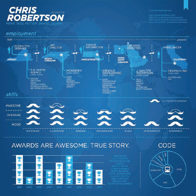
Chris Robertson's resume (Figure 4-10) shows diverse locations including multiple states in the United States and also locations in foreign locations, such as Dubai and Lebanon. Instead of showing an entire world map, Chris shows only the relevant states and countries and pinpoints the city locations where he has worked. This saves space and allows Chris to place the locations along a timeline. This design also gave Chris space to include additional information such as his title, the companies he worked for, and a few major client projects.
Company Logos and Icons
One of the easiest and most effective ways to add visual design elements to a resume is by including company logos. Companies have spent a lot of effort, time, and money to build their brand equity and recognition of their logos. Prior employment with a recognized company is a positive attribute in employment history and reflects well on the candidate for a new position. When people include the name of a prior company on their resume, one of the primary desired benefits is that respect for a recognized company will transfer some of that good will to the job candidate.
In traditional text resumes, people use many different text adaptations to emphasize the different companies they have worked for in the past. Bold, italics, different font type, or larger font size are all used to make the names of companies stand out from a page full of text as key information.
FIGURE 4-10: Infographic resume with map data—Chris Robertson
Coolinfographics.com/Figure-4-10
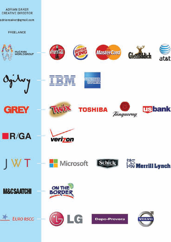
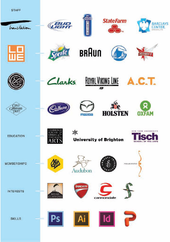
After reading the study from The Ladders (mentioned earlier) that concluded most recruiters look at each resume for only six seconds, Adrian Saker created this logo-only resume, using logos from both the companies he worked for, the client projects he was involved with, and additional logos for skills, education, and interests (Figure 4-11).
FIGURE 4-11: Logo resume—Adrian Saker
Coolinfographics.com/Figure-4-11
The addition of graphic logos from the different companies included in prior work experience can draw the reader's attention. If the companies are known and recognized by the reader, the logos can quickly make a candidate's work history easy to understand. If those companies have a positive reputation, the job candidate may instantly leave a positive impression on the hiring managers, even before they read a single word of the resume.
Based on this principle, LinkedIn, the site dedicated to professional connections, has begun displaying company logos on everyone's profile pages if it has one available from an official Company Page, as you can see from the author's profile (Figure 4-12). When people add a company position to their personal work history in their LinkedIn account, if they choose a company that LinkedIn already recognizes, the official company logo displays on the individual's profile page.
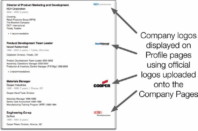
FIGURE 4-12: Company logos shown on LinkedIn profiles
There are many posts and articles online about understanding the legal issues surrounding the use of trademarked company logos. Many people do not understand trademark law and especially the Fair Use doctrine. In a reference to a company, especially in a list of multiple companies, the Fair Use doctrine enables the use of a company's trademark when referring to that company. More information about the Fair Use Doctrine is covered in Chapter 2, “Online Infographics,” but it's worth repeating that trademark law is different across countries, so it's worth understanding local laws.
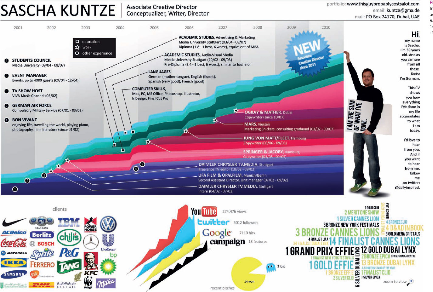
Sascha Kuntze used many company and brand logos in his infographic resume (Figure 4-13). In this design, the logos are used to represent past clients and also his social media presence. The reader is likely to recognize some of the mainstream logos included in this design, and the value of Sascha's work is elevated based on his association with these respected companies.
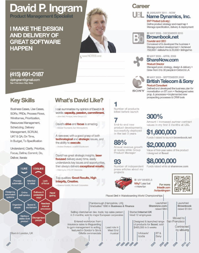
David P. Ingram's use of logos in his resume (Figure 4-14) is also effective. The logos draw the eye and attention instantly and creates the first impression the resume leaves on the reader. For example, Sony is generally regarded as a company with a tremendously positive reputation, especially related to its training of high-quality employees. The first impression on a hiring manager reading his resume might be that David comes from a reputable company, so David's resume is probably worth the extra time to read thoroughly.
As a hiring manager sorts through a pile of a hundred resumes, getting through that initial filter determining which resumes are worth serious consideration is a huge advantage for any job candidate.
FIGURE 4-13: Infographic resume using logos—Sascha Kuntze
Coolinfographics.com/Figure-4-13
FIGURE 4-14: Company logos on infographic resume—David Ingram
Coolinfographics.com/Figure-4-14
Software Application Logos
Infographic resumes initially grew in popularity with a younger generation of graphic designers and social media managers. These roles require an expertise in multiple software applications and web services key to the job, and using the application icons is similar to using company logos. Many of the primary applications are instantly recognizable by their icons.
Unlike company logos though, the software icons generally serve as a visual acknowledgment of the requirements for the job. The icons instantly show the hiring manager that the candidate has the software skills required for the open position, but doesn't position him above any other candidates that also possess the required skills unless more information is added.
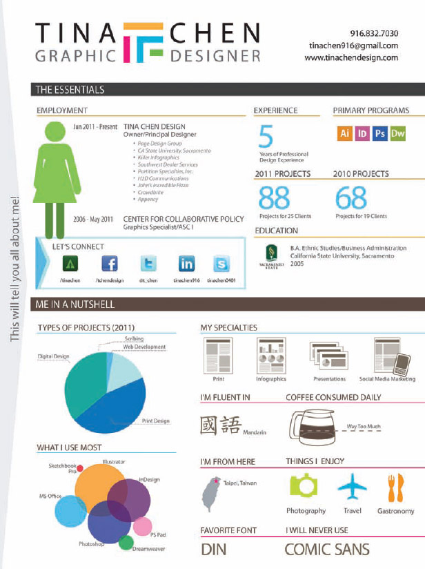
Tina Chen's resume (Figure 4-15) displays the four different software application icons that she primarily uses for her design work to demonstrate proficiency in each of them. Her other information, like years of experience, foreign language fluency, and the overall design itself are what set Tina apart from other candidates.
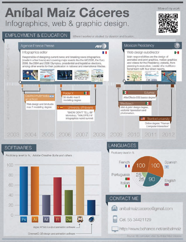
Additional visuals, such as the relative experience designs mentioned earlier can be used in combination with the software icons to add information. In Figure 4-16, Aníbal Maíz Cáceres' infographic resume shows the software icons integrated into a relative experience bar chart that shows his varying proficiency level in each application. Aníbal also makes the resume available online in multiple languages (English, Spanish, and French), and the use of icons reduces the amount of text that needs to be translated for each version.
FIGURE 4-15: Resume with Software Icons—Tina Chen
Coolinfographics.com/Figure-4-15
FIGURE 4-16: Infographic resume with software icons combined with a relative experience visualization—Aníbal Maíz Cáceres
Coolinfographics.com/Figure-4-16
Using an Infographic Resume
Because infographic resumes are still relatively uncommon in the job marketplace, the next challenge is how candidates can use them effectively in a market in which most resumes are still text-only. Initially, infographic resumes were embraced by candidates looking for graphic designer, web designer, social media, and web development roles. After the first couple of years, the trend quickly spread into other fields, and many infographic resumes have been used for more traditional roles such as CEOs, vice presidents, managers, accountants, actors, and IT professionals.
Job Application Systems
The biggest hurdle facing the use of infographic resumes are the automated job application systems (also called application tracking systems) used by many companies. These online systems prompt the job applicant to input or upload their resume file into a database, usually as text-only or Microsoft Word format. The application system then parses the text into key words that are automatically organized into predefined categories. The key words are loaded into a central database so that hiring managers and human resources departments can easily query the database to match open positions with job candidates.
Any visual design and even traditional text formatting from the resume becomes irrelevant because the hiring company never sees the original document, just the collected text. This means that even if job applicants have an infographic resume, its usefulness will be effective only when their resume is sent through e-mail, displayed as part of the candidate's online profile (personal website, LinkedIn, Facebook profile, and so on) and when physically shown to a potential employer in face-to-face interviews.
There are only two formats that I have seen to be effective when using an infographic resume as part of a job search: a separate, standalone infographic resume design and a combined design that integrates the data visualizations into the full-text resume.
Standalone Infographic Resume
So far, the most common format for an infographic resume is a separate infographic design used as a summary to supplement a traditional text resume. This format means the candidate still needs to maintain a separate, traditional, all-text resume that can be used in job application systems and interviews so that potential employers have the resume format they require. The infographic resume is used to initially generate interest and awareness in a job candidate, and then the text resume is used to provide full details.
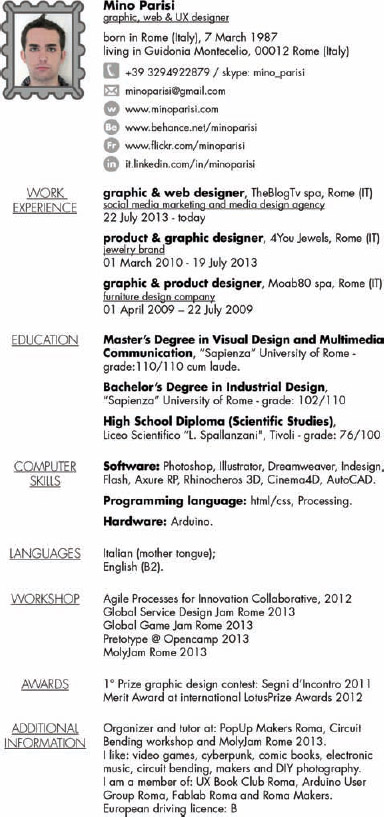
Mino Parisi's resume shown in Figure 4-17 is a great example of this. His infographic resume includes a timeline of his work and education history and a series of doughnut charts that show the relative amount of experience using different software applications (color-coded) in different types of design work. This standalone design is a snapshot look at many of Mino's key attributes but is mostly graphics with minimal text. His full text resume (in Italian) is available separately and includes the full details of his history (Figure 4-18).
Using an infographic resume in this manner essentially uses the infographic design as an advertisement to get attention or build awareness of the candidate. The infographic design would attract the attention of the employer or client, who can then look to the traditional resume for full details.
In this format, the infographic resume is a supplement to the traditional resume. It's not a replacement.
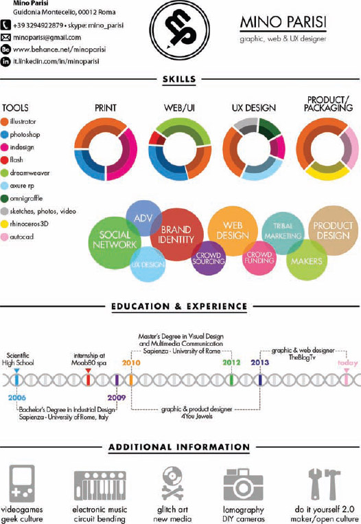
FIGURE 4-17: Standalone infographic resume—Mino Parisi
Coolinfographics.com/Figure-4-17
FIGURE 4-18: Separate text resume—Mino Parisi
As a variation to this format, the infographic resume design can be inserted as a separate page in a Microsoft Word document or PDF file that also includes the full-text resume pages. This allows the applicant to submit only one file in e-mail or online. When the potential employers view or print the resume, they have both the infographic resume and the full-text resume available as separate pages. Mino's resume above is available online as a single PDF file for download that includes both the infographic and text resumes as separate pages.
Combined Infographic Resume Design
An effective alternative infographic resume format is for the designer to embed individual data visualizations directly into the text resume. The advantage of this design format is that the candidate has only one document that includes both the visual design and the full text. The visuals are adjacent to the full-text details in the design, so there's little eye movement for a reader to find the detailed information about the candidate.
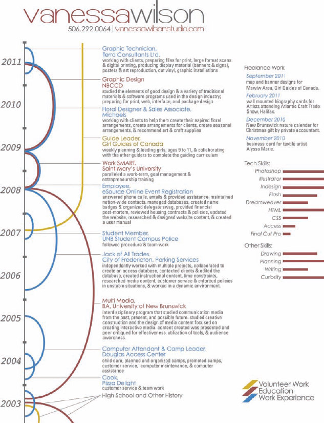
Vanessa Wilson's infographic resume (Figure 4-19) demonstrates this beautifully. The full-text descriptions of each role are connected to the visual timeline running down the left side of the page. The overlap between education, work experience, and volunteer work is easily seen, and the complete text description of each is also readily accessible to the reader.
This combined design format can be accomplished by inserting the data visualizations as images into a standard Microsoft Word document and wrapping the resume text around the visualizations. A more advanced method would be to use a desktop publishing application such as Adobe InDesign to integrate the visualizations with the text.
Taking this idea one step further, if the data visualizations are charts designed in Excel, the charts can be linked to the data source so that any updates to the data automatically propagate into the resume design.
FIGURE 4-19: Combined infographic resume—Vanessa Wilson
Coolinfographics.com/Figure-4-19
With this design style, it's important that all the information still exists in the text. We don't want to replace information with the graphics. When submitted to job application systems, the automated text-parsing ignores the images but still has access to the full text. If a text-only file format is required, exporting the document to a .txt file from Microsoft Word can remove all the images automatically.
The primary challenge of this format is keeping the resume short. If the goal is to maintain a one-page or two-page resume, the candidate needs to reduce the amount of text included to make room for the visualizations.
Publishing Infographic Resumes Online
The strategy for releasing an infographic resume online is similar to releasing an online marketing infographic. Candidates should establish the main landing page location for the resume and then link to that landing page whenever they share the infographic resume. In the case of the infographic resume, the landing page would normally be hosted on the candidate's personal website, but the resume landing page could also be hosted on an image site such as Flickr.com, Behance.com, Visual.ly, or Pinterest.com.
Wherever the infographic resume is hosted online, it is important to make viewing and sharing the file simple and easy. Different file format versions should be readily available to download for any potential employer or client. At least a PDF version should be available for download, but a Microsoft Word version is also recommended.
The ability to share the infographic resume in social media easily can also be effective to get your resume in front of the right people. Sharing buttons from the major social media services should definitely be included on the landing page. Many people that are not potential employers may appreciate the design and want to share within their networks (like in this book). This would be a fantastic outcome for any infographic resume design because it gets more people looking at the resume and more chances that it will catch the attention of a potential employer or client. That's how I came across all of the examples included in this book!
Recently, LinkedIn added an easy way to share an infographic resume on an individual's profile. Users can now add images and links as a part of their background summary that displays at the top of the profile page. By adding the URL of the resume landing page, LinkedIn can display a thumbnail of the infographic resume that links to the landing page URL when clicked.
Designing Infographic Resumes for Print
One area definitely worth mentioning is that hiring managers, recruiters, and HR managers are likely to print out your infographic resume on an office printer. It may be printed, photocopied, and faxed without your knowledge, so you need to design one with that in mind.
First, assume it will be printed on standard-size paper. The tall format infographic style is not a good design choice for infographic resumes. In the United States, that means 8.5″ × 11″ letter-size paper. In other parts of the world, it may mean 297 × 210 mm A4-size paper. Because the position may be in another country, the applicant should understand the standard local paper sizes in the locations where you may be applying for a job. The design of an infographic resume should be sized to fit the proportions of the page and use a font size big enough to be legible when printed.
Second, the designer won't have any idea what kind of printer might be used to print out the resume. Laser or inkjet? Color or black and white? High or low resolution? A good designer will test printing the design on the lowest features to make sure it's still legible and understandable. At home, the applicant can force his printer to print out the design at a lower quality level and only in black and white. Even though this may not be the primary design, it will still work when its use is out of our control.
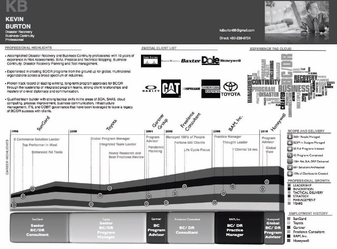
To demonstrate, Figure 4-20 and Figure 4-21 show Kevin Burton's infographic resume as it was originally designed and desaturated to show what it would be like when printed in only black and white. All the company logos had already been converted to black and white in the original version, so those translate perfectly. The parts of the design that do have the blue colors convert to grayscale nicely and remain easy to read and understand when the color is removed.
By using a lot of grayscale elements in the original design, this infographic resume works nicely when printed without the color. Kevin doesn't need to worry about how his resume will appear when printed on a variety of different printers. It will always come out well.
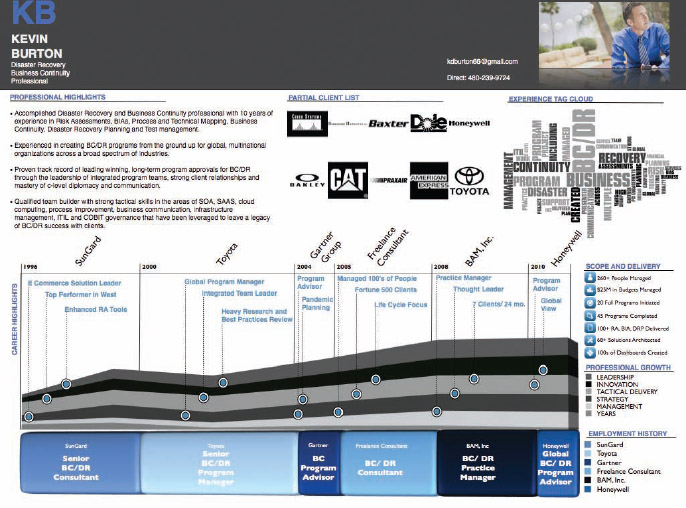
FIGURE 4-20: Original infographic resume—Kevin Burton
Coolinfographics.com/Figure-4-20
FIGURE 4-21: Black-and-white-only version—Kevin Burton
Jack Hagley took this idea one step further with his simplified, black-and-white resume design. He designed his infographic resume (Figure 4-22) with five objectives in mind:
- To be completely black and white, so that it always looked the same when printed
- To minimize the file size to make it easy to e-mail and download
- To use as little ink as possible when printed out by clients
- To be visually distinctive
- To contain a large amount of information
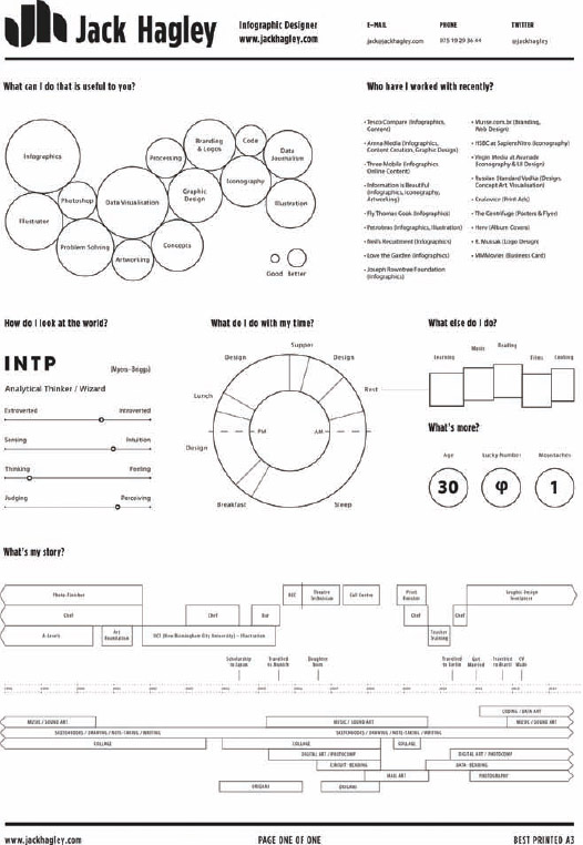
FIGURE 4-22: Infographic resume—Jack Hagley
Coolinfographics.com/Figure-4-22
An infographic resume needs to be easily printed by a recruiter or hiring manager. Although many infographic designs look great online with dark background colors, that style makes an infographic resume hard to print. Even if they have a color printer available, many recruiters will avoid printing out a resume with a black background for fear of how much printer ink or toner it would use.
Infographic Resumes on the iPad (or Tablet)
Another fantastic use of an infographic resume is Dave Rodgerson's infographic resume designed to be shown and shared on an iPad (Figure 4-23). The proportions of the iPad's screen (7.75″ × 5.82″) are smaller than a standard letter-size page of paper, so the design had to be simplified even further to make sure the text was legible on the small screen. Think of this as a mini-resume or an Infographic Elevator Pitch.
In this design, most of the text has been removed. Icons and logos tell most of the story about Dave—his employers, his major clients, his education, and his professional associations. The network map of his connections on LinkedIn show Dave's connections within the color-coded industries without needing to show the names of all his connections. The word cloud is created from his social media account on mirror.me (mirror.me) and shows what topics Dave is most often interested in and posting about online. Visually, the potential employer or client can learn a lot about Dave in just a few seconds.
The design is best formatted as a PDF file to be cross-platform and cross-device compatible. That means it can be viewed on the iPad using the Apple iBooks app, or even from within an e-mail message if it has been sent to someone. No requirement to install an extra app from a third-party is necessary. Using the built-in functions of the iPad, the two-finger pinch gesture can zoom in and zoom out of the design while showing it to someone.
FIGURE 4-23: Infographic elevator pitch—Dave Rodgerson
Coolinfographics.com/Figure-4-23
The secondary benefit of the PDF format is that all the HTML links included in the PDF file are functional. Each of the company logos and icons are tappable (or clickable) links. Dave didn't need to include the text of his e-mail address because anyone can tap the e-mail icon and it automatically opens up a new message in the default e-mail application properly addressed to him. The LinkedIn icon, if tapped, opens up his LinkedIn profile in the default web browser.
While Dave is showing his resume to someone in person, he can also e-mail it instantly to them by tapping the Share icon in the app. It automatically attaches the PDF file to a new e-mail message. The universal nature of the PDF file enables anyone to view the file on a tablet, smartphone, or computer.
Infographic Resume Design Tools
So, you want to try your hand at designing your own infographic resume?
You don't have to be a graphic designer (but it couldn't hurt). So far, most of the infographic resume designs are created manually using common graphic design software, such as Adobe Illustrator or Photoshop. Microsoft Office is also widely used to create both the individual data visualizations and the overall design.
However, with the increase in popularity of infographics, and infographic resumes in particular, a number of online services have begun to appear that offer to generate an infographic resume for the user automatically. These are not general infographic design sites. They are sites dedicated specifically to creating infographic resumes.
They all import an individual's profile information from LinkedIn.com and then enable you to edit or add custom information manually. To begin, you can choose between a handful of templates, make adjustments to the design style, choose which sections to include, and rearrange the sections as needed. Some of them enable the user to upload their text resume as the source data and additional images.
Because these sites are so new, they can definitely help a candidate stand out visually, but they start with predesigned templates. If the user just accepts the design defaults without making any changes, their resume may end up looking exactly like other resume designs the hiring manager has seen. The risk these sites will face in the future is that they could become perceived as only premade resume templates when infographic resumes become more popular and recognized.
The job candidate should always start with one of the design templates, and then customize the design using the available options to make their own resume visually unique and distinctive.
re.vu
![]()
re.vu enables users to upload example files or portfolio images of their work to be included in the resume design. Figure 4-24 shows re.vu CEO, Stephen Years’ infographic resume from the website.
Recognizing that many recruiters and hiring managers will still want to see your text resume, re.vu also enables you to upload your traditional resume to make it available for download from your custom infographic resume page.
Kinzaa.com
![]()
Kinzaa.com adds sections where the candidate can input data to include their desired company personality, work environment, preferred neighborhoods, and expected benefits to help match the candidate with the right company. Blogger Erica Swallow's resume (Figure 4-25) is used on the site to demonstrate an example resume.
FIGURE 4-24: re.vu designed infographic resume—CEO Stephen Years
Coolinfographics.com/Figure-4-24

FIGURE 4-25: Kinzaa.com infographic resume—Erica Swallow
Coolinfographics.com/Figure-4-25
Vizualize.me
![]()
Connect with a LinkedIn account and visualize.me will create an initial resume based on the information it can pull from the profile. Once the initial infographic resume has been created, the user can edit the profile information, choose from a selection of themes, and edit the design options such as colors, backgrounds, fonts, layouts, and more. Cofounder Kenneth Lee's resume is shown as an example in Figure 4-26.
The final infographic resume design is viewable using the custom URL defined by the user. The URL or visualize.me buttons can be shared in social networks. The final resume can also be downloaded as a PDF file for printing and e-mail. One unique feature of visualize.me is the stats page that will show traffic numbers of visitors to the resume page.
ResumUP.com
![]()
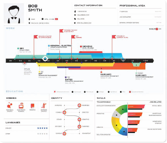
ResumUP has one design template that is applied to all users, which you can see in Figure 4-27. Login with a LinkedIn account and ResumUP will import the data to create the initial resume. The user has control to edit the information displayed and add information about the type of position and company they are looking for. The final resume is viewable online with a custom URL or can be downloaded as a PDF file.
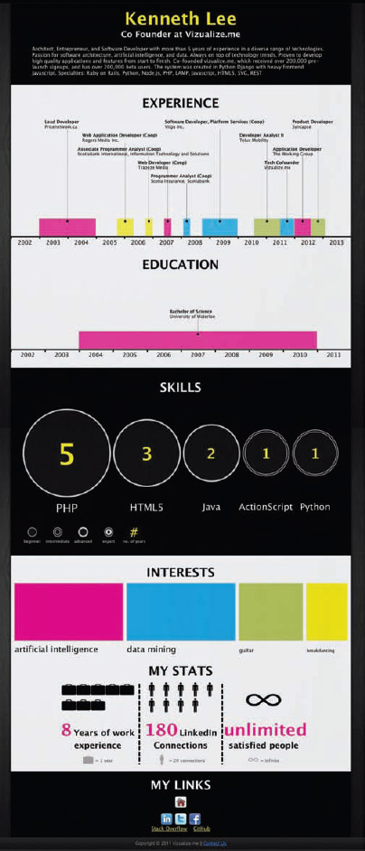
FIGURE 4-26: Vizualize.me infographic resume—Kenneth Lee
FIGURE 4-27: ResumUP.com infographic resume—Bob Smith sample
Coolinfographics.com/Figure-4-27
Cvgram.me
Anyone can login to cvgram.me with either a LinkedIn or a Facebook account. Depending on which type of account is used to login, cvgram will create an infographic resume based on the available information in the user's profile. As shown in Figure 4-28, once the initial resume has been created the user can edit their information and many of the design options (themes, colors, fonts, and more). A custom URL is created for each user to share his or her resume publicly with others directly from the site. The service is for online sharing only, so no options for downloading the infographic resume are available.
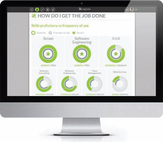
FIGURE 4-28: cvgram.me infographic resume builder
Coolinfographics.com/Figure-4-28
Shine

A new iPad app was recently launched in the iTunes store that will walk the user through the process of generating a personal infographic resume. Developed by Boluga, the Shine app (Figure 4-29) is free to download and includes one complete resume design template. Additional design templates and features are available through in-app purchases. Once a resume is created, the user can e-mail, share, and print copies directly from the iPad and the PDF files that Shine creates are fully text-searchable.
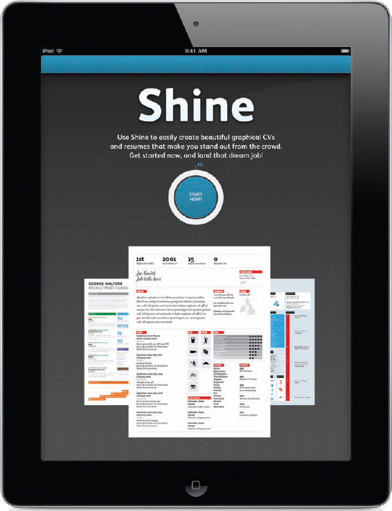
FIGURE 4-29: Shine is an iPad app that can be used to create a personal infographic resume
Coolinfographics.com/Figure-4-29
In addition, you can use any of the infographic design resources listed in Chapter 7, “Design Resources,” to create the different types of data visualizations used in infographic resumes. The visuals created by these tools can be inserted into your infographic resume as one component of the overall design.
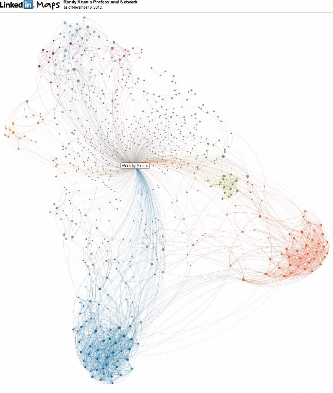
You can see my own network map (Figure 4-30) from LinkedIn InMaps (inmaps.linkedinlabs.com). InMaps is one online design tool worth specific mention in this chapter because it's a data visualization that is primarily aimed at being used as a visualization of you as an individual, which is perfect for use on an infographic resume. With user permission, the tool accesses the user's profile on LinkedIn and creates a network map of all the connections associated with that user and any interconnections between people in the user's network. It also creates color clusters of people related to the same company or industry, and creates a custom URL link that can be shared with others to view the resulting network map online. The image generated can also be easily inserted into an infographic resume design.
These network maps of connections are intended to show the reader how connected the candidate is with other professionals within a particular industry without showing the actual names of those connections. It is definitely a more qualitative design element that is indicative of how involved and engaged the candidate is with creating and maintaining connections online.
FIGURE 4-30: LinkedIn network map
Coolinfographics.com/Figure-4-30
All About You
Resumes are all about telling your story. Infographic resumes allow you to leverage the benefits of visual communication to tell your story in a more effective way. Making a resume stand out in a positive way, attracting the attention of a potential employer, making the personal information easier to understand, and making a candidate more memorable to the recruiter or hiring manager are all reasons why infographic resumes will continue to develop and become more popular.
I've accumulated hundreds of real infographic resumes in a Pinterest Board at pinterest.com/rtkrum/infographic-visual-resumes/. If you create one for yourself, send me a link. I'd love to add it to the collection!
References
1. “Keeping an Eye on Recruiter Behavior,” The Ladders, 2012, http://cdn.theladders.net/static/images/basicSite/pdfs/TheLadders-EyeTracking-StudyC2.pdf
Links
- Michael Anderson's infographic resume:
http://theportfolio.ofmichaelanderson.com/resume.pdf - Faz Besharatian's infographic resume:
http://visualresume.fazfolio.com - Randall Knapp's infographic resume:
http://randallknapp.com - Mike Wirth's infographic resume:
http://www.mikewirthart.com/?projects=infographic-resume - Duncan McKean's infographic resume:
http://duncanmckean.com/projects/infographic-cv/ - Hana Tesar's infographic resume (http://be.net/HanaTesar):
http://www.behance.net/gallery/Creative-Resume/1855167 - Navdeep Raj's infographic resume (http://be.net/navdeep):
http://www.behance.net/gallery/My-Resume/6217587 - Ana Foureaux Frazao's infographic resume:
http://anafxfz.com/portfolio/my-visual-resume - Chris Robertson's infographic resume:
http://visual.ly/infographic-resume-chris-robertson - Adrian Saker's logo resume (http://www.adriansaker.com):
http://householdname.typepad.com/my_weblog/2012/04/the-6-seconds-recruiters-spend-on-your-resume.html - Sascha Kuntze's infographic resume:
http://www.thisguyprobablycostsalot.com - David Ingram's infographic resume:
http://docs.google.com/open?id=0B2u9YPf3KC_FYmYxYWY3ZDItMmNlOS00MjFmLTkwYTEtNGMzOGJhOGI2YzEw - Tina Chen's infographic resume (http://www.tinachendesign.com):
http://www.tinachendesign.com/49207/443286/projects/personal-infographic-resume - Aníbal Maíz Cáceres’ infographic resume (http://be.net/anibalmaiz):
http://www.behance.net/gallery/My-visual-resume/5831227 - Mino Parisi's infographic resume (http://minoparisi.com):
http://www.minoparisi.com/image/CV_Mino_Parisi.pdf - Vanessa Wilson's infographic resume (http://be.net/vanessawilson):
http://www.behance.net/gallery/Resume-Infograph/2499627 - Kevin Burton's infographic resume (www.linkedin.com/in/kevindburton):
http://visual.ly/kevin-burton-resume - Jack Hagley's infographic resume:
http://www.jackhagley.com/ - Dave Rodgerson's infographic elevator pitch on iPad:
http://daverodgerson.com - re.vu CEO, Stephen Years’ infographic resume:
http://re.vu/stephen - Kinzaa.com infographic resume—Erica Swallow:
http://kinzaa.com/ericaswallow/ - Vizualize.me infographic resume—Kenneth Lee:
http://vizualize.me/kenneth - ResumUP.com infographic resume samples:
http://resumup.com/pages/pressroom#art - cvgram.me infographic resume tool:
http://cvgram.me/ - Shine, iPad infographic resume creation app:
http://itunes.apple.com/us/app/shine-graphical-cvs-resumes/id630664282 - LinkedIn Labs InMap, Randy Krum:
http://inmaps.linkedinlabs.com/share/Randy_Krum/319879238554000697230058926048394942850 - Infographic Visual Resumes Pinterest Board:
http://pinterest.com/rtkrum/infographic-visual-resumes/


