Design Resources
The question I get asked more than any other is, “What software do you use to design infographics?” Usually, the answer is, “It depends,” because different projects need different data visualization applications based on the data the designer has to work with.
Along with the explosion of infographics online in the last couple of years, the number of new data visualization and infographic software applications and websites online has also grown dramatically. There is a huge variety of software, both free and paid, available to users—and the challenge is making a choice from all the options.
Many people are surprised to learn that the vast majority of the data visualizations created to be included in the infographics are designed manually. People seem to think that we load the data into a magic computer program, and POOF! it spits out an amazing infographic. Not true.
Desktop Software Tools
Most of the infographics that exist are put together with desktop application software. You can use these applications to visualize the data, edit the image of a logo, adjust a photo, or put the whole infographic design together. Desktop applications are the main tool of designers, but there are many more applications beyond those mentioned here.
Vector Graphics
All infographics designers need a core vector graphics software program they can depend on. No matter where you create the data visualizations or illustrations, the final product is usually put together in a vector graphics program.
For designers, the main advantage of a vector graphics program is that all the text, photos, illustrations, and data visualizations are treated as separate objects that can be easily moved, resized, overlapped, and rotated. This makes putting together the layout of the final infographic design much easier.
Any shapes or objects created in a vector graphics program are in a vector format (not a static bitmap or raster image), so they can be resized without losing any resolution or clarity. Vector images are actually mathematical equations that define how to display the shape on screen so the software can recreate the identical shape at any size with crisp, smooth edges.
Most vector graphic programs can also import static images (such as photographs) that are treated as moveable objects, but they have a fixed resolution. It's simple for a designer to move a static image and integrate it into the overall design, but resizing static images can be a problem. If a designer resizes a static image larger than its original resolution, it begins to look pixelated or blurry. This is why a designer will create objects as vectors whenever possible.
The circles shown in Figure 7-1 are a quick example of the difference between vector and static objects. If the original small circle shape was a vector object, you can see how it would retain the crisp, clean edges when enlarged. The software redraws a new edge for a circle with a larger diameter. Conversely, if the original circle is only a static image of a circle with a fixed resolution, the pixelated edges are magnified when the circle is enlarged.
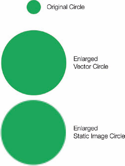
FIGURE 7-1: Differences when enlarging vector and static images
 Adobe Illustrator
Adobe Illustrator (Figure 7-2) is the premium vector graphics program on the market—and also the most expensive. As part of the Adobe Creative Suite, this is the package that most graphic designers rely on for any vector graphics work. It's big, it's complicated, and for any nongraphic designers that want to try to design their own infographics, the sheer complexity of learning Adobe Illustrator is intimidating. (www.adobe.com)
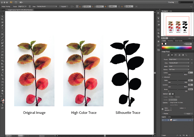
FIGURE 7-2: Adobe Illustrator screen shot
Adobe InDesign 
Another application from the Adobe Creative Suite, InDesign is the modern-day desktop publishing program (Figure 7-3). Meant for long-format print layouts, such as magazines and books, InDesign is also a great tool to put together many different pieces into a complete infographic. If your design has a lot of text, InDesign is especially useful for its text wrapping around images. (www.adobe.com)
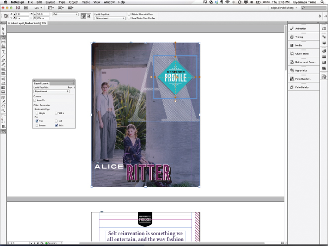
FIGURE 7-3: Adobe InDesign screenshot
 OmniGraffle
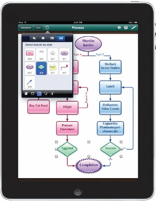
OmniGraffle (Figure 7-4) from the Omni Group is my personal application of choice when it comes to putting the final infographic designs together. I find it to be a much more lightweight and easier-to-use application than Adobe Illustrator, with most of the graphic functions required. Because it is primarily a diagramming tool, connecting objects together for flowcharts or network diagrams is easy. Although this program is Mac-only, there's also an OmniGraffle for iPad app that can also display and edit files created with the desktop application (Figure 7-5). (www.omnigroup.com/products/omnigraffle/)
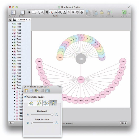
FIGURE 7-4: OmniGraffle screenshot
FIGURE 7-5: OmniGraffle for iPad
 Inkscape
Inkscape (Figure 7-6) is an open-source vector graphics editor that adds the use of Scalable Vector Graphics (SVG), an open XML-based W3C standard, as the native format. This is a powerful vector graphics program available for multiple platforms (Windows, Mac OSX, and Linux). The biggest advantage is that it's a free program for download. (www.inkscape.org)
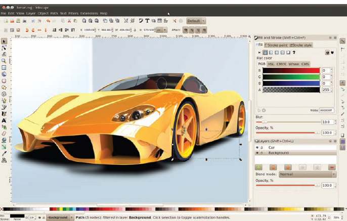
FIGURE 7-6: Inkscape screenshot
Microsoft PowerPoint 
What? Microsoft PowerPoint? Yep. Although, it's obviously mainly used and marketed as a presentation application, at its heart PowerPoint (Figure 7-7) is a simple vector graphics program. The application allows users to create floating text blocks, insert vector object shapes and import images to arrange in an infographic design. The process should be familiar to people that design presentation slides since they are already comfortable moving objects around on the page.
PowerPoint also has the advantage that Microsoft Office is probably already on your computer, so it's a tool you or your company already owns. Designers can create custom paper sizes to layout a tall format infographic design instead of the standard presentation slides. If you use the built-in charts as part of the design, you can easily update the infographic with new data at a later date. (www.powerpoint.com)
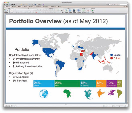
FIGURE 7-7: Microsoft Power-Point screenshot
Image Editing
Although some designers create entire infographic designs in an image editor application, these are primarily used to clean up images that are later imported into the vector graphics application. Image editors are a fantastic tool for changing colors, cropping images, and removing unwanted portions of images.
To make the background of a company logo transparent so that it blends into your infographic design, an image editor is the perfect tool. There are hundreds of image editing programs you can use, but these are the main ones used as part of an infographic design.
 Adobe Photoshop
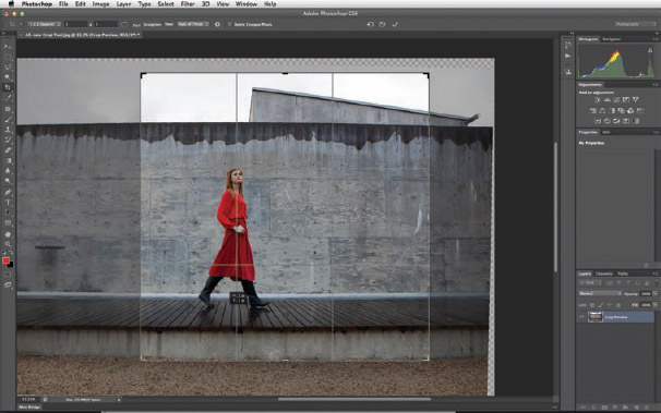
Adobe Photoshop (Figure 7-8) is the dominant application for photo and image editing software. This is another application included as part of the Adobe Creative Suite. It has everything you need to clean up images for infographic designs, and way, way more. Similar to Illustrator, the high price point and overall complexity are major hurdles for many designers. (www.adobe.com)
 Pixelmator
Pixelmator (Figure 7-9) is a much less expensive image-editing application on the Mac platform and is a popular tool of choice. This is a powerful, full-featured image editing application that is more than capable of handling the images used for infographic designs. (www.pixelmator.com)
FIGURE 7-8: Photoshop screenshot
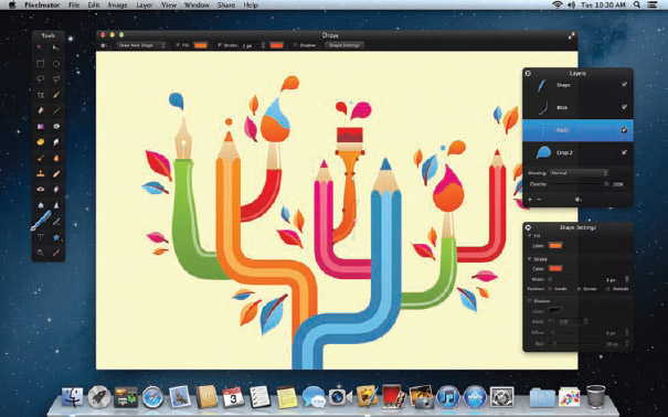
FIGURE 7-9: Pixelmator screenshot
 GIMP
GIMP
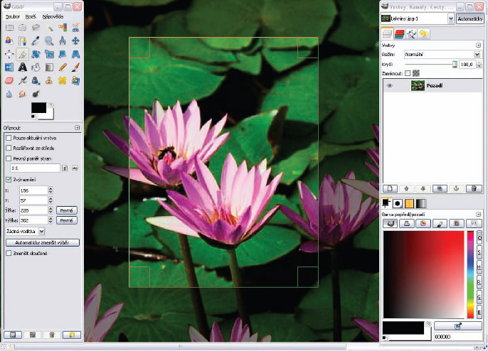
GIMP (Figure 7-10) is a free image manipulation application used for photo retouching, image composition, and image authoring. GIMP has all the core image editing functions, but its main advantage is its cross-platform support for Windows, Mac, GNU/Linux, Sun OpenSolaris, and FreeBSD. This is a great tool for those with a small budget. (www.gimp.org)
Acorn 
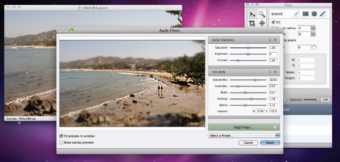
Acorn (Figure 7-11) by Flying Meat is an award-winning, low-cost image editing application, but this one is also Mac-only. Acorn is easy to use with some great design tools and filters. (www.flyingmeat.com/acorn)
Online Data Visualization Tools
There are hundreds of websites can help create the different data visualizations that designers include in their infographic designs. It all depends on what type of information you have to work with and what story you want to tell. Do you need a map, a word cloud, a flowchart, a timeline, or a simple bar chart?
The incredible diversity of data visualizations is amazing to behold, and new visualization methods and styles are developed every day. Following are just a handful of the tools that have been helpful to designers.
Periodic Table of Visualization Methods
One tool that helps many designers determine which type of data visualization is appropriate for their data is the Periodic Table of Visualization Methods (shown in Figure 7-12) from Visual-Literacy.org. Sometimes designers need some inspiration to break out of the standard bar charts, pie charts, and line charts. In the table, the visualization methods are grouped by the different types of data being visualized (Strategy, Data, Concept, Metaphor, and more). When you hover your mouse pointer over any of the methods on the chart, it displays an example of that visualization for your reference. The examples are a few years old, so they may appear dated, but you'll still understand the visualization style that could be used to model your data. (www.visual-literacy.org/periodic_table/periodic_table.html)
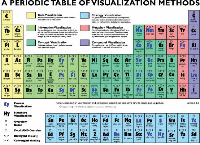
FIGURE 7-12: Periodic Table of Visualization Methods
Wordle.net
Wordle is a popular, free tool online for creating word clouds out of any text you have available. Word clouds size the font of each word based on its frequency in your text, so the largest words are the ones that appear most often. Figure 7-13 shows a word cloud of the entire Facebook Privacy Policy pasted directly from its website without any editing. After a word cloud has been created, you can edit the colors, layout, and fonts to your liking.
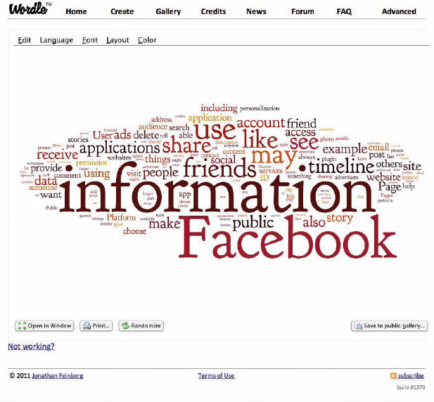
FIGURE 7-13: Facebook Privacy Policy on Wordle
Word clouds are usually used in situations in which your data is more qualitative than quantitative. The reader can get a general impression based on the word frequency, but no hard values are shown. There are also some advanced features to combine words in order to determine the frequency of phrases instead of just individual words. This is often used to separate positive and negative sentiment phrases, and the frequency difference between phrases such as “love” and “don't love.” Without the phrases, only the raw frequency of “love” would be counted, regardless of its context. (www.wordle.net)
Chartle.net
Chartle is easy to use and free. In addition to the normal pie charts, line charts, and bar charts, Chartle has a number of other useful visualizations that are often used in infographics. Specifically, the maps, Venn diagrams, and gauges (Figure 7-14) are different and popular. (www.chartle.net)
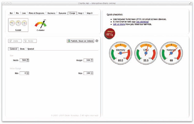
FIGURE 7-14: Chartle.net
ChartsBin
ChartsBin is an online, web-based visualization tool mainly used for visualizing data on a world map (Figure 7-15). You can enter your own data or browse the data sets in the gallery. The final visualizations can be downloaded as PNG image files to be placed into an infographic design. (www.chartsbin.com)
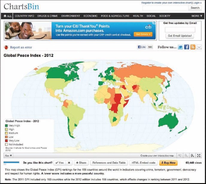
FIGURE 7-15: ChartsBin screen shot
DIY Chart
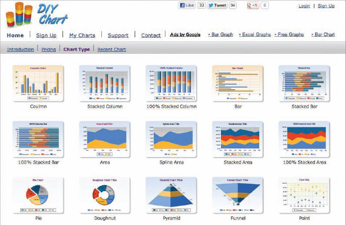
DIY Chart (Figure 7-16) has a number of chart templates that you can use as the data visualizations in an infographic design. You can create a handful of charts for free, and the $4.95/month fee for the Premium account gets you many more chart styles and removes the DIY Chart logo from your designs. You can save your chart images in BMP, PNG, Emf, or JPG formats to your local disk for use in infographic designs or even just as a chart in a blog post. (www.diychart.com)
Gephi
Gephi (Figure 7-17) is described as the Photoshop for data, and it's powerful for large, imported data sets of more than 50,000 nodes. After the visualization has been created, it can be exported to be included in an infographic design. (www.gephi.org)
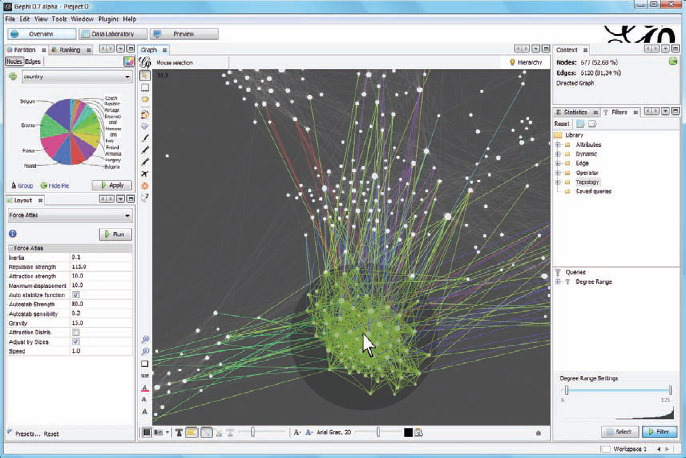
FIGURE 7-17: Gephi screen shot
Gliffy
Gliffy (Figure 7-18) is more for diagrams than traditional charts, such as flowcharts, Venn diagrams, network diagrams, and org charts. Diagrams can be saved as JPG, PNG, or SVG format files, which can then be included in an infographic design. (www.gliffy.com)
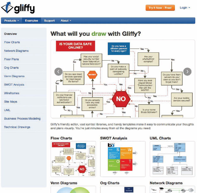
FIGURE 7-18: Gliffy diagramming application
iCharts
iCharts is a neat online tool for creating good charts. You can upload your data set and choose a chart type. A number of different chart types are available and you can customize all the chart attributes or use one of the chart design templates (Figure 7-19). When you finish, you can download your chart as a PNG image file for use in an infographic design. (www.icharts.net)
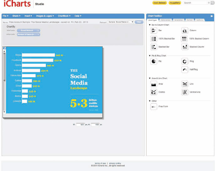
FIGURE 7-19: iCharts screen shot
Many Eyes
The Many Eyes project (Figure 7-20) is an ongoing experiment created by the teams at IBM Research and the IBM Cognos software group. The site enables you to create some more advanced data visualizations such as tree maps, bubble charts, word clouds, world maps, and network diagrams. Members can publish their visualizations online, and allow other members of the community to leave comments and view the raw data. (www-958.ibm.com/software/analytics/manyeyes/)
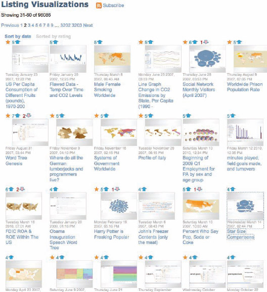
FIGURE 7-20: Many Eyes visualization listing
The Noun Project
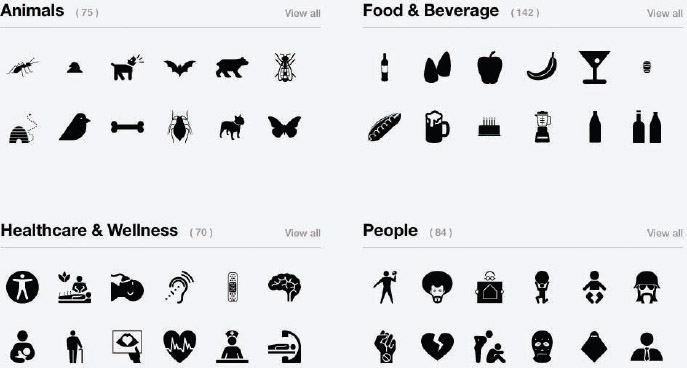
The Noun Project (Figure 7-21) is a fantastic resource to find icons related to the concepts you need to visualize in your infographic design. Most of the icons are free for use under a Creative Commons license as long as you give attribution to the designer in whatever design you include them in. Designers are always adding new icons to help build a broader visual language.
The Noun Project is built on donations and designs contributed by designers. If you can, consider contributing to the project. (www.thenounproject.com)
Finding Data Online
One of the big challenges for infographics designers is finding the data they need to visualize as part of their infographic story. If you aren't using your own company data or research results, you will probably search online to find the data used to design your data visualizations.
Search engines (Google and Bing) can certainly help, but finding the perfect data for your infographic is tough if you have to look through millions of search results. Of course, the type of data you're looking for can help narrow down your search efforts.
Following are a number of data repository sites that host thousands of data sets. The intent of these sites is to make these data sets available to the public, but make sure you understand their terms of service.
Data.gov
The official data website of the U.S. Government, Data.gov is a project about transparency and the Open Government Initiative of the White House. As of this writing, the site currently boasts a total of 392,435 combined raw data sets, tools, and geo-data sets (www.data.gov).
DataMarket
DataMarket is a data repository site that enables users to view data visualizations of sets from around the world. Free access enables users to view and share the data, and Pro accounts ($59/month) enable access to premium tools to publish data and access to additional data sets, such as market research and financial market data. (www.datamarket.com)
FactBrowser
FactBrowser is self-described as a research discovery engine. It's a search engine dedicated to indexing the statistics quoted in news articles and press releases from companies and organizations. You can browse by category, company, source, consumer type, and regions of the world. (www.factbrowser.com)
Google Public Data
Google maintains a fantastic public directory with hundreds of data sets and metrics from many world governments and global organizations. Users can browse through the data sets and view the interactive data visualizations on the site. (www.google.com/publicdata/directory)
Internet World Stats
Internet World Stats has some great data based on Internet usage worldwide, population stats, and even some market research data. The site is often referenced in infographics as an indicator of the size and scale of the Internet. (internetworldstats.com)
Many Eyes
In addition to the data visualizations you can create on Many Eyes mentioned earlier, Many Eyes also hosts a huge repository of public data sets. There were 367,835 available data sets as of this writing, and members of the community add new sets all the time. The community also has the ability to comment on specific data sets to share thoughts or questions. (www-958.ibm.com/software/analytics/manyeyes/)
Quantcast
Quantcast measures, estimates, and forecasts site traffic for most sites on the web. For any designs that compare websites or site traffic, Quantcast is a great resource. Keep in mind that these are usually estimates and not actual data, but for comparison purposes, its numbers are usually in the ballpark. (www.quantcast.com)
Wikipedia
Of course many, many people use Wikipedia as a data source for infographics. There are lots of great HTML tables and individual statistics listed in the various entries. Always try to find the original source cited by Wikipedia (if available) so you get the raw data whenever possible. (www.wikipedia.org)
Wolfram Alpha
Wolfram Alpha probably has some statistics or data related to your topic and is always worth checking. It might be stats about the airplanes in the air over your location, information about caffeine, or demographics about a particular country. (www.wolframalpha.com)
Online Infographics Design Sites
A handful of new websites dedicated to designing infographics have launched recently. These sites enable you to input (or upload) your own data to create the charts and enable the user to choose from a collection of predesigned infographic templates for layout and style. These sites are mainly intended for the nondesigner audience that wants to create its own infographics without learning the software applications previously mentioned.
A handful of potential advantages for using these sites make them attractive:
- Speed—By using the templates and the online charting tools, you can create a complete infographic in less than an hour.
- Hosting—These sites host the final infographics online, so the user doesn't need to create a separate infographic landing page to host the final design.
- SEO optimization—For users that don't have the knowledge or skills to optimize the metadata on the infographic landing page, these sites can make the text in any infographic design available to the search engine crawlers to find your infographic.
- Design style—These templates enable the nondesigner users to break out of the PowerPoint-looking charts they would normally create. The design styles are fresh and new, which makes for a great looking infographic. Most of them also include data visualization styles not available in the MS Office suite.
Of course, there are a few potential disadvantages to using these design sites as well:
- Templates—Just like the presentation templates in PowerPoint, these templates will definitely be used by multiple people and may begin to look like stock designs. If your infographic design looks just like another design the audience has already seen, you're no longer unique and memorable.
- Wrong chart—Templates draw the user in with easy, predesigned charts, even if that chart isn't the right way to visualize the data you have to work with.
- Dependency—These are brand new companies and the websites may not be available 12 months from now. If this is where you host your infographic, you're dependent on the site to remain functional to keep your infographic live on the Internet.
- Traffic and links—If you host your infographic on these sites, and not on an infographic landing page on your own site, all the traffic and backlinks to your infographic design benefit the design site and not yours. Even using the embed-code to display the final infographic design on your own site is redirecting some of the traffic and PageRank to the design site.
- Nonconfidentiality—You may consider using an online design site to create an infographic of company data for internal use, but you may be inadvertently making your confidential company data public. Even if the site doesn't publish your infographic design publicly, you may be exposing your private data to the members of the design company. None of these sites claim that your data is encrypted or protected in any way, which may be in violation of your corporate policies.
These sites are a great way to start using data visualizations and infographics to communicate your message visually. If you design your own infographic using these tools, you should at least understand what you are sacrificing by not having complete control over your design.
Easel.ly
Easel.ly enables you to choose from a large library of templates, shapes, and objects to create and share an infographic design. Easel.ly doesn't have any advanced charting tools, so it's up to the designer to manually adjust the sizes of shapes to match the data values. The circles shown in Figure 7-22 would each need to be resized by the user to match the data. (www.easel.ly)
FIGURE 7-22: Easel.ly design interface
infogr.am
Infogr.am is an online tool for creating and sharing infographics and individual charts based on your own data. Shown in Figure 7-23, it has simplified and prepackaged the design process to four steps:
- 1. Choose a template.
- 2. Add your own data.
- 3. Customize the design.
- 4. Publish and share.
The charts are interactive, which adds some animation and changes the display based on decisions from the viewer. The tool also enables you to embed the final designs on your site or share on the major social media networks. (infogr.am)
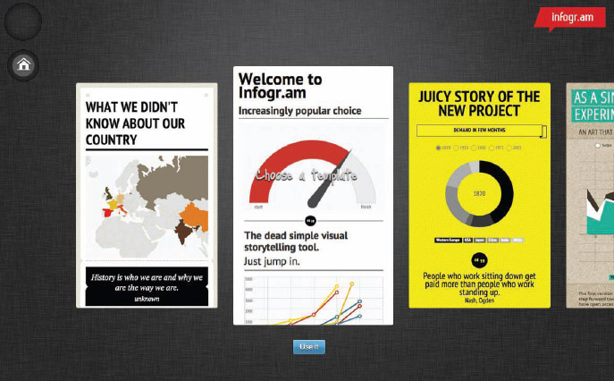
FIGURE 7-23: Infogr.am template chooser
Piktochart
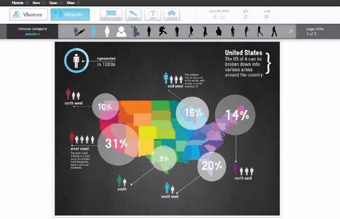
Piktochart is a WYSIWYG editor for infographics online. The tool enables you to create infographics online with interactive charts, and claims they are optimized for SEO and social media sharing. Users may create an account for free and have access to a handful of templates (Figure 7-24). PRO users pay $9.99 per month and get access to approximately 100 more templates. It also claims to have more than 1,000 icons and graphics in its library of images for would-be designers to incorporate into their designs. (www.piktochart.com)
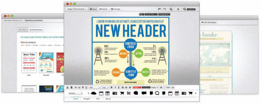
FIGURE 7-24: Piktochart interface
Venngage
Venngage is an online infographic creation site from the same people that developed the Vizualize.me infographic resume site mentioned in Chapter 4, “Infographic Resumes.” Upload your data into one of the predesigned templates and then customize the final design to the colors that match your brand or style (Figure 7-25). There are both free and Pro accounts ($19/month) available. (venngage.com)
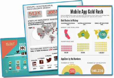
FIGURE 7-25: Venngage design templates
Visual.ly
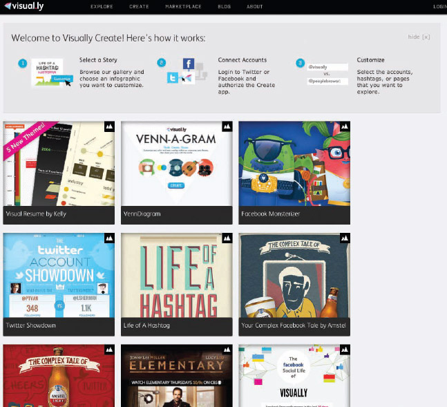
Visual.ly is primarily a gallery site for infographics, but it has recently launched the Visually Create! section of the website where users can create custom infographics based on a selection of predesigned templates (Figure 7-26). These are primarily social media-related designs that need access to connect with Facebook or Twitter to pull in the data used to create infographics (create.visual.ly).
Reading List
In addition to online resources, here are some of the other great books written about data visualization and infographics from my own reading shelf. Mostly focused on improving the data visualizations used in infographics, I highly recommend these books to anyone looking to learn more about using data to tell stories visually.


