Chapter Two
Artists' Books
The artist's book is a conquest of new territory.
Some of the most innovative crossover picturebooks fall into the category of what have been termed “‘artists' books' for children.” Although artists' books have been called “the quintessential 20th-century artform,”1 the definition and the term itself are still the subject of much debate. This study adopts the term “artists' books,” as it has become the most widespread, but often “artist's” is written in the singular or even without the apostrophe. Numerous other labels are also used to refer to these books, including book art, bookworks, and book objects. Often artists' books are defined in terms of what they are not, and one website begins by categorically claiming: “They are not children's books.”2 In fact, some of the most innovative artists' books are intended for young readers. Unfortunately, they are, for the most part, not well-known, unobtainable, and overlooked by critics. In France, “les livres d'artiste pour enfants” have received some scholarly attention, for the most part thanks to Les Trois Ourses, an association founded by several librarians in 1988 to promote artists' books for children and make them available to French readers.3 The French publishing house Éditions MeMo, which collaborates with Les Trois Ourses, specializes in artists' books for children from the past as well as the present. In Italy, Maurizio and Marzia Corraini, who began working with Bruno Munari in the 1970s, reedited titles which had previously been difficult to obtain, making them available not only in Italian, but also in English and French. In the English-speaking world, however, artists' books for children have been virtually ignored and, with very few exceptions, have received only passing mention by critics.4 In his study of artists' books, Stephen Bury cites the “children's book” as an example of the genres into which the artist's exploration of the book extended, and his list of works includes Bruno Munari's Prelibri and Andy Warhol's Children's Book, while Johanna Drucker's seminal The Century of Artists' Books, first published in 1995, devotes a couple of sentences to Munari and mentions Dieter Roth's Kinderbuch (Children's book) in very brief terms.5 Yet artists' books constitute one of the most influential and exciting areas of crossover literature.
The picturebooks examined in this chapter challenge not only the boundaries between adult books and children's books, but the boundaries of the book itself. Many of these innovative works question the conventional codex form, which dictates standard-size pages bound in a rigid sequence. Innovative experimentation with format and design has resulted in books that are also art objects and are sometimes referred to as “object-books” or “book-objects,” the latter term being preferable since they remain first and foremost books. The Italian designer Bruno Munari uses the term “libro-oggetto” (book-object) to refer to several of his groundbreaking works and the Swiss artist Warja Lavater refers to the celebrated series of imageries that she began publishing in the 1960s as “livres-objets” (book-objects).6 In book-objects, the narrative is told as much by the physical form as by the text and images. For these artists, the book is not merely a container for text and images, but a concrete, three-dimensional object. They explore every facet of the book and use all the resources of bookmaking, such as typography, paper, and binding, to tell the story.7 Munari worked as a book designer before he began creating his own children's books in the 1940s. The Japanese artist and designer Katsumi Komagata spent a number of years working as a designer in the United States in the 1980s before founding his own publishing house, One Stroke, in Tokyo in 1990, in order to bring out his unconventional books. The works of these artists constitute a provocative reflection on the very structure of the book.
Although these books are sometimes designated as “‘artists' books' for children,” they appeal widely to adults as well. Indeed, some adults question their status as children's books. Disconcerted by their enigmatic, interactive nature, they feel that these books are unsuitable for young readers, even when they are addressed explicitly to that audience. Limited print runs and high production costs may result in a price tag that is prohibitive for most readers of any age, making them predominantly collectors' books. Not all artists' books are expensive, however, and artists who create books with a young audience in mind are generally particularly concerned with making them accessible to a wider public. However, even reasonably priced artists' books are often sold in art galleries and museum gift shops rather than children's book stores, while libraries are reluctant to lend them if they are fortunate enough to have them in their holdings. The fragile nature of many of these works often discourages adults (parents as well as librarians) from allowing them into the hands of children. Artists' books thus often have the paradoxical status of being children's books that are kept away from children at all costs. The new and exciting possibilities of these versatile books explain their appeal with young readers. Children enjoy the playful, interactive nature of these works, while adults admire the artist's ingenuity. Artists' books offer readers of all ages innovative and challenging books of exceptional aesthetic quality.
Early Experimentations
It is often pointed out that this art form did not really begin in earnest until the 1960s. However, a number of striking examples of artists' books for all ages were produced much earlier. At least one eighteenth-century artists' book has a crossover audience. Like most of the works by the British poet, painter, and engraver William Blake, Songs of Innocence and of Experience (1794) combines text and image using the technique he called illuminated printing. The introductory poem, which was first published in Songs of Innocence in 1789, states that all children could take pleasure in hearing the songs he had written. Over the past two centuries, children have indeed taken pleasure in Blake's poetry. Nancy Willard, who first read Blake's work at the age of seven, published the award-winning picturebook A Visit to William Blake's Inn, with illustrations by Alice and Martin Provensen, in 1981. The subtitle, “Poems for Innocent and Experienced Travelers,” is a direct reference to the poet's work, and the author reminded me, in a letter dated March 21, 2000, that Blake wrote his happy songs “in a book that all may read,” and that he also tells us that “every child may joy to hear” them. Willard's book of magical poems about life at an imaginary inn run by William Blake and staffed by dragons that “brew and bake” and angels that “wash and shake” the feather beds became the first book of poetry to win the coveted Newbery Medal. Like Blake's Songs of Innocence and of Experience, Willard's picturebook is intended for a crossover audience.8
At the end of the nineteenth-century and the beginning of the twentiethcentury, the artists of the Vienna Secession and the Wiener Werkstätte (Vienna Workshops) completely rethought the children's book. The Vienna Workshops were founded with the intention of uniting the fine and applied arts to create beautifully designed objects of all kinds, including books. The members experimented with format, page layout, typography, and text-image relationship. The desire to communicate to children the cultural significance of beautiful books led to cheaply produced but high quality, artistically designed publications. The special character of children's book production at the time was largely due to individual publishers, such as Verlag der Wiener Werkstätte and Martin Gerlach & Co., as well as the Viennese art schools. These works demonstrated a wide range of the techniques possible in book art, including lithography, woodcuts, stencils, and so forth. Of particular note is the Gerlachs Jugendbücherei, which became famous well beyond Austria's borders. Between 1901 and 1920, thirty-four volumes were published in the famous series, each illustrated in colour by a different artist. Die Nibelungen, which was published in 1909 as volume 22, offers an excellent example of the trends of the Vienna Workshops. Carl Otto Czeschka, a prominent member of the Vienna Secession and a designer for the Vienna Workshops, is responsible for the illustrations and the design of the text, which was adapted from the ancient tale of knightly honour by Franz Keim. Die Nibelungen is a rather unassuming little book that gives readers no indication of the riches to be found between the rather plain covers. The sixty-seven-page book features eight double-page spreads printed in blue, red, black, and gold, as well as numerous small black-and-white vignettes, initials, and head and tail pieces. The text is written in gothic characters and all the pages, whether they contain text or illustrations, are framed by an ornamental border. This eye-catching frame highlights the small framed vignettes that are centred on a white background. An atmosphere of ritual and pageantry dominates the illustrations, which are reminiscent of the Byzantine imagery that characterizes the work of the Austrian artist Gustav Klimt. Czeschka's striking, abstract figures are solemn and ceremonial, while the décor is highly stylized. The decorative stylisation that was popular in applied arts at the time pervades the illustrations, where it is used for items as varied as wave foam, a ship's sails and figurehead, floor tiles, even horses and birds of prey. The geometric motifs and stylistic ornamentation of the bedclothes, draperies, clothing, armour, and weapons, as well as the use of the gold colour, evoke Klimt's “Golden Phase,” so-named because paintings such as Der Kuss (The kiss, 1907–1908) contained gold leaf. Die Nibelungen is considered the best volume in the popular series and one of the finest examples of the Art Nouveau illustrated book.
The increasing interest of painters, sculptors, and designers in children's books at the beginning of the twentieth-century resulted in some very revolutionary picturebooks. 1919 saw the publication of one of the great forerunners of the contemporary picturebook, Macao et Cosmage ou L'expérience du bonheur (Macao and Cosmage or The experience of happiness), which was written and illustrated by the French painter and illustrator Edy Legrand. It was the first picturebook for children published by the Éditions de la Nouvelle Revue Française or NRF (the original name of the leading French publisher Gallimard), and it remains one of the most important books in the history of children's book illustration. Macao et Cosmage is the work of a painter at the beginning of his career; Legrand completed the book when he was only eighteen years of age. The artist would go on to become one of the most important illustrators of the twentieth-century, but his later work does not rival the brilliant daring, originality, and visual impact of Macao et Cosmage. Legrand's work marks a significant break from the romantic styles of illustrators such as Arthur Rackham, Edmund Dulac, and Kay Nielsen, who were popular in the early twentieth-century, the so-called “Golden Age of Illustration.”
Macao et Cosmage contains fifty-four full-page engravings, vividly coloured by hand in the pochoir process. The book was revolutionary for a number of reasons, most notably for the reversal of the conventional text-image relationship. The text is minimal (some pages are wordless) and the major role is attributed to the illustrations, which carry the narrative. In addition, the artistically handwritten text becomes a component of the image itself. Some pages consist of a single plate, while others are divided into two asymmetrical images. The page layout is further diversified by the fact that many of the images are framed by a solid, black, handpainted border, while others remain unframed. The author-illustrator experiments with typography: the placement of the text varies from page to page, and can be found within the frame, outside the frame, framed between two images, or actually framing the image itself.

Figure 2.1 Die Nibelungen, interpreted by Franz Keim, illustrated by Carl Otto Czeschka, Verlag Gerlach und Wiedling, 1909, Digital Image © The Museum of Modern ArtLicensed by SCALAArt Resource, NY, reprinted by permission of The Museum of Modern Art.
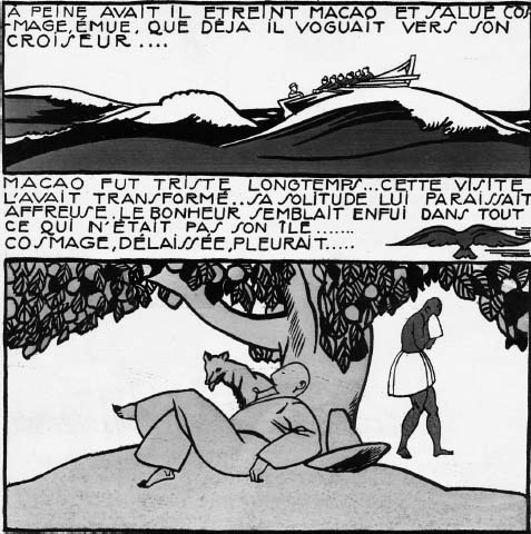
Figure 2.2 Macao et Cosmage ou L'expérience du bonheur by Édy Legrand, La Nouvelle Revue Française, 1919.
A few of the illustrations seem to herald the graphic novel. A short foreword addressed to the child reader and signed familiarly “Your Friend, Edy-Legrand” insists on the importance of the images. Child readers are advised to look attentively because the author “only tell [s]” the story of Macao and Cosmage, whereas “the colours, the slightest objects, the smallest animals have a raison d'être” that they are intended “to discover” for themselves. Macao et Cosmage broke with standard publishing practices of the early twentieth-century. It is a large book with a square rather than rectangular format, which was highly unusual at the time. Unlike the carefully bound and costly books, with elegant tipped-in plates on fine paper, that were prevalent, Legrand's book had bold illustrations on course paper and it was quite inexpensive. It was an early attempt to make high quality books available to children of all economic backgrounds. While very fine copies of other prominent illustrators of the same period, such as Rackham and Dulac, are plentiful today, even a very good copy of Macao et Cosmage is quite rare.
It is not only the format of Macao et Cosmage that is innovative, but also the content. The author's highly critical attitude toward industrial and technological progress was unusual at the beginning of the twentieth-century. The anti-colonial perspective he adopts was also ahead of his time. The eponymous protagonists, a white man and a black woman, are portrayed and named on a striking doublespread that precedes the foreword and the title page. Their idyllic existence in harmony with nature is brought to an abrupt end when the uncharted paradisiacal island is discovered, and “an army of soldiers, colonists, civil servants, and scholars” arrives, bringing “blessed civilization.” Eventually, Macao turns his back on the progress that was to have brought him happiness. The ending of the book seems quite bleak, especially to adult readers, but in the foreword the author offers the child addressee a glimmer of hope, saying that the story would be “sad” if he wasn't convinced that Macao and Cosmage “are happy today….” The book has a very philosophical message that is encapsulated in the final line of the foreword: “The only mystery in life is penetrated when one knows where one's happiness lies.” In the last unspoiled corner of the island (the image depicts two trees by a puddle-sized pond on a barren mountain), an elderly Macao finally “experiences happiness.” The ultimate message is nonetheless pessimistic, as the last page of the book states: “Child! Macao was a wise man but the governor was right!” The relentless march of “civilization” and “progress” cannot be reversed. Macao et Cosmage played an instrumental role in establishing a new path for children's book illustration. However, because the author forbade the republication of Macao et Cosmage in 1947, it was not available again until 2000, when the French children's publisher Circonflexe offered a faithful reproduction targeted at ages six and up.
In the early years of the twentieth-century, there was a widespread search among avant-garde artists in many countries for innovative styles that would reflect the new age. European artists in particular sought to break down the traditional borders between non-visual art and visual art. The Russian avantgarde artist and designer El Lissitzky designed his first suprematist book, About Two Squares, while teaching in Vitebsk with Kazimir Malevitch. Published in Berlin in 1922, the children's book is a homage to Malevitch, whose Black Square initiated suprematism in 1913. The “grammar” of this art movement was based on simple geometric forms (notably the square and circle), which could communicate directly with everyone and be applied to all creative fields, including books. About Two Squares is at once a picturebook and a manifesto, in which Lissitzky offers a revolutionary rethinking of the children's book and the book in general, applying suprematism to the graphic arts. In “Our Book,” published in 1926, he reflects on what the contemporary book should become in the new age. The traditional form of the book (jacket, spine, sequential numbered pages) must assume a new shape capable of expressing the times. In the young Soviet Union of 1926, he wrote: “The book is becoming the most monumental work of art…. By reading, our children are already acquiring a new plastic language; they are growing up with a different relationship to the world and to space, to shape and to color; they will surely also create another book.” Lissitzky himself had already begun to create another book for the new era, a revolutionary book with a universal visual language that took into account “the semiliterate masses.”9 Paradoxically, this simplified, abstract narrative intended to ensure communication with everyone was considered by many to be elitist.
Lissitzky's avant-garde vision of book design and typography is best illustrated in About Two Squares, which presents a new way of arranging typography on the page and relating it to visual images. The letter and the word have a visual form like the image. In a large format book, Lissitzky tells his “suprematist tale” (he uses the Russian word “skaz” meaning “tale”) in what the title page describes as “6 constructions,” which resemble the artist's Proun compositions. The verso of the title page encourages the active participation of readers in an act of construction rather than of reading. The paradoxical directive “Don't read” at the top of the page is followed by a dynamic graphic line that zigzags down to the bottom left hand corner where “readers” are instructed to “Take—Paper Fold, Columns Colour, Blocks Build.” The two flying squares from afar,” one red and one black, descend upon the round red ball of the earth, where they discover “black alarming” chaos. The red square strikes a downward blow that shatters the chaotic black world of three-dimensional geometric shapes. The words that accompany this Construction also fall, contributing visually to the narrative. In the next illustration, a new, more orderly red world is reconstructed on a black square. In the final Construction, the red square hovers suspended over the transformed world while the much smaller black square exits the upper right hand corner. Lissitzky's children's book presents a clear social and political message that challenges the old social order and proposes a revolutionary transformation. His little tale is an allegory of a new society that young readers will help to build.
Lissitzky's dynamic images of geometrical forms being knocked down and rebuilt remind us of a child playing with building blocks, as Margaret Higonnet rightly points out. The innovative graphic design and typography are strikingly evident already in the title on the front cover, which, states Higonnet, “speaks like a child's rebus.”10 On a stark white background, the word IIPO (ABOUT) appears in small, slanted letters before a large black numerical “2” and the pictorial image of a red square. Lissitzky combines word, number, and pictorial image in a single visual language. A fine black line forms a large square that frames the title on the cover and each of the images in the book. Only the author-illustrator's name figures discretely at the bottom of the cover rather like an artist's signature on a painting (the two words of his name meet on a diagonal so that they share the “L”). Lissitzky bends all the rules of conventional typography in the brief fragments of text under the images, varying the type size and style, mixing upper and lower case, rotating letters, setting words on a diagonal, combining lines and words, and so forth.
The open ending on the last page, which is translated in the English version as “Here it ended, further,” could be interpreted as an encouragement to the reader to continue the work of the two squares: “This is the end, continue.” The transformation of society and humankind is a never-ending process. Lissitzky explicitly targets a crossover audience. On the second page, he dedicates the book “to all, to all children.” The large white “P” that begins the Russian word for children (ribiatam) is set on a solid black rectangular background and tilted backward on the diagonal, as if poised to propel forward into the future. The book's creator also mentioned the intended audience in Typographical Facts: “In this tale of two squares I have set out to formulate an elementary idea, using elementary means, so that children may find it a stimulus to active play and grown-ups enjoy it as something to look at.”11 The square protagonists are introduced rather like the actors in a play. In “Our Book,” Lissitzky refers to the triumph of cinema and the “new media which technology has placed at our disposal.” About Two Squares is an attempt to give the book a “new effectiveness… as a work of art” by mimicking the new media. “The action unrolls like a film. The words move within the fields of force of the figures as they act: these are squares.”12 Lissitzky's children's book was quite successful: the 3,000 copies of the book produced and sold in 1922 was a significant number for that time. In 1990, Artists Bookworks in the United Kingdom made this seminal book available to English-speaking readers by releasing a facsimile reprint with English translations printed on a transparent overlay to register over the original Russian. According to the website of the MIT Press, which published an edition the following year, Lissitzky's book “marked the beginning of a new graphic art and is among the most important publications in the history of the avant-garde in typography and graphic design.” The revolutionary book, which attempts to address children in an abstract language, had a profound influence on other artists creating books for all ages.
Another very innovative children's book, Die Scheuche: Märchen (The Scarecrow: Fairy Tale), was published in Hannover, Germany in 1925 by Kurt Schwitters, one of the major figures of German Dadaism, famous for his Merz collages and assemblages. He was a friend and collaborator of Lissitzsky, who published his 1923 manifesto, “Typographie der Typographie,” (Typography of Typography) in Schwitters's Merz magazine. In spite of the revolutionary nature of Schwitters's children's books, they are not wellknown.13 The first two children's books he published in collaboration with the talented artist Kate Steinitz, Hahnepeter (Peter the Rooster, 1924) and Die Märchen vom Paradies (Paradise fairy tales, 1924), are more traditional than Die Scheuche despite the typographic experimentation (variations of type and size, a tilted layout of words, etc.). Schwitters and Steinitz hoped to create a whole series of “children's books of our times, yet timeless.” De Stijl founder Theo van Doesburg, who had published a Dutch version of About Two Squares, suggested they make an “even more radical [picturebook], using nothing but typographical elements.”14 Schwitters was responsible for the text of Die Scheuche, but he collaborated closely with Van Doesburg and Steinitz as well as the talented typesetter Paul Vogt on the typography, layout, and design of the avant-garde book. The tale was brought out simultaneously as numbers 14–15 of Merz and by Apossverlag (an acronym for Active, Paradox, Oppose Sentimentality, and Sensitive), a pressmark created by Schwitters and Steinitz, as the latter was concerned that “the Merz label would prejudice teachers (not children) against these new fairy tales for our times.”15
Die Scheuche was influenced by constructivism and De Stijl, two movements which had an important impact in Germany, particularly at the Bauhaus. Like Lissitzky, Schwitters experiments with new forms of typography and adapts his innovative ideas to a young audience. The Futurists had already combined various types and sizes of typefaces on the same page, but Schwitters takes this further, developing a revolutionary illustrative typography. He uses letters, words, sentences, and sounds as he would use any medium. Text is transformed into image in illustrations entirely composed of typographical elements. In keeping with Dada literature, Die Scheuche is a nonsense text, but Schwitters also borrows the conventions of the fairy tale, including the formulaic incipit, to tell the revisionist tale of a scarecrow who “once upon a time” was well dressed in a top hat, tux, cane, and beautiful scarf. It is an absurd, slapstick story in which the elegant Scarecrow is pecked and mocked by Monsieur le Coq and his hens, beaten and cursed by the farmer, and then stripped of his fancy garments by the ghosts of their former owners. The bodies of the flat characters are composed of very large capital letters, to which other typographical elements are added to form legs, feet, arms, etc. The eponymous protagonist is largely constituted of an “X,” which represents his tux, while the Bauersmann (farmer) is a “B” that gives him a protruding belly. Paul Vogt willingly worked with these new typographical ideas, agreeing for example to cut the large “O” they needed for the body of Monsieur Le Coq. Nor did he refuse, as Steinitz says “every ordinary typesetter would have,” to set “the big B slantwise” to allow the angry man to boot the useless Scarecrow.16 This particularly dynamic page is one of the best known images from the book. The Scarecrow's top hat is made up of a black square and a straight line, his cane of two lines, and his beautiful lace scarf of curlicues and loops. These letter-characters are somewhat recognizable figures, especially Monsieur Le Coq.
The size of the letters and words as well as their organization on the page all help to carry the narrative. The hens peck in a circle around Monsieur Le Coq, as the farmer grabs the scarecrow's cane. As in Dada sound poems, the tone and emphasis of voice in which the words should be read is suggested, for example, the capitalization of “ACH” in the refrain-like line: “ACH so schöne Spitzenschal” (OH such a lovely lace scarf). In his quest for a new visual language, Schwitters creates a very rhythmic narrative that is at once graphic and sonorous. The artist's interest in théâtre is evident in the dramatic page layout of the book. In the congested closing scene, the figures are all crowded toward the right side of the page “as if the characters in the drama were all exiting together at one side of the stage.”17 Like Macao et Cosmage and About Two Squares, Die Scheuche is not only revolutionary in form but also in content. The nonsensical revisionist tale can also be read as a political allegory, as both Margaret Higonnet and Jack Zipes point out.18 The pretentious Scarecrow is brought low by the hungry birds and his belongings are returned to their rightful owners. The darkness brought on by the farmer's violence, when he grabs the cane from the scarecrow, is replaced by light when a youth takes possession of the cane. Die Scheuche was a very revolutionary work far ahead of its time, and it has only recently begun to receive serious critical attention. As in the case of Legrand's Macao et Cosmage, Schwitter's children's book is perhaps his most original work.
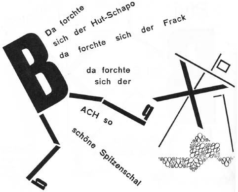
Figure 2.3 Die Scheuche: Märchen by Kurt Schwitters, Kate Steinitz, and Theo Van Doesburg, Apossverlag, 1925.
In 1937, the French writer Lise Deharme, one of the muses of surrealism, published Le Cceur de pic (The Heart of spades or The woodpecker's heart or The pick-axe heart, a play on words because spades in French is “pique,” while “pic” means “woodpecker” as well as “pick”), a book of short poems for children, accompanied by twenty black-and-white still life photographs by Claude Cahun, a prominent figure of the Parisian avant-garde. Their project fascinated the surrealists André Breton, Man Ray, and Robert Desnos. Le Cœur de pic has the distinction of being the only book for children ever published by José Corti, one of France's most prestigious publishing houses. Its founder, José Corticchiato, published the work of his surrealist friends, including André Breton and Paul Éluard, who wrote the preface of Le Cceur de pic. Deharme's “thirty-two poems for children,” which resemble nursery rhymes, are complemented exquisitely by Cahun's strange and disquieting photographs. Heterogeneous objects, such as flowers, leaves, branches, combs, bird's feathers, and feather pens compose striking, often surprising, little tableaux. As in all her work, Cahun uses photography to challenge the objectivity so often associated with this medium. The evocative atmosphere of these tableaux combines fantasy, mystery, humour, even cruelty. Ordinary objects are used to create a mysterious, strange world of the imagination. One of the photographs depicts three shoes on a set of wooden steps leading down into the darkness. Among them is a glass clog decorated with a white flower, evoking reminiscences of Cinderella's glass slipper. The accompanying text is equally enigmatic, beginning and ending with the same haunting lines: “three little shoes / my shirt burns me / three little shoes / climb up the stairs” (43). A tiny doll's hand, severed from its body, appears in a number of the symbolic photographs. Like many of the avant-garde children's books of the early twentieth-century, Le Cœur de pic is not well known, although it was republished in 2004 by Éditions MeMo. The French publisher recognizes the book as an object, one that is intended for all ages. They insist on their website that appreciating “a beautiful object” is not limited to a particular age group and therefore their books are intended to appeal to “young and old alike.”19 It is a belief and ambition shared by all the artists discussed in this chapter.
Breaking New Ground with Book-Objects
In the 1950s, Italian designers, notably Bruno Munari and Enzo Mari, began to use artistic and graphic language to create exceptional works for children, based on their observations of children's learning styles. The multi-talented Italian artist Bruno Munari, whom Picasso called “the new Leonardo,” had a significant influence on the editorial world throughout much of the twentieth-century. A painter, sculptor, designer, maker of toys, and architect, Munari was also an illustrator and author for both children and adults. As a young artist in the 1930s, Munari was involved in the Futurist experiments with bookmaking and creating metal books from tin cans. He illustrated Tullio d'Albisola's verses in the second famous Litolatta book, L'anguria lirica (The lyric watermelon, 1934). Although the text-image relationship is rather conventional, the format of this book-object is revolutionary: from the pages to the binding it is entirely constructed from tin. Munari would never cease to explore and question the conventions of the codex (binding, standard-size pages, fixed sequence, etc.), in order to find new structures for the book.
Munari's interest in children's books began as a result of his personal relationship with his son, whose birth in 1940 inspired his first games and books for children. In 1942, Munari began working as a graphic designer with the Italian publisher Giorgio Einaudi, and in the 1970s he directed Einaudi's picturebook series Tanti bambini, in which his innovative LAlfabetiere (first published in English in 1960 as ABC) was republished.20 The daring innovation that defines all Munari's books is especially evident in those addressed to children. For this reason, his children's books have always drawn the attention of adults. The groundbreaking book Nella notte buia (English trans., In the Darkness of the Night), published in 1956, has taken on cult status and become a landmark in children's publishing, but its appeal is not limited to young readers. Corraini markets Munari's classic Nella nebbia di Milano (1968; English trans., The Circus in the Mist) as a book-object that actively involves the reader, whether “adult or child.” A special place is devoted to Munari by Corraini, which bills itself as a publisher of “both ‘artists’ books and children's books.”
Like Bruno Munari, Enzo Mari was one of the most provocative and influential Italian designers of the latter half of the twentieth-century. He was also a writer, artist, and art theorist, who, sometimes in collaboration with his wife, Iela, produced several very innovative children's books. Each of his creations is the result of careful analysis and research. Mari's theoretical ideas on aesthetics and perception, expressed in books such as Funzione della ricera estetica (Function of esthetic research, 1970), were demonstrated visually in his picturebooks. The designer had already shown his interest in children in 1957 when he created the Sedici animali (Sixteen animals) puzzle for the Italian company Danese, which was founded in Milan at the end of the 1950s, by Bruno Danese and Jacqueline Vodoz, in order to produce unique objects by artist-designers (these were exhibited in their showroomgallery). Danese's meeting with Bruno Munari and Enzo Mari in 1958 led to the production of many innovative creations, which included books as well as games and other objects. Mari's puzzle is composed of sixteen wooden animals that fit into one another like a jigsaw puzzle. This puzzle-object functions as both a toy and a work of art and is appreciated by children as well as adults. A classic icon of twentieth-century design, it has gone through a number of re-editions. The most recent limited reissue sells for 341€, which means that it is most likely bought for the enjoyment of an entire family. When Enzo Mari addresses children, whether in toys, games, or books, his goal is to stimulate their imagination and their creativity; in so doing, he manages also to appeal to adults.21
As in Italy, designers and artists in other European countries were experimenting with the book as an object. The Swiss-German artist Dieter Roth (he later changed his name to Rot), who eventually settled in Iceland, is an extremely diverse artist well-known for his highly influential artists' books, some of which were produced for children. A poet as well as an artist, Roth chose the book as his medium of exploration and he became a pioneer of the modern artists' book. In the mid 1950s, he began deconstructing the formal qualities of conventional books (flat pages, traditional binding, fixed sequence, etc.) and proposing alternative structures. In Bok (Book, 1958), Roth cut holes in the pages and did away with the codex, permitting the reader to organize the pages in any order, while Daily Mirror (1961) was composed of the found material of a newspaper cut into 2 cm squares bound as a 150-page book. One of his best-known books is undoubtedly Literaturwurst (Literature sausage, 1961), which consisted of a sausage skin stuffed with ground up novels and mixed with spices and ingredients from sausage recipes. However, his first, and perhaps most remarkable books, are children's books; with them he began the exploration of alternative book structures that would mark all his work. His first children's book, titled simply Kinderbuch (Children's book), was conceived in 1954 for the son of the German dramatist and concrete poet Claus Bremer. Roth's playful approach to the book was suited to a young audience, but publishing houses were reluctant to take on such innovative books. Roth was unable to find a publisher either in Switzerland or in Denmark, where he moved in 1955, and the first copy of Kinderbuch was discarded. When he moved to Iceland in 1957, Roth, along with the writer Einer Bragi, established the publishing company, forlag ed., which provided him with a new independence and lack of restrictions that were conducive to his innovative book concepts. The first title published was Kinderbuch, a square book containing twenty-eight letterpress cardboard pages, with hand-cut and die-cut holes, that are folded in half and spiral-bound. The innovative book consists of opart-like geometric shapes and patterns in various sizes and colours, and the perforations allow glimpses of patterns and colours from the pages beneath. The colours and shapes give the book a striking harmony and rhythm. Roth deconstructs the standard-size pages of the codex by varying the sizes of the pages. This children's book marked the beginning of Roth's production of artists' books. However, the previous year he had hand produced three copies of another children's book, titled Bilderbuch (Picturebook). It is another square picturebook, which consists of approximately twenty sheets of transparent colour foil with rectangular die-cut holes of various sizes in a springclip folder. Roth's two children's books were published together in 1976 in the collected works he edited with the Stuttgart editor Hansjorg Mayer. As in the case of Bok, the basic titles chosen by Roth for his children's books (Kinderbuch and Bilderbuch) reflect the fact that structural explorations of the book became the subject matter of the book itself. Kinderbuch remains one of the artist's best and most beautiful books.
The Swiss artist Warja Lavater has gained an international reputation with the innovative “imageries” or “folded stories” that she began publishing in the 1960s. She has referred to these mobile works as “radical” books and they seem to herald the trend that Eliza Dresang would describe forty years later in Radical Change: Books for Youth in a Digital Age (1999). In actual fact, Lavater does not consider them to be books at all, but rather “book-objects” or even sculptures. These versatile books can be read as double-page spreads, either in a conventional manner from left to right or from back to front, or they can be hung and read from top to bottom, or they can stand, allowing all the pages to be viewed simultaneously. Lavater created the prototype of her first folded book, Le Petit Chaperon rouge (Little Red Riding Hood) in New York at the end of 1959, in a minuscule format no larger than a stamp. The first tale to be printed, however, was William Tell, a co-publication between the Museum of Modern Art (MoMA) in New York and the Swiss publisher Basilius Presse in 1962. Le Petit Chaperon rouge: une imagerie d'après un conte de Charles Perrault (Little Red Riding Hood: An imagery adapted from a tale by Charles Perrault) would be published by the French publisher Adrien Maeght in Paris in 1965, inaugurating a series of six tales by Charles Perrault (in actual fact, five by Perrault and the Grimms' Snow White) that are undoubtedly her best known works. The final tale in the series, La Belle au bois dormant (Sleeping Beauty), was published in 1982. All of Lavater's imageries are printed from original lithographs by the artist. Special editions of several of these tales were also made for the Museum of Modern Art in New York. Children quickly appropriated the expensive luxury books meant to be sold in museums to art lovers.
Katsumi Komagata describes his discovery of an “old-fashioned bookstore” in Paris, where “some wonderful books” produced by an artist using lithographs were treated as “art objects” by the bookshop owner.22 He is obviously referring to Lavater's books in the Librairie Maeght on rue du Bac. While the Japanese artist was working in the United States, he discovered Munari's books in the shop of the Museum of Modern Art in New York. Like Munari, Komagata began creating books for children when his first child was born. As he explains in the blurb of Blue to Blue, he hoped these books would expand children's imagination. They are nonetheless crossover works and the artist “expect[s] both adults and children to be flexible when they read [his] picture books.”23 The Form and Colours website designed to promote Komagata's books in the United Kingdom (they are not well known in the English-speaking world) markets them as “books for adults and children alike,” which are “as much examples of book art for children as a delight for book lovers.” Komagata's first books for children were the Little Eyes series, ten small wordless books published, in 1990, after the birth of his daughter, Aï. The title is an intentional play on words, as Aï is a homonym of “eye,” but it also means “love” in Japanese. Perhaps the artist also had the homonym “I” in mind, in light of young children's preoccupation with their own person. The small books are made not only for “little eyes,” but also for “little hands,” so they are user-friendly and easy to handle for babies and toddlers. There is no binding; instead, a kind of paper case contains twelve cards, folded in three sections, which have to be opened, adding rhythm and movement to the act of reading because, as the artist reminds us, babies are constantly moving. Komagata considers it the “minimal book, the basis of the future book.” The artist was strongly marked by the books of Munari, whom he calls “the pioneer” in the field of “three dimensional action books.”24 In turn, Munari expressed his admiration for Komagata's work in 1994. Like Munari, the Japanese artist explores new structural formats for the book and new ways of reading it. The Komagata exhibition organized to mark the centenary of Munari's birth clearly indicates that the Japanese artist is the heir to Munari's pedagogical thinking and his playful and creative approach to the book as a three-dimensional object.25
Book-Games
Book-objects that involve a significant element of play are sometimes referred to as book-games. Munari's early books for children fall into the category of what he calls the “libro-gioco.” The books of the historic series he published in 1945, while he was a graphic designer for the publisher Mondadori, are all designated as “animati” (moveable books), and contain a variety of surprises, including flaps, inserts, and cut-outs. Although these devices later became commonplace in picturebooks, they were quite revolutionary at the time. Munari's remarkable books were created, as Komagata's would later be, with his own child in mind, as he had been unable to find anything he felt was suitable for his five-year-old son. In his view, the children's books available at the time were designed to appeal to the adults buying the books rather than the intended readers, so he tested his book projects on his son to ensure that they were effective.26 Under the simple title I libri Munari, seven of the planned series of ten books were published by Mondadori. All the books in the series have the same rectangular dimensions, but the number of pages varies from eight to twenty-four. In many of the books, Munari offers an alternative to the standard-size pages of the conventional book, using pages of different sizes.
The first book in the series, Mai contenti (Never content), was published in English both as What I'd Like to Be (1953) and The Elephant's Wish (1959). Like humans, the animals in Mai contenti are dissatisfied with their lives and dream of being something else. The humorous illustration on the cover depicts a blue fish with large ox horns and a yellow bird as the pupil of its eye. Like several books in the series, Mai contenti can be turned into a guessing game. Each animal's fantasy is revealed when readers lift the flap of a camouflaged insert positioned in the approximate area of the animal's mind. In this ironic, circular story, the elephant, “bored with being a big heavy animal,” dreams he is a bird, but the bird is “bored with flying and singing,” and wants to be a fish, the fish would like to be a lizard, the lizard dreams of being an ox, and the ox would like to be an elephant. The final line reminds the reader that “the elephant dreams too.” Thus Munari brings readers full circle and they can begin the book again.
The cover of the third book takes the form of a door and the title, Toc toc: Chi é? Apri la porta (Knock, knock: Who's there? Open the door; English trans., Who's There? Open the Door), invites the reader to open the door. The reader enters the book to become the protagonist of the story. Munari felt it was fundamental that children's books should not have a protagonist: “In my books the protagonist is the child him/herself… who opens the door in the book Toc toc: Chi e? Apri la porta, a book in which there are many characters…, but where there is no protagonist.”27 A cut-out in the cover forms a peep hole through which a bird peers, as if deciding whether or not to let the reader in. The title's question is repeated throughout the book, and this questioning of readers is a common strategy in Munari's children's books. The book consists of six doublespreads of different coloured paper glued one inside the other in decreasing size, the largest constituting the cover. Page size helps to tell the story, as the pages constitute doors and objects that must be opened to continue the narrative.28 They reveal ever smaller animals until all the pages, or portions of them, are visible simultaneously at the centrefold. On the first doublespread, the giraffe Lucia stands listening to a wooden crate from Verona (in the English translation, the animals are given common English names and the Italian cities are replaced by major European cities). Inside the crate, readers discover a zebra with a trunk from Lugano, which, in turn, contains a lion with a valise, and so forth. In the fourth book, Il prestigiatore verde, large flaps are also opened to reveal the magician Alfonso's surprises, but this time the flaps are not simply rectangular as they were in the previous book. On the first doublespread, the magician asks readers to guess what is inside a piece of furniture. A hexagonal flap opens to reveal the conjurer himself standing on a table. Surprise is an essential element of the playfulness of Munari's book-games.
The fifth book in the series, Storie di tre uccellini (A tale of three little birds; English trans., Tic, Tac, and Toc, 1957), is composed of three books within a book. This format allows Munari to expand the book's fixed structure by creating additional spaces within it. However, the format is intrinsically linked to the content. The mini-books tell the story of three birds who end up in a cage in the frame story of the larger book. On the cover, the yellow, red, and blue birds are depicted together behind bars that bleed off the page. Each minibook bears its own title: “Storia di Ciò” (The Story of Ciò), “Storia de Cià,” and “Storia de Cì.” Cut-outs are also used to show a bird or part of a bird on the pages beneath. In the sixth book, Il venditore di animali (Animals for sale), page size again varies according to the progress of the narrative. On pages of ever decreasing size, the animal salesman tries unsuccessfully to sell a child ever smaller exotic beasts, including a flamingo, a porcupine, an armadillo, a bat, and a millipede, but the child is not interested because of their strange habits. In the end, all the pages are partially visible, as in Who's There? A sheet on the final endpaper opens to reveal the humorous ending: the child would like a roast turkey with French fries. The green string that had joined the salesman's hand to each of the animals now joins a chicken leg to a fork.
The last book to be published in 1945 was Gigi cerca il suo berretto: dove mai l'avrà cacciato? (English trans., Jimmy Has Lost his Cap), which uses a series of inserts with flaps to take the reader on a search for Gigi's lost cap. In 1997, Corraini brought out two previously unpublished titles in the series, Il prestigiatore giallo (English trans., The Yellow Conjurer) and Buona notte a tutti (English trans., Goodnight Everyone), which also contain pages of different sizes and/or inserts of varying sizes with flaps to lift. Under the flaps of Goodnight Everyone, readers discover creatures sleeping: a boy under a cover in bed, a fish behind a rock in an aquarium, and a cat under a pillow on the couch. Munari reserves two surprises at the end: hidden under a large flap, which looks identical to an umbrella hanging from the attic ceiling, is a sleeping bat, while the final small flap reveals a wide-awake moon. Munari's game-books have lost none of their popularity with the children and parents of the digital age. In 2010, a complete set of I libri Munari was listed on Bloomsbury Auctions in Rome for 4000–6000 €.29
In 1965, Enzo Mari published Il gioco delle favole (The fable game), an inventive children's “book-game” that is, in fact, a book to be endlessly constructed, deconstructed, and reconstructed. The book-game consists of six cards that can be interlocked. With the simple elegance so characteristic of his work, the artist represents forty-six simple animals borrowed from old and new fables (lion, fox, bear, wolf, etc.), as well as natural elements (sun, moon, trees, plants, etc.) and some objects (an apple, a boot, etc.) that could be found in classic fairy tales. One illustration portrays a crow sitting in a tree above a fox, immediately evoking La Fontaine's fable “Le corbeau et le renard” (The crow and the fox) or Aesop's version “Corvus et vulpes.” Despite the simplicity of the animals, generally depicted in only one or two colours, they are very expressive thanks to small details, their poses, and even their colour. The artist does not necessarily use the appropriate colour: the previously-mentioned fox is a vivid red, as is a rabbit, while a bright yellow dog barks at a more traditionally coloured rooster. The cards can be put together in a multitude of combinations, stimulating creativity, storytelling, and imaginative play. Children can invent their own fables or entirely different kinds of narratives; the storytelling possibilities are endless. Since Corraini reissued Il gioco delle favole, it has had several reprintings. It is a timeless classic that is considered even today to be one of the most important and ingenious games designed for stimulating creativity.
The various strategies that Munari uses in his own game-books are shared with children, parents, and educators in La favola delle favole (The fairy tale of fairy tales, 1994), a large book-game that allows children to create “their own personal books to treasure and to read when they are great-grandparents.” The paratext clearly indicates that Munari targets this book-game indirectly at a crossover audience of children and future adults. The fifty-seven large pages are held together by two fold back clips, making them completely interchangeable. A preface, signed by Munari, provides some game rules concerning the construction of the book as well as the story. He suggests the use of coloured sheets of paper as a background to drawings done on transparent paper or the creation of “special effects” with cut-outs from the coloured sheets, then provides the materials that children need to physically create their story. La favola delle favole gives readers of all ages new insights into Munari's creative process in general.
Komagata has also published book-games with three-dimensional cards to colour, titled simply Workbooks: Red Series and Green-Yellow Series. In 1999, a special issue of the Japanese magazine Bessatsu Taikyo, titled “Let's play with picture books,” was devoted to unique picturebooks with a ludic element that often involves the format. Komagata's work was given special attention and a previously unpublished book, Are you OK?, was included in the magazine. It is perhaps not surprising that his card-style books in the Little Eyes series were labelled toys, which have a much higher tax rate than books, by a French customs officer when the artist sent them to Lyon for the “1, 2, 3 Komagata” exhibition in 1994. Munari describes the Little Eyes series as “a game for all ages.”30 The ten mini-books in the series are autonomous but combine to create one large book about the world around us. Inspired by Munari's Prelibri, they offer a similar encyclopedia for preschool children. A different theme or concept is introduced in each of the ten books, which constitute as many visual games to accompany the child from birth. The first three books were created when Komagata's daughter was six months old and are designed specifically for babies, whereas the remaining books are intended for slightly older children. His daughter's development and responses to visual stimuli continued to inspire his later works. Komagata thus uses his artistic skills in the service of neurological and socio-cultural development.
Number 1 in the series is appropriately titled First Look (1990) and is designed especially for “babies from 3 months.” For the first six books in the series, Komagata uses the same format: twelve double-folded cards in a cardboard case. Little eyes are presented with a variety of shapes and forms (circles, triangles, squares, etc.) in the first book, the only one entirely in black and white. By using cut-out shapes, Komagata playfully presents the concept of volume. Three of the books deal specifically with colours. Designed as a “second step for babies,” number 2 is an introduction titled Meet Colours. Number 3 invites readersviewers to Play with Colours by offering more complex and surprising interactions between forms and colours. Although the third book is described as “advanced for babies,” the Forms and Colours website informs potential buyers that “this set is great fun for and actually very popular with design-conscious adults.” Number 6 bears the interrogatory title: What Colour? and relates colour to its occurrence in nature (a black bird and red cherries decorate the cover). Number 4, One for Many (1991), examines the world of geometry using colourful forms in different configurations (on the first card a circle divides into two shapes), while number 5, titled 1 to 10, looks at numbers.
In the tradition of Munari, Komagata combines essential themes and concepts with art and play. Whereas books 4–6 are categorized as “learning for children,” the remaining books in the series are billed as “fun for children,” and the emphasis is on the play element. All the previous books adopted the double-folded card format, but Komagata adopts new formats for the subsequent books. In number 7, a theme-oriented book titled The Animals, folds are used in a different manner to create surprising effects that delight readers. The folds in each of the eight cards get increasingly larger, so that the fold behind is partially visible and an image is formed (whale, elephant, chicken with an egg, cloud, etc.). When the card is unfolded, the image changes in surprising ways, presenting a scene with several animals. The thematic approach is continued in number 8, Friends in Nature. By showing the rain following the fine weather in nature, Komagata introduces the cyclic recurrence of natural laws that is a major theme in his work. This book consists of four booklets, in which the picture undergoes subtle changes from page to page, changes which suggest a mini-story.
The last two books in the Little Eyes series, Walk & Look and Go Around (1992), are the most playful. The format requires the child to move in order to “read” these books. Both books consist of four cards which use accordion folding, but in a slightly different manner. In both cases, the cards depict images (themes or subjects) that change depending on the direction from which they are viewed. However, the cards in number 9 are three-sided, with the accordion-folded images on only one side. This format makes the cards easy to stand up and since the double images only occur on the accordionfolded side, the reader is obliged to move only slightly to view the two images. The last book is more complex, as the cards have images on both sides of the accordion folding, thus creating four different scenes on each card, for example, the four seasons or the four stages in a penguin's life. The absence of the two straight sides makes standing the cards more of a challenge. As the title suggests, children are required to “go around” the card to “read” it. The accordion-folded images of the last book are contained in four, long narrow sleeves that constitute a kind of puzzle. When they are put side by side in the correct order, they form the image of a bee near a large flower on one side and on the other a small boy looking up at what is presumably the same bee above his head. In this series, Komagata begins with the simplicity of forms but shows the complexity of their relationships. Readers of all ages will find their certainties questioned and their perceptions modified. On one website, readers are warned that they are expensive: “At $375 for all ten, these may be the kids books you never let the kid touch,”31 while a comment posted July 21, 2008 on Ohdeedoh.com, a website devoted to “home, design, and children,” states: “The books aren't cheap, but they will surely be enjoyed and later cherished as works of art.”
In 1996, Komogata published Motion in his Mini Book series, which also includes the books Shape and Scene. The books in this series take the form of a case containing twelve cards to be viewed on both sides. Motion is inspired by Book 2 of Munari's Prelibri, in which a stylized white man walks, jumps, and exercises. The simple image changes according to the viewer's angle. In Motion, the figure of a gymnast engages in similar movements around the square hole in the centre of the cardspages that constitutes his body. Munari considered the reading of books like his libri illeggibili to be mental gymnastics. In these two books, reading literally becomes a form of gymnastics, as children move about the work viewing and often imitating the figure. The work's innovative creativity was acknowledged when it won special mention at the Bologna International Children's Book Fair in 2000.
Artists' books have played an important role in the development of the concept of ludopedagogy or education through play. Artists like Munari and Komagata realize that artists' books can be playful tools capable of stimulating children's creativity, learning, and development. Play is an essential element of all their books and inseparable from the act of reading. Late in his career, Munari developed workshops for children based on what he called “Giocare con l'arte” (Play with art), leading the first at the Brera museum in Milan in 1976. Mari and Komagata have also led creative workshops for children in several countries. At the Children's Workshop of the Centre Georges Pompidou in 1965, children who were given Warja Lavater's accordion fold book, Le Petit Chaperon rouge not only viewed it and played with it, but actually “play[ed] it like a musical instrument.”32 This invasion of museums, art galleries, and other bastions of high culture by children, for the purpose of creative play, is characteristic of the often irreverent appropriation of high culture by popular culture in contemporary society. Artists' books are finding their way out of museums and into the playground.
Wordless Books
In many artists' books, the narrative is carried more by the images than by the text, which is generally minimal or non-existent. A large number of books that fall into this category are wordless. In 1949, Munari began publishing the famous series of books he called “libri illeggibili” (unreadable books) because they contain no words to read. As an artist, Munari did not really believe they were “unreadable,” but he warns readers who feel that only text can be “read” to expect a different language. His experimentations in these books were intended to discover if “it's possible to use the materials that make up a book (excluding the text) as a visual language…. Or can the book as object communicate something independently of the printed words?”33 The importance of the libri illeggibili to Munari is evident from the fact that he would continue to produce them throughout his lifetime. He proposes an innovative type of communication that involves neither text nor image. These books tell visual stories by means of format, binding, colour, paper, transparencies, perforated or torn pages, and inserts. According to Munari, these visual stories “can only be understood by following the thread of the visual discourse”34 A cotton thread literally carries the thread of the narrative in a number of these innovative books, but the thread never imposes a story, leaving readers free to construct their own narrative. The beginning and ending can occur anywhere in these versatile books. Munari's early libri illeggibili were handmade works in a single copy or very limited editions, but he later adapted his works for mass production. In 1984, Munari designed Libro illeggibile MN 1 especially for Corraini. The popular book is currently in its seventh edition (each edition having had a print run of thousands) and sells for a mere 3.50€. Munari created this libro illeggibile in a small, square format that is meant for tiny hands. A piece of string or, in the case of the most recent edition, a piece of orange thread, binds together the thirty-two small pages of brightly coloured heavy paper cut in a variety of shapes. Like the Libro illeggibile con pagine intercambiabili, created in 1960, this book has “interchangeable pages.” The conventional formal aspects of the book, such as the title page and colophon, are also missing from Munari's “unreadable” books. These book-objects can be displayed in a standing position, adding the dimension of the play of light and shadow on the coloured forms of the pages.
The “books without words” produced by Iela and Enzo Mari in the 1960s have become classics. The couple's graphic innovation revolutionized Italian children's literature. Enzo Mari has received much more critical attention than his wife, Iela, despite the fact that she published several picturebooks on her own in addition to those on which they collaborated. Their first books were conceived for their own children and, like those of Munari and Komagata, they were based on close observations of their young children. The first books they designed, La mela e la farfalla, translated into English as both The Apple and the Moth and The Apple and the Butterfly, and L'uovo e la gallina (English trans., The Chicken and the Egg, 1970), are wordless books which examine nature's circular life cycles. According to Enzo Mari, they conceived a series of six small, square books, in which the images were to clearly correspond to the represented object in appearance and scale. The apple, the butterfly, and the chicken are all on a scale of 1:1. Books were still conventionally rectangular, so the square format was quite unusual at the beginning of the 1960s. The absence of a cover and the spiral binding would allow readers to begin at any point, eliminating the traditional book's idea of a beginning and an ending in order to emphasize the theme of the eternal cycle. The Apple and the Butterfly was published by Bompiani in 1960, and, according to Iela Mari, the books L'uovo e la gallina and Mangia che ti mangio (English trans., Eat and Be Eaten) had already been planned for the same publisher.35 Enzo Mari admits that The Apple and the Moth was a total failure because the small book was lost among the large, coloured covers of the fairy-tale volumes that adults favoured at the time. In order to present them to other publishers, the two picturebooks were given a more conventional, larger format with a hard cover that gave them a beginning and an ending.36 Both books use striking visual graphics to tell circular stories of the cycle of birth, growth, and reproduction. Inside a red apple, an egg gives birth to a caterpillar which, in turn, burrows out and becomes a chrysalis and finally a butterfly in The Apple and the Butterfly. Then the whole cycle begins again. The Chicken and the Egg depicts a chicken laying an egg, the hatching of the egg, and the development of the chick, which, in turn, becomes a chicken. Unusual perspectives are offered: only the lower part of the body and legs of the chicken are visible as the egg is laid and one doublespread depicts the yellow and white interior of the egg on a shiny black background. These children's books demonstrate how Enzo Mari works with form in all his designs: everything superfluous is eliminated in a desire to achieve simplicity and to express the essence.
The picturebooks that Iela Mari published on her own share the same qualities as those created in collaboration with her husband. In her wordless picturebooks, the narrative is structured by changing forms and the cycles of nature. The first to be published, in 1967, was Il palloncino rosso, which appeared in English in 1969 as The Magic Balloon but was also published subsequently under the more accurate title The Red Balloon. In this surprising book, representational forms are continuously transformed from one page to the next in what Carla Poesio refers to as “a wordless poetic narrative.”37 A little boy inflates a red balloon, which takes off into the sky and attaches itself to a branch, where it becomes a red apple, until it falls to the ground and breaks apart, taking the shape of a large red butterfly, and then landing on a stem where it turns into a red flower. The hand of the same little boy picks up the flower which assumes the shape of an umbrella as storm clouds threaten. The final, striking illustration depicts the umbrella from above, so that readers glimpse only the boy's two little feet walking home. The metamorphosis loses some of its impact in the later, smaller edition of the book. The more extensive white space of the original edition highlights the fine line of the china ink and the transformations of the red object. The Red Balloon is easily understood by small children, but it is thought-provoking for adults as well. Iela Mari continues to explore the cycles of nature in L'albero (1972; English trans., The Tree and The Tree and the Seasons), in which the same scene is used to depict the silent beauty of the changing seasons. In Eat and Be Eaten, finally published in 1980, each spread depicts a predator pursuing its prey. With each page turn, the prey in turn becomes a predator. The Emme catalogue describes Mari's book as “a mortal Ring Around the Rosy of hunger and satiety….” The last children's title she published, Il paesaggio infinito (The infinite landscape, 1988), consists of sixteen eye-catching cards—depicting animals in a shifting landscape—that can be mixed and matched to create an ever changing narrative. Although Iela and Enzo Mari's picturebooks have a limited range of colours, the details and precision of the drawing are outstanding. They reproduce with remarkable accuracy the pattern on a butterfly's wings, the blossom on an apple tree, or the rough texture of a chicken's foot. The simplicity of line and purity of form combined with the playfulness of the artists' images make their books unique and timeless. Their experimentations on communication through the image resulted in wordless picturebooks that stimulate the imagination of readers of all ages.
Warja Lavater also began experimenting with visual communication in the late 1950s. Like Munari, Lavater was influenced by the Bauhaus movement. At a very early stage, she felt that the combination of codes and signs linked to forms and colours could create a kind of new language that would no longer be verbal, but visual. The artist refers to the visual code of her imageries as “pictorial language” or “pictograms.”38 The only text is the legend on the flyleaf at the beginning, which explains the elementary code based on colours and forms. Guided by the symbols, readers construct their own version of the story. According to Lavater, her pictorial language has its origins in traffic signals, whose efficiency as a visual code had struck the artist during her first visit to New York. While this influence is evident in many of her works, it is most clearly demonstrated in Die Rose und der Laubfrosch: eine Fabel (The rose and the tree frog: a fable), a charming little story about traffic lights which Lavater wrote to prevent her two-and-a-half-year-old grandson from crossing the street on a red light. The fable, which the artist considers to be her only “children's book,”39 was published in 1978 by a different editor from her other works.
Lavater's visual code remains the simplest and most effective in the first work that she conceived using this technique. In Le Petit Chaperon rouge, there are only eight icons and they are limited to dots (Little Red Riding Hood is symbolized by a red dot and the wolf by a black dot), with the exception of one rectangle and a squared “U” shape for the bed. Readers easily follow the movements of the little red protagonist as she moves from scene to scene. In later books, a proliferation of more elaborate icons results in a more complex visual code that is less easily decoded without referring closely to the legend. Even William Tell, which was published prior to Le Petit Chaperon rouge although it was created later, is already more complex. Some characters and motifs retain the earlier simplicity: William Tell is a blue dot, his son is a smaller blue dot, Gessler's hat is a red triangle, and the forest is once again a group of green dots. However, the Tyrant Gessler, the knights, and the soldiers are all represented by symbols that combine multiple shapes. The later Perrault tales are also more complicated. In Blanche-Neige (1974), Snow White is a black, white, and red dot that represents her three distinguishing physical features, the evil stepmother is a yellow dot with a black centre that symbolizes her black heart, and the dwarfs are red diamonds outlined in yellow as if they exude a golden aura.40 In Le Petit Poucet (1979), Little Thumbling's brothers are simple blue dots, but the protagonist is distinguished by a purple centre, which no doubt denotes his intelligence, and all are encircled by purple shapes symbolizing their bonnets. In contrast, Lavater did not deem it necessary to represent the distinctive headgear of Little Red Riding Hood in the earlier tale, even though it is an inherent part of her name. The symbols are even more diverse and complicated in Cendrillon, published in 1976. Cinderella is an elegant silver dot ringed with black and blue, and superposed with two matching blue ovals that represent her slippers. In the narrative itself, the icon is sometimes completely splattered with black to represent the cinders of the hearth. The elaborate nature of the visual language of this tale is well illustrated by the scene portraying Cinderella's arrival at the ball. In a colourful, fancy swirl of orange gown, the heroine enters the ballroom, where the prince, a richly decorated triangle with protruding swirls that evoke a moustache, is surrounded by his dot-guests and flanked by the two stepsisters, whose circular icons are now laden with gold ornaments. The king's small triangular servants and soldiers stand at attention, while the fancy, gold-crowned dots of the king and queen occupy a podium, and the simple dots of the proletariat gather outside the line that represents the palace walls.

Figure 2.4 Blanche Neige: une imagerie d'après le conte by Warja Lavater, 1974, copyright © Warja Lavater/SODRAC (2011).

Figure 2.5 Blanche Neige: une imagerie d'après le conte by Warja Lavater, 1974, copyright © Warja Lavater/SODRAC (2011).
Lavater seemed to feel that her visual code was not entirely adequate to tell Perrault's least known tale. La fable du hasard (The fable of fate), based on Perrault's “Les souhaits ridicules” (The foolish wishes, 1968) as retold by the Brothers Grimm in “The Poor Man and the Rich Man,” is the only book in the series that has any text beyond the legend. A handwritten foreword by the author appears on the first double-page spread. Even the narrative itself has some text, as the final two-page fold contains Perrault's moral, but the handwritten text is part of the image. The commas that separate the string of adjectives in the second line are replaced by a series of dots that trail down the page like cosmic dust and blend in with the other dots of the image. The text is necessitated in part by the much more complicated pictograms. The poor man and his wife are charmingly portrayed as two complementary green swirls outlined in yellow, which seem to hold hands, or rather tails. The rich man and his wife, on the other hand, are appropriately represented by two dissimilar, unequal, and detached vertical jagged lines. The amount of text is greatly increased in the legend, where detailed explanations are given along with the interpretation of the symbol. All of the icons, with the exception of those representing “serenity” and the descriptive “a good meal for each day,” are accompanied by at least one line of explanatory text. The symbol for the saddle is followed by a text of six lines, which includes the rich man's second wish that sticks his wife on the saddle. His other wishes are given beside the symbols for horse and rain, the latter being one of the few self-explanatory symbols. The icon for the sun needs no commentary, but the artist includes a complex idea from the Grimms' tale: “it burns the hard of heart, but it shines for the pure of heart.” Such abstract notions cannot easily be rendered visually, but the meaning of the penultimate double-page fold of the couple basking in the rays of a golden sun should be evident to most readers. The two swirls that represent the couple even seem to smile happily at each other (the pink shading around them gives them a rosy, blissful glow). The rather cluttered legend of this tale contrasts sharply with the simple legend of the first tale, and its heavy reliance on text makes this book less accessible to young children.
In some of Lavater's “Folded Stories,” which will be discussed in a subsequent section, the artist includes a summary that covers the entire back of the concertina folding rather than complicating the legend. This is the case for two tales published in 1965: Hans im Glück (Lucky Jack, Folded Story 14, 1965) and The Ugly Duckling (Folded Story 15, 1965), where the tale is told briefly in three languages (German, English, and French) on three folds each. In these books, the legend is in black and white even though the pictorial narrative that follows is in colour. Although an “old woman” figures in the legend of both tales, Lavater does not retain the same symbol but varies it slightly. While the majority of the symbols are quite abstract, some are more figurative, notably the dog's teeth in The Ugly Duckling. A few of the symbols lie midway between, as in the case of the icon for the old woman, which resembles a female figure kneeling with rounded back, bowed head, and breasts. The ugly duckling is a thick vertical line with a rounded top, to which two curlicues are added as wings to represent the beautiful swan. Although the swan is quite stylized in the black-and-white legend, it is much more figurative in the narrative itself, which is rendered in colour. The grey stick with a touch of orange for the beak gradually changes colour and shape throughout the story. A great deal of thought obviously goes into even the most abstract symbols. While the mother duck is represented by an almost complete circle, the pretty ducklings are a neat half circle, and the wild ducks are an untamed version of the half circle with sides that curve up in an unruly manner.
Lavater manages to infuse her visual retellings with suspense, drama, and energy. The impression of movement is particularly striking in La fable du hasard, where the very first image draws viewers into a spiral as they follow a wandering Fortune, disguised as a poor beggar, first to the house of the discordant rich couple who turn him away, and then to the house of the harmonious poor couple who immediately bid him enter. A series of very dynamic doublefolds depict the rich man jumping on his horse and riding after Fortune in ever larger loops that evocatively imitate the galloping horse, until he overtakes him and makes his three foolish wishes. The colourful, dramatic illustration of the bloody scene in which the huntsman arrives to rescue Little Red Riding Hood and her grandmother are reminiscent of a smouldering volcano about to erupt, whereas a similar scene in Le Petit Poucet evokes an actual eruption. In both cases, the human contents of the villain's stomach are released unharmed in a spectacular graphic display of dazzling colour and dynamic movement. As the artist herself writes in the foreword to La fable du hasard, these classic tales are retold in a “new language,” a “visual language” that gives “complete freedom of interpretation” to the reader.
The French artist Jean Ache (pseudonym of Jean Huet) used a very similar visual code, which he called abstraction narrative, to recast several fairy tales in the 1970s. The geometrical shapes he employs to tell “Le Petit Chaperon Rouge” and “Cendrillon” in Le monde des ronds et des carres (The world of circles and squares), published in Japan in 1975, are strikingly similar to those used by Lavater. He also includes a legend at the beginning of the tale in both Japanese and French. Little Red Riding Hood is once again a red (or slightly orange) dot or “circle,” but the wolf is a black square. The wolf's symbol is somewhat complex, as it is divided into two triangular shapes by a jagged white line that represents its pointed teeth. Ache's geometric forms are not limited to squares and circles, as the volume's title suggests, and he also introduces into his narrative icons that do not appear in the legend. Ache's version of “Little Red Riding Hood” did not appear until ten years after Lavater's, but his “Cinderella” was published a year before hers. Further, he had already used the same visual code to retell “Le Petit Poucet” and “La Belle au bois dormant” in a collection of fables and tales titled Des carres et des ronds, published in Paris in 1974. Although the visual codes used by the two artists are quite similar, the works themselves are very different. Ache's books have a very conventional picturebook format and the visual retelling is supported by a verbal narrative. The tale is told briefly on the verso in both Japanese and French, while the illustrations appear on the recto. The illustrations also have captions that echo an important line from the text on the facing page.
Bruno Munari's libri illeggibili were not his only wordless books. The Prelibri, which will be discussed in the next section, were also remarkable wordless books published with very young children in mind. As we have seen, they had a profound influence on Katsumi Komagata's Little Eyes series. The Japanese artist designed the ten small wordless books in order to communicate with the “little eyes” of his baby daughter. He describes these books as “tools of visual communication” designed to “promote… dialogue” between “adult and child.”41 Many of Komagata's other works are also wordless, and even when they have text it is minimal.
Material-Books
Artists who address a young audience immediately perceive that young children have a very sensorial and physical relationship with books. The act of “reading” can involve all the senses. For most of the artists considered in this chapter, the material and the feel of a book are as important as the content and the graphic element. Munari's experimentations with the libro illeggibile were intended to discover if it is possible to “communicate visually and tactilely” using only “the materials from which a book is made” (paper, format, binding, sequencing of pages, etc.). Munari points out that paper is conventionally used “to support the text and illustrations,” rather than as a means of communication.42 His use of different materials was even more audacious in his books intended for children. In 1980, when the artist was more than seventy, he presented his celebrated series Iprelibri (The pre-books) at the Bologna Book Fair and published them with Danese. In 2002, Corraini reissued the books (still available at 120€) with a great deal of difficulty, as the materials used in 1980 were no longer available. The Prelibri are twelve small square books composed of a wide range of materials, including wood, paper, cardboard, plastic, and fabrics such as felt and für. Even the bindings are constructed of a variety of materials, including twine, string, metal, and plastic. Packaged together in a case as a book of books, they have a very small format that allows them to fit easily into the hands of three-year-old children. Like the libro illegibile, readers can begin anywhere and go “forward or backward.”43 For that matter, they can also be read upside down by toddlers who cannot distinguish either the front from the back or the top from the bottom. As the title indicates, they are intended to be a child's very first books, introducing toddlers who do not yet read to the object known as the “book.” For that reason, each one is titled simply Libro (Book), and numbered 1 to 12. Munari invites small children and their parents to experience books not just with their eyes, but with all their senses. The simple narrative in these multisensory books is visual, tactile, and even auditory, as in the case of Book 9, whose wooden pages provide an acoustic dimension as the pages are turned.44
The use of diverse materials and inserts creates delightful visual and tactile surprises for the young reader of the Prelibri. A red thread runs through Book 1, a button and a hole are found in the middle of fabric pages in Book 8, and a für tail is hidden between the pages of Book 12. The red thread that runs through Book 1 demonstrates that the artist's techniques are similar whether he is creating books for toddlers or for adults. Adult readers will immediately be reminded of some of Munari's libri illeggibili. The Prelibri are the result of many years of experimentation with the book as an object. In Munari's view, all books are objects and surprise should be an integral element of every book. It was the lesson he hoped to teach young children with his Prelibri.
Munari began his experimentations with materials in children's books early in his career. In 1940, he conceived the “book-game” Il merlo ha perso il becco (English trans., The Blackbird Has Lost Its Beak), a visual interpretation of a popular Italian children's song. The work was not published, however, until 1987, by Danese. In 2001, it was reissued by Corraini in a bilingual Italian and English edition. The book is accompanied by a musical cassette which contains, in addition to “Il merlo ha perso il becco,” three other songs about birds in three different languages. Although it is categorized as a “book-game,” it is being dealt with in this section because Munari uses the technique of serigraphy, that is, silk-screen printing on transparent plastic sheets. This process allows the construction and deconstruction of the blackbird, following the words and rhythm of the popular song. The words of the song are printed in a white block on each recto. On the first page, the blackbird's beak appears alone on the recto. When the plastic page is turned, the beak is, of course, now visible on the verso, while an eye appears on the recto. The next verso depicts the beak and the eye (to which a tiny black pupil has been added). The rectos continue to add body parts (a wing and one leg, the other leg, tail, head, body, etc.), until the entire blackbird is represented on the last verso. In Munari's free interpretation of the popular song, the blackbird even loses some of its internal organs. The transparency of the pages allows the artist to create a three dimensional effect: when the lungs are superimposed on the body, the red of the heart on the page below can be seen before it is actually added. Since the book can also be read from back to front, readers can reverse the game and deconstruct the blackbird. In his preface, Giovanni Belgrano points out that Munari's book has assumed new meaning in light of today's ecological problems: the blackbird that gradually loses all its body parts can be seen to represent nature under threat. Book printing conventions are challenged in Munari's innovative book. A transcription of the music by Davide Mosconi appears on the copyright page. Paratextual information (a preface as well as publisher's details) is printed on a single sheet of yellow paper, while Danese's name and logo at the top is folded to form a tag for the plastic bag in which the book and cassette are packaged. This so-called “book-game” is thus packaged more like a toy than a book.
Munari and other artists have achieved a variety of interesting effects through the use of semi-transparent or translucent paper rather than clear plastic sheets. Those that also include cut-outs will be examined in the next section. Katsumi Komagata's Found It!, a bilingual book published in both Japanese and English in 2002, is entirely composed of heavy, translucent pages that are painted on every other doublespread, so that on the alternating doublespreads readers see only a muted mirror image or echo of what is clearly perceived on the other side. When the illustration of a grasshopper is seen through the paper from the next doublespread, the reversed grasshopper is now superposed on a leaf on the verso. The use of translucent paper makes it possible for the artist to create layered sequences that give the book dimensionality. The degree of translucence in Found It! allows each sheet to be read over several others, resulting in an ever-shifting spatial composition. Komagata uses the translucent paper to create the surprise element that is so important in all his work, a lesson he learned from Munari. Found It! is structured entirely around the final, climactic surprise: a four-leaf clover that is completely hidden by a yellow butterfly of exactly the same shape on the previous page. The yellow butterfly seems to transform into the green fourleaf clover. The triumphant words “found it!” on the last page of the otherwise wordless story reveal that the entire narrative has been a quest for the elusive four-leaf clover. In addition to the visual possibilities offered by its translucency, the heavy, smooth paper provides an unusual tactile sensation. Komagata also uses the paper to question publishing conventions. Found It! has a heavy paper dust jacket that can be removed to reveal a plain white paper cover with absolutely no text on either the covers or spine.
While Munari and Komagata use semi-transparent pages to create realistic effects of daylight, water, fog, mist, and so forth, Lavater employs translucent paper or transparencies in some of her books to represent a spiritual or supernatural dimension. Le miracle des roses (The miracle of the roses, 1986), based on the legend of Saint Roseline, tells the story of a pious young woman in the Middle Ages who secretly fed the poor with food from her father's castle. The miracle occurs one January day when she unexpectedly runs into her father with her apron full of bread. When she opens her arms, she discovers, much to her amazement, that her apron is full of roses. The thirty-nine-page imagerie can also be read with a transparency that adds haloes of light or architectural details to the illustrations. In the 1990s, Lavater began a new series of “imageries en transparence” (imageries in transparency) adapted from Japanese folktales. As in Le miracle des roses, the legend appears in four languages, and a summary of the traditional tale is also given in each of the languages except Japanese.
The series was inaugurated in 1991 with Ourasima, the tale of a poor young fisherman who is rewarded with a magic shrine that grants his every wish for releasing a fish which is, in fact, the daughter of the King of All Seas. In these books created in the final years of her career, Lavater has a very developed sense of the overall composition of the book-object. Unlike her earlier works, the artist uses the entire book to tell the visual narrative. Ourasima and the other Japanese tales have the same format as the Perrault tales, also published by Adrien Maeght, but the back side of the concertina folding is no longer left blank. Lavater had used the back side of some of her earlier tales, such as Hans im Glick and The Ugly Duckling, but only to offer a verbal telling of the story. In Ourasima, one doublefold is dedicated to the brief verbal text, but the remaining folds of the back offer a pictorial representation of the sea that is the tale's setting. On a few folds, the reverse side even seems to reflect events taking place on the front side. For example, in the stylized sea of blue and white wavy lines on the third doublefold, readers see the princess (a white circle outlined in blue) being caught in the large green fish net that the young fisherman (a green diamond) casts out over a pale blue sea from his small boat. On the back of the same fold, a white dot in the blue sea corresponds to the luminous fish-princess that Ourasima releases. Lavater works with the translucence of the paper to add a mysterious luminosity to the tale's supernatural elements. Readers can only appreciate the story fully by playing with the light shining through the folds. The strange radiance of the fish caught in Ourasima's net indicates the true identity of the magical princess.
The blurb suggests that Lavater's abstract imagery reaches a new level of perfection with Ourasima due to simpler and more expressive coding. However, even the basic geometric forms, such as the diamond of Ourasima or the circle of the princess, are made more complex by the addition of little stringlike appendages that become arms to cast a net or to hand over a shrine. Some symbols are less abstract and resemble the actual object, as in the case of the fisherman's net or the turtle that carries Ourasima to the underwater kingdom. After the protagonist's return, the folds become quite busy, as the symbols are multiplied to represent the villagers whose wishes Ourasima grants, the delicacies with which they are showered, and the guards who pry open the shrine when they realize it can produce gold (the one condition imposed by the princess was that the shrine must remain closed). In a whirl of colour and supernatural energy, the King of All Seas buries everything and everyone in sand. The final, harmonious fold shows only rolling sand dunes against a dark blue that matches the deep blue of the sea on the reverse side of the folds, and the figure of Ourasima, who has floated to the top of the gold-coloured sand. At the end of the tale, Ourasima has undergone a strange transformation: the diamond shape of the poor fisherman, who alone survived the sand's devastation, is no longer solid green but has become a luminous white. Harmony has once again been restored to the universe.
Ourasima was followed by Tanabata (1994), inspired by a Japanese legend about the star-crossed lovers the Weaving Princess Orihime (Vega), daughter of the Sky King, and the cow herd Hikoboshi (Altair), who are separated by the Milky Way and allowed to meet only once a year on the seventh day of the seventh lunar month, a festival that is still celebrated in Japan. In this book, the translucent paper aptly evokes the light of these heavenly bodies. In 1997, Lavater published Kaguyahime, based on the oldest Japanese folktale, “The Tale of the Bamboo Cutter.” When a peasant discovers a beautiful little girl, Kaguyahime (Princesse Lumineuse), in a mysterious, shining stalk of bamboo in a bamboo forest, he adopts her. She grows up to become an extraordinarily beautiful young woman who imposes impossible tasks on her many suitors. The radiantly beautiful young woman turns out to be a moon princess, who must return to her own people. As in the other Japanese tales, the translucent paper of this imagerie allows the artist to give the pictorial narrative a luminous, otherworldly quality.
Munari uses fabrics in some of his Prelibri, but a number of artists create books entirely of fabric. Today many fabric books are created for very young children, but they are generally mass-produced books of very little interest. When her son was born, the French artist Louise-Marie Cumont began creating wordless fabric books as well as what she terms “tapis de lecture” (reading rugs), deconstructed books in which the pages are all visible at once. L'homme au carre (The squared man, 1992) is a small fabric book with a requisite square format. The sand-coloured border around the white pages creates the effect of a window through which readers peer. This book uses the same technique as Istvan Banyai's Zoom, but in reverse, recreating the effect of a camera lens gradually zooming in and bringing the reader ever closer to the small red square seen in the distance on the first page. The tiny red square turns out to be the body of a stylized human figure, which comes closer and closer until, in the final image, the red square fills the frame completely. Cumont's book immediately evokes the red square in Lissitzky's About Two Squares and the artist admits that her small red square seems to be a reference to Malevitch, although it is not of a revolutionary nature. She is particularly interested in Malevitch's reflection on the human figure in painting, which allowed him to turn the human face into a black square on a white background. Cumont, who adopted the “warm” medium of fabric on the birth of her son, stresses its close link to humanity because it is “the first material” to come between the mother's body and that of the child, a kind of “second skin.” Fabric has “a memory” and “lives like a language,” according to Cumont, whose “palette” is made up of fabrics from Europe and Asia that coexist in her books regardless of the period or country.45 The themes of her books are taken from the repertoire of important existential questions, as well as everyday situations. On the linen pages of Les voitures (The automobiles), created in 1995, scenes from the “real” life of adults on the rectos are mirrored on the versos by scenes from the imaginary life of children, for example, a man pushes a red car on the recto, while a boy plays with his red toy car on the verso. Cumont is not offering one narrative for children and another for adults, however, but a story that brings the two together.
The Greek artist Ianna Andreadis also creates fabric books. Le petit livre des couleurs (The little book of colours, 1997) is a small square book in which the different sized pieces of fabric compose tableaux that change as the pages are turned. Although Andreadis uses fabric rather than construction paper, the structure of the book is reminiscent of Munari's Libro illegibile MN 1. Fabric books by artists are generally unique pieces or produced in very small numbers. Fifty numbered copies of Le petit livre des couleurs were produced, while the twelve-page book of Andreadis's Villes (Cities, 2003) was limited to twenty copies. Cumont creates her works on request. The fabric books by both Andreadis and Cumont are distributed by Les Trois Ourses in Paris. Artists' fabric books tend to be rather expensive books. While the price of Cumont's L'homme au carre is only available on request, Les voitures sells for 1,000 €. Andreadis's books are somewhat more modest in price, ranging from 80–170 €. These artists explore the use of fabric materials to communicate both visually and tactilely in new ways.
Cut-Out Books
Material also plays a fundamental role in cut-out books, but the material used is almost exclusively paper, and paper-cutting techniques help to tell the story. In Munari's groundbreaking book Nella notte buia (1956; English trans., In the Darkness of the Night), the narrative is carried more by the different types of paper and the perforations, inserts, and flaps than by the text, which is minimal. The book was produced thanks to Giuseppe Muggini, a printer and editor in Milan, who supervised its hand printing on carefully selected paper. In the Darkness of the Night was the result of Munari's experiments with the libri illeggibili and the desire to communicate with different types of paper. The pages are composed of three very different papers, each marking an abrupt change in the narrative and thus dividing it into distinct chapters of sixteen pages each. In the company of a young cat, the reader is plunged into the dark night by the initial pages of black construction paper, on which silhouettes of characters and objects are printed in blue. On the first recto, the cat looks beyond the right hand edge of the page and onto the next page, as if he were peering around a corner. This curious detail goes unnoticed by many adults, according to Munari, who claims that “children are extraordinarily observant, and often notice things that grownups do not.”46 The dark night is penetrated by a golden glow visible through a small, round hole that perforates each of the black pages toward the top. In the first chapter, the vague narrative focuses on the mysterious star-like light that men in top hats (reminiscent of circus acrobats) attempt to reach by precariously assembling ladders one on top of the other. On the final black page, they tumble to the ground, losing their top hats, without having identified the source of the light that shines through from the underlying page.
The second chapter is told on semi-transparent pages that render the light of a new day. Blades of green grass, as well as various diurnal insects, have been printed on the rectos of the translucent pages, while the versos offer the muted mirror image of the same scene. Komagata was obviously strongly influenced by these pages when he created Found It! The readerviewer perceives the images of several translucent pages simultaneously, creating a sense of three-dimensional space. The source of the yellow light that pierces the darkness turns out to be the light of a firefly, which Munari humorously depicts as a lantern attached to the underside of the insect. Readers-viewers follow the firefly into the meadow, where the insect seeks a place to sleep during the daylight hours. Several ants eventually lead readers into the third part of the book, which is composed of pages of grey-beige recycled wrapping paper—full of impurities—that represents the earth. Ragged-edged holes of varying sizes and shapes perforate these pages to effectively evoke a cave. Readers are invited to crawl through the cave and each hole offers new discoveries printed in black: stalactites and stalagmites, prehistoric rock art painted on the wallspages, and the remains of an antediluvian animal which, according to the narrator's humorous claim, died after eating “a fossilized fish.” The artist's picture of the prehistoric animal shows a large museum-quality fish fossil lying in the area of the stomach. These pages also include inserts which offer further discoveries. Munari's sense of humour is once again evident when the reader lifts the flap of a pirate chest to find, not treasure, but items which seem to belong in a garbage pail: an old boot, a fish skeleton, a bone, and so forth. An underground river is evoked by the insertion of four small translucent white pages painted with green fish. In the cave, readers do not know if it is day or night, but when they reach the exit, black sky can be seen through the final hole.
A small sheet of yellow paper glued to the endpaper (it is actually an insert with information on the author) can be glimpsed through the holes in the last black page, creating the fireflies that once again illuminate the night sky. The cat sits on the back endpaper ready to begin its nightly prowl, bringing the story full circle and portraying in a striking manner the cyclic rhythm of night and day. As we shall see in the next chapter, the cyclic pattern found in so many artists' books is a widely used strategy in contemporary wordless picturebooks. According to the author, this remarkable book was originally turned down by several publishers because it “did not have any text.”47 Valentino Bompiani pronounced it “cute,” one of Munari's usual strange creations, but he refused to take it on, adding: “But this is not a book, where is the text?”48 In actual fact, the book is not entirely wordless. Several different voices narrate parts of the story: the cat's voice is heard in speech bubbles in the first chapter, while a first person plural voice encourages readers to follow the firefly into the meadow or wonders how long they have been in the mysterious cave.
The techniques used to draw readers into Munari's classic Nella nebbia di Milano (In the fog of Milan, 1968; English trans., The Circus in the Mist) resemble those of In the Darkness of the Night. Between heavy grey-brown endpapers, readers journey through the milky opacity of Milan's fog, which is evoked very effectively by translucent white pages on which figures and objects are printed in black, except for the few, sometimes muted, green lights. In his reflections on the libro illeggibile in Da cosa nasce cosa, Munari cites the example of a quire of the shiny paper used by architects and engineers, which “has a sense of fog about it: turning those pages is like entering fog,” and he points out that he used this effect in Nella nebbia di Milano.49 Through the fog, readers gradually begin to glimpse the colourful, exciting world of the circus, created on bright-coloured craft paper with clever cutouts. Every page in the circus section contains holes or partial holes, except the page depicting a close-up of a sad-looking lion in a cage (perhaps a hole would have allowed him to escape). In six superposed pages, increasingly smaller holes are cut to form an ever-changing variety of circular objects, including a target, a railway sign, a gong, and the moon. Readers eventually leave the vivid pages of the circus to head home through the park in the fog of further translucent pages. Munari uses this picturebook as an example of the child-reader as protagonist in his work: “In my books the protagonist is the child himself who looks at, who enters into the fog.”50 The semi-transparent pages in Nella nebbia di Milano allow Munari to create very ingenious details. The text that accompanies the bird printed on the first page tells readers “birds fly a little in the fog,” but when the page is turned, the same bird seen from the reverse side is less distinct and flies in the opposite direction, as the text tells us they “quickly return.” The majority of the translucent pages are printed on both front and back, creating very interesting possibilities beyond the simple, reversed mirror image effect and the changes due to the underlying pages. Whereas the tree on the final page is painted on the recto, the bird and the bush are painted on the verso, giving the latter a muted, misty effect when viewed from the recto, but a sharper appearance from the verso, as if the fog has shifted, improving visibility. This technique allows Munari to add humorous little surprises. For example, the people on the bus, who are seen from the back on the recto on which they are painted, become more ghost-like when the page is turned, an effect that is heightened by the addition of black eyes that pierce the fog and stare eerily at the reader.
Komagata has also engaged in very innovative experimentations with paper, which plays an essential role in all his works. The word “paper” even finds its way into the title of his famous Paper Picture Book Series (1994), which, according to the author's blurb in Blue to Blue, resulted from his “fortunate encounter with a paper company.” The sumptuous books in the series are made “especially for lovers of paper” and are marketed on the One Stroke website as being suitable “for interior design,” as well as for children. Paradoxically, these books are not in the holdings of the International Institute for Children's Literature, Osaka because of the potential risk of paper cuts. The quality of the paper is truly outstanding and the effects are breath-taking. The paper of each page is different, offering a wide variety of colours and textures which are largely responsible for carrying the narrative (the text is minimal). Komagata's skillful use of paper texture to assist the narrative is perhaps best illustrated by a scene in which small salmon follow a black whale northward through an icy, frozen sea strikingly evoked by shiny, textured white paper. The importance of colour in the three books is obvious from the choice of titles. Although each cover is a solid colour, a cut-out allows readers a glimpse of the range of colours and shades of the graduated pages inside. The three round holes cut diagonally in the cover of Yellow to Red reveal most of the graduated coloured pages of the book, which, as the title suggests, range in colour from yellow to red. The beautiful array of papers and colours can be fully appreciated when the cover is opened. In Green to Green, four square cut-outs form a window into the book, where the reader catches a glimpse of the graduated green and salmon pages cut to form a mountain against a blue sky. The single hole in the cover of Blue to Blue, the final book in the series, resembles a porthole through which the reader views the sea, formed by graduated pages cut in wave shapes and superposed with a translucent full page that creates the effect of mist or fog.
Only two or three pages in the entire book are full pages. The blue and white paper chosen for the final full page in both Green to Green and Blue to Blue creates the blue sky with wispy white clouds that forms the backdrop of all the other pages. The remaining pages in the books have all been reduced by some form of cutting. Even the few full pages generally have cut-outs. The paper cutting techniques used in the last book of the series are particularly masterful. All the graduated pages between the first and last full pages are cut to form waves, creating a turbulent sea in various shades of blue and a little, foamy white. Blue to Blue tells the story of the life cycle of salmon. The baby salmon that hatch from the eggs at the beginning of the story are represented by small cut-outs in the blue paper and their eyes are formed by tiny red dots on the page underneath. The cut-outs become larger as the salmon grow. Eventually they are no longer represented by a single hole cut in the paper, but by more elaborate cuts, while the eye is now a hole cut in the paper rather than a dot drawn on the page beneath. Some illustrations are formed by a complex superposition of multiple intricately cut pages, as in the case of the growing salmon swimming over rocks and through drifting seaweed. This scene is created by a small brown page cut to represent the rocky sea bed superposed on a green page cut to depict seaweed, behind which a blue page with cut-outs of the growing salmon is only partially visible against the waves of the sea and the sky above. When the small brown and green pages are turned, the two visible salmon become an entire school of fish.
All the books in the series contain die-cut shapes of animals (in a wide range of coloured paper) which can be viewed against the recto or the verso. The chick protagonist of Yellow to Red, who wakes up alone one morning, encounters several different species of birds in its search for its mother. When readers of Green to Green open the book, they immediately discover the cut-out of the head of a black cat, who stares up at a window cut in the first full page to match exactly the window in the cover. Through the eyes of a cat indoors peering out, readers now glimpse the same scene that was visible through the window in the cover. Komagata's domesticated cat protagonist jumps through the window and discovers the wild animals of the field, forest, and mountain (squirrel, monkey, lizard, etc.). Toward the beginning of Blue to Blue, the back half of a large, grey salmon swims into the gutter, the numerous cuts in the tail creating the effect of movement as it lays its eggs in the river. To the delight of readers, the front half of the salmon suddenly swims out of the gutter toward the end of the book. Sometimes a double or triple insert increases the viewing possibilities. When the salmon go in search of the parents they do not know, they encounter a swan with her ducklings, which leads them to wonder where their moms and dads are. The white swan and her two brown ducklings are separate cut-outs which offer several viewing possibilities: the ducklings can be viewed on the verso opposite their mother, they can appear nestled against their mother on the recto, or they can disappear behind her when the mother is viewed on the verso under the baby salmon.

Figure 2.6 Blue to Blue by Katsumi Komagata, copyright ©1994 Katsumi Komagata, reprinted by permission of Katsumi Komagata.
Like Munari, Komagata uses paper to evoke the cyclic passage of time. Whereas Nella notte buia spans a twenty-four hour period from night to night, Yellow to Red takes us from dawn to dawn. As the sun travels from east to west, the colours shift from yellow to red. However, hidden beneath what appeared to be the final red page is an entirely unexpected blue page that was not announced in the title. Separating the red and blue pages is an owl that can be viewed against the setting sun or the night sky. Komagata reserves yet another surprise when the reader turns the blue page to discover a final yellow page, representing the dawn of a new day. Between the two pages are the chick's parents, who can be viewed separately or together, either crowing at nightfall with the hen in the foreground or at daybreak with the rooster in the foreground. Thus readers are brought full circle and the cycle of another day begins, as the chick awakes to the crowing of its parents. Blue to Blue offers another of the cyclical stories for which Komagata has a definite predilection: readers follow the salmon until they are fully grown and have returned to the river where they were born in order to spawn. “Now they know what parents are,” writes the author humorously. Komagata's books are intended to be shared by parents and children.

Figure 2.7 Blue to Blue by Katsumi Komagata, copyright © 1994 Katsumi Komagata, reprinted by permission of Katsumi Komagata.
Komagata uses the same techniques in two books published in 2004, Sound Carried by the Wind and A Place Where Stars Rest. The Japanese edition of both books is available with an English or German translation. Although the text of many of Komagata's books is made available in other languages on a separate sheet of paper, A Place Where Stars Rest was published in French in 2004, under the title L'endroit oil dorment les etoiles, by Les Trois Ourses, who promote and distribute Komagata's books in France. The book was commissioned by the city of Grenoble as a gift to each baby born in the city in 2004 and, like other such books, is designed to appeal to the new parents as well. Both Sound Carried by the Wind and A Place Where Stars Rest share with the Paper Picture Book Series the same format, cover style, textured papers, paper cutting techniques, and diecut shapes. In every respect, they look like they belong to the series. They have the same elegantly textured cover, one in green and one in white. A musical note is cut into the cover of Sound Carried by the Wind, suggesting that the sounds carried by the wind are, in fact, a form of music. This book offers a lyrical story about the sounds that the wind carries through the sky and the forest, over the hills and rivers: chirps, moos, oinks, and quacks, whose owners are present as cut-out shapes inserted between the pages. This is one of the rare books in which Komagata actually includes the picture of a child, although the black silhouette shape listening to the sounds is only a shadowy figure. A star-shaped hole adorns the cover of A Place Where Stars Rest, providing a glimpse of several pages of white paper. This book is composed entirely of white paper of different shades, weights, and textures, with the exception of one black page that represents the night sky. The text appears in red on the white pages, but on the black page, dazzling silver text matches the stars themselves. The shapes of various plants and animals alluded to metaphorically are also cut out of white paper (e. g., a sheep when readers are told that the stars are too numerous to count). As in the Paper Picture Book Series, the pages are all graduated, and the tops of several are rounded, evoking the dome of the sky. The small page painted with fish, which Komagata inserts toward the end of the book, is reminiscent of the small translucent pages printed with fish in Munari's Nella notte buia. Perhaps Komagata intended it as a homage to the predecessor for whom he has such great admiration.
Komagata's elaborate paper-cutting techniques become increasingly complex in each book in the Paper Picture Book Series, but he goes even further in Boku, Umareru-yo! (I'm gonna be born), published a year later, in 1995. Like Blue to Blue, Boku, Umareru-yo! deals with birth, but this time it is the birth of a human baby. The heavy cardboard cover of the square book was doubled for the front cover so that an orange piece of paper could be inserted behind the cut-out of a foetus. The Japanese title of the book curves its way around the foetus on the orange paper that shows through the hole. In this very unusual book inspired by his four-year-old daughter's account of her memories of the time she had spent in the womb, Komagata evokes birth from the point of view of the baby. Two very distinct narrative voices tell a poetic story of creation and birth from the perspective of the foetusbaby. Although the voice that begins the story seems to be that of an anonymous third-person narrator, it is, in fact, that of the foetus, who switches to the first person as it becomes more developed. This voice adopts a cosmological vocabulary to describe the miracle of human creation as the foetus has personally experienced it. The innumerable “stars” in “mommy's belly” are sperm; only one of the thousands of stars manages to reach “the large planet from another world.” This star and planet create new life and a “new star” begins to grow. In an entirely different tone, an anonymous narrative voice intervenes to provide medical explanations of the foetusbaby's observations from an adult perspective, for example, “at two months, with a size of four cm, the foetus begins to resemble a human being.” This voice is distinguished from the other by the use of a smaller font size. Sometimes the adult comments are also quite poetic. The amniotic fluid is likened to the sea of our origins, and the voice describes the “vertiginous eternity” of “this sea of life.” The foetus's reaction is entirely physical, as she thinks how “pleasant” it is to “float in the warm water.”
The umbilical cord, so crucial to the developing baby, plays a major role in Komagata's book. When the baby says she hears “mommy's soft voice,” the adult narrator explains that the umbilical cord makes these exchanges possible. It is via the umbilical cord that the baby informs her mother that she is ready to be born (by means of a hormone explains the second, more scientific and didactic voice). The book is composed of a combination of very heavy paper and lighter, somewhat translucent pages, all in warm shades of yellow, orange, pink, and red, which evoke the warmth of the womb. The orange tones predominate because Komagata believes “the baby in the uterus perceives an orange glow.”51 On a sheet of translucent paper, the baby about to be born peers into the birth canal, created by a series of graduated holes cut into the pages of heavy craft paper. The last hole is cut to form the umbilical cord which can stretch out to reflect the narrative. As she feels herself being pushed and “detached” from mommy, the baby comments on the lengthening of the umbilical cord that “attached” her to her mother. Komagata wanted the umbilical cord to be cut into the book in such a way that it would lengthen. Rather than removing the paper from the last hole, it is cut to form the umbilical cord which extends when readers open the doublespread. This created a difficult technical challenge for the printer, who had to ensure that the cord would not get tangled in the machinery.

Figure 2.8 Boku, Umareru-yo! by Katsumi Komagata, copyright © 1995 Katsumi Komagata, reprinted by permission of Katsumi Komagata.
Holes are used very cleverly throughout several of Komagata's books. Like his book about birth, Namida (Tears, 2000) was also directly inspired by the artist's daughter, in this case the inexplicable sadness she sometimes experienced. The shapes of an eye and that of a tear are cut out of the front cover. As in Boku, Umareru-yo! the front cover has been folded under (but not glued this time) to create another eye-catching effect. In the underflap, a round circle has been cut out to form the pupil of the eye, which is painted in blue on the title page, so that the eye is formed by the superposition of three different layers of paper. The tear that is the protagonist of the charming story infiltrates the pages of the entire book in the form of a tear-shaped hole cut out of the centre of every page. The only visual sign that the tear falls from a child's eye are the two small red slippers on the first page above the large tear. The tear falls toward her black dog, which is illustrated in the next recto holding one of the slippers in his mouth, as if expressing his love for the crying child. The artist plays with perspective throughout the book. On the next recto, one slipper has been enlarged many times, so that the tear that has fallen on the ground seems miniscule in comparison (its small size is emphasized by the tiny ant that has crawled into the scene). Later in the book, a close-up of the same dog shows the tear falling from his eye and landing, on the following doublespread, at the feet of the same child (the dog has drunk her tear from a puddle). Toward the end, the tear even falls from the eye of the ant, which is now gigantic in the striking close-up. The tear is thus shared by the child, the dog, and the ant, but it also becomes part of nature. The child's tear is absorbed into the ground where it nourishes the roots of a tree; it falls as dew on a leaf to quench the thirst of a butterfly or an ant, or as a raindrop from dark clouds in a storm; eventually it makes its way to the sea and then into a tap that is undoubtedly in the child's home. The artist suggests that a child's tears are part of nature's life cycle, nourishing plants and animals, in a process that somehow seems to ease the child's sorrow. Namida is a simple, yet powerful, narrative that touches readers of all ages.
At the request of the French artist Sophie Curtil, who conceived the series Livres artistiques tactiles (Artistic tactile books), Komagata began creating a series of “tactile books” in 2002, in which cut-outs play an essential role. These books are a co-publication of One Stroke, Les Trois Ourses, and Les Doigts qui rêvent (Dreaming fingers), a small French publishing house dedicated to producing high quality picturebooks for visually impaired children. Komagata's books have increasingly appealed to the sense of touch, not only due to the different paper textures, but also to the cut-outs, which readers are encouraged to manipulate. The creation of a “tactile series” thus seems a logical step in the artist's evolution. The title of the second book in the series, Leaves, appears in English, as it does for many of Komagata's books, but also in Braille. The only text is a short, introductory, haiku-like text in Braille and English. The cover has the characteristic cut-out design, this time of a leaf. The leaves that are the subject of the book take the form of inserts cut out of very textured white paper and superposed on pages of coloured craft paper. The entire narrative is told by the inserts and the paper. It is once again the story of a life cycle, this time of leaves. The only text, other than the title, is a short introduction that explains the cyclic pattern of life without referring specifically to leaves. The concluding line could be applied to most of Komagata's books: “And so the cycle goes on, forever….” Between the page of text and the blank facing page is a small, unidentifiable insert of textured paper, which becomes a longer insert between the next opening, and by the third opening becomes identifiable as a twig because a small leaf has begun to unfurl. The one leaf grows larger, then a second appears, and eventually the twig bears many leaves. Between the subsequent doublespreads, the artist inserts leaves of various species of trees. In the final pages, a large single leaf is depicted with ever more holes and missing chunks until all that is left is the original twig. Leaves invites readers of all ages, those who are visually impaired and those who are not, to explore the evolving shapes and textures of tactile images that evoke the natural world.
Book-Sculptures
Artists' books are very often three-dimensional objects. Alberto Mondadori, whose father's publishing house had brought out Munari's first children's books a few years earlier, claimed that the artist's libri illeggibili initiated “a new language” analogous to that of cinema and music. He predicted that, in the future, these books would “constitute a new genre.”52 This “new genre” is also akin to sculpture. In a close reading of Munari's unreadable book, Libro illeggibile MN1, the Moravian-born sculptor Milos Cvach, who now lives in France, rightly points out that he can also treat it like “a sculpture” animated by the ever-changing light. Cvach's own artists' book Dans tous les sens (This way and that, 2007) is described as a “livre-sculpture” (book-sculpture) and “the heir of the libri illeggibili.” In the tradition of Munari's books, the narrative is told by means of colours, forms, and cut-outs. The heavy paper and the metal rings of the binding allow the book to stand easily. Like MN1, Dans tous les sens can be viewed as “a small coloured sculpture.”53 As the title suggests, it can be read in any direction, including upside down. Dans tous les sens is Cvach's fifth “artist's book for old and young alike.”54 As we have seen, Komagata considers Munari to be “the pioneer” in the field of “three dimensional action books.” Like his predecessor, Komagata uses a variety of techniques to draw readers into a threedimensional world constructed in paper. His very first books, the Little Eyes series, which make use of folds and cut-outs, are at once book-games and booksculptures. Many of the artist's books are works of paper architecture that draw on the traditional Japanese art of origami.
In the early 1990s, Komagata used paper-cutting techniques to create what he called “the spiral format book.” It is a form of folded book that can be read sequentially by following the folds of the work, or as an opened work of a single large sheet on the floor or on the wall. When it is unfolded, it loses its sculptural quality to take on more of a graphic presence. Komagata created these spiral books in an attempt to change the established pattern of reading to which the artist is expected to adhere. Many artists question the conventional linear reading process, whether it be the horizontal left-to-right movement of Western books or the vertical right-to-left movement of Eastern books. In Komagata's case, he hoped to change “the one-way movement” that the Japanese artist is forced to observe when “the texts are typeset vertically” and readers use their “right hand to turn the pages and follow the story that goes from right to left.”55 In the spiral book series, one large square sheet of paper is cut and folded, then pierced with a hole, leaving numerous holes when it is unfolded. Readers of Komagata's spiral books must continually turn the book to follow the wordless story. It is now a widespread strategy in contemporary picturebooks to oblige the reader to turn the book in various directions to read the narrative (Sara Fanelli's 1994 picturebook Button, which follows the journey of a red button lost from a man's overcoat, is an excellent example). Komagata also breaks with the conventional linear narrative pattern, because readers can enter the story of the spiral books at any point. Through the holes in the first book, Tsuchi no naka ni wa (Adventures underground, 1993), readers follow a woodlouse (aka wood bug, armadillo bug, roll up bug) that has numerous encounters underground. Although readers may choose to begin elsewhere, the story starts on the title page, where the bug protagonist heads toward the hole that has been pierced through the folds at varying angles. The holes do not line up perfectly to create a single hole through the book from the cover, as in Namida, but form an attractive gradation of the layers visible from the cover. This is a wordless book, but it nonetheless contains typographic symbols in the form of question marks and one exclamation mark. Komagata uses the same strategy in the other books of the spiral series. A question mark at the beginning of the story indicates not only the bug's curiosity concerning the hole, but that of the reader as well. A tail enticingly draws the bug and the reader down the hole, and only on the other side can its owner be identified as a lizard. As the bug continues its journey in the underground tunnels, followed closely by the reader, it encounters a squirrel, an ant hill, a snake, a centipede, a bear, and finally another woodlouse. At one point in his adventure, an exclamation mark indicates his surprise when he comes across a very large bug all curled up. The much smaller protagonist beats a hasty retreat.
The subsequent volumes of the spiral book series are constructed around the same concept. In Umi no boken (Adventure in the sea, 1993), readers follow a fish through the hole and into the depths of the sea. As in the case of the lizard's tail in the previous book, octopus tentacles can be seen extending beyond one hole, but the fish (and probably most young readers) does not identify the creature until it swims through the hole. The fish is visibly frightened, but so, too, is the octopus, and both exit the hole, the octopus in the lead. Again the use of the question mark heightens the suspense at one hole. In this book, Komagata multiplies the exclamation marks. One punctuates the surprise of suddenly coming upon a starfish, a lobster, crabs, and clams after passing through a single hole. The use of the exclamation mark is particularly expressive in the scene that depicts another large, open-mouthed fish coming toward the little protagonist or later when an eel chases the fish around in a circle. The presence of another exclamation mark may lead young readers to interpret his last encounter as yet another predatory scene when two large spotted fish come toward the little fish with their mouths open. However, these two spotted fish resemble the protagonist and their toothless, open mouths appear to be smiling. The fact that all three fish leave the last hole together seems to confirm that the protagonist has joined up with its parents. The story follows a pattern very similar to Yellow to Red, reuniting the young animal protagonist with its parents at the end. In the final book of the spiral series, readers follow a bird that encounters various animals as it flies through the woods to the field in Mori ni nohara ni (Through the forest to the field, 1993). Each of the spiral books is contained within an attractive cardboard case, whose colour (red, blue, and green respectively) is in keeping with the subject. The protagonist is depicted heading toward the hole that also pierces the case. The spiral books constitute intriguing book-sculptures which can also be unfolded to lie flat, offering a very different simultaneous reading.
Komagata uses a similar cutting and folding technique in two book-sculptures published under the title Pata Pata, Japanese for the sound made when pages are turned. Published in 1995, Snake is a wordless book constructed from a single sheet of paper that has been cut and folded to form the shape of the titular snake. The paper is white on one side and yellow on the other, creating a multi-coloured reptile on which spots have also been painted in various colours. Holes have been cut the entire length of its body, reminiscent of the holes in the spiral books, although these are irregularly spaced and of varying sizes. The snake's head constitutes a very unconventional “cover,” while the colophon occurs on the last triangular fold that forms the tail. The eye is a round hole and the mouth is a triangular cut that reveals part of a blue dot, as if the snake is in the process of swallowing something. Snake is a colourful book-sculpture with which young children will also want to play. The other title in the series, Soraga Aoito Umimo Aoi (Sea is blue when sky is blue), which was published the same year as Snake, is also a book-sculpture cut out of a single sheet of paper. This book has a more pedagogical intention, however, as it deals with basic science questions concerning the colours of light.
Komagata's first book in the tactile series, Plis et plans (Folds and planes, 2003), has a rectangular, horizontal format in keeping with the subject matter. The title indicates the importance of folds in this book, which presents geometric forms (circle, square, triangle) through the use of cuts and folds in the paper. As the reader turns the pages and lifts the folds, the forms change. In this mobile narrative, abstract forms are transformed into their opposites: the small becomes large and the single becomes multiple. Readers are invited to invent mini-narratives in the folds of the book. Plis et plans ends where it begins and can be read in either direction. In a brief introduction in Japanese, French, and Braille, Komagata addresses children in a haiku-like form to describe, in very enigmatic, poetic terms, the transformations that take place in the book which begins and ends “slowly slowly,” while an afterword helps adults understand the artist's intention. The book becomes a tactile, threedimensional object, whose form is constantly shifting in a very dynamic manner. It is, in essence, an ever-changing moveable sculpture. Komagata's innovative books allow readers to experience the space of the page in an entirely new manner.
Komagata adopts a new format in Little Tree, published in 2008 in a trilingual edition: Japanese, English, and French. It is, in fact, an artist's pop-up book, whose intricately cut pop-ups make it Komagata's most expensive book to date. Composed of coloured and textured heavy paper, the book has exquisite pop-ups on every doublespread. When the page is turned, a tree pops up on the centrefold. The artist once again tells the story of a life cycle, here in direct relationship to the changing seasons and the passing years. It takes the theme of Leaves one step further and tells the life story of a tree. The tiny unrecognizable seedling that emerges from the snow on the first doublespread gradually grows; leaves appear in spring; the green leaves turn to yellow and then red in autumn against warm, rust-coloured pages; the stark branches of the bare tree are silhouetted against the barren, grey background of winter. The seasons and the years pass. The doublespread that evokes the passage of many springs presents a tree covered in pink foliage standing on pink paper, evoking cherry blossom season in Japan. In this book, even light plays a role in telling the story. Komagata draws shadows on a few of the pages to draw readers' attention to the real shadows cast by the light, shadows which are constantly changing. The life cycle of the tree is linked to that of the birds that nest in its branches and to the man who is buried at its base. The tree, too, dies and when children return to catch cicadas and the elderly want to rest beneath it, the tree is gone, leaving only memories on an empty doublespread. The final doublespread brings us full circle, as a seedling sprouts in a scene that duplicates the first opening. Little Tree is a very poetic and ingeniously crafted book, which received special mention in the Fiction category of the Bologna Ragazzi Award at the Bologna Children's Book Fair 2010. Komagata's innovative experimentation with the book as a three-dimensional object has continued Munari's legacy and produced new spatial forms of artists' books.
Accordion Books
Book artists frequently experiment with the accordion book, which is composed of one continuous strip of paper folded accordion style and generally enclosed between two hard covers. These books are also called concertina books or leporello. Accordion books are a variation on the codex, in which the continuous flow of paper, unlike a scroll, is folded into page-like units so that it can function as a book with openings or as a single unfolded unit. However, they are also a form of book-sculpture. Folding books have a long tradition in Asia, notably in China and in Japan, where they were still popular in the Meiji period at the end of the nineteenth-century. They were also used in the Americas for the Mayan and Aztec codices, which were folded books of long strips of bark or animal skins. Komagata uses a variety of folding techniques in his Little Eyes series. In Walk and Look, for example, cards are folded accordion style and mounted between covers. As viewers “walk” around these books and “look” at them from different angles, the image and its meaning shift. Warja Lavater was inspired by the prefabricated folded books used by calligraphers in New York's Chinatown, which, in addition to the “doublepages” of standard books, provide “non-interrupted flowing tales.”56 The artist has used this format to tell a number of Japanese tales.
Although Lavater conceived her first imagerie in 1959, she did not publish her first book until 1962. The preceding year, Enzo Mari used the sixteen animals of his wooden puzzle to create the limited edition wordless accordion book L'altalena, which was first published by Danese in 1961, and reissued by Corraini in 2001. In it, the artist explores the concepts of weight, shape, quantity, and balance. The title appears on the wordless book in four languages: the words “L'Altalena,” “See-Saw,” “Balancoire,” and “Die Wippe” are stacked one above the other on the end of a red see-saw, much as the animals themselves will be on the inside pages. Although the images obviously depict a see-saw, and that word appears in English on the cover of the original edition, Corraini oddly gives the title of the book in English on their website as “The Swing.” The sequential images are narrated on one continuous folded sheet of light, high quality paper. The pages unfold between two soft green covers on which the text and image appear in vivid red. Unlike the majority of Lavater's accordion books, L'altalena does not stand easily due to the very light paper, the soft cover, and the large format (17 x 24 cm).
Mari's design principles are immediately recognizable in L'altalena. Although the cover is brightly coloured, the inside pages are white with dark, monochromatic images in only grey-black and brown. The artist's love of simple archetypal shapes is evident in the stylized animals of L'altalena. Mari thus demonstrates his tenet that “the shapes of toys must be based on archetypal images, and these images must be realized with the highest possible quality and not in the style of ‘children's drawings.’”57 The see-saw is depicted at the bottom of each doublespread as a simple, brown line balanced on a brown circle. The empty, perfectly balanced see-saw is the only image on the stark white background of the otherwise empty first doublespread. On the subsequent folds, the see-saw teeters back and forth as one animal after another is added, ranging from a duck and a bird to a camel and an elephant. The grey-black bodies of the animals are silhouetted strikingly against the white background, sometimes fitting tightly together, at other times leaving negative white spaces between them that form interesting and eye-catching shapes. The animals are textured by the use of the technique of xylography or wood engraving, the oldest of the graphic arts. Finally, all sixteen animals have been piled on the see-saw, as many as six high, with seven on the heavy side and nine on the other. At that point, readers see the first sign of trouble, as the bird loses its balance. On the following doublefold, all the animals have been tossed into the air. When the see-saw teeters to the other side, however, the animals assume a new order, fitting even more tightly together than previously. The five animals remaining on the left side are now stacked in an almost completely reverse order. The final double fold is even more surprising. All the animals now fit snuggly together, as they do in Enzo's puzzle, in the centre of a perfectly balanced see-saw. Enzo's truly remarkable work can be a book, a game, or a decorative strip to hang up. Design and illustration meet in this delightful book for young and old alike.
Almost all of Warja Lavater's works are accordion books. In France, her books were called “Imageries,” whereas in Switzerland and Germany they were marketed as “Folded Stories,” highlighting the format rather than the visual code. The Swiss artist herself refers to these unusual books as sculptures. She stresses the mobility and versatility of their unique format. The signs can be followed by viewing the doublefolds in a conventional manner from left to right. In the majority of Western accordion books, the story unfolds in that direction. However, the artist points out that it is also possible to go backwards “with much more continuity than in the classic book.”58 Although these books can be read as doublespreads, either from left to right or back to front, they can also stand, allowing all the pages to be viewed simultaneously. The fluid format of accordion books often necessitates the creation of slipcases. The Museum of Modern Art in New York had a little blue slipcase made for William Tell, whereas Adrien Maeght chose plexiglass cases to contain the Perrault series. Eventually, a colourful cardboard case beautifully illustrated by the artist was designed so that the entire set of six tales in their transparent cases could be sold as a boxed set. The unique boxed set is currently commanding prices in excess of 1,000 € on the rare book market.
In Switzerland, Lavater's first book, Wilhelm Tell, was published as “Folded Story 1” by Basilius Presse in 1962. All of her subsequent accordion books published in that country became part of the series of “Folded Stories,” which includes a total of nineteen volumes. The technique of concertina folding offers dramatic possibilities that Lavater uses very skilfully in conjunction with form, colour, and proportion. The action unfolds in a very cinematographic manner; zoom effects are achieved by increasing or decreasing the size of the coloured symbols. Suspense builds in Le Petit Chaperon Rouge as the black dot which represents the wolf moves through the green dot forest toward the little red dot. When the viewer unfolds the doublespread depicting the encounter, the black dot is suddenly huge and menacing in relationship to the little red dot. The black dot-wolf becomes even larger on the two-page folds that represent the climactic scenes in which he eats first the blue dot grandmother and then the little red riding hood dot. With basic geometric forms, Lavater skillfully interprets the archetypal motifs of the familiar traditional tales. In her rendition of the story of Snow White, the motif of the magic mirror, represented by a simple yellow rectangle, is particularly masterful. The folded format of the book allows a striking juxtaposition of the two doublespreads in which the queen consults her mirror. In a later juxtaposition that extends over four folds, the queen witnesses in the mirror the scene taking place in the forest, as the prince's kiss literally projects the poisoned apple from Snow White's throat. The treatment of the motif of the glass slipper in Cendrillon is both effective and humorous. Amusing scenes represent each of the stepsisters trying on the slipper while Cinderella sits on the sidelines in the hearth with the matching slipper, which is virtually invisible because it is represented on a much smaller scale and covered in ash. The following scene is situated entirely within the hearth. A resplendent Cinderella—almost the only figure not covered in ash—now takes centre stage to try on the slipper in front of the prince, whose proportions are humorously reduced so that he is no larger than the slipper.
Several of Lavater's Folded Stories published in the 1960s have an even smaller format than her Perrault tales. Die Party, Folded Story 4 (1962), was published the same year as her first book, William Tell. However, it is not a retelling of a traditional tale, but an original story told in black and white, as are several of her other early tales. On the first doublespread, which serves as a form of title page, the artist has handwritten in India ink a much more enlightening variation on the title: Die vier temperamente: Sanguiniker, Choleriker, Phlegmatiker, Melancholiker oder Party bei. The title is given only in German, but no translation is necessary, and the colophon gives the title simply as Party. The title is punctuated by two pictorial symbols that draw readers onward. The second double fold consists of the legend, which is presented in a very different manner from the majority of her works. A square with a heavy black frame is divided into four smaller squares by dotted lines and within each square a temperament is written in German. It is linked by an equal sign to a second similar square, in which four black symbols correspond to the temperaments. Some of the temperaments in the first square are described by several adjectives beginning with “s,” three of which are given in German and one in English. The sanguine temperament is described as “stark” (stout) and “schnell” (swift), the choleric as “schwach” (slight), and the phlegmatic as “slow.” The simple corresponding symbols will recur in subsequent works: a spiral (sanguine), a zigzag (choleric), a circle (phlegmatic), and a wavy, upside-down “V” (melancholic). Two of the five additional symbols under the squares are decoded in German, two in English, and the fifth is the internationally used French word “buffet.” In an attempt to reach as universal an audience as possible, the artist provides a thoughtful multilingual legend without resorting, as she will in later books, to giving the entire legend in several languages.
Folded Story 5, La promenade en ville (The walk in the city), was also published in 1962. Like Die Party, it is entirely in black and white, with the exception of the green and red traffic lights, but this time the title and legend occur only in French. Even the publication details are given in French, although it was brought out by Basilius Presse. The French language probably seemed the logical choice for a narrative about a young lady walking her dog. Lavater is continually experimenting with variations on her ingenious pictorial code. In this case, the legend leads directly into the story. Four of the elements in the brief key are accompanied by the usual abstract symbols, but the handwritten script of the first two, “une demoiselle” and “son petit chien,” simply continue as solid and broken meandering lines which trace the promenade of the young lady and her dog across the folds of the book. The two paths rarely run parallel, but twist, turn, and crisscross along the folds. One can easily imagine the dog curiously sniffing at litter in the street, stopping to urinate at a pole or a tree, encircling a garbage pail curiously, and so forth, as he and his owner make their way through town. The legend suggests that the promenade will not be without incident, as it also includes another dog, an enemy, and a gentleman. Not surprisingly, the remaining elements are red and green traffic lights, which add the only colour to the otherwise black-and-white book (even the covers are devoid of colour: the front cover is white and the back cover is a dark grey that borders on black).
A similar format was used a few years later for Re… Re… Revolution Re …, Folded Story 12 (1965), and Conform…. ismus…. ity…. isme, Folded Story 17 (1966), which almost seem to form a diptych presenting contrasting concepts. The titles of these books again suggest the artist's predilection for abstract notions that can be expressed by a single universally understood word. The stutter-like repetition of “re” in the title evokes all the connotations of the prefix “re”: “afresh,” “anew,” “one more.” Revolution has been a recurring phenomenon throughout the history of humankind. On the cover of the later book, the word “Conform” appears by itself on a line and the suffixes are listed below in a row. Unlike Die Party and La promenade en ville, the legend of Revolution is found on a sheet that folds out of the cover and is given in three languages. It is the simplest of Lavater's legends, as it is limited to three very basic symbols representing the powerful man, the powerless man, and the revolutionary. The colophon neatly printed at the bottom of the verso contrasts with the handwritten scrawl in black ink that reproduces the title across the first doublefold, where the visual narrative begins around the word “revolution” on the lower right hand corner of the recto, drawing the reader onward. The artist also adds a single colour to the black-and-white visual narrative, oddly not red as one might expect in light of the subject, but green, perhaps a more positive, less violent and bloody slant on revolution. In Conform …. ismus…. ity…. isme, Lavater returns to black and white. In this case, she seems to have felt the visual narrative is self-explanatory because there is no legend or summary.
Lavater experiments with folded books in a variety of sizes and shapes. In 1965, she adopted a very narrow, vertical format for Folded Story 11, whose lengthy, highly descriptive title leaves little doubt about the subject: Walk, Dont Walk, Walk, Attendez, Gehe, Dont Walk, Passez, Warte, Walk, Dont. Like the later children's book Die Rose und der Laubfrosch, also a tall, narrow book, Walk, Dont Walk is about traffic lights, a subject that seems to impose such a format. A legend is unnecessary in this book, as the visual language is less abstract and more figurative. Stylized, stick-like human figures with spidery limbs, vaguely reminiscent of the human figures in prehistoric rock art, move across the lower half of the splatter-painted folds. Like a choreographed dance, pedestrians walk, stop, wait, and walk, obeying the green and red circles that represent traffic lights. The variations in the shades of blue used for the human figures seem to reflect their pace. Individual pale blue figures begin walking slowly across the first fold, but their number quickly increases, as does their speed, until the crowd of figures becomes a dark blue blur that stops abruptly at a red light. Under the red light, a gap in the flow of figures marks the street, and on the other side the pale blue figures begin the cycle again. At one red light, the space between the figures on the two sides of the street contains squiggly, disjointed red lines that seem to fly through the air. A tiny eye (the only one in the book) confirms that the red lines, from which drops of red paintblood fall, constitute the body parts of an accident victim who has crossed on a red light. Although Walk, Dont Walk can be read as conventional doublespreads, the narrowness of this book lends itself to considering more than one doublefold at a time. This work constitutes a particularly coherent and striking visual narrative when it is completely unfolded and viewed as an ensemble.
Lavater's final Folded Story (number 19), Das Feuer und seine Hdhlen (The Fire and its caves), which was published in 1967, has a larger format than the other books in the series. Like Walk, Dont Walk, it is more figurative, using similar spidery stick figures. The story, which begins in the manner of a fairy tale: “Once upon a time there was a man,” traces various states in the history of humankind from the discovery of fire to the quest of the artist. The allegorical tale is told briefly in three languages on a flap that folds out at the front. It is one of Lavater's most complex tales, but, as in the much simpler Walk, Dont Walk, the figurative nature of the pictograms makes a legend unnecessary. Although the familiar legend is eliminated, words are added to the pictorial narrative in a new way. At the top of alternating doublespread folds, the artist includes German titles or keywords that she feels require no translation: “Matriarchat,” “Patriarchat,” “Magie,” “Mystik,” “Kosmologie,” and “Psychiatrie.” On these doublefolds, the caves are depicted as partial circles, becoming ever larger until a completed circle represents cosmology. The final image could be a metaphorical reflection on the artist's role. From the final cave of psychiatry, which is once again a half circle like the initial cave in which man put fire, “the creative one will break lose not to find fire but light,” writes Lavater in the verbal summary. The brief authorial text concludes with a line that reappears in other Folded Stories, encouraging readers to reflect on the relevance of these tales: “and if this were not an ‘imagerie’ it could be a true story….” The tall, stylized, black human figures, vaguely reminiscent of Walk, Dont Walk, stand out strikingly against the fire-like orange background of the caves, creating very eye-catching graphic images. The central figure of the matriarch, who presides over the fire and seems to be telling a story, is distinguished from the seated figures listening on both sides of her: round pink circles with red dots are appended as breasts to mark her sex. Around the patriarch stand warriors with spears, whereas the magician is surrounded by figures in an ecstatic trance, and the mysticpreacher leads a more sedate group of worshipers. There are no human figures in the complete circle representing cosmology, and the “creative one” who breaks loose from the last cave does not take a human form but rather that of coloured cosmic dust rising into the sky.
The philosophical reflections on humankind that Lavater presents in a more figurative manner in Walk Dont Walk and Das Feuer are pursued in her more abstract visual code in Homo Sapiens? Folded Story 13, published in 1965. The use of the Latin scientific name for humankind makes the title of this folded story universal. Three languages again figure in the legend, but Lavater continues to strive toward a common language. Sometimes a single word suffices (“Sensation,” “Ambition,” “Tradition,” “Emotion”) or a word or its root is given with additional suffixes (“Clima… t… e”); in other cases two words are necessary (“Opinion… Meinung”). The attempt to simplify seems sometimes to complicate, as in the case of “Vanit… y… e,” to which the lengthy German suffix is added below: “… eitelkeit.” Unlike previous stories, Homo Sapiens? begins with text, which is hand printed in lines that are curved or on various angles. According to Lavater, the lives and emotions of homo sapiens are dictated by “mass production,” and the fact that she gives this term only in English seems to lay the blame with the Anglo-American world. The question formulated in the centre of the doublefold, which asks whether homo sapiens remain “homo sapiens. Sapiens? Sapiens?” clearly indicates the meaning of the question mark in the title. This folded story is an ironic questioning of the appropriateness of the Latin term meaning “knowing man” or “wise man” for the human race in light of what it has become. In the bottom right hand corner of the first doublefold, inviting readers to follow, is a symbol that was not included in the legend: a somewhat derisory squiggly line portraying “homo sapiens.”
La melodie de Turdidi (The melody of Turdidi, 1971), an original tale in which Lavater takes up the unlikely subject of birdsong, was published simultaneously in Paris (in French) and New York (in Spanish and English). The tale is told on a fold following the legend and colophon. The multiple readings to which Lavater's pictorial narratives lend themselves are clearly demonstrated by the interpretation given to this story by Johanna Drucker in The Century of Artists' Books. She sees it as “a coming of age story” in which “a youngster in a musical family” finds “his own voice.” She points out, as I have done with regard to the birds that eat the trail of bread left by Little Thumbling, that Turdidi resembles “a baby Pac-man though he was invented long before.”59 Turdidi looks even more like a blackbird, however. His symbol, a black circle with a red and white dot for an eye and a pie-shaped wedge cut out of the top, resembles a blackbird's head with its upturned beak open in song. Furthermore, the brief verbal summary informs readers that the “young singer” Turdidi belongs to the Turdidae family of “great singers.” Turdidae is the zoological name for the thrushes (blackbirds, bluebirds, robins, etc.) whose family includes some of the most renowned songbirds in the world; their vocalizations are considered to be among the most beautiful on earth. Many identical young birds are grouped in two orderly rows around the much larger teacher, but Turdidi, whose eye colour distinguishes him from the others, stands apart singing in an entirely different direction. The melody that issues from the wide mouth of the teacher forms a beautiful, but highly structured design of different sized blue dots, while the melody from Turdidi's unique voice is represented as golden yellow dots of varying sizes which burst from him with spontaneous exuberance. Lavater often uses her pictorial language to express passions and emotions, and La melodie de Turdidi is no exception. The artist tells the story of the singer's rapid rise to stardom and his immediate return to obscurity when jealous birds sabotage his night of glory.
In this modern tale, Lavater introduces the world of show business, in the form of film, television, antennas, projectors, lights, microphones, amplifiers, plugs, and electrical cords. Although these elements are all represented by simple visual signs, they almost all resemble the actual objects, so that some scenes are less abstract than in other books. One of the most striking images in the book shows Turdidi singing his heart out in what is recognizably a television recording studio, surrounded by the paraphernalia of the business. Grey dotsparrows sit listening in the many antennae intended to capture and broadcast the young singer's voice. Sitting on the stage are two pigeon-journalists (after the word “pigeons” in the legend, Lavater adds the word “journalistes” in parentheses), symbolized very effectively by grey ovals with fluorescent green or pink shading that is very close to the colour of real pigeons. Turdidi's golden melody, which floats across the top of this aesthetically pleasing doublefold rendered largely in grey, black, and white, pervades the entire stage and encloses Turdidi in a yellow bubble in the next colourful doublefold. The subsequent spread cleverly repeats Turdidi's image on thirty tiny television screens that light up the darkness of the page. In front of each television, a viewing audience of anywhere from one to ten small birds sits enthralled by the performance (young readers may turn the doublefold into a counting exercise). The artist uses proportion and colour to create almost a visual translation of the musical term “crescendo.” The dark page illuminated by the thirty tiny images of Turdidi on television screens is immediately followed by a vividly coloured image of the singer live on the stage, now so large that only half of the little bird is visible on the doublefold, making the sparrows in the audience look miniscule. Within the speakers on the stage, the symbol for Turdidi's melody is enlarged many times suggesting the amplification of the little bird's song. In one particularly beautiful doublefold, arcs of coloured light from the projectors beam across the stage in every direction, creating a dazzling display of colour that transforms the little black bird. As the performance, the colour, and the excitement all reach a crescendo, the three jealous birds cut the electrical wires and the following doublespread is plunged into darkness (Turdidi's eye is the only spot of colour in the otherwise black and grey artwork). The prominent presence of antennae on skyscraper roofs in a dark, drab spread representing the city in winter seems to mock the lonely, despairing bird whose song had once been broadcast over those same antennae.
Lavater's story has a fairy-tale happy ending, however. A single page turn (or unfolding) transforms the drab winter into a colourful spring scene, in which Turdidi discovers many young birds all singing his song. Once again, the melody seems to be carried over the waves of the many antennae. In the explosion of colour and melody in the final scene, Turdidi has now assumed the role of teacher and master, but his methods are obviously very different from those used by his predecessor. The birds are not singing with a single voice that echoes the master, but each retains its uniqueness, as music explodes in all directions. It is rare that Lavater includes text in her images, but on a doublefold that depicts an overview of the théâtre, the star's name is billed across the top and along the side.
Lavater was extremely excited about the possibilities offered by the “leporello,” which she described in 1991 as “a book that can be transformed into sculpture, standing on the ground, or hung, unfolded, on the wall.” Naming a number of types of “book-objects” with which she has experimented, Lavater mentions the “livre-debout.”60 Although all her imageries could theoretically be categorized as “standing books,” she uses the term to refer specifically to a book that is meant to stand in a circle. Leidenschaft und Vernunft (Passion and reason) was published by Basilius Presse as a “Steh… auf Buch” (Stand… up book) in 1963 and reissued in French, German, and English by Adrien Maeght under the title Passion et raison as “un livre… debout” (a standing book) in 1985. Inspired by philosophy, the book consists of abstract illustrations of chaos, disorder, civilization, ideology, moral, culture, ethics, and essence. Passion is symbolized by a chaotic red line and reason by an orderly blue square. The artist depicts the shifting interaction of the two forces, until a third entity is created: a red square representing “essence.” In 1988, Lavater created another imagerie inspired by philosophy: Ergo is a reflection on Rene Descartes's argument “Je pense donc je suis,” which became a foundational element of Western philosophy. Warja Lavater devoted her entire career to exploring the possibilities of the accordion book.
Mural Books
Lavater explains that Japanese folded books give you “non-interrupted flowing tales, from left to right or from top downwards.”61 Although the story flows from left to right in the majority of Lavater's works several of her books unfold from top to bottom. These books all have a much larger format than the series of Perrault tales. The same year that she published Le Petit Chaperon rouge in Paris, two fairy tales were published in the mural format in Switzerland, the Grimms' Hans im Gluck as Folded Story 14 and Hans Christian Andersen's The Ugly Duckling as Folded Story 15. The colophon informs readers—in German, English, and French—that these “Folded Stories” can be used “both as books and as wall decoration.” This information, which is repeated on the back “cover,” is superfluous as both books have a string hook taped to the back on the fold with the legend (the legend is upside down when the book is hung). This paratextual element also states that Lavater's “Folded Stories” provide an experience that stimulates the imagination of “both children and adults.” Ramalalup (Folded Story 18, 1967), a philosophical tale about opposites (Ramala and Lup) who come to share the same wisdom, also has a vertical format, but, unlike the previous books, there is no hook to hang it. This book is unique in that the text has all been confined to the two covers: the legend appears on the front cover with the title and author's name, while the back cover contains the colophon and the summary of the tale. Both the textual and paratextual aspects of the book have thus been relegated to its exterior, leaving the interior entirely devoted to the visual narrative. Moon Ballad, published in New York in 1973, is an “imagery” adapted from the Grimms' “Sleeping Beauty,” but it is a highly original retelling. The metal hook that allows the book to be hung clearly indicates that Moon Ballad falls into the category of what Lavater calls a “mural book.”62 Not only does Lavater impose a vertical rather than horizontal reading, but she tells the story from bottom to top, much to the surprise of readers who will undoubtedly start at the top (the hook end) when they first pick up the book. Spectacle, published in 1990, is described as a “pictoson mural,” as she combines symbols and sounds in this depiction of the evolution of vowels and consonants, as symbols become letters. The format is much larger than her other works (175 x 30 cm), creating a long, vertical panorama, in eleven plates of soft cardboard, that can be hung by a hook. The legend and the explanation of the story are given in multiple languages on the back. A number of Lavater's imageries, notably the Perrault tales, have also been sold by Adrien Maeght mounted on wood as murals.
In 1995, the French editor Nicole Maymat brought out a series of books titled “livres-fresques” (fresco-books) with the children's publisher Seuil Jeunesse. Although it was not their intention to produce artists' books, according to Maymat, the large-format accordion books are all exquisitely illustrated by artists and glued by hand. The folds of the heavy paper open up to form a long “fresco,” which can be displayed hanging on a wall or as a “standing book.” The poetic and philosophical texts, all poems, have the beauty and high quality that characterized all the books published by Maymat's own publishing house, Ipomée. The relatively short texts gave the artists a great deal of freedom to experiment with the folded format. In all of the books, the text of the poem is artistically integrated into the illustrations and becomes an integral part of the artwork. The books are contained in a coloured cardboard slipcase, which has a rectangular cut-out—a kind of window into the book—through which the title and part of the cover illustration can be seen. The first book, Le secret du reve, is inspired by the poem “The Secret of Dreaming” by the Australian Jim Poulter and illustrated by the French author and illustrator Claire Forgeot, who, since 1994, has devoted herself entirely to her painting. Inspired by Aboriginal Australians, who believe that “the Land is sacredand man must be its Caretaker,” Poulter tells their creation story through a Dreaming of the Spirit of Life. The Secret of Dreaming was passed along through the elements and the species until it finally reached Man, who understood that he must protect the Dreaming of all living creatures. The magnificent artwork for this book, which was created on old wooden stair steps, portrays the different stages of the Dream's transmission. The original version of the poem as well as the French translation are printed on the back of Forgeot's “fresco,” so it can be read on both sides, like a number of Lavater's folded books. The French version of the poem is also integrated into the ten illustrated panels of the recto.
The second book in the “livres-fresques” series was L'orange bleue (The blue orange), written by the Moroccan poet Abdellatif Laabi and illustrated by the Italian-born artist Laura Rosano (both now live in France). The book is a poetic homage to the titular “blue orange” that is our planet earth. On heavy black paper, Rosano created collages that combine torn paper, white cut-outs, and photographs (of children, food, etc.). The striking mosaic-like technique used throughout was actually created with tiny pieces of paper from chocolate bars that the artist painstakingly glued by hand. Intricately cut white paper was used to create a decorative border or architectural details which, along with the mosaics, give the book a Moorish feel. Animals were created by paper folding techniques in white rice paper. Text and image are inseparable: the round “O” of “Orange” in the title becomes an aerial view of the earth, composed of Rosano's delicate mosaics. Most of the text is handwritten in white cursive script on the black background, but there are a number of very artistic typographical experiments. In large upper case black letters cut out of white paper and glued on, the word “SILENCE” screams its mute message on the first doublefold. On the following opening, the word “EARTH” is spelled out in six languages in letters cut from a variety of earth-coloured paper that explode vertically from a large brightly coloured vessel of torn paper, like a volcano erupting during the earth's birth. Sometimes ribbon-like white lines weave their way through the illustrations separating the lines of text or linking words. On a striking doublefold of a large tree, the final letters of the words “infini” (infinite) and “reves” (dreams) are linked across the gutter by the wavy white line into which they have been integrated and thus pulled out of their context in the poem and given new meaning. The words that formulate the poet's aspirations for a new world flow as if from a fountain, in curved lines which are accentuated by multicoloured mosaic-like curved lines. On the reverse side of the concertina folding, the poem is written from right to left, in both Arabic and English. The third book in the series, La maison des mots (The house of words, 1998), is based on a Brazilian poem by Rachel Uziel and illustrated by the Brazilian illustrator Angela Lago. The idea for the poem was inspired by Uziel's five-year-old daughter Aurylia, who declared one morning: “People are the house of words.” Lago has interpreted Aurylia's words literally in her illustrations. In all languages and colours, people are born from words and reach out their hands to dance around full of tenderness. The original Brazilian text again appears on the recto of the folded fresco. Unfortunately, the superb Livres-fresques series could not be continued due to the high production costs.
Object-Books
Artists have also experimented with books as spatial objects of very large dimensions, which are categorized here as object-books rather than bookobjects. Some object-books even become spaces in which to read, play, or perform. These artists' books are at once a book, a game, and an object to use. A number of very interesting examples are to be found in the world of Italian design. Both Enzo Mari and Bruno Munari were interested in all aspects of the child's world, and, in addition to books, designed games, toys, furniture, and other objects for children. In 1967, Danese published Enzo Mari's Il posto dei giochi (The place of games), a three-metre folding, corrugated cardboard sheet in ten panels, with abstract images and cut-outs intended to stimulate children's imaginations. Although he originally conceived a less expensive product, he was forced to “decorate” it or it would not have appeared. Resembling an oversize accordion book, it is at once a room screen and a playground that can be transformed into a fortress, a wall, a bridge, a hiding place, and a multitude of other things. Il posto dei giochi was faithfully re-produced by Corraini in 2008.63 The previous year, Corraini organized an exhibition at the Casina di Raffaello (the children's activity centre in the Villa Borghese in Rome), where Mari's The Fable Game was enlarged to child-size proportions. As with the original book-game, children could rearrange and reinvent it, but now they could not only play with it, but play in it. It could be turned into a small labyrinth, a théâtre backdrop, a space in which to read, or whatever else their imagination devised.
Munari takes the concept of the book as object to another dimension with his Libro letto (1993), formed from the homographhomophone letto, which means both “read” and “bed.” The book is composed of large differently coloured pieces of padded fabric in the form of soft sheets to be used as pages or a comfortable bed. It is a square, large-format book that can be transformed into a bed by detaching the coloured, soft padded fabric pages and joining them end to end with the zippers. In the design magazine Domus, Munari describes it as a “habitable book.”64 As well as being laid flat like a bed, it can be folded up and transformed into a tent or a hut. The short phrases of text printed on the border that runs along two edges of the “pages” constitute a story regardless of whether they have been joined to form a book or a bed. The story changes with each construction. Children can bring to the book-bed any book they choose, or they can simply dream, inspired by the text on the edge of their bed. Munari gives the bedtime story new meaning with Libro letto. Munari's work inspired Katsumi Komagata to create similar object-books, based on his own books. The child can enter the book in a large scale fabric replica of his book Snake, created in 1997, which has holes through which the child can crawl. It is somewhat ironic that the artist retains the title Pata Pata, evoking the sound that pages make when turned, for the large soft book that is virtually soundless. Like those of Munari's Libro letto, the “pages” of Pata Pata can be separated into individual squares. Two works in Komagata's Mini Book Series, Shape and Motion, also inspired a series of cushions which can be used to create a labyrinth by combining forms and colours. Munari and Komagata offer children “books” in which they can invent and re-invent stories.
Crossing Boundaries with Artists' Books
Artists' books transcend the traditional form of the book and allow readers to experience its space in new ways. Many of the books examined in this chapter are innovative not only in form but also in content, introducing philosophical topics and complex concepts with extreme simplicity. Readers of all ages are led to question their assumptions and beliefs, and often forced to recognize that their view of the world is flawed or partial. Often these unique books did not sell well in their day, as many of their creators were far ahead of their time. Artists' books offer readers of all ages innovative, challenging books of exceptional aesthetic quality, but the artists who create them often have to overcome major obstacles. Komagata raises the problem of the perception of “three dimensional action books” by the public, which tends to be suspicious of books that seem to rely on format to appeal to children, often classifying them in the “temporary goods category.”65 When Komagata exhibited at the second Artists' Book Fair in New York, he felt that the attention his books drew was due to the public's curiosity as to whether or not an artist can maintain the quality of his art in works that address children. The unconventional format can even lead to a questioning of their status as books. As we have seen, the books Komagata sent to Lyon for an exhibition in 1994 were labelled as toys by a French custom's officer, who, it is true, may simply have been anxious to collect the higher tax. Such innovative books often do not fit into conventional book marketing systems. To illustrate that his books do not conform to the Japanese distribution system, Komagata points to works like Snake that have no spine on which to put the title. The fluidity of accordion books, such as Lavater's, may necessitate special packaging in slipcases. Book stores and libraries often have difficulty shelving artists' books due to the unusual formats.
Artists' books expand the boundaries of the conventional book in the directions of objects, games, toys, sculpture, murals, music, and so forth. The unique works of artists such as Bruno Munari, Iela and Enzo Mari, Warja Lavater, and Katsumi Komagata also transcend geographical, cultural, and age boundaries. Artists' books, especially those that are wordless, lend themselves particularly well to border crossings, which may take place either before or after their publication. In Lavater's first books, the legend appeared in only a single language,66 but early on it was expanded to include several languages, generally English, French, German, and Japanese, although the legend of Spectacle is translated into eight languages. Enzo Mari gave the title of his wordless accordion book L'altalena in four languages. The titles of Komagata's books are often given in English as well as Japanese. This is true of wordless books (Snake, Found It!), as well as books with text which are otherwise entirely in Japanese (Yellow to Red, Green to Green, etc.). Short preliminary texts are often given in several languages, as in Munari's Prelibri, wordless except for an introductory text in four languages. When Komagata's books contain text, it is available in other languages, notably English and German, on a separate sheet of paper inserted in the book. One of his most recent books, Little Tree, is completely trilingual (in Japanese, English, and French). Even when artists' books contain text, the narrative is carried largely by colour, form, paper, image, and so forth, so that readers can enjoy the book without necessarily understanding the words.
Artists' books appeal to young and old alike, transcending the arbitrary boundaries that attempt to divide readers into specific age categories. Lavater admits her initial astonishment when people began telling her their children liked and even understood the luxury edition of Le Petit Chaperon rouge, but she now proudly claims that the “pictorial language” of her imageries appeals to all ages.67 Many of her titles, including the most complex and philosophical, can be found in the collection of the International Youth Library in Munich. Initially, Komagata could not believe that Munari's Prelibri had been produced for children, but successive readings changed his mind and he looked forward to the day when he could “play together with [his] own children using [Munari's] books.” In 1999, the Japanese artist stated that Munari's books were now “old and worn out, but still [a] treasure” that he intended to give his daughter as a wedding gift.68 Many of these artists began creating books for a young audience after the birth of their own children, but they include adults in their target audience. Their books encourage communication and playful interaction between adults and children. Because artists' books often have interesting three-dimensional formats that appeal to a variety of senses, they can have immense appeal even for young toddlers. They level the playing field, empowering children and adults more equally. The reader/viewer is invited to become author/storyteller and each reading can produce a new version of the story. A profound complicity exists between artist and reader. The innovative picturebooks of these artists have a universal language that appeals to all ages and cultures.
Many of these innovative books are considered true art objects and they are frequently marketed to adults and art collectors in museum shops and art galleries. Some are even published by museums or art galleries. Both Munari and Lavater have had books published by the Museum of Modern Art in New York. A number of books are put out by publishers who specialize in “artists' books” or who are at the same time art galleries. Lavater's Parisian publisher, Adrien Maeght, specializes in books that are treated as art objects. Corraini, with whom Munari collaborated toward the end of his career, is a contemporary art gallery as well as a publishing house that brings out “both artists' books and children's books.”69 Artists' books may be unique works or issued in very limited editions, as in the case of Dieter Roth's children's books. We have also seen that some works, notably certain fabric books, are produced by hand on request only. Production costs are usually high and mass-producing such books is extremely difficult. While many of these books may seem to be luxury books for an elite adult audience of book art enthusiasts, they are intended to be shared with children.70 Indeed, most were designed first and foremost for young readers.
Artists' books have often been associated with a number of other arts, including film, théâtre, choreography, and music. It has been pointed out that Munari's books introduce a new language closely related to movies and music. Not only do the colours and forms give his books harmony and rhythm, but some of the materials also give them an acoustic dimension. The book-music relationship takes on another dimension in Herve Di Rosa's wordless accordion book Jungle (1991), which is accompanied by a CD with the music Michel Redolfi conceived as a forest of sounds to correspond with the fourteen panels of the artist's Brazilian jungle fresco. The mobility of the format and the “fluid unfolding” of the images in Lavater's accordion books led the artist herself to compare them with théâtre, choreography, and film.71 Lavater's imageries based on the Perrault tales actually inspired an award-winning series of six digital image movies marketed for a general audience. The films are accompanied with music by the composer Pierre Charvet, who, using sound synthesis software, composed specific sounds which correspond to the geometrical “codes” of Lavater's work. The Imageries obtained the Pixel-INA award in the Art category, the European award of Media Invest Club, and the mention “best sound track” at the “Imagina 1995” exhibition. In his book About Two Squares, El Lissitzky sought to imitate the new technological media, which, in the 1920s, was film.72 Artists' books have much in common with digital media due to their interactive nature. For some critics, Lavater's book-objects published in the 1960s represented “a twenty year advance in computer icons and menus.”73 We have already seen that a number of her characters bear a striking resemblance to Pac-Man in the popular video game developed later. Elisabeth Lortic suggests that the multiple entry points of Komagata's spiral books resemble CD ROM's and may even have prepared the way for them.74 It is not surprising that a number of these avant-garde books have inspired works in other media. Lavater's imageries based on the Perrault tales were also the object of an interactive CD-ROM project. Komagata insists that what he calls “three-dimensional action books” are essential because they express the pleasurable and unique experience of the high-tech age.75
According to Henri Cueco, a French artist and poet who has published for children, artists' books open new horizons for the book: “The artist's book is a conquest of new territory.”76 Artists' books have had a very significant influence on contemporary picturebooks. The innovative works of Bruno Munari, Enzo and Iela Mari, and Warja Lavater, among others, attracted other artists to children's books. Over the past few decades, artists from many fields have enriched the world of children's books. As we have already seen, numerous artists are also illustrators, and picturebooks are being recognized as an art form in their own right. The French artist and illustrator Paul Cox created Le livre le plus long du monde (The longest book in the world) as a “quadrichronie in homage to Bruno Munari.” In the manner of the original version of Enzo and Iela Mari's The Apple and the Moth, Le livre le plus long du monde has no cover or title page. Four silkscreen printed images present a very simple narrative, using only minimal colours and shapes. Cox tells a never-ending story that goes from sunrise to nightfall and begins again. Within a large circle divided horizontally into two to create a horizon, the small half or full circle of the sun moves through the sky until night falls. The book's spiral binding allows readers to begin at any point. Like the work of the illustrator to whom the book is dedicated, the simple poetic visual narrative is appreciated by adults as well as children. Le livre le plus long du monde was published in 2002 by Les Trois Ourses, which specializes in artists' books. The same year Seuil Jeunesse published Cox's Cependant … (Meanwhile …), a lengthy, 116-page visual narrative bearing the apparently equally paradoxical subtitle “le livre le plus court du monde” (the shortest book in the world). The images on the thick cardboard pages of Cependant … offer a snapshot of the diverse activities taking place around the globe at the same moment. In the space of a single second, readers travel through twenty-four hours, passing from day to night. A clock indicates the time every five pages, as readers travel from meridian to meridian, encircling the planet. The illustrations depict adventures, catastrophes, and events from daily life. People are milking a cow, riding an elephant, climbing a mountain, travelling through the snow on a sled, sunbathing, being born, getting married, undergoing an operation, playing football, working in a chain gang, experiencing a tornado, and so forth. Unusual associations can be made between apparently unrelated images, for example, the umbilical cord attached to a newborn baby is echoed in the cable that attaches an astronaut to his spaceship. The simple, square images are composed of coloured dots (in the primary colours) that resemble the pixels of digital images. Like Le livre le plus long du monde, Cependant… is a spiral-bound book that allows readers to begin at any point. Both books can also be read in either direction. The General Council of the Val de Marne bought Cependant … in order to offer a copy to all the children born in that department in 2003. Cox believes that when confronted with innovative and unusual books, children, no less than adults, are aware of their newness and the emancipatory energy that they convey.77 Cox's books illustrate extremely well the ambivalent nature of the border between artists' books and picturebooks. Contemporary picturebooks seem to defy all the boundaries. Katsumi Komagata questions the need to categorize artists' books or books of any kind. Expressing his discontent with the term “shikake-ehon” or “mobile books,” the Japanese artist states categorically: “books are books, that's all.”78